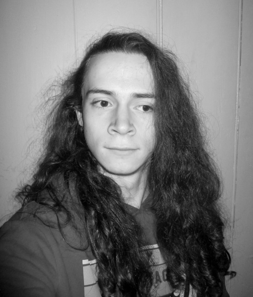
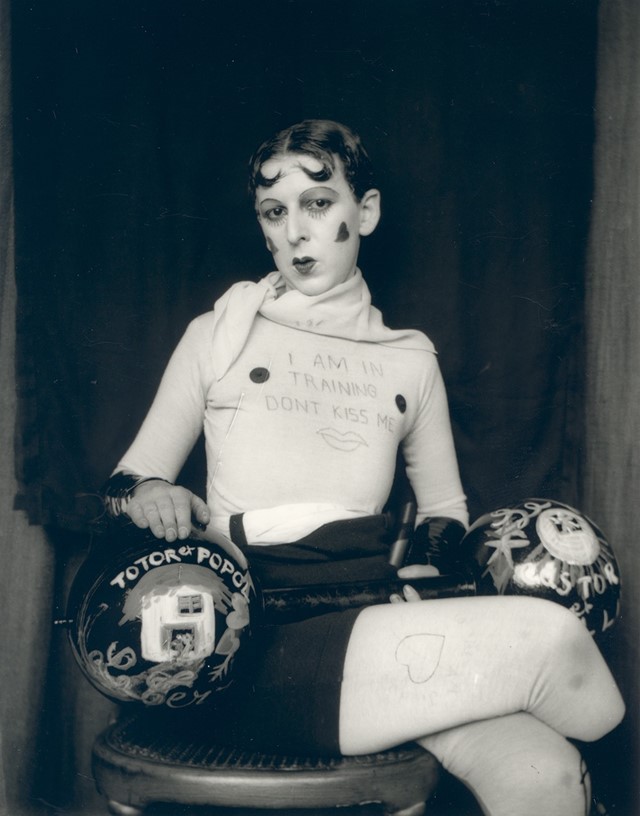
The image on the left is a self portrait of myself. It is a black and white, head and shoulders shot with a plain background. The image on the right is called “I’m training, don’t kiss me” by Claude Cahun in 1927. It is also a black and white portrait image with a plain background, however this image is a full body shot.
Similarities
Both images are black and white portraits, which helps emphasize the features of the model. They both use a plain background to create a contrast not only in colour but also detail, allowing the model to attract the attention of the viewer. There is also a contrast between the lightest and darkest parts of the image, made clearer by the black and white filters.
Differences
My image uses a male model wearing casual clothing, the image is a head and shoulders shot, allowing the face and hair of the model to take up most of the image. The model is looking away from the camera to the side, however there is no clear message behind the image. There are no props in this image.
This image uses a model who’s gender is not made explicitly clear, they are wearing a costume depicting the male bodybuilding stereotype. The image is a full body shot with the model looking directly at the camera. This image has a clear narrative about gender. with the use of lipstick, props, writing that is meant to be seen as mocking, drawings of hearts, etc…
An example of portrait typologies and deadpan portraiture
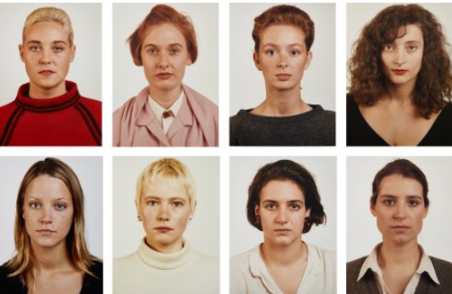
A photographic typology is a single photograph or more commonly a body of photographic work, that shares a high level of consistency. This consistency is usually found within the subjects, environment, photographic process, and presentation or direction of the subject. An example of this is passport photos which all follow certain rules which enable every picture to be consistent (seen below)
FACE:
eyes must be open and clearly visible, with no flash reflections and no ‘red eye’
facial expression must be neutral (neither frowning nor smiling), with the mouth closed
photos must show both edges of the face clearly
photos must show a full front view of face and shoulders, squared to the camera
the face and shoulder image must be centred in the photo; the subject must not be looking over one shoulder (portrait style), or tilting their head to one side or backwards or forwards
there must be no hair across the eyes
hats or head coverings are not permitted except when worn for religious reasons and only if the full facial features are clearly visible
photos with shadows on the face are unacceptable
photos must reflect/represent natural skin tone
BACKGROUND:
Photos must have a background which:
has no shadows
has uniform lighting, with no shadows or flash reflection on the face and head
shows a plain, uniform, light grey or cream background (5% to 10% grey is recommended)
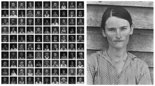
THOMAS RUFF
Thomas Ruff followed these rules for his “Portrait” collection, in his studio between 1981 and 1985, Ruff photographed 60 half-length portraits in the same manner: Passport-like images, with the upper edge of the photographs situated just above the hair, even lighting, the subject between 25 and 35 years old, taken with a 9 × 12 cm negative and, because of the use of a flash, without any motion blur.
The early portraits were black-and-white and small, but Ruff soon switched to colour, using solid backgrounds in different colours; from a stack of coloured card stock the sitter could choose one colour, which then served as the background. The resulting Portraits depict the individual persons – often Ruff’s fellow students – framed as in a passport photo, typically shown with emotionless expressions, sometimes face-on, sometimes in profile, and in front of a plain background.
STUDIO
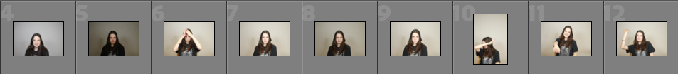
In the studio we did a small shoot of passport-type images
Some contact sheets from the shoot
My setup in the studio
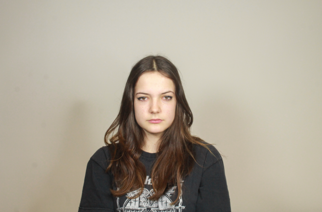
This is my most successful image from the shoot as it complies with the standards for passport photos the best.
I resized the image so it would seem more fitting for a portrait- with less negative space.
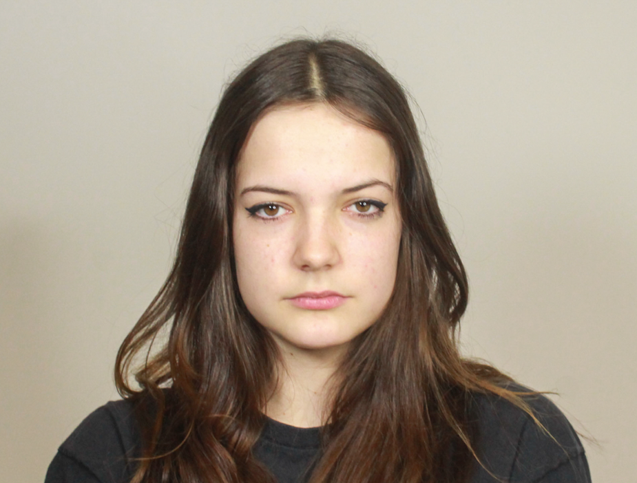
This is my final image, I believe it looks very similar to Thomas Ruff’s work however photos with the deadpan aesthetic often look very similar- especially passport photos as the entire point is to get a clear portrait formally showing someone’s facial features.
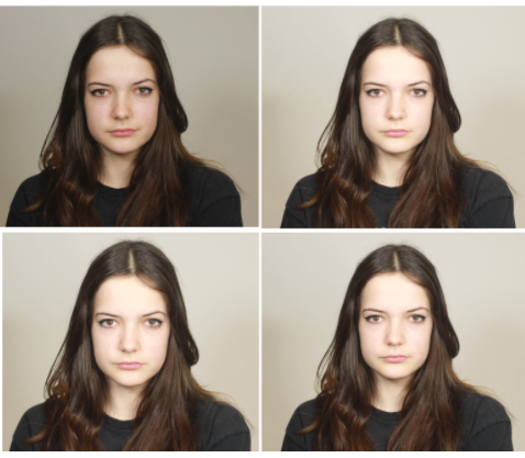
My try at typologies
Overall these images look very similar to Thomas Ruff’s portraits photos with the deadpan aesthetic, however I do not have the variation of portraits of different people in a collection. My images are also not edited minus the resizing, this is reinforce the rules of passport photos, where there cannot be any editing however this displays an inconsistent display of portraits where they look slightly different.
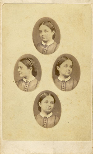
he Patent Diamond Cameo photograph was registered by F.R. Window of London in 1864. Four small oval portraits (1″ x 3/4“) were placed on a carte de visite in the shape of a diamond, each portrait being of the same person photographed in a different position. A special camera made by Dallmeyer was used in which the one glass negative was moved to a new position in the back of camera after each portrait had been taken, and when the paper print had been pasted on the card a special press was used to punch the four portraits up into a convex cameo shape. It is unlikely the process became very popular with Adelaide’s photographers, as the failure of just one of the four portraits through movement, poor expression or incorrect exposure meant that the plate had to be rejected and another four portraits made on a new plate. To obtain a carte de visite which had a pleasing overall effect would have involved careful advance planning of the four positions to be taken, as it was only after the negative was developed that the photographer could see if an acceptable negative had been produced.
Example
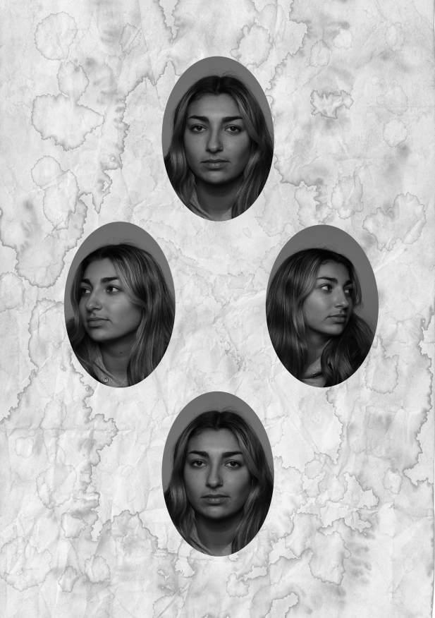
To make mine I took 4 photos of someone looking straight on, away to either side and down. I put these into a photoshop document, levelled them, cut them out and arranged them in a diamond shape. To also add a more vintage and worn appearance I copied in a photo of an old piece of paper then reduced the opacity to add a more worn out look.
I repeated this process again outside of school in a makeshift studio but with varied facial expressions and actions. I like how this one came out more as it feels more personal and the lighting changed a bit halfway through the shoot because of a malfunctioning reading lamp I was using to cast shadows.