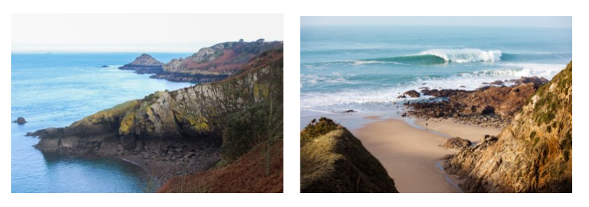
Thomas Ruff is a German photographer born February 10, 1958. He lives and works in Düsseldorf, Germany.
THE DEADPAN AESTHETIC
According to source the origins of the word “Deadpan” can be traced to 1927 when Vanity Fair Magazine compounded the words dead and pan, a slang word for a face, and used it as a noun. In 1928 the New York Times used it as adjective to describe the work of Buster Keaton.
It is less clear when it was first used to describe the style of photography associated with Edward Ruscha, Alec Soth, Thomas Ruff and many others. Charlotte Cotton devotes a complete chapter to Deadpan in the photography as contemporary art and much that has been written since references that essay.
In summary Deadpan photography is a cool, detached, and unemotional presentation and, when used in a series, usually follows a pre-defined set of compositional and lighting rules.
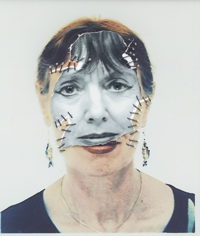
He decided he would like to mimic a passport photo set up. he used this criteria to make his passport images.
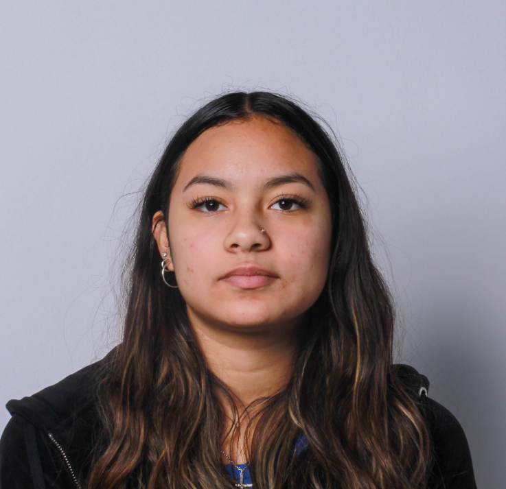
This image meets the critria of a passport photot eyes open, neutral face, whole face in image, face and shoulders centered in image, no hair covering the eyes, no hats, no shadows on the face and natural skin tone.
FACE:
- eyes must be open and clearly visible, with no flash reflections and no ‘red eye’
- facial expression must be neutral (neither frowning nor smiling), with the mouth closed
- photos must show both edges of the face clearly
- photos must show a full front view of face and shoulders, squared to the camera
- the face and shoulder image must be centred in the photo; the subject must not be looking over one shoulder (portrait style), or tilting their head to one side or backwards or forwards
- there must be no hair across the eyes
- hats or head coverings are not permitted except when worn for religious reasons and only if the full facial features are clearly visible
- photos with shadows on the face are unacceptable
- photos must reflect/represent natural skin tone
BACKGROUND:
Photos must have a background which:
- has no shadows
- has uniform lighting, with no shadows or flash reflection on the face and head
- shows a plain, uniform, light grey or cream background (5% to 10% grey is recommended)
Deadpan
a deadpan image can be described as a photograph that is devoid of emotion the subject is cantered in the image and the camera should be positioned straight on to the subject.
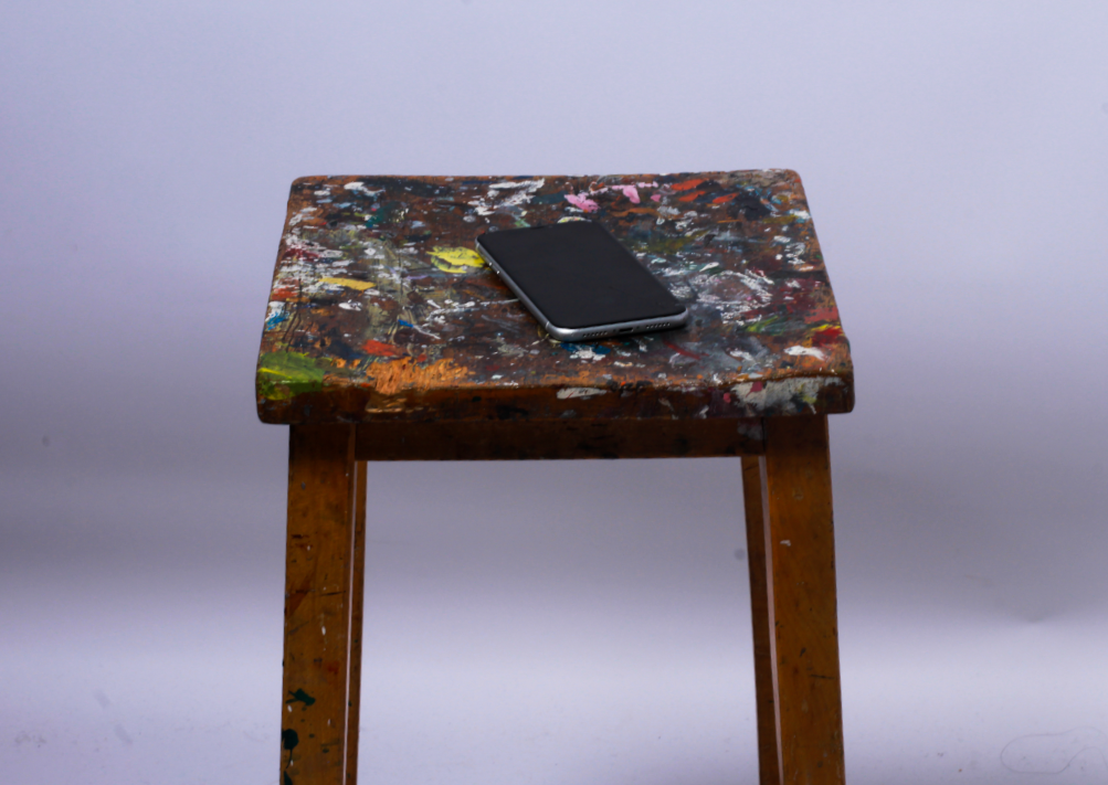
this image is of a stool I chose to use a stool because it would be easier for a stool to not show emotion than a person. the stool is centred in the frame, I positioned myself straight on from the stool to take this photograph.

