headshots

The dead pan aesthetic
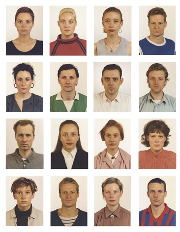
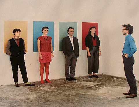
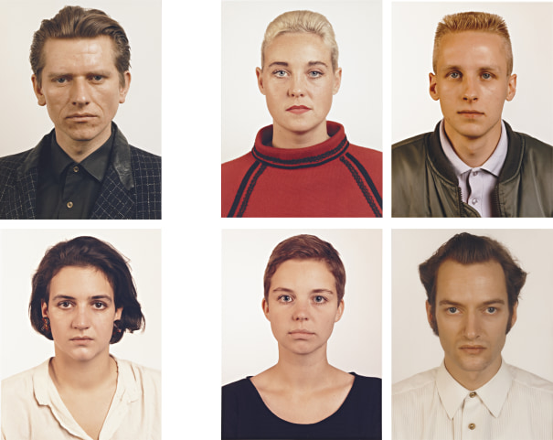
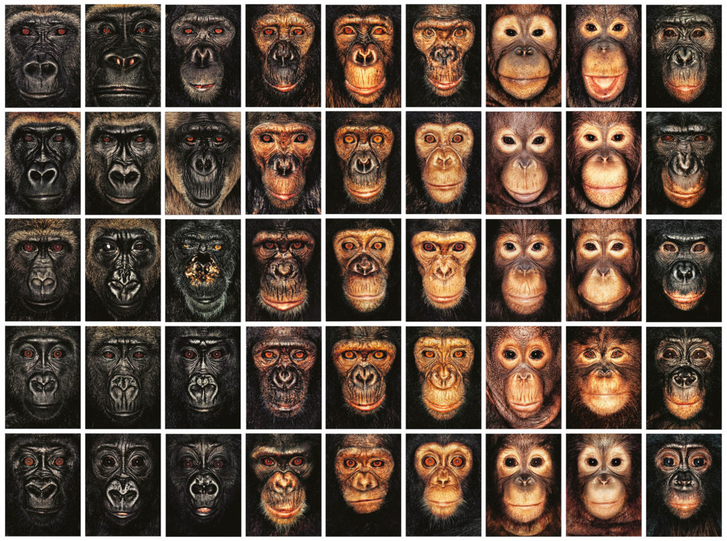
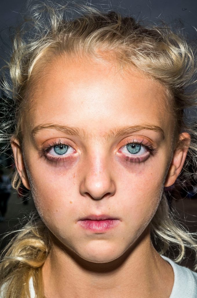
Portraits Carolin Rewer, Thomas Bernstein, Isabelle Graw, Sabine Weirand,  Rupert Huber, Karin Kneffel, Johan Röing, Stoger, Ralf Müller, Axel Hütte,  Simone Buch, Coeline, a.o. 16 works by Thomas Ruff on artnet
Thomas Ruff - Contemporary Art Day Sale London June 2010 | Phillips

Deadpan photography goes back all the way to the 1920s. It’s a very distinct style of photography that has somehow made its way into the 21st century, quietly and persistently influencing you in a way you might not even be aware of.

According to sources the origins of the word “Deadpan”  can be traced to 1927 when Vanity Fair Magazine compounded the words dead and pan, a slang word for a face, and used it as a noun. In 1928 the New York Times used it as adjective to describe the work of Buster Keaton.

It is less clear when it was first used to describe the style of photography associated with Edward Ruscha, Alec Soth, Thomas Ruff and many others.  Charlotte Cotton devotes a complete chapter to Deadpan in The Photograph as Contemporary Art and much that has been written since references that essay.

In summary Deadpan photography is a cool, detached, and unemotional presentation and, when used in a series, usually follows a pre-defined set of compositional and lighting rules.

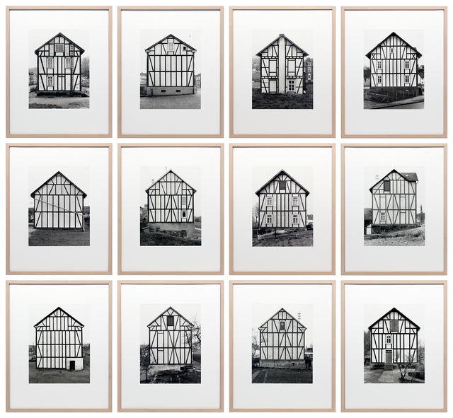
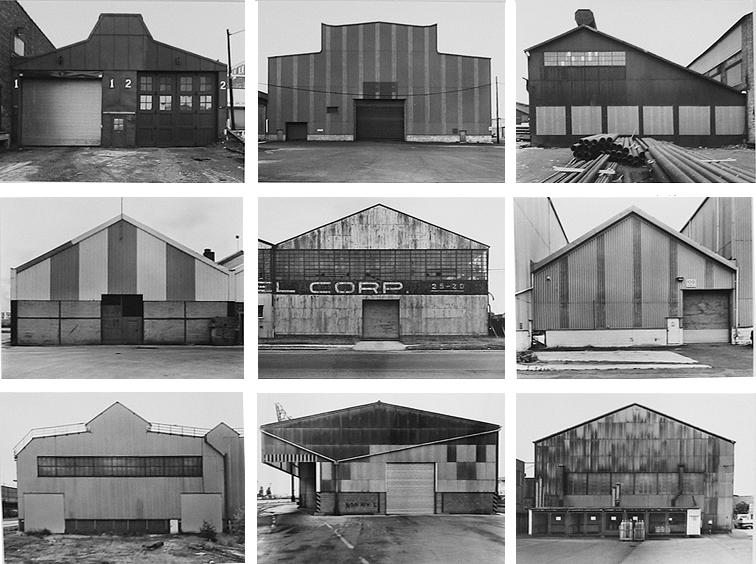
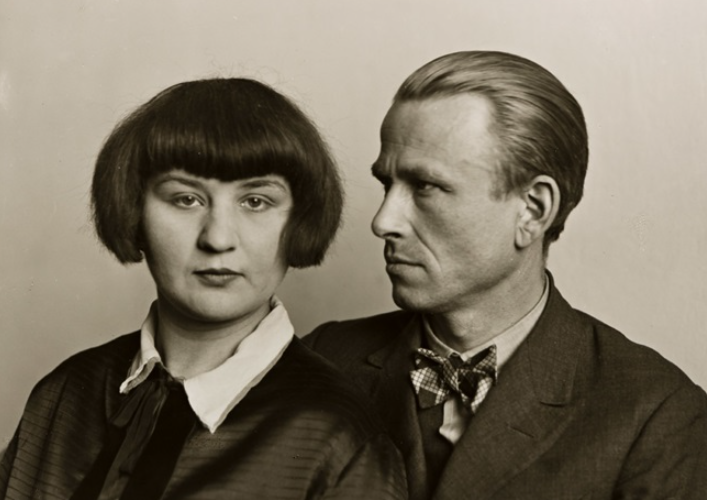
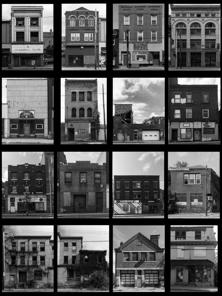
This style originated in Germany and is descended from Neue Sachlichkeit, New Objectivity, a German art movement of the 1920s that influenced the photographer August Sander who systematically documented the people of the Weimar Republic . Much later, in the 1970s, Bernd and Hilla Becher, known for their devotion to the principles of New Objectivity, began to influence a new generation of German artists at the Dusseldorf School of Photography (4). These young German photographers included  Thomas Struth, Andreas Gursky, Candida Hofer and Thomas Ruff. The Bechers (4 & 5) are best remembered for their studies of the industrial landscape, where they systematically photographed large structures such as water towers, coal bunkers or pit heads to document a soon-to-disappear landscape in a formalistic manner as much akin to industrial archeology as art. The Bechers’ set of “rules” included clean, black and white pictures taken in a flat grey light with straight-on compositions that perfectly lent themselves to their presentation methodology of large prints containing a montage of nine or more similar objects to allow the study of types (typology) in the style of an entomologist.

The deadpan aesthetics is considered a technically perfect photograph which depicts a landscape, still life or a person by a direct centred composition. The photographs usually have a single central theme (a mining tower, face, mound of clay, etc.), the background is usually unimportant (which does not
apply for more sociologically oriented concepts), ignored or is neutral and sterile. Other photographs are based on the richness of motifs (immense landscape, crowd of people, clump of trees, etc.), in which it is impossible to identify the main motif. The first paradigm was denoted by Robert Silverio as a negation of composition and the second one as a disintegration of composition.

Above all the other formal attributes, there is a high level of modality, based on which a photography has an impression of being very realistic and believable. Colours are slightly desaturated, dull. Composition gestures are constrained or minimized. Photographs seem depleted, describing a given reality without unambiguous attitude of an author. However, no photograph can be purely descriptive and unemotional, although, the photographer may seek to marginalize their subjective input and focus their attention to their objectiveness. Besides high-level craftsmanship, the visual language of the deadpan aesthetics is mainly built on the absence of a photographer’s emotional input.
They deliberately give up their emotional or political view and keep a certain distance from the theme.

However, paying attention to a strongly emotional theme is not totally excluded. Such emotional theme can have an emotional
impact on a photographer, but they still keep their distance when taking the photograph and do not involve their emotions in the photograph. In that way, thanks to the neutral attitude of the author and the way of interpretation which is
cold and objective, the recipient is provided with a strong emotional content of the photograph. When analysing deadpan photographs, it is important to perceive their content from a wider, more comprehensive point of view. Creation of such photographs results from an approach which is more anthropological and scientific than critical and artistic. Formal characteristics of the deadpan aesthetics can be described as means of expression of scientific and systematic methodology in photography.

Typologies

A photographic typology is a single photograph or more commonly a body of photographic work, that shares a high level of consistency. This consistency is usually found within the subjects, environment, photographic process, and presentation or direction of the subject.

One of the golden rules in typological photography is consistency. Not only do you need to photograph a certain type of subject, you need to create a body of work that clearly points to the differences and similarities between each one.

The German artists Bernd and Hilla Becher, who began working together in 1959 and married in 1961, are best known for their “typologies”—grids of black-and-white photographs of variant examples of a single type of industrial structure.

They began collaborating together in 1959 after meeting at the Kunstakademie Düsseldorf in 1957. Bernd originally studied painting and then typography, whereas Hilla had trained as a commercial photographer.

They took photos of Industrial structures including water towers, coal bunkers, gas tanks and factories. Their work had a documentary style as their images were always taken in black and white. Their photographs never included people.

The Becher’s were influenced by the work of earlier German photographers linked to the New Objectivity movement of the 1920s such as August Sander, Karl Blossfeldt and Albert-Renger-Patzsch.

August Sander was a German portrait and documentary photographer. Sander’s first book Face of our Time was published in 1929. Sander has been described as “the most important German portrait photographer of the early twentieth century”.
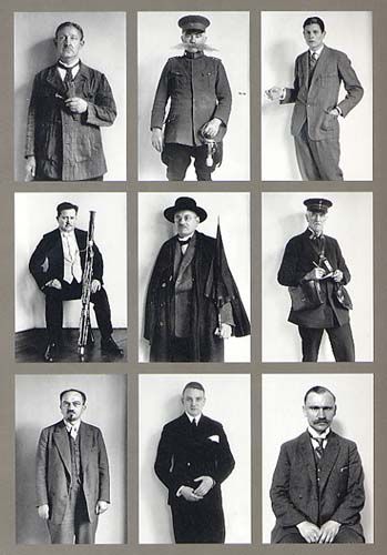
Adam sandlers work

Karl Blossfeldt early photographs reveal an interest in the typology of plant forms which was to become a fundamental concern of his later work. He shot his plants in front of natural backgrounds, lit them with weak daylight whenever possible, and used either a vertical or horizontal perspective.

KARL BLOSSFELDT: ART FORMS IN NATURE
Karl Blossfeldt works

Up close

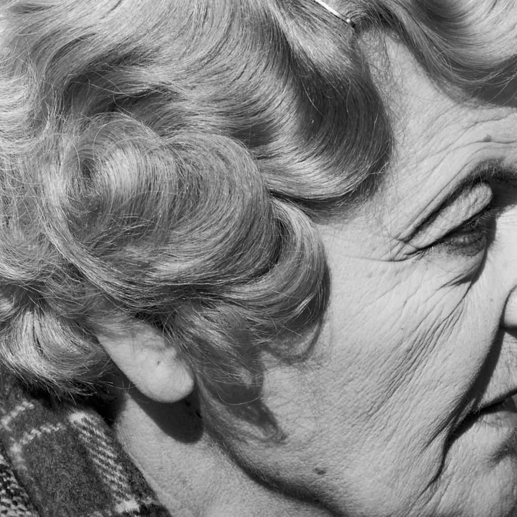
Bruce Gilden is an American street photographer. He is best known for his candid close-up photographs of people on the streets of New York City, using a flashgun. He has had various books of his work published, has received the European Publishers Award for Photography and is a Guggenheim Fellow.

Right from childhood, he has always been fascinated by the life on the streets and the complicated and fascinating motion it involves, and this was the spark that inspired his first long-term personal projects, photographing in Coney Island and then during the Mardi Gras in New Orleans.

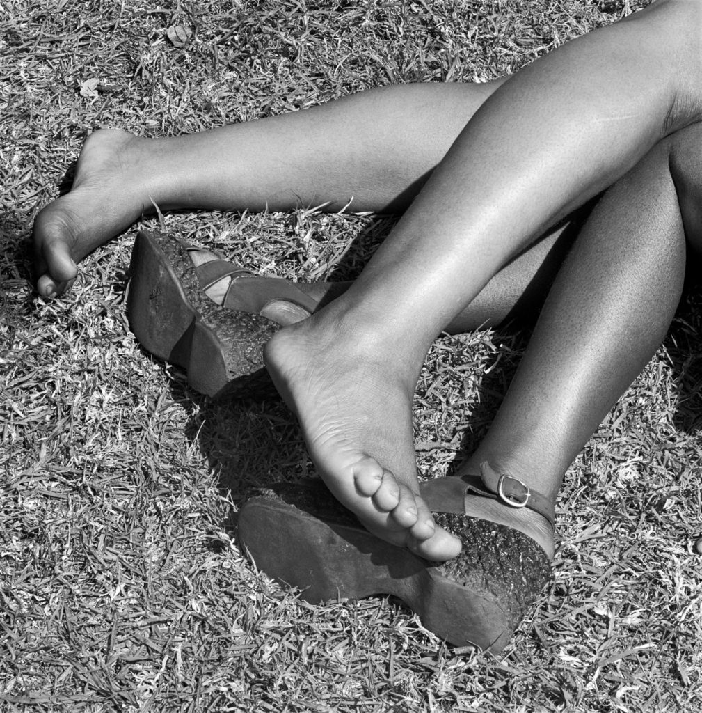
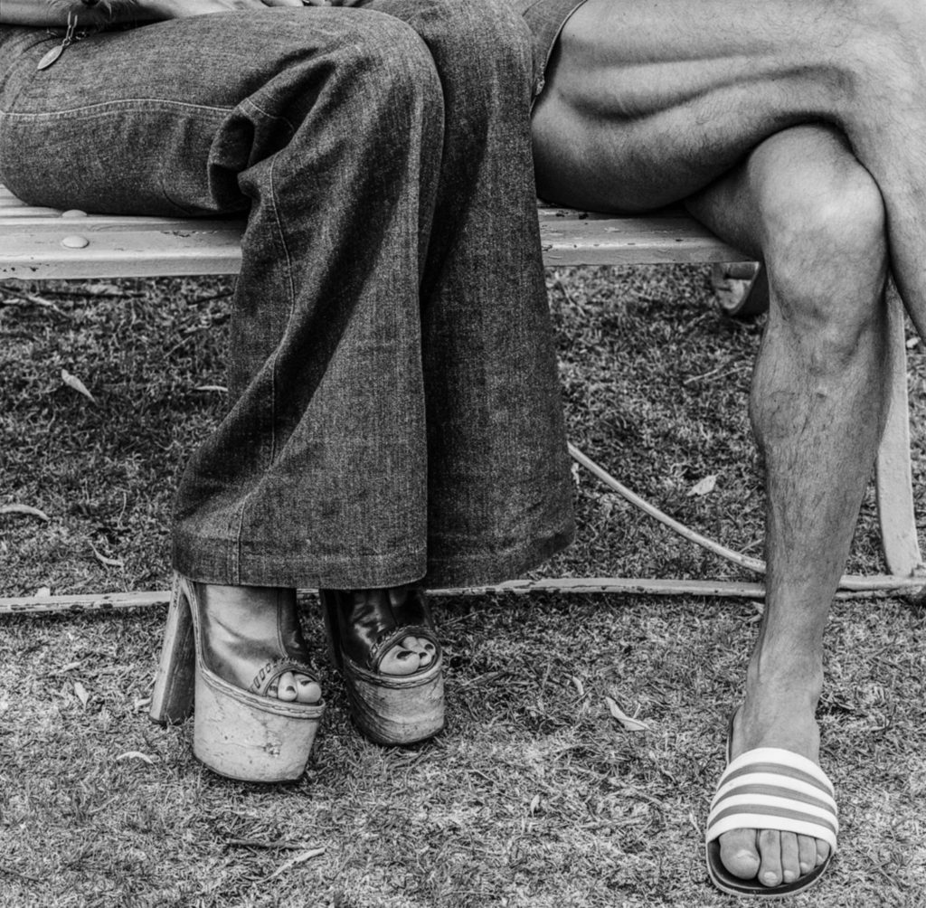
David Goldblatt was a South African photographer noted for his portrayal of South Africa during the period of apartheid. After apartheid had ended he concentrated more on the country’s landscapes.

Following a series of portraits of his compatriots made in the early 1970s, photographer David Goldblatt, for a very short and intense period of time, naturally turned to focusing on peoples’ particulars and individual body languages “as affirmations or embodiments of their selves.” Goldblatt’s affinity was no accident: Working at his father’s men’s outfitting store in the 1950s, his awareness of posture, gesture and proportion technical as it was formed early and would accompany him throughout his life.

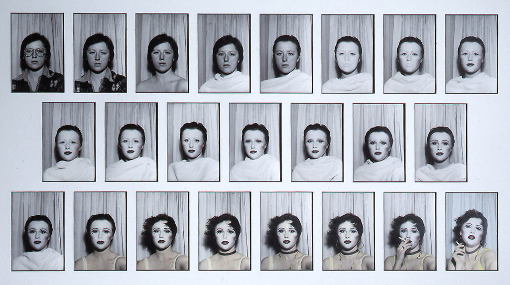
Sequence / grid

A sequence, sometimes called an image sequence, is created by using editing software such as Photoshop, to combine all photos from a camera burst into a single image. This single image then shows the path of an object or subject.

This technique is often used in action sports photography in order to depict an athlete performing a trick or extreme feat that would be difficult to document or understand with a single frame photo. A sequence is created by shooting with your camera in burst mode to fire off a quick series of back-to-back photos.

Duane Michals (b. 1932, USA) is one of the great photographic innovators of the last century, widely known for his work with series, multiple exposures, and text. Michals first made significant, creative strides in the field of photography during the 1960s. In an era heavily influenced by photojournalism, Michals manipulated the medium to communicate narratives. The sequences, for which he is widely known, appropriate cinema’s frame-by-frame format. Michals has also incorporated text as a key component in his works. Rather than serving a didactic or explanatory function, his handwritten text adds another dimension to the images’ meaning and gives voice to Michals’s singular musings, which are poetic, tragic, and humorous, often all at once.
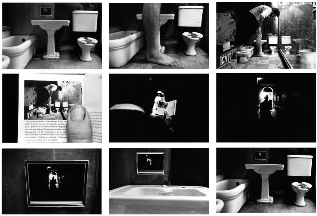
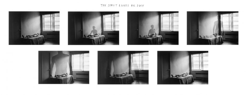
Duane michals, Things are queer, 1973
the spirit leaves the body , 1968

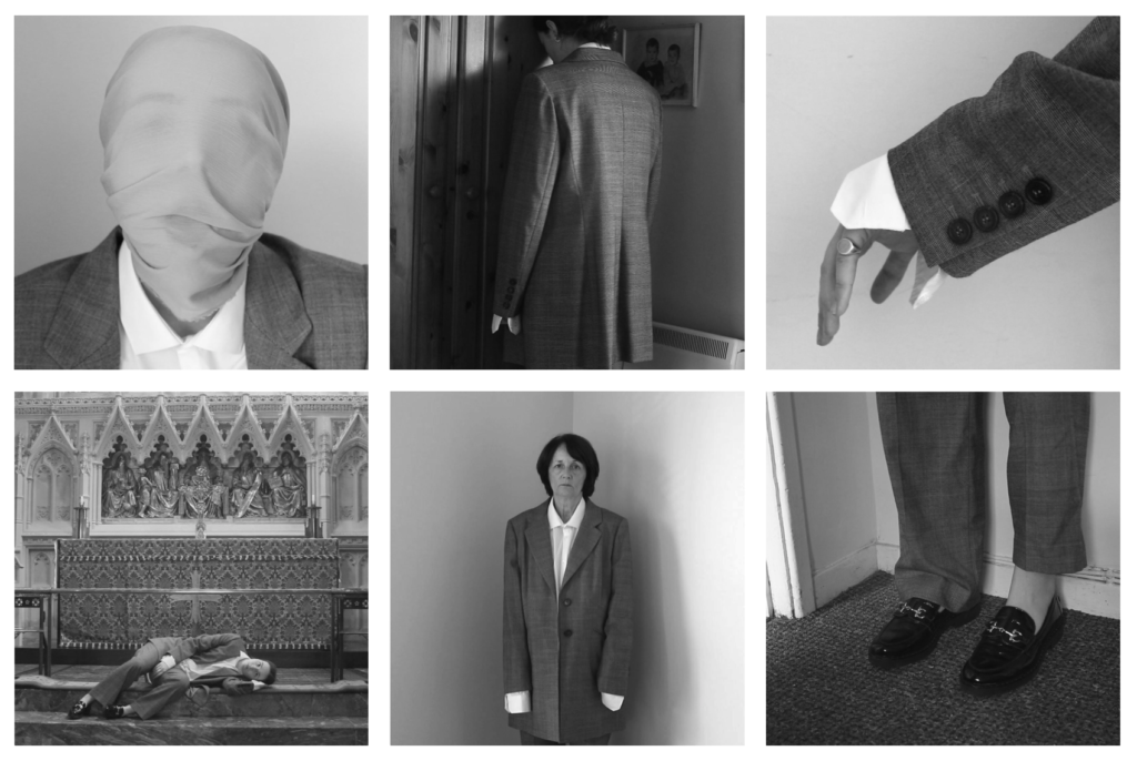
Shannon O’Donnell: That’s Not The Way The River Flows (2019) is a photographic series that playfully explores masculinity and femininity through self-portraits. The work comes from stills taken from moving image of the photographer performing scenes in front of the camera. This project aims to show the inner conflicts that the photographer has with identity and the gendered experience. It reveals the pressures, stereotypes and difficulties faced with growing up in a heavily, yet subtly, gendered society and how that has impacted the acceptance and exploration of the self.

Shannon O’Donnell

Tracy Moffatt: The nine images in Something More tell an ambiguous tale of a young woman’s longing for ‘something more’, a quest which brings dashed hopes and the loss of innocence. With its staged theatricality and storyboard framing, the series has been described by critic Ingrid Perez as ‘a collection of scenes from a film that was never made’. While the film may never have been made, we recognise its components from a shared cultural memory of B-grade cinema and pulp fiction, from which Moffatt has drawn this melodrama. The ‘scenes’ can be displayed in any order – in pairs, rows or as a grid – and so their storyline is not fixed, although we piece together the arc from naïve country girl to fallen woman abandoned on the roadside in whatever arrangement they take. Moffatt capitalises on the cinematic device of montage, mixing together continuous narrative, flashbacks, cutaways, close-ups and memory or dream sequences, to structure the series, and relies on our knowledge of these devices to make sense and meaning out of the assemblage.
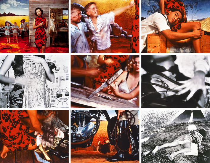
Tracy Moffatt

Juxtaposition

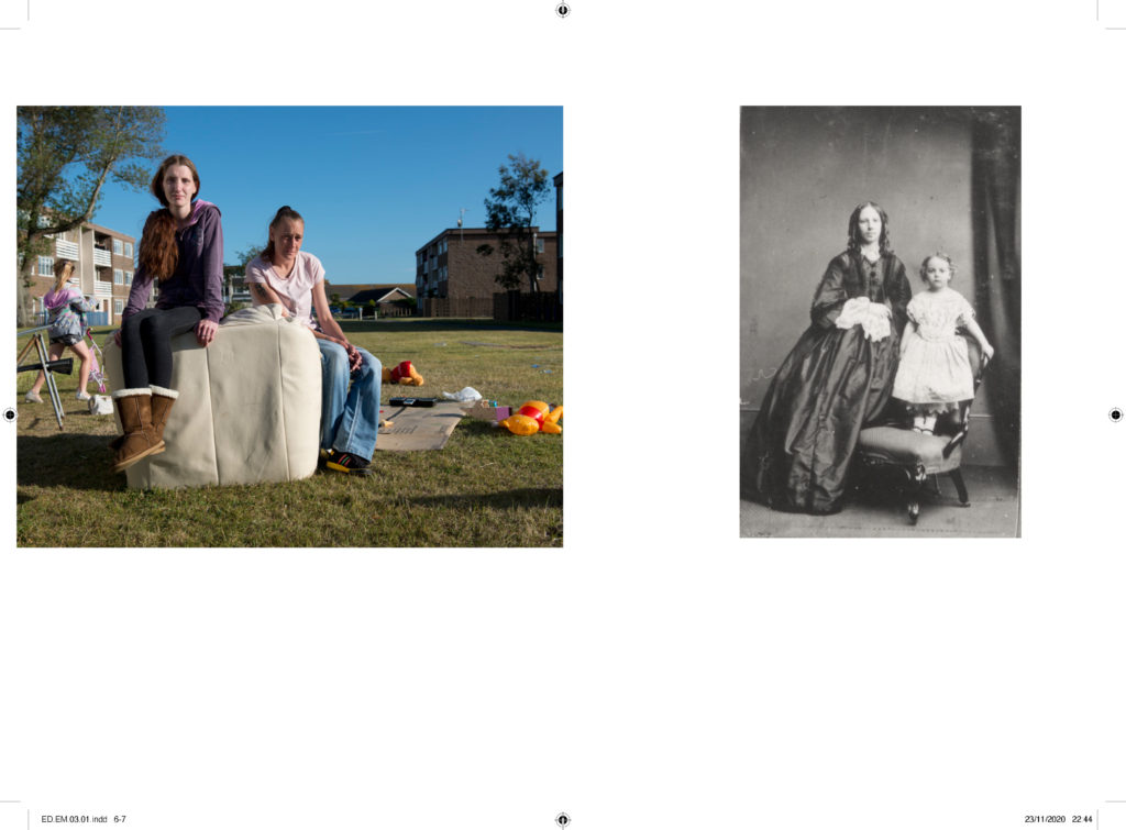
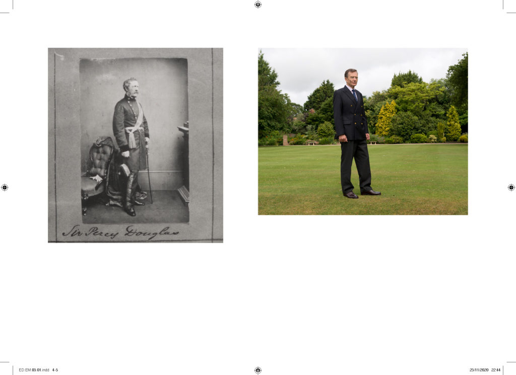
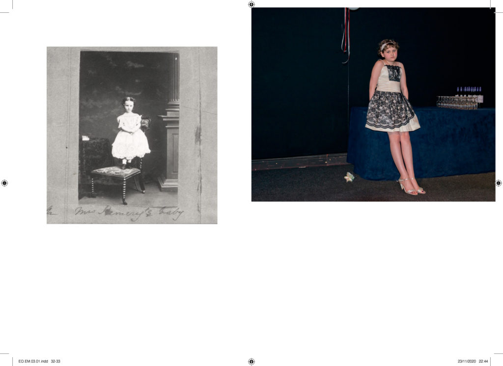
Juxtaposition is placing two images together to show contrast or similarities. For inspiration look at some of the page spreads from ED.EM.03 where pairings between portraits of Henry Mullins and Michelle Sank are juxtaposed to show comparison/ similarities/ differences between different social and professional classes in Jersey mid-19th century and early 21 st century.

Comparing my work

Angela Kelly

My Work
Angela Kelly’s Work

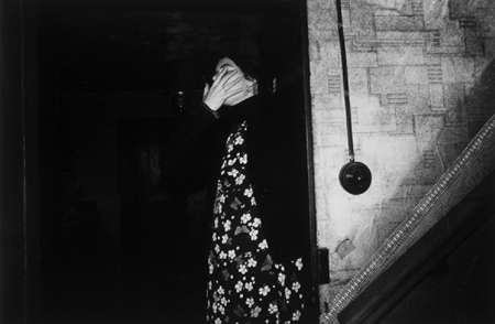
I’m comparing one of my images to one of my original inspirations, Angela Kelly, as I think we’ve got some similarities in our work, despite them looking so different. We’ve both used photos of ourselves and hidden our faces however have gone about it in different ways, I used photoshop to blur out my face post-photoshoot whilst Kelly has used her hand to hide hers during the photoshoot. We’ve also used full body photos of ourselves with the background still in view, taking attention away from us and almost allowing us to become apart of the background of our own photos.

Despite all this, we also have a few differences in our work such as the editing style. Kelly has made sure to increase the contrast in her image which allows the shadows to take control of the image and almost consume her into the background whilst I’ve decided to keep my image in colour, allowing all the details from the photo to stand out against one another and create different points of focus due to how busy the photo looks. Alongside that, Kelly has a more naturalistic style, keeping her images simple and lifelike as if someone had taken a photo of her leaving the room whilst I’ve edited a page out of a book to my work, taking away the naturalness of my original image.

Robin Cracknell

My Work
Robin Cracknell’s Work

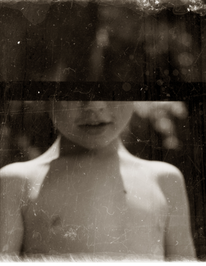
I’m comparing my some of my work to Robin Cracknell’s as both our images look dramatic and vintage, mine through the use of an overlay and his through he use of a vintage camera. This adds to our work, making it look older and almost like a memory which links back to both of our themes. Both of our images are centred, helping to draw attention towards the figure, aka the focal point of the image, despite both of us using different profiles in our portraits – his using a front profile whilst mine is more of a side profile. Along with that, we’ve both hidden part of the face in our photos, although we’ve obscured a the face in very different ways – I used an image of a plaster whilst he used his vintage camera to his advantage and purposefully framed the photo to create a line across the face.

i


[

My Work
Robin Cracknell’s Work

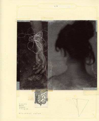
Here, I think our work also shares similarities as we’ve both chosen 2 of our photos and placed them next to each other, allowing them to work as one piece instead of individual images. Along with that, we’ve both used paper to help enhance and bring the 2 images together, however, I’ve used photoshop to blend the paper into the photo whilst Cracknell’s printed out his images and stuck them down onto a piece of paper, adding to the vintage manner of his work.

There are also some clear differences between our work such as the amount of colour in my work vs the lack of colour in Cracknell’s work. His lack of colour creates a dismal atmosphere surrounding his images, almost as though the viewer is supposed to mourn/pity the girl in the image which is emphasized by the lack of focus in the image as it’s almost as though the girl is hiding from the camera, especially as her back is turned away from the camera in one photo and her arm is the only visible proof of her in the other.

History of portrait Photography

Portrait photography has a long and varied history that dates back to 1839. Portrait photography became popular through early images of famous people and evolved as a way to preserve history. A portrait is a photograph of a person taken by another person, while a self-portrait is a picture one takes of themselves.

Louis Daguerre

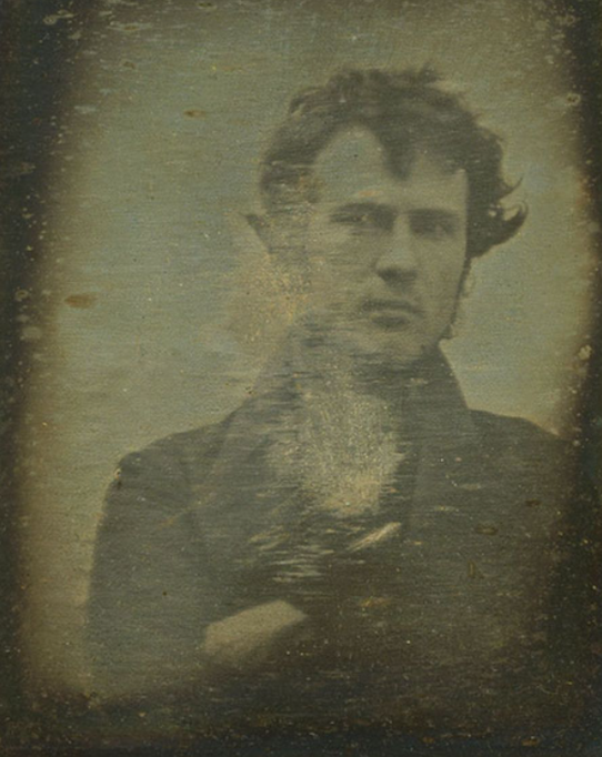
The invention of photography can be credited to Louis Daguerre, who first introduced the concept to the French Academy of Sciences in 1839. That same year, Robert Cornelius produced what’s considered the first photographic self-portrait.

Robert Cornelius in the first photographic self-print.

Portrait studios started springing up the next year. These early studios weren’t an instant hit, as a majority of the public was still unsure of the new medium.

To dissuade their fears, photographers sought to capture images of famous people, such as Abraham Lincoln and Charles Dickens. Portrait photography became a way for people to have an image of a loved one or a celebrity without having to commission an artist to paint a time-consuming portrait.

PORTRAIT PHOTOGRAPHERS THROUGHOUT HISTORY

ROBERT CORNELIUS

(March 1, 1809 – August 10, 1893)

Robert Cornelius was an American photographer and pioneer in the history of photography. He designed the photographic plate for the first photograph taken in the United States, an image of Central High School taken by Joseph Saxton in 1839. His self image taken in 1839 is the first known photographic portrait of a human taken in the United States. He operated two of the earliest photography studios in the United States between 1841 and 1843 and implemented innovative techniques to significantly reduce the exposure time required for portraits.

HENRY MULLINS

 (1818-1880)

Henry Mullins is one of the most prolific photographers represented in the Societe Jersiase Photo-Archive, producing over 9,000 portraits of islanders from 1852 to 1873 at a time when the population was around 55.000. The record we have of his work comes through his albums, in which he placed his clients in a social hierarchy. The arrangement of Mullins’ portraits of ‘who’s who’ in 19th century Jersey are highly politicised.

Henry Mullins Album showing his arrangements of portraits presented as cartes de visite


Henry Mullins started working at 230 Regent Street in London in the 1840s and moved to Jersey in July 1848, setting up a studio known as the Royal Saloon, at 7 Royal Square. Here he would photograph Jersey political elite (The Bailiff, Lt Governor, Jurats, Deputies etc), mercantile families (Robin, Janvrin, Hemery, Nicolle ect.) military officers and professional classes (advocates, bankers, clergy, doctors etc).

His portrait were printed on a carte de visite as a small albumen print, (the first commercial photographic print produced using egg whites to bind the photographic chemicals to the paper) which was a thin paper photograph mounted on a thicker paper card. The size of a carte de visite is 54.0 × 89 mm normally mounted on a card sized 64 × 100 mm. In Mullins case he mounted his carted de visite into an album. Because of the small size and relatively affordable reproducibility cartes de visite were commonly traded among friends and visitors in the 1860s. Albums for the collection and display of cards became a common fixture in Victorian parlors. The immense popularity of these card photographs led to the publication and collection of photographs of prominent persons. He also arranged single portraits into diamond cameos.

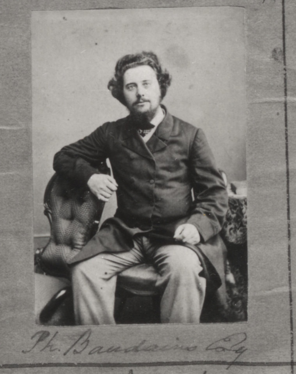
Portrait of Philip Baudains, Writer, Advocate, Constable and Deputy of St Helier. The four headshots of Baudains are presented in a Diamond Cameo which is a process in which four separate portraits of the same subject are printed on a carte de visite.

Some headshots by Mullins of both Jersey men and women were produced as vignette portrait which was a common technique used in mid to late 19th century.
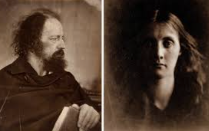
Some of Mullins’ portraits of Jersey locals

JULIA MARGARET CAMERON

(11 June 1815-26 January 1879)

Julia Margaret Cameron was a British photographer who is considered one of the most important portraitists of the 19th century. She is known for her soft-focus close-ups of famous Victorian men and for illustrative images depicting characters from mythology, Christianity, and literature

Sappho- Julia Margaret Cameron

Cameron was often criticized by the photographic establishment of her day for her supposedly poor technique: some of her pictures are out of focus, her plates are sometimes cracked, and her fingerprints are often visible, however Cameron was an amateur- the camera she used being a gift from her son-in-law.

Having lived in India and London, Cameron’s family had recently moved to the Isle of Wight, a popular location for Britain’s cultural elite—residents included essayist, philosopher, and historian Thomas Carlyle, author Charles Dickens, inventor John Herschel, and poet Alfred Lord Tennyson. Cameron photographed these famous tenants and anyone else who would let her. Such local figures as the postman, as well as her own family and servants, appear in many of her images.

Her tenacity and eccentricity eventually became well known; she allegedly followed promising-looking people on the streets until they consented to model for her. A well-read, educated woman, she often pressed her subjects into posing for pastoral, allegorical, historical, literary, and biblical scenes, such as in Madonna with Children (1864). In this photograph, she transforms Mary Kellaway, a local dressmaker, and Elizabeth and Percy Keown, children of a gunner in the Royal Army, into figures in an enduring art historical scene.

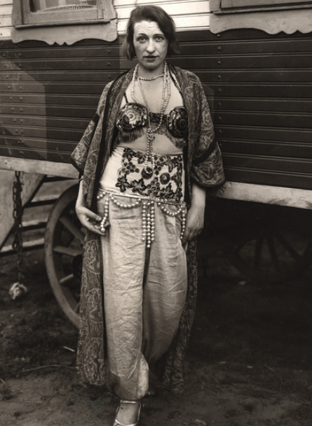
AUGUST SANDER

(November 17, 1876 -April 20, 1964)

August Sander was a German portrait and documentary photographer. Sander’s first book Face of our Time was published in 1929. Sander has been described as “the most important German portrait photographer of the early twentieth century”.

His photos are similar to modern street photography, capturing people in their natural environment .

August Sander was a German photographer whose work documented the society he lived in. Lauded as one the most-important portrait photographers of the early 20th century, Sander focused his gaze on bricklayers, farmers, bakers, and other members of the community. “Nothing seemed to me more appropriate than to project an image of our time with absolute fidelity to nature by means of photography,” he once declared. “Let me speak the truth in all honesty about our age and the people of our age.”

Born in Herdorf, Germany on November 17, 1876, Sanders learned photography during his military service in the city of Trier. By 1910, he had moved to a suburb of Cologne, spending his days biking along the roads to find people to photograph. By the time the Nazi regime rose to power in the 1930s, Sander was considered an authority on photography and recognized for his book Face of Our Time (1929).

During this era, he faced both personal persecution and the systematic destruction of his work. Following the death of his son in 1944, and the destruction of his work in 1946, Sander practically ceased photography altogether. He died in Cologne, Germany on April 20, 1964 at the age of 87. Today, the artist’s works are held in the collections of The Museum of Modern Art in New York, the National Gallery of Art in Washington, D.C., and the Wallraf-Richartz Museum in Cologne, among others.

THOMAS RUFF

(February 10, 1958-)

Thomas Ruff  portrays works that examine complex relationship between photography, political propaganda, and the possibilities of digital manipulation.

Born in 1958 in Zell am Harmersbach, Germany, Thomas Ruff attended the Staatlichen Kunstakademie in Düsseldorf from 1977 to 1985. Ruff rose to international prominence in the late 1980s as a member of the Düsseldorf School, a group of young photographers who had studied under Bernd and Hilla Becher and became known for their experimental approach to the medium and its evolving technological capabilities.

Ruff in particular made a radical break with the style of his teachers, establishing a distinct approach to conceptual photography through a variety of strategies, including the use of color, the purposeful manipulation of source imagery—originally through manual retouching techniques and eventually through digital methods—and the enlargement of the photographic print to the scale of monumental painting.

Working in discrete series, Ruff has since utilized these methods to conduct an in-depth examination of a variety of photographic genres, including portraiture, the nude, landscape, and architectural photography, among others. Highly influential to subsequent generations of photographers, Ruff’s overarching inquiry into the “grammar of photography” accounts for not only his heterogeneous subject matter, but also the extreme variation of technical means used to produce his series, ranging from anachronistic devices to the most advanced computer simulators and covering nearly all ground in between

artists references

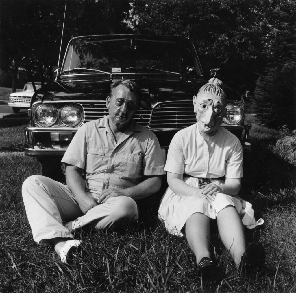
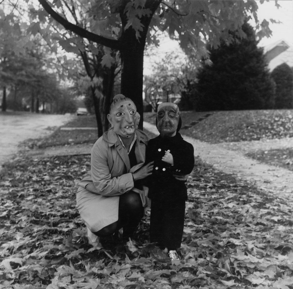
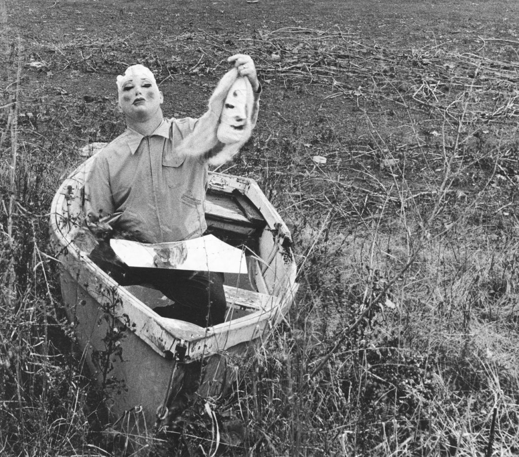
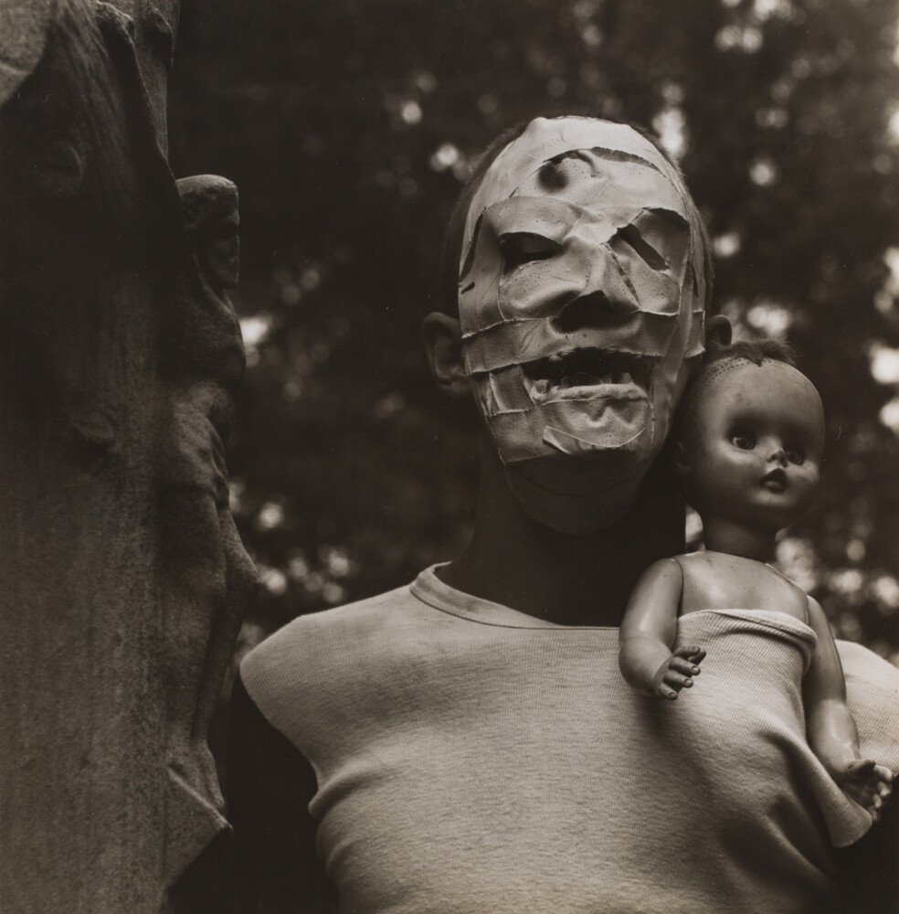
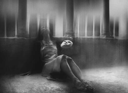
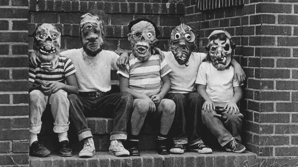
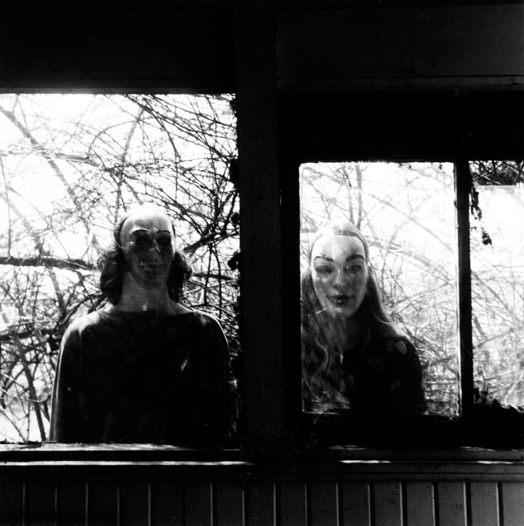
Ralph Eugene Meatyard

Ralph Eugene Meatyard lived in Lexington, Kentucky, where he made his living as an optician while creating an impressive and enigmatic body of photographs. Meatyard’s creative circle included mystics and poets, such as Thomas Merton and Guy Davenport, as well as the photographers Cranston Ritchie and Van Deren Coke, who were mentors and fellow members of the Lexington Camera Club.

Meatyard’s work spanned many genres and experimented with new means of expression, from dreamlike portraits, often set in abandoned places, to multiple exposures, motion-blur, and other methods of photographic abstraction. His best-known photography featured dolls and masks, or family, friends and neighbours pictured in abandoned buildings or in ordinary suburban backyards.

I have chosen him as I really like how surreal his photography looks. It captures a really unusual sense of reality and captures a creepy setting which i am particularly interested in. I especially like the inclusion of masks as they make the entire feel slightly more eerie.

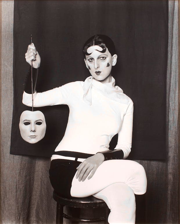
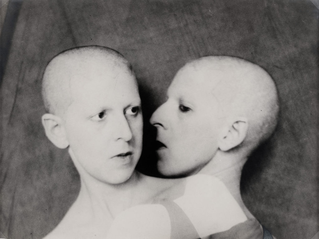
Claude Cahun

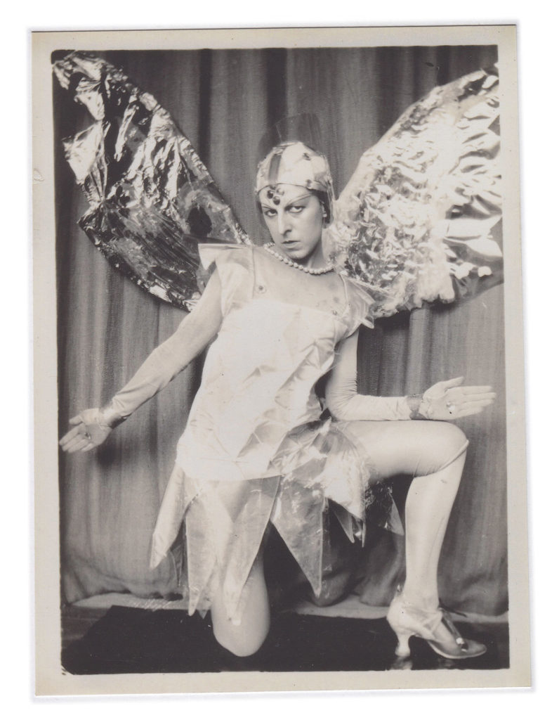
Claude Cahun, born Lucy Schwob was a French photographer, sculptor, and writer. She is best known for her self-portraits in which she assumes a variety of personas, including dandy, weight lifter, aviator, and doll. They created some of the most startlingly original and enigmatic photographic images of the twentieth century. Prefiguring by over seventy years many of the concerns explored by contemporary artists today, the importance of her work is increasingly recognised.
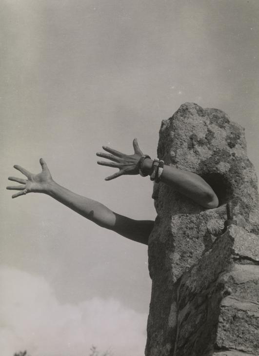
While many male Surrealists depicted women as objects of male desire, Cahun staged images of herself that challenge the idea of the politics of gender. Cahun was championing the idea of gender fluidity way before the hashtags of today.  She was exploring her identity, not defining it. Her self-portraits often interrogates space, such as domestic interiors  and Jersey landscapes using rock crevasses and granite gate posts.
She used her work to challenge notions of identity and gender with androgynous self-portraits that bring to life an array of characters. In one, she’s a bodybuilder holding barbells and hearts drawn on their cheeks; in another, she’s a lady of the manor swathed in velvet. Her work is a playful clash of the masculine and feminine, but also a critique of the societal norms she spent her life refusing to adhere to. Cahun believed that gender was transmutable. Assuming different identities was her forte, and she regularly performed in avant-garde theatre in 1920s Paris.

 “Under this mask, another mask; I will never finish removing all these faces.” – Claude Cahun

I particularly enjoy the way this photographer presents themself by their use of clothing choice, props, appearance and setting altogether to present gender identity experimentation.

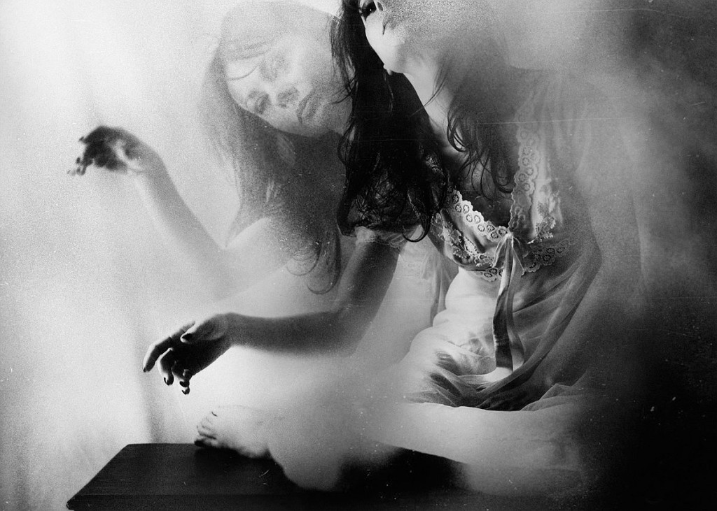
Rosita Delfino

“Photography is a dimension where pictures enhance the words and become means of expression of our inner world, through the filter of our eyes they have the power of changing the reality.” – Rosita Delfino

Rosita Delfino is an Italian photographer who captures quite surreal images and was emotionally involved by the great power of images in communicating and amazingly evoking words, alongside with the innermost expressions of the soul. She believed that only images can transform objective reality into a new creation giving voice to the individual secret world. An endless dialogue between appearing and being, a charming journey into women’s visions, where the body goes beyond space and time to plunge into a dreamlike dimension.

I chose this photographer as I enjoy her blurry images to create a very uncanny sense to the piece, implying a chaotic setting that comes off as looking very unsettling. I enjoy the use of overlapping images so that the concept looks way more hectic and overwhelming not just to people admiring these images, but also to the model in the photograph.

Lara Gilks

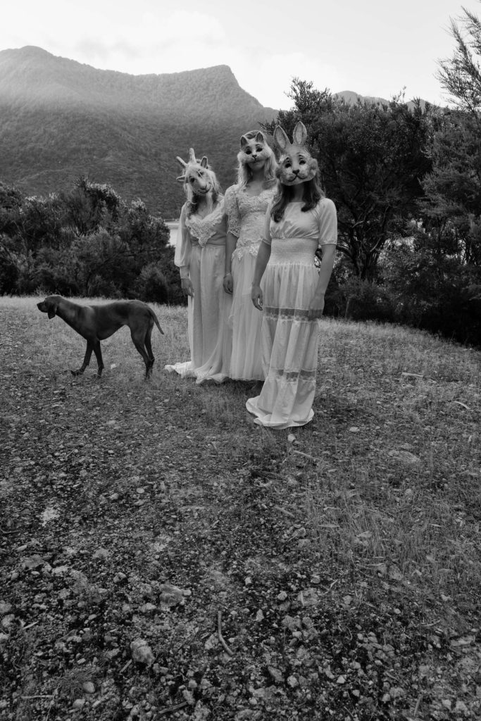
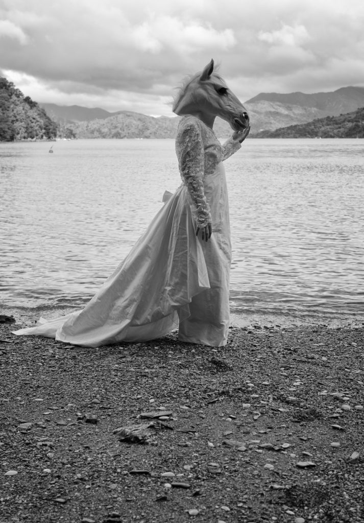
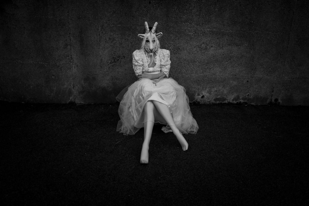
Lara Gilks is a photographer based in Wellington, New Zealand. She utilises the elements of nature, water, light, beauty, in the context of the dreamscape between two worlds. She explores that dreamscape through the themes of metamorphosis, mortality, escapism, ascension, peace, silence.

She tends to compose a series of images in a collection and gives them names such as “the backyard theatre”, “white lies”, “new work and single images” and many more.

One of her collections – the backyard theatre, she tend to use her backyard as the set and this was where she composed most of her photographs. She stated that “It is barren, cold and the props create tension. I focus on the characters – they are disguised, obscured – they taunt, spook and challenge the traditional sense of a backyard scene.”

I chose this artist as I particularly enjoyed the uncanny images she was producing where the models wore masks. I particularly like how disturbing the animal ones look as they give off a creepier atmosphere for the photograph. I love the use of masks in any form of art whether it be photographs or paintings, as they create a very intriguing piece, wanting others to wonder what’s hiding behind it.

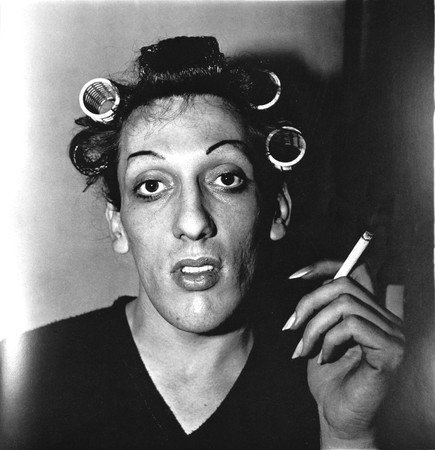
Diane Arbus

“We’ve all got an identity. You can’t avoid it. It’s what’s left when you take everything else away.” – Diane Arbus

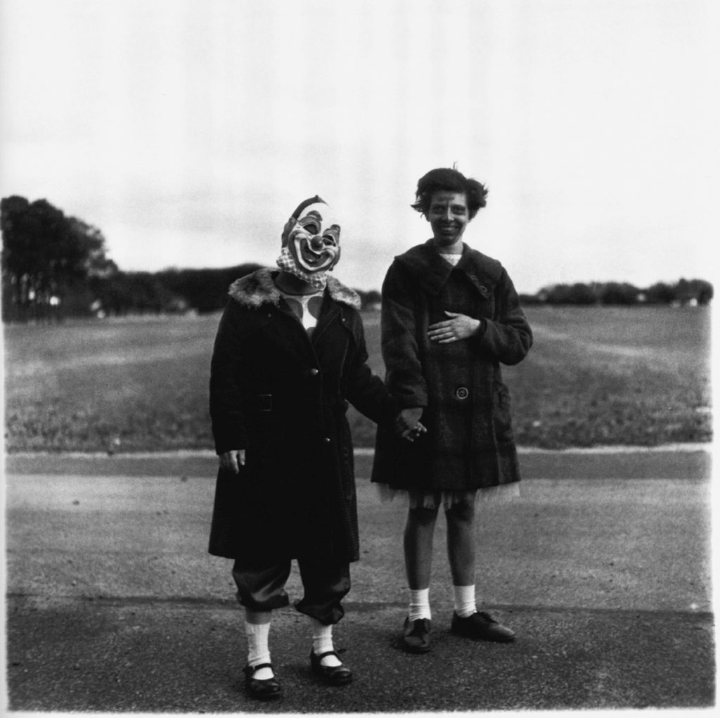
Diane Arbus was an American photographer best known for her intimate black-and-white portraits. Arbus often photographed people on the fringes of society, including the mentally ill, transgender people, and circus performers.

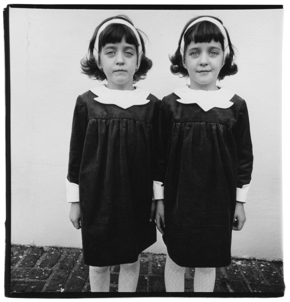
Interested in probing questions of identity, Arbus’s Identical Twins, Roselle, New Jersey (1967), simultaneously captured the underlying differences and physical resemblance of twin sisters. “A photograph is a secret about a secret. The more it tells you the less you know,” she once mused. 

I chose this artist as I loved the way each of her pieces were composed. From the settings, to the props, to the meaning behind the piece, everything catches my attention. The repetitive ominous field of each piece intrigues me a lot.

My own analysis

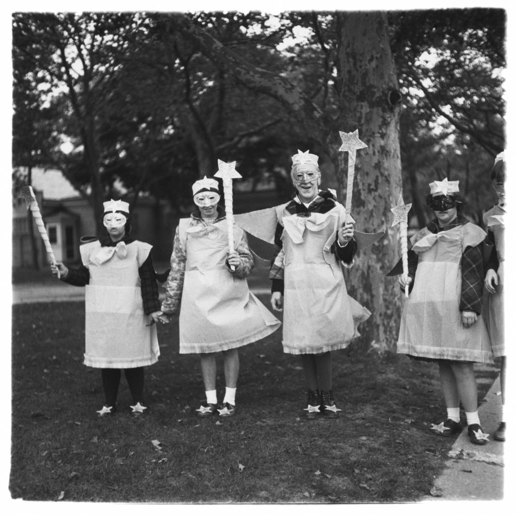
As you can see from all the artists I’ve chosen as inspiration, they all tend to include masks as their focal piece for the photograph. I have a real interest in the idea of using this prop and what sense it gives off for the whole piece. It provides a compelling meaning as the model is using it as a way to hide their true self.