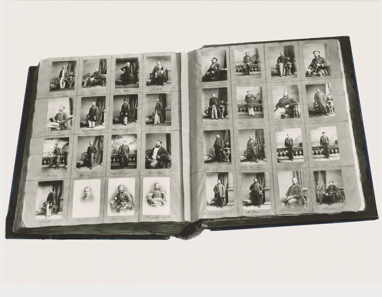
Henry Mullins
Henry Mullins was a mid 19th century photographer based in Jersey. He was the first professional photographer in Jersey and started his business around 1848, called the Royal Saloon. He had photographed most of the more affluent and influential people on the island at the time. After his death, over 20,000 negatives were collected by Clarence Philip Ouless which were put into sets in his collection and given to La Société in only recent years.
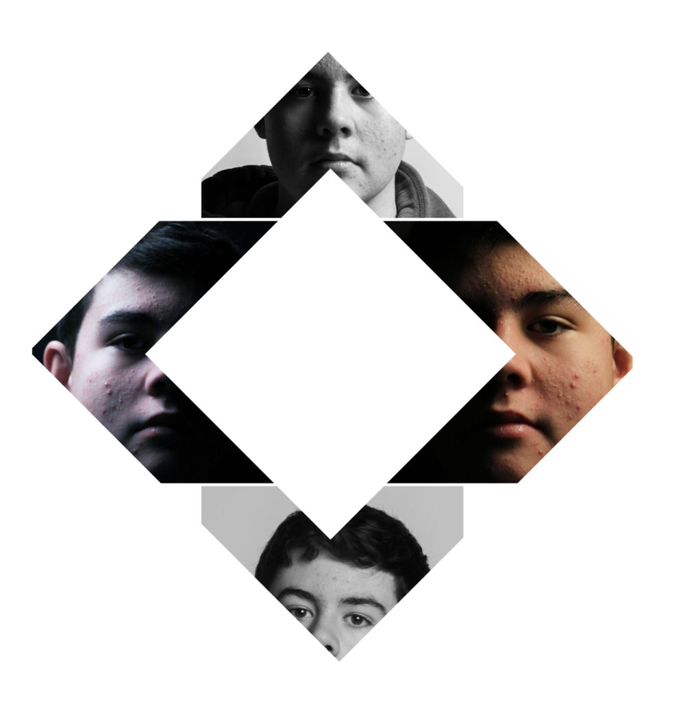
Diamond Cameo

A Diamond Cameo image is a collection of portraits of the same person taken at different angles and arranged into a diamond shape, usually with the side images having the model face in an outwards direction and the top and bottom images being either a straight-on shot or slightly turned to the side. The images used in a Diamond Cameo also have no shadows, which is likely a result of the natural light used in studios at the time.
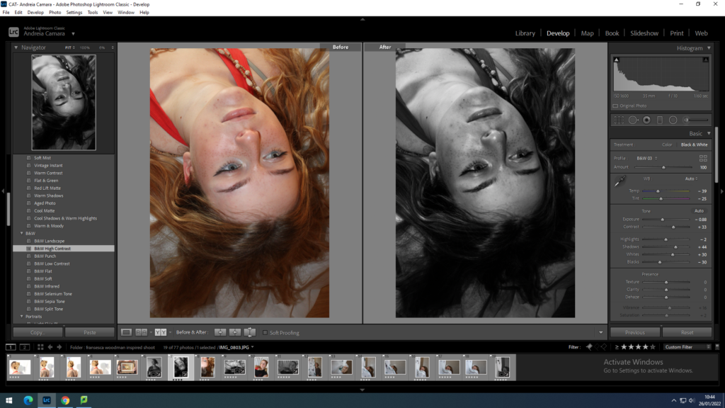
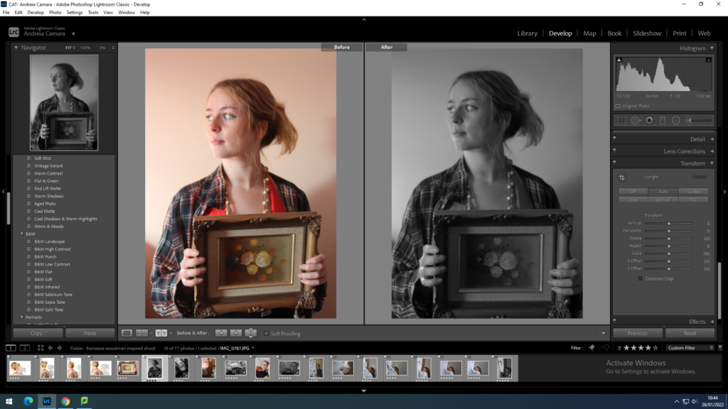
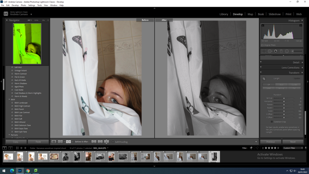
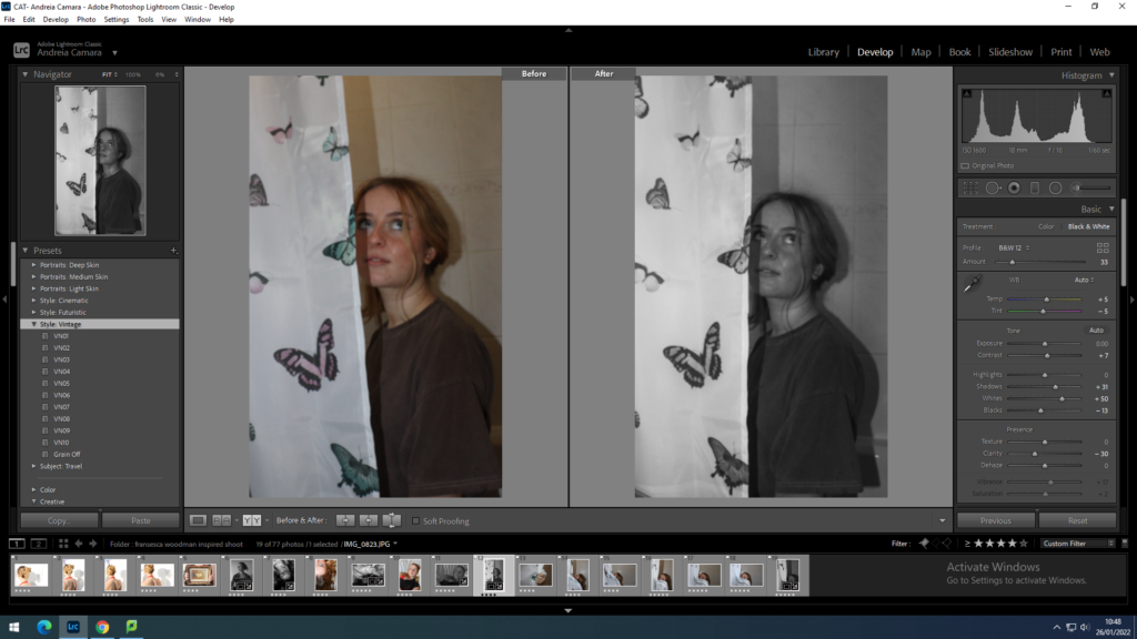
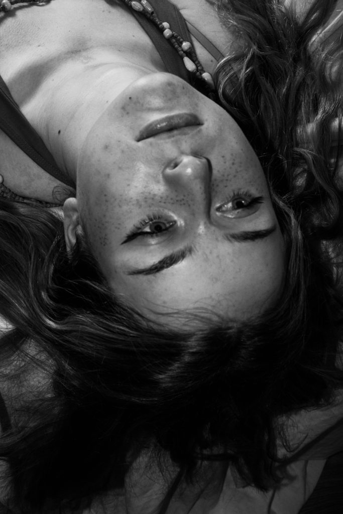
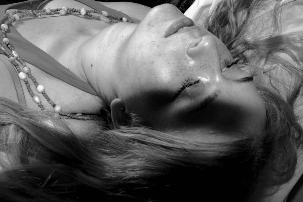
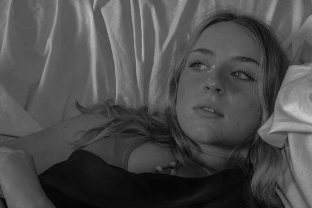
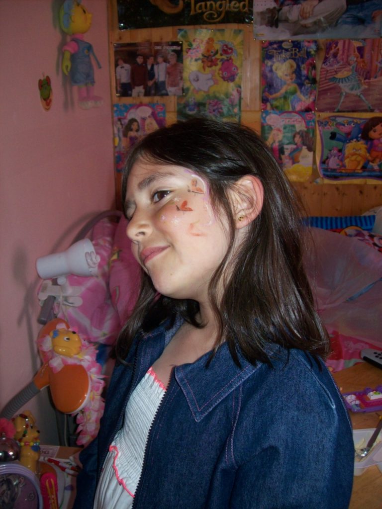
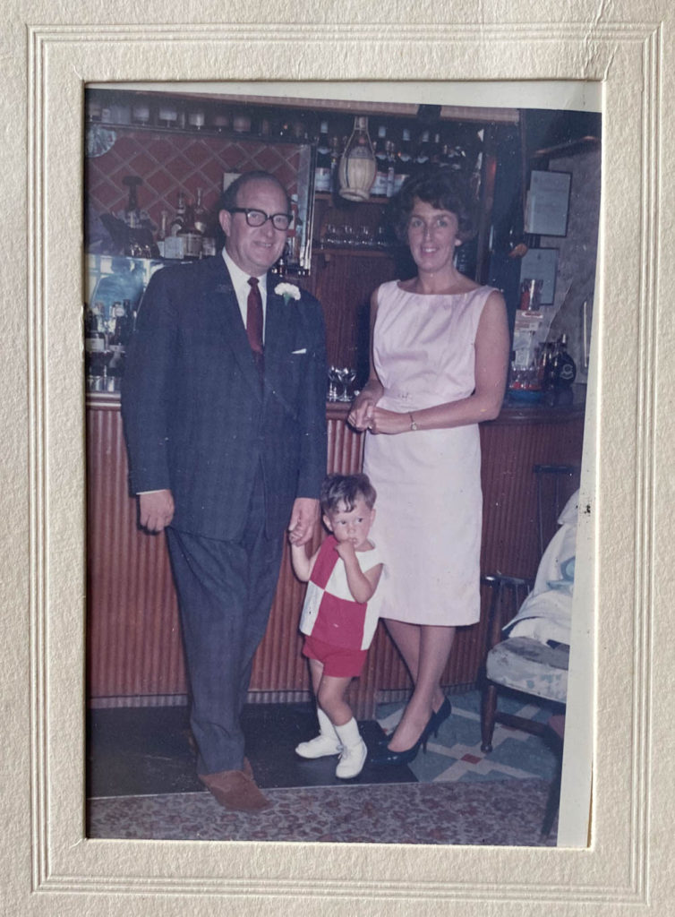
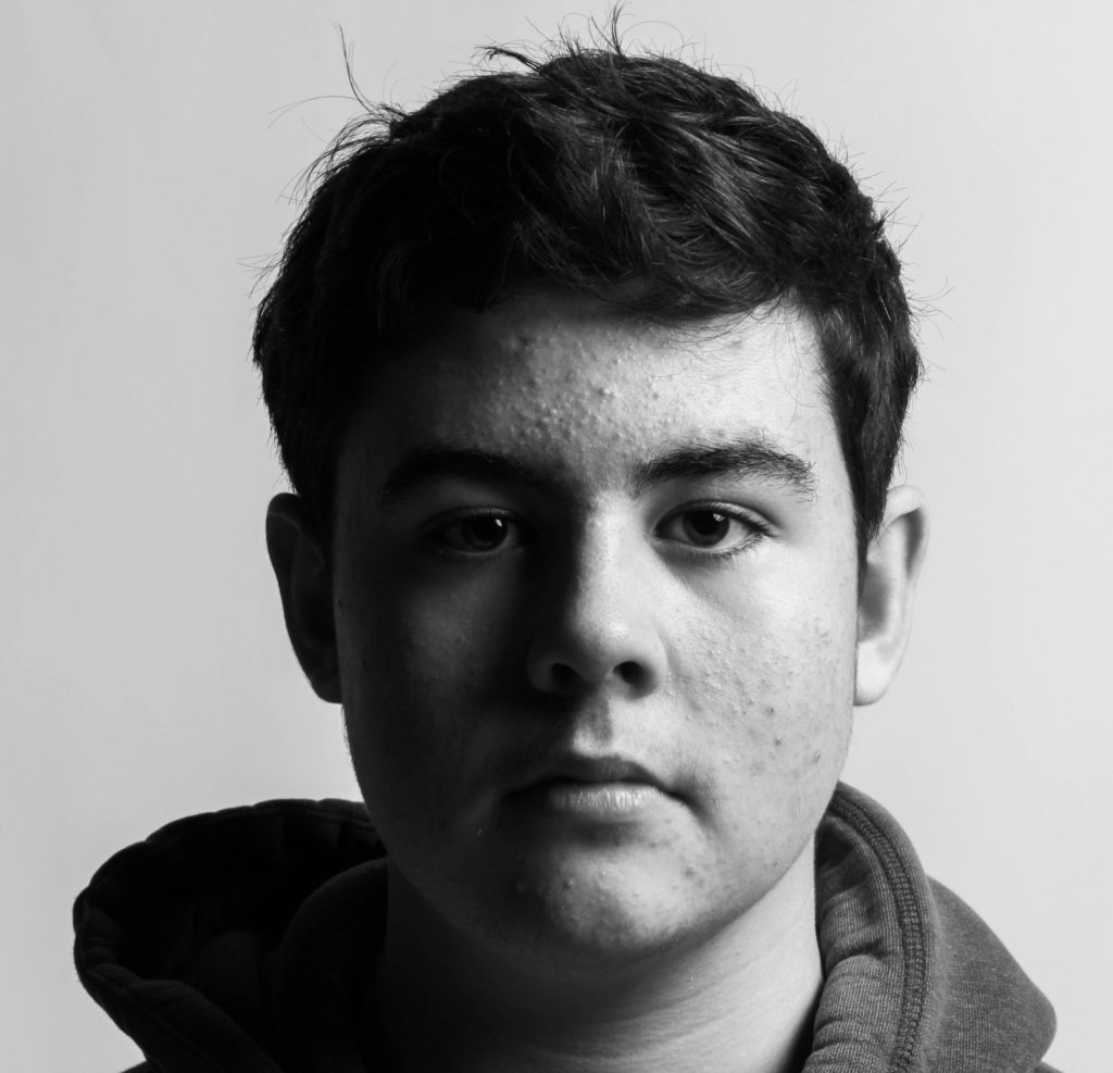
My own examples
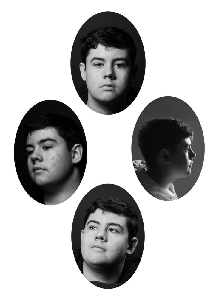
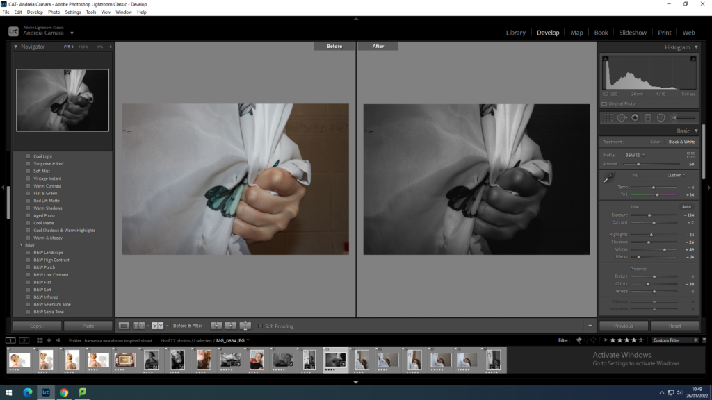
Evaluation:
I like the idea of taking the classic diamond cameo layout and experimenting with it to create something new and more intricate. However, I don’t think the images I used fit the role in a diamond cameo sequence too well, so next time I will try and cover all of the angles so it can be more successful.
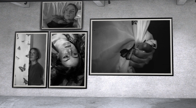
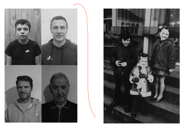
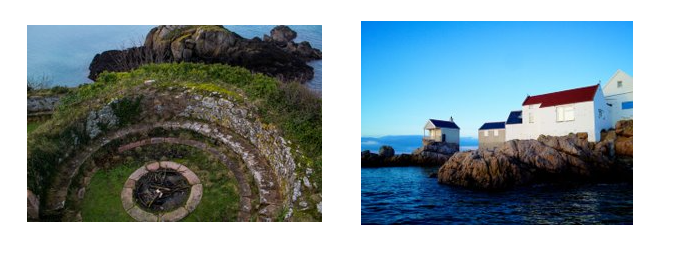
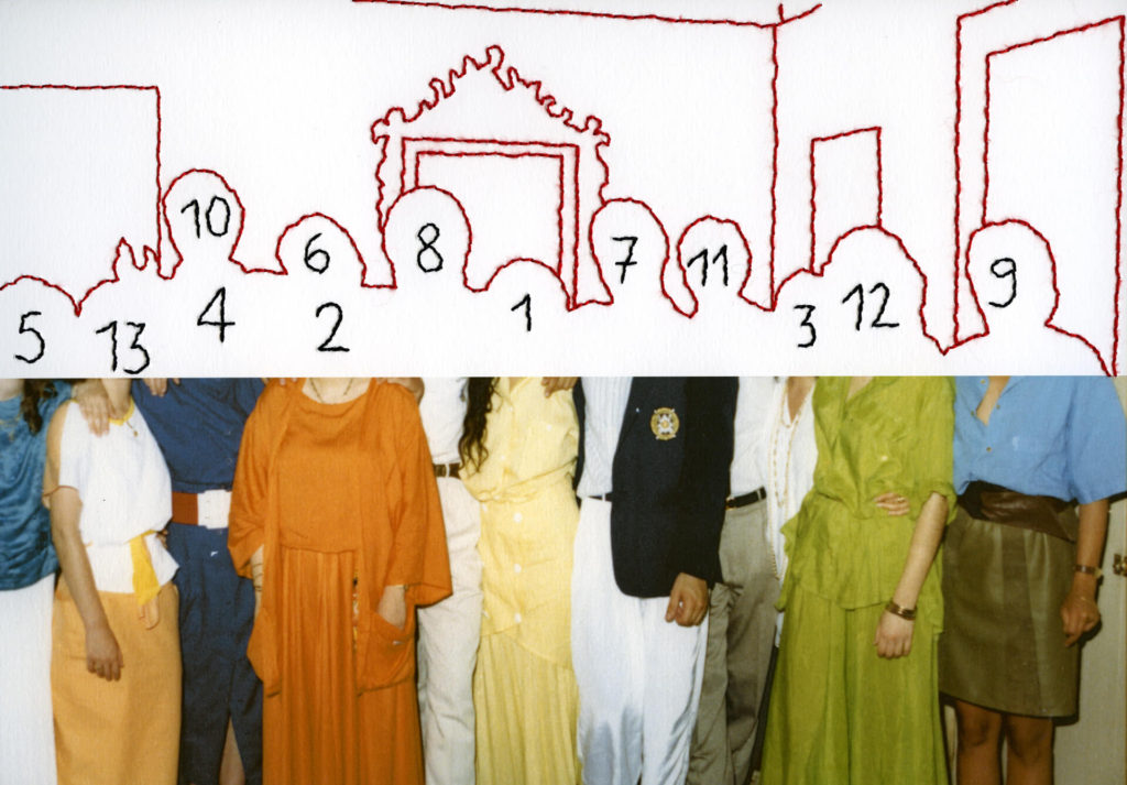
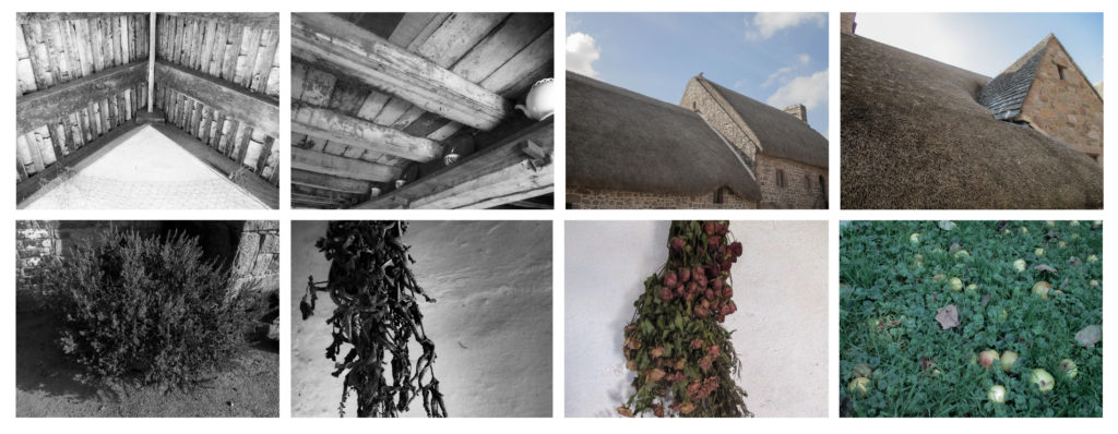
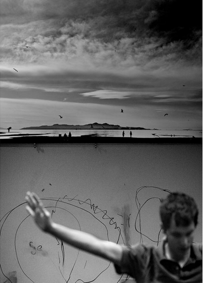
Sequences/Grids
A sequence or grid is simply a collection of images usually in a standard order which can be organised in whichever way the photographer chooses. This organisation can help create storytelling by connecting the pictures through similarities or other patterns.
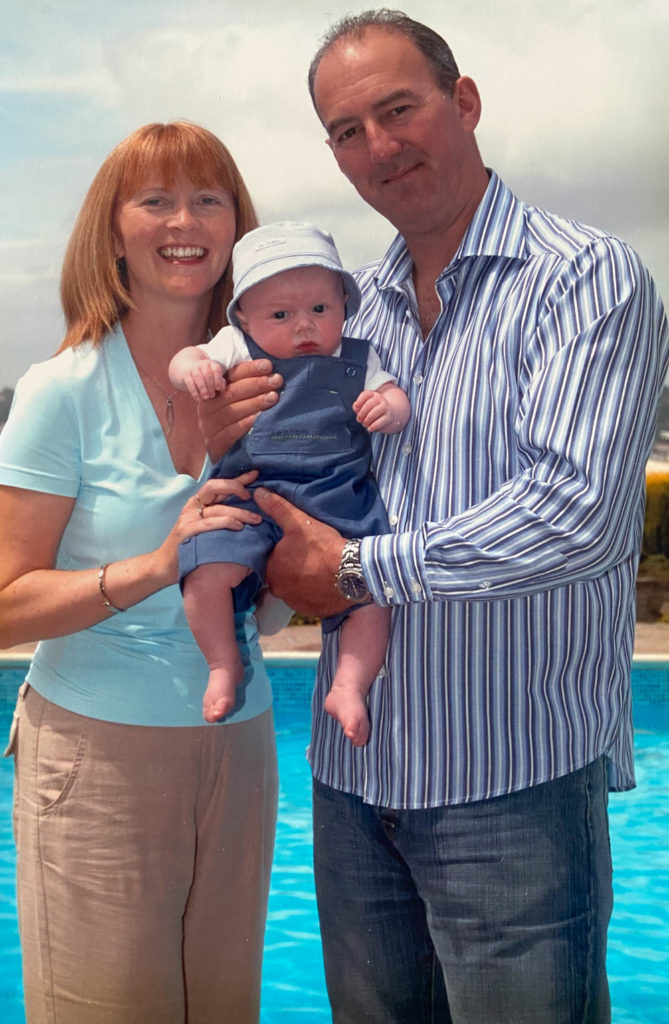
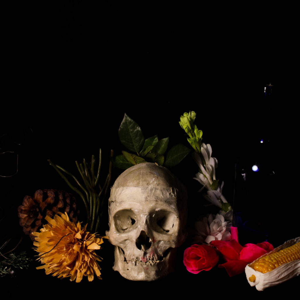
My own examples
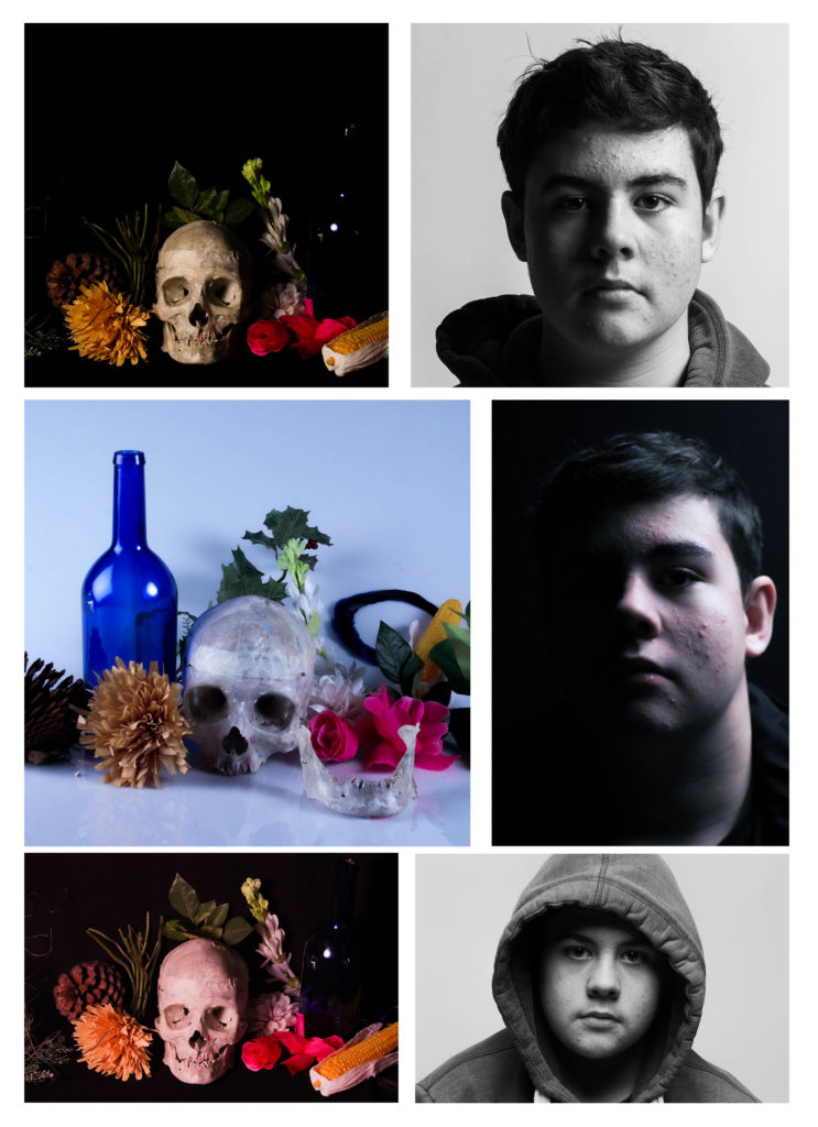
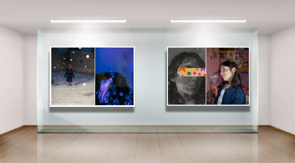
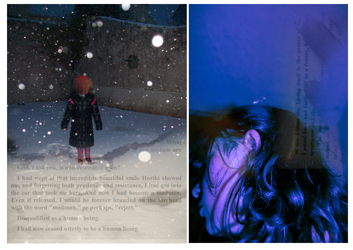
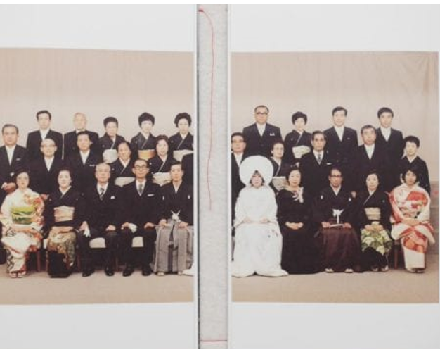
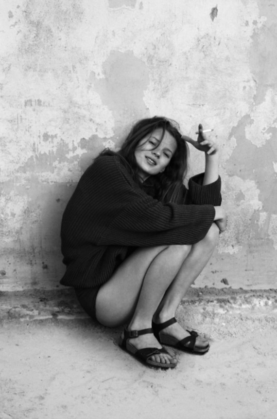
Juxtaposition
Mike Terry
Mike Terry is a New-England, Australia based photographer/filmmaker and anthropologist who has worked in several countries such as the UK, US, India, Germany, Haiti. He has worked as a visual and online producer for filmmaker Yulia Mahr’s studio and is currently a visual producer for the school of environment and rural science in New England.
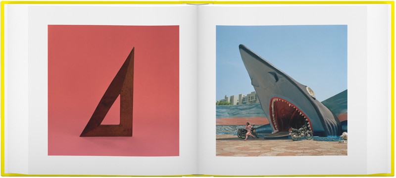
Juxtaposition is placing two or more images together that are different from each other, but have links made by these differences. These differences can be in colour (in the example above there is a difference in colour, but they make a link as they use complementary colours), shape (both are triangular shapes), lighting, poses, etc…
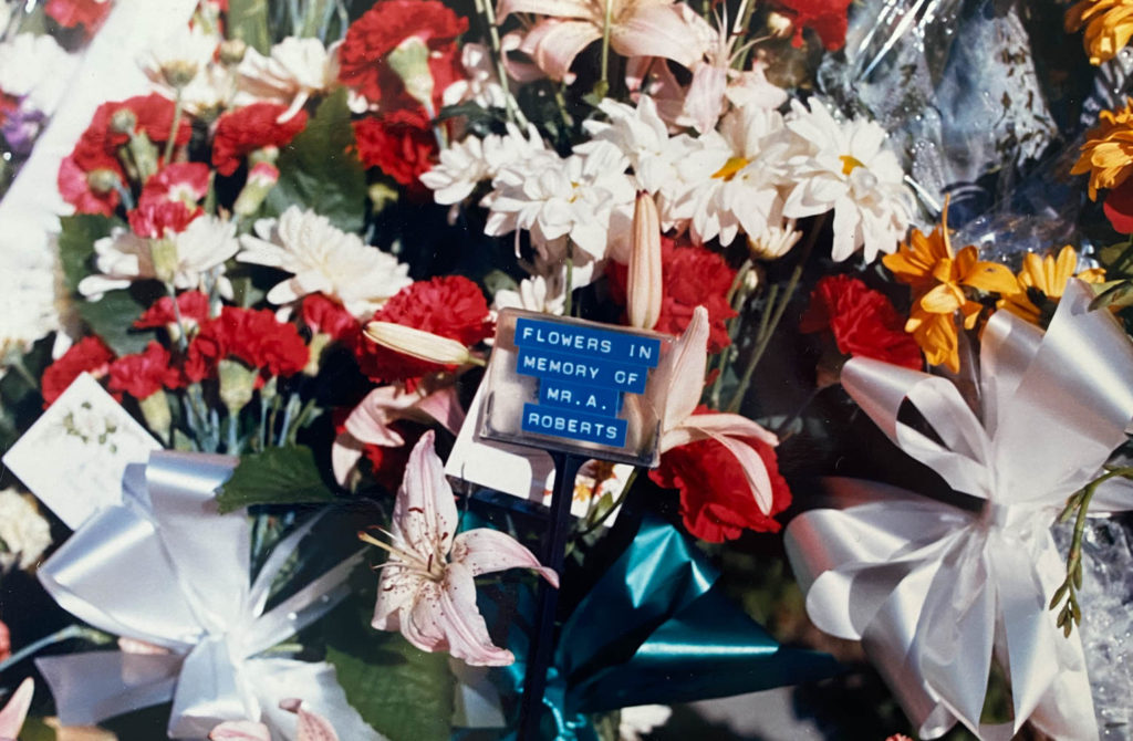
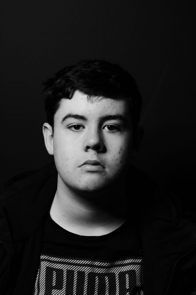
My own examples


Evaluation:
I enjoyed experimenting with multiple images as it allowed me to look at connections between them, rather than within a singular image. I think I understand the concept well and I am happy with the way the images turned out, however (at the time of writing this) I felt like the options I had from the photographs I have made were few.
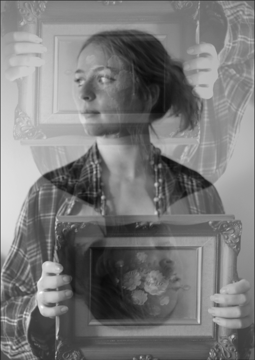
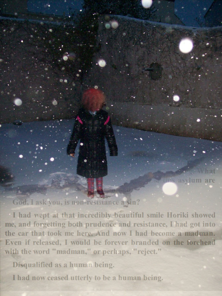
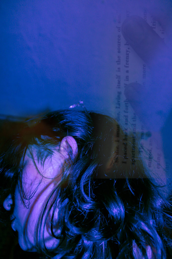
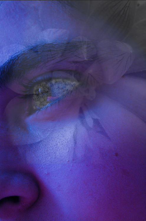
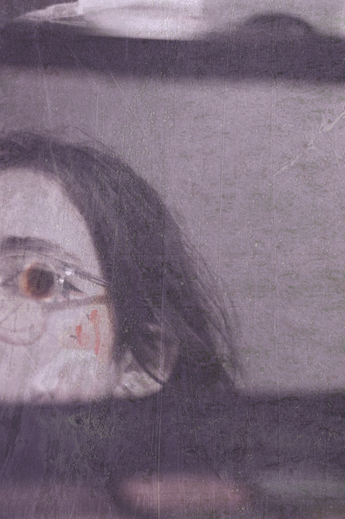
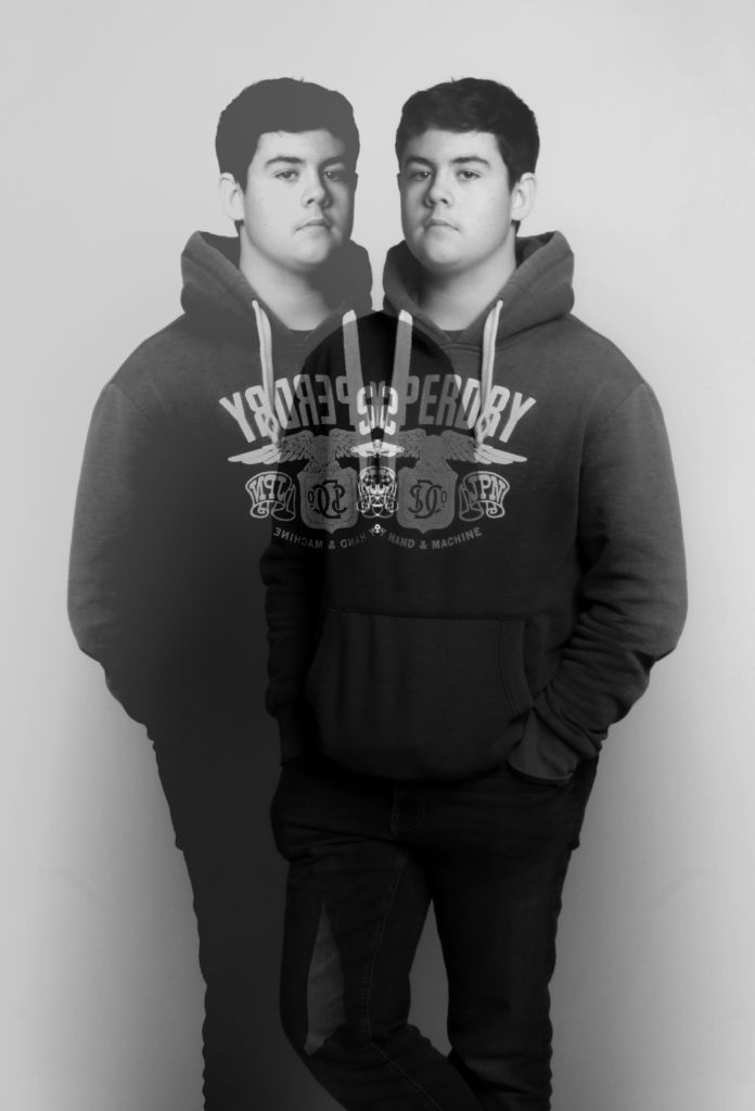
Multi-Exposure
Man Ray
Man Ray was an American 20th century painter and photographer who produced a variety of major works in the surrealism and Dada art movements. He mainly worked in Paris, and while he worked there he rediscovered the camera-less photogram method of photography which he named Rayographs, he used this method to create many famous Dada images.
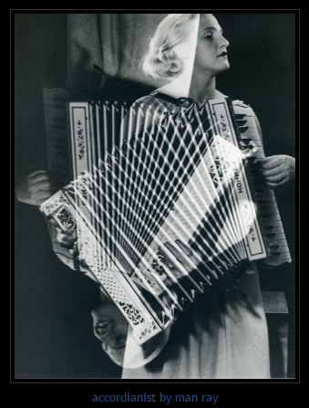
Multi Exposure refers to a singular image which has been created by either exposing a singular piece of film to two or more images (analogue), or by stacking two or more images on top of each other with different opacity/blending settings (digitally). Usually these images are created with the same model in different positions, or a singular model with a landscape image exposed with them, both creating a surreal and unnatural image.

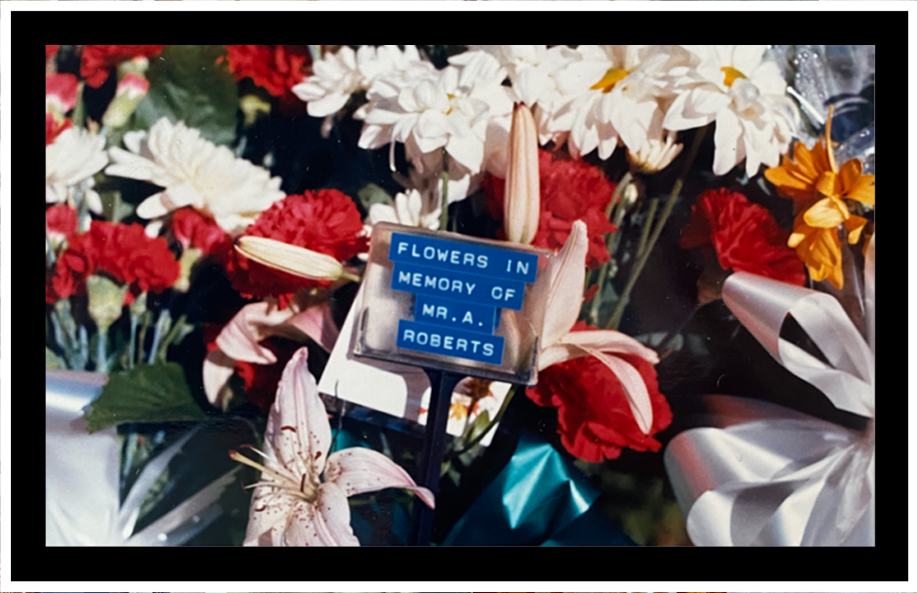
My own examples


Evaluation:
I like the way these images turned out, the use of different blending options gave me a lot of different possibilities when editing, which I think I will develop in later photoshoots. Next time I think I should incorporate more colour into this type of editing to see what effects can be made.
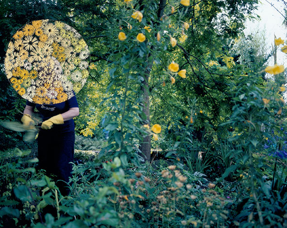
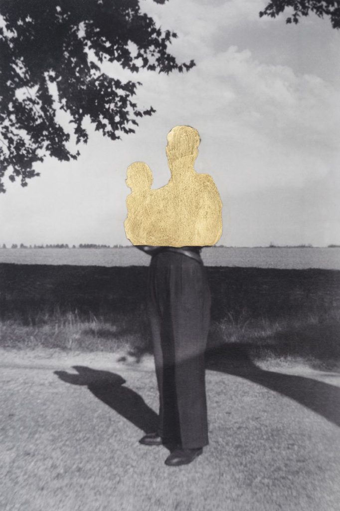
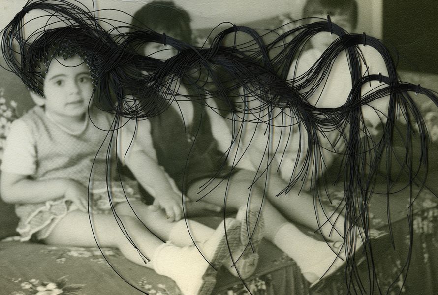
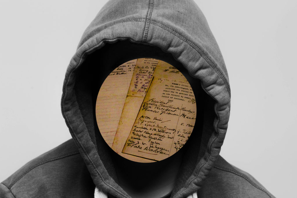
Photomontage
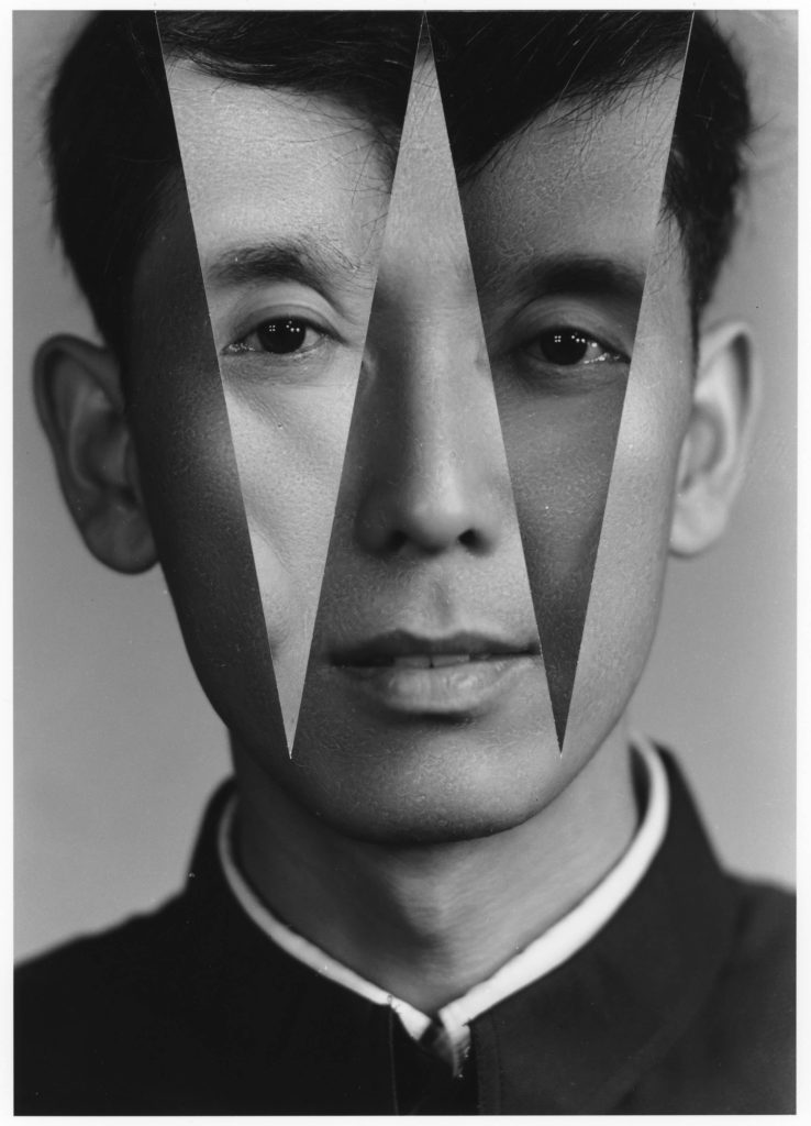
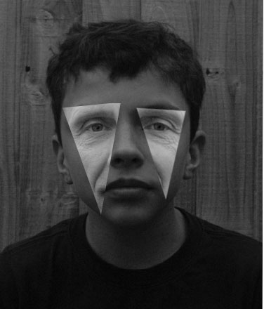
John Stezaker
John Stezaker is a British artist who is best known for his collage works that distorts the face of the model, using another portrait or landscape image. His work has been described as surrealist and correlates to the pop-art style.

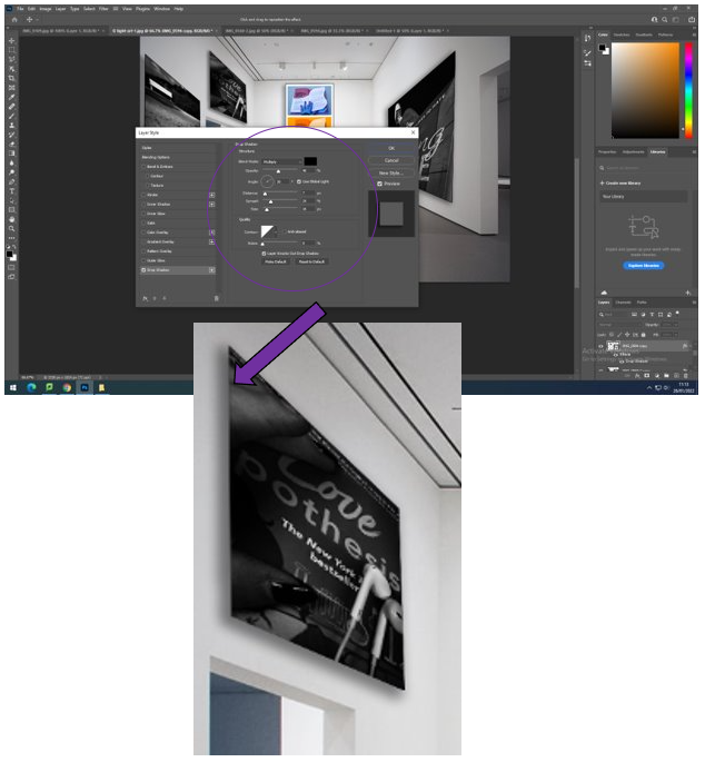
A photomontage is an image that has had other images placed on top of it to create an unnatural scene, this can be done digitally with software such as photoshop where you can cut parts out of an image using the tools provided, or it can be done in analogue, using printed/physical images that are cut out with some sort of knife or scalpel. As the images used are usually different, there will be different lighting, colours, etc… which, when put together, creates unique, unnatural images.
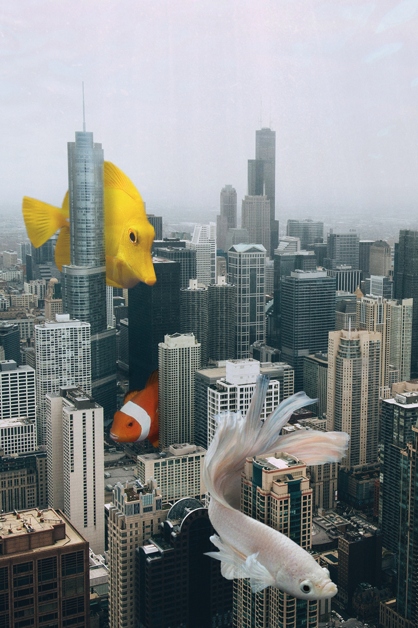
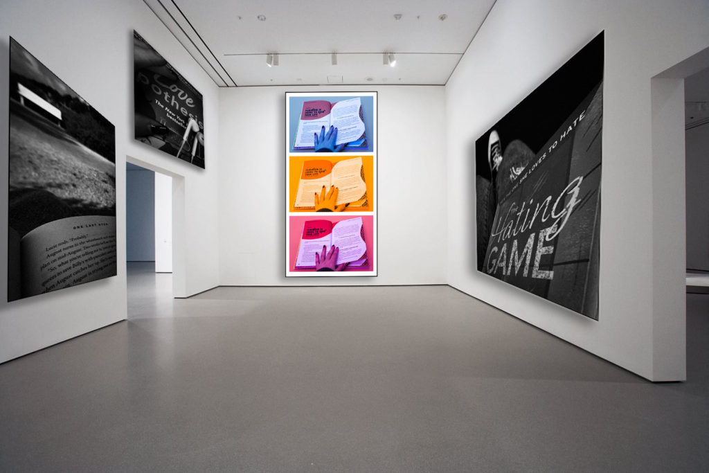
My own examples


Evaluation
I like the way these images turned out, as well as how each is slightly different from one another. I think my favourite is the one with the hooded figure with paper covering its face, as it has a sense of mystery behind it. I think a photomontage could be an interesting concept to return to for later work.