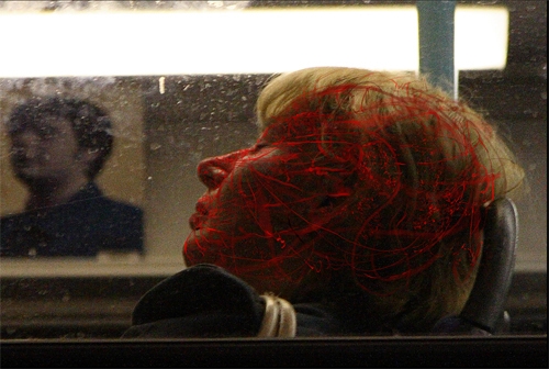
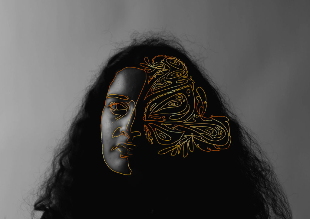
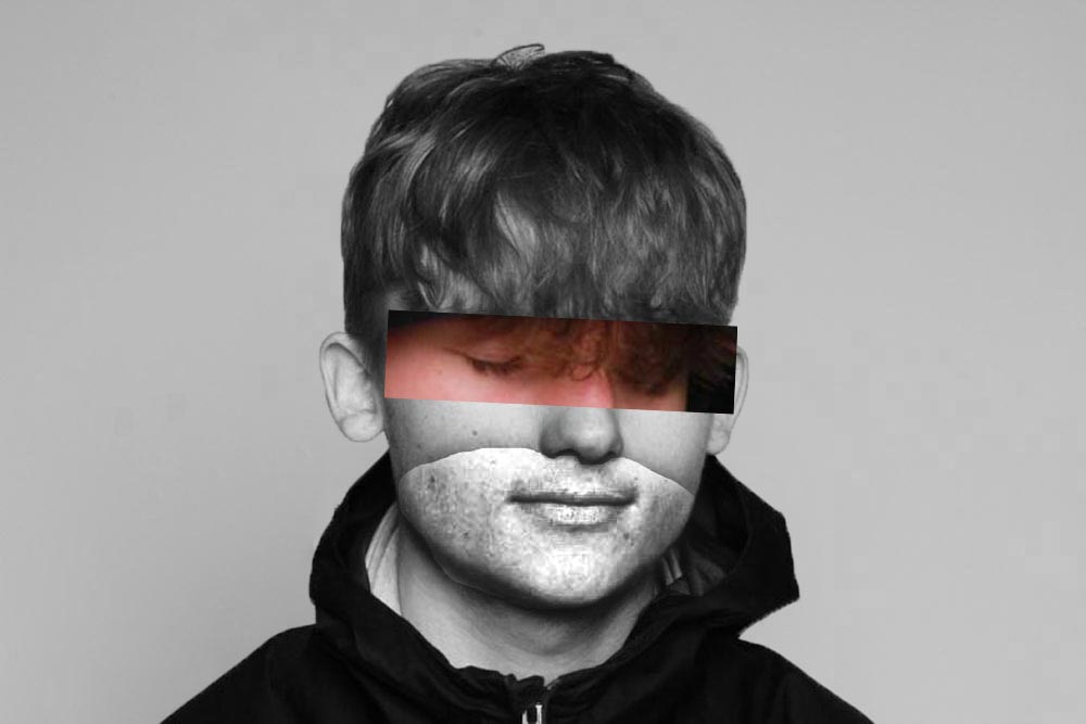
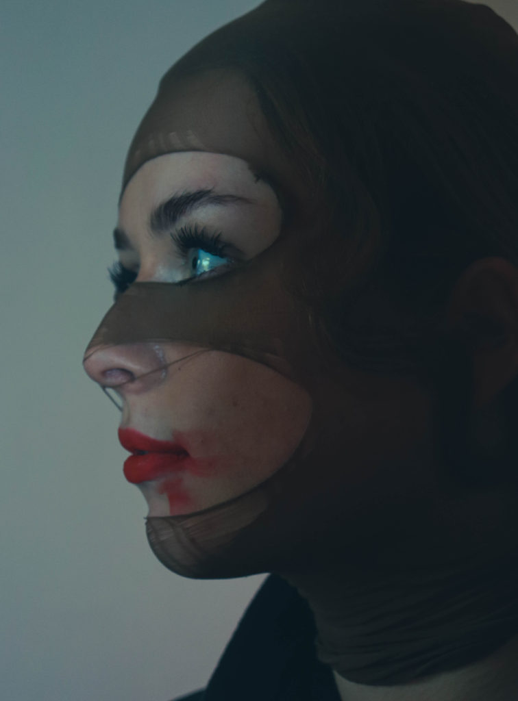
I liked the work of Dryden Goodwin and wanted to edit a portrait inspired by his style. I did it digitally by drawing on the lines in photoshop and then using an eraser tool to soften the edges. If I were to do this again I would probably do it on a physical print using a paint pen, so I can get more organic looking lines. Despite this, I still really like this image and enjoy the contrast between the monochrome and then the brighter red. I also coloured the edges to be lighter and made the inside of the red darker to make it more visually interesting.
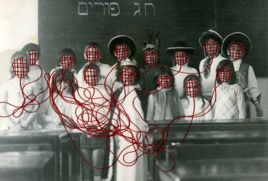
Work inspired by Carolle Benitah
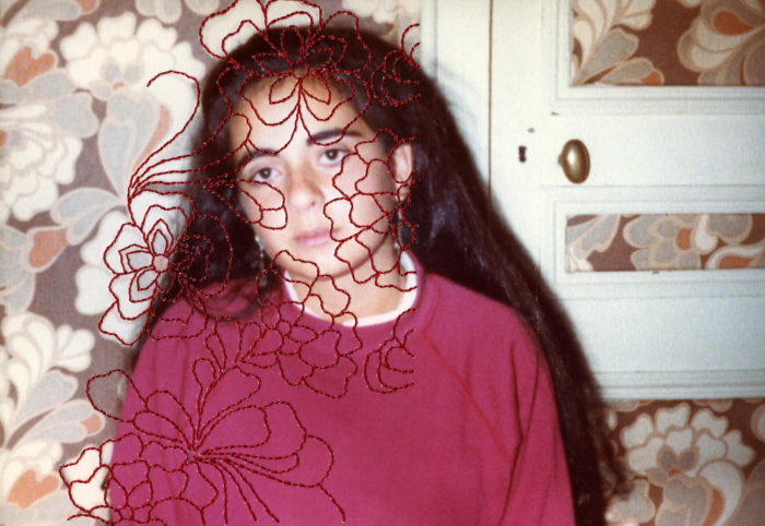
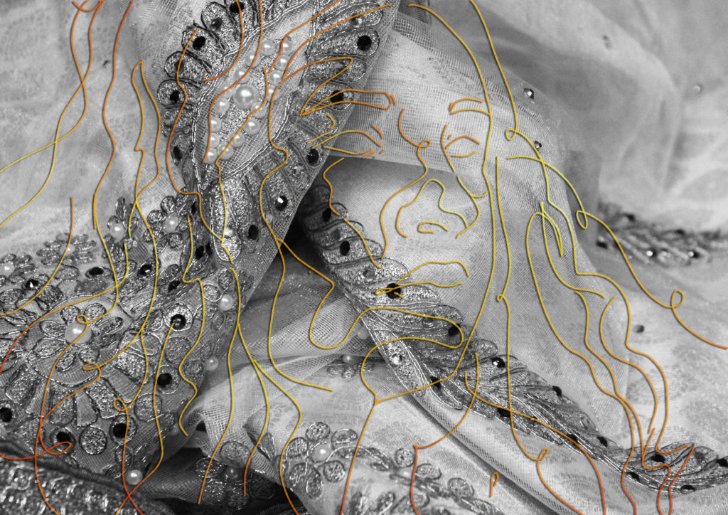
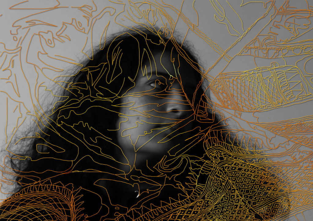
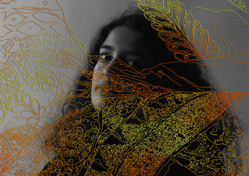
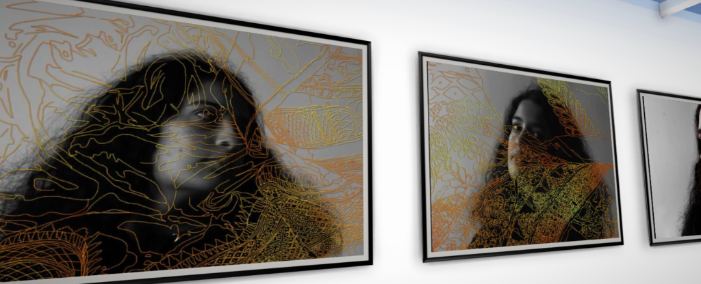
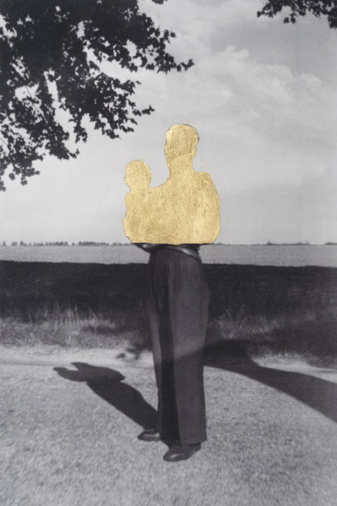
Here I drew over my portrait in photoshop (instead of embroidering them like I originally planned) in an attempt to recreate the style of Carolle Benitah. I traced over an image of one of my family’s saris and then placed it on top of a portrait of myself. I then coloured it gold and added a drop shadow to create some contrast in the areas where it just sits on the grey. The gold also creates some unity between this photo and others where used similar techniques. I enjoy how it looks and am glad I traced over the fabric shape as well as the actual patterns as well.
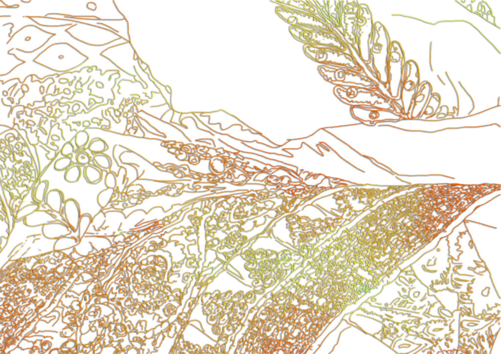
The Image I traced over
My Linework
Overall I feel like I was successful with replicating the styles of the photographers I was inspired by and learned a lot during this project. If I were to do it again I would want to be slightly more prepared by printing out my images in advance so I could have a chance to edit them physically as well as digitally.
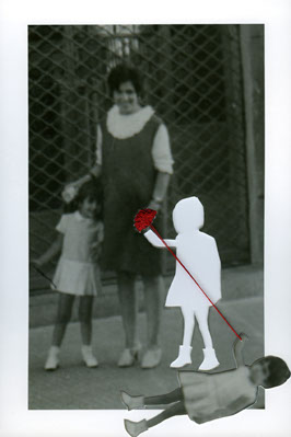
In this Experiment I did the reverse by drawing myself over a Sari picture but I do not like it as much.
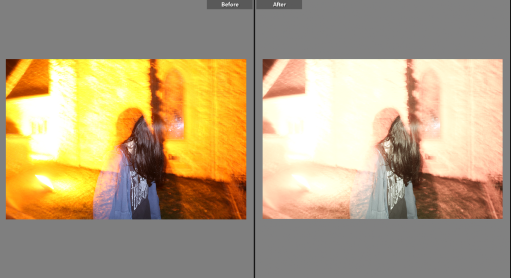
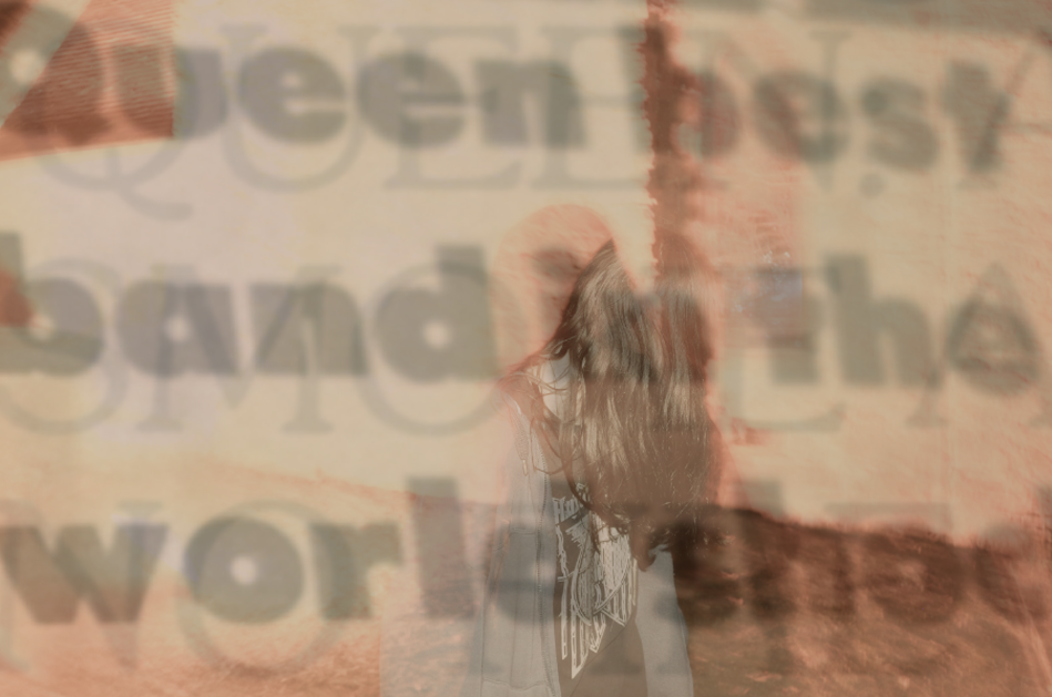
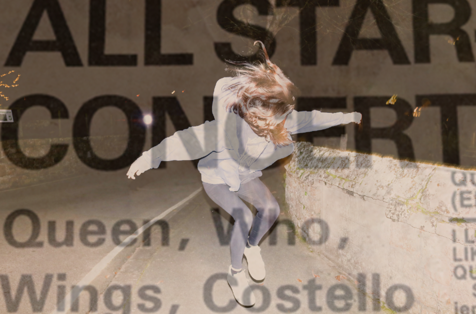
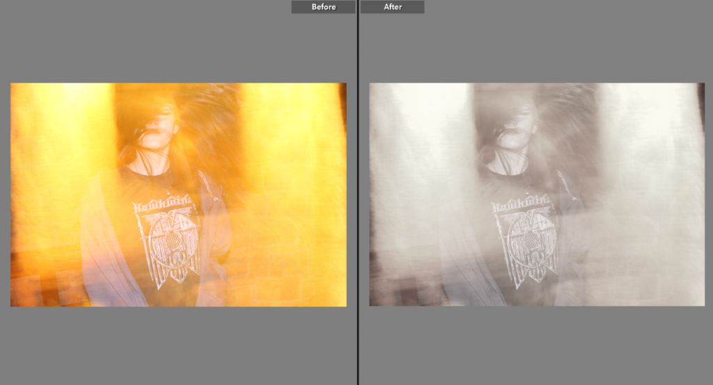
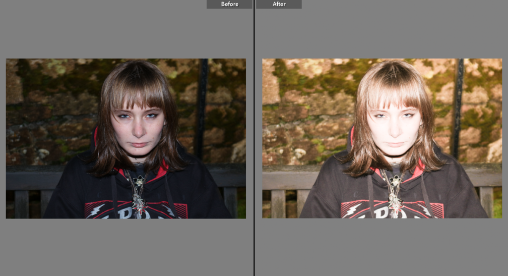
I began by editing my photo on Lightroom – for this I brightened the photo and lowered the saturation so that the yellow tones of the photo wouldn’t be so bright – I did this so that my photo had the same colour palette as the newspaper clippings I used to create the multiple exposure with.
My three photos used to create the multiple exposure.
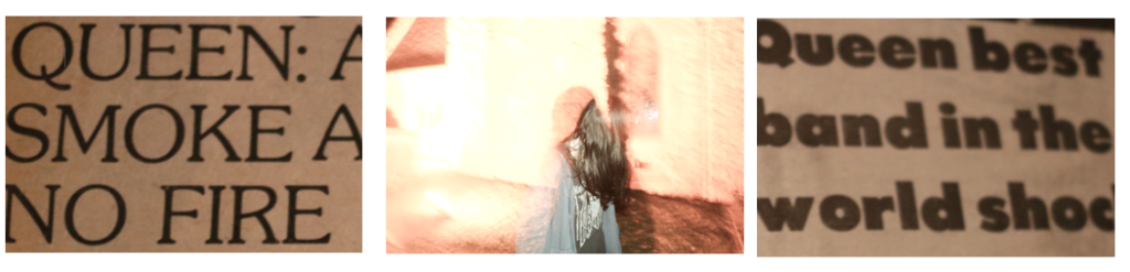
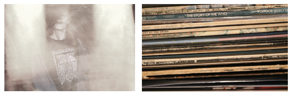
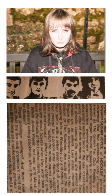
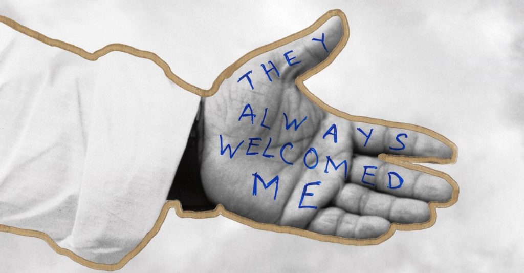
This is the final outcome of my first photo – I used the text to contrast with the photo, taking inspiration from Jim Goldberg’s use of combining text with images. The way this photo turned out makes it look vintage which I really like.
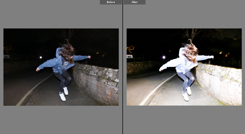
I had to choose one of the two photos of me jumping so i decided on this one – I brightened the image in attempt to make it look more like an action shot of 90s photography. The end result on Lightroom makes everything the photo look more defined.
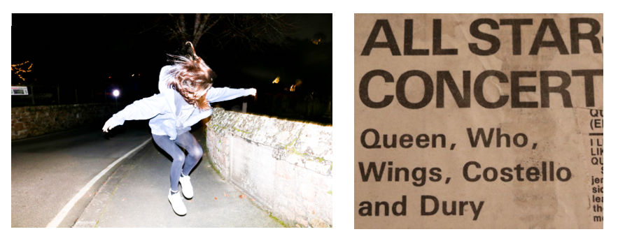
I used another newspaper clipping from my scrapbook as the overlay – I chose this photo because of the bold headline ‘ALL STAR CONCERT’ and the featured artists including The Who which gave a further meaning to my theme of my attempt to recreate Pete Townshend’s jump. It relates back to my artist research on Bob Gruen – most of his work on celebrities features action shots e.g the photo of The Clash in the moving vehicle I used in a previous post.
I was originally going to keep the orange colours in this photo but decided to tone them down in order for them to fit with my other pictures. I lowered the saturation and vibrance slightly but still kept it as unedited as I could to try and narrate the theme of a candid stage photo – much like Bob Gruen’s photos of musicians performing.
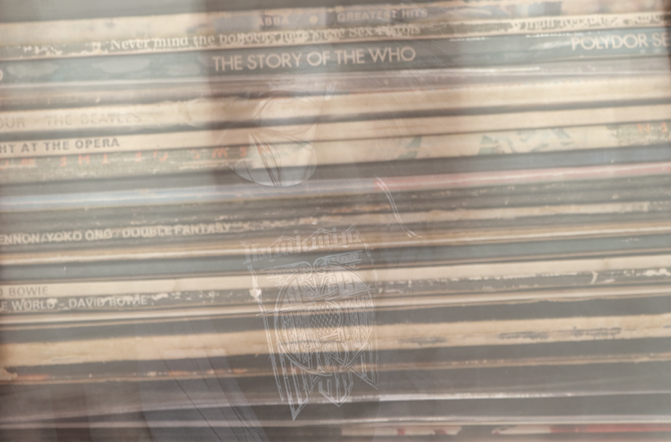
I added the photograph of my record collection on top to convey my identity as these are my personal belongings and have sentimental value to me, as some are originals and were given to me by my parents. The two photos go very well together as they both fit the theme – one being representative of different music styles and what I listen to, and the other being the aspect of performance.
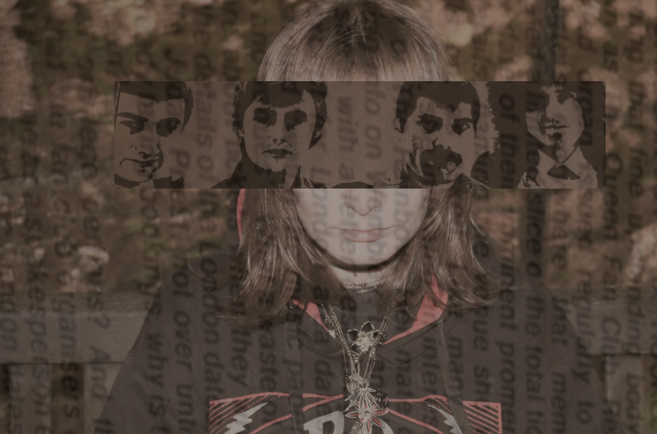
I changed more to the original image on photoshop than I did on Lightroom, but for this photo I again brightened the image and changed the hue to match the colours of my second image below of Queen.
This is the outcome of the last photo after I edited it on photoshop. I began by lowering the saturation then putting the photo over her eyes – then I added the newspaper horizontally over the top and lowered the opacity so it had a faded look to it. My favourite part of this photo is the contrast between the photo of Alex and the one of Queen – the dark colours of the older photo combined with flash photography shows how music has aged but still has a legacy.
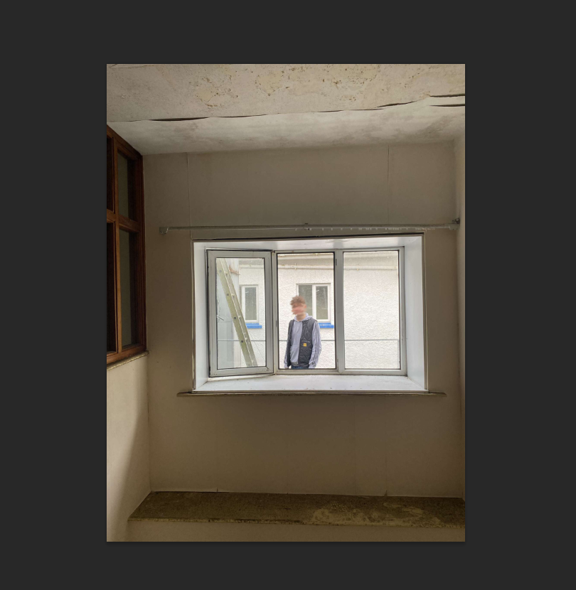
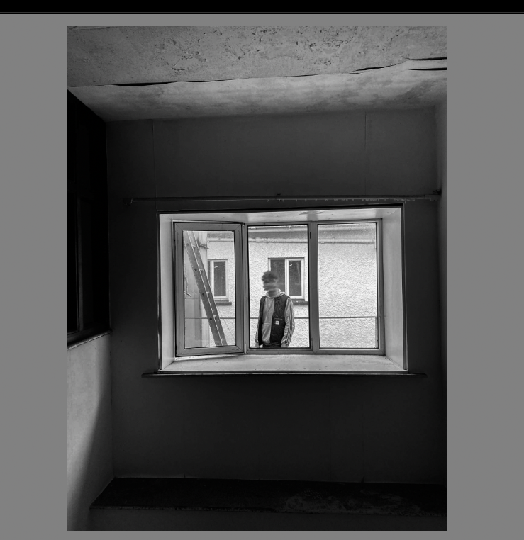
for this image i used my photoshoot from the waters edge hotel where i used natural lighting which i feel was a very good photoshoot location as lots to capture
below was one of the originals
i then took it to photoshop and used the smudge tool to hide the head seen below
to further develop this i took it to Lightroom where i changed to black and white
and also changing the exposure slightly and the contrast
I will print my below images on A3 – I believe this will work best due to the amount of things going on in each collage.
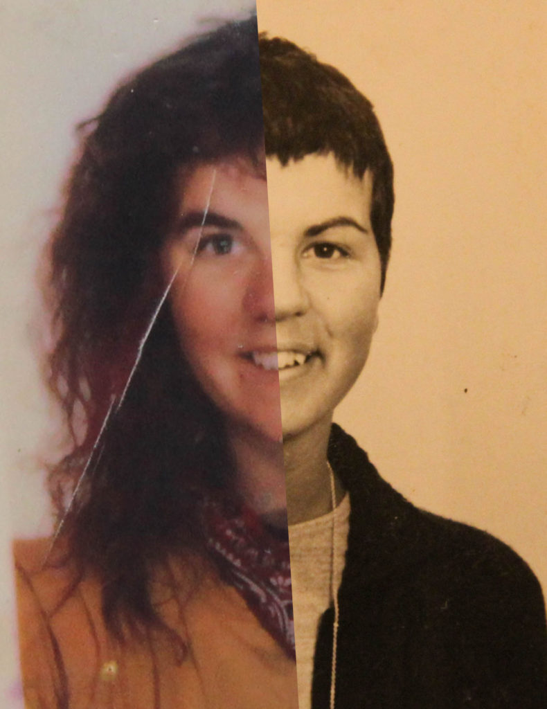
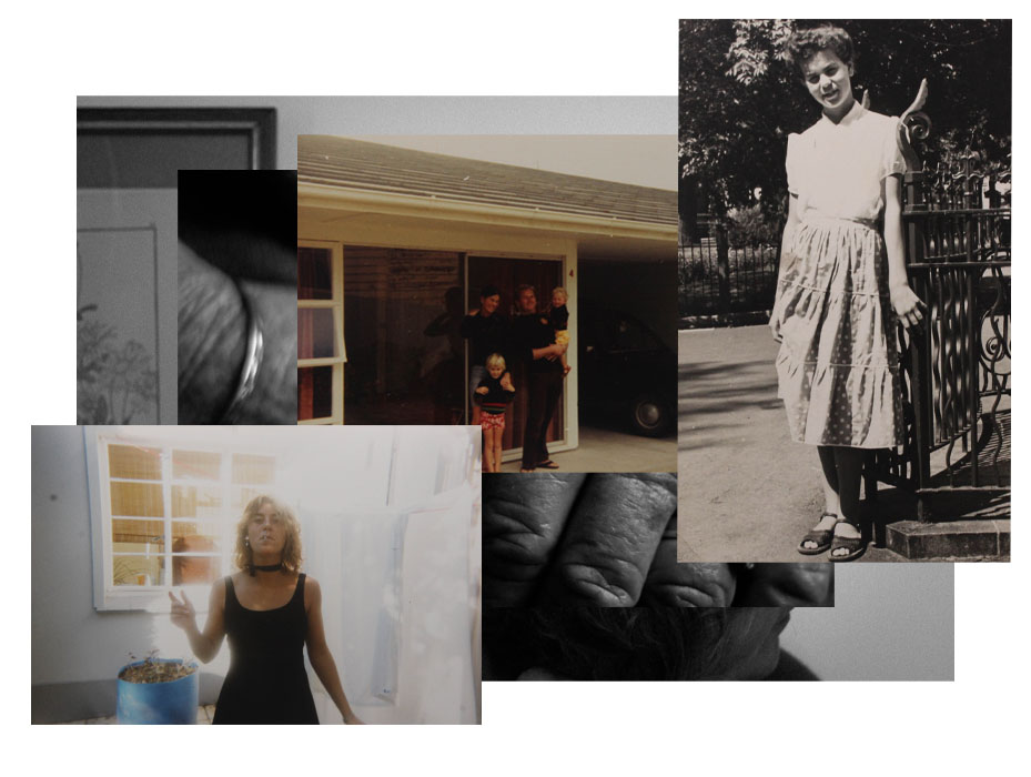
I chose this collage as one of my favourites because of how it shows the passing of time and age of my subject – by juxtaposing half of new and old photos I think the viewer sees more in each face. I also liked my use of different colour in this – using two black and white and one colour creates high contrast which I like.
I chose this collage as one of my final images due to the interesting composition that the mix of new and old images creates. I like the way the present day images are concealed in some way by an older image, which adds a sense of maybe a change in identity in the subject.
Out of all my work based on Joachim Schmid, I chose this as my final image. I love how the split between both my mum and nana’s face shows the similarities between each face, and the differences between 2 generations. I think this also a successful image because of its link to generational identity, which I was trying to show through my work.
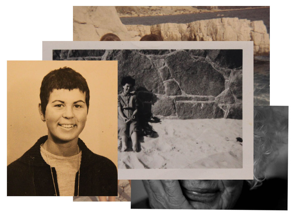
I chose this collage as one of my final images because of its comment on age identity, as well as environmental identity, using images of my grandmother on her favourite beach, as well as older portraits of her. By contrasting these with a modern image of my nana, but concealing it slightly, I think I achieved a piece on the topic of environmental and age identity successfully.
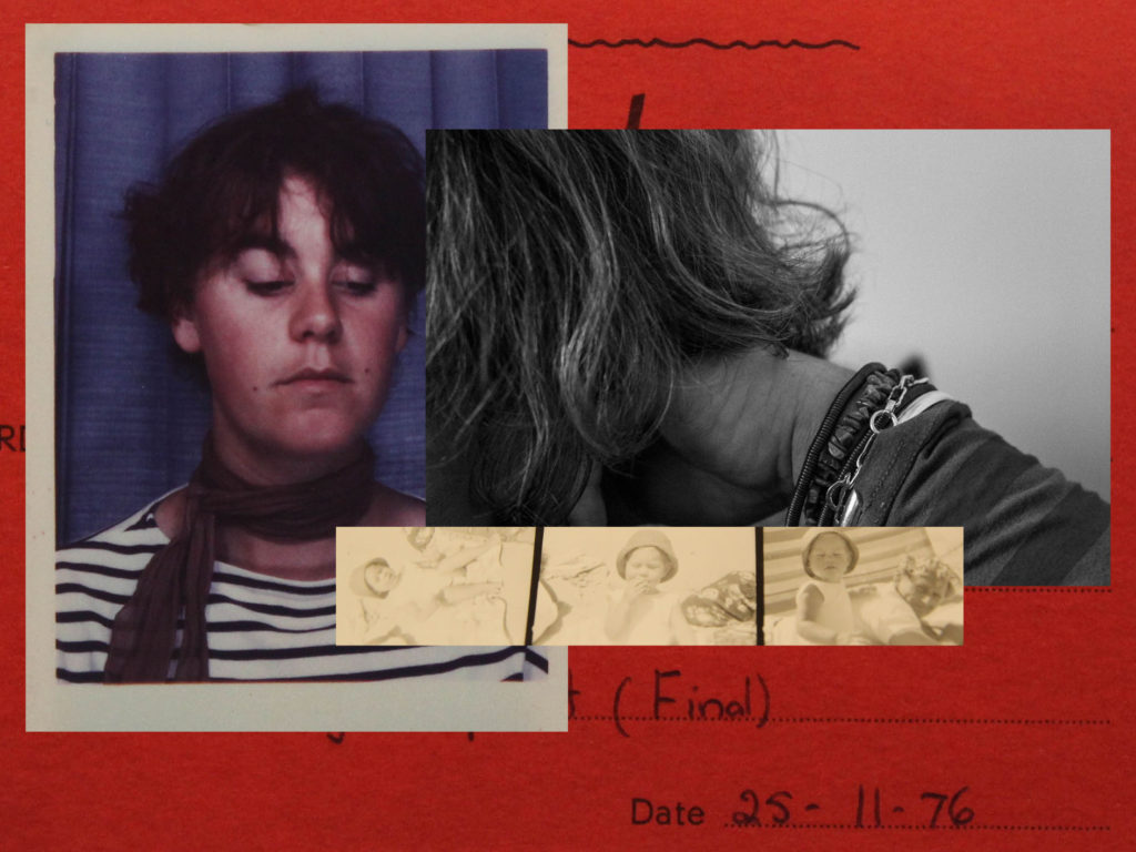
I chose this as one of my final images because of the composition and arrangement of the images, but also because of the use of different types of images – Polaroids, documents and film. I also liked my use of the red document, with the date on, which I think adds to the idea of passing of time. I think the red colour of this image also adds contrast to the image and makes he other elements bolder, especially the polaroid and film picture with its white border.
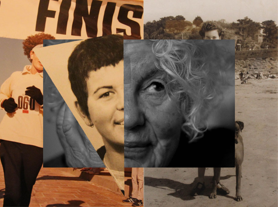
I chose this image as one of my final outcomes due to its unique layout. I like how I made the split of two older images, with one modern and a slice of another archive image on top. I also like the layering that’s created, and how parts of my nana’s face are concealed in each image, but it’s still clear that it’s her.
Finally, I chose this collage as one of my final outcomes because of the comparison between 2 generations. I like that the older images contrast by themselves, with newer images kind of hidden underneath and disguised.
Set 2 – Abstract images and portraits juxtaposed
Below, I have created mock final outcomes in photoshop. For my actual final outcomes I will print my images out A4 size, then I will arrange them on mount-board or foam-board.
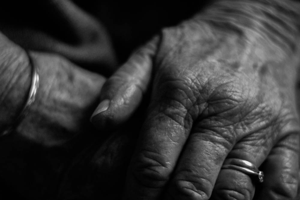
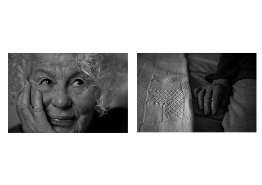
This is my best abstract image. I think it really shows parts of my grandmother’s identity, without showing her face which I think is quite unique for this image. I love the high contrast, B and W edit on this photo, and I think the vignette which I added really frames the hands. – The lighter tones also highlight the jewellery on her hands, which is good because this jewellery is very precious to my nana.
Final outcome mock up
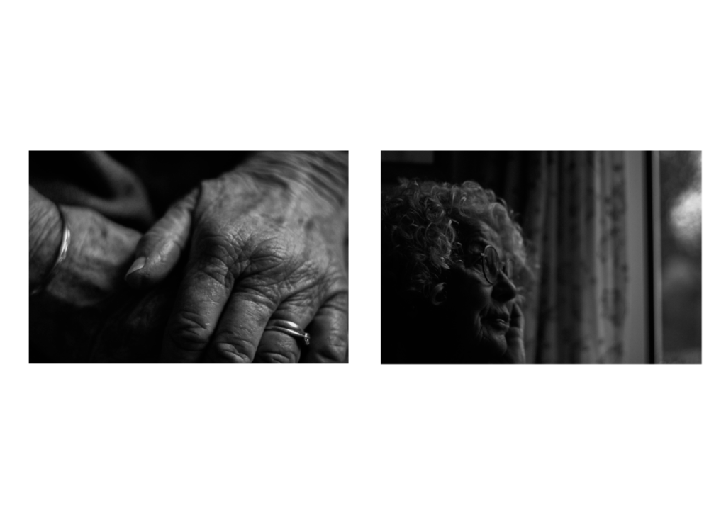
I chose these two images together as I think they show two different parts of my subject. The left is showing very little about my subject, whereas the right shows a playful, inquisitive side. I put these two together because of their highly contrasted nature, but also with some light tones in each. I placed the image to the right in the position because it creates the illusion my subject is looking outside the frame which I like.
I chose to put these images together because they both have a reflective nature – they both picture my subject in thought, but with different shots. The left is much closer, showing much more of a physical identity. However the image to the right is pensive in a way. It pictures more of my subject’s surroundings, which reveals more of an environmental identity than the left. I think that this contrast between the two helps them go together nicely.
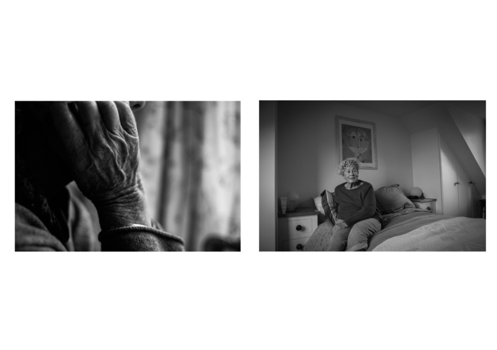
I chose to put both these two images together because of their great differences – however they both feature my subject’s hand. which draws them together. Also they both have a lot of white and grey tones. For example on the left in the hair, and on the right the colour of the blanket and throw on the bed. The image on the right is more secretive, which I like, whereas the one on the left is a close up, showing lots about the subject.- I think this contrast brings them together.
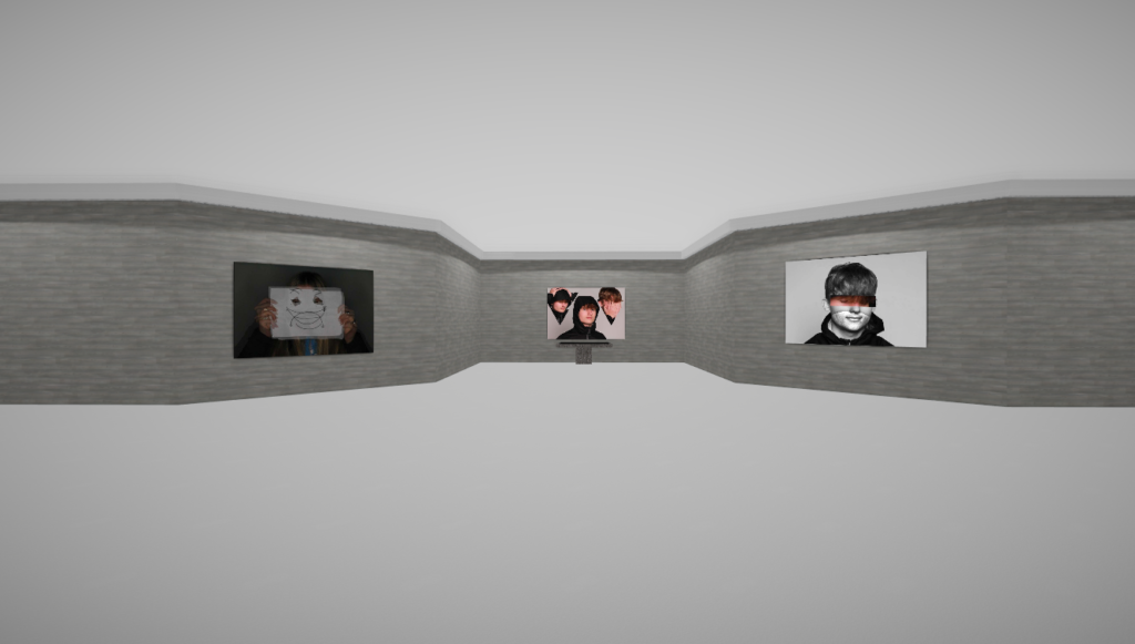
Virtual Gallery
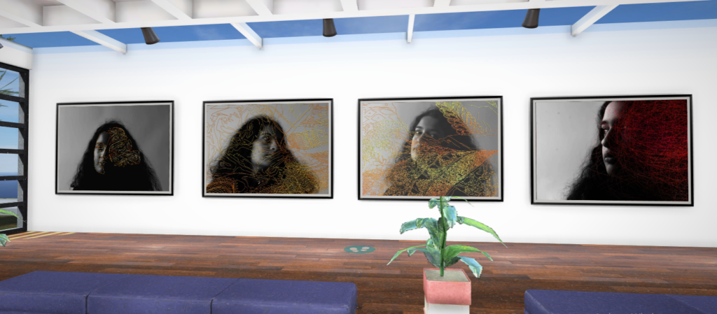
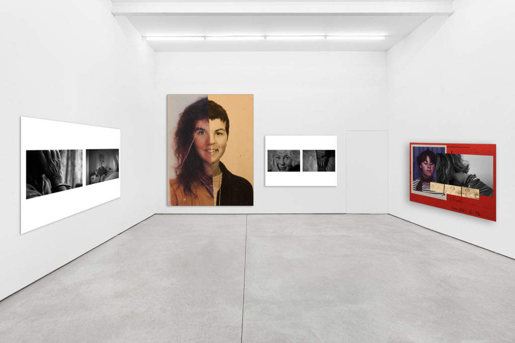
After finalising my final outcomes, I created a virtual gallery of my favourite images. I did this by adding each image I want into a blank gallery space, and adding a drop shadow and stroke to make the images look more realistic, as well as using the perspective tool to change the angle of the image on the wall of the gallery.
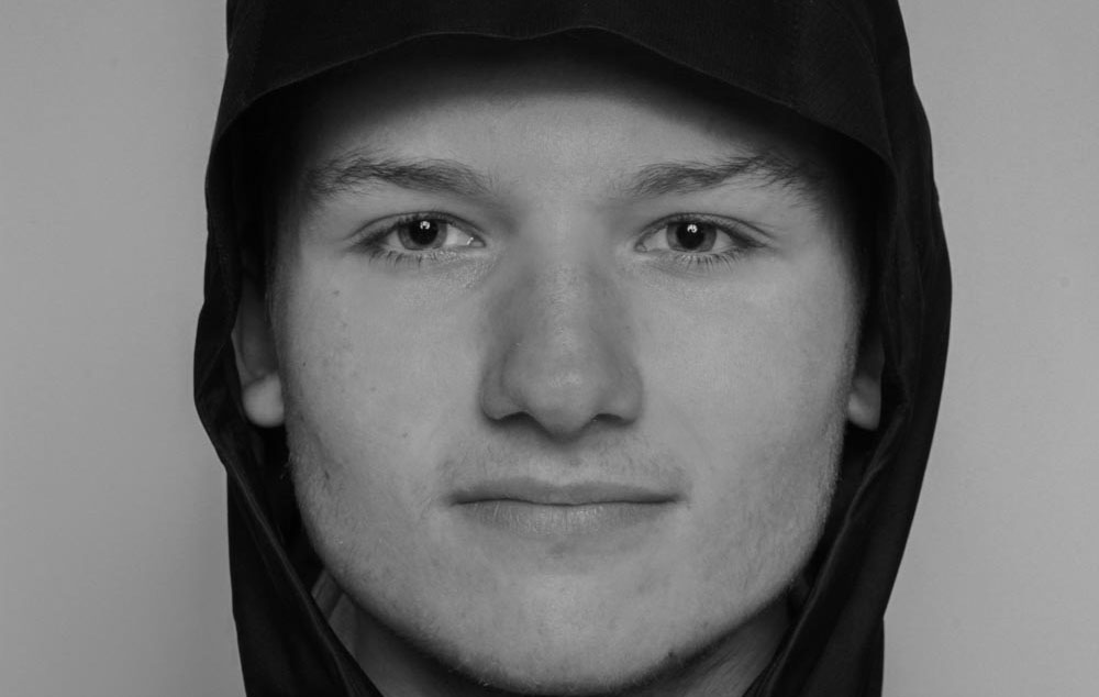
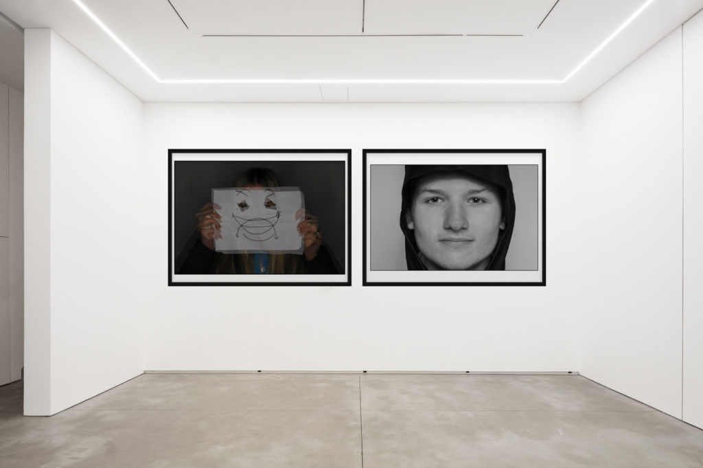
I picked 5 main final images for the end result of the mock exam. I chose these photos as they included the best photos that I had taken as well as the best editing that was done to the photos. I believe these photos best fit the description of the task, identity, and are very good at portraying identity to viewers. My final images are placed next to an image of one of my chosen artists to show the visual comparison between the images.
Analysis
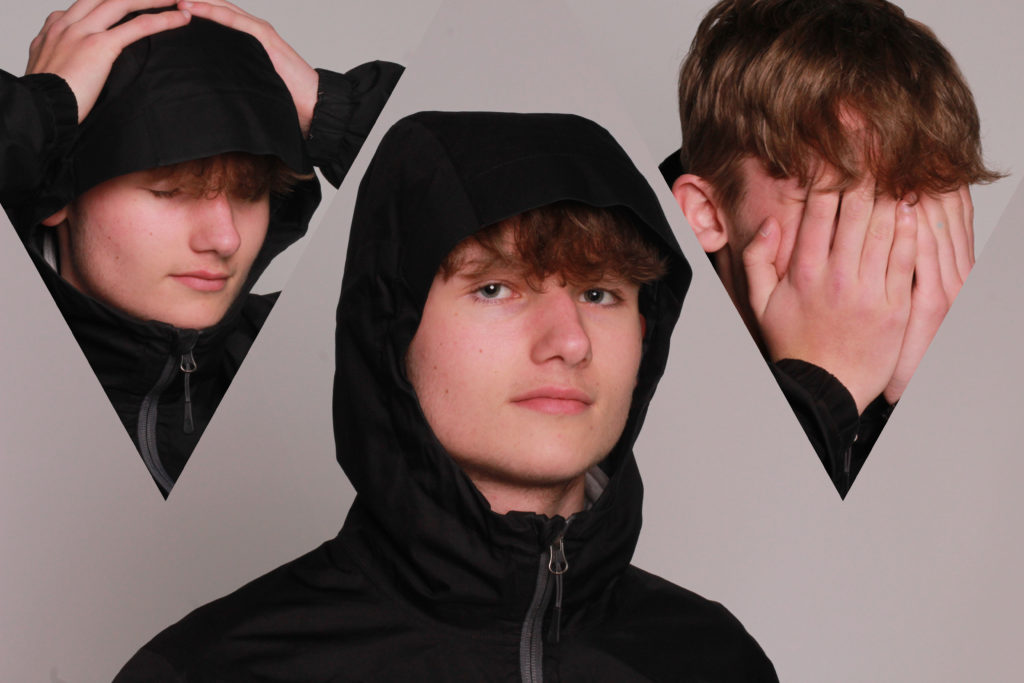
This image shows a persons different moods and identities that they can carry on their shoulders with them, and show off these different identities to different people. I was not inspired by any other artists to create this image, and used my own ideas to create it in Photoshop.
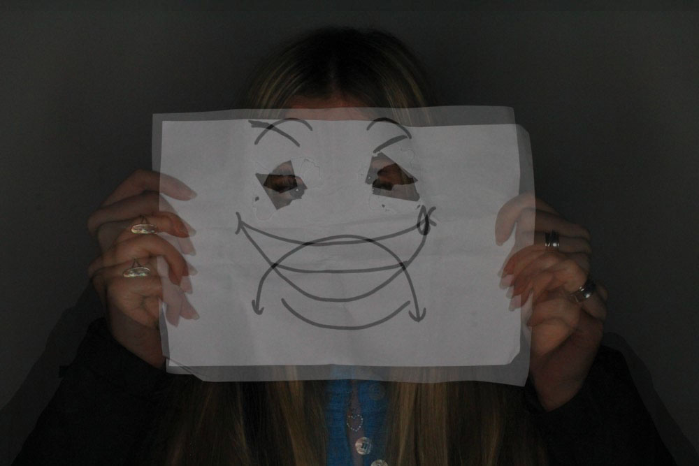
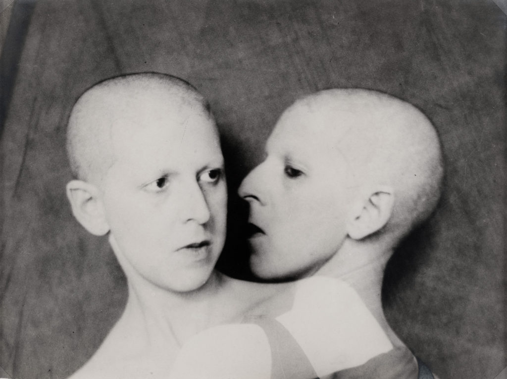
This photo on the left can explain that sometimes people can show 2 different faces or identities when among others, the multi exposure effect shows a happy face and a sad face which can portray that sometimes people may be feeling one mood, but putting on a mask of a different mood. I was inspired by the photo on the right taken by Claude Cahun. It also features a multi exposure effect which inspired me.
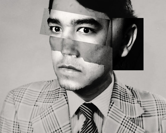
This photo on the left portrays the juxtaposition of identity, and how a persons identity can be distinguished differently from different perspectives of multiple people. I was inspired to create this image by the image of one of my chosen artists on the right, the different contrasts of the image interested and inspired me to create an image of my own which is similar.
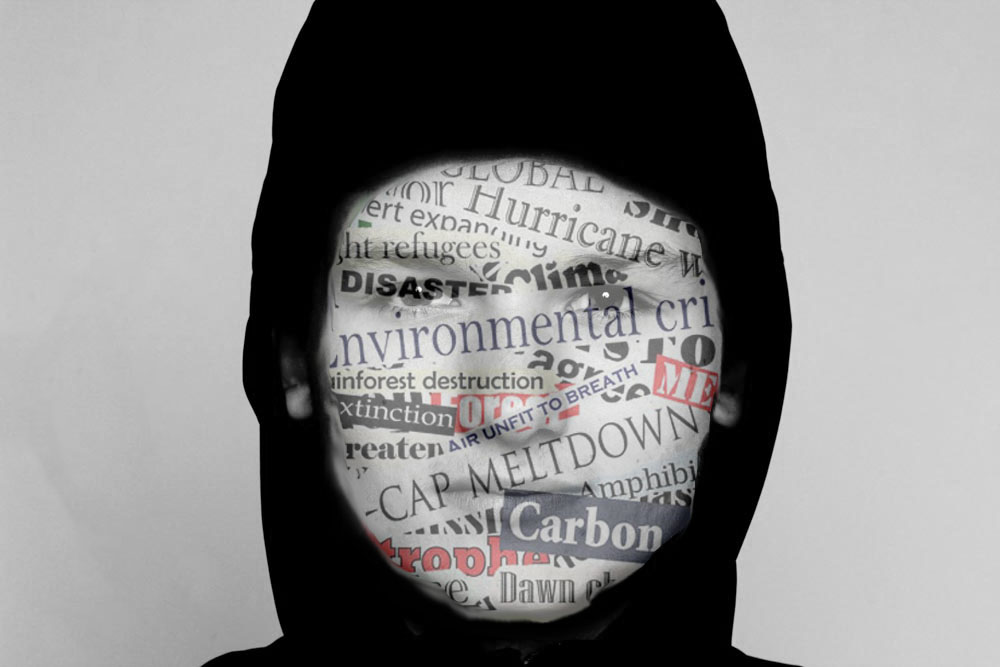
This photo portrays how the media and news headlines can affect a persons views and identity, the headlines pasted on the face of major events and problems happening in the world show how the information can stick to someone and convert a persons identity. I was not inspired by another artist for this photo, but instead used my own ideas to create the image.
This photo can portray a persons single identity, and how someone who does not know them my view them from first glance. The photo on the right was taken by one of my chosen artist and helped inspire me to create this image, I found the image on the right very interesting which is why I chose it to compare to my image
Evaluation and Critique
For a first photography mock exam I have completed, I believe that I have done very well, although there were some things which could have been completed better. Firstly, I could have completed more photoshoots, I only managed to complete two photoshoots and took roughly 70 photos, which were narrowed down to about 25 photos, and then narrowed down once again after editing to about 10 photos (which I chose 5 of for the final images). With more photos, I would have been able to edit more photos and present more ideas for my final images. I believe that I chose a great artist to inspire me and compare my images to, as I found the artist very interesting. For the next exam, I will aim to take more photos so I have more content to work with to create better or more final images.
VirtualGallery’s
I created 3 gallery’s of my final images, 2 on photoshop and one on Artsteps as a virtual online gallery.
Over all I am happy with the final outcomes I managed to produce using my artist references and own ideas. My editing on Lightroom was straight forward but very effective as I think the images that I produced before editing were strong. I made many different edits for each of my final images until I was happy with the tones shadows and the feel that the images emoted.
my best image from shoot 1
my best image from shoot 2
Critique
If I could of done anything differently I would of taken more photographs in my second shoot as although i was happy with my images in the end the initial selection process was slightly challenging. I also wish I had used the studio for one shoot as it would of created sharper lines and made the images look more crisp.
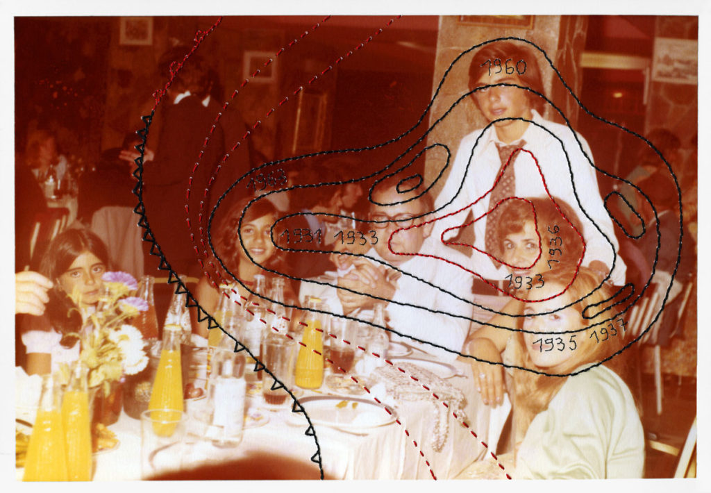
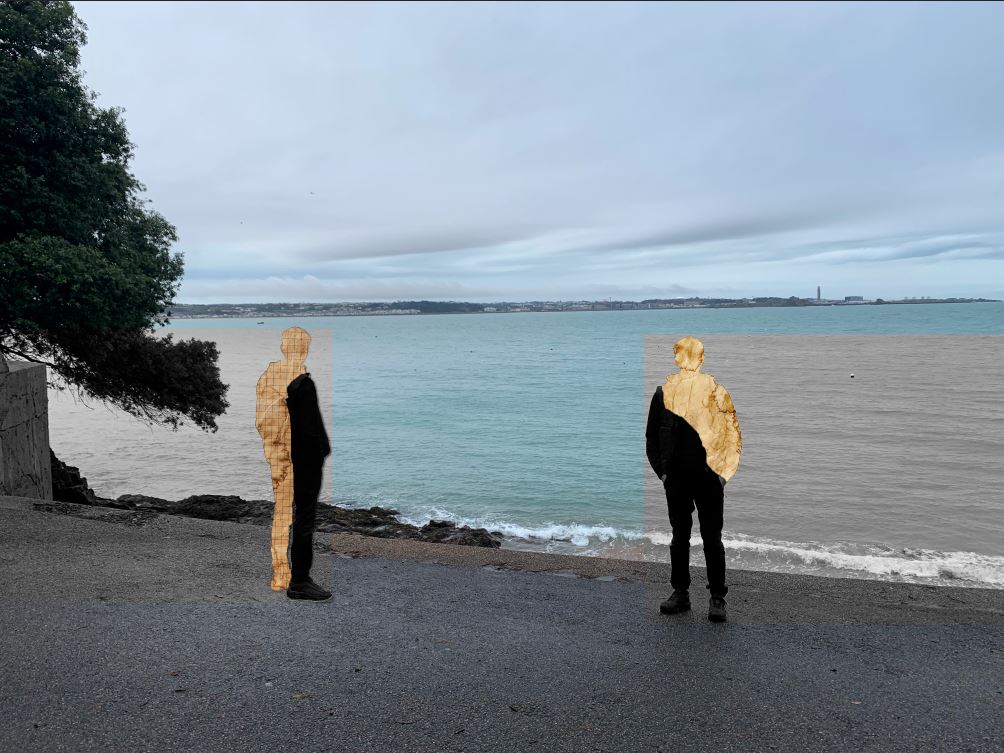
This idea was inspired by the work of Carole Benitah and was my take of portraying geographical identity, as well as portraying the passage of time. Carole has a series of images where she has taken old family photos and either cut them up, or draw/sew over them to create unknown figures amongst a normal portrait or background.
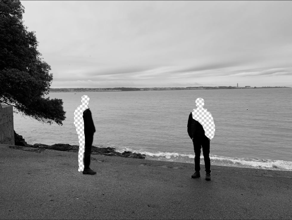
To make my idea I used a photo from a small bay behind St Aubin’s fort called Belcrout bay, which used to be very popular for its diving stage during the late 1930’s, because its a place my subjects grandparents often visited.
I had more photos from the same photoshoot so it was easy to cut out a subject from the other photos as they had the same angles and lighting. After I had added him in and adjusted the colours I used the magic wand tool to select a portion of his body which I then used layer-via-cut on to remove them from the layer. I duplicated. I added in photos of old discoloured paper behind the layer. To finish it I used the marquee tool to remove sections behind them revealing the black and white layer I had created earlier.
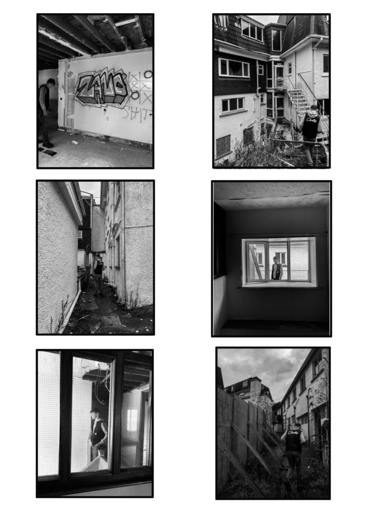
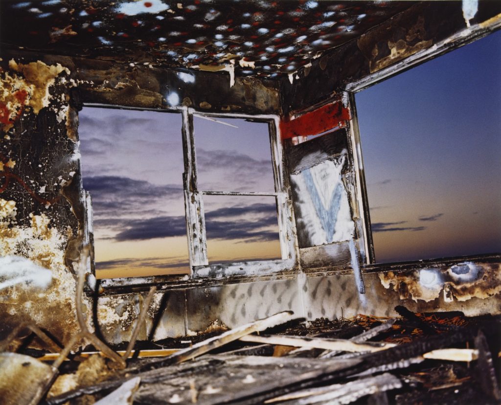
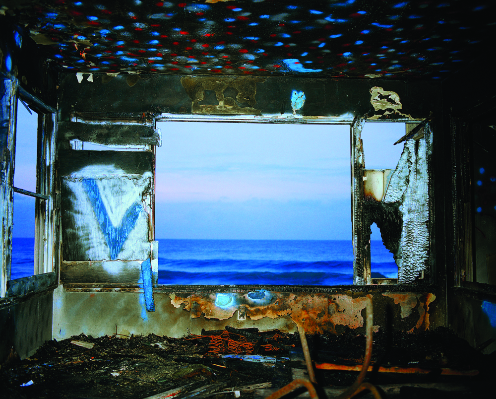
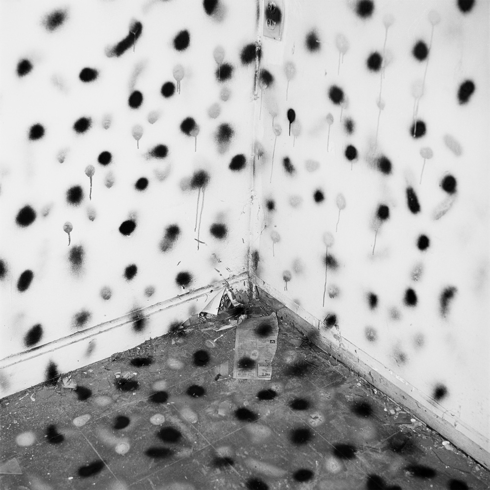
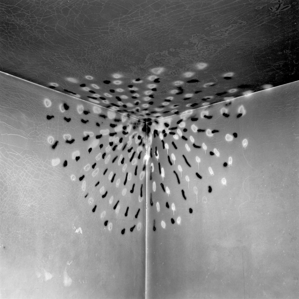
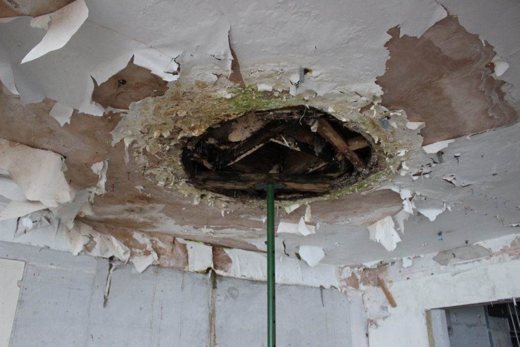
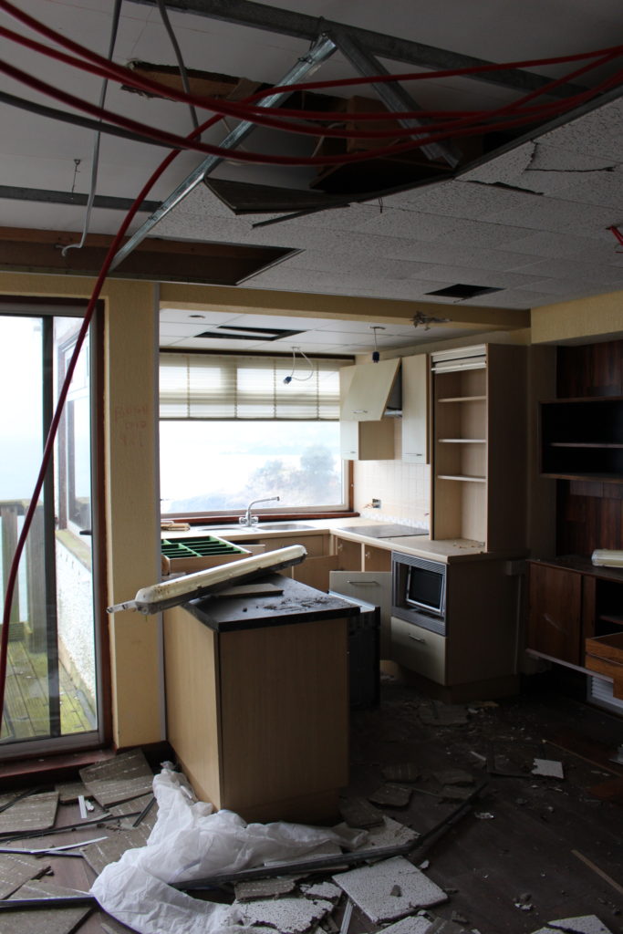
I have created my second piece inspired by John Divola, an American contemporary visual artist. He has a series of images called “Zuma” where he goes into abandoned buildings in California at various times during the day and takes photographs from interesting angles and perspectives. He then goes throughout the house spray painting, creating graffiti, breaking things and moving objects around. He then goes around the house again taking more photos.
Some of Divola’s Work
“Divola’s works trace a schematic desire for escape, movement and transcendence. “
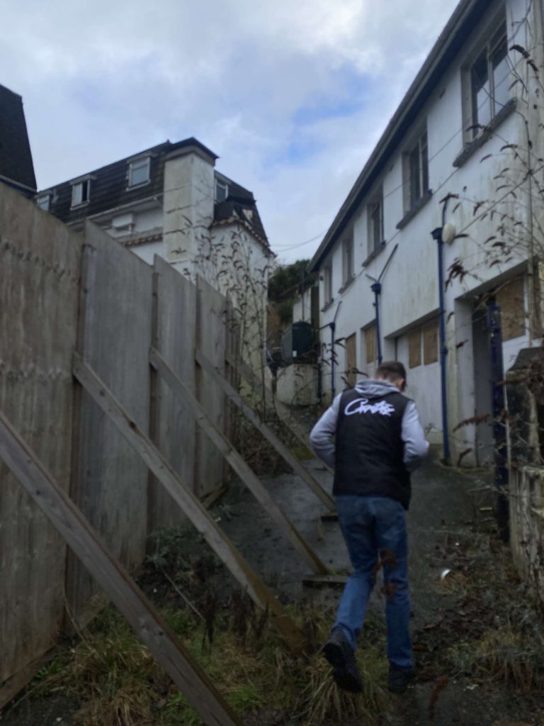
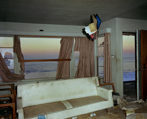
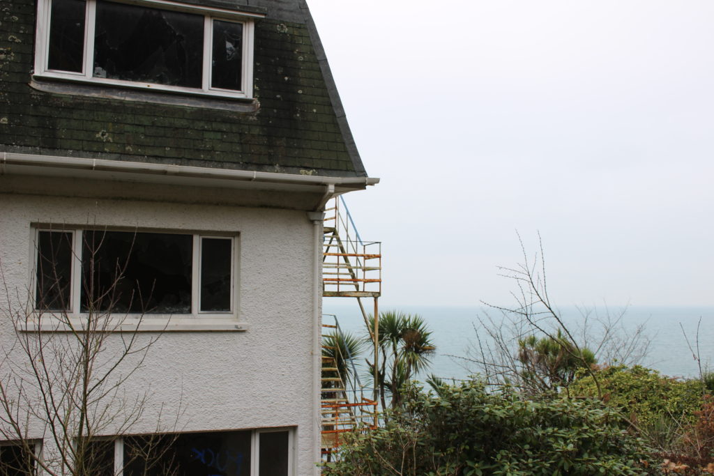
My “Zuma” Inspired images taken in a derelict hotel
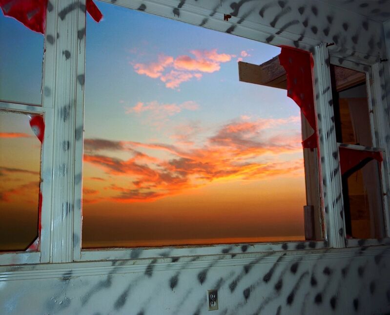
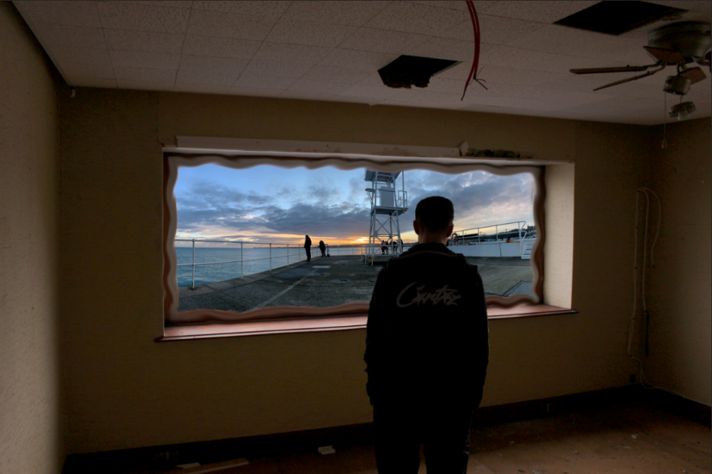
I chose to base my images off this project as I had a good idea of how I could represent loss ofidentity through a visual representation of mental health disorder, specifically Dissociative Disorders, more specially Depersonalization-derealization Disorder .
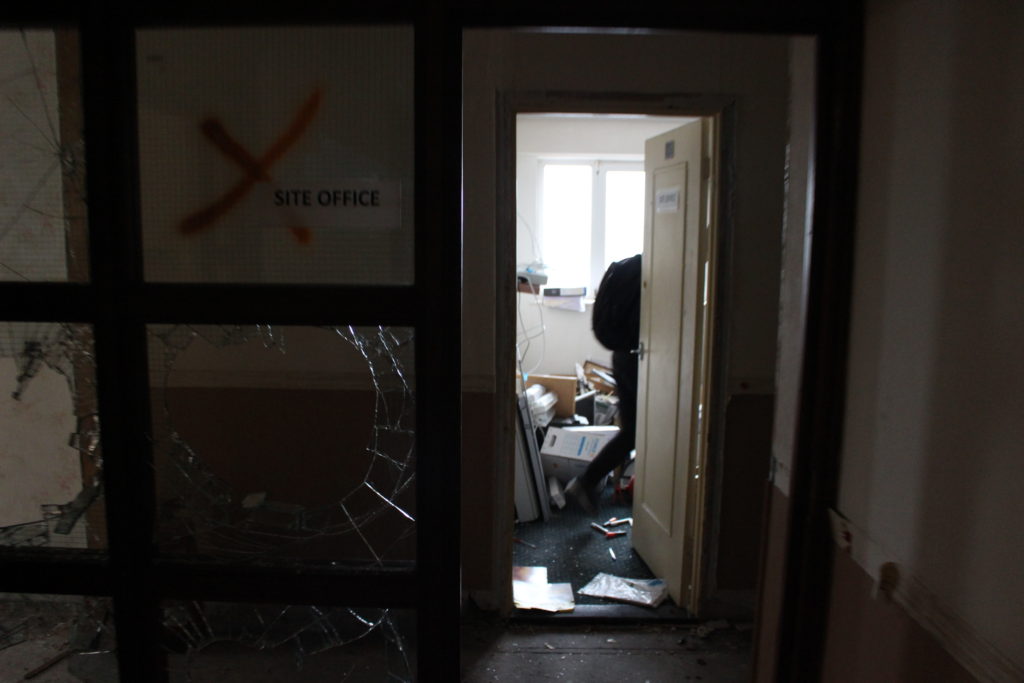
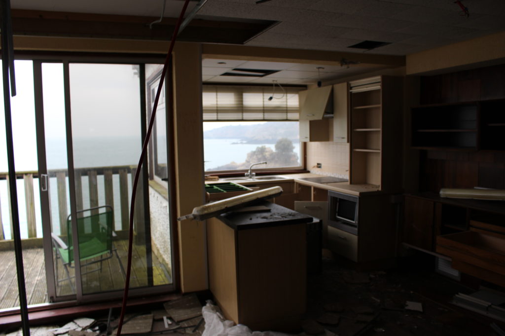
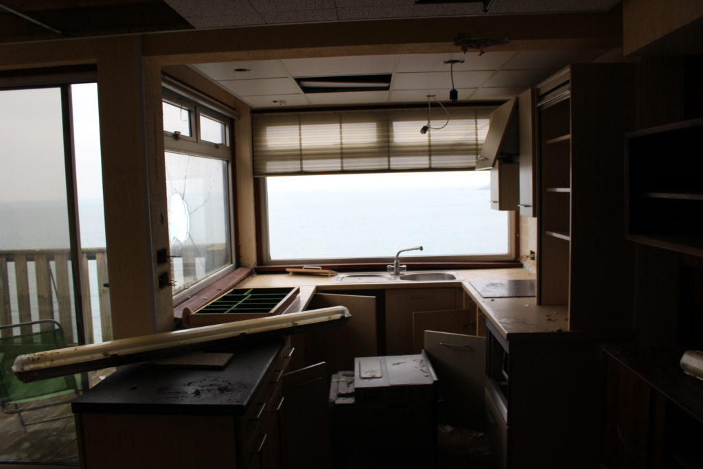
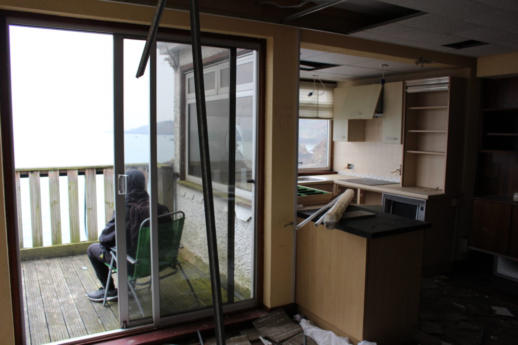
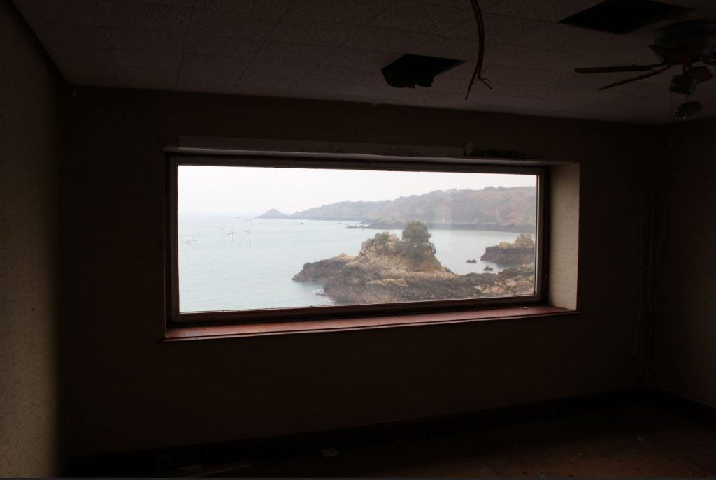
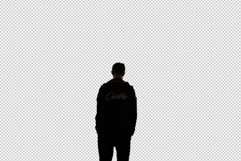
I chose this image of a dark, dingy hotel room which was in a state of decay and falling apart which will represent someones head.
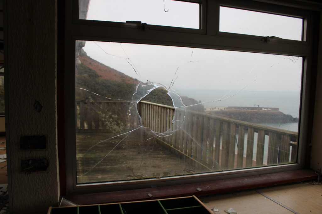
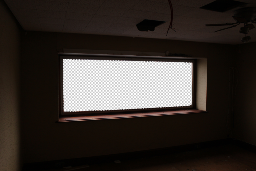
Selecting window
layer via cut
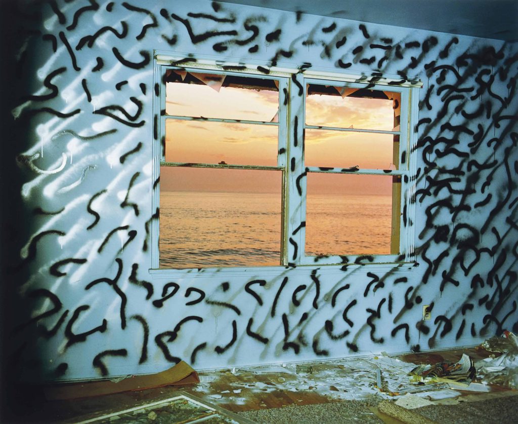
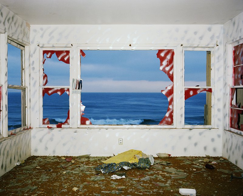
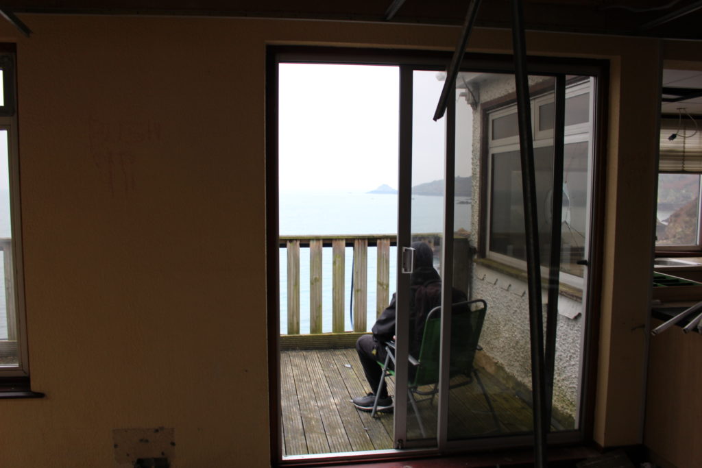
Once I had a clear view out the window I chose a photo which i thought would contrast the dim environment in the room.
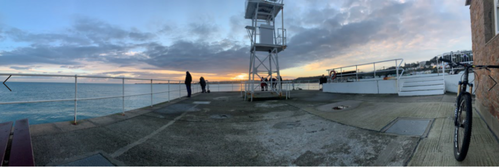
My chosen image for the view
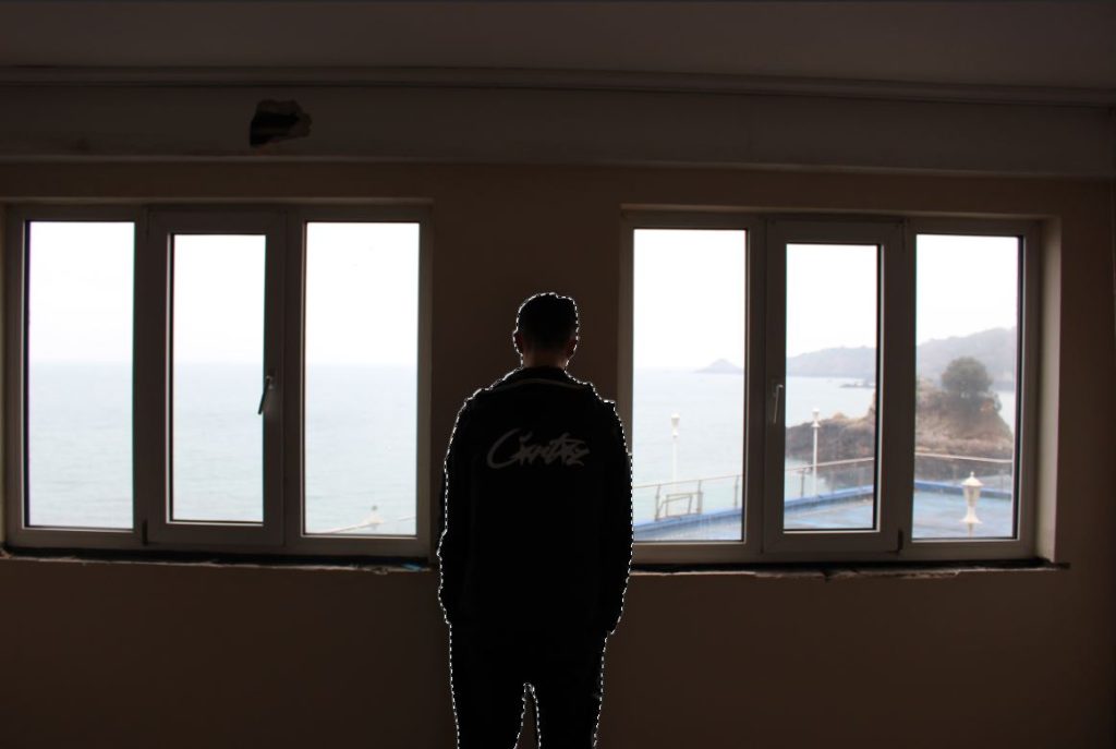
I added this photo into the project, placed it the layer below and cropped until it looked right and played with the colour settings until it fit in. To add the final part of the image I cut out someone looking out a window to represent personality/conscience.
Original
Cut Out
After adding them in I used the FX to create a drop shadow and used the smudge tool to create a waved effect around the border of the window which I think reflects the idea of it being set in a brain/head quite well.
Final Image
Overall I think this idea came out very well and looks how I was trying to make it look. It looks similar to John Divola’s work but portrays a slightly different message in a more cryptic way.
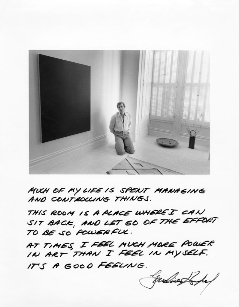
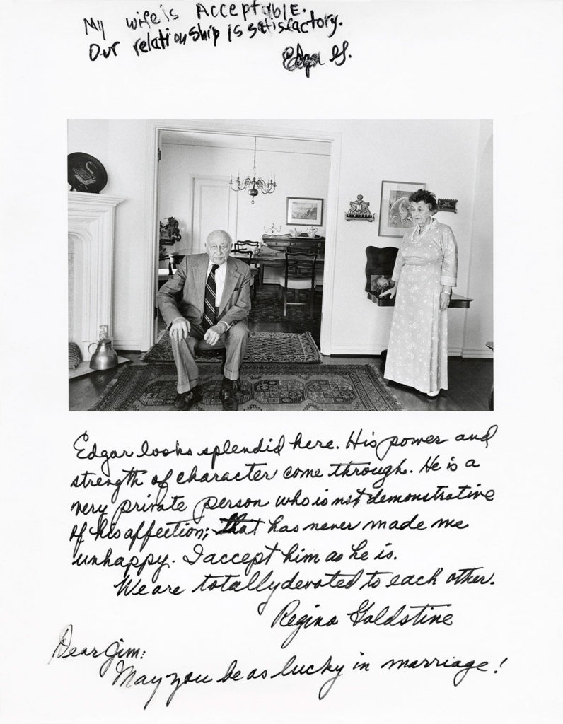
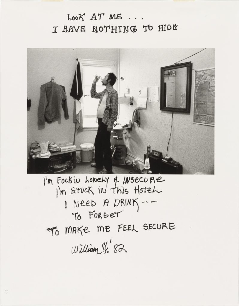
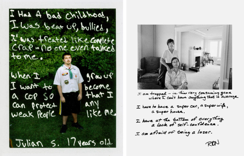
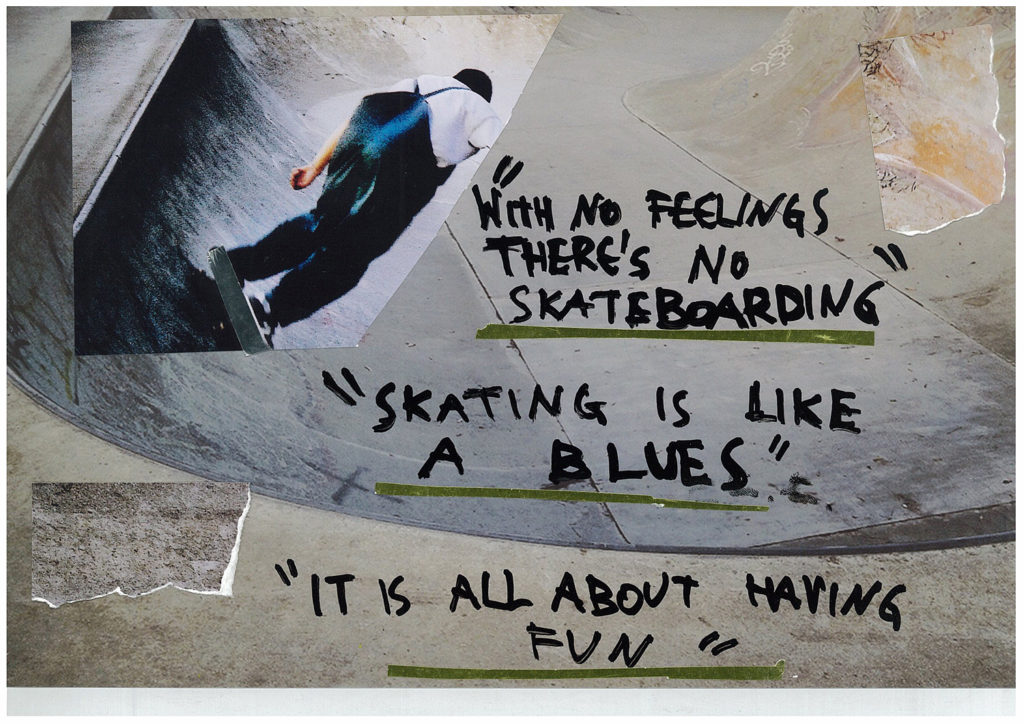
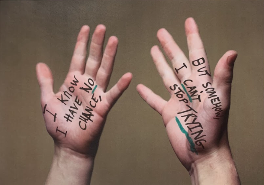
My first piece is a montage inspired by the work of Jim Goldberg. Goldberg photographs sub-cultures creating photo collages, including text with his photographs, often written by his subjects telling some sort of story about an element of their life which is often quite depressing or just hard truth. He makes these pieces to highlight the gap between the rich and the poor and pretty much provide a semi detailed insight into ordinary people and their identitys.
Goldberg’s Work
Mid Photoshoot
He mostly uses black and white photos with a few exceptions with straight on portraits of people often in their homes or places of significance to them. His photos come off as dark and a bit depressing as they are basic with not much to them, on top of a white background. He then asks the subjects to write out something about their life, their feelings, their situation etc which provides a personal addition to the piece and is what really gives it the deep meaning.
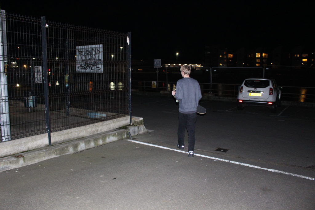
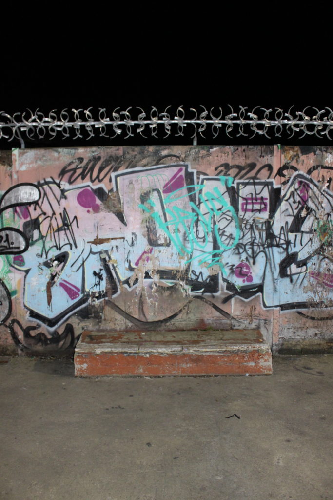
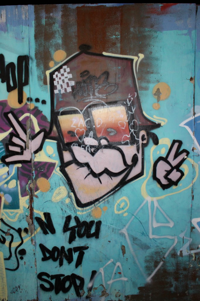
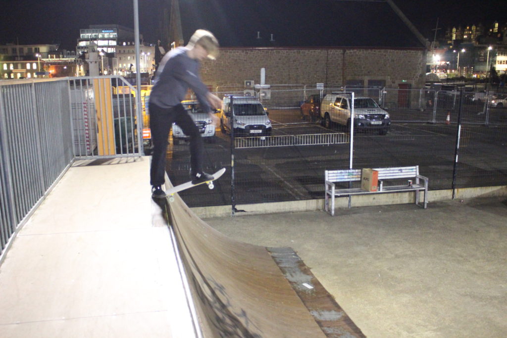
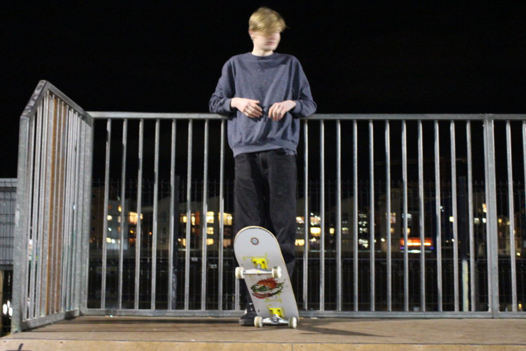
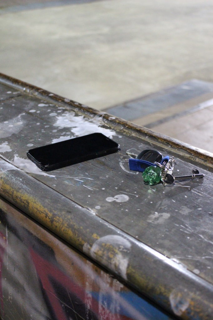
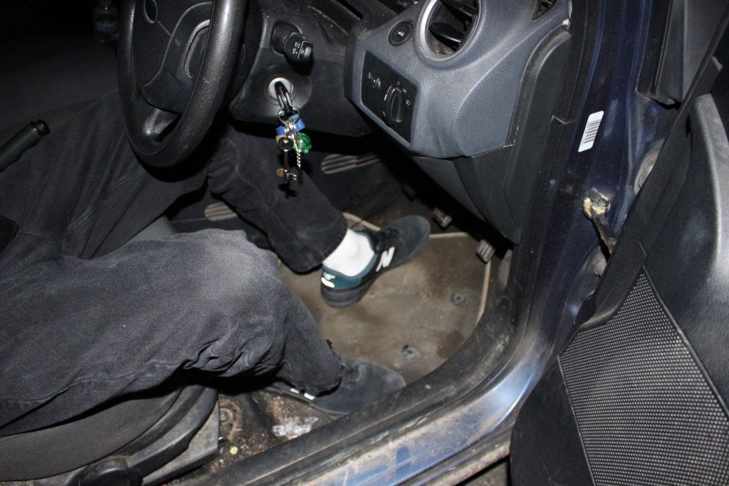
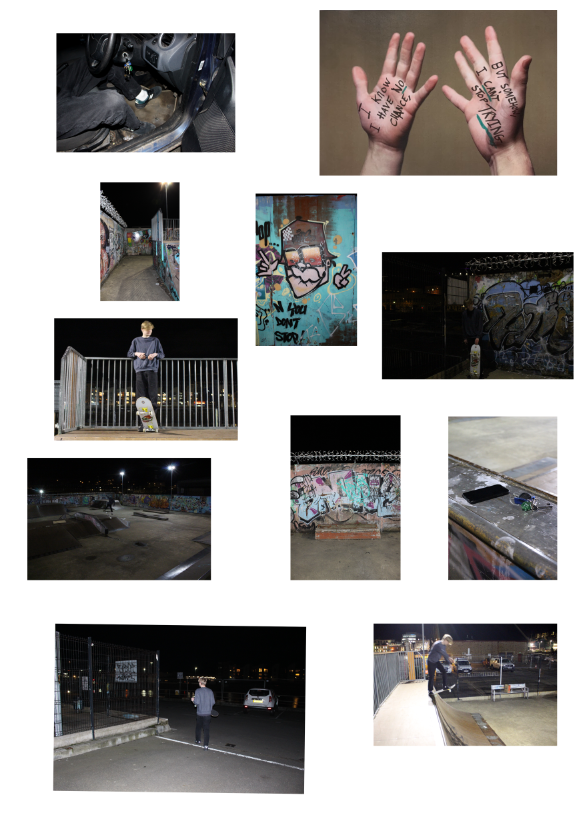
For my collage I went to my local skatepark and photographed a skater in different settings, while trying to portray their personality and identity as much as possible. I also added in a seperate piece consisting of a close up his hands which was inspired by one of Goldberg’s other pieces, as I then printed out and wrote a quote from my subject (as Jim had) about why he tries the same trick for so long, as Jim had.
Pictures Used
Once they were all in photoshop I created an A2 project, colour levelled each photo, added them in and spent a while adjusting their positions and sizes based on their relevance. I took these photos at night with flash and so they all have the the same tone which looks good on the montage. This is the final piece however I am going to be printing them out and adding them to an A2 board which I will be writing on and around the photos in the style of Jim Goldberg.