Analysis and Evaluation of my process

Artist Choices

I think that choosing both my artists was the right idea overall, but I think some things could be improved overall.

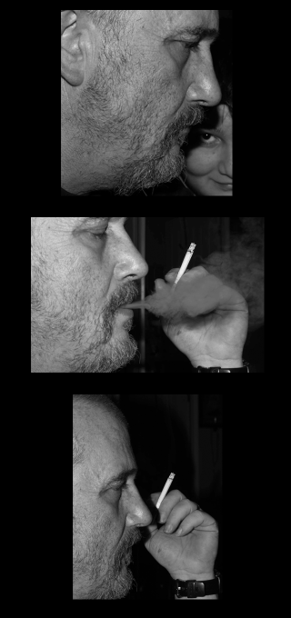
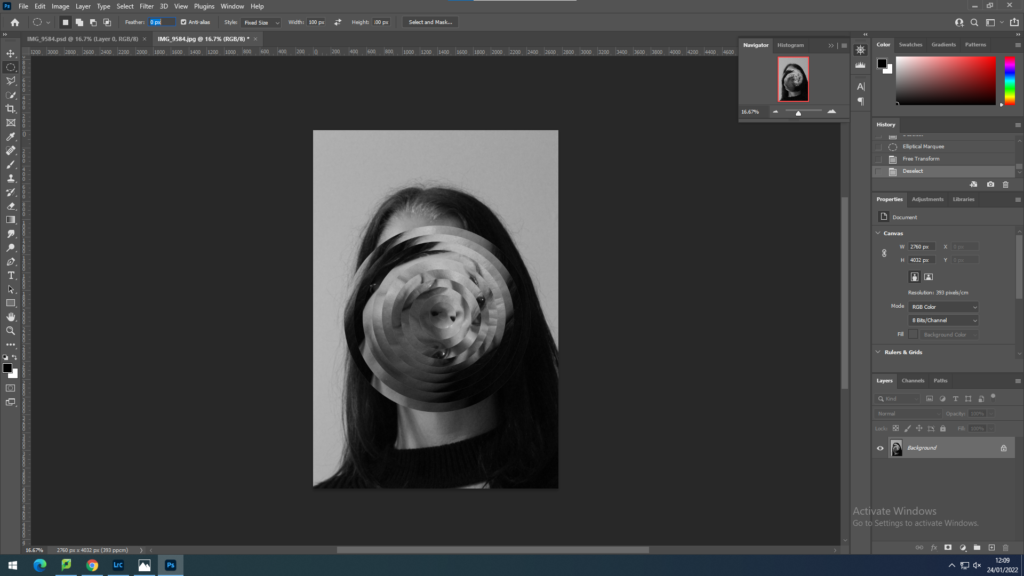
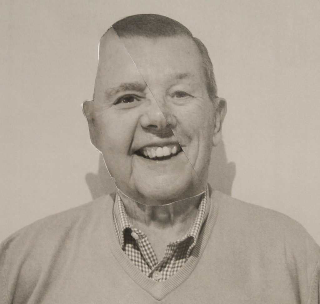
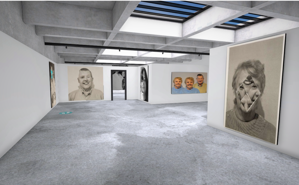
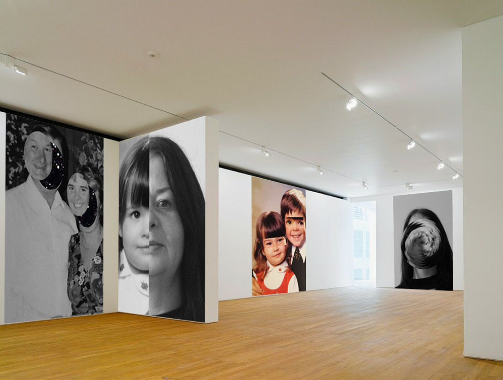
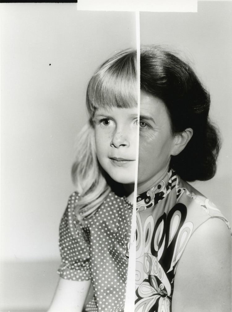
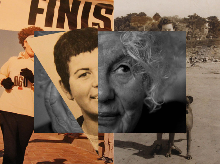
Joachim Schmid – artist comparison

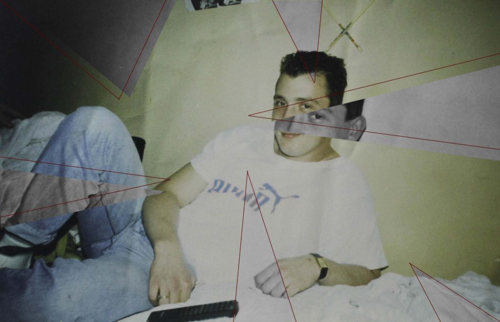
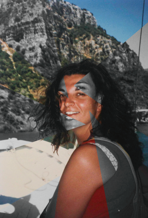
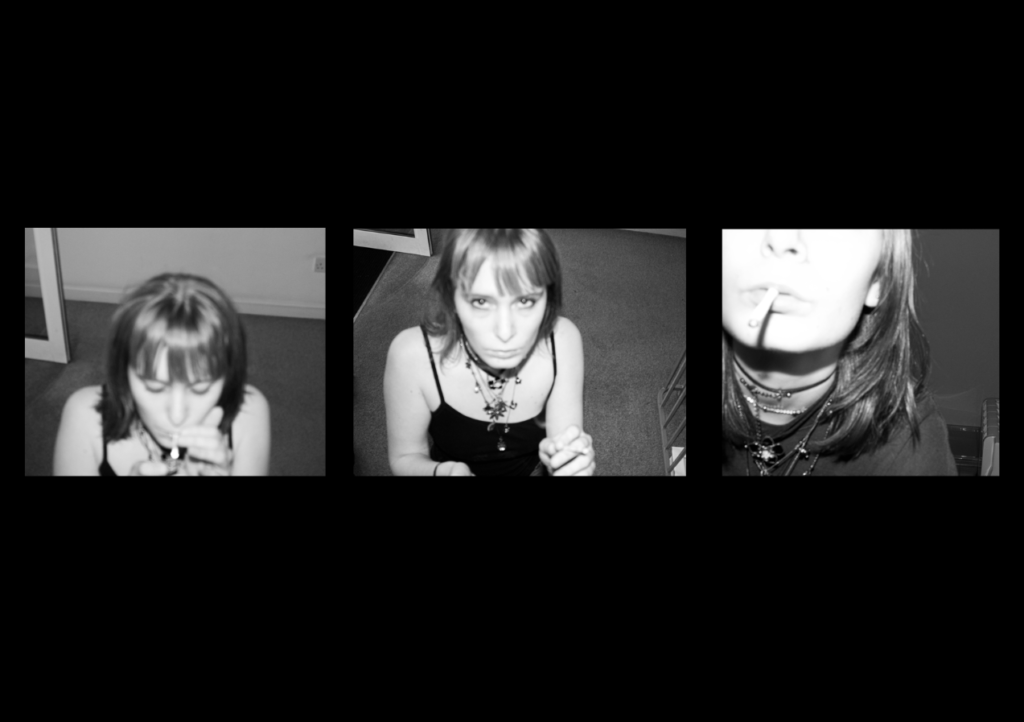
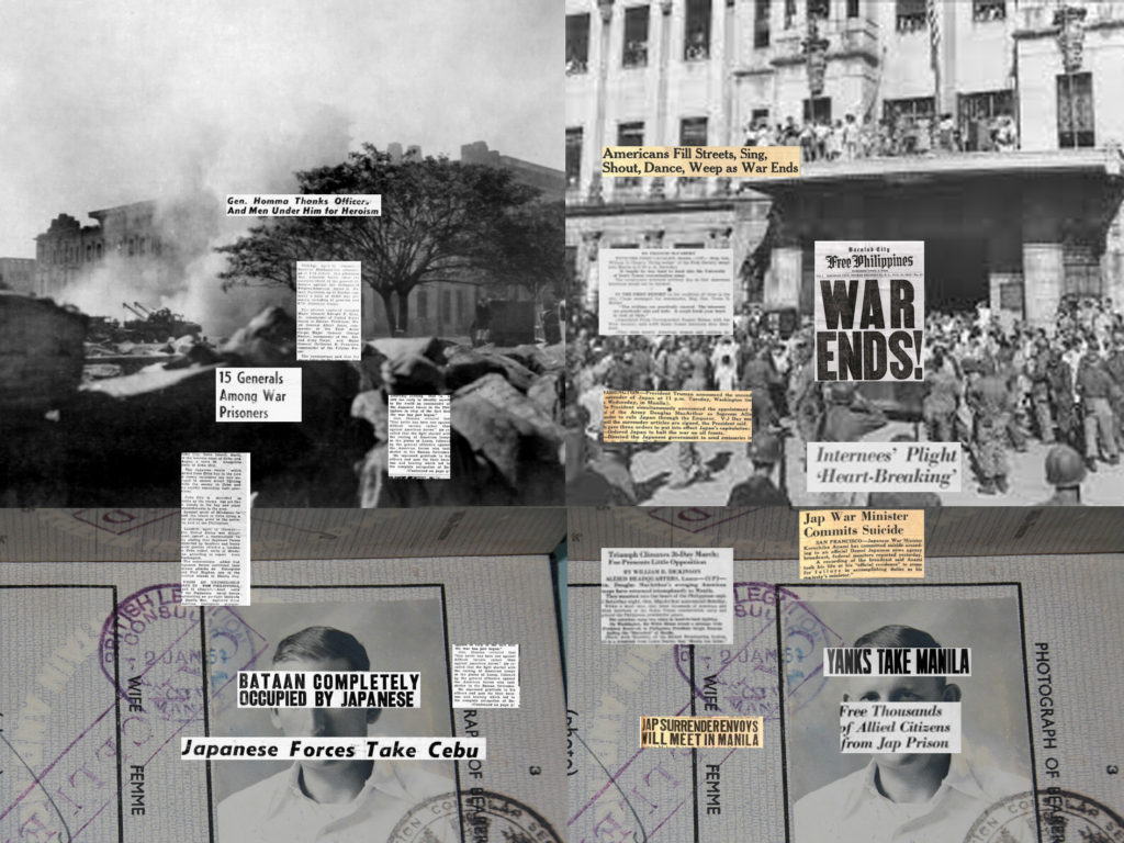
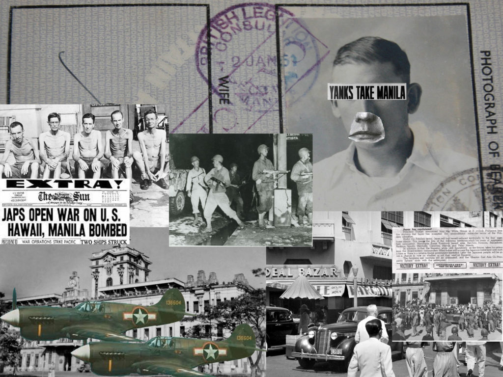
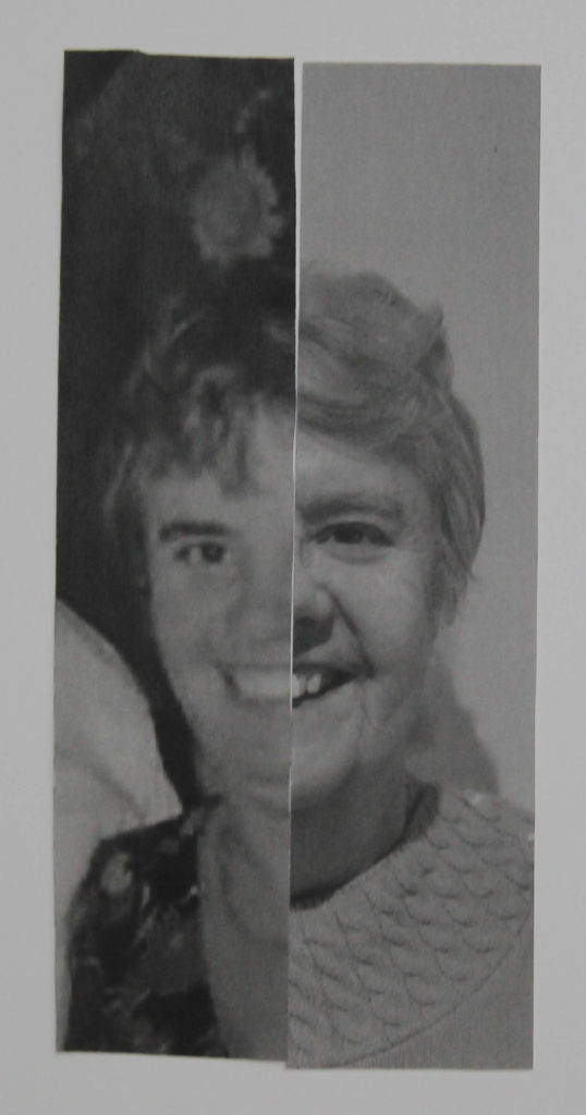
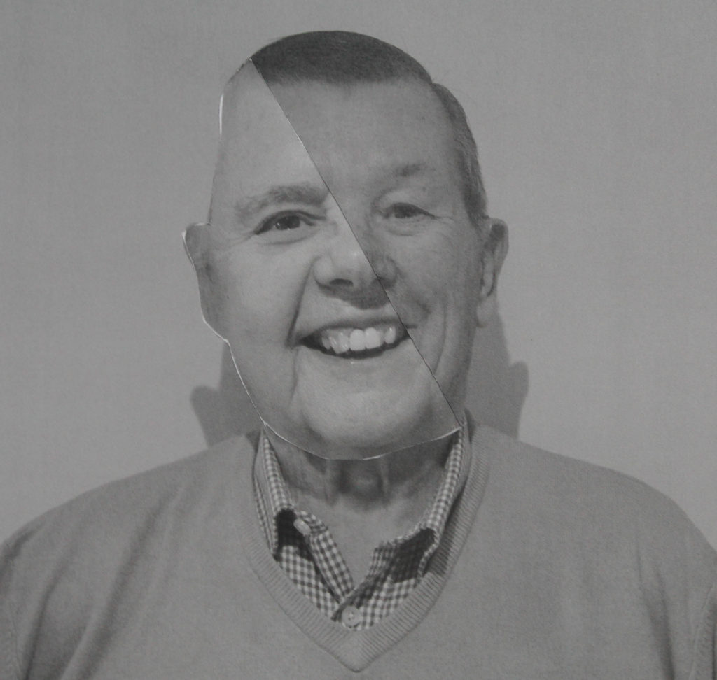
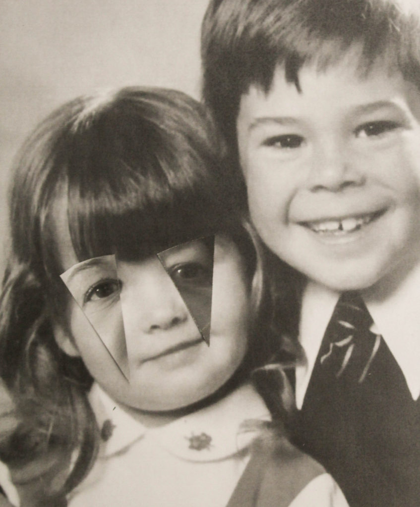
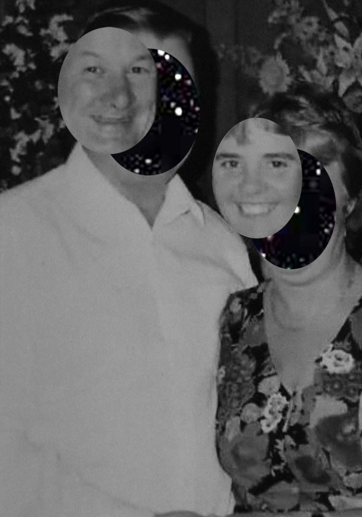
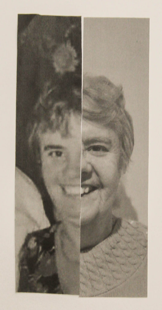
Overall, I’m glad I chose Joachim Schmid as my artist to base my final experiments and outcomes on. I think in some experiments, like the one below, my work does look extremely similar to his, through my use of cropping and pasting of my archival images.
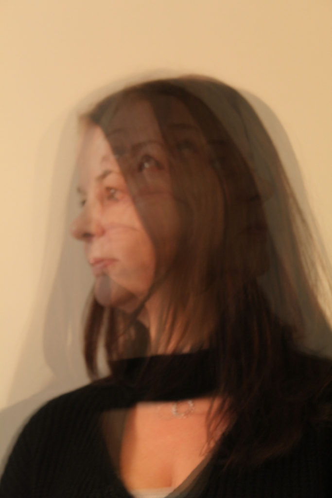
My work
Joachim Schmid’s work

Reflection

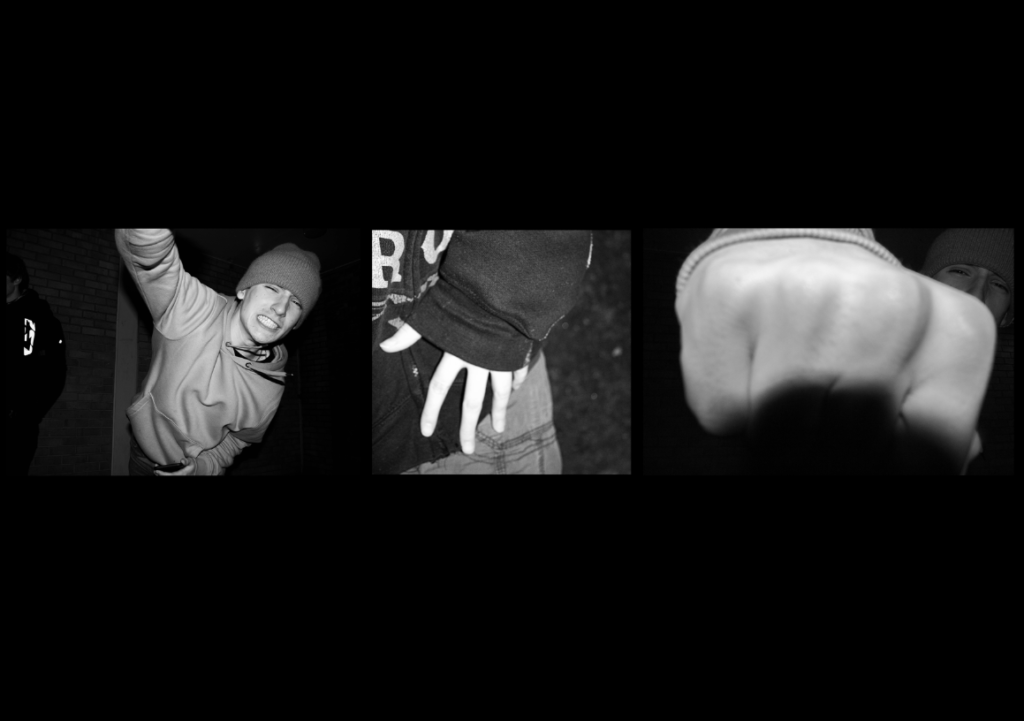
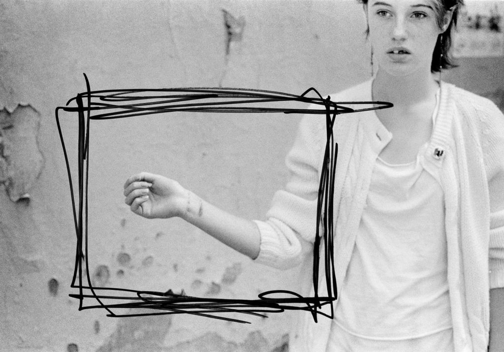
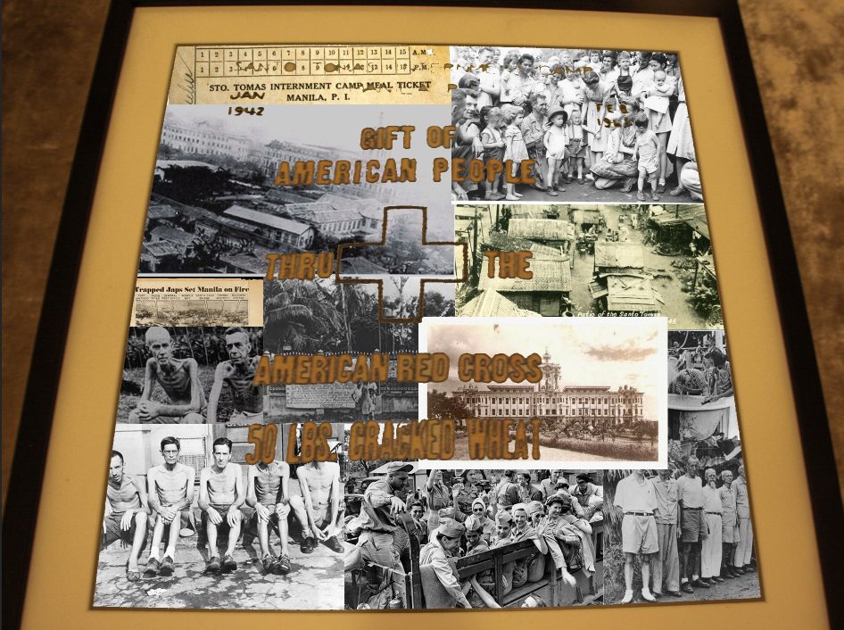
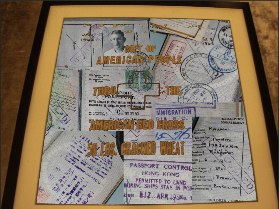
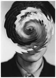
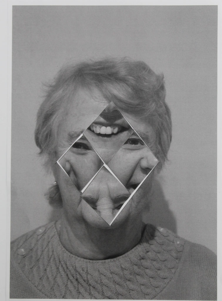
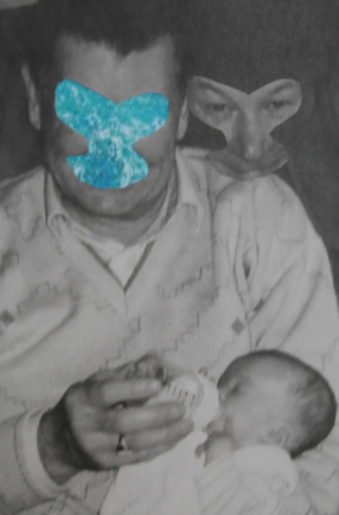
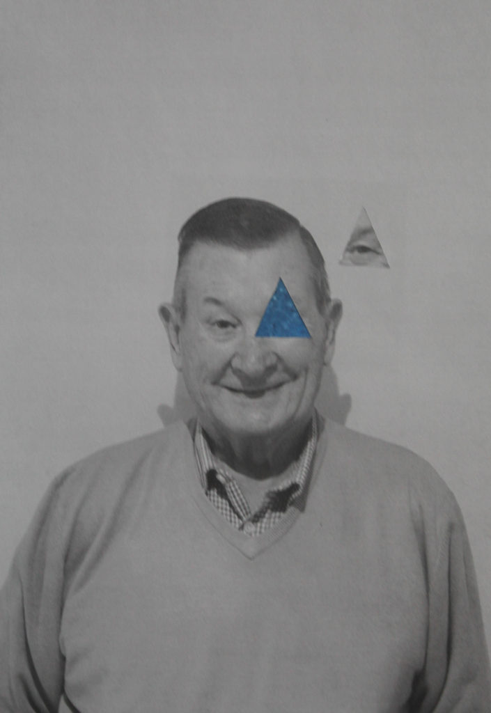
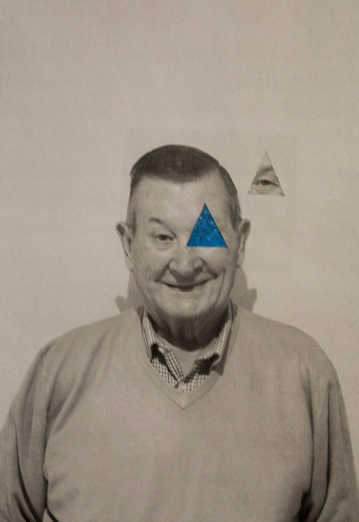
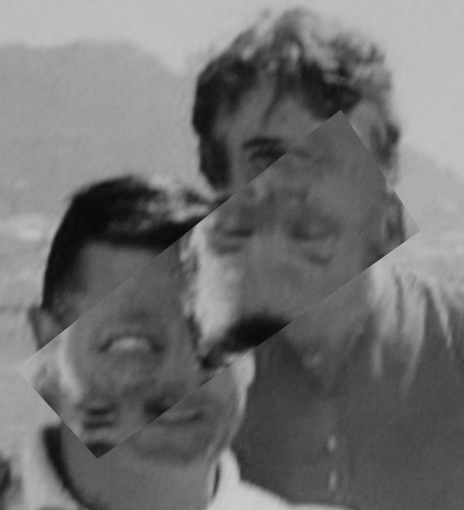
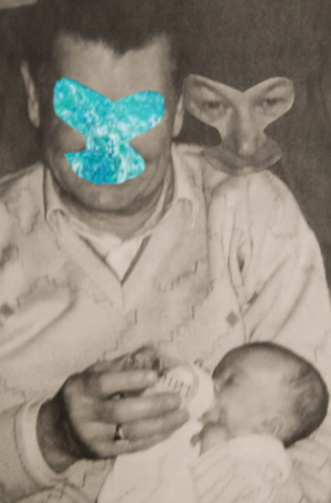
However, in a lot of my other outcomes, I found this approach a little bit limiting. I would start an experiment like Joachim’s but then continue to develop and branch out more into the idea of photomontage, a style which I’ve previously used and knew I liked, featuring artists like John Stezaker. (see an example of this in my work below) But, even with my development further than Joachim Schmid’s work, I am still glad I chose him as my artist – I liked that I had something to base my ideas off that I could then develop from further. Because of all of this, if I was to do this project again, I would maybe choose an artist who focuses on photomontage as well, like John Stezaker for example, who I could have done some more research into.
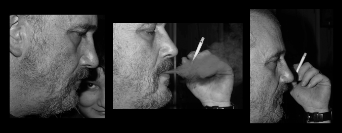
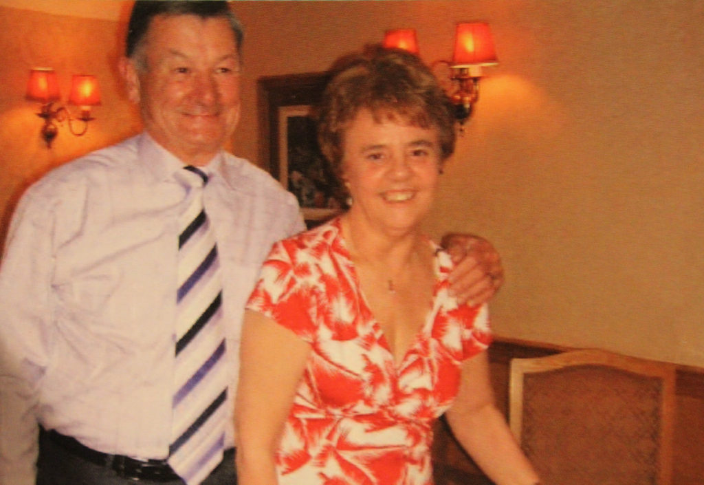
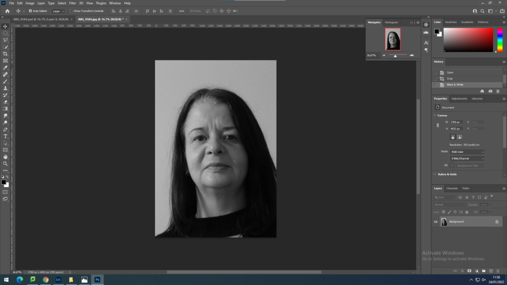
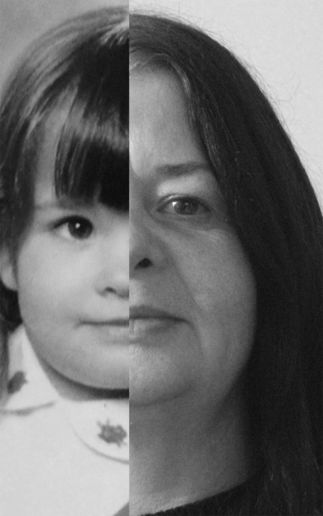
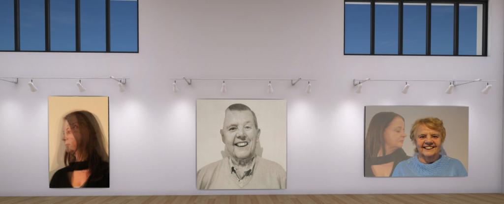
My work

Bill Brandt

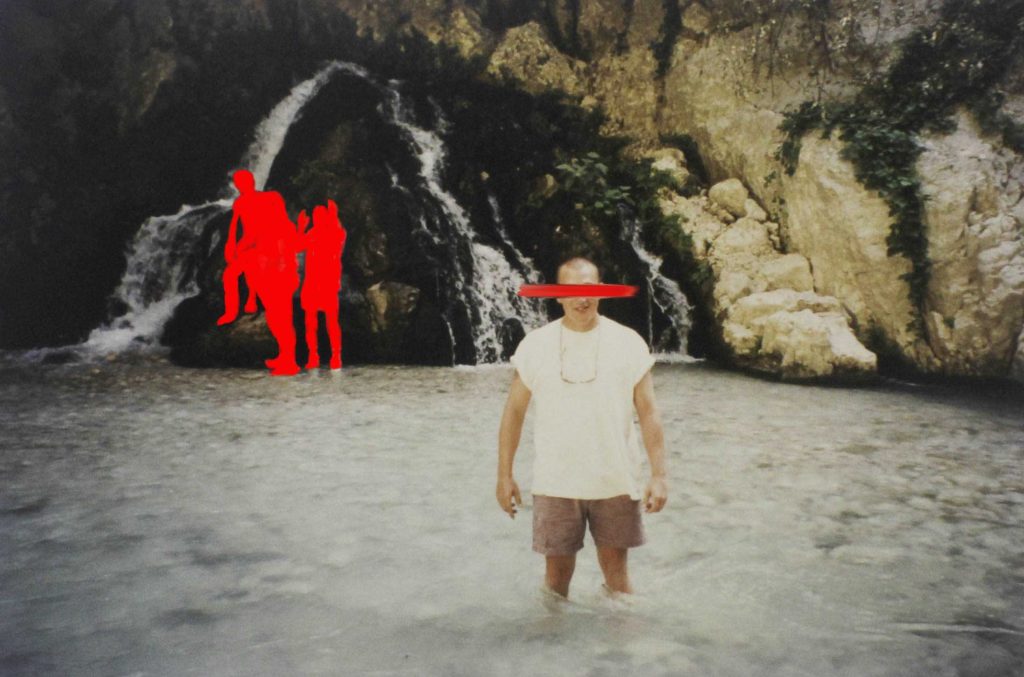
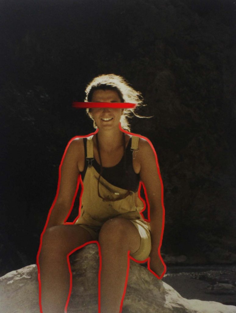
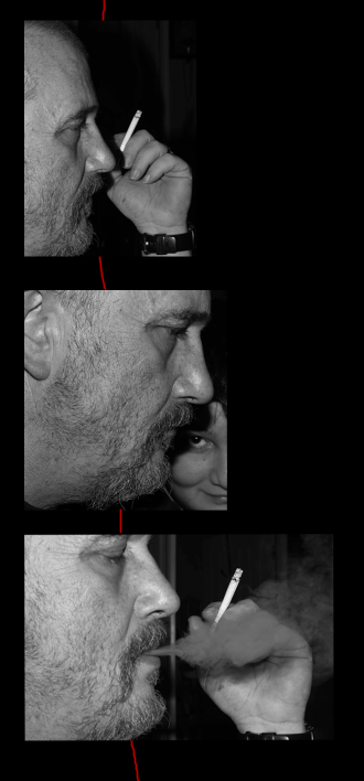
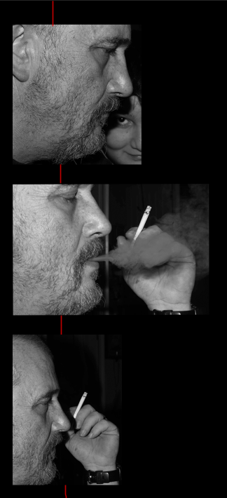
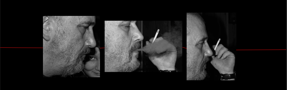
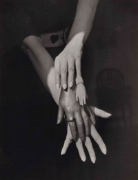
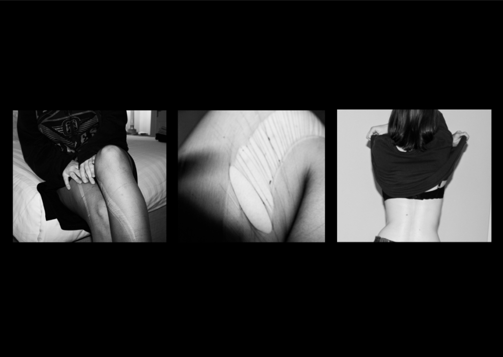
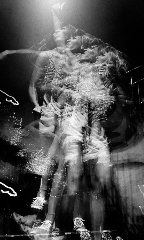
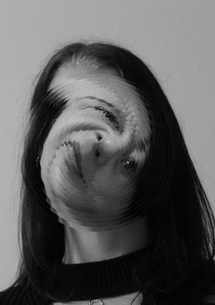
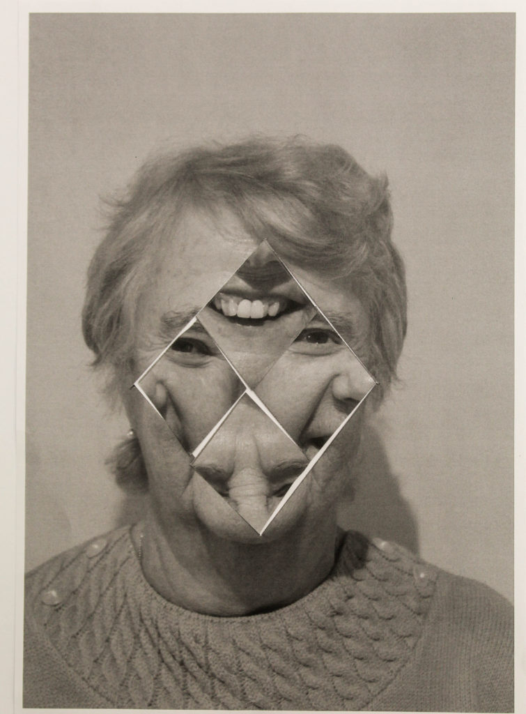
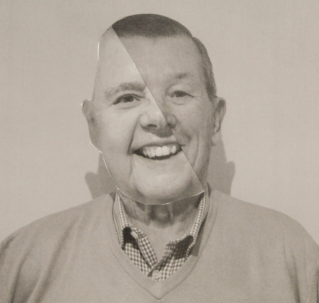
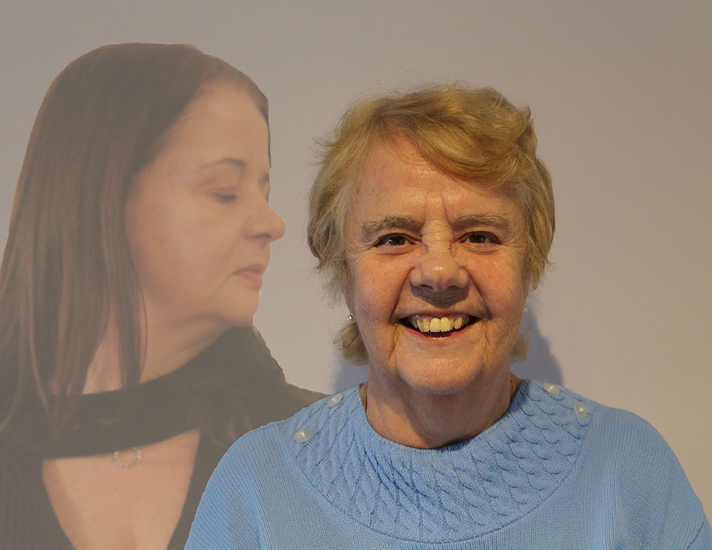
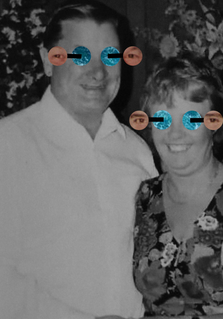
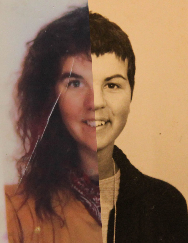
I’m also glad I chose Bill Brandt as my artist to base my initial edits on. I think that my images worked well with his style, especially with my abstract images. For example below, I think that the high contrast, black and white style really suits this image, and adds definition and emphasis to all features of the subject.

My work

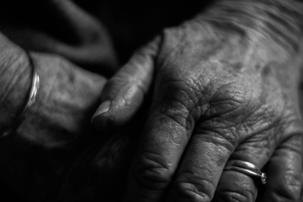
I think that my work does look similar to Bill’s work, but I think that in future, I could shoot in black and white or even use a film camera to achieve a more authentic looking effect. Overall though, I am pleased with my images compared to his – I think that my images, especially my abstract ones as above, carry the idea of concealed identity which he used in his images.

Bill Brandt’s work

Experiments

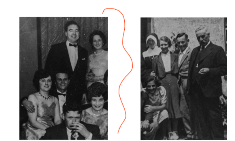
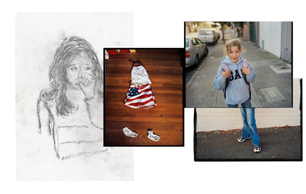
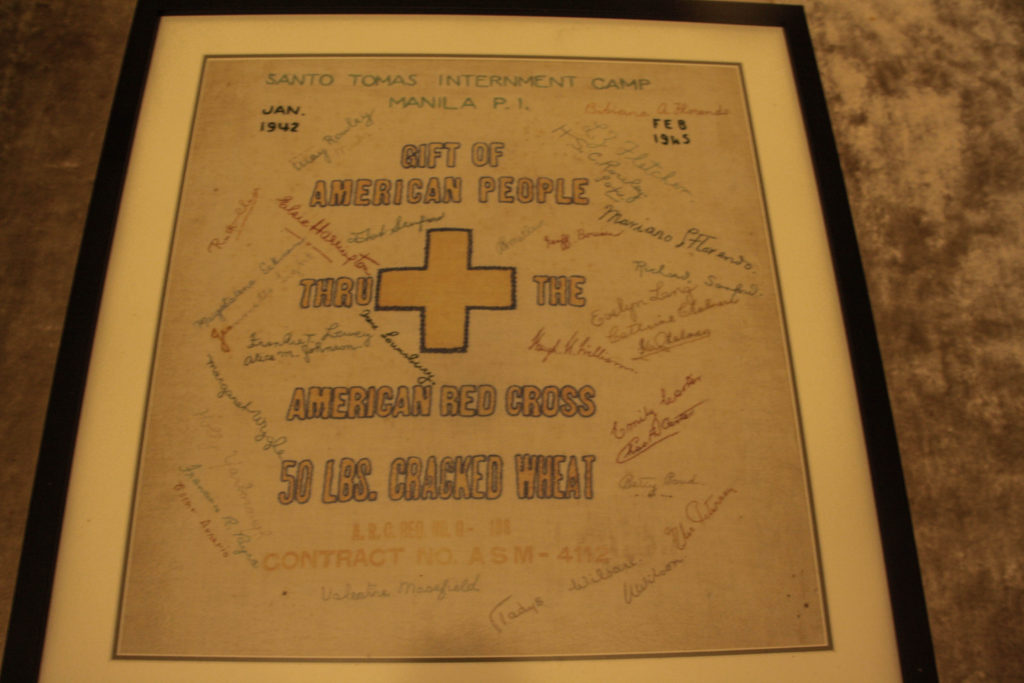
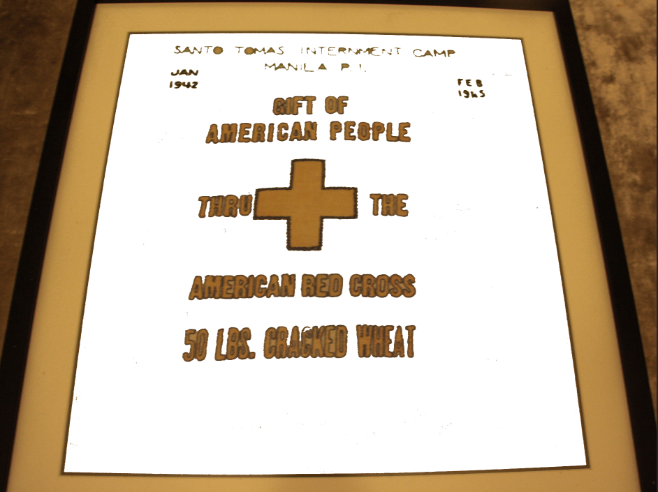
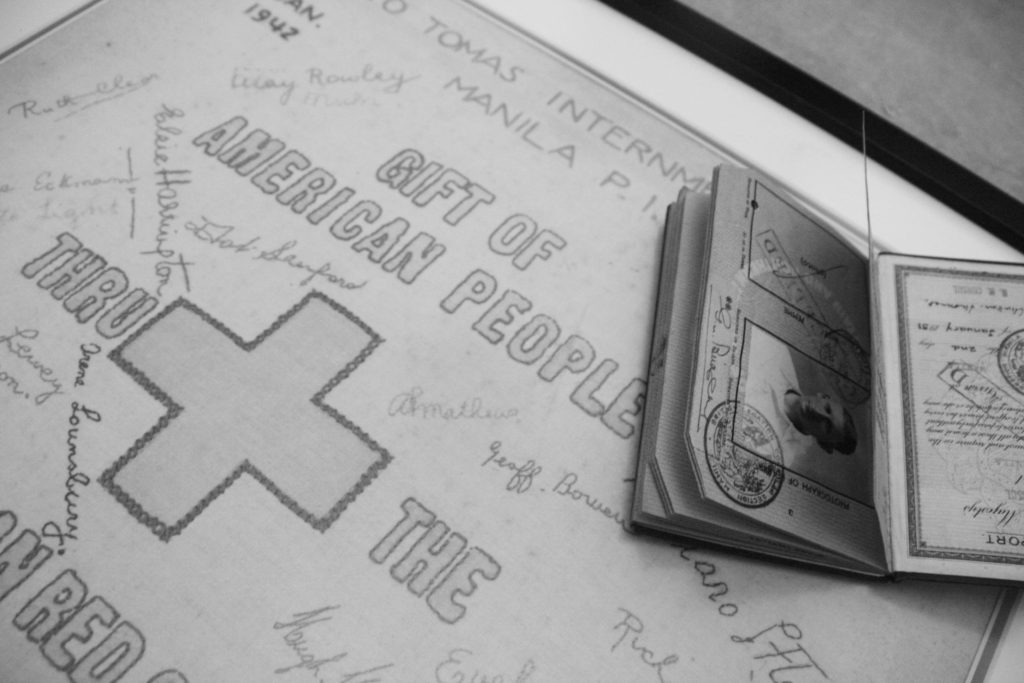
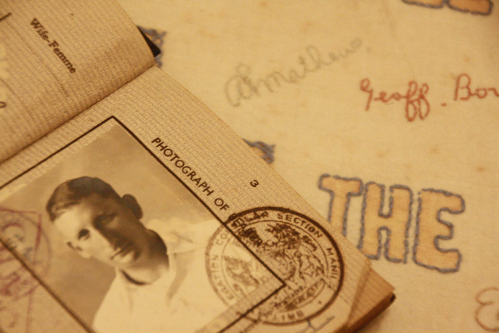
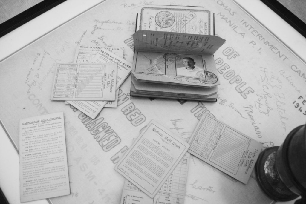
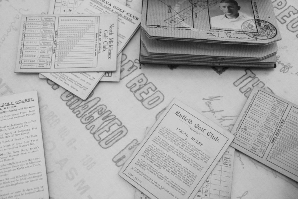
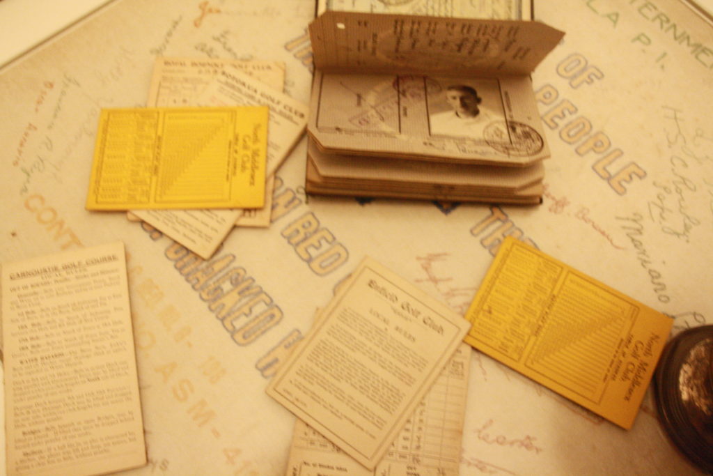
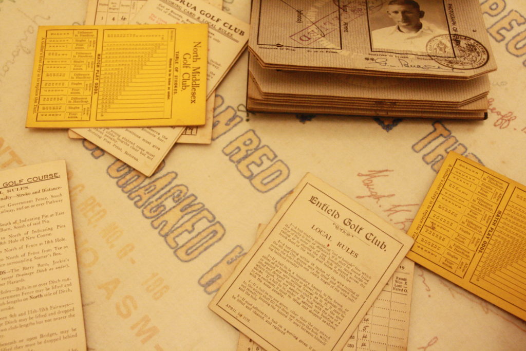
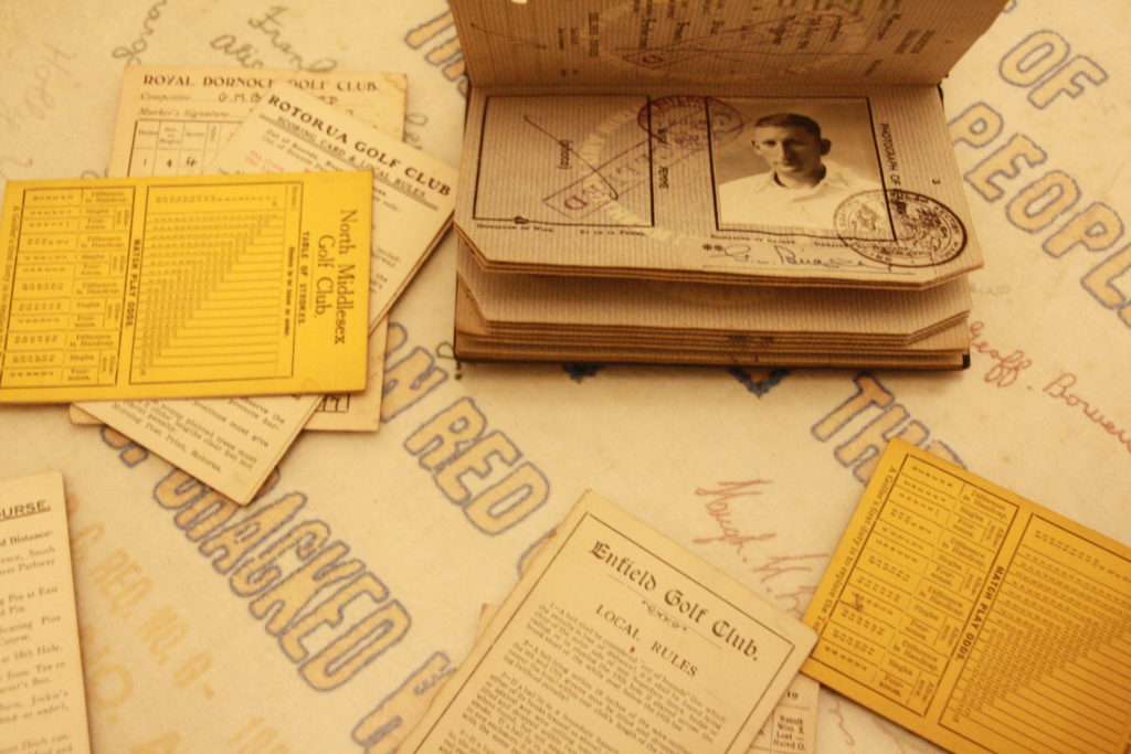
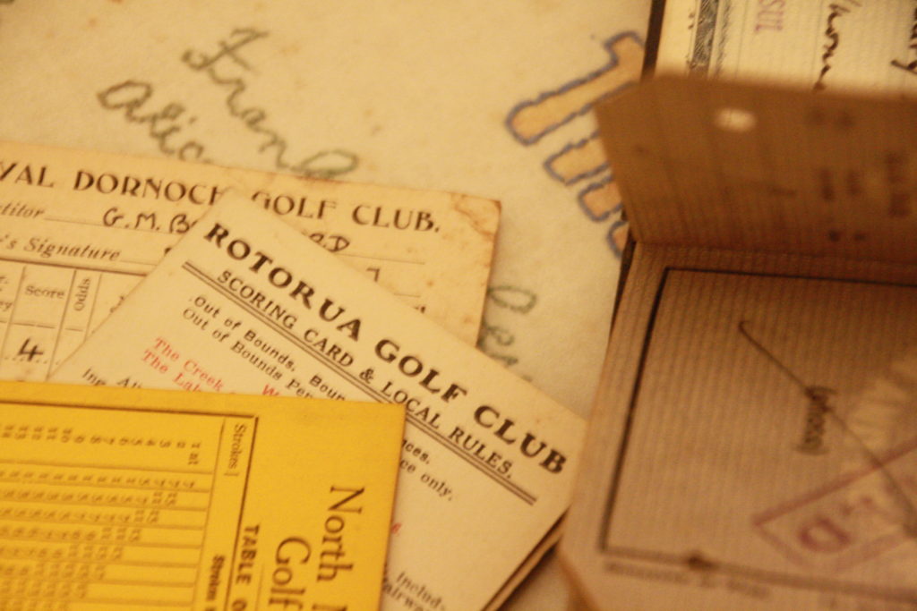
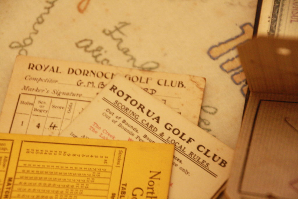
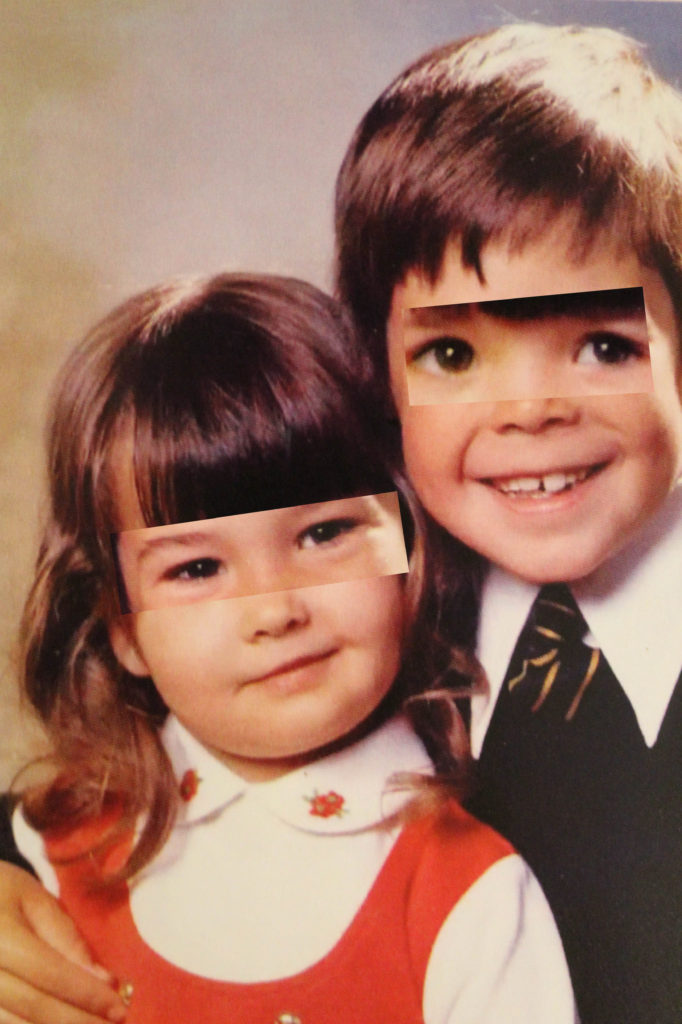
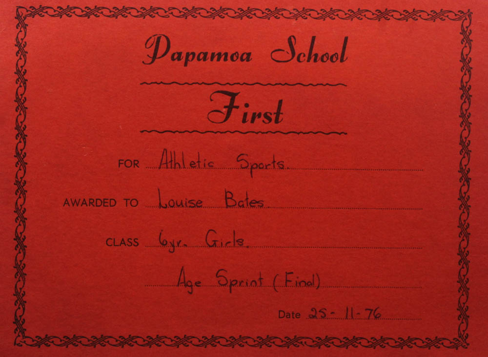
Overall, my experiments in general I was quite happy with. I think that after looking at all of my photos from different photoshoots, I think my abstract images worked the best in my favourite style of experimenting, collages. Therefore, if I was to do this project again, I would make sure to take some more abstract images. Also, I found images like the certificate from my mum’s school and the image of her bedroom really useful for backgrounds of my collages.

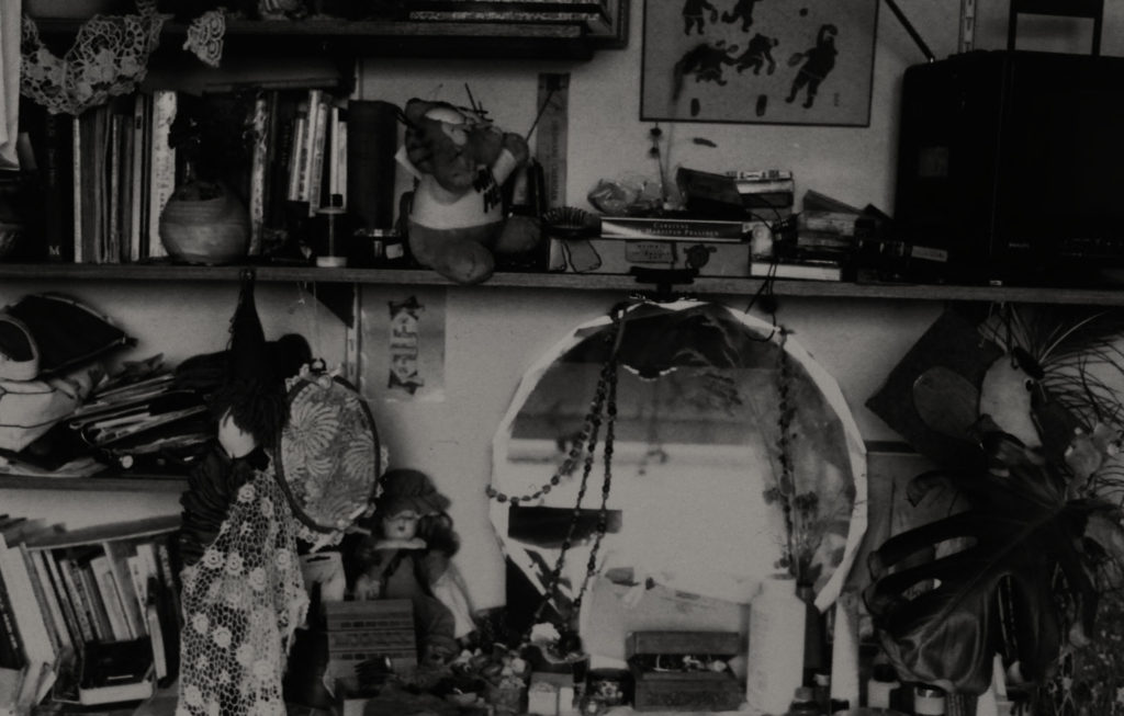
If I was to redo this project I would definitely collect more of these to photograph as I liked what they added to my collages.

Editing issues

Originally, I had chosen to edit my images in the style of Bill Brandt and also Luigi Ghirri. I had chosen to edit like Luigi Ghirri because of the faded, vintage nature of his style, and how this would match my archival images well. However, when attempting to edit my new pictures in his style, I found it incredibly difficult. I found it hard to recreate the faded, soft nature of his style, on fresh, modern images. – I then had to make the decision to only edit in the style of Bill Brandt as I mentioned above. I still love Luigi Ghirri’s work, and still want to incorporate it into my future work, so I should maybe try using a film or disposable camera in future, or using his editing on landscape images instead.

Final Outcomes

In this photo, I was inspired by Carolle Benitah and her work with her old family photos as well as her use of different materials. In photoshop I used the brush tool to get the effect of an actual paintbrush over the eyes of my dad. I also used the same tool to cover the three men that stood behind him as I thought that the final image would be too plain if I hadn’t. This photo was taken while my parents were on holiday in their 20s so you can see the age of the photo especially after I retook them with the copy stand. I like that you can see the age behind the photo because it adds character to the final piece. As the lighting wasn’t the best in the original image I increased the exposure slightly which has given it a more washed outlook which I really like and it compliments the background and the colour on the clothes that my dad is wearing. I like the red which was used because it’s very bright and bold which sits nicely against the background but is still eye-catching, I also like how it’s not a big circle covering the but its silhouette. The streak over my dad’s eyes I tried to make it look like a paintbrush so I used the mixer brush so that it would blend with some of the colours with the actual photo which you can’t really see in the middle of it but at the ends, it slowly mixes with the colours from the background.

This photo is also inspired by Carolle Benitah Instead of filling in the body I outlined it to make it seem like it’s sitting in the background. This is another holiday photo of my mum in her 20s in a similar place as the other Carolle Benitah inspired photo. I like how you can see the ‘paint’ streak more clearly over her eyes and that you can really see the blending of the darker background in with the bright red. I’m happy that I didn’t outline my mum’s face as well as her body because I feel it would have been harder and looked wrong with the way her hair is blowing in the wind, I also allow for the red line to be the centre of attention on her face without crossing or competing with anything else. The original photo was also quite dark, to begin with, so I increased the exposure to make it light while doing that it made the reflection of the sun off the hair loom more golden which frames both her face and makes her skin look more tanned. I also really like how the golden features and the red go together and compliment each other nicely. Lastly, I like the way the foreground (my mum and the rock she is sitting on) is a lot lighter and contrast with the darker background making the foreground pop even more.

This photo is inspired by Yoshikatsu Fuji, I looked at one of Fuji’s photos from his ‘Red String’ book where he had his parent’s wedding photo (coloured) and layered it over another photo of his mother down at the beach (black and white. I adapted that idea and decided to outline the different coloured triangles with red to represent the connection between my photos. they also help to see the actual colour difference as the original picture is less pigmented especially around the bedsheets and certain spots on the wall. By moving some of the triangles slightly it gives the look of the photo being pulled apart and put back together. This photo is of my dad just after he had moved to Jersey which was over 30 years ago, this is also one of the photos that my dad had sent back to my grandparents. I like how the photo has a slight yellow tint which shows its age and how it looks slightly washed out which makes the greys stand out more especially in bold and more pigmented colours, for example on the jeans and on my dad’s face.

For this photo, I took inspiration from my edit above by taking different parts of the photo and turning them black and white as well as slightly moving then giving the effect of the photo coming apart revelling and colour photo underneath. In the edit, I decided not to outline the triangles with the red as I felt like the photo didn’t need it and the different red from the lines and the red on the top might clash. This photo is of my mum while she was on holiday when she was in her 20s, I like how the hill in the background is slightly blurry compared to my mum who is in focus. I think it makes her stand out against the hill making her the main viewing of the photo. The black and white triangles fit nicely next to the more saturated colour of the older photo.

As I need to use some of my own photos I decided to do a sequence of my dad which I took while I was back in Ireland, I tried to put the three images in the order of ‘smoking’. I like how there are different factors in each picture that aren’t in the following photo, for example, my brother’s face in the background of the first image, the smoke in the second photo. These make the photos interesting and show more dept into what was happening around when the photos were being taken, but in each background is plain black which hides everything so viewers have to use their imagination.

Photo Gallery

Experimentation

I was inspired by Yoshikatsu Fuji’s ‘Red string’ book as all the photos and different elements of the final piece is connected by the red string. Most of the photos are stitched into the book and while reading you following the red string to the different parts of Fuji and his parents lives before their divorce.

My Work

I have put together three photos of my dad, all taken of the right side of his face and in black and white. I have been testing out different positions and sequences of the photos to see what will look best with this group of photos. I have tried to make sure that the photos will be able to be connect by red ‘string’ which I will do on photoshop.

I have added red ‘string’ to the sequence so that I can see how it will look with the different positions of the photos. Once the images are printed out I will replace the red lines from photoshop with actual red string so when you look at the final piece the red will pop out as it will be sitting on top of the frame which will connect all of my final images.

In the first edit I like how the images are going down in size order and how it seems that the red ‘string’ will fall through the photos and not going over them so it covers parts of the images. For the second edit I like how the middle image isn’t centred exactly in the middle of the two images above and below it, I also like how there is more of a thought out order to the placement of the photos as it represents the actual motions of what my dad is doing. In edit 3 I have chosen to place the photos horizontally instead of vertically like the other two, what I like about this edit is that photos look like that they are all hanging from the string as if it had actually been hung up, even through the photos could have bigger spacer in between them which would make it looked less squished together I like how they all look next to each other and the sequence of the photos. Edit three photos are in the same order that edit two are and that I shows the motions and are not just in a random order.

final outcomes, evaluation and critique

Below I have displayed my final outcomes, the process of how they were created and why I have chosen them based on how successful they are. In addition, I have outlined the ideas behind each piece of work and their individual strengths and weaknesses.

  1. I have selected this image to be part of my final collection as it tells a story of both sides of my family being kept apart, as my mums and side were never close or one family unit. This piece tells a message about how distance between a family can affect future generations such as myself and my brother. To create this work I placed the images in photoshop, selected the half of the images which would be used in the piece, then used the pencil tool along with the red colour to draw the red wavy string down the middle. I like how the red string is the most prominent part of the image, as the red really stands out from the black in the images. In addition, it’s interesting how these images could be linked, yet I have set them quite far apart to convey the idea of a family separation.

2. Below I have created my second final piece. composed of my grandparents wedding image. To actually create this piece I placed the image into Photoshop, then changed the colour of the background to a more yellow/ beige tone, this was in an attempt to recreate my artists work when he created his ‘Red String’ project, and the red line that is creating a boarder around the image, making it look like the red string around a homemade book. I think this image is only partly successful as although, of course, the red string is digital, it looks too fake and should be made more realistic. However, I think that the legibility of my grandparents wedding photograph makes the image more valuable, as the history of the image incorporated with a new idea of the Red String work makes for modernising an old piece.

3. Below I have created this final piece which is also linked to Fujii’s work, I have used a wedding picture of my great grandparents on my dads side (left) and a wedding photo of my grandparents of my mums side (right). I have decided to use these two images together instead of separately as it explores the theme of how the separation in a family has effected the lives of the current generations such as me and my brother. I think that this piece is successful as the idea and the actual images contradict each other, and its also obvious that these images are taken within decades of each other.

4. For this final piece I have taken old family images of my grandmother (left) and my mum (right) and I have placed them together in photoshop. The aim and idea of this piece was to create something that would show the difference between the ways in which the women which affect my life most today were brought up, and by putting them together I am creating a piece that will illustrate that family ideas can be combine together to effect later generations. Furthermore, even the photos themselves contradict each other as they have completely different tones, with the left being a warm tone and an older image, and the left of my mum being a cooler tone and more recent image. The strengths of this piece is that the quality of the original images is good and even the people features have the same facial features, one weakness is that this final piece is a bit simple.

Final Comparisons and evaluations

Henry Hargreaves

Comparison –

I think that my work reflects Henry Hargreaves influence well within my photos, this is because they both use the hand of another person who is going through a book that has a message which it wants to show to their audience. It also uses the brighter colours and bold works in my book too, which Hargreaves work has but not as intense as his photograph of the book doesn’t have as much writing. I prefer having more writing as it creates a story from the book about feminism which I used and people will want to read it as the title of the chapter is bold and eye-catching.

Evaluation –

I am happy with my final pictures and how they turned out in the style of Henry Hargreaves because I enjoyed working in his style of photography, because it let me experiment and learn how to use the idea of identity in an interesting way where you don’t need to have a persons face, or a full body picture of them as you can use a part of the body instead, like a hand because they are able to signify who someone may be just by looking at them and then with the influence of the book that they are reading it can reveal a lot to you about a person which you may not have known, which was how to influence others yet also keep it light-hearted and not emotionally deep which can happen.

Claude Cahun

Comparison –

I think that my work shares some similarities to Claude Cahun’s work because I have changed the photos into black and white, similar to their style as I like how it adds a dramatic effect to the picture as it makes the picture feel as if it is creating an emotional and meaningful message in what they are trying to highlight to their audience. I also like how in my work I use objects such as books, places, surroundings, etc to show who I am as a person whereas Cahun uses their self instead because I think that it reveals much more about a person instead because you are able to find out their opinions/views/perceptions/etc of what they do in their everyday lives.

Evaluation –

Throughout this project, I have taken into consideration of how Claude Cahun uses photography in their own style throughout their work which I can then put into my own, in a personal way. I think that this has been successfully conveyed as you are able to see a connection between our photos as they both create authentic and genuine messages in different yet similar ways how we want to be perceived as a person.

identity project – inspiration analysis

JIM GOLDBERG IMAGE ANALYSIS #1

This is a photo taken from Goldberg’s collection Raised By Wolves, a series of images of teenagers on the streets of California. He documented their emotions and battle with taboo subjects such as addiction or abuse – the series focused particularly on two young runaways, Tweeky Dave and Echo, who met each other and were interviewed by Goldberg on multiple occasions. I took inspiration from Goldberg from the bold way he presented identity and showed the reality of what life is like through the eyes of people – particuarly youths dealing with trauma.

The image is taken in black and white, with a stark black square around the subjects arm, highlighting what seems to be a bruise or scar. It immediately directs the viewers eye to the injury without noticing anything else. The models emotion seems to be that of discomfort judging by the look on her face as she is not making eye contact and instead staring off into the distance. The photo appears to be taken in natural lighting, perhaps outside in the middle of the day. The holes and dents in the walls gives a wider idea of the setting and the meaning behind the image.

JIM GOLDBERG IMAGE ANALYSIS #2

These photos are from the collection Ruby Every Fall – this series captures growing up through the eyes of parents and the individuals identity through the years. What caught my eye about this series was the different layouts – some big some small some with multiple photos.

This group of photos presents identity through different aspects – the drawing of the girl highlights childhood emotion through the distressed look on her face versus the photo of her walking to school looking happy shows contrast between the photo and how they are laid out.

BOB GRUEN IMAGE ANALYSIS

As mentioned in previous posts, Gruen is famous for photographing multiple celebrities, predominantly throughout the 70’s and 80’s e.g Led Zeppelin and John Lennon. The reason I was drawn to his work was mostly for his photos of musicians from the rock scene as my whole theme is centered around music, but also the way he takes the photos, like the one above.

The image above is of Tina Turner, taken at a concert in 1970. Although this is one image, it was taken with a slow shutter speed throughout one second, so Gruen managed to capture Turner moving in a way that when an image is taken, it presents as a multiple exposure. The photo itself is in black and white, illuminated by the stage lights in the back.

Image Editing/ manipulation / experimentation

I experimented with this background making photomontages in the style of Raoul Hausmann.

I started by removing the background and then adding images onto it.

These were a mix of images I took or found off the internet. I focused on Philippine newspapers from the time.

I also used it as a background for some of the photos I took and edited

I used my grandads old belongings for this, like his golf scores and passport.

identity photographers

Donovan Wylie-

Donovan Wylie is an Irish photographer from Northern Ireland, based in Belfast. His work chronicles what he calls “the concept of vision as power in the architecture of contemporary conflict”

Donovan Wylie | The Maze/Long Kesh Prison: Inertia Stage 12 | The  Metropolitan Museum of Art

Tish Murtha-

Patricia Anne “Tish” Murtha was a British social documentary photographer best known for documenting marginalised communities, social realism and working class life in Newcastle upon Tyne

Snapshot: 'Tish Murtha: Works 1976-1991' | Financial Times

Mike Brodie-

Mike Brodie, also known as the “Polaroid Kid” or “Polaroid Kidd”, is an American photographer. From 2004 to 2008, Brodie freight hopped across the US, photographing people he encountered, largely train-hoppers, vagabonds, squatters and hobos.

Mike Brodie: A Period of Juvenile Prosperity, Deluxe Limited Edition Metal  Box Set with Type-C Print Mounted on Aluminum | Mike BRODIE, Jack, WOODY,  Paul, SCHIEK | 1st Edition

Gregory Crewdson-

Gregory Crewdson was born in Brooklyn in 1962. Crewdson is recognized for his elaborately staged scenes of small town American life. His photographs have dramatic and cinematic qualities, and he often has an extensive support crew on site for proper staging and lighting.

Gregory Crewdson | Gagosian

Theo Gosselin-

AWAKE MY SOUL | theo-gosselin.tumblr.com/ theo-gosselin.blog… | Flickr

Mock exam 2022 – 24/02/2022

This is by blog post for my photography mock exam. For this mock my focus was to explore my identity through my families heritage on Jersey. I explored information into my ancestors back to my great grandparents on my mums side who were farmers before during and after the German occupation.


These are my best images from my Photoshoots


Now that I have finished selecting and developing my images I am going to import them into Adobe Photoshop where I am going to experiment using Kensuke Koike’s style with my own images. Kensuke Koike is one of the photographers I selected for inspiration in this project as I really like his method of taking two people and combining them together. i feel that this links in with my theme as two people coming together and combining their lives is how families are built.


Method 1

Firstly, I ensured my models face was central in the image. this was vital to ensure that the editing would be symmetrical.

Next I made the image black and white to fin in with Kensuke Koike’s style

This is where I began transforming the image. I used the elliptical marquee tool to create a circle 200pxls smaller each time starting at 2100pxls. I rotated each circle 20 degrees clockwise each time.

My image next to Kensuke Koike’s


Method 2

To create this image in the style of Kensuke Koike I first made the image black and white in order to properly capture the style. i then duplicated the background and imported an image of a night sky and placed it behind my background copy. I used the elliptical marquee tool to move the faces of my models revealing the background image.


I intend to experiment using printed images and a scalpel as this is how Kensuke Koike creates his images.


These pictures are some I created using the old fission method of prints and cutting them using a Stanley knife to cut and paste my images in different arrangements. This is how Kensuke Koike creates his images. I re-digitalised these images. I imported them into Lightroom in order to crop them and edit the tones to give a more old fashioned look.


I have done some editing in the style of Claude Cahun’s multi-exposure shots.


These are the images I took inspiration from when creating my multi exposure shots.


Comparison to reference artist


I took inspiration from Kensuke Koike’s photographs in order to create images of a similar style. The image on the right is one of Kensuke Koike’s photographs and the image on the left is an image I created using the same style as inspired by Kensuke Koike. I think I managed to create an image that highly resembles Kensuke Koike’s work. However to improve my work next time u would ensure that my image has a focal point as Koike’s does. I believe that although I am happy with my work it would improve my final outcome.


Evaluation

This is my final evaluation of my photography mock exam 2022

Overall, I believe that this mock exam has gone well. I have worked hard to complete all the tasks required and completed each one to the best of my ability in the time provided. However my work does have room for improvement in some areas.

What Went Well ?

Firstly, the photographs I took for this project linked in well to my theme and worked well with the style of Kensuke Koike and Claude Cahun. I was greatly inspired by Claude Cahun and the time she worked which is the reason I decided to link my work to history. Additionally during my development and editing process I feel I captured the style of my reference artists and matched their intent the have in their work in mine. I think that my edits using the old fashioned method was a success even though the quality was not to the highest standard I feel that the idea worked out and that the physical copies in addition to the digital copies gives some variety to my project. In addition to evaluating Kensuke Koike I also evaluated Claude Cahun of which i think relates closely to my project. My edits in the style of Claude Cahun i feel went well however I felt more inspired by Koike’s work as i get the impression of combination and mixing people and lives which is largely what my project was based on.

What could be improved ?

My pictures could have been of a higher quality however due to the images being of old photographs and the original quality being low it would be impassive to make them HD. I also feel as though I could have taken more photos in order to give my images more variety. i feel as though my images that i manipulated using the old fashioned method could have been neater and reassembled better. I feel like even though my edits in the style of Claude Cahun went well i could have created more edits in her style.


My Final Images

My best Images


This image has an empty alt attribute; its file name is image-854-1024x492.png
This image has an empty alt attribute; its file name is image-898-1024x633.png
This image has an empty alt attribute; its file name is 11125933-Empty-gallery-space-lit-with-spotlights-on-a-suspended-ceiling-and-wood-flooring-Photographers-Gallery-London.jpg
This image has an empty alt attribute; its file name is image-907-1024x415.png