juxtaposition

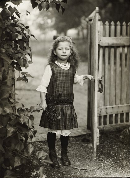
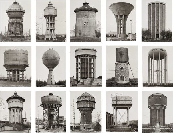
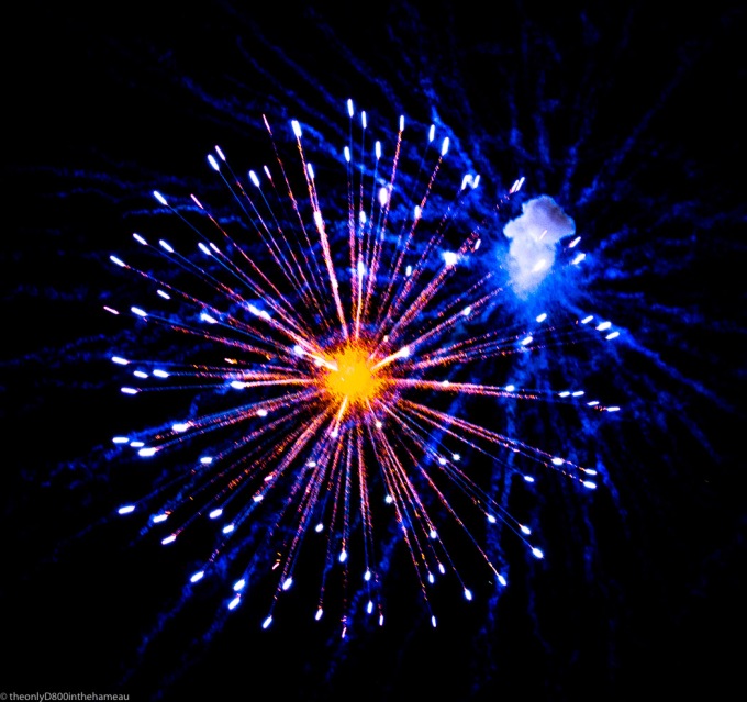
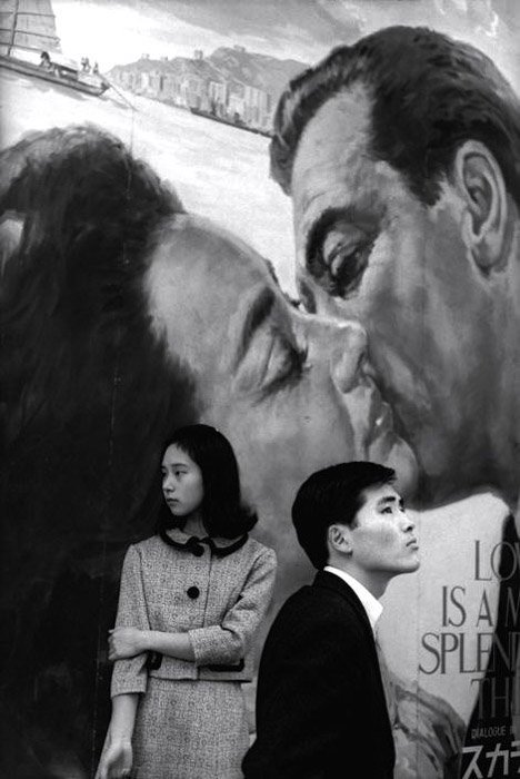
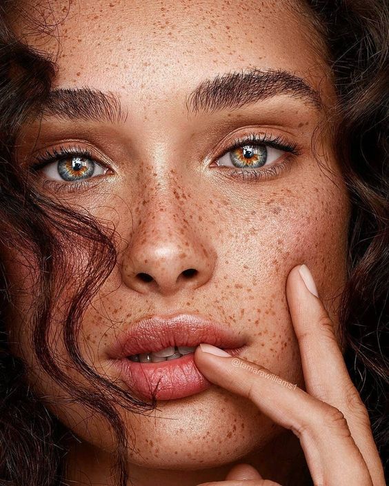
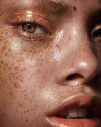
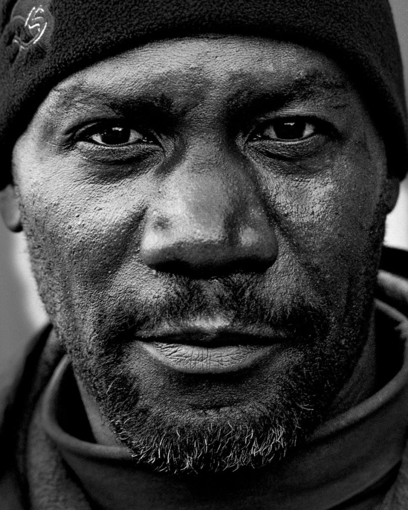
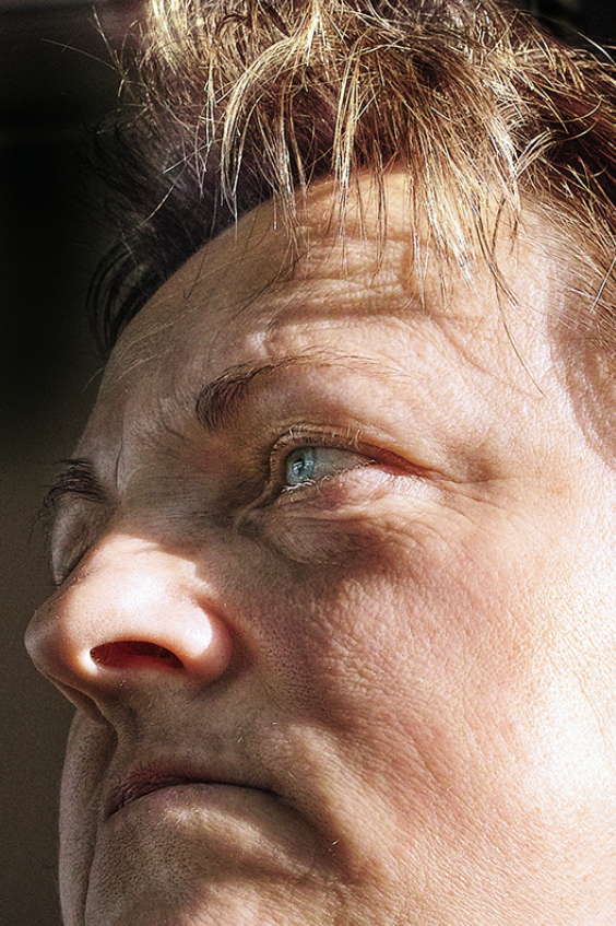
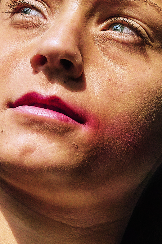
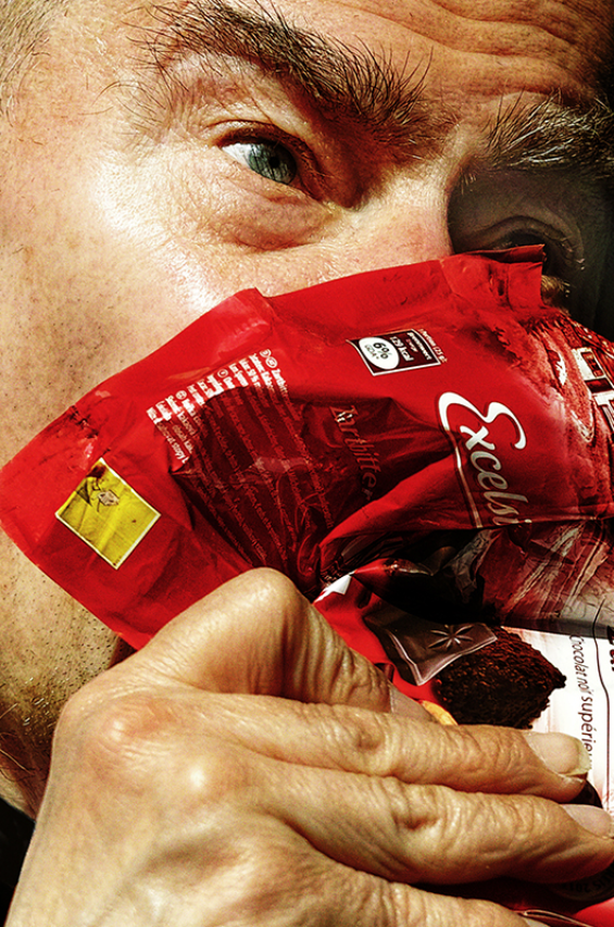
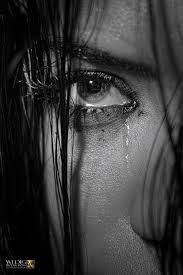
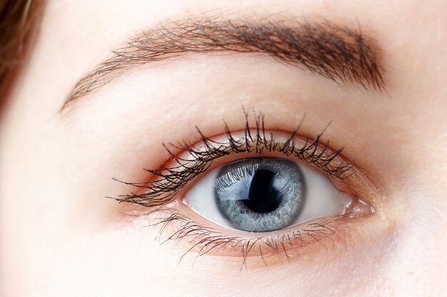
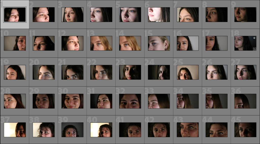
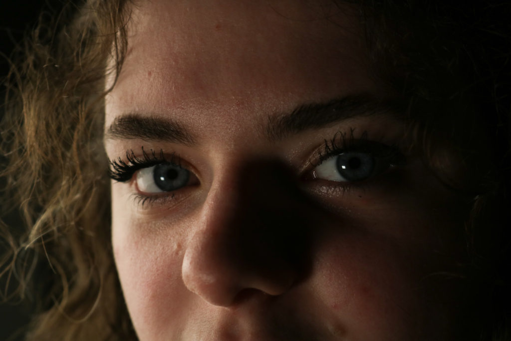
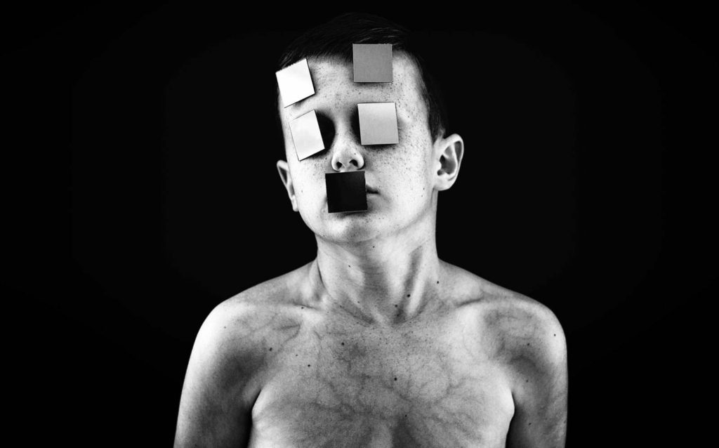
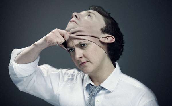
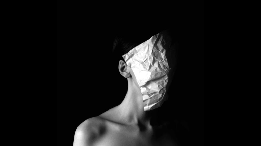
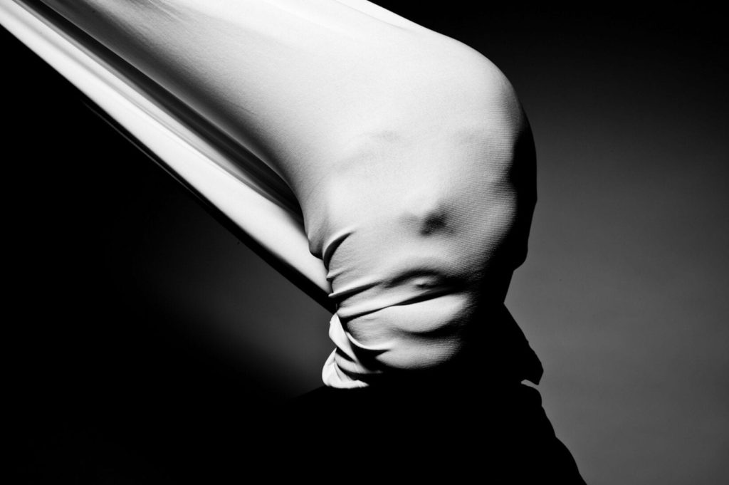
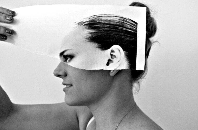
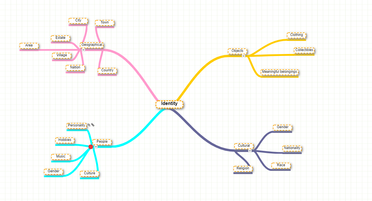
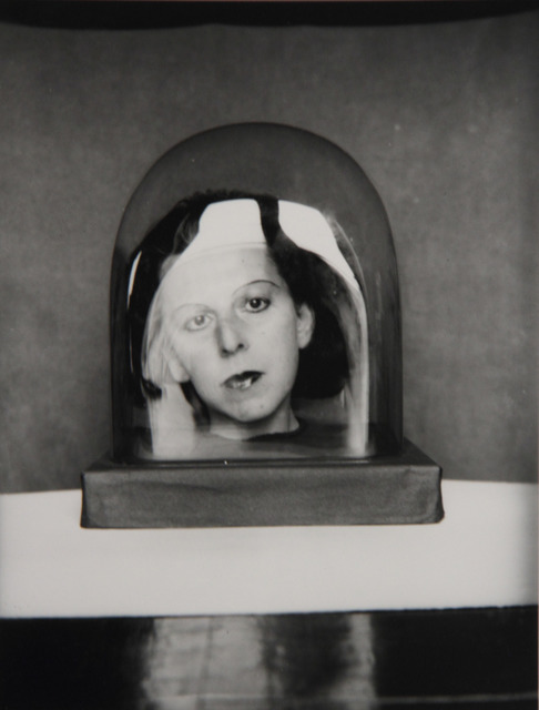
Introduction and Mood Board

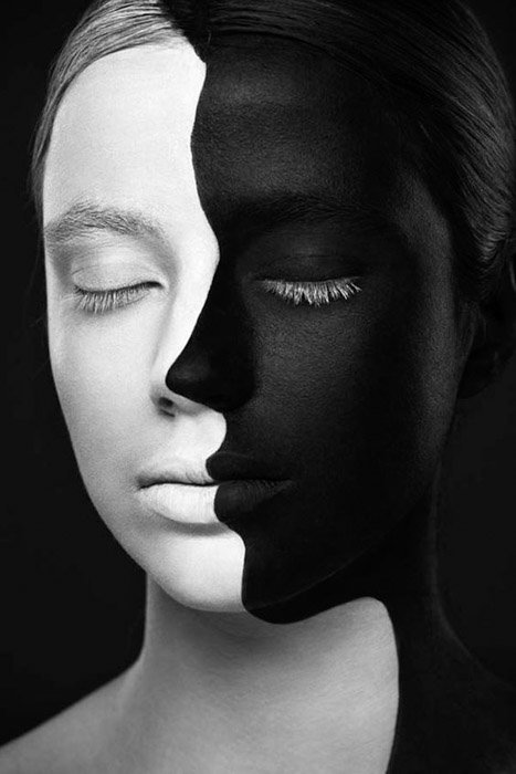
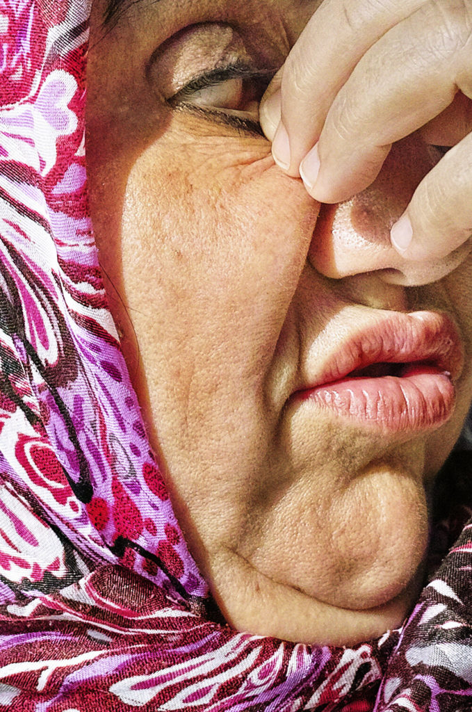
In art, as in literature, juxtaposition refers to the side-by-side placement of two or more contrasting things. As with colour, shape, and cropping, juxtaposition can become a key component of photographic compositions, helping to tell a story and emphasise differences or similarities between objects or people.

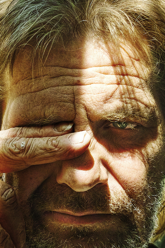
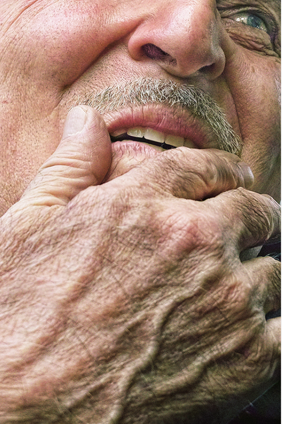
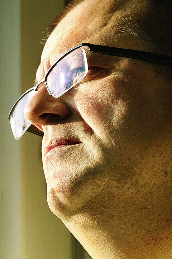
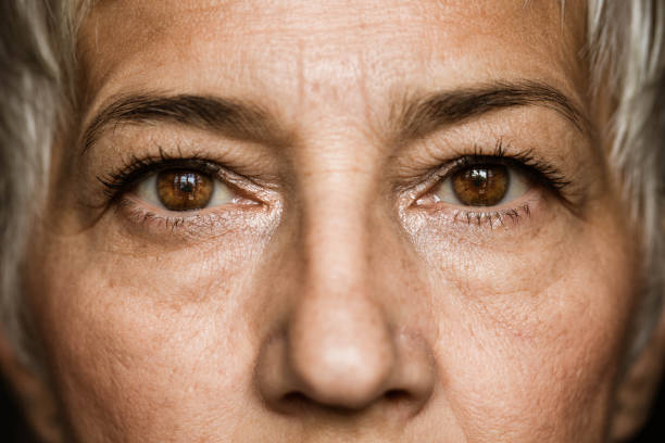
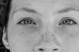
I have created this mood as an inspiration for how I will create/ take some of my juxtaposing images, the main idea of the layout of this mood board as to create a blend between photographs of objects and the ones of objects and landscapes. What I like about these images impartially is the wide use of portraits as they have been contrasted with other individuals or for example their younger self or landscapes such as mountains.

Why do writers use juxtaposition? When a writer juxtaposes two elements, they invite the reader to compare, contrast, and consider the relationship between those elements more closely. Also, Writers create juxtaposition by placing two entities side by side to create dramatic or ironic contrast. Juxtaposition is a form of implied comparison in that there is no overt comparison or inference on the part of the writer.

Beyond that, juxtaposition is a theme that spans genres, from street photography to landscapes. Below, we’ll take a look at some exciting and unexpected examples of juxtaposition within the 500px community. Any photo that uses proximity to make a subject appear larger or smaller than it is, is an example of forced perspective. It works particularly well in street photography, where your position can make a person look tiny—and a dog or a cat appear huge in comparison.
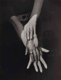
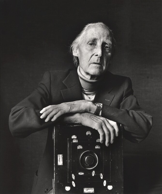
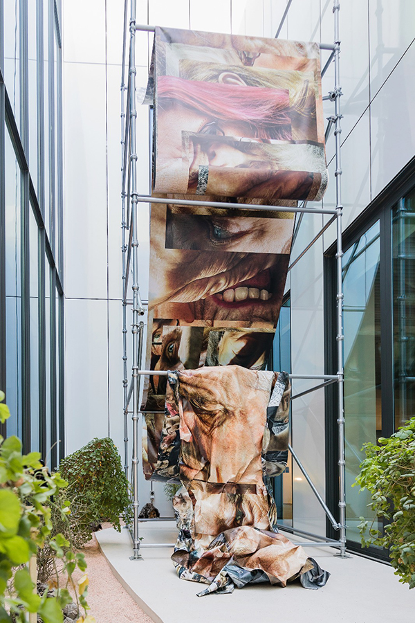
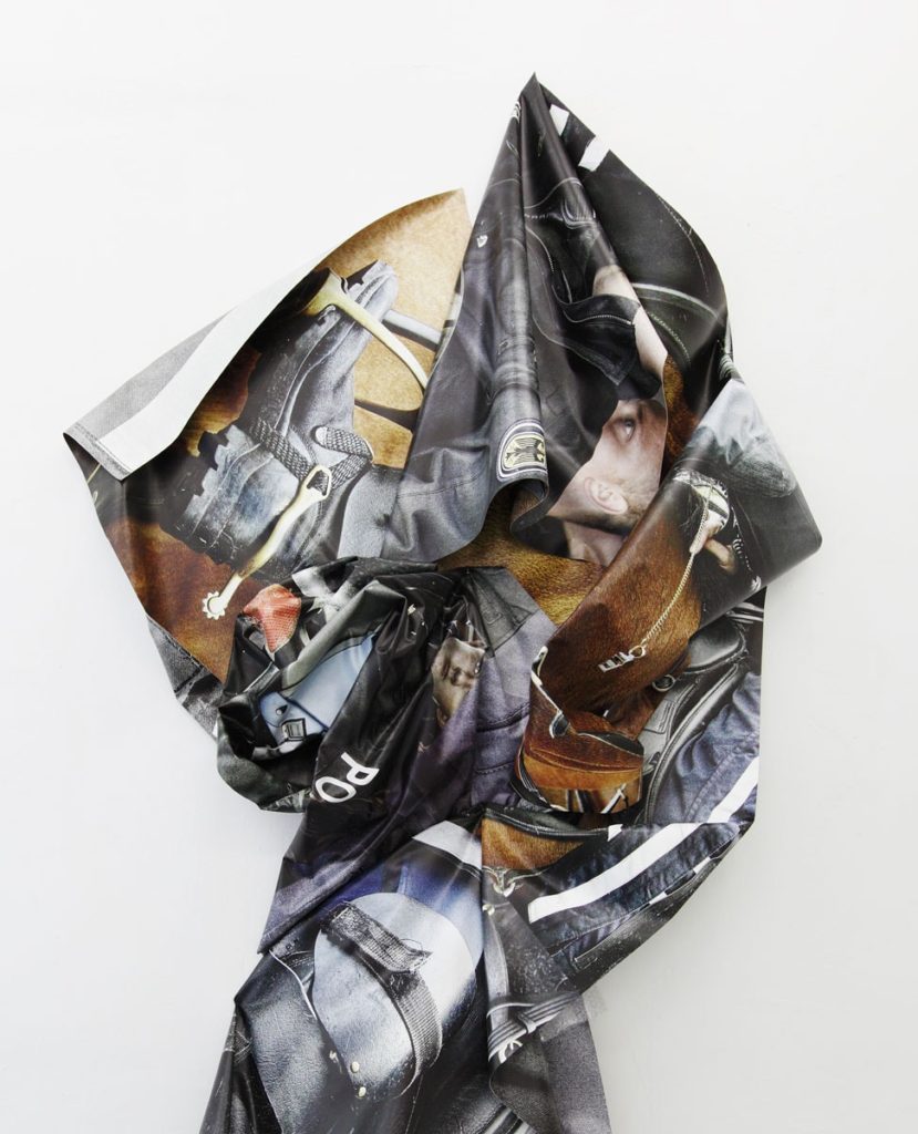
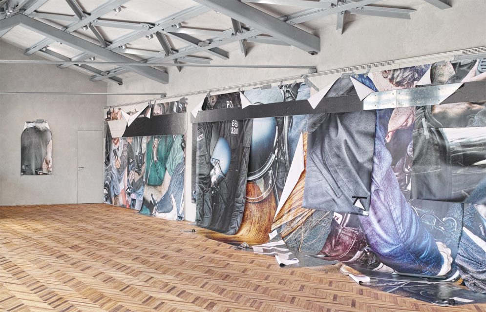
Robert Rauschenberg

Robert Rauschenberg was an American painter and graphic artist whose early works anticipated the pop art movement. Rauschenberg is well known for his Combines (1954–1964), a group of artworks which incorporated everyday objects as art materials and which blurred the distinctions between painting and sculpture. Rauschenberg was both a painter and a sculptor, but he also worked with print and paper making.

Rauschenberg received numerous awards during his nearly 60-year artistic career. Among the most prominent were the International Grand Prize in Painting at the 32nd Venice Biennale in 1964 and the National Medal of Arts in 1993. Rauschenberg lived and worked in New York City and on Captiva Island, Florida, until his death on May 12, 2008.

Rauschenberg merged the realms of kitsch and fine art, employing both traditional media and found objects within his “combines” by inserting appropriated photographs and urban detritus amidst standard wall paintings. Rauschenberg believed that painting related to “both art and life”.

Rauschenberg had experimented with technology in his artworks since the making of his early Combines in the mid-1950s, where he sometimes used working radios, clocks, and electric fans as sculptural materials. He later explored his interest in technology while working with Bell Laboratories research scientist Billy Klüver. Together they realised some of Rauschenberg’s most ambitious technology-based experiments, such as Soundings (1968), a light installation which responded to ambient sound.

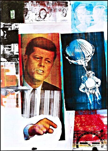
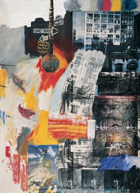
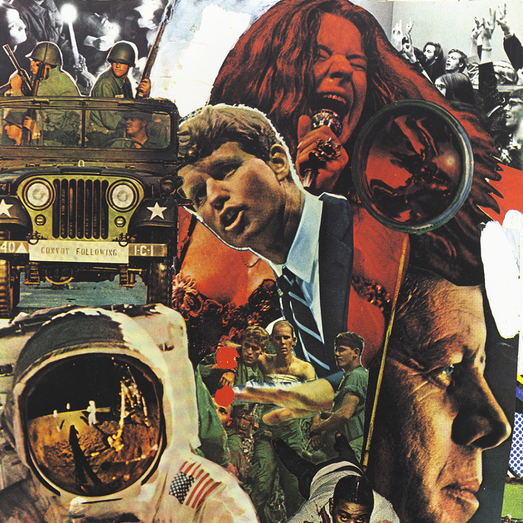
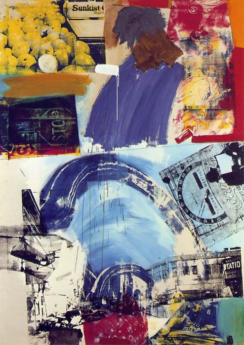
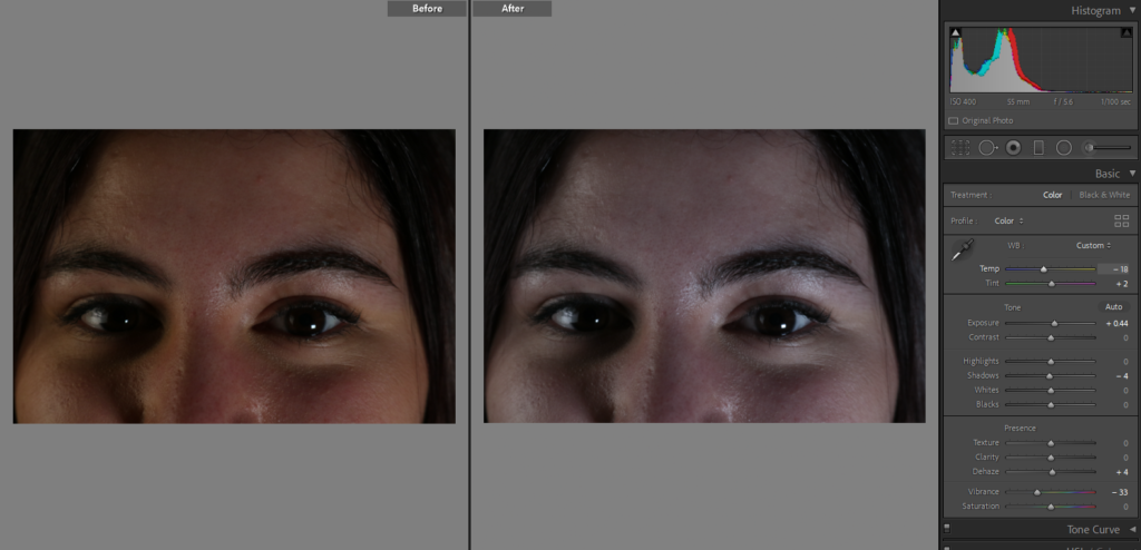
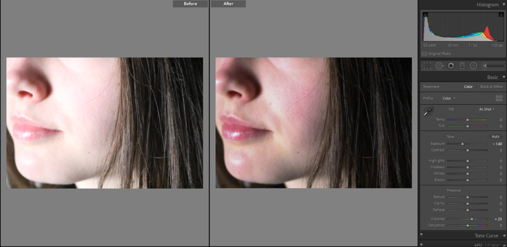
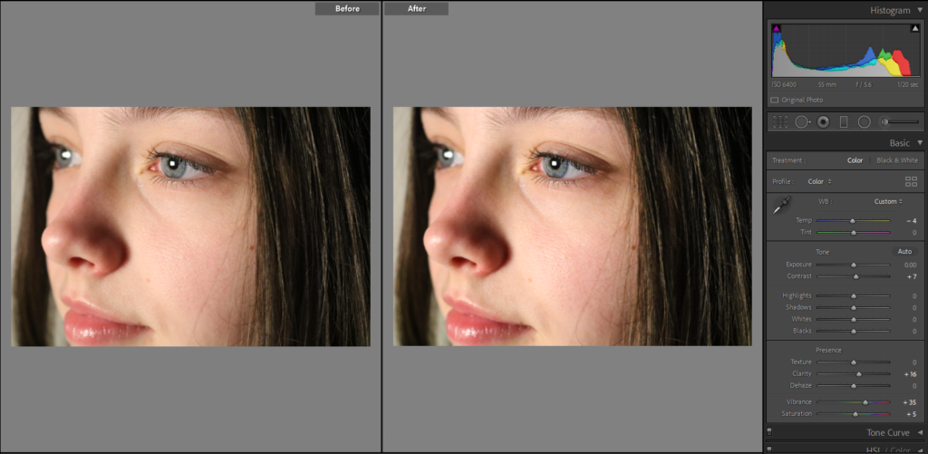
Why I would like to use his work to influence my ideas: I like how these pieces of art allow for a lot of creative freedom, as they could be seen as random and sporadic. Thinking my work could benefit from this inspiration, I am going to recreate these types of pieces with my monochromatic portraits, combining multiple different peoples faces together to create final pieces. I do like how Rauschenberg’s work is full of colour and therefore life, but I will not copy his work, just apply his techniques to my editing to attempt to made combinations of portraits.

Artist Contribution: In 1969, NASA invited Rauschenberg to witness the launch of Apollo 11. In response to this landmark event, Rauschenberg created his Stoned Moon Series of lithographs. This involved combining diagrams and other images from NASA’s archives with his own drawings and handwritten text. Also, International travel became a central part of Rauschenberg’s artistic process after 1975. In 1984, Rauschenberg announced the start of his Rauschenberg Overseas Culture Interchange (ROCI) at the United Nations. Almost entirely funded by the artist, the ROCI project consisted of a seven-year tour to ten countries around the world.
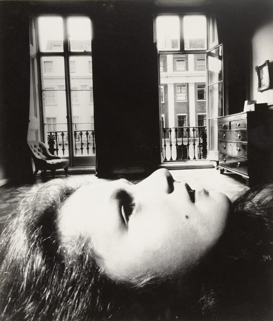
Other Ideas

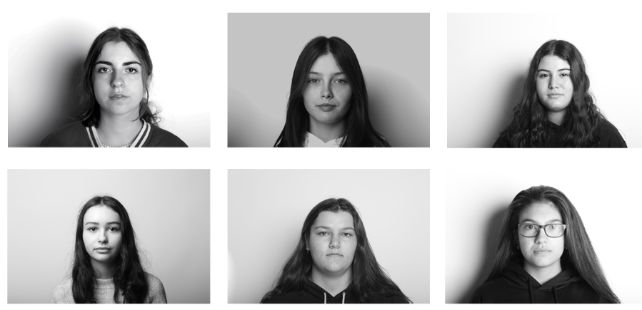
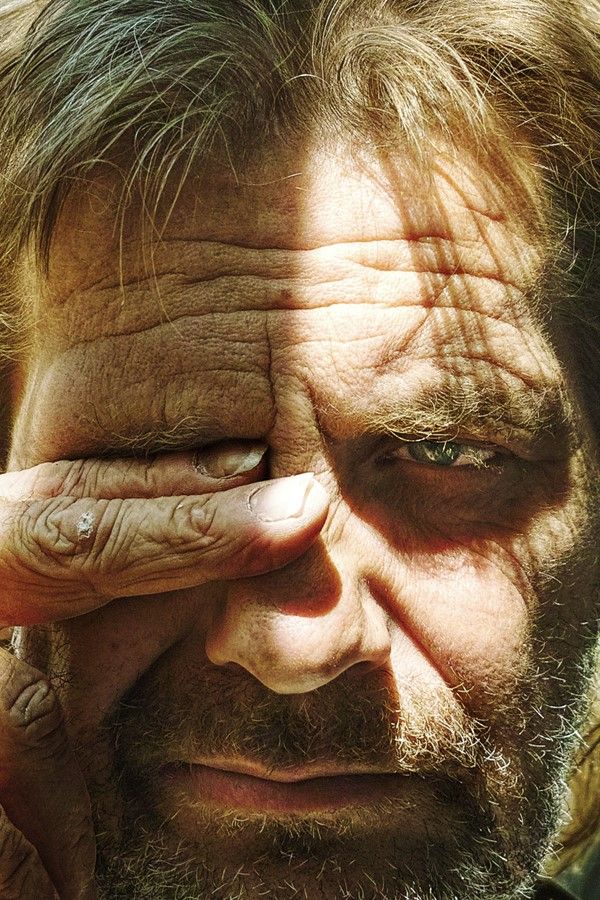
Here I have no use any inspiration from any artists to create photo montages, but have just combined some of my favourite images, mostly to just experiment and to learn what works and what doesn’t, but furthermore to showcase my strongest photographs and illustrate and multiple images put together can show a story throughout time.

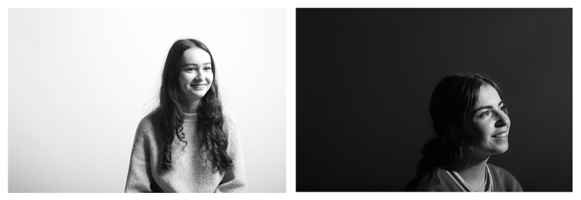
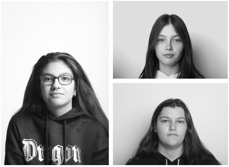
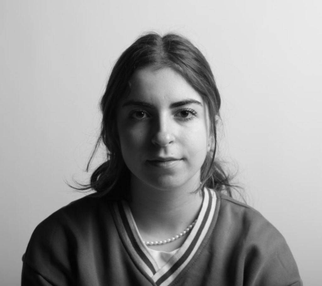
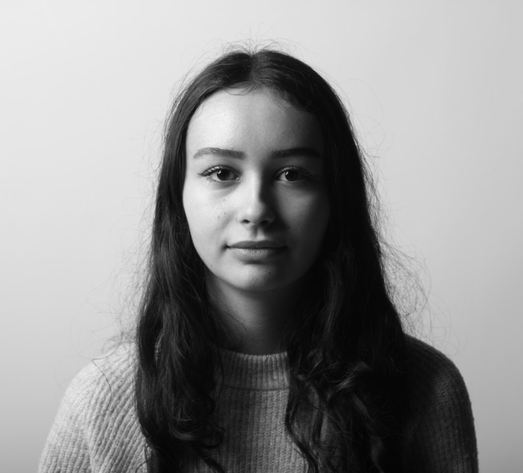
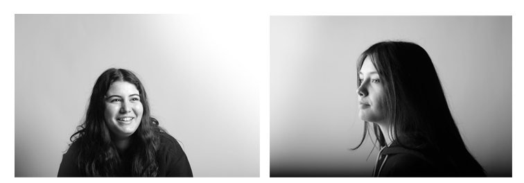
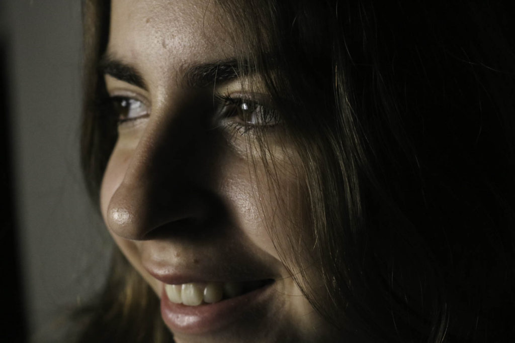
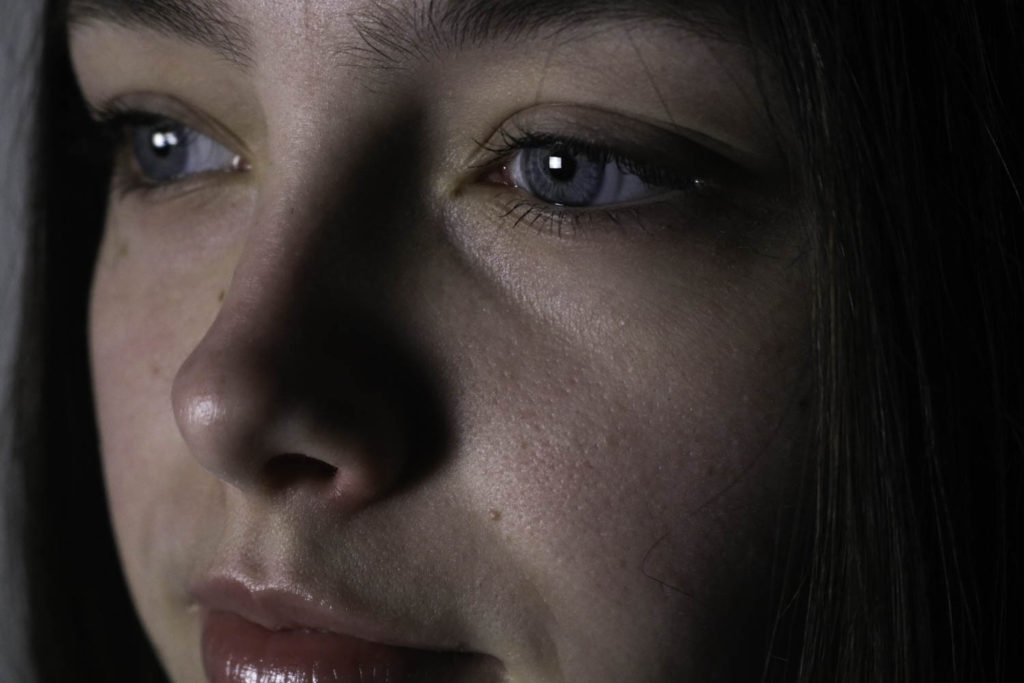
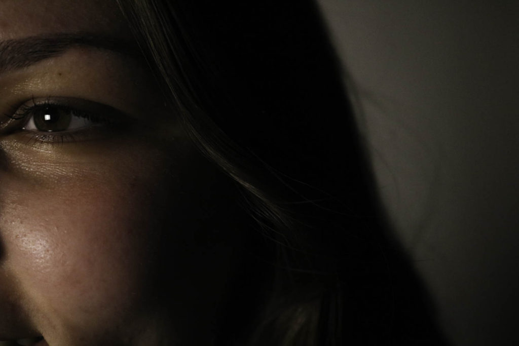
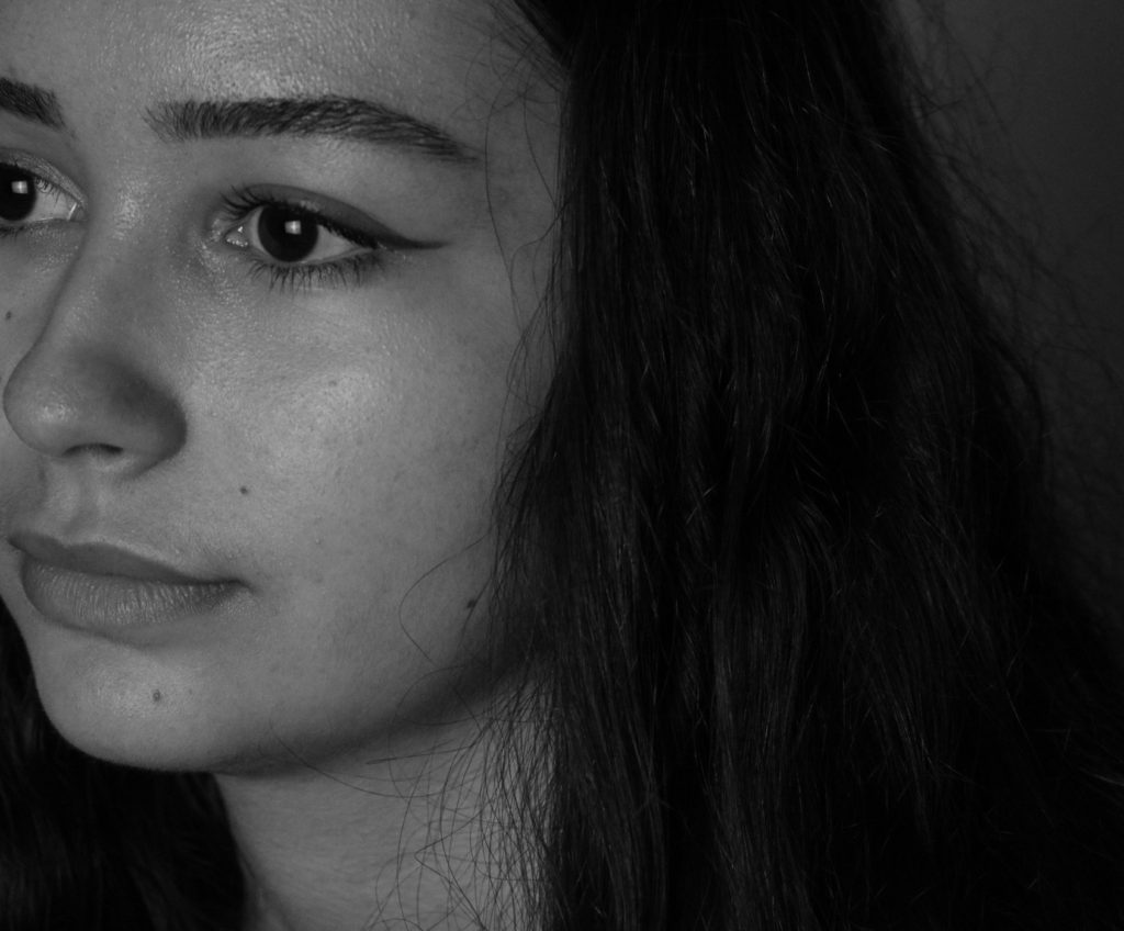
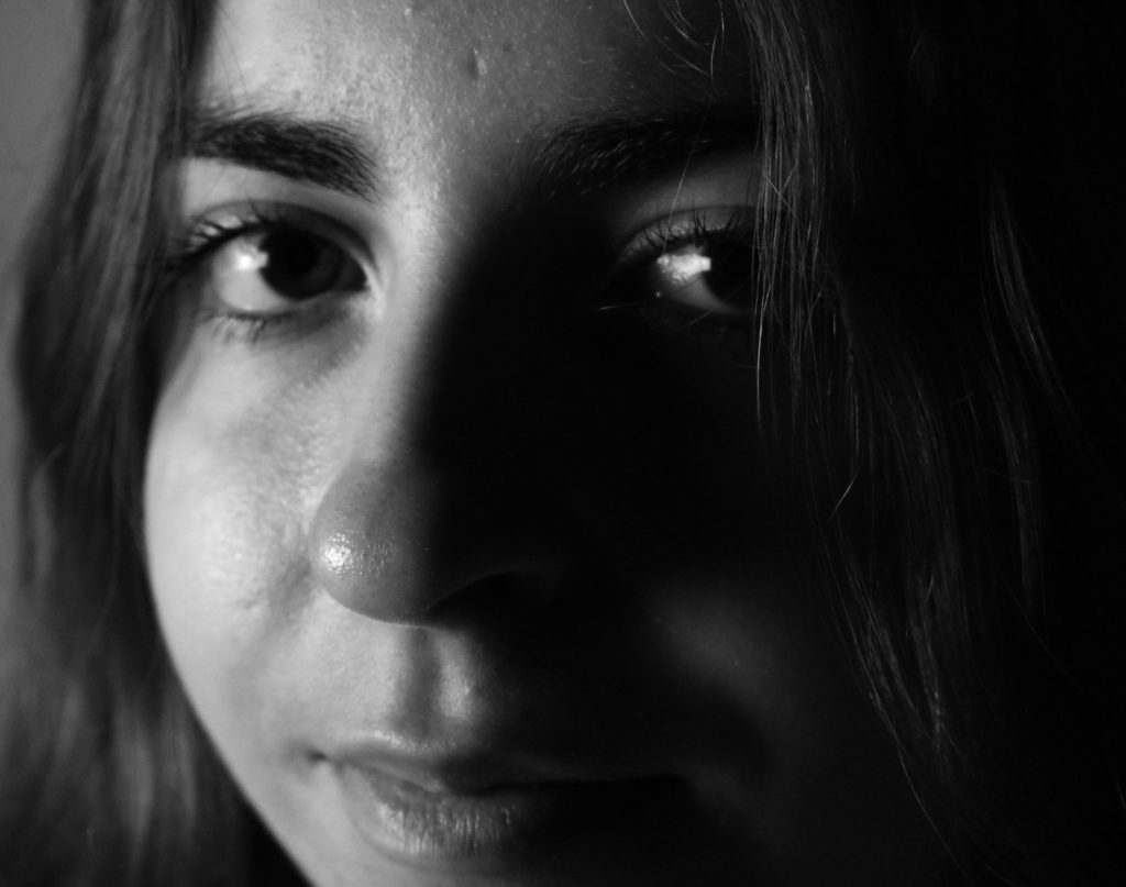
This piece was created using some images of Katarina and Diana, the whole aim of this piece was for both of them to be looking in the same direction, like they are both smiling for the same reason. I think that this images compliment yet still contrast each other well as the left of Katarina has no shadows is a very light and subtle image whereas the portrait of Diana on the right of Diana is very dark, containing the focus onto her face and only that, whilst Katarina’s focus is more on her hair and eyes. It could be implied that this could be linked to the idea of night and day and the image of Diana looks like it was taken during the night time. Furthermore, it could be thought that the initially thinking of this montage would be to compare these two individuals, but it’s actually to allow them to relate to the same things, this is all linked back to them looking in the same direction.

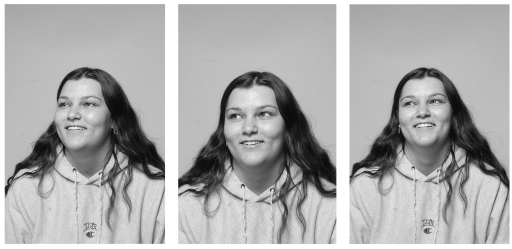
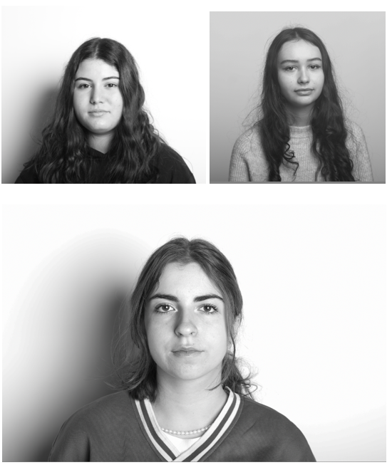
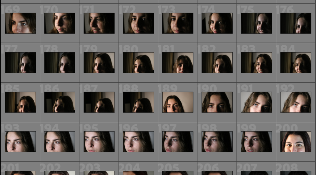
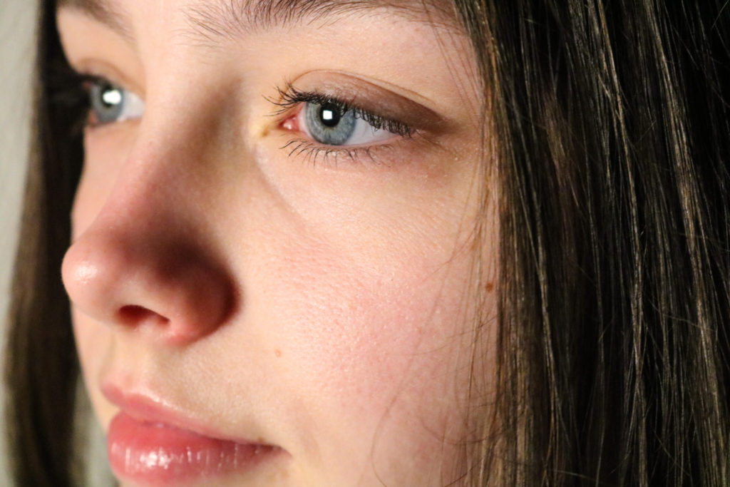
Above I created a photo montage in photoshop, using 3 photos of Niamh from the same photoshoot, I ordered them so that the most zoomed in image was in the middle, making this piece symmetrical. In addition, these images are actually placed in time ordered, with the first being taken before the last, the aim of this way to create a story through time and me and Lottie were behind the camera attempting to make her laugh, as in my opinion her best features are brought out this way. I really like how this turned out as her smile gradually gets wider and the placement of the photographs compliment each other well.

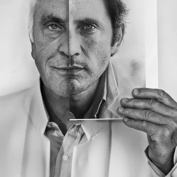
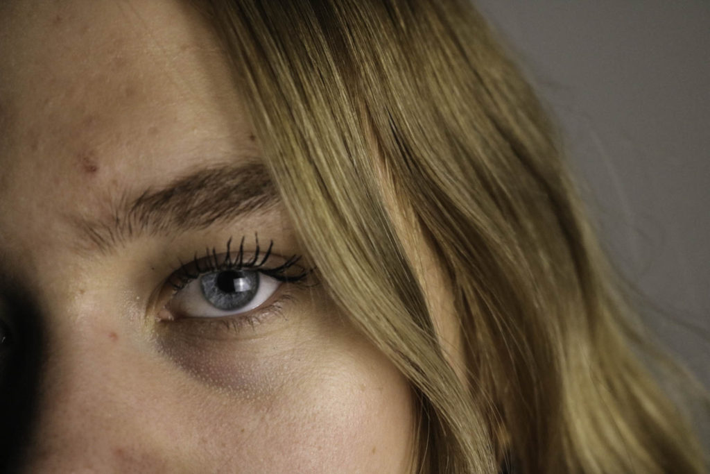
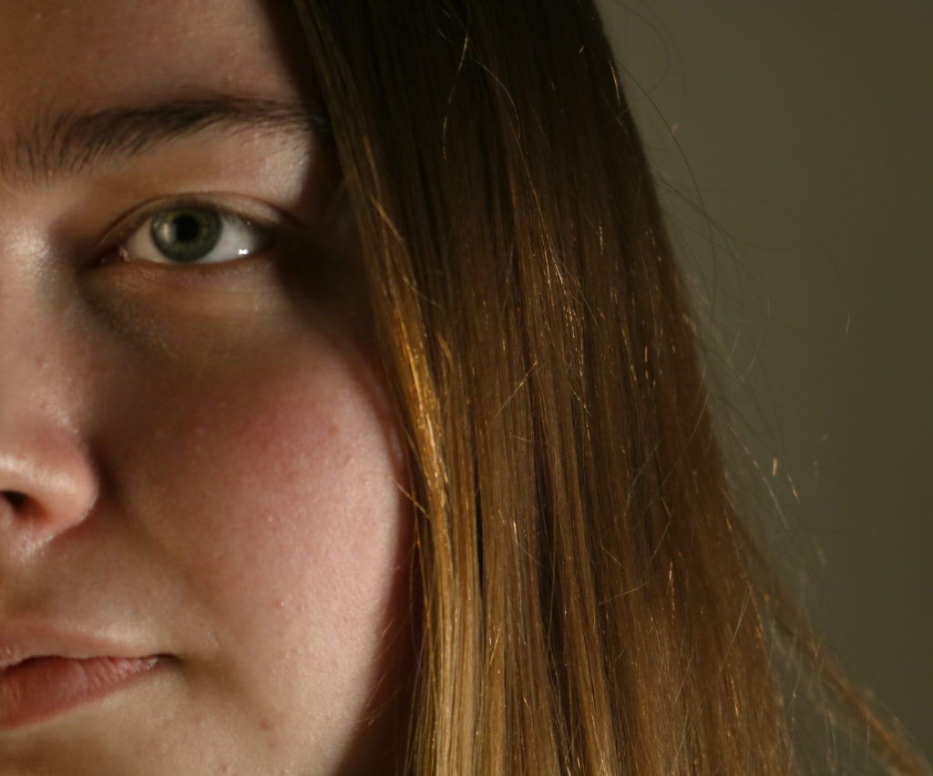
Another experimentation I created when making photomontages was this one of Leticia on the left and me on the right. In my opinion, the main contrasting element of this piece is us looking in opposite direction, with Leticia looking very natural and happy. Whilst the photo of I juxtaposes this as its very serious and posed, despite being very different I still like both of these images and i think thats why this piece turned out so successful.

Portrait and Identity: Research

Francesca Woodman 1958-1981

Francesca Stern Woodman was an American photographer best known for her black and white pictures featuring either herself or female models. Many of her photographs show women, naked or clothed, blurred, merging with their surroundings, or whose faces are obscured. Her work explored many themes that affected young people and herself, for example: relationships, sexuality, questions of self, body image, alienation, isolation and confusion or ambiguity about personal identity.

I have picked her because I like her gothic like style. It looks like she might be struggling mentally and I want to do something similar because it interests me. The blurry pictures that she takes could indicate that she feels like she doesn’t know who she is or is lost.

Claude Cahun 1894-1954

Claude Cahun was a French surrealist photographer, sculptor and writer. They are best known for their androgynous self-portraits that focus on identity, gender and social norms. During the second world war they lived in Jersey Channel Islands with their partner Marcel Moore until 1954. Because they lived here during the occupation, they got imprisoned and sentenced to death due to their resistance activities; however, it never got carried out because Jersey was liberated . They would go to town with their partner dressed as old ladies and place German messages about the idiocy of war on car windows and inside cigarette packets.

 “Masculine? Feminine? It depends on the situation. Neuter is the only gender that always suits me.”

Lorna Simpson 1960

Lorna Simpson is an American photographer that became well known in the 1980s for exploring themes and ideas relating to identity politics. Identity politics focuses on the lives and experience of those who are often marginalised in society such as people of colour, women and gay people. She combines her photographs with words and questions and challenges the narrow ideas surrounding women, culture and race.

I like her work as it focuses on gender norms and stereotypes. I think her use of sequences is quite powerful and it’s something I would like to incorporate into my own work.

Angela Kelly 1950

Angela Kelly is an Irish photographer that moved from Belfast to the US as a full- time Visiting Artist at the School of the Art Institute, Chicago. One of her early works is called “Woman’s Identity” and is from 1975-79. In this project she takes on the conscious idea of a self portrait as both problematic and self empowering, and issues of feminism, identity and place. The title refers to a singular woman’s gaze rather than assuming a universal status for all women.

I picked her because I like how all of her work is simple and how she doesn’t show her full face in any of the photographs, which could indicate that she doesn’t want to be known and is not important enough because she is a woman and at the time men had more power and importance.

Up Close

Close up photography refers to a tightly cropped shot that shows a subject (or object) up close and with significantly more detail than the human eye usually perceives. The extreme close up shot is generally used to allow the viewer to enter the character’s personal space, revealing traits and emotions that might otherwise go unnoticed. The frame is so tight that using an extreme close up shot gives the viewer no choice but to experience the character’s feelings alongside them.

Satoshi Fujiwara

Satoshi Fujiwara is a contemporary artist and photographer who was born in Kobe, Japan and is currently based in Berlin, Germany. He has produced and contributed to several art books such as Code Unknown, this book consisted of portraits taken by Fujiwara while he was on a subway in Berlin of his fellow passengers. As he knew he couldn’t publish pictures of people without their consent or knowledge he edited them so that identifying the person was practically impossible. Using shadows and various compositional approaches, as well as digital processing, framing, and trimming, Fujiwara modified the “code” of his secret portraits, thereby also circumventing the right of likeness. Accustomed to the homogeneity of Japanese society, he was struck by the diversity of people and the diffusion of codes he encountered.

“I took these pictures over a period of several months while riding various subway lines in Berlin from morning to night. The city is home to people from a diverse range of ethnic backgrounds. On the train, the air is not only filled with German, English, and other European languages, but also many languages from the Middle East and Asia. To someone like me, who was born and raised in a racially homogenous country like Japan, it seems as if these codes, unleashed from every direction and unmixed, form a diffuse reflection.” -Satoshi Fujiwara 

Contact Sheets

These are a couple of my contact sheets which show the different types of close-up photos that we took. As you can see we tried different lighting and many different angles to try and get the perfect photos for each person.

Editing

These are some of my edited photos in lightroom, in most of the photos I have only adjusted a few of the different settings, these include exposure, contrast, highlights and shadows. For the edit of the right, I decrease the shadows so that the final photo was darker, by doing this the shadows around the eyes and nose are more prominent. In the edit on the left, I have decreased highlights instead so the lighting on the left side of the face wasn’t as shiny or bright.

Final Portraits

I have chosen these photos as my final ones as I feel that they each have different lighting which compliments the model in the photos. I really like the bottom left photo as it is a close-up of her face where you can see all the different features such as her smile lines, I also like that she is looking away from both the camera and the light which means the camera captures the shadowing around the nose and mouth as the light is on the other side facing the camera. Another one that I think shows the model’s feature nicely is the top middle, by the way, the camera angles and how she is looking towards the camera you can see the different heading in the eyes and the different texture of the hair as it frames her face.

up close-portrait work

Definition: Close up photography refers to a tightly cropped shot that shows a subject (or object) up close and with significantly more detail than the human eye usually perceives. With close up photography, you reduce the field of view, increasing the size of the subject, and creating a tight frame around your selected shot.

Role in my project: I could use the images taken from this photoshoot to create diamond cameos and multi-exposure edits. I also think that being able to see models’s facial features more easily makes for interesting photography on my blog as it means I can display a good range of different ways to photograph, showing skills.

Mood Board

Bill Brandt

Bill Brandt (born Hermann Wilhelm Brandt; 2 May 1904 – 20 December 1983): 14  was a British photographer and photojournalist. An English photographer of German birth, Brandt travelled to Vienna in 1927 to see a lung specialist and then decided to stay and find work in a photography studio. There, in 1928, he met and made a successful portrait of the poet Ezra Pound, who subsequently introduced Brandt to the American-born, Paris-based photographer Man Ray.

Upon his return to London, in 1931, Brandt was well versed in the language of photographic modernism. During the 1930s he published his important early monographs The English at Home (1932) and A Night in London (1932) in addition to becoming a frequent contributor to the illustrated press, specifically Picture Post, Lilliput, Weekly Illustrated, and Verve, his published pictures exemplifying his technical skill and his interest in building visual narratives.

Image analysis of his work

Bill Brandt - Inspiration from Masters of Photography - 121Clicks.com

I have selected to analyse this image as this portrait is not of a face, and I think that I will recreate this in my project. The fact that this image is in black and white means that the shadows that are in between the fingers are more prominent, this also makes the texture of the skins more obvious, adding depth to the image. It can be implied that this portrait is composed of a male and a females hand as the different in hand sixes and textures is apparent, and they could have a big age gap. Furthermore, the fact that they are their fingers are interlocking like holding hands means they could be in a relationship or have been positioned this way to make it appear as in the linking of fingers is the connection or their love. Additionally, their is a variety of the shapes in this piece as the ovals around the tips of the fingers and the stronger outliners around the stones below contrast each other, but still compliment each other. As this could also represent the theme of the living and the inanimate as the hands are laid above the stones to create a part of a contrasting image.

Satoshi Fujiwara

It was through a career in advertising, working as a graphic designer and planner, that Satoshi Fujiwara, born in Japan and now living in Berlin, became interested in how visual information and photographic images influence people and society, and how he could attempt to redefine photography to make cross-sectional inquiry within his artistic practice

Satoshi has also published several books, including : Code Unknown, published by IMA photobooks, 2015; 5K CONFINEMENT, Luigi Alberto Cippini, published by la Fondazione Prada, 2017; HORSES, Satoshi Fujiwara & Yngve Holen, published by Walther König, 2018.

Second picture below: It was taken at 12:37 p.m on September 10, 2014, a couple of years after relocating to Berlin where I started working as a photographer. Since the beginning, I’ve had a strong interest in the various fuzzy boundaries in relentlessly reproducible contemporary imagery. To focus on portraiture, the right of likeness is something that has long-troubled photography since the invention of the camera. Today, with the rise of social media, we have become even more acutely aware of photographs and those who appear in them when they are posted on digital media.

With furthering technological developments in digital photography, it will be even more difficult to make legal judgments in cases involving the right of likeness. I won’t mention anything about this specific subject. How she/he actually looked like, so-called ’fact’ or ‘background’, and so on except for the date photographed which is visible in the data. Because only the image that is detached from the ‘original’ context allows the viewer to be read with subjective interpretation.

Image Analysis: These images are very different from Brandt’s as they are full of colour and warmth, and these pieces of work are of the full face and not just part of the faces such as the ears and nose. Firstly, I think that the clarity of this photograph and the lighting make for a part more interesting image and better final product, as other aspects such as the lighter line on his cheek bone and the freckles and wrinkles on the face of an older individual creates more depth of the image. Furthermore, the grey/ blue colours in the eyes creates a nice colour difference compared to the red of the food packaging, and the fact that this is scrunched up means that it adds additional texture to the image despite the wrinkles on the face already being there. My favourite part of this photograph is actually the hand at the bottom and it creates an end to the image and you can see that part of the smallest finger as been cropped out, I think this is an effective way to combine these piece together, as the skin from the forehead and at the bottom on the hand make the image more cohesive.

How to create a close up portrait:

  1. Make your model’s face stand out with makeup or face paint
  2. Take face close ups using a zoom lens
  3. Use a large aperture for a softer focus
  4. Use natural side light to make every close up look good
  5. Use direct light to create portrait lighting patterns
  6. Make sure a range of lighting techniques are used
  7. 1 and 2 point lighting should be included
  8. Additionally the Rembrandt and butterfly effect

Contacts Sheets

Below I have placed some contact sheets to show that I have placed them into Lightroom and organised them, as the third contact sheet is full of images i think are usable for this project, along with some being edited. To do this I created a quick collection to better help organise my images.

Best images, before editing

Editing

Below I have placed some screenshots of the editing process, done in Lightroom Classic, to alter these photos I have changed setting such as the exposure, saturation and white balance to make these images look better.

Final Images

Here I have edited an image of Katarina, in the same way in which Bill Brant does, making the image monochromatic so that the texture of the skin is more prominent, this means that it gives the final image more depth and even more clarity then it did before. My favourite part of this up close image occurred by accident, and that is the light reflecting off her eyes, as this mean that the bright light in her eyes matches with the light reflecting off of the end of her nose ad some areas of her cheeks, making the piece more cohesive. Furthermore, I decided that this image would look better in black and white as the darker tones in Katarina’s hair and eyes means that tones in the image can link together better.

I have selected this image of me as one of my final ones as I think the lighting of this images of some of the best in our taken collection of images meaning that my facial features are clear and the pigment on my lips and in my eyes stand out as the best aspects of the image. Furthermore, I changed the exposure of this image so that its on the verge of being too exposed an I think this was a good choice because it means that the light reflecting on my eyes is more apparent, and this matches with my pale complexion whilst still leaving the shadow next to my nose.

Above I have chosen this photos of Diana as one of my final pieces as I have cropped it so that the background and some of her hair are now taken away so that more focus is on her face.

identity

Identity – the fact of being who or what a person or thing is.

A photograph resembles the likeness of what appeared before the lens. So, in the case of a profile picture, family album or mug shot, identity is based on the repetition of sameness that is evidenced by the image produced by the camera. Typical ways of expressing our identity include our choice of hairstyles, clothing, and make-up through to marks on our bodies including paint, tattoos, scars and piercings. Other aspects of identity such as language, race, ethnicity, religion and occupation are also powerful markers of cultural identity.

Gender identity – an individual’s personal sense of having a particular gender.

Cultural identity – cultural identity refers to identification with, or sense of belonging to, a particular group based on various cultural categories, including nationality, ethnicity, race, gender, and religion

Social identity – social identity is the portion of an individual’s self-concept derived from perceived membership in a relevant social group.

Geographical identity – an individual or group’s sense of attachment to the country, region, city, or village in which they live.

Political identity – is a political approach wherein people of a particular gender, religion, race, social background, social class or other identifying factors, develop political agendas that are based upon these identities.

Claude Cahun:

Claude Cahun was a French surrealist photographer, sculptor, and writer. Schwob adopted the pseudonym Claude Cahun in 1914. Cahun is best known as a writer and self-portraitist, who assumed a variety of performative personae. Cahun’s work is both political and personal.

More information on Claude: https://en.wikipedia.org/wiki/Claude_Cahun

Examples of her work:

Claude Cahun | Art, Biography & Art for Sale | Sotheby's
Claude Cahun - 12 Artworks, Bio & Shows on Artsy
Claude Cahun | Artnet

Henry Hargreaves:

  • Henry Hargreaves born 1979 is a Brooklyn-based artist and food photographer. 

Examples of his work:

Henry Hargreaves ☻ Photographer
Henry Hargreaves (photographer) - Alchetron, the free social encyclopedia

Comparisons of Cahuns and Hargreaves work

Sans titre, 1939
Claude Cahun
Plastic Paper - Henry Hargreaves ☻ Photographer
Henry Hargreaves

Comparing Claude Cahun’s work and Henry Hargreaves there is a clear difference in their photography styles. Claude Cahun’s style is full of darker, grey and black tones to create shadows and then uses lighting to create a distinct highlight upon the photo to be able to show you the message they are trying to create for the people who see it. On the other hand, Henry Hargreaves uses brighter, contrasting colours within his work to make it stand out with a deep meaning, as text can accompany a lot of his photography highlighting what the photo is about. Although he will also have that light hearted, comfortable atmospheric feeling to his photography to relay a message towards people but still keep a serious tone attached to it. The top picture is from the photographer Claude Cahun, in my opinion I think that it highlights the meaning of how all races/genders are able to come together and support each other in any way possible. It can also show how the prejudice ideas and stereotypes of different races/genders are able to be pushed past, which is mostly true this current day and age, and how it doesn’t matter what gender, age, sexuality or race someone may be because it doesn’t change how they should be perceived based on a stereotypical idea. Therefore, Henry Hargreaves work shows a different message where he highlights the importance of plastic pollution and what it is doing to the earth. The yellow colour, in the background, and red colour, of the plastic bags writing, is used to represent the dangers of pollution and how damaging the plastic bags can be to the wildlife. The words ‘Thank you’ which are repeated on it continuously can also be taken in a horrible way where the plastic bag is almost thanking you for letting it free and contributi8ng it towards pollution which makes you consider what your actions are contributing too and how much of a difference it would make to change to reusable bags instead.

My Photographers

Claude Cahun

  • A French Surrealist photographer, sculptor and writer.
  • Focuses mainly on self portrait and sculptor work.
  • Their work was both political and personal.

Some more information about Claude Cahun.

Examples of their work –

This image has an empty alt attribute; its file name is dont_kiss_me_16_9.jpeg
Selbstporträt, 1928
Autoportrait, cheveux rasés, 1928

Analysis –

Sans titre, 1939
I personally really like this photo which was taken by Claud Cahun because it shows peoples hands, which can be used to tell a lot about someone as it can show their heritage, what they may work as, their personality etc. Therefore in this photograph I think that it is clearly shown, because it shows how 3 people have come together and have joined as if they have been united together. I also like how the black/white contrast highlights the hands well, making them stand out against each other which draws your attention towards it to make you wonder why these 3 people have come together.

Henry Hargreaves

  • Famous for still life/food photography.
  • Commercial photographer.
  • His work is often including funny yet edgy messages.
  • Often collaborates with people.

Here is some more information about him/pictures of his work.

Examples of his work –

This image has an empty alt attribute; its file name is BOOKS0787.jpg
This image has an empty alt attribute; its file name is PLASTIC-BAG-BOOK_50439.jpg
This image has an empty alt attribute; its file name is BOOKS0802.jpg

Analysis –

This image has an empty alt attribute; its file name is BOOKS0805.jpg
I think that this photo by Henry Hargreaves is quite a successful image because it shows how someone is holding the book, as if they are looking through it and find it interesting. I also think that the pastel colours of the background and book work quite well together because they aren’t too bright and contrast nicely against each other, which I want to do in my own work as I really like the fluidity of how well it works together.

Identity ideas

Identity is seen as a group of factors which are used by a person or group to show what defines them. It can include gender, heritage, where you live, your interests, personality, culture, political etc.

There can be many stereotypes which come from the different categories of identity which can influence a prejudice idea of how people are viewed from some people.

Mood board –

List of ideas about identity for a photoshoot

  • Focussing on someone’s interests.
  • From their point of view/looking down at it.
  • Of objects that have some relevance to the person with their hands in it.
  • Photographed somewhere they enjoy reading.
  • Include other smaller objects to add detail.

My final idea:

For my idea I’m going to focus on my own identity, from my perspective. I enjoy reading, which is a hobby of mine. Therefore I will go and take pictures from my point of view of me reading a book, going somewhere I enjoy reading, my favourite books/quotes from books, putting myself into a forced isolation when I read, showing headphones etc.

The 7 Best Books to Escape Into All Summer Long | Bon Appétit

sequence/ grid of images

My Examples

Aim: this photoshoot was to create effective deadpan photographs, and to look as similar to passport images as possible. Furthermore, we wanted the lighting to be as similar as we could throughout all these photos so they created the same aesthetic. Mostly lighting from the front would be used, keeping the attention on the models facial features.

Here I have displayed some of deadpan images in a types of sequencing styles that I think best compliment each other. After going to the studio and shooting in black and white, then adjusting settings such as the exposure and temperature, I put the images into Photoshop to create galleries like done on the blog, but in slightly different layers, with portrait and landscape images stacked alongside each other.

This image has an empty alt attribute; its file name is image-202.png

Strengths of my work: with the lighting being the main factor of these photographs, we used lights mostly from the front of the models to create this deadpan aesthetic. This create a contrast between our lighter skin tones and darker shades of hair, giving the monochromatic images more depth. In addition, the majority of these images don’t have shadows, allowing for the models to be the main focus of the image, meaning our individual facial features are clear.

Weaknesses of my work: I am aware that some of these images, as some are landscape and not portrait, despite capturing the rest of the deadpan aesthetic. The shadows in some of these images are not strict to the rules of deadpan images, as the lighting should 100% be on the face, however the models are in the middle of the frame, following the rest of the rules such as no other objects such as headphones or hats.

This image has an empty alt attribute; its file name is image-192.png

Above I have taken my best deadpan images and created a grid to better match with the aesthetic, placing all of these landscape images in photoshop, then making them the same sizes to create this 6 piece grid. I have arranged these images trying to spread the ones with stronger and weaker lighting around each other. Furthermore, the original concept is kept as despite the changes in lighting the most important deadpan concepts are retained.

How this work could be improved is for us not to have shot every image in black and white, creating more variety, however, I decided to keep them all this way as all of the models look better with the lack of colour and drastic tones. Alternatively, we could have taken more photographs as this would have made the editing and selection process a lot easier, however I do think these final images are successful.

This image has an empty alt attribute; its file name is image-197.png

Here I have taken some of my deadpan images and created another mini gallery with a slightly different layout using photoshop. I like how the lighting on the model’s faces in all 3 images is prominent, making their skin looks smoother.

Moreover, I like how this aesthetic represents everyone in the same way, no matter of background or past experiences, creating a new version of photography by putting everyone in the same perceptive, preventing prejudice/ judgment. Not judging one person against the other, this could be helpful for decisions such as cast certain individuals for films, as specific features could be required.

Best Images

I have selected this final image of Diana as it if a good example of a successful two point lighting image, as the light is coming from the left of her face and the front. This means that there is still some light on the right side of her face this is creating a triangle on her cheek, but the lighting contrasts. As with the other image the dark tones in her eyes matches with her hair and the background with the tones in her face, bringing the whole image together. Furthermore, I cropped this image so that the white surroundings wouldn’t distract from Diana’s facial features/ the focus of the image. I have taken these photos in black and white, this is mostly because most people look best with this type of editing.

I have selected this image as my best one to analyse, as I think that it looks very professional, with the lighting being a vital part of the final product turning out well. In my opinion, this lighting makes her face look smooth and helps show the best of her facial features, as the lighting is soft and not too harsh, it means that shadows on Katarina’s face are created on the right side of her face, the use of the Doran 1 Point Lighting technique is an important part of the successfulness of this image. Furthermore, the eye contact with the lens of the camera and the shine of her eyes make the focus of the image the middle of her face, particularly her eyes, which match the tones in her hair and creating a more cohesive final product. Furthermore, we took many all of these photographs during this shoot in black and white, I think this makes for more interesting portraits and the textures on her face are more visible and other details such as the hairs in her eyebrows are more prominent.

deadpan aesthetic/ typologies

Introduction

Deadpan photography goes back all the way to the 1920s. It’s a very distinct style of photography that has somehow made its way into the 21st century, quietly and persistently influencing you in a way you might not even be aware of! Today we’ll dig a little deeper into what deadpan photography is, talk notable names of photographers that shoot in this style, and show you a collection that is in line with deadpan aesthetics.

This style originated in Germany and is descended from Neue Sachlichkeit, New Objectivity, a German art movement of the 1920s that influenced the photographer August Sander who systematically documented the people of the Weimar Republic. Much later, in the 1970s, Bernd and Hilla Becher, known for their devotion to the principles of New Objectivity, began to influence a new generation of German artists at the Dusseldorf School of Photography.

These young German photographers included  Thomas Struth, Andreas Gursky, and others. The Bechers are best remembered for their studies of the industrial landscape, where they systematically photographed large structures such as water towers, coal bunkers or pit heads to document a soon-to-disappear landscape in a formalistic manner as much akin to industrial archeology as art. The Bechers’ set of “rules” included clean, black and white pictures taken in a flat grey light with straight-on compositions.

The criteria for passport/ deadpan images includes; neutral facial expression, eyes looking into the camera, no objects that are distracting such as headphones and hats, no shadows on the face (as these deter the natural features), from a front angle and symmetrical, showing the whole face. Other important factors include a light background and no reflections, this is why the glasses cannot be worn.

August Sanders

August Sander was a German photographer whose work documented the society he lived in. Lauded as one the most-important portrait photographers of the early 20th century, Sander focused his gaze on bricklayers, farmers, bakers, and other members of the community. Born in Herdorf, Germany on November 17, 1876, Sanders learned photography during his military service in the city of Trier. By 1910, he had moved to a suburb of Cologne, spending his days biking along the roads to find people to photograph.

Following the death of his son in 1944, and the destruction of his work in 1946, Sander practically ceased photography altogether. He died in Cologne, Germany on April 20, 1964 at the age of 87. Today, the artist’s works are held in the collections of The Museum of Modern Art in New York, the National Gallery of Art in Washington, D.C., and the Wallraf-Richartz Museum in Cologne, among others.

August Sander, 1940

Sander once said ‘The portrait is your mirror. It’s you’. He believed that, through photography, he could reveal the characteristic traits of people. He used these images to tell each person’s story; their profession, politics, social situation and background. Sander did not use the newly invented Leica camera. Instead he remained devoted to an old-fashioned large-format camera, glass negatives and long exposure times. This allowed him to capture minute details of individual faces. Shot against neutral backgrounds and titled more often than not by profession alone, he let the images – and the faces in them – speak for themselves.

The main concept of August Sander’s work is how he photographed the most common and working class members of the public, and more upper class people but in the same way. This illustrates that he treated all people equally and could be to illustrate that class divides were unfair. Photographing them in the same way shows that they were all people and viewed as equals by Sander’s, demonstrating his more forward thinking considering the time.

Furthermore, the layout and lighting of these images is significant because of how consistent t it is, with all the of the photographs being taken in the same way. Its clear that Sander has a clear passion for his work ad I hope this is also reflected in my work. The objects that are in these image also tell a story and have a personal connection between the individuals being photographed, and their profession.

Typologies

A photographic typology is a single photograph or more commonly a body of photographic work, that shares a high level of consistency. This consistency is usually found within the subjects, environment, photographic process, and presentation or direction of the subject.

Definition- 1 : study of or analysis or classification based on types or categories. 2 : a doctrine of theological types especially : one holding that things in Christian belief are prefigured or symbolized by things in the Old Testament. Other Words from typology Example Sentences Learn More About typology. The photographic typology has the ability to reshape perception, heighten and focus attention, and transform everyday objects into a thing of art. Ironically the process and execution, often cold and systematic can be extremely emotive, and a powerful tool of communication when contextualised.

Bernd and Hilla Becher

Who created typology in photography? The German artists Bernd and Hilla Becher, who began working together in 1959 and married in 1961, are best known for their “typologies”—grids of black-and-white photographs of variant examples of a single type of industrial structure.

Bernhard “Bernd” Becher, and Hilla Becher, née Wobeser, were German conceptual artists and photographers working as a collaborative duo. They are best known for their extensive series of photographic images, or typologies, of industrial buildings and structures, often organised in grids.

Water Towers', Bernd Becher and Hilla Becher, 1972–2009 | Tate
Name: Water Towers

Bernd and Hilla Becher first began their still-ongoing project of systematically photographing industrial structures – water towers, blast furnaces, gas tanks, mine heads, grain elevators and the like – in the late 1950s.

I like how these objects are placed how normal passport photos, this along with the black and white images gives the image an old fashion feel despite it not being very old at all. This gives the image depth and authenticity and I think that the contrast between the different shapes makes the image more interesting, You can also notice that the more cylinder shapes are symmetrical to each other with the forth and sixth images being simirla to each other, and the same goes for the first, third, seventh and last image.

Image Analysis

Bernd and Hilla Becher - 20th Century ... Lot 10 March 2017 | Phillips

I have selected this image of Bernd and Hilla Becher’s as I think that the grid layout of twelve and not nine makes for a more interesting image as there is more to looks at, and their is more opportunity to create more affective images as part of the final piece. Firstly, I think that the fact that these images are in black and white means that the image may appear more authentic and this highlights the different shadows and shapes within the water towers, for example the squares in the 8th image. Furthermore, the variety of shapes within this image creates a more exciting image, meaning that the contrast between the circles, rectangles and the cylinders placed next to eac other creates depth to the image.