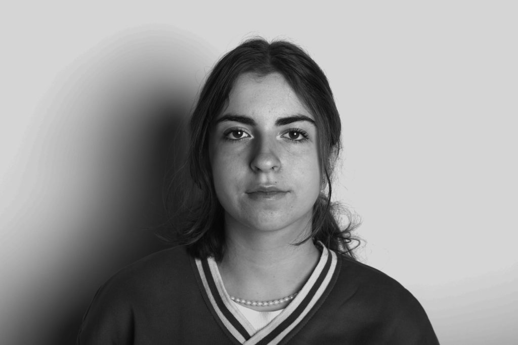
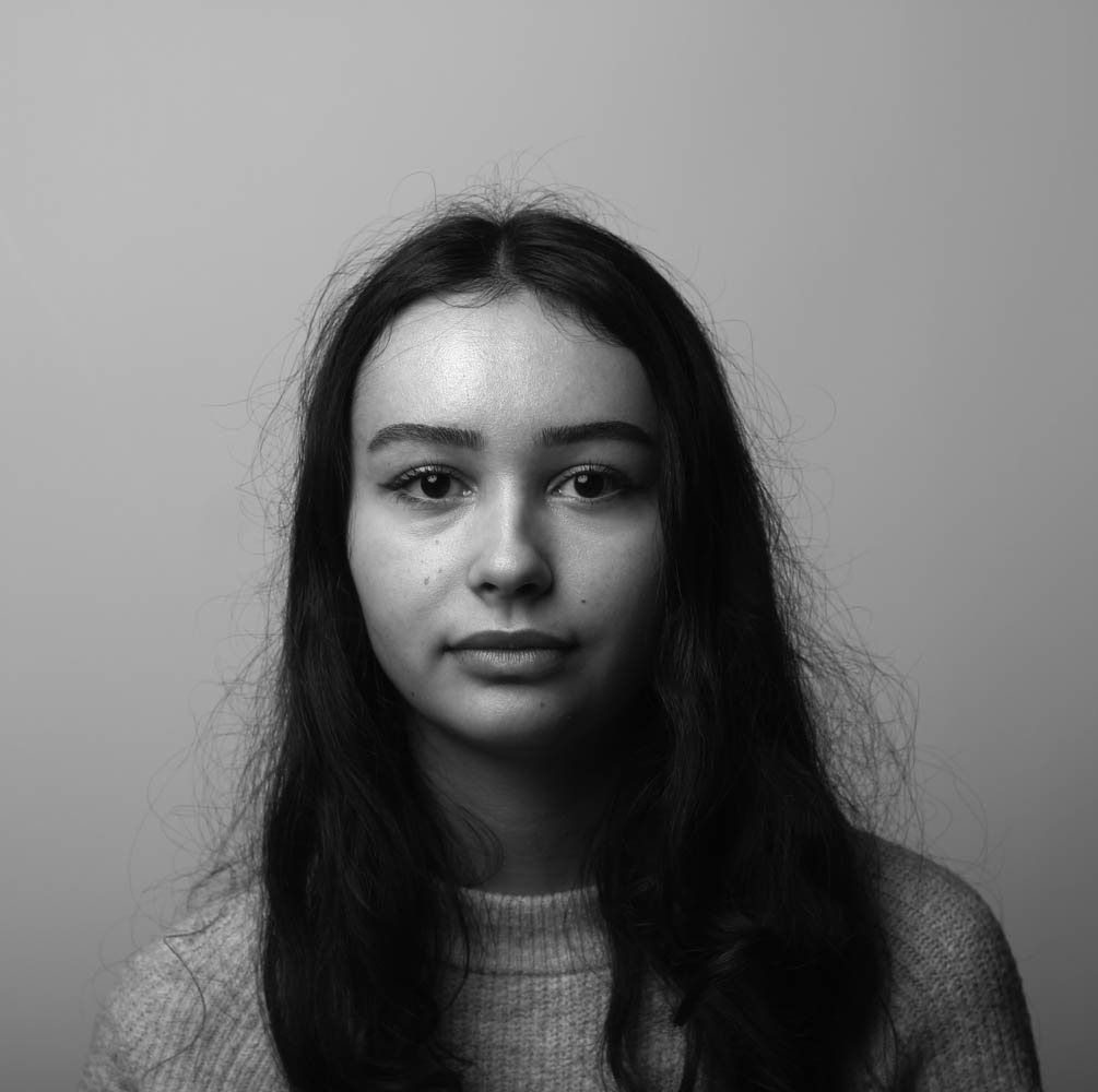
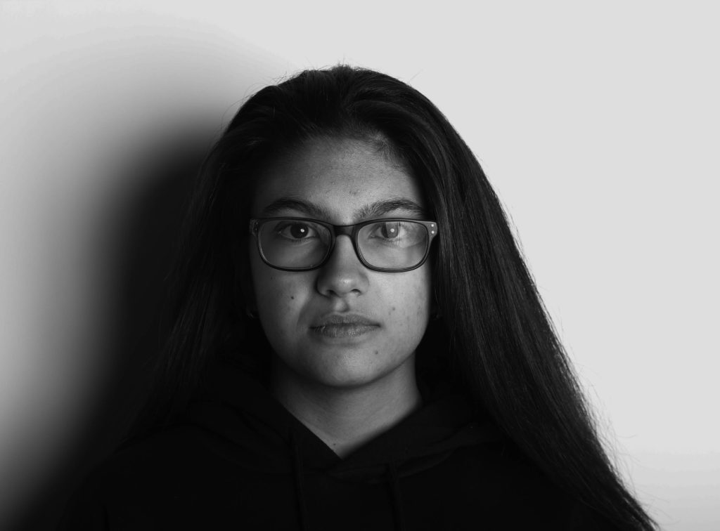
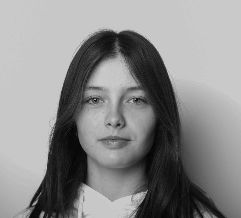
identity

Full definition of identity– 1a : the distinguishing character or personality of an individual : individuality. b : the relation established by psychological identification. 2 : the condition of being the same with something described or asserted establish the identity of stolen goods.

Mind Map
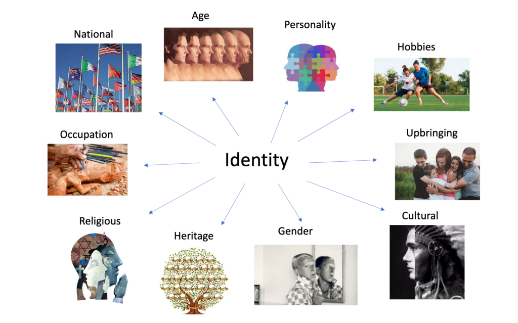
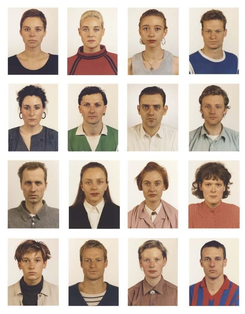
Identity in photography– A photograph resembles the likeness of what appeared before the lens. So, in the case of a profile picture, family album or mug shot, identity is based on the repetition of sameness that is evidenced by the image produced by the camera. Here I have combined the idea of a mood board and a mind map to illustrate my initial ideas both through words and images, this has helped me visualise my first ideas, meaning that I can more easily identify what I would like to explore further.

Gender Identity

Definition– Gender identity is the personal sense of one’s own gender. Gender identity can correlate with a person’s assigned sex or can differ from it. In most individuals, the various biological determinants of sex are congruent, and consistent with the individual’s gender identity.

Claude Cahun: The Androgynous Surrealist Artist

Gender identity as a concept was popularised by John Money in the 1960s. He founded the Gender Identity Clinic at Johns Hopkins University and formulated, defined, and coined the term “gender role” and later expanded it to gender-identity/role.

Role in my project– I have a few ideas I would like to explore including one where I link my family history, focusing on the idea of the role of woman when my grandparents were middle aged.

Claude Cahun

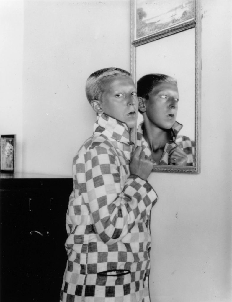
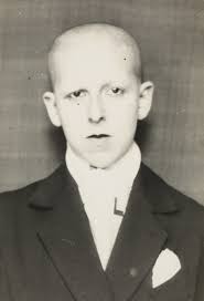
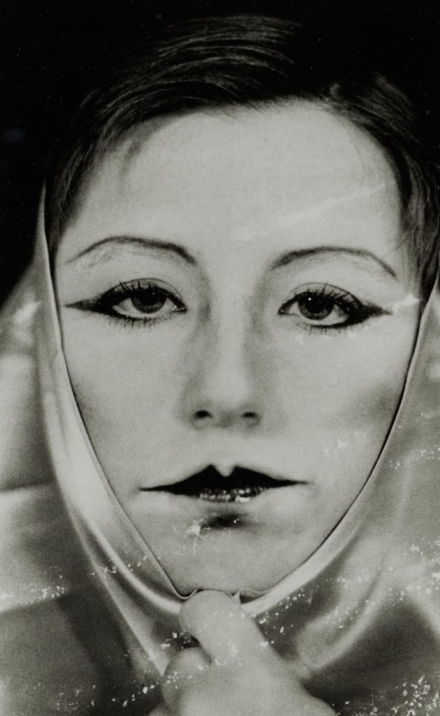
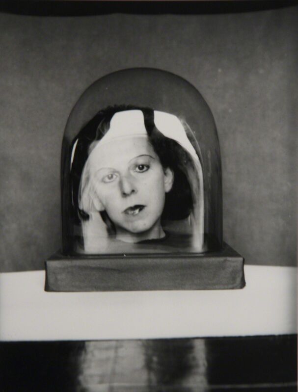
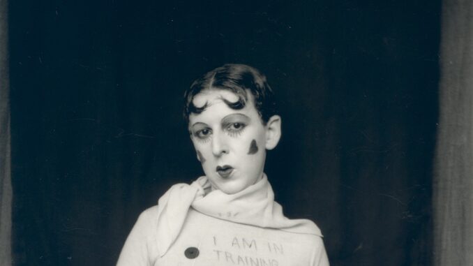
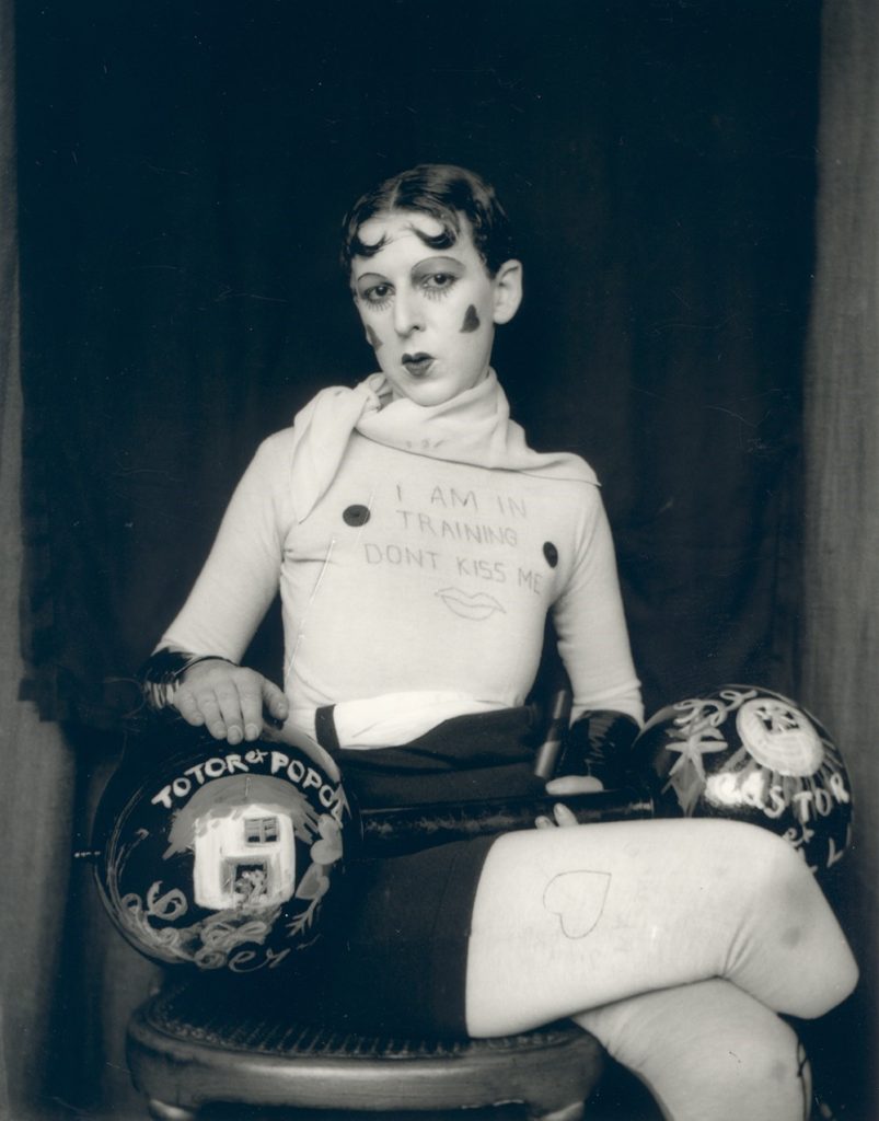
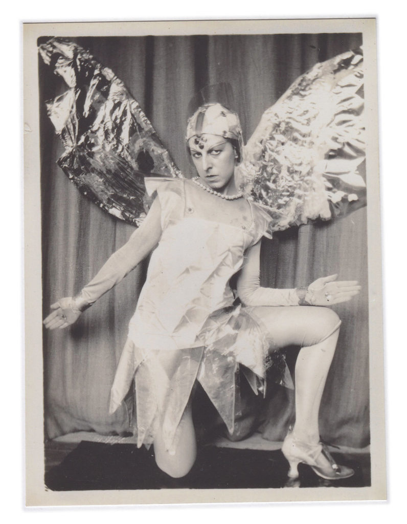
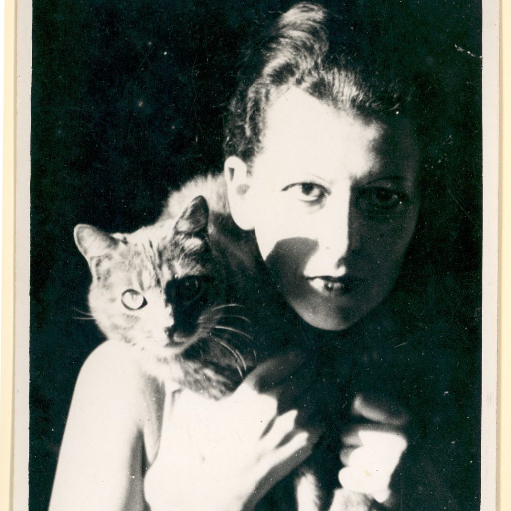
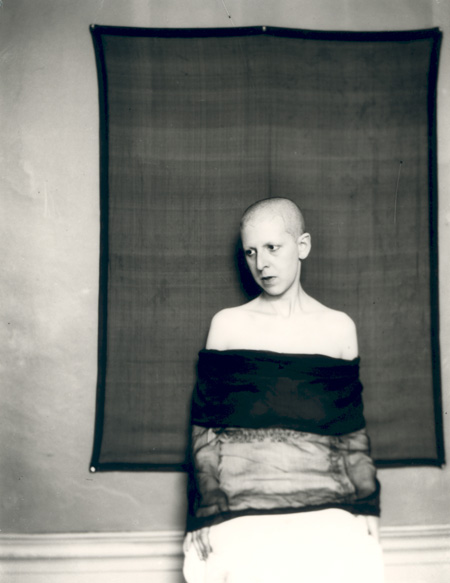
Claude Cahun was a French surrealist photographer, sculptor, and writer. Schwob adopted the pseudonym Claude Cahun in 1914. Cahun is best known as a writer and self-portraitist, who assumed a variety of performative personae. Cahun’s work is both political and personal.

Cahun made ambiguity a theme in a lifelong exploration of gender and sexual identity as a writer and photographer. Decades after her death, she has a growing following among art historians, feminists and people in the LGBTQ+ community. The photographs are by far her most compelling work. At first, scholars thought of them as self-portraits. But the gathering consensus is that Cahun choreographed and posed for the photos, and that her romantic partner, Marcel Moore, who was born Suzanne Malherbe, often took the photographs.

As writer and photographer, Cahun worked at upending convention. “My role,” she wrote in an essay published after her death, “was to embody my own revolt and to accept, at the proper moment, my destiny, whatever it may be.”

In the 1990s, she received a rush of attention as gender issues were gathering steam around the world. “Suddenly,” said Vince Aletti, a New York photography critic and curator, “she seemed incredibly of the moment.”

Cahun’s photographs have been displayed in group shows in the last two years in nearly a dozen museums in London, Paris, Washington, Melbourne, Warsaw and elsewhere. She is featured in a group exhibition running through early July at the Contemporary Jewish Museum in San Francisco. Another group show opened in Bonn, Germany, in late May, and one opened in Sweden in mid-June.

Image Analysis

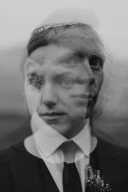
4th photo in this gallery: The main feature of this image, is clearly the face, with the significance of the face paired with the fact that the image is composed of a reflection, help to tell a story. It can be implied that this is linked to gender identity as the reflection means Cuhan doesn’t know their true self despise looking in the mirror everyday, this image could link more to a search for identity mixed with the confused on not knowing your own self. Furthermore, Cahun is looking lost in this reflection which may mean they are suffering of the lost of identity, and this idea is supported by the sad expression on their face, I like how this work is relatable to many people who are apart of the LGBTQ+ community and how much revolutionary these ideas were a5t the time. As during the time of World War II concepts such as gender roles and sexuality were not usually openly discussed and challenged, making Cahun’s work even more remarkable.

Artists i have chosen

LARA GELKS

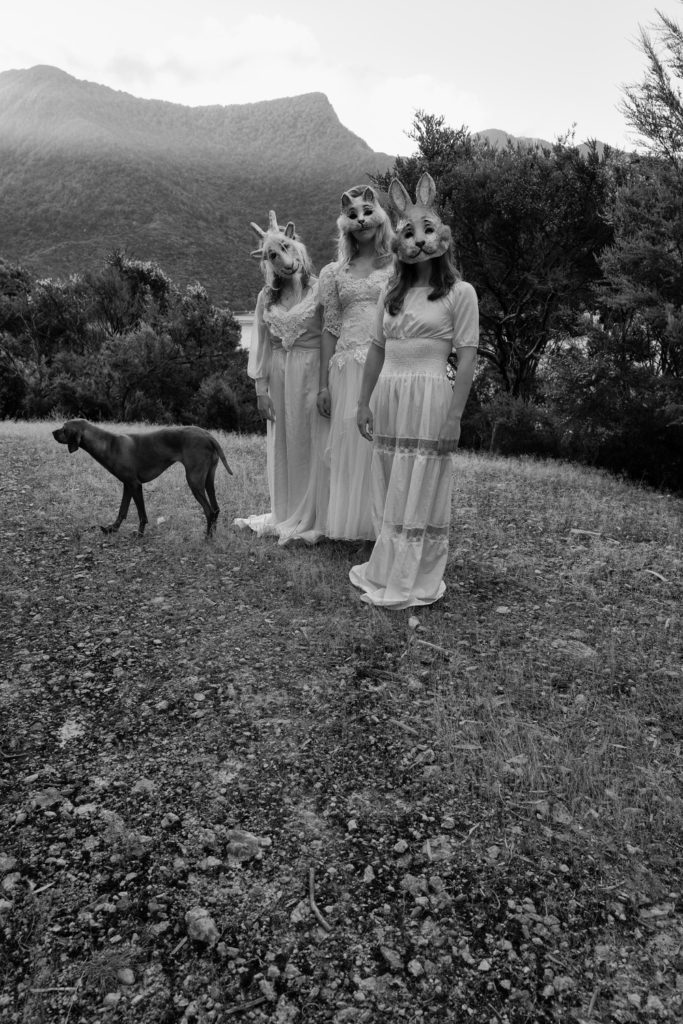
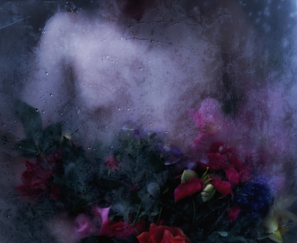
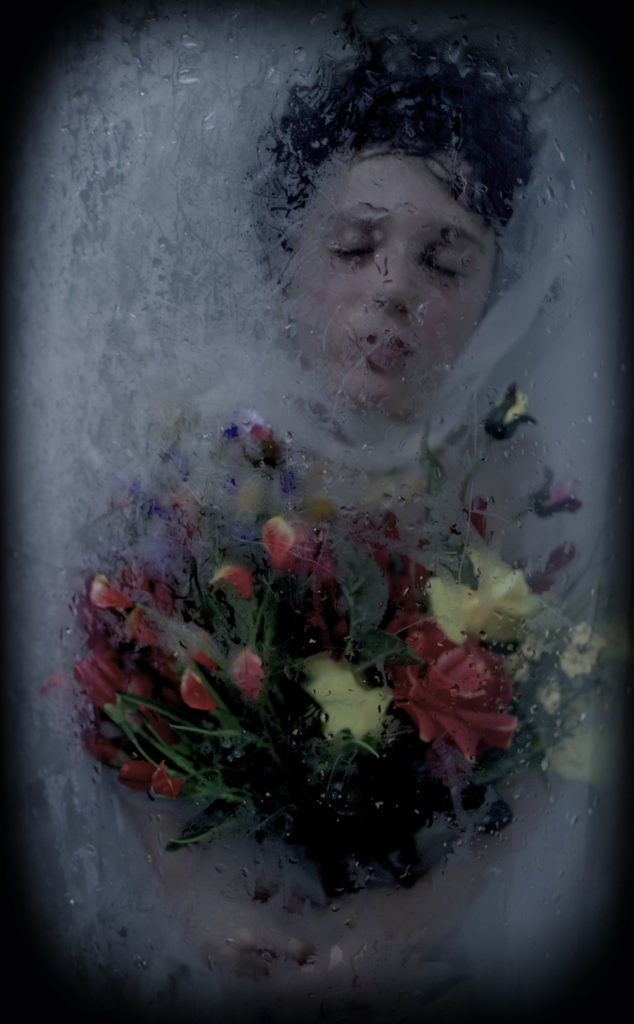
Lara Gilks is a photographer based in Wellington, New Zealand. She uses elements of nature, water, light, beauty in the context of the dreamscape between two worlds. Lara explores that dreamscape through the themes of metamorphosis, mortality, escapism, ascension, peace, silence. Through her work she seeks to create tension and an opportunity for the viewer to reconcile elements that don’t naturally fit together. Her pictures provide much space for imagination and interpretation. She wants to engage the viewer and create images that ask questions. 

Why did I choose Lara Gilks?

I chose Lara Gilks because I was inspired with

CLAUDE CAHUN

Claude Cahun’s photographic self-portraits present a dizzying kaleidoscopic mix of mystery, exuberance, and sobriety. Born in France, Cahun lived mostly on the island of Jersey with long-term love, Marcel Moore. Also known as Lucy Schwob and Suzanne Malherbe, they both adopted their preferred gender-neutral pseudonyms during early adulthood. Moore, although often invisible, was always present – typically taking the photographs and also authoring collages – and in this sense was as much artist collaborator as Cahun’s personal support. Described in Cahun’s own words as a “hunt”, through a combination of text and imagery, Cahun’s exploration of self is relentless and at times unsettling. From circus performer, clothed in layers of artifice, to a stripped-down Buddhist monk grounded by integrity, Cahun is engaged in an ongoing dialogue with multiplicity. Tragically in line with the fragmentary nature of Cahun’s outlook, much of the artist’s work was destroyed following an arrest and subsequent imprisonment for resistance against the Nazis. What remains bares interesting parallel to the title of Cahun’s diaristic publication Aveux Non Avenus, translated as Disavowals, which enigmatically suggests that for all that is revealed and given, much is still hidden or has been lost.

RALPH EUGENE MEATYARD

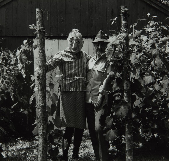
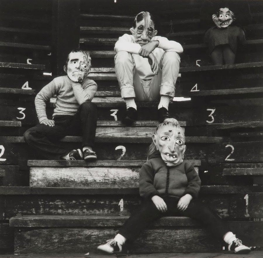
Ralph Eugene Meatyard lived in Lexington, Kentucky, where he made his living as an optician while creating an impressive and enigmatic body of photographs. Meatyard’s creative circle included mystics and poets, such as Thomas Merton and Guy Davenport, as well as the photographers Cranston Ritchie and Van Deren Coke, who were mentors and fellow members of the Lexington Camera Club.

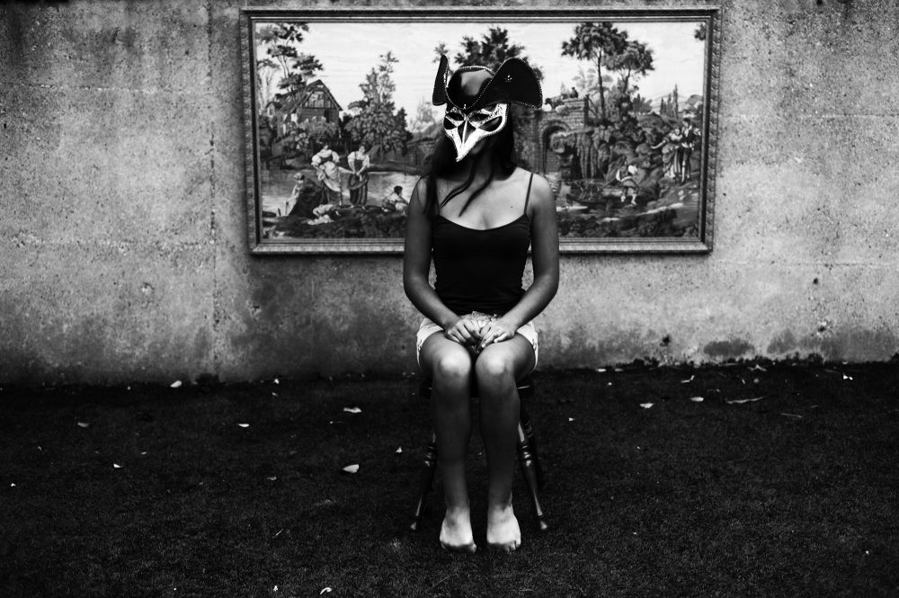
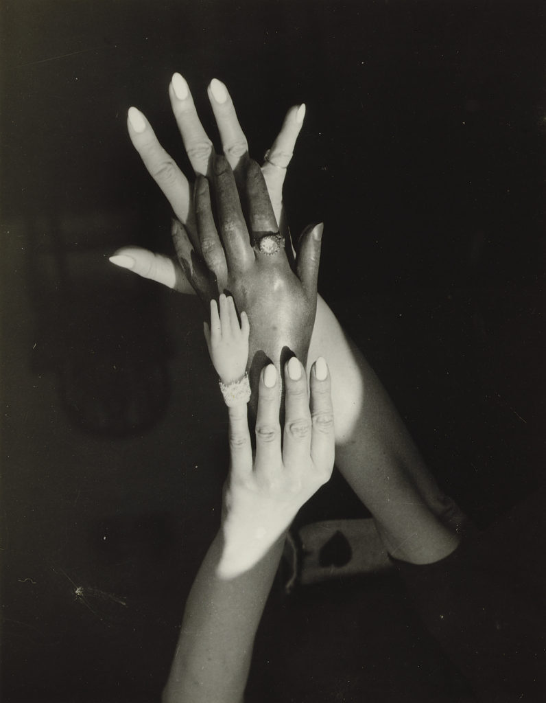
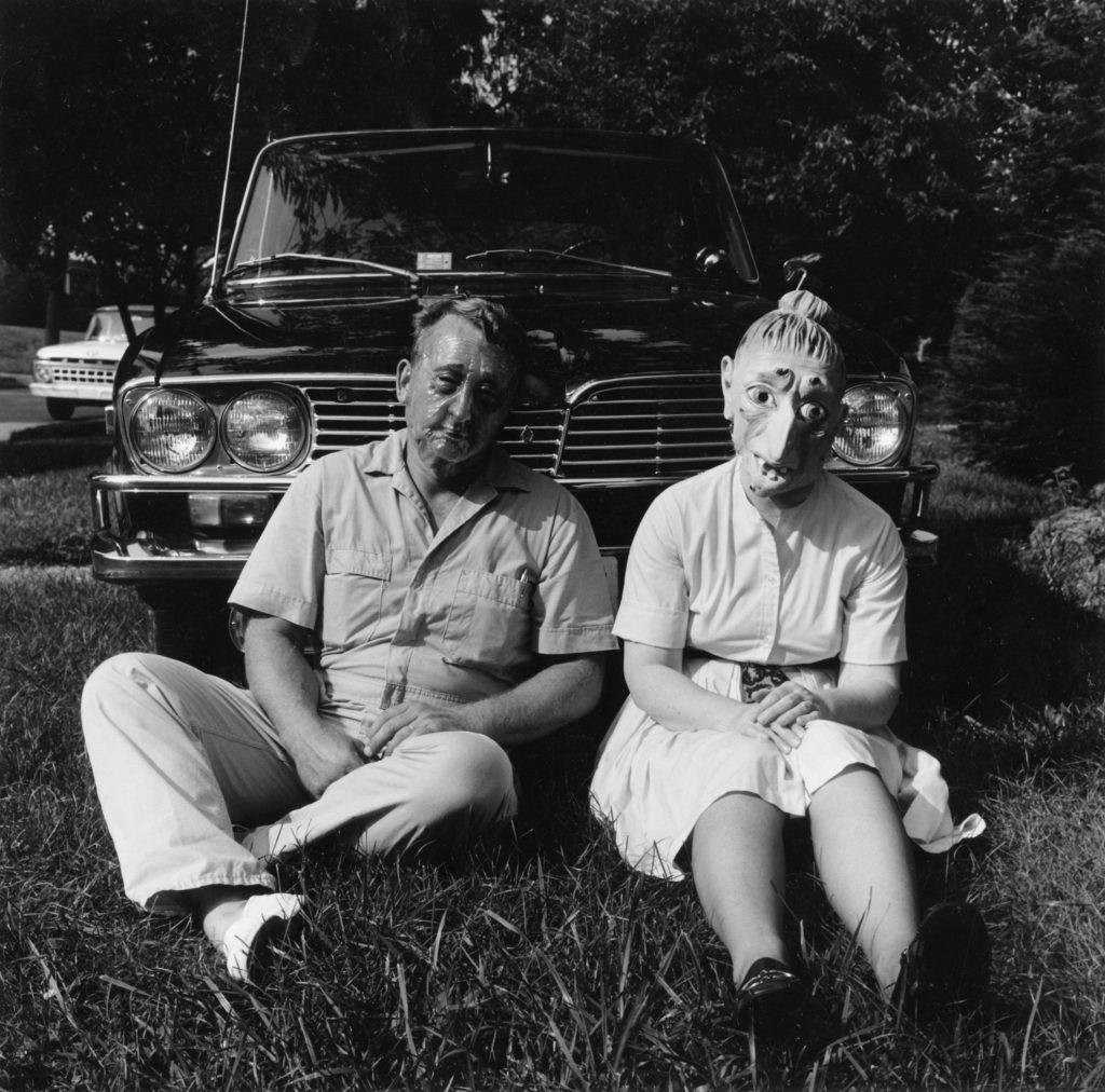
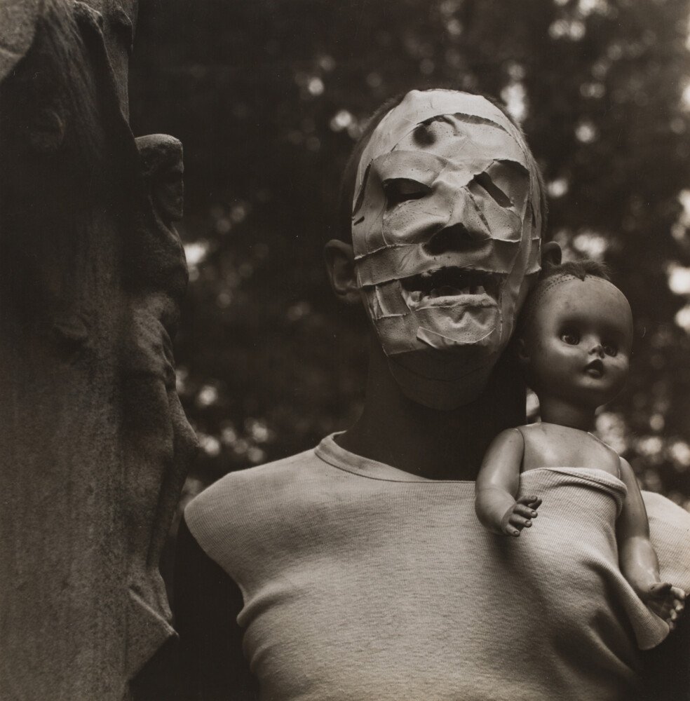
Meatyard’s work spanned many genres and experimented with new means of expression, from dreamlike portraits—often set in abandoned places—to multiple exposures, motion-blur, and other methods of photographic abstraction. He also collaborated with his friend Wendell Berry on the 1971 book The Unforeseen Wilderness, for which Meatyard contributed photographs of Kentucky’s Red River Gorge. Meatyard’s final series, The Family Album of Lucybelle Crater, are cryptic double portraits of friends and family members wearing masks and enacting symbolic dramas.

is best-known photography featured dolls and masks, or family, friends and neighbours pictured in abandoned buildings or in ordinary suburban backyards. Ralph Eugene Meatyard lived in Lexington, Kentucky, where he made his living as an optician while creating an impressive and enigmatic body of photographs.

Identity

Identity – being what or who a thing or person is.

Identity mind map template - Deepstash

Claude Cahun

Taken from AwareWomenArtists’ Website

Claude used many ways to express their identity. Their fashion and style was probably their most notable feature as it was always changing.

Claude Cahun: A Very Curious Spirit | AnOther
Claude Cahun: Jersey's queer, anti-Nazi freedom fighter

Identity Photoshoots

Photoshoot plans –

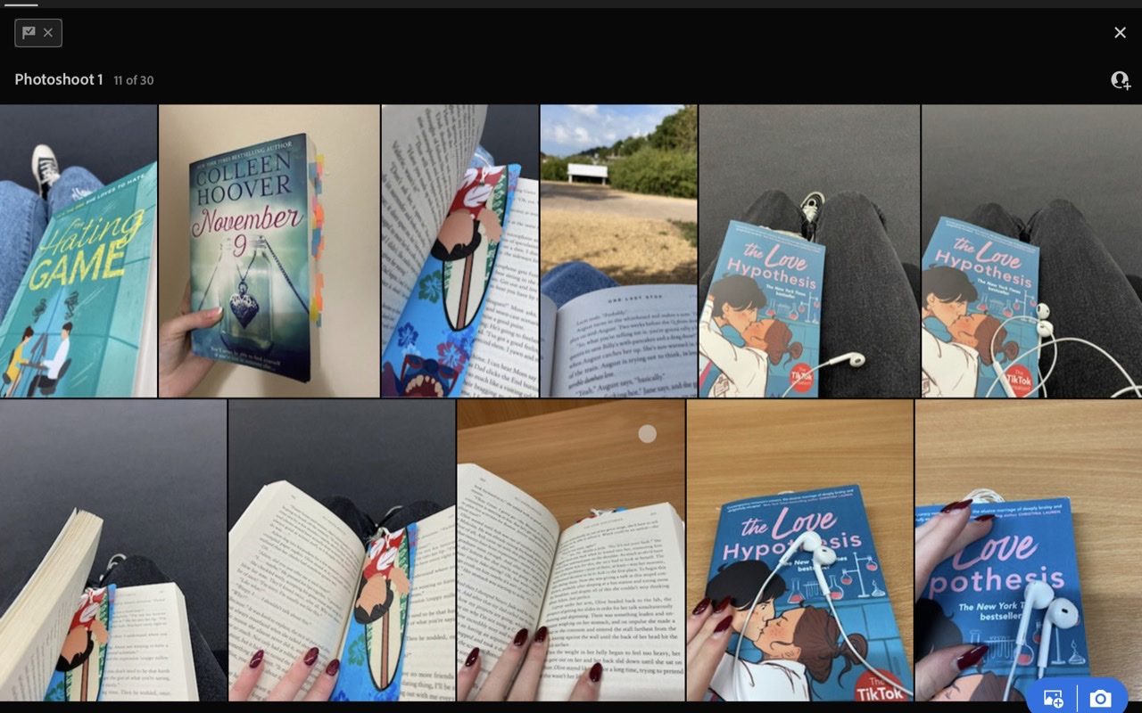
1st: Photos taken of my book from my point of view in various places.

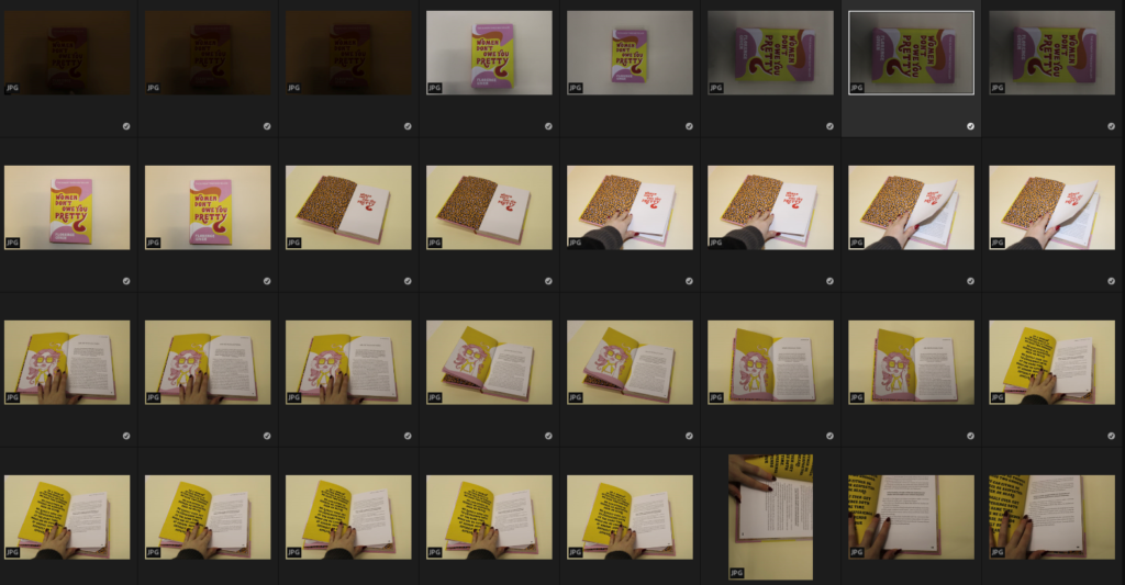
2nd: Similar to Henry Hargreaves work in the studio using books about feminism and working hard.

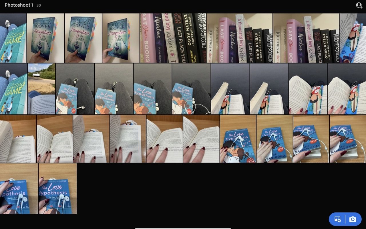
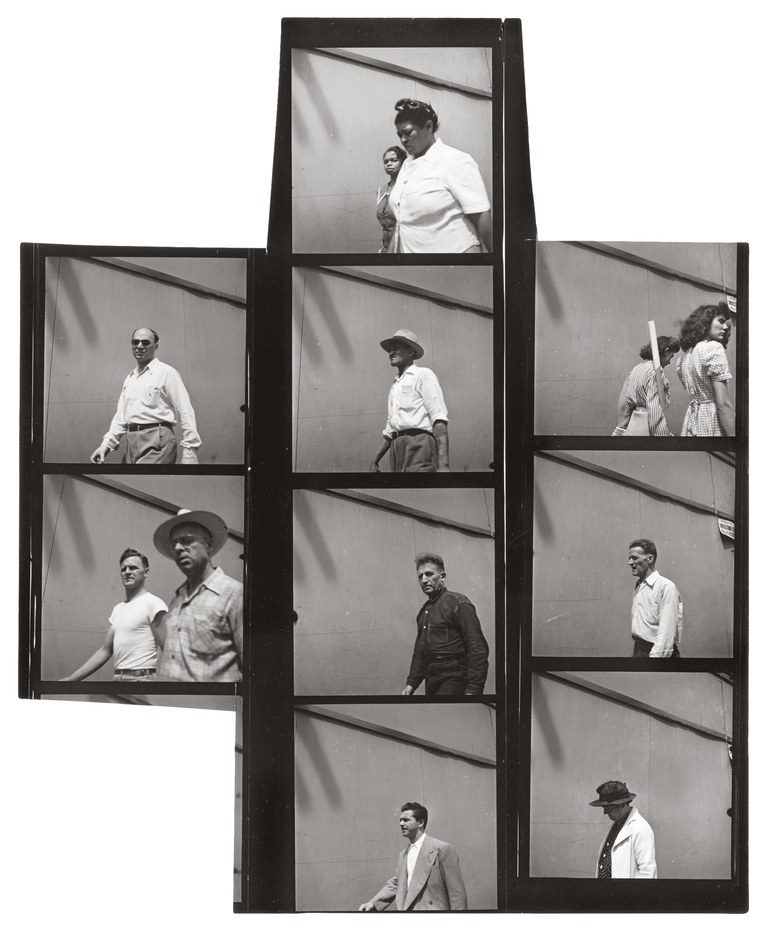
Contact sheet for 1st Photoshoot

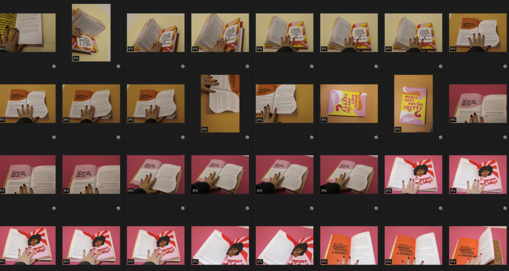
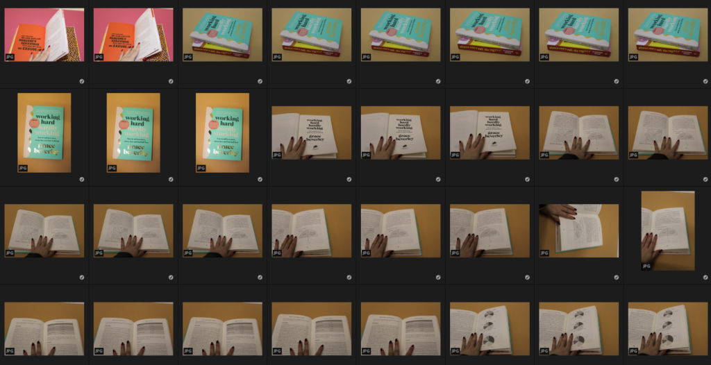
Here are photos which I took from various angles of different books, with a variety of locations and other props used to add detail and personality to the photos.

Best shots –

These are my best shots which I have selected on Lightroom which I think are successful and represent the viewpoint of looking down at a book you’re reading and how in solitude you can be and how calming it is. I will choose a few of these photos to use so that I can create my final outcome and edit them through Adobe Lightroom with editing to control the lighting/contrast/etc.

Contact sheets for 2nd Photoshoot

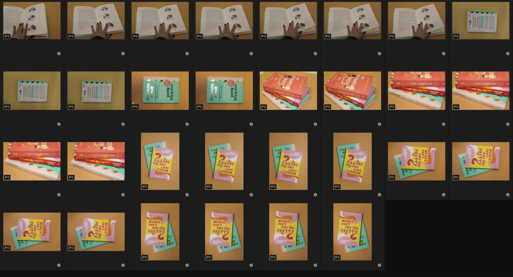
For this photoshoot, I used different coloured card to create bright backgrounds which is similar to Henry Hargreaves work and I think that these worked well with the books because the colours compliment each other nicely.

Best shots –

These are the photos which I have selected to be my best shots, this is because I like how the lighting is with the photos and the viewpoint which I have taken them from. I also like how the coloured backgrounds work well, as the colours compliment the book and the various pages which I have chosen to photograph.

diamond cameo

William Hall

William Hall originated from Scotland. William Hall was, according to his own account, born in the Scottish county of Roxburghshire around 1826. In the 1891 census, William Hall gives his place of birth as Selkirk, a Scottish town located in a neighbouring county. When he was in his twenties, William Hall moved to England, where, around 1853, he married his wife Eliza (born c1826, Portsmouth, Hampshire). The couple settled in the Sussex seaside resort of Brighton, where, during the 4th Quarter of 1854, their first child, Eliza, was born.

William Hall

General Photographic Institution was unusual in that the photographers offered to take portraits using all three of the available photographic processes. – Daguerreotype, Talbotype and Collodion Positive. 

During his business association with the photographer Stephen Grey, which lasted for over 4 years, William Hall had fathered two more children. William Hall junior was born in Brighton towards the end of 1856 and his brother James Hall was born in Brighton during the 2nd Quarter of 1858. William and Eliza Hall’s fourth child, Christiana (or Christina) Hall was born in Brighton during the 4th Quarter of 1859.

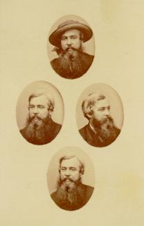
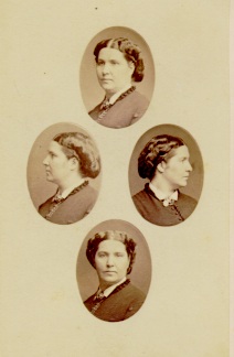
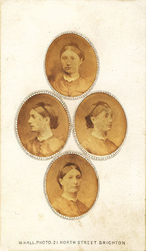
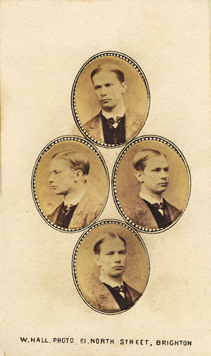
What I like about the image above: I think that the boarder on this image makes it more interesting as it makes the oval portraits stand out from the background, as its very light and the black contrasts with this. Furthermore, I think very warm tones in the ovals means that the portraits stand out more, and when I recreate diamond cameo I think I will do this but in a more modern way, maybe in black and white as this will be putting my own twist on this old fashion diamond cameo work, and I like how to can use some of my existing work (portraits) to do this.

Furthermore, I think that the the formal of these diamond cameos gives me a good opportunity to use some of my good portraits that weren’t suitable for other aspects of this portrait project. In my opinion these pieces are a good way to use both monochromatic portraits and colour photographs and showcase all angles of the face, especially the side profile, as stronger noses and jawlines are shown off great in these pieces of work, and the fact that the oval profiles of the faces and that fact that they can be edited makes modelling for creating diamond cameos even easier and the majority of the time, these models end up looking good and liking diamond cameo work.

Process of creating a diamond cameo:

  • Choose images and edit them in Lightroom
  • Find a diamond cameo piece that already made
  • Open this on photoshop and use this as a template
  • Cut out the portrait areas on the existing diamond cameo
  • Drag the new image you would like in this area into Photoshop
  • Repeat so that all of the portrait areas are filled
  • Position the ovals so that they are symmetrical

My examples and Analysis:

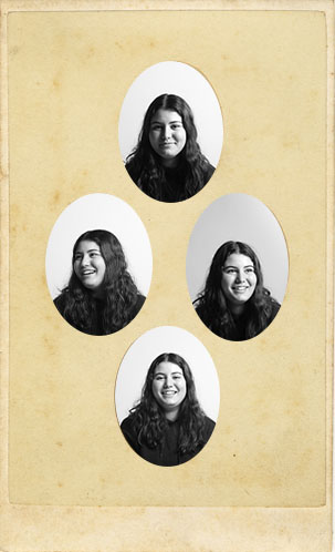
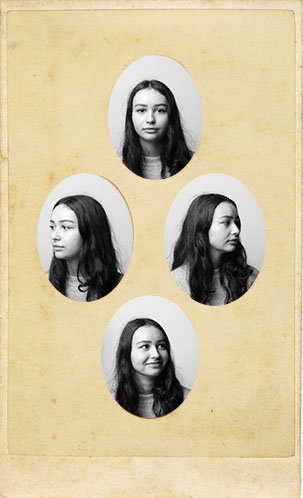
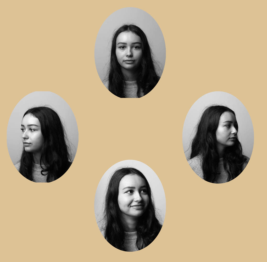
Here I have created a diamond cameo of Leticia, finding four separate images of her looking in different directions was easier than expected as we had instructed most of our models during our shoots to look in multiple different directions, as we knew we had to create diamond cameo pieces, but only using one persons face with four different photographs of the same person. I think that this image came out successful despite the small darker yellow tones around some of the oval portraits, as it was hard to position the pictures of her so that these darker tones were not visible, one other weakness is that the portrait on the left hand side has a slightly different background and this means that it stands out in a bad way, but i think the fact that she is still looking in the opposite direction, meaning this is still a good diamond cameo, makes up for the fact that it doesn’t one hundred percent fit with the other portraits.

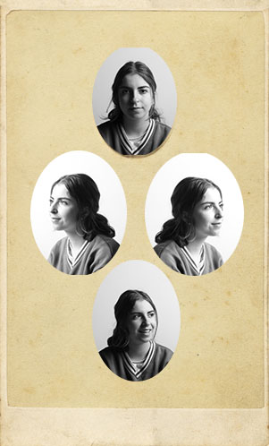
Above I have created a diamond cameo piece using photographs of Diana, finding a good variety of images to use to create a good piece was difficult, as we didn’t take any photos of Diana looking to the left during her photoshoot. To overcome this problem I put the image on the right into photoshop and flipped it around so i had an identical image but just reflected, this meant that I could still create this piece, as I couldn’t do this with images of a wider variety of people as photographs of them were just not suitable or of good enough quality to create diamond cameos out of. I think that this example is good as the ovals in the middle are slightly bigger meaning that the darker yellow tones around the ovals that appeared in diamond cameos of Leticia and Katarina did not occur, as this takes away the positive attention from the actual portraits. However this did made this piece not as symmetrical which could be seen as a weakness.

Final/ Best Piece:

I have selected this diamond cameo of Katarina as my final image as I think that the original photographs of her are better compared to the the ones of Leticia and Diana above as they required no editing and no need for using photoshop other than to create the actual diamond cameo. I think this piece is really good as Katarina has a good side profile and the lighting whilst taking the original portraits is better compared to when other modelled, as we got her to look in different directions and got her to laugh whilst doing so, these images came out looking very natural and only the top, deadpan aesthetic portrait, came out looking serious, and i think that the other ones are so unposed creates great contrast within this final piece. Furthermore, my favourite part about this diamond cameo is how symmetrical these portraits are without the same image being flipped to do so.

sequence

A photo sequence means putting a bunch of pictures in the order the viewer will receive those images, it can be for a book, an exhibition walking tour, or just the reading order of a few photographs displayed on a wall.

Tracy Moffatt

Tracey Moffatt is a contemporary Australian artist known for her photographs and films. With a variety of narrative techniques, including text, collage, and set design, Moffatt explores issues of childhood trauma, Aboriginal people, and popular Australian culture. She approaches all her work with a film director’s eye for setting and narrative, and her photographs play with a dynamic array of printing processes. Moffatt was the first Australian Indigenous artist to represent Australia for the 2017 Venice Biennale, in a solo presentation of two new photographic series Passage and Body Remembers in the Australia Pavilion in the Giardini.

Something More, 1989

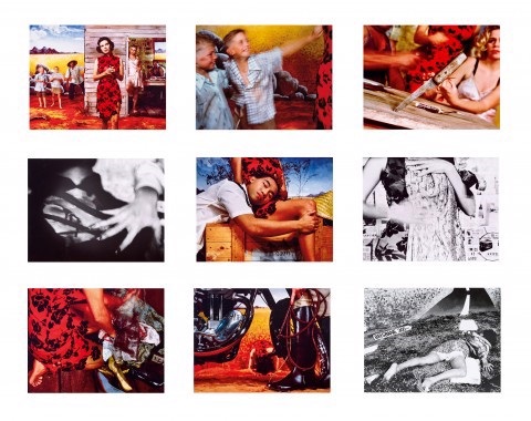
‘Something More; (1989) is a photographic series composed of six colour prints and three black-and-white prints. It is a now-iconic series of photographs that built Moffatt’s first widespread public attention, each of which borrows from film language to construct what is described as “an enigmatic narrative of a young woman looking for more out of life than the circumstances of her violent rural upbringing.” The series has been described by critic Ingrid Perez as ‘a collection of scenes from a film that was never made. While the film may never have been made, we recognise its components from a shared cultural memory of B-grade cinema and pulp fiction, from which Moffatt has drawn this melodrama. The ‘scenes’ can be displayed in any order – in pairs, rows or as a grid – and so their storyline is not fixed, although we piece together the arc from naïve country girl to fallen woman abandoned on the roadside in whatever arrangement they take.

Up in the Sky, 1997

In Moffatt’s series ‘Up in the Sky‘ (1997), the artist employs the aesthetic conventions of Italian Neo-Realist films to portray scenes of an outback town in which there is some lurking violence. “My work is full of emotion and drama, you can get to that drama by using a narrative, and my narratives are usually very simple, but I twist it,” she has explained. “There is a storyline, but there isn’t a traditional beginning, middle, and end.” The 25 images in Up in the Sky read like stills from a black-and-white movie, set in an Australian outback town desolated by poverty, violence and despair. The narrative of the series is non-linear, but threaded through it are the figures of a young white woman and an Aboriginal baby who represent moments of peace and love amongst the menacing figures of grim nuns withered old men and feral townspeople.
Contact Sheets

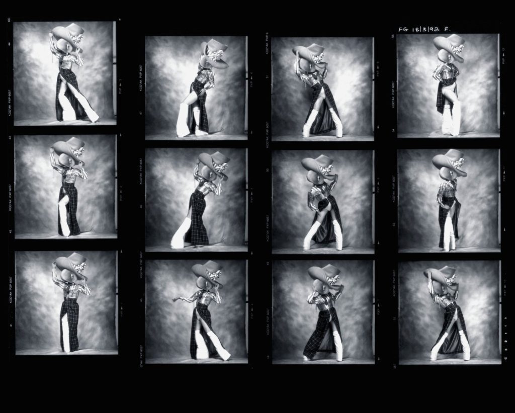
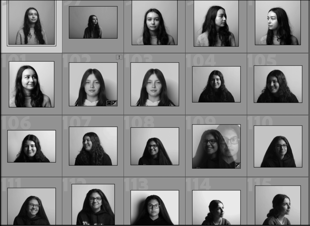
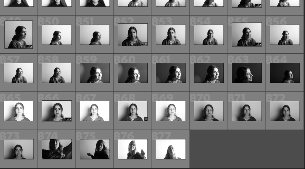
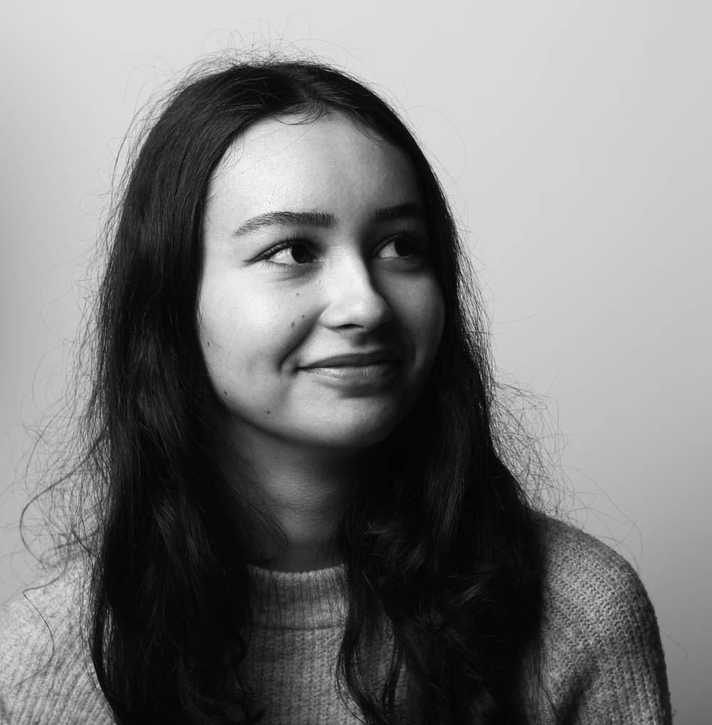
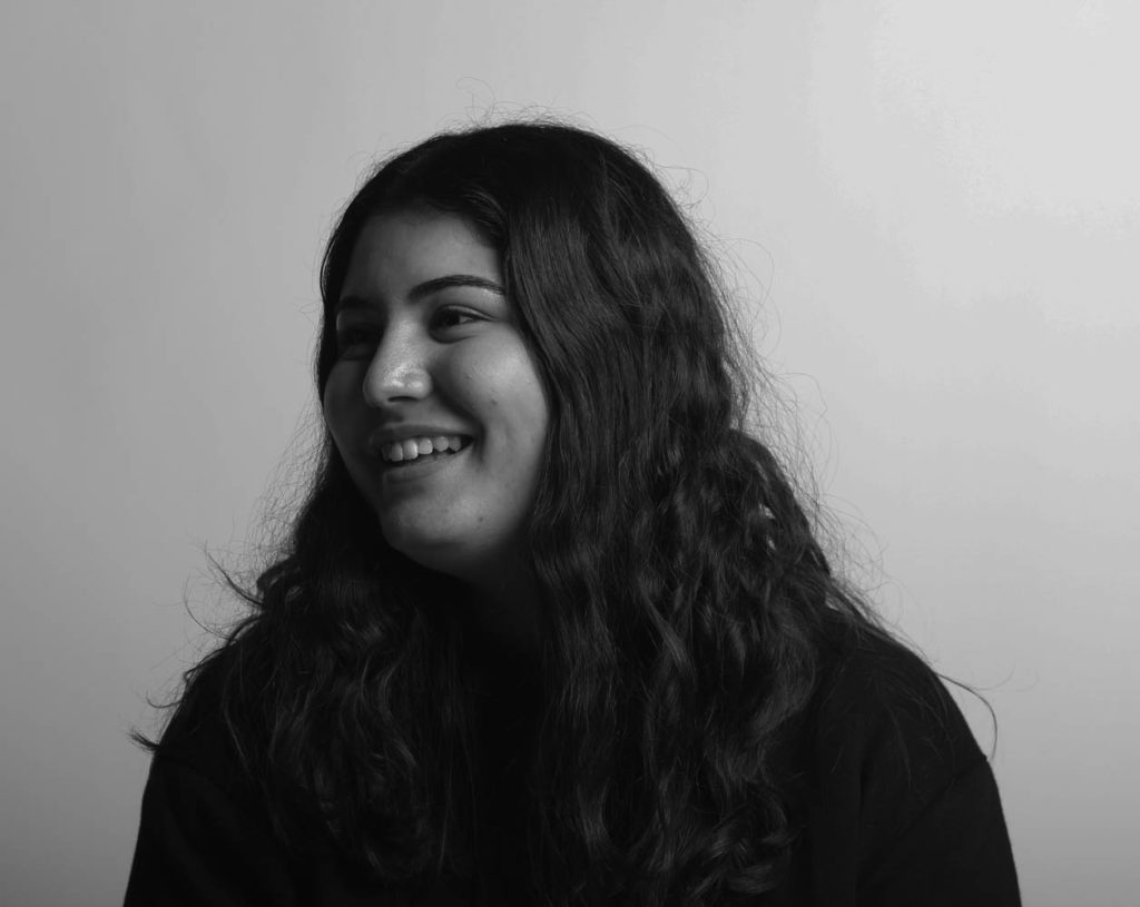
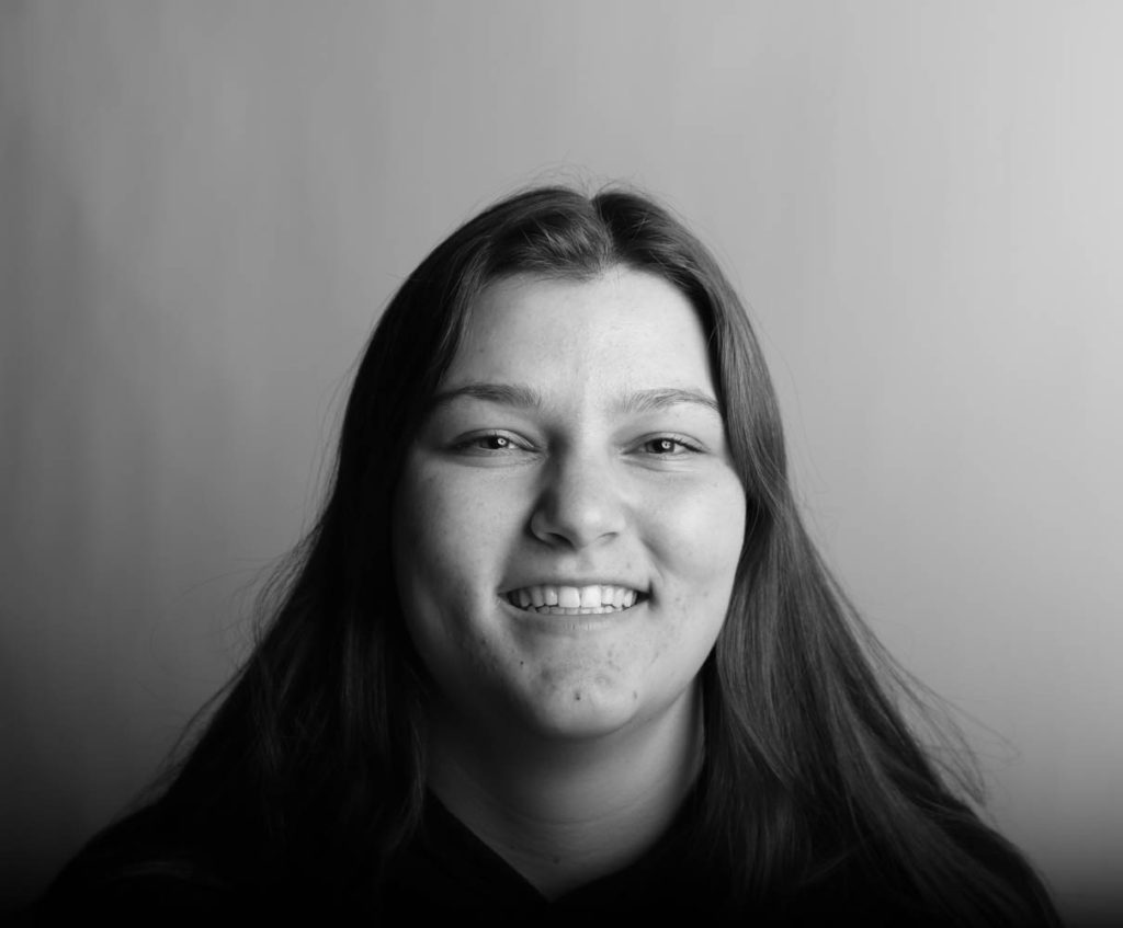
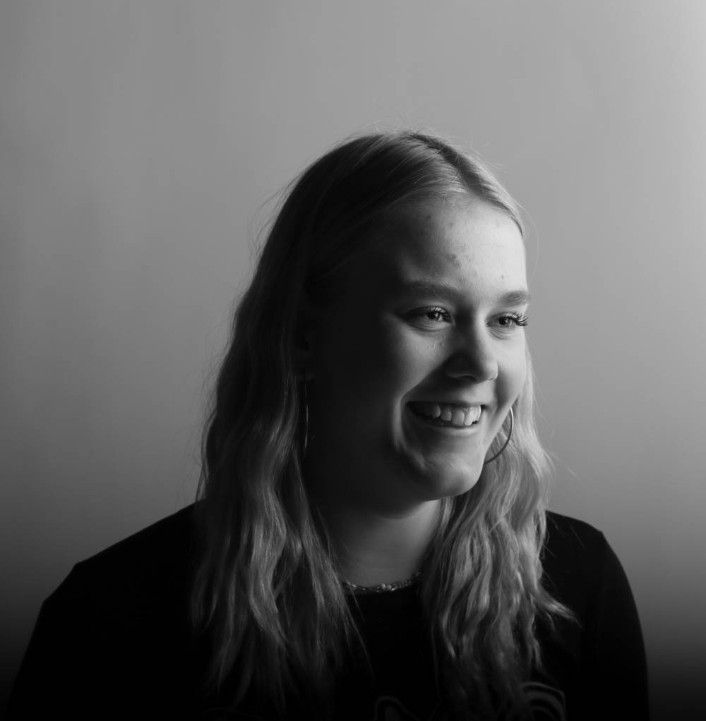
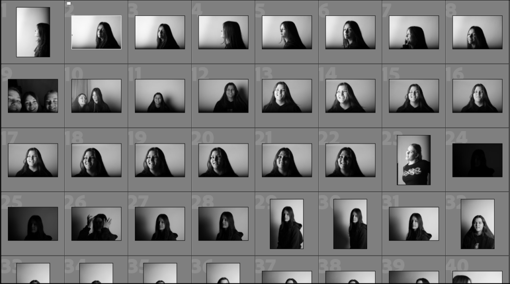
These are some of my contact sheets from the photoshoot, they consist of portraits that are taken from different angles and in different lighting so that I could find which look best for each individual person. I also tried to get as many different faces/emotions as I could so that there were contrasting emotions and it also made it easier to make different sequences.

Editing

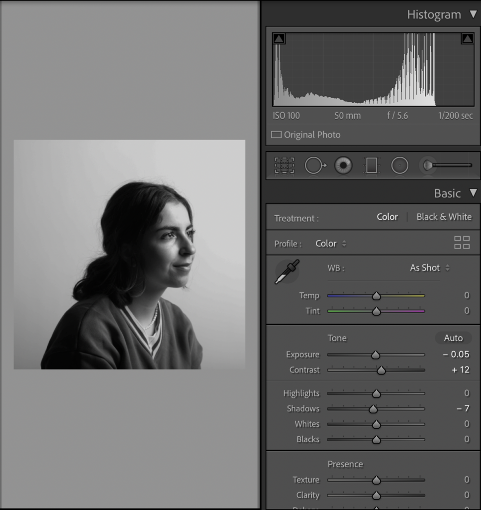
In most of my photos, I really like how they came out a first hand so I have only slightly adjusted the exposure, contrast and some others etc, highlights and shadows.

Final Images

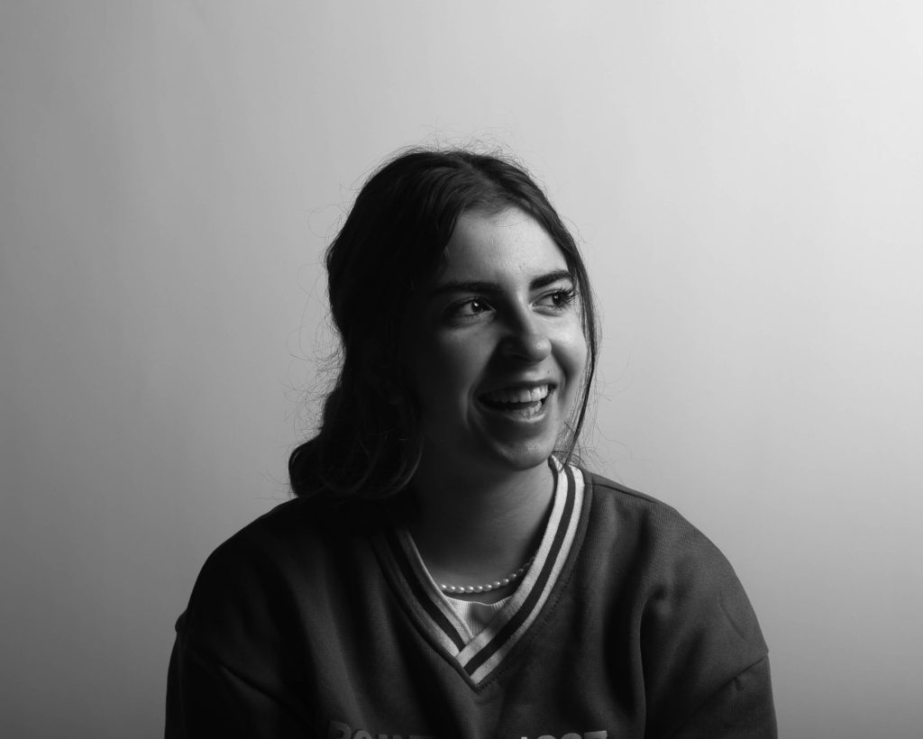
I have chosen to do two different sequences, the first one is us smiling either towards the camera or while looking away and the second one is the black expressions looking straight at the camera. These are two different and contrasting sequences as there are very different emotions being shown.

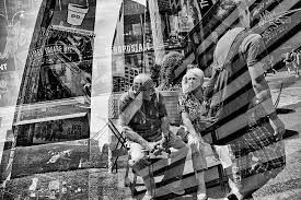
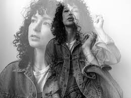
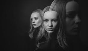
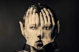
DOUBLE / MULTI-EXPOSURES

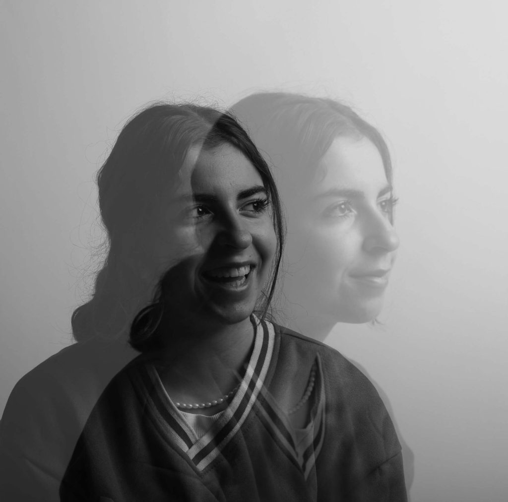
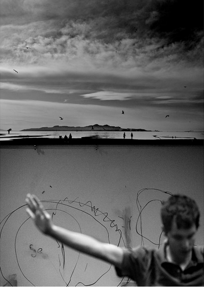
A multiple exposure photograph is a type of photo that is created by exposing the same frame of film to light two or more times. Harking back to the days of early film cameras, this allowed the photographer to superimpose one image over another, creating a ghostly image that showed two scenes at once.
Alexander Rodchenko

Alexander Rodchenko was known for his politically motivated photography, posters, paintings, and sculpture. “The avant-garde of Communist culture is obligated to show how and what needs to be photographed,” he said of the medium. “What to shoot—is something every photo group knows but how to shoot—only a few know.” An early influence came from Kazimir Malevich, whose Suprematist style contributed to Rodchenko’s adoption of an austere aesthetic and use of materials.
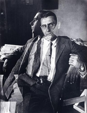
Painter Alexander Shevchenko – The double exposure portrait, 1924

Rodchenko was one of the most versatile Constructivist and productivist artists to emerge after the Russian Revolution. He worked as a painter and graphic designer before turning to photomontage and photography. His photography was socially engaged, formally innovative, and opposed to a painterly aesthetic. Concerned with the need for analytical-documentary photo series, he often shot his subjects from odd angles—usually high above or down below—to shock the viewer and to postpone recognition. He wrote: “One has to take several different shots of a subject, from different points of view and in different situations, as if one examined it in the round rather than looked through the same keyhole again and again.”

Contact Sheets

These are some of the photos from our photo shoot, they are portraits of me and my friends with different emotions, they were taken from different angles and with different lighting to try and find what works for each person.

Editing

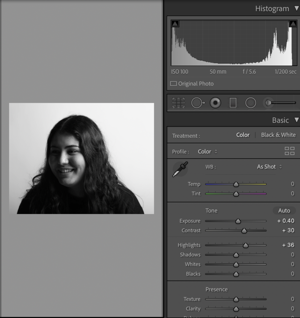
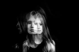
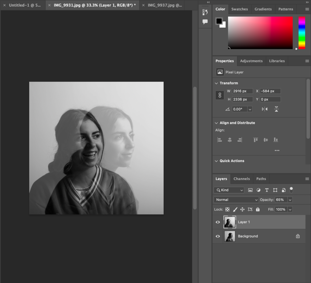
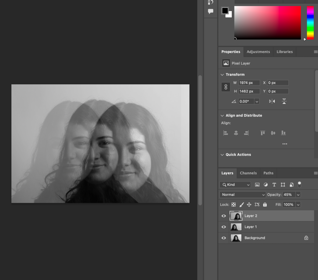
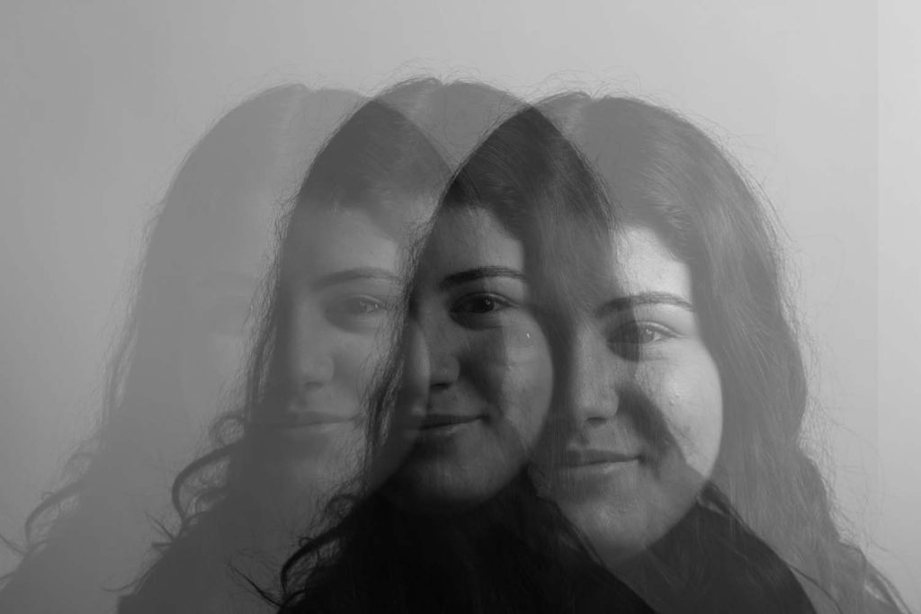
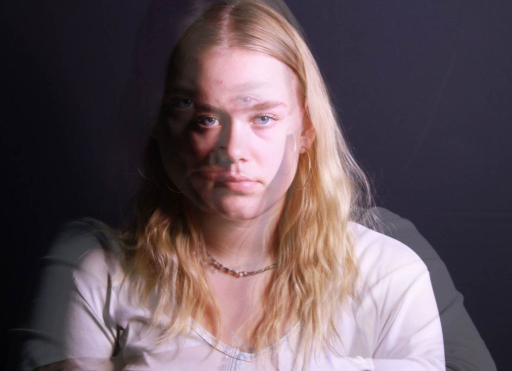
While editing I used both Lightroom and photoshop, in Lightroom I adjusted both the exposure and contrast as some of the photos were overexposure due to the lighting. I moved the pictures to photoshop where I layered images and reduced the opacity so that you could see the different layers which created a ghostly effect. On the right, I have used the same three images but have moved two away from the centre but are still overlapping whereas on the left I have used two different images which give two angles of the model instead of just the one.
Final Images

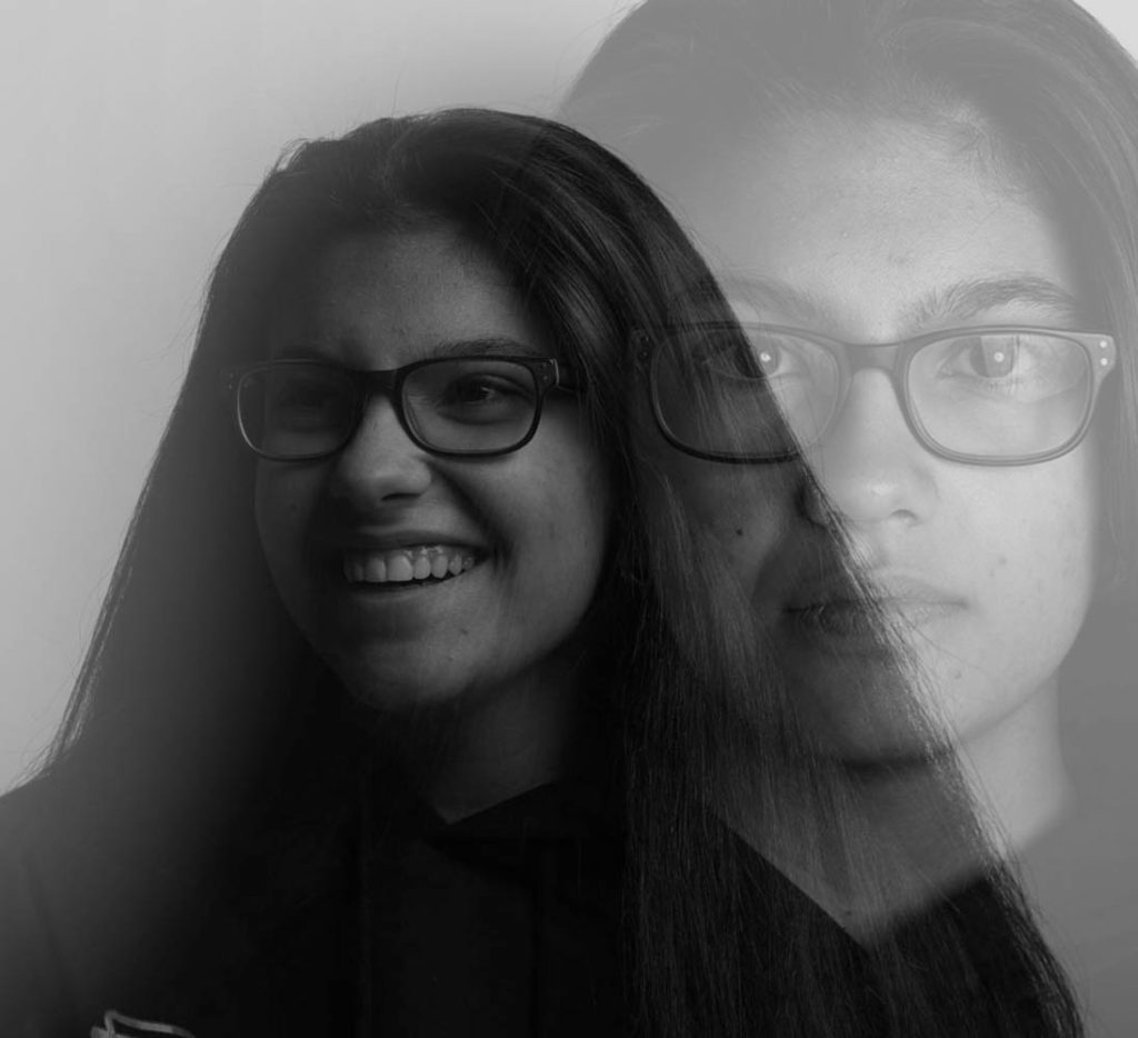
These are the final four images that I have chosen because I think that they all have unique differences which make them eye-catching. I like the bottom image because of the pink tint as it stands out against the three black and white images, I also like how you can see the multi-exposure and her face clearly which makes the photo captivating. The top right and left photos are similar as they have two exposures, one of the models smiling/laughing and one of them with serious/blank features. The two contrasting emotions allow the viewer to see two sides of the model all in one photo, the photo on the left I also like how the black expression is bigger but still seems to be in the background of the photos while the laughing on is seen as in front.
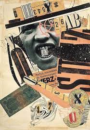
PHOTO-MONTAGE

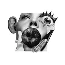
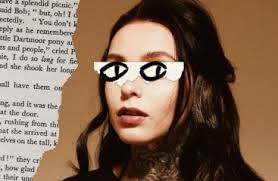
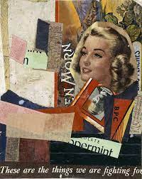
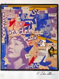
Photomontage, a composite photographic image made either by pasting together individual prints or parts of prints, by successively exposing individual images onto a single sheet of paper.

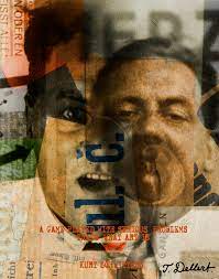
Kurt Schwitters

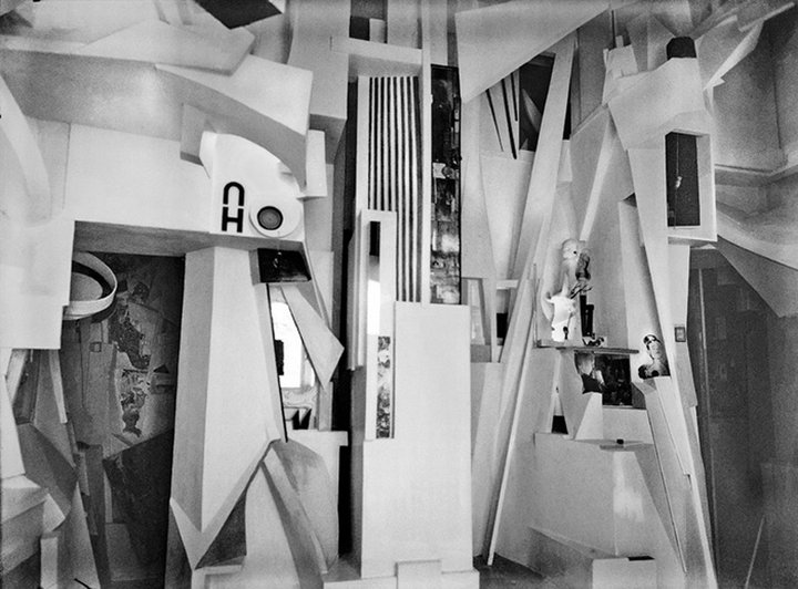
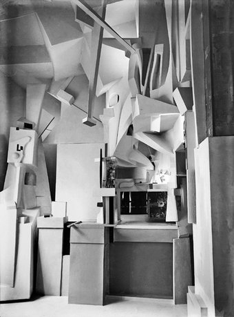
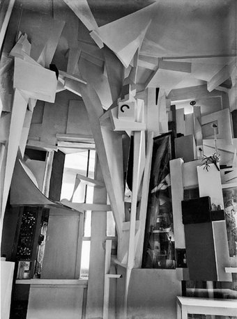
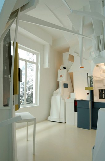
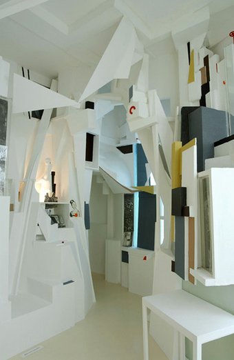
Kurt Schwitters was a German artist involved in both Dadaism and Constructivism. Schwitters is best known for his Merz and Merzbau works, which incorporated collage, found objects, typography, and sound poetry to construct unique compositions. In these works, the artist used magazine clippings, waste material, and other recycled items in an attempt to express the rapidly changing world.

Alongside his collages, Schwitters also dramatically altered the interiors of a number of spaces throughout his life. The most famous was the Merzbau, the transformation of six (or possibly more) rooms of the family house in Hanover, Waldhausenstrasse 5. This took place very gradually; work started in about 1923, the first room was finished in 1933, and Schwitters subsequently extended the Merzbau to other areas of the house until he fled to Norway in early 1937. Photos of the Merzbau were reproduced in the journal of the Paris-based group abstraction-création in 1933-34, and were exhibited in MoMA in New York in late 1936.

One entire wall of the Merzbarn was removed to the Hatton Gallery in Newcastle for safe keeping. The shell of the barn remains in Elterwater, near Ambleside. In 2011 the barn, but not the artwork inside it, was reconstructed in the front courtyard of the Royal Academy in London as part of its exhibition Modern British Sculpture.

“I could see no reason why used tram tickets, bits of driftwood, buttons and old junk from attics and rubbish heaps should not serve well as materials for paintings,” he observed. “It is possible to cry out using bits of old rubbish, and that’s what I did, glueing and nailing them together.”

Final Images

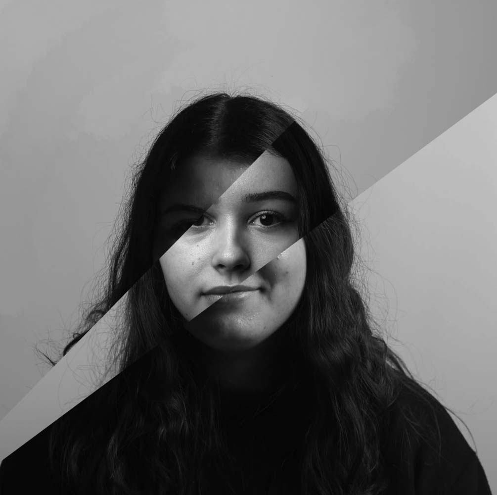
I have put together three photo montages, using the photos from out portraits photoshoot. The image on the right I have split two portraits with neutral expressions down the middle and I photoshop I have placed them together, I have tried to line the faces up evenly, while still showing all the features of the faces. The photo in the middle I have left in colour as I liked how vibrant the colours are and stood out underneath the two black and white eyes. The eyes are from other portraits of different people which I have tried matching up with the different elements of the background photo. And lastly the photo on the left includes two portraits, one is underneath another which has been split so that it looks like they are slowly coming apart revealing a different face.

I like all of these montages, as they bring different aspects and different ways of montaging photos together. I especially like the image on the right as I think the two halves of the faces compliment each other as they are two different skin tones as well as having darker/lighter clothing. the image on the left I think i should have kept more of the face from the photo on top to make it seem more like it was slowly coming apart and less like there has been a chunk taken out of it.

Diamond cameo

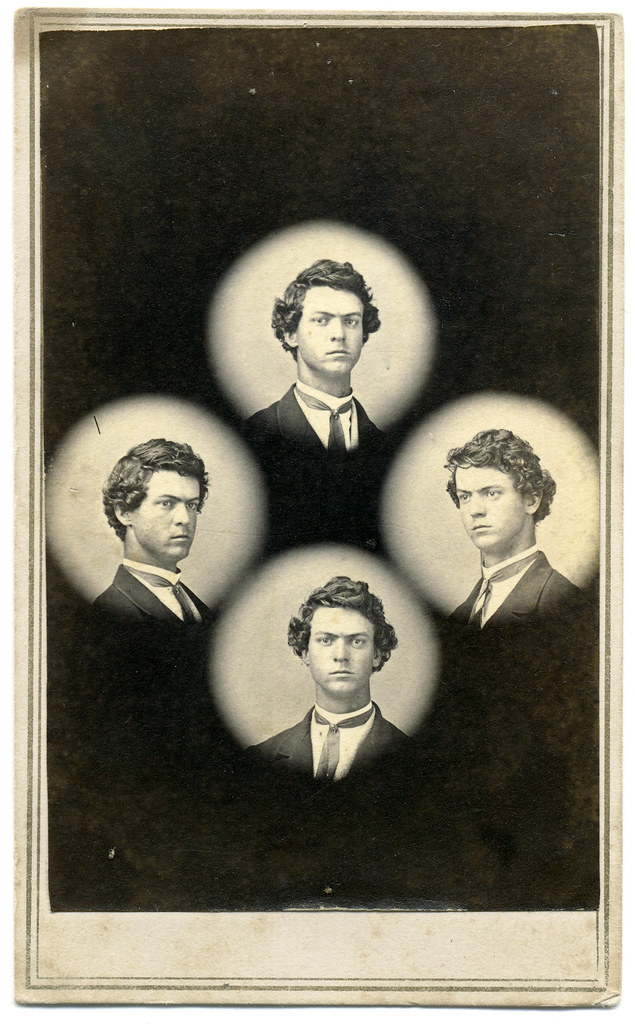
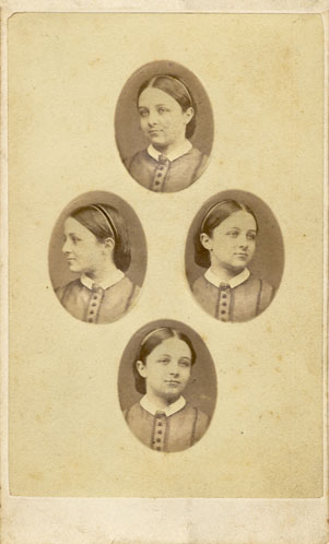
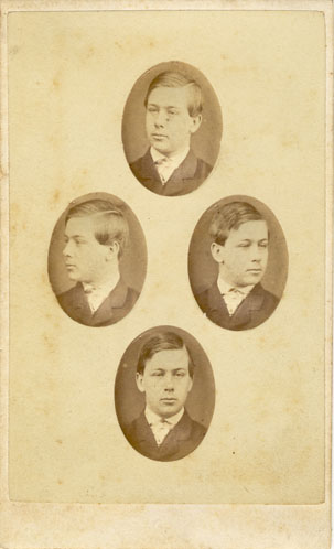
A diamond cameo is when 4 portraits of the same person are placed onto paper in a diamond shape, each photo having the model looking in a different direction

In 1864 was when Diamond cameos started getting used, four small oval portraits were placed on a visit card in the shape of a diamond, each portrait being of the same person photographed in a different position. A special camera made by Dallmeyer was used in which the one glass negative was moved to a new position in the back of camera after each portrait had been taken, and when the paper print had been pasted on the card a special press was used to punch the four portraits up into a convex cameo shape. But if there had been a failure of just one of the four portraits through movement, poor expression or incorrect exposure meant that the plate had to be rejected and another four portraits made on a new plate.

In 1865 Frazer Crawford returned from Melbourne with ‘all the latest improvements and novelties in photography’ which included a camera to make Diamond Cameo photographs which, he said, was a new style that was ‘becoming so fashionable.’

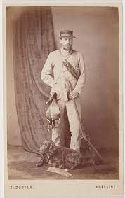
Townsend Duryea

Townsend Duryea and his brother were American-born photographers who provided South Australians with invaluable images of life in the early Colony. 

Townsend Duryea began making Diamond Cameos about May 1865, saying that as he was ‘supplied monthly with all the most recent improvements by the most eminent photographers of England and America’, he felt it was his duty ‘to the public of South Australia to introduce any improvement or novelty worthy of note with as little delay as pressure of business will admit of.’ The novelty of the Diamond Cameo must have worn off by the end of the year as he offered his camera for sale in December, ‘complete with press and dies.’

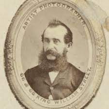
William Hall

William Hall was a Scottish photographer that moved to England in his twenties, he did this to create a partnership with Stephen Grey ion Brighton who was a portrait painter and photographer. By July 1854, the firm of Grey and Hall had established a ‘Photographic Institution’ at 13 St James’ Street, Brighton. In an advertisement dated 13th July 1854, Grey & Hall announced the opening of their “General Photographic Institution”, where they made photographic portraits “by all the most recent  and improved processes, by License of the Patentees”. In 1862 Hall brought a business premises at 21 North Street, Brighton. The building had previously been used as a lace and linen warehouse, but Hall successfully converted it into a photographic portrait studio. By the early 1860s, William Hall was mainly producing small carte-de-visite portraits at his photographic studio.

Between 1870 and 1873, William Hall was operating a photographic booth on the West Pier as well as a well-equipped photographic studio at 21 North Street, Brighton. The carte-de-visite portraits produced at Hall’s West Pier booth are distinct from the formal portraits taken at Hall’s main photographic studio in North Street. Whereas the portraits taken in Hall’s North Street premises contain the usual studio props – furniture, drapes, books, painted backcloth, etc., his West Pier portraits are more stark with plain backgrounds with only a collection of fake rocks and boulders to suggest a seaside setting. William Hall closed his West Pier studio after a couple of years.

Final Images

Here I have tried to make a diamond cameo out of some of the portraits I have taken. I edit this in photoshop by creating the ovals and putting the different angled portraits in them. I also tried to pick a neutral colour for the background as I wanted the photos to be the main focus. I like how in all the photos they are very similar as they were taken in the same lighting and the camera wasn’t moved, but the shadows move around the face due to the different positions of the face.

I tried to match the colour of the background to the with the other popular cameos so that they look similar but so that you can see the difference between the modern portrait and one taken in the early 1900s.

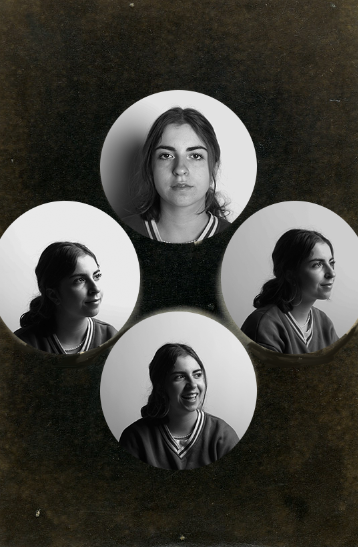
In this diamond cameo I have used an old cameo which I have chosen off google as my background and have used the framing tool to out line each circle where I want to place my portraits. I like how the black and white photos sit on the darker background, which isn’t fully black and has little specs of white which shows it age and gives an idea of when the background may have been used first. I couldn’t find a portrait which was looking to the left so i chose a similar portrait of her looking in the same direction but at a different angle and with different lighting.

Juxtaposition

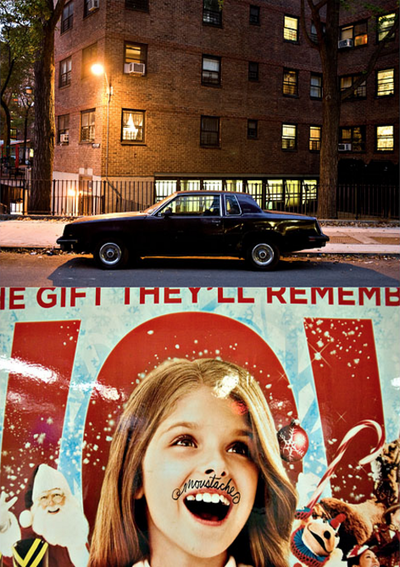
A juxtaposition is an act or instance of placing two elements close together or side by side. This is often done in order to compare/contrast the two, to show similarities or differences.

In some pieces where photographers have juxtaposed their photos, they have united them by the quality of light, different viewpoints, subjects, colours and moods to create tension.

Photographers tend to juxtapose their photos when they are trying to highlight or focus on their similarities or differences. They could be trying to show wealth and poverty, class differences, beauty and ugliness or even the different lighting. Photographers might also use this technique for people to see different ways of living in certain places around the world.

Henry Mullins / Michelle Sank

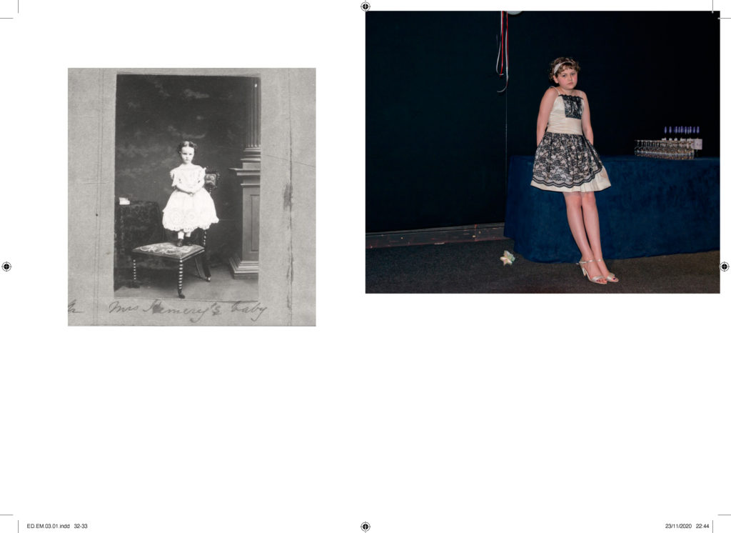
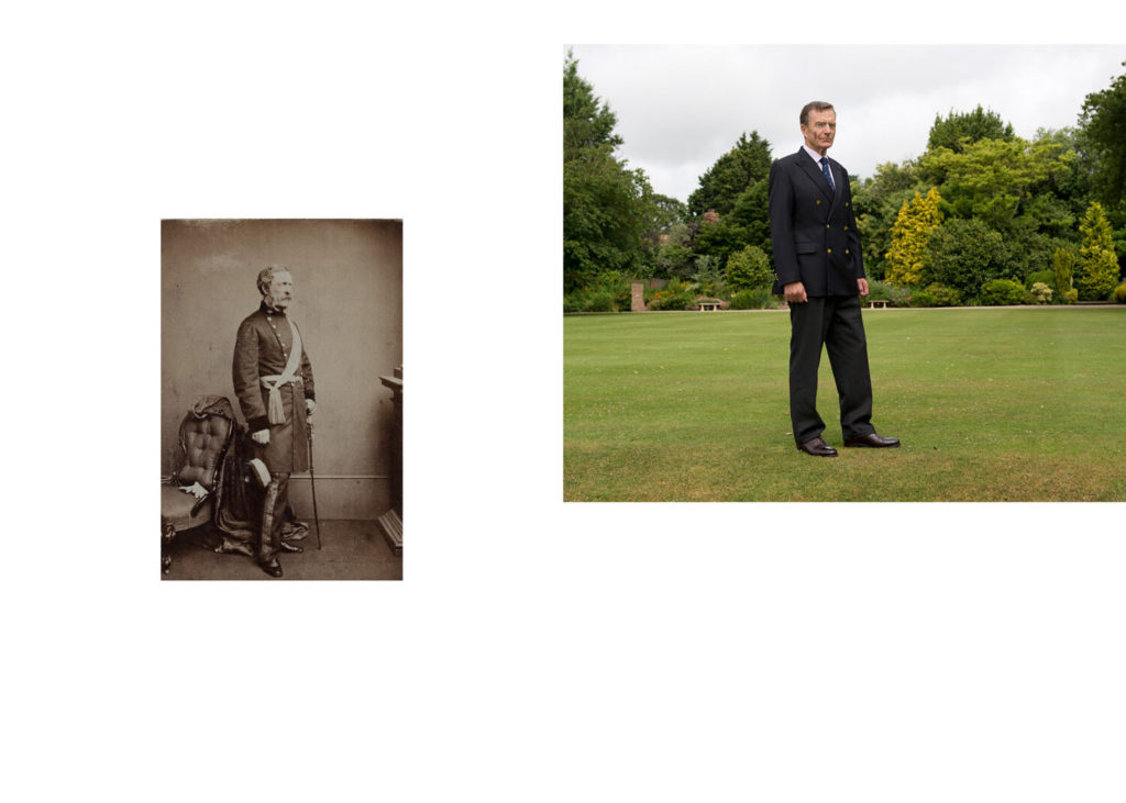
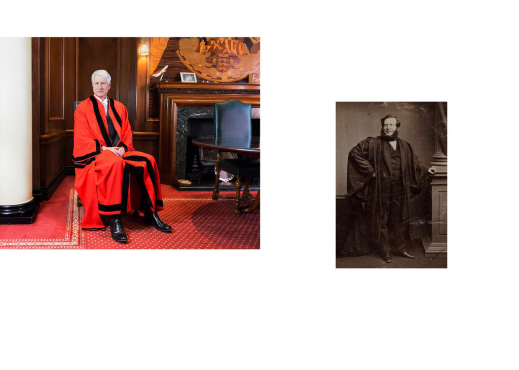
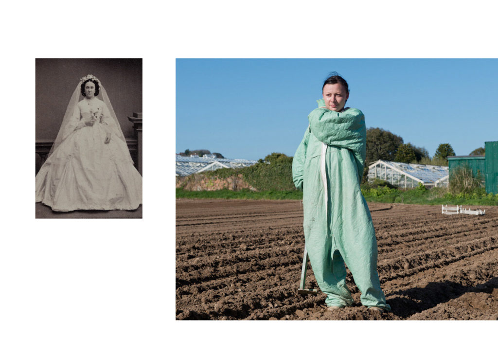
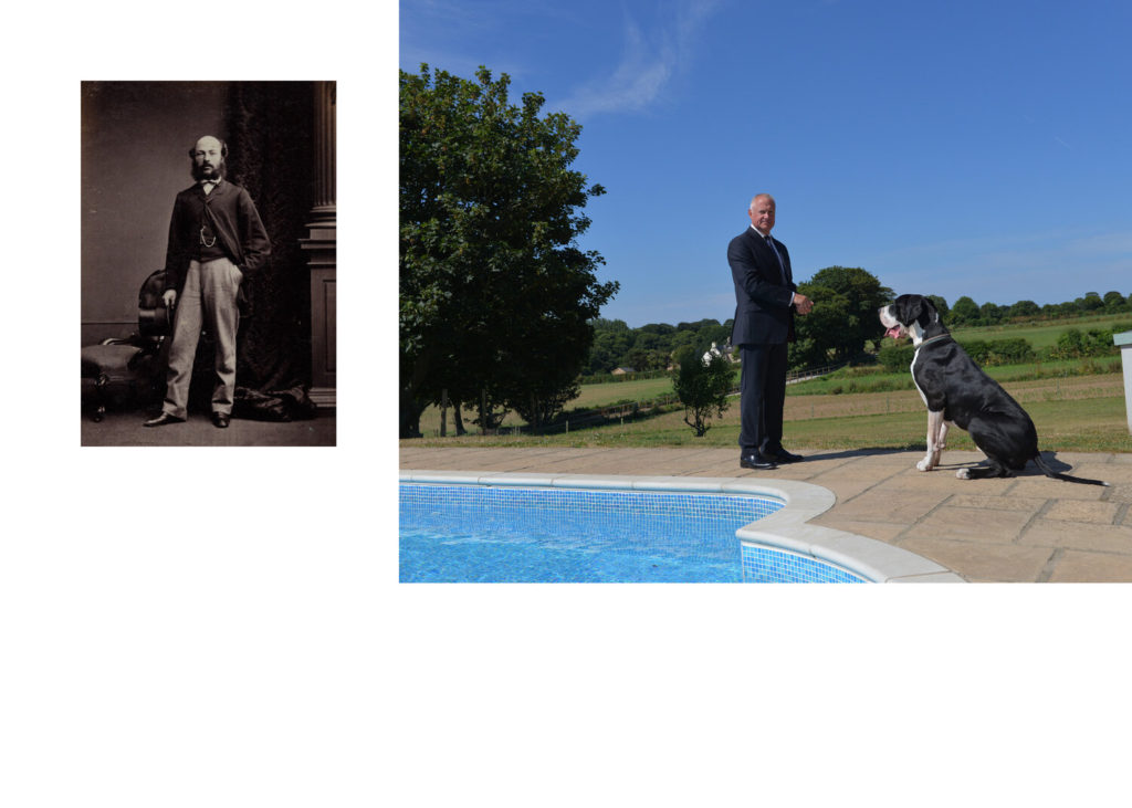
Henry Mullins and Michelle Sank represent 165 years of the practice of photographic portraiture in Jersey. That period has seen the island undergo major social and economic changes. Sank shows how the social divides that were placed during Mullins time can still be seen today. For example in the bottom left photo Sanks image of a farmer in the middle of a field contrasts with Mullins image of a woman in what seems to be upper class getting her portrait taken.

Between 1850-73 Henry Mullins made over 9000 carte de visite portraits of Jersey’s ruling elite and wealthy upper classes. The collection that exists of his work comes through his studio albums, in which he placed his clients in an ordered grid with reference to mid-nineteenth century social hierarchies. 

“This sense of theatre, ritual and a richness of materiality are things I was very tuned into during my residency and consequently when making the work which crossed class, age and gender.” -Michelle Sank

My Experiments

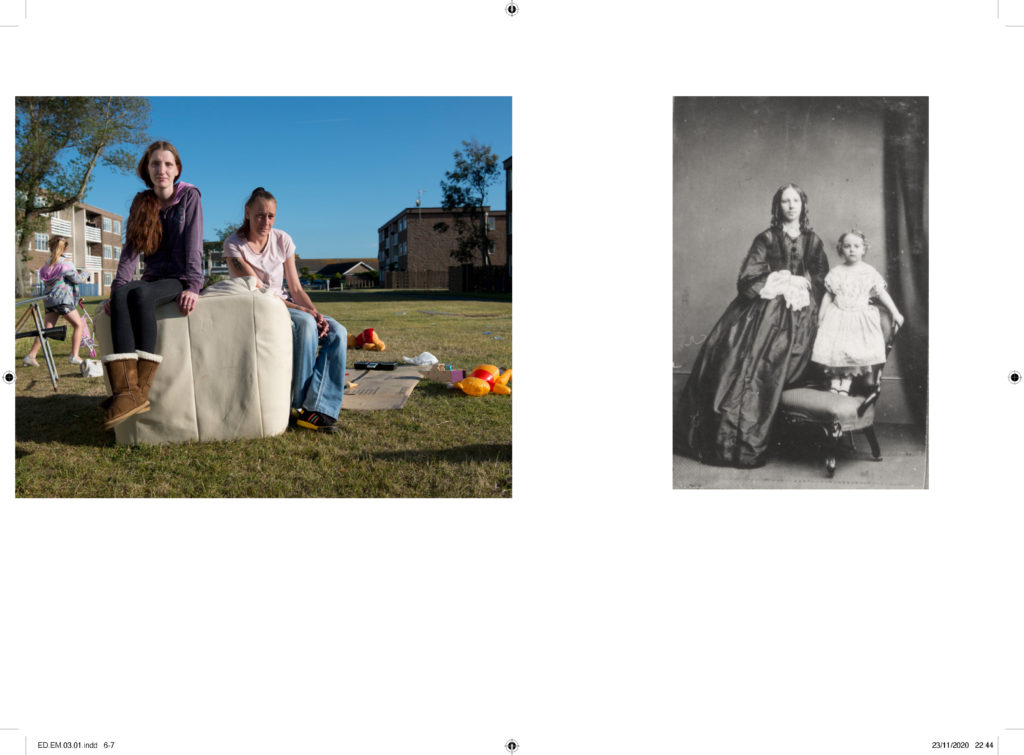
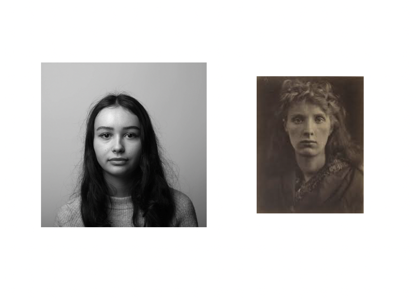
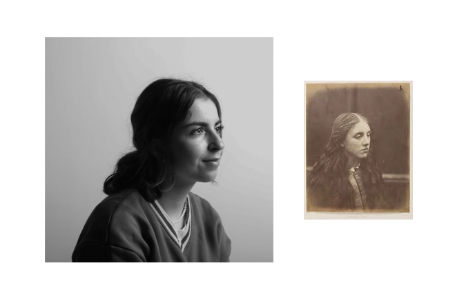
I have used two portraits taken by Julia Margaret Cameron and have put them next to two other portraits that are more modern and are in black and white which I have taken. I like how in Cameron’s photos you can see the age through the colours, how clear the portraits are and on the right, you can see the wore out edges.

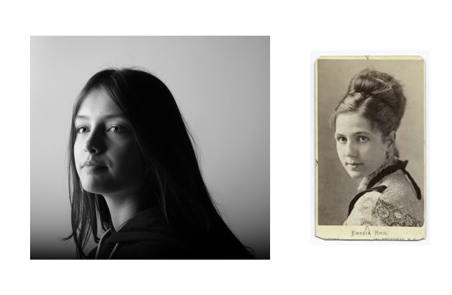
I have used a portrait of a young woman which was taken in the 1800s by an unknown photographer. I like how in both photos they are both in the middle and looking in the same direction but you can see clearly that they are from two different eras and not just by the quality of the portraits. The more modern hairstyle and clothing contrast with the older style that was worn during the 1800s.