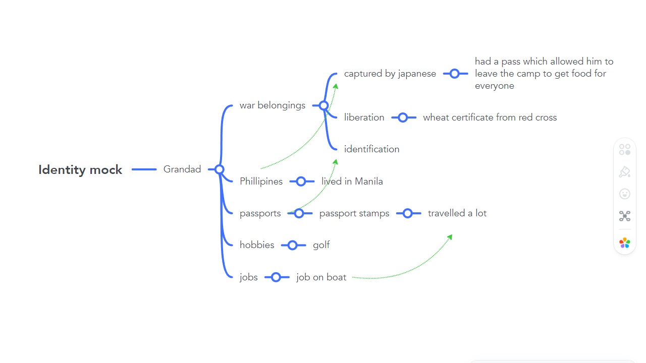
Mind-map of ideas


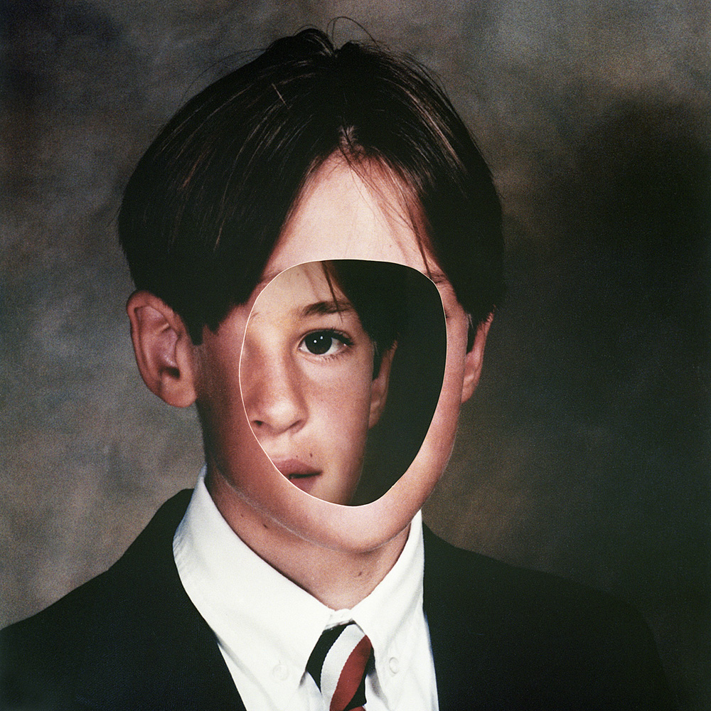
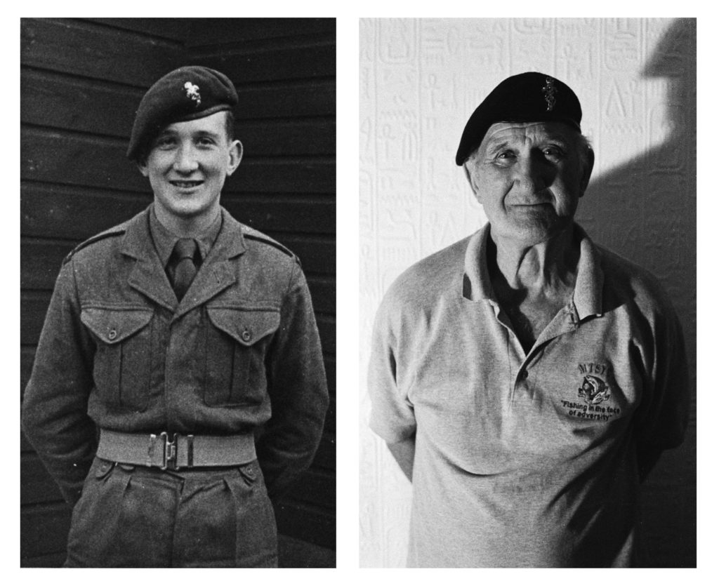
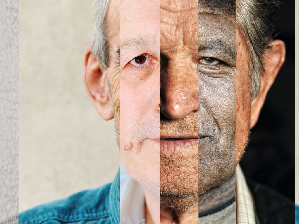
The identity of a person or place is the characteristics they have that distinguish them from others.
Identity can be influenced by “place”, or belonging, your environment or upbringing. Many factors lie within someone’s personal identity, such as gender identity, cultural identity, social identity, geographical identity, political identity.
CLICK ON IMAGE BELOW FOR ANALYSIS OF INSPIRATIONS
These factors can change how people think of others and themselves which can also lead to a lack of identity where an individual may question who they are and may feel disconnected from who they are as a person.

INSPIRATIONS
CORINNE DAY
Corinne Day (Feb 19 1962 – Aug 28 2010) was a British photographer whose influence on the style and perception of photography in the early 1990s and onwards has been immense.
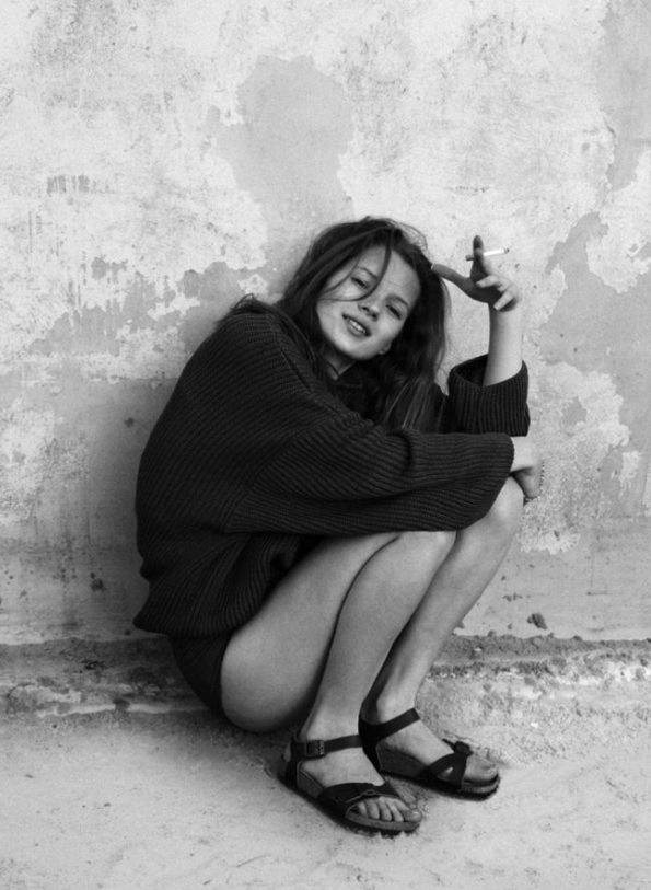
Self taught, Day brought a more documentary look to fashion imagery, in which she often included autobiographical elements. Her pictures unflinchingly document her life and relationships with a realist snapshot aesthetic-representing a youth culture set against the glamour of fashion and avoiding fictionalization or voyeurism.
Gaining notoriety both for a scandalous photo of Kate Moss in Vogue in 1993 and for pioneering so-called ‘grunge’ fashion photography, she was exiled from the mainstream fashion media-which had always been wary of her potential for controversy

FRANCESCA WOODMAN
Francesca Stern Woodman was an American photographer best known for her black and white pictures featuring either herself or female models. Despite her short career, which ended with her suicide at the age of 22, Woodman produced over 800 untitled prints.
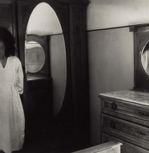
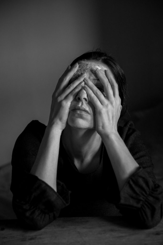
Influenced by Surrealism and Conceptual Art, her work often featured recurring symbolic motifs such as birds, mirrors, and skulls. Many of her photographs show women, naked or clothed, blurred, merging with their surroundings, or whose faces are obscured.

RYAN MCGINLEY
Ryan McGinley was born on October 17, 1977, in Ramsey, New Jersey. He received a BFA in graphic design at Parsons School of Design, New York, in 2000. That same year he staged his first solo show of photographs, The Kids Are Alright, inside an abandoned warehouse in New York’s SoHo neighbourhood.
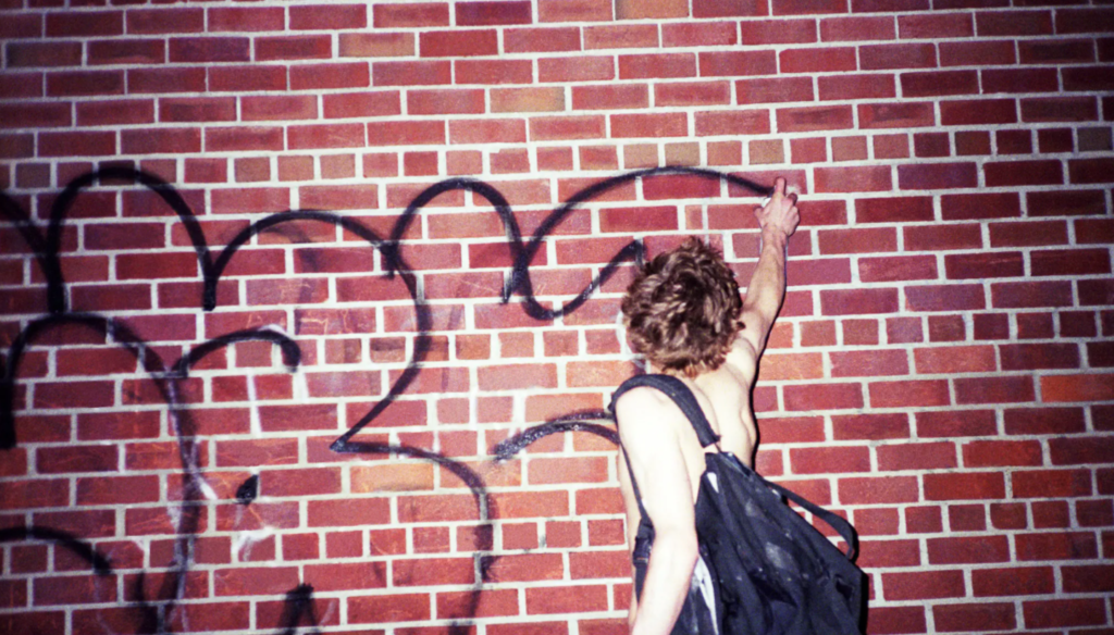
McGinley’s work typically features young, white models outdoors, captured in a carefree mode that the artist calls an “evidence of fun. He gravitated toward street culture early in his adolescence and began hanging out with a band of self-proclaimed outsiders—skateboarders, club kids, graffiti artists, queer-identified youths, and indie musicians.

The definition of identity is who you are, the way you think about yourself, the way you are viewed by the world and the characteristics that define you.
definition in photography: A photograph resembles the likeness of what appeared before the lens. So, in the case of a profile picture, family album or mug shot, identity is based on the repetition of sameness that is evidenced by the image produced by the camera.
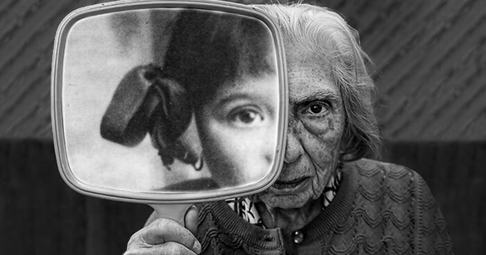
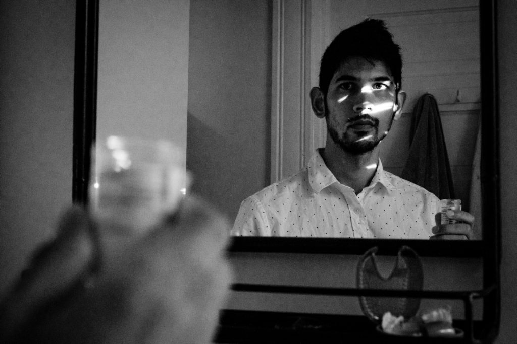
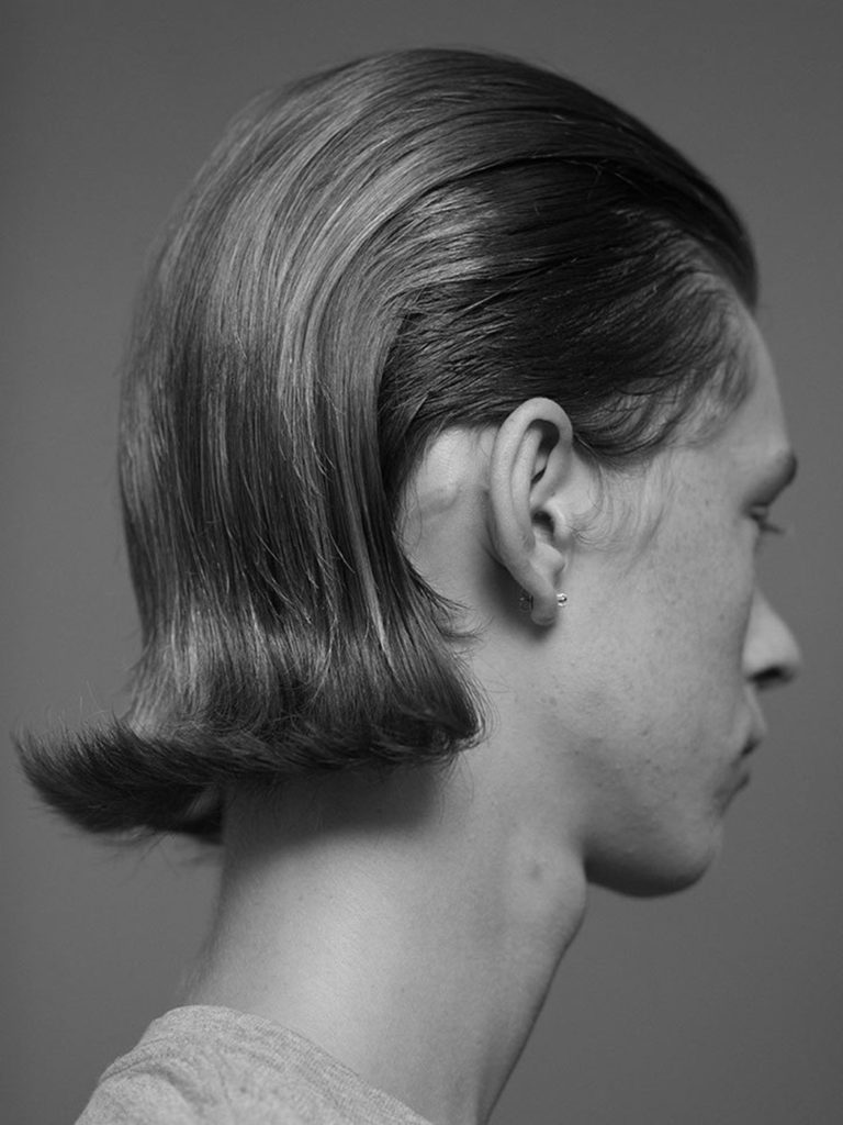
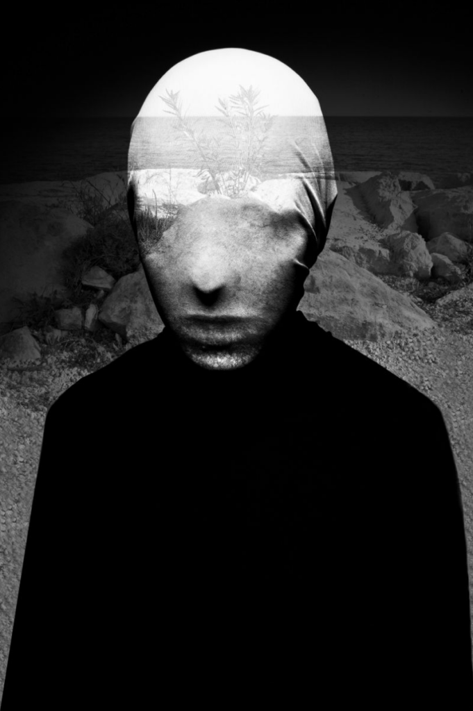
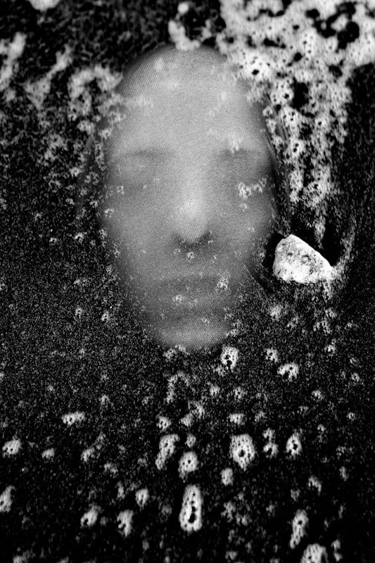
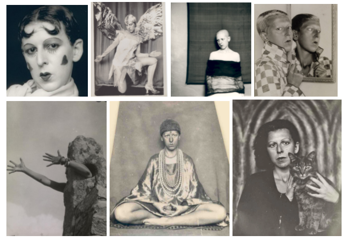
Claude Cahun, born Lucy Renee Mathilde Schwob was a French surrealist photographer, sculptor, and writer.
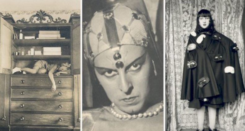
Schwob adopted the pseudonym Claude Cahun in 1914. Cahun is best known as a writer and self-portraitist, who assumed a variety of performative personae.
Cahun’s work is both political and personal. During World War II, Cahun lived in Jersey and was active as a resistance worker and propagandist
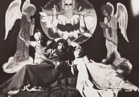
Cahun lived in Jersey during the Occupation, her resistance activities during that time led to her imprisonment.
A death sentence was commuted and she was freed from prison when Jersey was liberated. She lived in Jersey with her stepsister until her death in 1954.
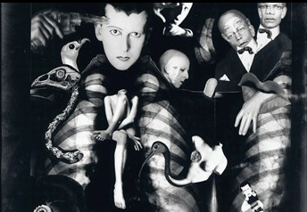
Since her “rediscovery” over a decade ago, Claude Cahun has attracted what amounts to a cult following among art historians and critics working from postmodern, feminist, and queer theoretical perspectives.
Photographs of Cahun posing in the 1920s and 30s in various dramatic settings and guises have been displayed alongside contemporary works, showing the timelessness of her work.

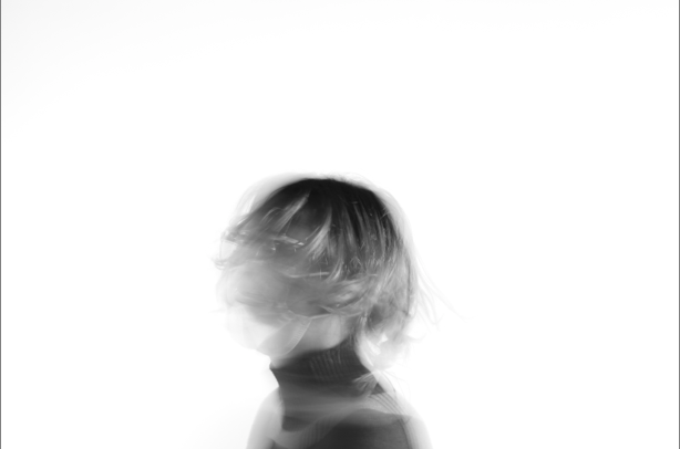
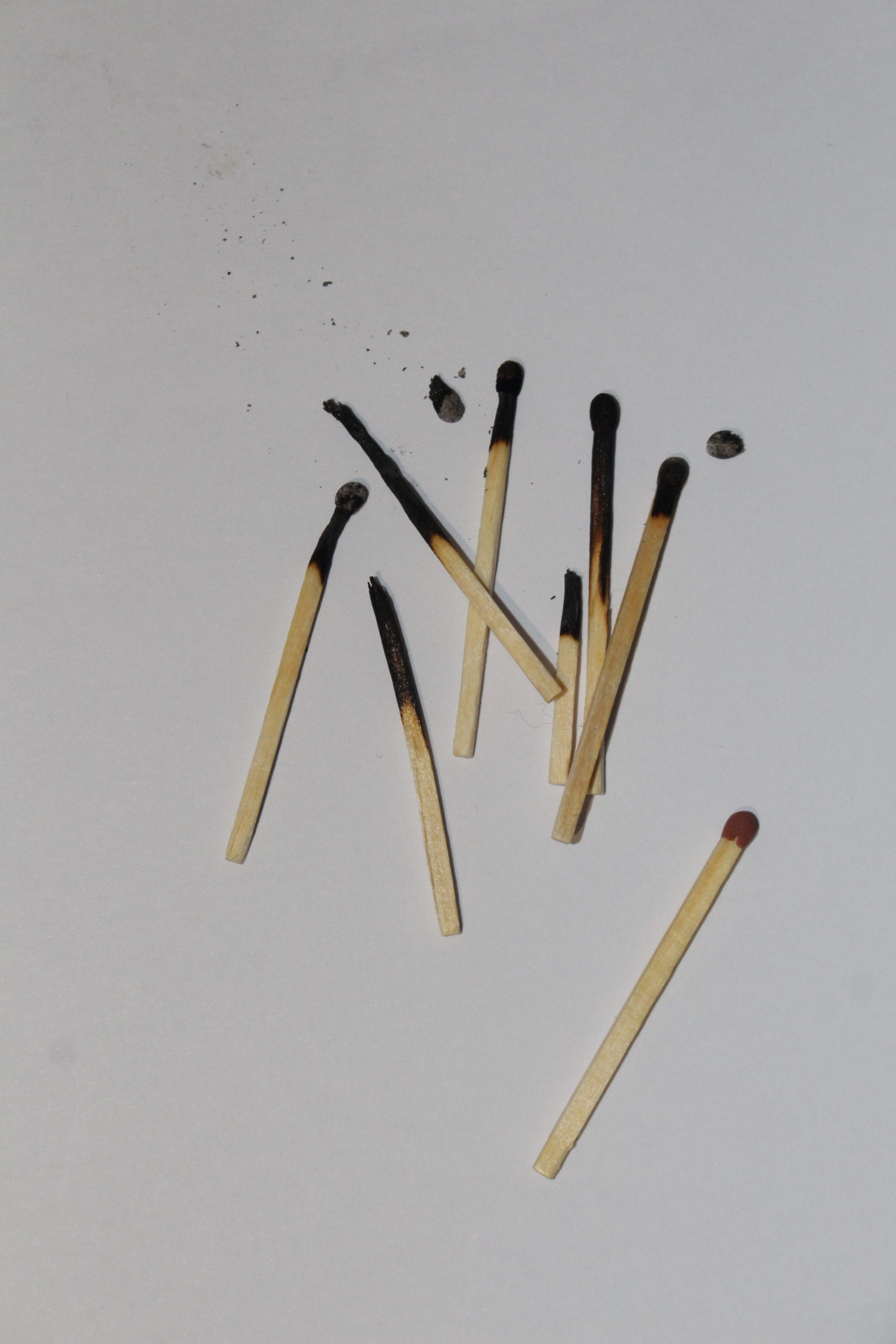
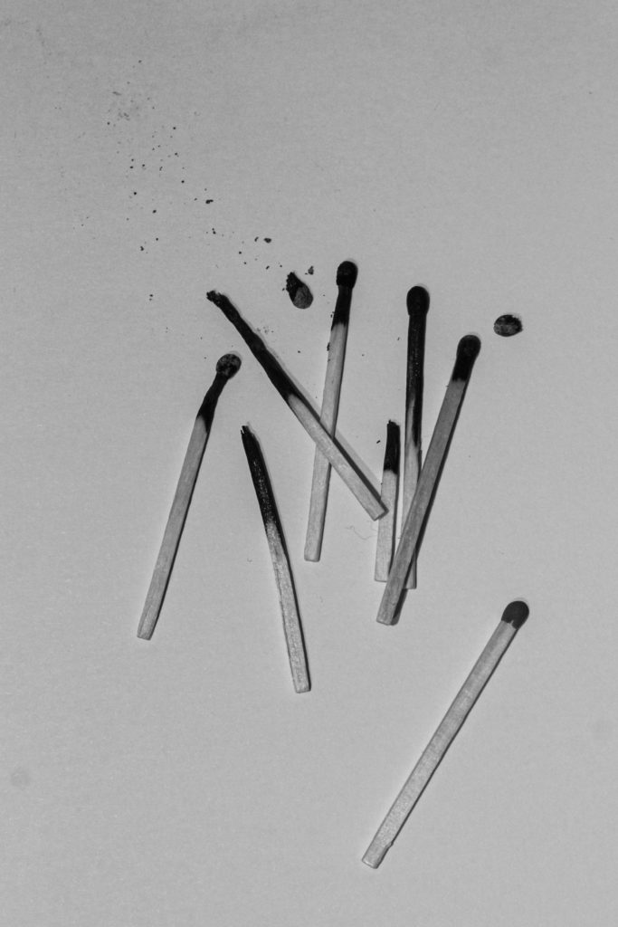
Some Before and Afters:



More Final Edits:
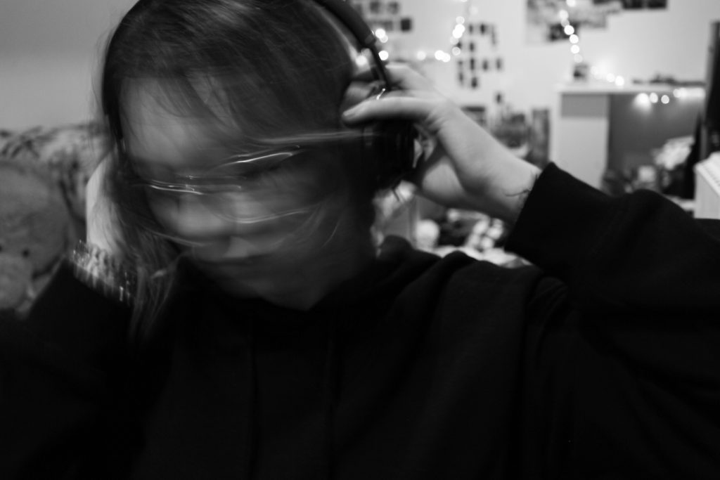
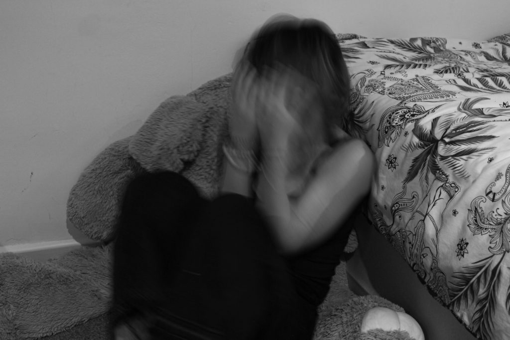
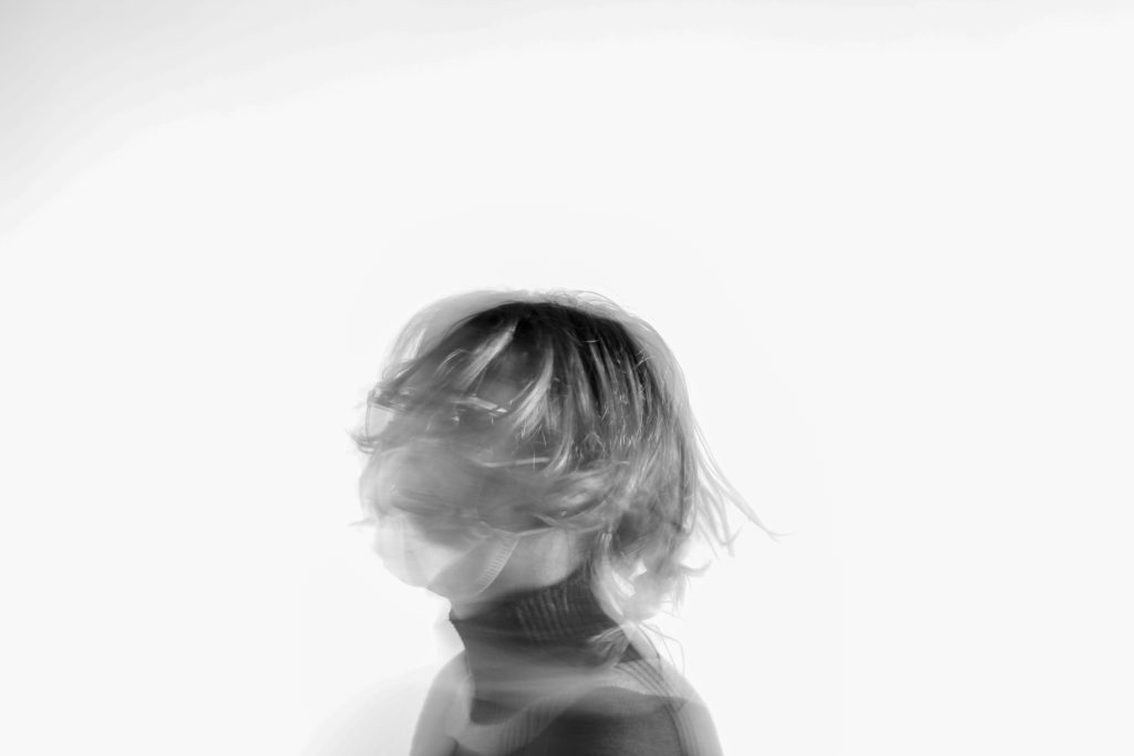
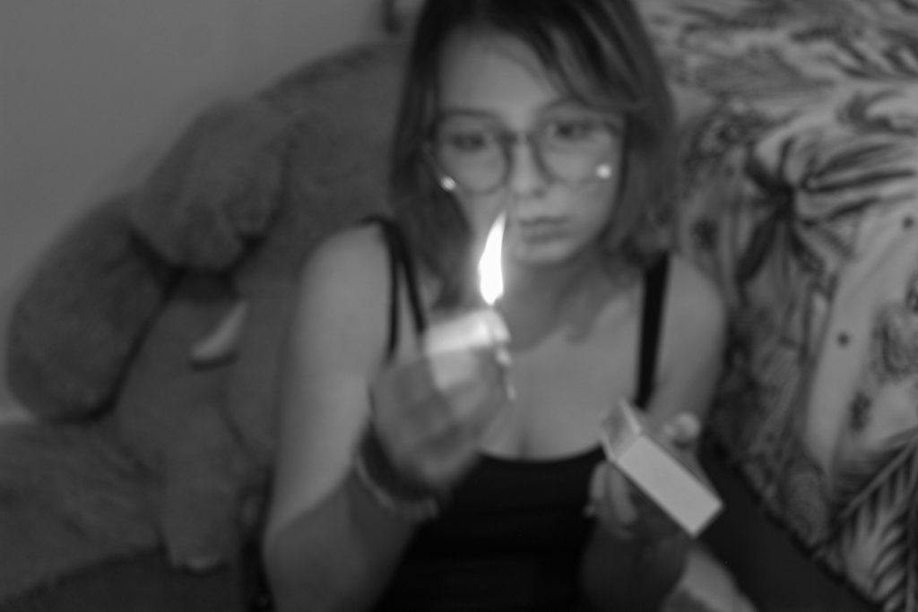
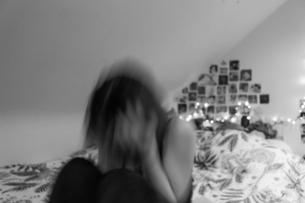
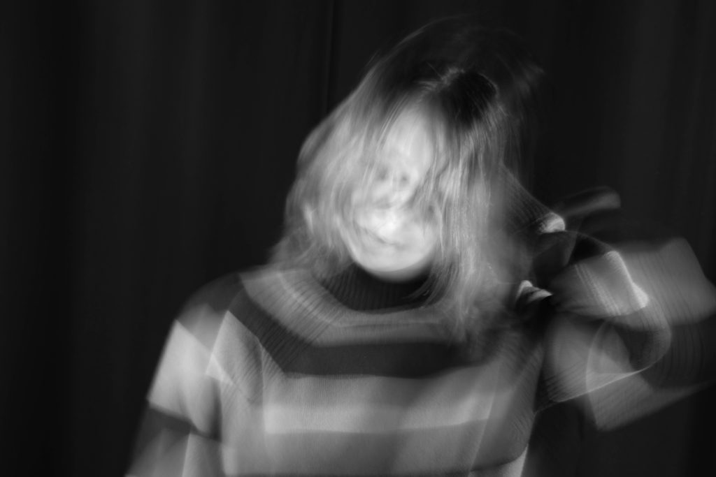
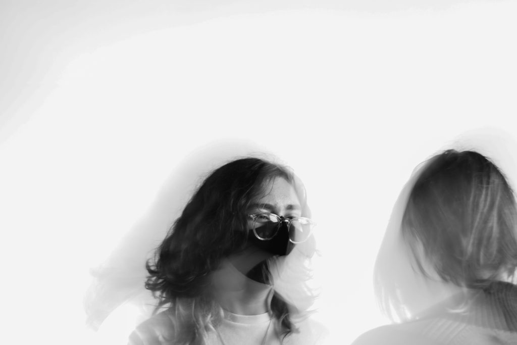
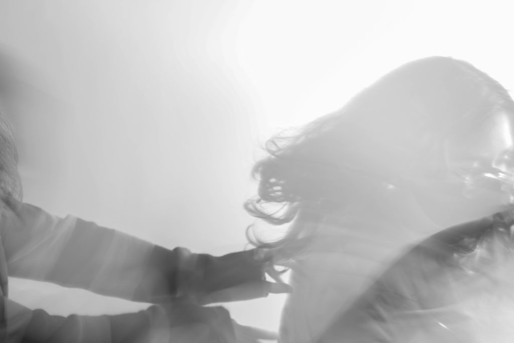


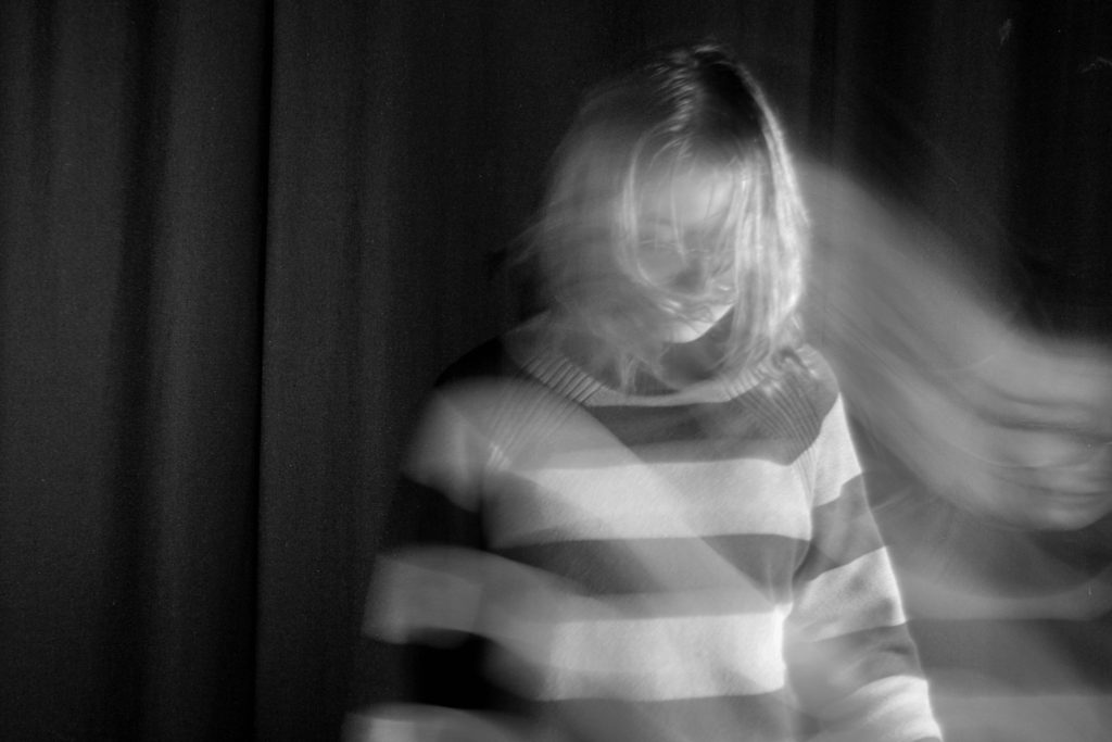
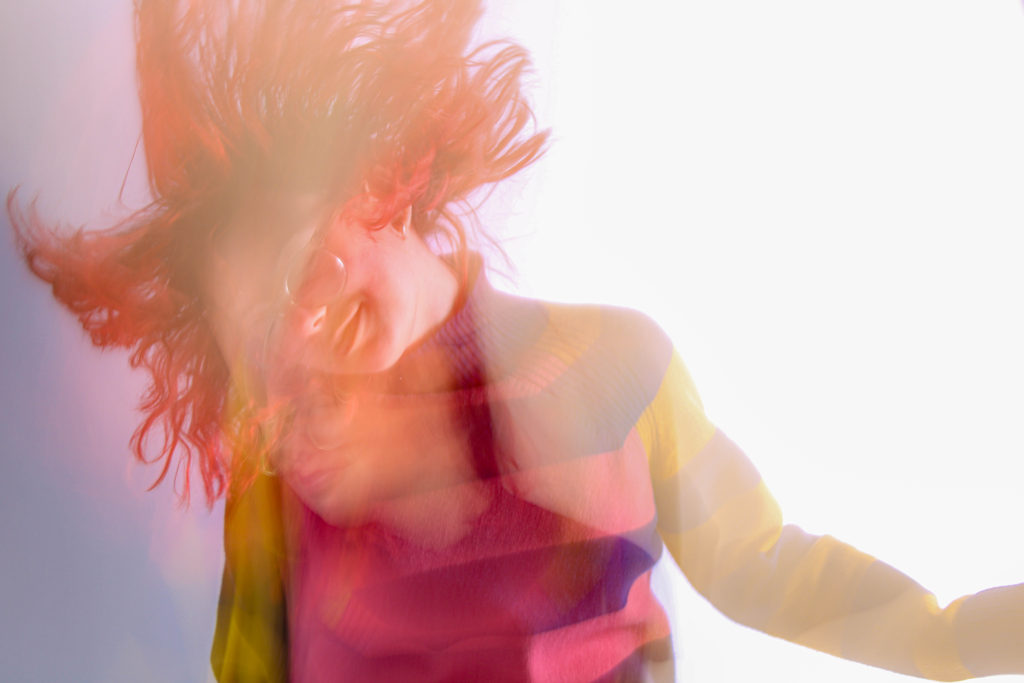
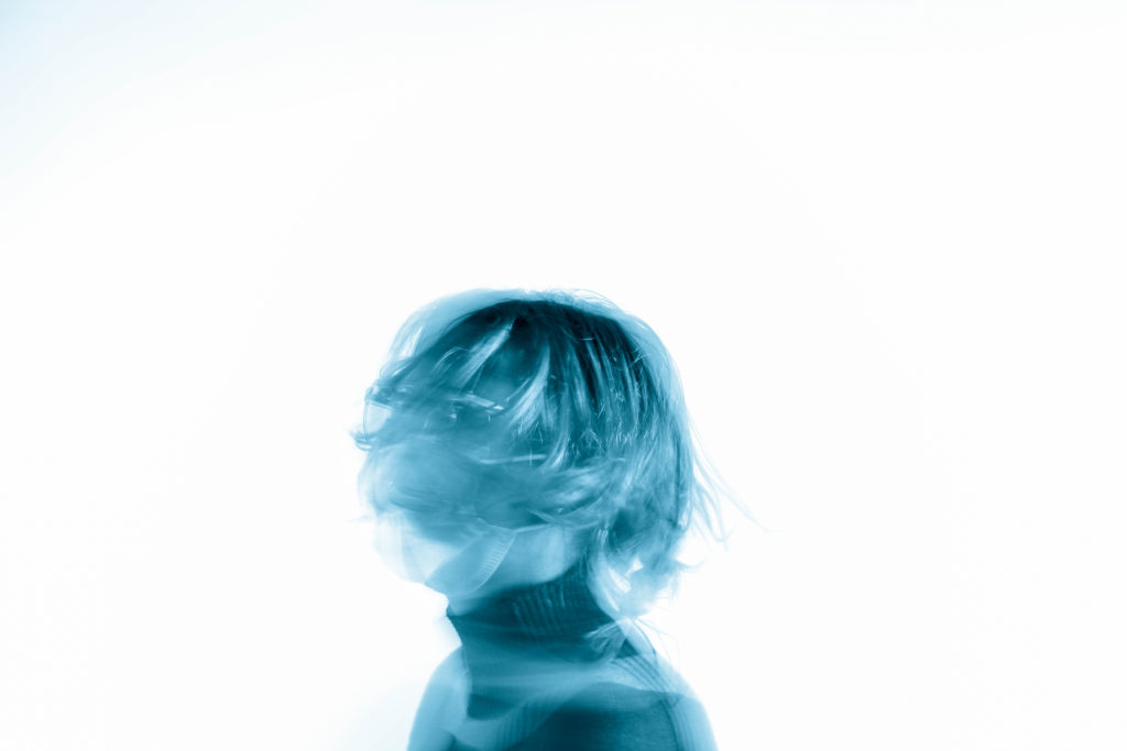

Over the next two weeks you will be looking at producing blog posts and responding photographically to:
URBAN LANDSCAPES
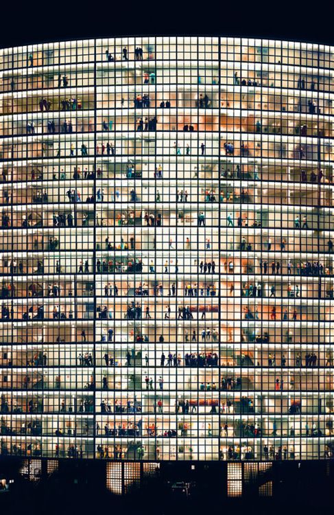


The New Topographics
The beginning of the death of “The American Dream”
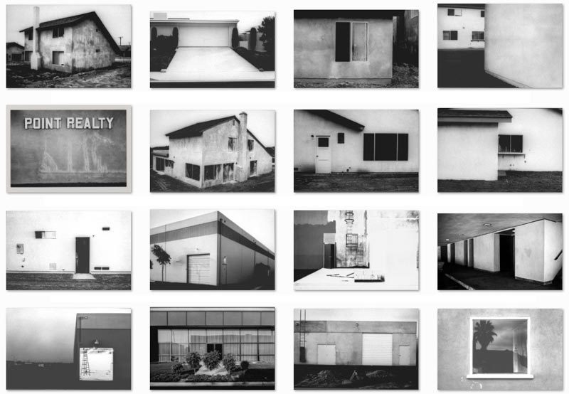
New Topographics inspired by the likes of Albert Renger Patszch and the notion of The New Objectivity
Parking lots, suburban housing and warehouses were all depicted with a beautiful stark austerity, almost in the way early photographers documented the natural landscape. An exhibition at the International Museum of Photography in Rochester, New York featuring these photographers also revealed the growing unease about how the natural landscape was being eroded by industrial development.
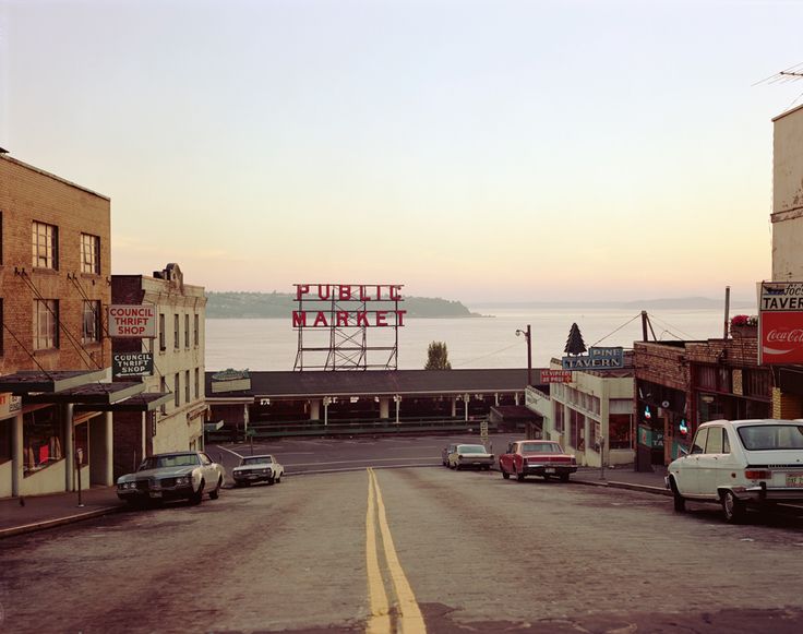
The New Topographics were to have a decisive influence on later photographers including those artists who became known as the Düsseldorf School of Photography.
BLOG POST: Photoshoot / Practical Responses…
Look at how the New Topographics approach has inspired landscape photography and the way we document our surroundings / the way we are using and transforming the land.
You should look at photographers such as…
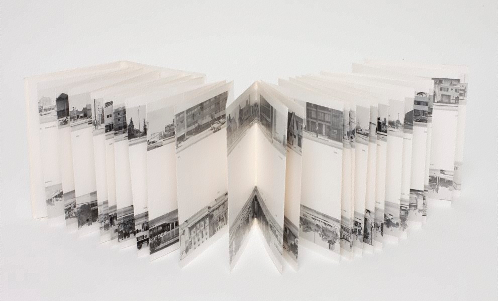
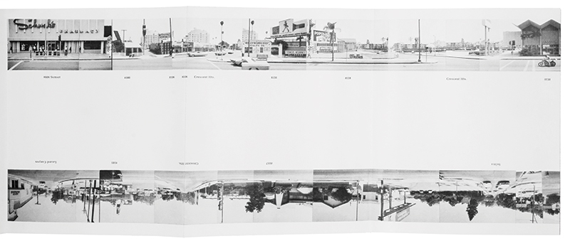
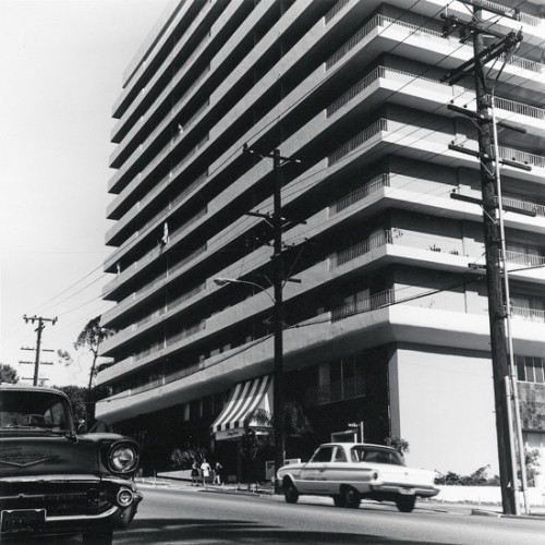
Ed Ruscha, “Every Building On The Sunset Strip”
The artist Ed Ruscha is famous for his paintings and prints but is also known for his series of photographic books based on typologies, among them Every Building on the Sunset Strip, Twentysix Gasoline Stations, Some Los Angeles Apartments, and Thirtyfour Parking Lots. Ruscha employs the deadpan style found in many photographic topologies. The book shown above is a 24 foot long accordion fold booklet that documents 1 1/2 miles of the Sunset Strip in Hollywood.
Here’s another topology for you to look at by Ólafur Elíasson :
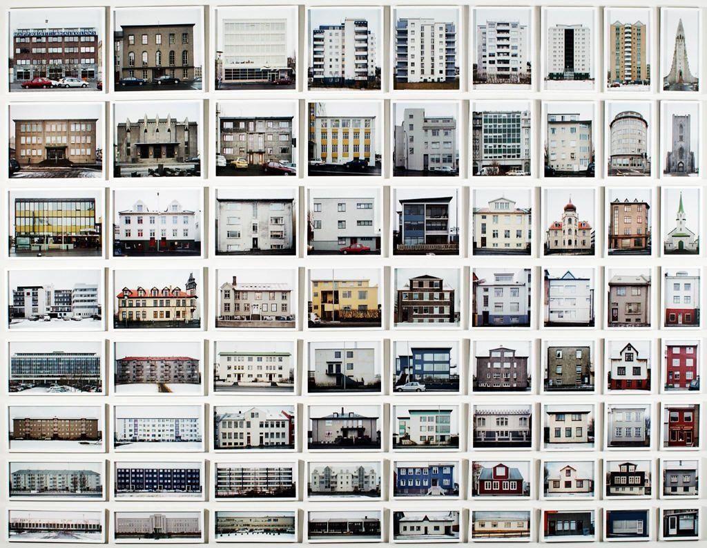
Thom and Beth Atkinson< Missing Buildings, 2016
https://www.thomatkinson.com/missing-buildings
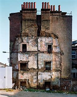
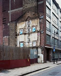
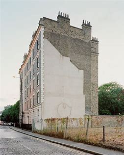

Research a selection of these photographers and respond with…
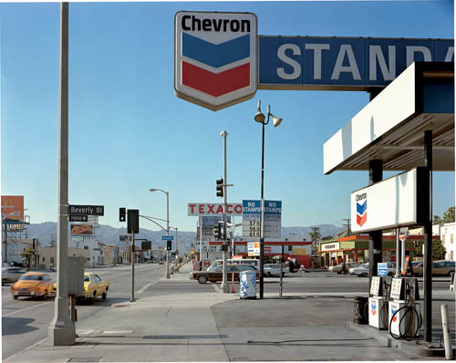
Stephen Shore, Beverly Boulevard and La Brea Avenue, Los Angeles, California, June 21, 1975, 1975, chromogenic color print
Analysis and discussion… starting points and key features of The New Topographics
Remember to use this
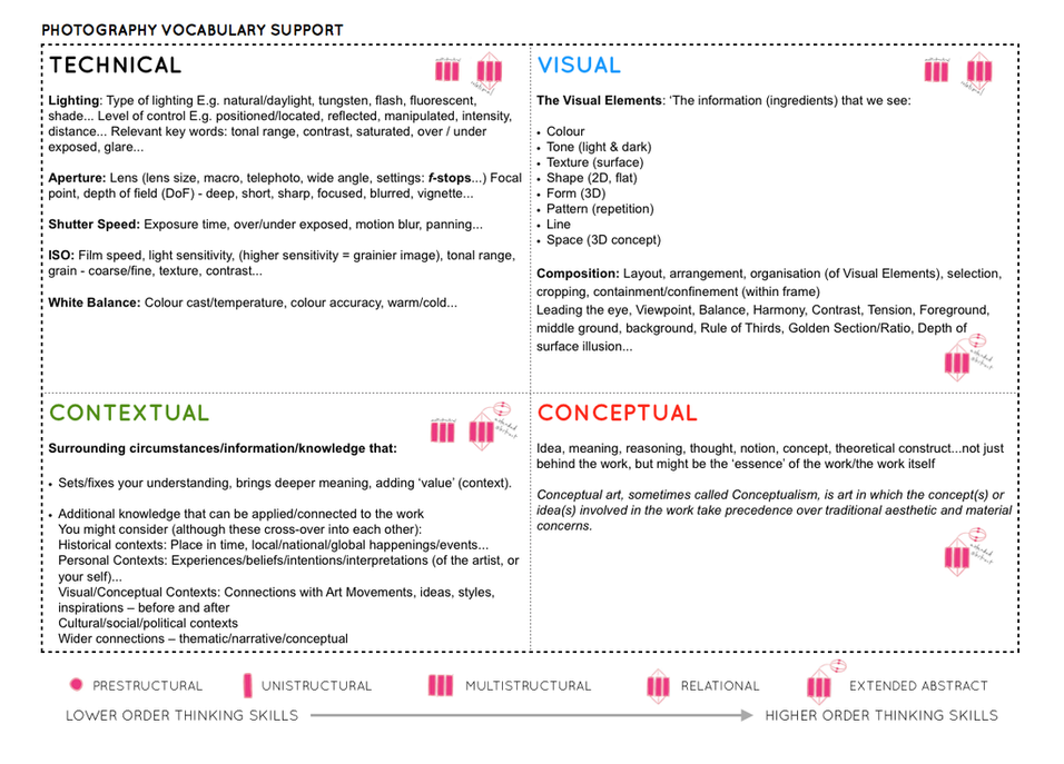
Follow this 10 Step Process and create multiple blog posts for each unit to ensure you tackle all Assessment Objectives thoroughly :

Once you have completed your photo walk from Havre Des Pas to La Collette you should aim to make comparisons with photographers and their work
Your image selection and editing may be guided by this work…and you must show that you can make creative connections.
For Example Albert Renger Patszch and The New Objectivity
https://www.atlasofplaces.com/photography/new-objectivity/
Keld Helmer Petersen
https://www.keldhelmerpetersen.com/1950-1959
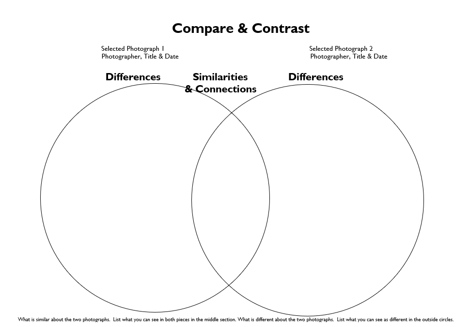
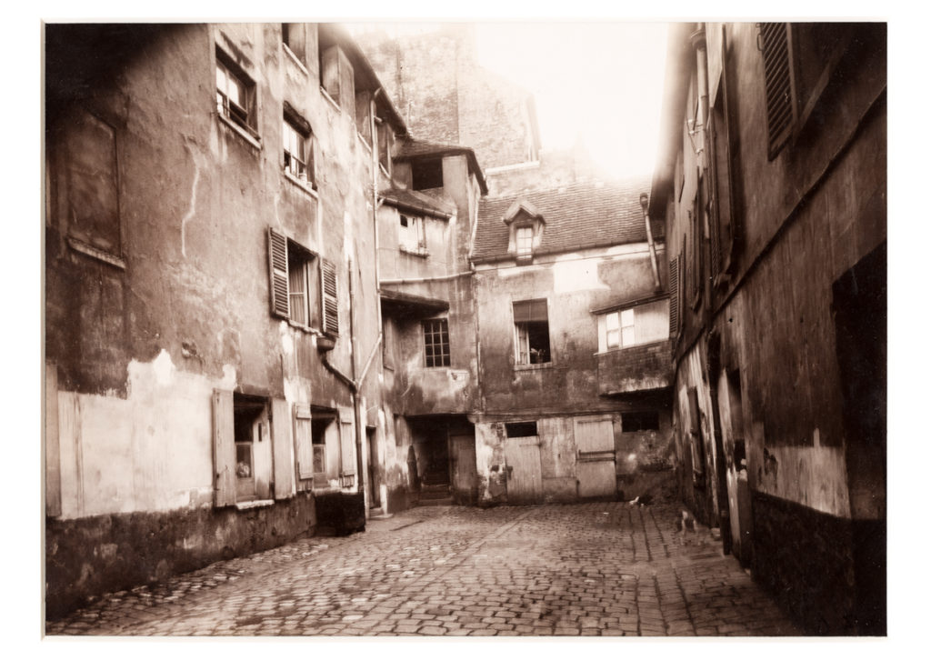
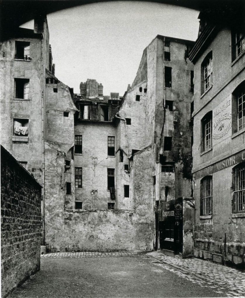
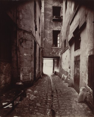
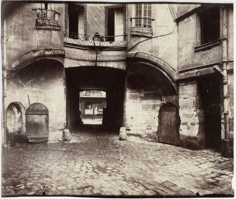




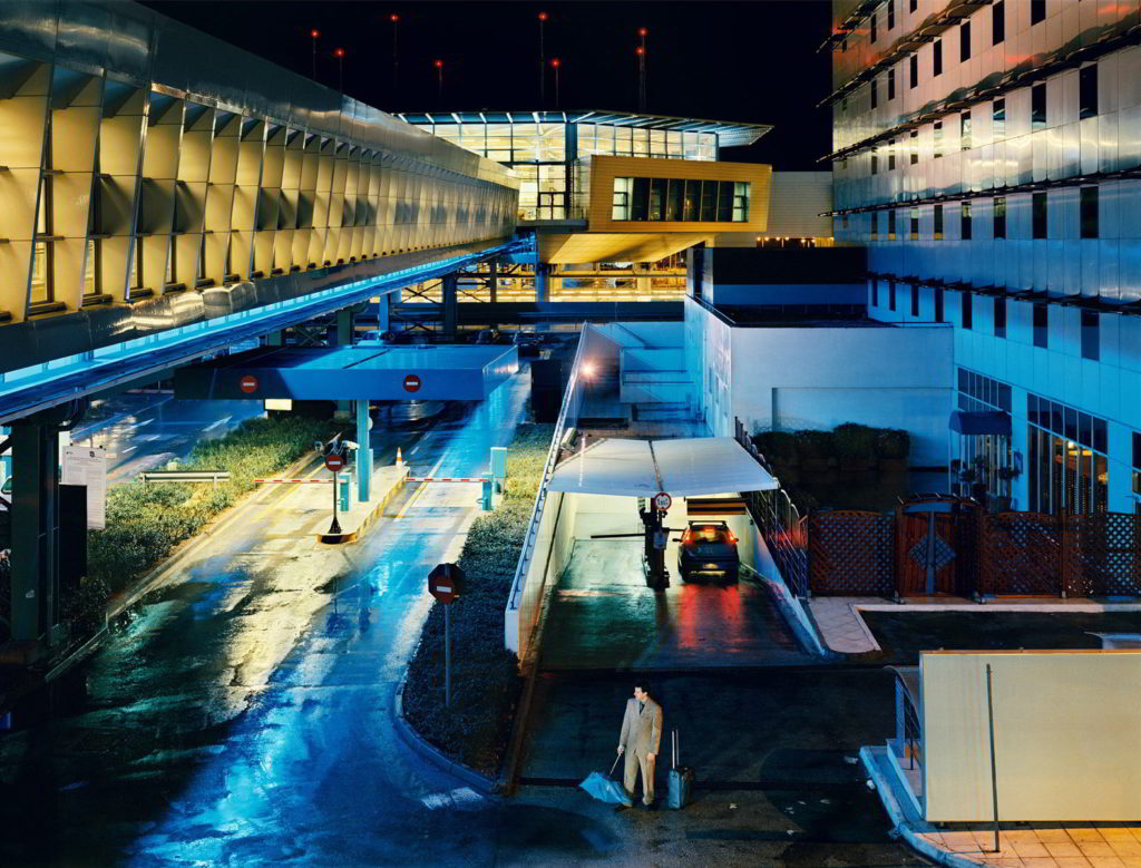


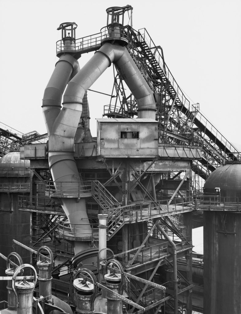


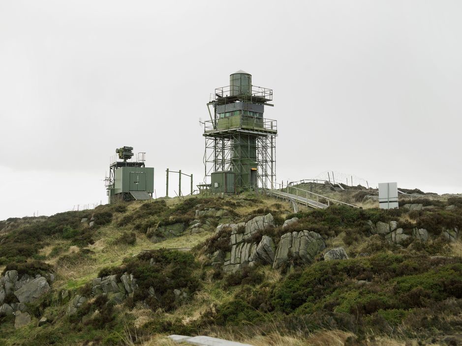


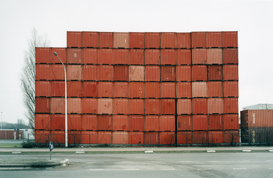
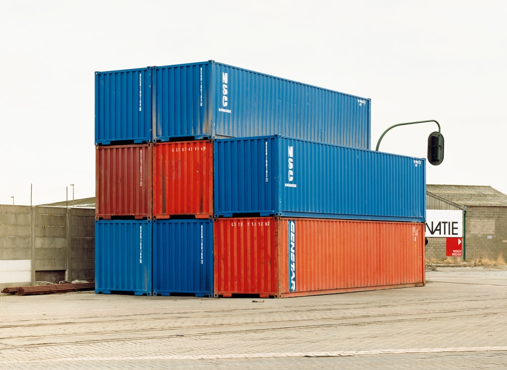
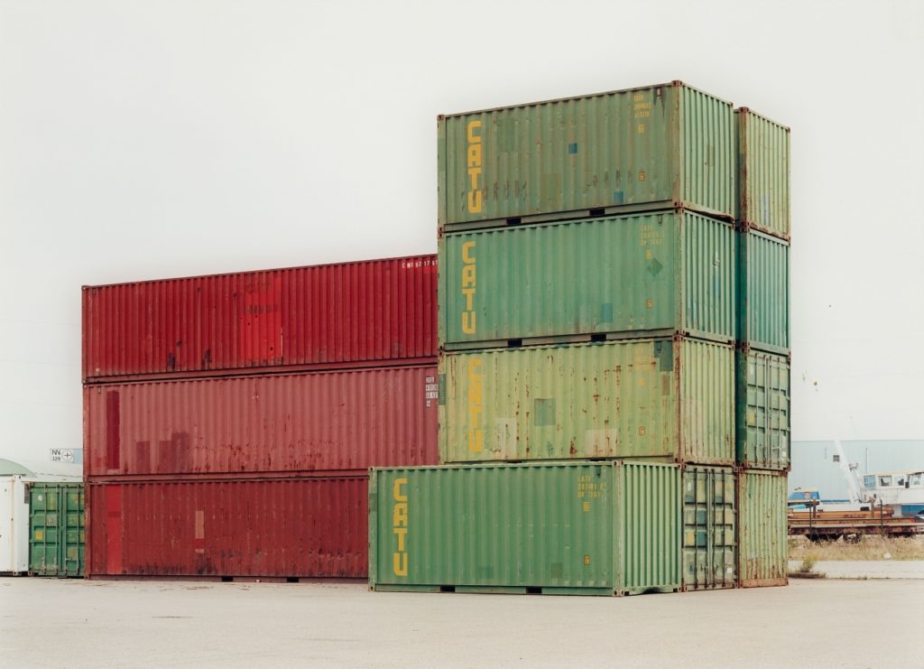

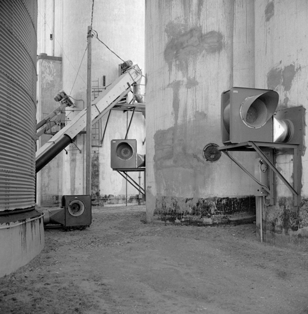


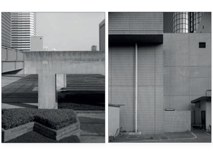

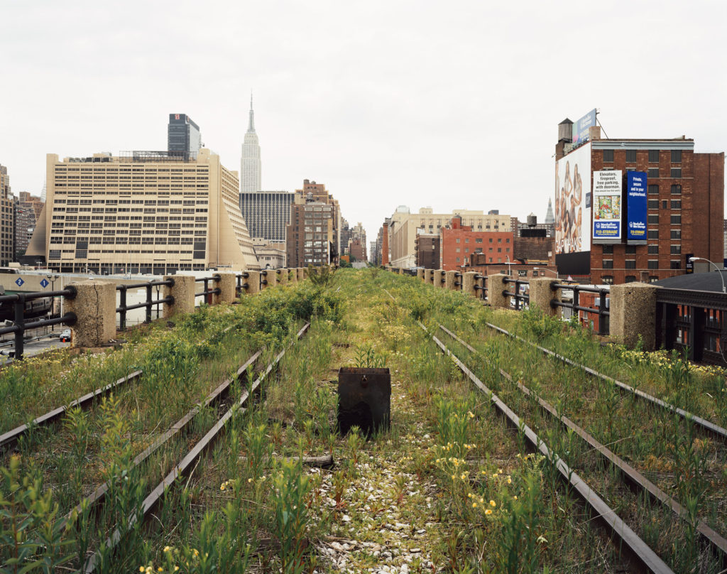
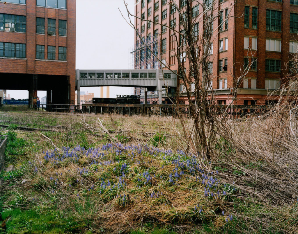

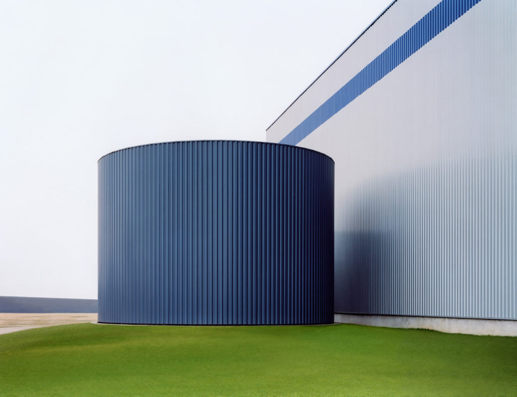
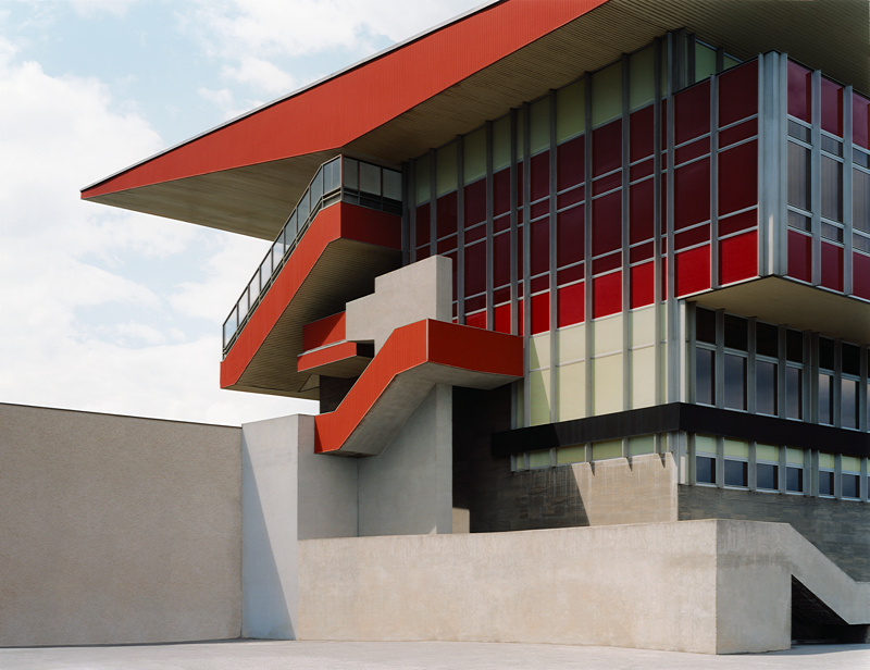

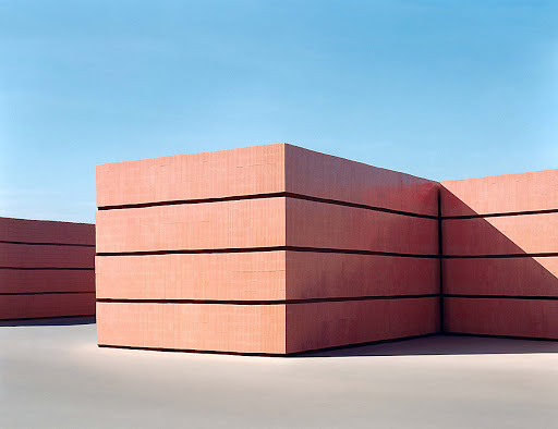
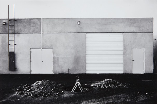


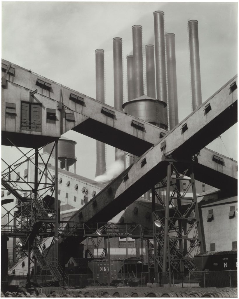


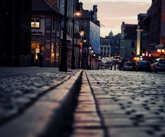
Your vantage point affects the angles, composition, and narrative of a photograph. It is an integral part of the decision-making process when taking a photograph.
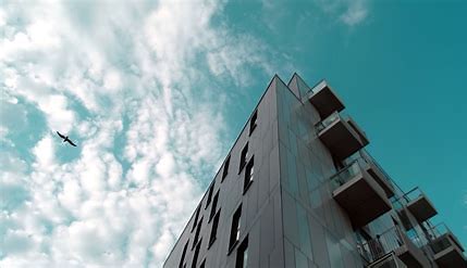
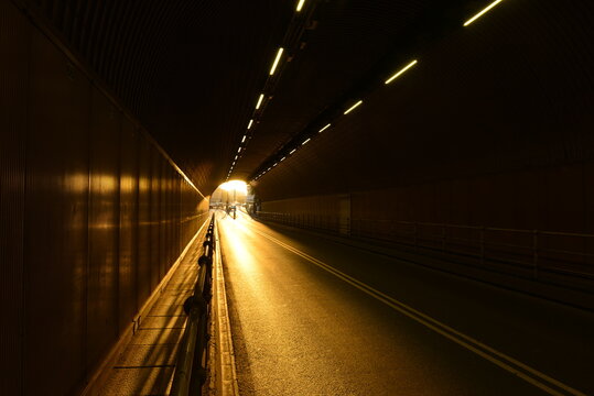
We often spend more time considering camera settings and lighting, than exploring viewpoints. A picture taken from a unique vantage point makes us think about the subject in a different way. Perspectives from high or low angles add emotion to the photograph.
Eye-level vantage points provide a feeling of directness and honesty. Changing your vantage point can include or exclude part of the photo’s story.
As you look through your viewfinder, ask yourself some questions:
TRY LOOKING UP, LOOKING DOWN, AT AN ANGLE, FROM A DISTANCE, A WORMS EYE VIEW ETC.






TYPOLOGIES and the landscape
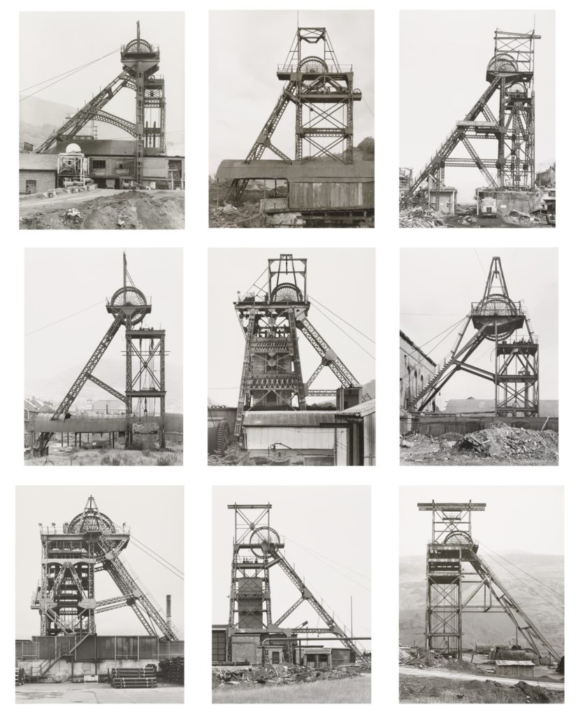
Bernd and Hilla Becher – Typologies of industrial architecture
Read this useful introduction to the Becher’s work from American Photo magazine which describes their interest in the ‘Grid’ and their influence on future generations of photographers, members of the Düsseldorf School.
The term ‘Typology’ was first used to describe a style of photography when Bernd and Hilla Becher began documenting dilapidated German industrial architecture in 1959. The couple described their subjects as ‘buildings where anonymity is accepted to be the style’. Stoic and detached, each photograph was taken from the same angle, at approximately the same distance from the buildings. Their aim was to capture a record of a landscape they saw changing and disappearing before their eyes so once again, Typologies not only recorded a moment in time, they prompted the viewer to consider the subject’s place in the world.
The Bercher’s influence as lecturers at the Dusseldorf School of Photography passed Typologies onto the next generation of photographers. Key photographic typologists such as Thomas Struth, Thomas Ruff, Thomas Demand and Gillian Wearing lead to a resurgence of these documentary-style reflections on a variety of subject matter from Ruff’s giant ‘passport’ photos to Demand’s desolate, empty cities.

Create your own typological series documenting repeated forms where they live and work. For example, you might like to choose one of the following subjects:

Images from 100 Abandoned Houses – A record of abandonment in Detroit in the mid 90’s by Kevin Bauman
Day 1
Select your images in Adobe Lightroom and clearly show your selection process on the blog…include your reasoning for your choices eg how do they link to your artist reference?
Edit, manipulate and enhance your images using Adobe Lightroom and Adobe Photoshop (or other methods)
Take regular screenshots to show the key changes in your process
CONTROLLED CONDITIONS : Essentials
Day 2
Aim to complete your editing…review and reflect on your process
What is working well?
What do you need to change or improve?
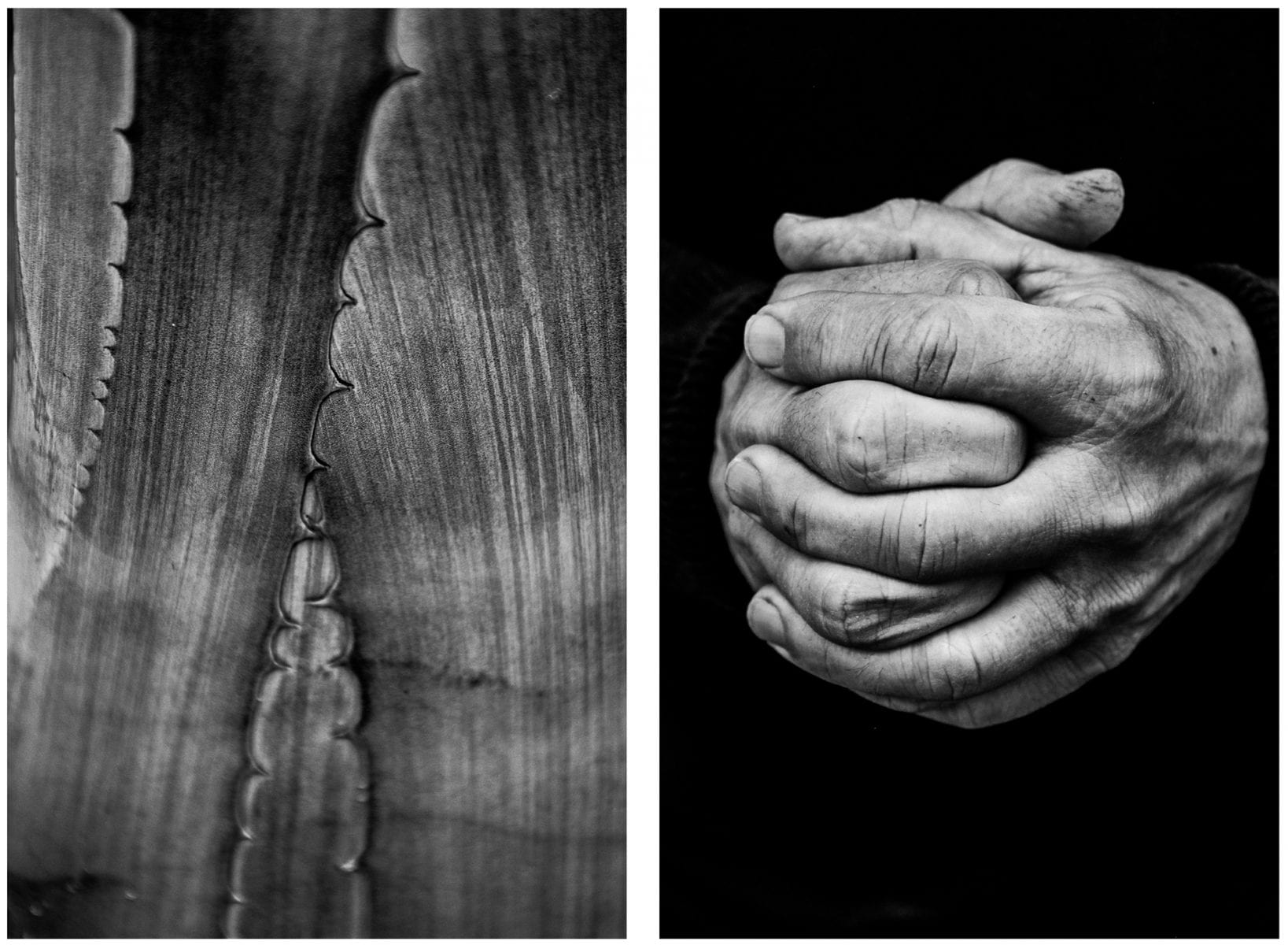
How are you going to sequence and order your images / prints ? This can drastically alter the story and impact of your images. Think about the size and shape of your images too…

Remember : 1 image = statement / 2 images = a question

Day 3
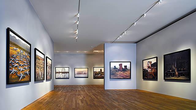
Making a Virtual Gallery in Photoshop
Download an empty gallery file…then insert your images and palce them on the walls. Adjust the persepctive, size and shape using CTRL T (free transform) You can also add things like a drop shadow to make the image look more realistic…
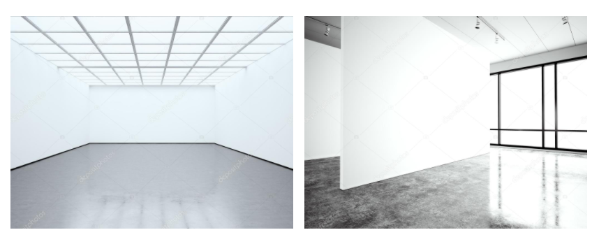
…or using online software
Step 1: Go to www.artsteps.com
Step 2: Sign in / up.
Step 3: Create.
Step 4: Create your own location or choose a template.
Step 5: Upload your images, put them in your exhibition, name it and give it a description.
Step 6: Present / view your Exhibition.
File Handling and printing...

This will ensure you have the correct ASPECT RATIO
Ensure you label and save your file in you M :Drive and then coip across to the PRINT FOLDER / IMAGE TRANSFER
For a combination of images, or square format images you use the
ADOBE PHOTOSHOP > NEW DOCUMENT + PRINT PRESETS on to help arrange images on the correct size page (A3, A4, A5)
You can do this using Photoshop, Set up the page sizes as templates and import images into each template, then you can see for themselves how well they fit… but remember to add an extra 6mm for bleed (3mm on each side of the page) to the original templates. i.e. A4 = 297mm x 210 but the template size for this would be 303mm x 216mm.
2nd Photoshoot Contact Sheets – Inside
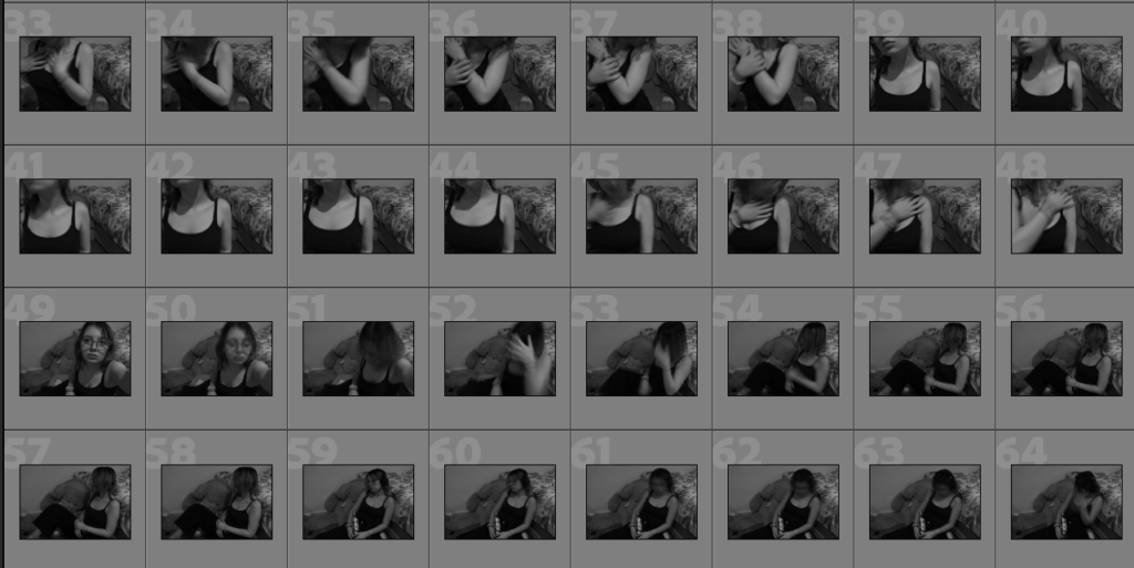
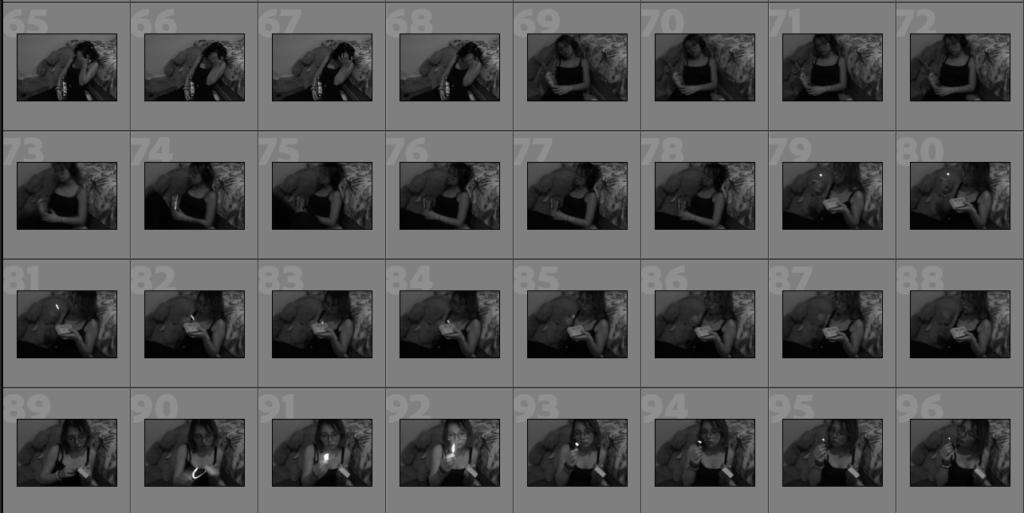
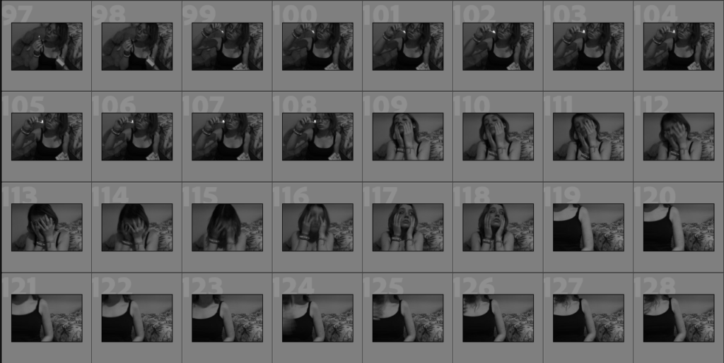
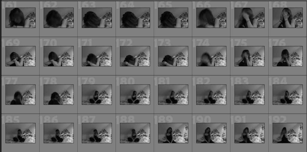
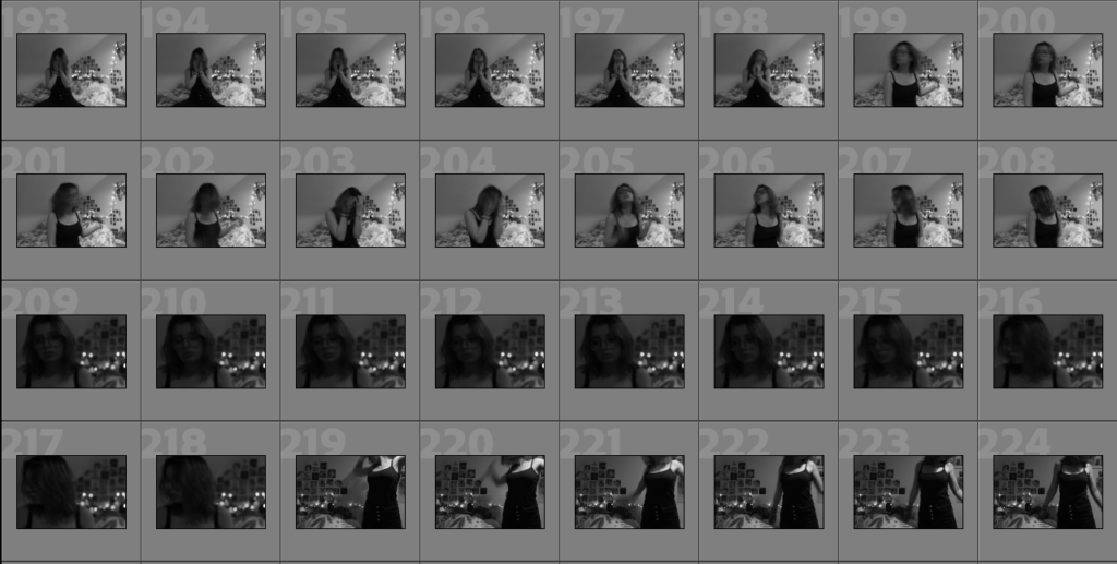
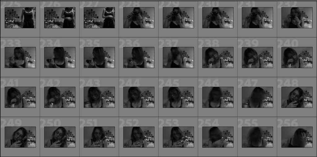
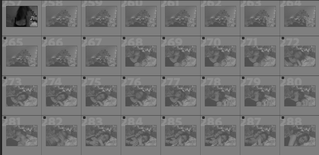
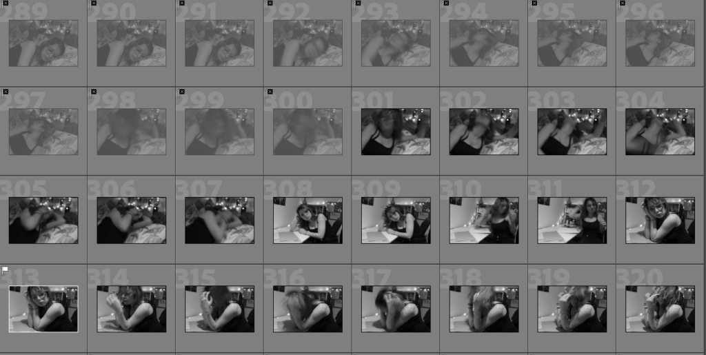
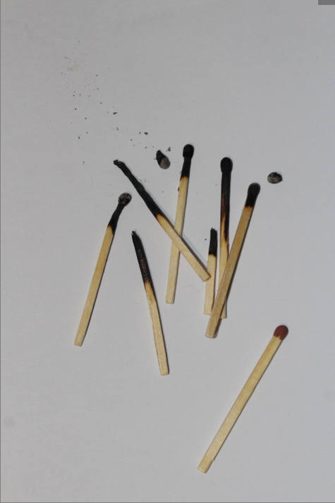
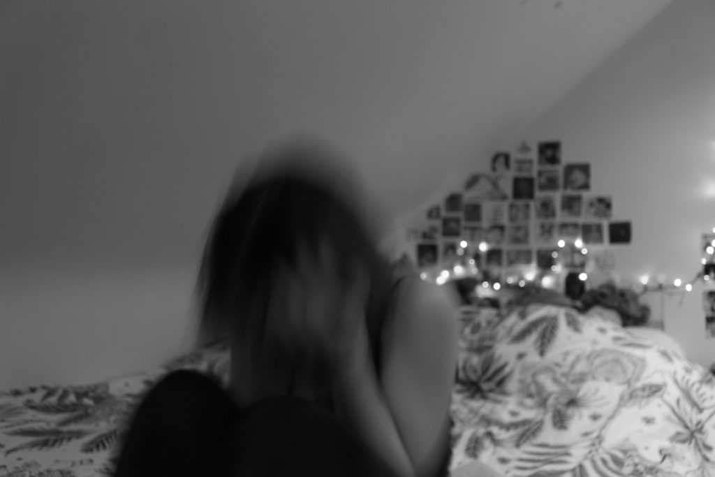
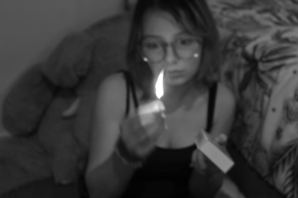
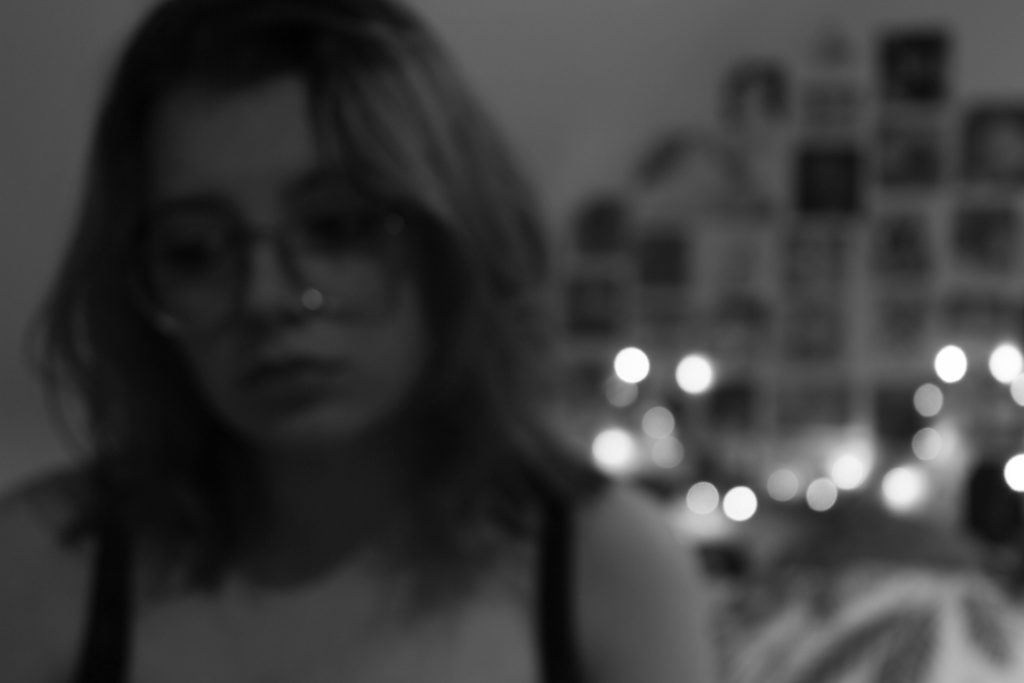
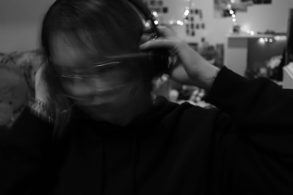
For my second photoshoot, I focused on taking pictures of myself in my own room. I used a tripod and a timer and had to manually press the button on the camera in order to take the pictures and because of that most of the images are out of focus. However, I like the way they look because I feel like it adds more personality. The only props I used were a match box, a glass bottle and a book. To improve I think I should take more pictures and try out different angles and the use of more props would also make the images look better.



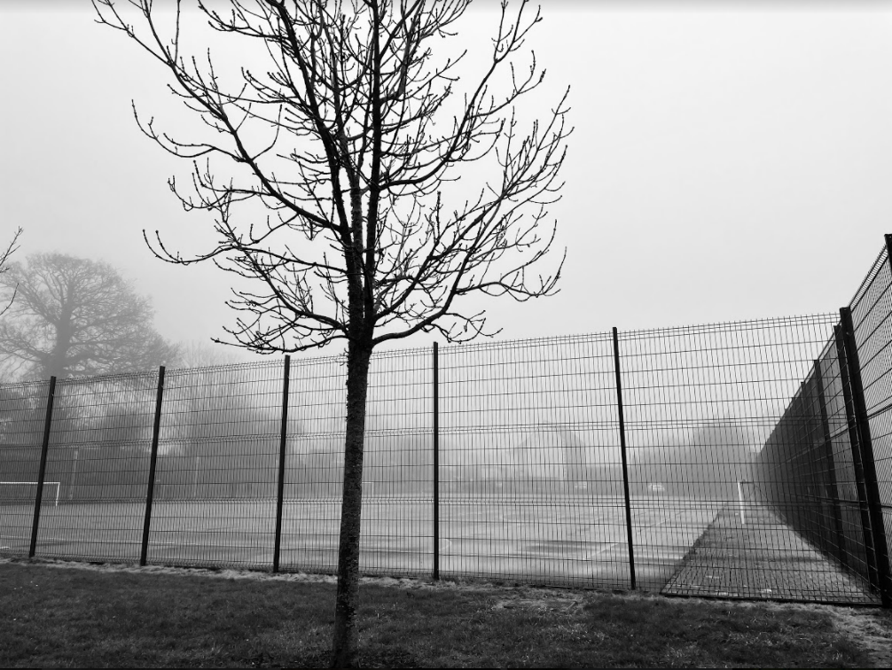
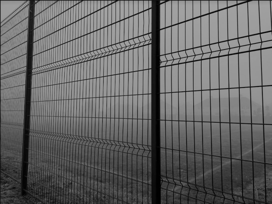
Extra Contact Sheets – Outside

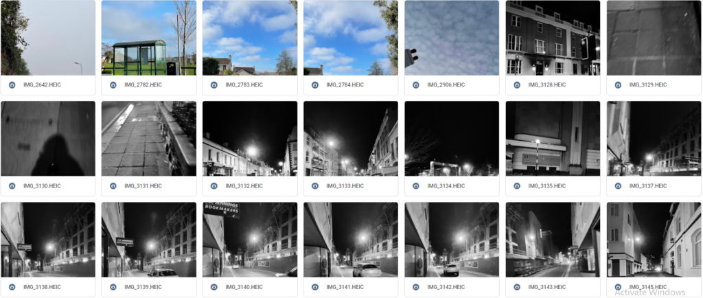
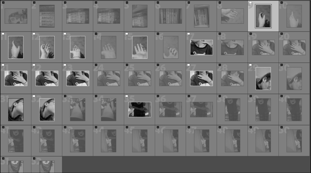
This is not a photoshoot and the pictures were not planned, they’re just random photos I’ve taken in the past 2 weeks or so. I think it’s a good idea adding them here because they are part of me and who I am as an individual.
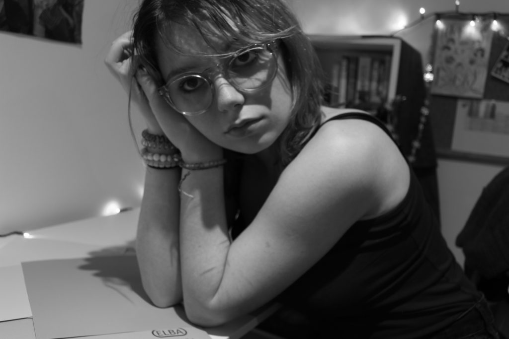
Best Images:
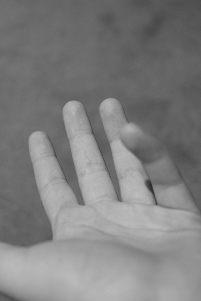
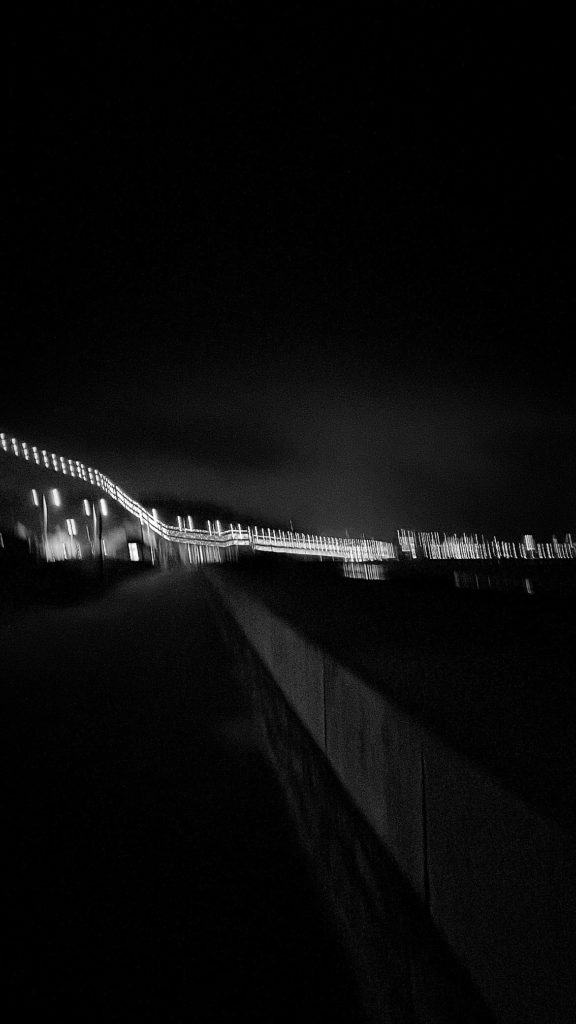
I have picked these images as my best shots because I like the framing of some and how they are not in focus. I think they will all look good together later on.
List of ideas –


How I will do it –
I have decided to create a virtual gallery which can be done on photoshop.

Claude Cahun, born Lucy Renee Mathilde Schwob was a French surrealist photographer, sculptor, and writer.

Schwob adopted the pseudonym Claude Cahun in 1914. Cahun is best known as a writer and self-portraitist, who assumed a variety of performative personae.
Cahun’s work is both political and personal. During World War II, Cahun lived in Jersey and was active as a resistance worker and propagandist

Cahun lived in Jersey during the Occupation, her resistance activities during that time led to her imprisonment.
A death sentence was commuted and she was freed from prison when Jersey was liberated. She lived in Jersey with her stepsister until her death in 1954.

Since her “rediscovery” over a decade ago, Claude Cahun has attracted what amounts to a cult following among art historians and critics working from postmodern, feminist, and queer theoretical perspectives.
Photographs of Cahun posing in the 1920s and 30s in various dramatic settings and guises have been displayed alongside contemporary works, showing the timelessness of her work.
