To explore what identity means to me I decided to focus on my cultural heritage. My idea is to take portraits of myself and edit them to reflect my identity and to make them more interesting to look at. I enjoy the work of photographers like Carolle Benitah, and Dryden Goodwin, and wish to incorporate their editing styles into my final pieces.
Photo shoots-
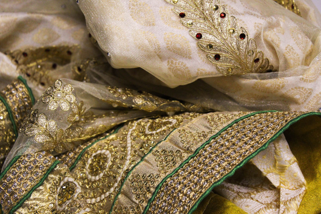
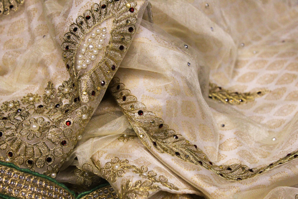
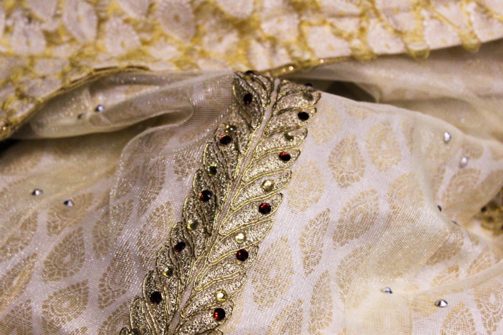
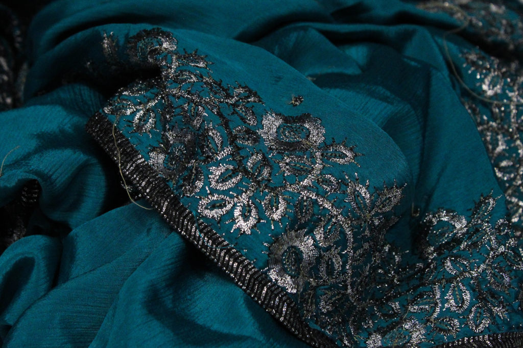
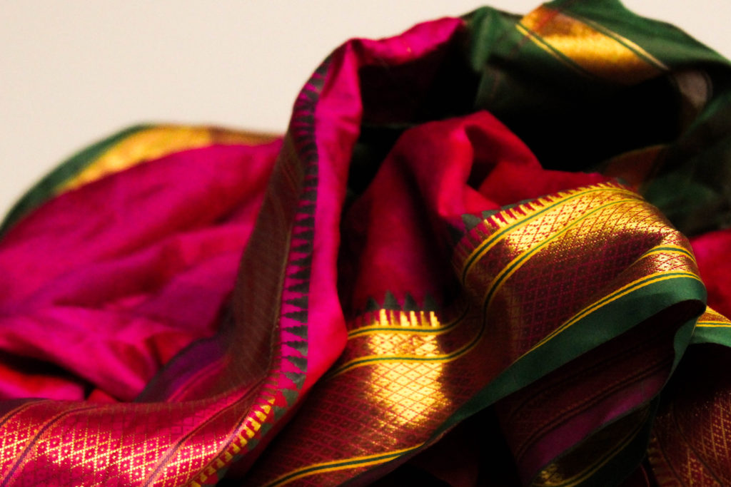
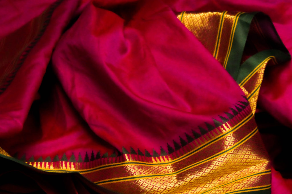
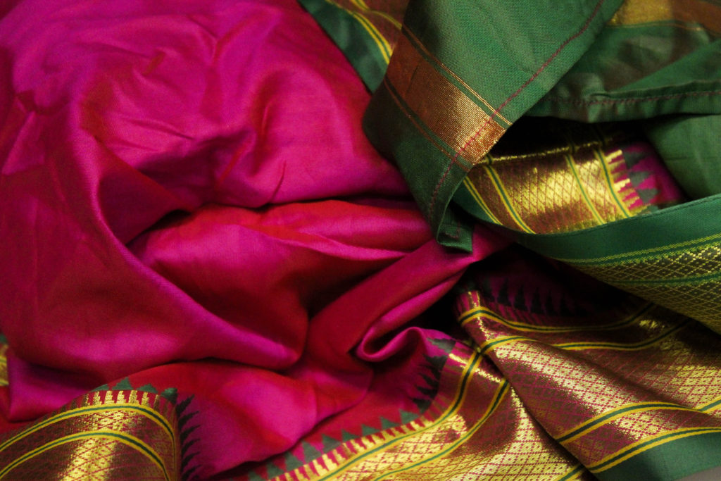
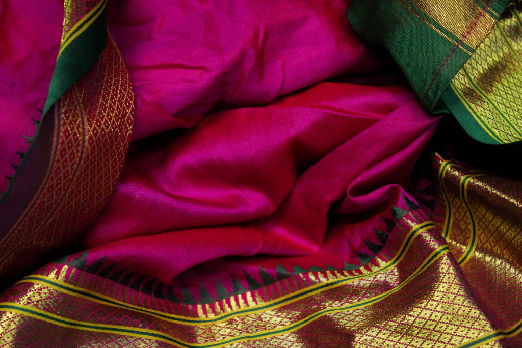
Saris-
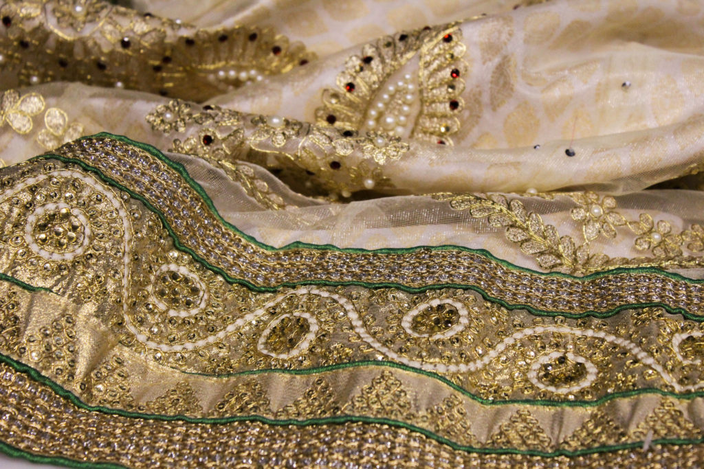
My plan is to sew the patterns from the saris my family owns onto portraits. Saris (sometimes spelled ‘sarees’) are a traditional South Asian garment and my family own quite a lot because that is where my mum’s side of the family is originally from. They are significant to me because I would never normally get to wear one, despite it being a part of my cultural heritage. I did the photoshoot during the Christmas holidays in preparation for the project.
I did a second shoot in the studio so I could get better images, I will be using the images from that. In the studio I put them onto a white background so they can be the main focus, and just used the basic lights already on in the room.
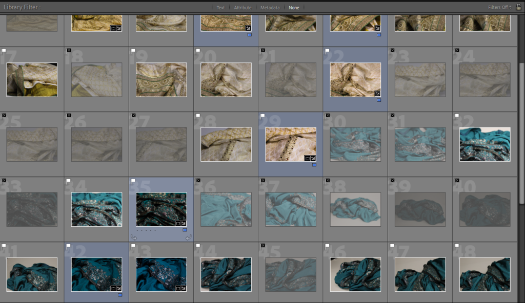
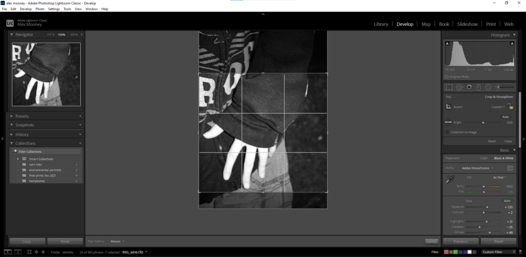
Contact Sheet – I tried to pick images that showed off the patterns that I liked and wanted to use.
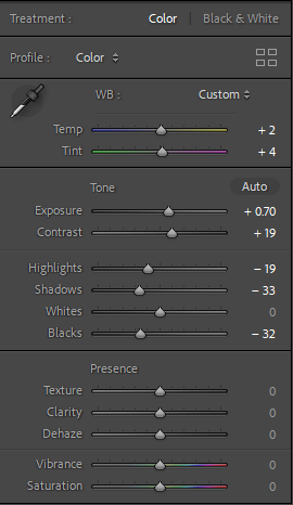
To edit them I mostly increased the brightness, contrast and saturation.
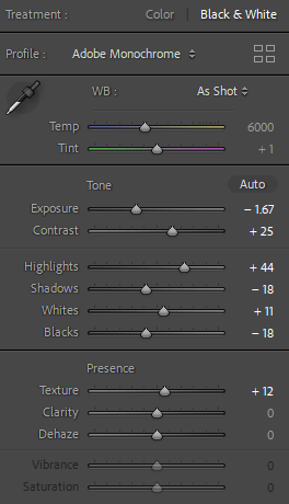
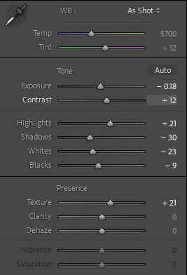
These were the settings used for the latest image of the pink sari
I most liked the patterns of the white one and the pink one, and also like how the pink one looks photographed. Pink Saris are often associated with femininity while white is often associated with purity and new beginnings, but also has connections with mourning and death. The patterns on the fabric themselves often do not have much meaning, at least, the one’s owned by my family.
Portraits-
The second shoot I am planning is some portraits which could be used to draw on or embroider into. I will take this portraits in the studio so I can use the best lighting setup I can get. These images need to be high quality as they will be used as a base for my final products.
I had to get a friend to help take these. For the ones at the bottom I used a red gel sheet over a light so it came out red however I did not end up using these images.
I edited them using a variety of styles, keeping some in colour and others in black and white. I was thinking of doing another photo shoot so I had more pictures to choose from but could not find the time.
Some of my pictures from the photoshoot, I was probably harsher with my selection than usual because I am not used to taking pictures of myself.
The first set I chose to edit was on violence and restraint, I really liked the first image as it reminded me of the underground punk movement in the 70s- which was fuelled by violence and soon became mainstream thanks to the likes of The Sex Pistols and The Clash, introducing a new generation of teenagers to the turmoil of “punk life”
Original set before editing
These images also reminded me of Ryan McGinley and Corinne Day’s work, showing an autobiographical display of adolescence culture.
First I started by turning each image black and white to mimic Francesca Woodman’s distinct black and white style as she rarely shot in colour.
Images after changing to black and white
Then I played with the exposure and contrast to create images that look like they were taken with a film camera so they did not look unnatural when I changed them in photoshop to look like a grid of polaroid images.
Every image was edited with the same settings so the behaviour of the subjects is the most outstanding thing.
I wanted the two “violent” images highly contrasted so they looked shocking to the eye and stand out while the middle image (showing restraint) nearly sinks into the background as it has lots of dark negative space – demonstrating how quiet behaviours often go unnoticed.
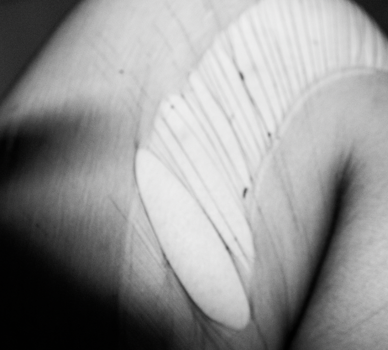
I also turned up the texture so facial expressions and details on hands were more noticeable.
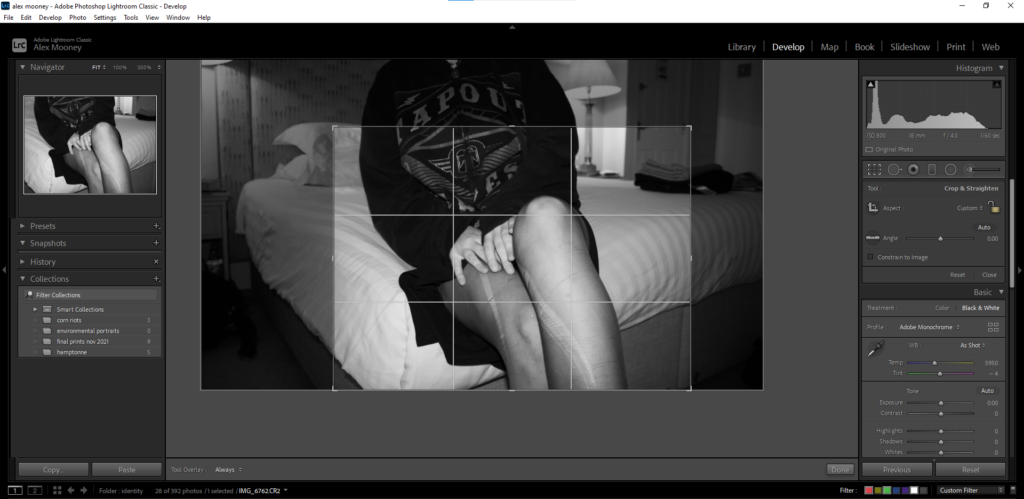
While I was editing these images on photoshop (see bottom of blog post for arrangements of sets on Adobe Photoshop Classic) I realised I didn’t like the way they lined up as two of the images were landscape while the other was portrait, so on photoshop I resized the middle image to make it more square-shaped so it would fit in with the other images better- then I exported this image back onto Photoshop.
SET #2
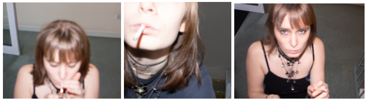
The second set I chose to edit was on bad habits, I really liked the third image as it looks similar to Corinne Day’s photography style with my take on it where I took the photographs from a higher angle to make the perspective look more unusual.
Original images before editing
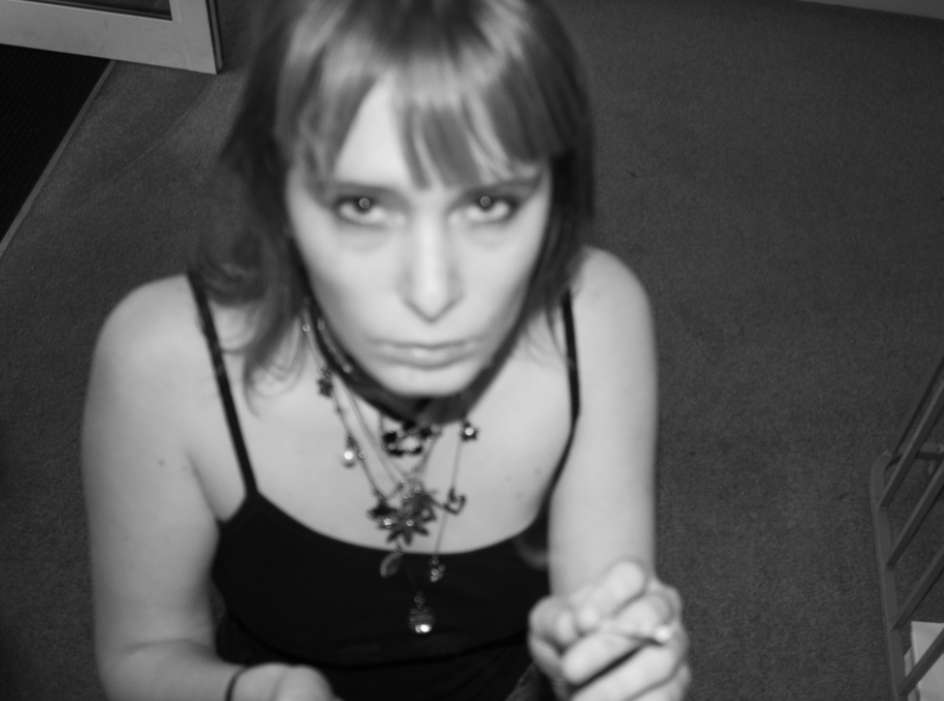
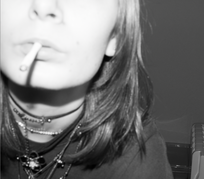
I decided I wanted every set to be black and white so I changed all the images into monotone and resized them to focus on the main subject of the image.
My images taken from this shoot are quite blurry and out of focus but I decided to keep them like that because I believe they look more raw and improvisational, as they show a short timeline which looks natural and intimate.
Images after resizing and changing to black and white.
I edited all the images in the same style, playing with the texture to make the images look more grainy and heightening the contrast between black and white so the images are more drawing to the eye.
Every image was edited with the same settings.
I turned up the contrast and whites while turning down the exposure and blacks to create more of a simple tonal spectrum that concentrates on the textures of the images and the main subject.
SET #3
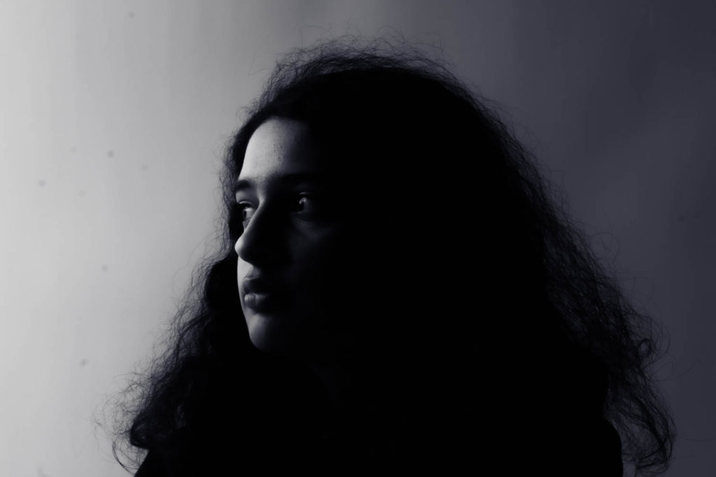
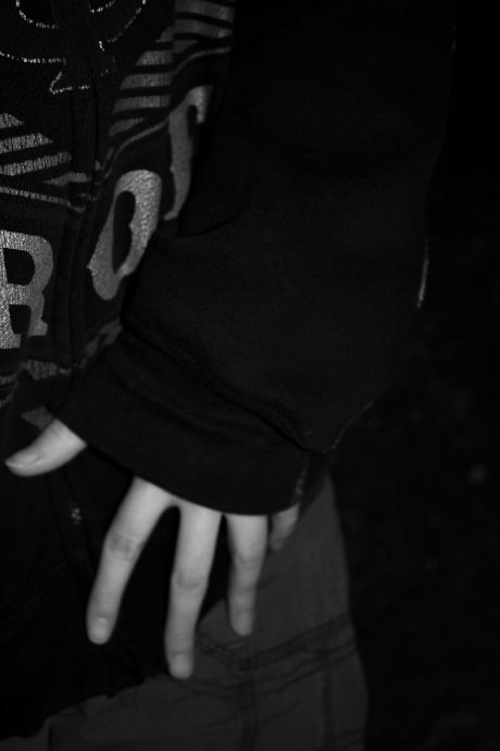
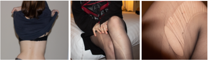
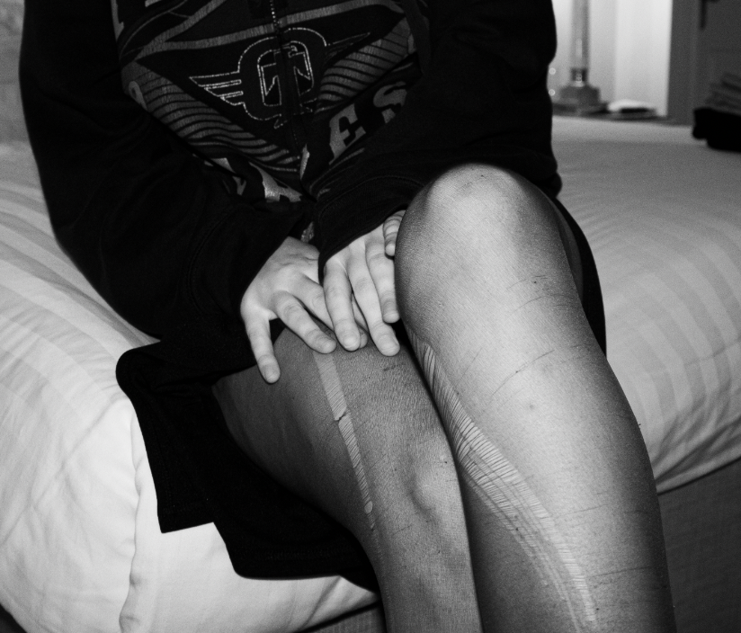
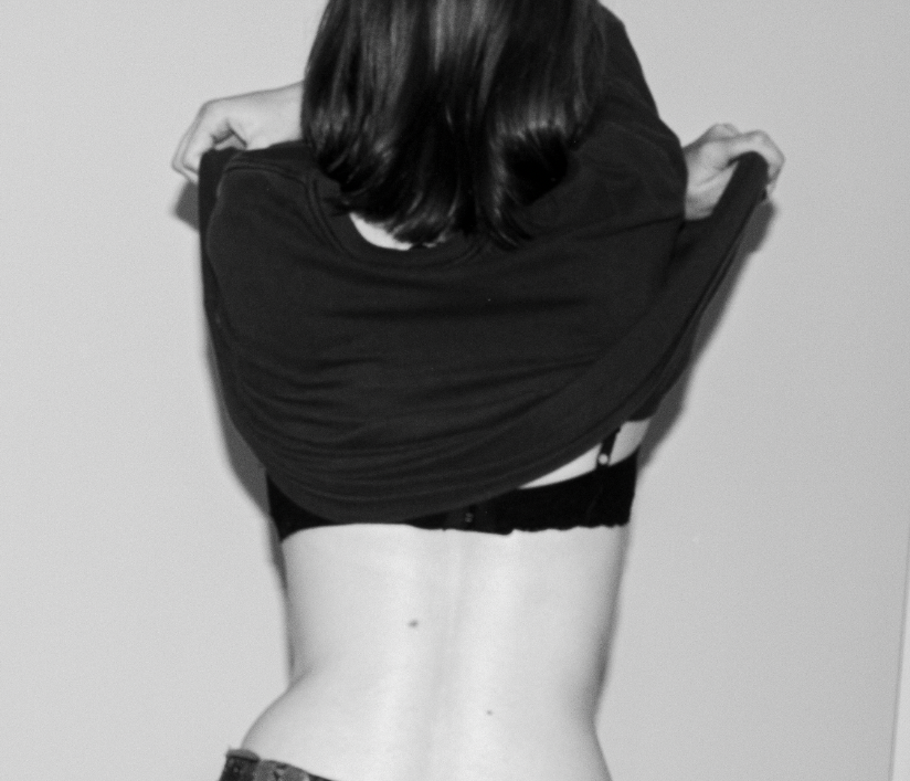
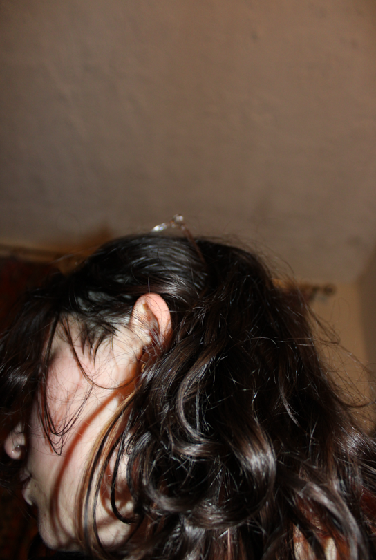
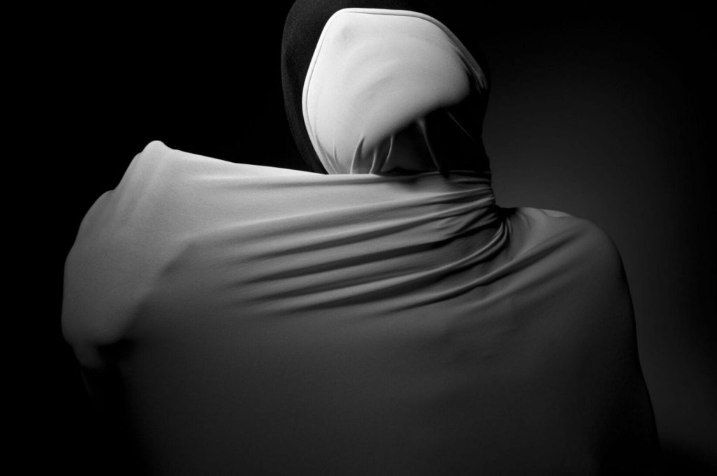
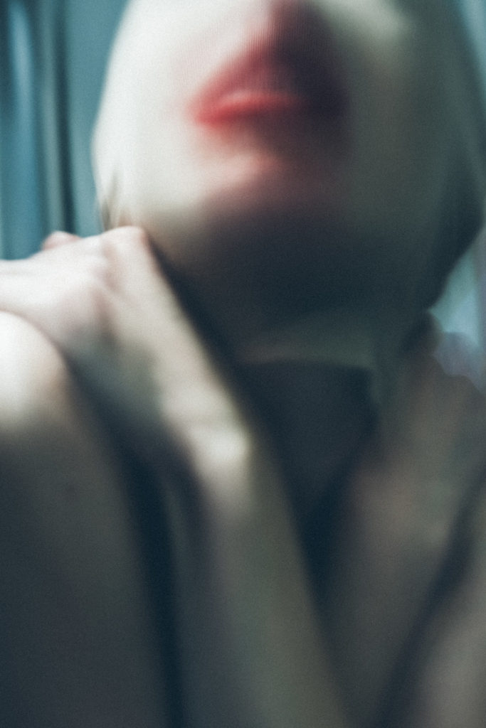
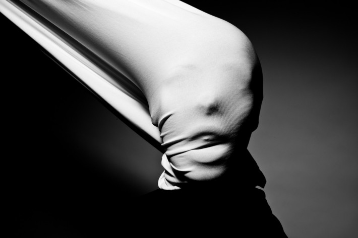
Finally I edited my third and final set of images, these images reminded me of Francesca Woodman’s work, they carry a similar theme where identity is see through someone’s body, while their face remains anonymous.
Original images after being resized.
First I changed all the images into black and white and resized them to centre on the main subject.
Images after being turned black and white
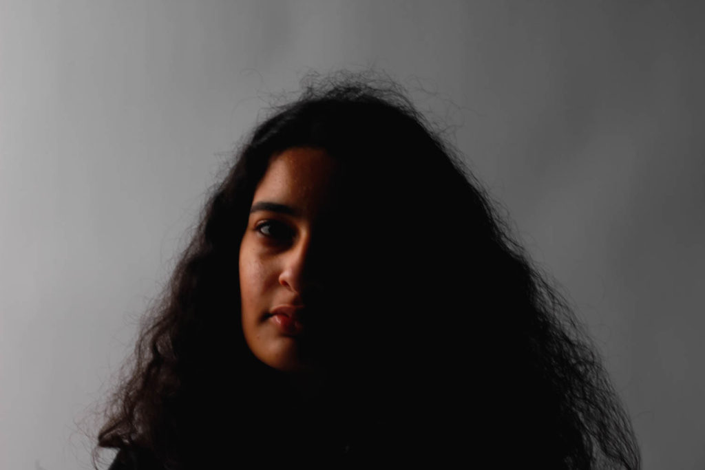
I wanted these images to have more of a minimal, light tonal composition to portray the idea of the pureness of the human body which is highly contrasted with the darker tones of the clothing the subject is wearing.
Once again, I edited all the images the same way as they belong in a set.
I turned up the contrast and whites while turning down the exposure and blacks to create more of a simple tonal spectrum that concentrates on the textures of the images and the main subject.
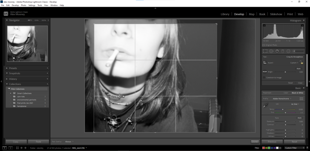
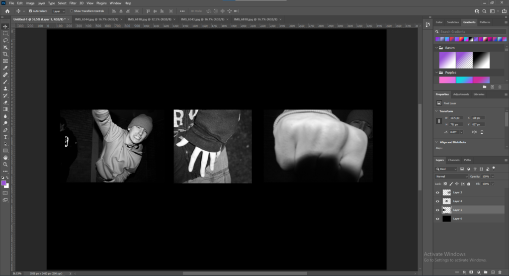
ADOBE PHOTOSHOP ARRANGEMENTS FOR ALL SETS
First I opened a new page and changed the first layer to landscape with a black background (as all the photographs are in black and white I believe this will make them stand out)
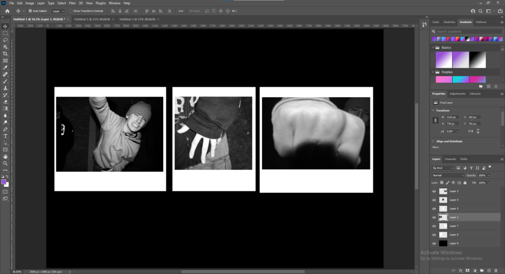
Then I imported my images into Photoshop and resized then arranged them in a way that I believe told a story about the images. After this stage I decided to experiment try and make them polaroid-style on Photoshop.
I created a new white background and resized it beneath the images so they would look like polaroid pictures. Overall I’m unsure if I like this style and if I will continue with it on all sets.
I repeated these steps with all my sets, then I flattened all the layers on each separate set to create my final sets of images.
I knew that I wanted some of my images to be bright and colourful so I experimented with a variety of colours and images in order to create a set of neon images.
Experiments
—–Experiment 1: ——————–
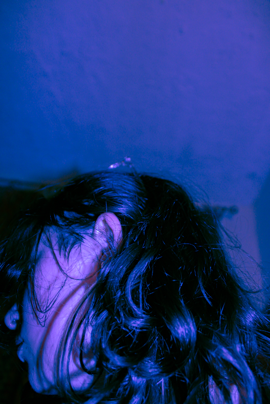
Original Photo
Here, I tinted the shadows a deep blue whilst making the highlights a softer pink which made the photo stand out a lot more, making it more visually interesting.
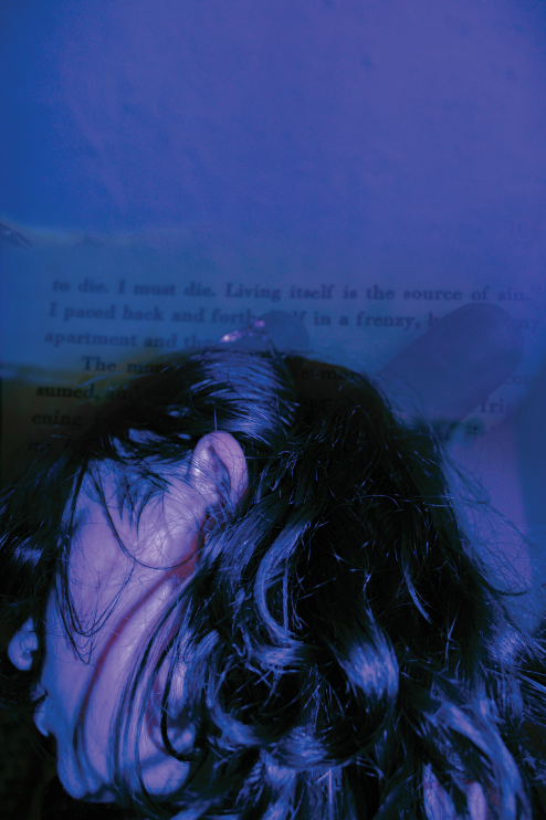
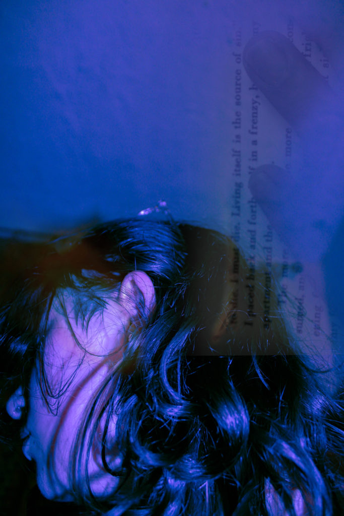
Next, I decided to add a photo of a page from the book ‘No Longer Human’ by Dazai and blend it into the background, as it’s a book that I really enjoy and thought would work with this image.
Finally, I finished the edit by moving the book page to the right side of the photo in order to fill up some empty space then added a burn along the top of the book page and a small lens flare over my face.
I like how this edit turned out and plan to use it as a part of my final project as the colours as really vibrant and work well together which I enjoy. I think it would contrast well against some of my other photos that are less vibrant and would add to the project as a whole.
—–Experiment 2: ——————–
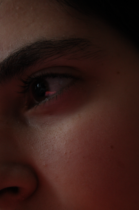
Original Photo
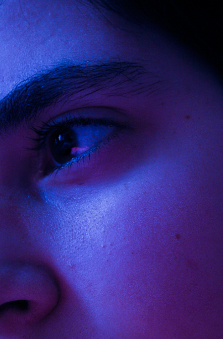
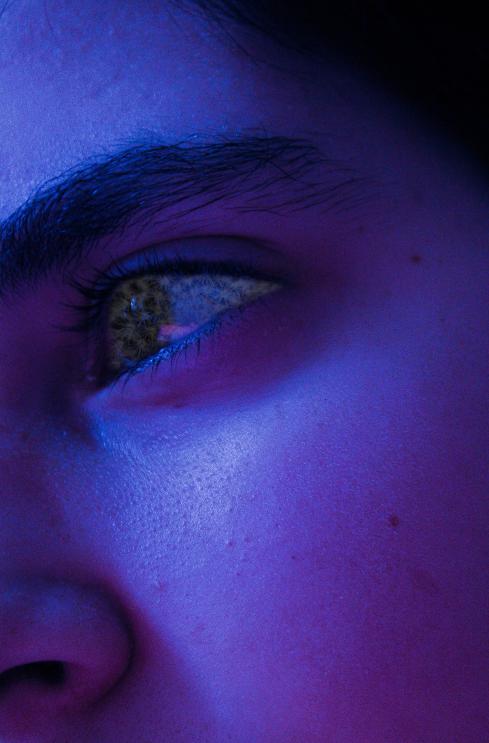
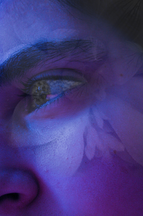
Here, I decided to decrease the temperature of the image, making it a bluish-purple colour before proceeding to tint the shadows a pink colour.
Then, I photoshopped a photo of my cactus onto my eye, making sure it’s only in my eye.
I finished the edit by adding a photo of my other plant over my face, making sure it’s transparent so the details of my face can still be seen. [The plants represent growth as I plan to pair this photo with another photo from when I was younger]
I plan to use this photo in my final project as I really like how it turned out. I like how the vibrant colours and transparency of the plants don’t distract from the details within the photo and make it look interesting without being so busy that it looks tacky.
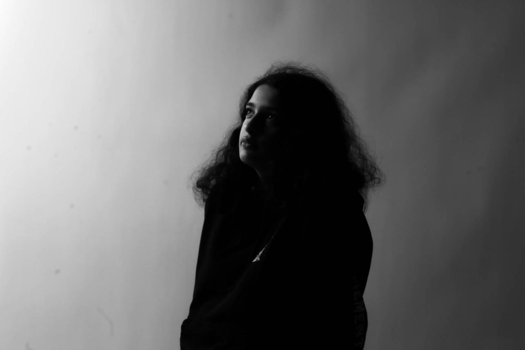
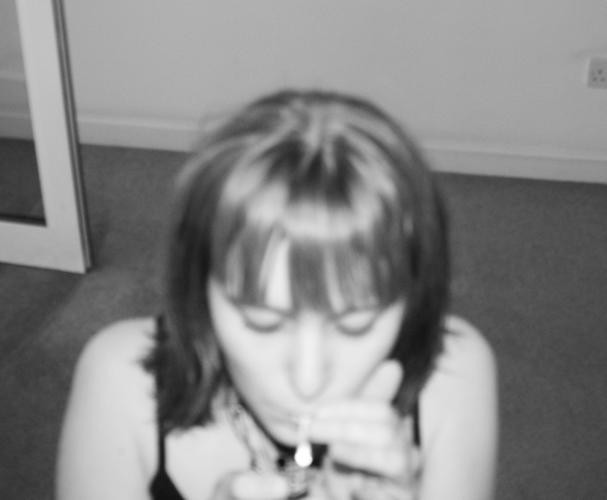
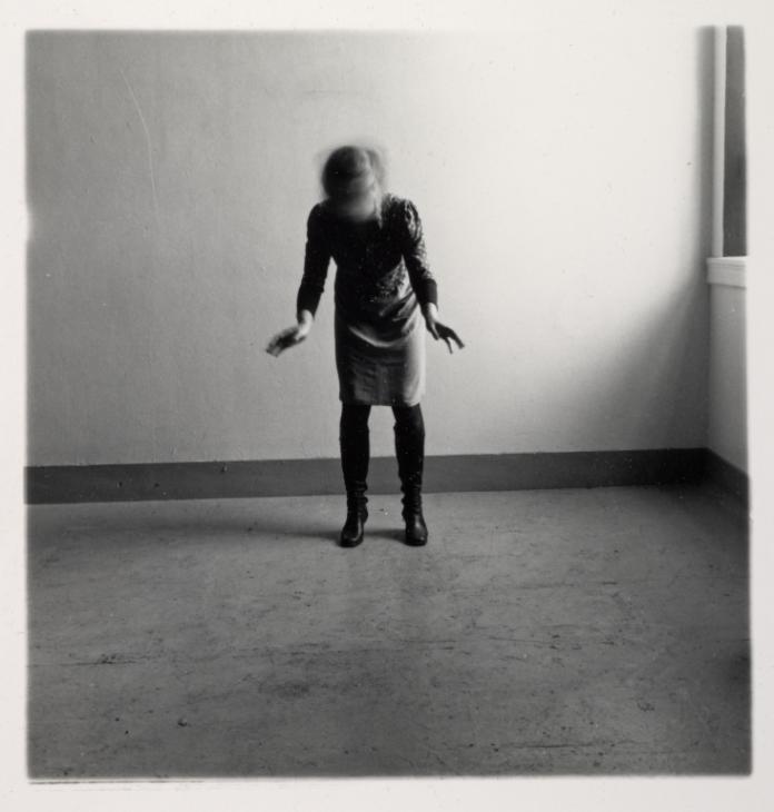
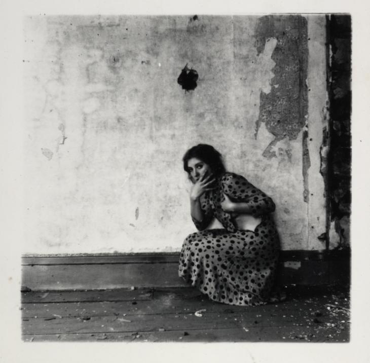
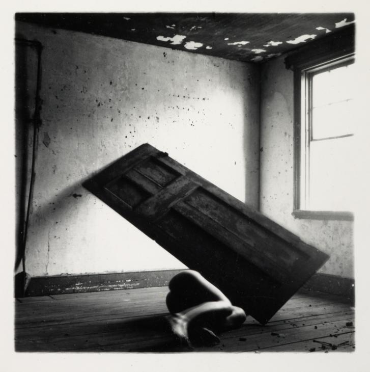
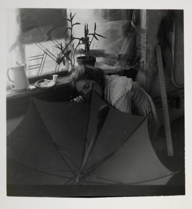
for my second shoot I was inspired by Francesca woodman i used plain backgrounds with slightly darker lighting to give my images a dark yet soft feel inorder to portray the loss of identity or lack of.
I will use props and take images in natural lighting to try and mimic the shadows in her images. I will also use multiple angles to photograph my subject in various positions some awkward to create a similarity between my images and Woodman’s work.
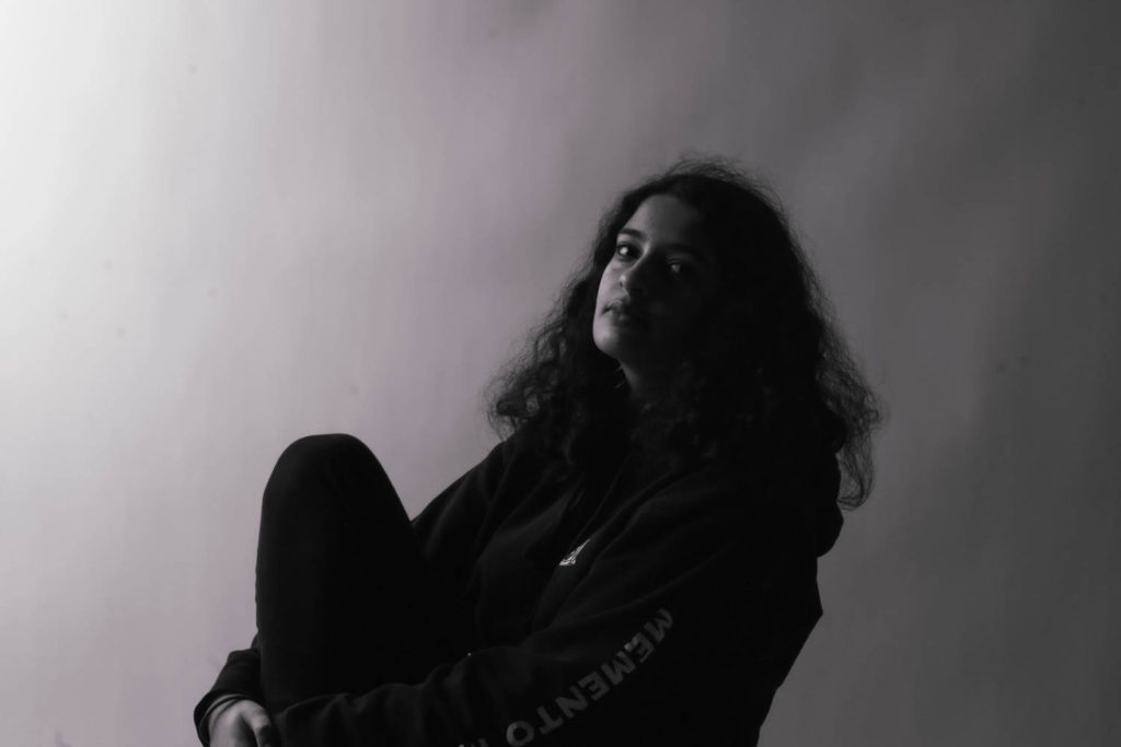
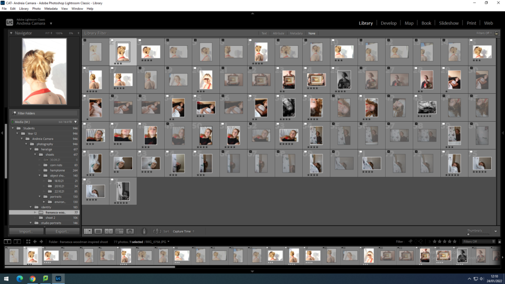
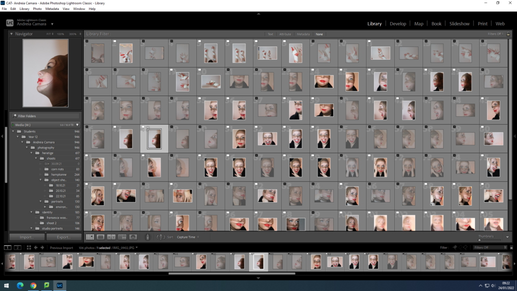
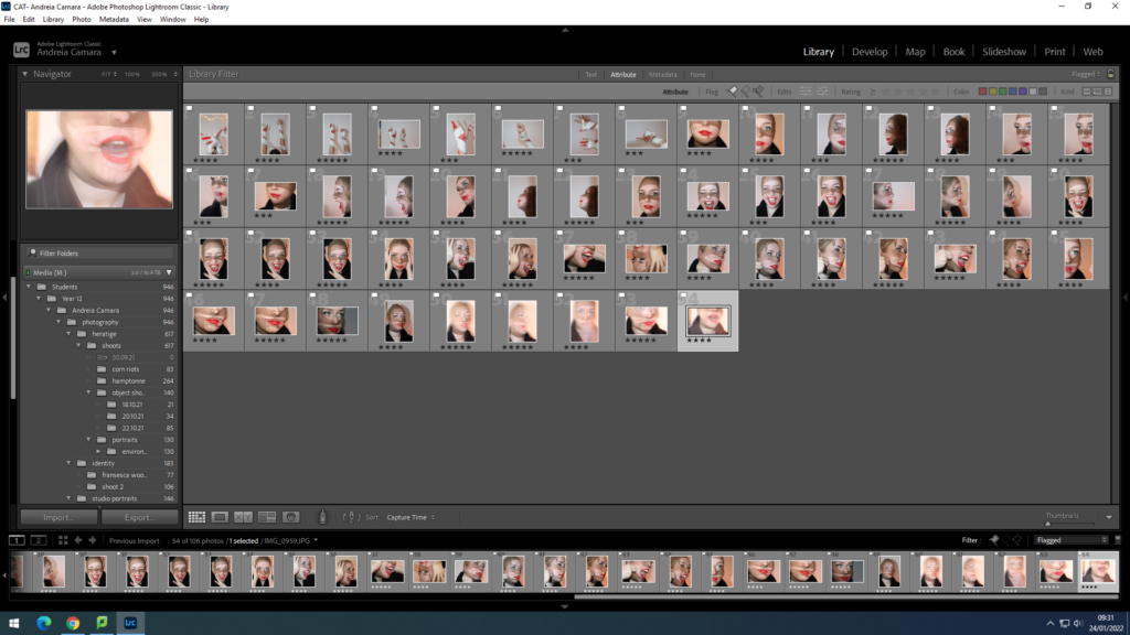
contact sheet
imported my images and started the selecting process using ctrl P for the images I wanted to keep and X for the ones I didn’t
then i went through and did a more thorough selection using the staring system 5 stars being the best images from the shoot
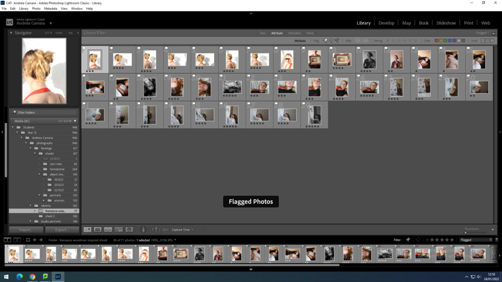
Then I filtered my images by flagged and stared ready for developing in Lightroom
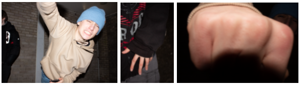
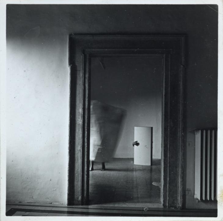
for my shoot I will be taking portraits of my friend inspired by Andreas Poupoutsis’s work I will be using a plain background to avoid pulling the focus away from the subject. Using the manual setting it will allow me to get the right depth and shadows I need I will also take some images with a low shutter speed in order to make some more surreal than the others. To really help show someone who has lost their identity might feel.
I will use a variation of flash and natural lighting and a series of angles the subject will be placed in front of a white background with a face covering to show a sense of lost identity such as in Poupoutusis’s images.
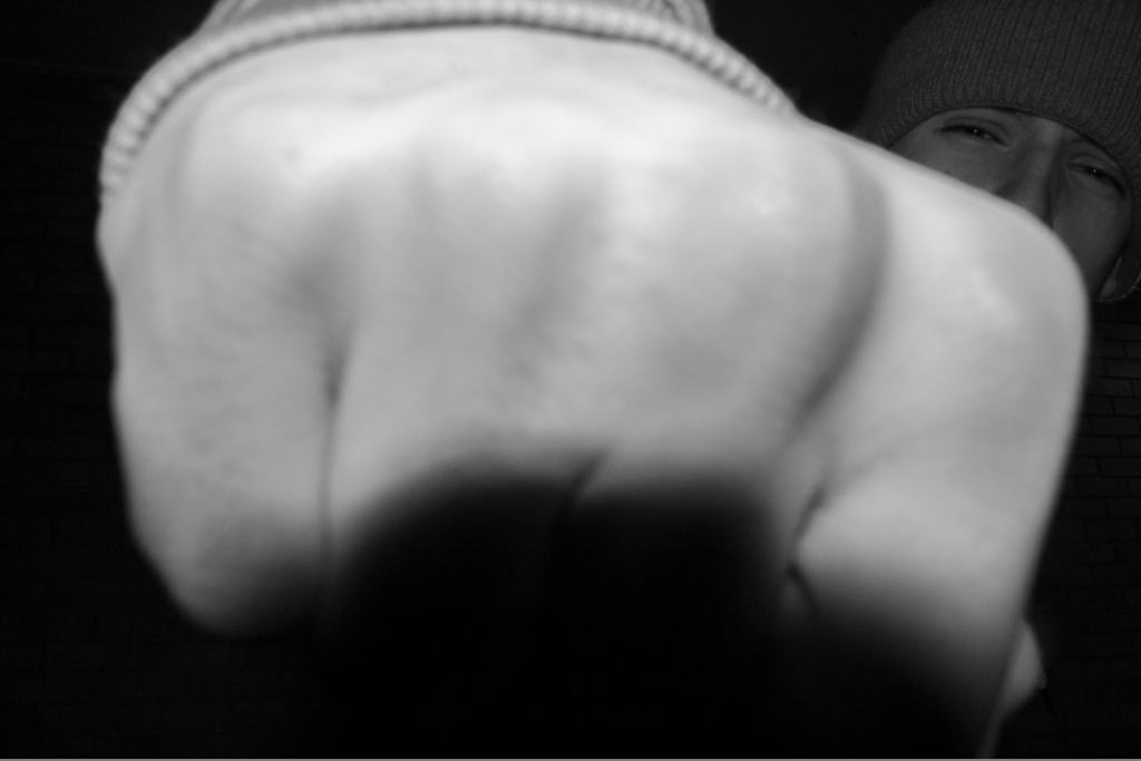
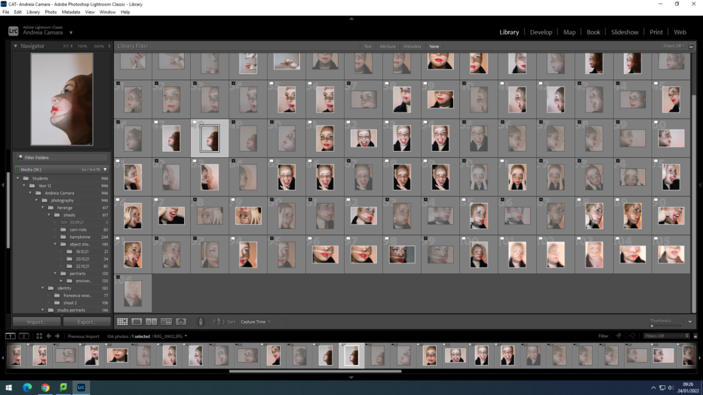
Contact sheet
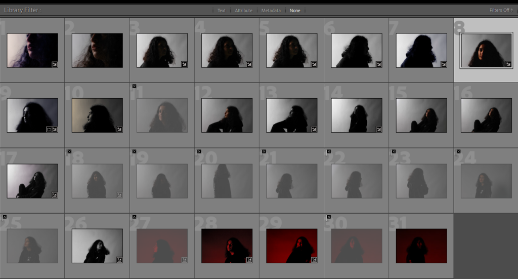
After importing the images from my second shoot I started my selecting process by using (p) and (x).
I then filtered the images by flagged and started a staring system
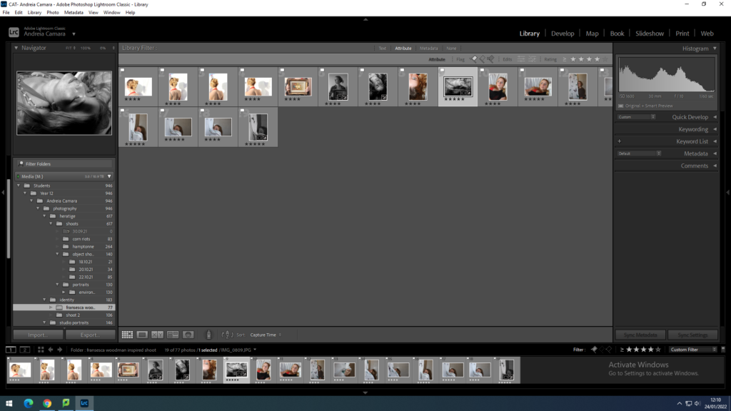
then I filtered them in order to just have the ones rated 5 stars visible and went into develop mode