Claude Cahun was a French surrealist photographer, sculptor, and writer. Schwob adopted the artist name Claude Cahun in 1914. Cahun is best known as a writer and self-portraitist, who assumed a variety of performative personae.
About her work
Cahun’s work is both political and personal and also focuses on creating work linked to the surrealist movement. Although she made sculpture, embedded herself within activism and wrote extensively, Cahun is mostly synonymous for her contributions to surrealist photography, particularly her striking self-portraits, in which she questioned societal expectations of gender years ahead of her time
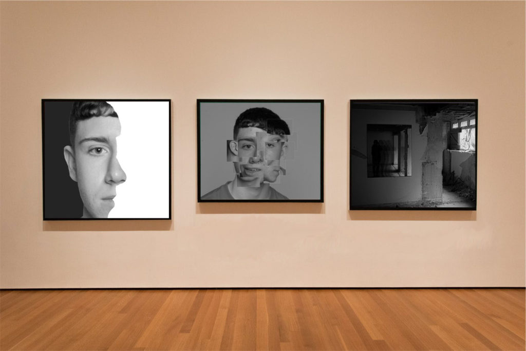
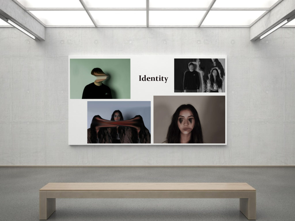
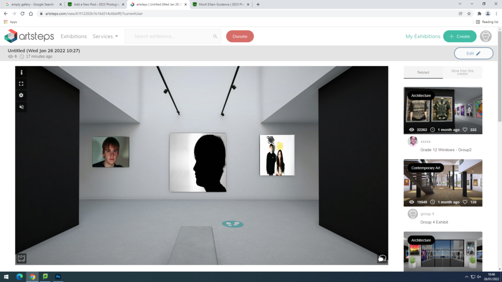
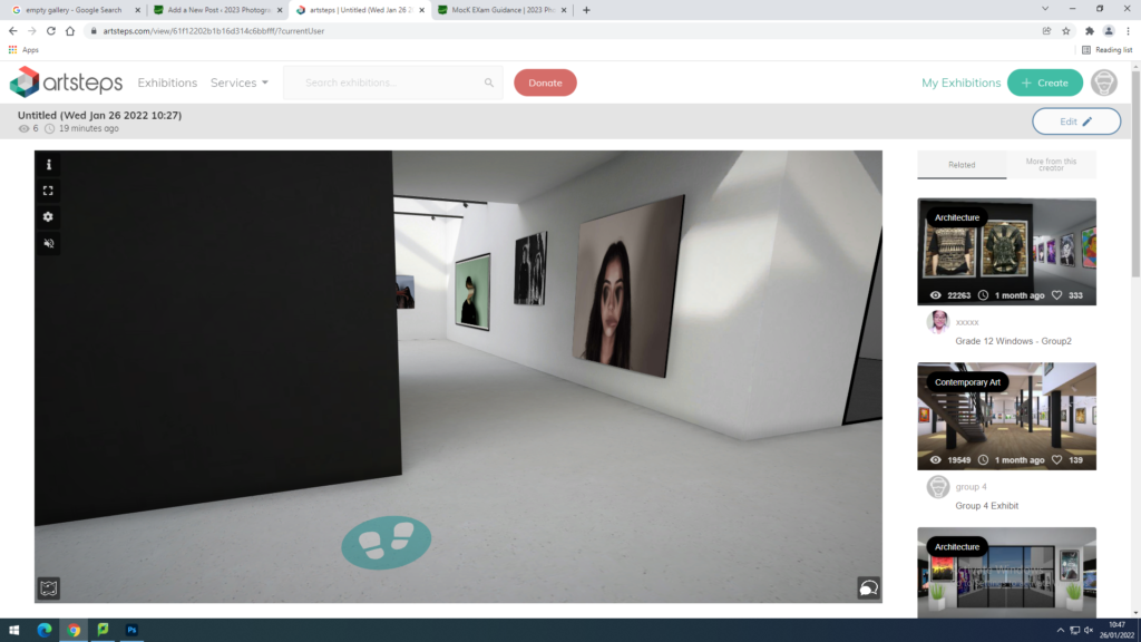
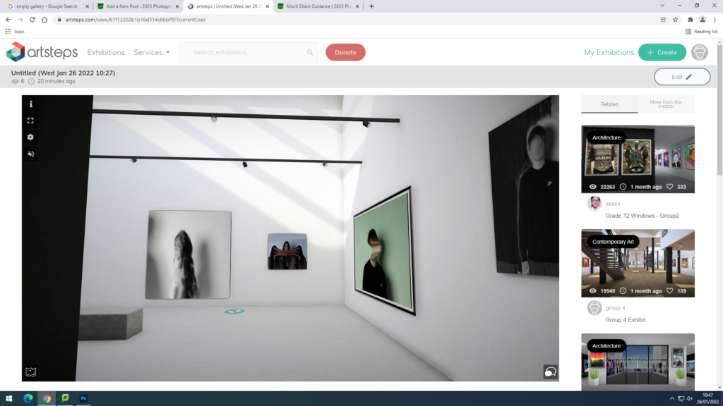
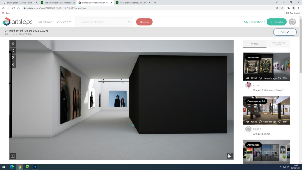
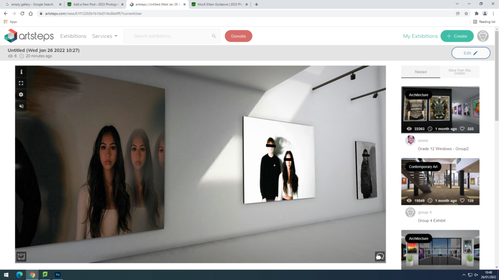
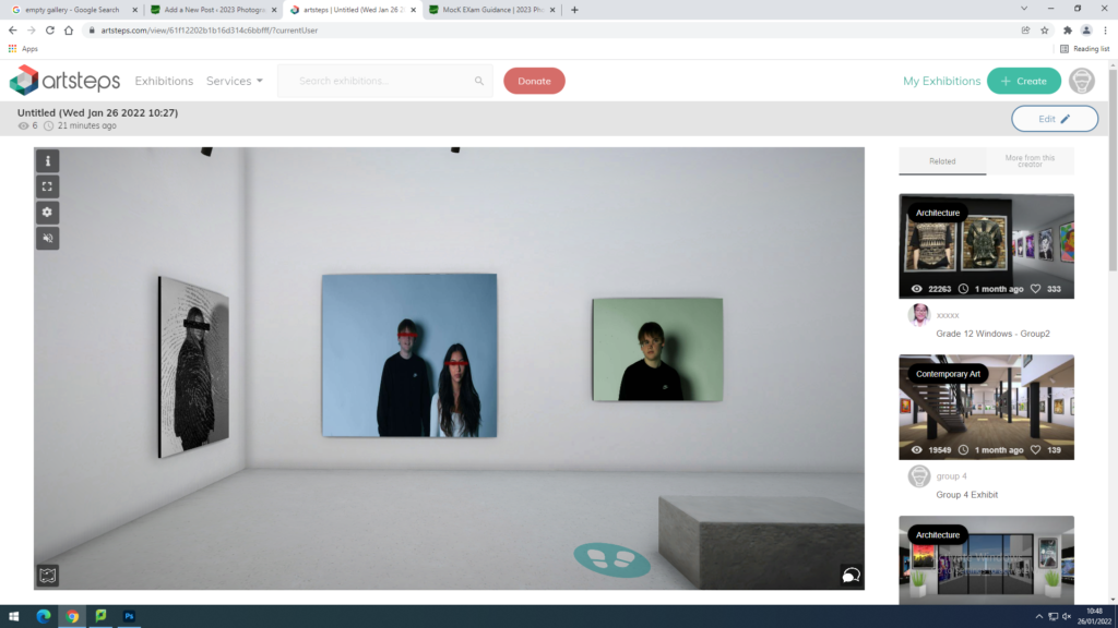
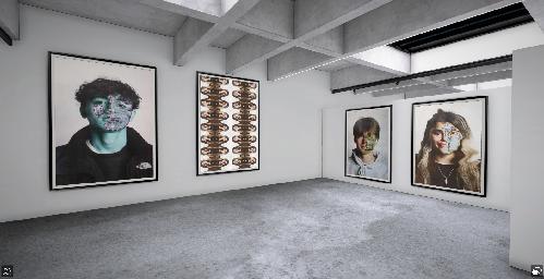
These images here are my 4 final images that I have presented through the blog and through galleries. I chose to present my images in black and white because it prevents people from judging and stereotyping the models choice of colours. Also, I think that most images look a lot better in black and white due to them being basic and effective. These images are inspired by multiple artists such as, Claude Cahun, Brno Del Zou and Boogie. I have produced multiple portrait photos which are all linked to the idea of ‘loss of identity’. For my photos I used Lightroom and Adobe Photoshop to produce the edits shown in my images.
Image was inspired by Brno Del Zou
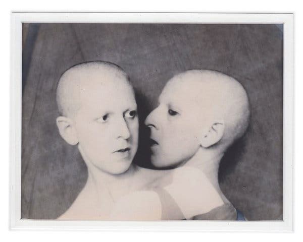
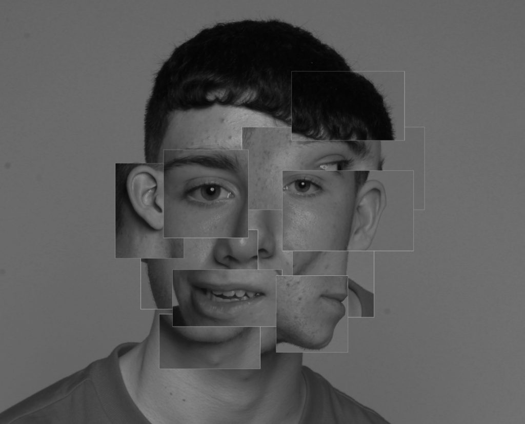
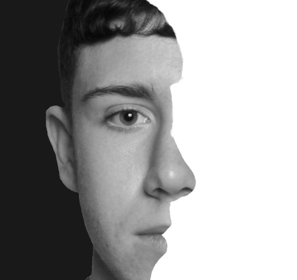
Image was inspired by Claude Cahun and BoogieImage was inspired by BoogieImage was inspired by Brno Del Zou
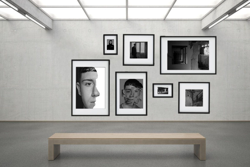
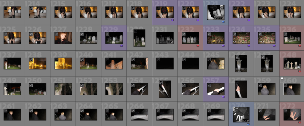
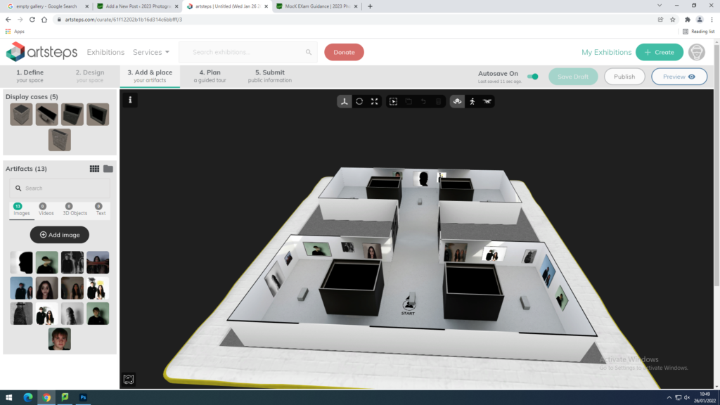
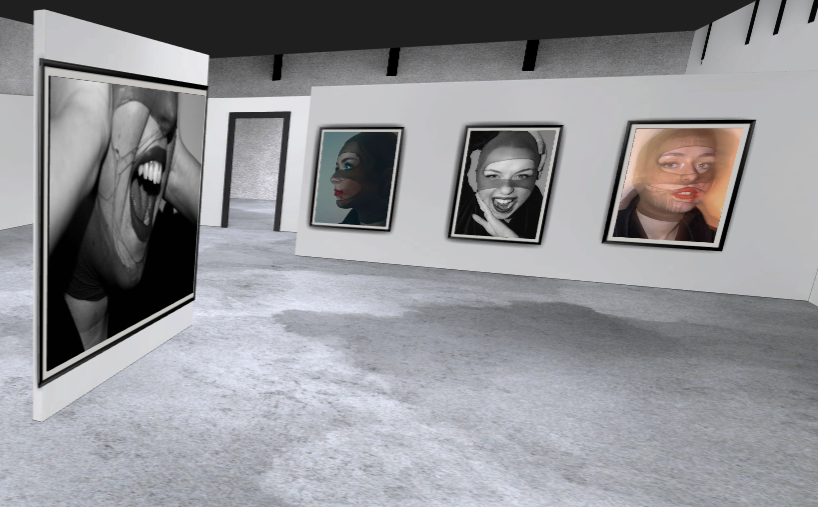
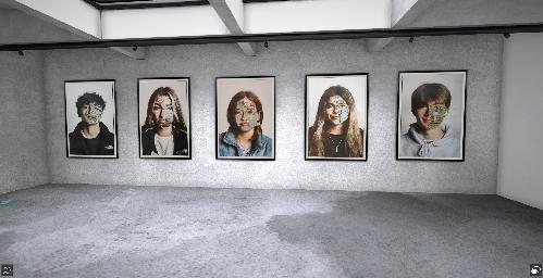
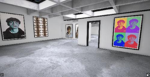
In the virtual gallery I decided to put more than my 4 final outcomes and chose to use a few of my favourite images from the past around the gallery.
Image Analysis:
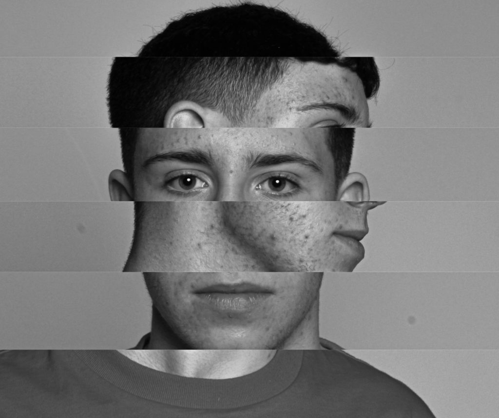
For my first image, I was inspired by Brno Del Zou who has done many pieces of work like this one. For this photo I used Lightroom to first make the main image look good and change features such as the contrast and exposure. After deciding that the main image looked good I exported it over to photoshop and began to edit. This photo signifies that the model has many different identity’s because it is many different headshots in one.
This image is one of my favourites due to the location and surrounding area of the shot. I was slightly inspired Claude Cahun and the way she created her images. This photo could suggest the idea of ‘faded identity’ or ‘hidden identity’ because as you can see the models features aren’t visible and they seem to be fading away into the light of the room. Also, in the window you can see a fading hand that seems to be the hand of a ‘spirit’. I was inspired to do this by a 1900s photographer S. W. Fallis who has a spirit like theme in his images.
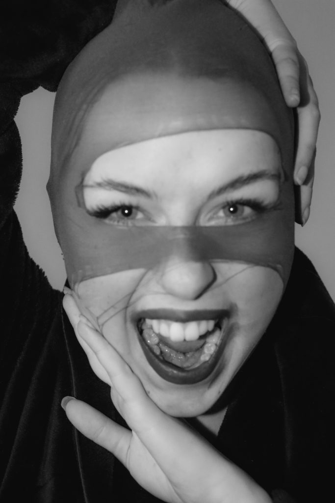
In this image I was inspired by a photographer named ‘Boogie’ who does close up headshots in black and white. I chose this as one of my ideas because I really like the way this photo can be seen in two different perspectives such as the side profile and front of the face. This photo suggests the idea of ‘chosen identity’ because you can choose how you want to view this photo.
This image was only slightly inspired by Brno Del Zou due to the cut-outs and using multiple images in one. For this I chose two very simple images that I knew would work with this edit and curt-out long rectangles on the main headshot image and placed the side profile layer behind the main layer. This photo could suggest the idea of ‘social identity’ because the model isn’t hiding any of his facial features and doesn’t care how he looks.
Unsuccessful Image:
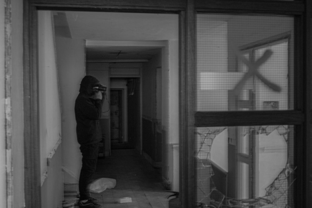
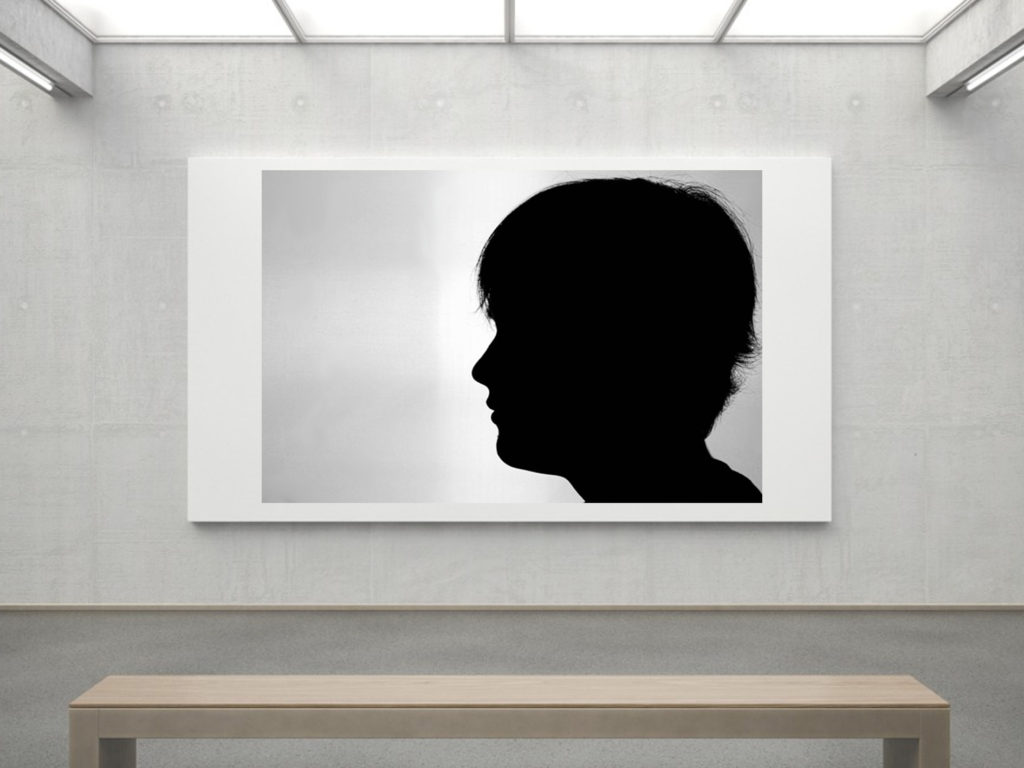
I did not include this image into my final pieces. The idea of this image is ‘hidden identity’ because my model appears as a black shadow and shows no skin or facial features. Also it can be said that the model wants to be hidden from society due to being in an abandoned building. However, I didn’t use this image as my final piece because I don’t believe there is enough use of editing and it seems to be quite blurry.
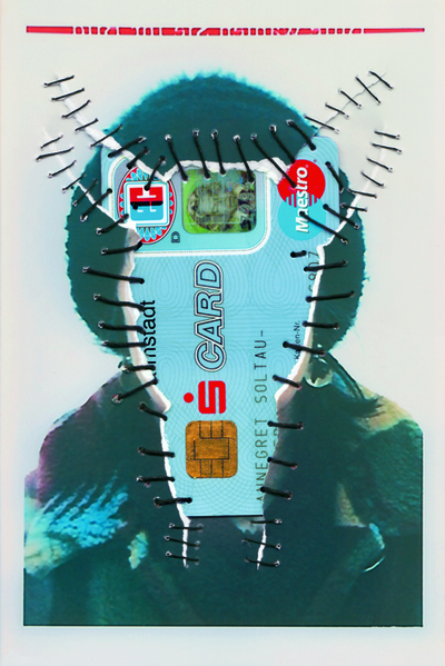
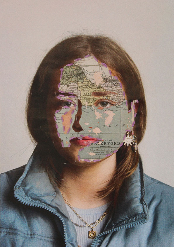
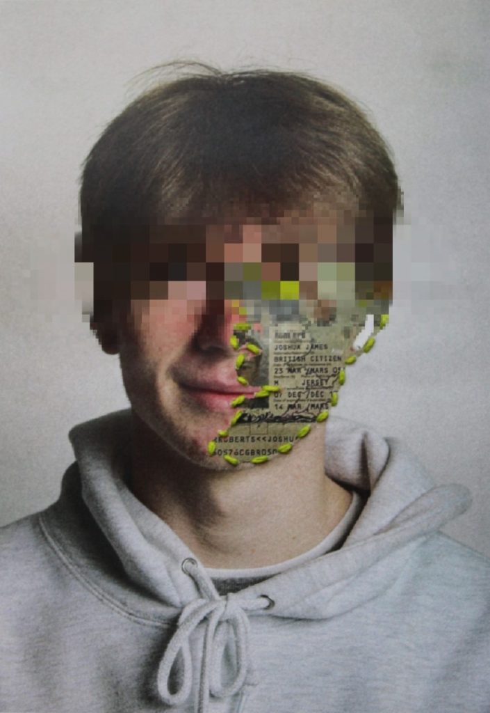
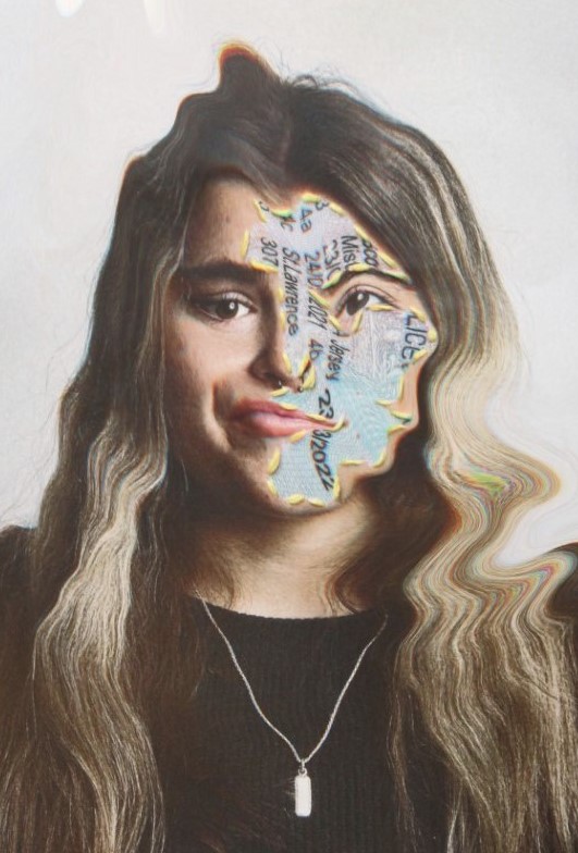
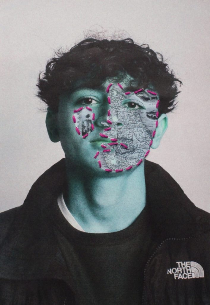
For my identity mock exam project, I created a collection of images inspired by Annegret Soltau. I like the way I took my own approach to her style of work, to do this I sewed the identity into the skin of the face to create a metaphor that identity is ‘skin deep’. I focused on geographical identity including passports, maps and ID from various paces such as, Jersey, Poland and Portugal. I wanted to include multiple locations as diversity and appreciating other peoples cultures is very important to me. I believe my images turned out well and look very good with the stitching.
What I would do different
For my next project, I will start by taking more images, I photographed a total of 14 people however I only took roughly 4 images of each person, this is down to the fact that I should’ve booked the studio out or an extra hour to be able to take more images. I would also like to create a product with more of a deeper and complex meaning, although geographical identity is very important, I feel I could’ve gone a lot more in depth if I had chosen a different theme to cover and could’ve done more complex editing. I expressed more editing styles in my further editing, some of which I wish I had incorporated into my final piece.
Here is one of my images side by side with Soltaus
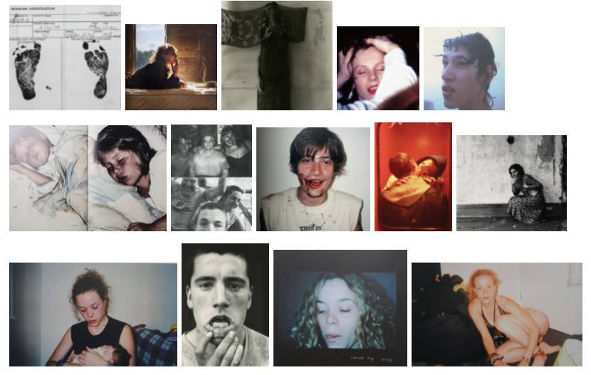
I plan to create images with the main characteristics of Francesca Woodman’s work but with the personality of Corinne Day and Ryan McGinley’s work, showing possible self destructive behaviours which are camouflaged by the vitality of youth and teenage culture.
CLICK ON MOODBOARD BELOW FOR BLOG POST ON INSPIRATIONS
My mood board
I don’t have a set idea of what I want to photograph, my view on the identity project was that I wanted to create a set of images that show a teenagers point of view on taboo subjects that are usually censored or lectured about by adults.
Mind map of ideas
PHOTOSHOOT #1
I started by taking photographs of my belongings in an almost clinical, professional way- I quickly realised that my idea of the word identity doesn’t mean professional, clean photos but more gritty and personal images that show the young side of identity; where someone’s personal identity is taken apart, sculpted and analysed by society before being put back in a broken way where one has to “fit in” before they can continue.
An idea that I didn’t continue with
For my first photoshoot I used the self-timer setting on my camera and set it up on a flat surface as I didn’t have a tripod.
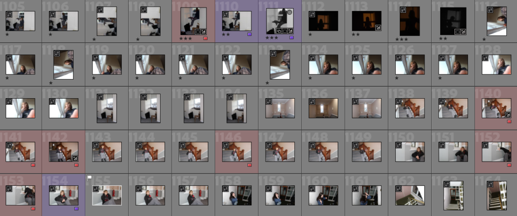
Contact sheets from the shoot
My first photoshoot was in a family member’s flat that they had just moved into as I really liked how empty the space looked, I was the main subject for all my images so all the images were taken on self timer and with flash to make them look more grungy and raw.
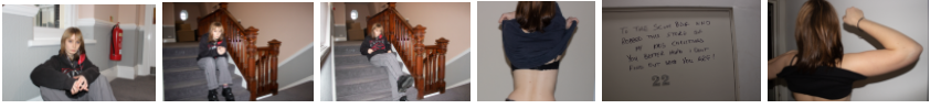
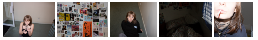
MY FAVORITE IMAGES FROM PHOTOSHOOT #1
PHOTOSHOOT #2
My second photoshoot was around my apartment building and in my bedroom, once again I was the main subject in my photos but I also took pictures of my surroundings such as my bedroom and bedroom walls.
Contact sheets from the shoot
MY FAVORITE IMAGES FROM PHOTOSHOOT #2
PHOTOSHOOT #3
My third photoshoot was outside around St Brelade’s bay and in my hotel room in the St Brelade’s Bay Hotel. I took some pictures with my friends at a local youth club then I went to the Fisherman’s chapel and the graveyard around it as well as the beach.
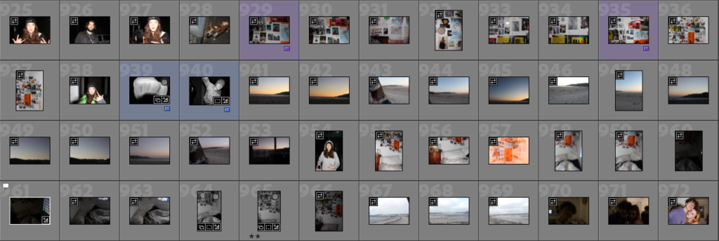
Contact sheets from the shoot
All my images were taken with flash and some are out of focus but I believe this gives them a cool effect.
MY FAVORITE IMAGES FROM PHOTOSHOOT #3
As well as the images I’ve taken from these photoshoots I plan to use images from past projects however as I am still unsure of what I want my images to portray and how I am going to show identity.
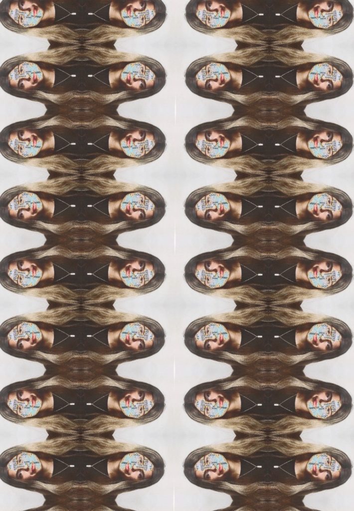
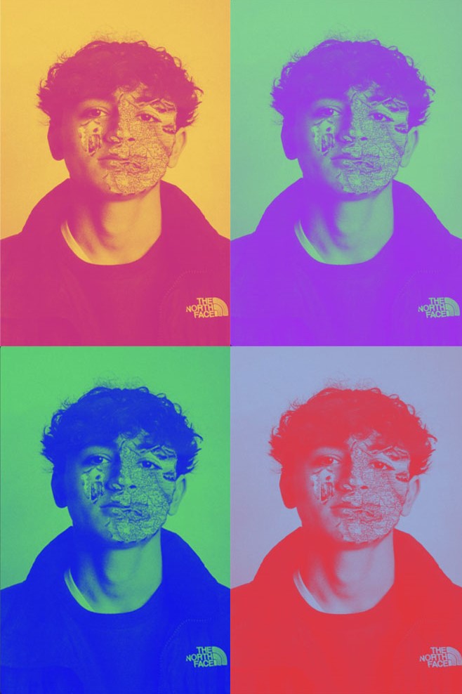
I wanted to see what else I could create with my final images- here are some edits I have created of my final stitched pieces. The quality is lower as these are re-photographed.
For this image, i wanted to highlight the biometric science of eyes and identity. By removing his eyes I am some what removing his technologically recognised identity.
This image I have created to highlight the multiple identity’s someone may have.
In the older photos, as I was retaking them they came out darker them the original photo so I have increased the exposure so it resembles the same lighting.
Photo-montage editing
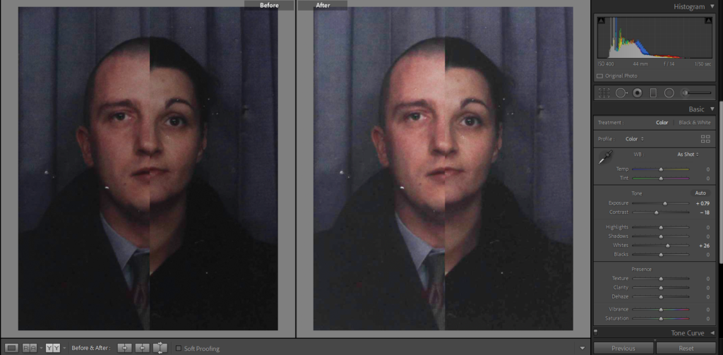
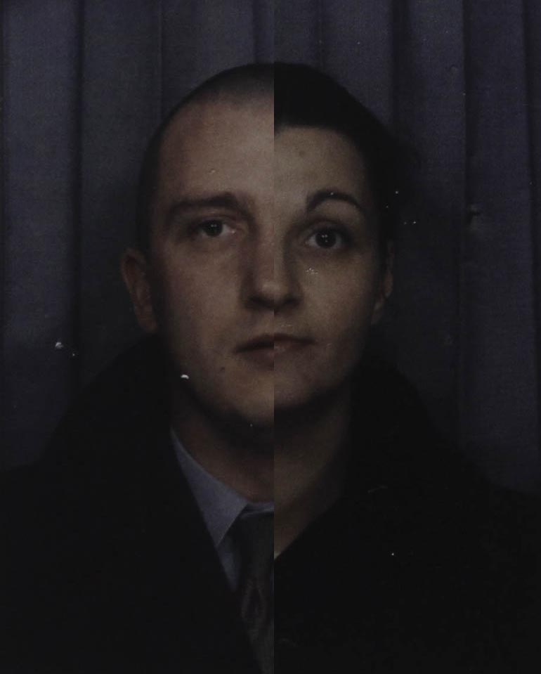
I have got some old headshots of my mum and my dad which I have halved and put together to create a montage of their faces. I used photoshop to do this as I am able to layer the two images on top of each other to get this effect of the spilt faces. I also used the cropping tool to take off the white boarder which was around the two photos, I did this because they were hard to line up as the faces are different sizes, in the end the final photo looked better without them. After editing them on photoshop imported the new montage into Lightroom where I increase the exposure and adjusted some others like contrast and whites so that it didn’t look to dark but also so its not to bright as well.
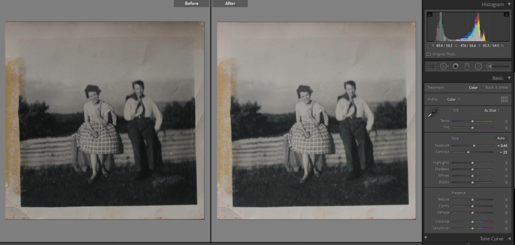
I found some old pictures of my Granny and Grandad from when they would go on day trips, as they could only take photos of each and none together, I have taken the picture of my Granny and put her into the picture with my grandad. As they had taken the photos in the same place it was easy to match the surrounds in each picture, I have cropped the individual picture of my Granny so that you can only see her and moved it top my Grandad’s picture. Once I got it so the railing they were both sitting on lined up I used the history brush tool to take away the background that was still surrounding my granny and to show the scenery behind my Grandad. As the photo below my Granny’s is more blurry I decreased the opacity slightly so that they look more similar and not out of place. I then moved the final montage to Lightroom to fix the lighting and just make the image brighter.
Carolle Benitah Inspired
One of the photographers that I have chosen, often used different materials such as paint, embroidery or beading to create her pieces. On photoshop I have tried to recreate that but I have experimented with different colours and brush types. In Benitah’s photos she used gold paint but I have chosen red as it links with the other photographer I have chosen and will link with the other ideas that I have. I decided to paint over the people in the background as I thought it was to plain to leave with it just over my dads face.
Original Image
Final Image
I like that is Benitahs style you are taking old photos and creating and giving them a new meaning, You are also able to direct the attention of the viewer to whoever/whatever you want in the photo.
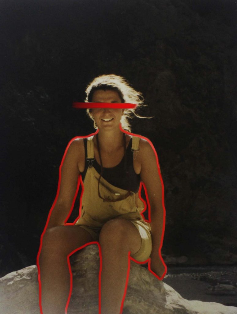
I have taken some ideas from Benitah and adapted them into what suits my photos, I didn’t just want to leave this photo with just a red streak over the eyes so I outlined her body so that it stands out from the background. I used the same tools on photoshop as the ones above as well as a mixer brush over the eye so that it replicates a brush stroke, light at the beginning and slowly gets more pigmented.
Original Image
Final Image
Yoshikatsu Fuji Inspired
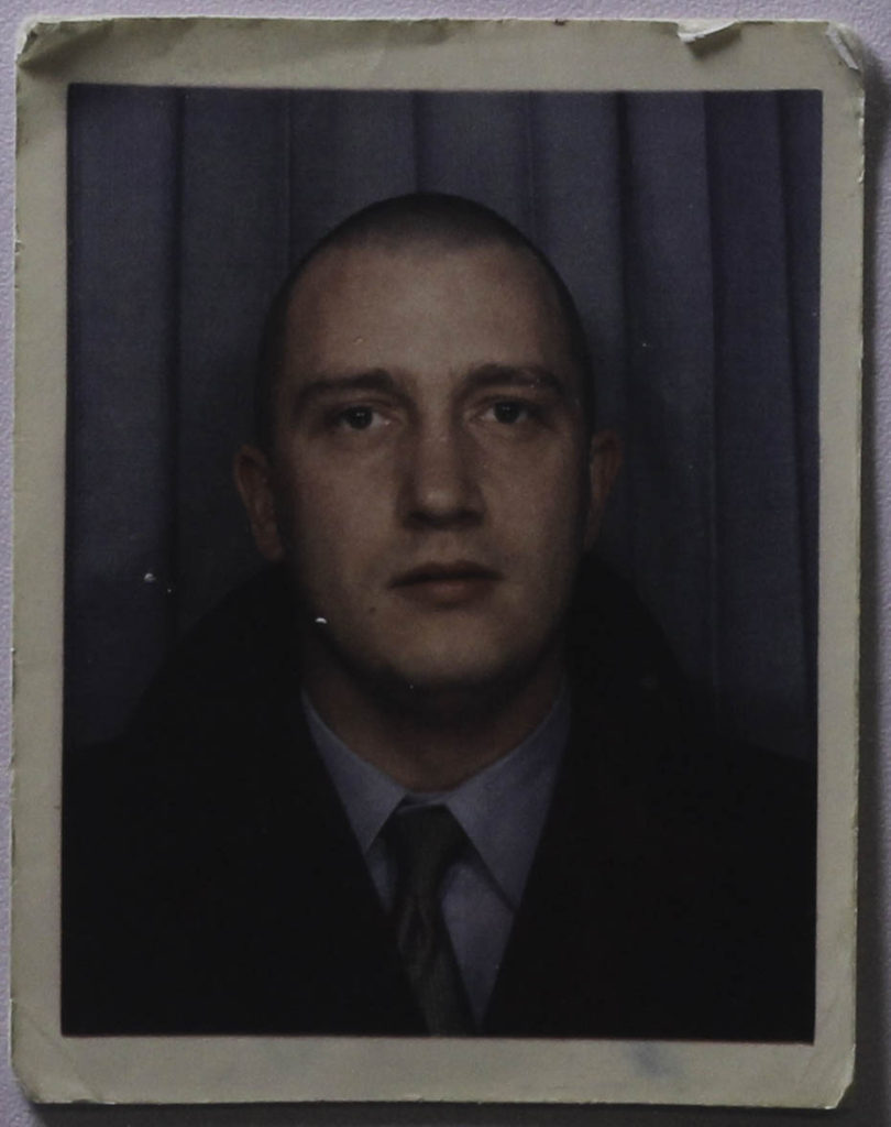
I am planning on adapting one of Fujis ideas the ‘Red String’ book which they have got many awards and recognition for. Once my final outcomes are printed out I would like to put them into a black frame and connect each one of them with red string. I am going to be using the red string as a link between all of my final images. I like how Fuji crops his photos, on the front cover of his book he has his parent wedding photos with their heads cropped off, even without the key feature of someone’s identity the photo still tells a big part of their story. There is also a photo where their coloured wedding photo is crop off at his mum and layered on another black and white photo years later of his mother at the beach, this shows how his mother has aged and matured but is still the same person who his father married. I have tried to do something similar with one of the old headshots of my mum and dad, I had already edited half of their faces together but I got two photos from a few years after and edited their eyes onto the headshots.
Original Image
Original Image
First edit
Final Image
Once these have been printed I would like to add embroidery to the bottom half of the photo which is taking from Carolle Benitahs style. I would do it at an angle which would go from the bottom left to the middle of the right side of the photo. I didn’t want to do this in photoshop as I thought I would look better with a different material added onto it.
Original Image
Final Image
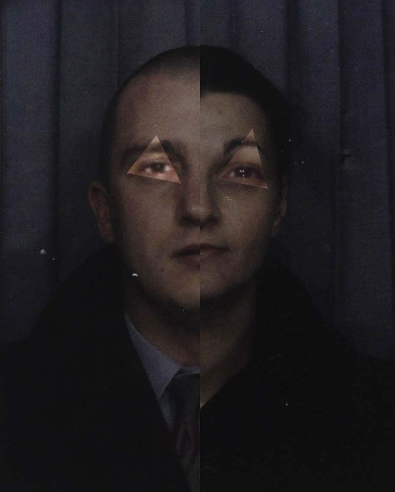
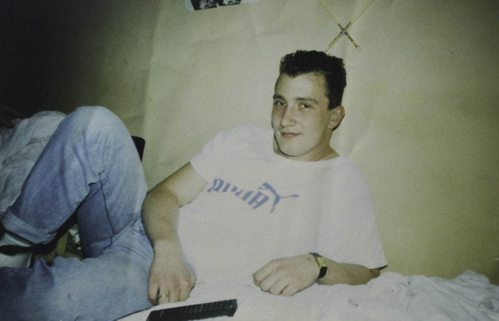
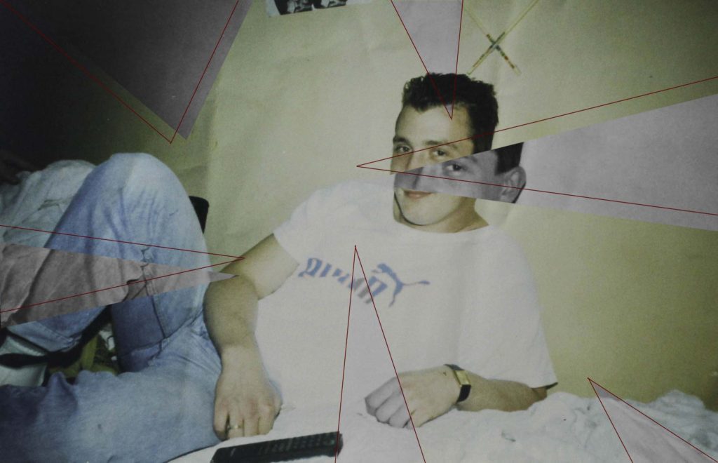
For this image I exported it from Lightroom and into photoshop where I used the line tool which I coloured red so that it would link in with the other images and the red string that I will be using once they are framed. I made triangles which came from the sides of the photo and crossed over many parts which highlighted different elements of the photo like my dads face, hands and legs. I then used the lasso tool to select the triangle which I turn black and white so that they would standout more against the coloured background. With some of the triangles I slightly moved them so they wouldn’t be lined up exactly to make the final piece more interesting and eye catching.
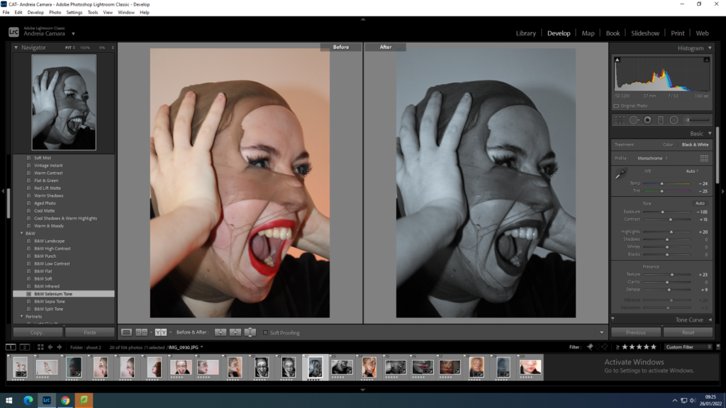
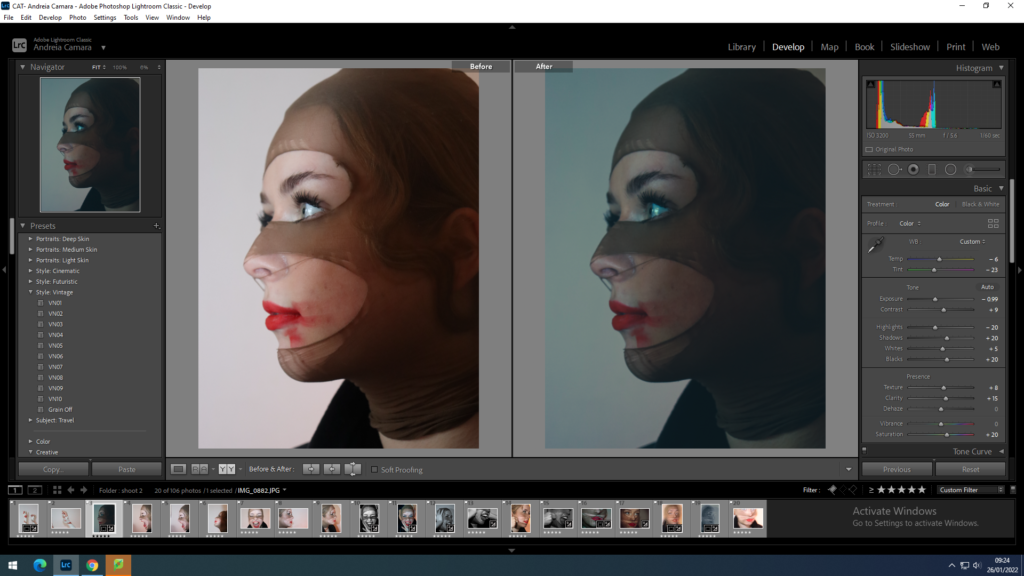
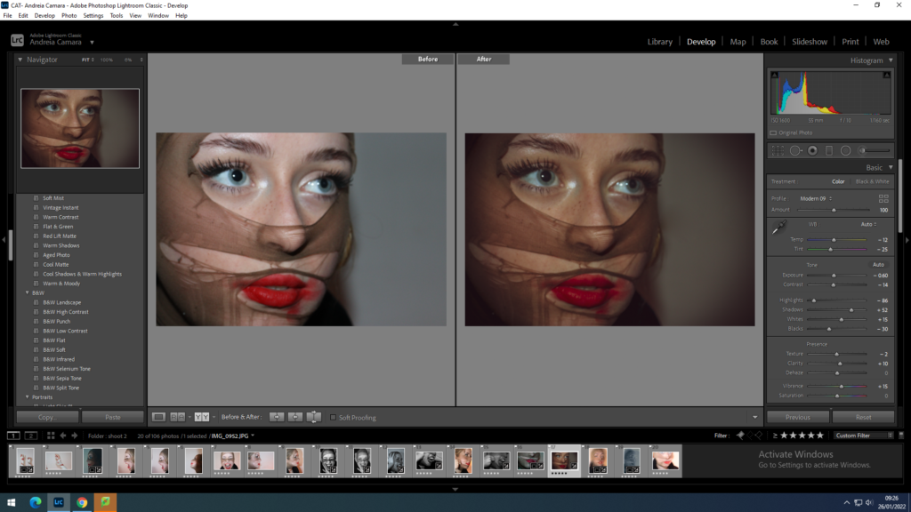
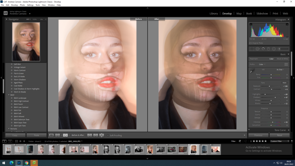
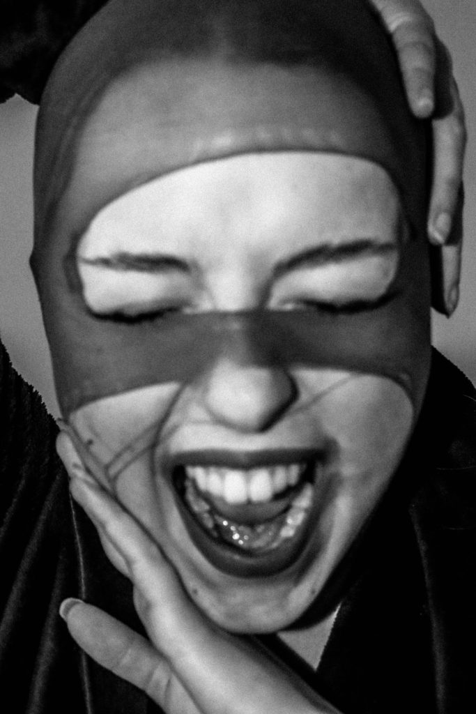
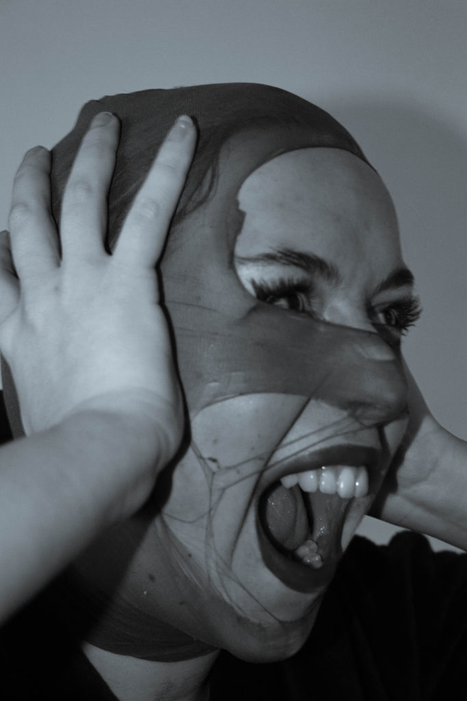
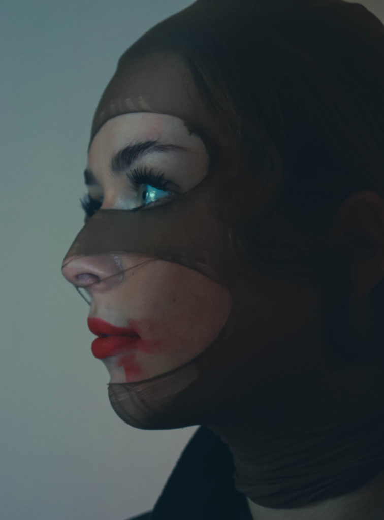
for my final images I wanted the simplicity of black and white as it doesn’t pull focus away from the actual images it also allows for more depth and the shadows create a good balance against the contrast of the head piece. I also wanted to keep them as close to my chosen artists theme of identity loss.
For all my images I adjusted the WB and the contrast in order to bring more depth into my images once they were turned into black and white I also cropped them to allow for a cleaner finish.
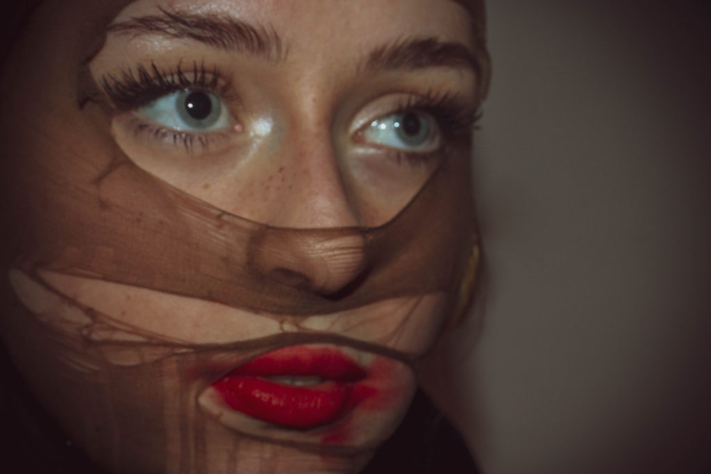
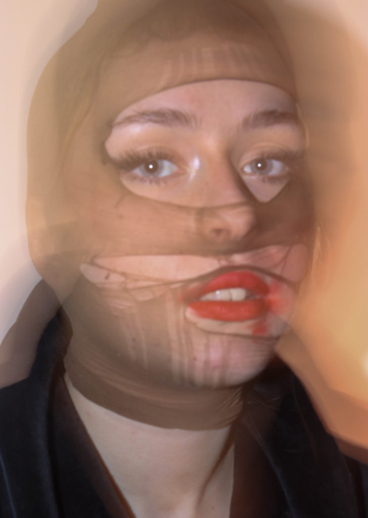
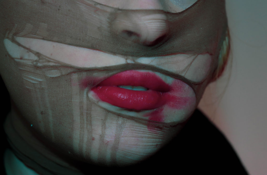
The coloured images lack a certain brightness which helps to pull focus to the more defiant facial features such as the lips and eyes as a persons eyes can tell you a lot about them and how they perceive themselves or portray themselves to others around them. The contrasting cool and warm tones go hand in hand with the softer and harsher shadows in the first images which make them a more correlated final outcome.
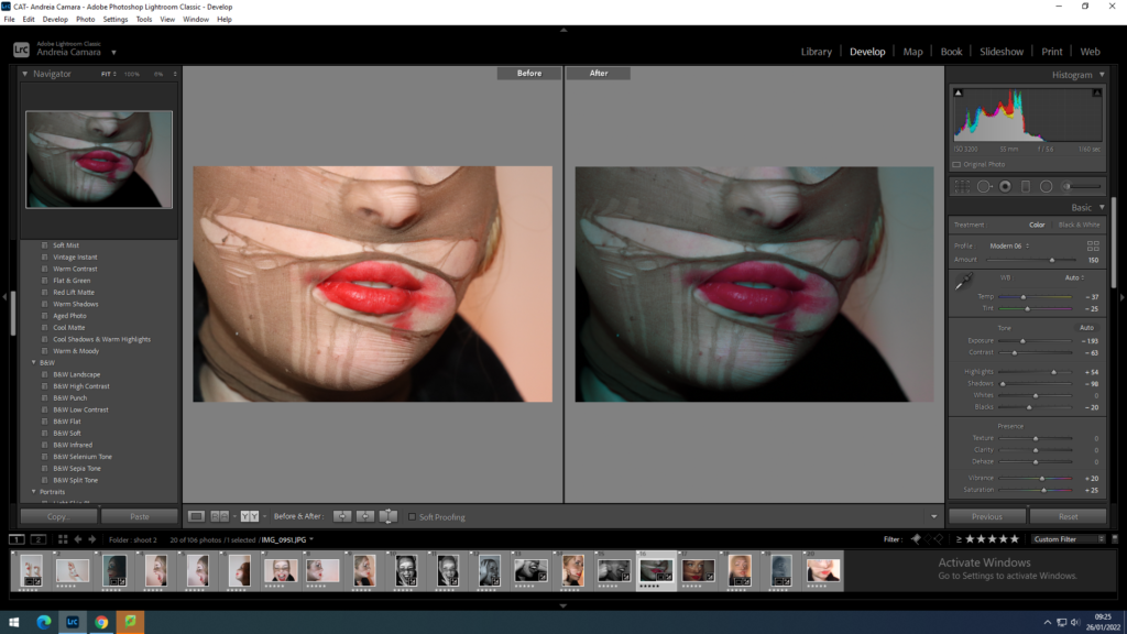
for the coloured images I wanted to focus on not losing the brightness of the red tones in the lipstick as it was one of the main focal points of this shoot. I strategically chose to make two images cooler tones in order to show an almost dark and mysterious side to her identity and two warmer tones to show a sense of calmness and youthfulness through a more playful tone.
final images after Lightroom
reworking ideas
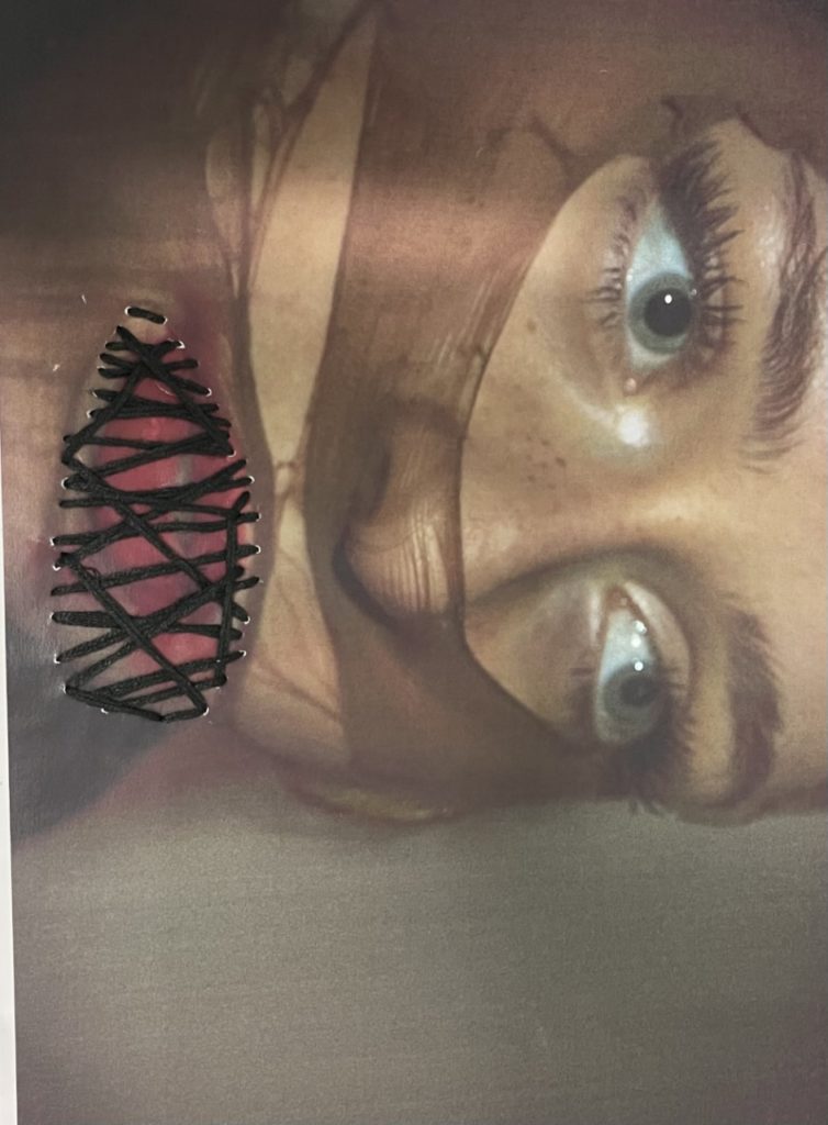
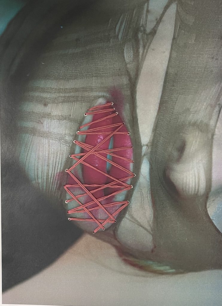
idea 1: print off these two images and stitch the mouth closed to add contrast to the red of the lipstick I’ll either use black or tan thick thread in order to use colours that are already in the images.
I printed the images on A4 paper and used adhesive to glue them to some card so they wouldn’t rip when sown threw I then made a selection of a thicker almost yarn like thread to pull more focus in the images.
used black thread to eventuate her eyes and to help portray the theme of lost identity
the stitching in red helps to show how identity isn’t always shown through superficial factors
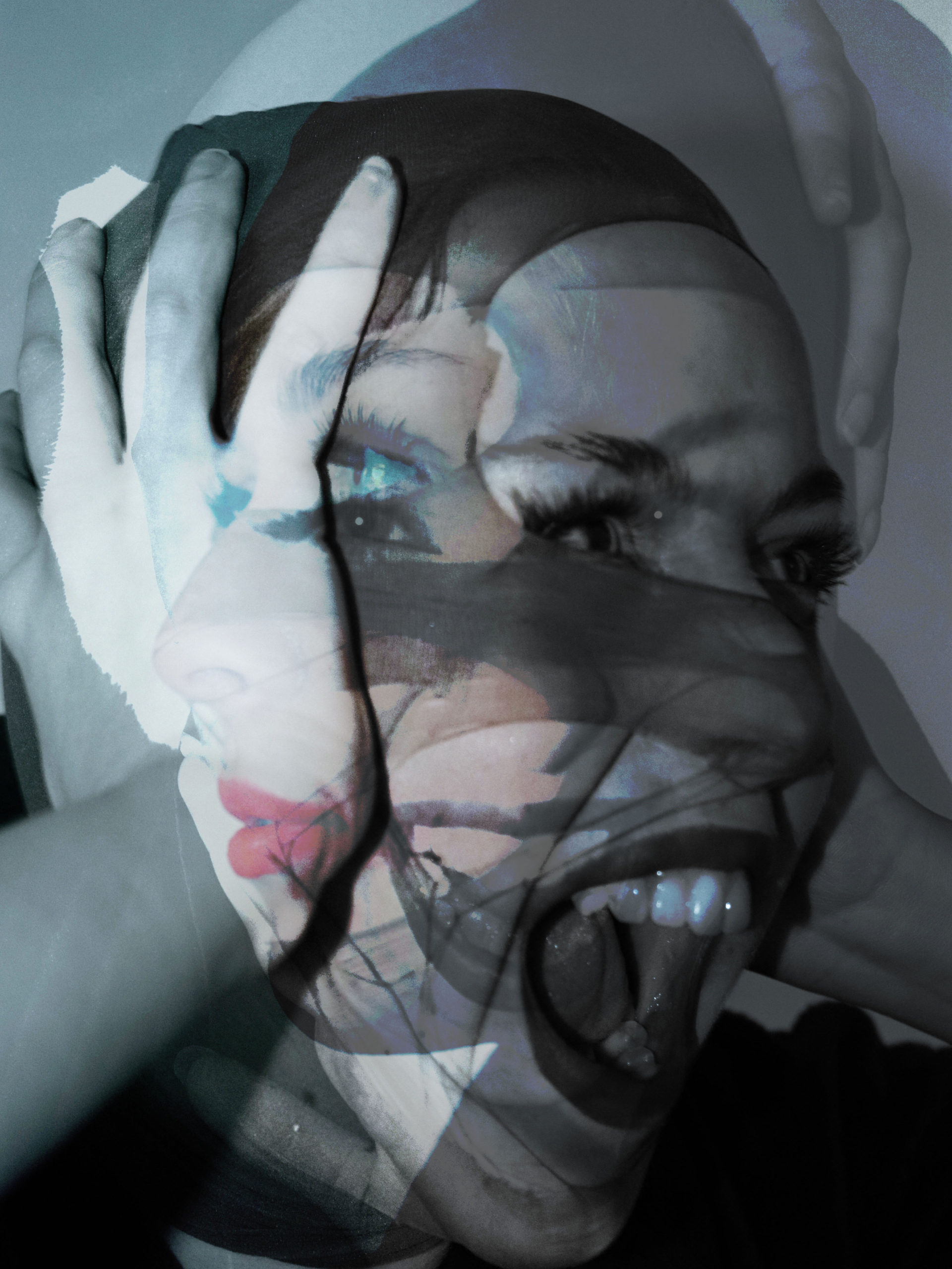
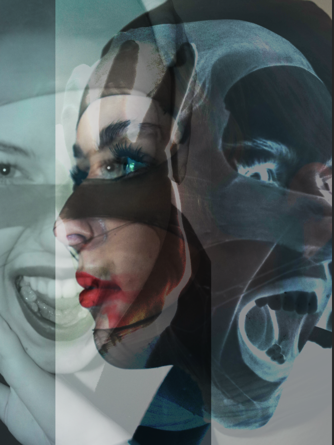
Idea 2: Double exposure on photoshop to create a set of dream like images and add a factor of surrealism to my identity project. These are the images I will use to achieve this.
Final Double Exposures
i used 2 black and white images and one in a cool tone to create a good contrast and made sure to use different angles and poses in order to create a sense of chaos to the images.
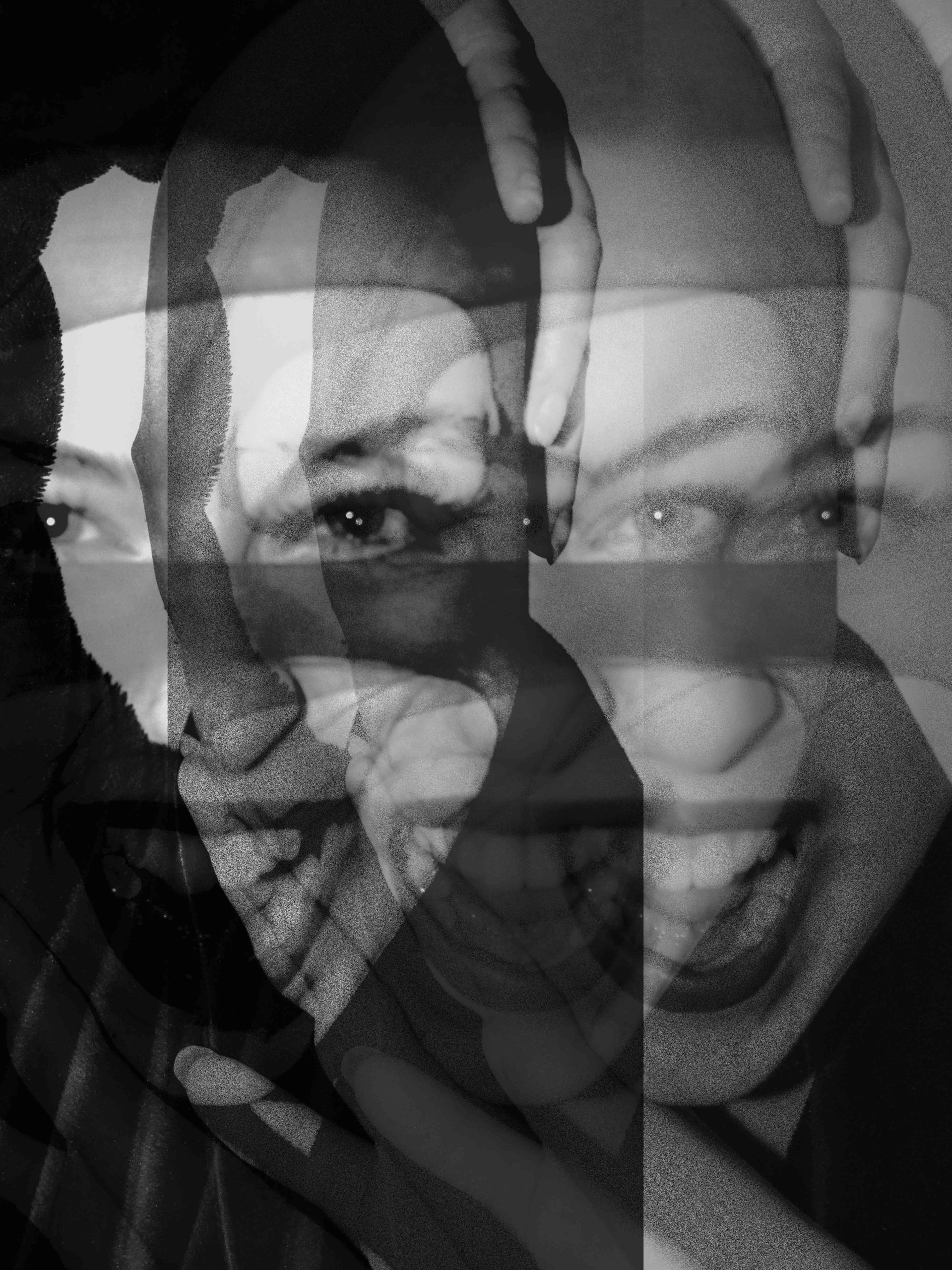
comparison
Both mine and Andreas use a head piece to create a sense of mystery as to who the person under it is although my subject is more visible than his it still holds the same feeling of loss of identity through the facial expressions.
My image is taken at a different angle with a smoother lighting which creates less focal points and mine opposes his full loss of identity through having some of the more prominent facial features exposed.
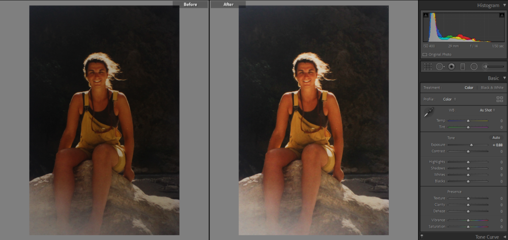
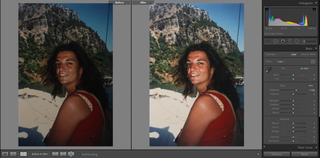
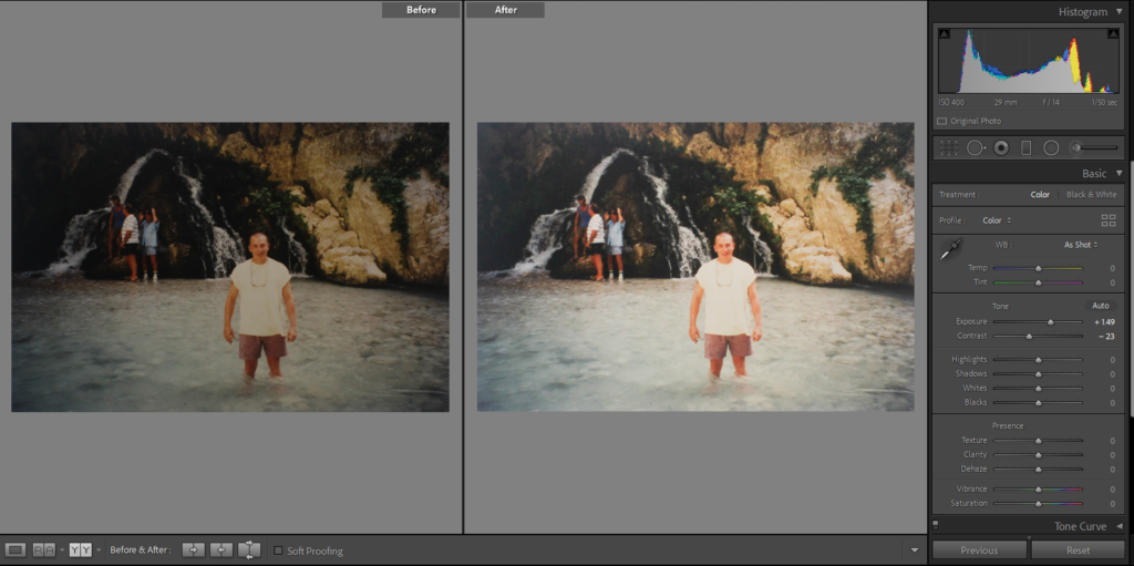
I started by doing small adjustments to each image which included increasing the sharpness, contrast etc on Lightroom before beginning to experiment with colours.
Experiments
————– Experiment 1: ——————
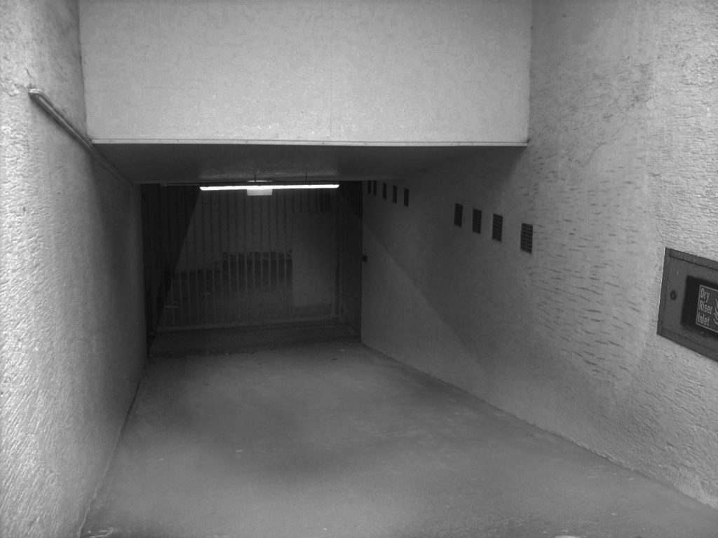
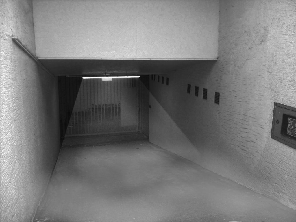
For this image, I wasn’t sure whether I wanted a dark image with the light being the only thing lit up in the photo or whether I wanted a really bright and colourful image so I decided to attempt both and choose which one I liked better.
The Original Photo
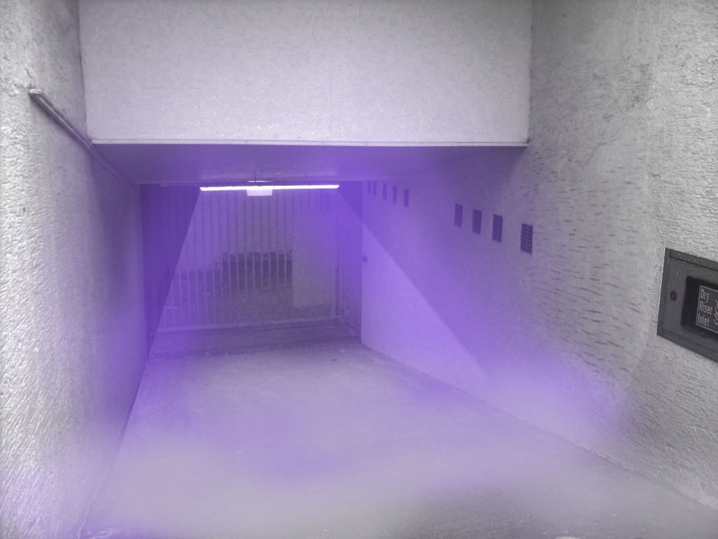
I decided to combine both these ideas, focusing on adding one colour to the the foggier image which led to this:
I like this edit best as it looks mysterious and almost alluring which is complimented by the purple highlight. The intensity of the colour makes the photo seem more eye-catching and gives it more personality as it uses up what would’ve been wasted space.
I like the way this edit turned out and I’d like to try and use it as a part of my final project, however, I do think I’ll struggle to make it work with the rest of my images due to how different and vibrant it is.
————– Experiment 2: ——————
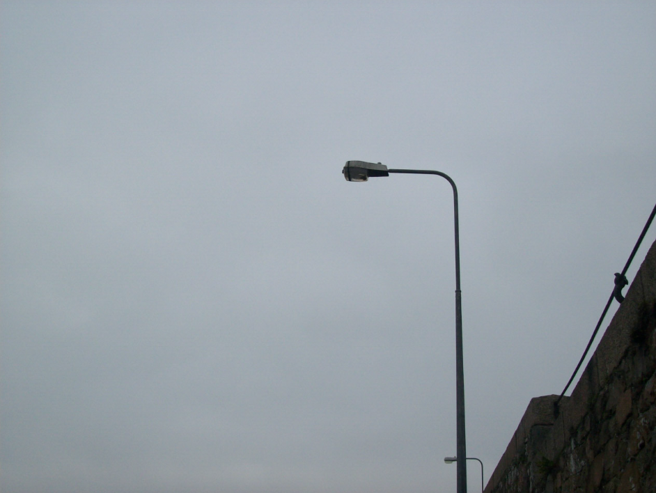
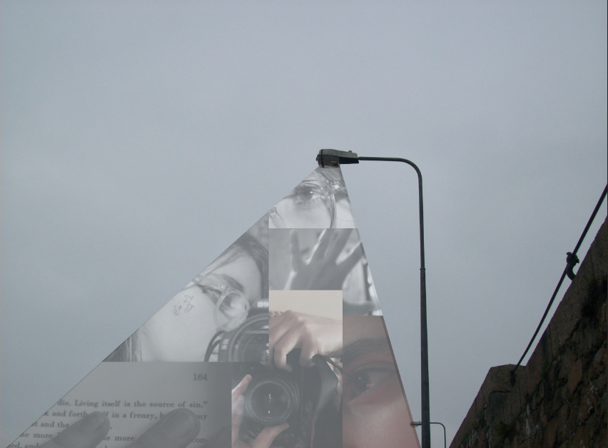
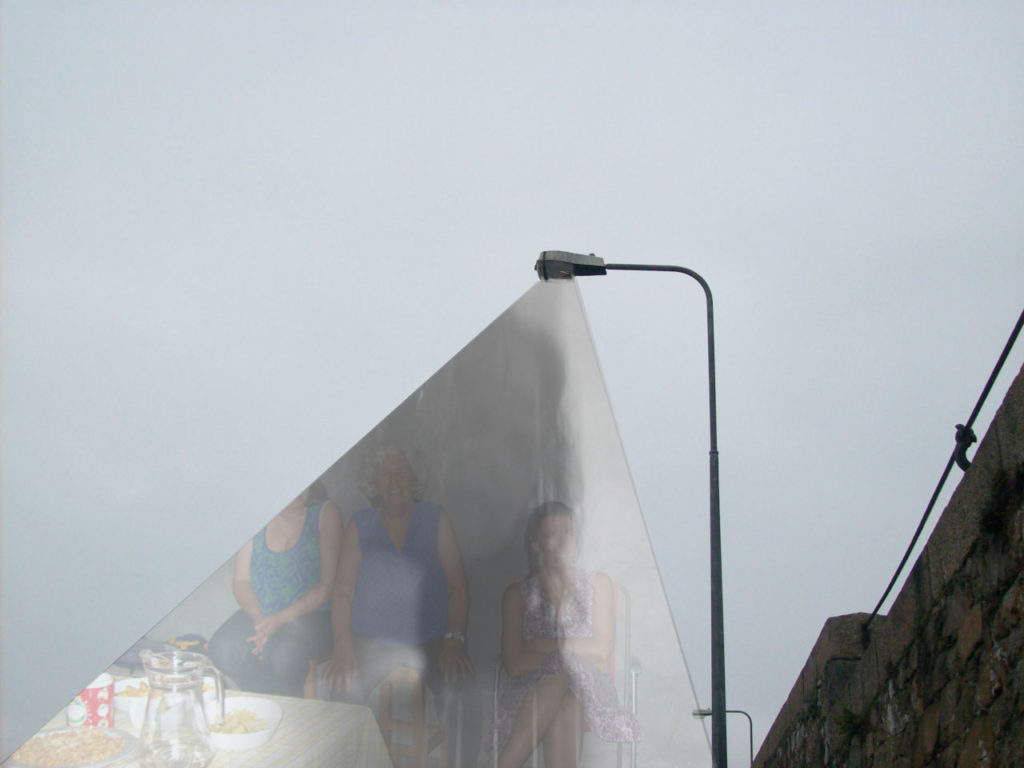
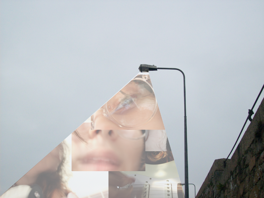
For this image, I knew I wanted to use the light in order to reveal something although I wasn’t sure how I wanted it to look so I experimented with a few ideas I had.
Original Photo
For this edit, I used the polygonal lasso tool on photoshop to create he shape of the light then created a small collage of my portraits.
Here, I decided to brighten the photo of the lamppost before adding in a photo of some of my family and a blurry photo of me ontop.
For this experiment, I carefully selected a series of photos that I could combine together to create one scene. [i.e.: I’ve chosen a photo of an eye, mouth, hand etc]
My favourite out of the 3 experiments is the second one as I like how simplistic it is which is emphasized by the lack of colour, allowing the images to blend together better than the other experiments. I like the ideas of creating a collage using my portraits and am thinking about using something similar as a part of my final project.