identity- fINAL IMAGES evaluation/comparison to inspirations

SET #1:

VIOLENCE + RESTRAINT

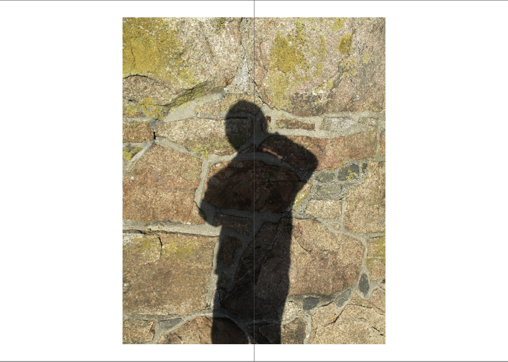
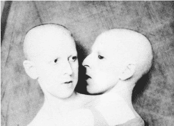
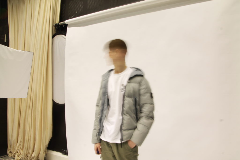
I took these images of my friend Leon who started pretending to punch my camera, while he was doing this I managed to take 2 pictures of him in action with flash.

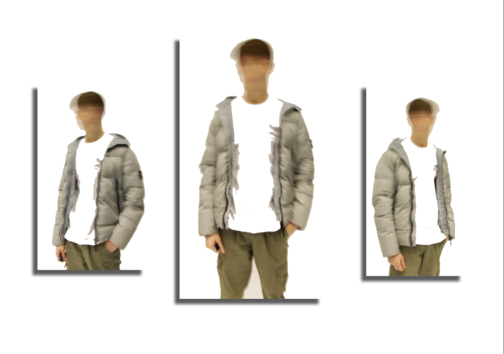
In response to these 2 images I decided to create a set titled “VIOLENCE + RESTRAINT” where I chose the middle picture as a tense hand against someone’s side which massively contrasts against the “violent” images.

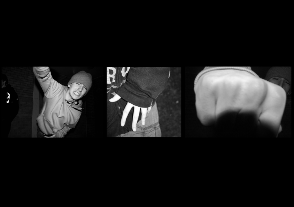
When arranging my images on photoshop I also thought about the size of my images, the 2 “violent” images are landscape while the middle “restraint” image is square-shaped, I have chosen this so it symbolises how violence takes up more room in society and commands more attention while restraint often goes unnoticed.

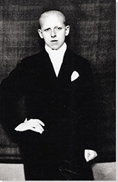
This is my favourite set of images as I am really interested in the history of punk and grunge, whether it be musical history or the entire ethos of the movement itself which was spurred on by “punk idols” such as Sid Vicious of The Sex Pistols and Siouxsie Sioux of Siouxsie and the Banshees. This set really reminds me of the punk mindset which was often taken to extremities such as violence.

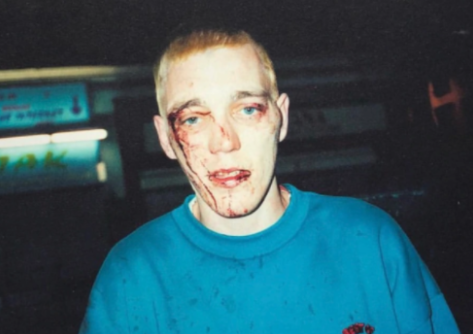
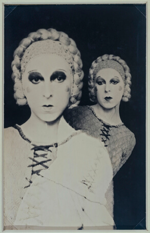
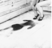
One of my inspirations for this set was this image taken from Corinne Day’s photobook titled “Diary” which shows her friends in a natural and autobiographical sense. Although my set of images does not look like a direct response to this image I wanted to show a story of violence versus restraint rather than just the aftermath of it.

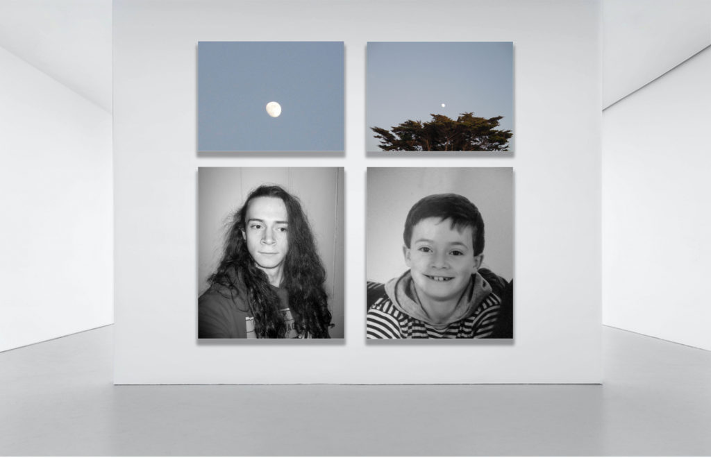
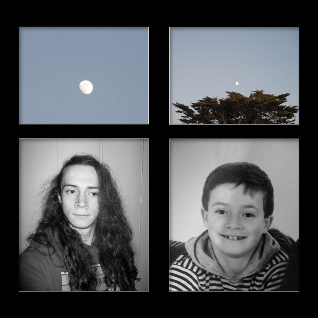
I made all the images black and white to mimic the style of Francesca Woodman as she rarely shot in colour, this artistic decision was also made as all the images were quite inconsistent in colour which didn’t fit visually. I followed this rule for all of my sets of images.

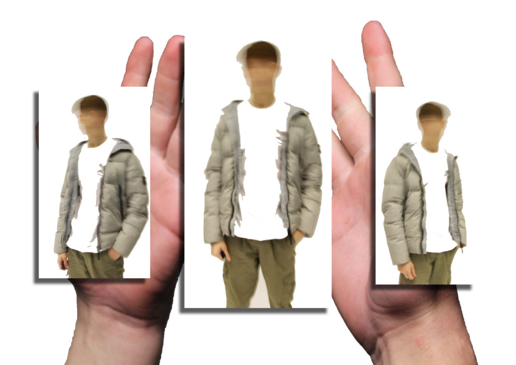
I feel as if I successfully showed the emotions and sense of identity I wanted to display with this set of images, however as this was my first set to edit and photoshop it made me realise some problems with arrangement on photoshop where it was incredibly difficult to evenly align images with different dimensions.
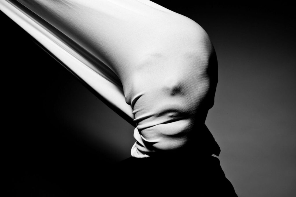
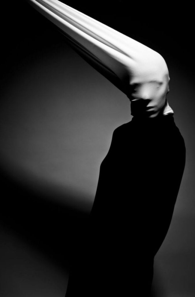
SET#2:

TORN

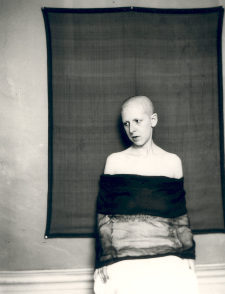
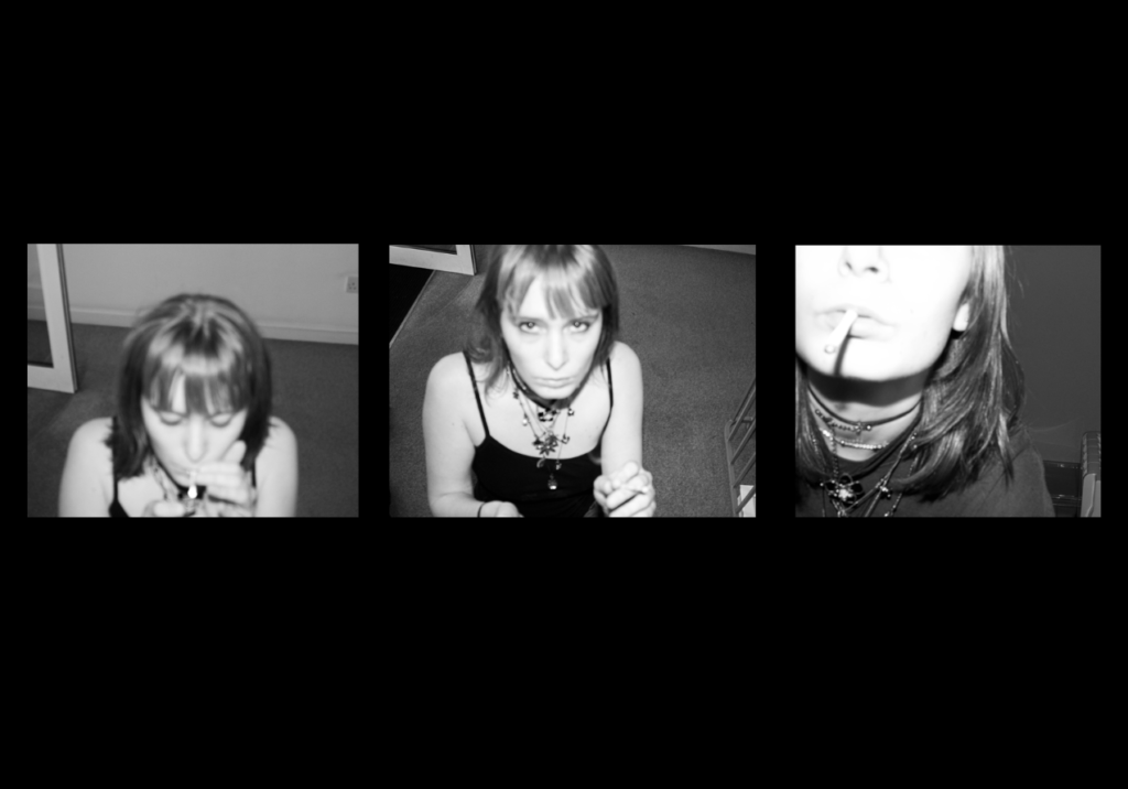
These images were taken of myself on self-timer with flash, I wanted to explore teenage attitudes to sex and sexuality. I named this set “TORN” to imply a sense of torn feelings towards sex and sexuality while also displaying the literal images of torn tights.

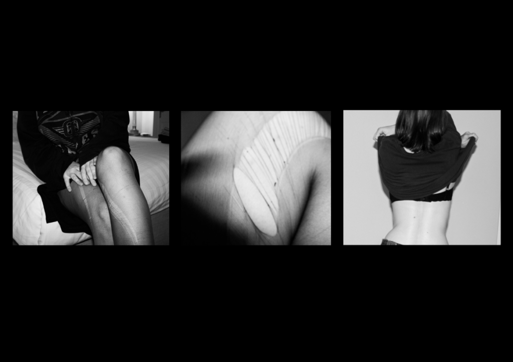
This set massively reminds me of Francesca Woodman’s work as I wanted to keep the main subject’s face concealed- which is a massive theme in Woodman’s work.

I was inspired by this photo taken by Woodman so in the first image in the set I tried to imitate the way the subject was sitting and the attitude it conveys, which I believe I successfully fulfilled. I also really liked how Woodman displayed womanhood and sexuality in her images so I attempted to give this same sense through my set of images.

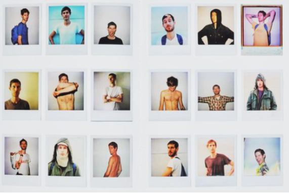
I was also massively inspired by Ryan McGinley’s collection of polaroid sets in the arrangement of all my sets-I experimented with displaying the sets as polaroids but decided to not continue with this idea as all the images had different dimensions. In this specific set I was interested how McGinley showed his photos as a collection of intimate memories- something that takes up a large part of someone’s identity.

The middle image on the left page of the book was also a massive inspiration (displays an image of someone taking off their shirt) as it really displays the exact sense I wanted to tackle in this set so I created my own version of this single image.

In this set of images I feel as if my inspirations are very defined and have clear connections to my finished product which communicate a sense of identity to the viewer which is subjective and relatable.

SET #3:

DOWN THE LINE

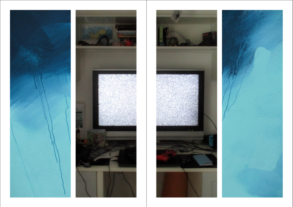
My third and final set is titled “DOWN THE LINE” as I wanted to explore so-called “self-destructive” behaviours which can cause problems in the future (or “down the line”).

I really like these images as they are not pretty or professional, they have a more raw and “homemade” feeling to them which conveys a feeling of secrecy- where the viewers are intruding on hushed behaviours.

I didn’t have any clear inspirations for this set, one could say I was inspired by Corinne Day and Ryan McGinley’s sense of exploitation in natural images with their muses but my photography style in these images are very different from any of my inspirations as I took the images from a high perspective to give a sense of overlooking and intruding.

Identity Project – Final Images and Evaluation

Final Images

(These are the images I included in the Zine)


Comparison to Artist Reference

As I deviated from my original plan of photomontages during the exam, my final outcomes turned out to be wildly different to that of Jesse Treece’s work, with only one image (or page from the Zine) roughly mimicking it. This page is arguably the most unusual/different compared to the other images shown in the Zine as it is simply a picture of the moon, however the placement of the moon could very loosely resemble photo montaging.


The Finished Zine

Notes:

– In the Zine (on page 6) I used segments from a poem I wrote when I was around 11 years old for the text , which describes a dream-like scene of a beach.

– The title: ‘Dreaming of Yore’ was used because a lot of the photographs in the Zine are of places from my past/childhood.


Other Ways of Presenting my Final Images:

Virtual Gallery Presentation

Here I used an image of an empty art/photography gallery which I edited on photoshop to include some of my Final Images. I used the ‘drop shadow’ and ‘stroke’ to make the images look like they were actually hung.

Window Mount

On photoshop I made a window mount using a black background and some of my Final Images. I used the ‘Drop Shadow’ and ‘Stroke’ blending options to make it seem more realistic.


Evaluation

Overall, I think the project worked out well in the end, despite the slight detour in what I was making, however there is definitely room for improvement in my planning stages. While I was taking images for the project, I specifically tried to be general so I would have had a lot of material to work with which, looking back now, only made things harder, however with this knowledge I will be able to plan a future photomontage project more effectively. I think ordering the images I took in a sequence to create storytelling was more effective than creating a photomontage.

What went Well:
Over the course of the exam, I learnt how to create a Zine which gave me a better understanding of how I can put my images in a sequence and what techniques I can use while doing so, which I can perhaps use in later projects. I think I now have a clearer idea of how I should be taking my photographs, with a greater focus on what I had planned.

What I can Improve on:
I can definitely improve on my planning of the project and what I was making, I should have been more specific with what I was photographing and why, which would have allowed me to produce images of a higher-quality that linked together better. Next time I will come up with a more detailed plan and take more focussed images that link to that plan better, I will also make my final outcomes closer to the work of my artist study.

Identity Project – Zine Making

After my experimentations with photomontages, I concluded that my original idea was not as strong at conveying a message/question as I thought it would be. I looked to ordering my images into a sequence and try to tell a story, after looking over my images by printing them out and ordering them, I thought a Zine would be an effective way of ordering them.

Zine Case Study

Nihon Photography Zine on Behance

A Zine is a small (A4 – A5) booklet in the style of a magazine containing usually images and text, due to their size they can be mass-produced if desired. Zines are made to tell a visual story with the photographs/text that it contains and the links that bind them. Techniques or relationships typically seen in a sequence or grid (or other examples of a collection of images) such as Juxtaposition, repetition or other details can also be seen in a Zine, however the viewer would have to turn a page, allowing the photographer to use that knowledge (of what image they will see first) to their advantage.

Jersey’s ED.EM (or Éditions Emile) is an example of a Zine, each containing images from The Société Jersiaise Archive, that is published around 3 times a year, each with different themes from different collections.


Editing

These are the images I selected as my best. Here I show the original and after-editing versions of each image.

Here, I simply increased the ‘shadows’ and ‘blacks’ sliders to make the shadows less dense, while keeping the sky roughly the same colour, making the overall image look softer.

I did not make massive changes to this image, however I increased the contrast slightly, making the dark side of the pole darker.

For this image I reduced the contrast and made it slightly cooler, giving it a softer look overall.

Here, I reduced the exposure of the sky by using the ‘Graduated Filter’ tool on Adobe Lightroom. I also made the overall image slightly darker by reducing the highlights and increasing the contrast.

I made this image slightly cooler to make the tarmac stand out more from the green/yellow in the background. I also increase the contrast to make the shadows denser.

For this image I increased the contrast to make the shadow more dense, I also lowered the saturation of the image slightly to further make it stand out.

I didn’t change this image too much, however I did make the exposure slightly lighter in order to match the other moon image (below).

For this image I made the exposure slightly lighter and reduced the shadows to give the trees more detail.

I simply made this image black and white to allow the lighter parts of the image (such as my face) to contrast more with the darker parts (my hair).

Here, I adjusted the ‘horizon’ of the desk. I also increased the contrast to make the TV screen stand out more.

I simply made this image black and white to match the other portrait image.

Here, I made the image slightly warmer and slightly increased the exposure.

I simply made this image slightly lighter to emphasise the difference between the light and dark parts of this image.


Experimentation

First, I made a mock-up example of a 16-page zine by folding 4 A4 pieces of paper in half and stacking them, then numbering the pages, placing the images on the pages that they could go on, lastly, I noted the specifics of each image (such as whether the image is full/double page, etc…).

Then I remade that mock-up on Adobe InDesign so I could get a better/clearer idea of what the zine would look like, with the correct sizes of images being used.

The Digital InDesign version of the Zine (Some pages excluded and the Title is a placeholder)

Layout Experimentations

On InDesign, I experimented with some ways of how I could present the images in the Zine.

Here, I left a small gap on the right of a double full page spread image which can be used to link to the next page with the colours of the background, or to simply place text or another image.

Here, I did the same as before, but on the bottom of the double page, giving text that could be placed there a more traditional caption look.

This experiment was to see how an image (with boarders on the top and bottom) would look in the centre of a double page, this gives the image more space (making it the main focus of a page) and allows text to be placed if desired. The warping of the image due to how it is placed in the gutter can also be used to physically manipulate an image.

Here I experimented with splitting an image within a box and placing it on opposite ends of a double page spread, giving the image a more abstract look.

This experiment was to see how I can create links between the images on one page, then link those images to the page adjacent to it.

Identity Project – Photomontage Editing and Experimentation

Editing

To start my editing process, I went through all my images and used the ‘Pick’ and ‘Reject’ buttons to select what I thought are the best images.

Next, I went through my ‘Picked’ images and ranked them by giving them a number of stars out of 5, with 5 being the images I will use, and 1 the images I will not.

After, I went through my images again and assigned them a colour, with red being the images I won’t use, yellow and green being the ones I may use and blue being the ones I will use.


Experimentation

For this image I was experimenting with how I would place myself and the objects, while also dabbling a little into layer blending options.

For this experiment I wanted to explore how I can place the portrait and the object photographs together by cutting parts off of the portrait (the legs) and by using different blending options for the object.

Here, I was experimenting with how I could connect the object photographs to the landscape photographs, while also testing how layer blending options affected the portrait image.

This is where I started to approach my ideas in a less ‘chaotic’ way. Here I wanted to see how ordering my images over a background would look.

Here I experimented with how many images I should use to overlay, as well as seeing how much of the background should be visible.

Identity

What is Identity?

Identity" is Dictionary.com's 2015 Word of the Year

To me, a person’s identity is how they describe/express themselves through aspects of their personality such as morals, emotions, appearance, morals, interests, which can effect how they act. What others describe someone as can also be considered a part of their identity, such as their fashion sense, ethnicity, etc… Sometimes some parts of a person’s identity can be kept secret from others for different reasons.

Identity can be influenced by the place a person lives in, as a place can provide a sense of community, which a person can identify themselves within or explore what they are/can be in that community. A place provides a person with a general culture to identify themselves with, while the people around them can heavily influence their personality, maybe through social expectations or norms, and other parts of their identity, such as likes/dislikes, how they present themselves etc…

I also think upbringing can play a large role in forming a person’s identity/personality, in the sense that a person can decide to be similar to their parents/family/friends, or completely different (which may leave some people feeling lost or confused about their identity)

Identity (or Identification) can also refer to how a person is literally identified, for example a person’s drivers license shows some information about that person, such as their date of birth, name, country they live in, etc…

Mood Board of General Ideas


Case Studies:

Claude Cahun

Claude Cahun: Jersey's queer, anti-Nazi freedom fighter

Lucy Schwob, better known as Claude Cahun, was a French, early-mid 20th century photographer, writer, sculptor and activist, who explored gender through surrealist photographs. They worked with their lover Suzanne Malherbe, better known as Marcel Moore, to create images which explored both masculinity and femininity. They moved to Jersey in 1937 as a way to escape from the fascist ideals in France. The pair opposed the German forces who occupied Jersey in 1940 by creating notes addressed to German soldiers with poetical messages to make them think about what they themselves want to do, a cryptic and almost surreal method. A few years after Jersey was liberated from the German Forces, they were recognised for their activism and resistance towards the Germans with a medal of French Gratitude in 1951. With the emotional and physical help of Moore, they continued to create thought invoking work.

Image Analysis

Claude Cahun: A Very Curious Spirit | AnOther
A self-portrait of Cahun taken in 1927

This image could be a way for Cahun to explore the male gender as being the more physically-focussed, not very romantic/emotional gender, as seen by the text “I am in training don’t kiss me” on their shirt, while also using lipstick and hearts to contradict, or perhaps mock, that less emotional/romantic view. Cahun’s body language in this image could also portray men as being more vocal and confident about their views compared to women, which could be a way for them to try and enforce equality of voices and freedom of speech between the genders. I like the way the white clothing worn by Cahun contrasts with the black backdrop, perhaps to emphasise the message (in this case literal text and drawings) she is trying to voice. The lighting in this image is not too harsh, with little to no shadow appearing on Cahun at all, Cahun probably did this to make themselves, and what they was exploring, clearer.

Other examples of their work:

Jesse Treece

jesse treece | Saatchi Art

Treece is a self-taught collage artist based in Seattle, USA, who was inspired to create collages when he found a box of old newspaper/magazine clippings and decided to create a visual story and express himself with them. He likes 70-80’s style comic book strips and magazines, which he takes inspiration from to create ‘disturbing’ imagery. He typically uses glue and scissors to create his collages manually, mixing ordinary and whimsical images together to create several unique and somewhat absurd collages.

Image Analysis

collage by jesse treece — “the sisters of mercy” hand-cut collage, a...

As this image is a collage, lighting varies between each image it uses. The lighting is soft on the background images, however on the image with the three hooded figures, lighting is slightly harsher, which allows shadows to form behind the creases in the clothes. The shadows on the left-most figure are the most dense and are the darkest point on the image, which allows that image to contrast more with the whole collage. The colour palette in this image is quite limited, the majority of it being made up of dark greys, however, there is some light red on the figures faces and the circle in the background, as well as a dark, faded blue tint in the background, which stands out from the rest of the image. There are a lot of lines on this image, from the hill like structures in the background, the building in the bottom right of the image, the horizon line where the water meets the hill and on the clothing of the three figures, however where there is colour, there are not too many lines, making them appear softer, while the black and white parts of the image look more jagged.

Other examples of his work:

Comparing Claude Cahun’s and Jesse Treece’s work

Similarities:

  • Both use portraits of people playing a role, perhaps of a job or hobby, in everyday situations
  • Both use objects/props/costumes/clothing as a way to make the image more interesting

Differences:

  • Cahun typically likes to use plain backdrops to emphasise the model in the image, whereas Treece uses backgrounds (usually) taken from one or more landscape photographs
  • Treece’s collages explore scenes with unnatural and sometimes confusing imagery (such as people sailing in a village), while Cahun uses portraiture as a way to explore identity
  • Cahun mainly explores the theme of Gender through their photography clearly, whereas Treece’s images explore his own ideas and fictional worlds that he creates.
  • Treece uses a large colour palette and different types of geometrical shapes to create variety in his images, whereas Cahun mainly uses black and white (due to equipment at the time) portraiture

Statement of Intent:

I intend to explore my own identity using a series of photomontages exploring the different ‘levels’ of my personality. I based this idea of ‘levels’ from a Japanese proverb, which regards a person’s identity as being made up of three faces: The First face being the one you show to strangers/the public, the Second face being the one you show to close friends/family/loved ones, and the Third face being the one you show only to yourself. With each face (with the First face being leftmost and the Third being the rightmost if I was to place them in order) getting more and more personal. I will use a collection of self portraits (with different facial expressions, poses and shot types (headshot, full body, etc…)), landscapes and objects to create the photomontages and plan to lay them out in a triptych or sequence.


Photoshoots

Photoshoot Plan 1 (Landscapes):

What?I will take pictures of the landscapes around this area, such as the fields, roads, beach and the view from the top of a hill downwards.
Where?The area around to my house with beaches, fields and houses.
When?When the sun is out so I can capture natural light in the images, around noon.
Why?I have lived around this area my whole life so it is special to me.
How?I will search for interesting parts of the different sceneries around this area.
The area I will take pictures of/around

Contact Sheet


Photoshoot Plan 2 (Objects):

What?I will take images of personal objects which can help identify me.
Where?At my home.
When?During the day to make use of natural light.
Why?These objects have different forms and shapes, which, if I use with a photomontage, will give my final images a more interesting look.
How?I will lay the objects on plain paper to get a clear white background and I will put it next to a window to make use of natural light.
Photography Skills: How to Isolate an Object Against a Black Background |  Light Stalking
An example of object photography

Contact Sheet


Photoshoot Plan 3 (Portraits):

Who?Myself (Self-portrait).
What?I will take pictures of myself with different facial expressions or hairstyles to represent my identity.
Where?My home.
When?Likely during the day to make use of natural light.
Why?I think a self-portrait is an effective way of capturing someone’s own identity.
How?Maybe using a mirror or with someone else’s aid.
Portrait Photography by Ines Thomsen Photography - Portrait Photographer
An example of portrait photography

Contact Sheet


Identity

Identity

Identity from Latin means “the same”, and so in a sense it is the sameness of individuals that makes them belong, as well as the distinctiveness of character that makes a remarkable being, the sense of oneness we feel within ourselves. Identity can take years to mould and it determines our entire life; our job, our friends, the place we live in; in order to stay happy we need to live accordingly to our true identity. The desire to belong and be accepted in a society has always been here. We surround ourselves with so many influences it is hard to isolate what feels right and what is right. Being wanted and appreciated feels right but is it truly right when it requires us to conduct ourselves in a superficial manner. Factors that strongly influence identity include culture, language, religion, social status or race as often those shape the way we perceive the world; our views, opinions and practices. Identity also includes what we stand for, values such as kindness, honesty or trustworthiness. All those help us recognise what matters to you most and effect our everyday choices. Our upbringing can have a huge impact on our sense of self. The way our parents or the society lets us explore, learn and express ourselves and our desires. If we were shamed or discriminated for expressing our true selves our sense of identity can be distorted to the liking of others. A fair amount of individuals does not have a solidified sense of identity or suffer from identity loss due to some events in their life such as finding out truths about your family history.

Mood board

Claude Cahun

Born Lucy Schwob, later changed to a gender neutral Clause Cahun, in 1894 to a Jewish family in France the photographer explored gender identity and the subconscious mind, presenting neither masculine nor feminine. Their work dates back as early as the 1912. Cahun moved to Paris where they started experimenting in the Surrealist art scene and went on to collaborate with artists such as Man Ray, as well a co funding the Contre Attaque with Andre Breton and George Bataille, the Anti-Nazi Resistance group. In 1930 Cahun moved to Jersey where they lived disguised as non-Jew. Soon Claude was caught spreading anti-Nazi propaganda and sentenced to death. They avoided the death sentence and was freed when Jersey was liberated in 1945. Unfortunately Cahun never recovered from the mistreatment in prison and passed away in 1954.

I find Cahun inspiring because they knew what they stood for, what they believed and represented, without hesitating to show it. They influenced photographers such as Cindy Sherman, Gillian Wearing and Nan Goldin.

Bobby Becker

Bobby Becker is a Nashville based photographer who presents the thin boundaries between reality and illusion and does so in a simple yet powerful manner. By contrasting the black with the white he conveys the distance, the struggle for connection, the comprehension of all and nothing, light and darkness, the loss of identity and rediscovery.

I find those photographs inspiring because they convey the feeling of emptiness formed from the lack of identity, as if a piece of you is missing, or looking in the mirror and not recognising yourself for the person you are. They also represent the way identity is influenced. A significant influence on our identity being the media. I think the media forces individuals to uniformity in order to be accepted, by in a way, fabricating our identity, based on the standard image. The photograph presenting two people underneath a house to me represents the impact your family and upbringing can have on your identity and the idea of nature vs nurture as generally a big part of us is shaped by believes passed on to us for generations; the basic values and principles. What part is really your true nature and what is your parents views materialising through your actions? To me, the photograph of people trapped in a house portrays the struggle some individuals face in order to be able to express themselves in the way they desire. This can relate to certain cultural or religious believes our family holds. A great deal of individuals faces rejection and discrimination every day, as certain patterns of expression are viewed as socially or morally unacceptable. For example, the LGBTQ+ community as opposed to members of the older generation.

Ideas

shadows/ silhouette of identities, loss of identity, mask out of alter egos/ different people like pixel art, double exposure.

Photoshoot plan

Equipment needed: Drum set, guitar, microphone plus a stand, camera stand, warm, round light, white infinity curve.

Photo series 1 = Subject 1 playing the guitar

Photo series 2 = Subject 2 playing the drums

Photo series 3 = Subject 3 singing

Only light source being a warm light on the right, behind the subject creating the silhouette, warm and bright mood. Photos taken in the studio as space and equipment needed.

Contact sheet

Those are all the photographs I took in two separate shoots. The first shoot was more for gathering ideas and setting up the lights and the camera settings.

Image selection

Those are the photographs I flagged as usable

Those are the photographs marked with 5 stars. I chose those because they were the sharpest silhouettes and had the right amount of asymmetry to help illustrate the movement.

Image editing

Firstly I cropped the image as at the top you could see the white infinity curve end. I increased the contrast because the photographs didn’t look deep and defined enough but rather bleak and washed out, I also increased the blacks to make the silhouette stand out more against the orange light. Since I shoot the pictures in the dark it was hard to get the right settings on the camera and all of the photographs came out a bit grainy so to smooth that out I turned down the texture. This also gave it a satisfying blur effect around the edges and the background, leaving the middle sharp, especially the model. The colours weren’t very defines as well and I wanted to get that yellow-orange sunset colour so I changed the tint to +30 and increased the saturation and vibrance to +10. I needed all the photographs to look the same for a triptych so I used the synch settings option to edit the pictures all at once with the same setting as the original one.

Experimentation

I converted my final photographs into black and white because I wanted to find out how powerful they would be if they followed Claude Cahun’s or Bobby Becker’s black and white theme. I personally found that too dull and apathetic, not really conveying the excitement of self discovery or the journey that comes with it.

Final outcomes

Visual Gallery

The overall idea behind those photographs was to show the loss of identity and finding a huge part of my identity in music. You can’t see the subjects but you can clearly see what they do and what they represent. This is because even when I feel like I can’t or find it difficult to express myself in front of others I always find ways to express myself in my music, whether it’s playing an instrument or lyric writing. The first and second triptych shows the progression of movement which makes it really dynamic almost like a video. In this I wanted to convey the journey to self discovery. The momentum in the third triptych on the other hand has a pause in the middle as the model singing is standing still without any movement, this gives it a subtle contrast and represents the doubts or struggles individuals face in their journey. The third tryptic also represents the idea of unity within identity and how it gives individuals a sense of belonging.

I decided on using warm, bright light to create that sunset vibe and because it is the most attention grabbing of the colours. Yellow also energises, helping convey the liveliness and movement and the orange hue adds enthusiasm and excitement. The position of the light source is behind the subject creating a silhouette and to the right, pointing at the background. This creates the smudge effect on the left side as the light fades helping express the concept of motion. The light reflecting onto the floor behind the subject adds visual depth and makes the photograph look 3D as well as the yellow/ orange hue contrasting the deep black as lighter colours tend to be perceived as close and dark colours as being further away. The space also makes the photograph feel light, not cluttered. Since the contrast between the light and dark is so high you can clearly see the outline of the silhouette, all the shapes such as the hair or shoelaces. This also creates space as sharp, well focused objects appear closer than blurry objects such as the background.

Comparisons

My photographs differ from Cahun’s or Becker’s in that I decided to use colour to help me convey the idea of a journey and included actual movement as opposed to my chosen photographers who take still, black and white photographs. On the other hand, I quite liked the idea of strongly contrasting two colours together like in Becker’s photographs to show the distance between losing your identity and rediscovering it. He shows that sometimes less can communicate more.

Evaluation

In my opinion, I did a good job with setting up the scene (lighting, background, props) as well as wording my ideas to the models to achieve the desired shots. I could have done a better job with the camera settings as the photographs weren’t as good of a quality as I wanted. The images came out a bit grainy because the ISO was too high as I needed to use fast shutter speed to capture the movement. I should have used a higher aperture to make up for the light lost with the high shutter speed instead of increasing the ISO so much. If there wasn’t a time limit I would have reshot the photos.

Piece 4

For this idea I used a studio environment to capture portraits with a low shutter speed which created motion blur when shaking your head.


After opening these in photoshop and doing some cropping, I placed them into one image, added a drop shadow and arranged them in line creating a piece that show some movement.

To finish I just added this shot of his hands behind to give depth and a more personal look.

To finish I just added this shot of his hands behind to give depth and a more personal look.


Final Piece

evaluation

What went well:

For my photography mock exam, I produced multiple images but only chose to use the collection of 6 and the single one as my final pieces. I am happy with the way all my images ended up coming out using photoshop and lightroom. I like the way I was inspired by multiple artists and used my own approach to create my own style of images. I am happy that I was able to include at least one of my images from when I went to the skatepark to take some photos because I think skateparks are a great place for phtoshoots

What didn’t go well:

For my next mock exam project, I will make sure to take a lot more photos so I have many more options to choose from in the future. I would’ve liked to include more photos from skatepark but most of the photos I took didn’t turn out in the best quality. Also, I would’ve liked to have more ideas for good edits on some of the photos I took.

Conclusion:

Overall, I am very happy with my final outcomes and the work I produced. and how i used my inspiration from tish murth to try show what kids do and followed her ideas in using the derelict buildings (the bouely bay hotel)

final image 1

For this image i used 2 photoshoots one being the skatepark and the other being the old waters edge hotel

for this photo i edited to photos i took at the hotel over one at the skatepark to create an image of the three being one i took some inspiration form Tish Murtha and how she photos derelict buildings with children playing in them relating to the derelict buildings in the mirrors and where kids play at the skatepark

to do this i cut out the mirror in this picture

aswell as my second image

after cropping them out i placed them over this picture from the skate park

this is the image after that

i then took it to light room editing it like this

to get my final image