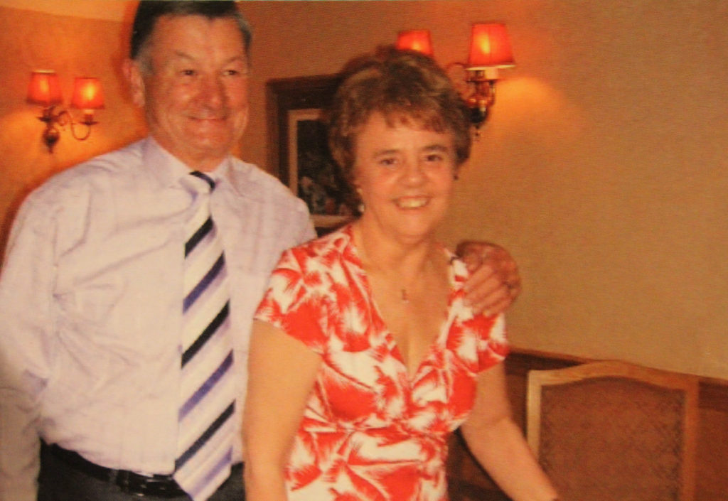
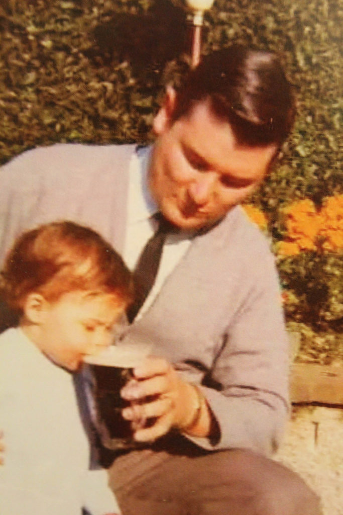
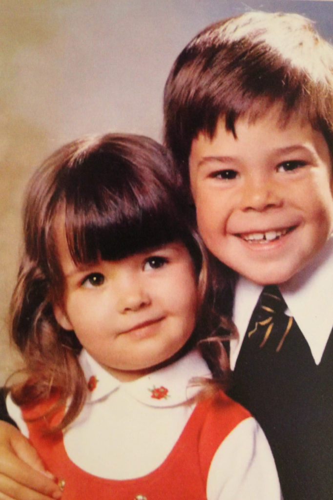
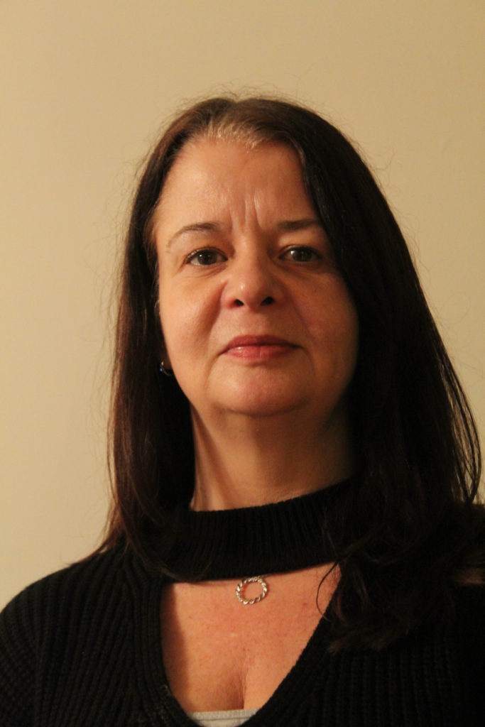
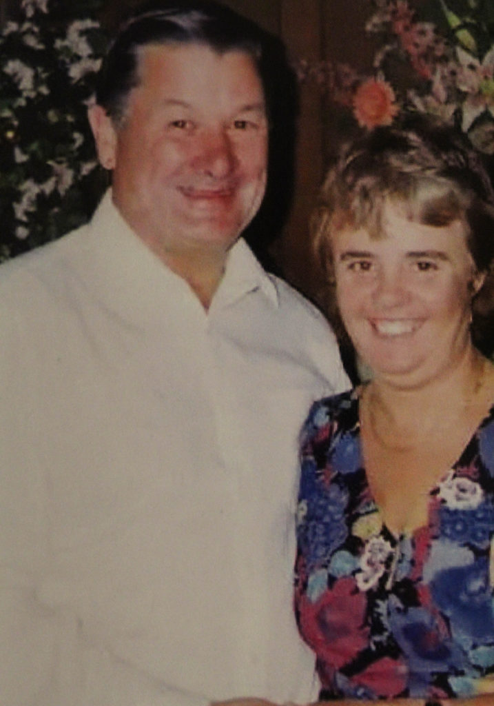
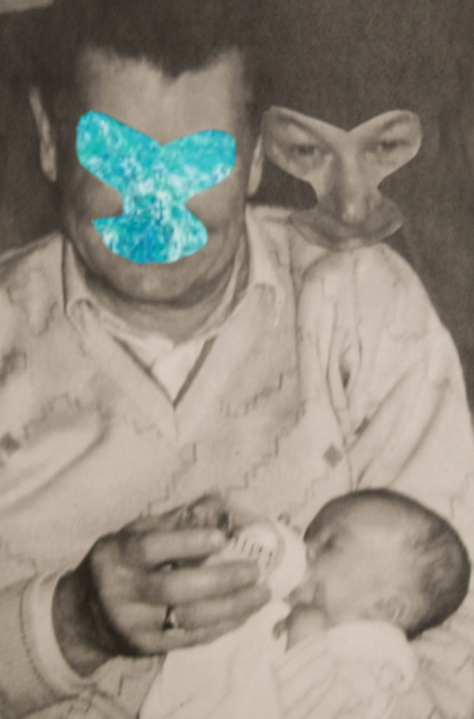
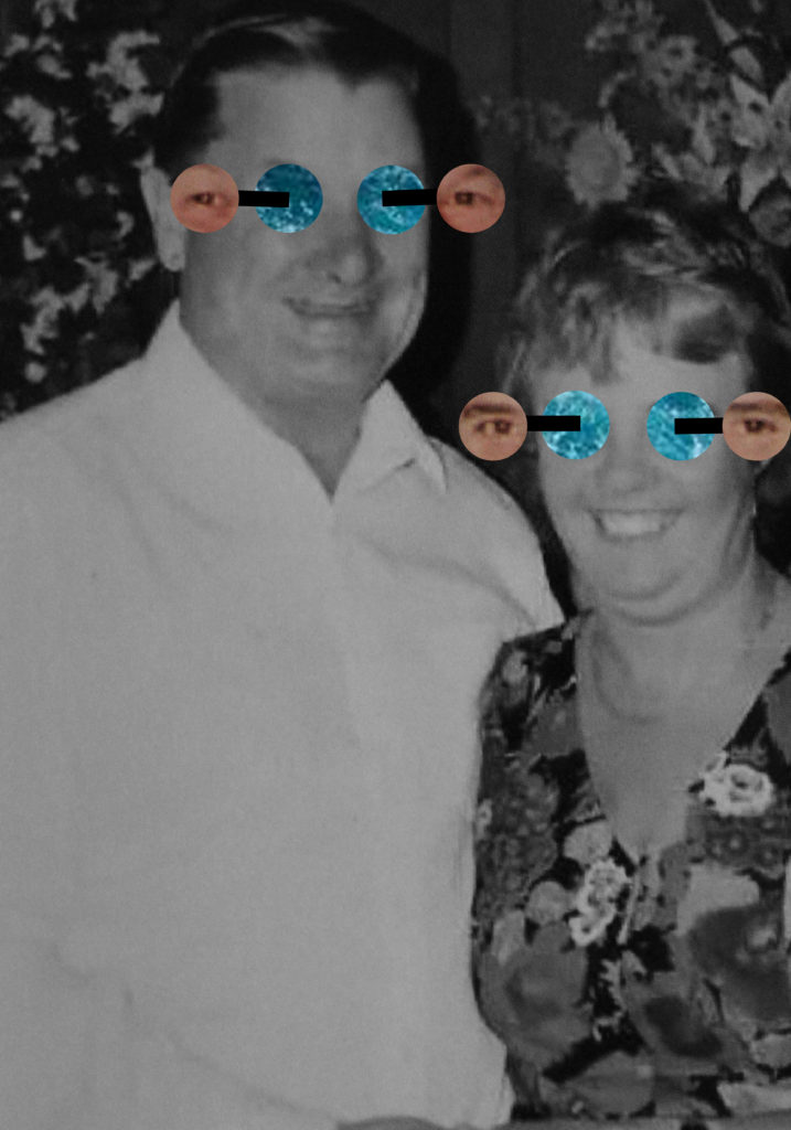
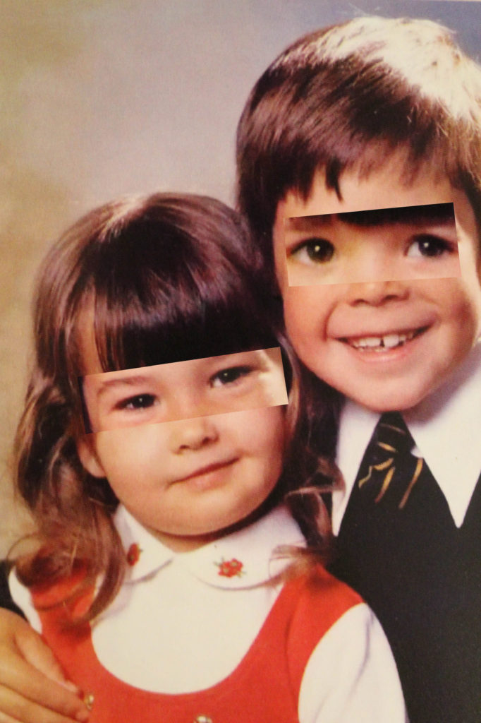
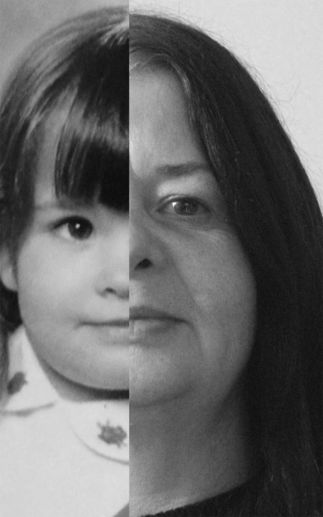
This is by blog post for my photography mock exam. For this mock my focus was to explore my identity through my families heritage on Jersey. I explored information into my ancestors back to my great grandparents on my mums side who were farmers before during and after the German occupation.
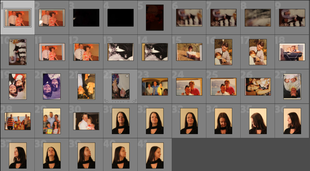
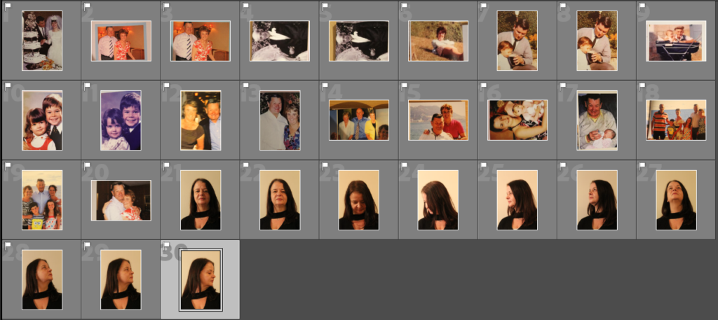
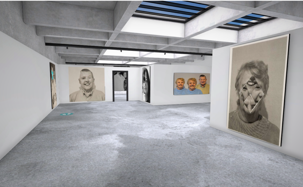
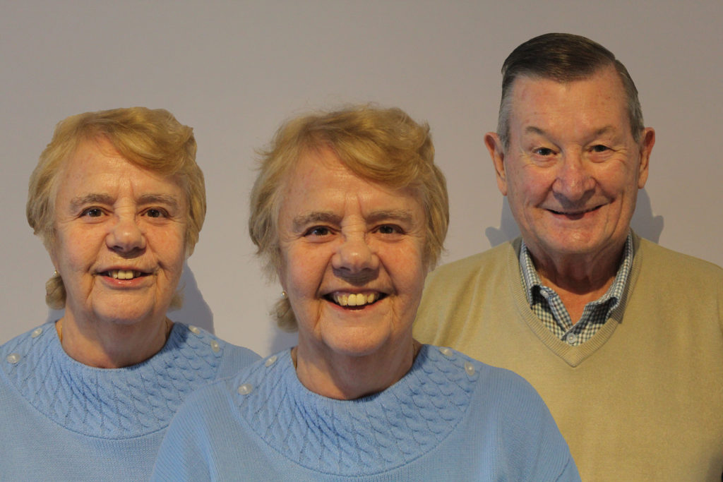
These are my best images from my Photoshoots
Now that I have finished selecting and developing my images I am going to import them into Adobe Photoshop where I am going to experiment using Kensuke Koike’s style with my own images. Kensuke Koike is one of the photographers I selected for inspiration in this project as I really like his method of taking two people and combining them together. i feel that this links in with my theme as two people coming together and combining their lives is how families are built.
Method 1
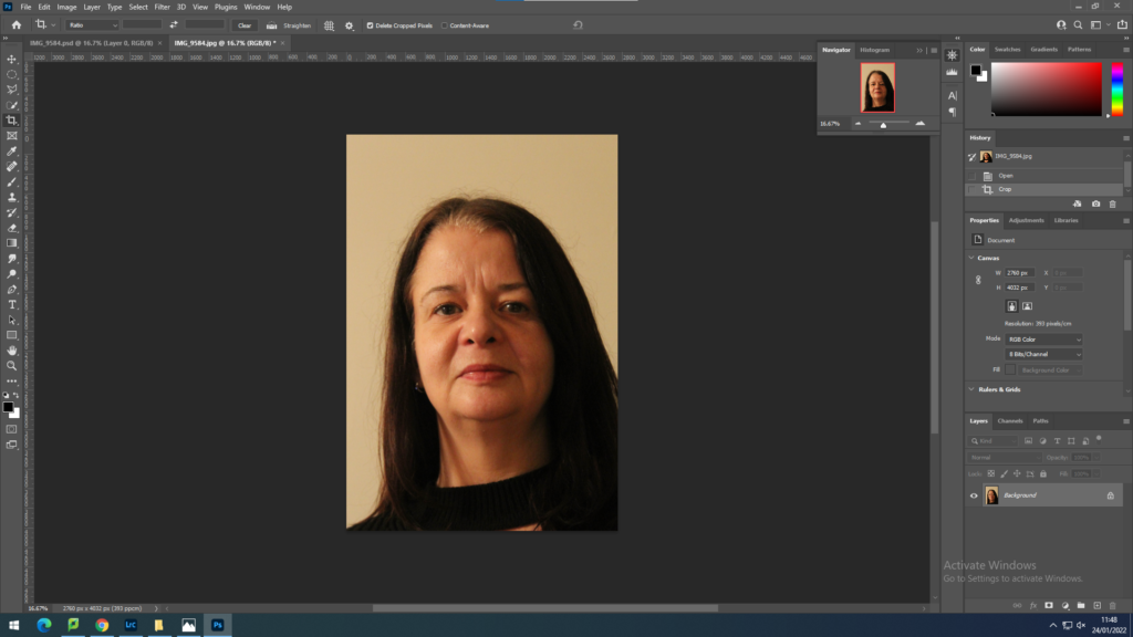
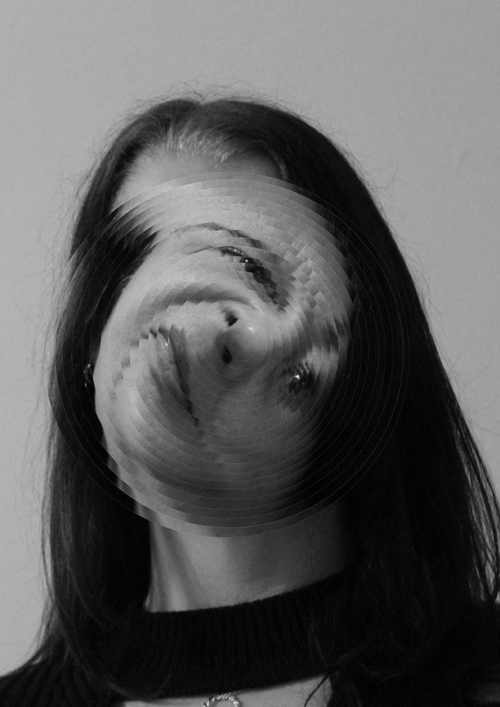
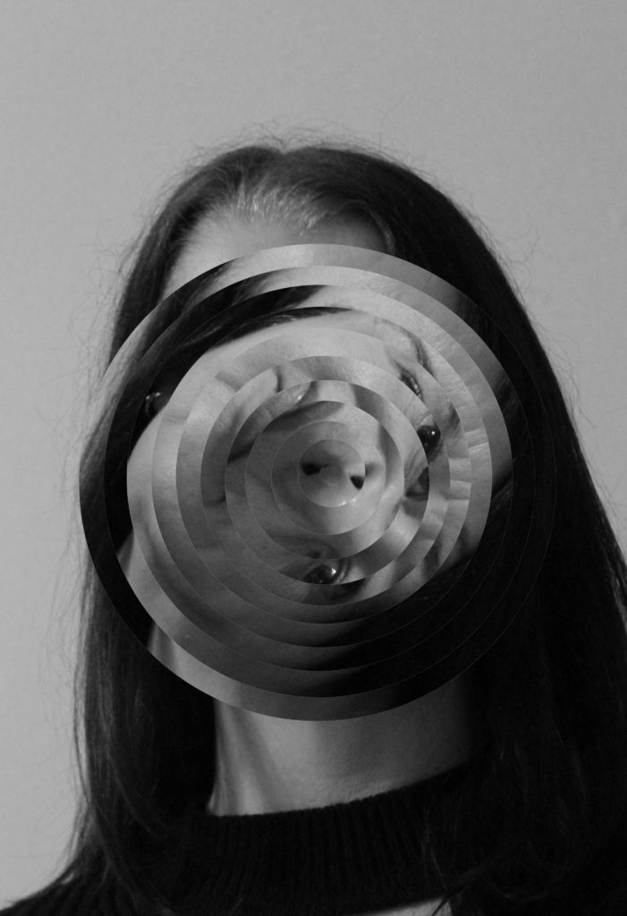
Firstly, I ensured my models face was central in the image. this was vital to ensure that the editing would be symmetrical.
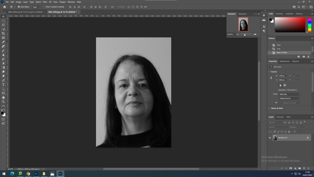
Next I made the image black and white to fin in with Kensuke Koike’s style
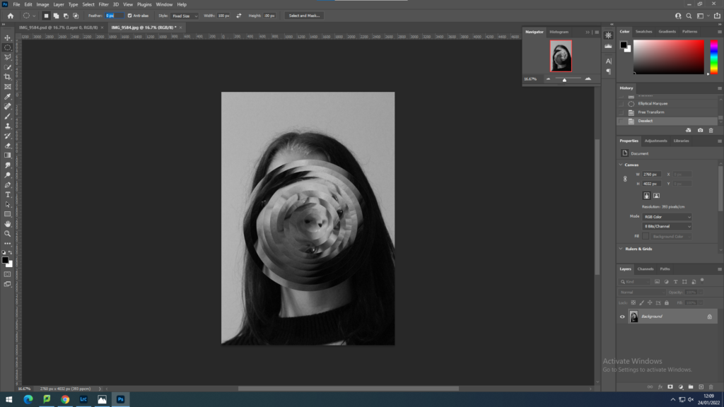
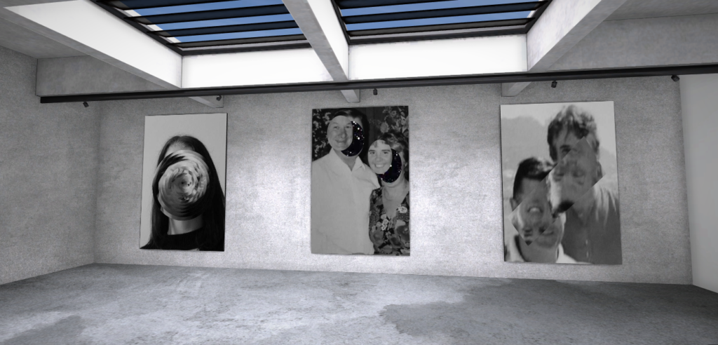
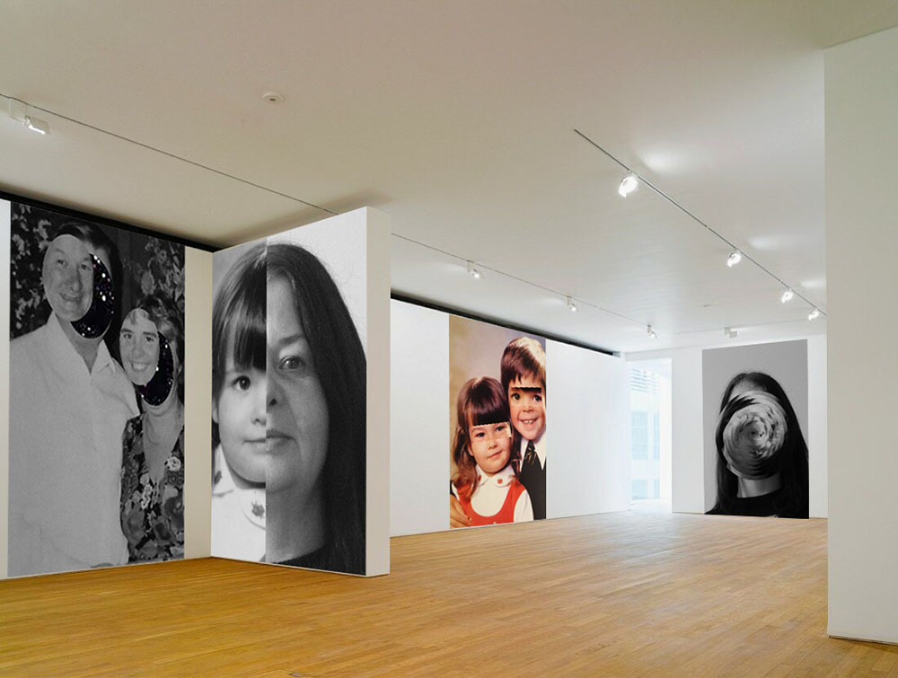
This is where I began transforming the image. I used the elliptical marquee tool to create a circle 200pxls smaller each time starting at 2100pxls. I rotated each circle 20 degrees clockwise each time.
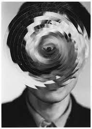
My image next to Kensuke Koike’s
Method 2
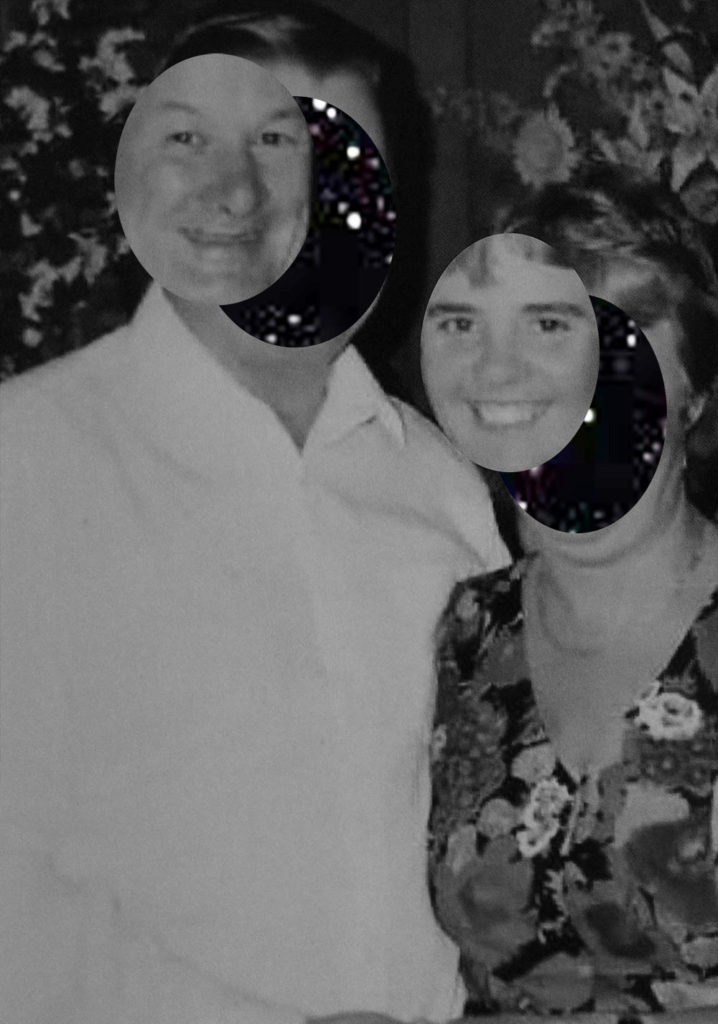
To create this image in the style of Kensuke Koike I first made the image black and white in order to properly capture the style. i then duplicated the background and imported an image of a night sky and placed it behind my background copy. I used the elliptical marquee tool to move the faces of my models revealing the background image.
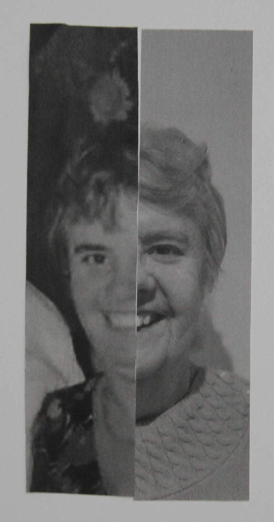
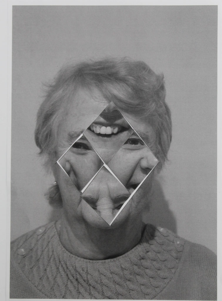
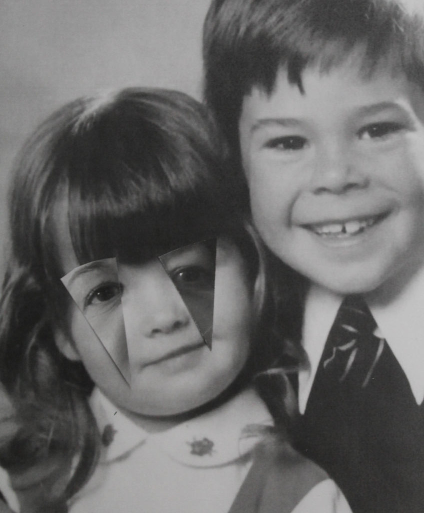
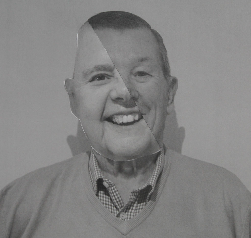
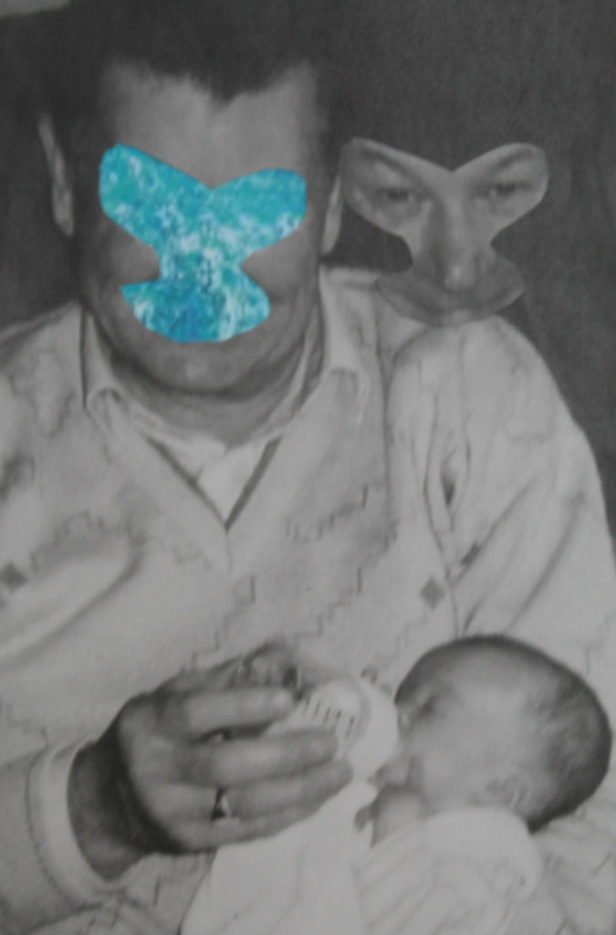
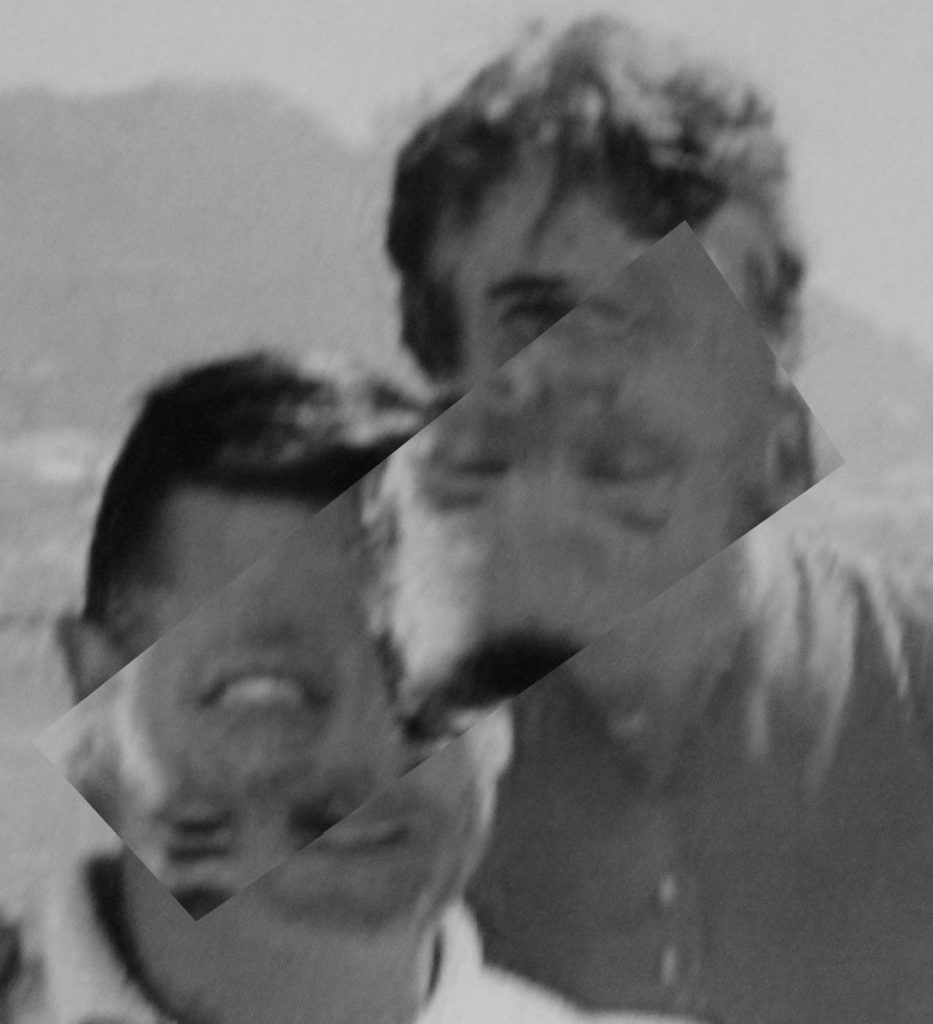
I intend to experiment using printed images and a scalpel as this is how Kensuke Koike creates his images.
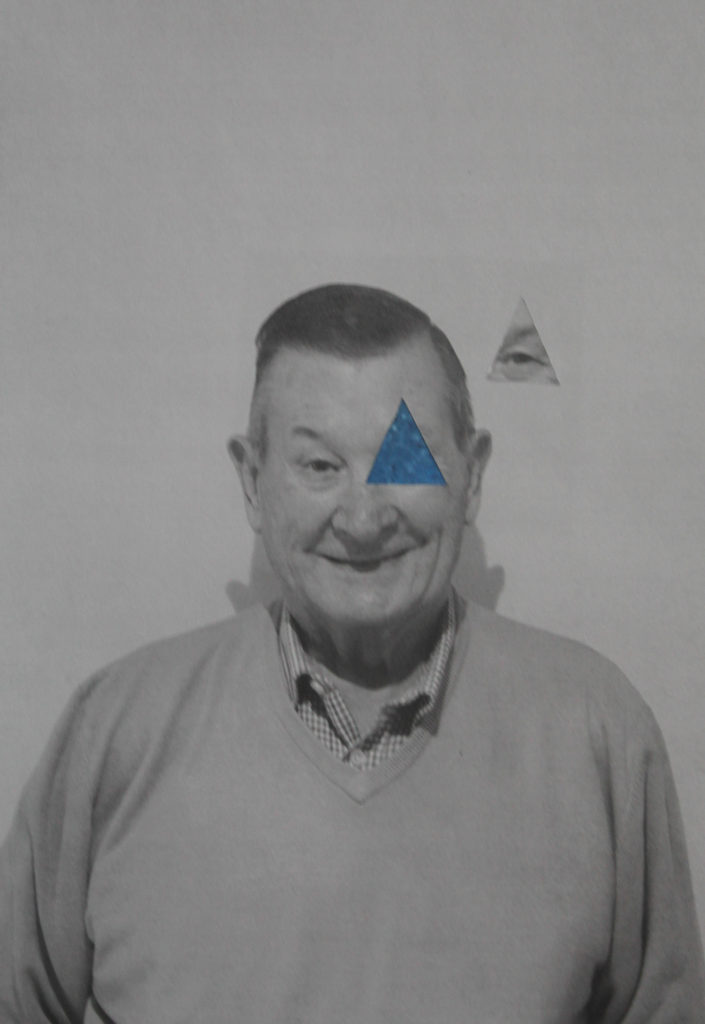
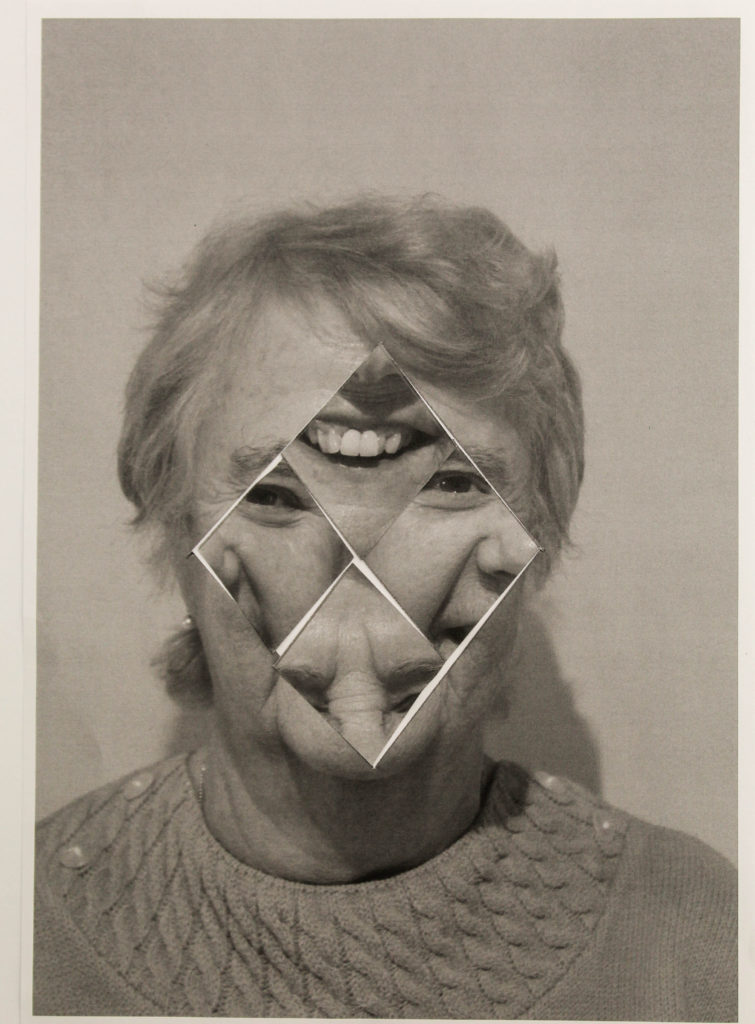
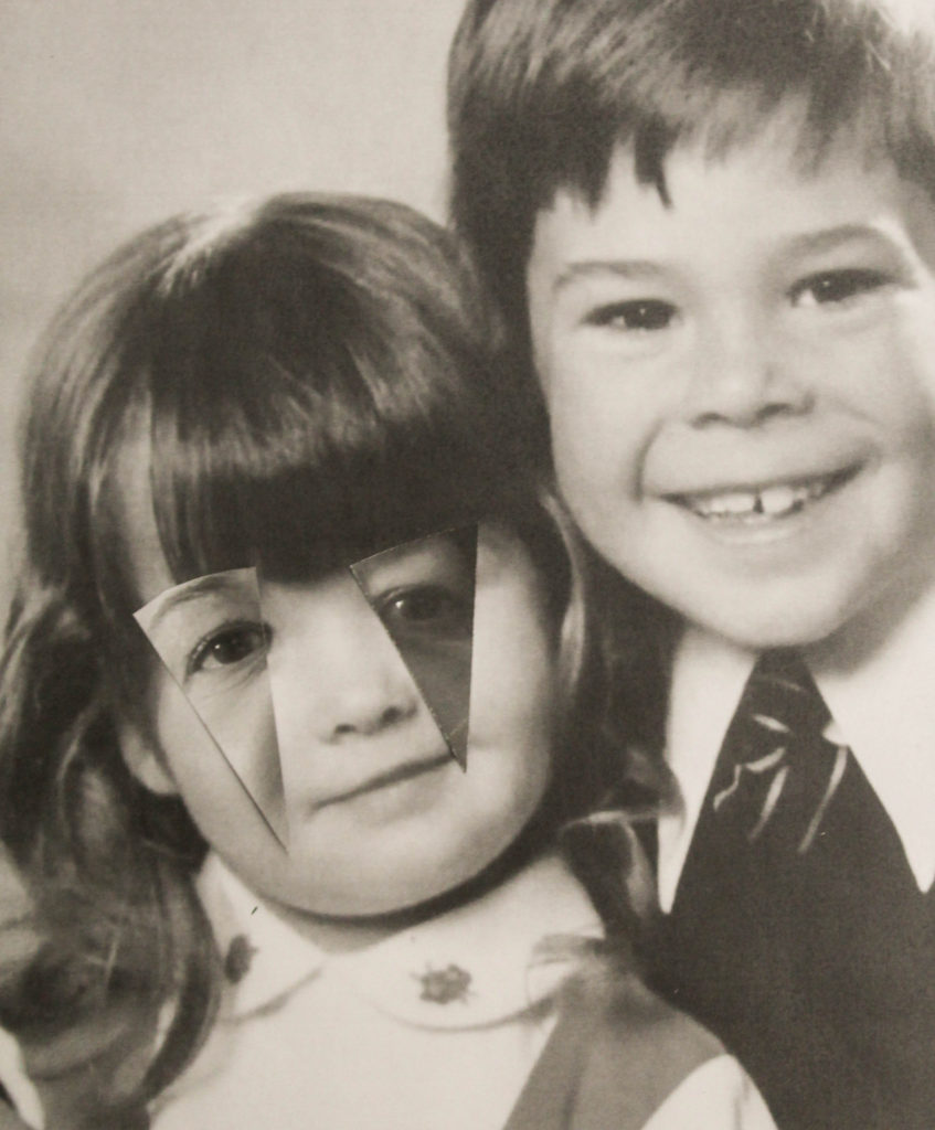
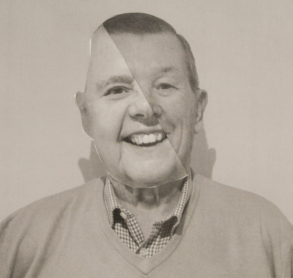
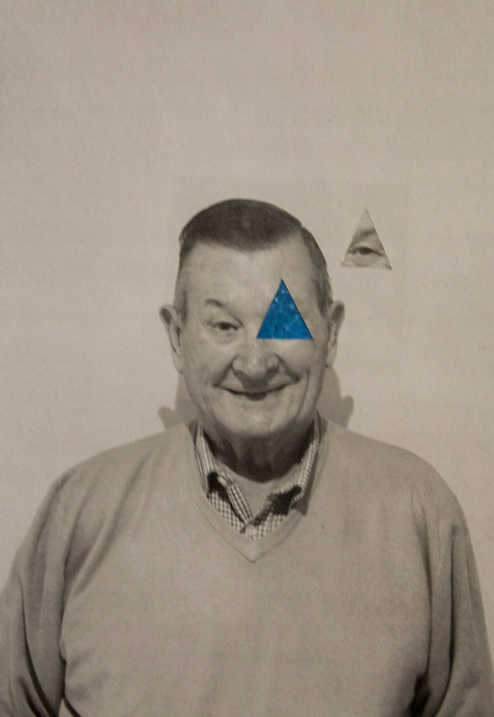
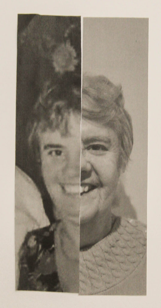
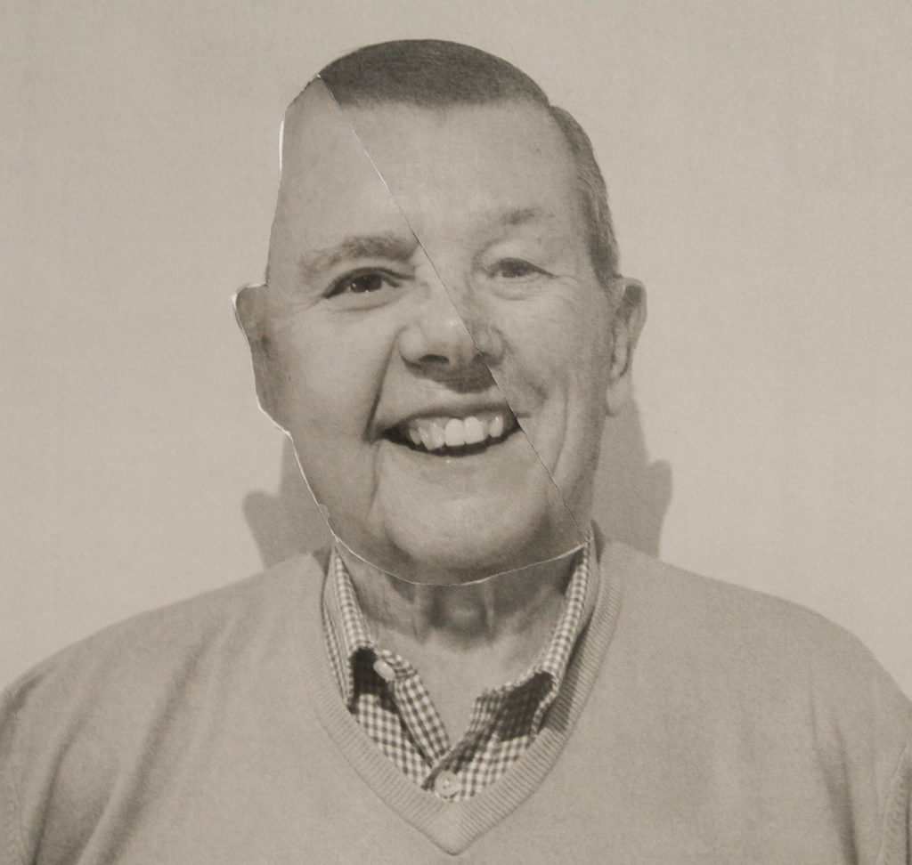
These pictures are some I created using the old fission method of prints and cutting them using a Stanley knife to cut and paste my images in different arrangements. This is how Kensuke Koike creates his images. I re-digitalised these images. I imported them into Lightroom in order to crop them and edit the tones to give a more old fashioned look.
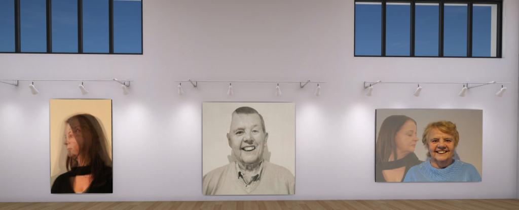
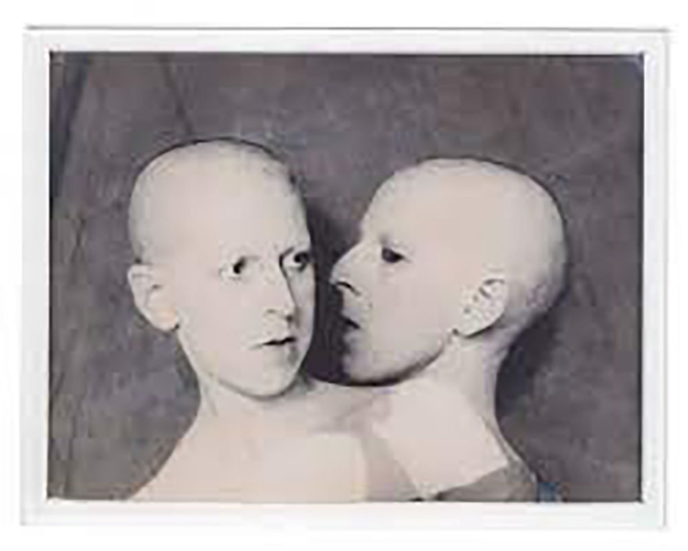
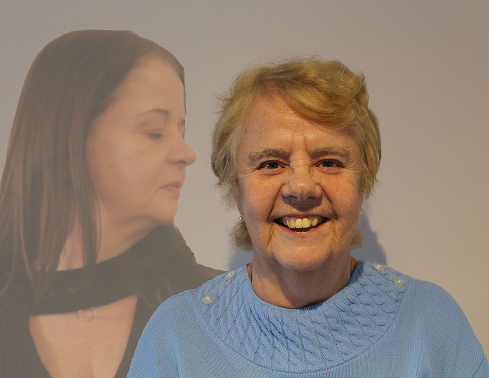
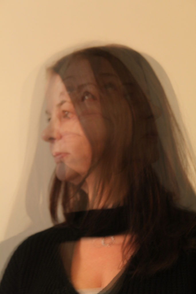
I have done some editing in the style of Claude Cahun’s multi-exposure shots.
These are the images I took inspiration from when creating my multi exposure shots.
Comparison to reference artist
I took inspiration from Kensuke Koike’s photographs in order to create images of a similar style. The image on the right is one of Kensuke Koike’s photographs and the image on the left is an image I created using the same style as inspired by Kensuke Koike. I think I managed to create an image that highly resembles Kensuke Koike’s work. However to improve my work next time u would ensure that my image has a focal point as Koike’s does. I believe that although I am happy with my work it would improve my final outcome.
Evaluation
This is my final evaluation of my photography mock exam 2022
Overall, I believe that this mock exam has gone well. I have worked hard to complete all the tasks required and completed each one to the best of my ability in the time provided. However my work does have room for improvement in some areas.
What Went Well ?
Firstly, the photographs I took for this project linked in well to my theme and worked well with the style of Kensuke Koike and Claude Cahun. I was greatly inspired by Claude Cahun and the time she worked which is the reason I decided to link my work to history. Additionally during my development and editing process I feel I captured the style of my reference artists and matched their intent the have in their work in mine. I think that my edits using the old fashioned method was a success even though the quality was not to the highest standard I feel that the idea worked out and that the physical copies in addition to the digital copies gives some variety to my project. In addition to evaluating Kensuke Koike I also evaluated Claude Cahun of which i think relates closely to my project. My edits in the style of Claude Cahun i feel went well however I felt more inspired by Koike’s work as i get the impression of combination and mixing people and lives which is largely what my project was based on.
What could be improved ?
My pictures could have been of a higher quality however due to the images being of old photographs and the original quality being low it would be impassive to make them HD. I also feel as though I could have taken more photos in order to give my images more variety. i feel as though my images that i manipulated using the old fashioned method could have been neater and reassembled better. I feel like even though my edits in the style of Claude Cahun went well i could have created more edits in her style.
My Final Images
My best Images
