
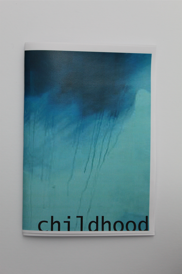
After my experimentations with photomontages, I concluded that my original idea was not as strong at conveying a message/question as I thought it would be. I looked to ordering my images into a sequence and try to tell a story, after looking over my images by printing them out and ordering them, I thought a Zine would be an effective way of ordering them.
Zine Case Study

A Zine is a small (A4 – A5) booklet in the style of a magazine containing usually images and text, due to their size they can be mass-produced if desired. Zines are made to tell a visual story with the photographs/text that it contains and the links that bind them. Techniques or relationships typically seen in a sequence or grid (or other examples of a collection of images) such as Juxtaposition, repetition or other details can also be seen in a Zine, however the viewer would have to turn a page, allowing the photographer to use that knowledge (of what image they will see first) to their advantage.
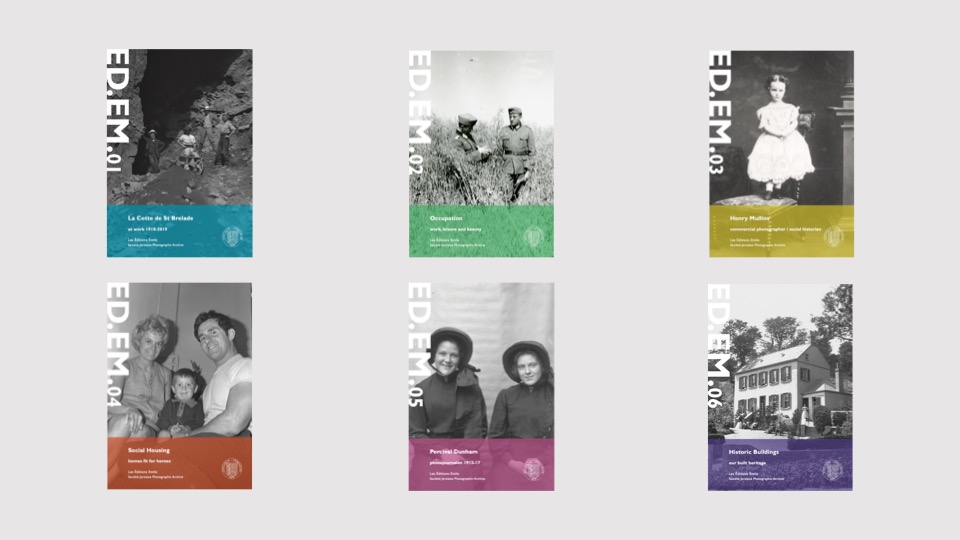
Jersey’s ED.EM (or Éditions Emile) is an example of a Zine, each containing images from The Société Jersiaise Archive, that is published around 3 times a year, each with different themes from different collections.
Editing
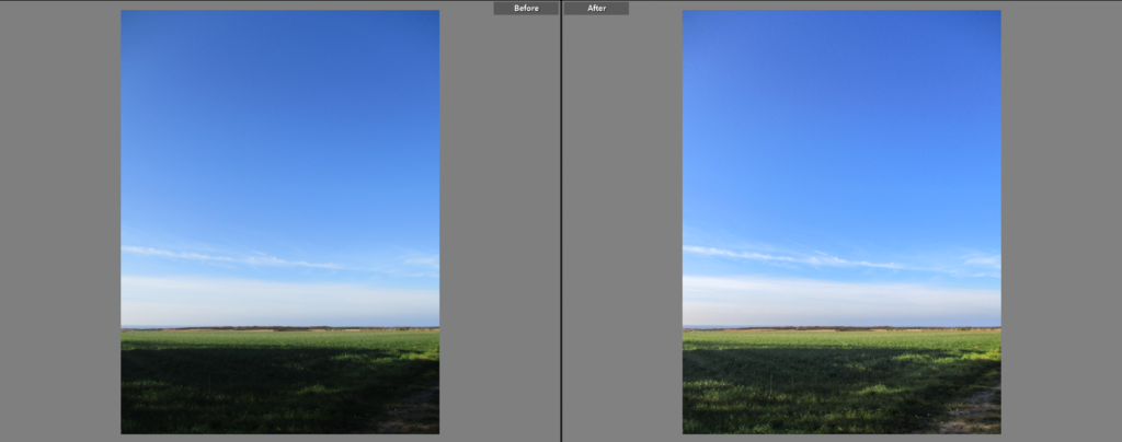
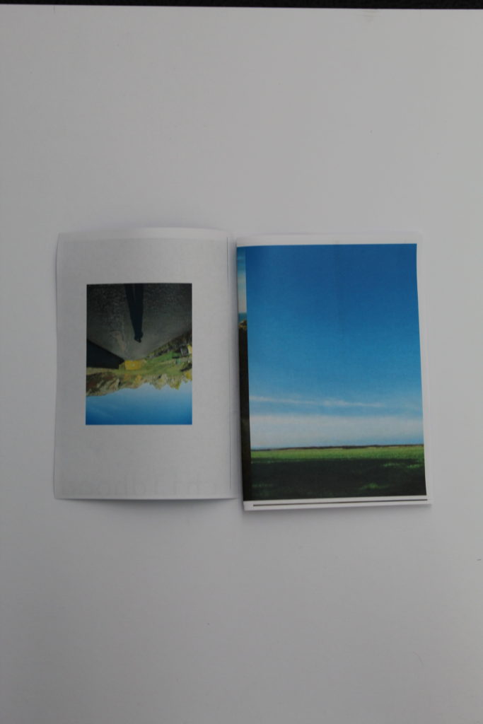
These are the images I selected as my best. Here I show the original and after-editing versions of each image.
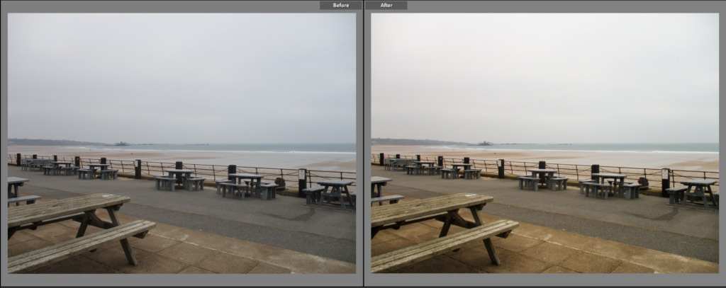
Here, I simply increased the ‘shadows’ and ‘blacks’ sliders to make the shadows less dense, while keeping the sky roughly the same colour, making the overall image look softer.
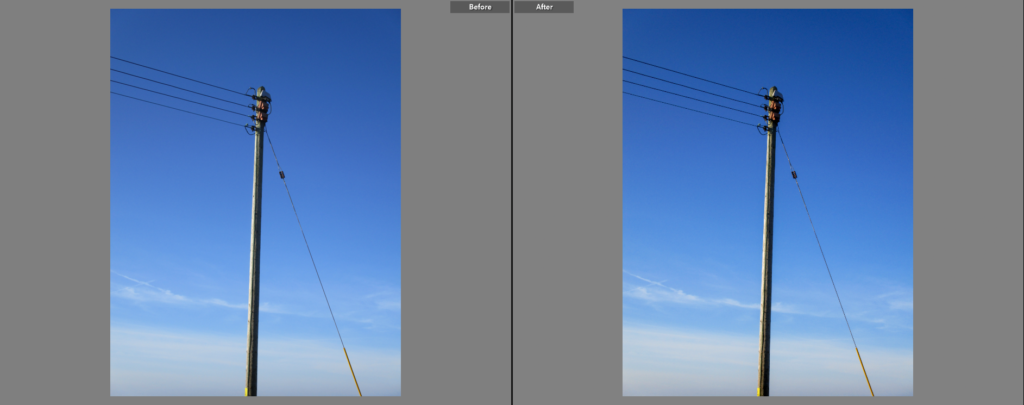
I did not make massive changes to this image, however I increased the contrast slightly, making the dark side of the pole darker.
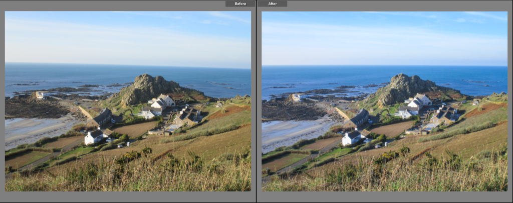
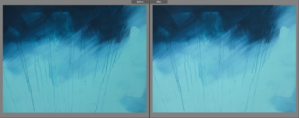
For this image I reduced the contrast and made it slightly cooler, giving it a softer look overall.
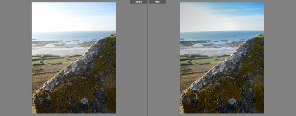
Here, I reduced the exposure of the sky by using the ‘Graduated Filter’ tool on Adobe Lightroom. I also made the overall image slightly darker by reducing the highlights and increasing the contrast.
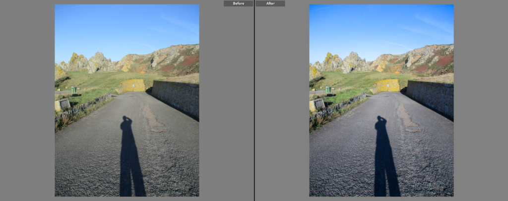
I made this image slightly cooler to make the tarmac stand out more from the green/yellow in the background. I also increase the contrast to make the shadows denser.
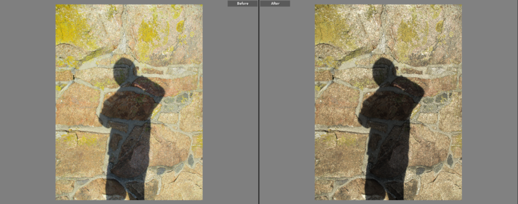
For this image I increased the contrast to make the shadow more dense, I also lowered the saturation of the image slightly to further make it stand out.
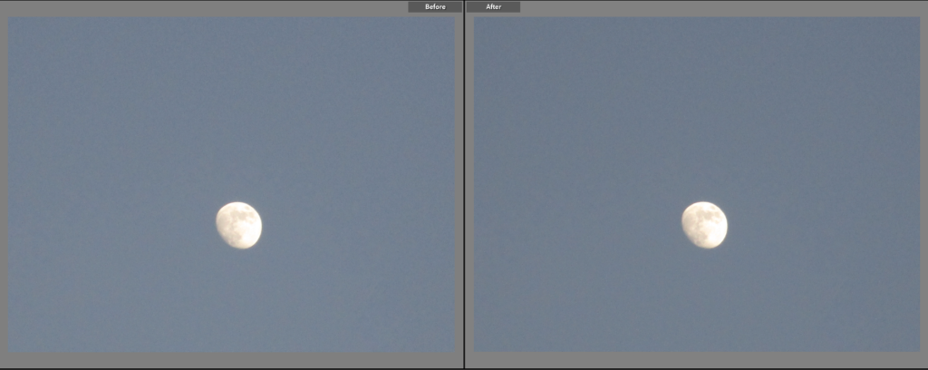
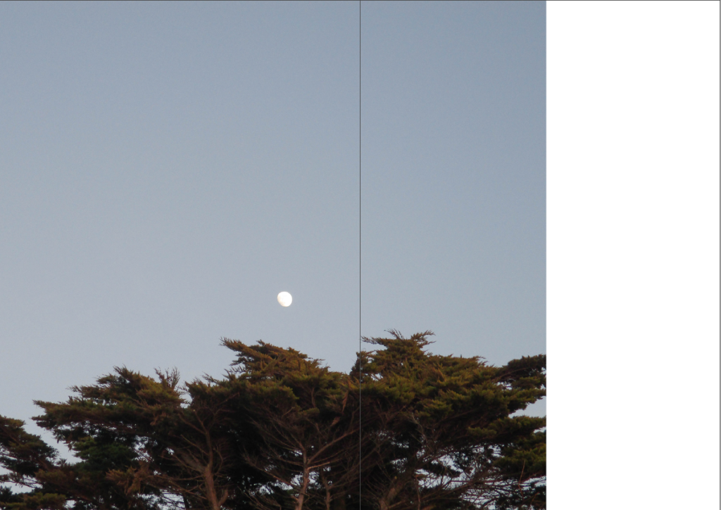
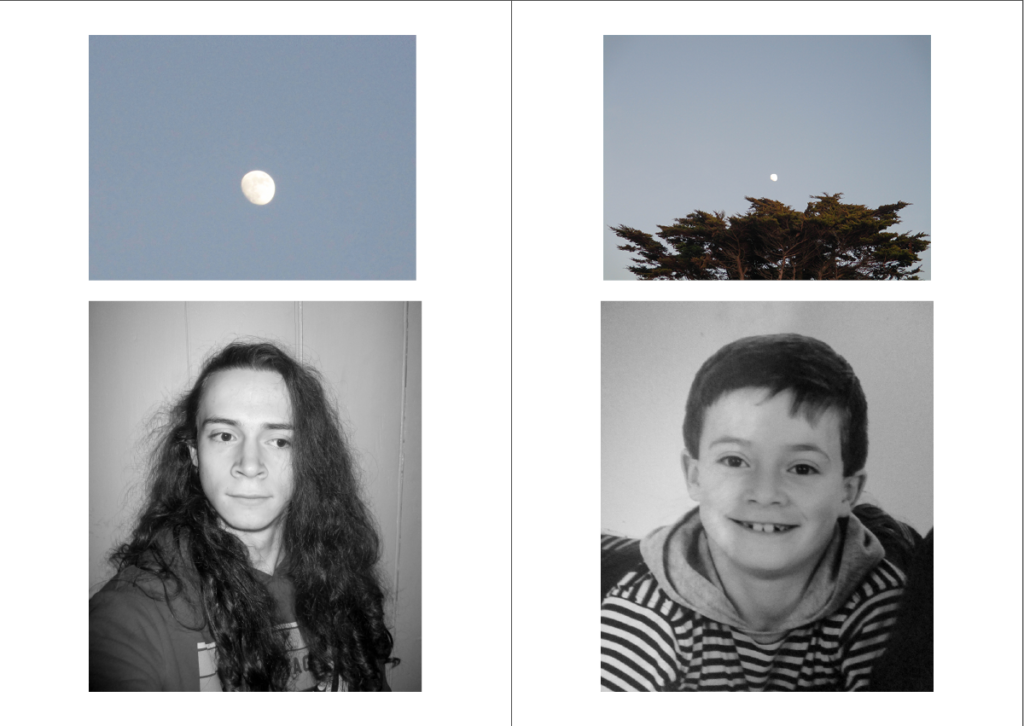
I didn’t change this image too much, however I did make the exposure slightly lighter in order to match the other moon image (below).
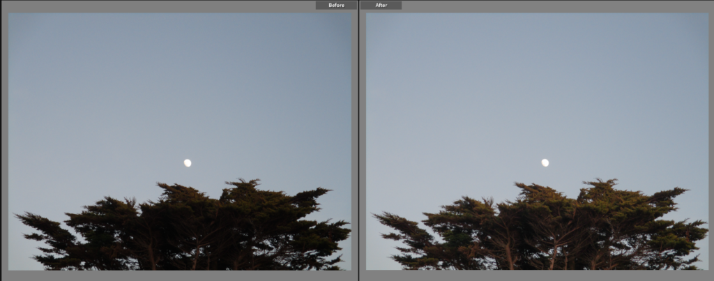
For this image I made the exposure slightly lighter and reduced the shadows to give the trees more detail.
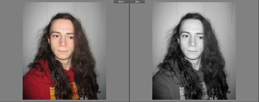
I simply made this image black and white to allow the lighter parts of the image (such as my face) to contrast more with the darker parts (my hair).
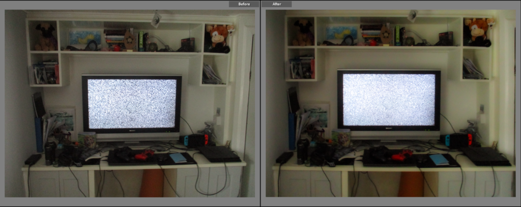
Here, I adjusted the ‘horizon’ of the desk. I also increased the contrast to make the TV screen stand out more.
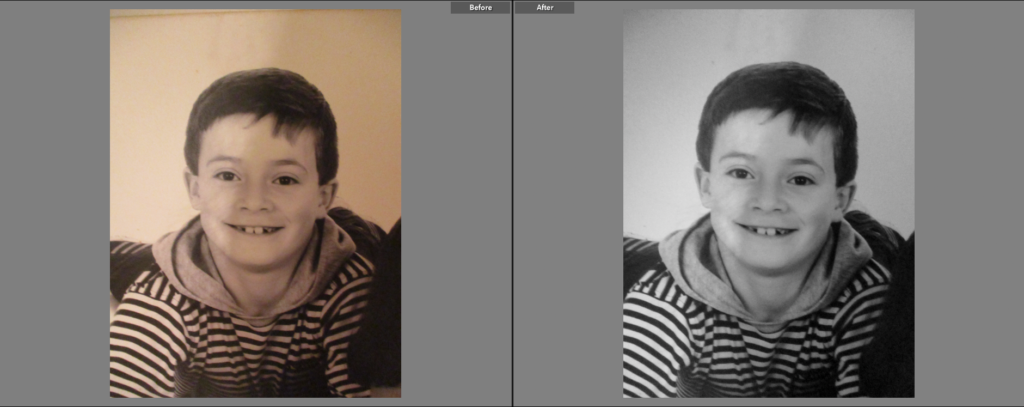
I simply made this image black and white to match the other portrait image.
Here, I made the image slightly warmer and slightly increased the exposure.
I simply made this image slightly lighter to emphasise the difference between the light and dark parts of this image.
Experimentation
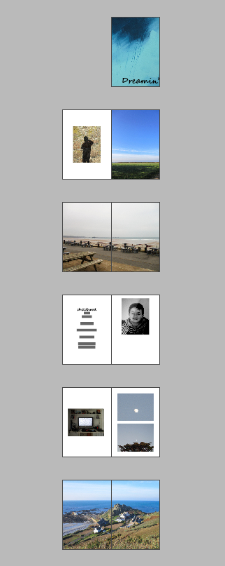
First, I made a mock-up example of a 16-page zine by folding 4 A4 pieces of paper in half and stacking them, then numbering the pages, placing the images on the pages that they could go on, lastly, I noted the specifics of each image (such as whether the image is full/double page, etc…).
Then I remade that mock-up on Adobe InDesign so I could get a better/clearer idea of what the zine would look like, with the correct sizes of images being used.
Layout Experimentations
On InDesign, I experimented with some ways of how I could present the images in the Zine.
Here, I left a small gap on the right of a double full page spread image which can be used to link to the next page with the colours of the background, or to simply place text or another image.
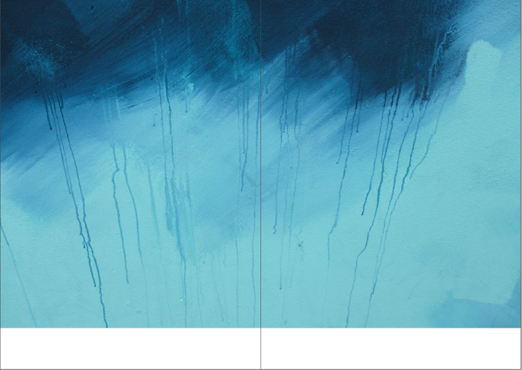
Here, I did the same as before, but on the bottom of the double page, giving text that could be placed there a more traditional caption look.
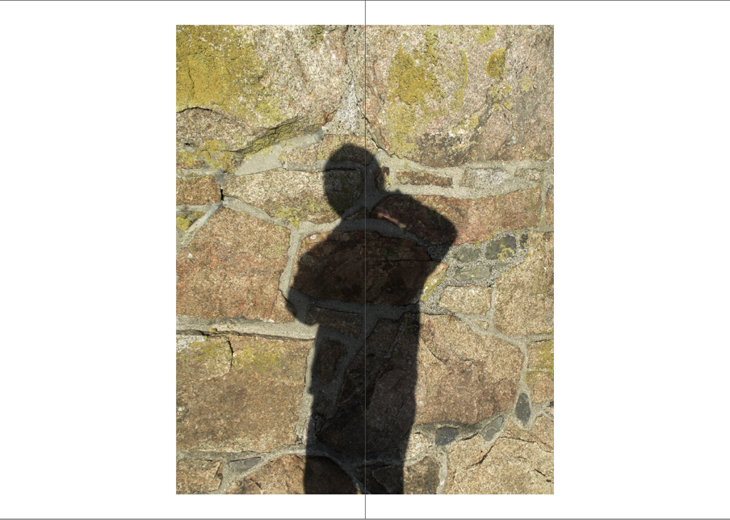
This experiment was to see how an image (with boarders on the top and bottom) would look in the centre of a double page, this gives the image more space (making it the main focus of a page) and allows text to be placed if desired. The warping of the image due to how it is placed in the gutter can also be used to physically manipulate an image.
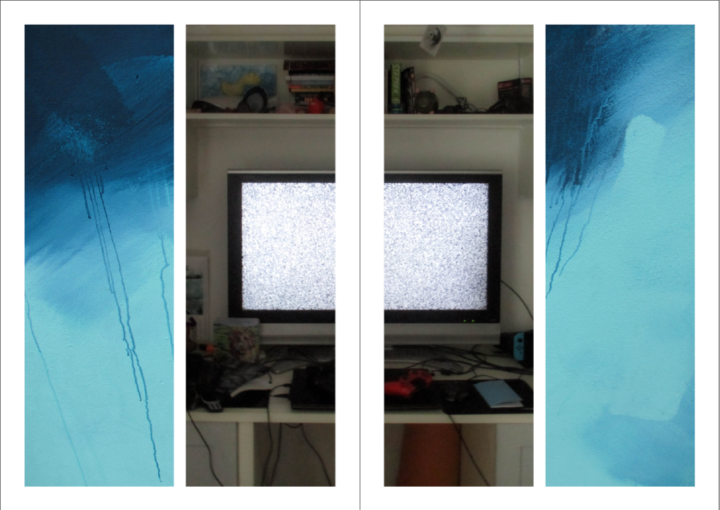
Here I experimented with splitting an image within a box and placing it on opposite ends of a double page spread, giving the image a more abstract look.
This experiment was to see how I can create links between the images on one page, then link those images to the page adjacent to it.