Final Images
(These are the images I included in the Zine)
Comparison to Artist Reference
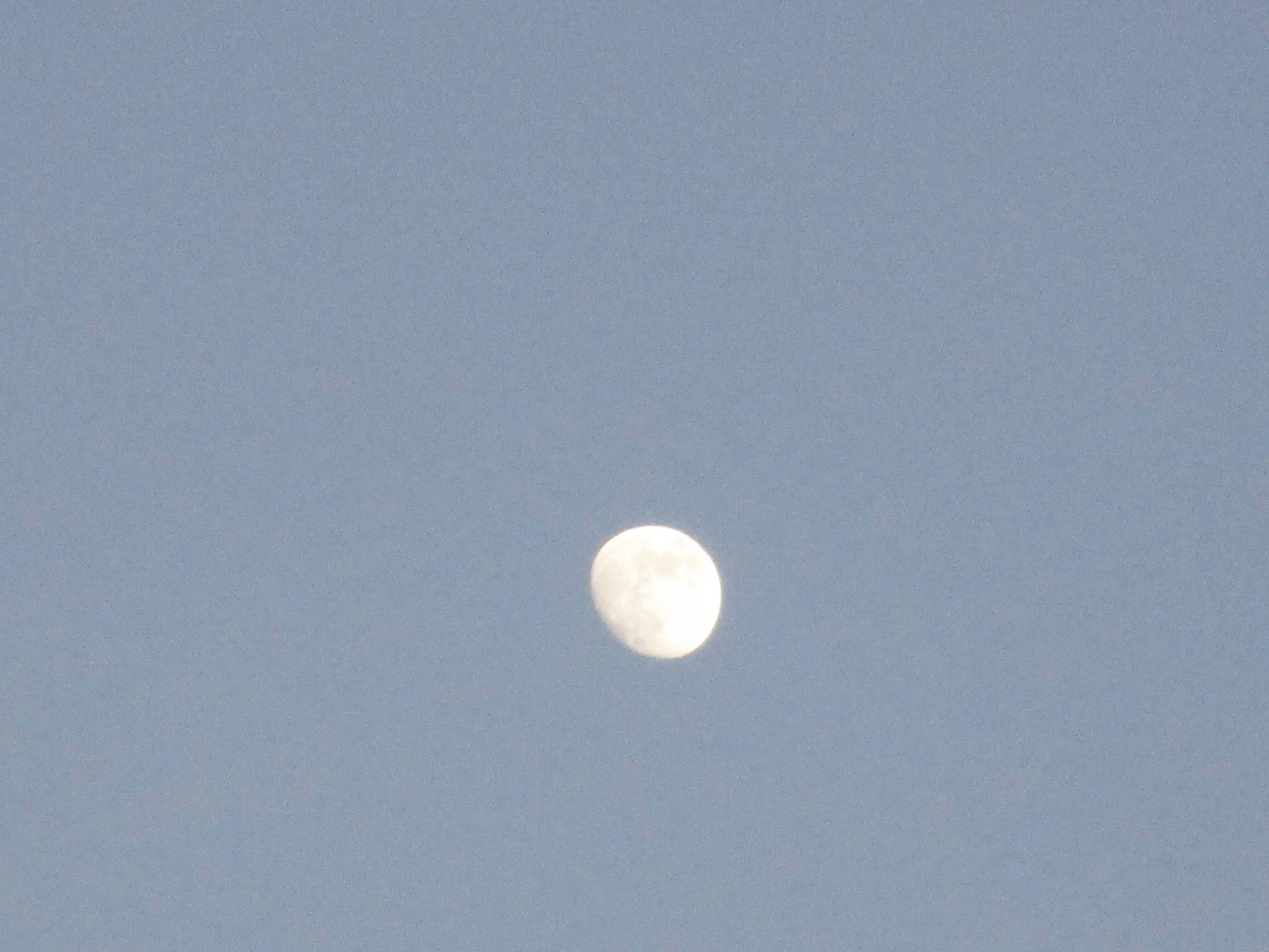
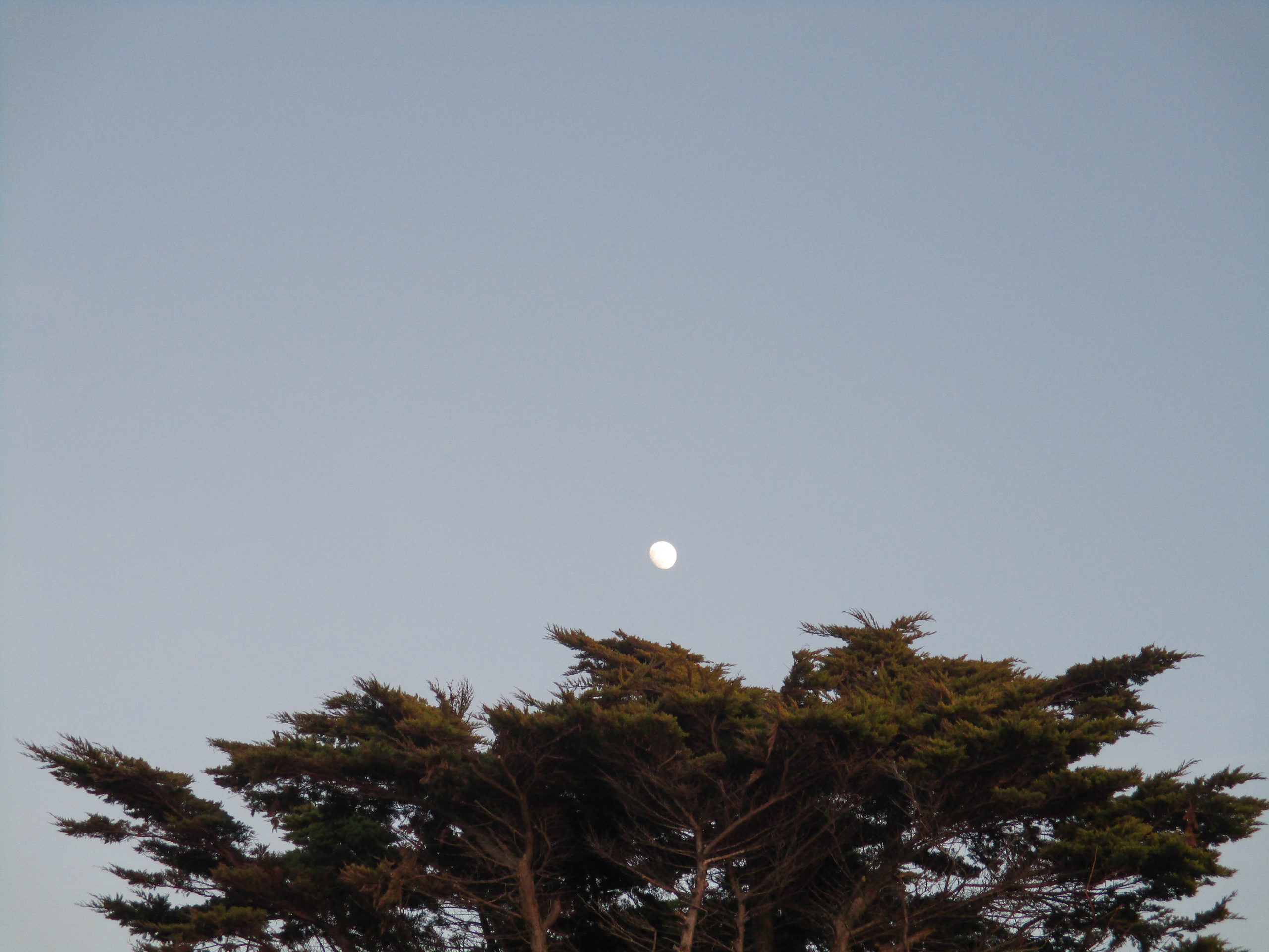
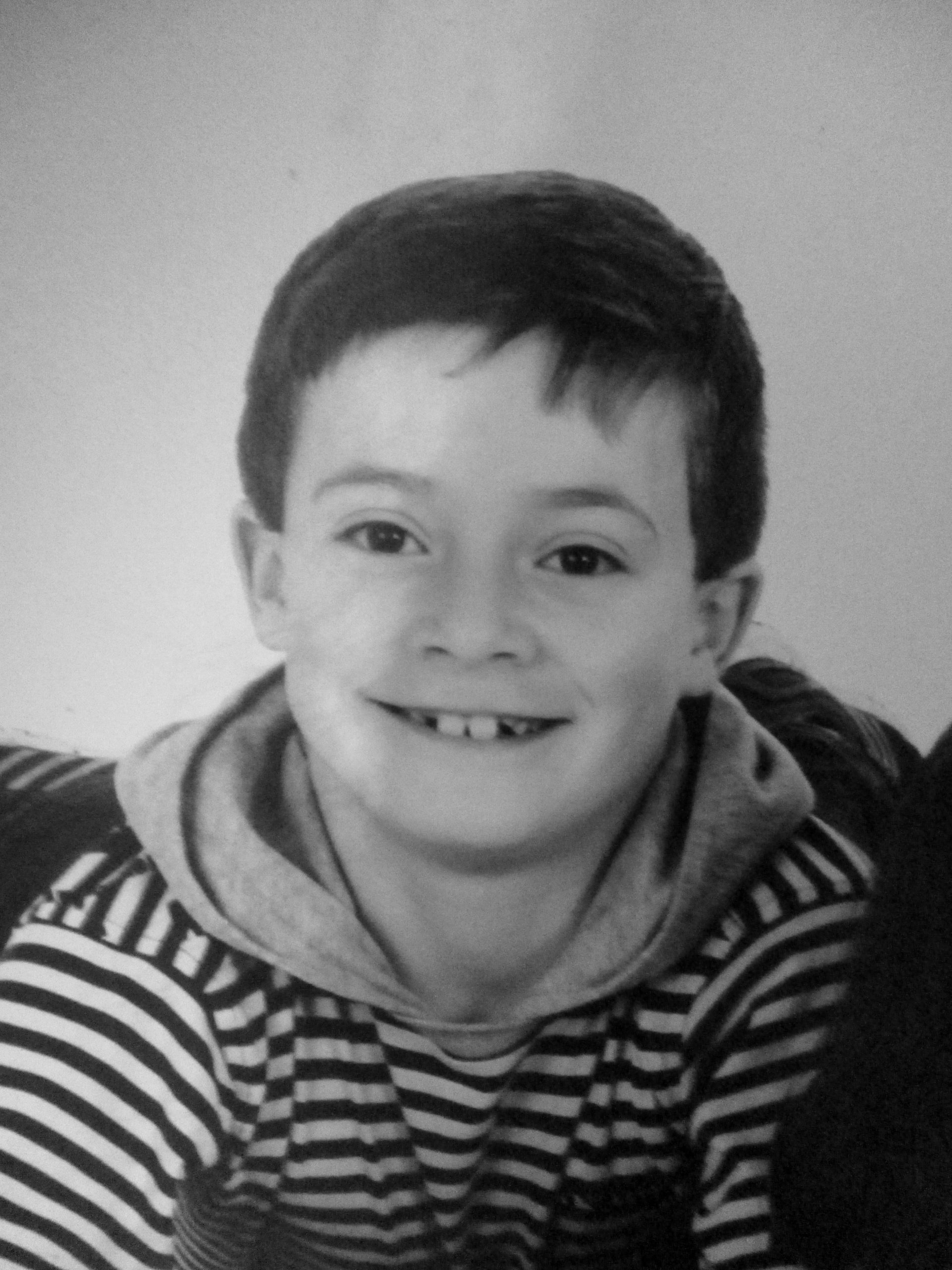
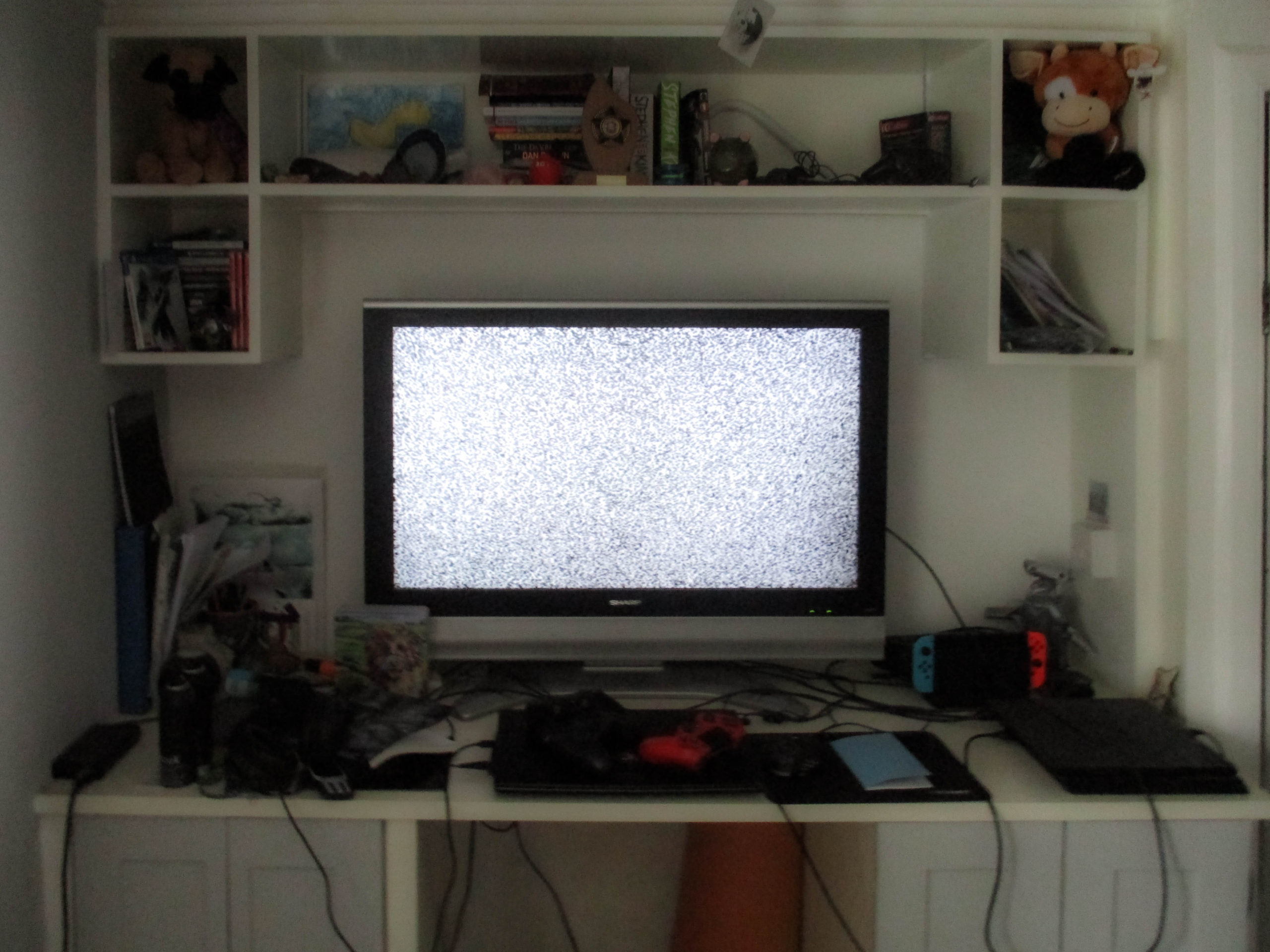
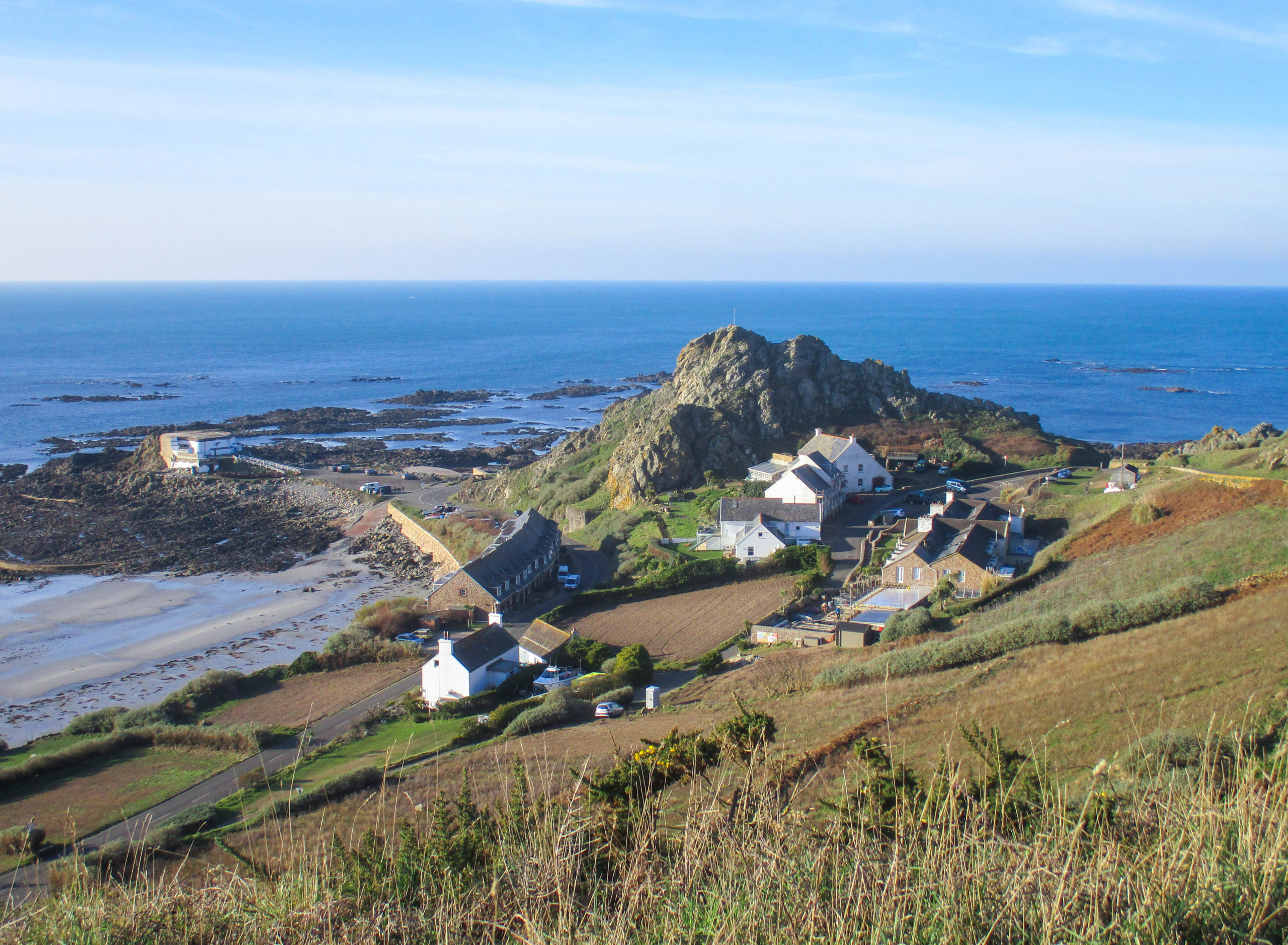
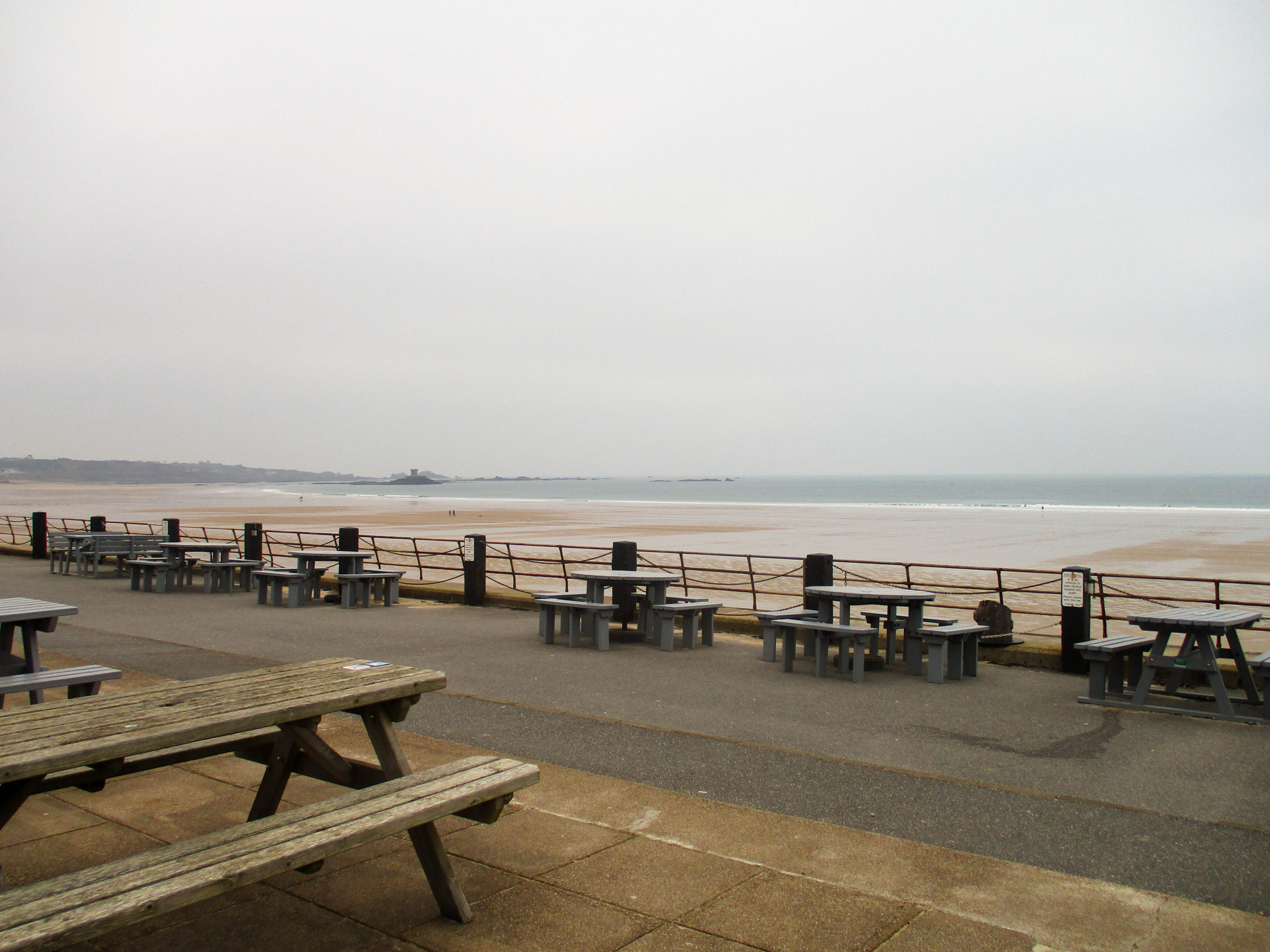
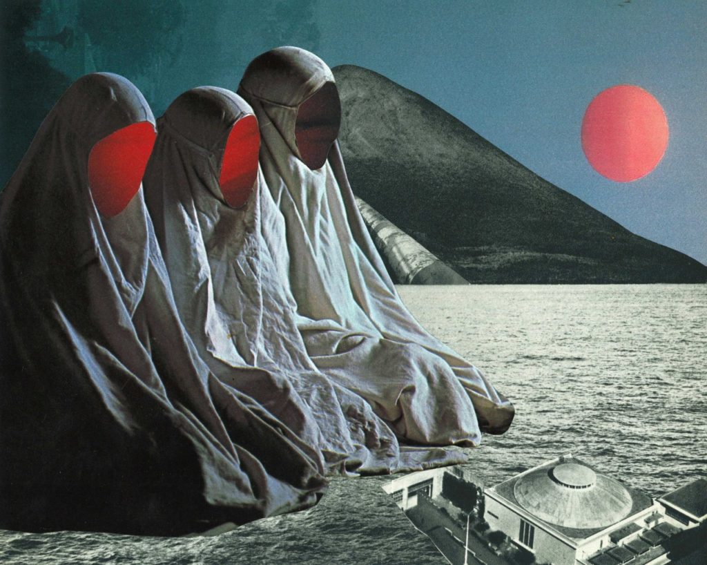
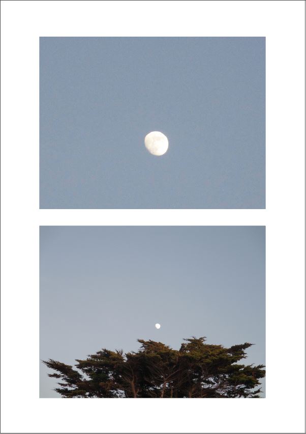
As I deviated from my original plan of photomontages during the exam, my final outcomes turned out to be wildly different to that of Jesse Treece’s work, with only one image (or page from the Zine) roughly mimicking it. This page is arguably the most unusual/different compared to the other images shown in the Zine as it is simply a picture of the moon, however the placement of the moon could very loosely resemble photo montaging.
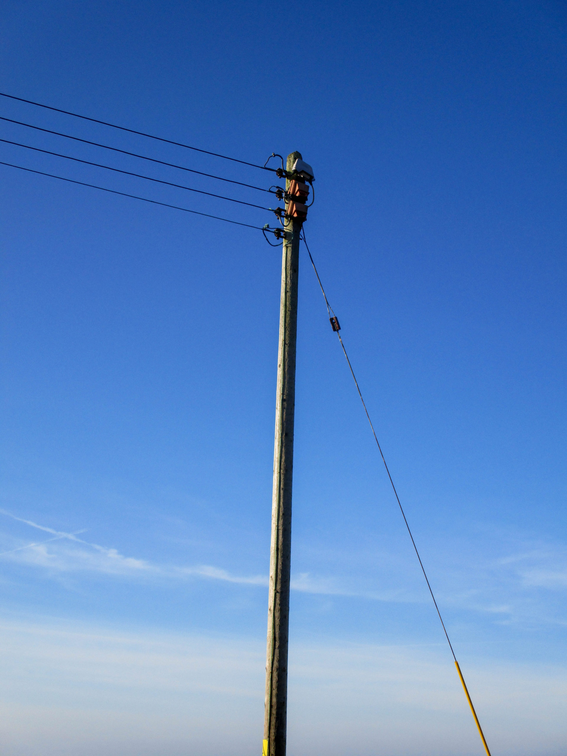
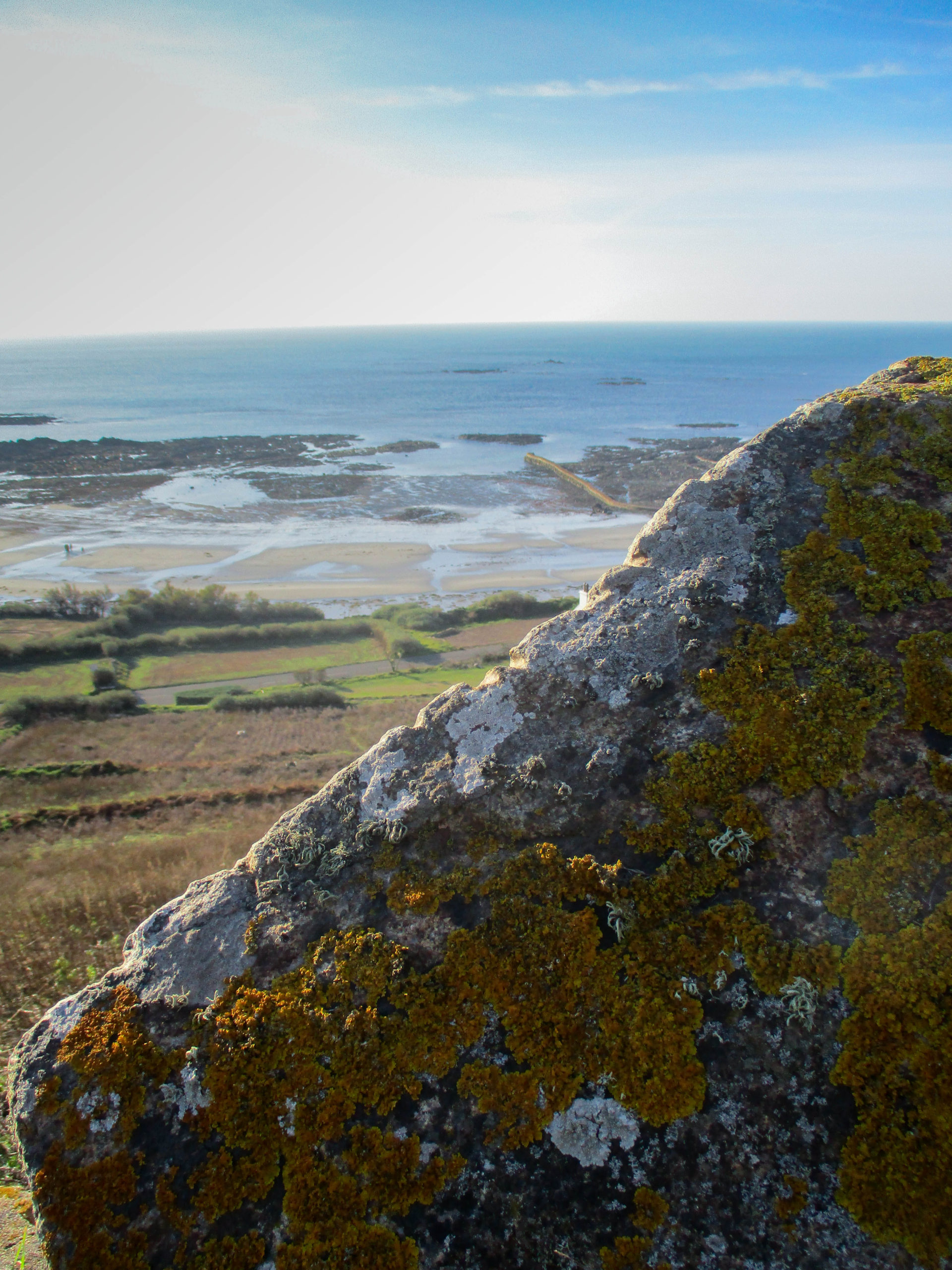
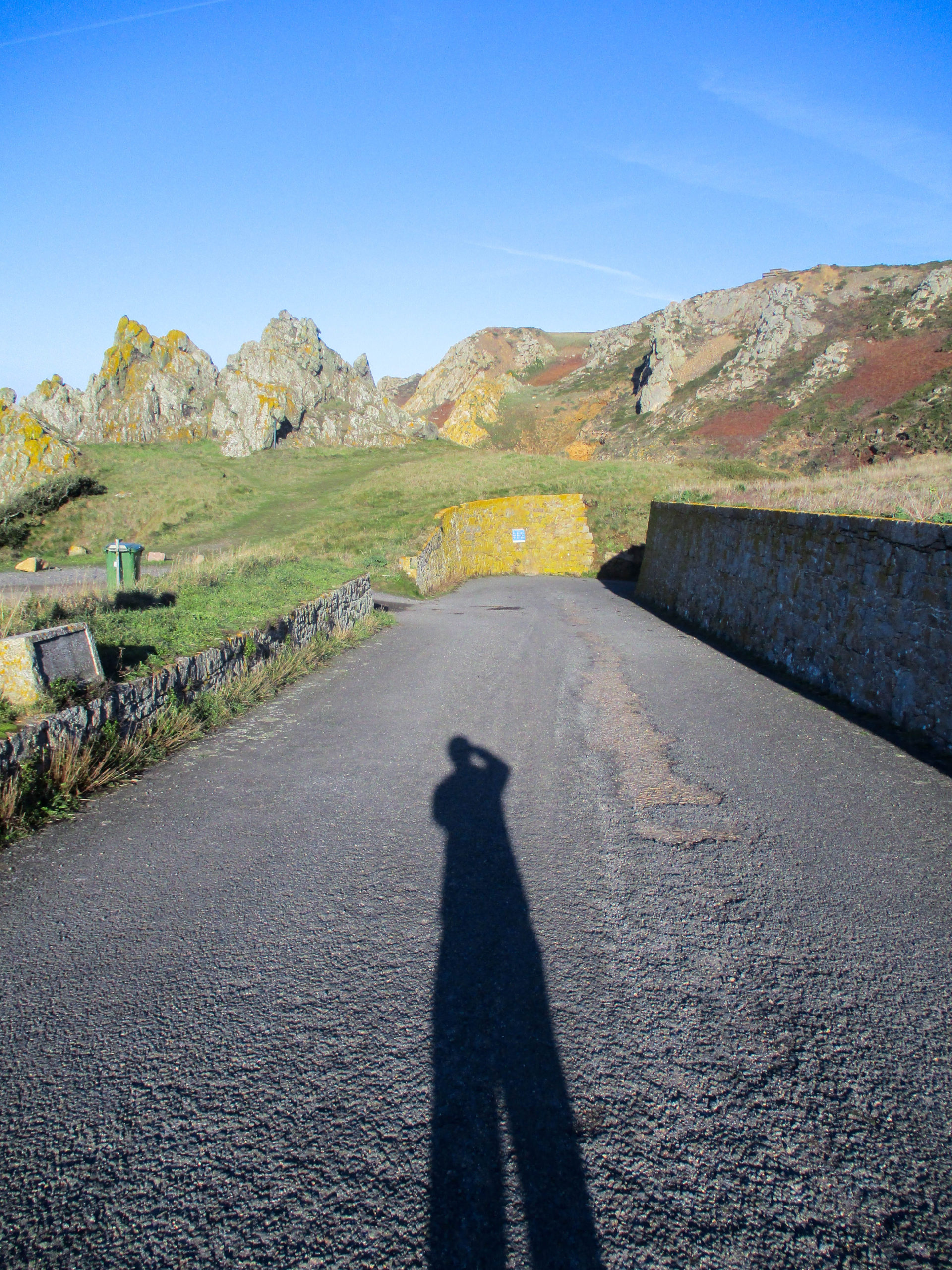
The Finished Zine
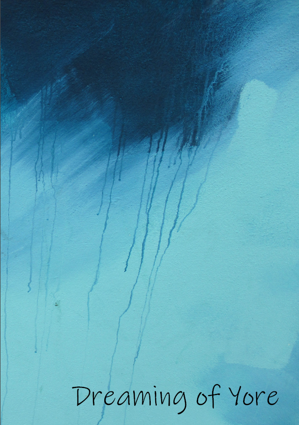
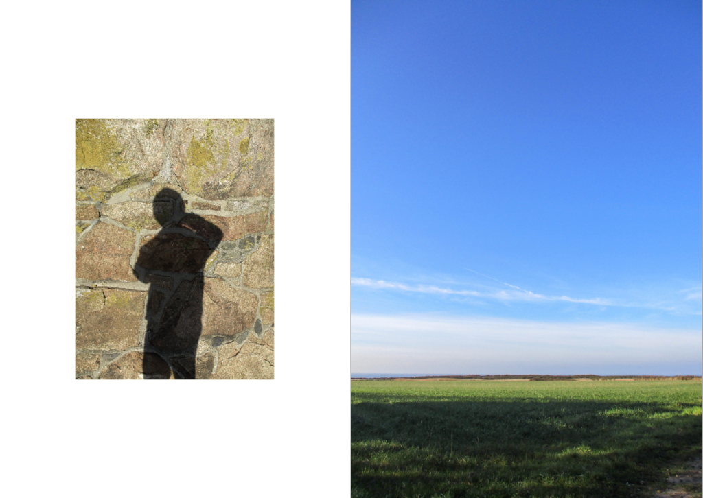
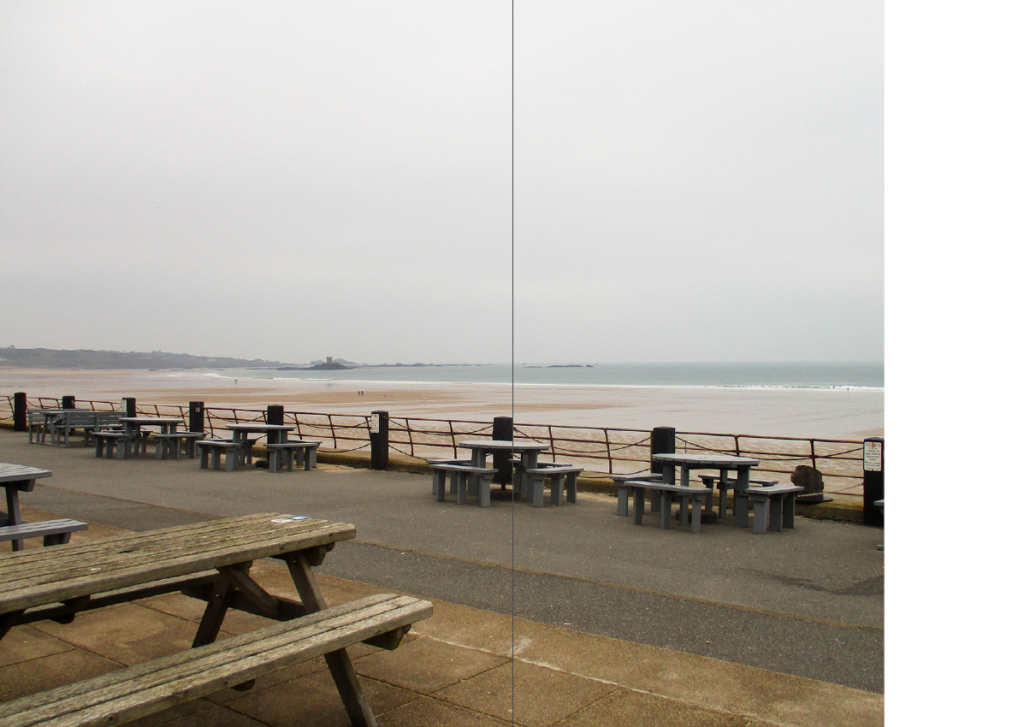
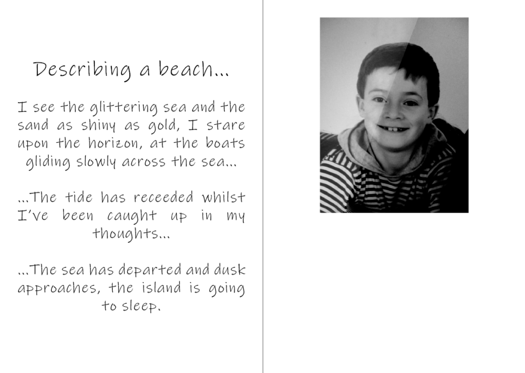
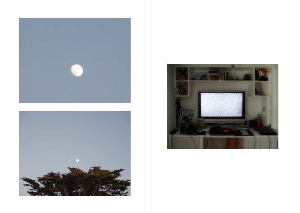
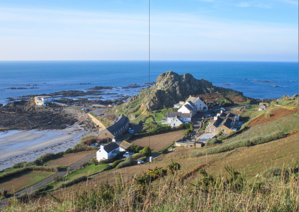
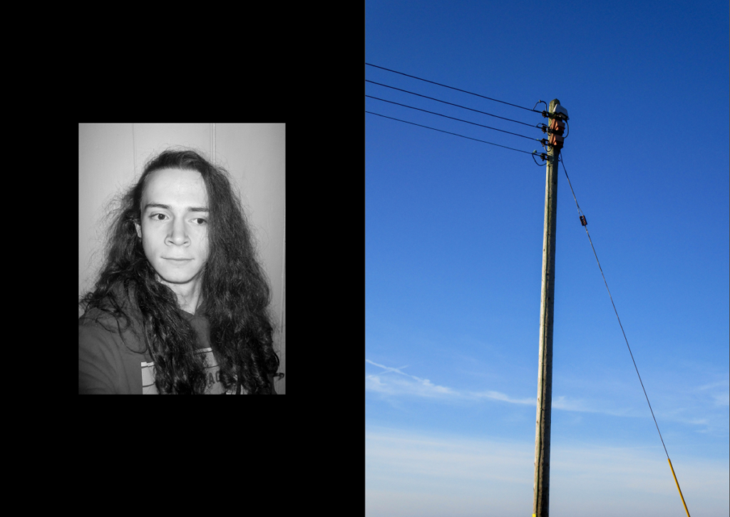
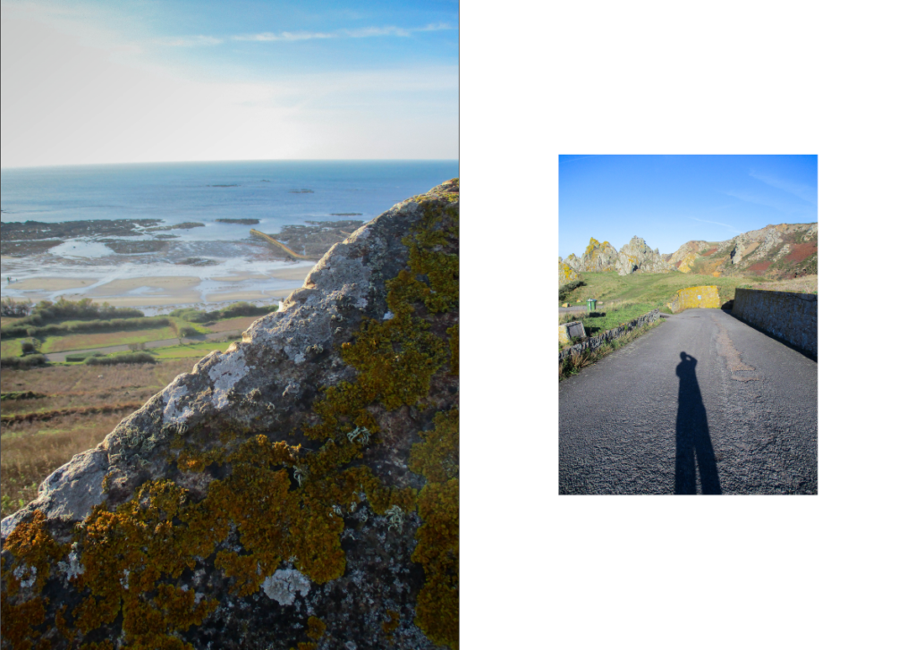
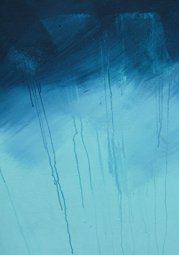
Notes:
– In the Zine (on page 6) I used segments from a poem I wrote when I was around 11 years old for the text , which describes a dream-like scene of a beach.
– The title: ‘Dreaming of Yore’ was used because a lot of the photographs in the Zine are of places from my past/childhood.
Other Ways of Presenting my Final Images:
Virtual Gallery Presentation
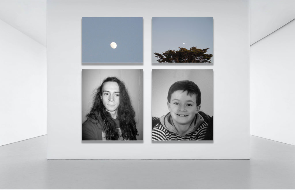
Here I used an image of an empty art/photography gallery which I edited on photoshop to include some of my Final Images. I used the ‘drop shadow’ and ‘stroke’ to make the images look like they were actually hung.
Window Mount
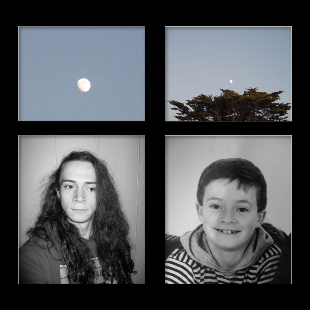
On photoshop I made a window mount using a black background and some of my Final Images. I used the ‘Drop Shadow’ and ‘Stroke’ blending options to make it seem more realistic.
Evaluation
Overall, I think the project worked out well in the end, despite the slight detour in what I was making, however there is definitely room for improvement in my planning stages. While I was taking images for the project, I specifically tried to be general so I would have had a lot of material to work with which, looking back now, only made things harder, however with this knowledge I will be able to plan a future photomontage project more effectively. I think ordering the images I took in a sequence to create storytelling was more effective than creating a photomontage.
What went Well:
Over the course of the exam, I learnt how to create a Zine which gave me a better understanding of how I can put my images in a sequence and what techniques I can use while doing so, which I can perhaps use in later projects. I think I now have a clearer idea of how I should be taking my photographs, with a greater focus on what I had planned.
What I can Improve on:
I can definitely improve on my planning of the project and what I was making, I should have been more specific with what I was photographing and why, which would have allowed me to produce images of a higher-quality that linked together better. Next time I will come up with a more detailed plan and take more focussed images that link to that plan better, I will also make my final outcomes closer to the work of my artist study.

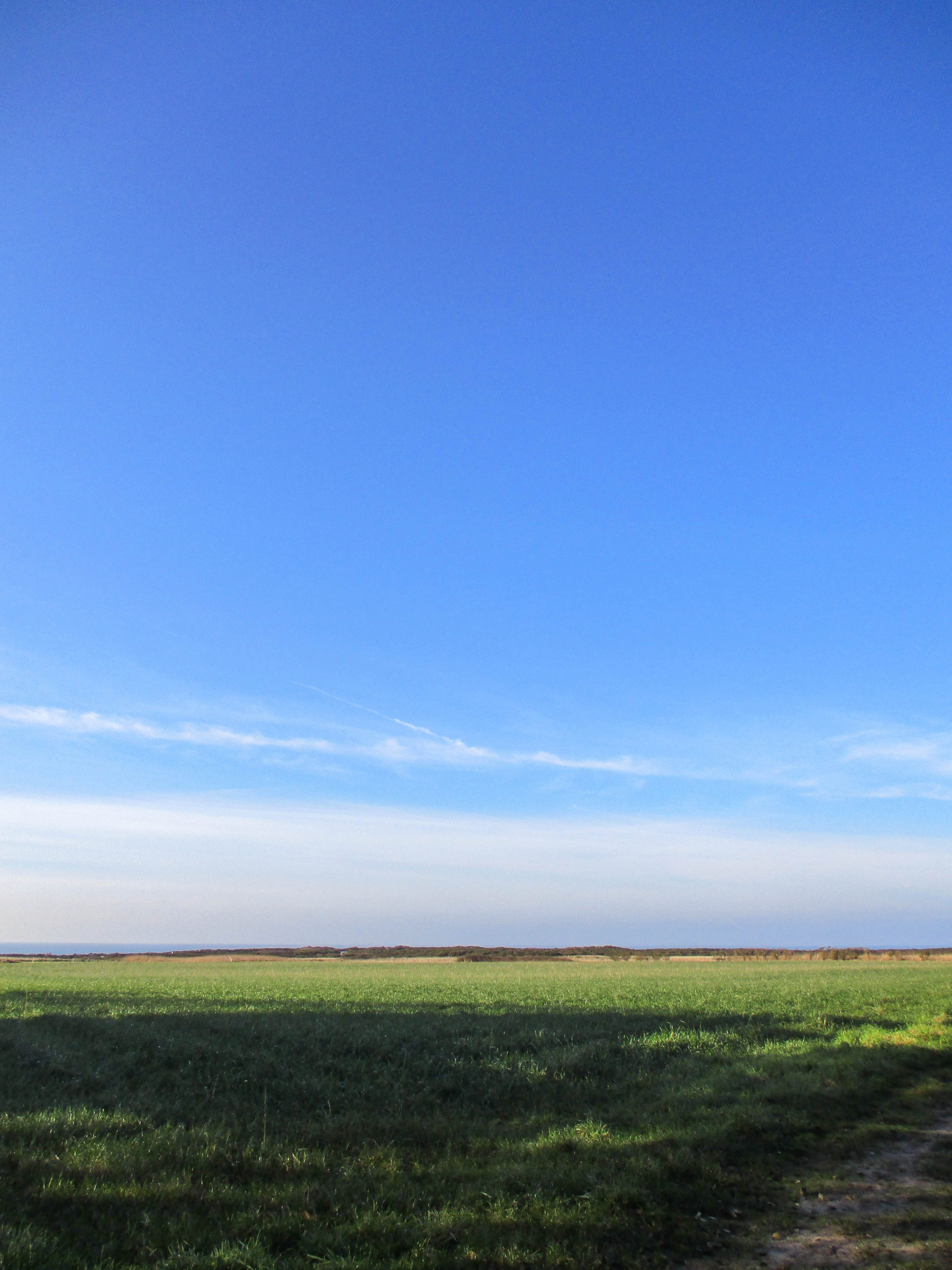
what did you use to make the zine?
Adobe InDesign