
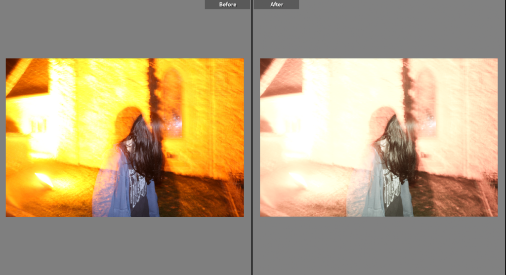
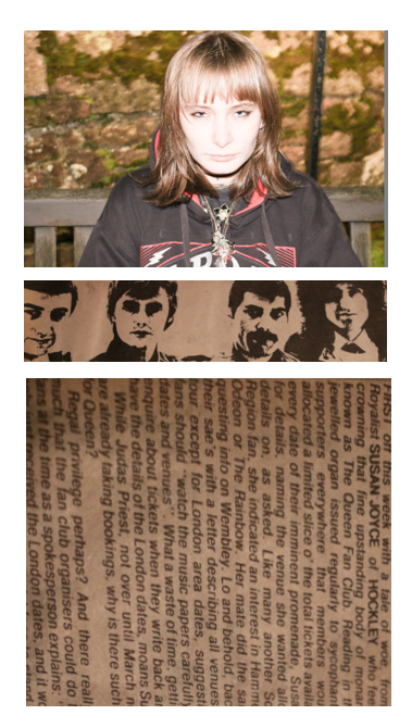
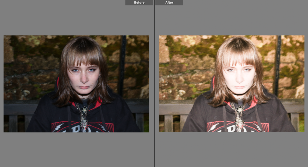
I began by editing my photo on Lightroom – for this I brightened the photo and lowered the saturation so that the yellow tones of the photo wouldn’t be so bright – I did this so that my photo had the same colour palette as the newspaper clippings I used to create the multiple exposure with.
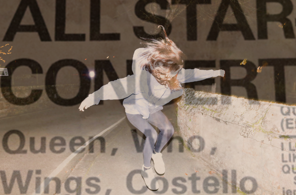
This is the final outcome of my first photo – I used the text to contrast with the photo, taking inspiration from Jim Goldberg’s use of combining text with images. The way this photo turned out makes it look vintage which I really like.
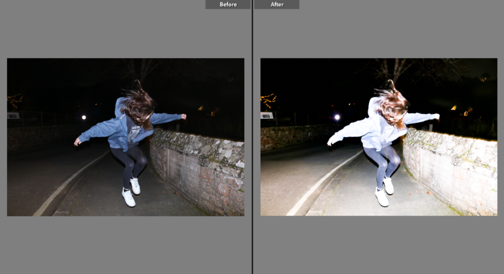
I had to choose one of the two photos of me jumping so i decided on this one – I brightened the image in attempt to make it look more like an action shot of 90s photography. The end result on Lightroom makes everything the photo look more defined.
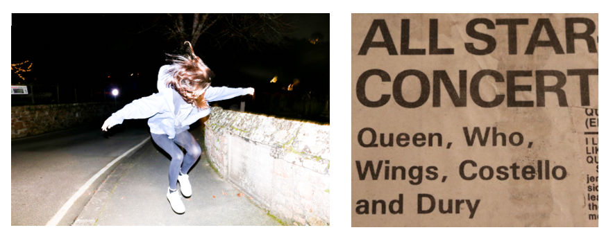
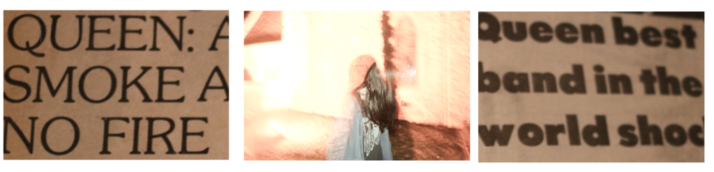
I used another newspaper clipping from my scrapbook as the overlay – I chose this photo because of the bold headline ‘ALL STAR CONCERT’ and the featured artists including The Who which gave a further meaning to my theme of my attempt to recreate Pete Townshend’s jump. It relates back to my artist research on Bob Gruen – most of his work on celebrities features action shots e.g the photo of The Clash in the moving vehicle I used in a previous post.
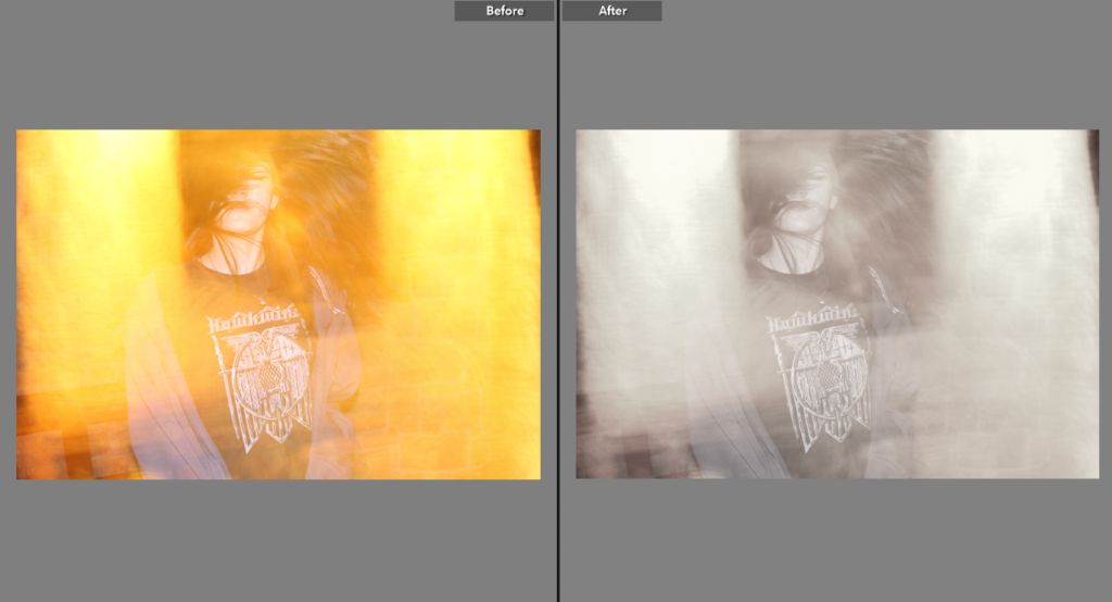
I was originally going to keep the orange colours in this photo but decided to tone them down in order for them to fit with my other pictures. I lowered the saturation and vibrance slightly but still kept it as unedited as I could to try and narrate the theme of a candid stage photo – much like Bob Gruen’s photos of musicians performing.
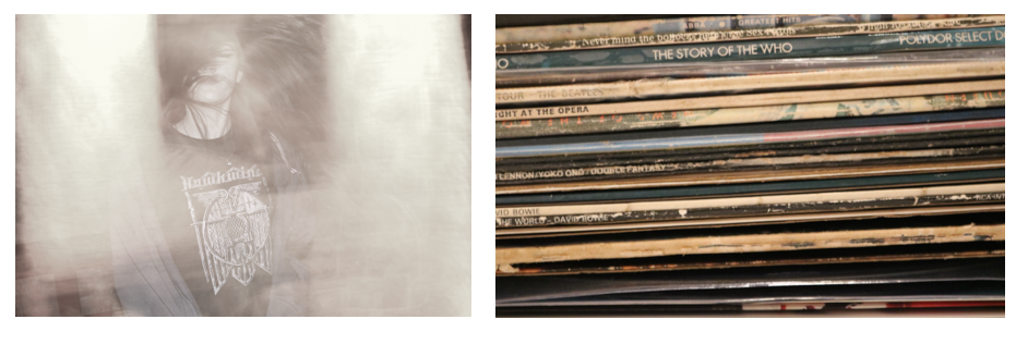
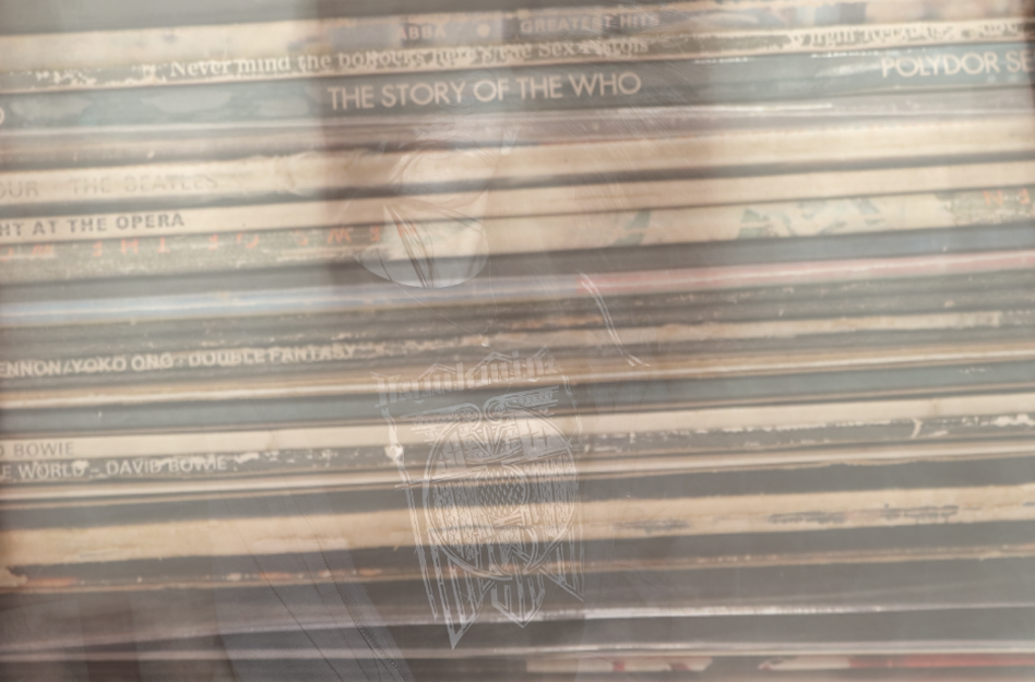
I added the photograph of my record collection on top to convey my identity as these are my personal belongings and have sentimental value to me, as some are originals and were given to me by my parents. The two photos go very well together as they both fit the theme – one being representative of different music styles and what I listen to, and the other being the aspect of performance.
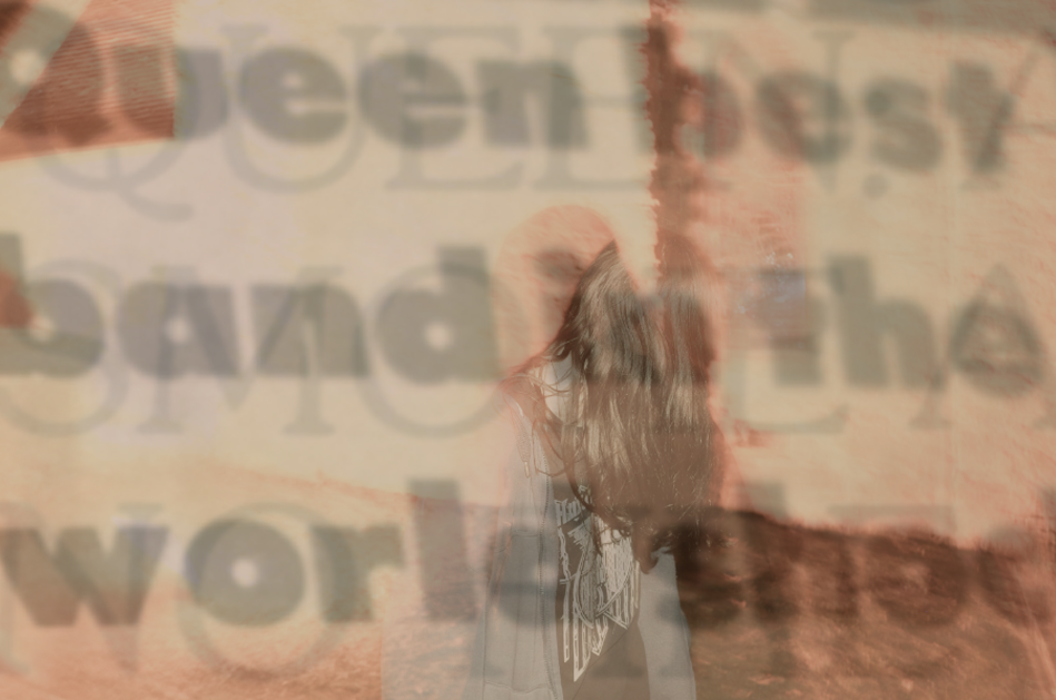
I changed more to the original image on photoshop than I did on Lightroom, but for this photo I again brightened the image and changed the hue to match the colours of my second image below of Queen.
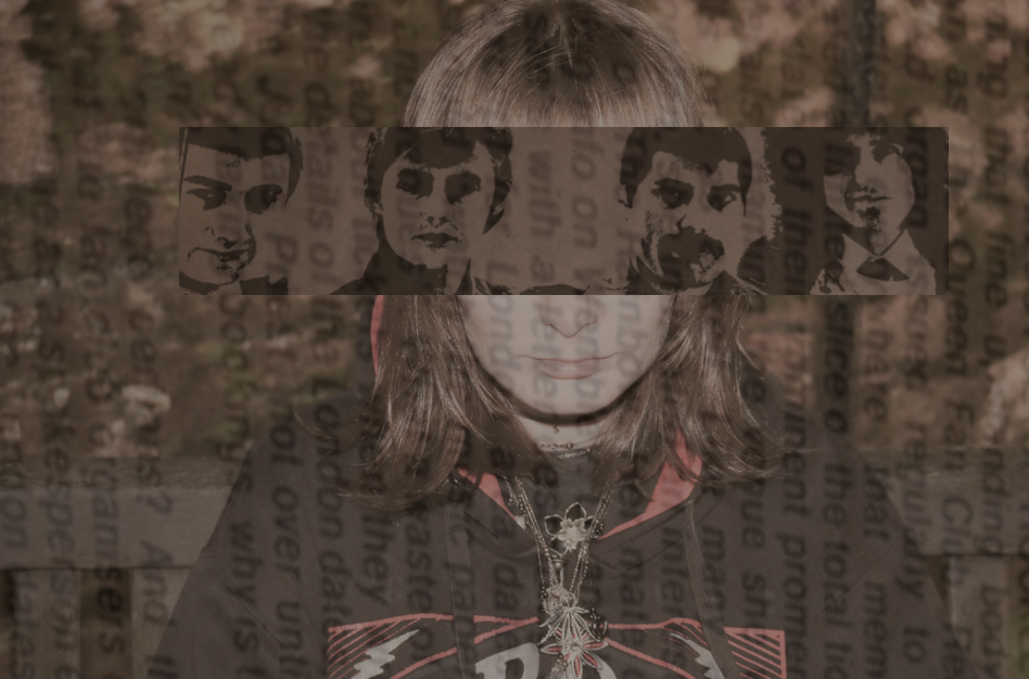
This is the outcome of the last photo after I edited it on photoshop. I began by lowering the saturation then putting the photo over her eyes – then I added the newspaper horizontally over the top and lowered the opacity so it had a faded look to it. My favourite part of this photo is the contrast between the photo of Alex and the one of Queen – the dark colours of the older photo combined with flash photography shows how music has aged but still has a legacy.