
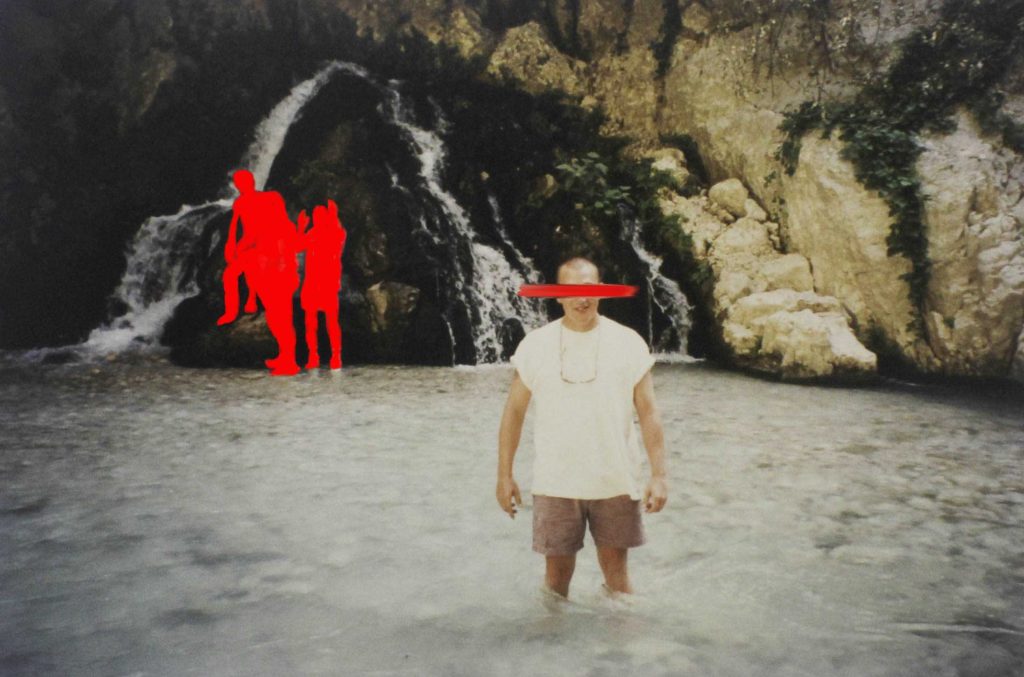
In this photo, I was inspired by Carolle Benitah and her work with her old family photos as well as her use of different materials. In photoshop I used the brush tool to get the effect of an actual paintbrush over the eyes of my dad. I also used the same tool to cover the three men that stood behind him as I thought that the final image would be too plain if I hadn’t. This photo was taken while my parents were on holiday in their 20s so you can see the age of the photo especially after I retook them with the copy stand. I like that you can see the age behind the photo because it adds character to the final piece. As the lighting wasn’t the best in the original image I increased the exposure slightly which has given it a more washed outlook which I really like and it compliments the background and the colour on the clothes that my dad is wearing. I like the red which was used because it’s very bright and bold which sits nicely against the background but is still eye-catching, I also like how it’s not a big circle covering the but its silhouette. The streak over my dad’s eyes I tried to make it look like a paintbrush so I used the mixer brush so that it would blend with some of the colours with the actual photo which you can’t really see in the middle of it but at the ends, it slowly mixes with the colours from the background.
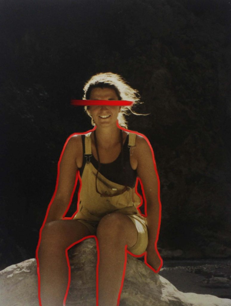
This photo is also inspired by Carolle Benitah Instead of filling in the body I outlined it to make it seem like it’s sitting in the background. This is another holiday photo of my mum in her 20s in a similar place as the other Carolle Benitah inspired photo. I like how you can see the ‘paint’ streak more clearly over her eyes and that you can really see the blending of the darker background in with the bright red. I’m happy that I didn’t outline my mum’s face as well as her body because I feel it would have been harder and looked wrong with the way her hair is blowing in the wind, I also allow for the red line to be the centre of attention on her face without crossing or competing with anything else. The original photo was also quite dark, to begin with, so I increased the exposure to make it light while doing that it made the reflection of the sun off the hair loom more golden which frames both her face and makes her skin look more tanned. I also really like how the golden features and the red go together and compliment each other nicely. Lastly, I like the way the foreground (my mum and the rock she is sitting on) is a lot lighter and contrast with the darker background making the foreground pop even more.
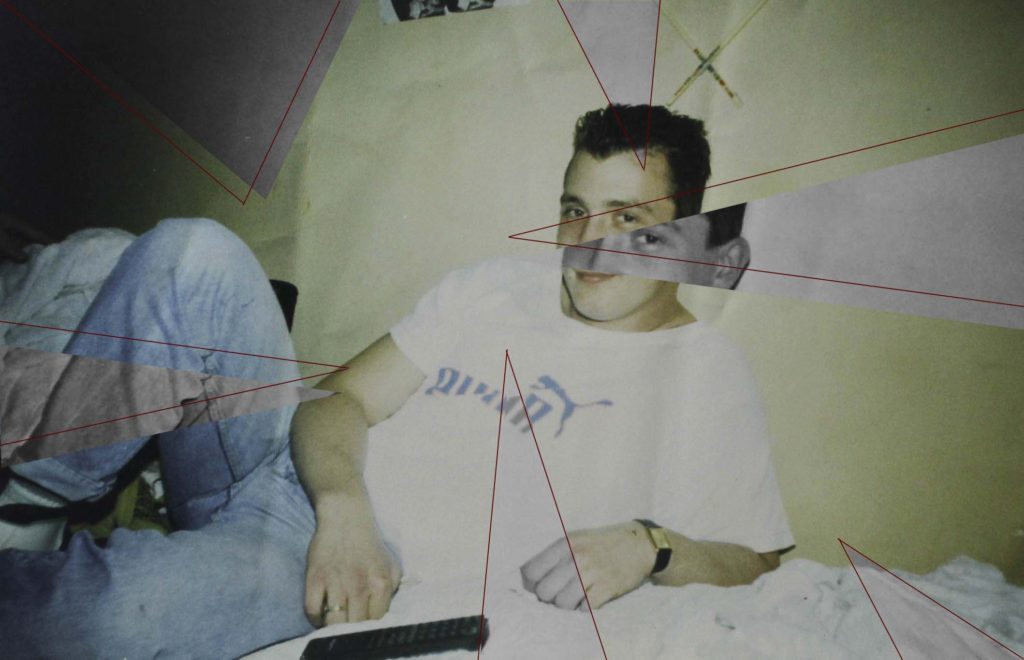
This photo is inspired by Yoshikatsu Fuji, I looked at one of Fuji’s photos from his ‘Red String’ book where he had his parent’s wedding photo (coloured) and layered it over another photo of his mother down at the beach (black and white. I adapted that idea and decided to outline the different coloured triangles with red to represent the connection between my photos. they also help to see the actual colour difference as the original picture is less pigmented especially around the bedsheets and certain spots on the wall. By moving some of the triangles slightly it gives the look of the photo being pulled apart and put back together. This photo is of my dad just after he had moved to Jersey which was over 30 years ago, this is also one of the photos that my dad had sent back to my grandparents. I like how the photo has a slight yellow tint which shows its age and how it looks slightly washed out which makes the greys stand out more especially in bold and more pigmented colours, for example on the jeans and on my dad’s face.
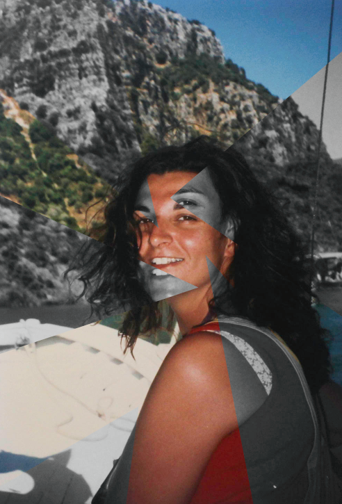
For this photo, I took inspiration from my edit above by taking different parts of the photo and turning them black and white as well as slightly moving then giving the effect of the photo coming apart revelling and colour photo underneath. In the edit, I decided not to outline the triangles with the red as I felt like the photo didn’t need it and the different red from the lines and the red on the top might clash. This photo is of my mum while she was on holiday when she was in her 20s, I like how the hill in the background is slightly blurry compared to my mum who is in focus. I think it makes her stand out against the hill making her the main viewing of the photo. The black and white triangles fit nicely next to the more saturated colour of the older photo.
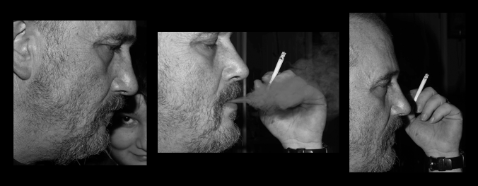
As I need to use some of my own photos I decided to do a sequence of my dad which I took while I was back in Ireland, I tried to put the three images in the order of ‘smoking’. I like how there are different factors in each picture that aren’t in the following photo, for example, my brother’s face in the background of the first image, the smoke in the second photo. These make the photos interesting and show more dept into what was happening around when the photos were being taken, but in each background is plain black which hides everything so viewers have to use their imagination.
Photo Gallery

You have until February Half Term to complete and improve any missing / weak blog posts. In this time you can also add to your photo-shoots, ideas and edits…maybe even coming up with more final images.
Use your tracking sheet to pinpoint areas for improvement.
We will be framing and displaying your final prints too before Half Term and re-marking your coursework for you.
Keep working hard!