These images here are my 4 final images that I have presented through the blog and through galleries. I chose to present my images in black and white because it prevents people from judging and stereotyping the models choice of colours. Also, I think that most images look a lot better in black and white due to them being basic and effective. These images are inspired by multiple artists such as, Claude Cahun, Brno Del Zou and Boogie. I have produced multiple portrait photos which are all linked to the idea of ‘loss of identity’. For my photos I used Lightroom and Adobe Photoshop to produce the edits shown in my images.

I chose to represent my images in 3 different galleries including a virtual gallery (link here: https://www.artsteps.com/view/61f11565eb9c642065b2910f/?currentUser ) because I believe it is the best way to present them due to it being slightly realistic.
In the virtual gallery I decided to put more than my 4 final outcomes and chose to use a few of my favourite images from the past around the gallery.
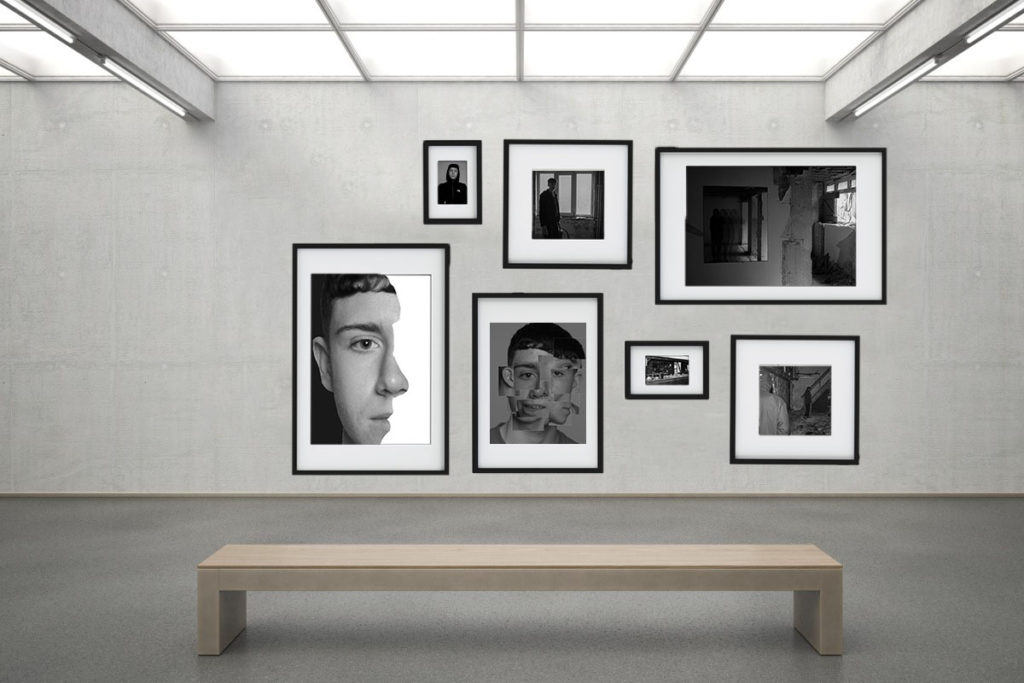
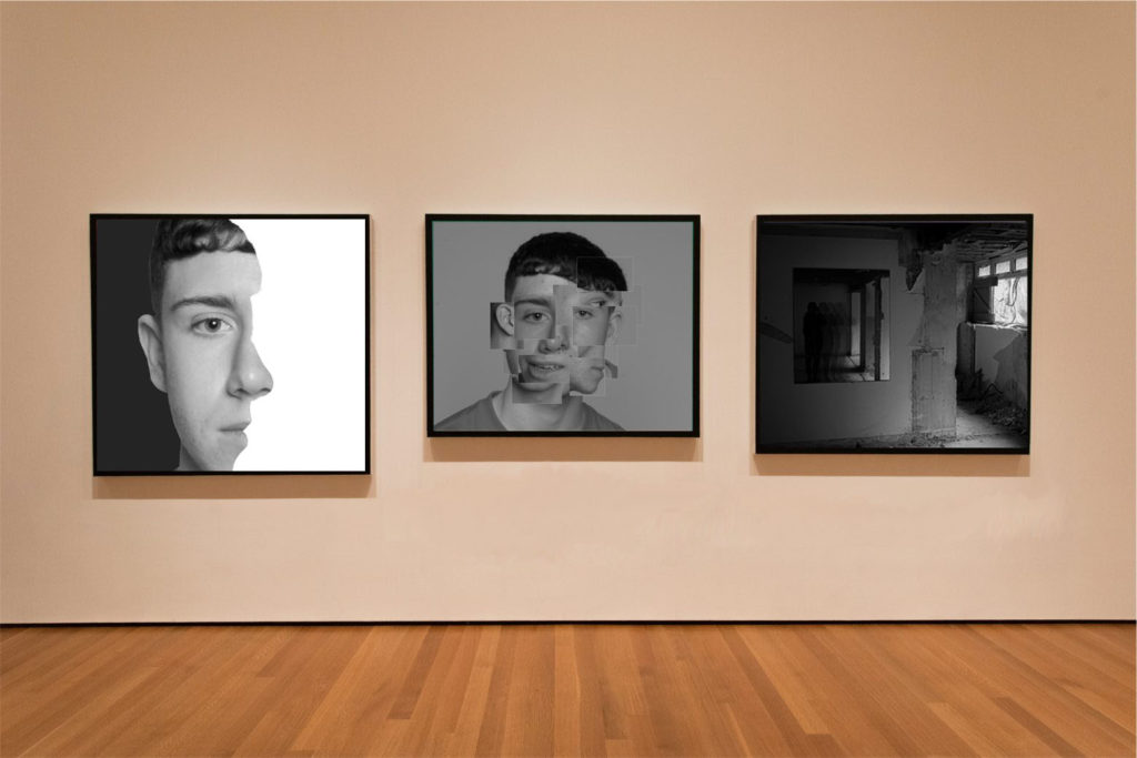
Image Analysis:

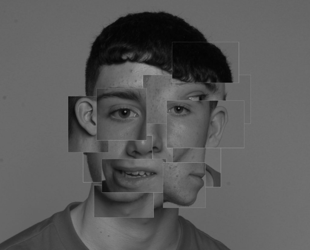
For my first image, I was inspired by Brno Del Zou who has done many pieces of work like this one. For this photo I used Lightroom to first make the main image look good and change features such as the contrast and exposure. After deciding that the main image looked good I exported it over to photoshop and began to edit. This photo signifies that the model has many different identity’s because it is many different headshots in one.

This image is one of my favourites due to the location and surrounding area of the shot. I was slightly inspired Claude Cahun and the way she created her images. This photo could suggest the idea of ‘faded identity’ or ‘hidden identity’ because as you can see the models features aren’t visible and they seem to be fading away into the light of the room. Also, in the window you can see a fading hand that seems to be the hand of a ‘spirit’. I was inspired to do this by a 1900s photographer S. W. Fallis who has a spirit like theme in his images.

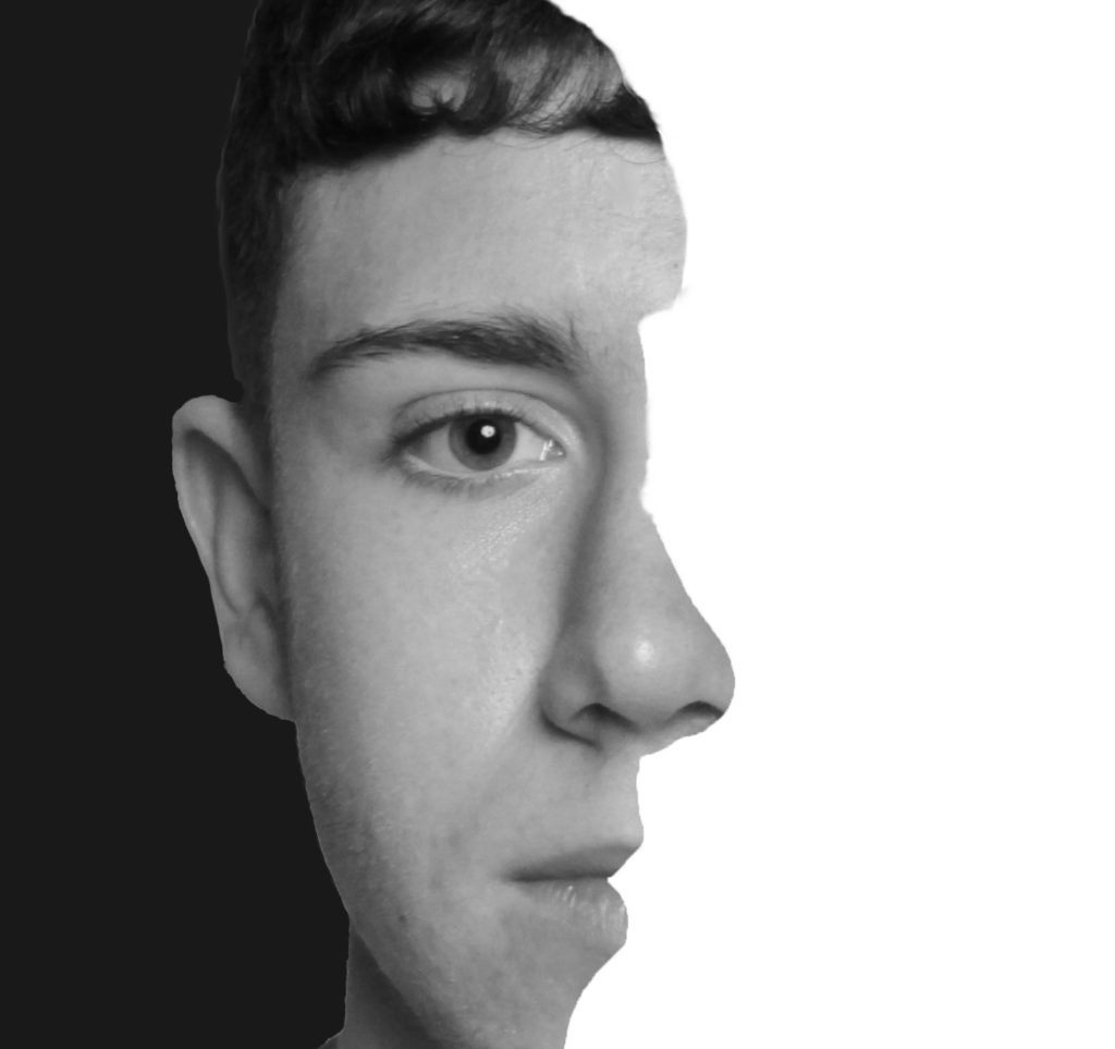
In this image I was inspired by a photographer named ‘Boogie’ who does close up headshots in black and white. I chose this as one of my ideas because I really like the way this photo can be seen in two different perspectives such as the side profile and front of the face. This photo suggests the idea of ‘chosen identity’ because you can choose how you want to view this photo.

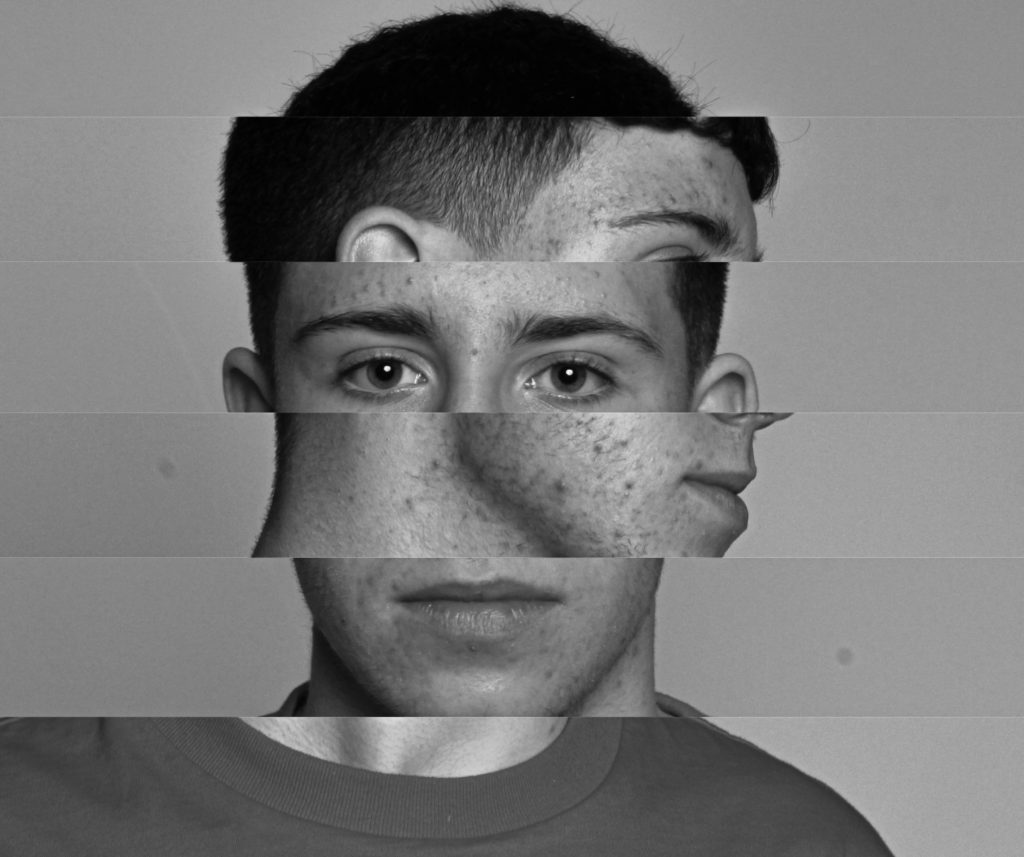
This image was only slightly inspired by Brno Del Zou due to the cut-outs and using multiple images in one. For this I chose two very simple images that I knew would work with this edit and curt-out long rectangles on the main headshot image and placed the side profile layer behind the main layer. This photo could suggest the idea of ‘social identity’ because the model isn’t hiding any of his facial features and doesn’t care how he looks.
Unsuccessful Image:
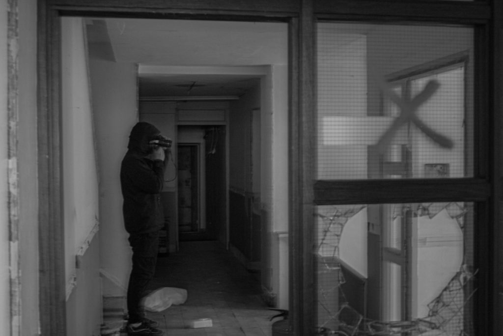
I did not include this image into my final pieces. The idea of this image is ‘hidden identity’ because my model appears as a black shadow and shows no skin or facial features. Also it can be said that the model wants to be hidden from society due to being in an abandoned building. However, I didn’t use this image as my final piece because I don’t believe there is enough use of editing and it seems to be quite blurry.
