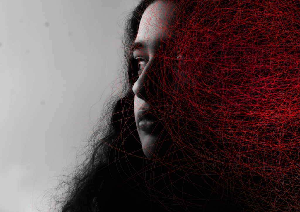
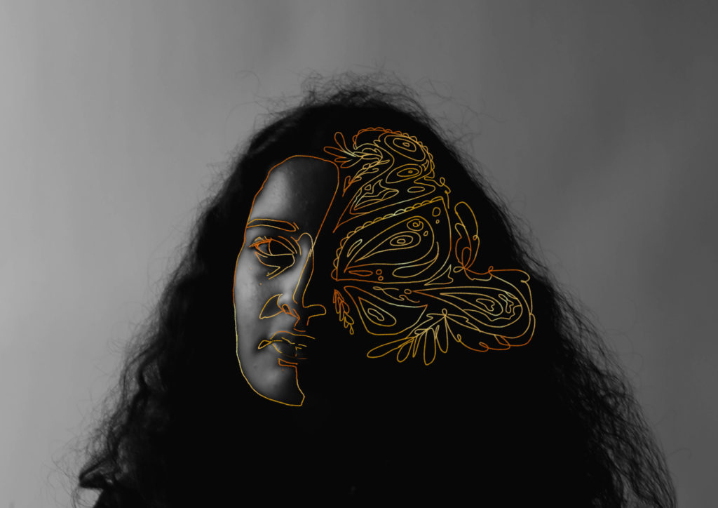
I liked the work of Dryden Goodwin and wanted to edit a portrait inspired by his style. I did it digitally by drawing on the lines in photoshop and then using an eraser tool to soften the edges. If I were to do this again I would probably do it on a physical print using a paint pen, so I can get more organic looking lines. Despite this, I still really like this image and enjoy the contrast between the monochrome and then the brighter red. I also coloured the edges to be lighter and made the inside of the red darker to make it more visually interesting.
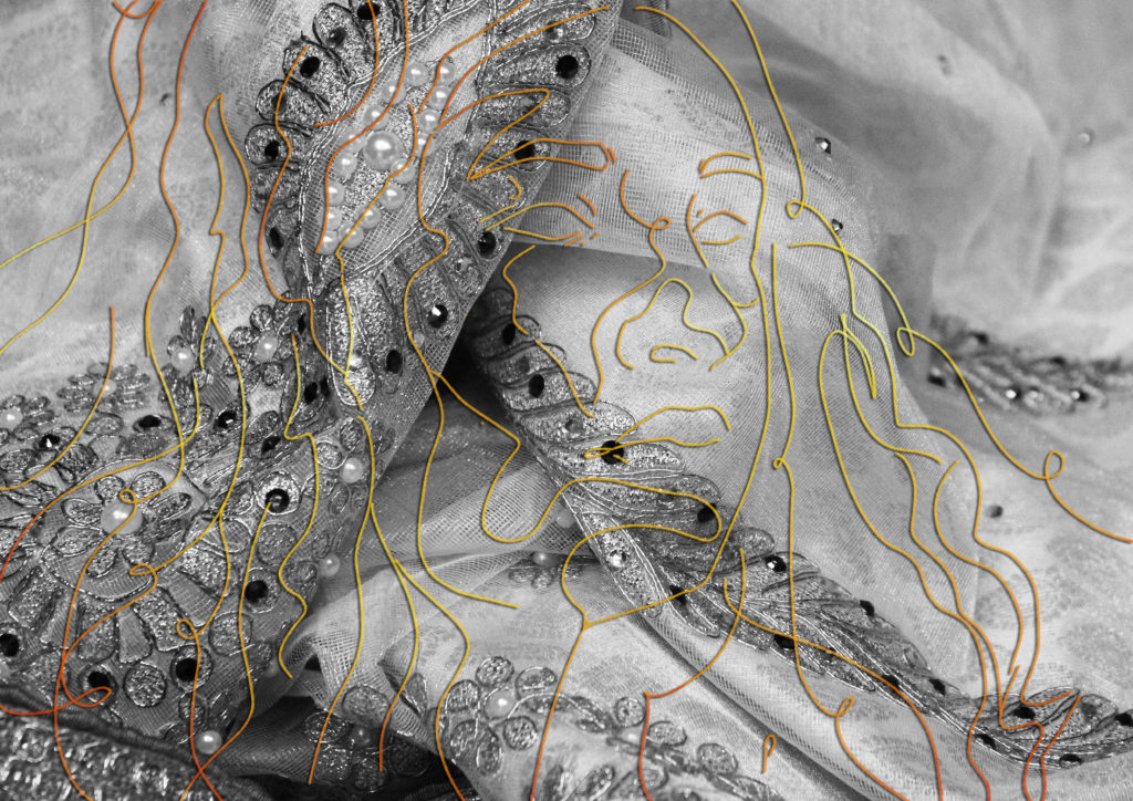
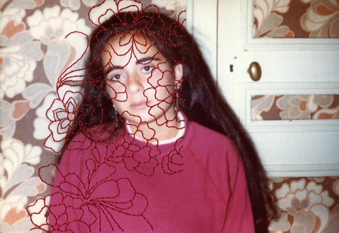
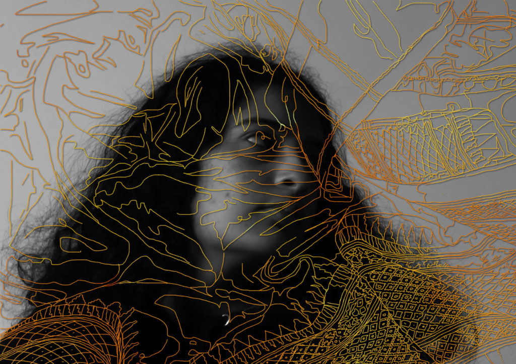
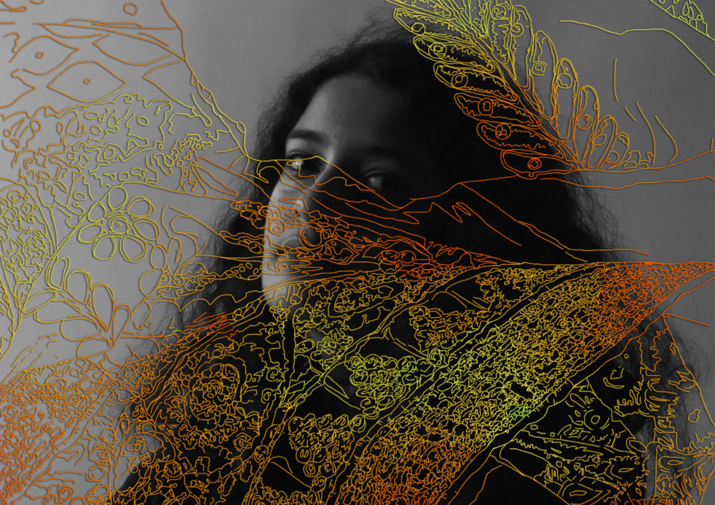
Here I drew over my portrait in photoshop (instead of embroidering them like I originally planned) in an attempt to recreate the style of Carolle Benitah. I traced over an image of one of my family’s saris and then placed it on top of a portrait of myself. I then coloured it gold and added a drop shadow to create some contrast in the areas where it just sits on the grey. The gold also creates some unity between this photo and others where used similar techniques. I enjoy how it looks and am glad I traced over the fabric shape as well as the actual patterns as well.

The Image I traced over 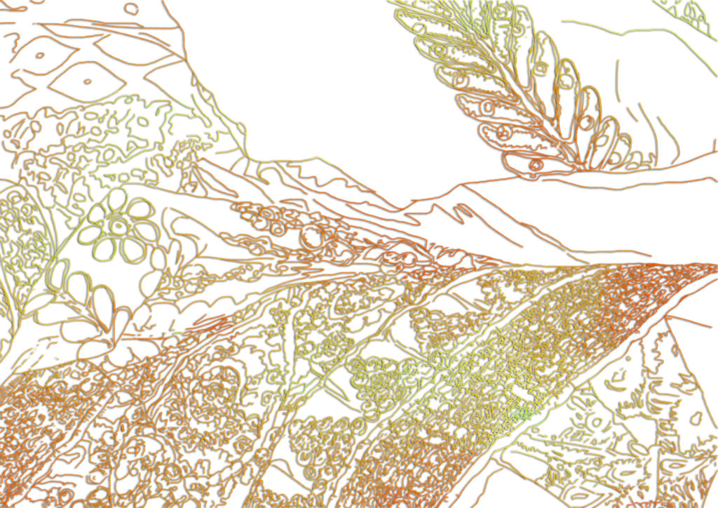
My Linework
Overall I feel like I was successful with replicating the styles of the photographers I was inspired by and learned a lot during this project. If I were to do it again I would want to be slightly more prepared by printing out my images in advance so I could have a chance to edit them physically as well as digitally.
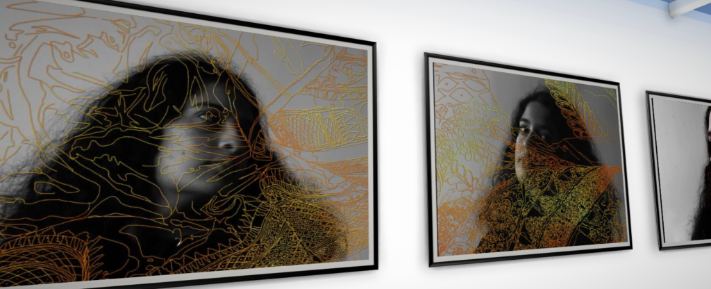
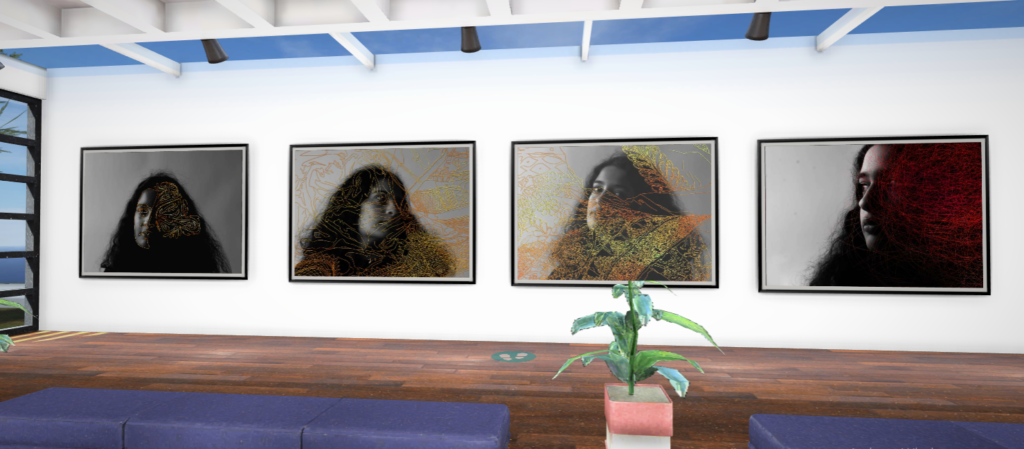
Gallery Mockup-

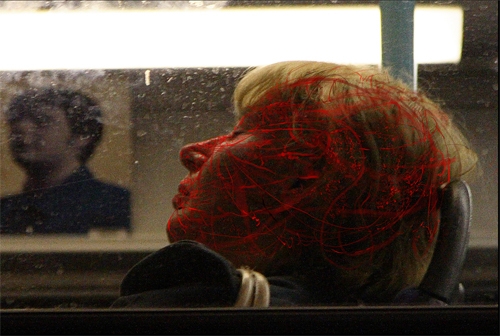


You have until February Half Term to complete and improve any missing / weak blog posts. In this time you can also add to your photo-shoots, ideas and edits…maybe even coming up with more final images.
Use your tracking sheet to pinpoint areas for improvement.
We will be framing and displaying your final prints too before Half Term and re-marking your coursework for you.
Keep working hard!