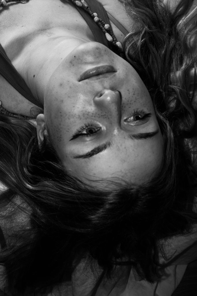
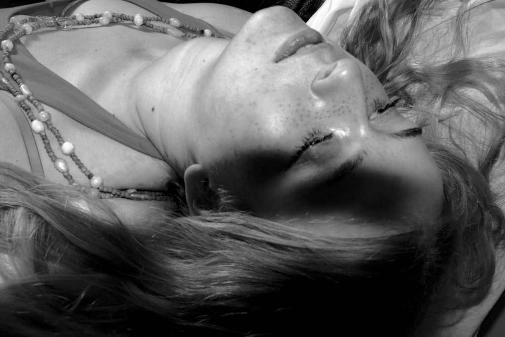
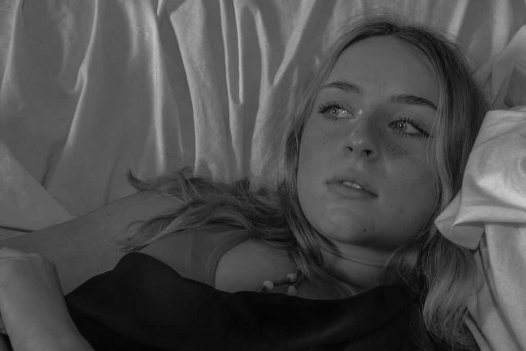
initial edits in Lightroom
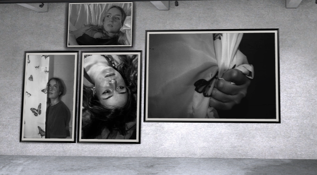
for my final images I wanted them to also be black and white in order to keep them similar to my artists work by playing with softer daylight and shadows on multiple colour backgrounds it will help the tones of the images to vary just like Francesca woodman’s work. And to help stick with the theme of loss of identity

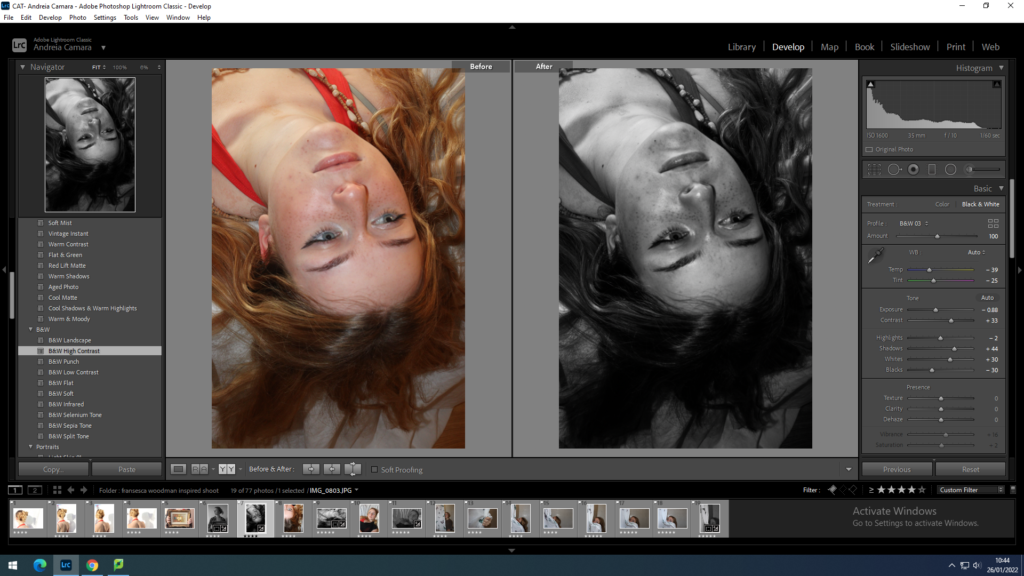

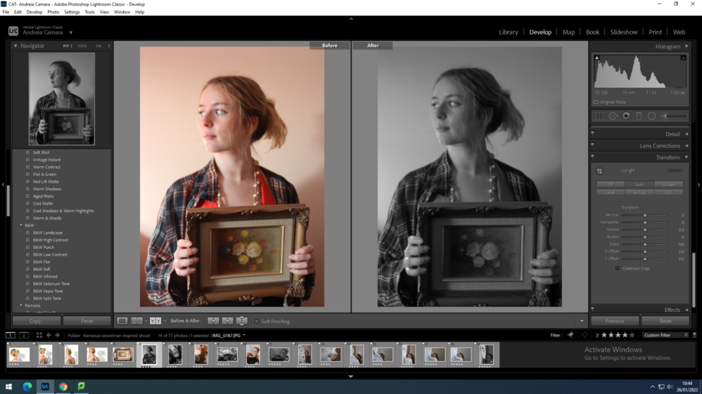
by having only 2 images with darker shadows it allows me to portray a better story as they slowly become darker as the loss of identity occurs similar to Woodman’s later work where tones and shadows were much deeper than in her early projects.
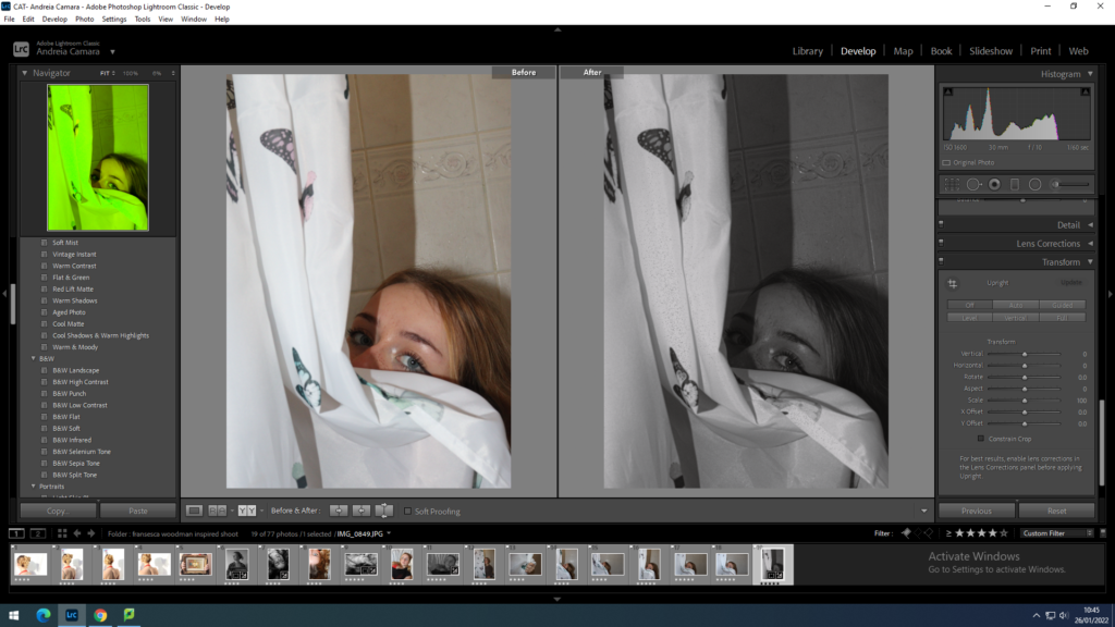
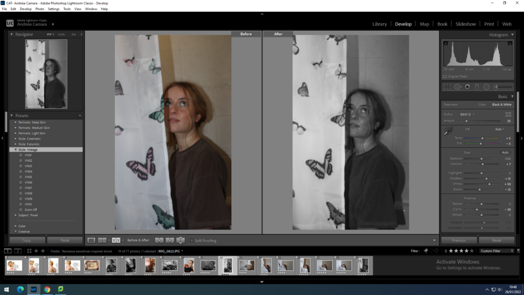
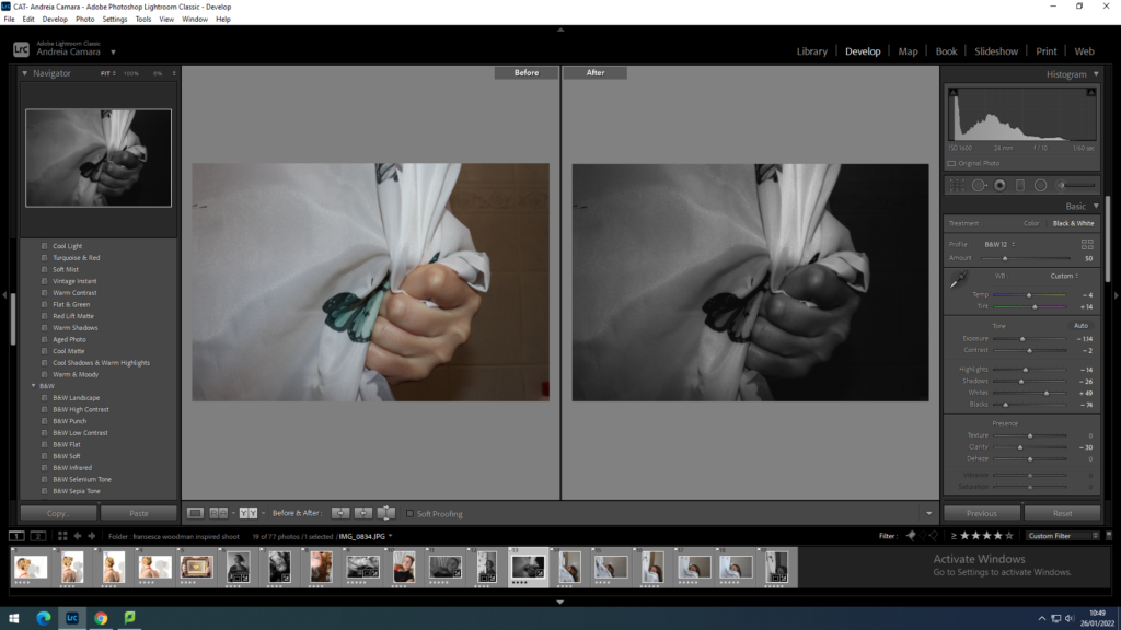
I wanted these images to have a timeless feel as the tones are varied and they leave the images up for anyone to interoperate in their own way.
final images after Lightroom
Reworking ideas
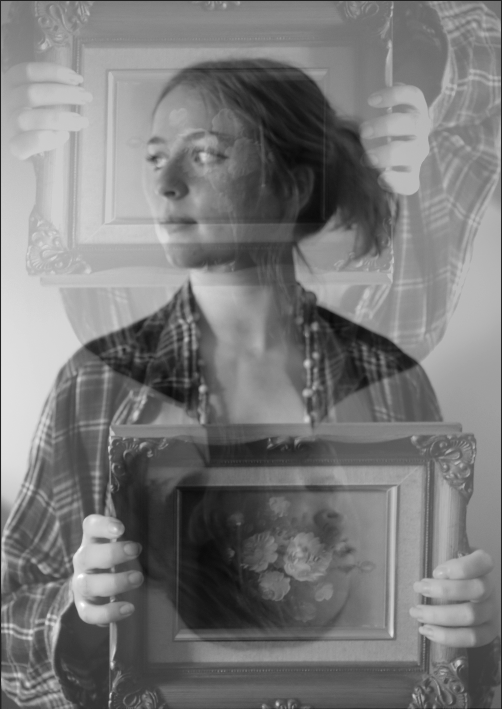
for my reworking I went on photoshop and played around with multiple layers to create some more

Comparison
Both mine and Woodman’s work have an almost awkward layout with the objects in the image I think I managed to give my image a feel of her work through the lighting and camera settings I also used a double exposure to emote her other work which is often taken with a slow shutter speed.
However my image is slightly softer than Woodman’s hers shows a deeper insight into her identity as a person as it is a self portrait.


