Photo-montage editing
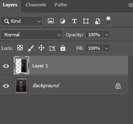
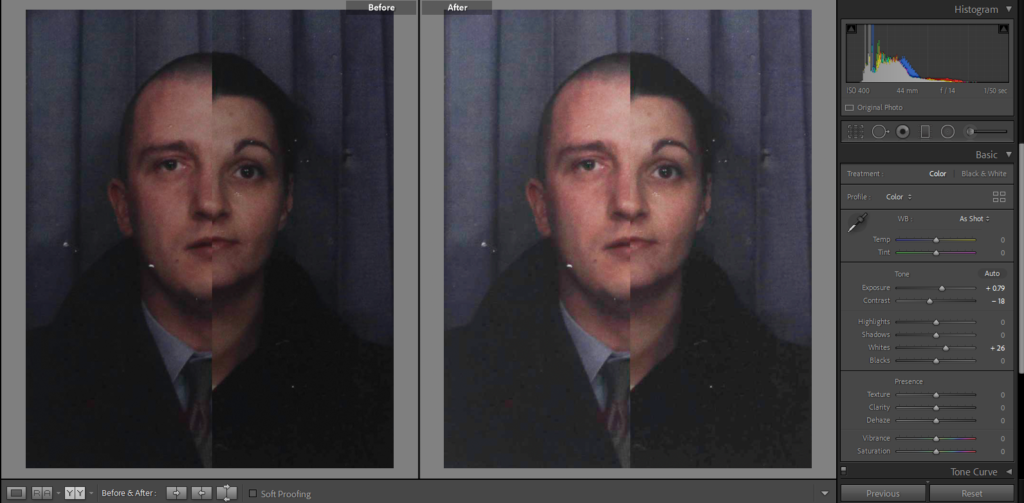
I have got some old headshots of my mum and my dad which I have halved and put together to create a montage of their faces. I used photoshop to do this as I am able to layer the two images on top of each other to get this effect of the spilt faces. I also used the cropping tool to take off the white boarder which was around the two photos, I did this because they were hard to line up as the faces are different sizes, in the end the final photo looked better without them. After editing them on photoshop imported the new montage into Lightroom where I increase the exposure and adjusted some others like contrast and whites so that it didn’t look to dark but also so its not to bright as well.
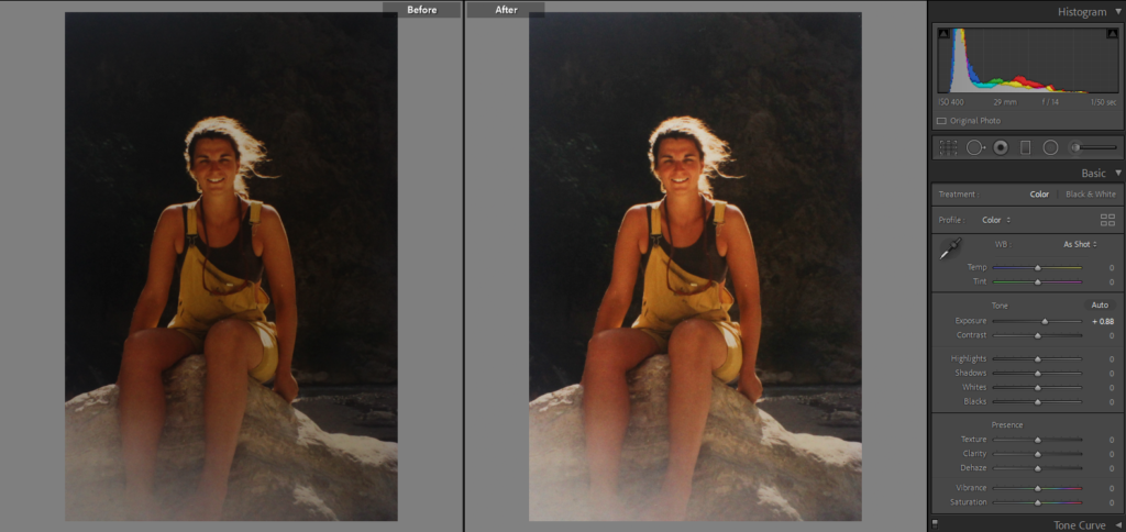
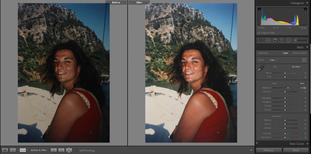
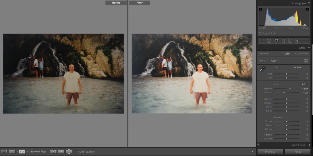
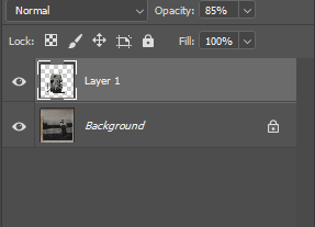
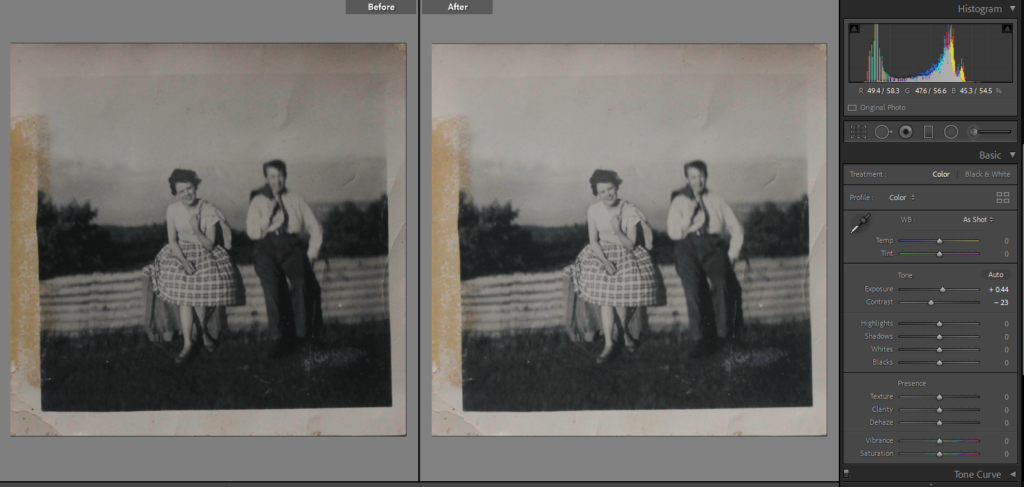
I found some old pictures of my Granny and Grandad from when they would go on day trips, as they could only take photos of each and none together, I have taken the picture of my Granny and put her into the picture with my grandad. As they had taken the photos in the same place it was easy to match the surrounds in each picture, I have cropped the individual picture of my Granny so that you can only see her and moved it top my Grandad’s picture. Once I got it so the railing they were both sitting on lined up I used the history brush tool to take away the background that was still surrounding my granny and to show the scenery behind my Grandad. As the photo below my Granny’s is more blurry I decreased the opacity slightly so that they look more similar and not out of place. I then moved the final montage to Lightroom to fix the lighting and just make the image brighter.
Carolle Benitah Inspired
One of the photographers that I have chosen, often used different materials such as paint, embroidery or beading to create her pieces. On photoshop I have tried to recreate that but I have experimented with different colours and brush types. In Benitah’s photos she used gold paint but I have chosen red as it links with the other photographer I have chosen and will link with the other ideas that I have. I decided to paint over the people in the background as I thought it was to plain to leave with it just over my dads face.
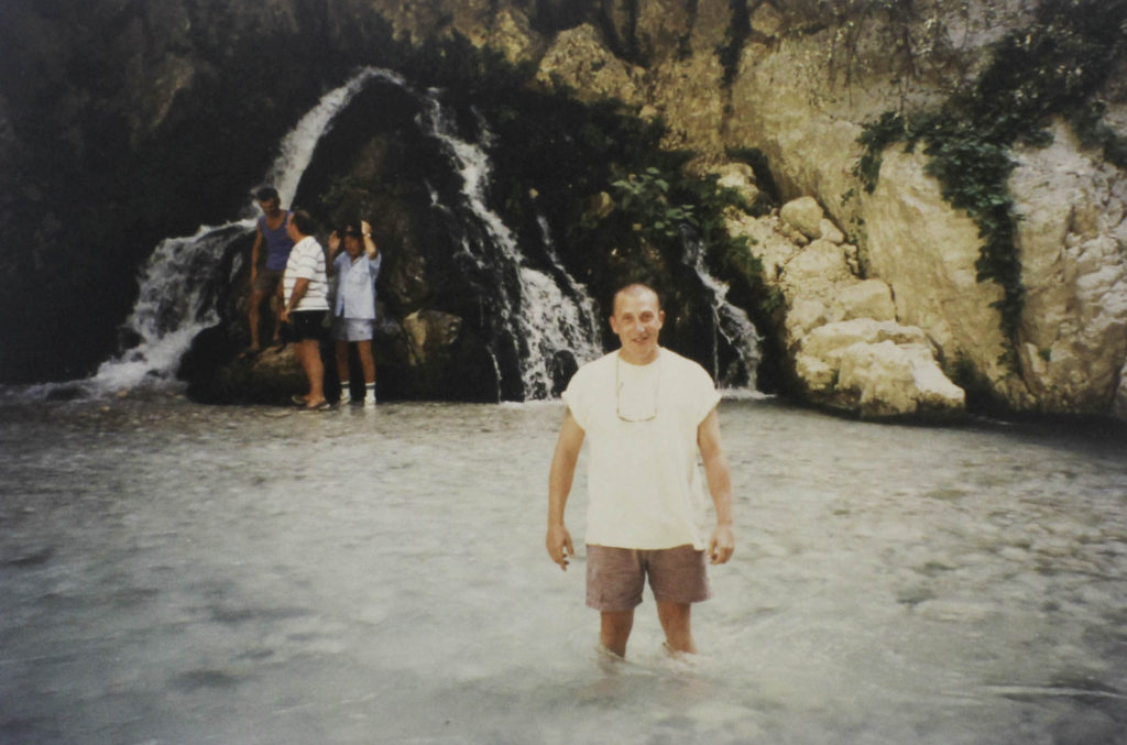
Original Image 
Final Image
I like that is Benitahs style you are taking old photos and creating and giving them a new meaning, You are also able to direct the attention of the viewer to whoever/whatever you want in the photo.
I have taken some ideas from Benitah and adapted them into what suits my photos, I didn’t just want to leave this photo with just a red streak over the eyes so I outlined her body so that it stands out from the background. I used the same tools on photoshop as the ones above as well as a mixer brush over the eye so that it replicates a brush stroke, light at the beginning and slowly gets more pigmented.

Original Image 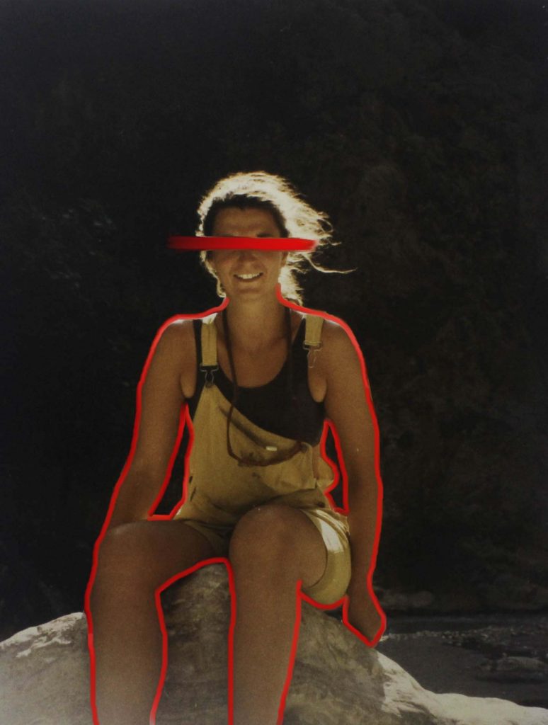
Final Image
Yoshikatsu Fuji Inspired
I am planning on adapting one of Fujis ideas the ‘Red String’ book which they have got many awards and recognition for. Once my final outcomes are printed out I would like to put them into a black frame and connect each one of them with red string. I am going to be using the red string as a link between all of my final images. I like how Fuji crops his photos, on the front cover of his book he has his parent wedding photos with their heads cropped off, even without the key feature of someone’s identity the photo still tells a big part of their story. There is also a photo where their coloured wedding photo is crop off at his mum and layered on another black and white photo years later of his mother at the beach, this shows how his mother has aged and matured but is still the same person who his father married. I have tried to do something similar with one of the old headshots of my mum and dad, I had already edited half of their faces together but I got two photos from a few years after and edited their eyes onto the headshots.
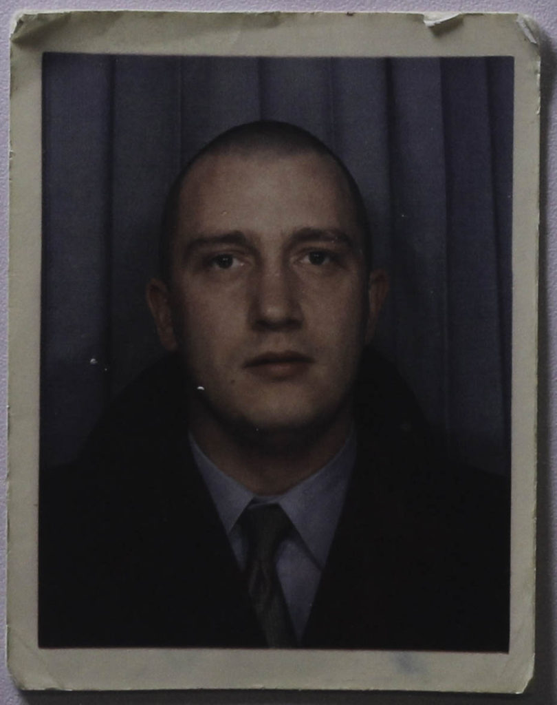
Original Image 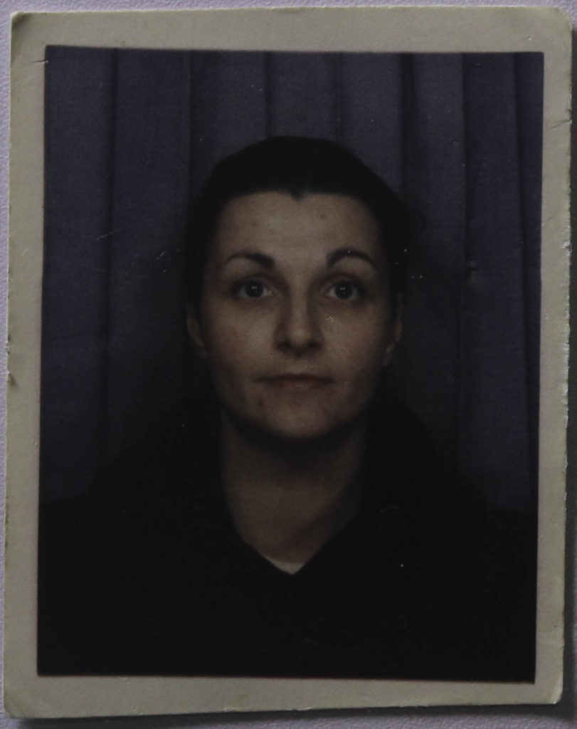
Original Image 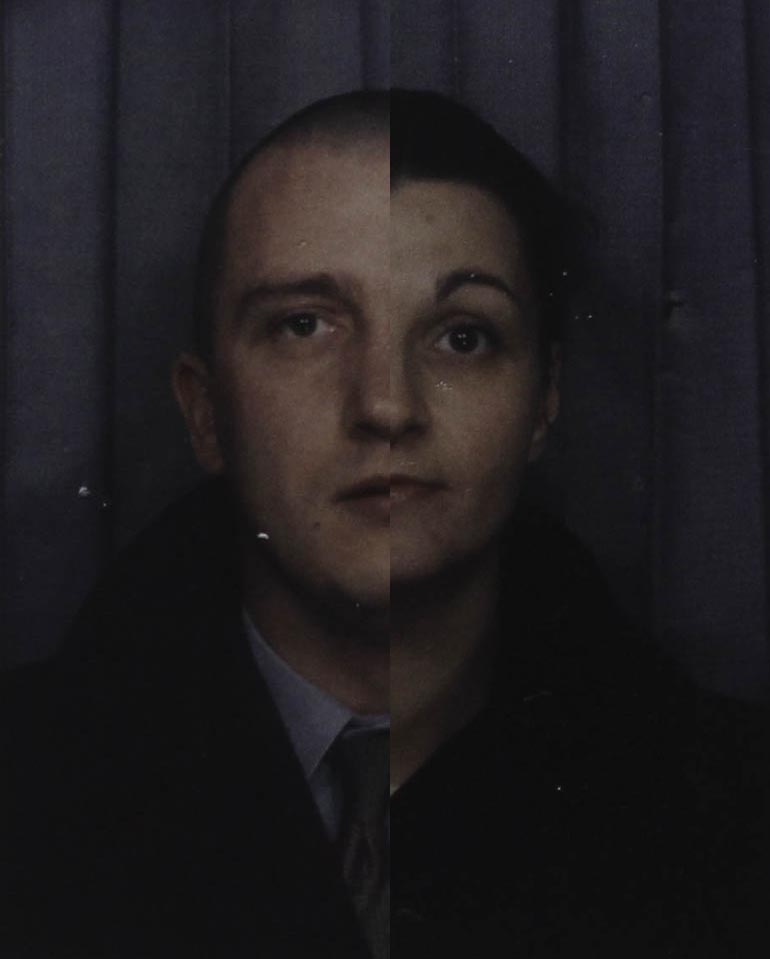
First edit 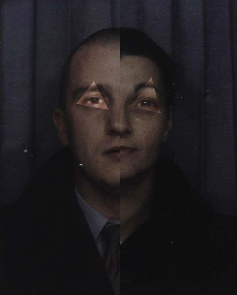
Final Image
Once these have been printed I would like to add embroidery to the bottom half of the photo which is taking from Carolle Benitahs style. I would do it at an angle which would go from the bottom left to the middle of the right side of the photo. I didn’t want to do this in photoshop as I thought I would look better with a different material added onto it.
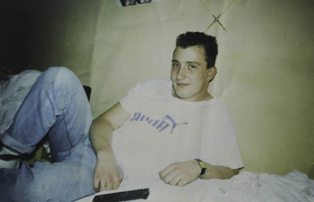
Original Image 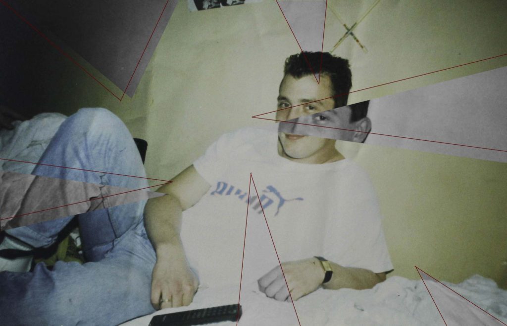
Final Image
For this image I exported it from Lightroom and into photoshop where I used the line tool which I coloured red so that it would link in with the other images and the red string that I will be using once they are framed. I made triangles which came from the sides of the photo and crossed over many parts which highlighted different elements of the photo like my dads face, hands and legs. I then used the lasso tool to select the triangle which I turn black and white so that they would standout more against the coloured background. With some of the triangles I slightly moved them so they wouldn’t be lined up exactly to make the final piece more interesting and eye catching.

