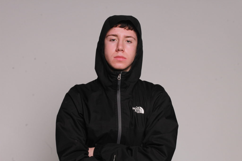
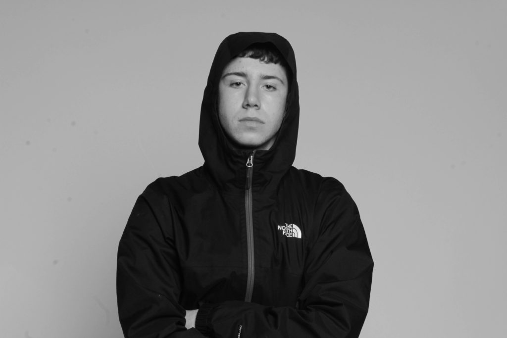
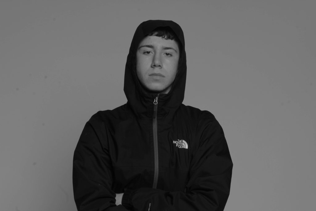
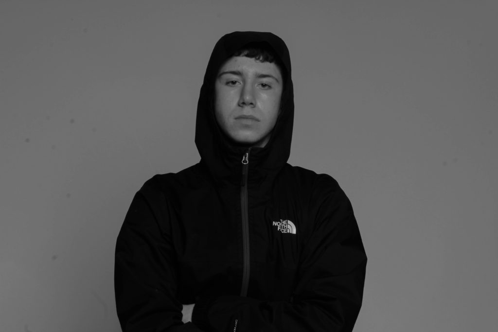
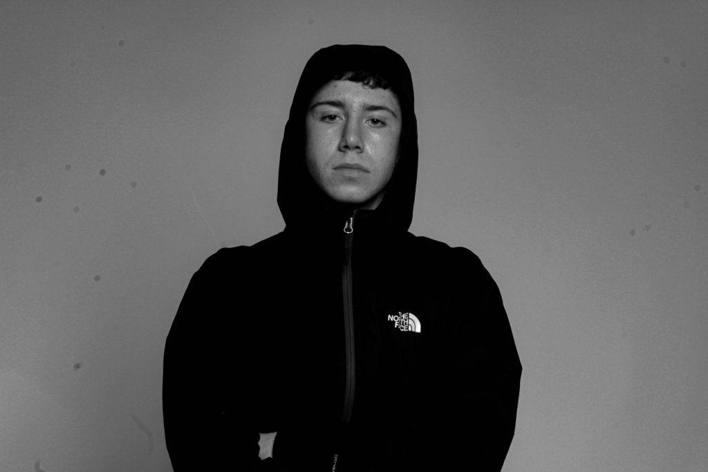
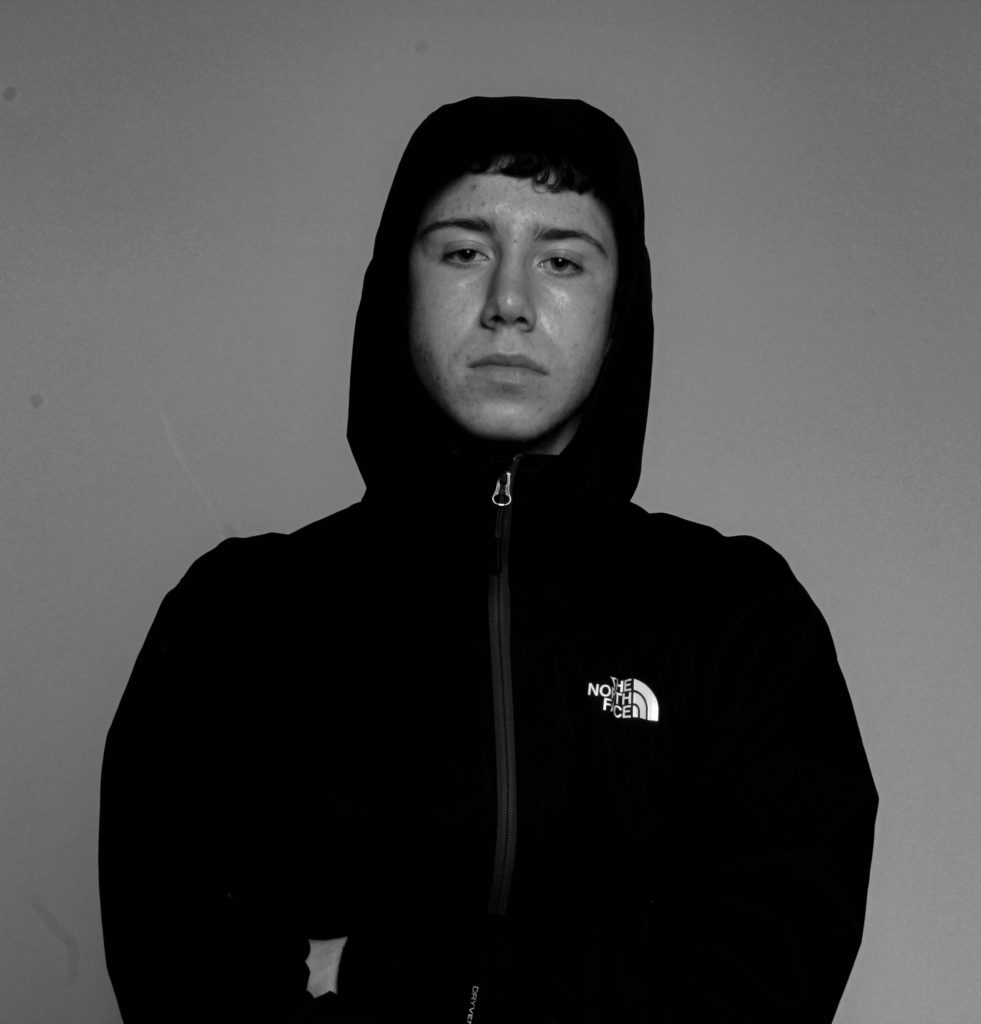
Mock exam final image #2

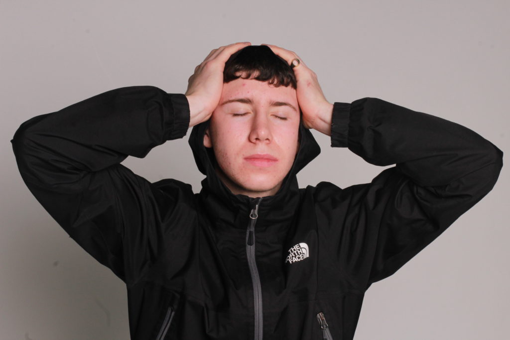
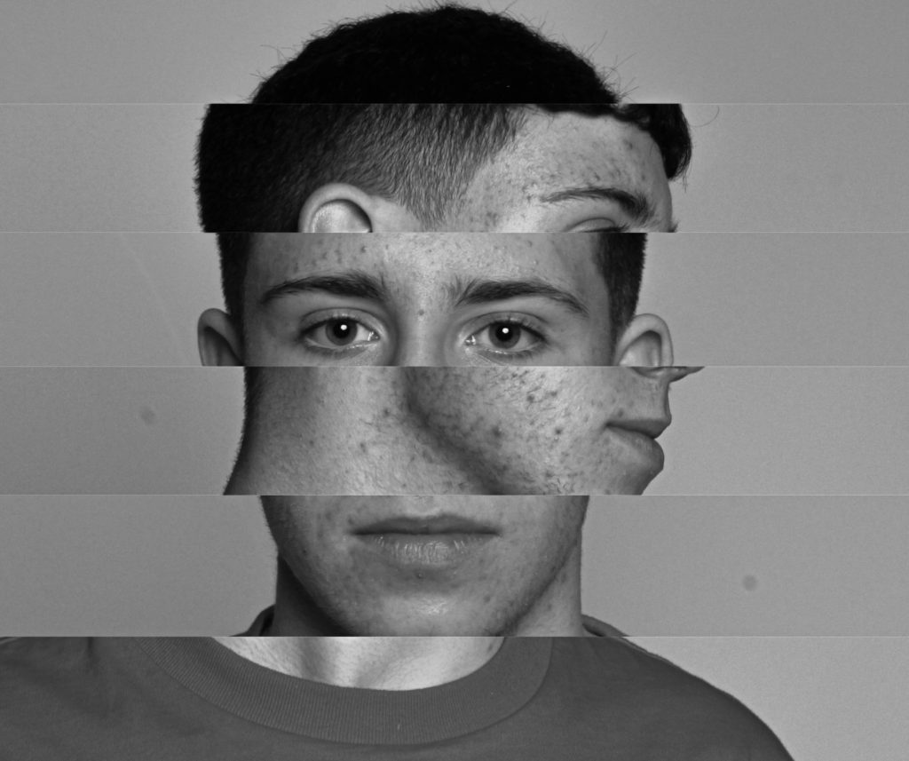
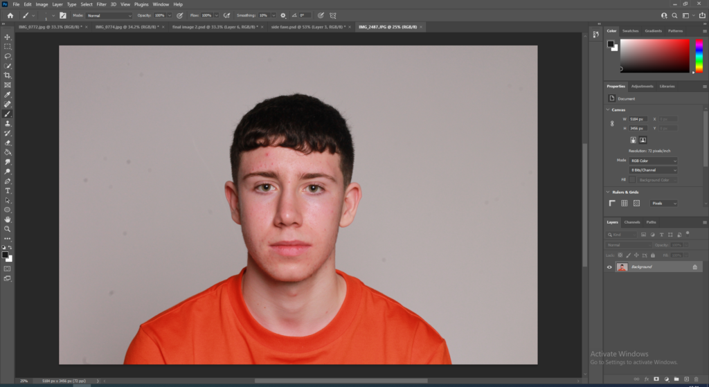
Firstly, I chose my favourite headshot which I think would be the most effective when making the image, and exported it from lightroom into photoshop.

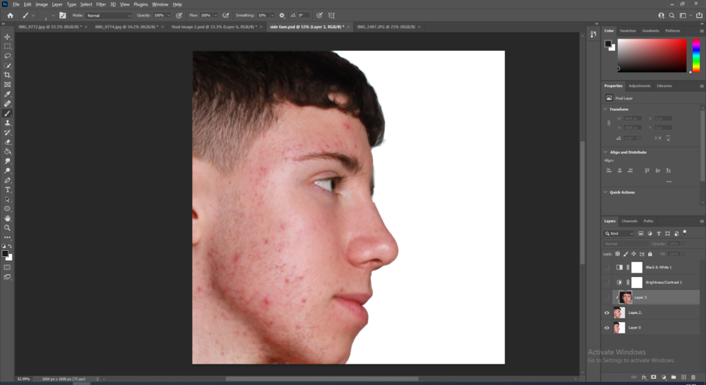
Next I chose another image from lightroom and made sure it was a photo of the models side profile so I can create this image effectively.

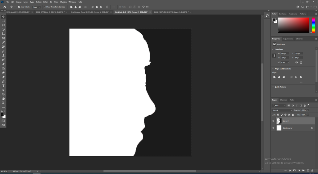
Then I used the quick selection tool to select around the models face and removed the face just so I have the outline of the side profile remaining.

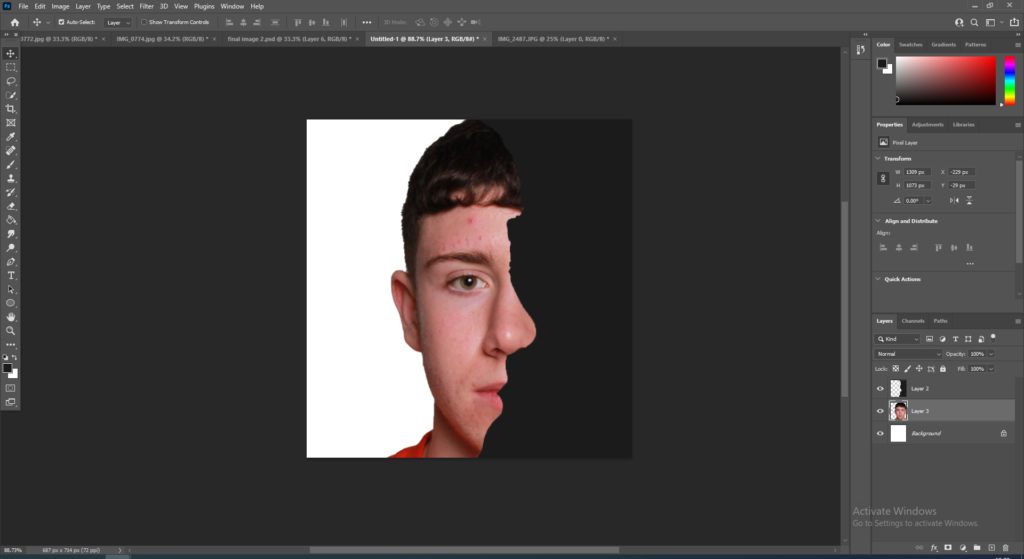
Next, I got my main image and put it behind the Layer 1and positioned the face to line up perfectly with the outline of the side profile.

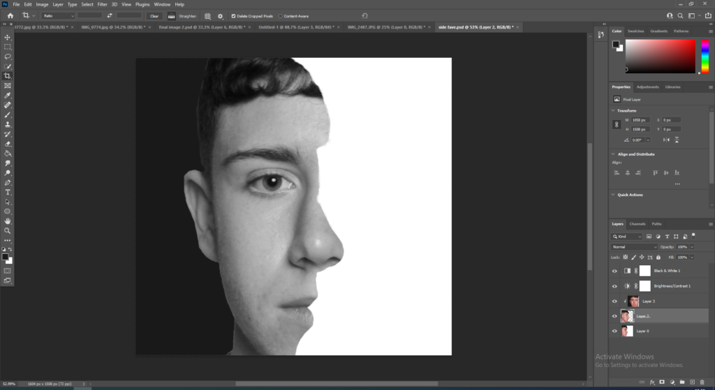
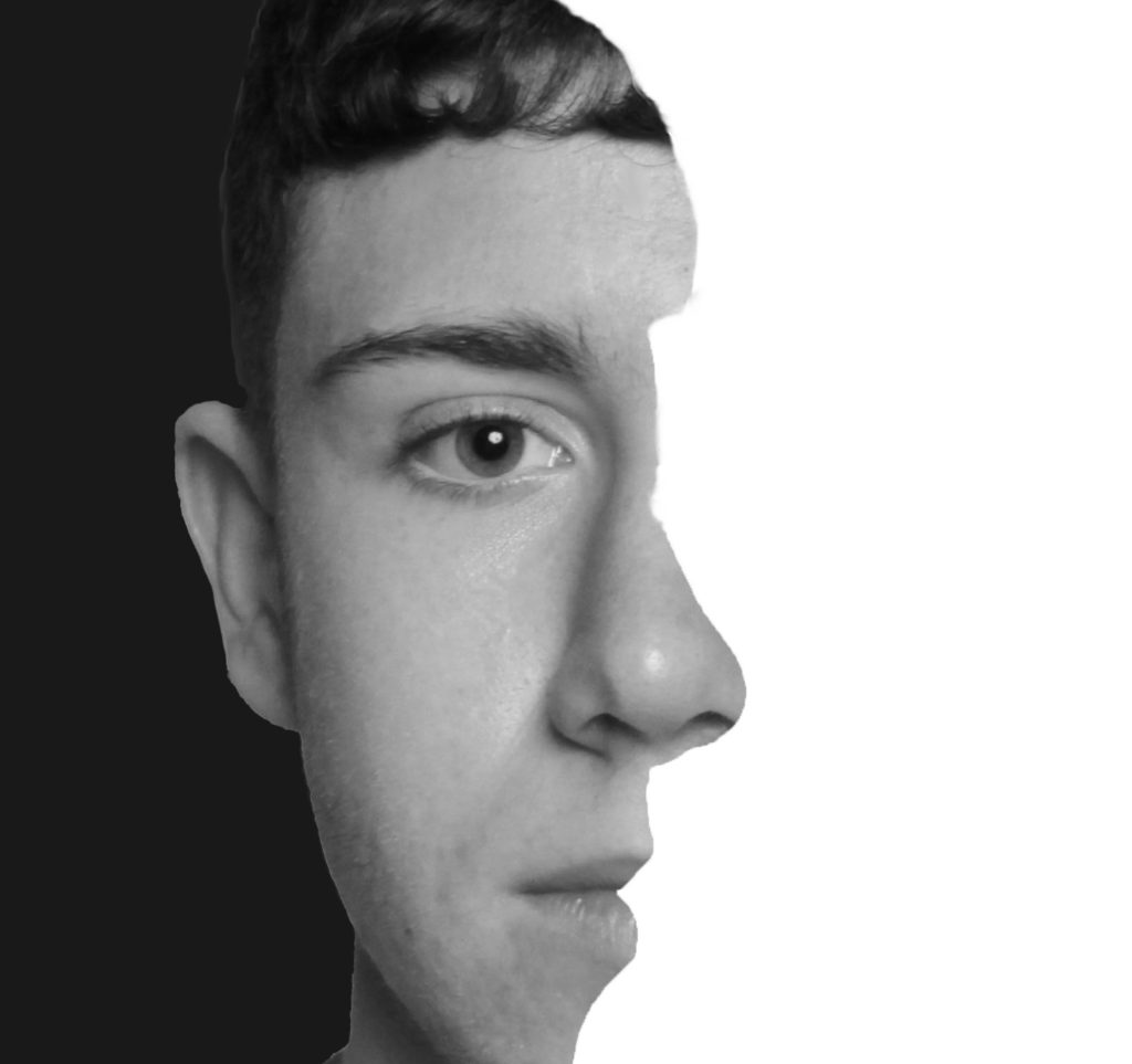
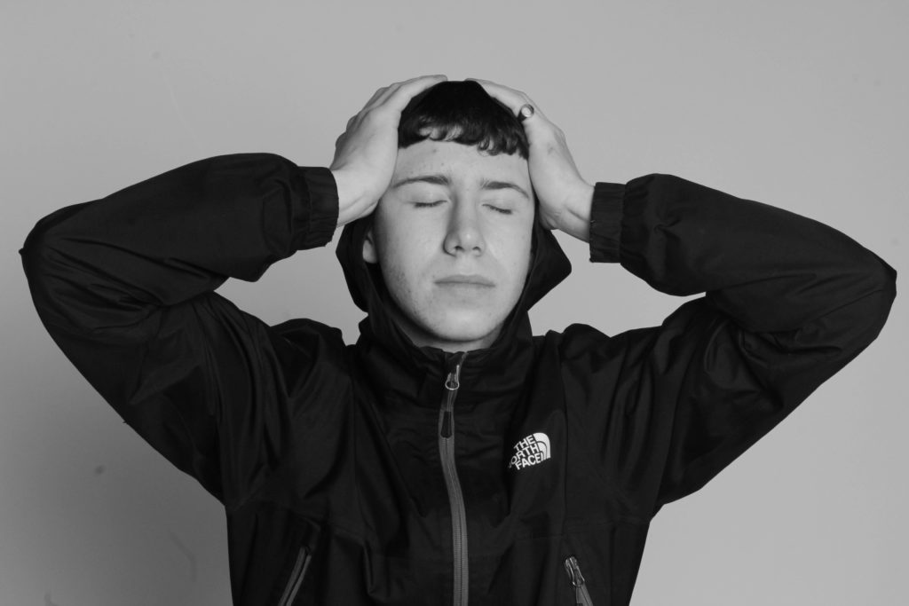
Finally, I changed the colour of the whole image to black and white. Also I used the paint brush and smudge tool to get rid of the rigid outline and made the side profile more smooth and realistic.

Final Image:

The idea from this image came from a Serbian photographer named Boogie. He inspired me to make the image black and white which has improve the image massively compared to colour. Also, Boogie does many portraits which are all in black and white which I believe is better than using colour.

image selection and editing

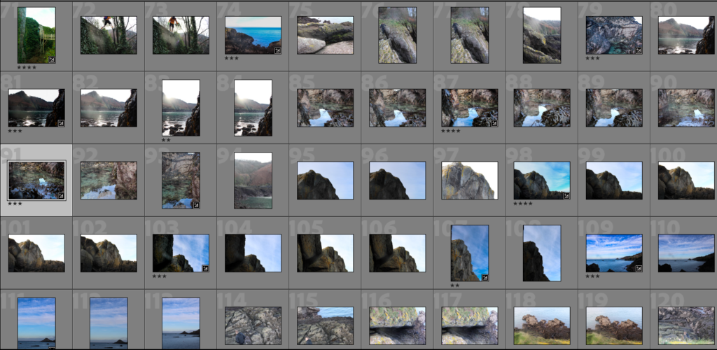
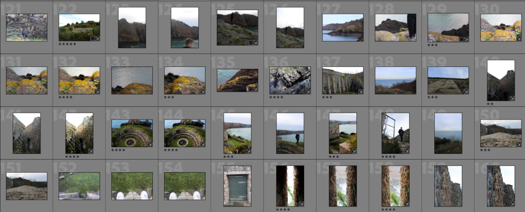
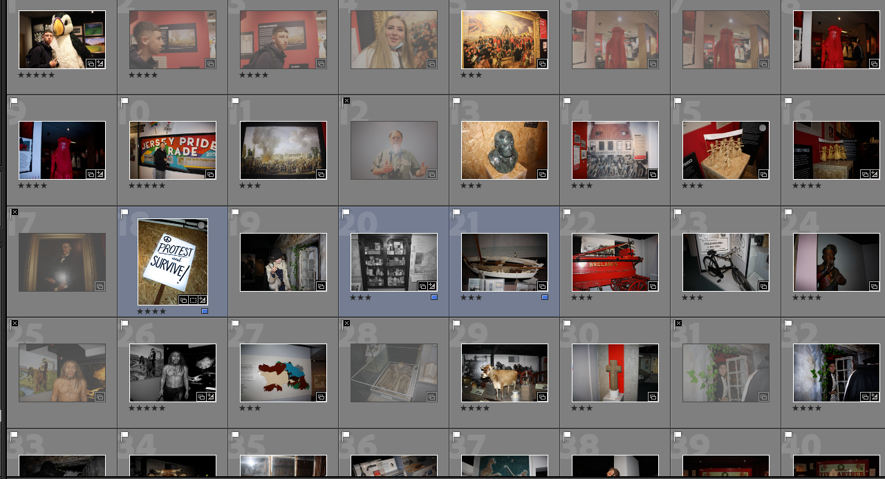
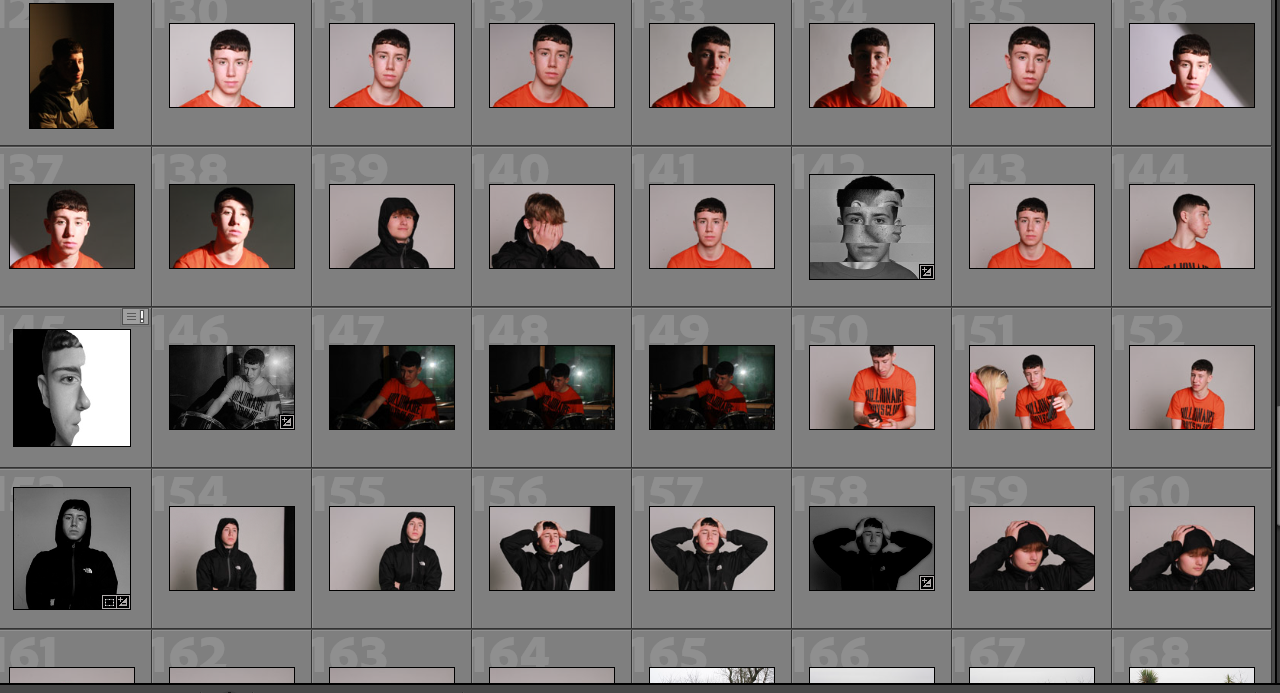
Here is a contact sheet with some of my images I have used the 5 star rating system to show the better images that relate to the identity of the island.

the artist reference I have chosen is Andy Le Gresley who is most famous for his landscape photography based around Jerseys coast lines and land marks. this shoot was inspired by him to show the identity of the island through the different experiences it has been through.

I went L’Etacquerel fort , it was built in 1836 to prevent French from landing near the east side of Bouley. now this fort is a symbol of a stage of the islands life that has past now.

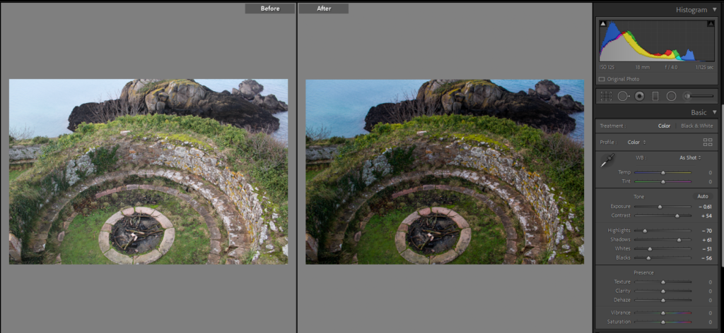
This image has an empty alt attribute; its file name is image-416-1024x472.png

This image shows where one of the traversing gun platforms this. I increased the shadows to create a darker sense to the image to represent a when the had to fight to protect this island.

Tourism and Leisure Photography - Andy Le Gresley Photography

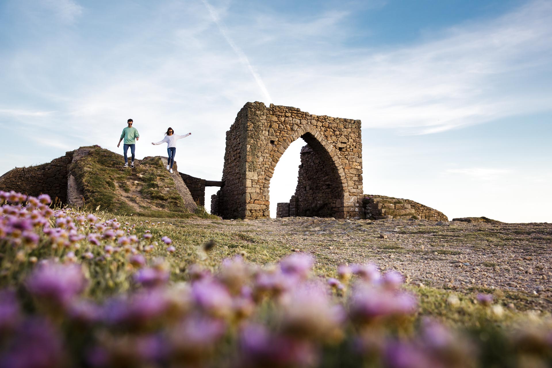
Andy Le Gresley took this image which as a full frame of Grosnez castle, which was built in 1330 and commission for the farmers to take rescue in event of French invasion. so his image shows the heritage of jersey through this image. I like that he has taken this image from a lower point of view with the pink in the foreground.

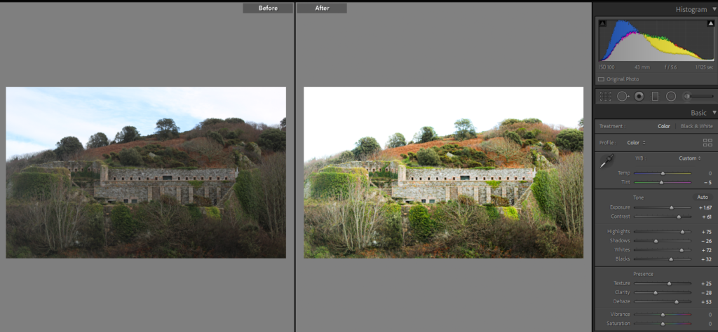
this is a full frame of the full fort. I decreased the tint to bring out the green that has over taken the walls of the fort to represent the islands growth since it was no longer needed.

editing ex🅿eriments #1

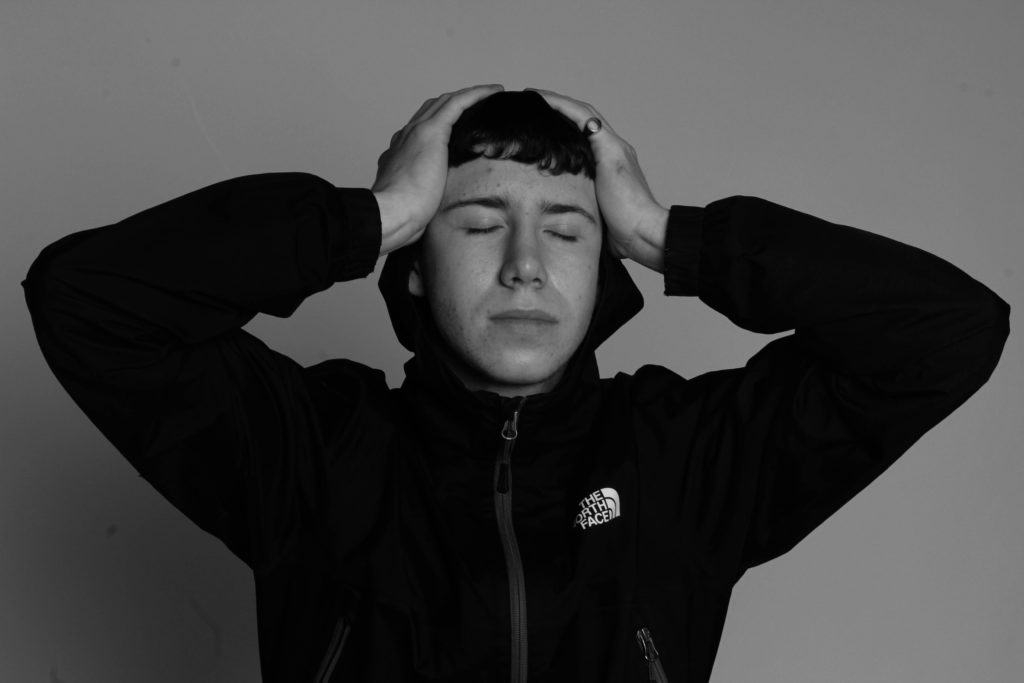
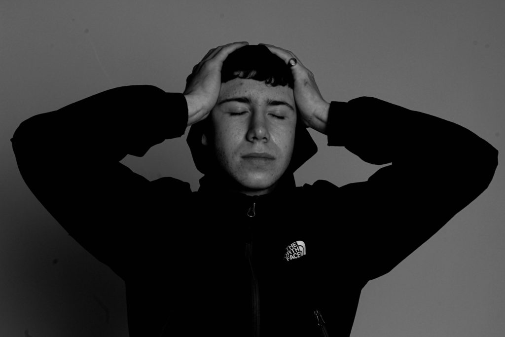
In this post I am going to gather a few of my headshot portraits that I have taken and edit them using a few photographers as inspiration to my edits. This type of editing will be used in my final piece because I like the way black and white portraits work out.

Shirren Lim inspired edits:

Sam Contis inspired edits:

More black and white edits:

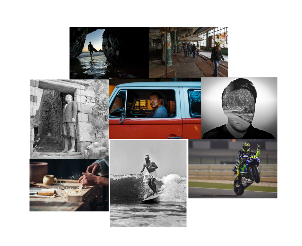
IDENTITY- Inspirations- Analysis

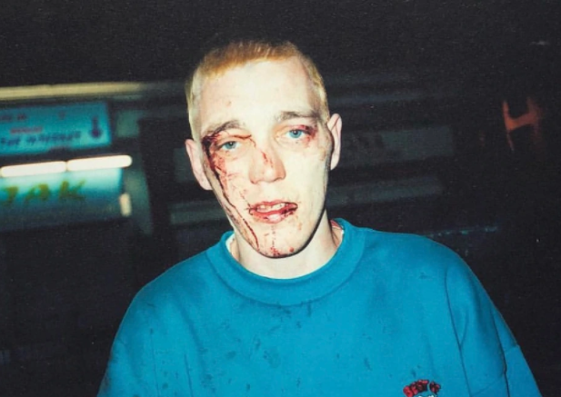
CORINNE DAY

This image is of one of Day’s friends showing the aftermath of a fight, the image itself was taken with flash and is quite overexposed on the subject’s face, with the background much darker showing the image was taken at night.

Corinne Day, before her commercialised clean-cut style of photography, created images in an autobiographical sense- showing adolescence in a brutally honest and open sense.

Her style of ‘dirty realism’ was to become enormously influential within mainstream advertising. But where the imagery of nonchalant, nonconformist youth was for Day an extension of her life, in fashion the ‘look’ returned as pure, empty style

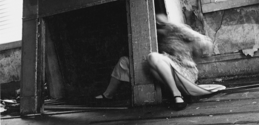
FRANCESCA WOODMAN

This image was taken with a slow shutter speed in order to enhance motion blurs, the image was probably taken on a timer as Woodman herself was often the main subject of her images, the image was also taken in natural lighting.

A common theme in Francesca Woodman’s work is fragmenting her body by hiding behind furniture, using reflective surfaces such as mirrors to conceal herself, or by simply cropping the image, she dissects the human figure emphasising isolated body parts.

In her photographs Woodman reveals the body simultaneously as insistently there, yet somehow absent. This game of presence and absence argues for a kind of work that values disappearance as its very condition.

This style of photography portrays representations of the female body, many photographers who have been inspired by Woodman often look at sexuality, gender roles and stereotypes.

RYAN MCGINLEY

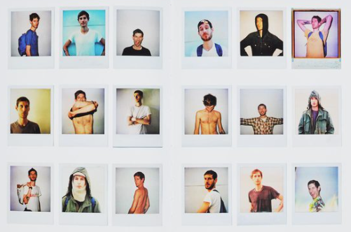
This set of images were all taken in artificial light, some with flash and feature may different subjects. The polaroid way that the images are presented show a personal look towards the images, as it looks like a collection of memories with friends.

Early photographs by McGinley, whose pioneering, documentary-style approach captured the antics and daily activities of himself, his friends, and collaborators in lower Manhattan in the late 1990s.

The unmistakable marks of McGinley’s early work featured chromatic portraits of friends and lovers, with an energetic, spontaneous, and intimate—rather than objectifying—fixation on the human body.
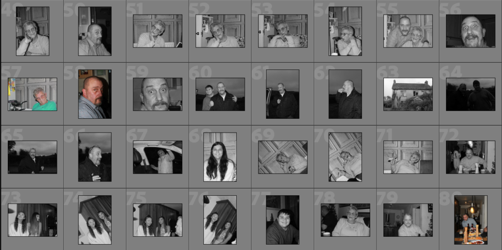
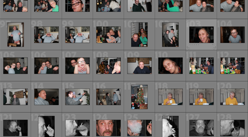
Contact sheets

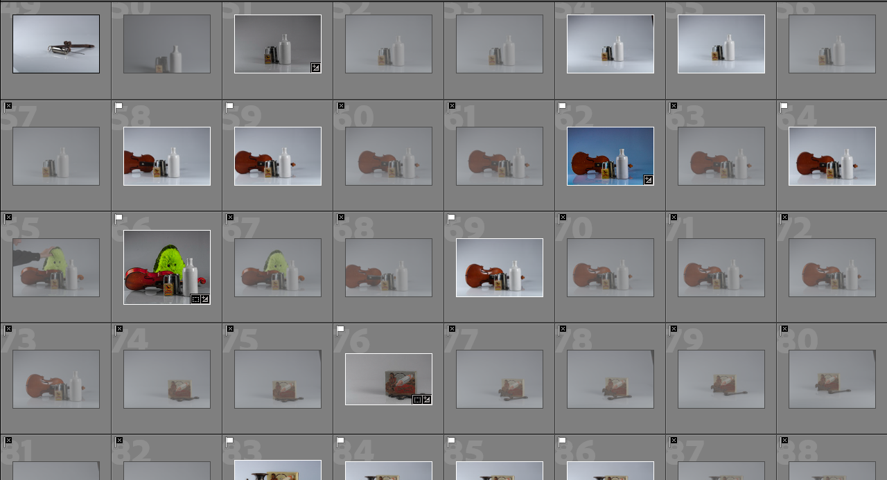
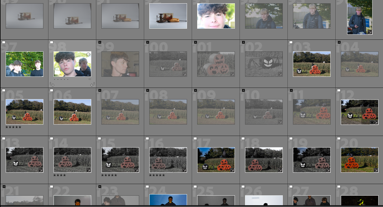
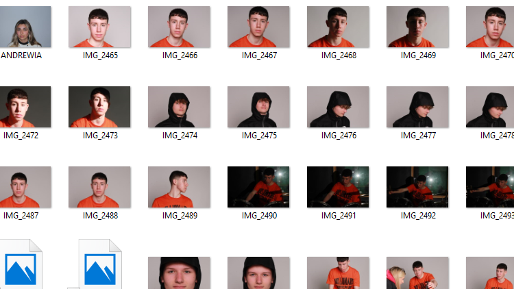
As I have a lot of pictures, contact sheets help to show them in a more condensed form and it helps me to see all the different colours (pictures in black and white or colour) and the kinds of lighting each photo has. It also helps me see the quantity of photos and what they consist of. Most of my photos are portraits or of people, so I would like to get more of different objects.

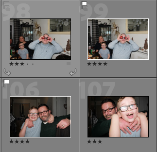
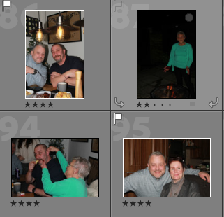
Image selection

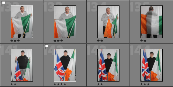
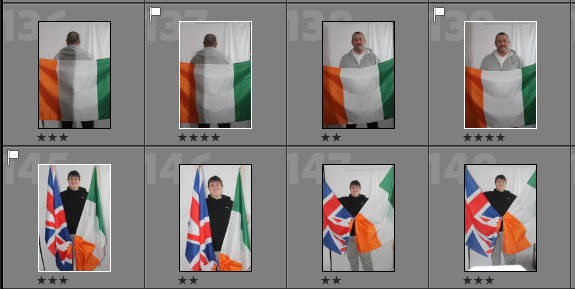
To help separate and select my photos I have used a star rating at the bottom and have flagged the ones that I think that I would want to use the most. The pictures with the highest rating I will look at more closely and highly consider using them as one of my final images. By the using the flag I have been able to narrow down and pick the photos that I have chosen to edit and might use in one of my final pieces.

Photoshoots

My first photoshoot was over Christmas while I was visiting my family in Ireland, I took pictures at the New years eve party that we had where I would be able to all of my family. I got a lot of photos there which I would like to use as in my final images as they just give a little insight into what my family is like. I also got photos with a lot of different people from my family, most of the photos aren’t ‘professional’ or taken how you would in a studio, they are quick snapshots of the night which show different elements of each of their personalities.

My second photoshoot was of my Dad and brother holding up their flags, my Dad was born in Belfast, Ireland and moved to Jersey in his twenties. My brother has both Irish and English heritage which comes from my mums side as she was born in Birmingham, England, but like me he was born in Jersey. I had my Dad hold up an Irish flag and my brother hold up an Irish flag and Union Jack, I am planning to edit and Jersey flag behind my brother so it can show all three.

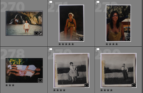
I have also used the copy machine take photos of older ones which I brought into school, these are phots of my Grandparents when they were younger and my parents while they were on different holidays. I also have some old headshots of both my mum and dad which I am planning on editing together. I like using these as they show how different and how much people have changed from when they were younger to how they are now.

Artist References

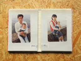
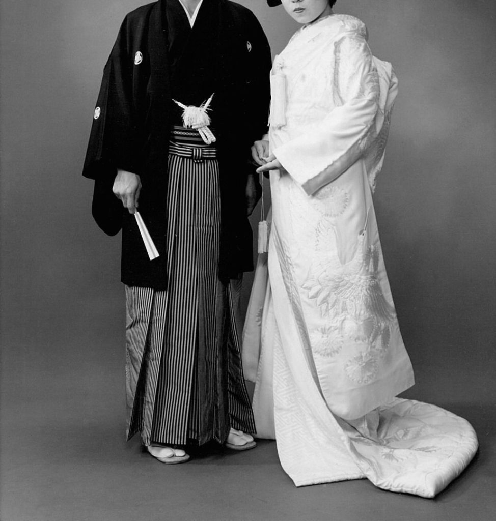
Yoshikatsu Fuji

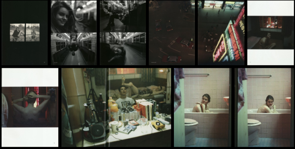
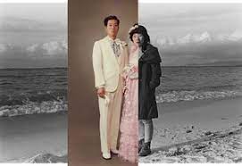
Yoshikatsu Fuji is a photographer born and raised in Hiroshima City and began his photography work in Tokyo. His work consists of historical themes and memory lingering on in contemporary events. His main piece was a photobook, ‘Red String’, which was inspired by his parents divorce. After he moved back to his home city he has a started a long term projects called “Hiroshima Graph.” This photo series attempts to see through the eyes of the third generations of the atomic bomb victims. It sheds light on the disappearing traces of the war so that future generations can see the history and what has happened.

The ‘Red String’ is a glimpse into Fuji and his parents past and their life while Fuji was growing up. Throughout the book it show the slow separation of his parents from the very beginning to the end. In the text at the back of the book Fuji explains why he used the red string as a way of connecting the different photos through the piece. There’s a Japanese legend  that says predestined lovers are tied together by an invisible piece of red string, from the moment they are born.

“My family will probably never meet all together again. But I can feel without a doubt that there is still proof inside each of us that we once lived together.”

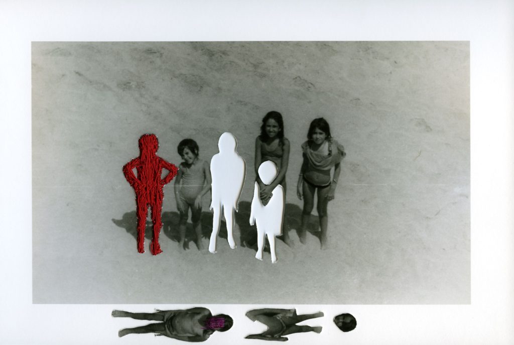
Carolle Benitah

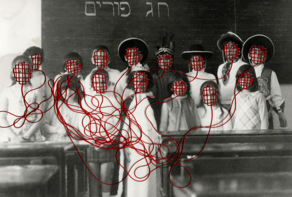
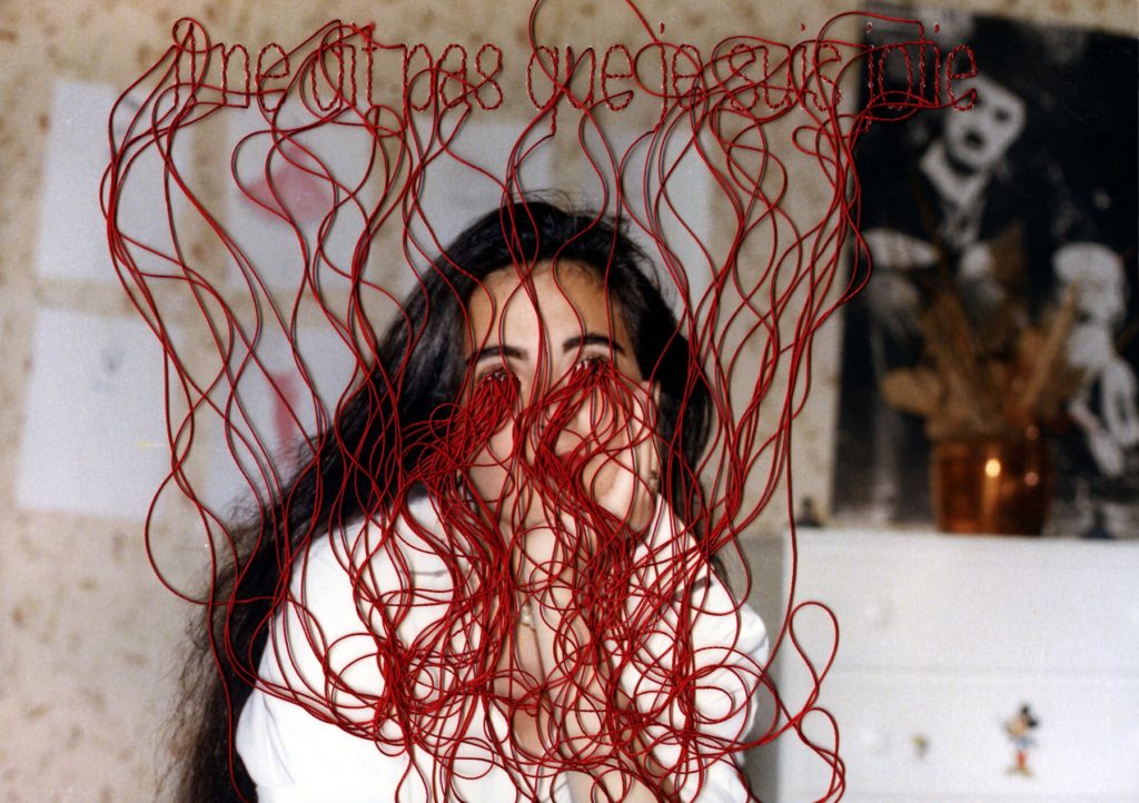
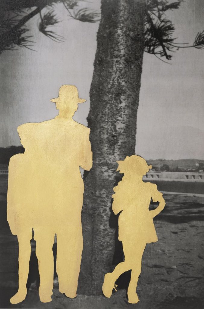
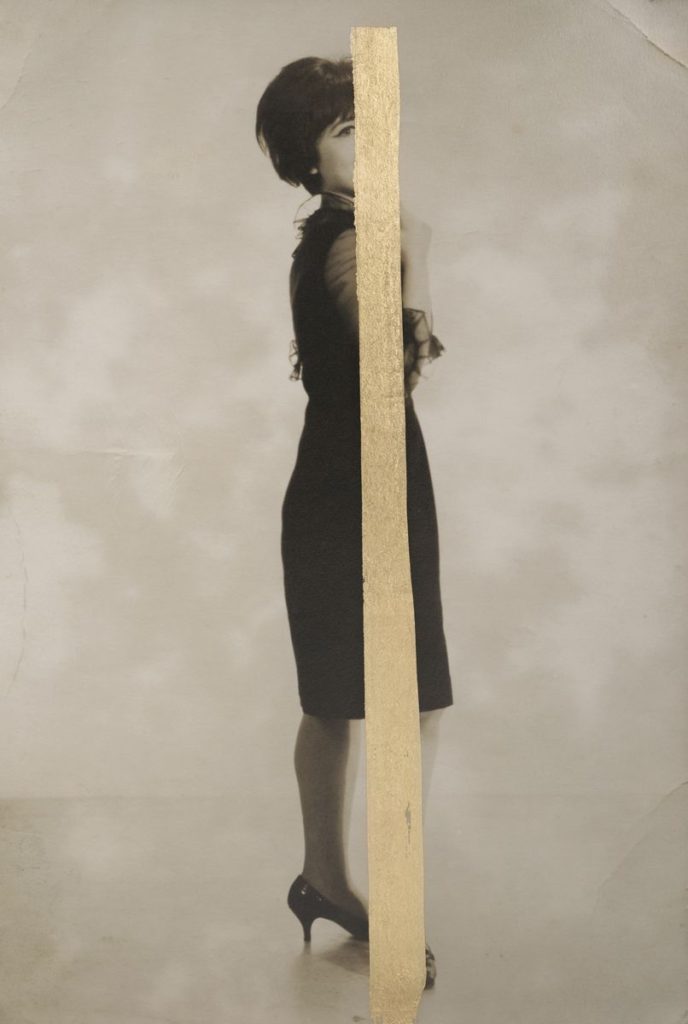
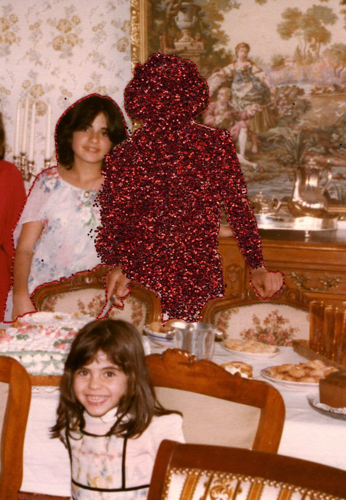
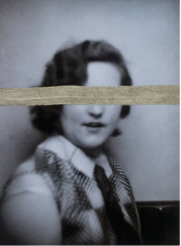
Carolle Bénitah was a French Moroccan photographer, who worked for ten years as a fashion designer before turning to photography in 2001 she explores memory, family and the passage of time. Often pairing old family snapshots with handmade accents, such as embroidery, beading and ink drawings, Bénitah seeks to reinterpret her own history as daughter, wife, and mother.
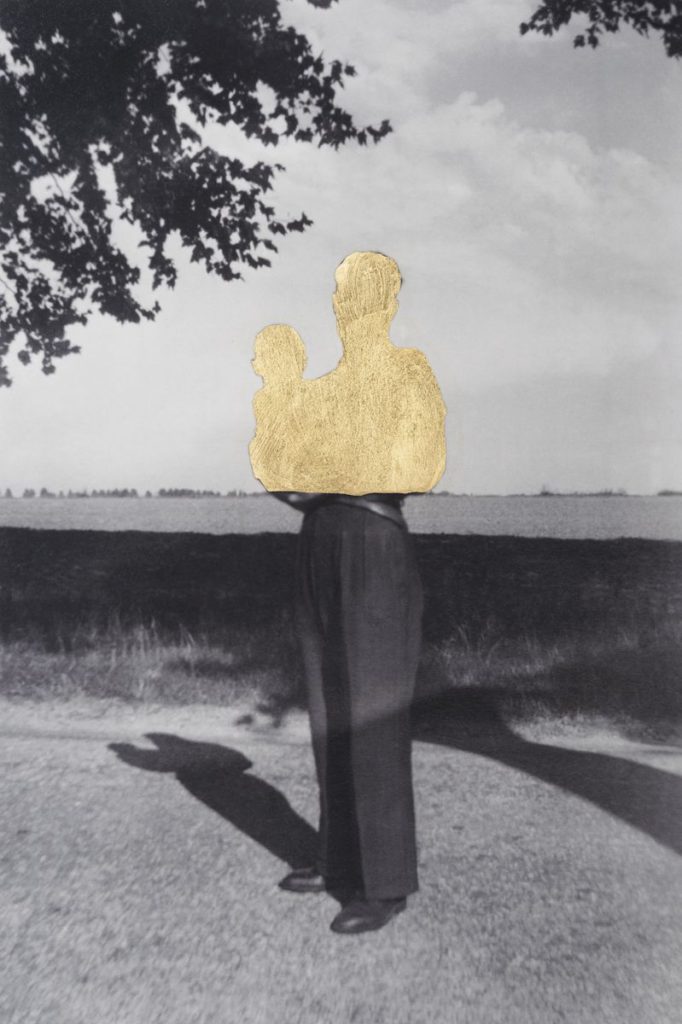
Benitah took old family photos and made them into new ones but with her version of the story and her feelings towards the people and the photos. She used different styles to re-interpret her own history. For example, she used embroidery on many of her pieces as a way to express her thoughts and experiences, or on some, she used gold paint to cover a part of somebody or she would cover everyone and leave the background black and white.

“Those moments, fixed on paper, represented me, spoke about me and my family told things about my identity, my place in the world, my family history and its secrets, the fears that constructed me, and many other things that contributed to who I am today”

I like how in Carolle Benitahs work its all the same style but with she adds different twists to each piece, like she says she uses many different materials to try and capture/show her feels through the images. I especially like the very bottom photo where there’s 6 girls standing on the beach, I think she has cut out and embroidered over the girls she is either doesn’t talk to and doesn’t like as she hasn’t tried to piece back together the head and body of one of the girls she cut out. The other cut on the left has also had her face scribbled over which shows that she has quite strong emotions towards the people in the photo. Even though the actual photo isn’t very clear you can see the age and can kind of work out the time it was taken showing that as you grow up you don’t always stay connected to the people you with when you were younger. As all the girls are looking up we know that its taken from high angle which allows for all the shadows to be seen but isn’t obstructing or getting in the way of anything else, the shadows also help create quite and eerie effect as their are just two white silhouettes standing in front of them instead of the people who use to be there.

Editing

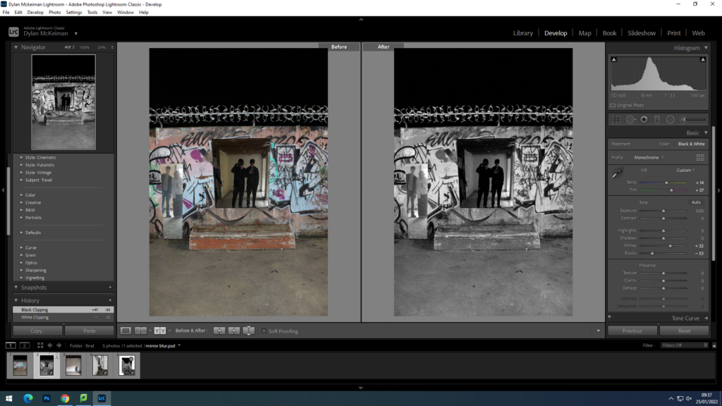
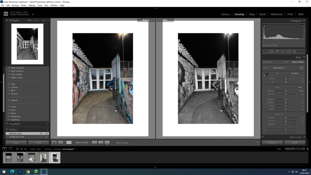
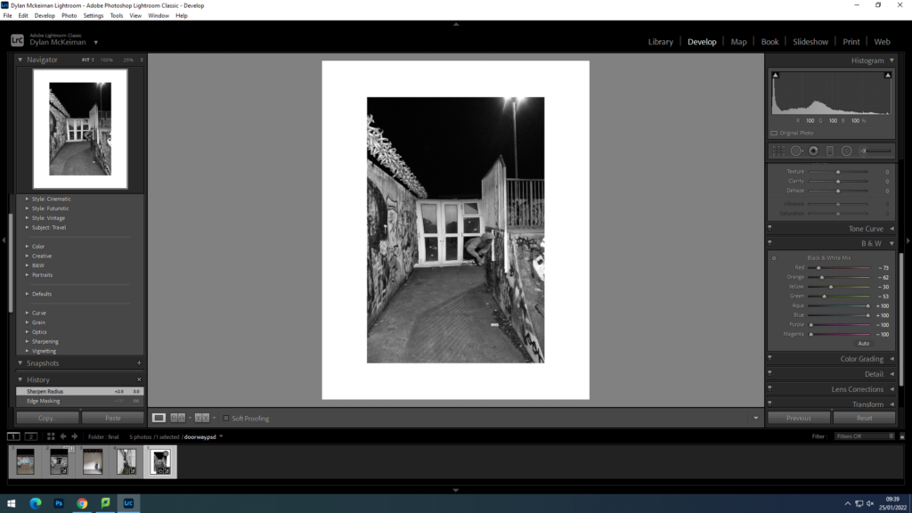
For this photo i changed it to black and and white while adjusting the temp and tiny very lightly and adjusted the whites and blacks

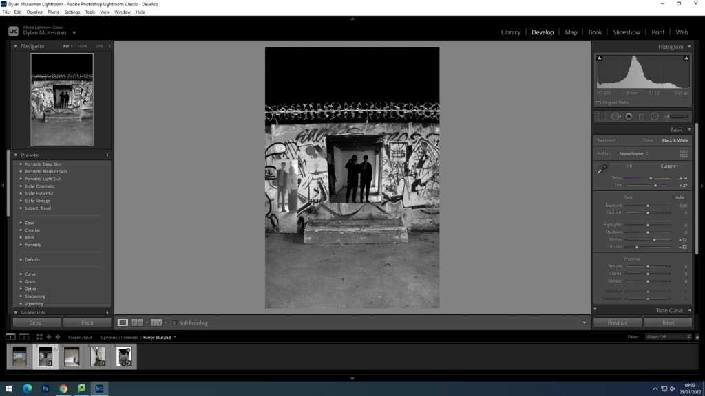
for this photo i adjusted the colour settings in more detail as well as make it black and white

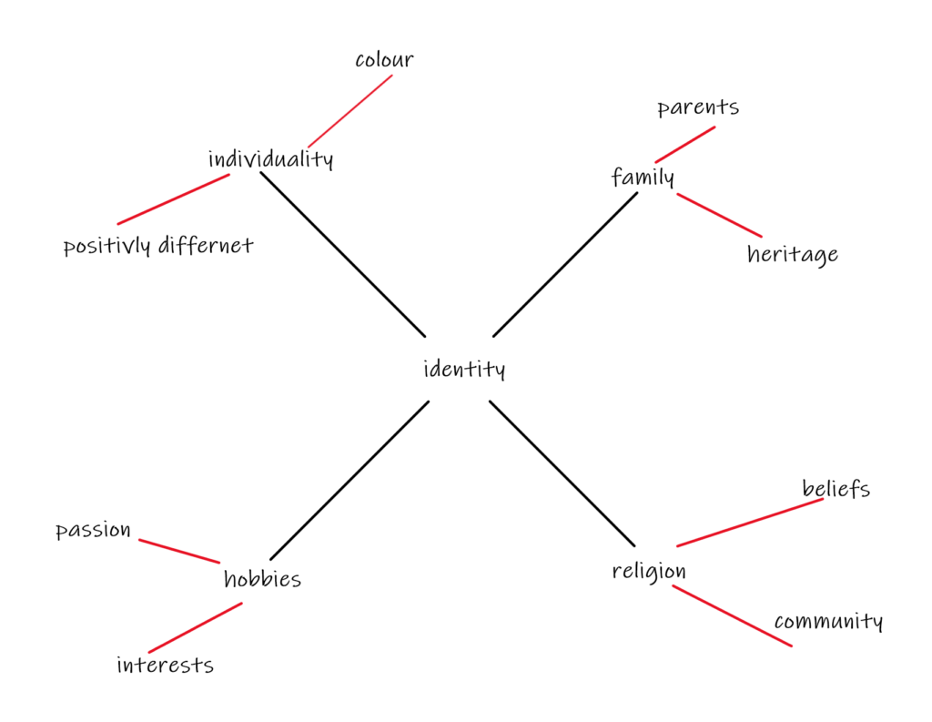
identity

A photograph resembles the likeness of what appeared before the lens. So, in the case of a profile picture, family album or mug shot, identity is based on the repetition of sameness that is evidenced by the image produced by the camera.

How do you show identity in photography?

Typical ways of expressing our identity include our choice of hairstyles, clothing, and make-up through to marks on our bodies including paint, tattoos, scars and piercings. Other aspects of identity such as language, race, ethnicity, religion and occupation are also powerful markers of cultural identity.

How does place affect a person’s identity?

Places also become imbued with symbolic meaning; they inform current self-concepts and can become an important part of an individual’s self-identity. Finally, individuals use aspects of place to support various identity-relevant projects, such as creating a continuous sense of self and self-worth.

Photography Ollie Murphy

Photography Ollie Murphy