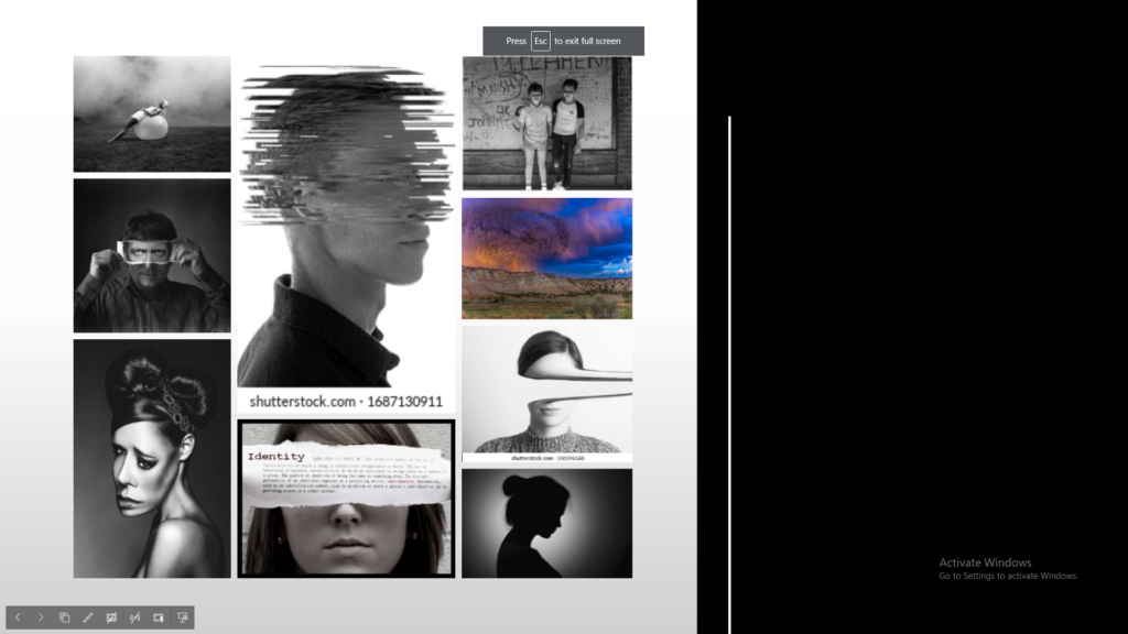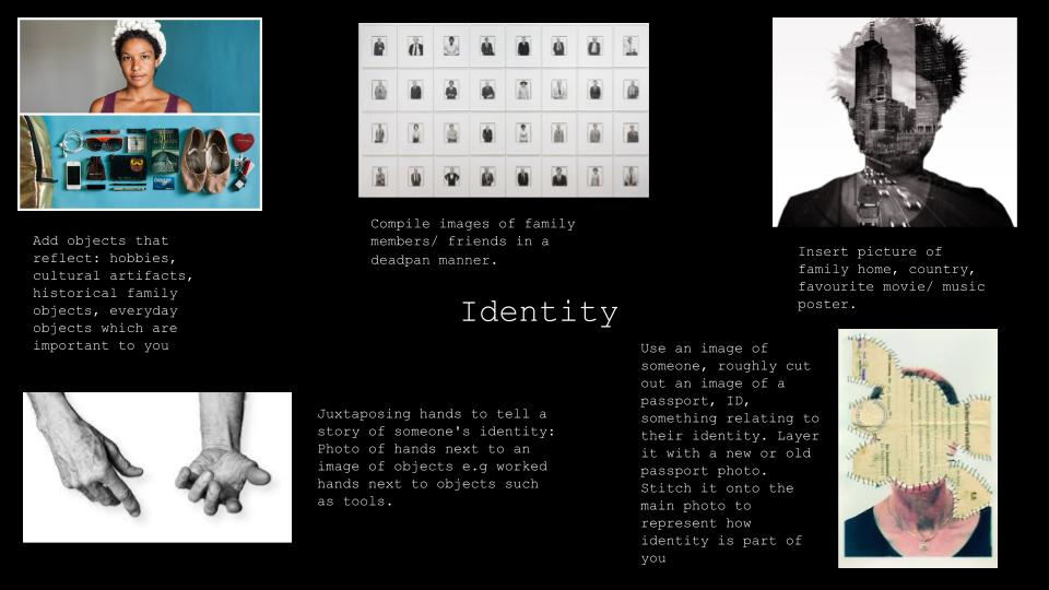
identity mindmap

Photographers I am researching:

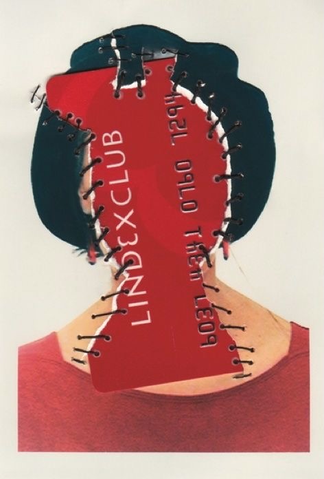
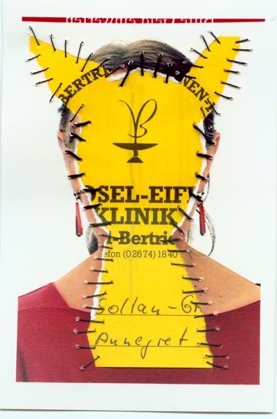
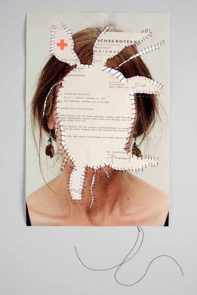
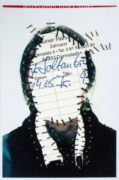
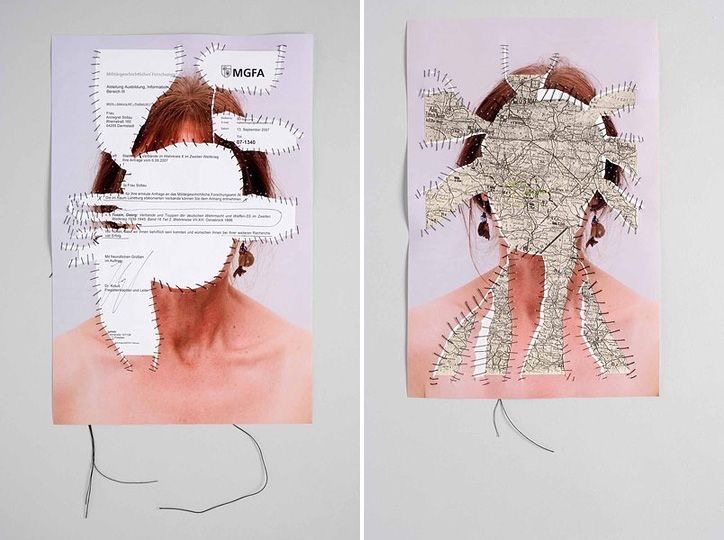
Annegret Soltau

Forms of Geographical ID:

Map, passport, citizen’s card, birth certificate, book about location, words in that language.
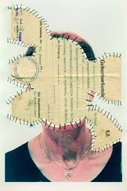
Annegret Soltau. Personal identity — Self-portrait research project

Annegret Soltau is a German visual artist, born in Lüneburg, Germany. Her work marks a fundamental reference point in the art of the 1970s and 1980s. Photomontages of her own body and face sewn over or collaged with black thread are the most well-known works of the German artist.

While the focus of Soltau’s work never ventures far from the female body and its bodily processes, often incorporating images of herself, at the heart of her practice is an inexhaustible search for identity and meaning.

Claud Cahun

Claude Cahun was a French surrealist photographer, sculptor, and writer. Since her “rediscovery” over a decade ago, Claude Cahun has attracted what amounts to a cult following among art historians and critics working from postmodern, feminist, and queer theoretical perspectives.  Cahun who moved to the Jersey in 1937 with her stepsister and lover Marcel Moore, was imprisoned for activities in the resistance during the Occupation, and remained here after the war.

In early-20th-century France, when society generally considered women to be women and men to be men, Lucy Schwob decided she would rather be called Claude Cahun. It was her way of protesting gender and sexual norms. She thrived on ambiguity and she chose a name, Claude, that in French could refer to either a man or a woman. She took the last name from her grandmother Mathilda Cahun.

Claude Cahun was a Surrealist photographer whose work explored gender identity and the subconscious mind. The artist’s self-portrait from 1928 epitomizes her attitude and style, as she stares defiantly at the camera in an outfit that looks neither conventionally masculine nor feminine. “Under this mask, another mask,” the artist famously said. “I will never be finished removing all these faces.”  In the late 1930s, Moore and Cahun moved to Jersey, an island off the coast of Normandy, where they, disguised as non-Jews, they produced and distributed anti-Nazi propaganda. After being caught, imprisoned, and sentenced to death, they successfully escaped such a fate when Jersey was liberated by allies in 1945. Cahun is considered to be a ground-breaking artist who fully embraced her gender fluidity long before the term came into use. Tragically, she never fully recovered from her maltreatment in prison and passed away on December 8, 1954 in Jersey, United Kingdom. Her work left a huge impression on photography and directly influenced contemporary photographers Cindy ShermanGillian Wearing, and Nan Goldin. Today, her works are held in the collections of The Museum of Modern Art in New York, the San Francisco Museum of Modern Art, and the Museum of Fine Arts in Boston, among others.

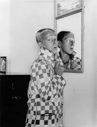
Claude Cahun Self Portrait c.1927
This queer Jewish photographer resisted the Nazis and escaped death—and  made great art | by Rian Dundon | Timeline

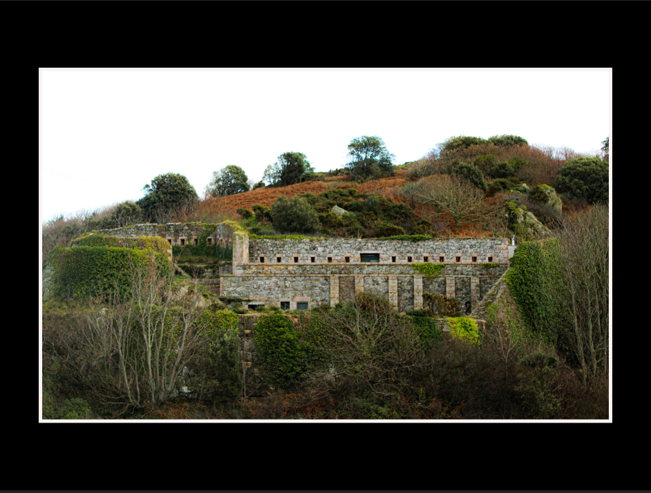
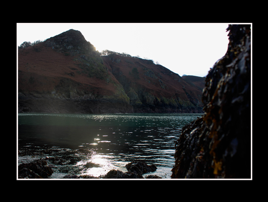
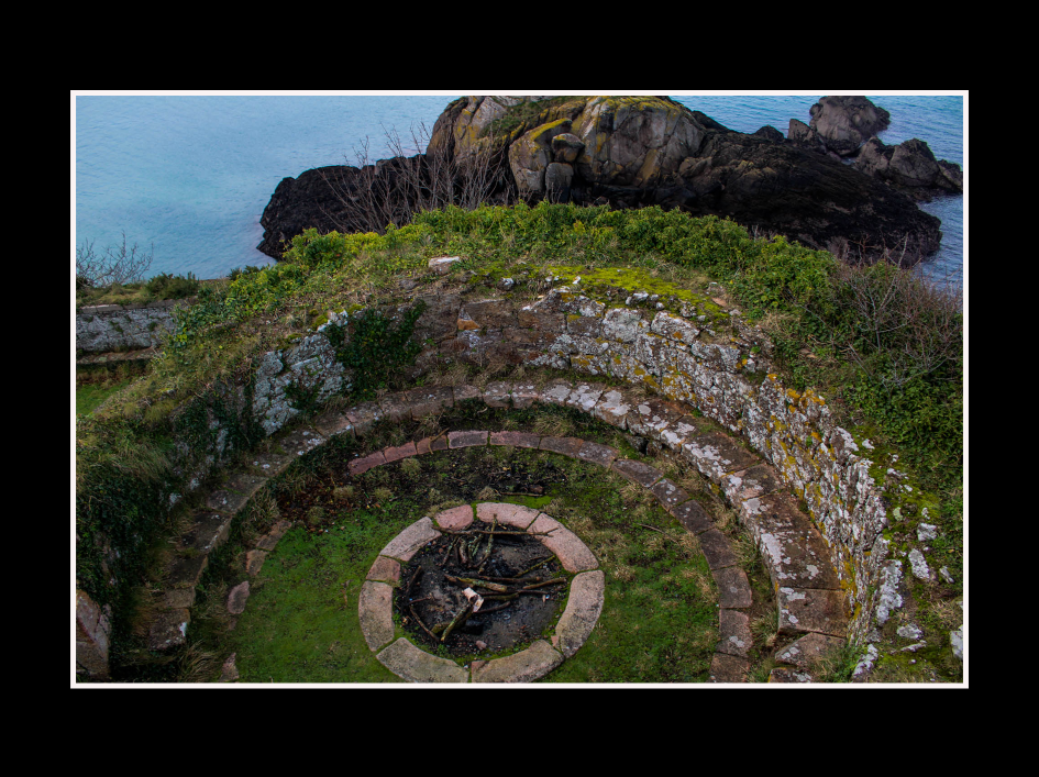
my final images

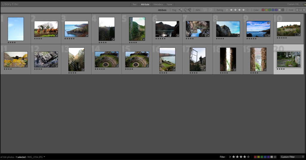
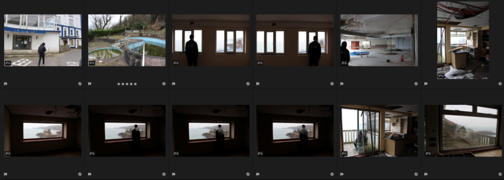
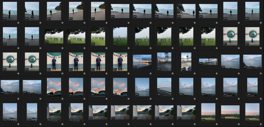
I narrowed down all my images through the star rating systems.
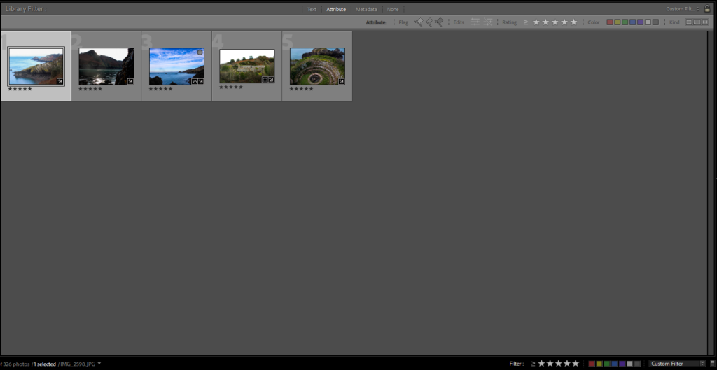
until I found my the best five.
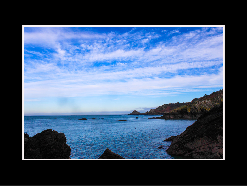
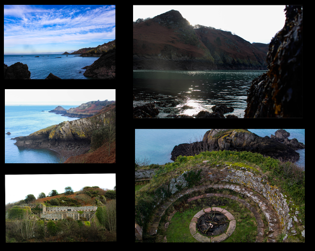
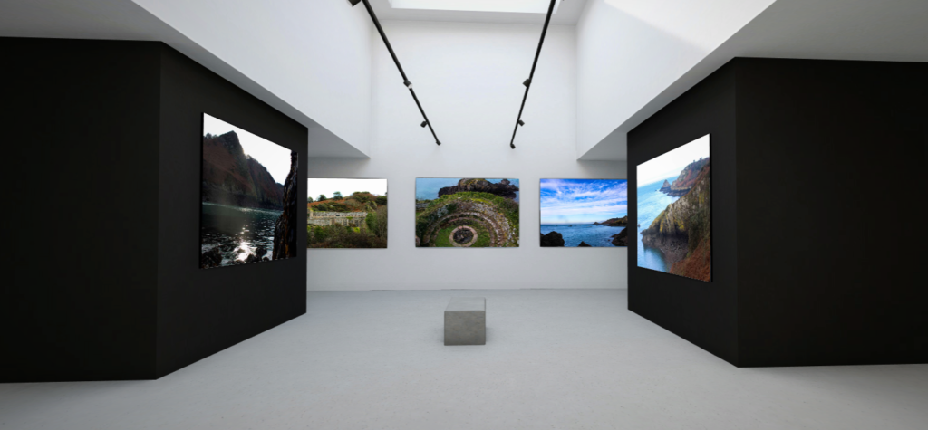
I have chosen my final images because I like the way it portraits the identity of the island showing of its beautiful views and the way it links to Andy Le Gresley landscapes of the island.

This is all of my final images in a virtual gallery that i created using art steps.

My selection process was very useful to narrow down from all my images to all the good ones then i looked to see which ones link to my artist reference the most.

My photo shop skills have definitely improved a lot through this mock. these skills could be further improved to help me work faster and more efficient.

Edited photos to use

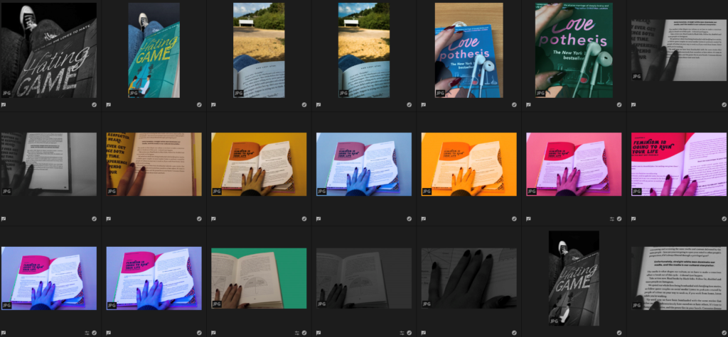
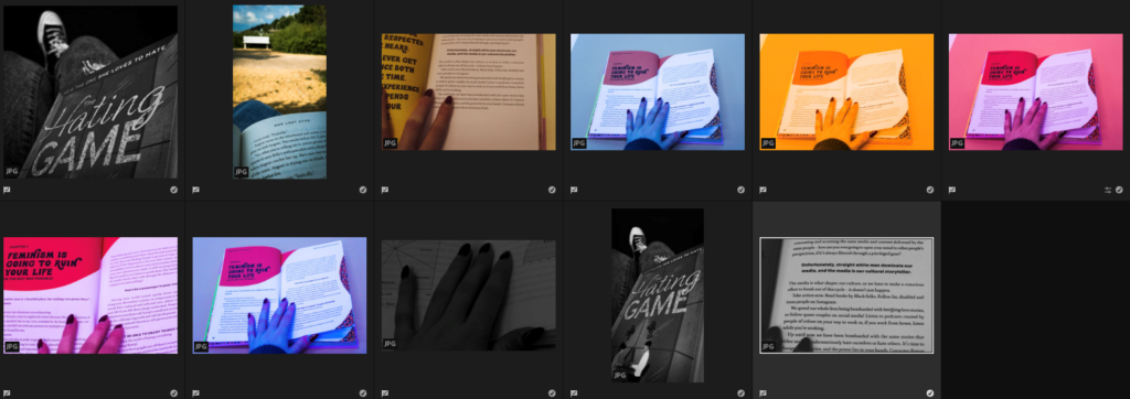
Here are all the edited versions of the images which I created on Adobe Lightroom, I will use “Z” to pick my favourites.

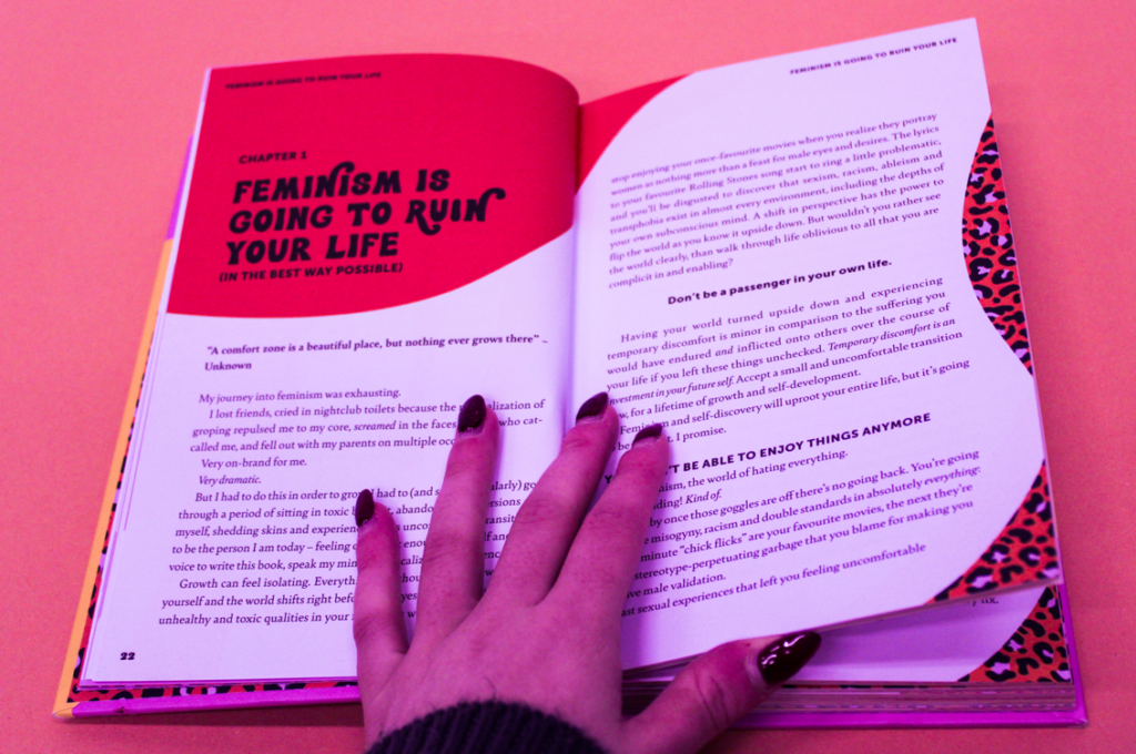
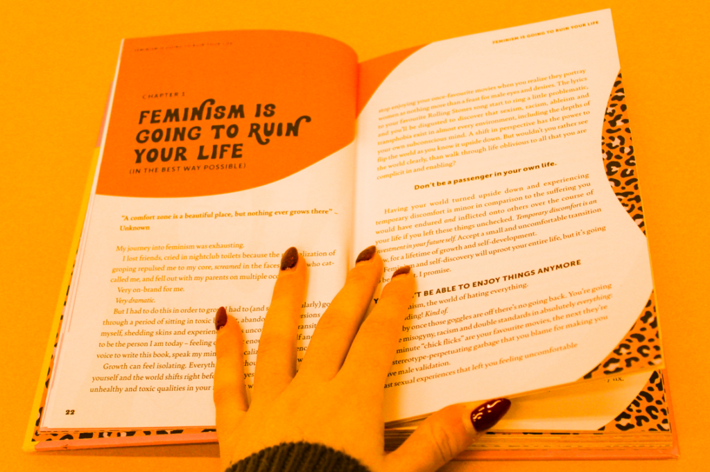
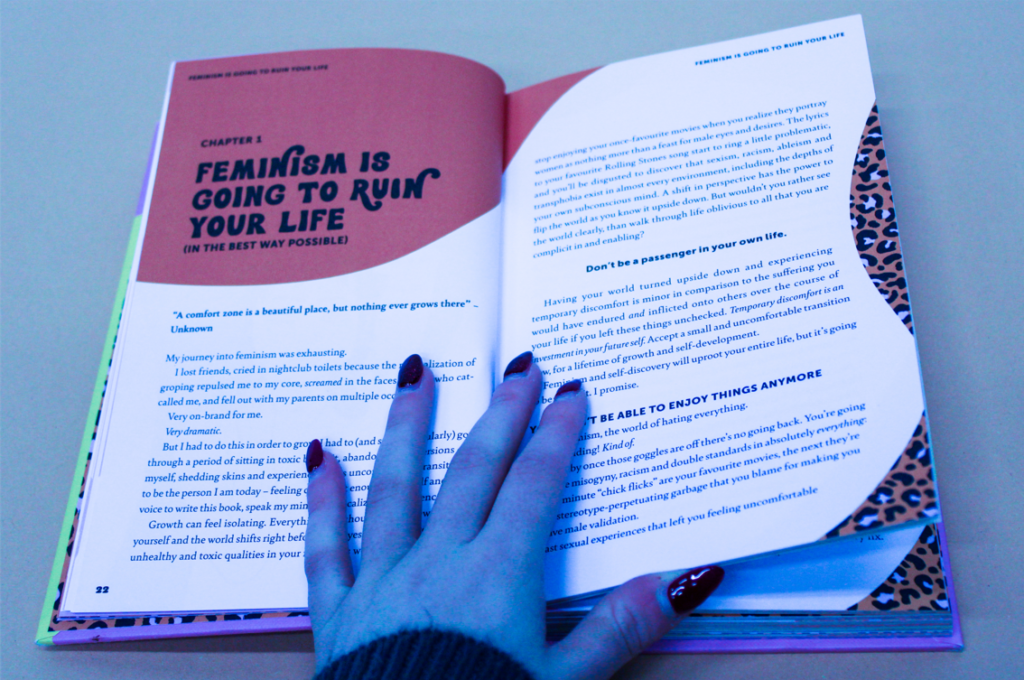
I really like how these particular edits turned out because they show a range of creativity within them using different editing skills/features. For my 1st photoshoot, I really liked how the photo looked in black and white, so I will use the edits with slight cropping, to use for a part of my final piece. In my opinion from my 2nd photoshoot, I really like the brightly coloured ones of the books and will crop the rest of the pictures which are related to that book to use within my final piece.

The edited images

1st Photoshoot images –

2nd photoshoot images –

ideas i had

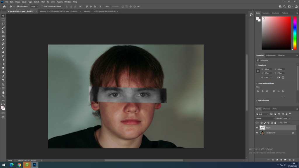
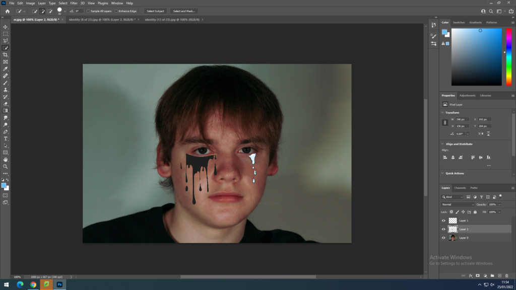
for this image, i used to lasso tool to crop out the eyes from a black and white photo then dragged ut onto a different photo to create this affect.

I copied a picture from google and pasted onto photoshop, I then used the magic wand to get rid of any un needed outlines and dragged to fit into the image.

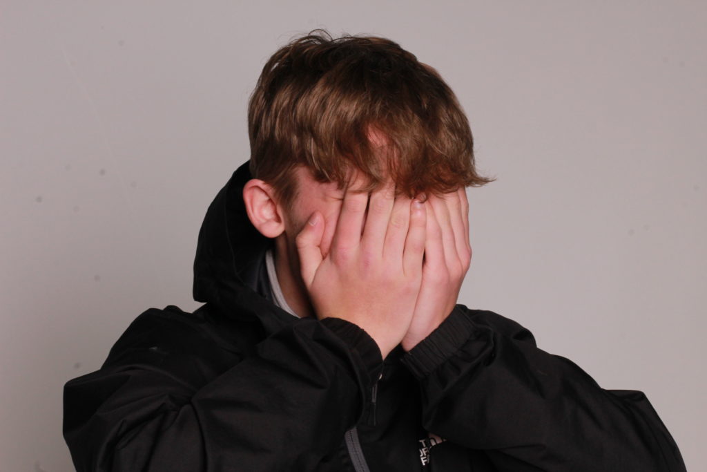
I didn’t use this idea as it doesn’t represent his identity, only his emotions.

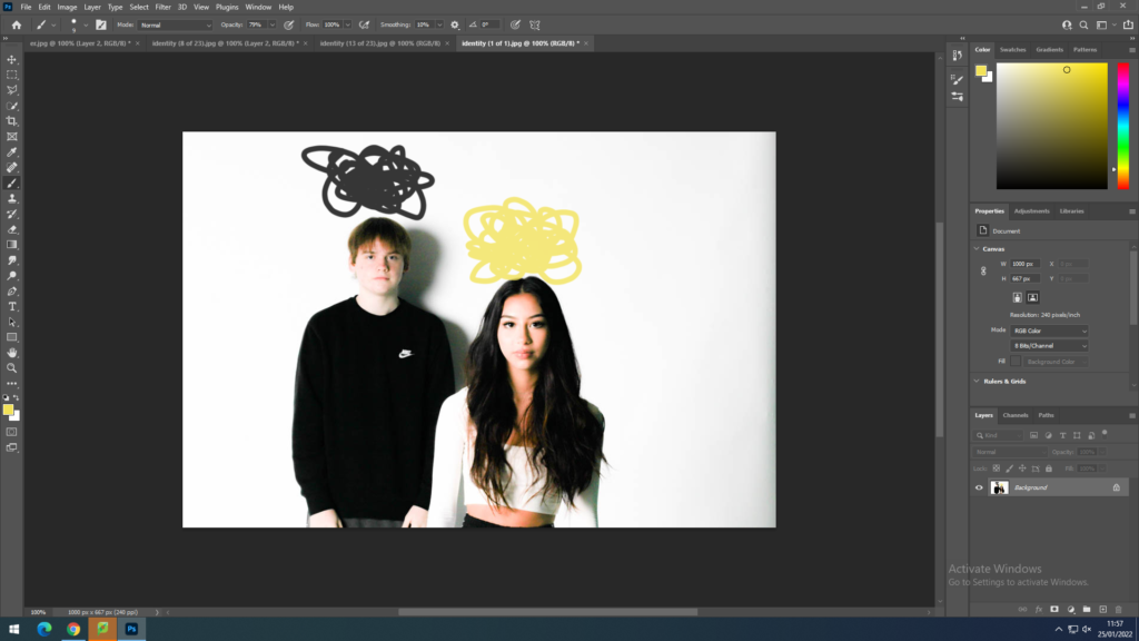
i simply just used to brush tool and drew over their heads, one in black for darkness and one in yellow for purity.

this idea focused more on the energy they present and not mainly on the identity.

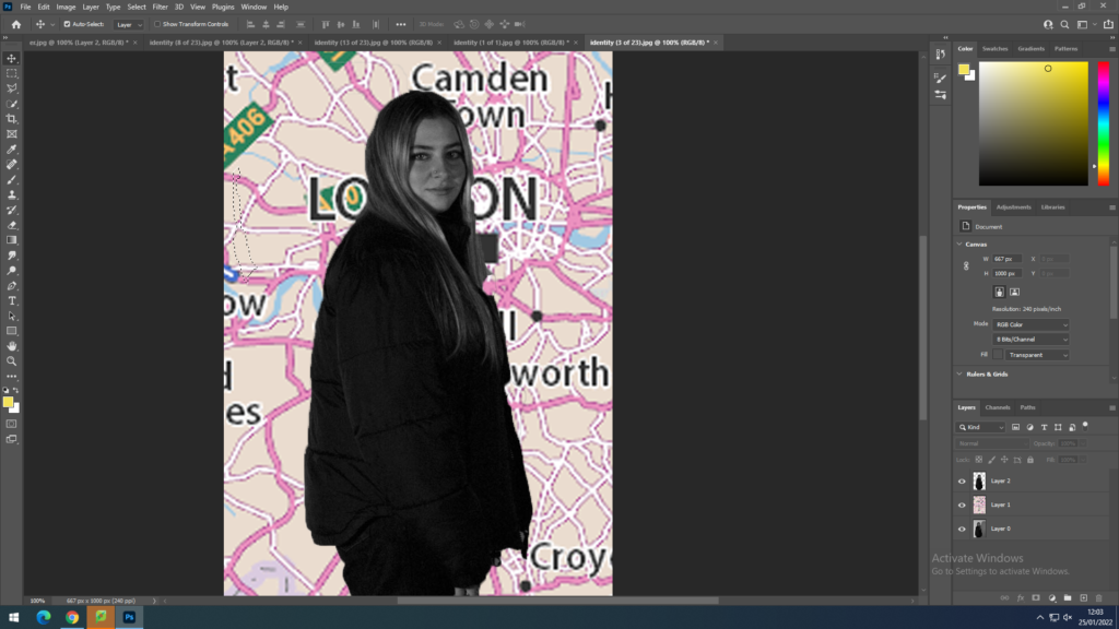
identity – favourite place

i uploaded a map from google and copied the outline of jasmine and put it over the map in a new layer, then cropping out jasmine to fit.

Jan mock selections

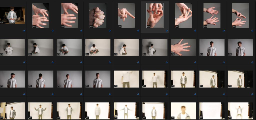
Contact Sheets

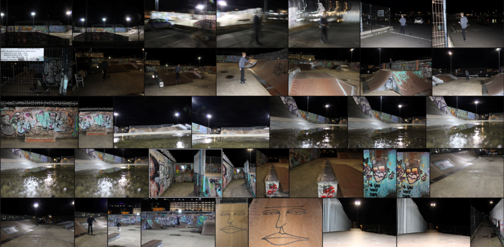
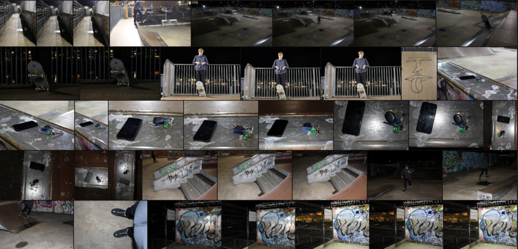
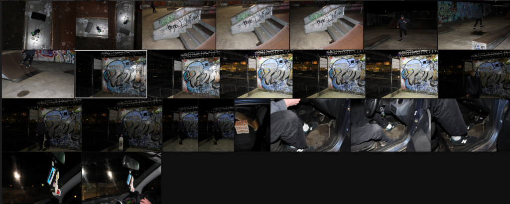
Photoshoot 1


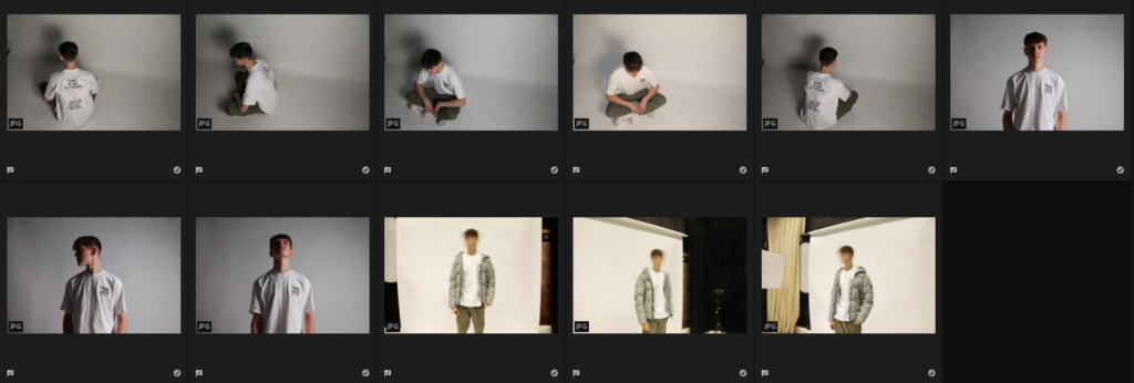
Final Selections

I picked these as my chosen images because I feel like they do a good job at portraying this subjects identity/ personality through the setting of a skatepark. The skatepark setting generally comes with a stereotype of a “skater” which makes it easy to portray a personality through simple images. I will be displaying these images as a grid which is an idea I have seen before from previous exams. I will be linking these to some of Corrine Day’s work in which she attempts to portray the vitality/ pressures of youth, as many people would describe skateboarding as an escape from everyday problems.


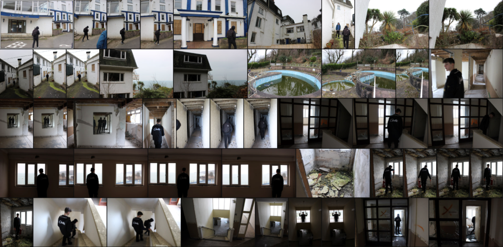
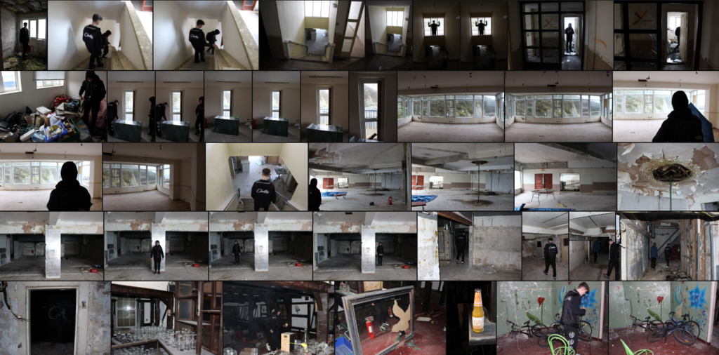
Photoshoot 2


Final Selections


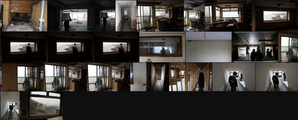
I picked these for my chosen images as I have a good idea of how I am going to lay out/ edit them to portray the idea of loss of identity, memories of childhood, and mental health. I will be trying to link the use of a decaying building to the deterioration of the mind that comes with time in terms of memories loss and mental health disorders . I will be

Photoshoot 3


Final selections


Others


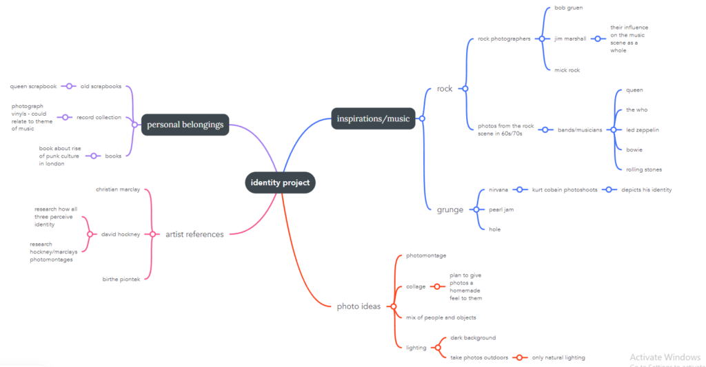
identity project – planning and mindmap

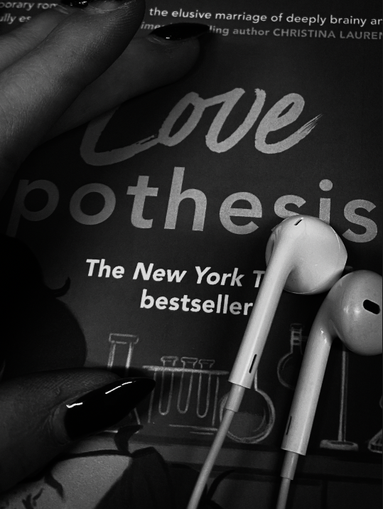
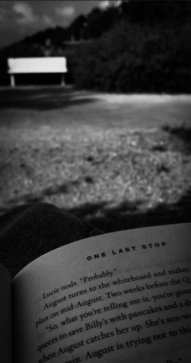
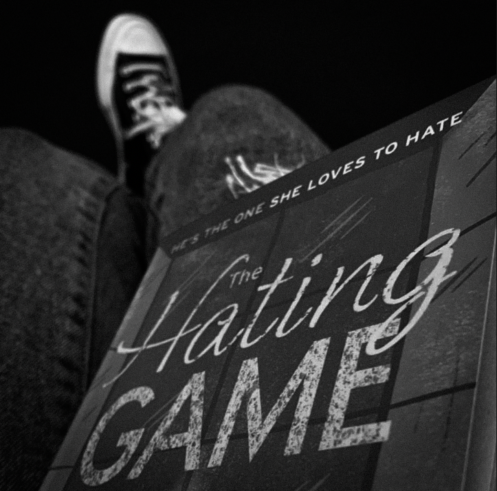
I started off with an idea to focus my project around my family, friends and my heritage. I took some photos to experiment but realized I wanted to go a different direction to what I had intentionally planned. Instead my plan will be to focus the project more on myself and the music I listen to because I feel like what style of music you listen to can influence you as a person.

The photoshoots I take will be loosely based off different genres/subgenres of music and how I view them – for example when I think of a style like blues or folk music I picture a scenic photoshoot of a landscape or something peaceful like the sea or night sky however with rock/punk rock or metal I think of a busy photo with lots of things that catch your eye instead of just one main focus.

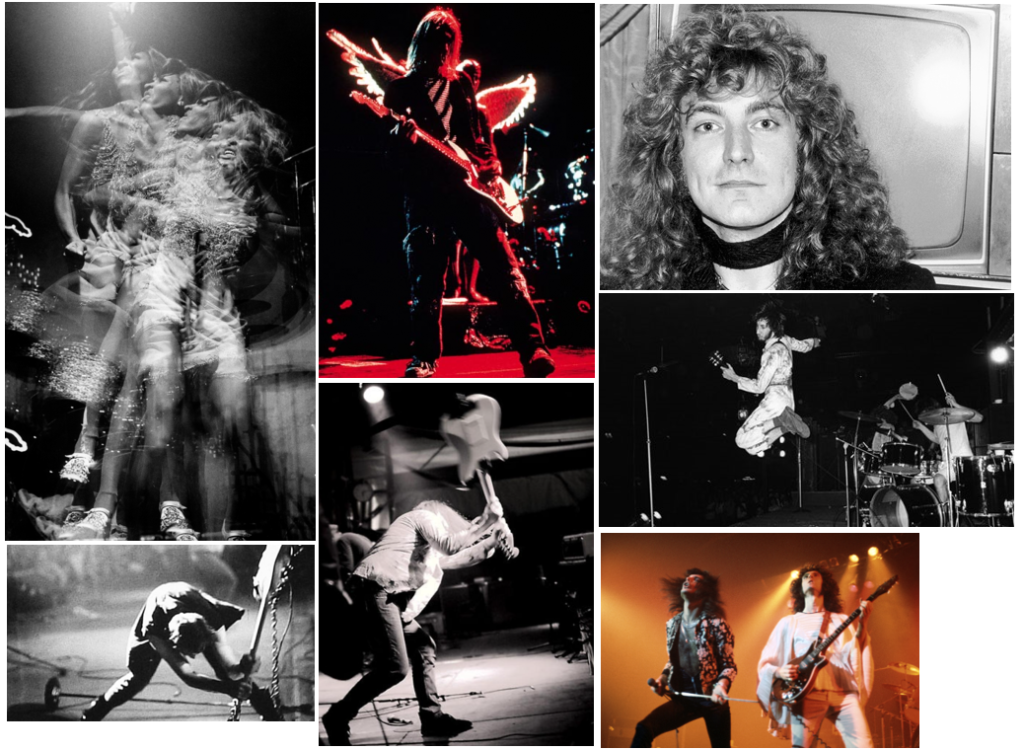
For my first step I looked at some iconic photos of musicians, particularly in the rock or grunge scene from the past few decades, then picked some that really stood out to me:

I planned to give my photos the same atmosphere as these – some chaotic with a lot of things going on whilst some with one main focus like a few of these above. My original plan was to create a photomontage much like David Hockney or Christian Marclay’s work, but once I began my editing I realized I wanted to use a grid format instead. I then made a mindmap of where I could go and how I could take my photos.

Evaluation and critique

I chose to base my project on photomontage inspired by Raoul Hausmann. I edited the pictures in photoshop to create photomontages like his.

I thought my final pieces came out well. I explored something real and embedded in my family. I worked hard over the 3 days and produced something that i am happy with

I could have taken a better photo of my background, which was taken at an angle

I think this would look neater as a pan shot from the top and would have made my photomontages more effective. I didn’t really plan well enough. If I had planned better I would have realised this before entering the exam.

I also think the idea of picturing my grandads belongings might not have been the best choice because I don’t have many of his items. I could have made more content for this project if I thought of multiple ideas and did other photoshoots.

I can use this to not make these mistakes in a real exam.

Experiments

After editing my images, I exported them in higher resolution into photoshop to ensure they were good enough quality.

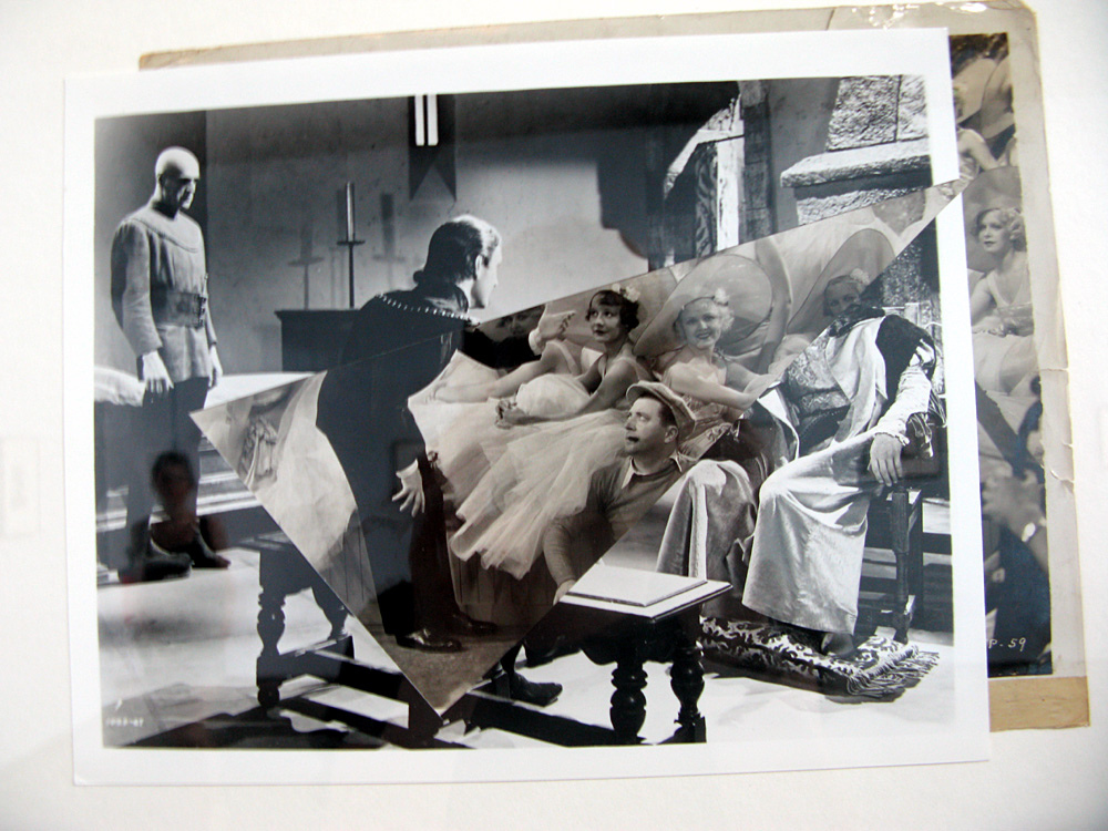
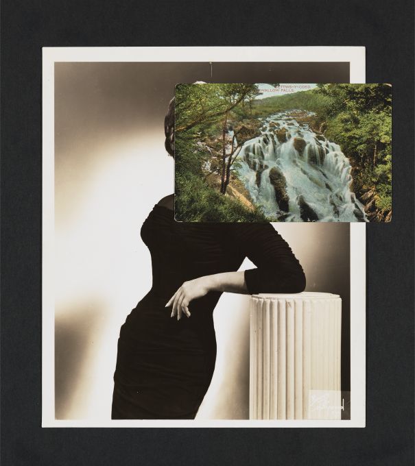
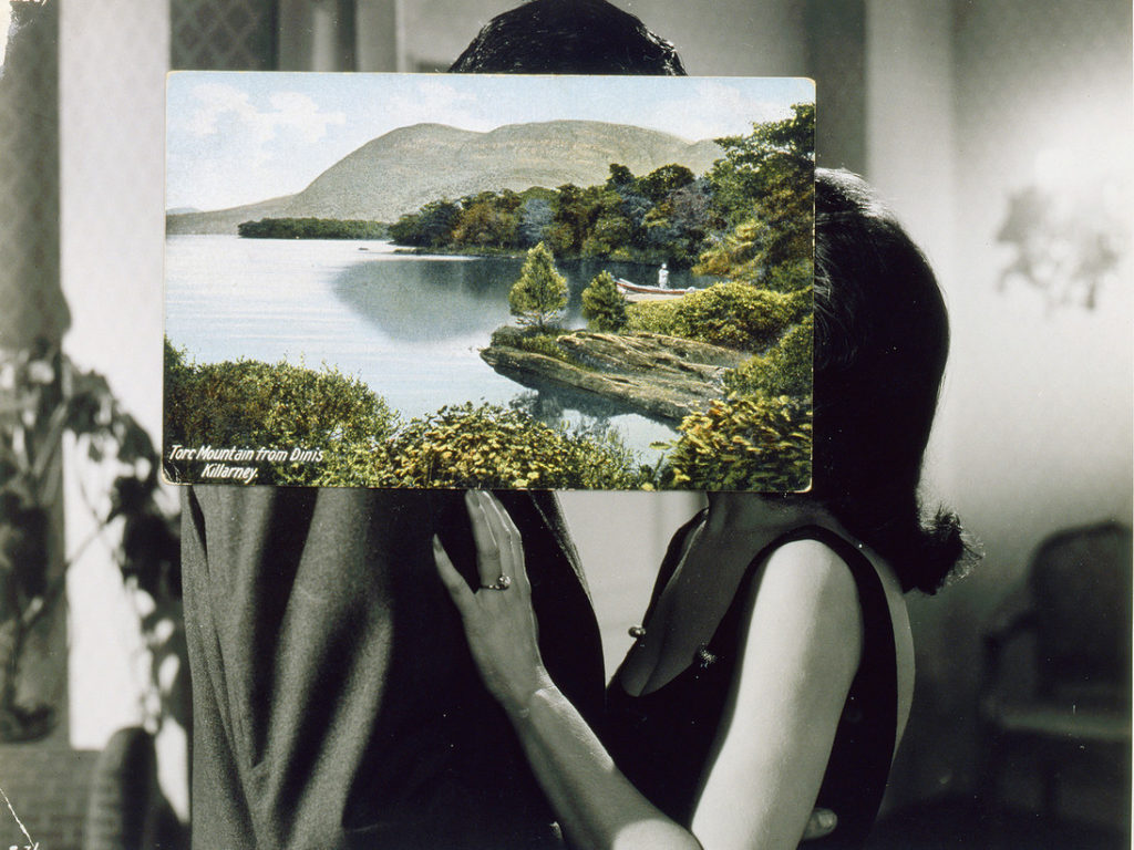
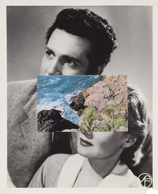
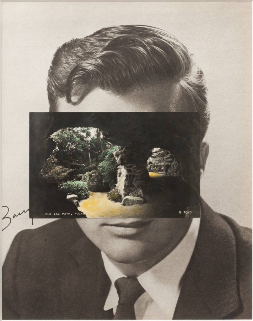
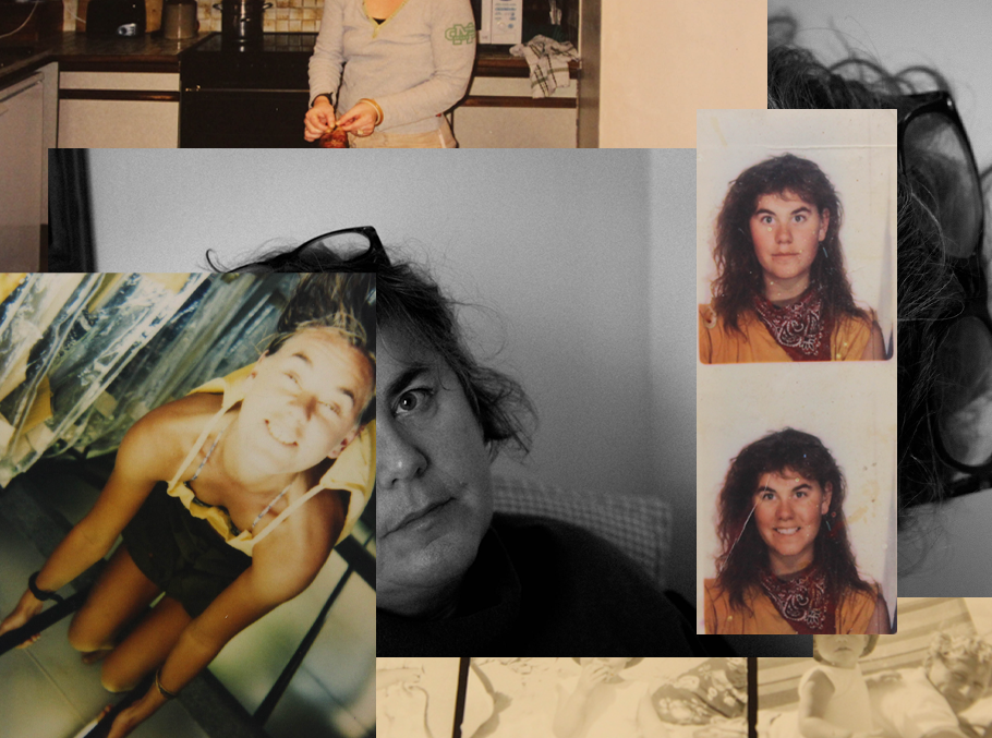
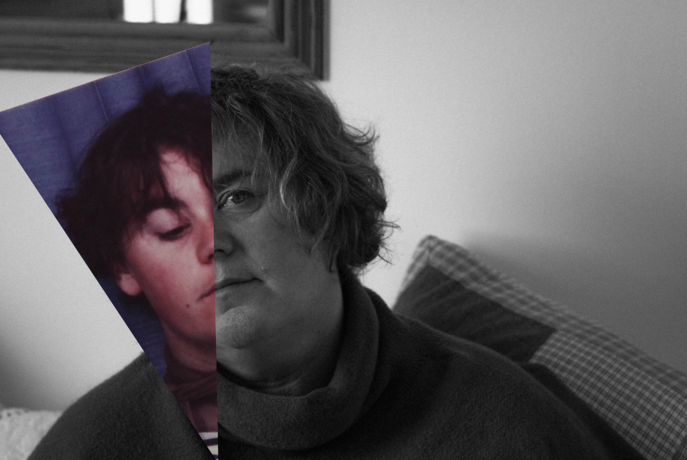
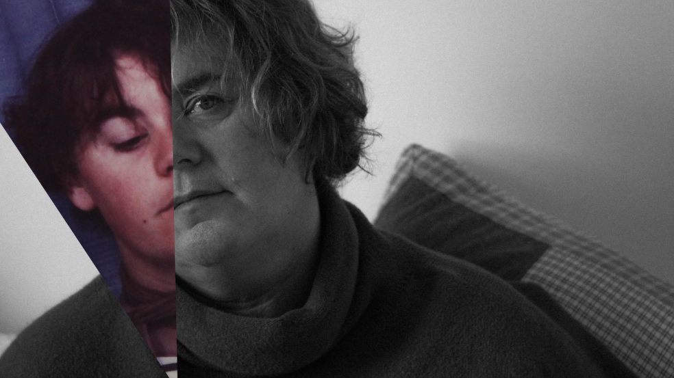
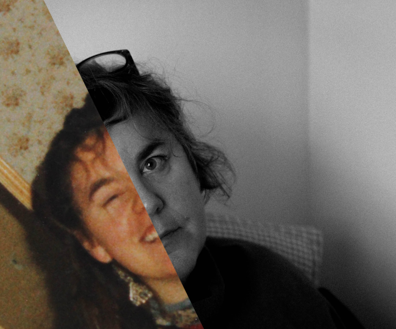
In my experiments below, I was inspired by Joachim Schmid to include halves/bits of faces, and to collage these together, but also collage and photomontage artists like John Stezaker.

I think that the work of John Stezaker and Joachim Schmid work well together, and are similar in some ways, which inspired my experiments below.

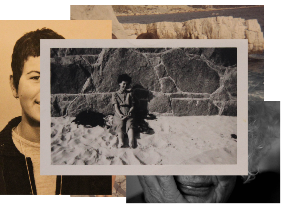
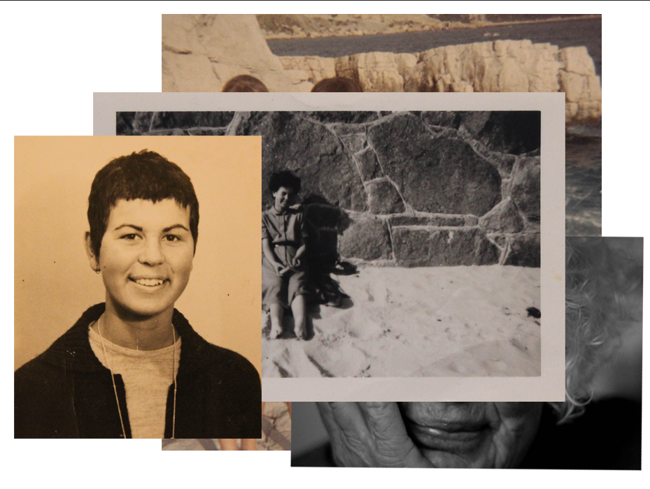
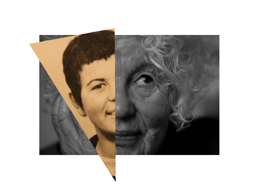
Combining my found images of my mum’s old bedroom with an image of her age 17, and a present day image of her. I chose this combination of images to show age identity, as well as to document and comment on the passing of time. I also like the way all the colours of this image go together. with the two monochromatic, Bill Brandt inspired images, and the old photograph with its yellow tones.

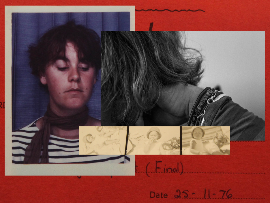
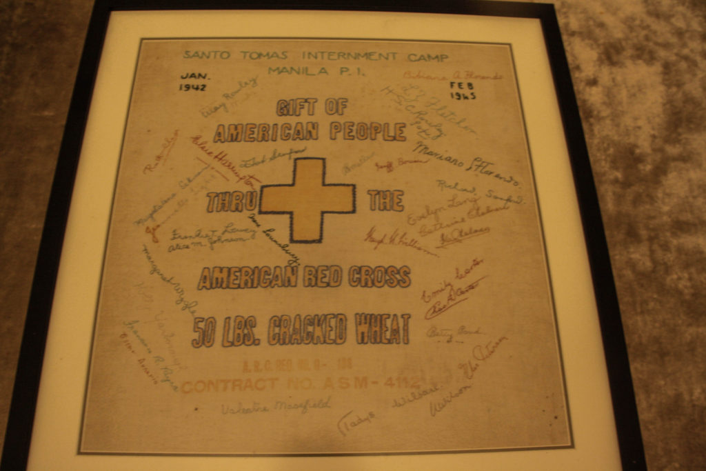
Another of my experiments -here I experimented with adding an old document in the background, which created a vibrant colour contrast. I used an old polaroid of my mum as a child with my grandfather, along with a picture of her when she lived in London, and an abstract picture of her in the present day.

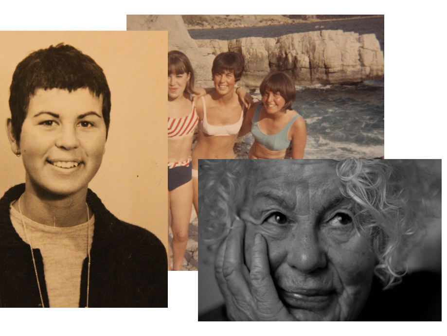
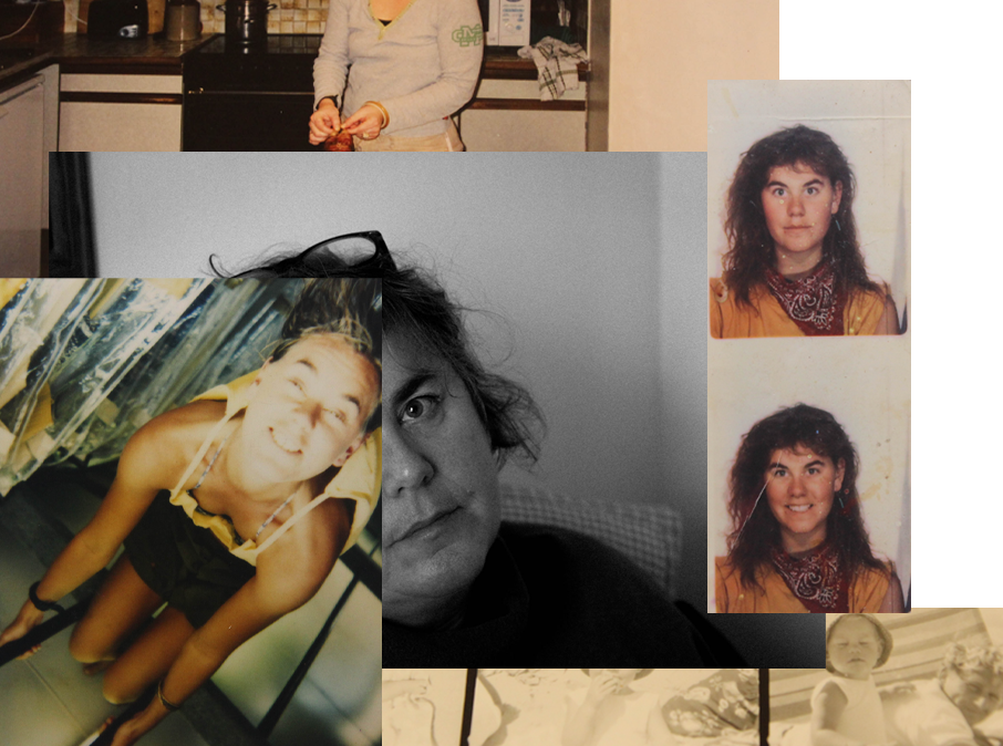
In this edit I wanted to do the same kind of idea as my previous experiments, but with two generations. I used images of my mum and nana from the present day, on the bottom, with a family portrait from the 70s when my family lived in New Zealand, as well as two images of my mum (left) and my nana (right) when they were young. My mum would have been about 20, and my nana a little younger, in her teens. I wanted to produce a juxtaposition of generations in this experiment.

Joachim Schmid Experiments

Below are my edits specifically inspired by Joachim Schmid.

My second experiment – I think the angle and placement of my archival image was much better here, which created a much better composition and the two images of my mum blended more seamlessly together.
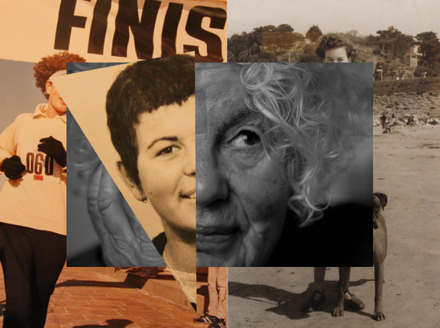
Another of my experiments – this time focusing on my grandmother. I placed the image of my nana in the present onto a white background, then added a slice of an image of her when she was younger, bringing it out of the border of the first image. I liked the effect it created, adding dimension.

I then added to this edit. I placed two more archival images of my grandmother into the background. I covered my nana’s face on the left, causing the viewer to focus only on the faces in the middle – this was inspired by John Stezaker. The image to the right contrasted nicely with the other image – the image above it concealed parts of the image, leaving just my nana’s feet and hair visible. I kept her hair visible as this is a huge part of her identity, and it shows in this collage, through the passing of time.

My most successful edit – I used an archival image of my mum (left) and my grandmother (right), to show the similarities and differences between them when they were younger. I think that the method of cropping the whole image and placing it on top of another was a better idea that just slicing a part of the image I wanted to add ( with lasso tool), as it created better composed edits.

MOCK EXAM EDITING AND EX🅿eRiMENTATION

Black and White

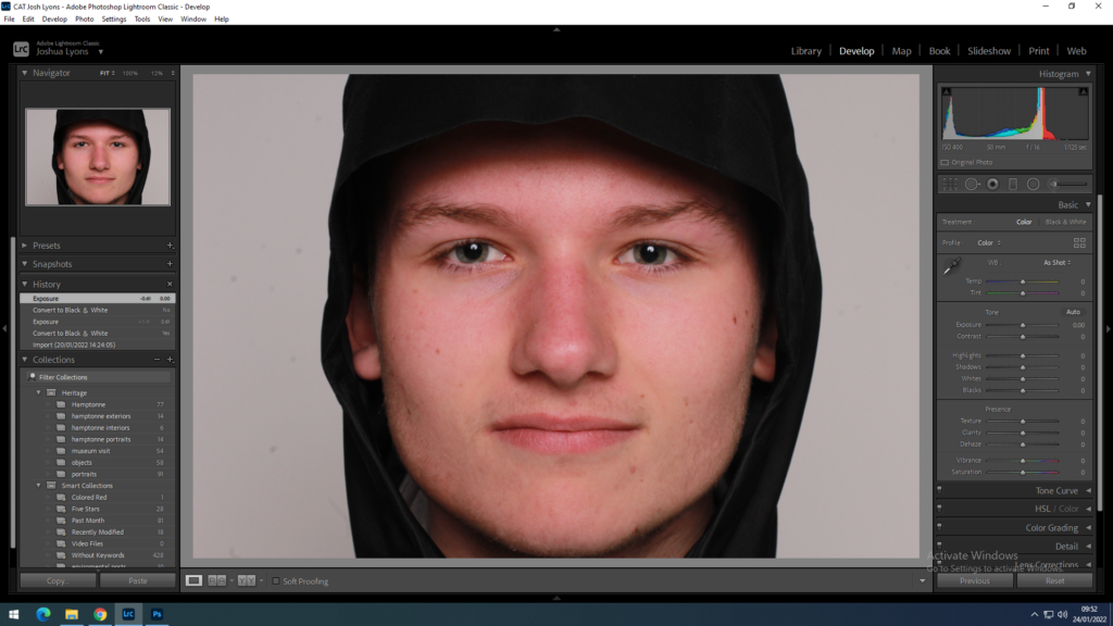
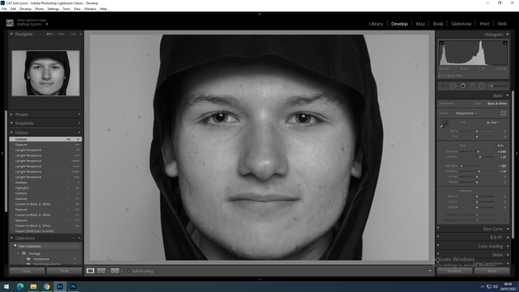
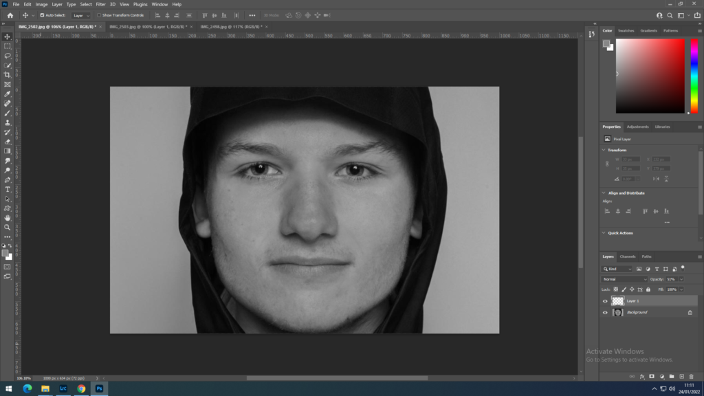
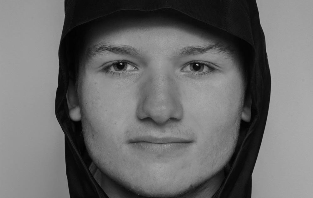
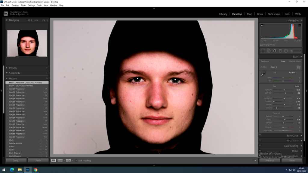
I first went into Adobe Lightroom to use the black and white effects, I played around with the contrast, exposure, highlights and shadows until I got this edit below.

I then exported the image from Lightroom into Photoshop, to remove shine off the face and cleaned up the image using the airbrush and spot healing brush tools by creating a new layer at 50% opacity and then merging the two layers together.

Above are more black and white edits

Above is a final edit of my portrait compared to portrait I found from my chosen artist Andrzej Steinbach.

Other Edits

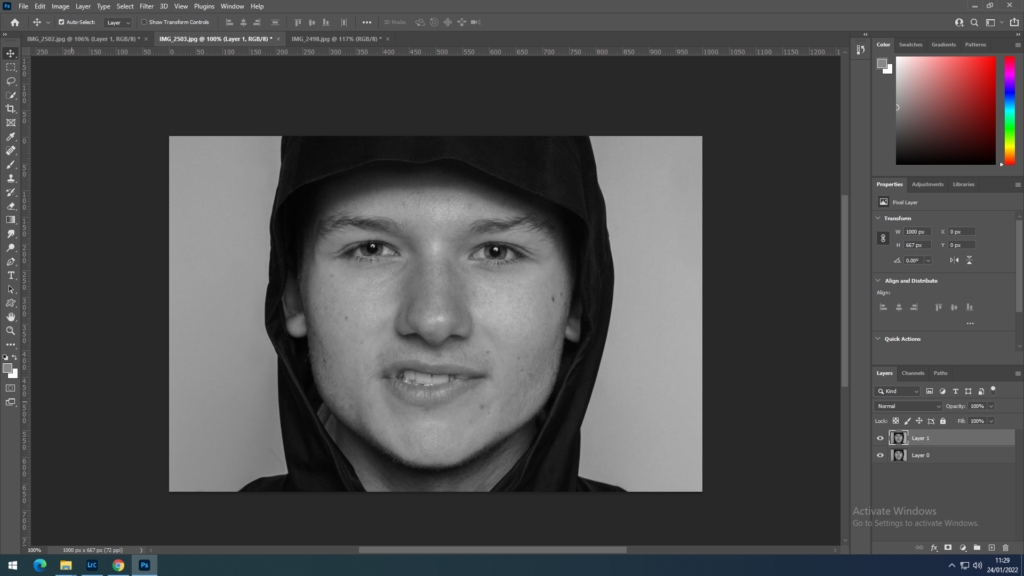
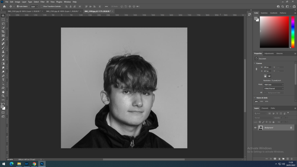
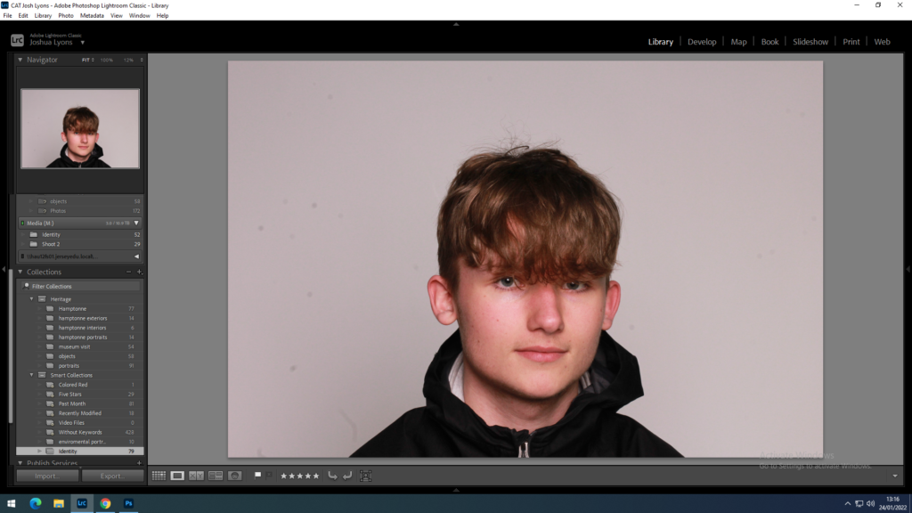
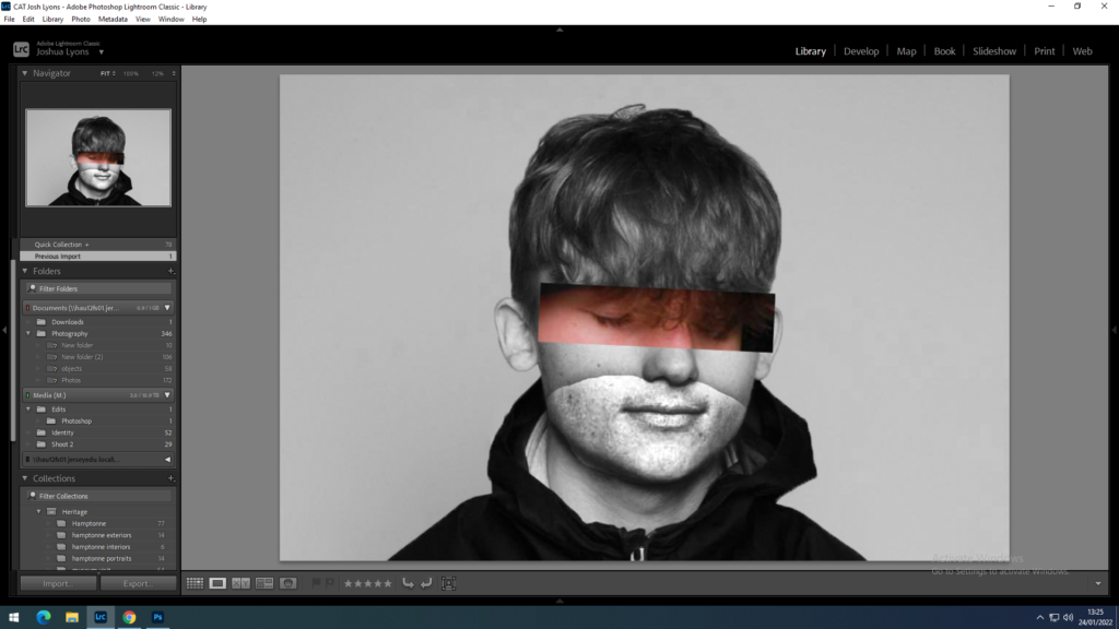
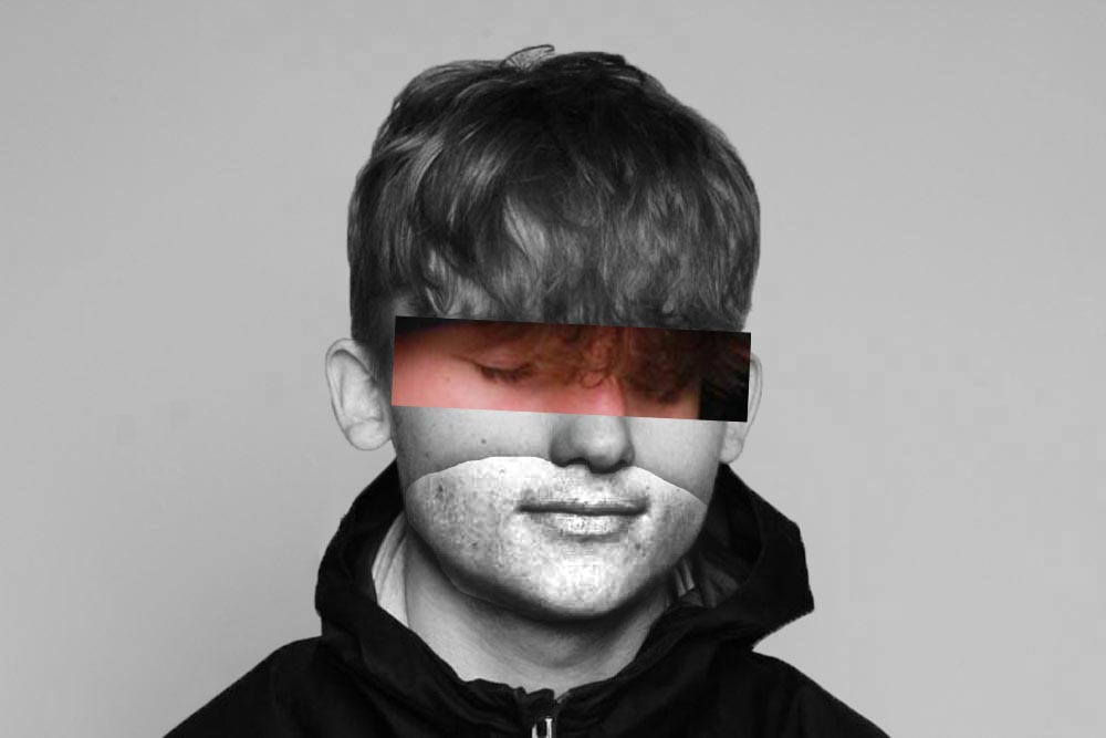
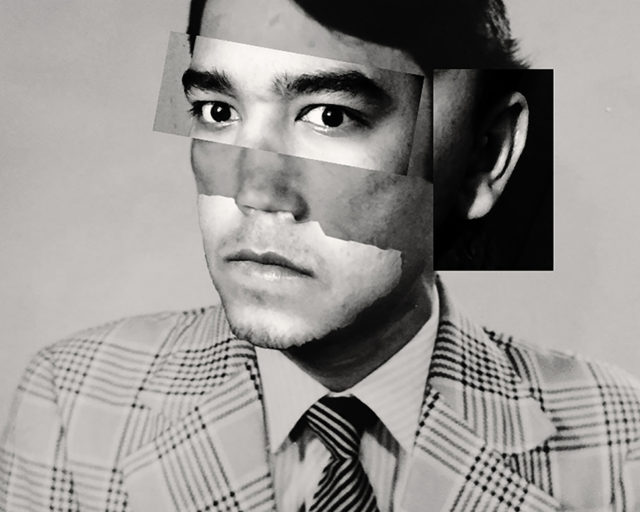
I took this photo and played around with different tools in Photoshop such as, the lasso, the marquee tool, the black and white filters and the spot healing brush to create the image below. For the section with the eyes I took another photo and pasted it over using the marquee tool and transformed it into the best fitting position. I then took the photo back into Lightroom and increased different tools such as the texture and clarity to create a beard like effect on the bottom half of the face.

The final edit is placed above a photo by one of my chosen artists.

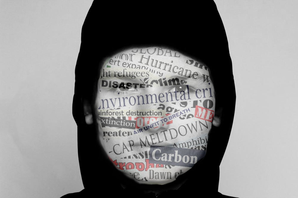
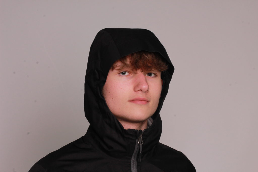
For this edit I played around with the exposure, contrast, highlights, shadows, whites, blacks, clarity and dehaze tools in Lightroom. I then exported the edit into Photoshop, where I used another photo I found off of google of newspaper headlines and pasted it onto the photo. I then used the lasso tool as well as making the image black and white to make it look more effective. I then used the blur and smudge tool to make it look more realistic. I also cleaned up the background of the image using the spot healing brush. This created the final image below.

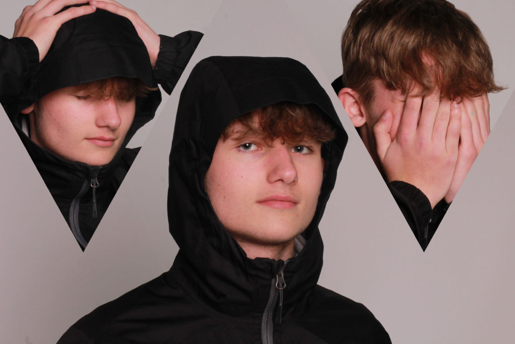
Using these 3 photos I created another edit in Photoshop, using the shapes tool and creating a clipping mask I added 2 of the photos into the shapes to create this edit.

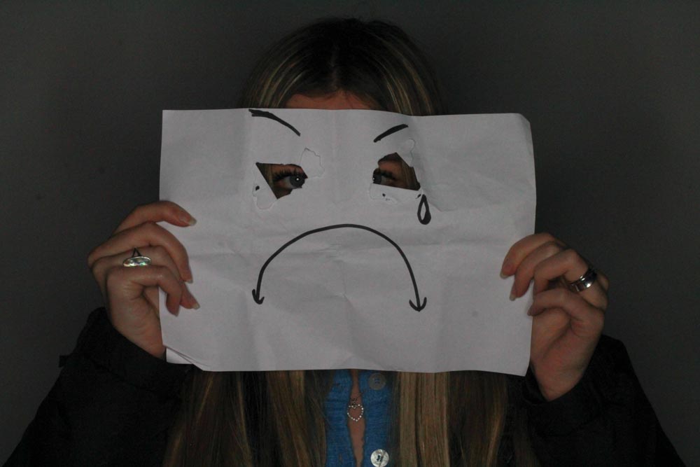
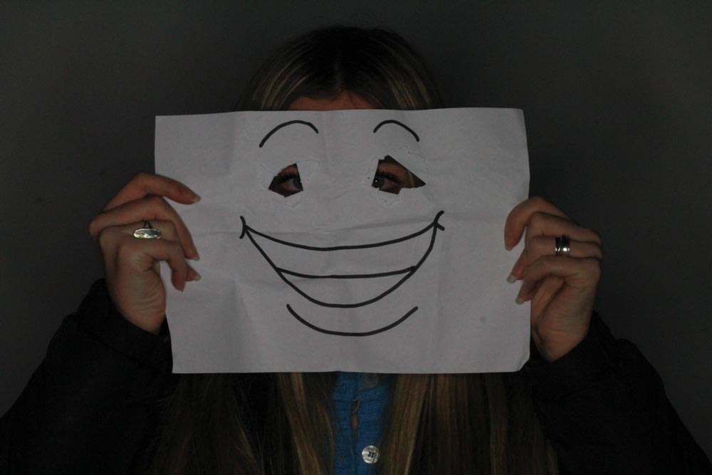
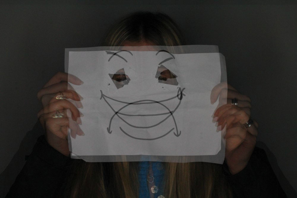
I used these 2 images and merged them together on photoshop and changed the opacity of one of them to 50% to give the illusion of a double exposure effect with a happy face and a sad face. I also edited the 2 photos in Adobe Lightroom and increased the contrast and exposure of the images to make them appear lighter as they were quite dark.