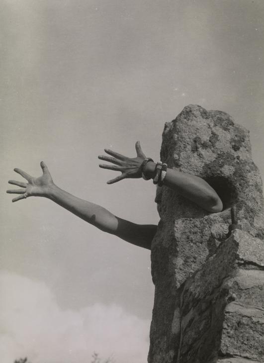
“I Extend My Arms” by Claude Cahun, 1931 or 1932 
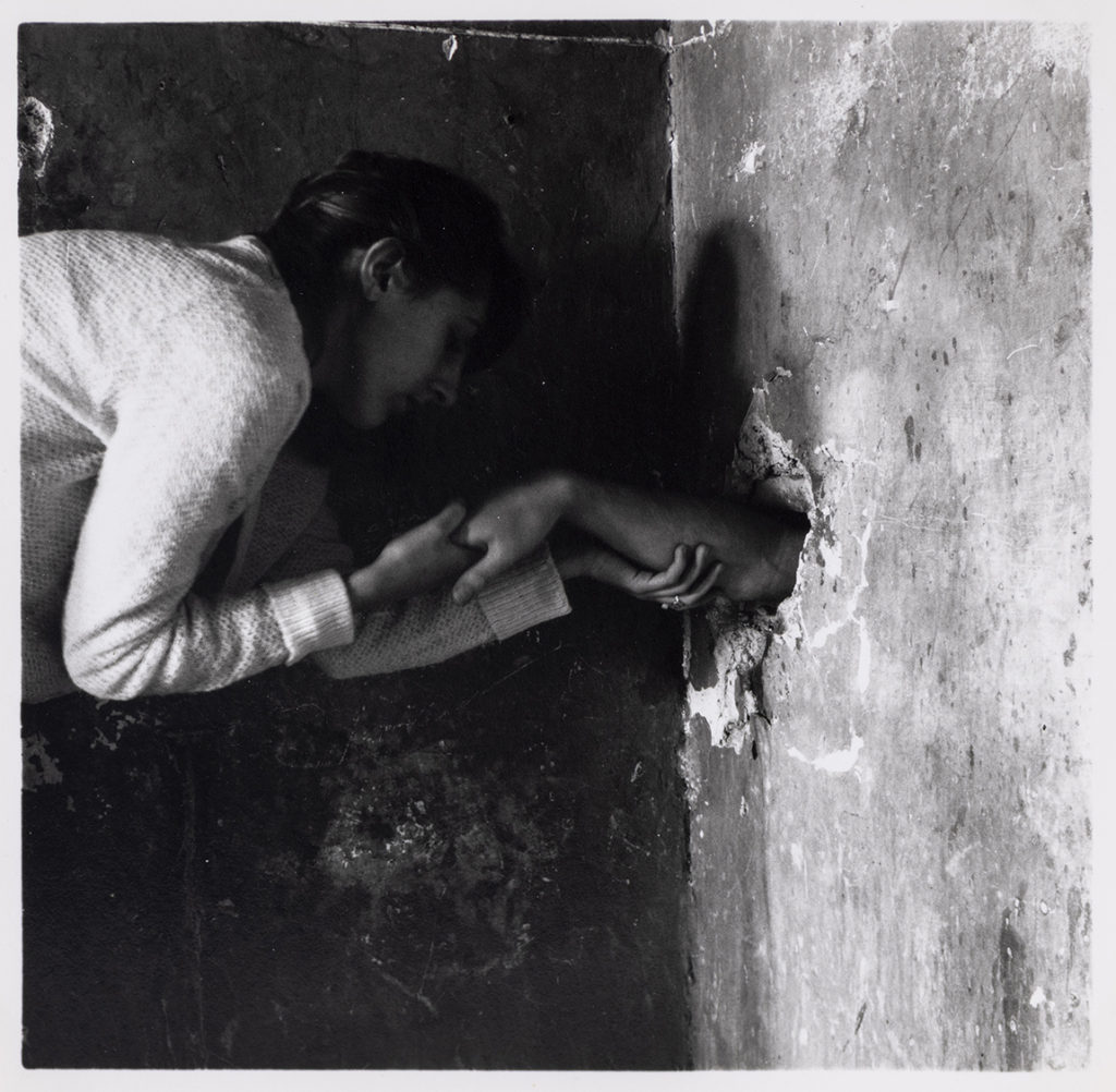
“Untitled” by Francesca Woodman, Rome, Italy, 1977-78
I have decided to compare Claude Cahun and Francesca Woodman’s work because both artists usually shoot in black & white, always have a hidden message in their pictures and they both struggle with their own identity.
An obvious similarity between these images is that they are both in black and white however, Cahun’s image looks softer and has yellower tones (probably because of the cameras available during the 30s) compared to Woodman’s which has a high contrast between her white clothes and the dark background.
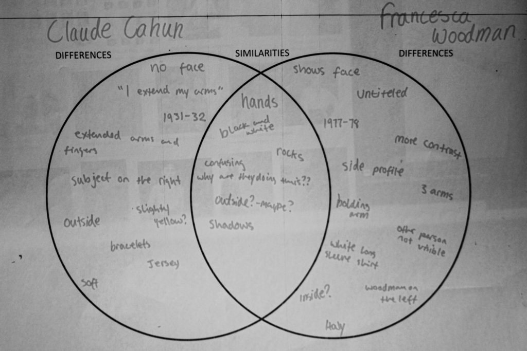
| Claude Cahun Differences | Both Similarities | Francesca Woodman Differences |
| no face | black and white | side profile |
| extended arms and fingers | hands | abandoned building? |
| artist on the right | outside? | artist on the left |
| 2 arms | rocks | 3 arms – 2 holding 1 |
| bracelets | shadows | white sleeves |
| 1931/1932 – France? | confusing – what is going on? why? | 1977-78 – Italy |
| “I Extend My Arms” | untitled | |
| 1 person | 2 people – 1 not visible | |
| naked? | high contrast |

