Inspiration
My main inspirations for this project are Kensuke Koike and Yoshikatsu Fujii, as their work links to my themes of family and age identity. To link this to my project as I’m planning to recreate some of their work, some in Photoshop and some using printed out images. Below I have recreated one of Kensuke Koike’s pieces of work. I have done this by taking three images; one of my dad, one of my uncle and one of my grandad. Firstly, I exported these images, then put them into Photoshop to that I could combine the images together.
Photo Montage
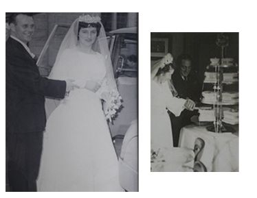
I have taken my main inspiration for the photo montage from Zed Nelson, who focuses on making sequences of monochromatic family photos to tell a story. This piece below is similar to his as its part of a sequence and not just one image. Also, these images are edited in the same style (these were originally black and white) whilst Nelson’s are edited to create a sense of authenticity.

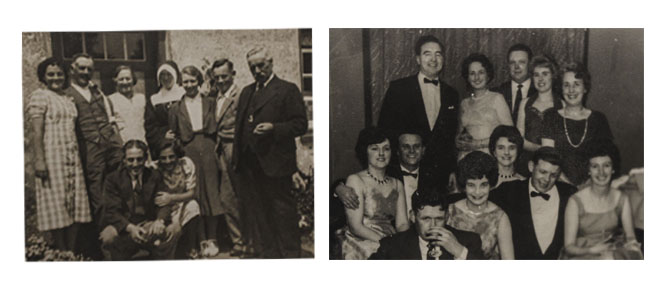
Above I have created a photo montage/ juxtaposition of my grandparents of my mums side (left) and my great grandparents (right) at their weddings. This is still inspired by Nelson however I am just merging his style of my own, and relating it to my family and these individuals in the images never met each other. It’s interesting how you can also see the differences and similarities in details such as the weddings dresses and suits.
Also, these images are edited in the same style (these were originally black and white) whilst Nelson’s are edited to create a sense of authenticity. In contrast, my images are placed in this order to juxtaposed each other, firstly they are placed in chronological order as my dads family (left) are older than my mums (right). I selected these particular images to juxtapose how my grandparents on my dads side were brought up compared to my grandparents on my mums. As my dads side were brought up on a Jersey farm and my mums grew up in Scotland and look like they lived a more comfortable life.
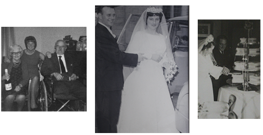
Here I have combined 3 images, one of my grandparents wedding, one of my great grandparents weddings and one of my great grandfather on my dads side, who unfortunately lost his legs to gangrene infection during World War I along with my great grandmother and one of my great aunts. I placed these images in this order so that the family’s way of life can be compared. With my grandparents on my mums side obviously having grown up decades after the affects of World War I affected my great grandparents lives.
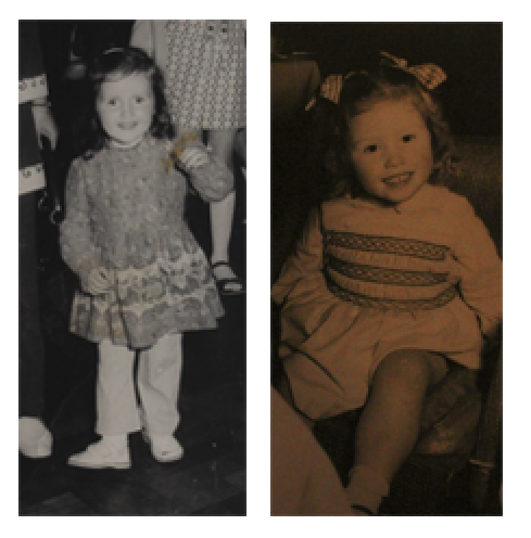
This piece is composed of one image of my mum when was around 6 (left) and a photograph of my grandmother on my dads side when she was 3 (left). I like how the difference in the colour tones of the images make for the start of the juxtaposition, as these were taken around 30 years apart. However, these two women have had a major influence of my life today and will continue to do so.
Multi Exposure
The ideas for my multi exposure work came to mind after researching and recreating Zed Nelson’s work. Despite him not creating multi exposure edits, I thought instead of creating a story through images I could combine objects relating to my family, and my family members themselves. To create these pieces of work I placed the 2-3 photos in photoshop and edited the opacity, this means that one image becomes more prominent than the other, creating a interesting merged affect.
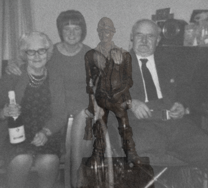
The main object of this image is the miners lamp statue you can see in between the 2nd and 3rd person. I have placed it here next to my great grandfather as he was also a man of trade, as he served in World War I on the frontline trenches, where he unfortunately was infected with gangrene and lost both of his legs, the original image was taken decades after he returned home safely. These photographs link as my grandad (also on my dads side but there weren’t related) was a man of his trade, working down in the coal mines during the 1960’s.
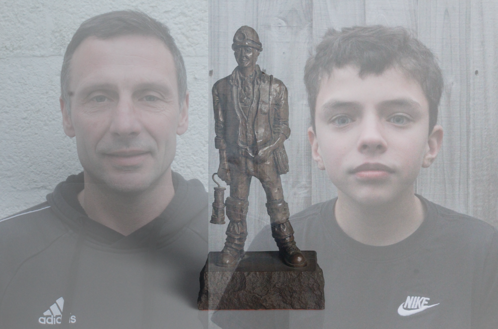
Here I have created an image composed of my grandad’s miners lamp statue, my dad and, my brother. The aim of this piece was to link all three generations of my family members together through both primary images and physical objects. Furthermore, I like how the people in the image aren’t as clear as the statue, implying that the roots of the family are just as important as what family members are alive today.
Failures
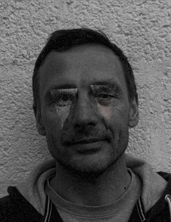
Why it was a unsuccessful: The main problem with this image is the clarity, even though I previously knew my first photos weren’t good quality, mostly due to the bad quality lighting the images were taken in, putting them in black and white and increasing the dehaze seemed to fix this problem enough. Also, I did take the three different images at slightly different angles, and additionally in different lighting, meaning that the sizes of the triangle sections were always going to be different sizes and therefore not proportionate.
Why it could be used: This piece of work was originally an attempt to copy Kensuke Koike’s work, but this artist reference didn’t turn out as expected. However. I still put in on the blog to show the real process of creating final outcomes, how some go to plan and other turn out with a lack of meaning and with no links to the project. Even though this piece directing links to one of my artists, I believe that I can recreate some of Koike’s work effectively.

