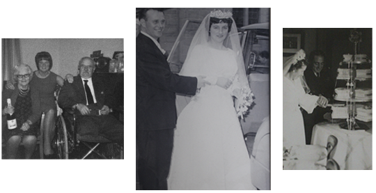
lightroom

photoshoots

For my first photoshoot I set it on a very sunny day, so that I could capture the sun reflecting out of the boys eyes, although only a few images were successful, I did manage to get 2 or 3 great images.

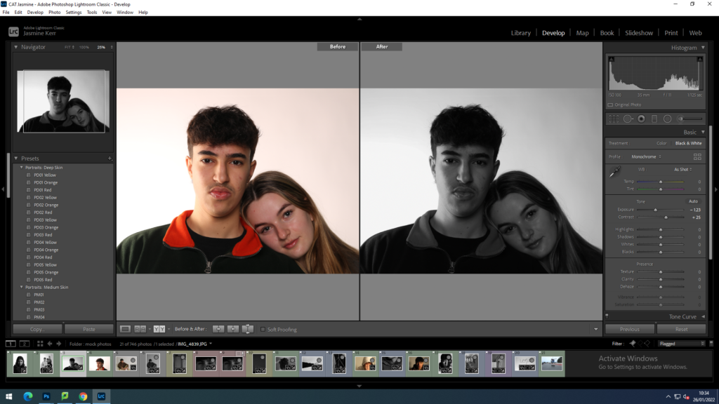
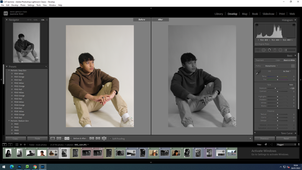
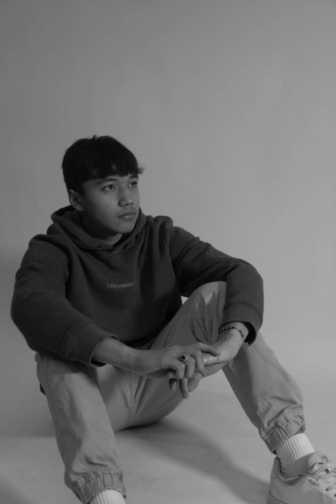
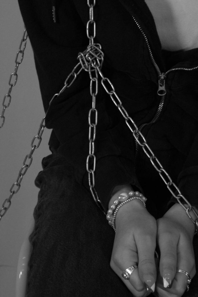
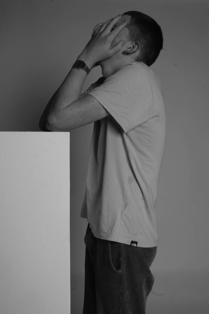
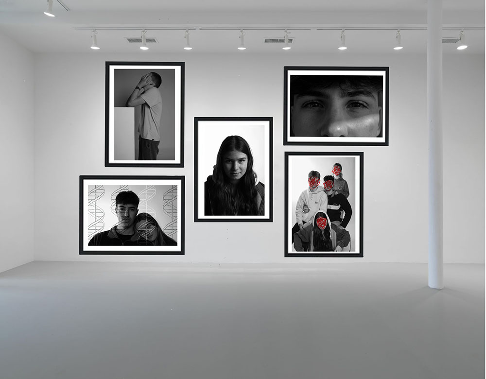
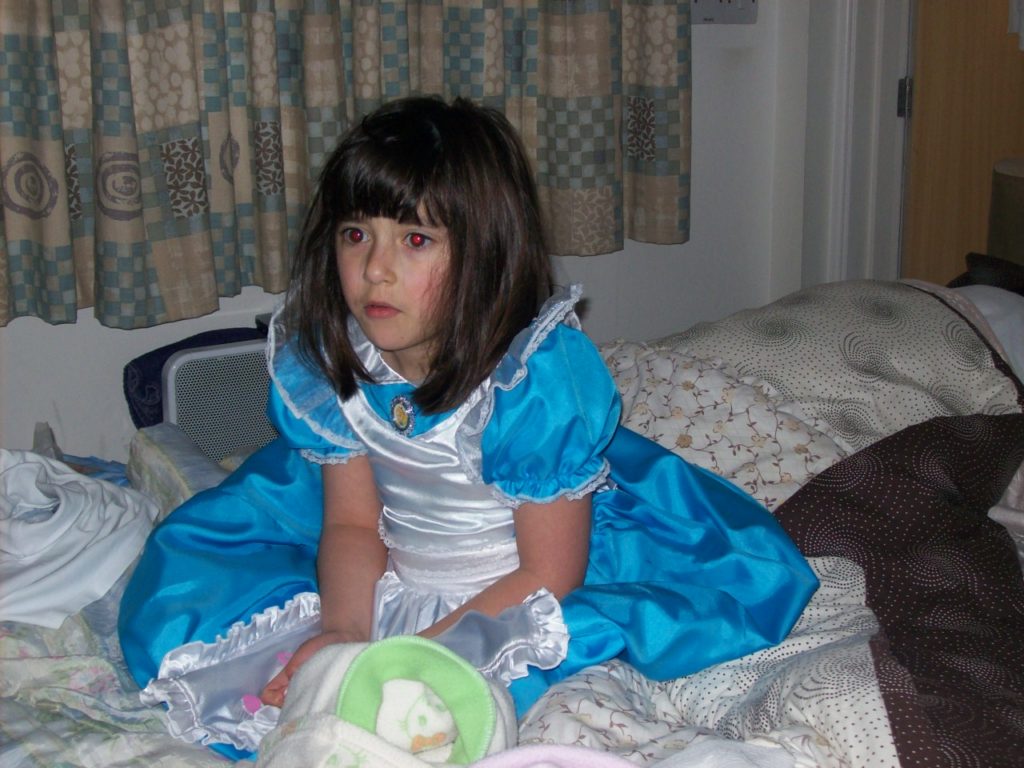
My second shoot was set in the studio, with 5 of my friends, here is where most of the good images came from. We tried many different lightings including Rembrandt, butterfly and silhouette and tried many different portrait ideas and positions.

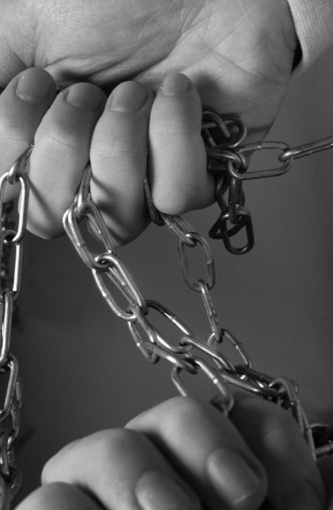
Some of my images where unplanned images, that were taken in the spare of the moment as I saw an opportunity arrive. I have been collecting these images for a couple weeks.

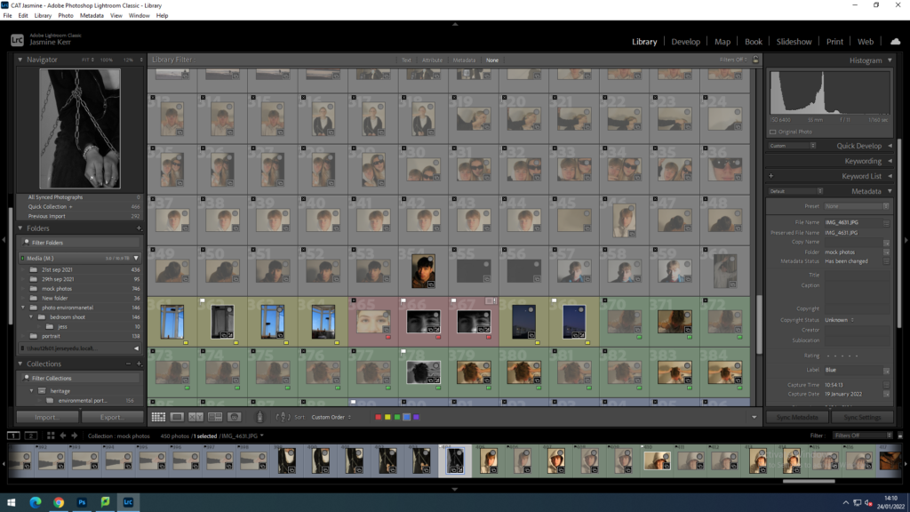
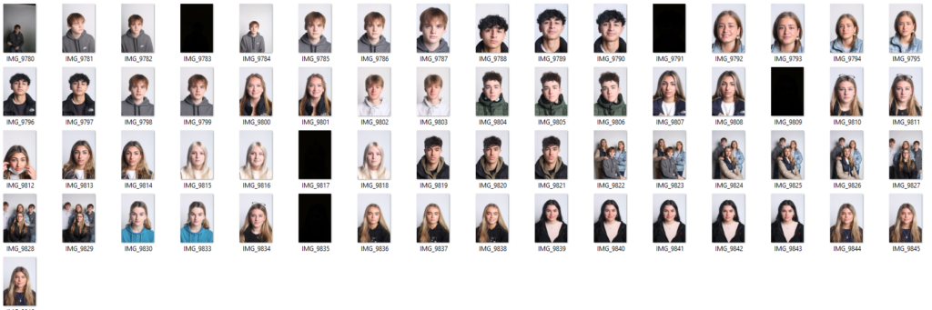
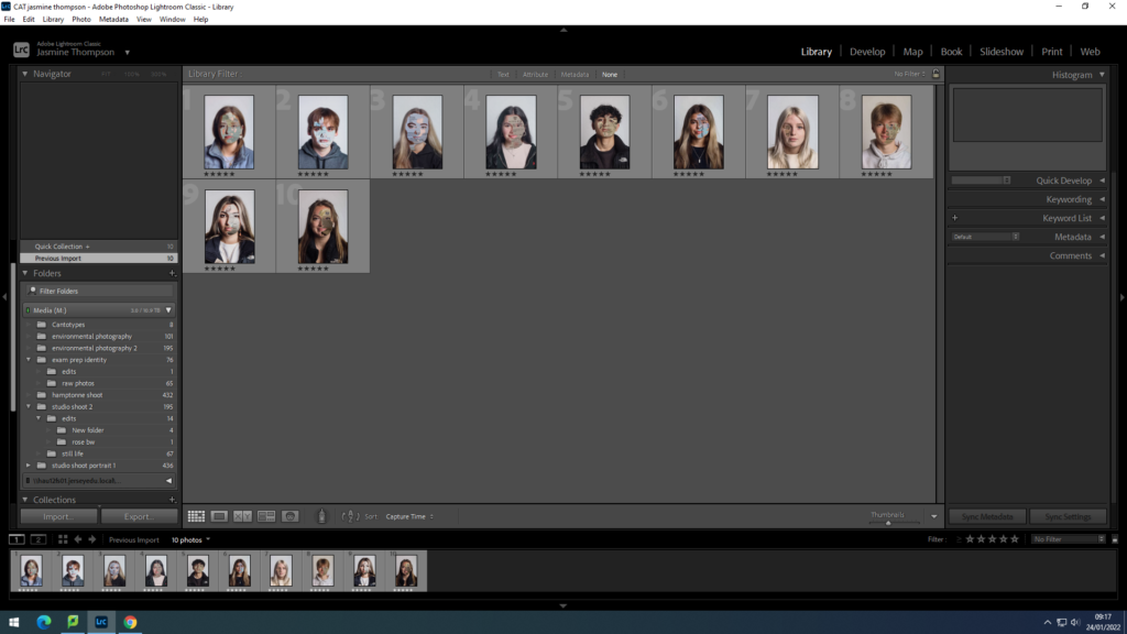
Here I am beginning to sort through all 800 + of my photos and select the potential photos with ‘shift p’ and reject the photos that aren’t so good with ‘shift X’

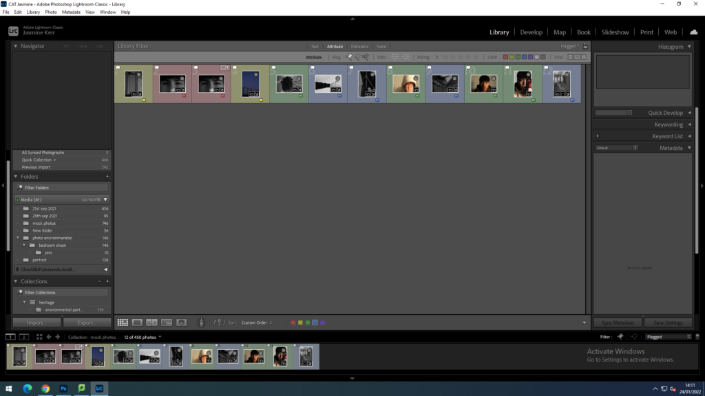
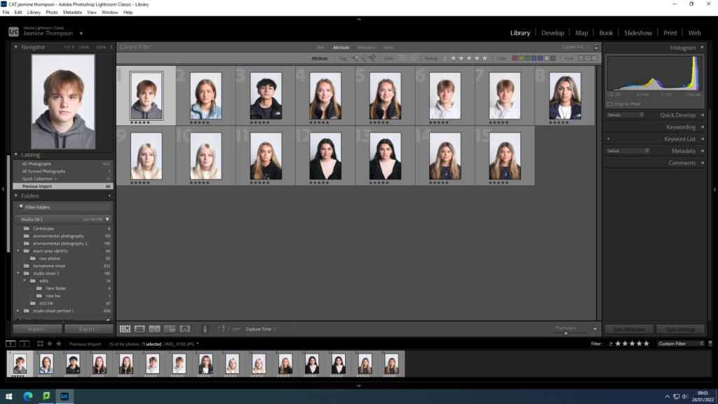
Now that I have reduced my photos to around 12, I am colour coding them into portrait, object and landscape.

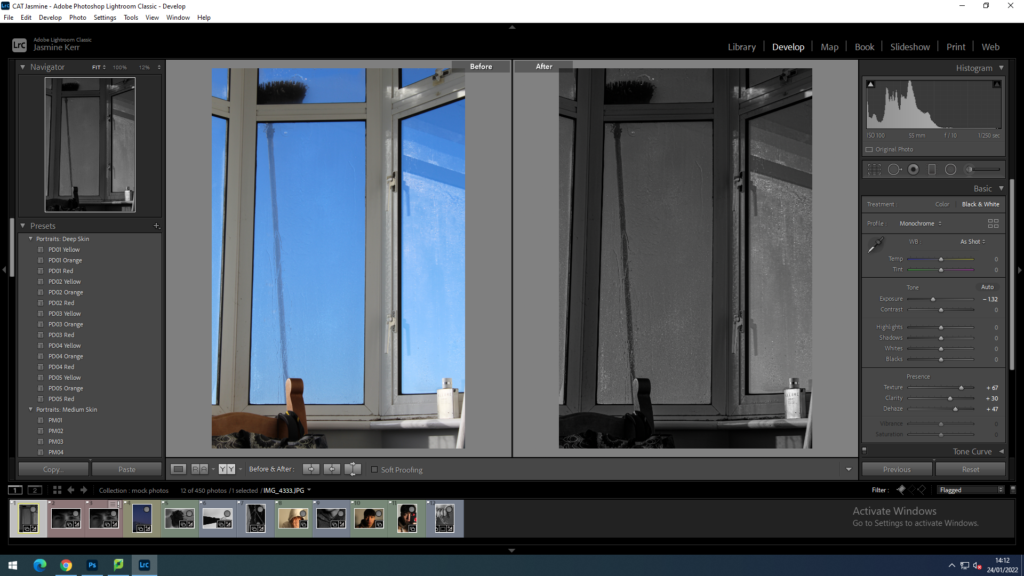
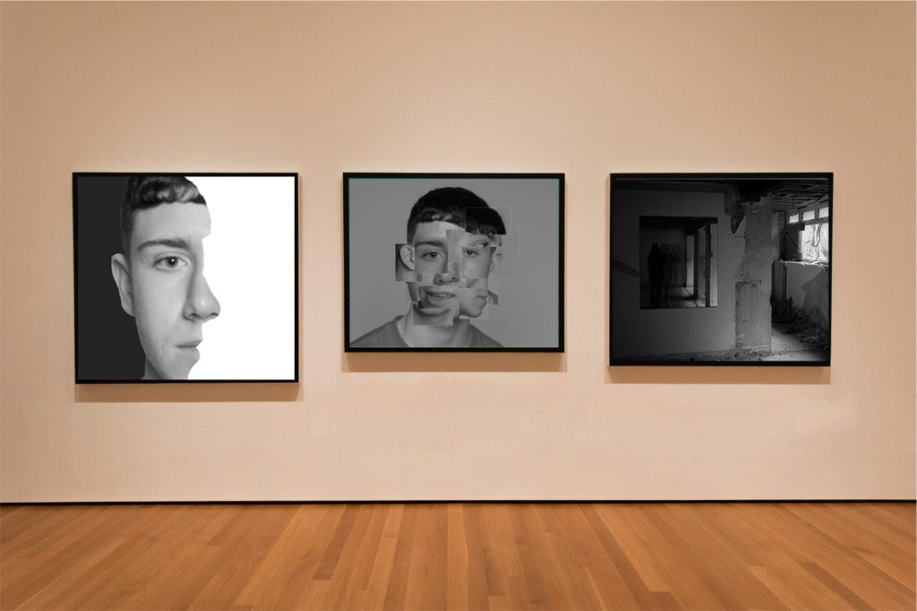
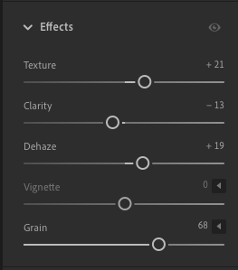
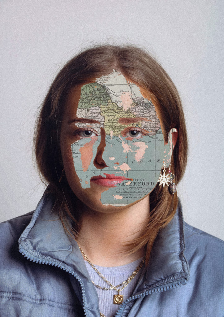
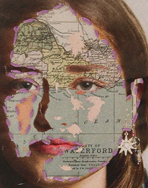
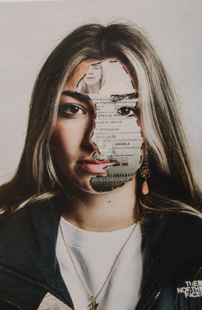
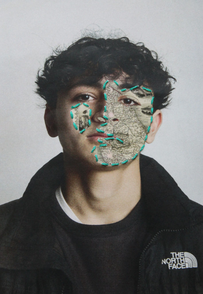
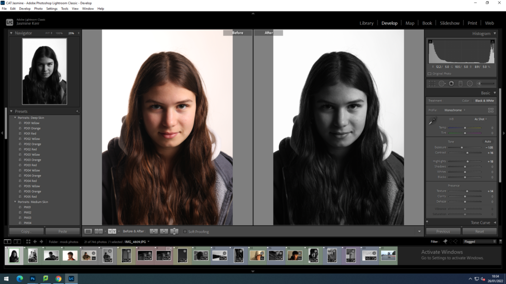
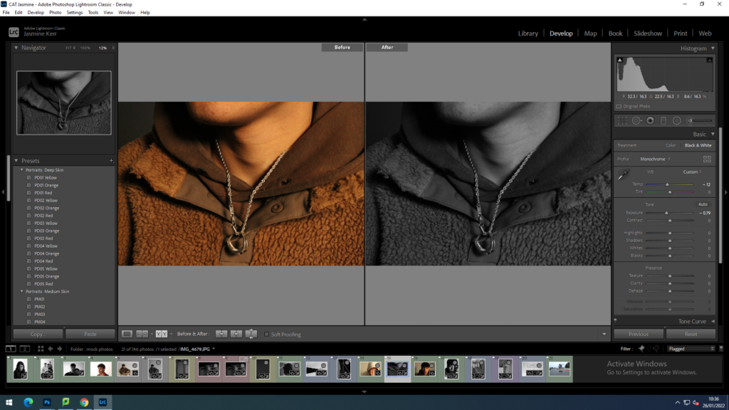
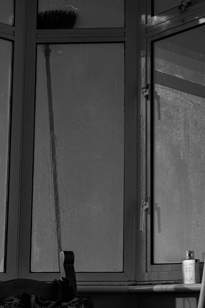
Now I am beginning to edit the lighting and crop my images to portray my view of lost Identity. I have changed the image to black and white to take away the personality through colours. By reducing the highlights and exposure and increasing the clarity, texture and contrast, the water dripping down the window is enhanced. This also creates the idea that tears are dripping down someone’s face.

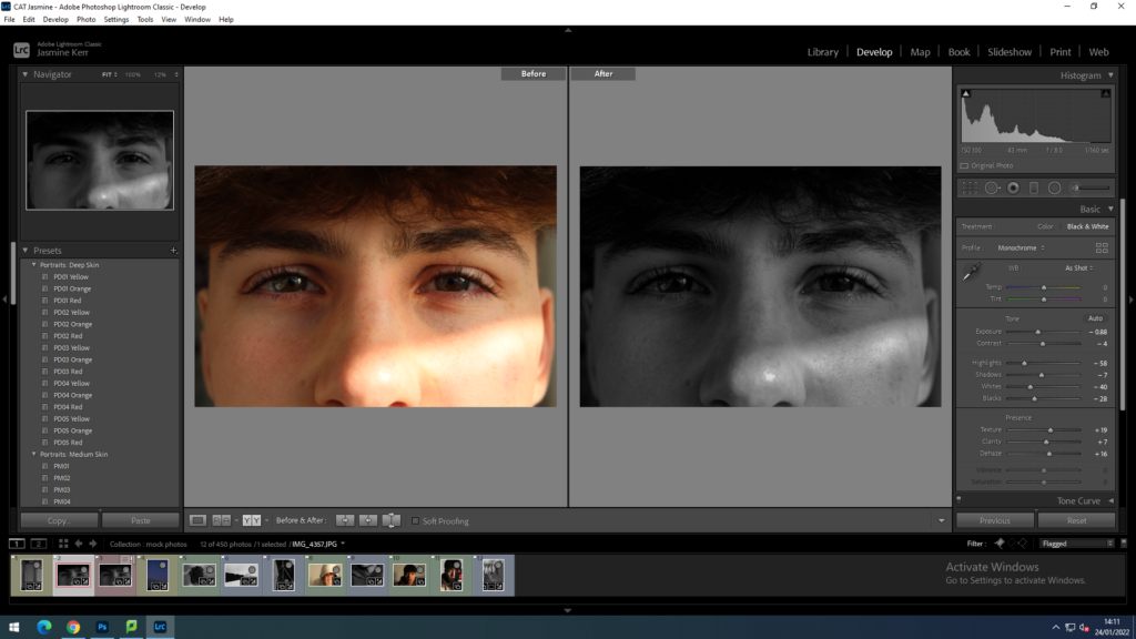
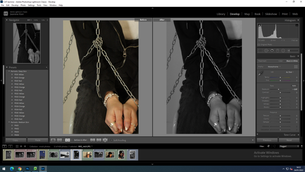
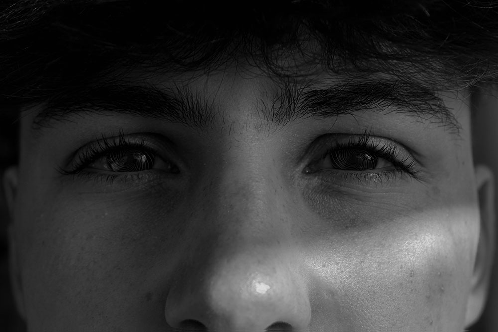
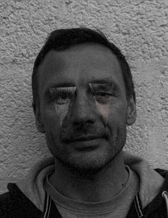
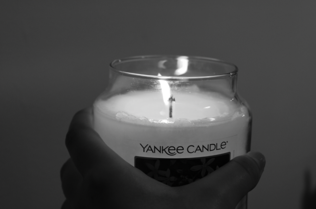
I have changed this image to black and white, decreased the exposure, highlights and whites and increased the contrast shadows, texture and clarity to give the effect that his eyes are like glass.

more before and afters

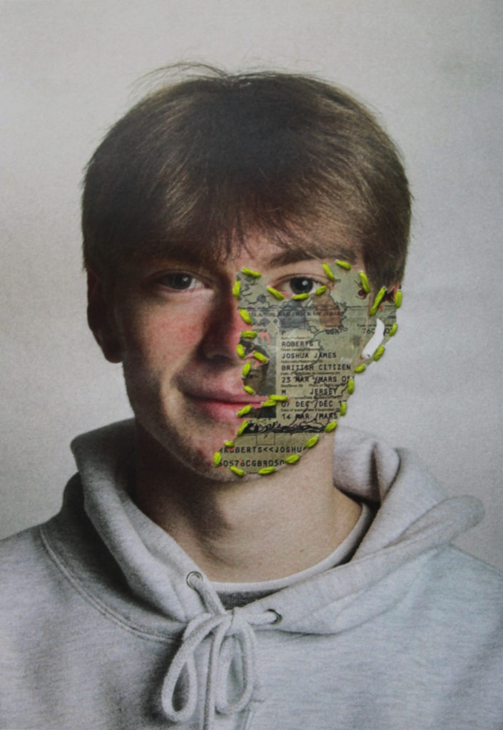
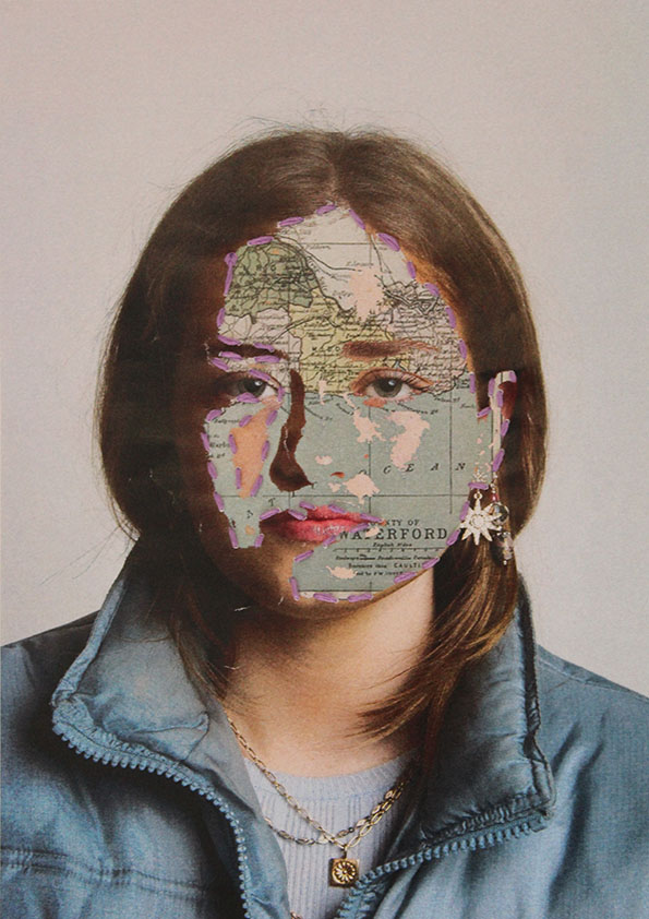
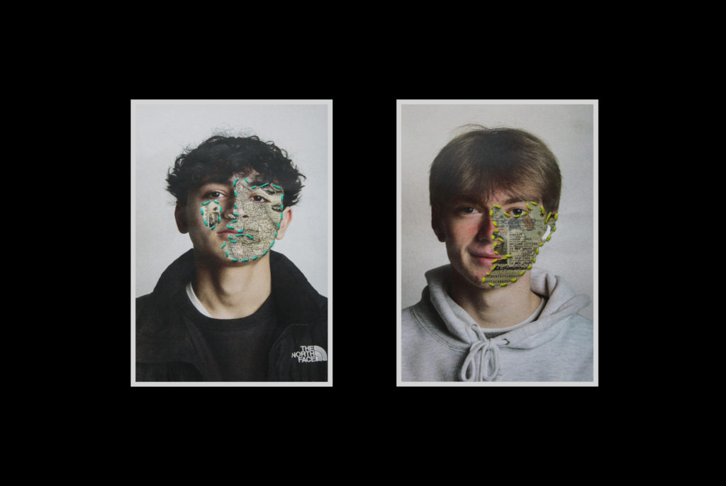
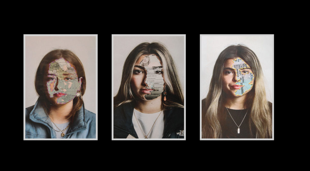
photoshop editing examples

image 1

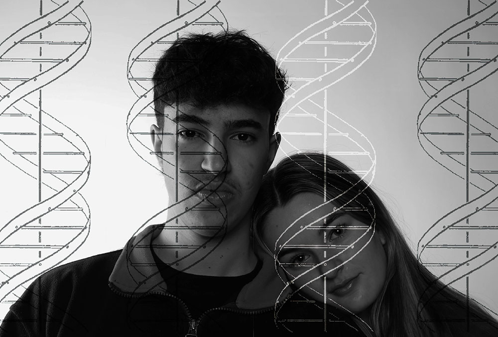
I started off with this black and white image of Reinaldo and Hattie.

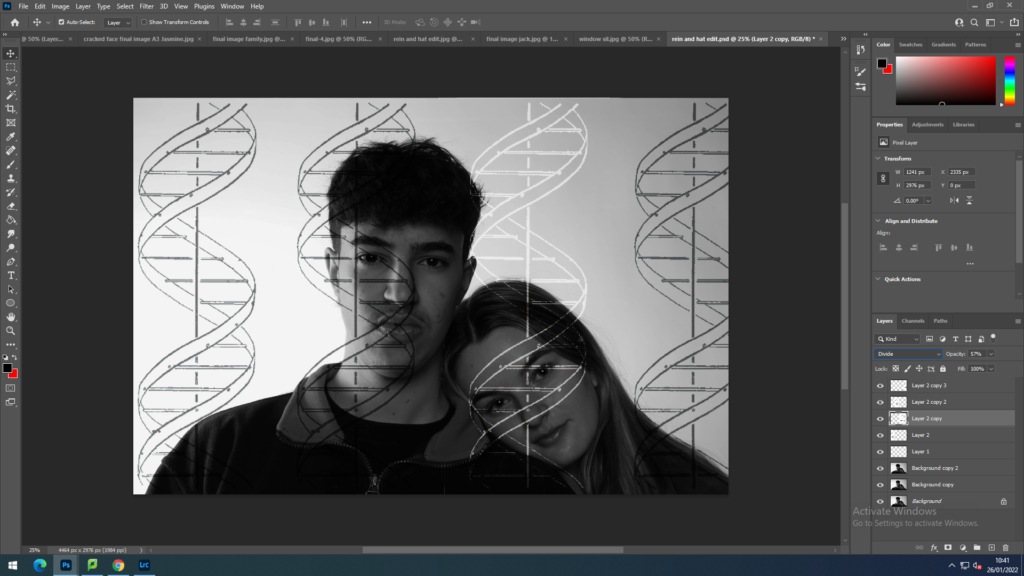
I then took it into photoshop and started inserting DNA into the image. I took out the white background and duplicated the layer until there were 4 DNA helix’s. I think positioned them equally across the screen and set them all to linear burn so that they looked like sketches over the drawing. After a bit of trial and error I then decided hat something didn’t look quite right with the image, so I changed one of the spirals into the divide setting, making it white. This spiral represents the ‘odd one out’ or the ‘unique’ person in society.
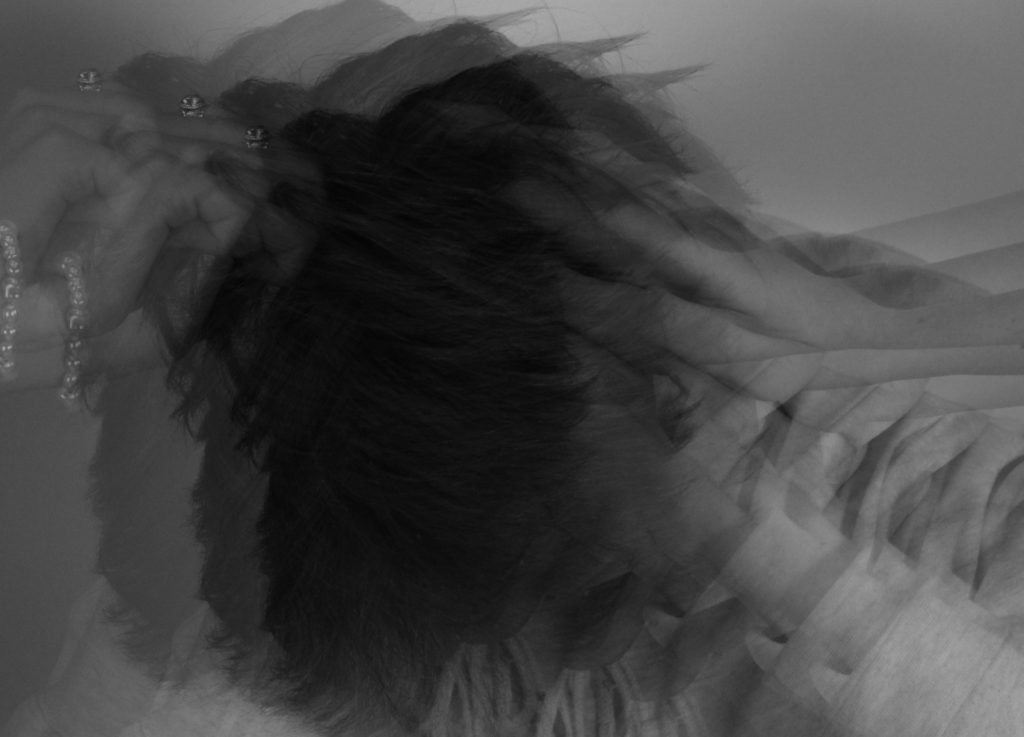
image 2

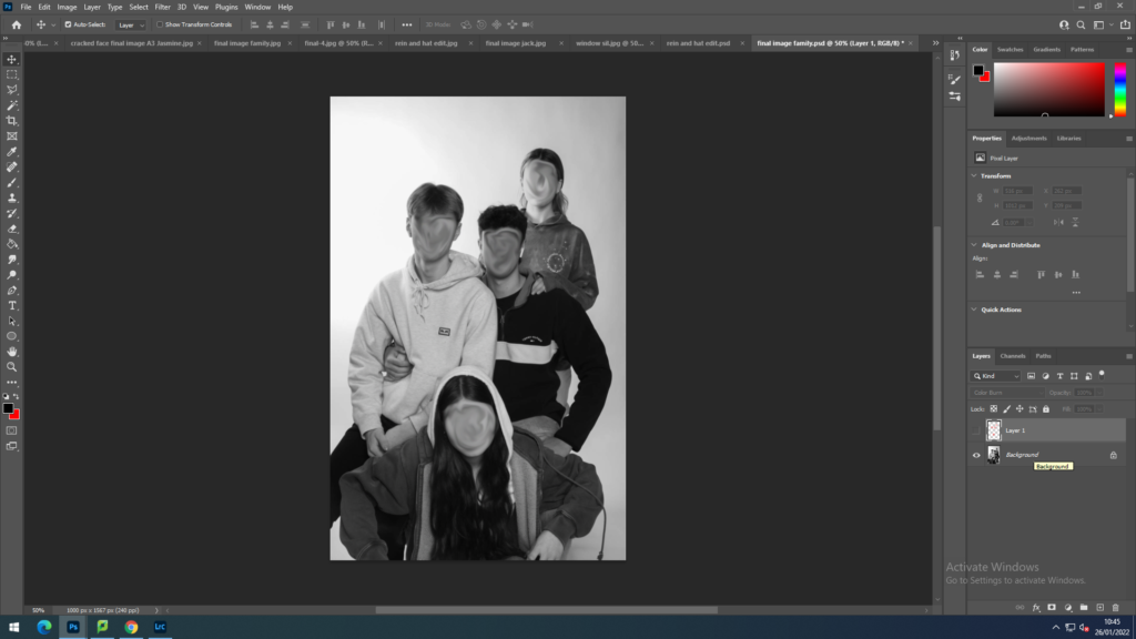
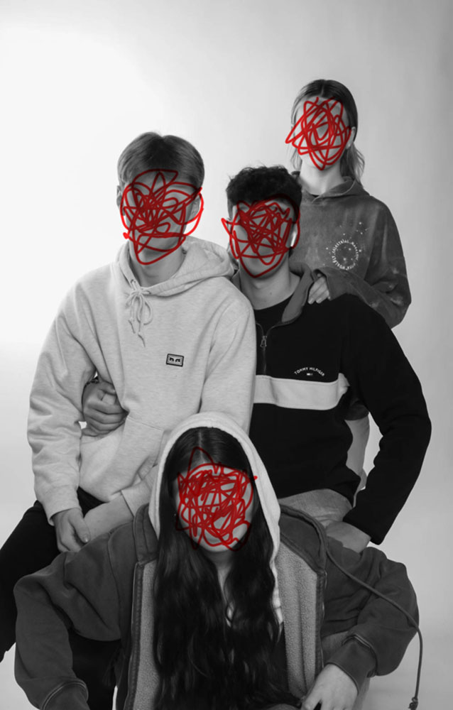
with this image, I started off by using the smudge and blur tool to swirl their facial features out as I didn’t want their faces to be recognisable.

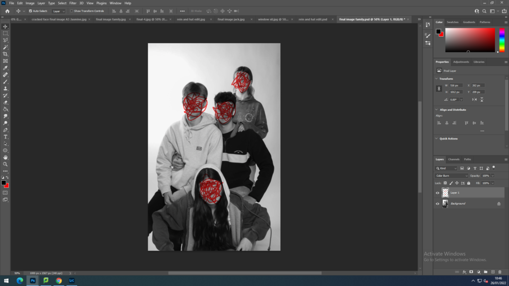
secondly, I used the paint tool to draw irregular scribbles over their faces and then changed the setting to blend colour burn so that the scribbles still looked part of the image.
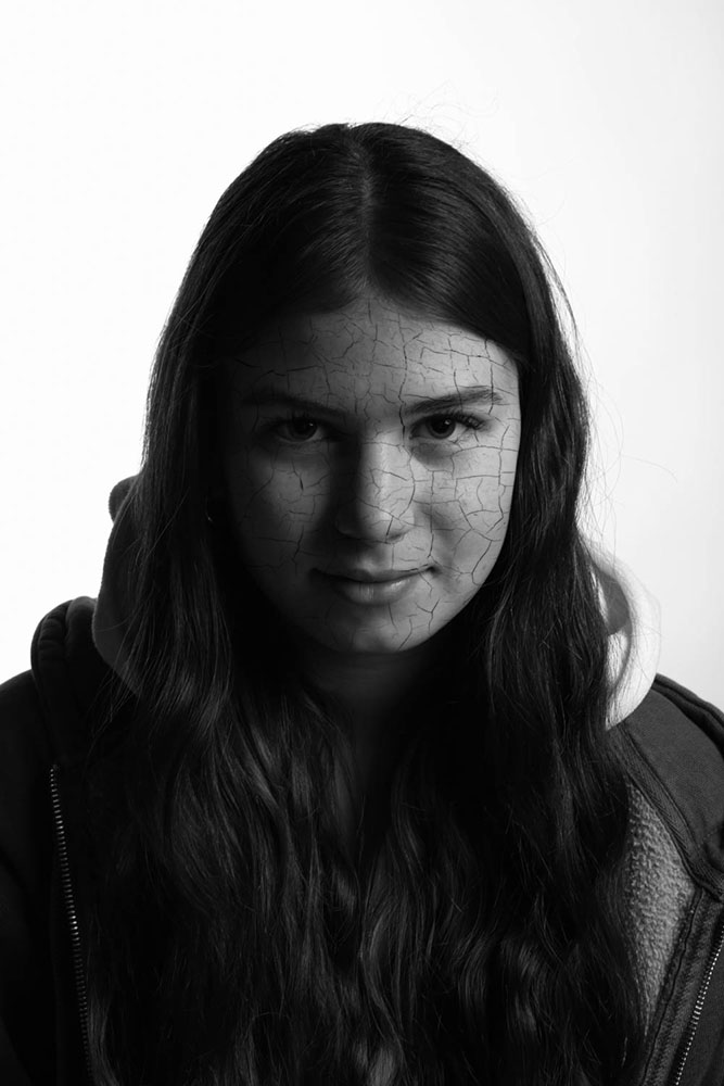
Image 3

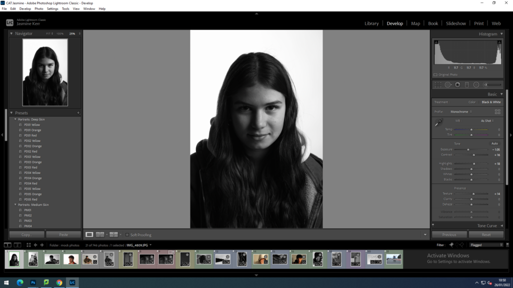
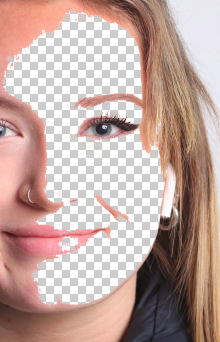
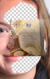
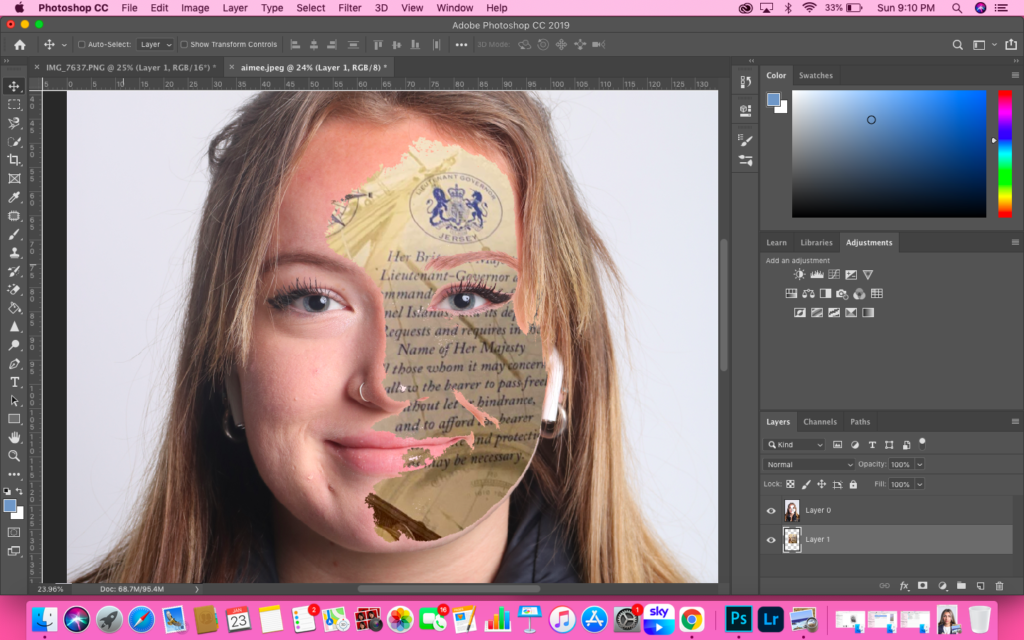
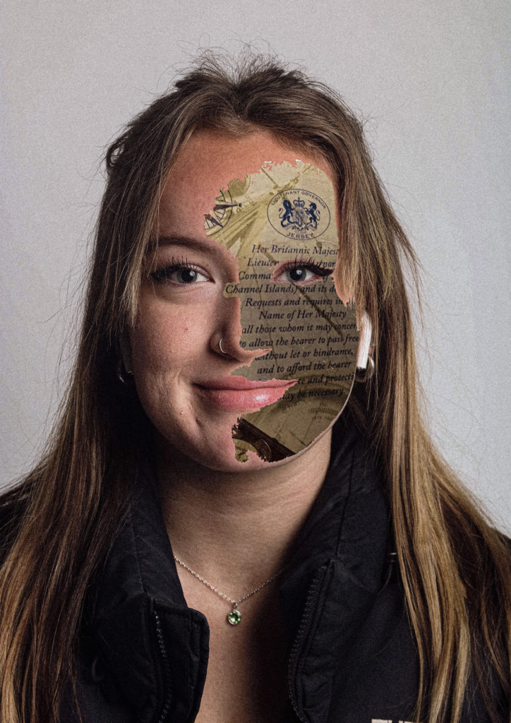
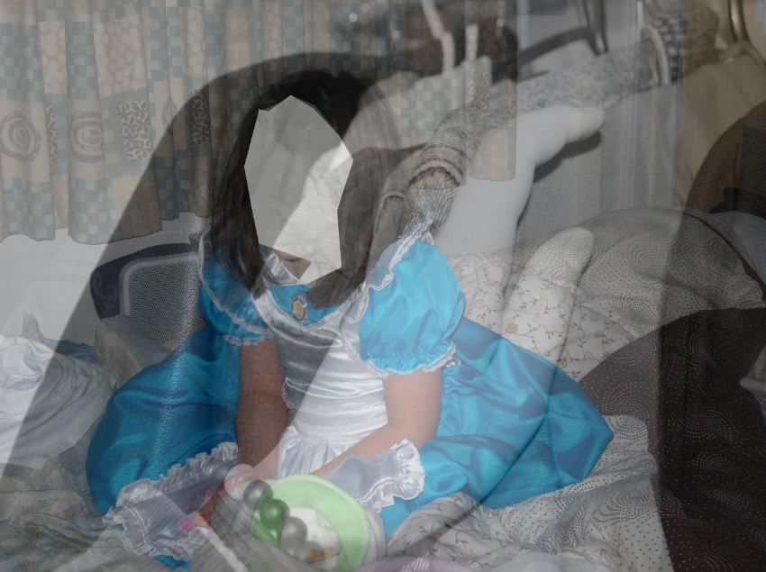
Firstly I started off having a few ideas about what I wanted to convey from this image, It was a lot of trial and error before I came up with the final idea. Originally I wanted to put a fingerprint over her face, and make it look like, instead of having a face, she was merely a fingerprint. However I was not satisfied with the outcome and changed my idea completely. Then after some time making decisions with other images I came up with the idea to make her face look shattered and cracked.

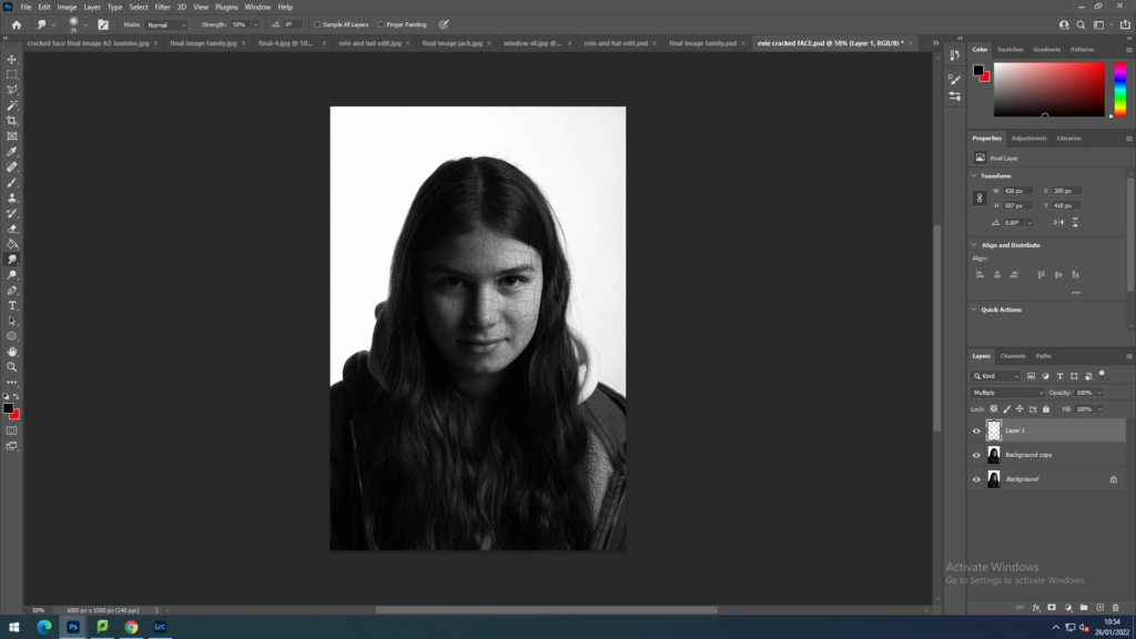
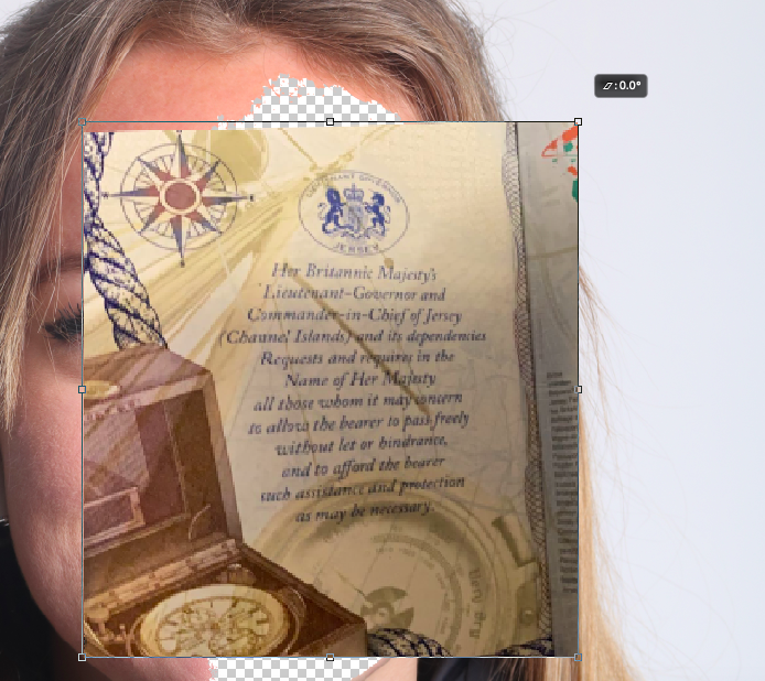
To achieve the cracked face, I inserted an image of cracked paint and began to experiment with how I could make it look like it was actually part of her face. After many failures, I achieved this by: firstly changing the opacity to 50%, and cropping the image down so that it was just a little bigger than her face by using the polygonal lasso tool. I then used ‘control T’ and right clicked, dropped down and selected ‘warp’. The warp tool allowed me to curve the image to combine in to her face shape and structure. After this I used the eraser tool to remove the cracking from her eyes and around her face where it shouldn’t be. Finally, I put the opacity back to 100% and used the setting multiply to stick the image to her face.
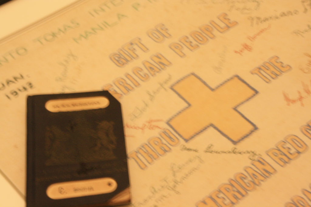
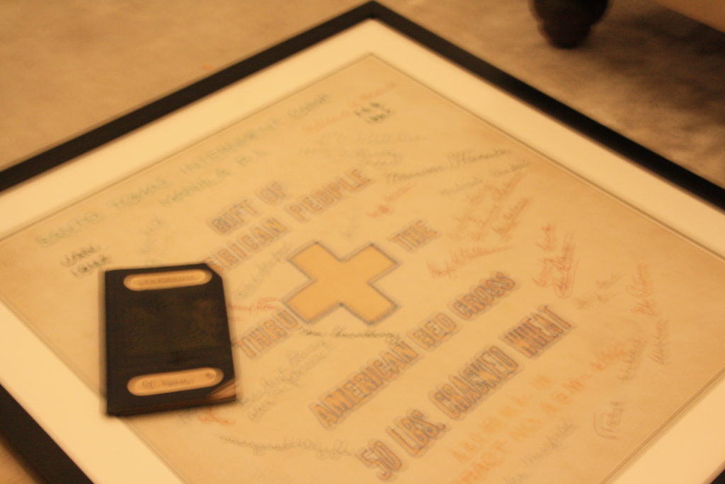
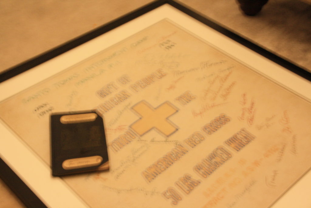
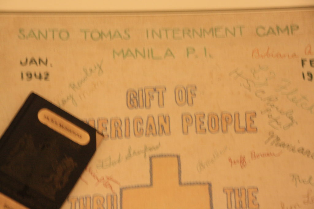
Final outcomes

Evaluation

All the images that I am presenting here are all of my chosen images, edited so that the lighting and composition. They are in black and white in response to Claude Cahoon and Mihaela Ivanova. Another reason for using black and white is that I wanted all colours erased out of my images to cancel out assumption, stereotyping and personality through choice of colours. I have produced a series of portraits, objects and landscapes all with a connection to my take on ‘lost identity’. I wanted to show that Identity is constantly being altered, controlled and changed by society to the point where people cant remember who they really were, or even have lost their unique identity completely. I have used many techniques in photoshop and delicate lighting editing to achieve this. In response to Mihaela Ivanova, I have produced a few slow, black and white images much like her style

successful pieces

In this image I have increased the contrast slightly, blurred out their faces and scribbled over them in photoshop. This photo signifies the ‘Perfect Family’ on paper, but behind the scenes this family could not be so normal or perfect. The faces are scribbled out to show that none of these people truly understand their identity and how behind the fake smiles they are simply just people who are lost.

This image is one of my favourites, I chose to take a simplistic portrait, without any photoshop. I increased the contrast and highlights, and decreased the exposure to make the neckless the key focus point. The reason I have done this is because the necklace belongs to his parents, with their initials engraved in it, which shows a strong part of his identity. I have chosen to take the image just below his face, only showing his neck and shoulder to keep his identity covered but show slight hints through the necklace. The idea behind wearing a family ring around his neck links into the theme of lost identity because it is almost like he is expected to be a certain way for his parents and may have to keep his true identity covered from them.

In this image I have lowered the expose and increased the contrast, texture and clarity to enhance the water dropping down the window. The idea behind this image, although slightly hidden, is that the window washer signifies the way `I view identity as washed out and hidden. The water dripping down the window is highlighted and symbolised tears behind someones facade. I enjoy the realism in this image, as it was not set up, it was an idea that sprung to mind as soon as I saw it, and I only had a small period of time to take the image.

In this image, I haven’t changed a lot to the lighting, I simply decreased the exposure and increased the contrast to really pull the couple away from the background. I have used photoshop to insert 4 DNA helix’s to signify that everyone comes from tiny, miniscule supercoiled code, that can’t be seen and that nobody ever really thinks about. You’re DNA is something that nobody can change, this links to lost identity because your identity feels confined to what you were given. For example if your DNA says you are female, then feeling like you are supposed to be a boy can make you feel trapped and confined.

in this image I have increased the contrast and whites, and decreased the exposure. In photoshop I edited cracked skin look onto her face. This image signifies the way that although she is smiling, she is fighting something behind the scenes and It is slowly breaking her identity down before she looses it. This relates to the idea that other people begin to control the way you view yourself, to the point where you actually forget the real you.

In this image I have decreased the exposure, highlights and whites and increased the contrast shadows, texture and clarity to give the effect that his eyes are like glass. I have also done this to enhance the texture of his skin, bringing out the subtle freckles on his face. I wanted to make his eyes look like glass reflecting light to signify that people can be fragile on the inside, however the identity that we all see may not show that. In photoshop I have edited hypnotising spirals into his eyes, although hard to notice and first glance, the more you look and the image the more you can see it. I have done this to show that everything that we see on a daily basis is altering our identity without us realising, from what people are wearing to what they are doing, saying and how their body language is.

Unsuccessful pieces

I did not include this image as a final piece. The idea behind this was that his identity is being controlled by others, which you can see through the hands pulling his hair back and forth. I wanted to make the image multi exposure, so that it gives the effect of the confusion happening in his head. However, if this exam was extended or in the future I would change the lighting and camera settings slightly so that there was no grain to the image and the quality was better. I would also make one of the layers red to show anger in a lost identity.

first experiments

Inspiration

My main inspirations for this project are Kensuke Koike and Yoshikatsu Fujii, as their work links to my themes of family and age identity. To link this to my project as I’m planning to recreate some of their work, some in Photoshop and some using printed out images. Below I have recreated one of Kensuke Koike’s pieces of work. I have done this by taking three images; one of my dad, one of my uncle and one of my grandad. Firstly, I exported these images, then put them into Photoshop to that I could combine the images together.

Photo Montage

I have taken my main inspiration for the photo montage from Zed Nelson, who focuses on making sequences of monochromatic family photos to tell a story. This piece below is similar to his as its part of a sequence and not just one image. Also, these images are edited in the same style (these were originally black and white) whilst Nelson’s are edited to create a sense of authenticity.

Above I have created a photo montage/ juxtaposition of my grandparents of my mums side (left) and my great grandparents (right) at their weddings. This is still inspired by Nelson however I am just merging his style of my own, and relating it to my family and these individuals in the images never met each other. It’s interesting how you can also see the differences and similarities in details such as the weddings dresses and suits.

Also, these images are edited in the same style (these were originally black and white) whilst Nelson’s are edited to create a sense of authenticity. In contrast, my images are placed in this order to juxtaposed each other, firstly they are placed in chronological order as my dads family (left) are older than my mums (right). I selected these particular images to juxtapose how my grandparents on my dads side were brought up compared to my grandparents on my mums. As my dads side were brought up on a Jersey farm and my mums grew up in Scotland and look like they lived a more comfortable life.

Here I have combined 3 images, one of my grandparents wedding, one of my great grandparents weddings and one of my great grandfather on my dads side, who unfortunately lost his legs to gangrene infection during World War I along with my great grandmother and one of my great aunts. I placed these images in this order so that the family’s way of life can be compared. With my grandparents on my mums side obviously having grown up decades after the affects of World War I affected my great grandparents lives.

This piece is composed of one image of my mum when was around 6 (left) and a photograph of my grandmother on my dads side when she was 3 (left). I like how the difference in the colour tones of the images make for the start of the juxtaposition, as these were taken around 30 years apart. However, these two women have had a major influence of my life today and will continue to do so.

Multi Exposure

The ideas for my multi exposure work came to mind after researching and recreating Zed Nelson’s work. Despite him not creating multi exposure edits, I thought instead of creating a story through images I could combine objects relating to my family, and my family members themselves. To create these pieces of work I placed the 2-3 photos in photoshop and edited the opacity, this means that one image becomes more prominent than the other, creating a interesting merged affect.

The main object of this image is the miners lamp statue you can see in between the 2nd and 3rd person. I have placed it here next to my great grandfather as he was also a man of trade, as he served in World War I on the frontline trenches, where he unfortunately was infected with gangrene and lost both of his legs, the original image was taken decades after he returned home safely. These photographs link as my grandad (also on my dads side but there weren’t related) was a man of his trade, working down in the coal mines during the 1960’s.

Here I have created an image composed of my grandad’s miners lamp statue, my dad and, my brother. The aim of this piece was to link all three generations of my family members together through both primary images and physical objects. Furthermore, I like how the people in the image aren’t as clear as the statue, implying that the roots of the family are just as important as what family members are alive today.

Failures

Why it was a unsuccessful: The main problem with this image is the clarity, even though I previously knew my first photos weren’t good quality, mostly due to the bad quality lighting the images were taken in, putting them in black and white and increasing the dehaze seemed to fix this problem enough. Also, I did take the three different images at slightly different angles, and additionally in different lighting, meaning that the sizes of the triangle sections were always going to be different sizes and therefore not proportionate.

Why it could be used: This piece of work was originally an attempt to copy Kensuke Koike’s work, but this artist reference didn’t turn out as expected. However. I still put in on the blog to show the real process of creating final outcomes, how some go to plan and other turn out with a lack of meaning and with no links to the project. Even though this piece directing links to one of my artists, I believe that I can recreate some of Koike’s work effectively.

experiments: Montaging

I decided to experiment with some double exposures and photo montaging as I had some sets of images that I wanted to pair together and wanted to explore how I could pair them together.

Experiments

————– Experiment 1: ——————

These are the photos that I’m going to merge together
I started by using the polygonal lasso tool on photoshop to take away my face in an irregular pattern
I then added some texture onto the blank space, making seem like paper and giving it more detail
Finally, I pasted the other photo on top of the older one and lowered the opacity, creating a double exposure

Overall, I’m happy with how this experiment turned out. I’m especially happy with the second screenshot as I like the way it looks with the face removed and I may use it as a part of my final project. Although I like how the double exposure looks, I don’t think I’ll be using it as a part of my final project as I’m unsure as to what I’ll do with it or how it’ll fit in with the rest of my images.

————– Experiment 2: ——————

These are the photos I’m going to montage together
I started by turning the candle black and white so it wouldn’t be bright and would blend in with the colours of the other photos
Then, I layered my photos as shown above, matching the candles flame to my leg in the photo so the images blend together
Finally, I changed the bottom layer so it was black and white too along with the legs as I was attempting to make it seem as though the flame is travelling up, however, I didn’t like the way it looked and prefer my original montage.

I like the way the original photo montage turned out as there aren’t too many colours in it, making all the images blend together nicely. I think I could use it as a part of my final project by pairing it with a simpler and less busy image as it would create a strong contrast between them.

Sequencing and Grouping

Sequencing – A sequence is created by using editing software such as Photoshop, to combine all photos into a single image. This single image can then show the path of an object or subject.

Grouping – Grouping pictures lets you rotate, flip, resize, or arrange pictures together, as if they were one picture. They will often be from the same set of photos, having similarities or can be used to show differences.

Using photoshop, I practiced sequencing and grouping of my photos in various ways, these were:

  • Separately, to show the two different photoshoots.
  • Using all photos together.
  • In a group of three.
  • In a group of four.

Experimentation

I liked how some of these tuned out, but due to the sizes of the images and how they were all different. I found it difficult to group/organise them well, therefore in the future I don’t think that I would use grouping/sequencing with these images again in the future for my final piece.

Raoul hausmann case study

Raoul Hausmann was an Austrian artist and writer. His experimental photographic collages, sound poetry, and institutional critiques would have a profound influence on the European Avant-Garde in the aftermath of World War I.

Hausmann, a founder member of the Berlin Dada group, developed photomontage as a tool of satire and political protest. The fragment of a German banknote behind the critic’s neck suggests that he is controlled by capitalist forces. The words in the background are part of a poem poster made by Hausmann to be pasted on the walls of Berlin.

The Right to Copy – Disphotic

Hausmann’s artistic contributions to Dada were purposefully eclectic, consistently blurring the boundaries between visual art, poetry, music, and dance. His “optophonetic” poems of early 1918 fused lyrical texts with expressive typography, insisting on the role of language as both visual and acoustic.

outcome

Annegret Soltau. Personal identity — Self-portrait research project

My exam piece is inspired by Annegret Soltau a German visual artist.

I will focusing on the theme of geographical identity, i will be showing this through the use of physical documents and identity in the style of Annegret Soltau. E.g. Map, passport, citizen’s card, birth certificate, book about location, words in that language.

I will be creating a series of images using people from Hautlieu as my models. I will be using Annegret Soltau as my inspiration. My project will be made using both computer software and also doing bits by hand e.g. the sewing aspect.

I have decided to sew the forms of Identity into the skin instead of covering the face like Annegret Soltau, i feel this creates a more personal style while still emulating the style of Annegret Soltau, I also feel this creates a more personal sense of identifying with their geographical identity as the country you or your family originate from is ‘skin deep’.

Eyes Biometric science

Identification of persons through the eyes is in the field of biometrical science, I wanted to highlight this in my work as a link between document ID and every day life. Technology has been made for places such as airports to validate someone’s passport by comparing the eyes on the photo and the eyes of the traveller. No two eyes have exactly the same iris patterns. Iris scanning measures the unique patterns in irises, the coloured circles in people’s eyes. Biometric iris recognition scanners work by illuminating the iris with invisible infrared light to pick up unique patterns that are not visible to the naked eye.

Adobe Lightroom

I began by importing my images into Adobe Lightroom, I selected the images I thought looked most suitable. I then used the star rating system to choose a final few images. I rated the images I didn’t want to use 1 star and the images i did want to use 5 stars.

Adobe Photoshop

To begin the editing process, I began by collecting different forms of geographical identity from the different models I photographed prior to the exam. I collected forms of ID such as passports, addresses, maps of different towns/ country’s which the subject relates with geographically/ culturally.

Image after having the magic eraser tool used on it.

I began by using the magic eraser tool to select parts of the face to remove to later replace with a form of identity. I decided to keep features such as eyebrows, eyes, nostrils included in some of the images to have the ID seem more attached to the skin.

I placed the image of the treaty title for the monarch of the United Kingdom, a royal style used in international law and diplomacy onto Aimee’s face, linking with how she is from Jersey but spent some of her childhood living in England.

I resized the image onto Aimee’s face deciding which parts i want showing and which parts I want hidden.

I then moved around the layers to have the images blended together creating a skin-like outcome.

I tested out 2 different ways of editing these images, the first way i tested this was by covering the face completly more similarly to Annegret Soltau, however, I decided I wanted to take more of a personal approach on the style and make it more complex, in that sense, i decided to create the images with the ID stitched into the skin instead of covering the face, I also feel this creates a more personal sense of identifying with their geographical identity as the country you or your family originate from is ‘skin deep’.

Lightroom

I exported the edited images into Lightroom for colour editing.

To edit my images I wanted to emulate the colour style of Soltau. I edited all my images similarly along the lines of the edit history below. I adjusted the editing slightly depending on the persons skin tone/ hair colour to have all the colours and shadows looking some what the same.

My images before sewing.

Sewing

I wanted to include the sewing aspect from Soltau’s work into mine. I used different coloured thread for each person.

  1. I printed out my images on normal A4 paper
  2. stuck them on a piece of more sturdy paper to dodge ripping when sewing.
  3. traced the outline with a lightboard of the part I was sewing
  4. sewed my images.

The outcome