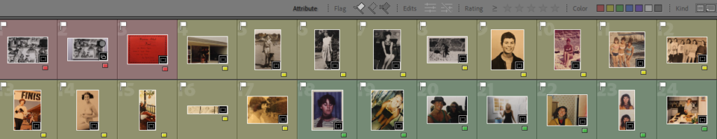
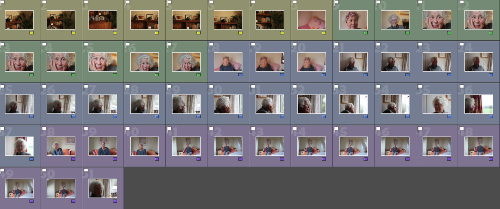
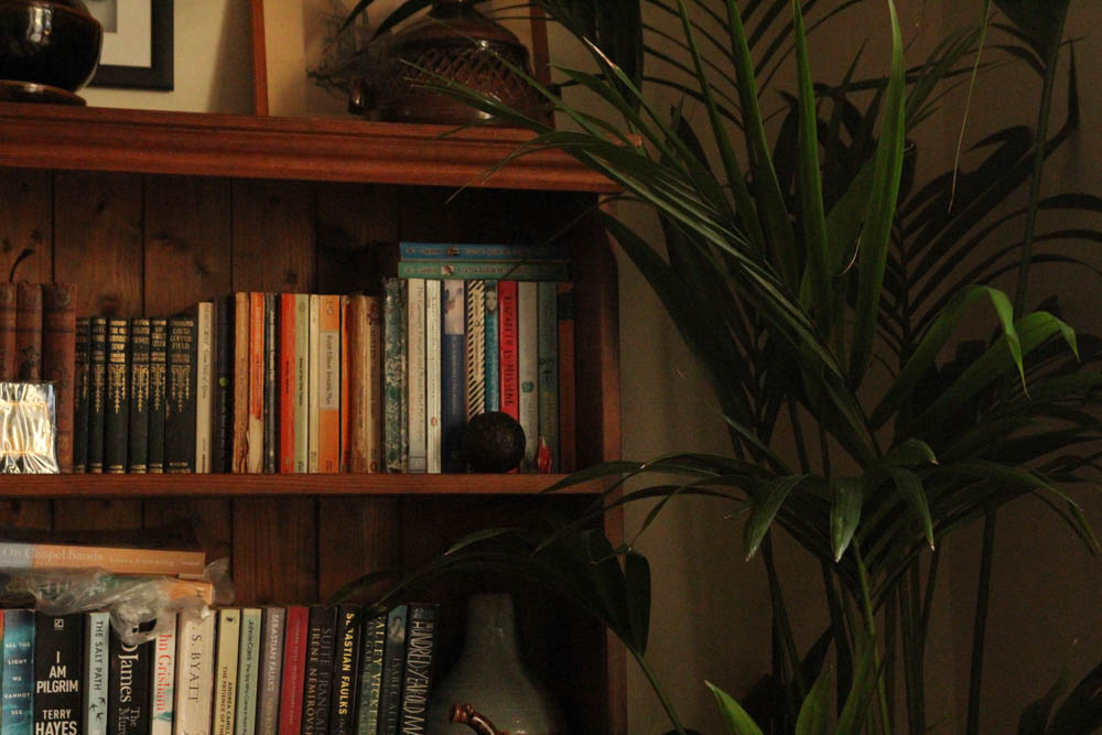
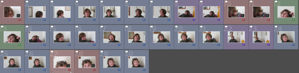
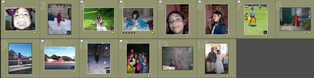
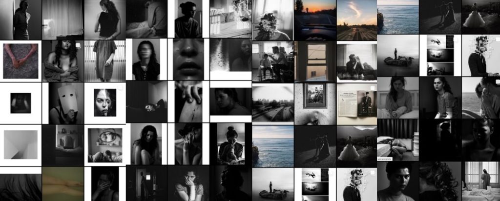
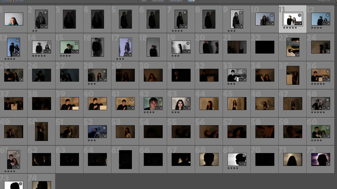
After taking my images, I put them into separate folders in Lightroom. For example, I had a folder purely for my more abstract images, as well as each shoot. I did this for my abstract images using a colour label (red), as well as using a separate folder and the flagging system (P and X keys). Below are contact sheets of my favourite images, as well as a gallery of my favourites for each shoot.
When I was selecting my favourite images, I was looking for clear, straight images, in which the subject had a suitable facial expression, and was framed properly. I also didn’t want to select images with too much over/underexposure, and images too grainy – a small amount is okay, due to my editing I hope to do, but too much would make it too difficult to develop my editing. – I had to be especially careful in my 2nd shoot of this. Additionally, when selecting images from my last shoot I had to be careful of shaky images, one of my issues in that shoot. When I had selected my final favourites from each shoot, I then rated them with the 5 star rating, and exported them as blog-friendly images (100 pixels on the long edge).
Photoshoot 1
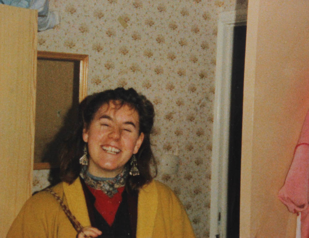
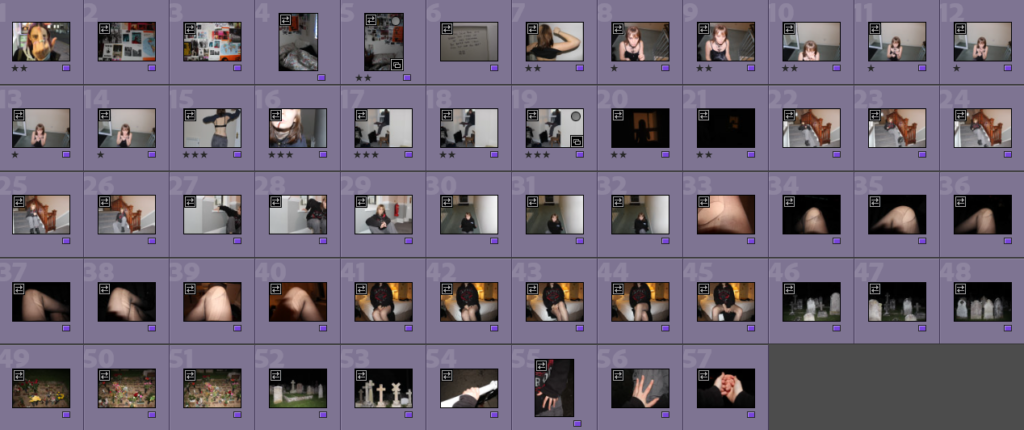
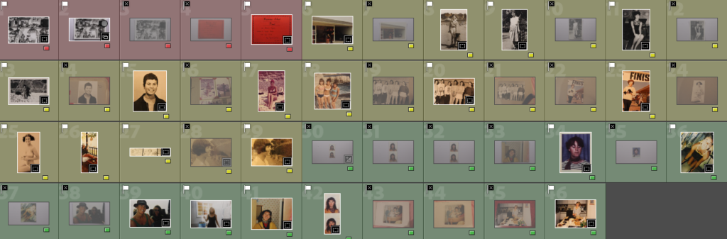
Selecting my best images for my found images – using colour labels: red for objects/non-portraits, yellow for pictures of my grandmother, and green for pictures of my mum. I flagged my favourite using P and X. This will make it easier for me to find my favourites of each subject when editing and collaging.
Best images
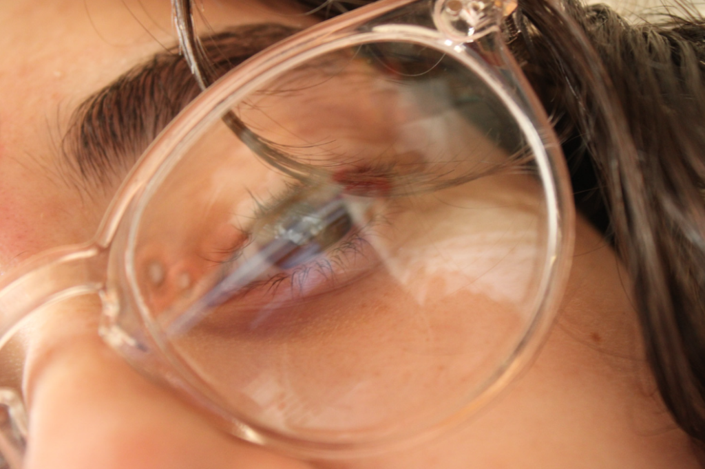
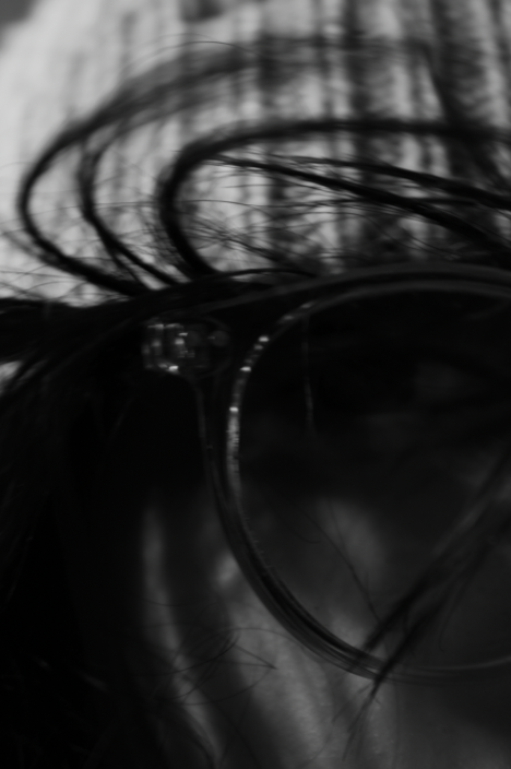
Abstract Images
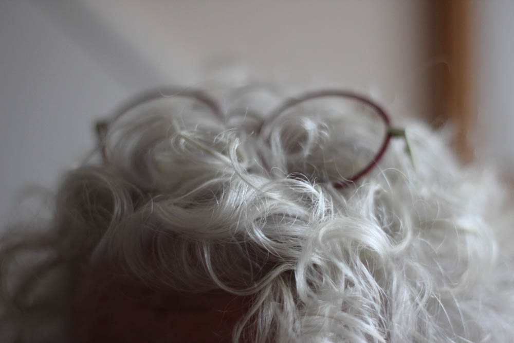
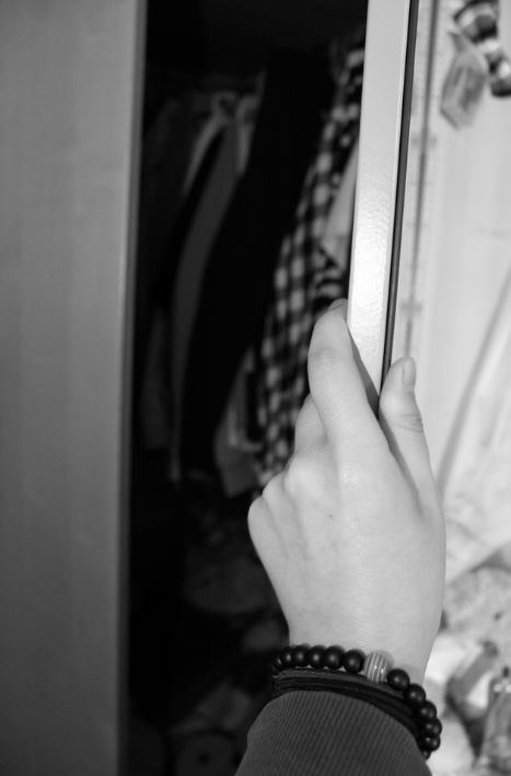
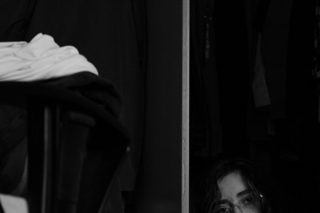
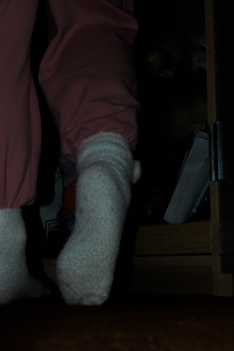
Here is a contact sheet of my favourite abstract, highly zoomed images, that only show certain parts of the subject.
Best Images
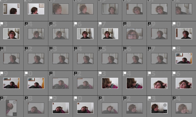
Photoshoots 2 and 3
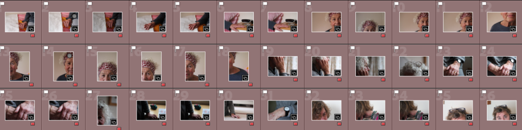
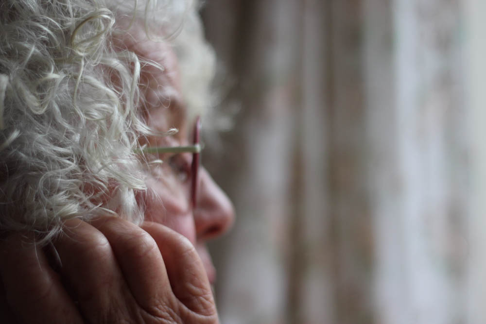
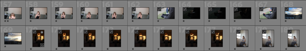
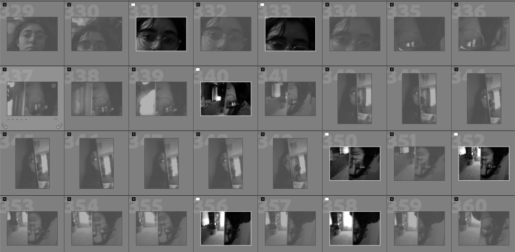
Here is a contact sheet of my best images for my two photoshoots of my grandmother. I used the P and X tools first to filter my favourites, then colour labels for each type of shot- – yellow for objects/non-portrait, blue for headshot, green for close up, red for abstract (not in this screenshot for this shoot, see above), and purple for my wider shots.
Best Images
Photoshoot 4
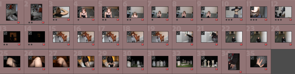
My best images of my last photoshoot of my mum. I organised my images by using a separate collection for this shoot, and using P and X to separate my most successful. I then used colour labels for different shot types – Red for abstract, Green for close up, Blue for headshots, and Purple for pictures showing more of my subject with less zoom.
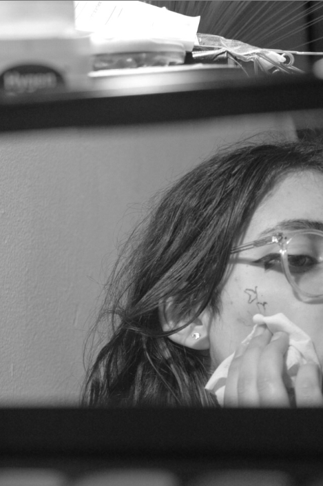
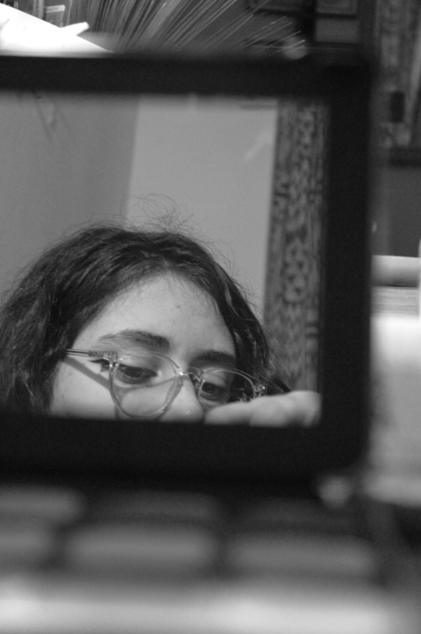
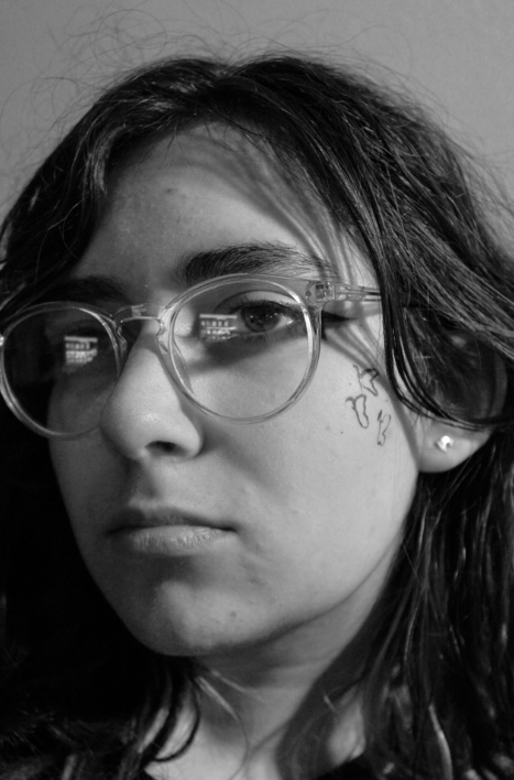
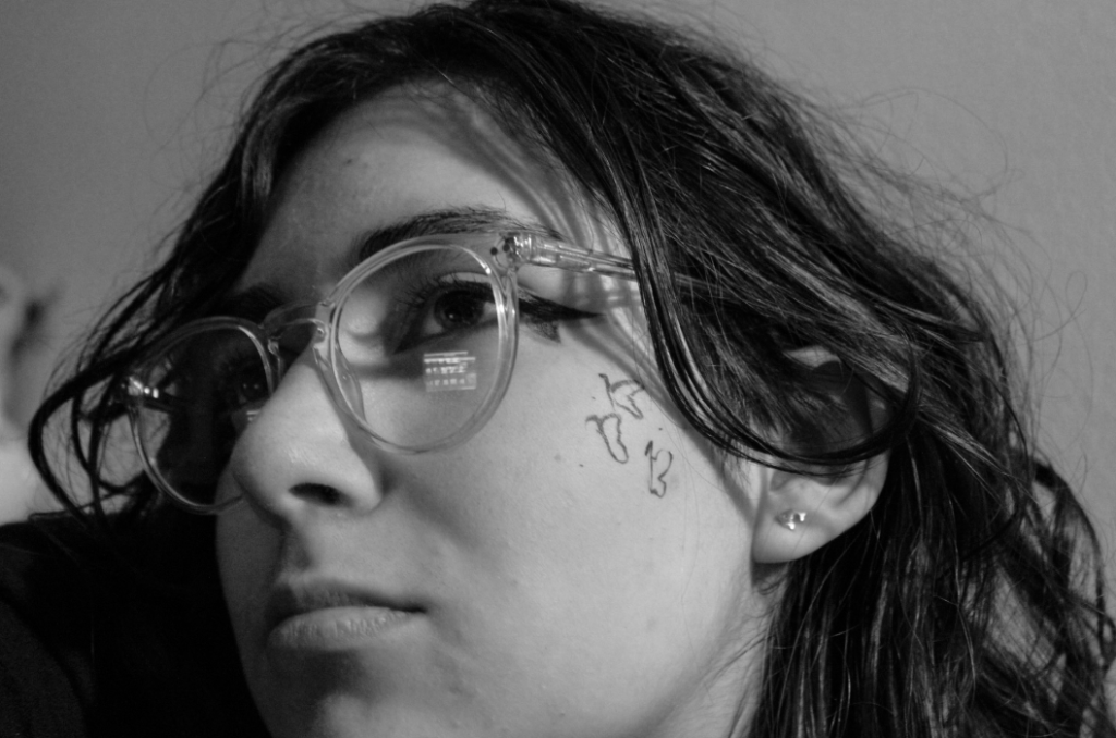
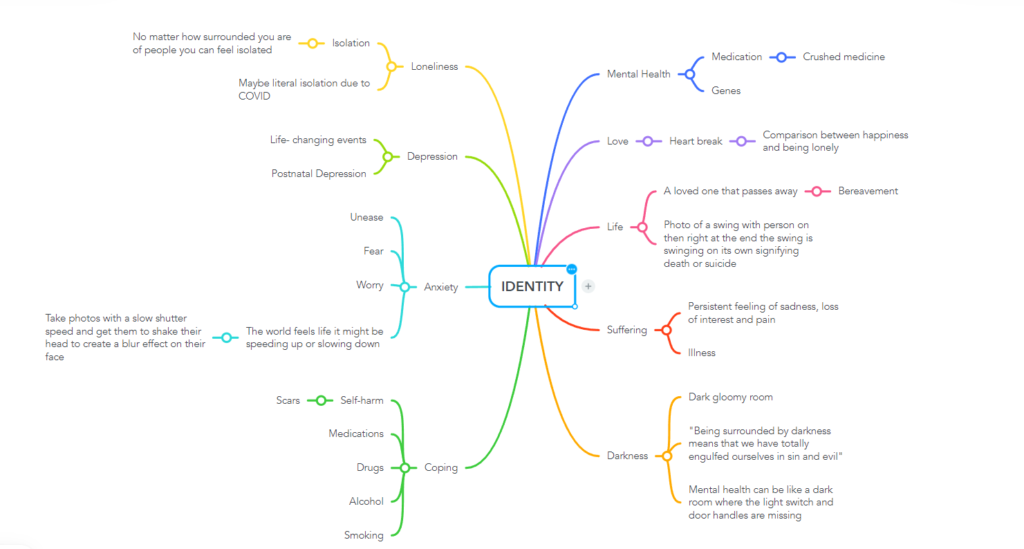
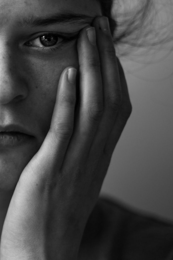
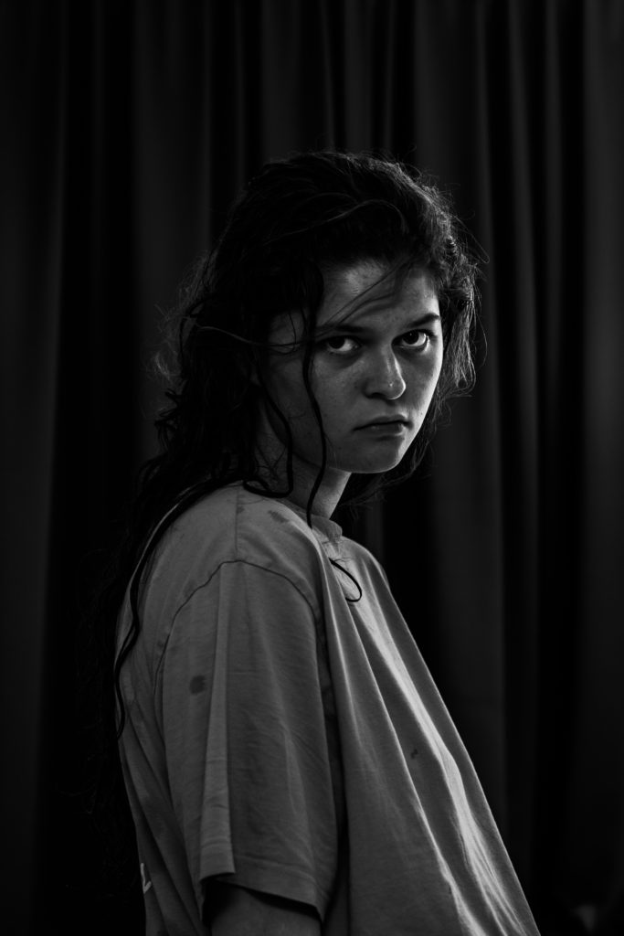
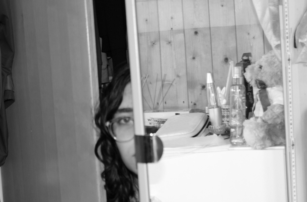
When taking my photos I didn’t have a set idea of what I wanted to photograph, my view on the identity project was that I wanted to create a visualisation of a teenage perspective of identity, showing possible self destructive behaviours which are camouflaged by the vitality of youth and teenage culture.
In order to make a fair selection I went through each photoshoot I did and created a 1-3 star rating system- 3 stars being most likely to use and 1 star being least likely to use on Adobe Lightroom Classic.
Then I colour-coded images with 2+ stars to create a sub-selection of images which I am interested in editing. These images are the ones I believe thoroughly show my inspirations in my individual perception of what I want to portray.
From this selection I then picked my final images that I wanted to edit/experiment with in Adobe Lightroom Classic, I colour-coded these images red.
After this I colour-coded images that I wanted to present as a set that carry a certain theme as when I present my images in a physical sense I would like them to be displayed as sets of polaroids so they have a more autobiographical sense.
One set of images I may use
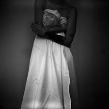
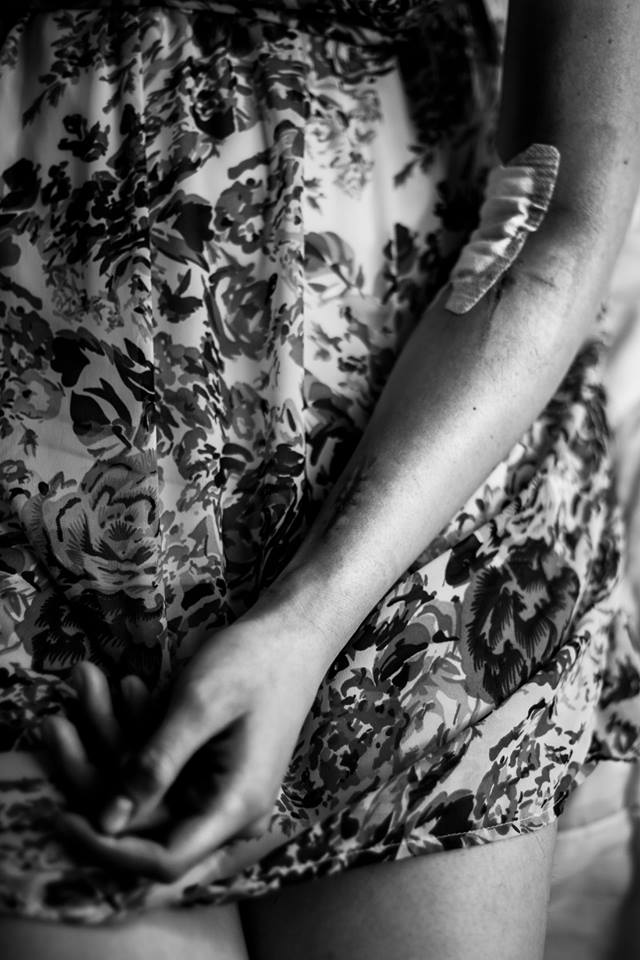
When editing these images I want them to have a raw and intimate effect to them which portrays somewhat taboo subjects such as sexuality, restraint and self destructive behaviours. I believe the images I’ve chosen portray these feelings and once they go through the editing process I hope they are successful in the delivery of these emotions to the viewers.
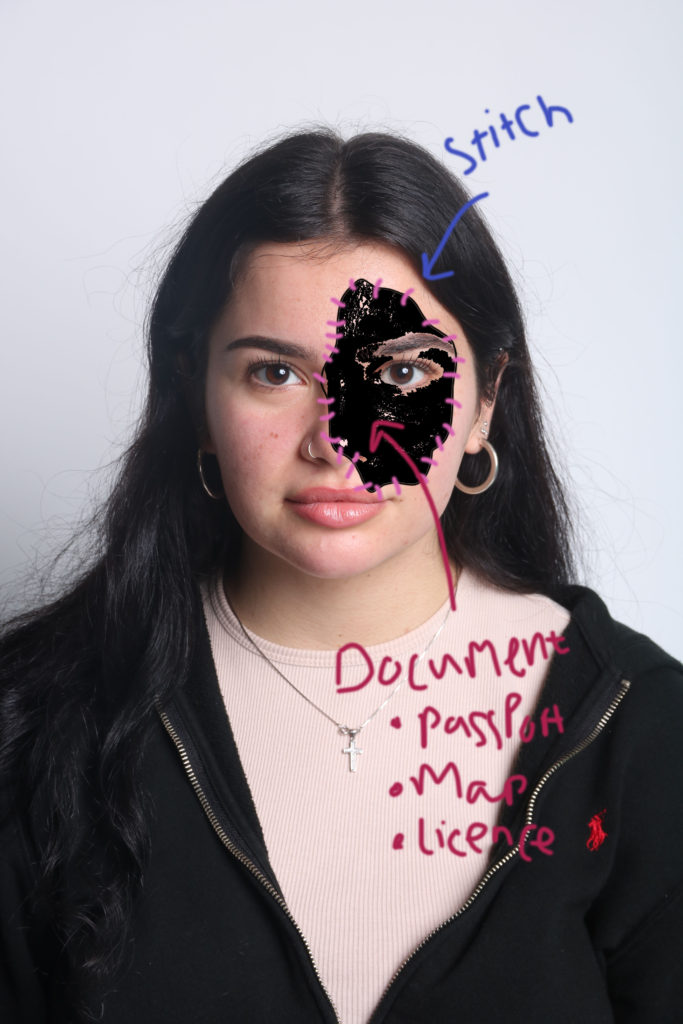
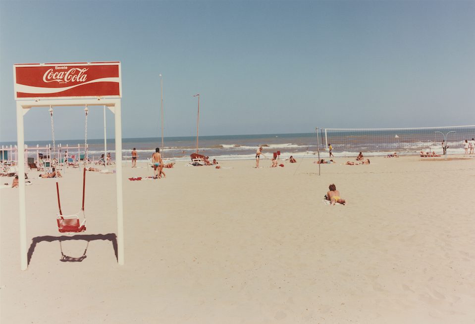
I will focusing on the theme of geographical identity, i will be showing this through the use of physical documents and identity in the style of Annegret Soltau. E.g. Map, passport, citizen’s card, birth certificate, book about location, words in that language.
I will be creating a series of images using people from Hautlieu as my models. I will be using Annegret Soltau as my inspiration. My project will be made using both computer software and also doing bits by hand e.g the sewing aspect.
The photoshoot
For my photoshoot, I will be creating a series of deadpan images, similar to old passport images.
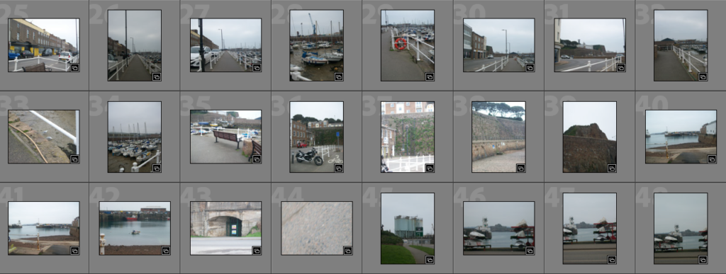
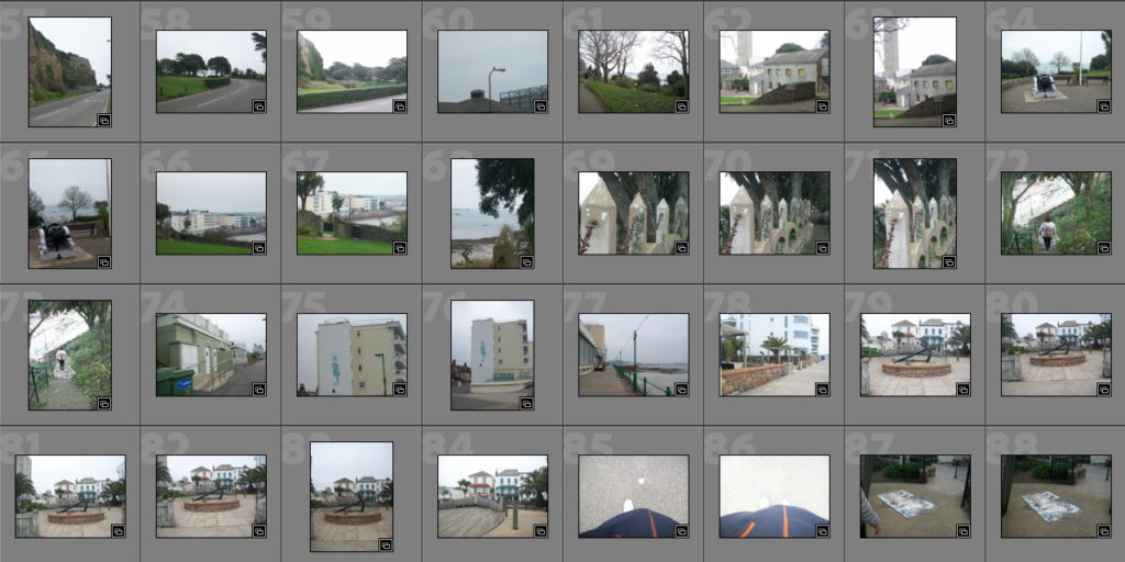
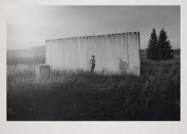
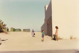
For this photoshoot, I went on a walk and visited some locations where I grew up, taking photos on an old camera that was used to take some photos of me when I was younger which helped create a similar vibe between the old and new images. Later, I decided that I wanted to recreate a certain photo from when I was younger and so I had a smaller photoshoot in order to explore some ideas that I could link together.
Best Shots
Locations:
Some of these photos gave me ideas on how to edit and connect all my photos together whilst the rest of them were well framed and in focus which I thought would be useful later on.
Self Portraits:
Most of these photos I chose as they were in focus or because I had a specific idea on how I wanted to edit them later on.
After selecting my best shots on Adobe Lightroom using “Z”, I’m going to select 3 photos from each photoshoot to mainly focus on as part of my final piece. These pictures will then be edited in various ways in Lightroom, in a similar way, and exported into photoshop to create the virtual gallery effect.
My first photoshoot focussed on the privacy of reading and how it can become a forced solitude that people voluntarily put themselves into and enjoy as it is a hobby of theirs which they may find calming and rewarding, I used various backgrounds of places where I like to read and props to add different layers of personal detail to the photos. Then for my second photoshoot, I wanted to use books which are revolved around a certain theme, for this its feminism and working hard, to show how they can be create a message yet also be enjoyable while raising awareness of things which are commonly looked over in everyday life, hoping that the messages in them are impactful.
For all of these photos I have decided to experiment with 2/3 different ways to manipulate them; I will achieve this by using different filters (such as black and white), changing the contrasts dramatically, experimenting with cropping, etc. Then I will bring them into Photoshop to experiment with sequencing/grouping and create a virtual gallery.
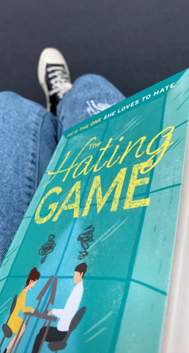
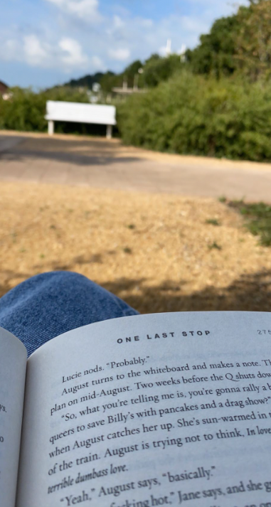
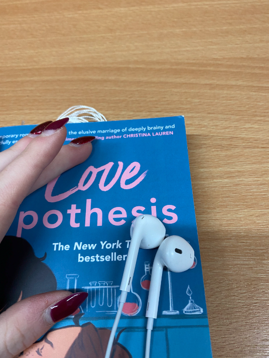
3 best shots from photoshoot 1
Why I chose this photo: I chose this photo because I like how the cover of the book is brightly coloured, in a fun way as it creates a calm atmosphere for me and others while I read the book. It also works well with the background, of the jeans and shoes, as the camera is only focussed on the cover and its finer details and the colours compliment everything nicely. I really enjoyed reading this book as well as it focussed on my favourite genre, which is romance. This was photographed in one of my favourite places to read in school, the street, as it is secluded and normally quite quiet yet there are other people also doing their own thing.
Why I chose this photo: I chose this photo because I like the warmer, rich yellow and orange/brown tones and shadows which have been created naturally in this photo through the lighting on a sunny day as well as the green from the bushes as it adds another element of colour towards the photo that contrasts nicely against the blue of the sky. I really liked how it shows how calm the surroundings of where I were was as it made me feel really comfortable and safe while I was reading.
Why I chose this photo: The reasons that I chose this photo to use in my final piece was because of the bright blue and pink tones of the book, which help to show that this book is a romance and create a safe and loving atmosphere for the viewers while reading or looking at the photo, against the darker tones of the wooden table below. I also like how the headphones add a level of personality towards the photo and it shows how the photographer creates a secluded place for themselves while they read as they choose to listen to music and block the world out so that they can entirely focus on the book instead.
3 best shots from photoshoot 2
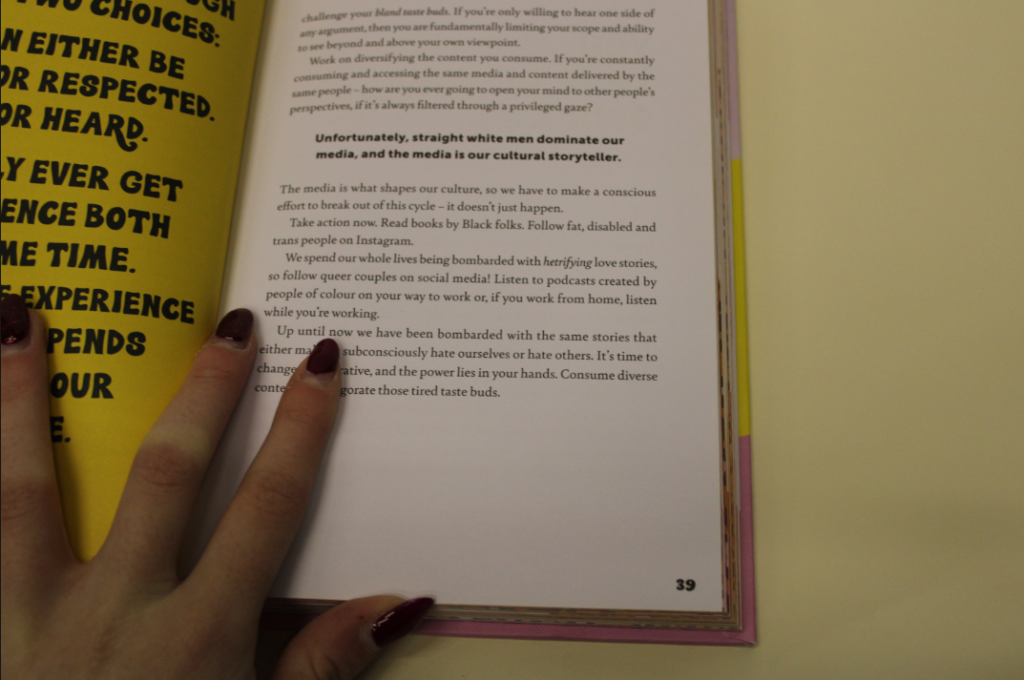
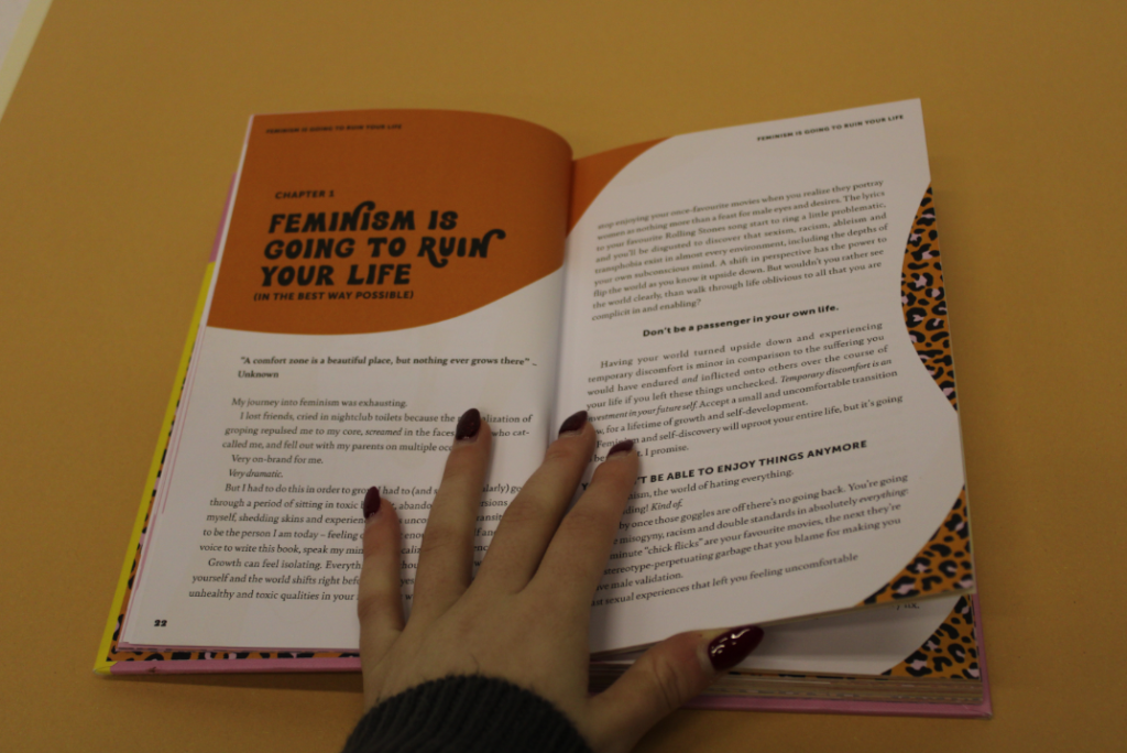
Why I chose this photo: I really liked this photo because I love how there’s the clear message, which you can see in bold, which grabs your attention easily and makes you think what this book may be focussing on, which is feminism and its various topics, then it makes you want to know more. I also like how the yellow of the background works well with the book, even if it is slightly lighter, which can be altered in Lightroom, as it is similar to Henry Hargreaves work.
Why I chose this photo: I chose this photo because I liked how the oranges work well together, as they aren’t exactly the same which is beneficial otherwise I think that they would get lost in each other. I also liked how the boldness of the statement “Feminism is going to ruin your life” is shown as it makes it become the main part of the photo which you will focus on as it creates this message then gives information underneath in various products to support its point, as if it is a debate.
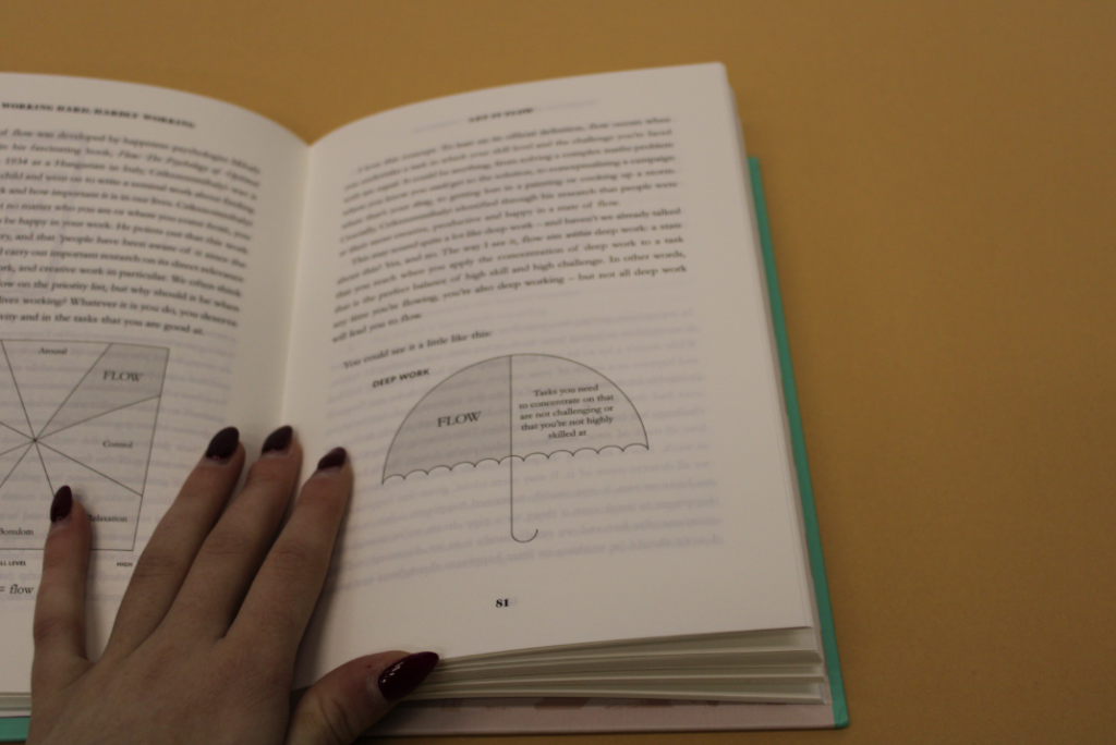
Why I chose this photo: I chose this photo because I like how simple yet effective it is because it shows how to help yourself become motivated and ways to make that happen through the little picture of the umbrella which is seen. It creates a feeling of motivation towards you as well which I like as it makes you want to be as productive as you can be. I also like how the colour of the pages of the book are a muted tone as it works nicely within the photo.
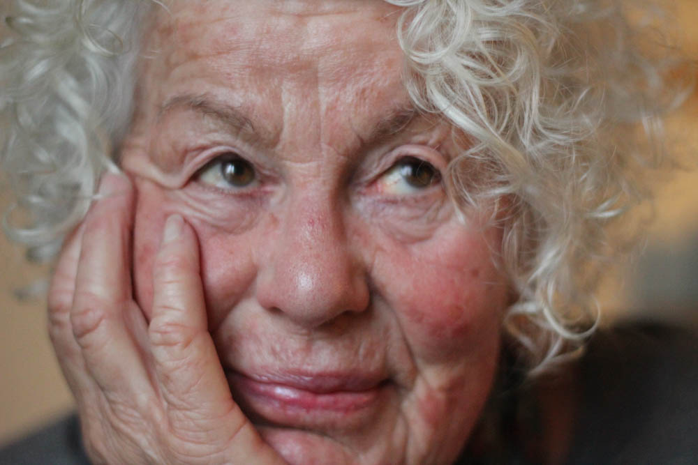
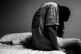
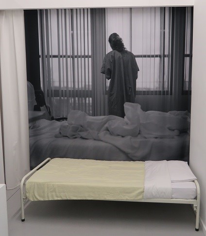
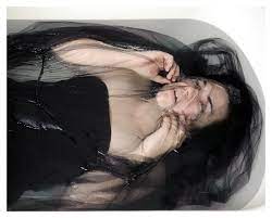
Laura Hospes has been photographing herself since she was 16 because she felt as though she needed to connect with other people and has become necessary over the years. Her work focuses on the struggles that she has experienced in life. Her experiences of depression and anxiety and mirrors well-being, she is currently working on a project about caring and healing.
As closure of a difficult period of time, Hospes created a book called UCP (named after the psychiatric ward where she had to stay in. UCP was chosen as one of the best photo books of 2016 by De Volkskrant, is shortlisted as one of the best Dutch Book Designs 2016 and shown on many book fairs and exhibitions.
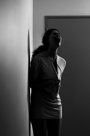
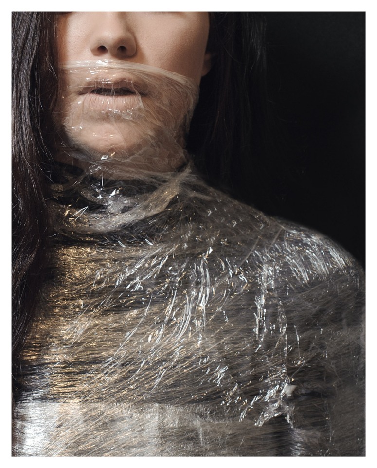
Katie Joy Crawford
Katie Joy Crawford focuses on her own experiences with anxiety, battling it for a decade she felt as though she was finally able to express her inner emotions. Her work consists of self-portraiture and she visually interoperates her own emotional and physical journey as a way of projecting the weight that so may people bare in society. She wants her work to be used as a source of healing for other people as it was for her.
Photoshoot Plans
Photoshoot 1– Inspired by Laura Hospes
For my first shoot I’m going into the studio with two of my friends
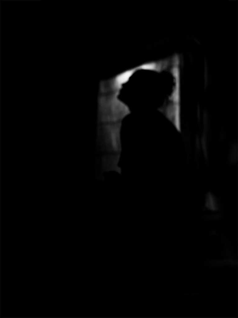
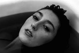
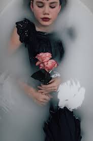
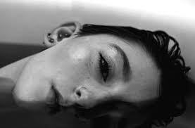
Photoshoot 2– Inspired by Katie Joy Crawford
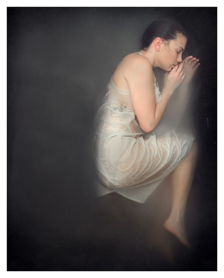
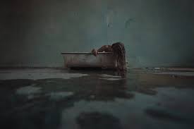
For my second photoshoot I am planning to make a milk bath that I am going to dye black with flowers.
Inspiration of a Dark Milk Bath that I found on Goole and Pinterest
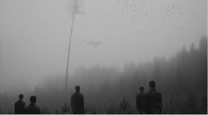
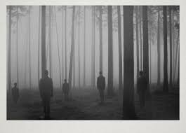
Photoshoot 3– Wild goose chase of a photoshoot
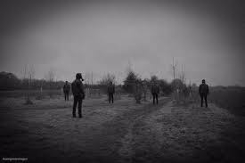
For my final photoshoot I have decided to take images of a Forrest as I think that it will tie the idea of loneliness no matter how surrounded you are when it comes to mental health.
With two of my friends will go into St Saviours Forest
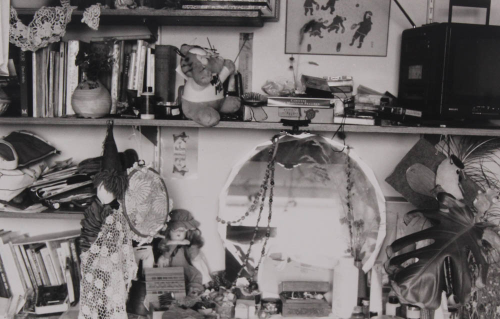
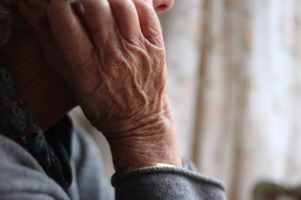
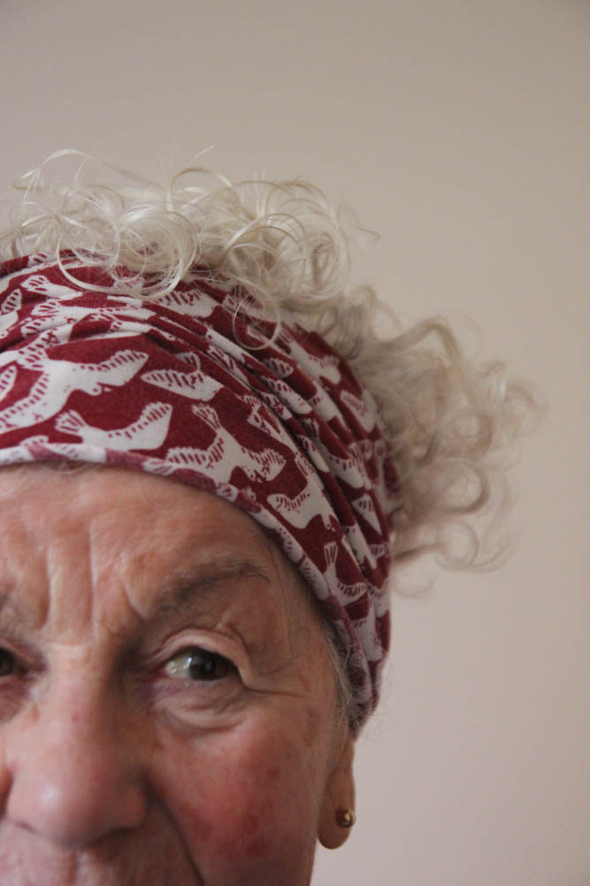
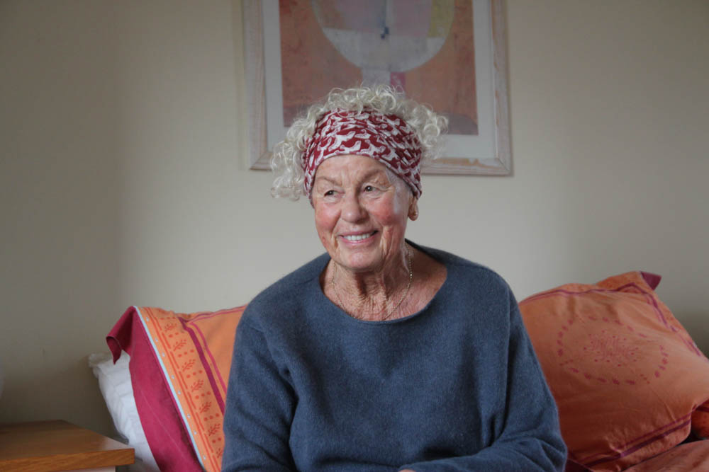
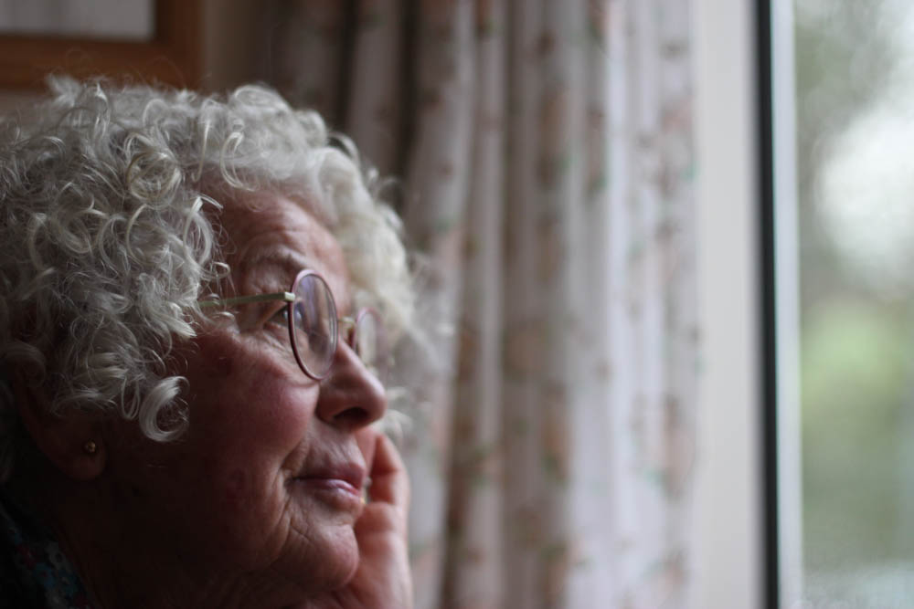
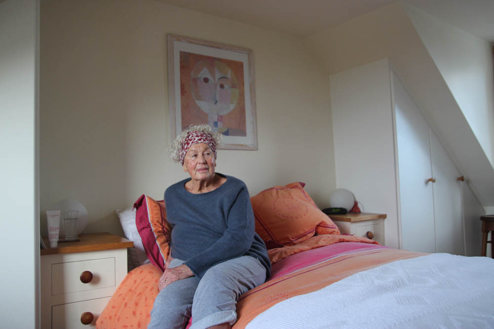
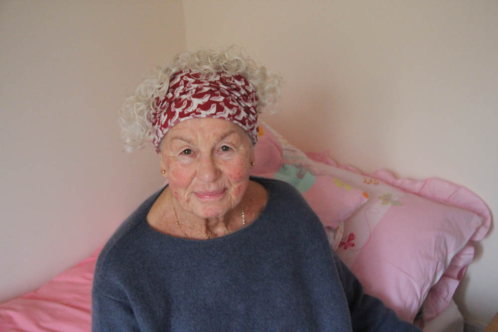
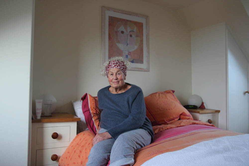
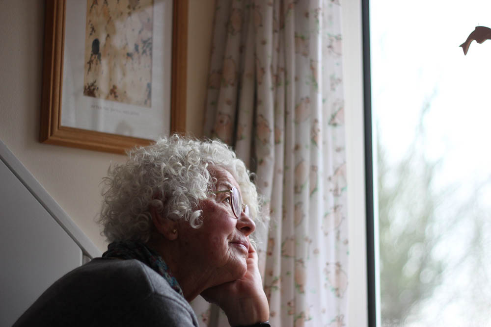
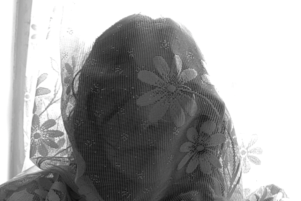
Grandmother’s house – in a bedroom, hallway and dining room, using windows, and plain backgrounds
Natural – using window lighting, to create shadow and reflections
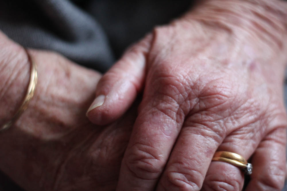
Macro, headshots, half body, full body
Identity – generational identity, identity in her home, age identity
Personal objects, jewellery, bracelets
Camera – portrait lens
2 – pictures of found images
Studio
Artificial
Birds-eye
Generational identity, age identity, the passing of time
White paper for the background
Camera, trigger, copy stand
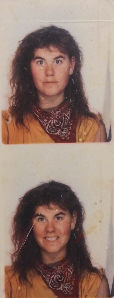
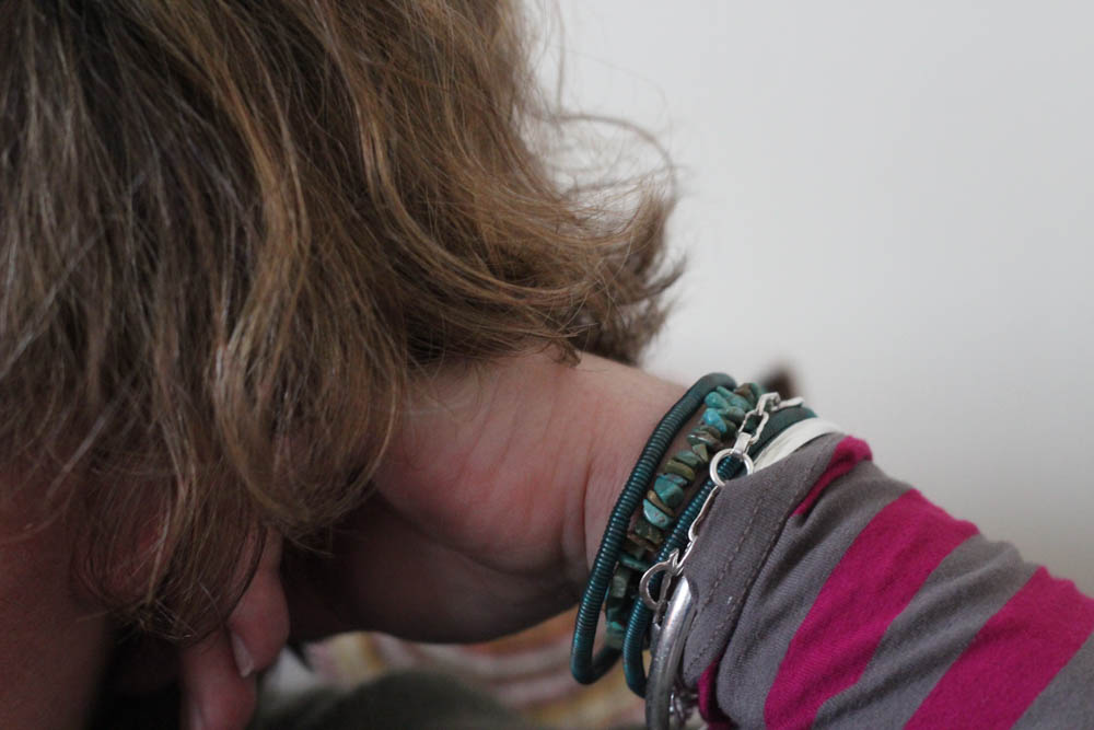
3 – pictures of mum
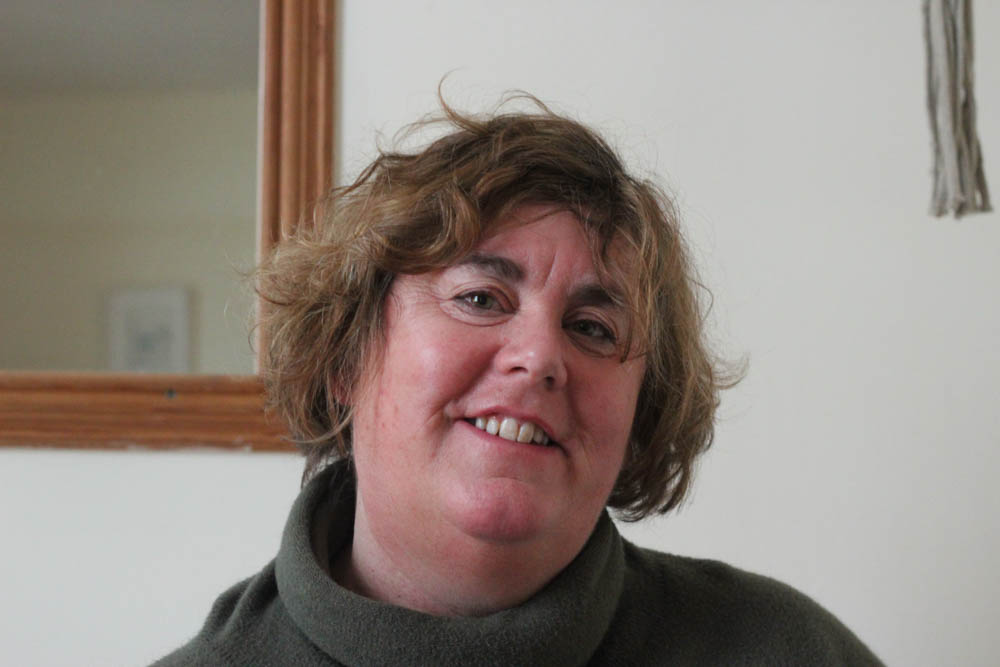
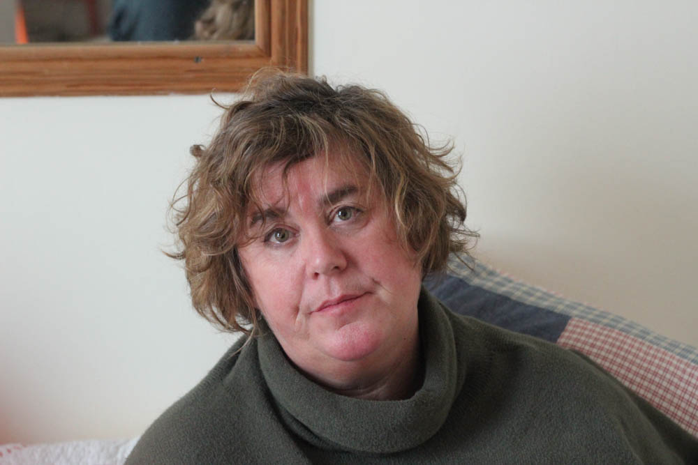
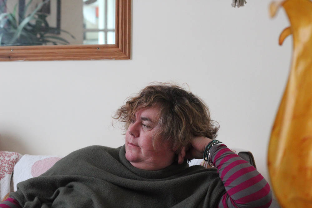
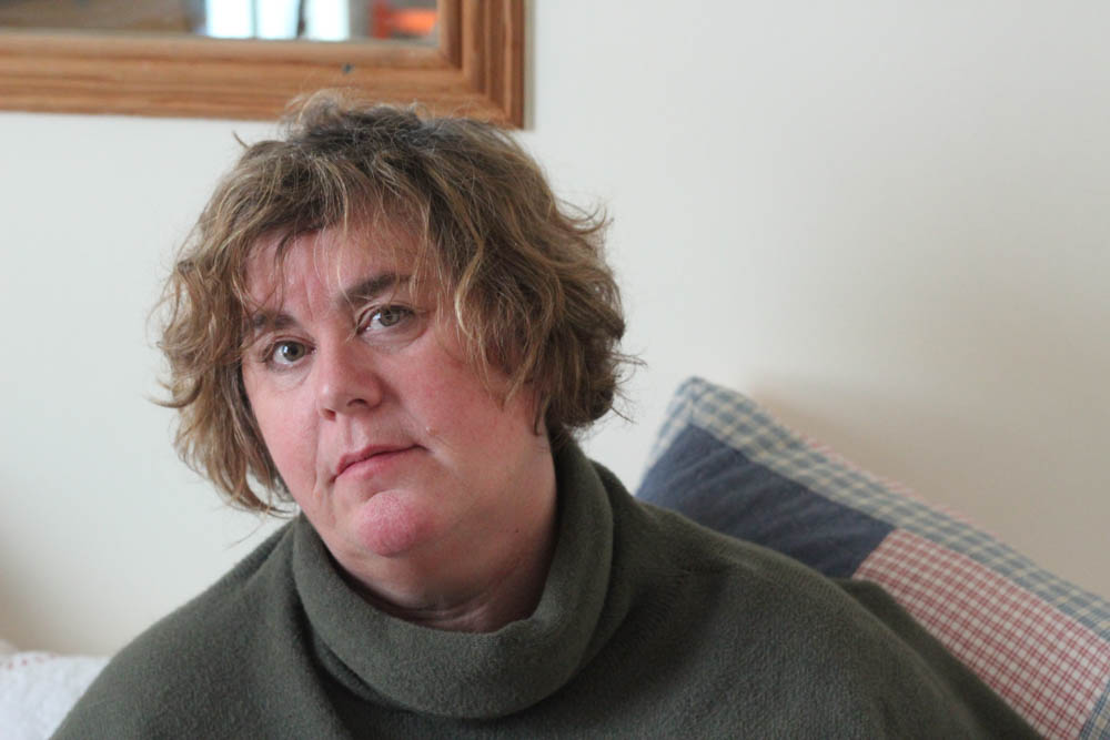
My house – windows, bedroom, lounge and kitchen
Natural, using window lighting to add shadow and dimension
Macro, headshots, half-body, full body
Generational identity, age identity, identity in the home
Jewellery and personal belongings
Camera, possibly tripod, portrait lens
Photoshoot plan
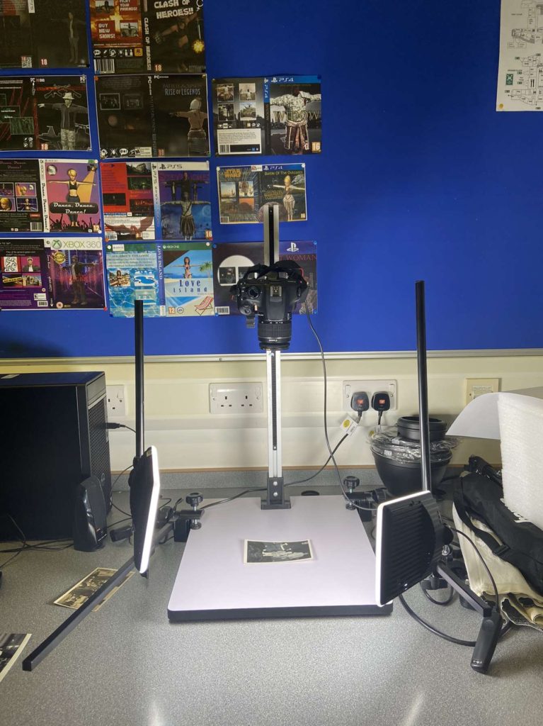
In my photoshoot using the copystand, I want to capture images from above, with evenly lit images, which I will then crop in lightroom as part of my editing process. In all 3 portrait shoots, I wanted to capture different shot types. I wanted to take some classic headshots, with natural lighting, as well as close up, abstract shots which only show certain parts of my subject.
After taking my pictures, I will import them into lightroom, with different collections: one for close up abstract pictures, one for headshots and one for wide/full body shots. I am planning to edit my pictures in the style of both Bill Brandt, and also photographer Luigi Ghirri. After these edits, I will experiment with collage and montage in style of my main artist, Joachim Schmid. These will inspire/ make up my final outcomes and final images that will then we printed and presented.
Luigi Ghirri
I love the grainy, vintage-looking editing style both these artists use, which will help me to edit my images to a similar style to my archival images of my mum and grandmother.
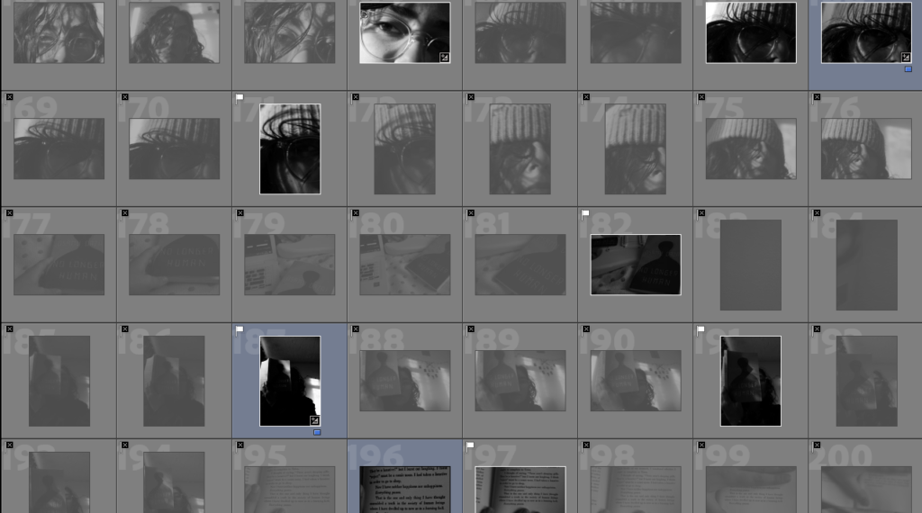
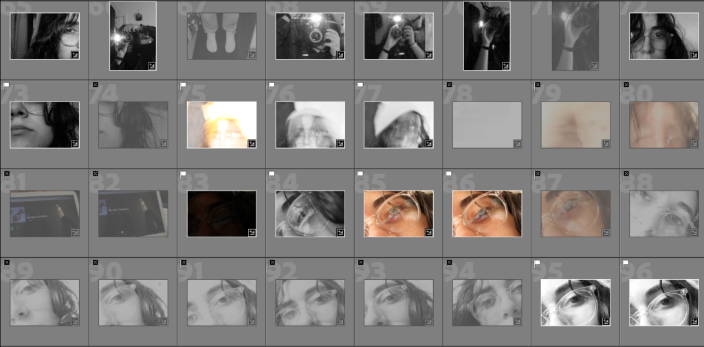
Contact Sheets
After taking my images, I imported and filtered my images in lightroom.
Here is my contact sheet for my copy stand pictures – this was an overall successful shoot. – In some of these, I used a birds eye view at home instead of the copy stand, which sometimes produced unwanted light. To combat this in future photoshoots, I will only use the copy stand in the studio. This will ensure constant lighting, with no unwanted reflections or light. – Lots of images had duplicates so I filtered these out to find my favourites using P and X tools, then cropped the images.
An image of our set up on the copy stand.
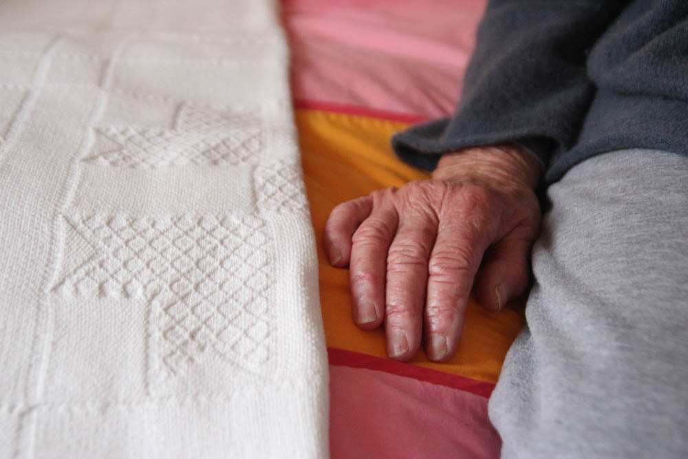
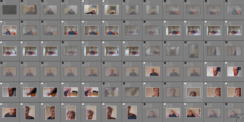
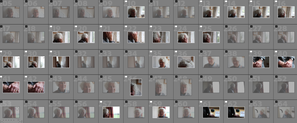
One of my contact sheets from my first shoot of my grandmother. In this shoot, I had trouble with grainy images and ISO levels – to combat this in my second shoot I used better lighting and changed the ISO settings and set the camera to manual. Due to this photoshoot’s issues, I decided to do a second in the same place, which was much more successful.
One of my contact sheets for my second shoot of my Grandmother – this was my more successful shoot. I shot with better lighting, a portrait lens and with different ISO settings which reduced the grain that I experienced in my last shoot. This shoot was more successful because of the changes I made, but also due to the weather being better for shooting. I will keep this in mind for future photoshoots.
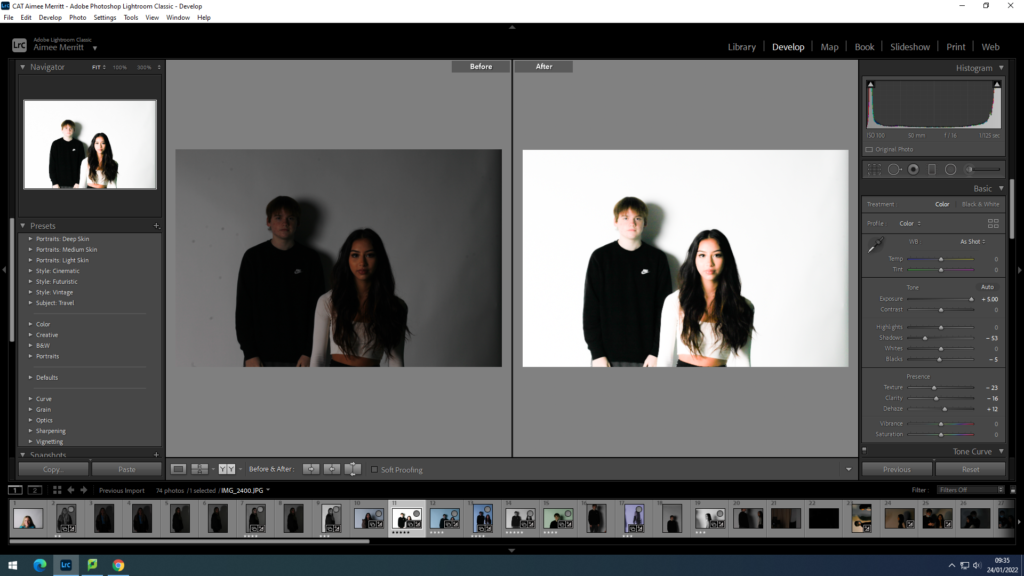
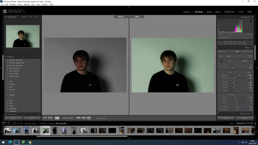
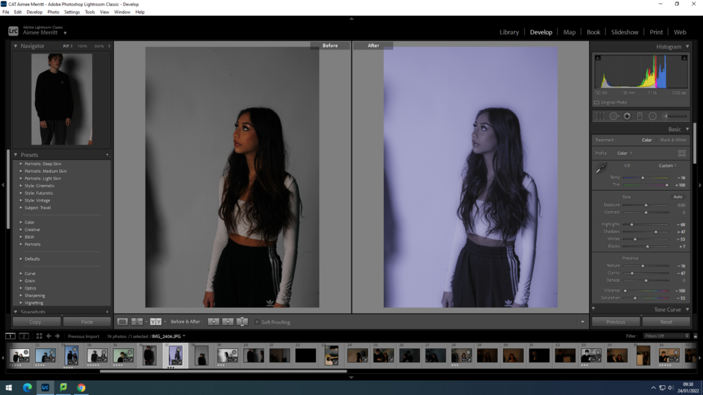
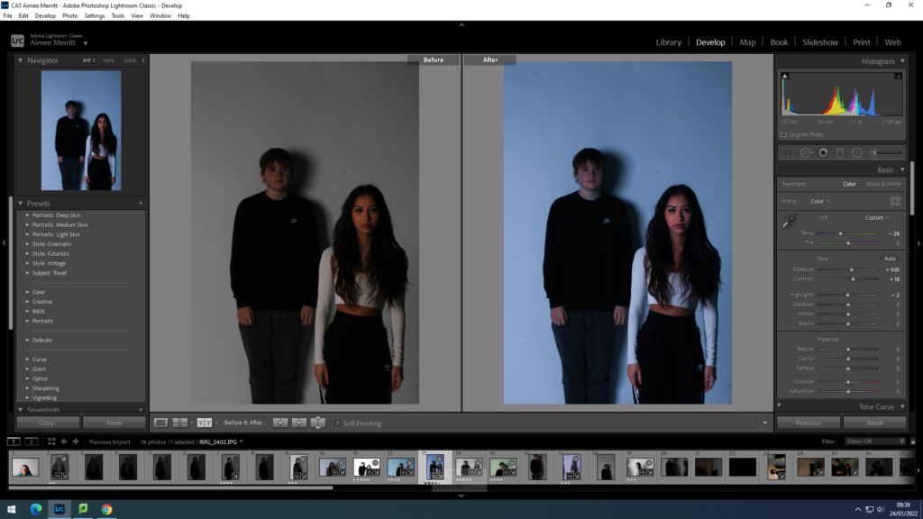
One of my photoshoots from my second shoot, of my mum. In this shoot, although there were some successful images, I found that the lighting was difficult. I tried to use different lighting, and found that with the lights off, the pictures came out less yellow, and less blurry. I also had trouble with shaky images in this shoot, and to combat this in the future I would use a tripod or balance my camera on something to keep it steady. Overall though, I think this was a successful shoot with some outcomes which I liked.
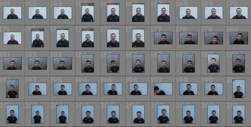
Below I have placed some contact sheets of my images after being imported into Lightroom from my camera, this is before I have gone through the selection process and looked and what images I would like to actually use in my project, as some of these don’t have enough clarity to be used as final images. Furthermore, this contact sheet of portraits of my dad and brother have been organised so that its only portraits in this specific screenshot, meaning that the presentation of my photographs is more organised and is separated into each photoshoot.
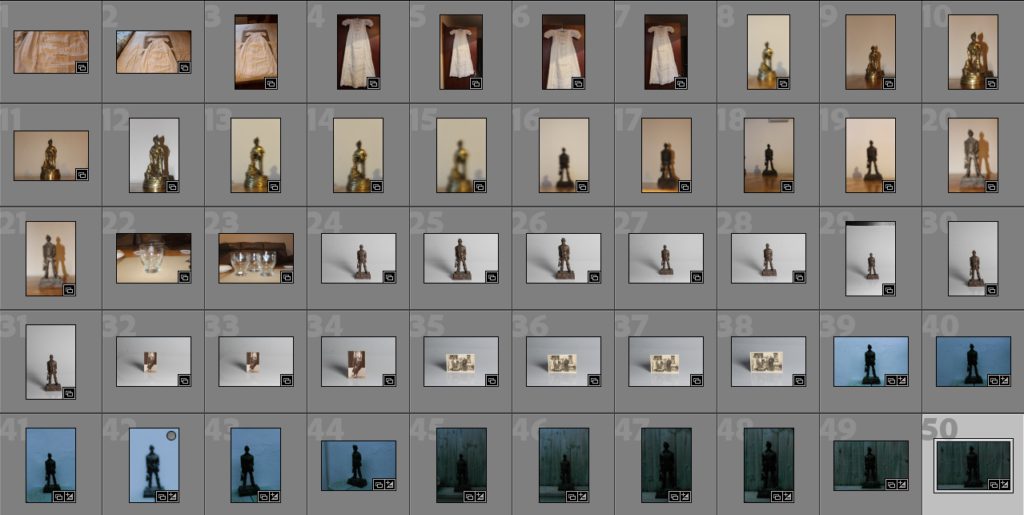
Objects
This contact sheet is only of the objects which may be used in my final project, I am unsure if they will come into my project as I have more substantial plans using my other images of old family photographs and portraits. The layout of these images helps highlight my ideas as the three components of family, portraits and objects are separated.
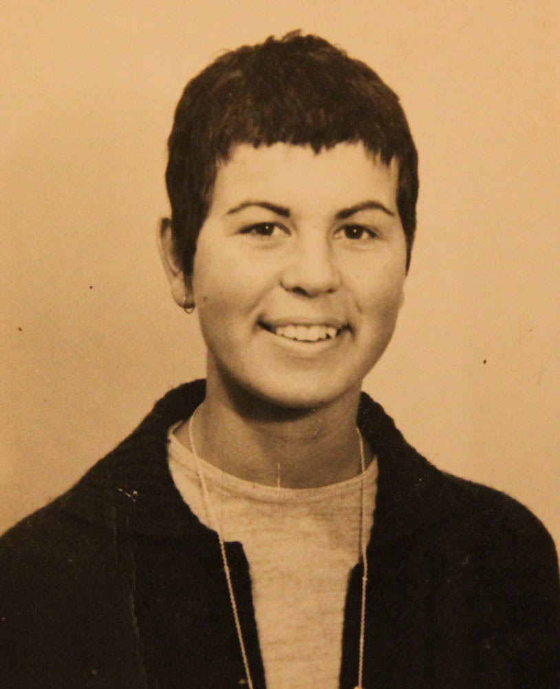
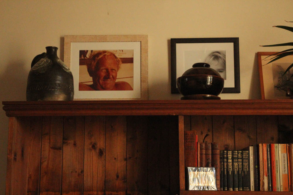
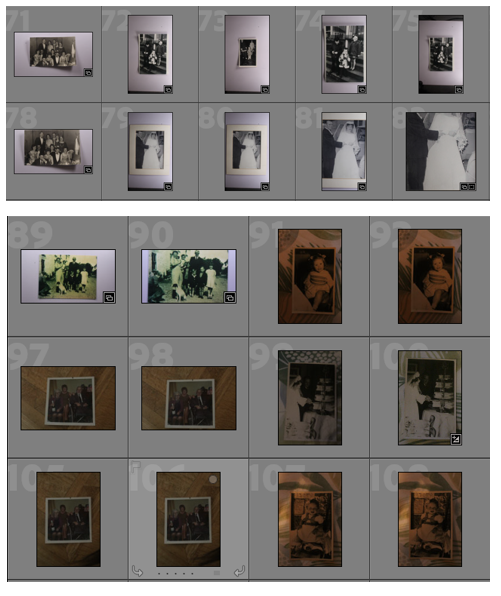
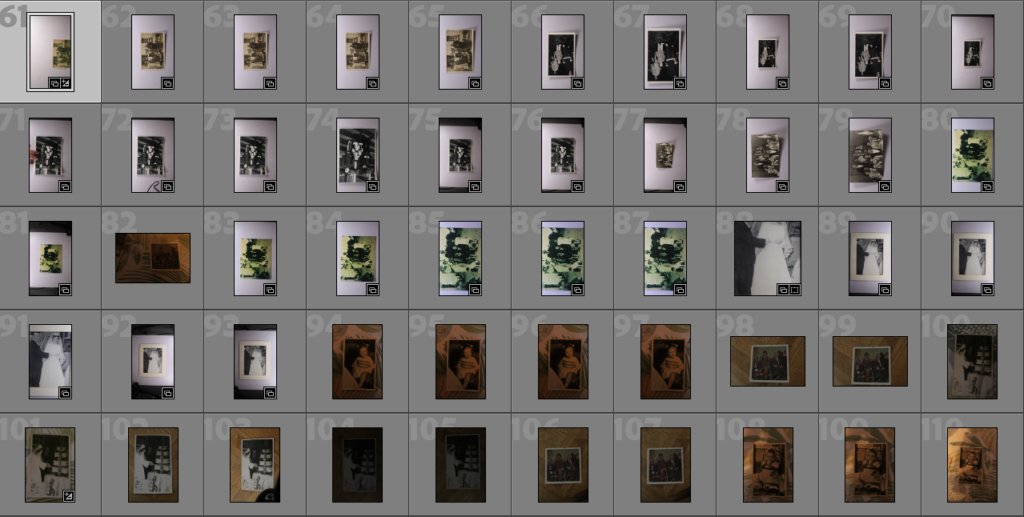
Old Family Photographs
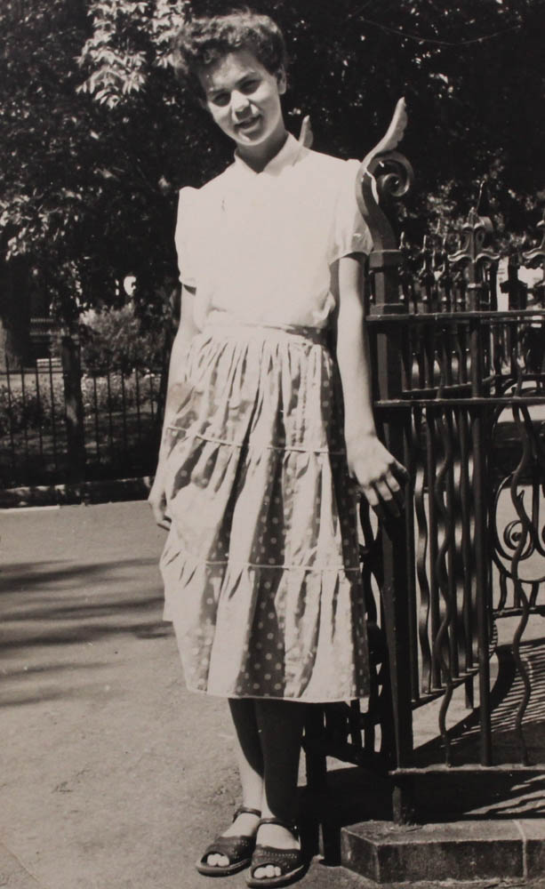
Continuing, here I have a range of images that are photographs of my old family photos, I have organised them so that the first half are ones of my mums side of the family and the second half are ones of my dads side of the family, throughout most of the images its clear that the old ones (dads side) are a slightly more yellow (as seen below) tint, this might be due to them being decades old or just the conditions they were kept it over time.
i have chosen these images as part of my selection because they are good representations on how i am going to expand the wider range on identity and how they fit my idea.
For this photoshoot I focused on coming up with interesting images by using props [guitar, plants, books etc] and a variety of camera angles. I found it difficult to take some of the photos as I didn’t have a tripod and had to use timer for a lot of them, meaning I wasn’t able to see what the composition of the photos were until after I’d taken them as the camera would shift slightly, however, this did also help me get some photos that I really liked due to certain things being slightly cut out of frame.
For my last photoshoot, I’m going to take photos of some places I either like or grew up near in order to separate my portraits from one another and make my project look more interesting. I also plan on finding some photos from when I was younger in order to link my current portraits with the locations, possibly through the use of juxtaposition.
Best Shots
For some of these images, I changed the exposure, contrast or vibrancy in order to decide whether I liked the photo and to check how well it would work against my other photos.