
In this post I will be editing the three best shots which I chose from my 1st photoshoot in Adobe Lightroom, so that they can be used when creating my final pieces, I used a variety of different skills when editing these photos to show a range of diversity, then the editing which I like most I will apply to all to create a flowing dynamic in my final piece.
Experimenting
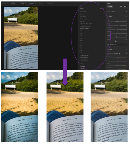
1st photo experiments –
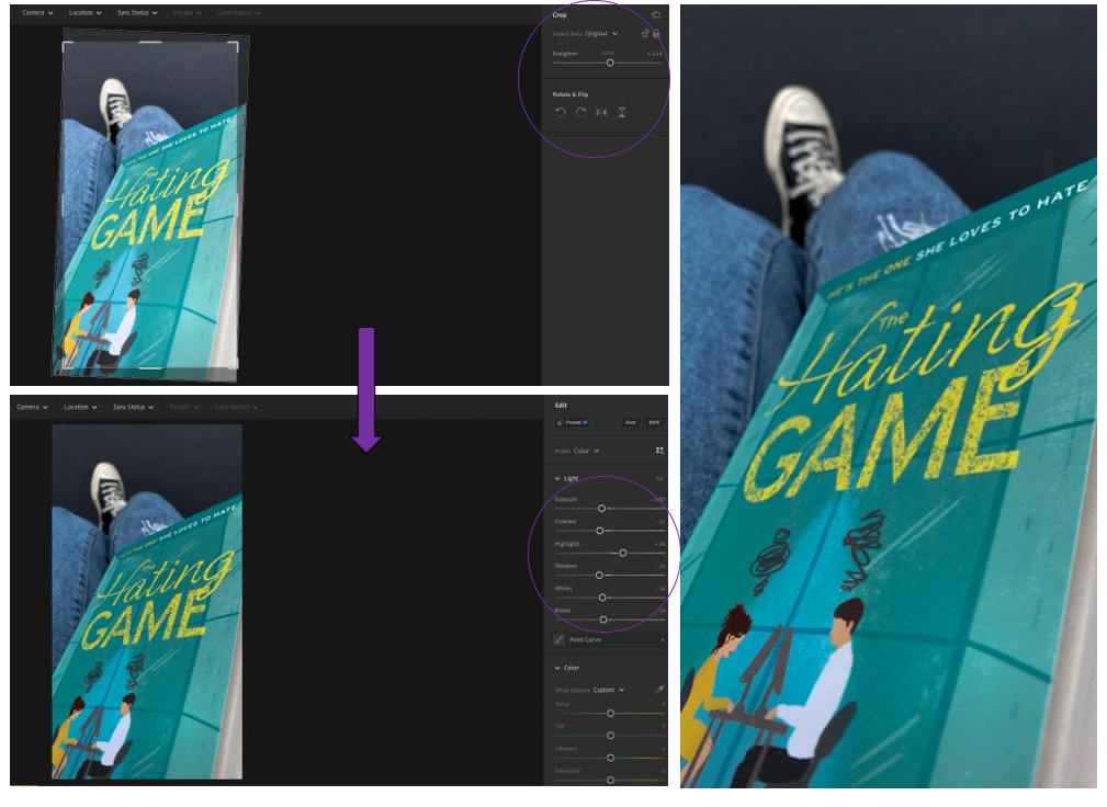
– I brought the exposure down so that the colour of the pages became more defined and clearer to see.
– I brought the colours down using the contrast to reduce the glare from the lens to the book then I used the whites and highlights to brighten it up slightly.
– Then changed the contrast by a lot to make the darker tones stand out better against the lighter ones.
– Then to help the white tones I changed the highlights all the way up which made the white really bright.
– I added a slight shadow around the edge of the photograph using the “Vignette” tool, then added some texture with the “Grain” tool.
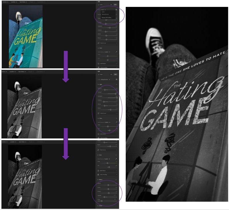
– As if someone has stolen it from you, preventing you from knowing more.
– Makes you want to know more about the book, as covers are usually good ways of describing it.
2nd photo experiments –
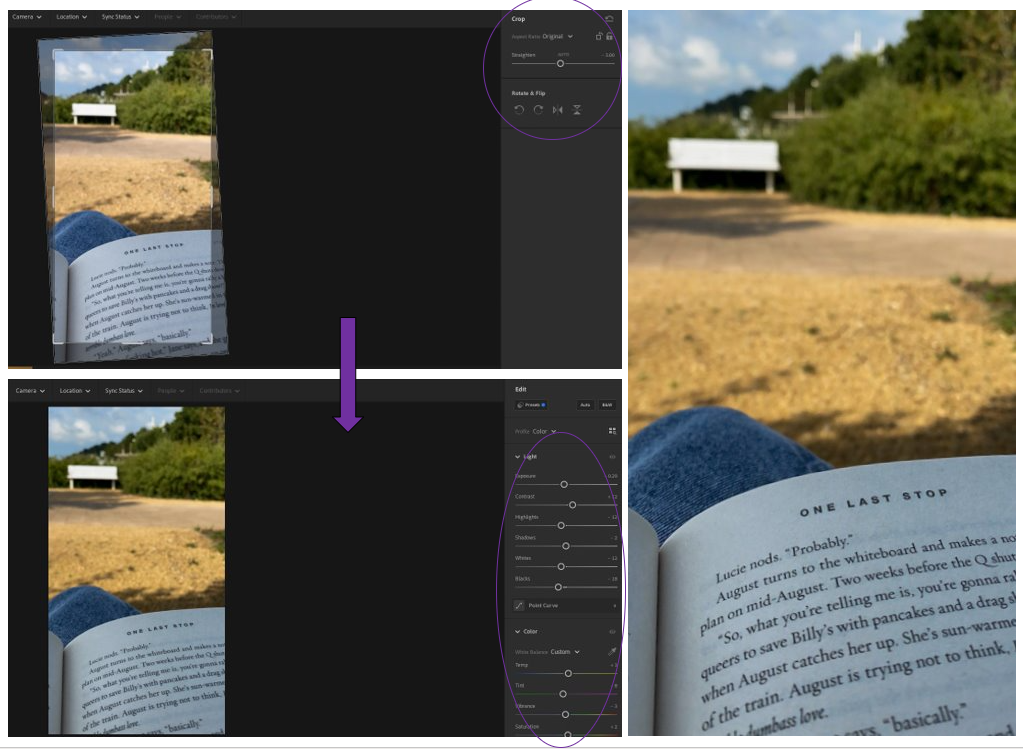
– I then slightly brought up the contrast for the darker tones along with the temp which made the photos ‘temperature’ appear warmer.
– I brought down the exposure, whites and highlights to make it less bright, form the sunlight but only slightly.
– I also brought down the shadows because I liked how it made the shadows more defined as it creates an unusual pattern on the floor which adds character to the photo as it shows its landscape.
– Chose from the “Cinematic” area of choice which gives them a dystopian, rural theme.
– 1st=PD04 Yellow, 2nd=PD05 Orange, 3rd= PD02 Yellow
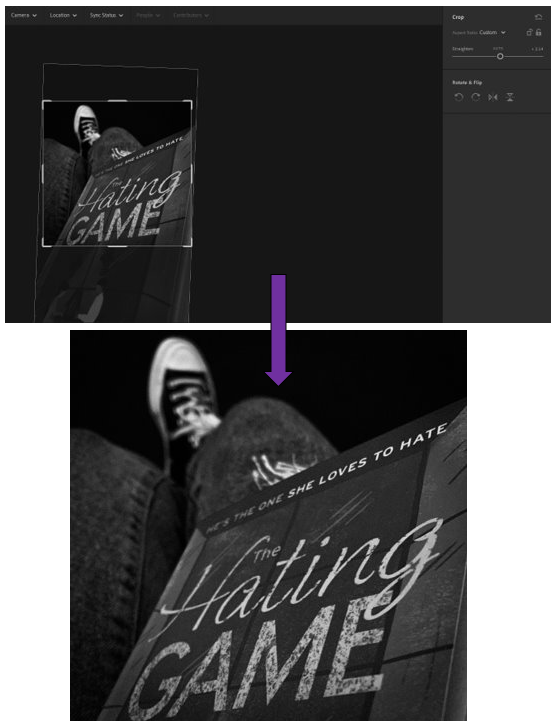
I decided that I was happy with the experiments which I had done with this one because I had previously cropped it in a way which I liked and thought worked well for the photograph.
3rd photos experiments –
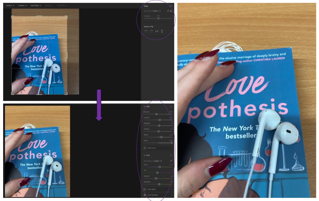
– Brought up the contrast so that the colours from the wood of the table and the colours from the book that I changed using the temp, tint and brightness so that they would create a nice difference between each other in a subtle yet brightened way.
– Made the headphones more defined using the exposure, whites and highlights then the blacks to create a shadow – and make it more defined.
– Simple yet effective.
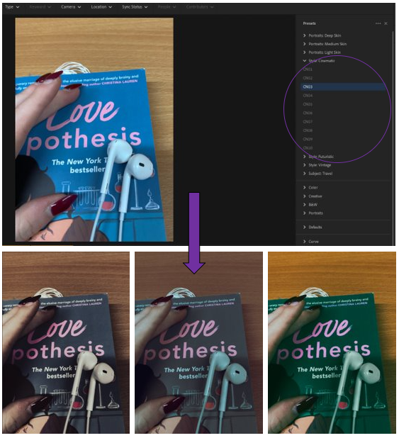
– Created an old, cinematic look that you would see in older films where there isn’t that much colour.
– Used the filters = CN03, CN07, CN09.
-CN09 is my favourite as it creates this beautifully vibrant tone with the wood in the background which contrasts well against the book which has been transformed in a blue/green colour.
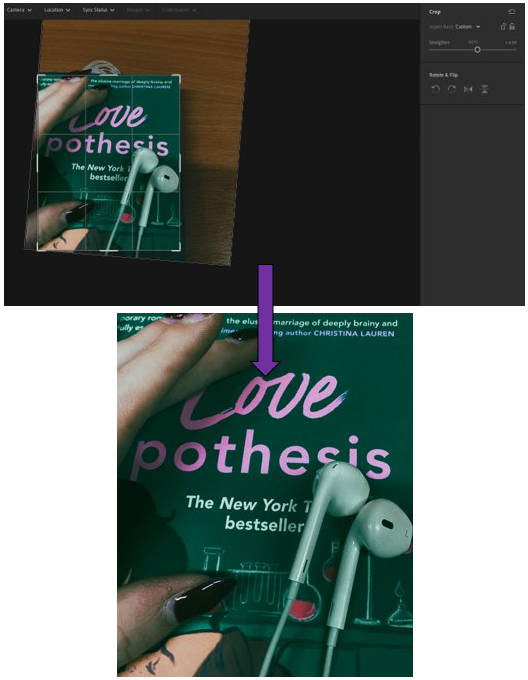
– Photos and headphones add a level of personality to the photo, as the hands can tell you a lot about someone and who they are.