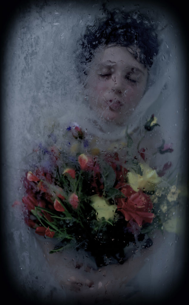
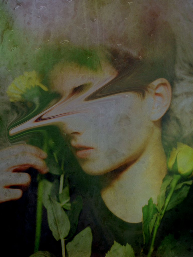
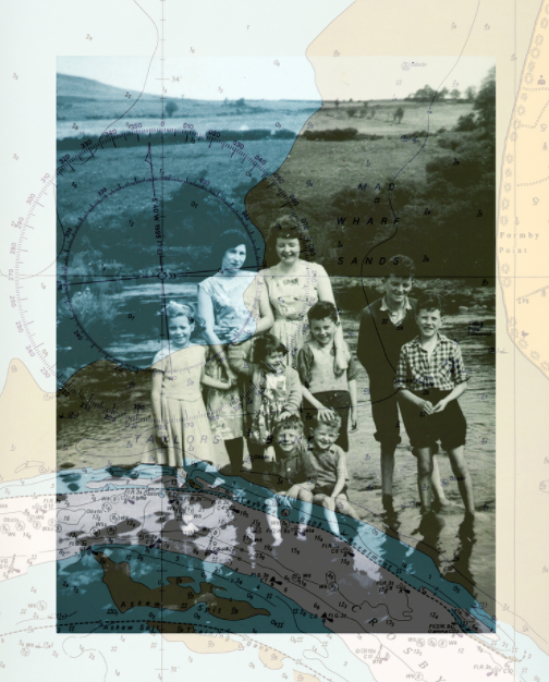
As I mentioned in my plan, I was planning to edit two different ways – in the style of Bill Brandt, as well as Luigi Ghirri. – However, I found that Bill Brandt’s edits worked more with my archival pictures and my own pictures, and Luis Ghirri’s much more difficult and not fitting as well with my new pictures. Therefore I decided to only edit in the style of Bill Brandt, and pair these with my archival images. This type of editing will make up my final pieces, edited together in the style of Joachim Schmid.
Bill Brandt inspired edits
Turning B and W and adding grain
Using gradient map (37% opacity)
Adding more grain
Adding contrast and brightness
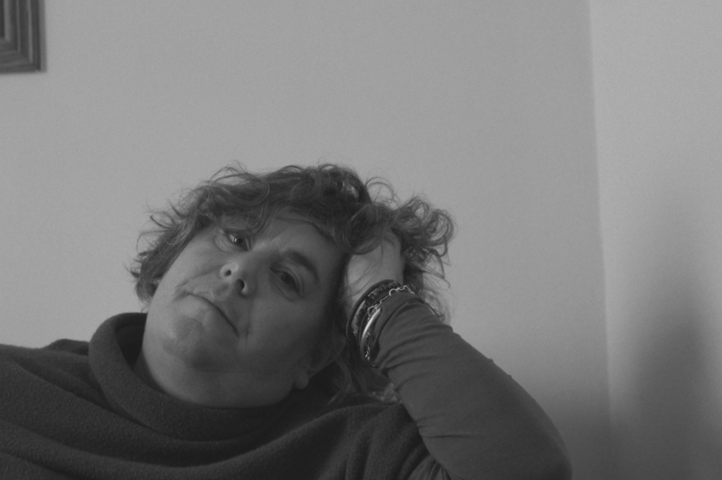
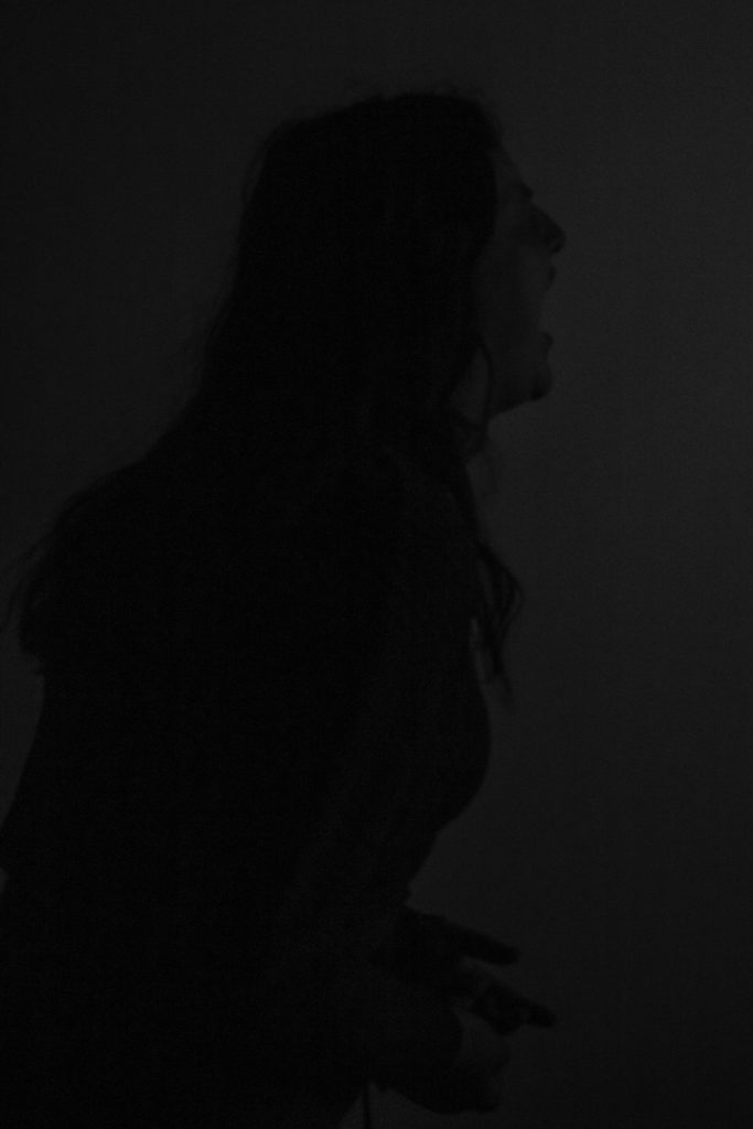
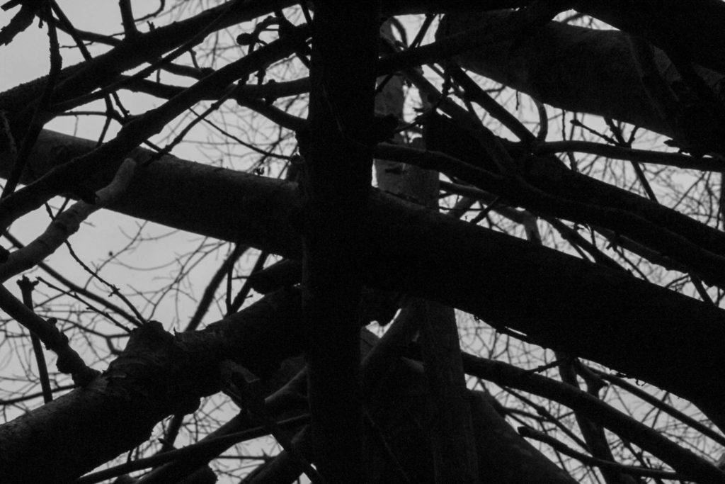
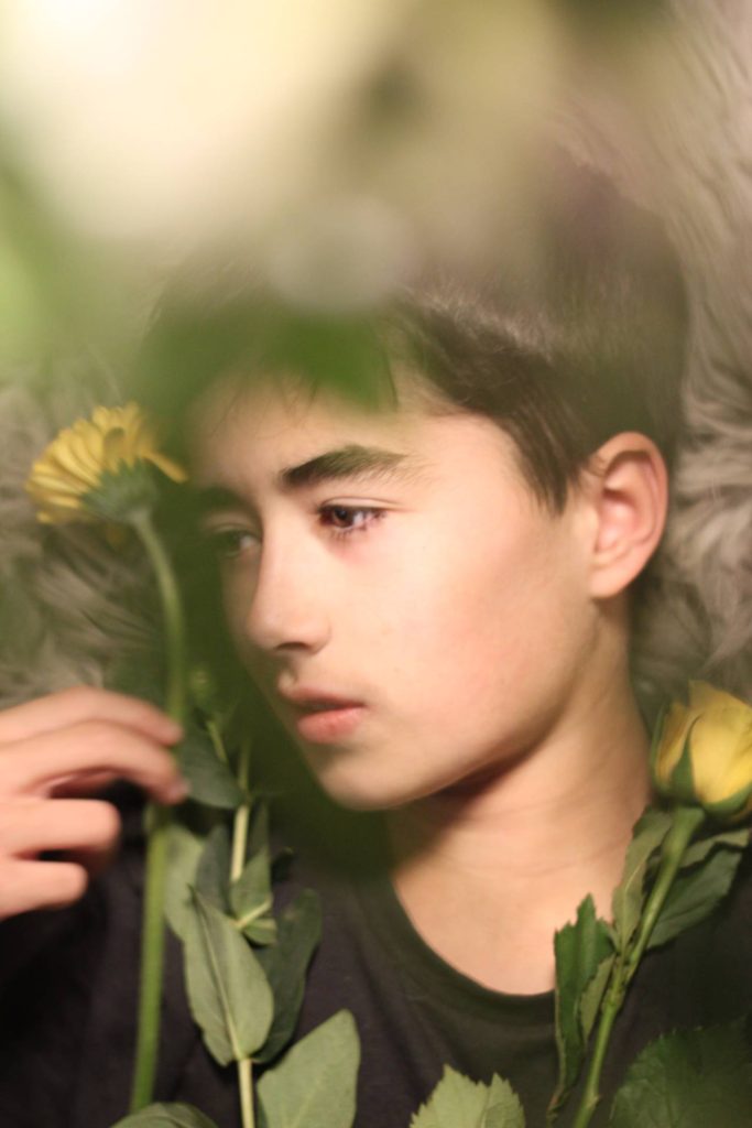
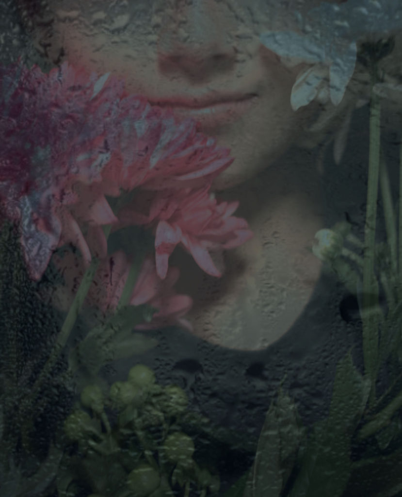
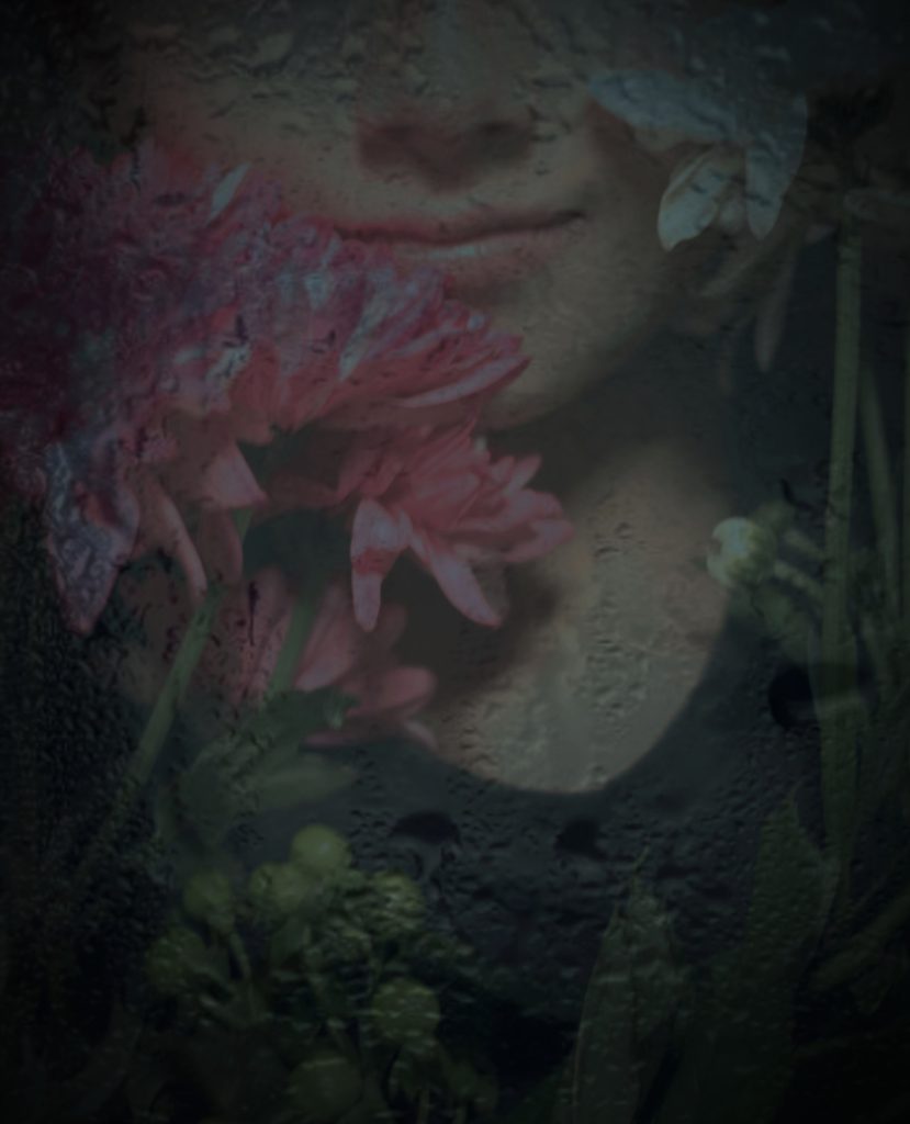
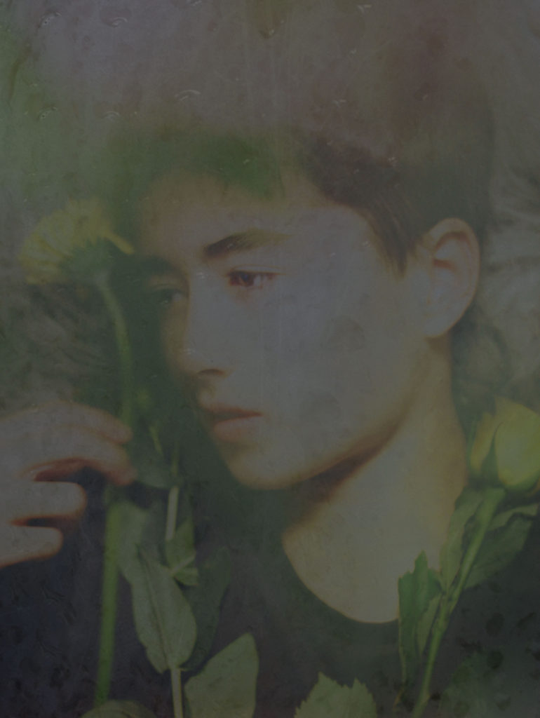
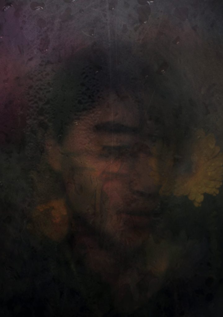
Final Edit in the style of Bill Brandt
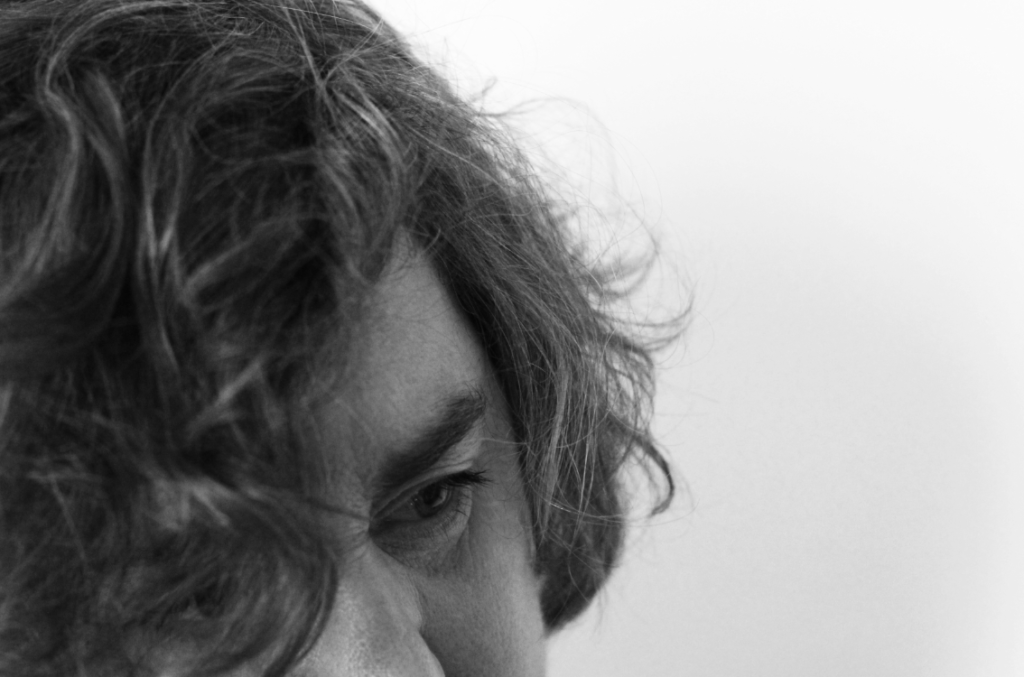
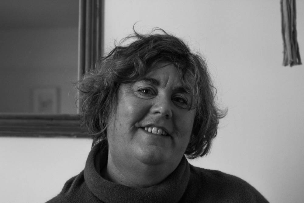
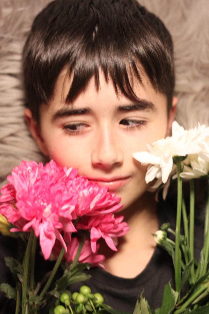
Original image
My first edit in the style of Bill Brandt – high contrast B and W
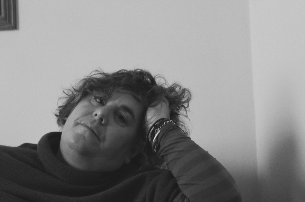
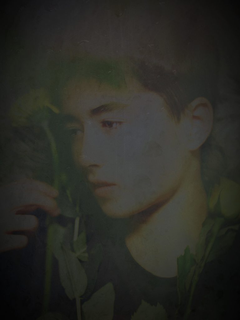
Turning B and W
Increasing contrast
Adding brightness and sepia tint
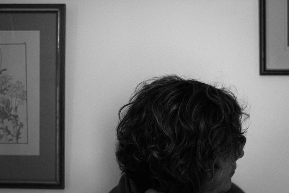
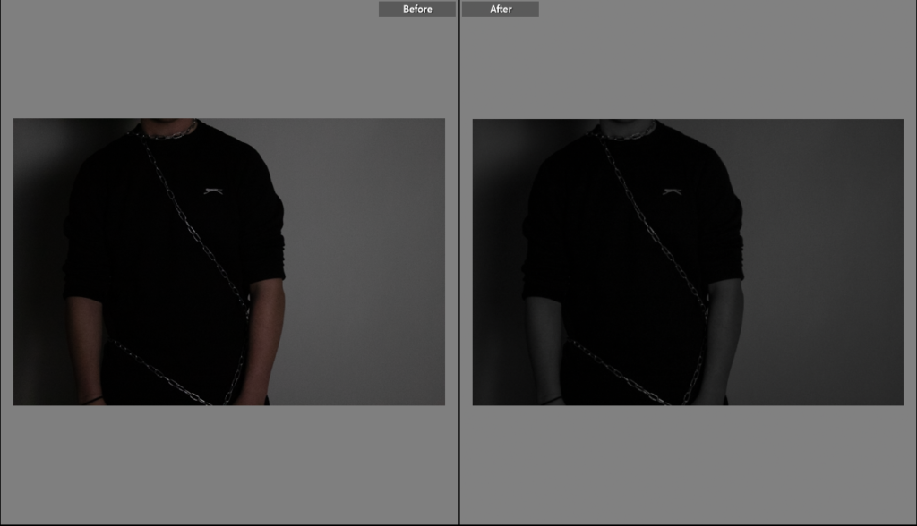
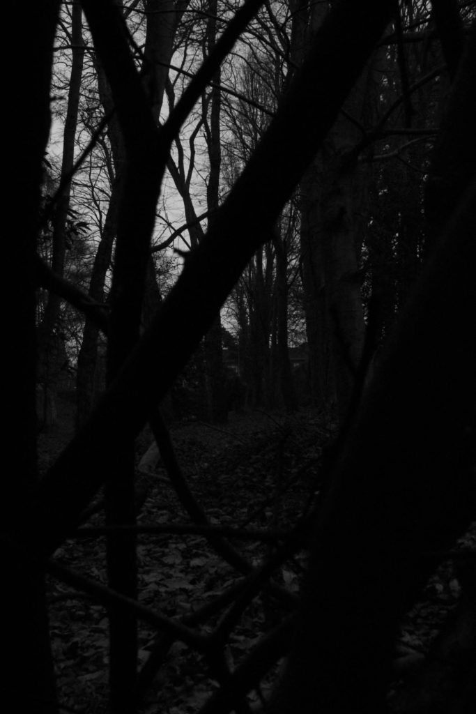
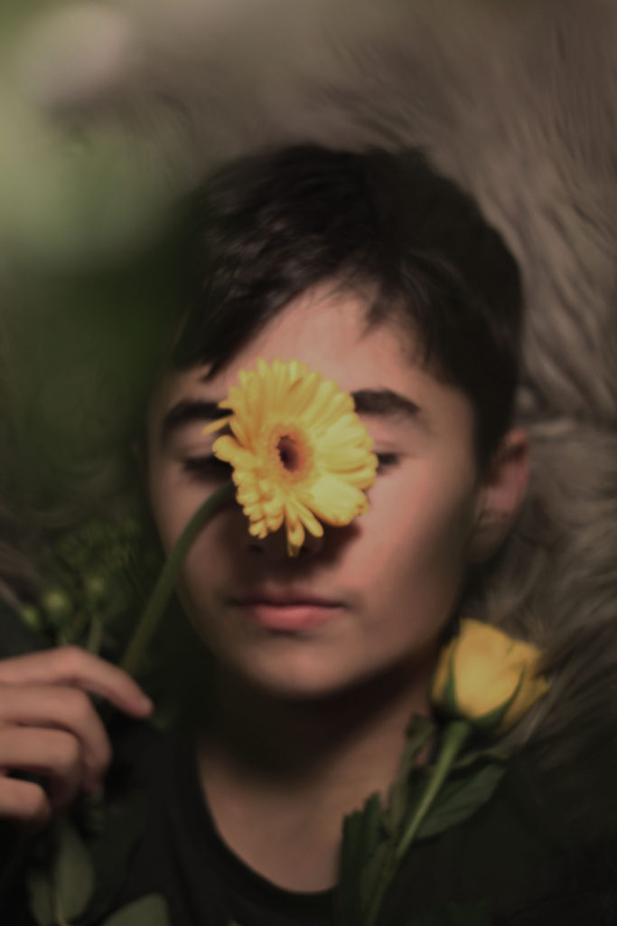
Original image
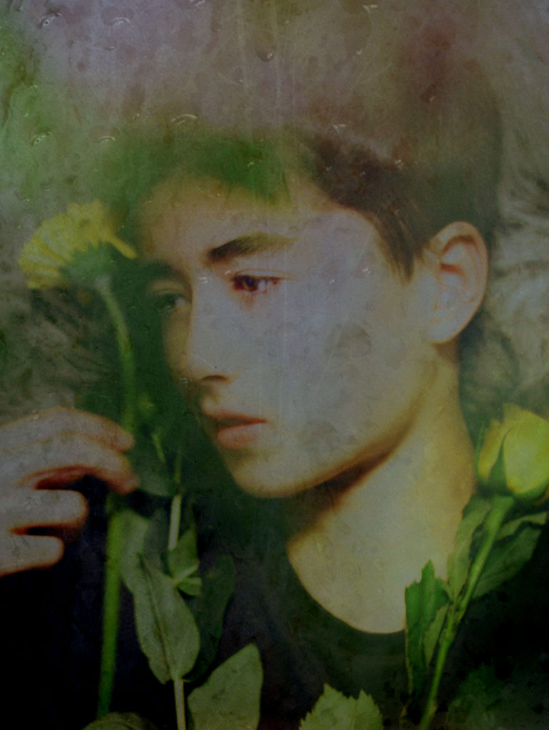
One of my archival pictures in the style of Bill Brandt
Turning B and W
Adding grain
Adding gradient map
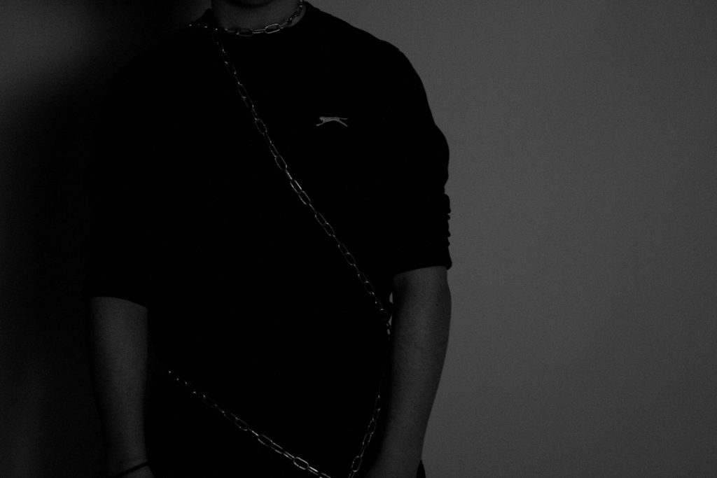
Adding more contrast and grain, and brightness
Final edit
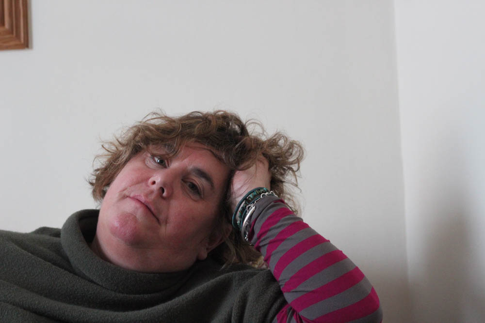
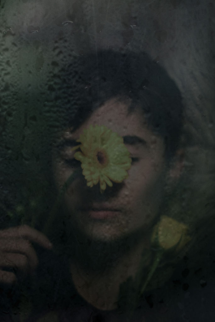
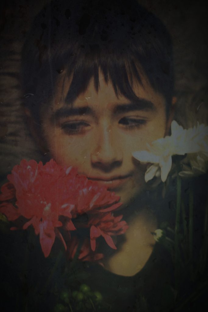
Original image
Original edit
Turning black and white
Adding contrast
Adding contrast and grain
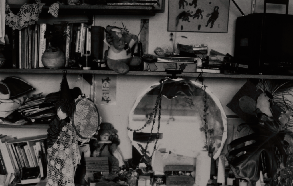
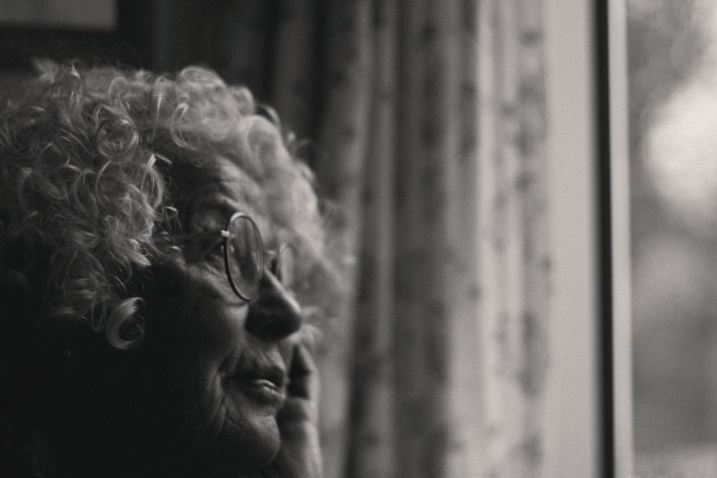
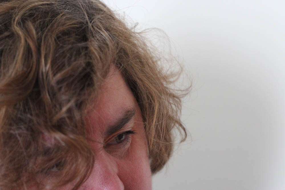
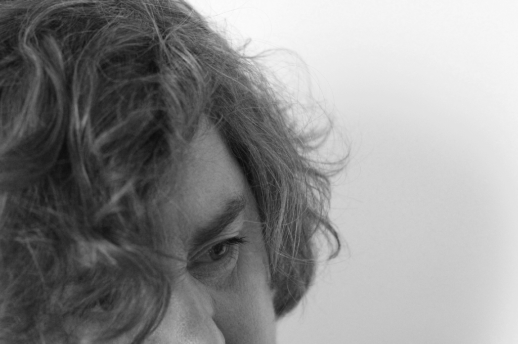
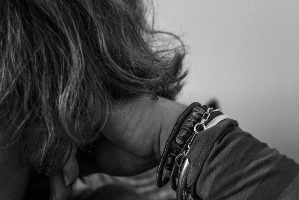
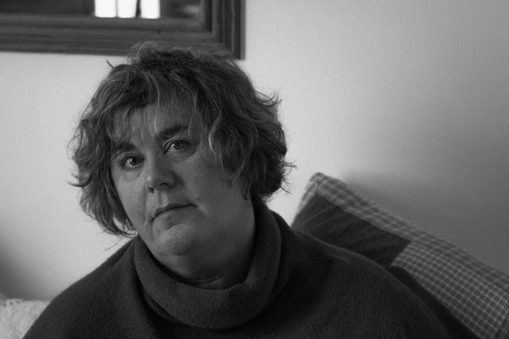
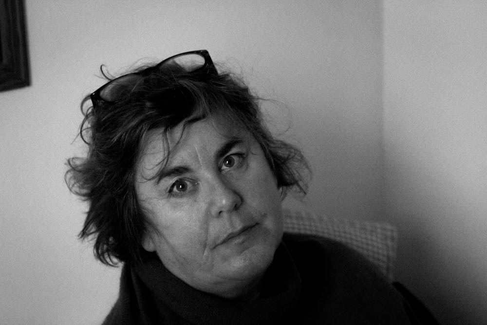
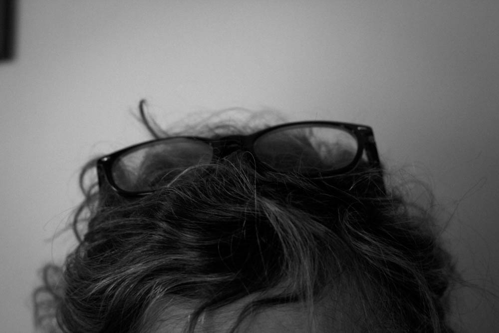
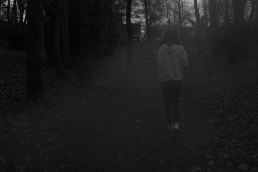
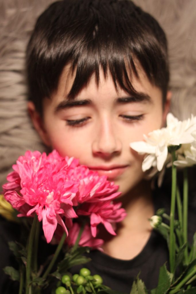
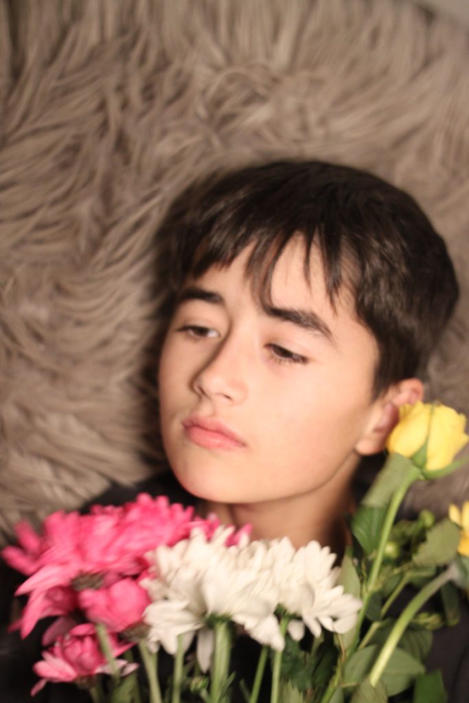
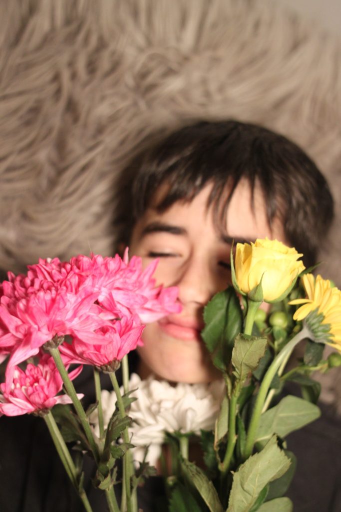
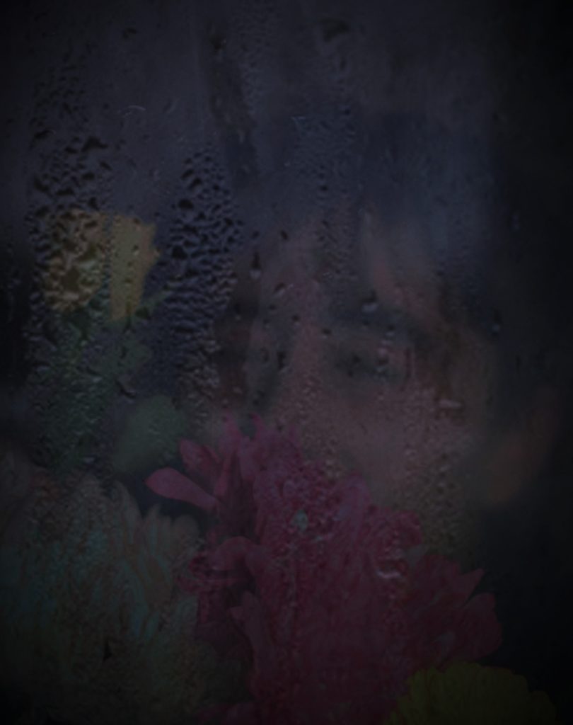
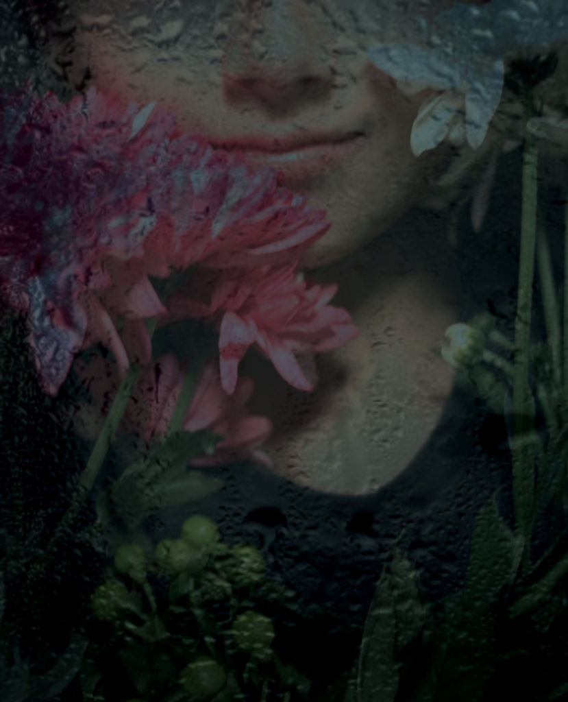
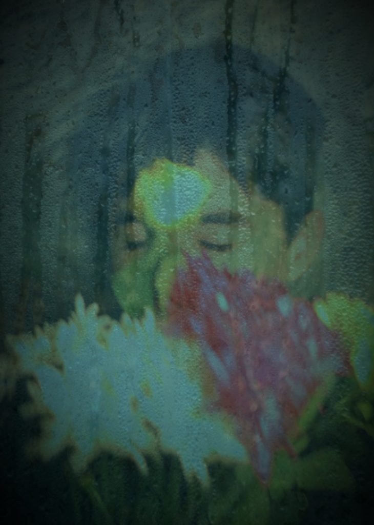
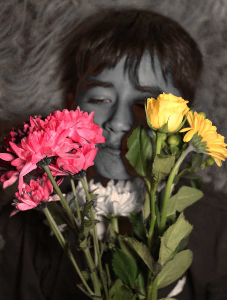
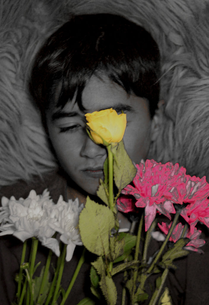
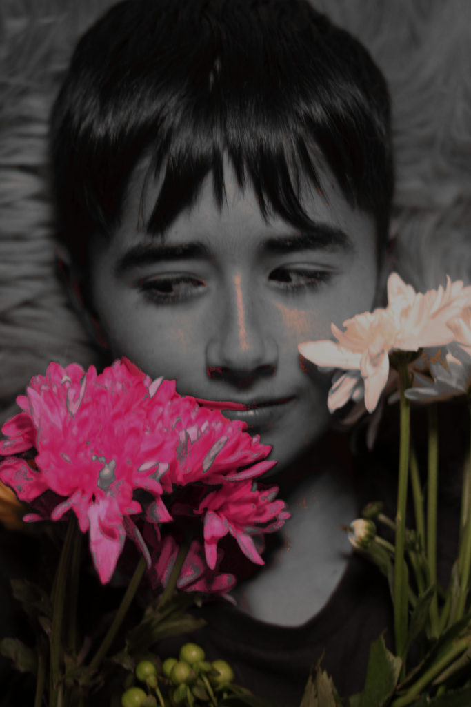
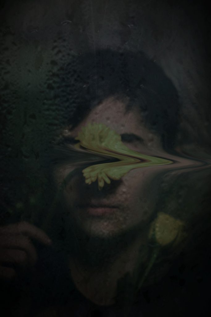
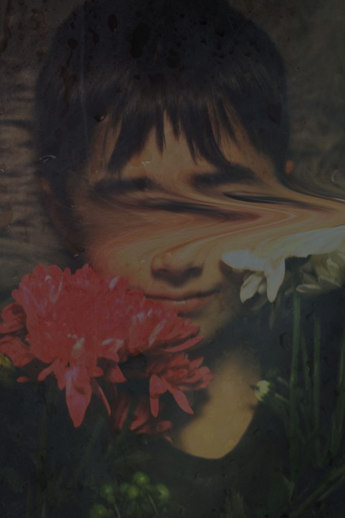
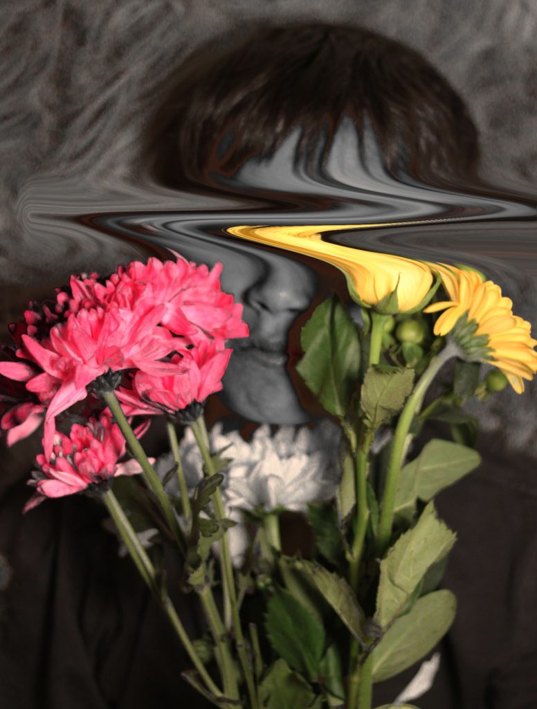
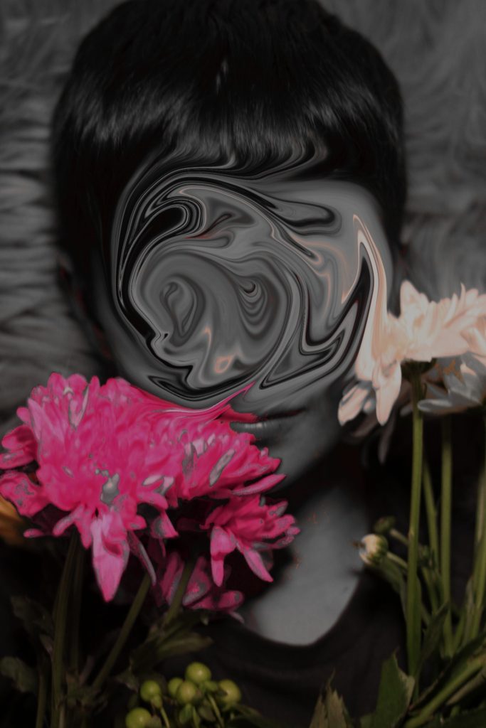
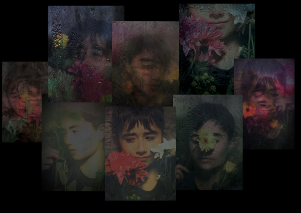
Other examples of my editing
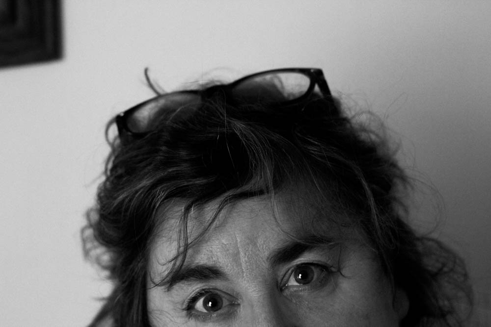
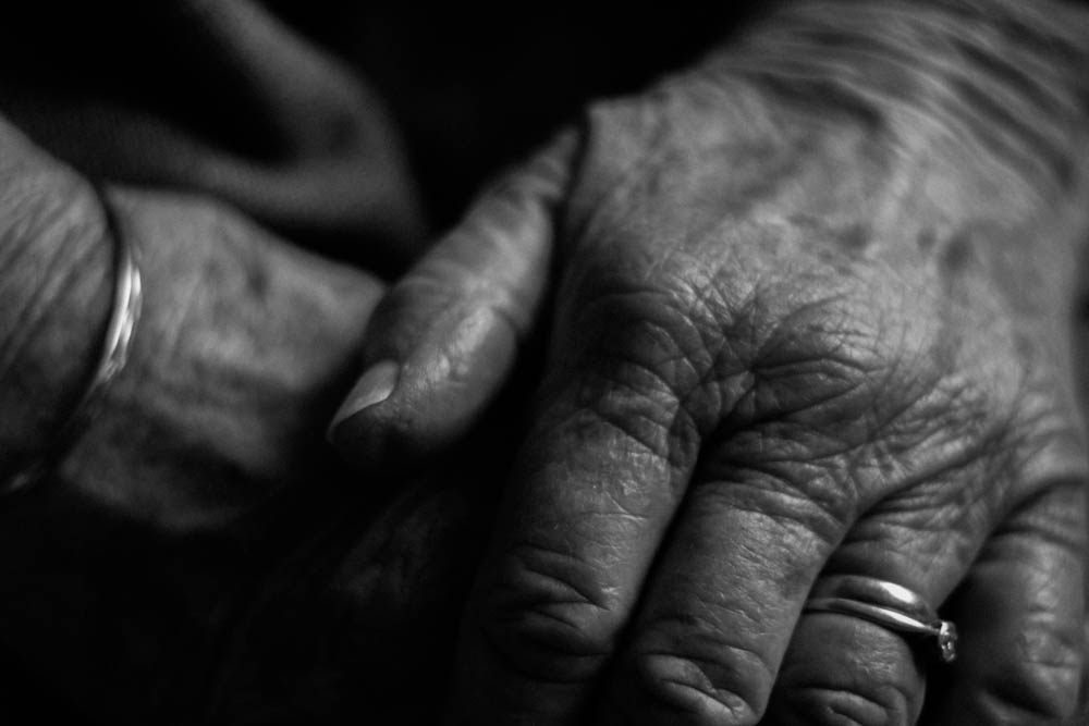
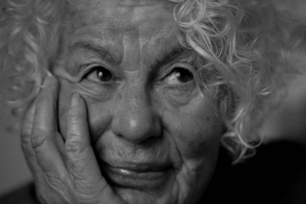
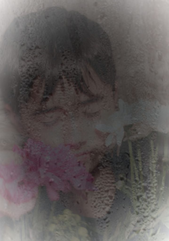
Some examples of my edits – these are from my photoshoot of my mum.
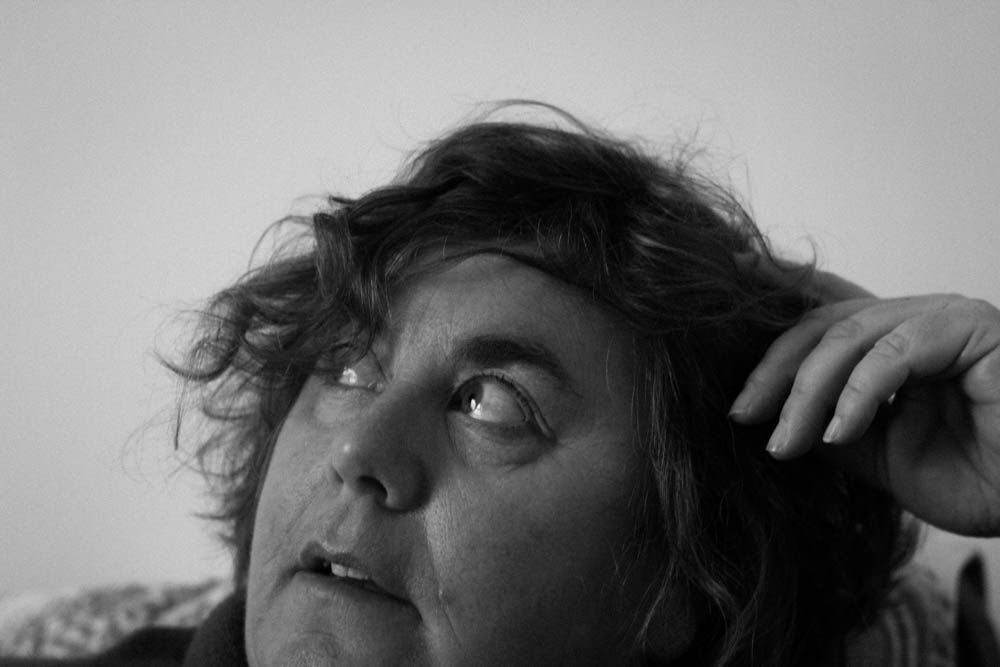
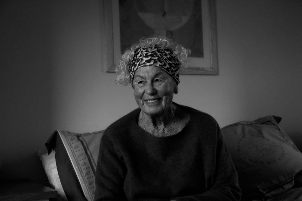
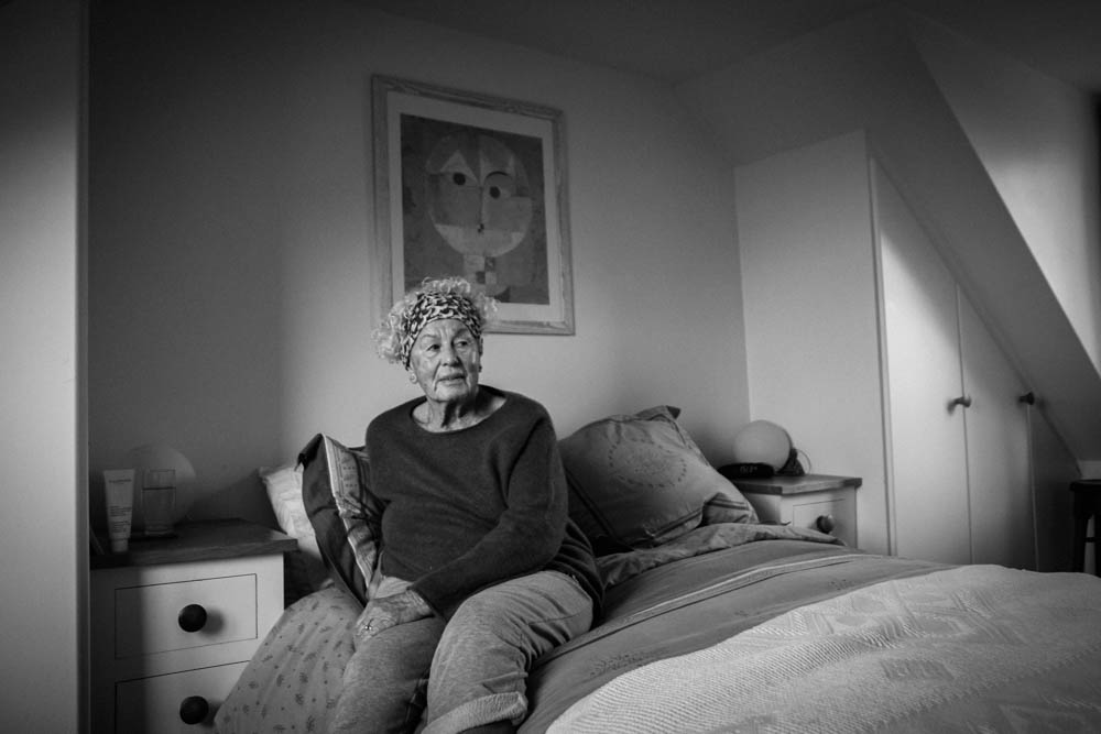
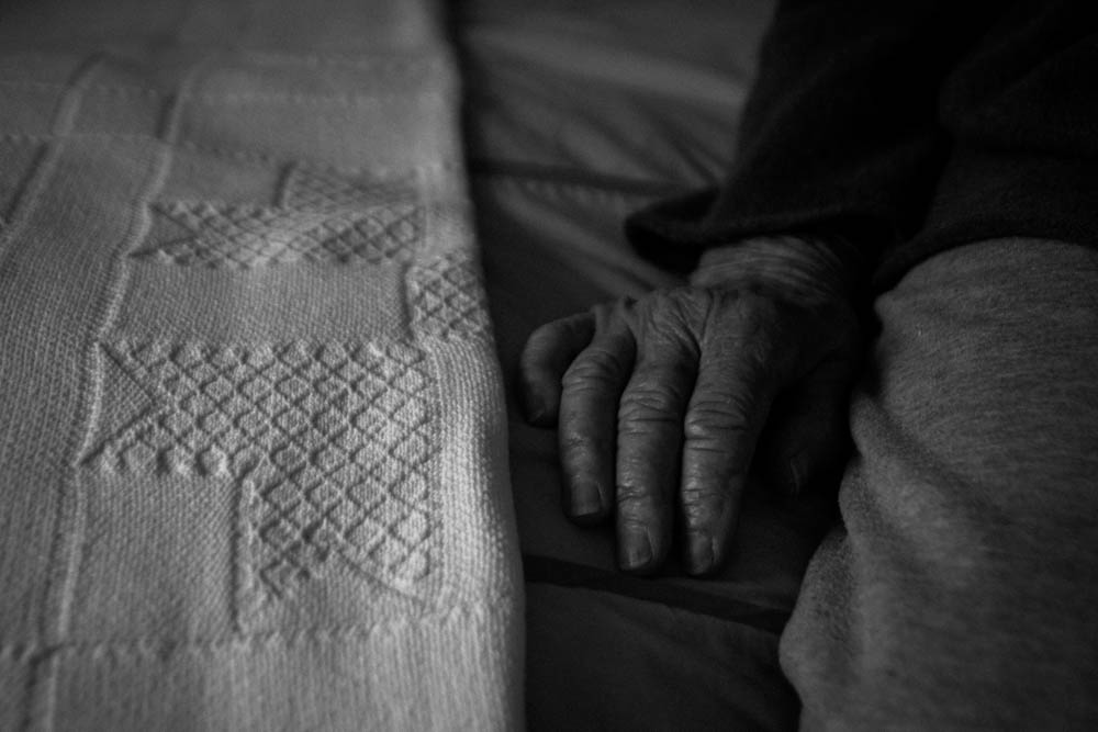
More examples – this time of my nana, both abstract, headshots. and wider angle shots.
I’m glad I made the decision to only use Bill Brandt as my editing inspiration, as I think that they show the idea of age and generational identity better, and fit more coherently with my found images. This will make it easier for me to create my final pieces in the style of Joachim Schmid.
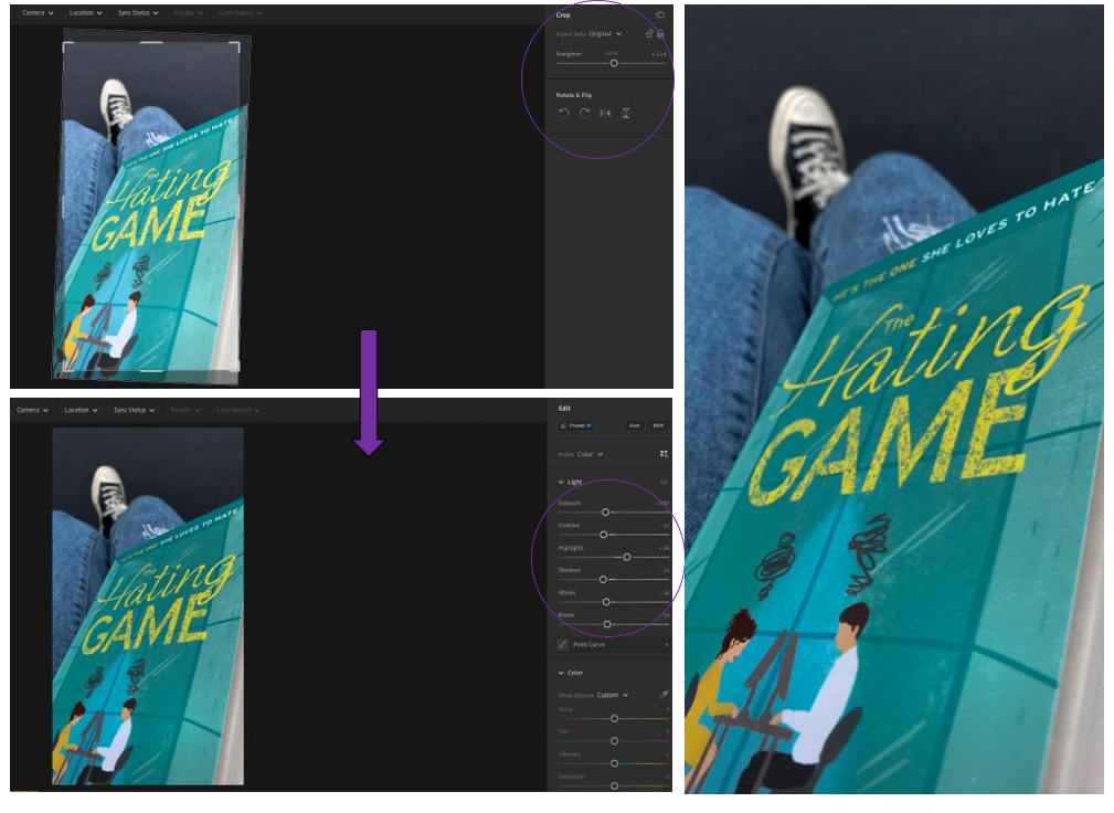
In this post I will be editing the three best shots which I chose from my 1st photoshoot in Adobe Lightroom, so that they can be used when creating my final pieces, I used a variety of different skills when editing these photos to show a range of diversity, then the editing which I like most I will apply to all to create a flowing dynamic in my final piece.
Experimenting
1st photo experiments –
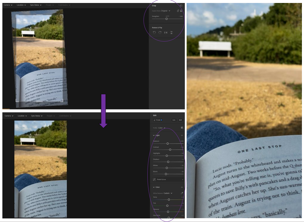
– I cropped it so that the photo became more centred and straight. – I brought the exposure down so that the colour of the pages became more defined and clearer to see. – I brought the colours down using the contrast to reduce the glare from the lens to the book then I used the whites and highlights to brighten it up slightly.
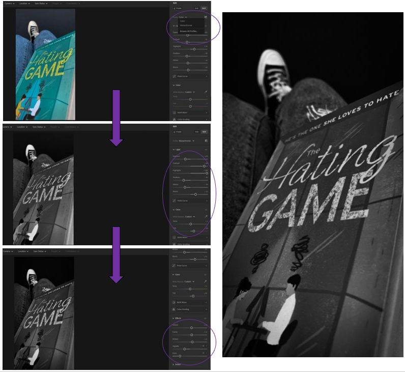
– Used the monochrome filter to change it into black and white. – Then changed the contrast by a lot to make the darker tones stand out better against the lighter ones. – Then to help the white tones I changed the highlights all the way up which made the white really bright. – I added a slight shadow around the edge of the photograph using the “Vignette” tool, then added some texture with the “Grain” tool.
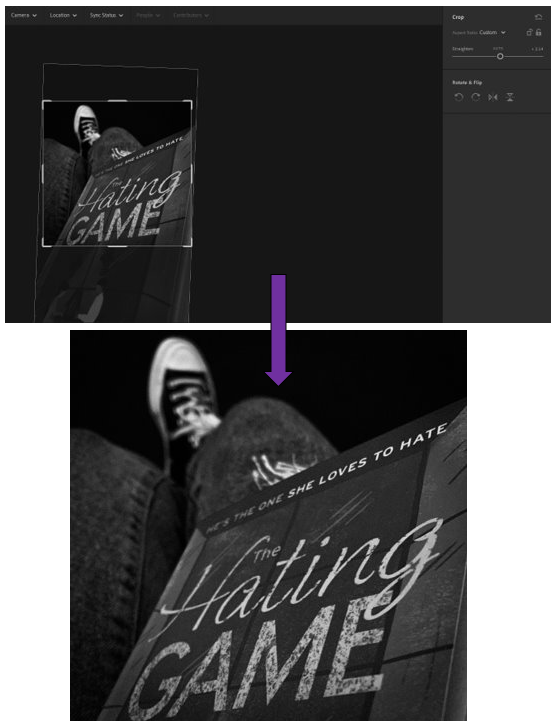
– I cropped it like this so that it creates a dramatic feeling with the title of the book as the rest of the cover isn’t able to be seen. – As if someone has stolen it from you, preventing you from knowing more. – Makes you want to know more about the book, as covers are usually good ways of describing it.
2nd photo experiments –
– I cropped it to get rid of the slope in the photograph which was there initially. – I then slightly brought up the contrast for the darker tones along with the temp which made the photos ‘temperature’ appear warmer. – I brought down the exposure, whites and highlights to make it less bright, form the sunlight but only slightly. – I also brought down the shadows because I liked how it made the shadows more defined as it creates an unusual pattern on the floor which adds character to the photo as it shows its landscape.
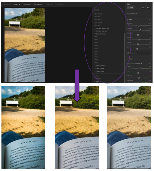
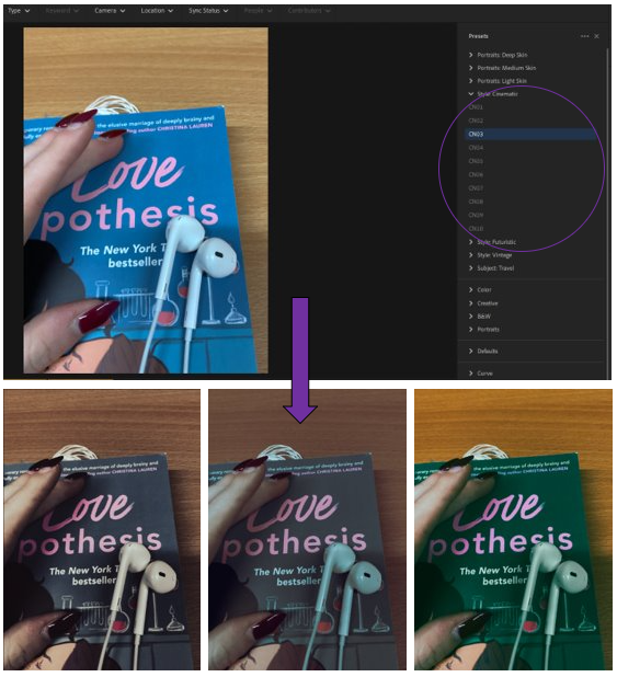
– Experimented with the pre-set setting on Adobe Lightroom. – Chose from the “Cinematic” area of choice which gives them a dystopian, rural theme. – 1st=PD04 Yellow, 2nd=PD05 Orange, 3rd= PD02 Yellow
I decided that I was happy with the experiments which I had done with this one because I had previously cropped it in a way which I liked and thought worked well for the photograph.
3rd photos experiments –
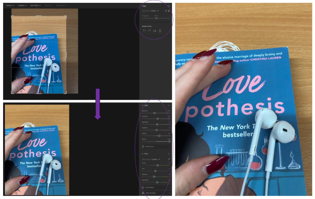
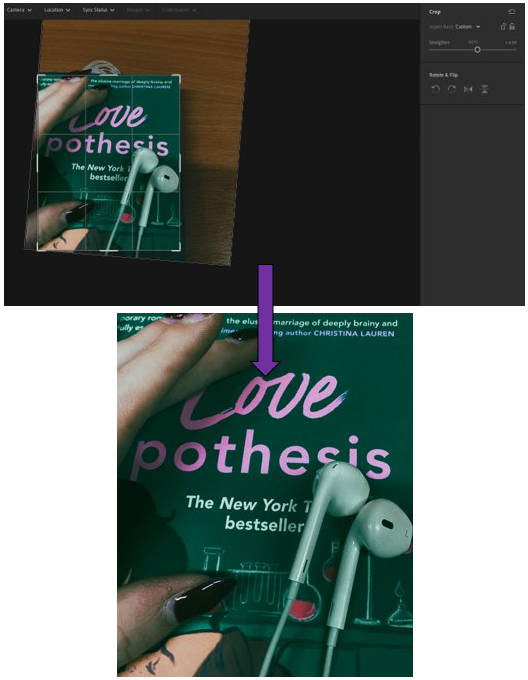
– Cropped the photo so that the sides and top didn’t have as much extra space. – Brought up the contrast so that the colours from the wood of the table and the colours from the book that I changed using the temp, tint and brightness so that they would create a nice difference between each other in a subtle yet brightened way. – Made the headphones more defined using the exposure, whites and highlights then the blacks to create a shadow – and make it more defined. – Simple yet effective.
– Experimented with the pre-set settings from the theme of “Cinematic” on Adobe Lightroom. – Created an old, cinematic look that you would see in older films where there isn’t that much colour. – Used the filters = CN03, CN07, CN09. -CN09 is my favourite as it creates this beautifully vibrant tone with the wood in the background which contrasts well against the book which has been transformed in a blue/green colour.
– I cropped it like this to create a main focus for the photograph, so that your attention is only to the middle of the photo. – Photos and headphones add a level of personality to the photo, as the hands can tell you a lot about someone and who they are.
Born on August 6th, 1928 but sadly passed away on February 22nd in 1987.
Experimented with a variety of art forms such as performance art, video illustrations and writing and film-making.
Took the aesthetic of commercial art/photography and brought in an Avant guard style to it.
Won many awards for his style of art, and by 1950 developed the idea of “Pop art”, which was seen in his pictures of Campbells soup cans.
Also made many celebrity portraits.
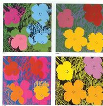
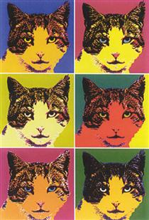
Examples of his work –
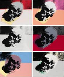
Skulls, 1976.
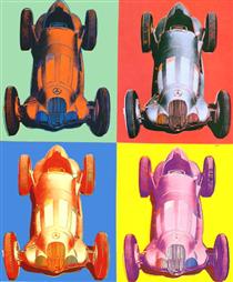
Benz Racing car, 1986.
Flowers, 1970.
COM.
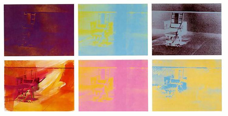
Image analysis –
Electric Chair, 1971,
I think that this picture which has been manipulated into different colours by Andy Warhol in 1971, is very unique and usual which I really like. This is because he has taken a picture of an electric chair, which aren’t used in many places now due to the danger and inhumanity of them, and shown it in different colours. I think that these colours can help to represent different feelings people may have of it.
This can be ranged from; the blue (being sadness), red (anger), black (death/pain), pink (showing love from loved ones), yellow (happiness) and brown/red (revenge). I think that this is a very clever way to show this as it is subtle yet impactful due to the messages which it can create towards the audience.
Therefore for my editing in my second photoshoot, I will use this technique inspired by Andy Warhol because I like how he repeats the same/similar photos in bright colours to create this idea of “pop art” as it is unusual due to the objects which he photographs as many photographers would use a variety of them, whereas Warhol likes to focus on just one main subject photo instead because it creates a deeper message.
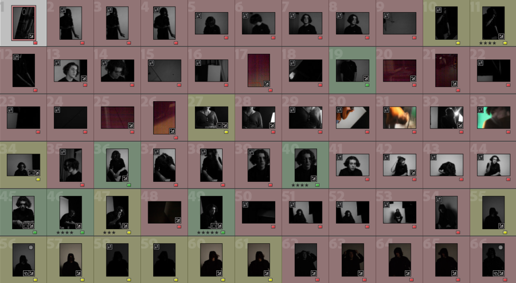
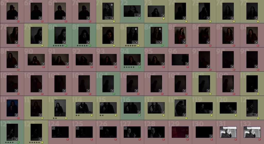
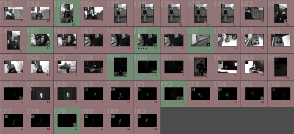
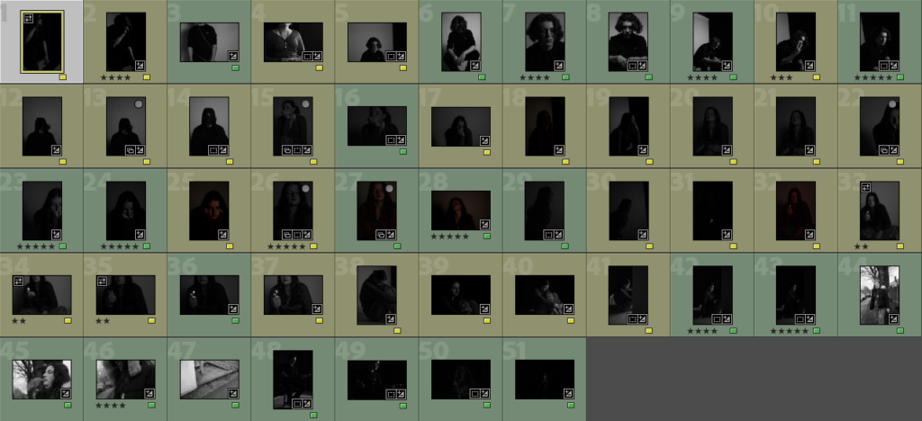
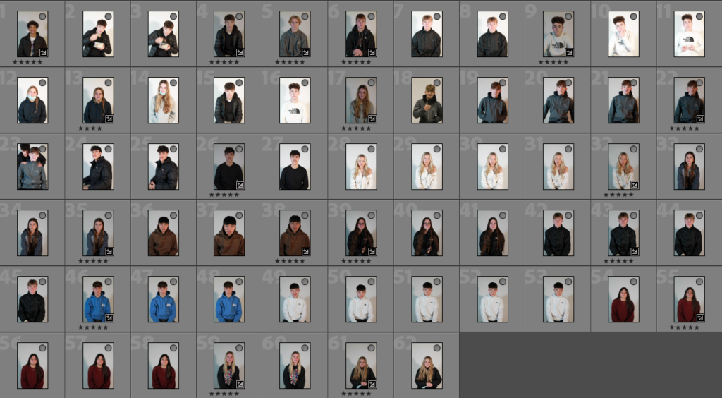
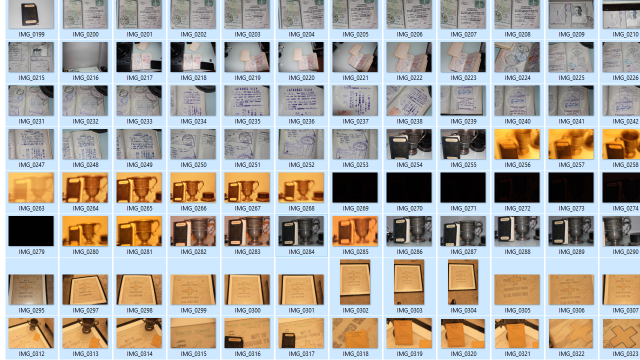
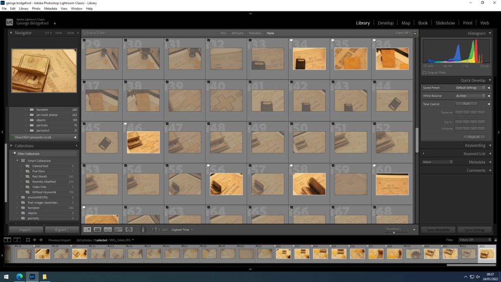
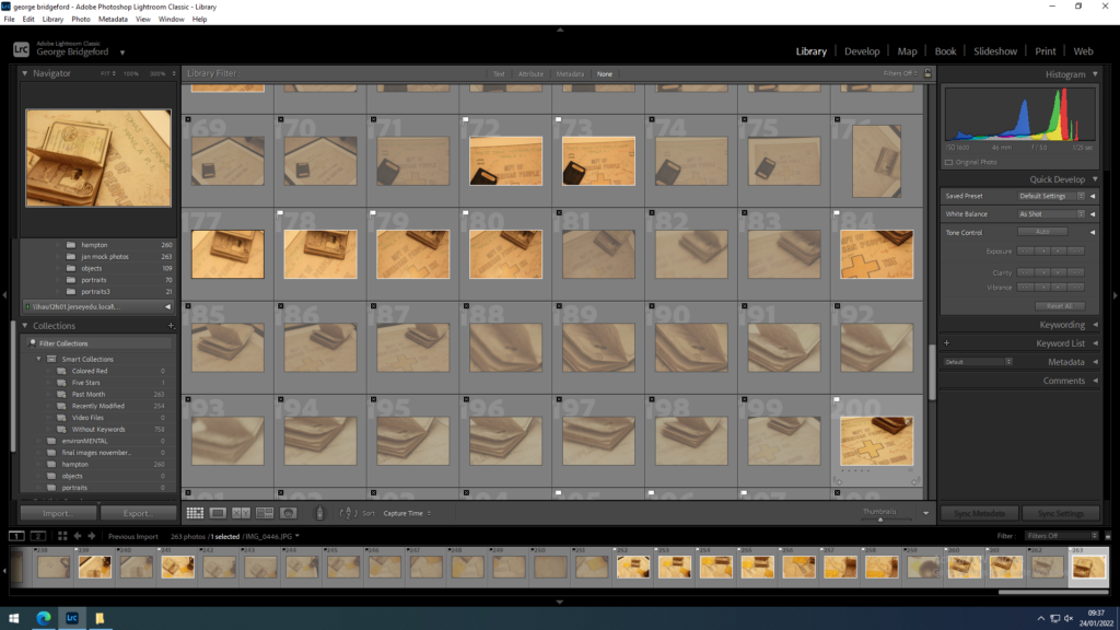
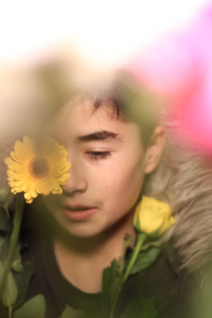
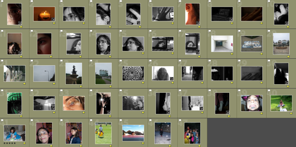
Using the Red, Yellow and Green colour labels I narrowed my 182 images down to 51 images that I could work with and the Green ones being the ones that I am definitely going to use.These are the images that I have decided to work with, the Green labelled ones are my best photos that I have selected and the Yellow images being my back ups.
Laura Hospes
I chose Laura Hospes as one of my artists as
My image
Laura Hospes inspiration
My image
However, I am unhappy with how some of my images inspired by Hospes turned out as I found that the lighting was too dark and therefore when
Editing
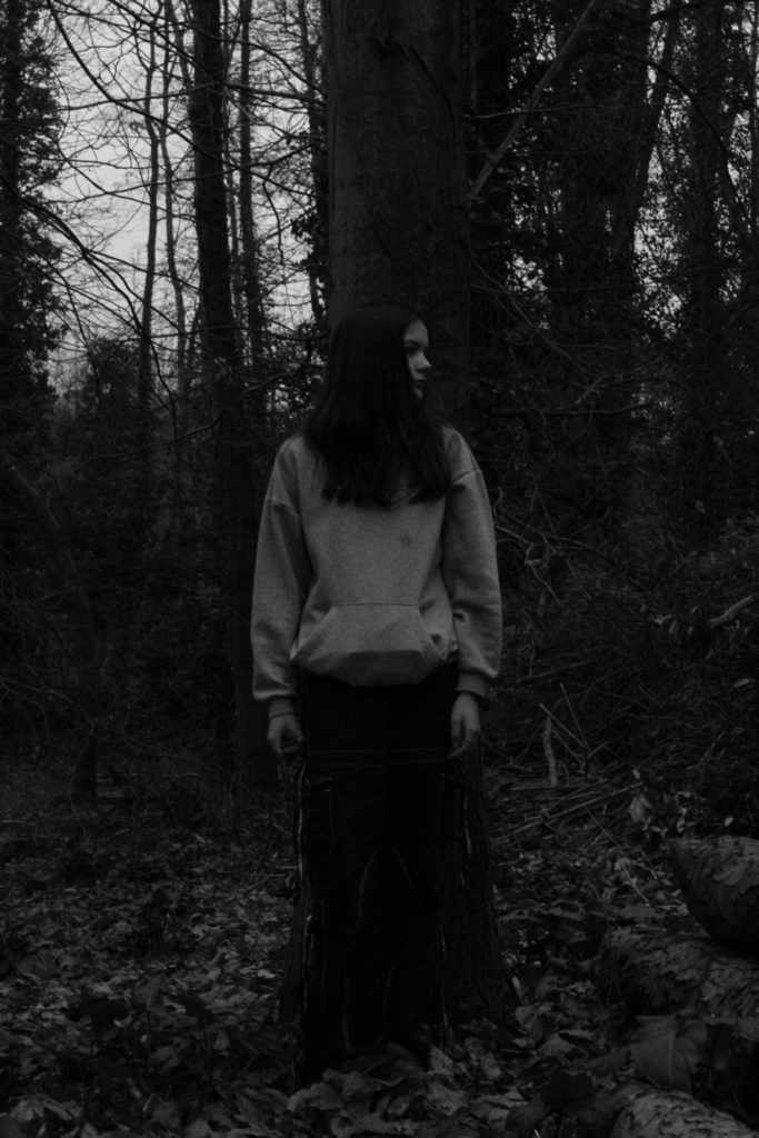
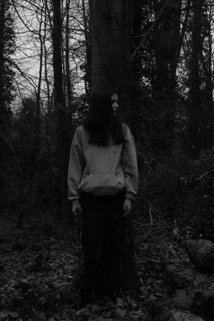
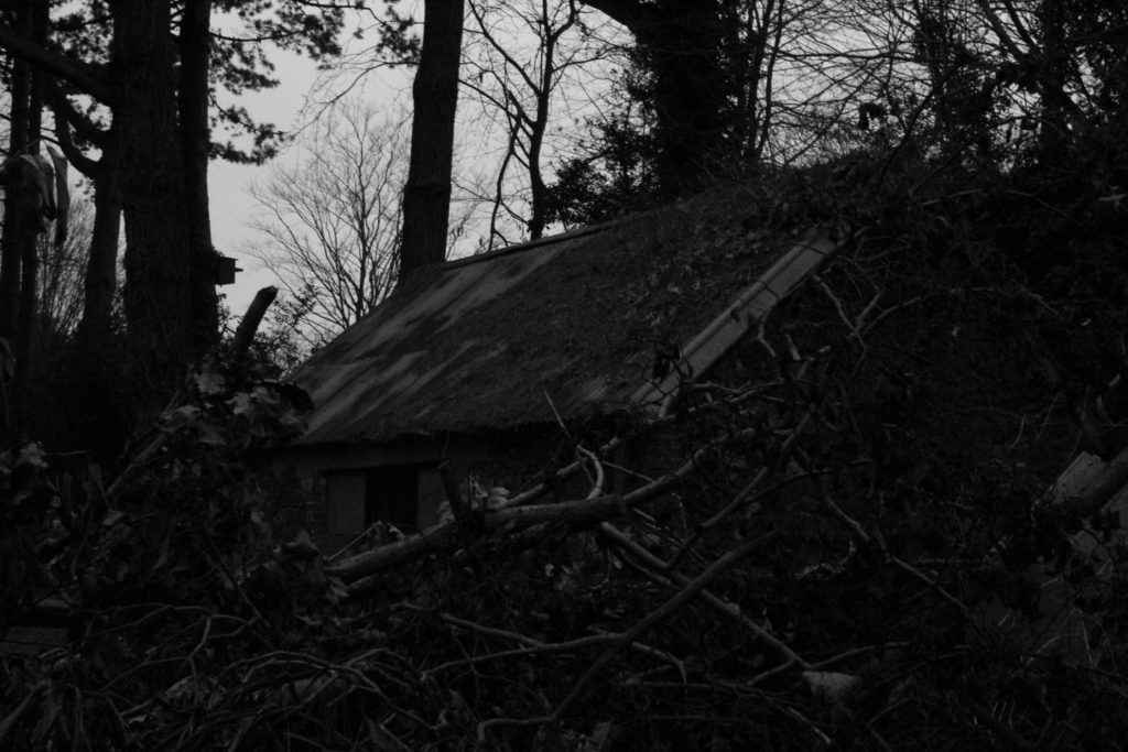
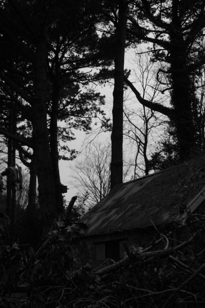
Photoshoot 2
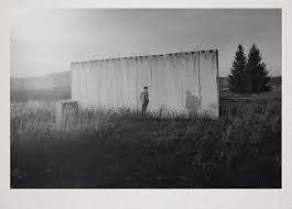
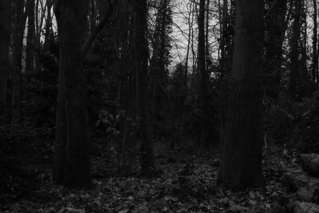
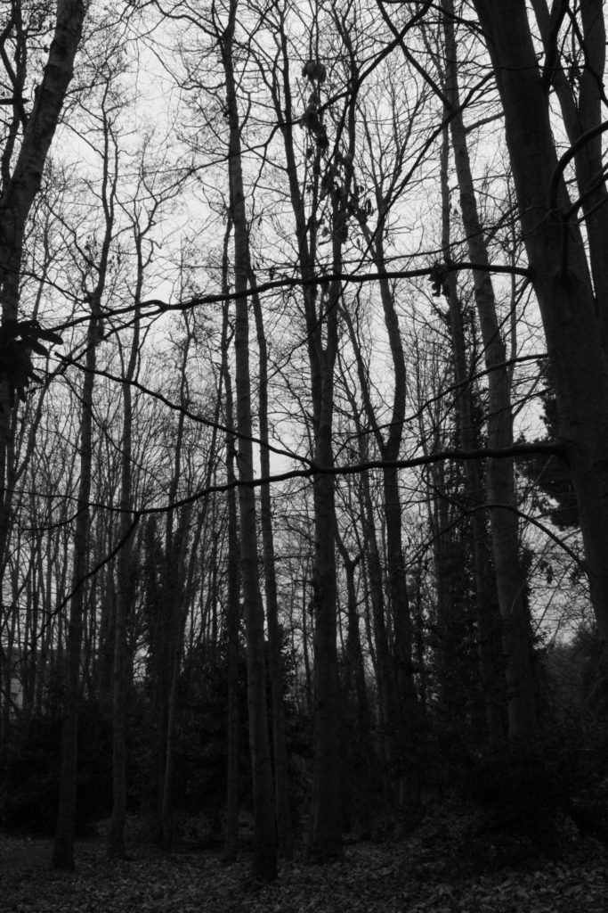
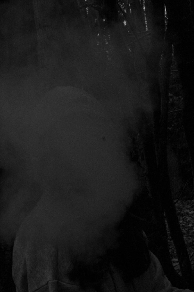
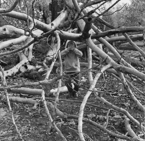
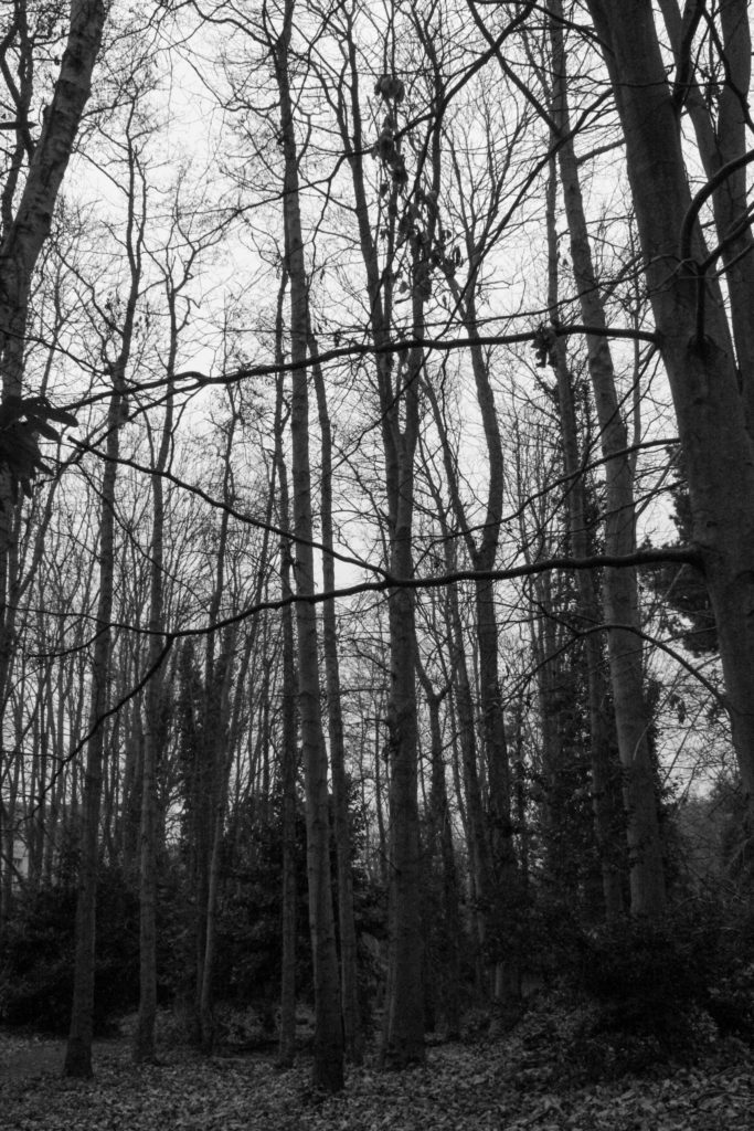
I chose to take my last photoshoot in Saviours forest because forests convey the message of Chaos is nature.
Chaos- Conveys a certain message and make order out of the chaos in nature. Structure (Visual Highways), balance and harmony. Vertical growing trees chaos is the variety of tree heights, shape, colour, grow in different places, tilt, break and grows branches in different places. Chaotic mixtures of leaves, trunks and branches. To control chaos set up a tripod defines perspective. However I wanted to capture that chaos as I captured the chaos of Mental Health in my previous photoshoots.
Talk about my camera position ie crouching (worms eye view), standing on objects and eye level.
Do I capture the forest floor and the horizon.
Contrast- Noon on a sunny day gives high-contrast light. sun up and clear sky direct light shines through the canopy, leaves, branches and trunks with dark shadows filling the forest.
Could use high contrast
The following photographs are the inspiration for my shoot.Using colour labels I narrowed my phoroshoot down to my favourite 16 images that I am going to use for my zine.
My image
Inspiration
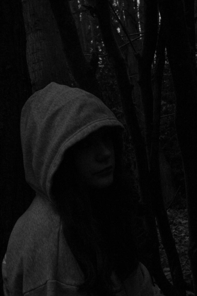
I used the following camera settings Shutter speed:1/100 Aperture: F14 and ISO: 3200. Along with these settings I photographed against the light shining through the trees
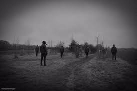
I don’t want high contrast therefore I am taking my images in the evening just before sunset when the contrast is significantly reduced giving my images a soft lighting under a cloudy sky in almost foggy conditions.
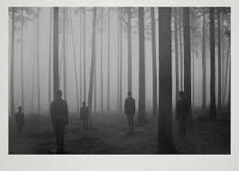
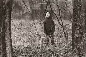
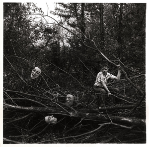
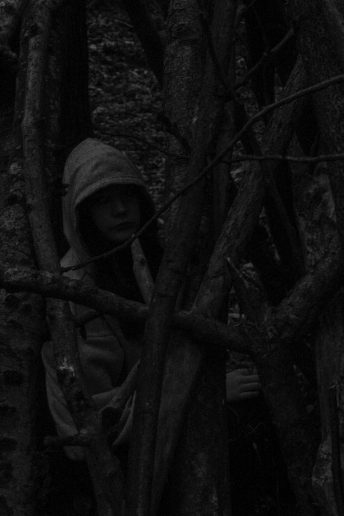
Ralph Eugene Meatyard
My Image In Response
Artist’s Image
My Image In Response
My Image In Response
My Image In Response
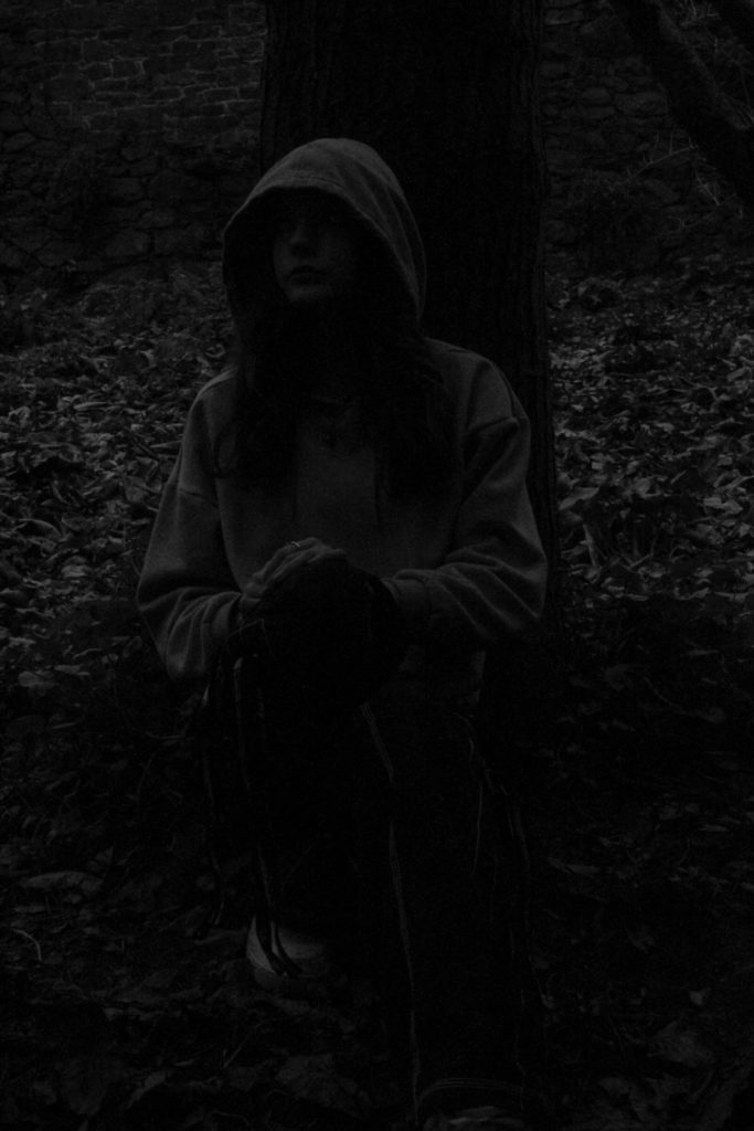
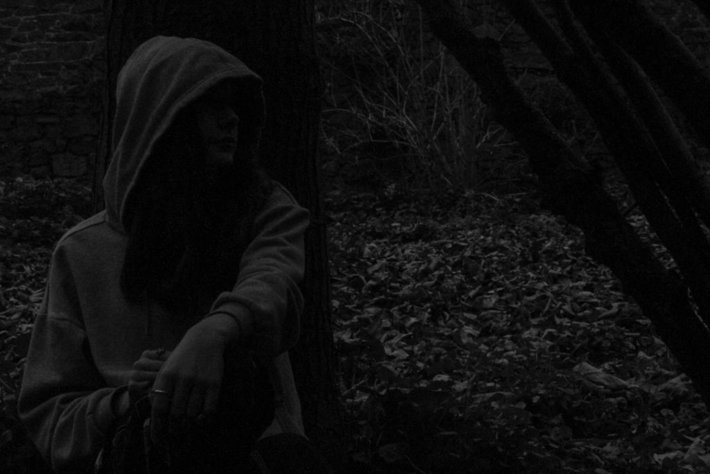
Editing
For all my photos in Photoshoot 3 I decided not to edit them much as
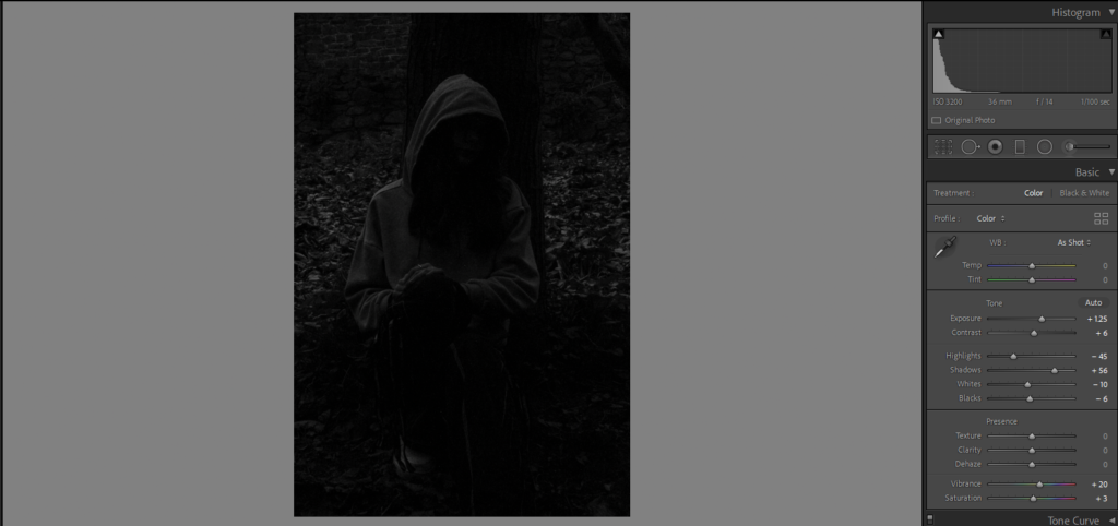
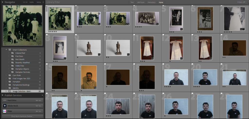
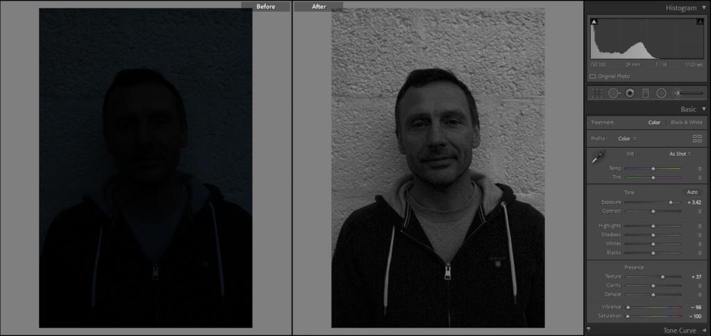
Before editing any of my images in Lightroom, I have organised my photographs so that I can identify which are of the best quality and which are most likely going to be used in my project. So I made a quick collection in Lightroom and placed my images in this folder, to do so I flagged which ones where going to be moved here, then after I rated them out of 5 stars. This was based on three aspects; the quality, likeliness of being used in my project, and the composition of the photographs, even before being edited.
Original Images Before and After Editing:
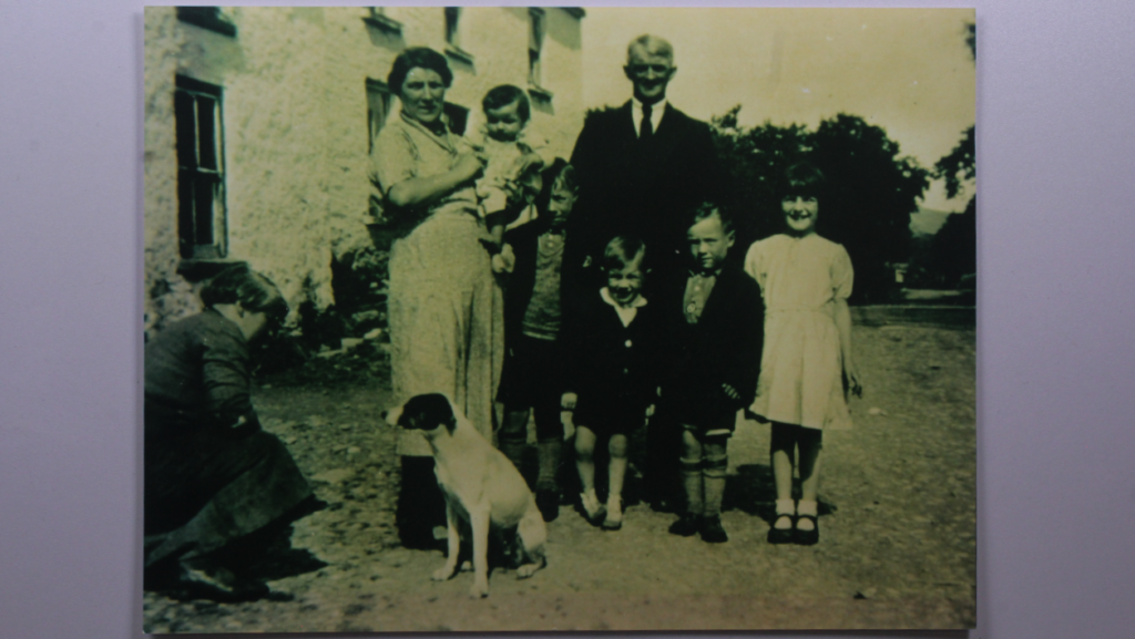
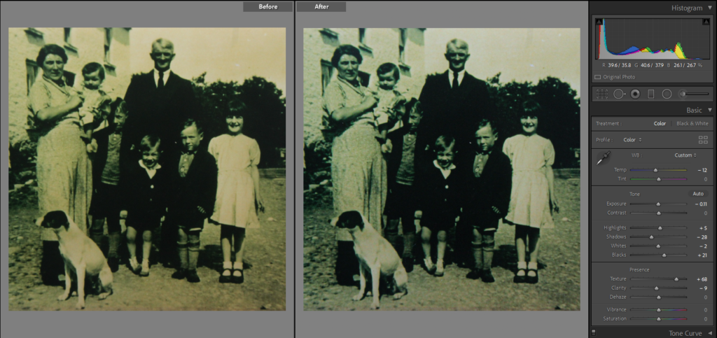
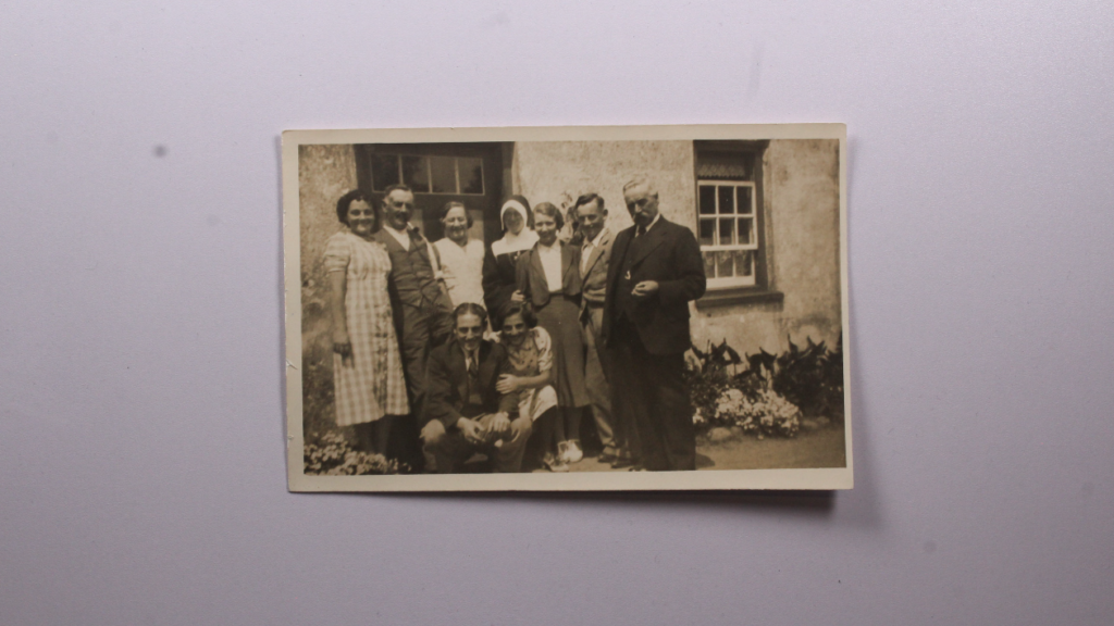
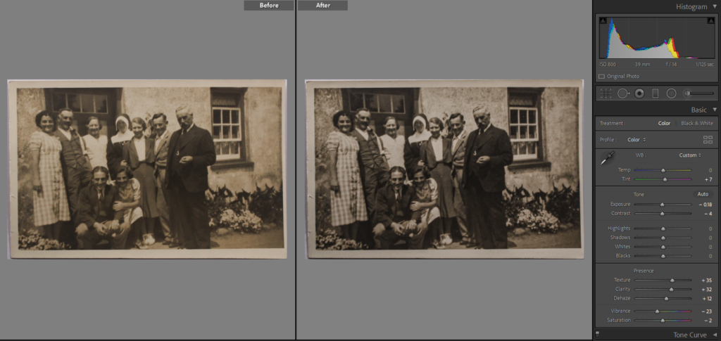
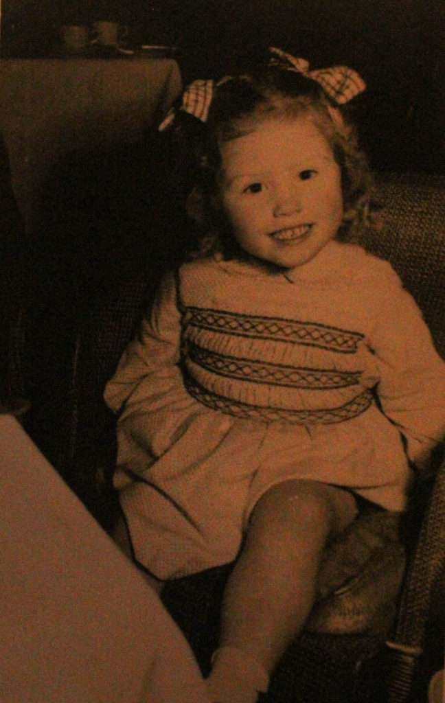
To start off editing this image, I thought it was a good idea to crop off a section from the left of it, as I’m not sure if the man crouching down was relevant to this family photo, also you cannot see his face, meaning he is not adding anymore value to this image. I also altered the textures and black and white tones of this photograph as it adds more detail to the clothing of my grandparents and making the children’s faces more visible.
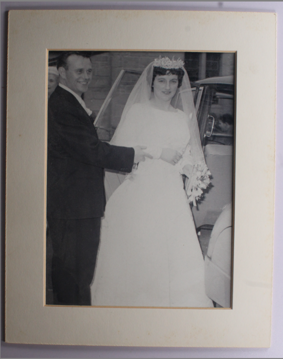
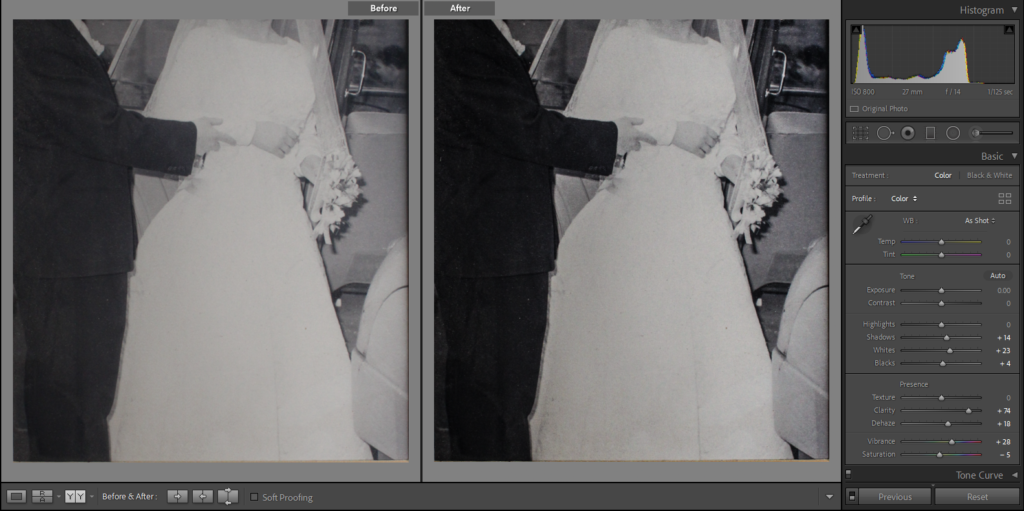
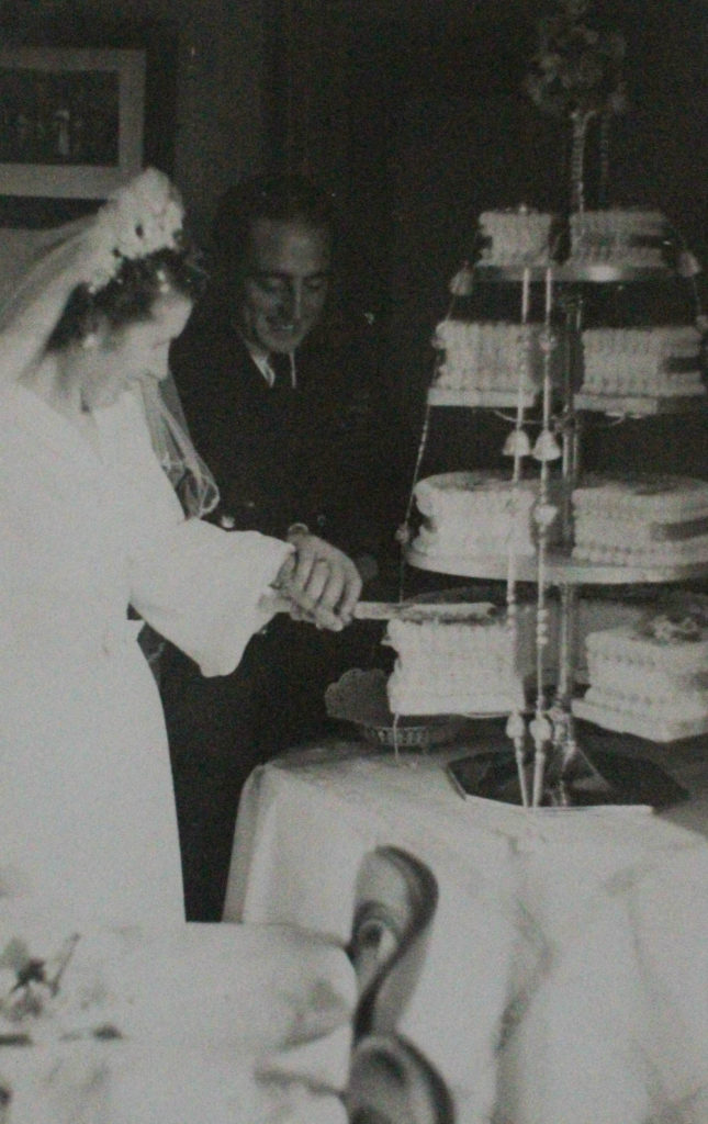
I have taken this image of my grandparents getting married and cropped off the white cardboard frame that the original photograph is normally taken it, and also cropped off their heads. This is in preparation for my Kensuke Koike artist reference where I am recreating part of his work, which is included in his ‘Red String’ project, as this image fits this idea perfectly. I have changed the clarity, vibrancy and shadows of this photo to make the details such as the flowers and veil more visible.
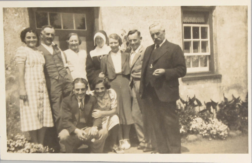
Here I have edited an of picture of my dads side of the family, including my great grandparents and my grandmother when she was young, by keeping the original small white frame around the image but still cropping away the white background. Additionally, I have changed texture, clarity and dehaze settings to make the photograph in an attempt to bring it to life to this old image.
Fixing lesser quality images:
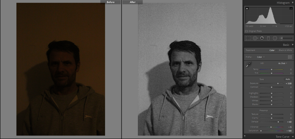
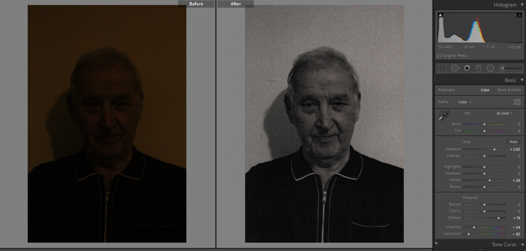
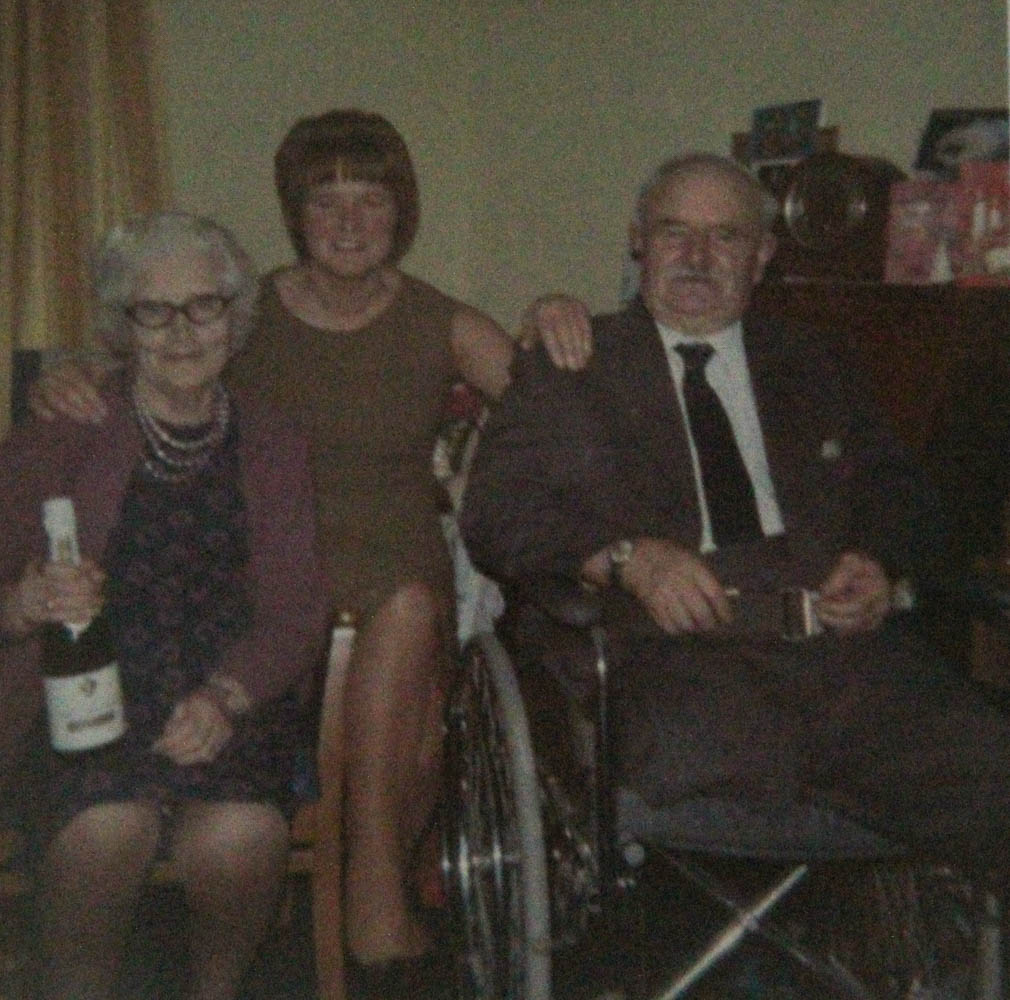
I have taken some images of my uncle (above), I was unaware that the exposure on my camera was far too low, meaning that the quality of images was compromised. However, I have found a use for these images in my project, when doing a Kensuke Koike artist reference I will takes parts of the image where my uncles face is, and make a photomontage also using pictures of my dad and uncle to link to the theme of family identity.
Furthermore, these image came out with a yellow tint, so to fix this I made the photos black and white, cancelling out of the colourful tones and bringing out more texture by editing the whites and blacks, this also added depth to the wrinkles in my grandad’s face. I like how this made them look more old fashioned, linking to other parts of my project when I’m using old family photographs.
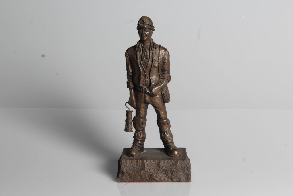
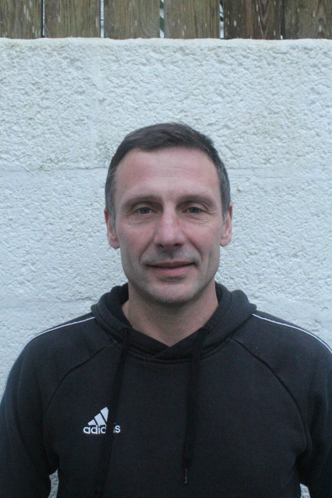
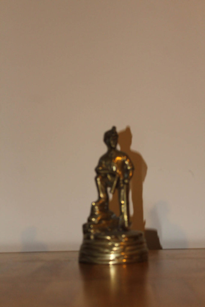
This image of my dad is better quality compared to the ones of my grandad and uncles, so my plan is for the majority of the photo montage to be of his face, and for the rest to be composed of the lesser quality images. Even though these images aren’t as good as some of my other (for example of the miners lamp/ statue, I think they fit in with my project better.
Here I deleted the photos that didn’t come out well or ones I didn’t need to edit.
STAGES ON PHOTOSHOP:
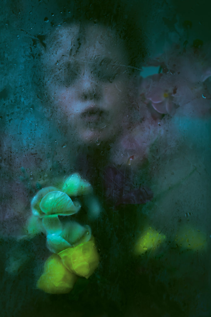
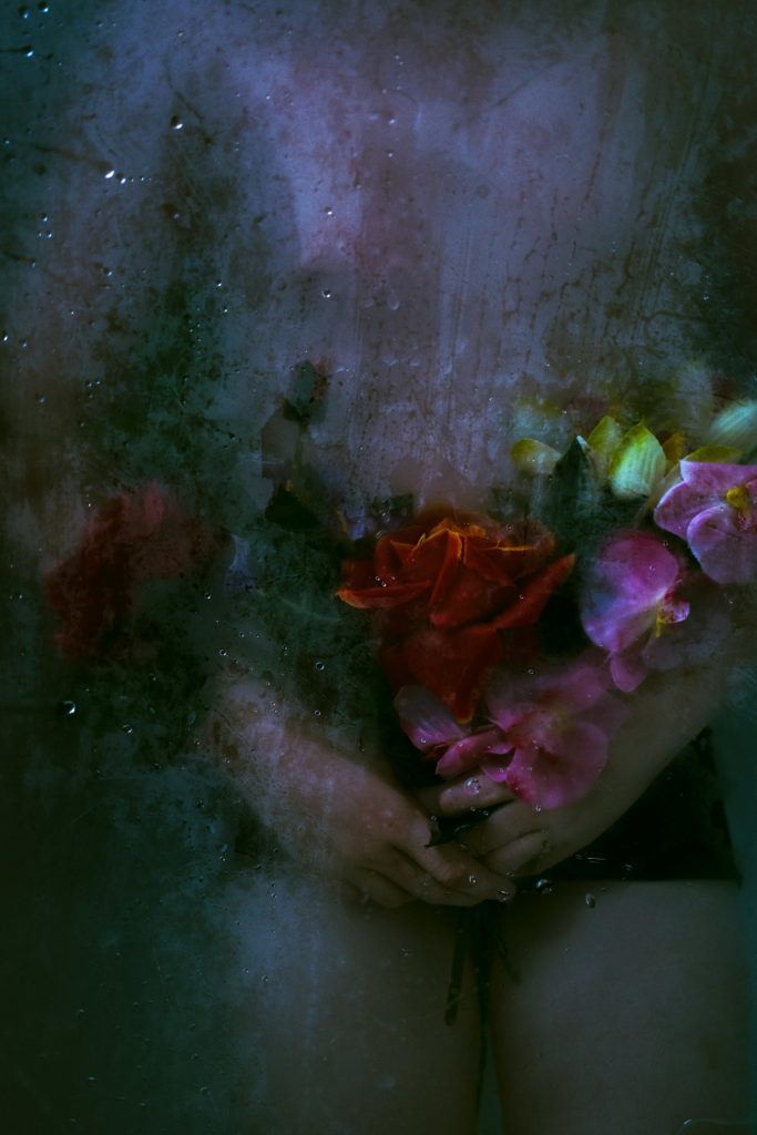
First photo: The unedited photo Second photo: Here I Adjusted the brightness and colours and lowered the brightness to -55 and +31 contrast. I lowered the saturation to make the photo have some dullness. Third photo: I used an image of steamed glass and lowered the opacity and tinted it green
FIRST ATTEMPT:
For these images I used Photoshop to adjust the colours of the original photos. I used Lara Gilks ‘beneath the ice’. On photoshop I changed each photos brightness and contrasts and then I added an image of steamed glass and lowered the opacity to give the same effect as Lara Gilks photos have.
SECOND ATTEMPT:
I wasn’t happy with the first attempt because the edits came out with a soft faded colour and wouldn’t look good when printed so I used the curves on Photoshop to add more depth to the photos.
DAY 2
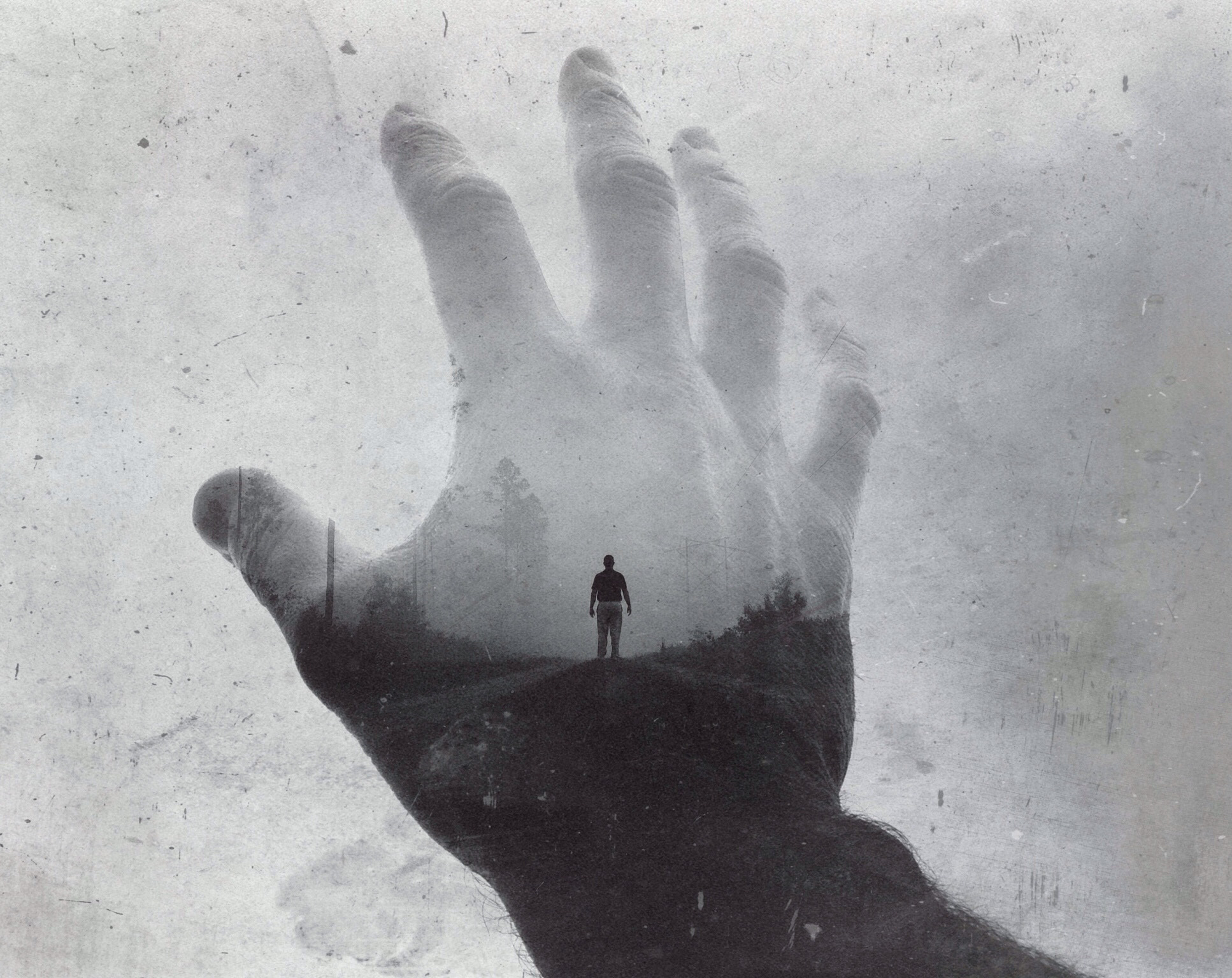
For these two photos I used 3 different photos and lowered the opacity and merged them together for a multi/double exposure.
EXPERIMENTS
FINAL PIECE
OPTION 1OPTION 2
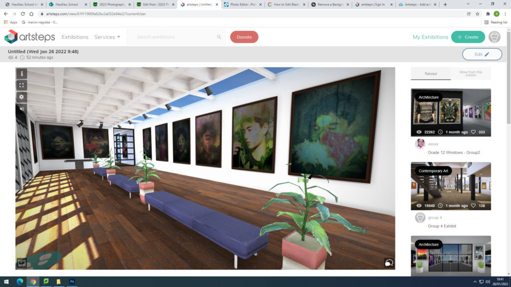
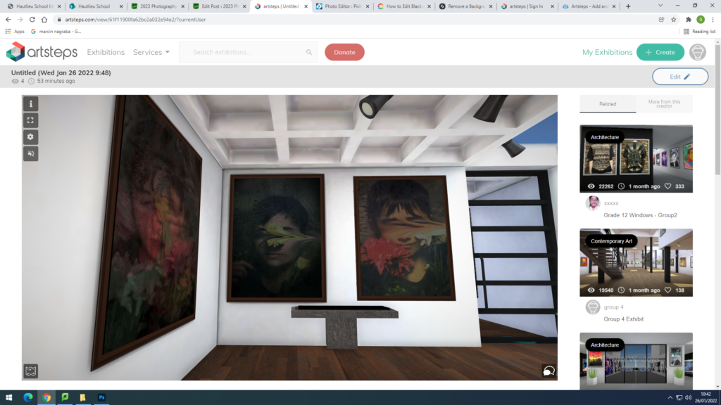
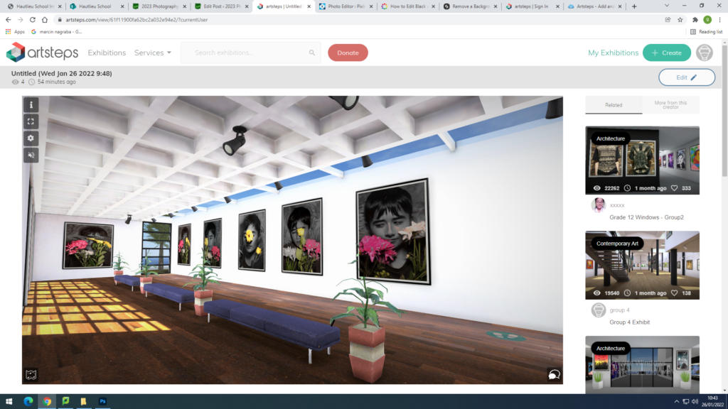
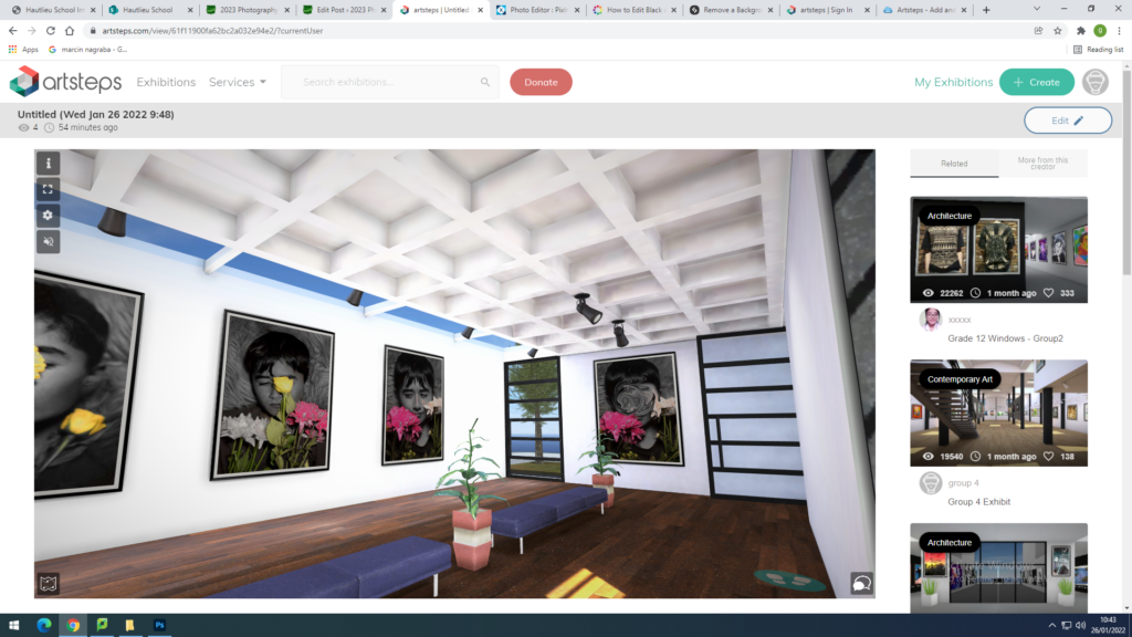
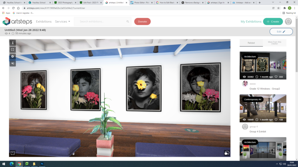
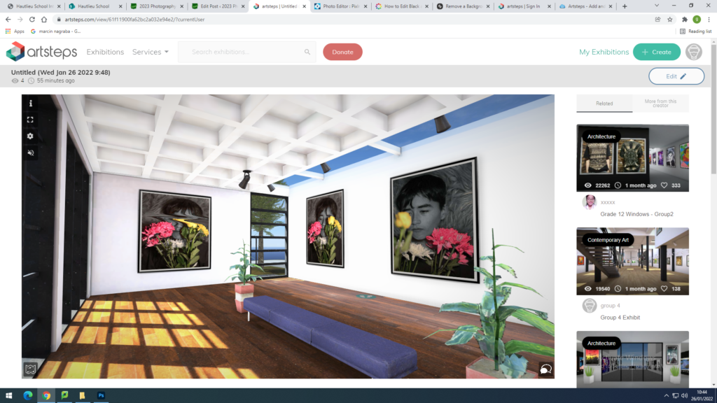
GALLERY: artsteps
COMPARISON
MINELARA GILKS
I tried my best to make the photos similar to the artists ones
EVALULATION
What went well: I really liked how my first photos came out because I really liked the idea of how Lara gilks beneath the ice looked and how the models looks like they are trapped under ice. Instead of using a steamed glass in the bathroom like she did I used images off the internet and put them on photoshop and lowered the opacity. They turned out well as I was expecting
Critique: With my second photoshoot I didn’t have any inspiration or artists I had in mind, I could of spent a bit more time on having a artist reference.
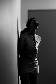
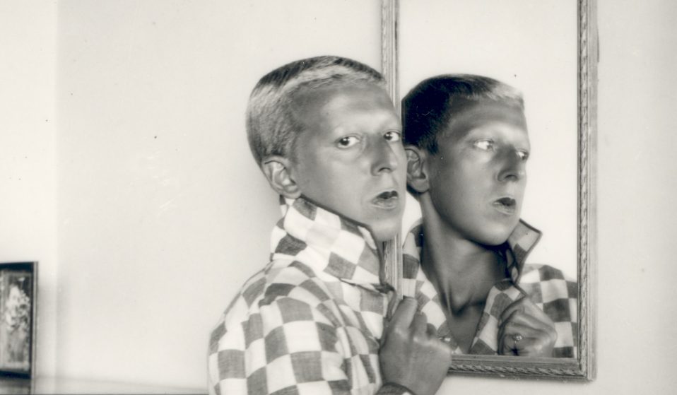
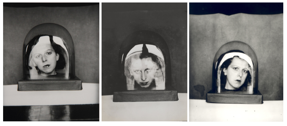
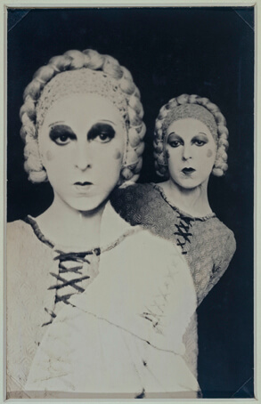
Claude Cahun (born Lucy Schwob) was a french surrealist photographer whos work generated controversy as it revolved around her gender identity and feminism. She was one of the first to experiment with this and her work was based off her as a person e.g the picture below, ‘I Am In Training, Don’t Kiss Me’ which is arguably one of her most famous works. Cahun’s works combined writing, photography, and theatre. She is most remembered for her highly staged self-portraits and that incorporated the visual aesthetics of surrealism. During the 1920s, Cahun produced an number of self-portraits in various guises such as aviator, dandy, doll, body builder, vamp and vampire, angel, and Japanese puppet.
In early-20th-century France, when society generally considered women to be women and men to be men, Lucy Schwob decided she would rather be called Claude Cahun. It was her way of protesting gender and sexual norms. Some of Cahun’s portraits feature the artist looking directly at the viewer, head shaved, often revealing only head and shoulders (eliminating body from the view), and a blurring of gender indicators and behaviors which serve to undermine the patriarchal gaze.
During the early 1920’s she met In 1937 Cahun and Moore settled in Jersey. Following the fall of France and the German occupation of the Channel Islands. They became active as resistance workers and propagandists. Fervently against war, the two worked extensively in producing anti-German fliers. Many were snippets from English-to-German translations of BBC reports on the Nazis’ crimes and insolence, which were pasted together to create rhythmic poems and harsh criticism. They created many of these messages under the German pseudonym ‘Der Soldat Ohne Namen’, or ‘The Soldier With No Name’, to deceive German soldiers that there was a conspiracy among the occupation troops.
Cahun’s work titled ‘Self-Portrait’, 1925.
IMAGE ANALYSIS
Claude Cahun’s photographs are captured in an abstract way that makes the viewer look for the deeper meaning behind them. The photo is likely taken indoors, with the lighting being predominantly focused on the models. The dark eye makeup and black background contrasts with the light outfits and headwear. The layout of the photo involves two models, perhaps Claude and a friend or just Cahun by herself with the help of layering techniques. The model in the front is making direct eye contact whilst the one in the back is looking slightly to the left – this makes the viewer more likely to focus on the one in the front, as the eye contact combined with a lighter costume and darker makeup essentially makes you feel more drawn to her.
I flagged all the photos I liked and managed to lower my photos from roughly 800 to 200. From there, I went through all my photos again and marked all my best shots yellow, making it easier to distinguish them from the rest of my photos, leaving me with a total of 47 photos, including the older photos from when I was younger.
My final selection
Current Plan + Ideas
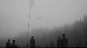
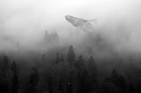
At the moment, I plan to create some double exposures with a few of my photos, similar to some of the images below:
Brandon Kidwell
Angela Kelly
Jacob Loafman
I also plan on experimenting with colours and their saturation which includes adding or taking colour away from certain parts of photos or taking away parts of photos all together which will lead me to having a mix of oversaturated photos and darker colourless images that I can choose from and develop further.