Some Before and Afters:



More Final Edits:
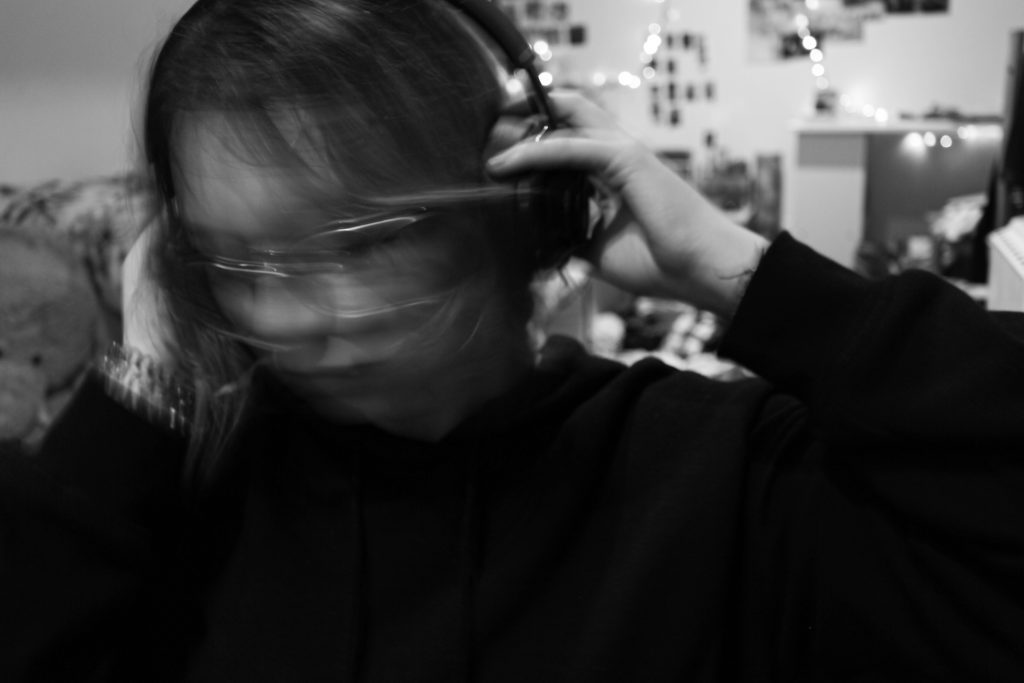
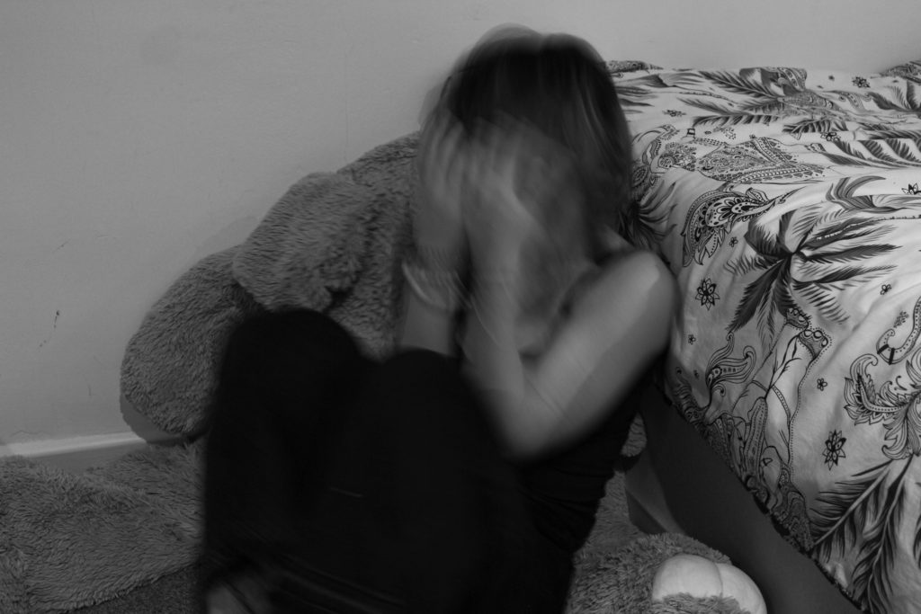
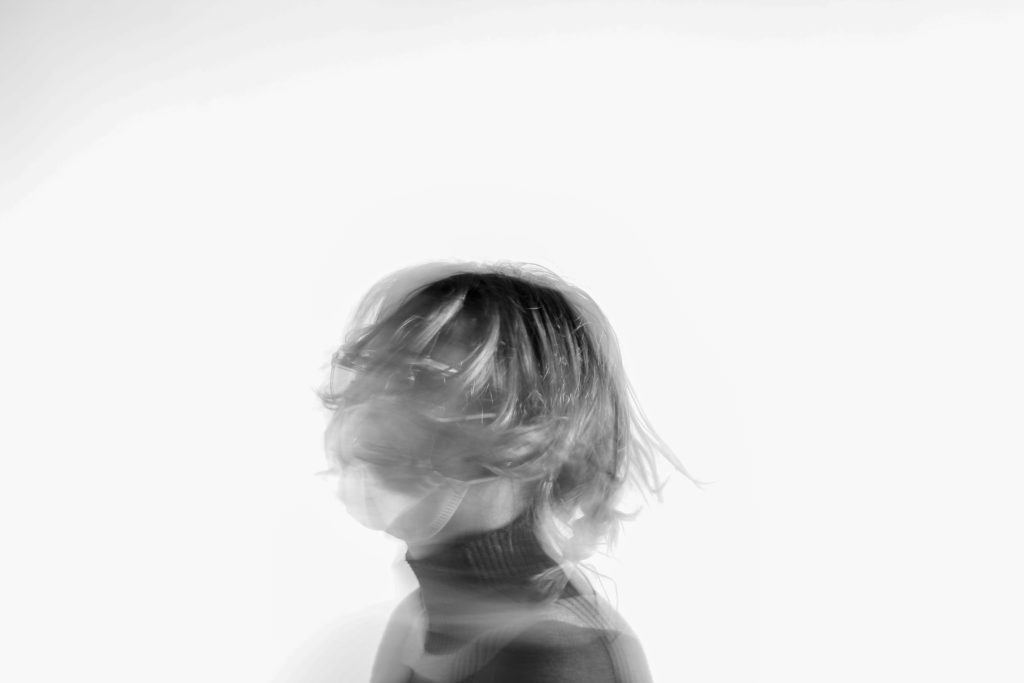
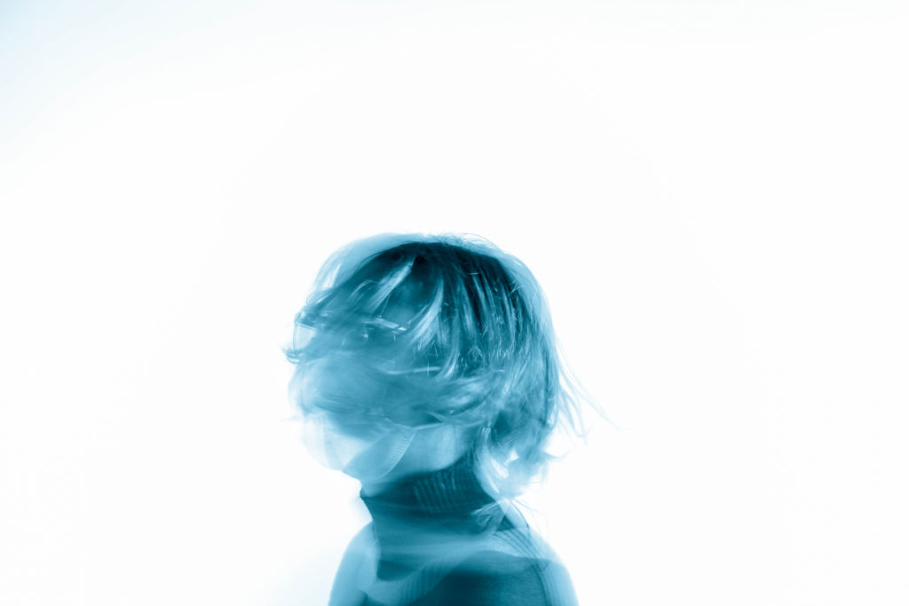
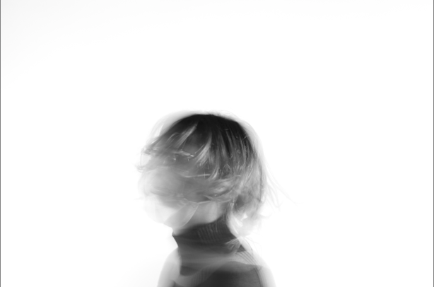
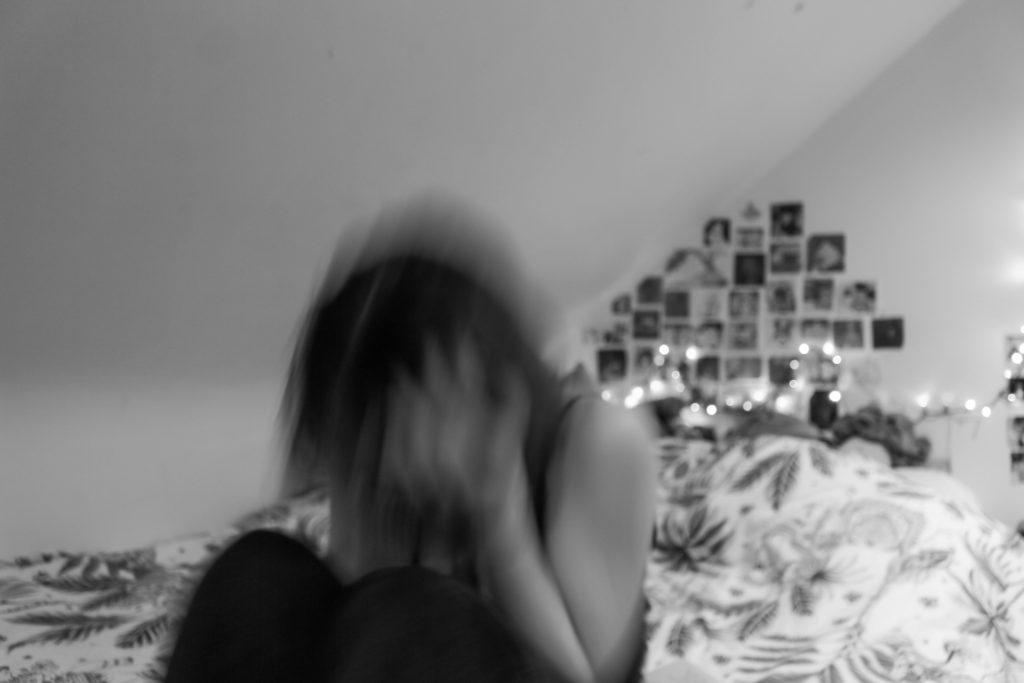
I like this image because it’s confusing me. I like how I can barely see my face and how my hair is so much shorter than it actually is and how I’m just blending into the background because of the slow shutter speed. 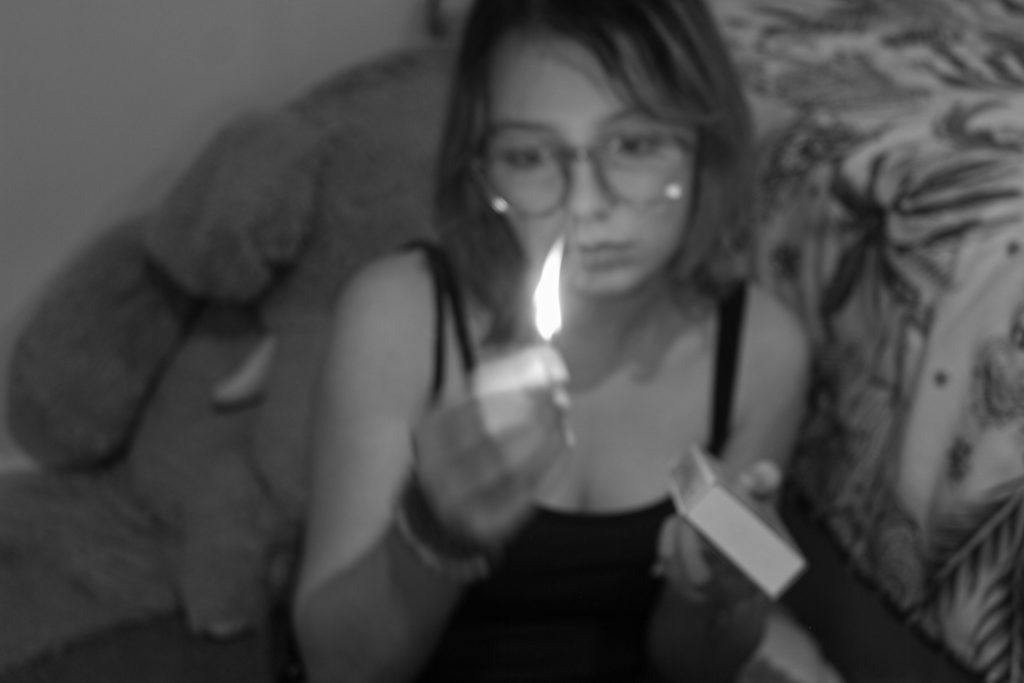
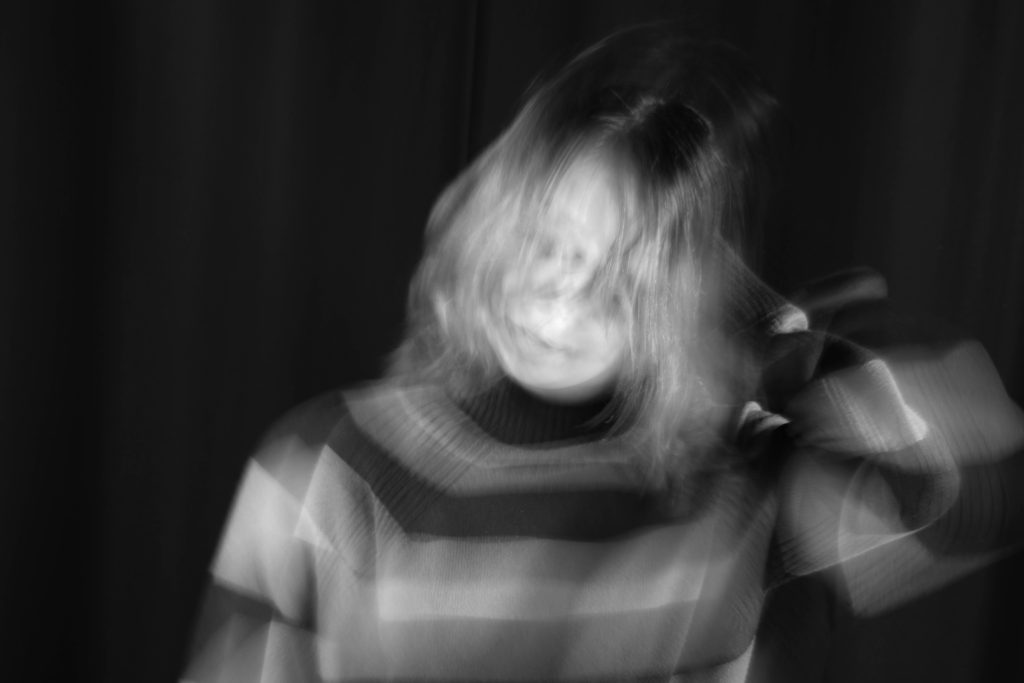
I really like this picture because I think the slow shutter speed made it look interesting. I just like how my face is hard to see because it’s so bright and how it looks ghost like. 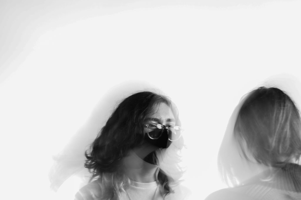
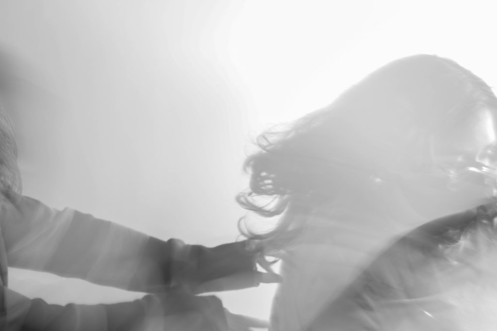


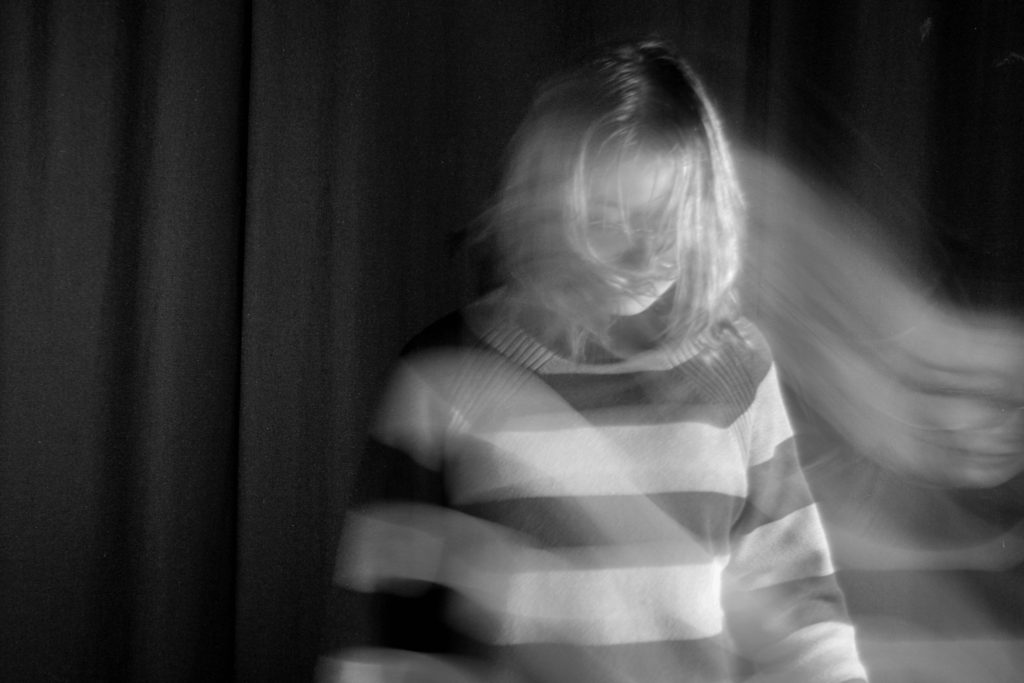
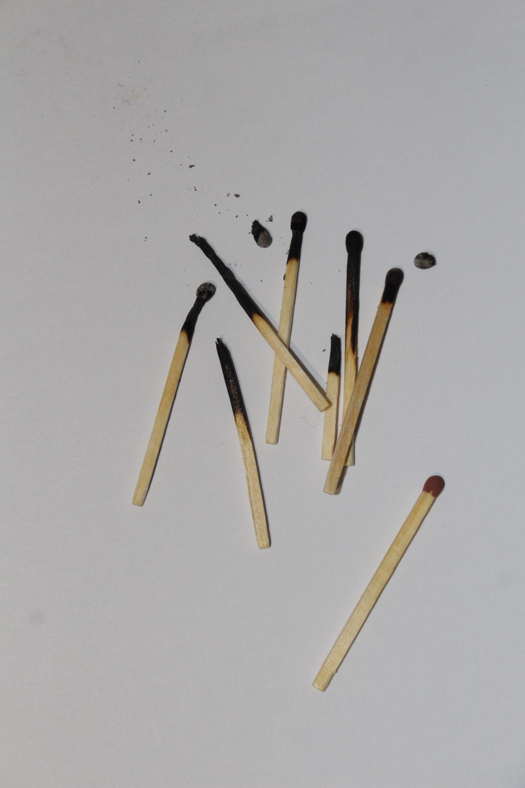
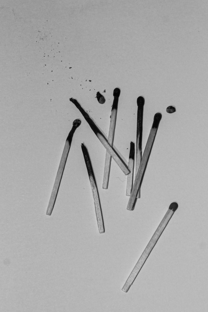
This is one of my favourite images because it looks almost like my body is leaving my soul and I think that is interesting. 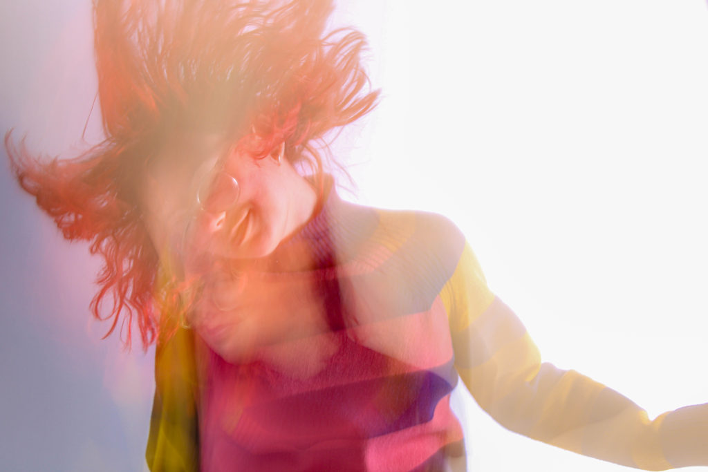
I decided to keep this picture with the other ones because it contrasts them. Unlike the other edits, this image is colourful and happy and for once you can actually see my face and my smile. 