MocK EXam Guidance

Day 1

Select your images in Adobe Lightroom and clearly show your selection process on the blog…include your reasoning for your choices eg how do they link to your artist reference?

Edit, manipulate and enhance your images using Adobe Lightroom and Adobe Photoshop (or other methods)

Take regular screenshots to show the key changes in your process

CONTROLLED CONDITIONS : Essentials

  • You will have 15 hours to complete this unit…focus on selecting and editing your final images / set of images
  • Remember to label each JPEG  in the print folder with your name
  • Minimum 1 x file per A3, A4, A5
  • Ensure that your final images are a direct response to your chosen photographer (s) and show a clear visual link
  • Print size images = ADD YOUR a4, a3, a5 MEASUREMENT TO SHORT EDGE in Lightroom / Photoshop
  • BLOG SIZE images = 1000 pixels on SHORT EDGE

Always ensure you have enough evidence of…

  1. Mood-board, definition and introduction (AO1)
  2. Mind-map of ideas (AO1)
  3. Artist References / Case Study (must include image analysis) (AO1)
  4. Photo-shoot Action Plan (AO3)
  5. Multiple Photoshoots + contact sheets (AO3)
  6. Image Selection, sub selection (AO2)
  7. Image Editing/ manipulation / experimentation (AO2)
  8. Presentation of final outcomes (AO4) ENSURE THIS IS A SEPARATE BLOG POST
  9. Compare and contrast your work to your artist reference(AO1)
  10. Evaluation and Critique (AO1+AO4)

Day 2

Aim to complete your editing…review and reflect on your process

What is working well?

What do you need to change or improve?

How are you going to sequence and order your images / prints ? This can drastically alter the story and impact of your images. Think about the size and shape of your images too…

Photo Assignment #6 :: Photo Sequences - The Art of Photography
Grid

Remember : 1 image = statement / 2 images = a question
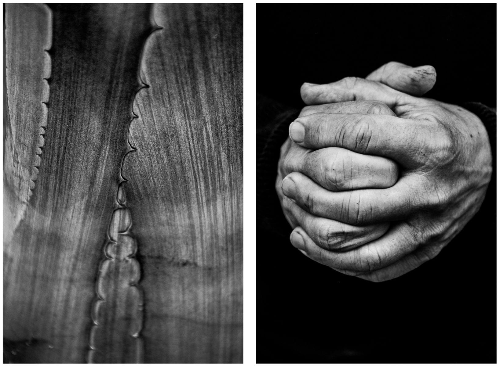
Visual Exercises: A Series of Diptychs by Alicja Brodowicz
Picture

Day 3

  • You must aim to complete all of your Identity Blog Posts.
  • Complete a VIRTUAL GALLERY (add your images to a gallery in order to show the presentation of them…)

Making a Virtual Gallery in Photoshop

Download an empty gallery file…then insert your images and palce them on the walls. Adjust the persepctive, size and shape using CTRL T (free transform) You can also add things like a drop shadow to make the image look more realistic…
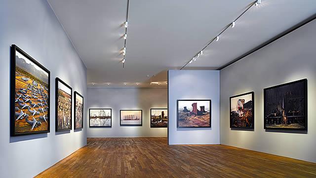
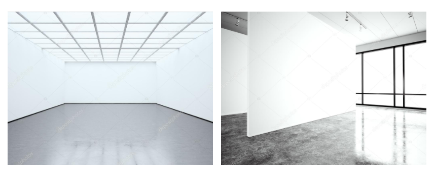
The Photographers' Gallery - Gallery - visitlondon.com

…or using online software

How I did it:

Step 1: Go to www.artsteps.com

Step 2: Sign in / up.

Step 3: Create.

Step 4: Create your own location or choose a template.

Step 5: Upload your images, put them in your exhibition, name it and give it a description.

Step 6: Present / view your Exhibition.

  • Add your images to the print folder here…M:\Departments\Photography\Students\Image Transfer\Printing Yr 12 IDENTITY
  • Complete any unfinished work from last term if you have time

File Handling and printing...

  • Remember when EXPORTING from Lightroom you must adjust the file size to 1000 pixels on the Short edge for “blog-friendly” images (JPEGS)
  • BUT…for editing and printing when EXPORTING from Lightroom you must adjust the file size to Short edge for “high resolution” images (JPEGS) like this…
  • A5 Short Edge = 14.8 cm
  • A4 Short Edge = 21.0 cm
  • A3 Short Edge =29.7 cm

This will ensure you have the correct ASPECT RATIO

Ensure you label and save your file in you M :Drive and then coip across to the PRINT FOLDER / IMAGE TRANSFER

For a combination of images, or square format images you use the 

ADOBE PHOTOSHOP > NEW DOCUMENT + PRINT PRESETS on to help arrange images on the correct size page (A3, A4, A5)

You can do this using Photoshop, Set up the page sizes as templates and import images into each template, then you can see for themselves how well they fit… but remember to add an extra 6mm for bleed (3mm on each side of the page) to the original templates. i.e. A4 = 297mm x 210 but the template size for this would be 303mm x 216mm.

Identity: Photoshoot 2 + extra

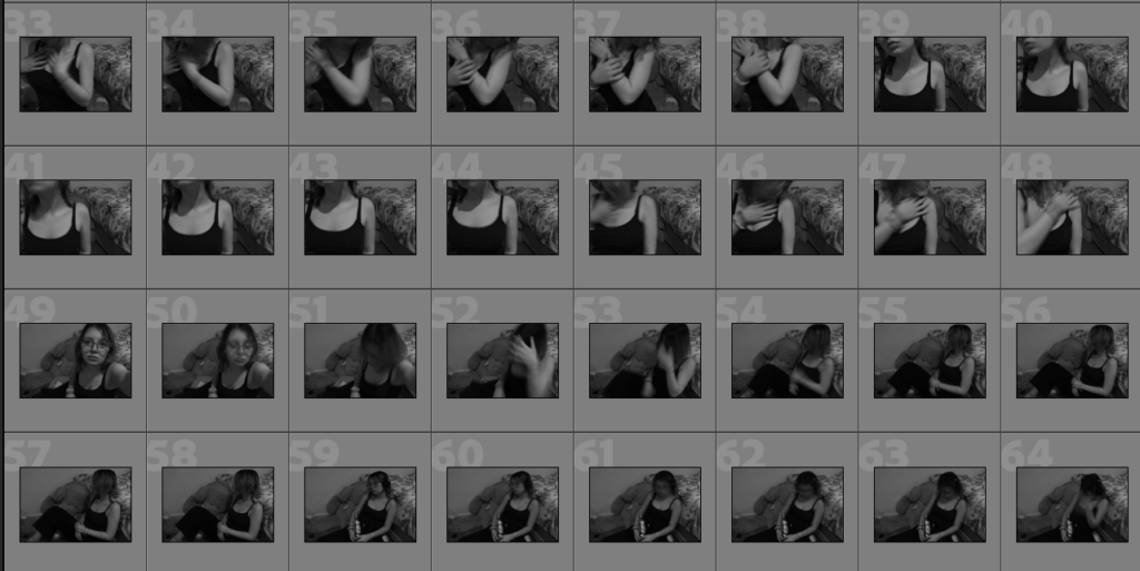
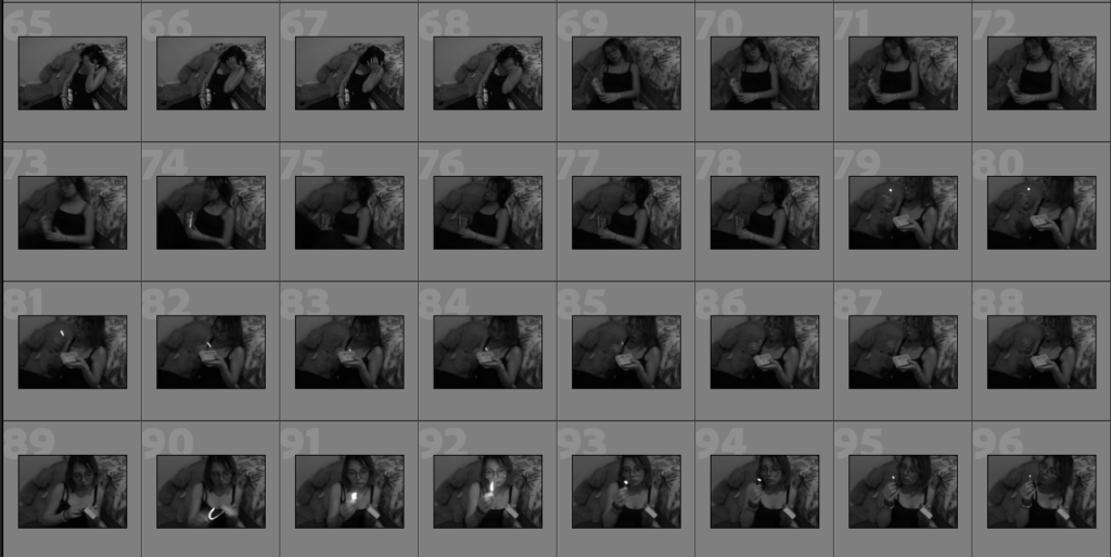
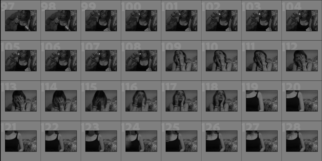
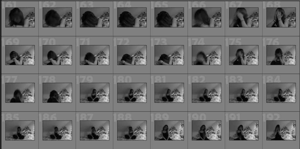
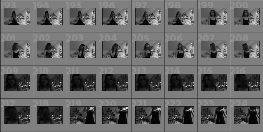
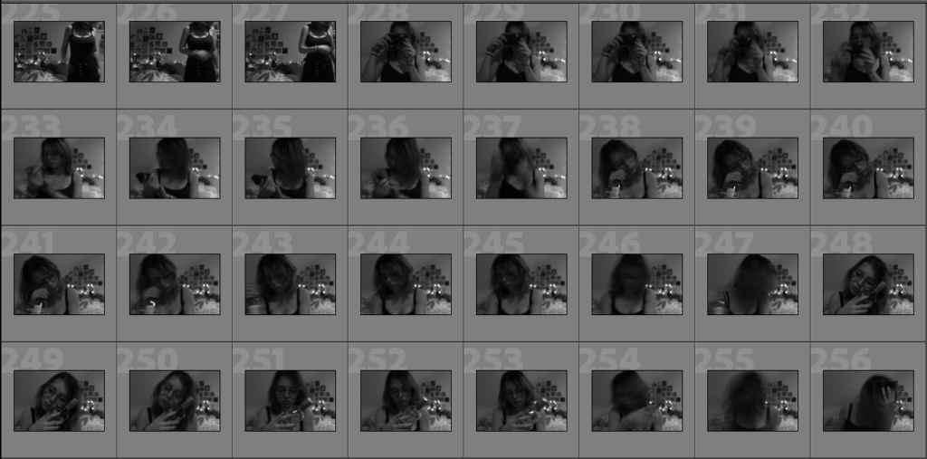
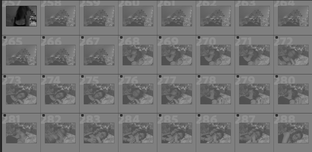
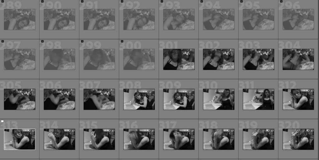
2nd Photoshoot Contact Sheets – Inside

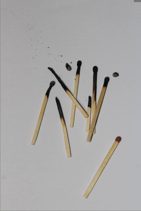
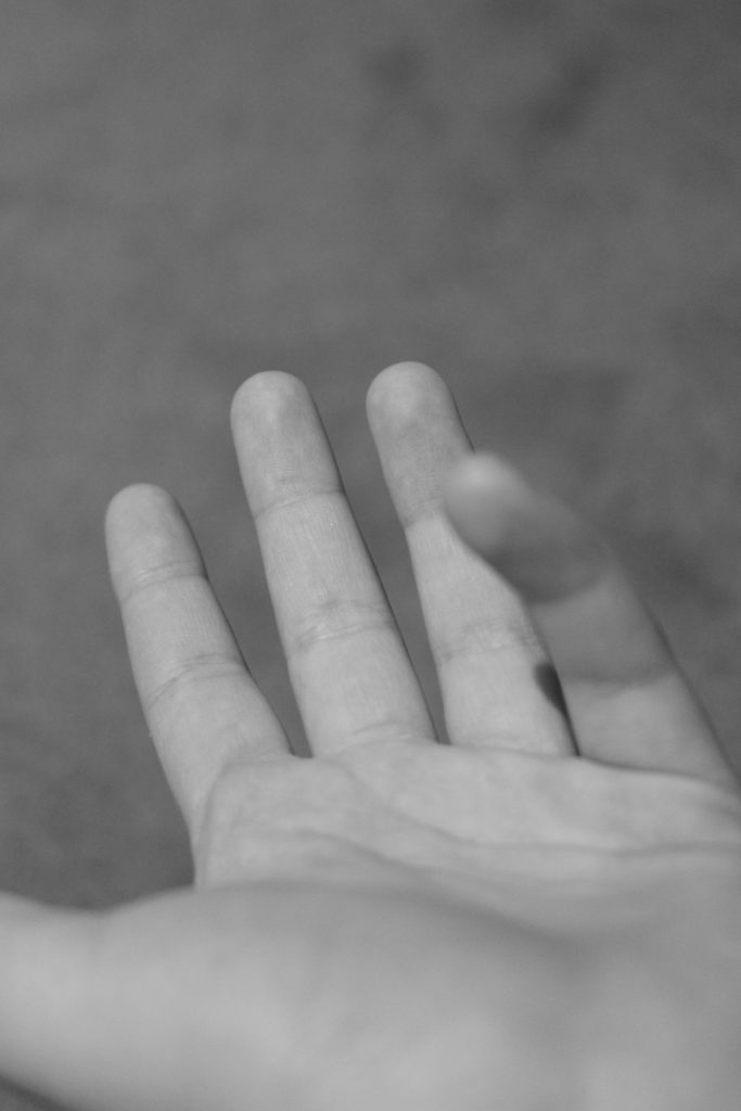
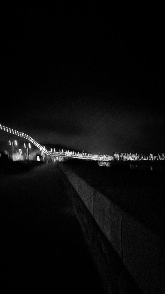
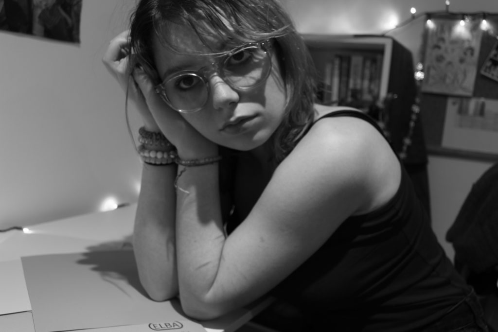
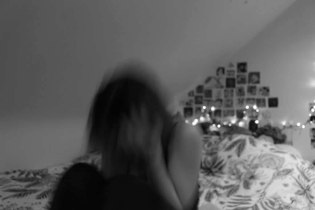
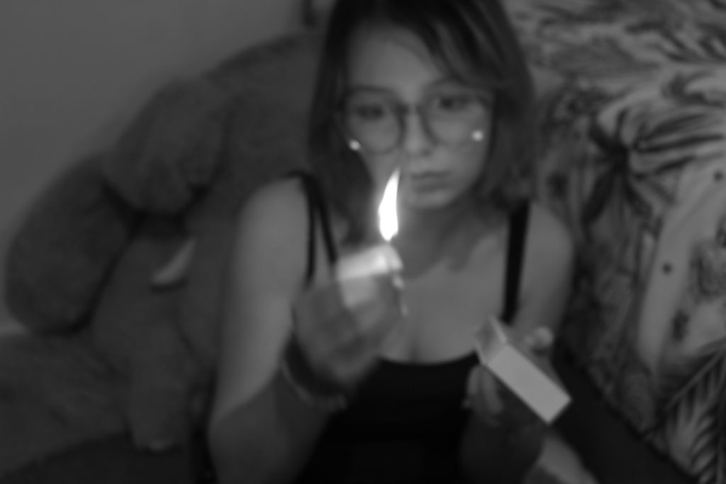
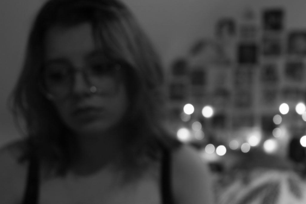
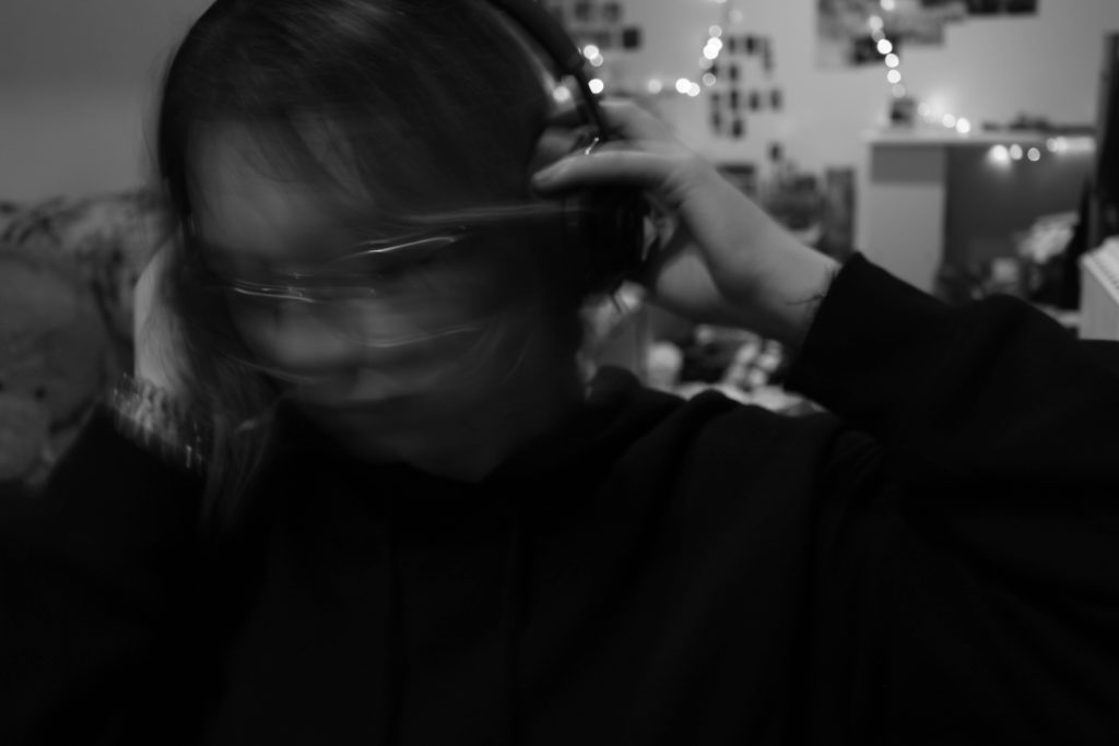
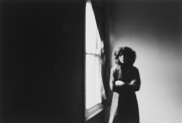
For my second photoshoot, I focused on taking pictures of myself in my own room. I used a tripod and a timer and had to manually press the button on the camera in order to take the pictures and because of that most of the images are out of focus. However, I like the way they look because I feel like it adds more personality. The only props I used were a match box, a glass bottle and a book. To improve I think I should take more pictures and try out different angles and the use of more props would also make the images look better.
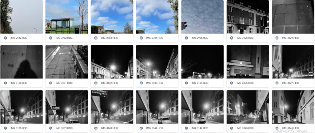
Extra Contact Sheets – Outside

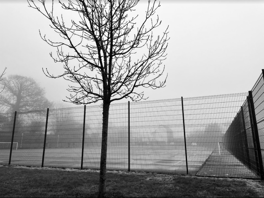
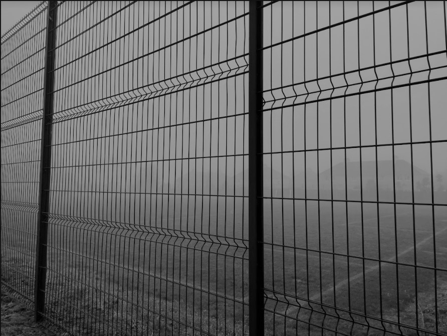
This is not a photoshoot and the pictures were not planned, they’re just random photos I’ve taken in the past 2 weeks or so. I think it’s a good idea adding them here because they are part of me and who I am as an individual.

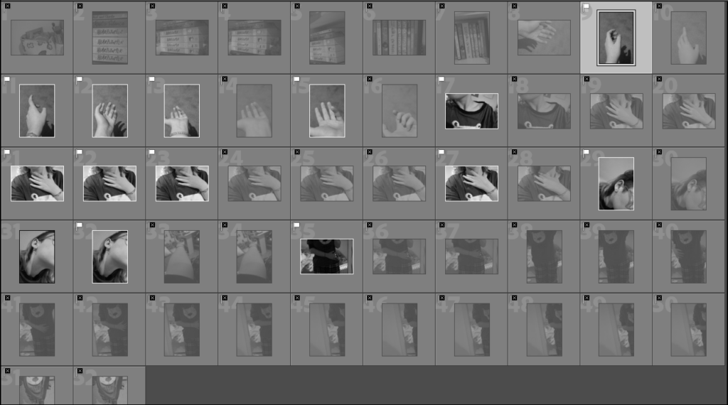
Best Images:

I have picked these images as my best shots because I like the framing of some and how they are not in focus. I think they will all look good together later on.

Idea for my final outcomes

List of ideas –

  • Collaged
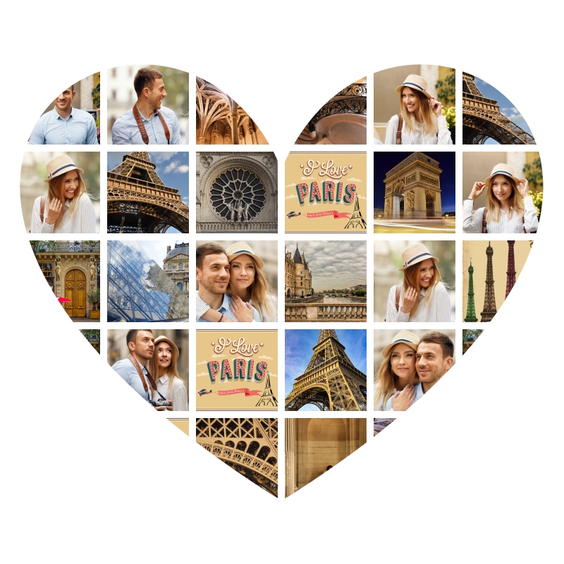
  • Collaged together in the shape of an object/person
  • In a Sequence
  • One photo/multiple photos in a frame
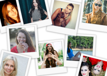
  • Create the illusion as if the photos have been taken on a polaroid.
  • Creating a virtual gallery.
Online Collage Maker | photo-collage.net
Killing machines: beautiful images of ugly objects
Photo collage maker - online, free and easy | Photovisi

How I will do it –

I have decided to create a virtual gallery which can be done on photoshop.

  1. Choose 3-6 pictures which I think work well together that create a message.
  2. Edit them on Adobe Lightroom.
  3. Upload them to photoshop and arrange them on a template picture of a gallery from the internet.
LOREM IPSUM - PART TWO - 3D virtual exhibition by IGNITE GALLERY |  art.spaces | KUNSTMATRIX

claude cahun

Claude Cahun, born Lucy Renee Mathilde Schwob was a French surrealist photographer, sculptor, and writer.

Schwob adopted the pseudonym Claude Cahun in 1914. Cahun is best known as a writer and self-portraitist, who assumed a variety of performative personae.

Cahun’s work is both political and personal. During World War II, Cahun lived in Jersey and was active as a resistance worker and propagandist

Cahun lived in Jersey during the Occupation, her resistance activities during that time led to her imprisonment.

A death sentence was commuted and she was freed from prison when Jersey was liberated. She lived in Jersey with her stepsister until her death in 1954.

Since her “rediscovery” over a decade ago, Claude Cahun has attracted what amounts to a cult following among art historians and critics working from postmodern, feminist, and queer theoretical perspectives.

Photographs of Cahun posing in the 1920s and 30s in various dramatic settings and guises have been displayed alongside contemporary works, showing the timelessness of her work.

Identity

Identity is what sets an individual apart from those surrounding them and is influenced of by a persons environment, upbringing, gender, culture and more. These factors can change how people think of others and themselves which can also lead to a lack of identity where an individual may question who they are and may feel disconnected from who they are as a person. All of these factors can affect how a person dresses/acts towards others due to their personal experience throughout life.

———

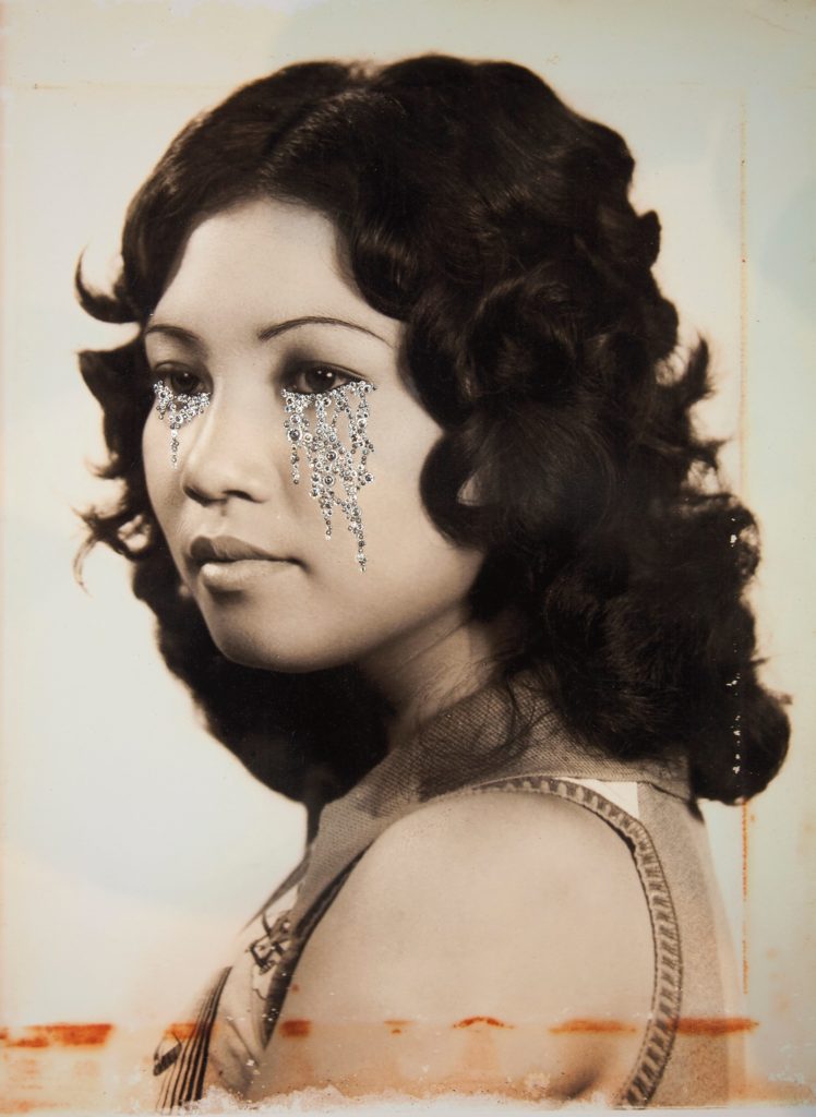
Elle Perez
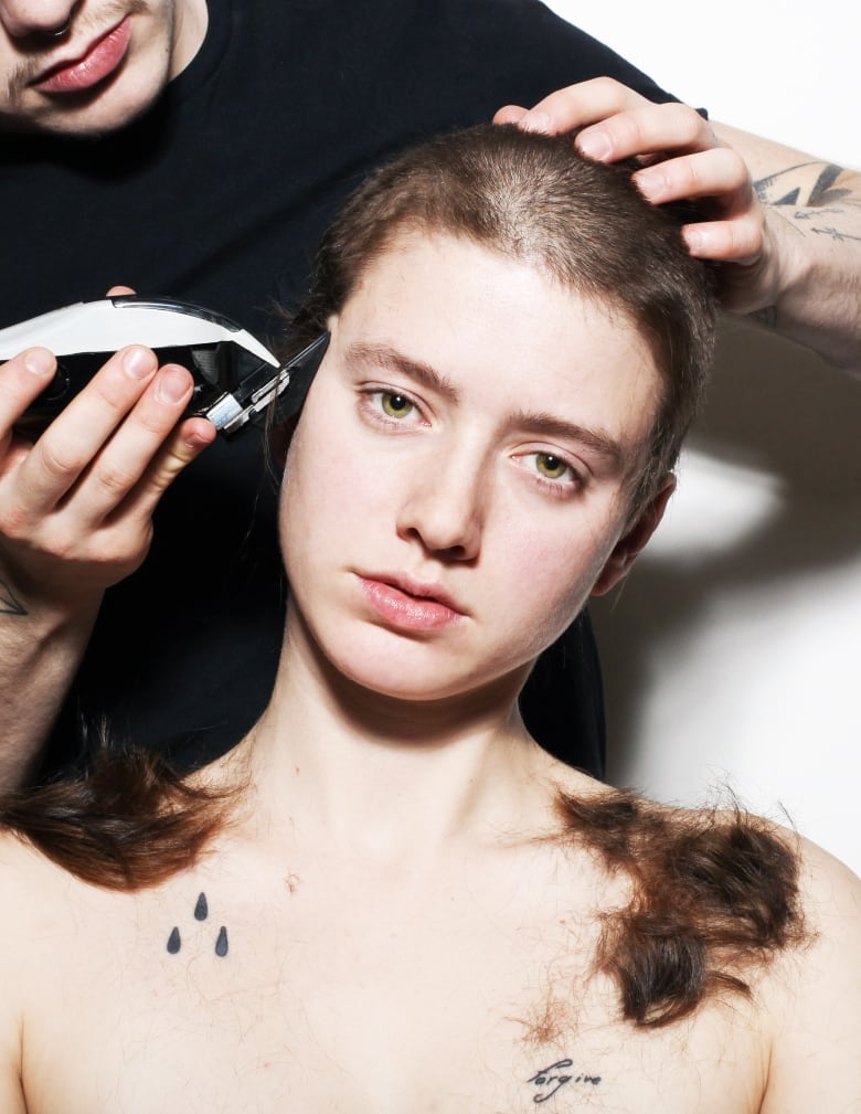
When Elliot Page was ready for his closeup, he wanted photographer Wynne  Neilly behind the lens | CBC Arts
Wynne Neilly

———

Claude Cahun [1894-1954]

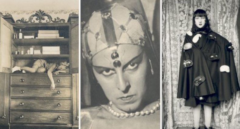
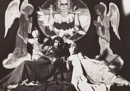
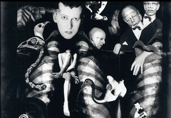
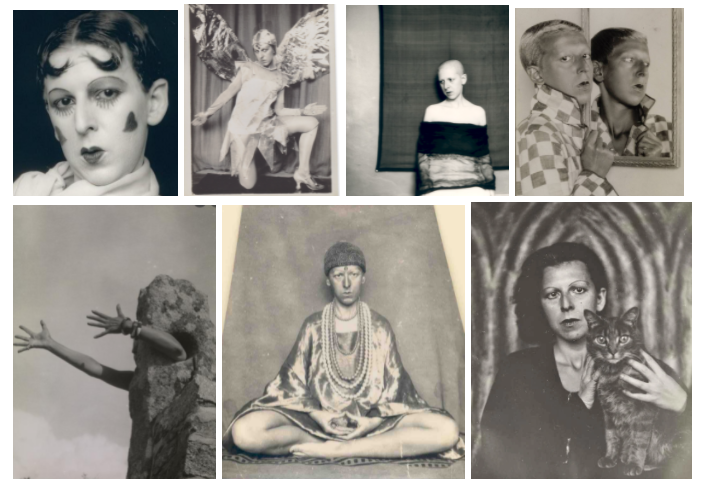
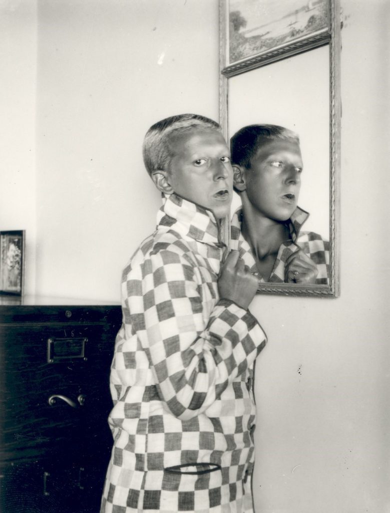
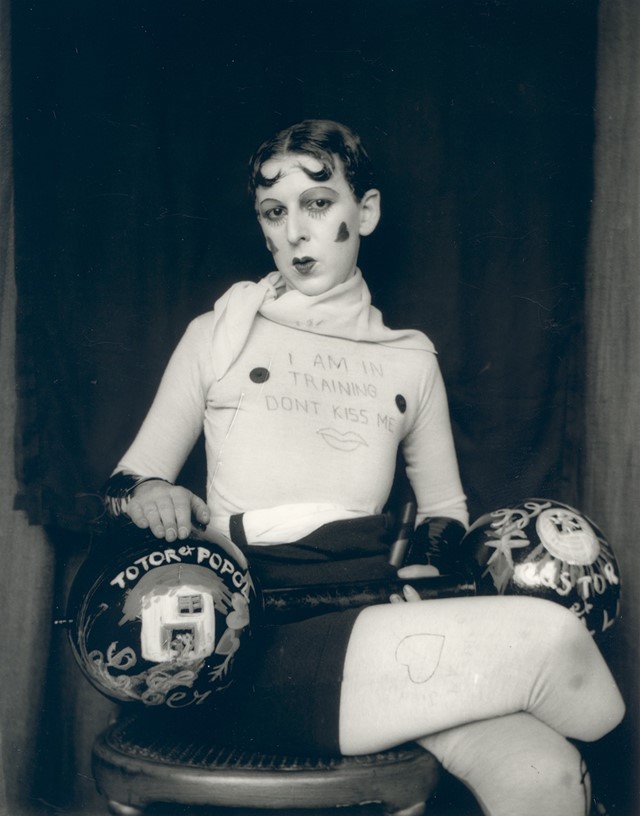
Claude Cahun was a French surrealist photographer who challenged identity, gender and social norms by taking androgynous self-portraits, looking drastically different in each portrait due to the characters they portrayed in each photoshoot. They embraced gender fluidity in their work by dressing up in different clothing [most of which society wouldn’t have accepted back then] and would pose in interesting ways, making their work easily recognisable due to their artistic flare.

“Masculine? Feminine? It depends on the situation. Neuter is the only gender that always suits me.”[4]

– Claude Cahun

In this self-portrait, Cahun is dressed in a stereotypically masculine way with shaved hair and men’s clothing, something that wasn’t acceptable at the time [women didn’t start wearing trousers until the mid-20th century]

In this self-portrait, Cahun is dressed as a body builder with hearts drawn on their face, adding femininity to a male dominated sport.

Angela Kelly

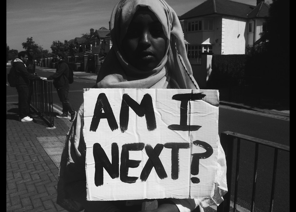
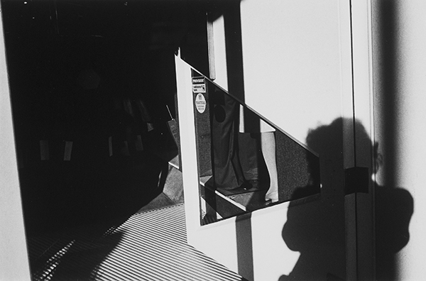
Angela Kelly is an Irish photographer whose work focuses on documenting women and exploring historical places. I will be taking inspiration from some of her early work, specifically her collection ‘Woman’s Identity’. In this collection, she takes a variety of self portraits, all in black and white, and focuses on how she’s changed over a period of 5 years both in her work and mind as she becomes a photographer and feminist.

I like the framing and lighting in this image as it surrounds Kelly an almost unearthly which emphasises where she’s framed in the centre of the image
I like the how everything is framed in the image as it allows each object to flow from one to the next. I also like how Kelly’s shadow is barely in the image, drawing more attention to everything else in frame

“The visual history of women is an incomplete record. If we don’t make a record of our lives it’s as if we didn’t exist.” – Angela Kelly, July 1987