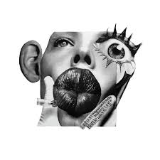
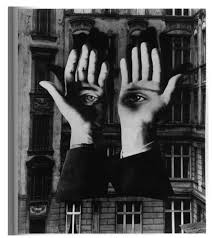
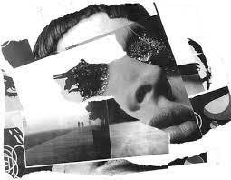
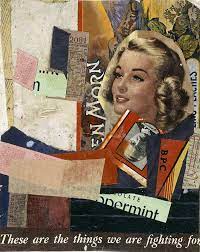
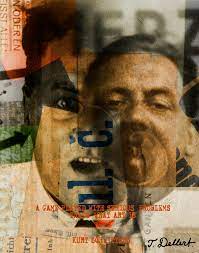
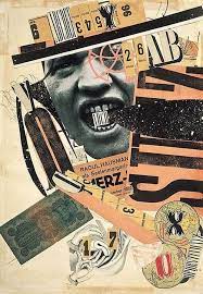
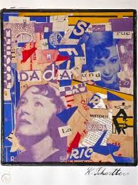
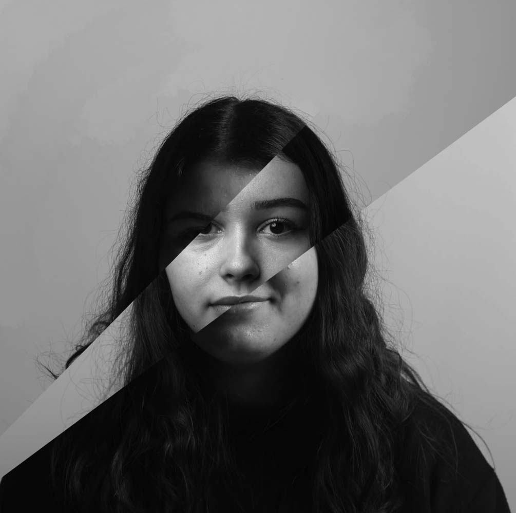
Photomontage, a composite photographic image made either by pasting together individual prints or parts of prints, by successively exposing individual images onto a single sheet of paper.
Kurt Schwitters
Kurt Schwitters was a German artist involved in both Dadaism and Constructivism. Schwitters is best known for his Merz and Merzbau works, which incorporated collage, found objects, typography, and sound poetry to construct unique compositions. In these works, the artist used magazine clippings, waste material, and other recycled items in an attempt to express the rapidly changing world.
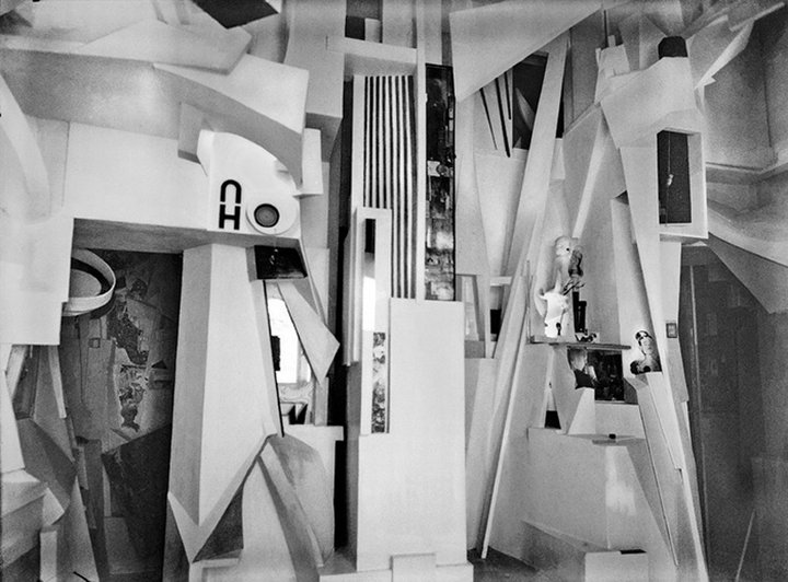
Fig.1
Kurt Schwitters
Merzbau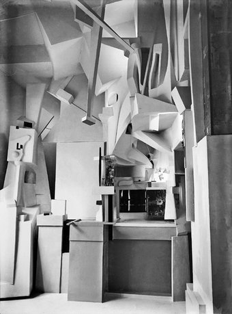
Fig.2
Kurt Schwitters
Merzbau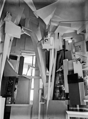
Fig.3
Kurt Schwitters
Merzbau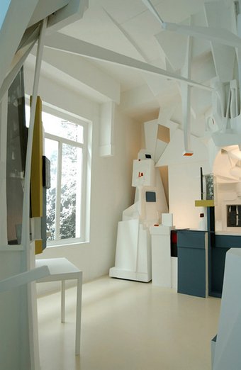
Fig.4
Kurt Schwitters
Merzbau 1933
Fig.5
Kurt Schwitters
Merzbau 1933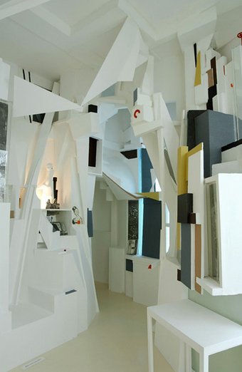
Fig.6
Kurt Schwitters
Merzbau 1933
Alongside his collages, Schwitters also dramatically altered the interiors of a number of spaces throughout his life. The most famous was the Merzbau, the transformation of six (or possibly more) rooms of the family house in Hanover, Waldhausenstrasse 5. This took place very gradually; work started in about 1923, the first room was finished in 1933, and Schwitters subsequently extended the Merzbau to other areas of the house until he fled to Norway in early 1937. Photos of the Merzbau were reproduced in the journal of the Paris-based group abstraction-création in 1933-34, and were exhibited in MoMA in New York in late 1936.
One entire wall of the Merzbarn was removed to the Hatton Gallery in Newcastle for safe keeping. The shell of the barn remains in Elterwater, near Ambleside. In 2011 the barn, but not the artwork inside it, was reconstructed in the front courtyard of the Royal Academy in London as part of its exhibition Modern British Sculpture.
“I could see no reason why used tram tickets, bits of driftwood, buttons and old junk from attics and rubbish heaps should not serve well as materials for paintings,” he observed. “It is possible to cry out using bits of old rubbish, and that’s what I did, glueing and nailing them together.”
Final Images
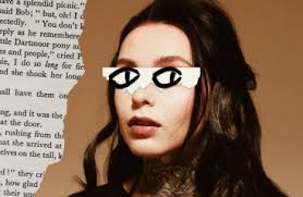
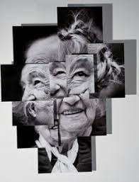
I have put together three photo montages, using the photos from out portraits photoshoot. The image on the right I have split two portraits with neutral expressions down the middle and I photoshop I have placed them together, I have tried to line the faces up evenly, while still showing all the features of the faces. The photo in the middle I have left in colour as I liked how vibrant the colours are and stood out underneath the two black and white eyes. The eyes are from other portraits of different people which I have tried matching up with the different elements of the background photo. And lastly the photo on the left includes two portraits, one is underneath another which has been split so that it looks like they are slowly coming apart revealing a different face.
I like all of these montages, as they bring different aspects and different ways of montaging photos together. I especially like the image on the right as I think the two halves of the faces compliment each other as they are two different skin tones as well as having darker/lighter clothing. the image on the left I think i should have kept more of the face from the photo on top to make it seem more like it was slowly coming apart and less like there has been a chunk taken out of it.

