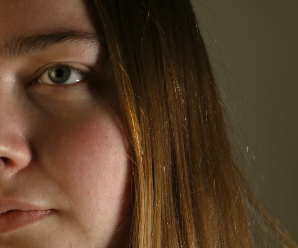
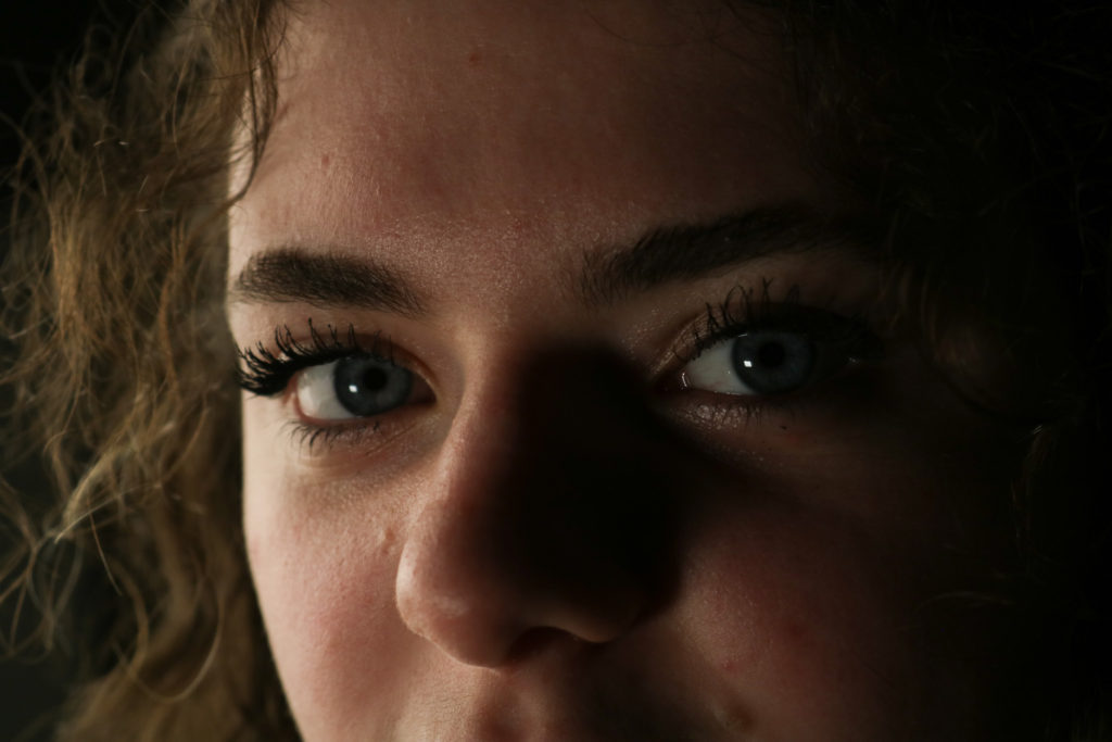
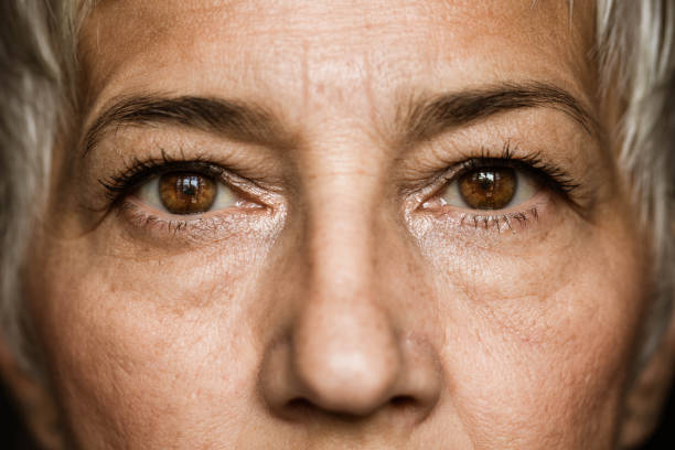
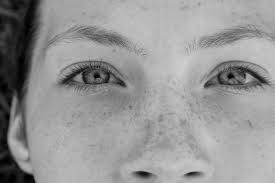
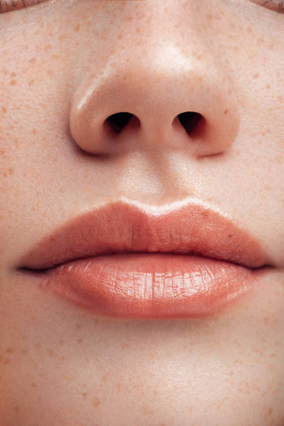
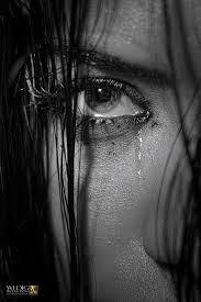
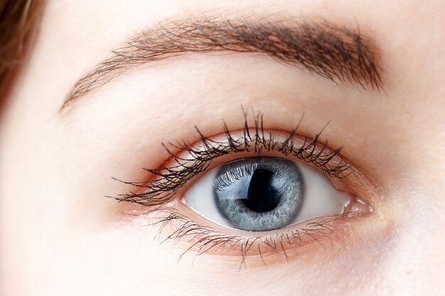
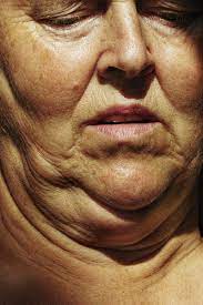
Definition: Close up photography refers to a tightly cropped shot that shows a subject (or object) up close and with significantly more detail than the human eye usually perceives. With close up photography, you reduce the field of view, increasing the size of the subject, and creating a tight frame around your selected shot.
Role in my project: I could use the images taken from this photoshoot to create diamond cameos and multi-exposure edits. I also think that being able to see models’s facial features more easily makes for interesting photography on my blog as it means I can display a good range of different ways to photograph, showing skills.
Mood Board
Bill Brandt
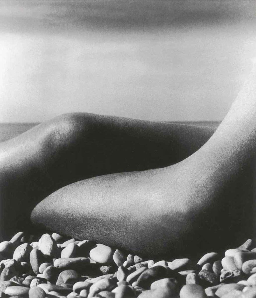
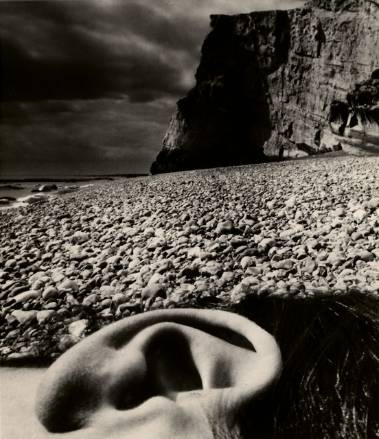
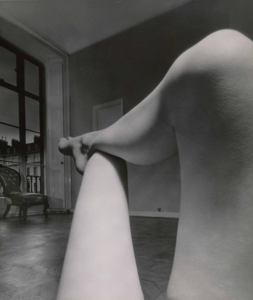
Bill Brandt (born Hermann Wilhelm Brandt; 2 May 1904 – 20 December 1983): 14 was a British photographer and photojournalist. An English photographer of German birth, Brandt travelled to Vienna in 1927 to see a lung specialist and then decided to stay and find work in a photography studio. There, in 1928, he met and made a successful portrait of the poet Ezra Pound, who subsequently introduced Brandt to the American-born, Paris-based photographer Man Ray.
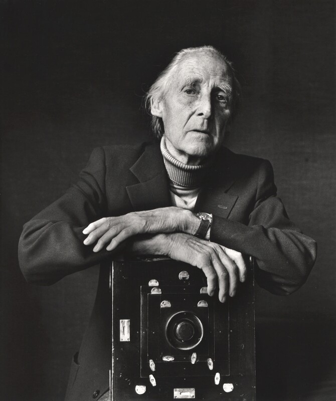
Bill Brant 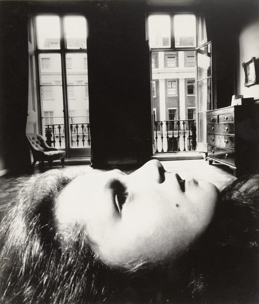
Example of his work
Upon his return to London, in 1931, Brandt was well versed in the language of photographic modernism. During the 1930s he published his important early monographs The English at Home (1932) and A Night in London (1932) in addition to becoming a frequent contributor to the illustrated press, specifically Picture Post, Lilliput, Weekly Illustrated, and Verve, his published pictures exemplifying his technical skill and his interest in building visual narratives.
Image analysis of his work
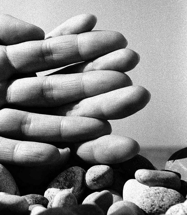
I have selected to analyse this image as this portrait is not of a face, and I think that I will recreate this in my project. The fact that this image is in black and white means that the shadows that are in between the fingers are more prominent, this also makes the texture of the skins more obvious, adding depth to the image. It can be implied that this portrait is composed of a male and a females hand as the different in hand sixes and textures is apparent, and they could have a big age gap. Furthermore, the fact that they are their fingers are interlocking like holding hands means they could be in a relationship or have been positioned this way to make it appear as in the linking of fingers is the connection or their love. Additionally, their is a variety of the shapes in this piece as the ovals around the tips of the fingers and the stronger outliners around the stones below contrast each other, but still compliment each other. As this could also represent the theme of the living and the inanimate as the hands are laid above the stones to create a part of a contrasting image.
Satoshi Fujiwara
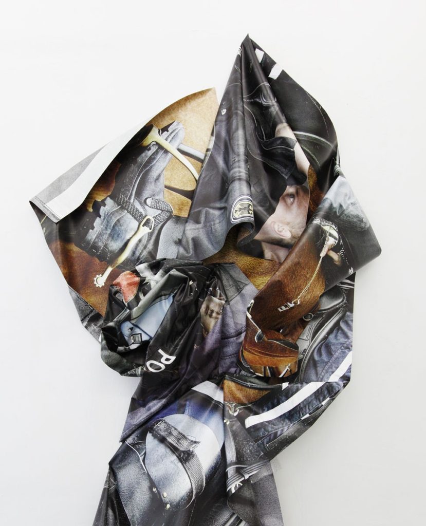
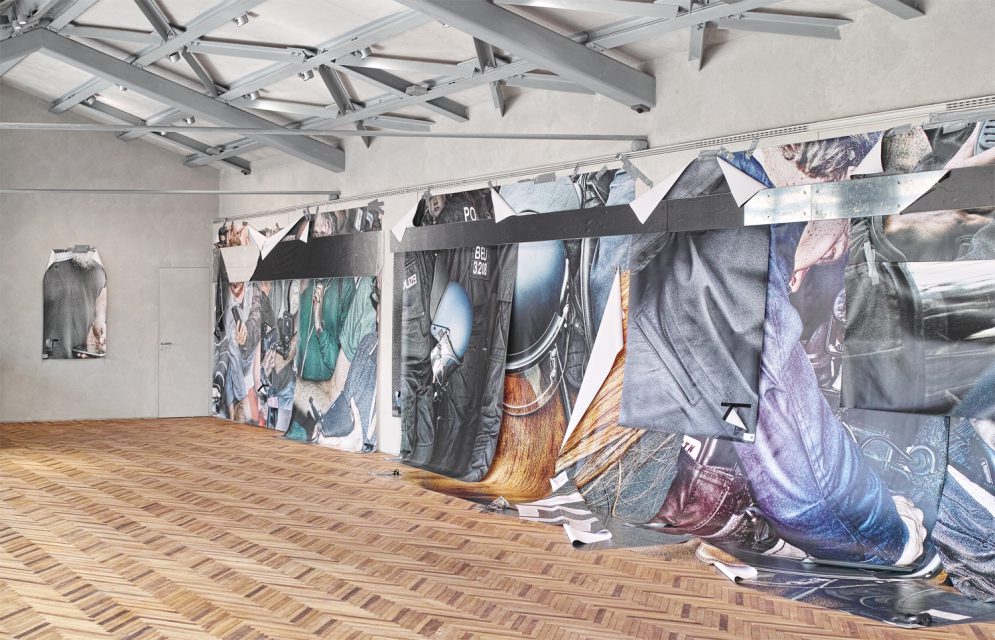
It was through a career in advertising, working as a graphic designer and planner, that Satoshi Fujiwara, born in Japan and now living in Berlin, became interested in how visual information and photographic images influence people and society, and how he could attempt to redefine photography to make cross-sectional inquiry within his artistic practice
Satoshi has also published several books, including : Code Unknown, published by IMA photobooks, 2015; 5K CONFINEMENT, Luigi Alberto Cippini, published by la Fondazione Prada, 2017; HORSES, Satoshi Fujiwara & Yngve Holen, published by Walther König, 2018.
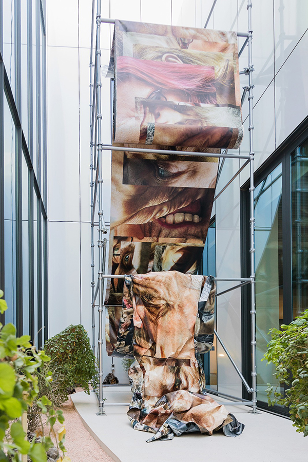
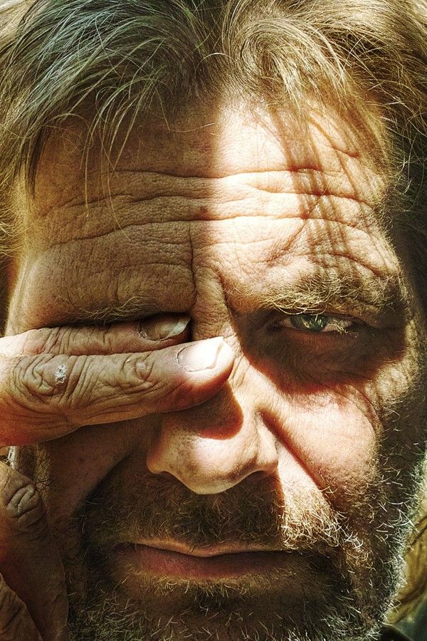
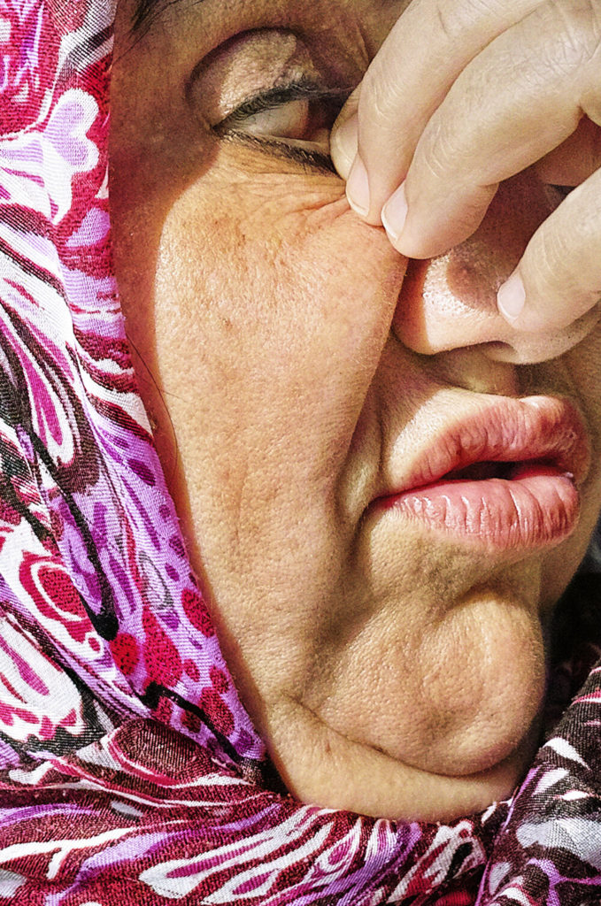
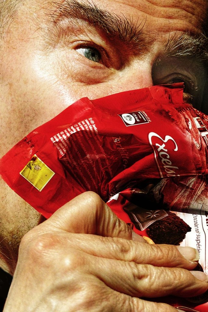
Second picture below: It was taken at 12:37 p.m on September 10, 2014, a couple of years after relocating to Berlin where I started working as a photographer. Since the beginning, I’ve had a strong interest in the various fuzzy boundaries in relentlessly reproducible contemporary imagery. To focus on portraiture, the right of likeness is something that has long-troubled photography since the invention of the camera. Today, with the rise of social media, we have become even more acutely aware of photographs and those who appear in them when they are posted on digital media.
With furthering technological developments in digital photography, it will be even more difficult to make legal judgments in cases involving the right of likeness. I won’t mention anything about this specific subject. How she/he actually looked like, so-called ’fact’ or ‘background’, and so on except for the date photographed which is visible in the data. Because only the image that is detached from the ‘original’ context allows the viewer to be read with subjective interpretation.
Image Analysis: These images are very different from Brandt’s as they are full of colour and warmth, and these pieces of work are of the full face and not just part of the faces such as the ears and nose. Firstly, I think that the clarity of this photograph and the lighting make for a part more interesting image and better final product, as other aspects such as the lighter line on his cheek bone and the freckles and wrinkles on the face of an older individual creates more depth of the image. Furthermore, the grey/ blue colours in the eyes creates a nice colour difference compared to the red of the food packaging, and the fact that this is scrunched up means that it adds additional texture to the image despite the wrinkles on the face already being there. My favourite part of this photograph is actually the hand at the bottom and it creates an end to the image and you can see that part of the smallest finger as been cropped out, I think this is an effective way to combine these piece together, as the skin from the forehead and at the bottom on the hand make the image more cohesive.
How to create a close up portrait:
- Make your model’s face stand out with makeup or face paint
- Take face close ups using a zoom lens
- Use a large aperture for a softer focus
- Use natural side light to make every close up look good
- Use direct light to create portrait lighting patterns
- Make sure a range of lighting techniques are used
- 1 and 2 point lighting should be included
- Additionally the Rembrandt and butterfly effect
Contacts Sheets
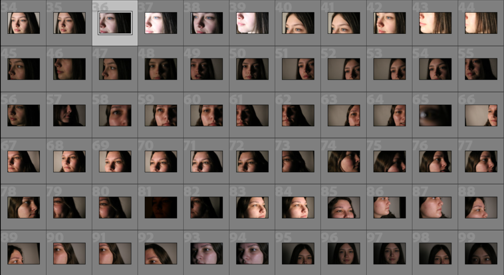
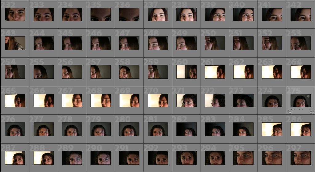
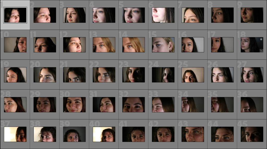
Below I have placed some contact sheets to show that I have placed them into Lightroom and organised them, as the third contact sheet is full of images i think are usable for this project, along with some being edited. To do this I created a quick collection to better help organise my images.
Editing
Below I have placed some screenshots of the editing process, done in Lightroom Classic, to alter these photos I have changed setting such as the exposure, saturation and white balance to make these images look better.
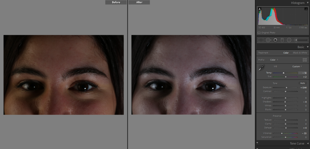
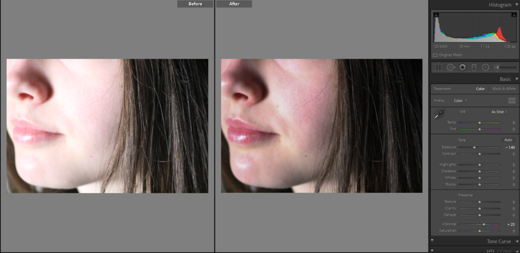
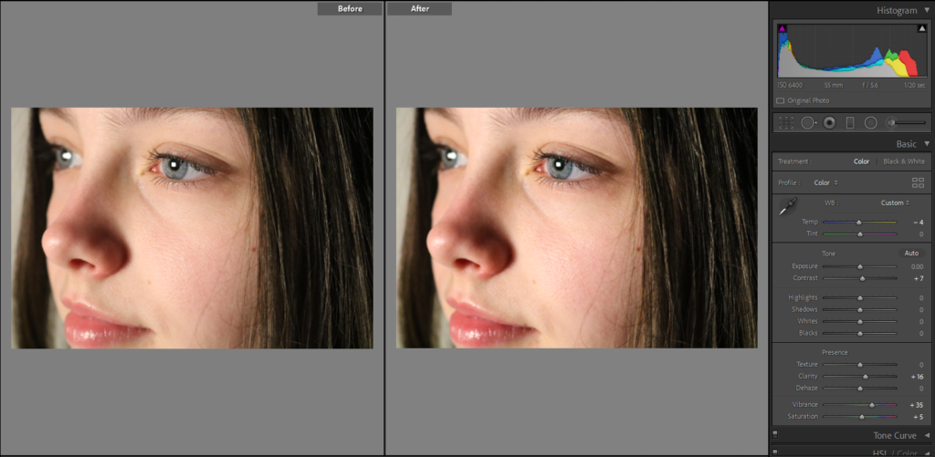
Final Images
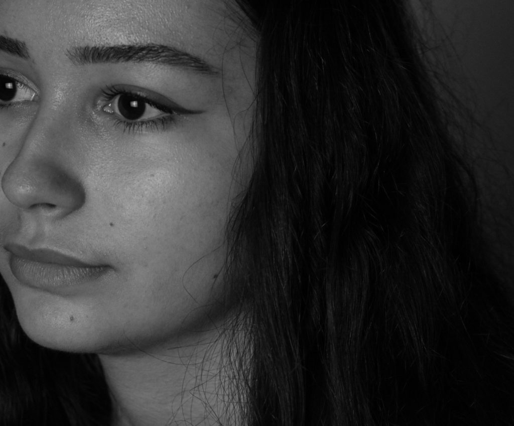
Here I have edited an image of Katarina, in the same way in which Bill Brant does, making the image monochromatic so that the texture of the skin is more prominent, this means that it gives the final image more depth and even more clarity then it did before. My favourite part of this up close image occurred by accident, and that is the light reflecting off her eyes, as this mean that the bright light in her eyes matches with the light reflecting off of the end of her nose ad some areas of her cheeks, making the piece more cohesive. Furthermore, I decided that this image would look better in black and white as the darker tones in Katarina’s hair and eyes means that tones in the image can link together better.
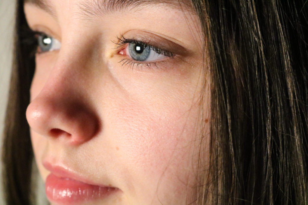
I have selected this image of me as one of my final ones as I think the lighting of this images of some of the best in our taken collection of images meaning that my facial features are clear and the pigment on my lips and in my eyes stand out as the best aspects of the image. Furthermore, I changed the exposure of this image so that its on the verge of being too exposed an I think this was a good choice because it means that the light reflecting on my eyes is more apparent, and this matches with my pale complexion whilst still leaving the shadow next to my nose.
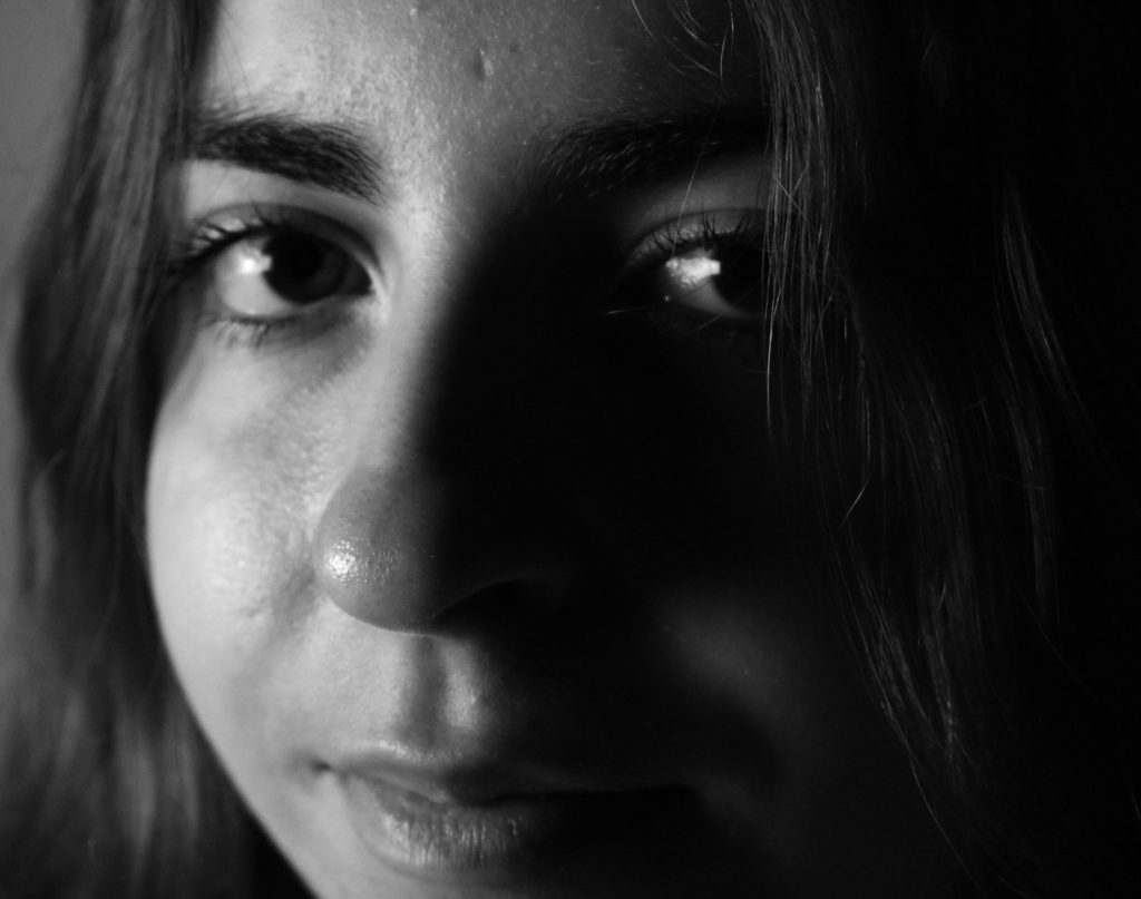
Above I have chosen this photos of Diana as one of my final pieces as I have cropped it so that the background and some of her hair are now taken away so that more focus is on her face.
