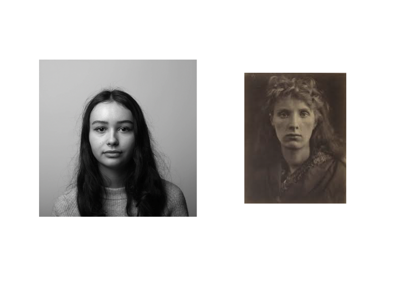
A juxtaposition is an act or instance of placing two elements close together or side by side. This is often done in order to compare/contrast the two, to show similarities or differences.
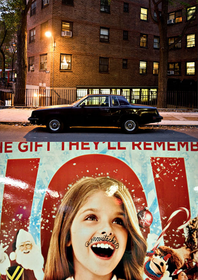
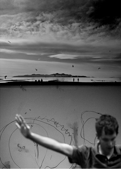
In some pieces where photographers have juxtaposed their photos, they have united them by the quality of light, different viewpoints, subjects, colours and moods to create tension.
Photographers tend to juxtapose their photos when they are trying to highlight or focus on their similarities or differences. They could be trying to show wealth and poverty, class differences, beauty and ugliness or even the different lighting. Photographers might also use this technique for people to see different ways of living in certain places around the world.
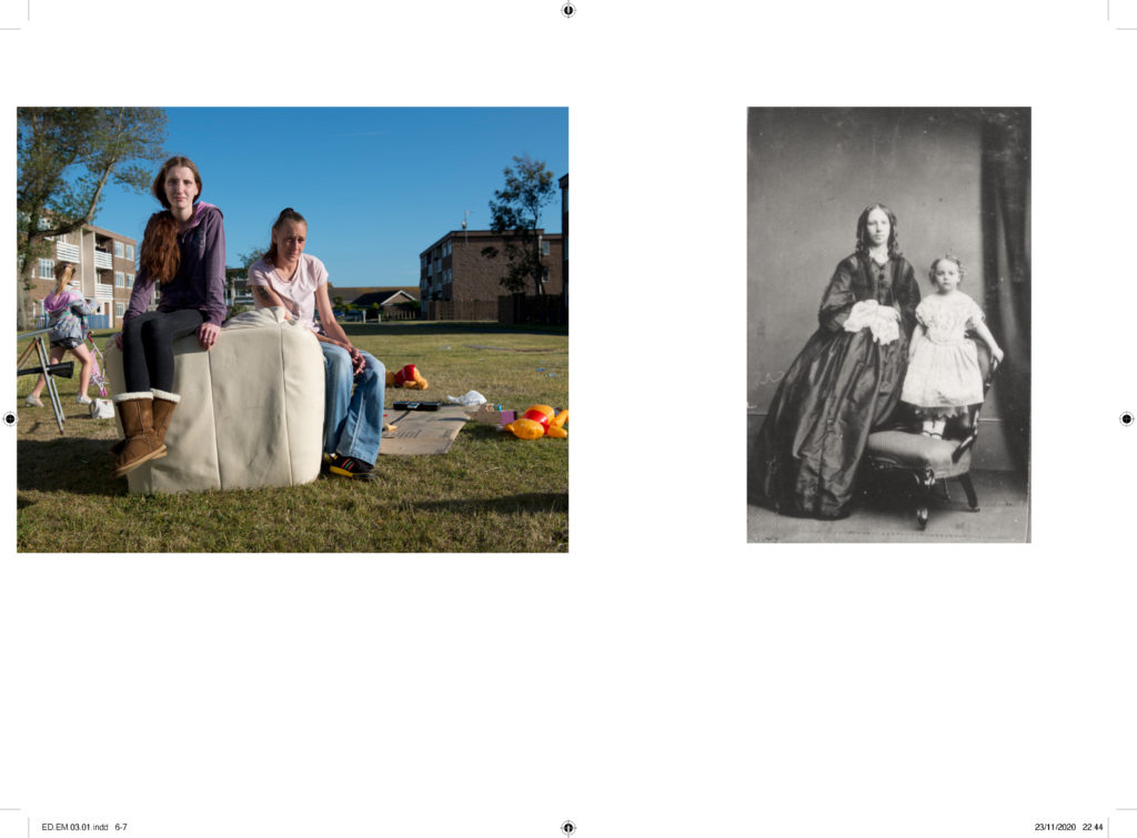
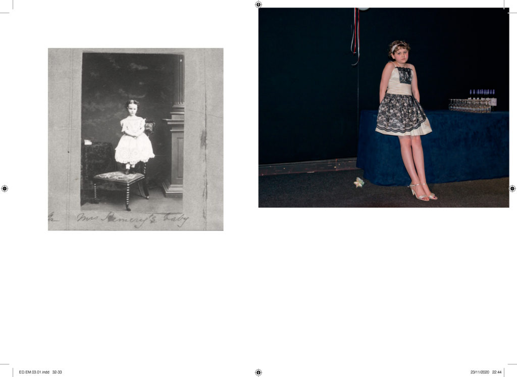
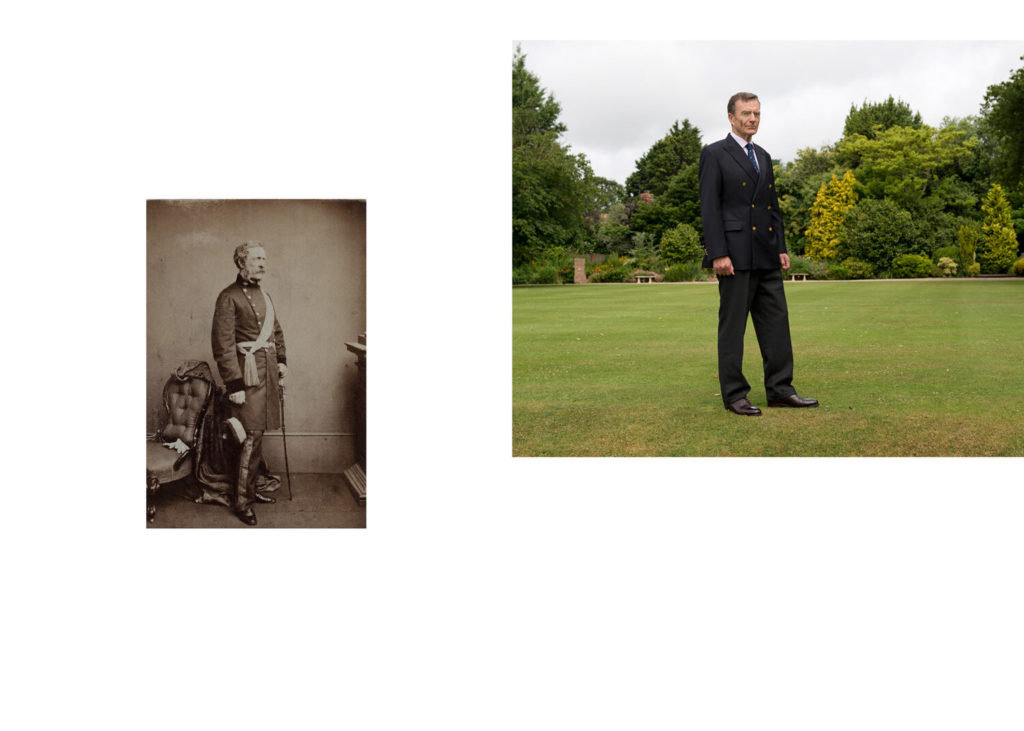
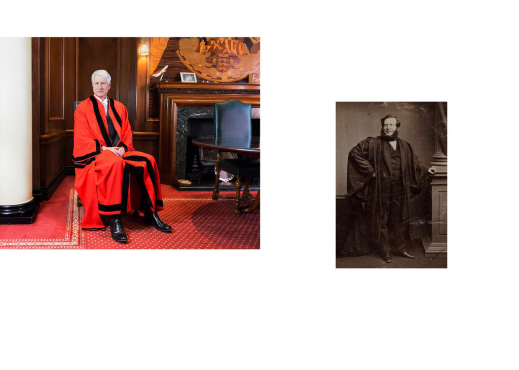
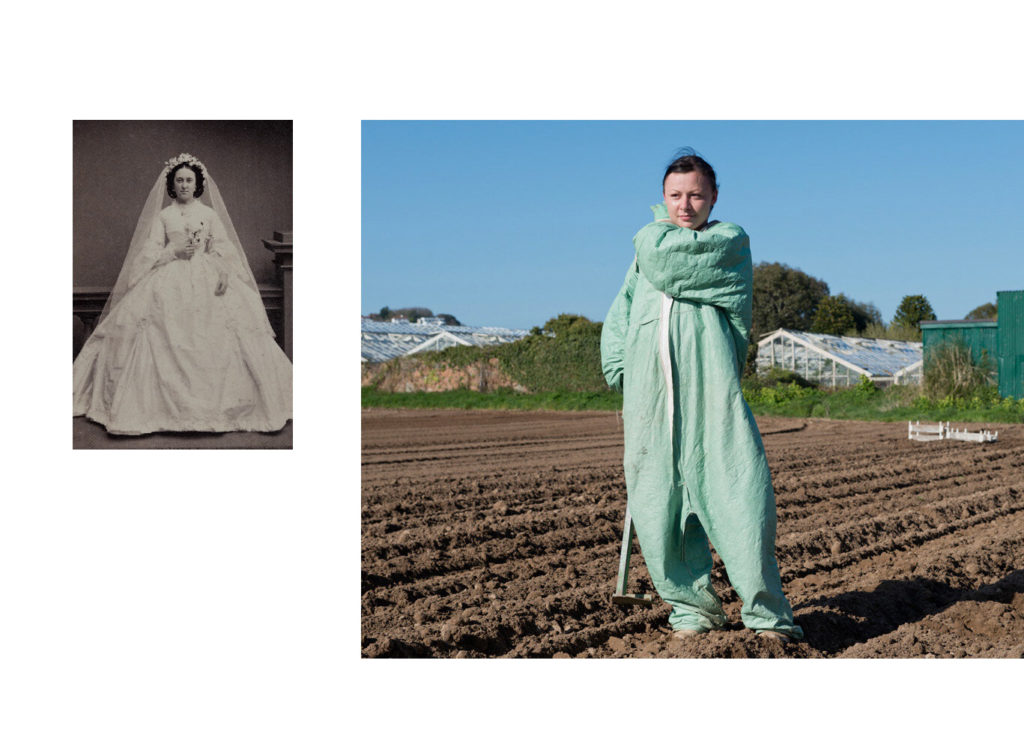
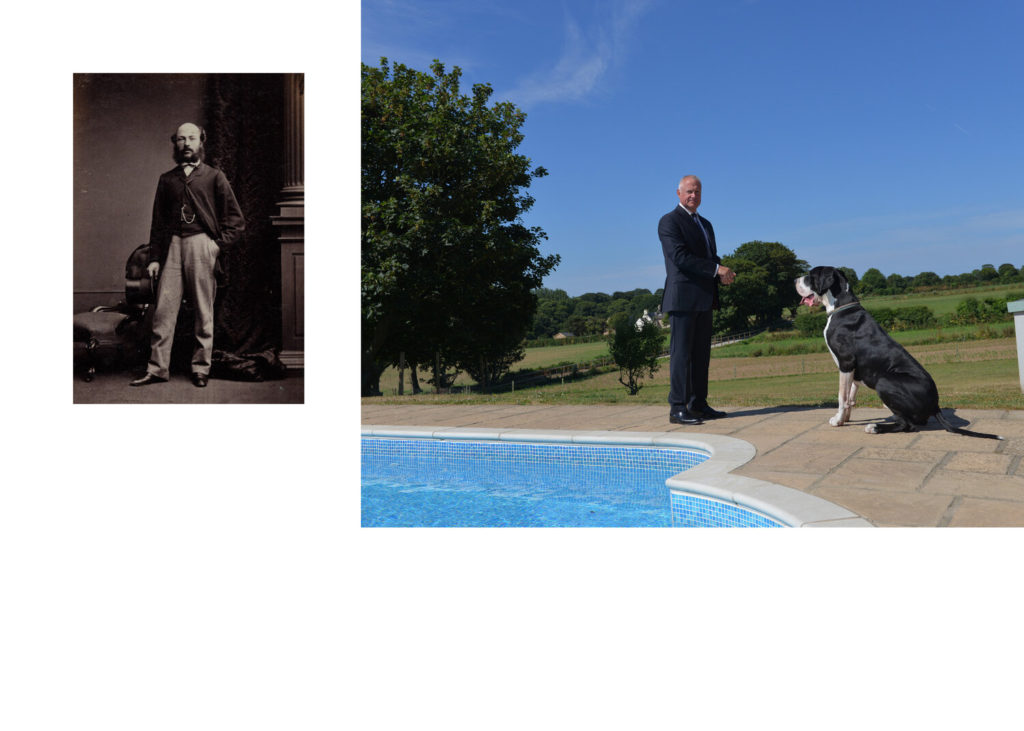
Henry Mullins / Michelle Sank
Henry Mullins and Michelle Sank represent 165 years of the practice of photographic portraiture in Jersey. That period has seen the island undergo major social and economic changes. Sank shows how the social divides that were placed during Mullins time can still be seen today. For example in the bottom left photo Sanks image of a farmer in the middle of a field contrasts with Mullins image of a woman in what seems to be upper class getting her portrait taken.
– Michelle Sank
Between 1850-73 Henry Mullins made over 9000 carte de visite portraits of Jersey’s ruling elite and wealthy upper classes. The collection that exists of his work comes through his studio albums, in which he placed his clients in an ordered grid with reference to mid-nineteenth century social hierarchies.
“This sense of theatre, ritual and a richness of materiality are things I was very tuned into during my residency and consequently when making the work which crossed class, age and gender.” -Michelle Sank
My Experiments
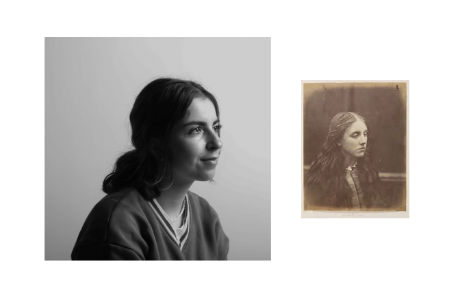
I have used two portraits taken by Julia Margaret Cameron and have put them next to two other portraits that are more modern and are in black and white which I have taken. I like how in Cameron’s photos you can see the age through the colours, how clear the portraits are and on the right, you can see the wore out edges.
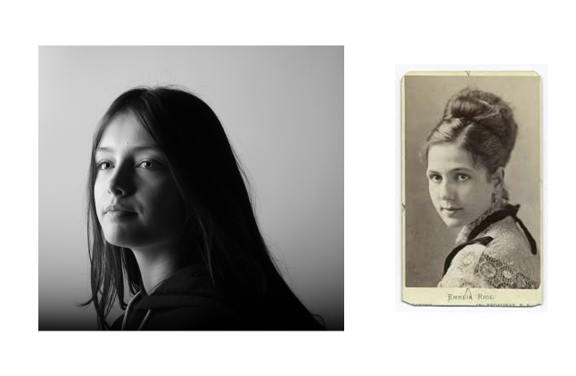
I have used a portrait of a young woman which was taken in the 1800s by an unknown photographer. I like how in both photos they are both in the middle and looking in the same direction but you can see clearly that they are from two different eras and not just by the quality of the portraits. The more modern hairstyle and clothing contrast with the older style that was worn during the 1800s.


