
My Examples
Aim: this photoshoot was to create effective deadpan photographs, and to look as similar to passport images as possible. Furthermore, we wanted the lighting to be as similar as we could throughout all these photos so they created the same aesthetic. Mostly lighting from the front would be used, keeping the attention on the models facial features.
Here I have displayed some of deadpan images in a types of sequencing styles that I think best compliment each other. After going to the studio and shooting in black and white, then adjusting settings such as the exposure and temperature, I put the images into Photoshop to create galleries like done on the blog, but in slightly different layers, with portrait and landscape images stacked alongside each other.
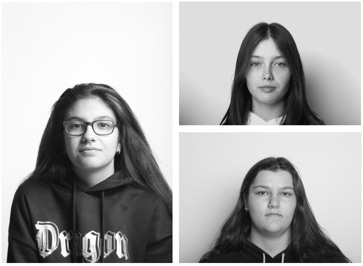
Strengths of my work: with the lighting being the main factor of these photographs, we used lights mostly from the front of the models to create this deadpan aesthetic. This create a contrast between our lighter skin tones and darker shades of hair, giving the monochromatic images more depth. In addition, the majority of these images don’t have shadows, allowing for the models to be the main focus of the image, meaning our individual facial features are clear.
Weaknesses of my work: I am aware that some of these images, as some are landscape and not portrait, despite capturing the rest of the deadpan aesthetic. The shadows in some of these images are not strict to the rules of deadpan images, as the lighting should 100% be on the face, however the models are in the middle of the frame, following the rest of the rules such as no other objects such as headphones or hats.
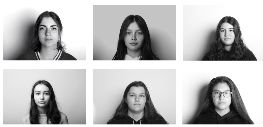
Above I have taken my best deadpan images and created a grid to better match with the aesthetic, placing all of these landscape images in photoshop, then making them the same sizes to create this 6 piece grid. I have arranged these images trying to spread the ones with stronger and weaker lighting around each other. Furthermore, the original concept is kept as despite the changes in lighting the most important deadpan concepts are retained.
How this work could be improved is for us not to have shot every image in black and white, creating more variety, however, I decided to keep them all this way as all of the models look better with the lack of colour and drastic tones. Alternatively, we could have taken more photographs as this would have made the editing and selection process a lot easier, however I do think these final images are successful.
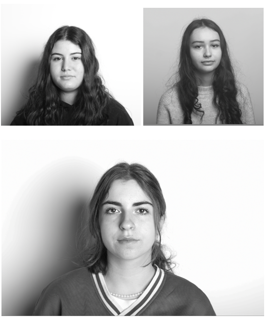
Here I have taken some of my deadpan images and created another mini gallery with a slightly different layout using photoshop. I like how the lighting on the model’s faces in all 3 images is prominent, making their skin looks smoother.
Moreover, I like how this aesthetic represents everyone in the same way, no matter of background or past experiences, creating a new version of photography by putting everyone in the same perceptive, preventing prejudice/ judgment. Not judging one person against the other, this could be helpful for decisions such as cast certain individuals for films, as specific features could be required.
Best Images
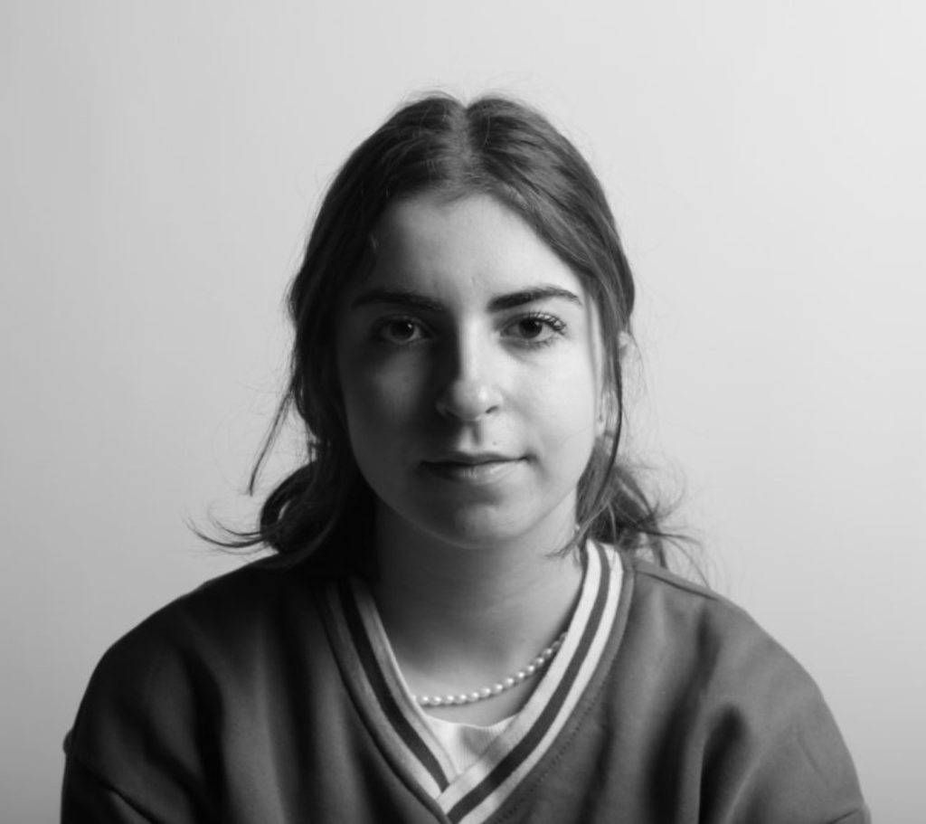
I have selected this final image of Diana as it if a good example of a successful two point lighting image, as the light is coming from the left of her face and the front. This means that there is still some light on the right side of her face this is creating a triangle on her cheek, but the lighting contrasts. As with the other image the dark tones in her eyes matches with her hair and the background with the tones in her face, bringing the whole image together. Furthermore, I cropped this image so that the white surroundings wouldn’t distract from Diana’s facial features/ the focus of the image. I have taken these photos in black and white, this is mostly because most people look best with this type of editing.
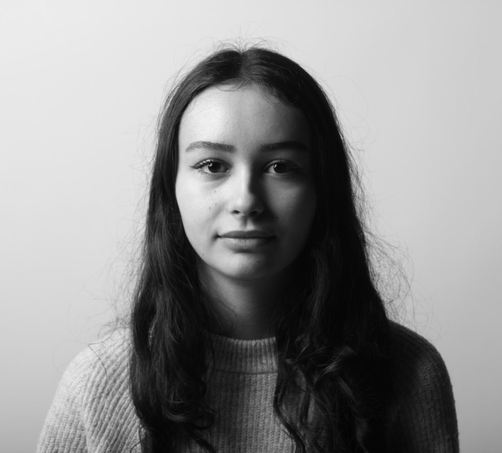
I have selected this image as my best one to analyse, as I think that it looks very professional, with the lighting being a vital part of the final product turning out well. In my opinion, this lighting makes her face look smooth and helps show the best of her facial features, as the lighting is soft and not too harsh, it means that shadows on Katarina’s face are created on the right side of her face, the use of the Doran 1 Point Lighting technique is an important part of the successfulness of this image. Furthermore, the eye contact with the lens of the camera and the shine of her eyes make the focus of the image the middle of her face, particularly her eyes, which match the tones in her hair and creating a more cohesive final product. Furthermore, we took many all of these photographs during this shoot in black and white, I think this makes for more interesting portraits and the textures on her face are more visible and other details such as the hairs in her eyebrows are more prominent.