Introduction
Deadpan photography goes back all the way to the 1920s. It’s a very distinct style of photography that has somehow made its way into the 21st century, quietly and persistently influencing you in a way you might not even be aware of! Today we’ll dig a little deeper into what deadpan photography is, talk notable names of photographers that shoot in this style, and show you a collection that is in line with deadpan aesthetics.
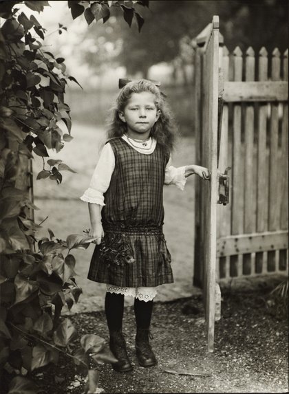
This style originated in Germany and is descended from Neue Sachlichkeit, New Objectivity, a German art movement of the 1920s that influenced the photographer August Sander who systematically documented the people of the Weimar Republic. Much later, in the 1970s, Bernd and Hilla Becher, known for their devotion to the principles of New Objectivity, began to influence a new generation of German artists at the Dusseldorf School of Photography.
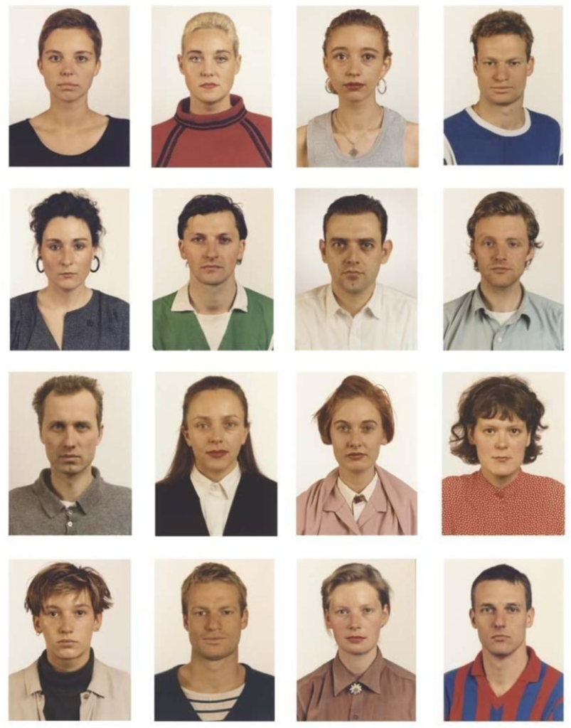
These young German photographers included Thomas Struth, Andreas Gursky, and others. The Bechers are best remembered for their studies of the industrial landscape, where they systematically photographed large structures such as water towers, coal bunkers or pit heads to document a soon-to-disappear landscape in a formalistic manner as much akin to industrial archeology as art. The Bechers’ set of “rules” included clean, black and white pictures taken in a flat grey light with straight-on compositions.
The criteria for passport/ deadpan images includes; neutral facial expression, eyes looking into the camera, no objects that are distracting such as headphones and hats, no shadows on the face (as these deter the natural features), from a front angle and symmetrical, showing the whole face. Other important factors include a light background and no reflections, this is why the glasses cannot be worn.
August Sanders
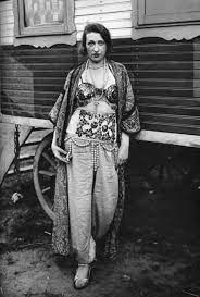
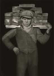
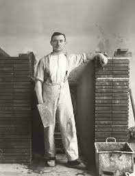
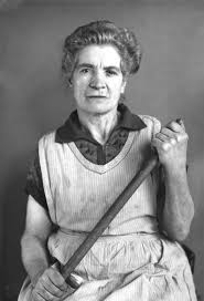
August Sander was a German photographer whose work documented the society he lived in. Lauded as one the most-important portrait photographers of the early 20th century, Sander focused his gaze on bricklayers, farmers, bakers, and other members of the community. Born in Herdorf, Germany on November 17, 1876, Sanders learned photography during his military service in the city of Trier. By 1910, he had moved to a suburb of Cologne, spending his days biking along the roads to find people to photograph.
Following the death of his son in 1944, and the destruction of his work in 1946, Sander practically ceased photography altogether. He died in Cologne, Germany on April 20, 1964 at the age of 87. Today, the artist’s works are held in the collections of The Museum of Modern Art in New York, the National Gallery of Art in Washington, D.C., and the Wallraf-Richartz Museum in Cologne, among others.
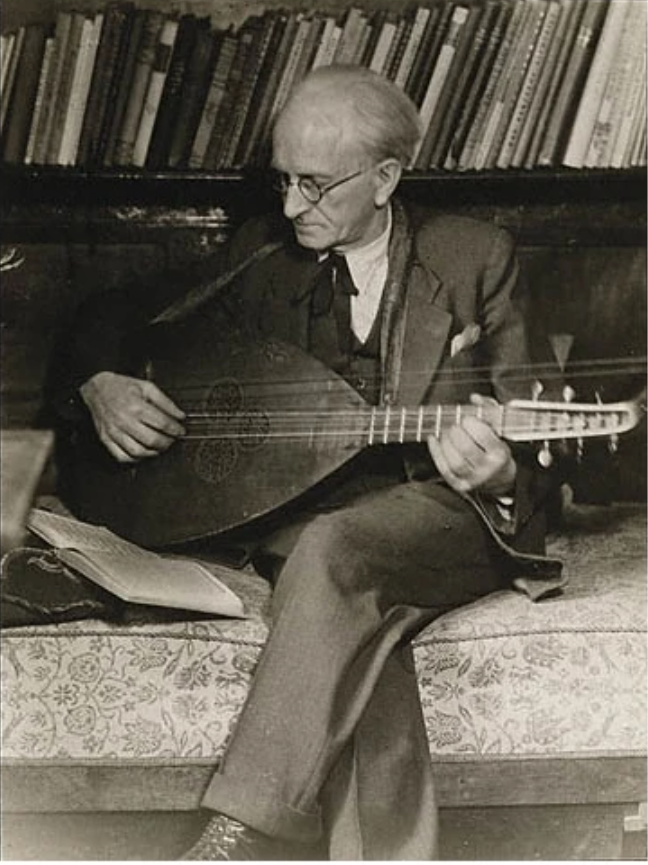
Sander once said ‘The portrait is your mirror. It’s you’. He believed that, through photography, he could reveal the characteristic traits of people. He used these images to tell each person’s story; their profession, politics, social situation and background. Sander did not use the newly invented Leica camera. Instead he remained devoted to an old-fashioned large-format camera, glass negatives and long exposure times. This allowed him to capture minute details of individual faces. Shot against neutral backgrounds and titled more often than not by profession alone, he let the images – and the faces in them – speak for themselves.
The main concept of August Sander’s work is how he photographed the most common and working class members of the public, and more upper class people but in the same way. This illustrates that he treated all people equally and could be to illustrate that class divides were unfair. Photographing them in the same way shows that they were all people and viewed as equals by Sander’s, demonstrating his more forward thinking considering the time.
Furthermore, the layout and lighting of these images is significant because of how consistent t it is, with all the of the photographs being taken in the same way. Its clear that Sander has a clear passion for his work ad I hope this is also reflected in my work. The objects that are in these image also tell a story and have a personal connection between the individuals being photographed, and their profession.
Typologies
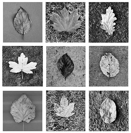
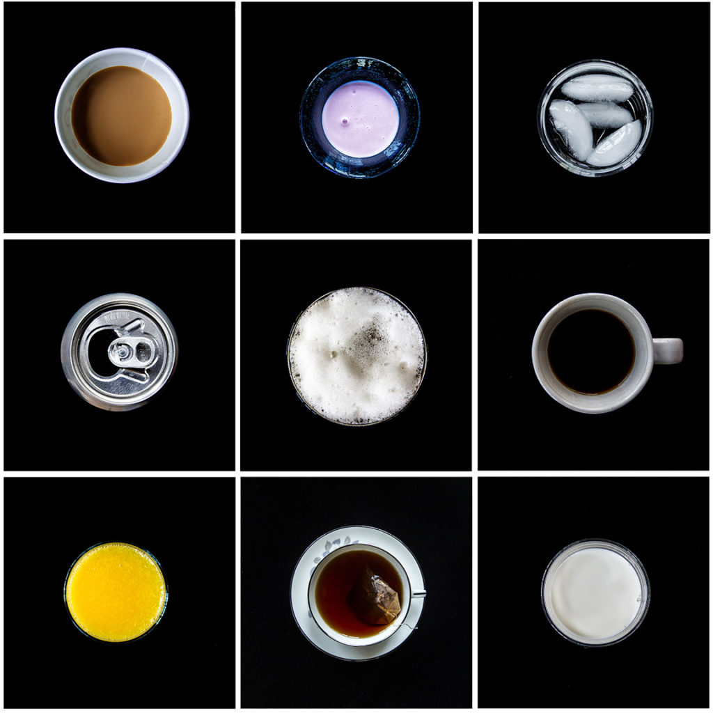
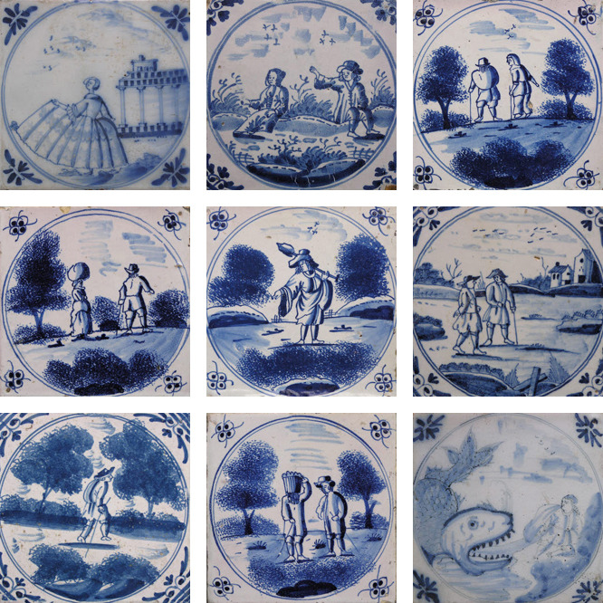
A photographic typology is a single photograph or more commonly a body of photographic work, that shares a high level of consistency. This consistency is usually found within the subjects, environment, photographic process, and presentation or direction of the subject.
Definition- 1 : study of or analysis or classification based on types or categories. 2 : a doctrine of theological types especially : one holding that things in Christian belief are prefigured or symbolized by things in the Old Testament. Other Words from typology Example Sentences Learn More About typology. The photographic typology has the ability to reshape perception, heighten and focus attention, and transform everyday objects into a thing of art. Ironically the process and execution, often cold and systematic can be extremely emotive, and a powerful tool of communication when contextualised.
Bernd and Hilla Becher
Who created typology in photography? The German artists Bernd and Hilla Becher, who began working together in 1959 and married in 1961, are best known for their “typologies”—grids of black-and-white photographs of variant examples of a single type of industrial structure.
Bernhard “Bernd” Becher, and Hilla Becher, née Wobeser, were German conceptual artists and photographers working as a collaborative duo. They are best known for their extensive series of photographic images, or typologies, of industrial buildings and structures, often organised in grids.

Bernd and Hilla Becher first began their still-ongoing project of systematically photographing industrial structures – water towers, blast furnaces, gas tanks, mine heads, grain elevators and the like – in the late 1950s.
I like how these objects are placed how normal passport photos, this along with the black and white images gives the image an old fashion feel despite it not being very old at all. This gives the image depth and authenticity and I think that the contrast between the different shapes makes the image more interesting, You can also notice that the more cylinder shapes are symmetrical to each other with the forth and sixth images being simirla to each other, and the same goes for the first, third, seventh and last image.
Image Analysis
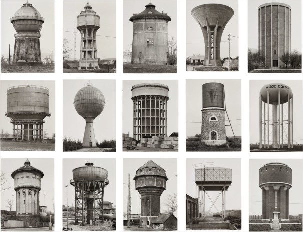
I have selected this image of Bernd and Hilla Becher’s as I think that the grid layout of twelve and not nine makes for a more interesting image as there is more to looks at, and their is more opportunity to create more affective images as part of the final piece. Firstly, I think that the fact that these images are in black and white means that the image may appear more authentic and this highlights the different shadows and shapes within the water towers, for example the squares in the 8th image. Furthermore, the variety of shapes within this image creates a more exciting image, meaning that the contrast between the circles, rectangles and the cylinders placed next to eac other creates depth to the image.

