Introduction and history
In film photography, a double exposure is a combination of two exposures in one image to produce evocative results. In this easy-to-follow tutorial, learn how graphic artist Erica Larson uses Adobe Photoshop to combine two photos, creating a seamless double exposure effect. Some of the first double exposure photos emerged during the 1860s as another source of revenue for photographers. To give their business a boost, they discovered how to make a portrait subject appear twice in a frame, as if they had an identical twin. In each of the pictures, the person was striking a different pose.
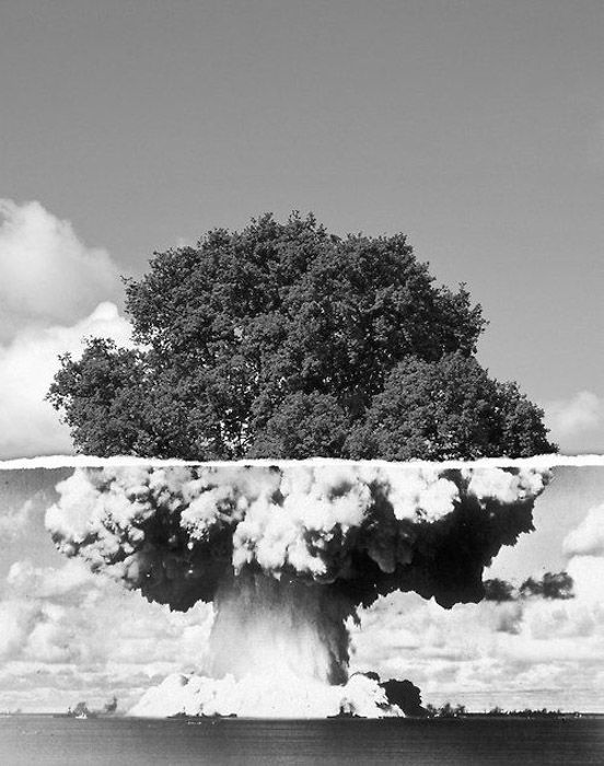
Multiple exposure photography was one of the earliest instances of special effects in photos. It was an opportunity to create something that couldn’t be seen with the naked human eye. People today are accustomed to altered images, so that novelty has worn off. But double exposures still offer an opportunity to push your creative limits and craft unique and meaningful images
With digital photography and editing software, multiple exposures are easier to achieve. “You can execute a shot so much more effectively now than when you were trying to double expose in the camera,” experienced photographer Carli Davidson says, “especially with images that are taken at different times or in different spaces.”
While some digital cameras have double exposure settings, the settings and tools vary depending on the brand and may not be in older cameras at all. The flexibility of editing software is where photographers and artists can really push the creative limits of double exposures. Ingersoll notes that you can “take two digital photos and lay them on top of each other. Through blending modes, transparencies, and masking you can create a double exposed image.”
Advantages of double/ multi exposures include; they’re easy for beginners to produce and two or more images can be made into a piece of art. This means that colours can be blended and shapes can create new illusions in these pieces of work, showing that photograph is a great form or artwork.
Another good thing about these types of edits is that they can be made on Adobe Photoshoot, but can also be created on cameras, as they can be created by taking a series of photos that are automatically composed together, or alternatively can be created on the most modern models of iPhones.
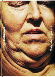
Man Ray
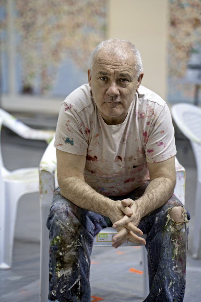
Man Ray was an American visual artist who spent most of his career in Paris. He was a significant contributor to the Dada and Surrealist movements, although his ties to each were informal. He produced major works in a variety of media but considered himself a painter above all. Soon after graduating from high school in 1908, Ray was offered a scholarship to study architecture but decided to pursue a career in arts. While his parents were unhappy with his decision, they supported his love for the arts. Ray stayed for 4 years working towards being a professional painter, while also earning some cash as a technical illustrator and commercial artist at various Manhattan companies.
Encouraged by Marcel Duchamp, Ray relocated to Paris in 1912, he spent the whole of his life in France. During his time in France, Ray continued to be part of artistic avant garde, coming into contact with renowned figure such as Gertrude Stein. Man Ray started working in several mediums including sculpture, painting, film, and photography. His earliest artistic works were relatively static, influenced mostly by cubism and expressionism.

While in France, he produced brilliant art works which are today known as Rayogrammes – images created on a piece of photographic paper without a camera; the subject is placed directly on a piece of paper, light is exposed then the image is produced. The shadow of the object is what produces the image, which emphasises the influence of the light and shadow instead of the importance of the picture itself.
In his final years, Ray continued his finest art works, with exhibits in London, New York, Paris and other popular cities before his death. He died in his studio in his beloved city of Paris on November 18, 1976. He was 86 years of age. His works can be found in a number of museums around the globe.
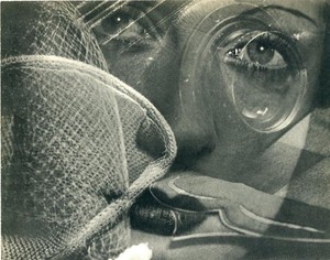
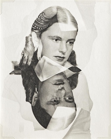
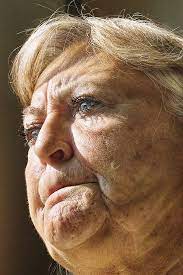
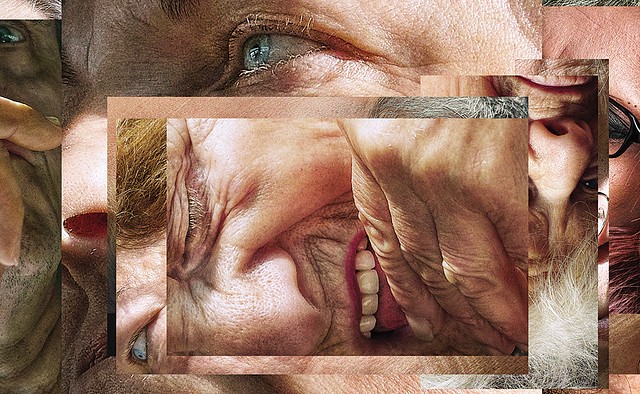
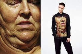
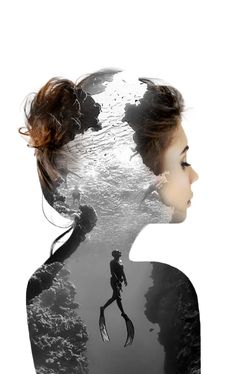
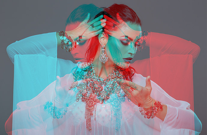
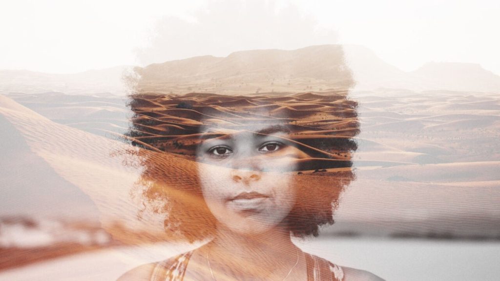
I like how Man Ray’s work relates to our work as he mostly uses 2 portraits blended together, or alternatively a portrait then a random image which links into the portrait. Furthermore, the middle image is significant as the use of portraits juxtaposing each other at opposite angles a difference between the two individuals.
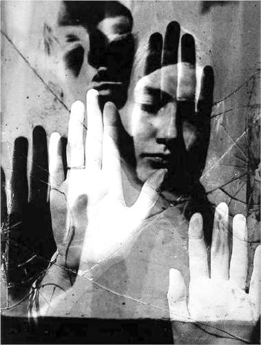
In addition, the juxtaposition of black and white palms in the third photograph creates a difference between the two pictures, we can interpret that this could be to show expectations vs reality or other themes such as life vs death. Alternatively, the first image may be the merging or a portrait and objects that link to this lady, this helps inspire my work as I could incorporate this into my project.
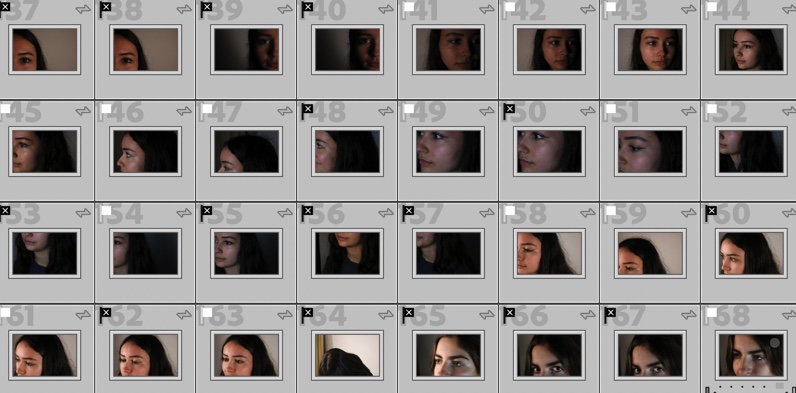
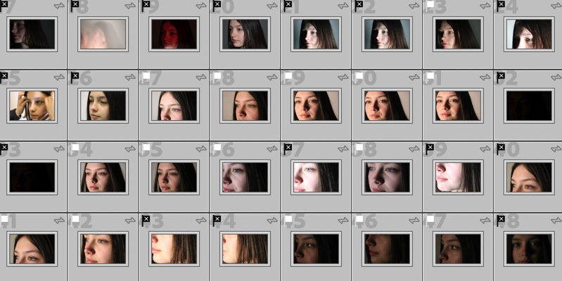
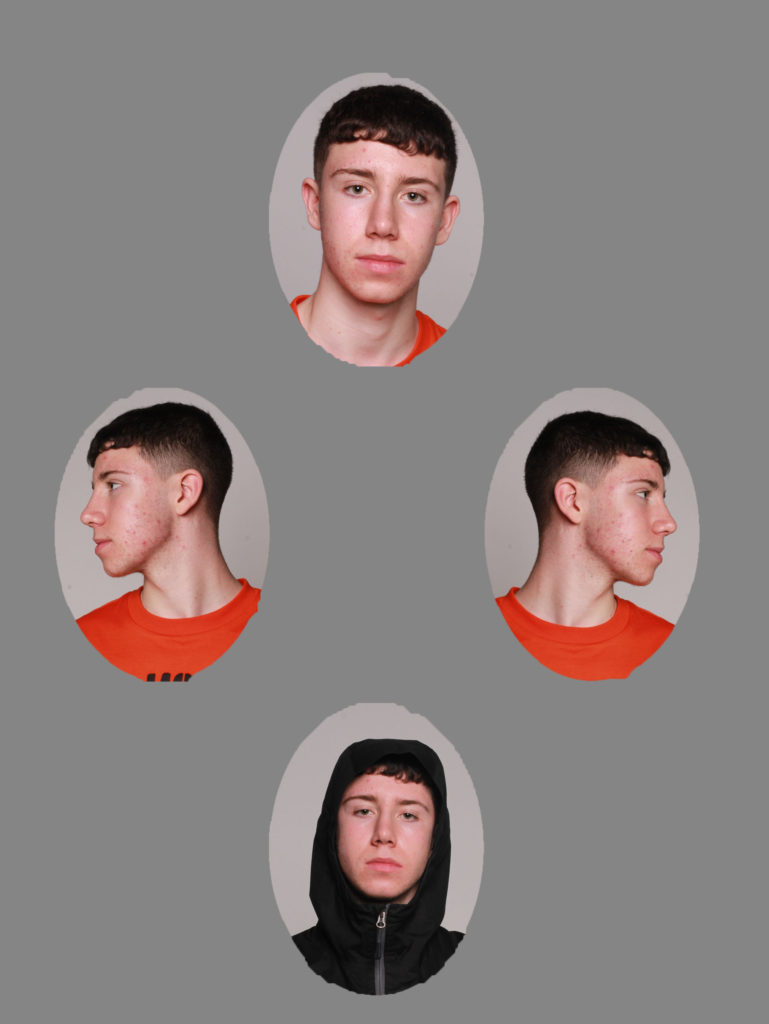
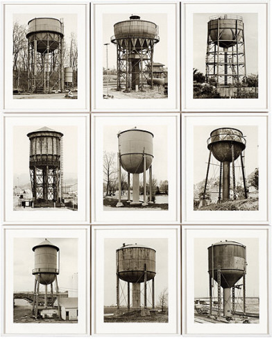
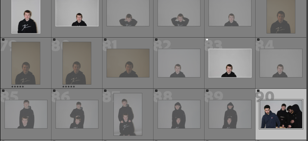
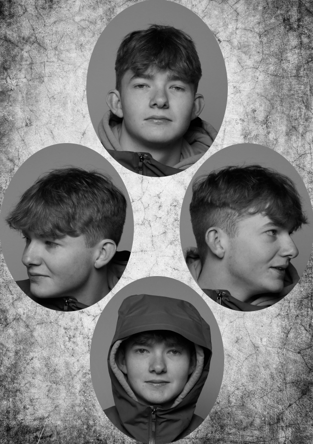
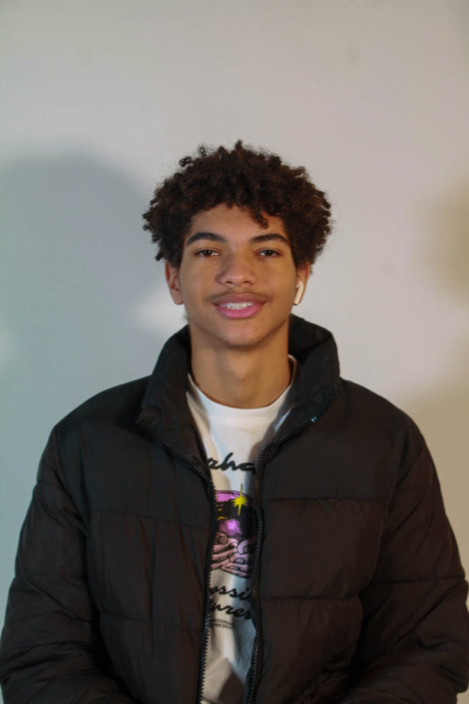
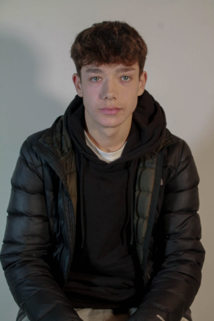
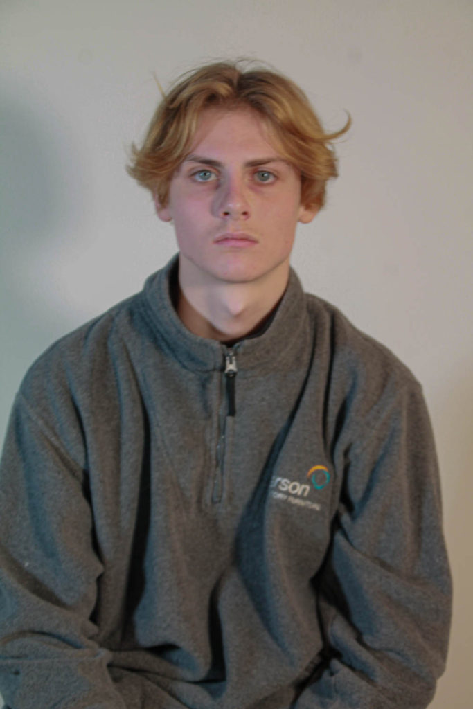
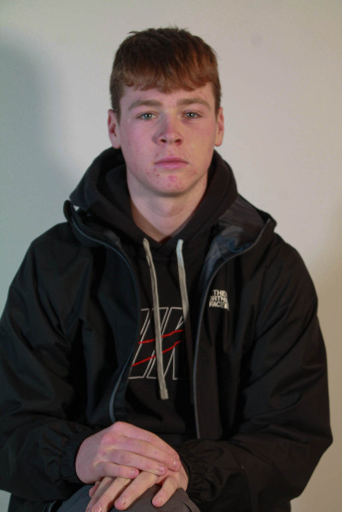
Contact Sheets
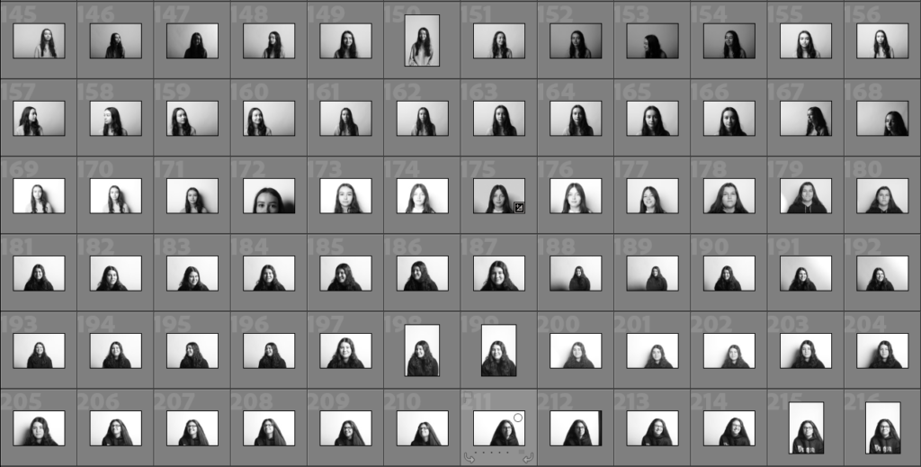
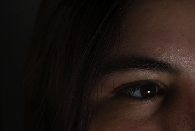
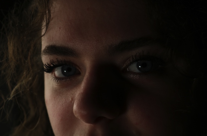
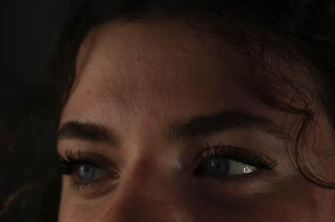
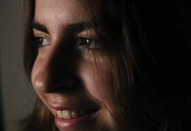
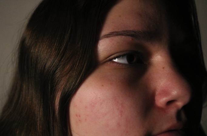
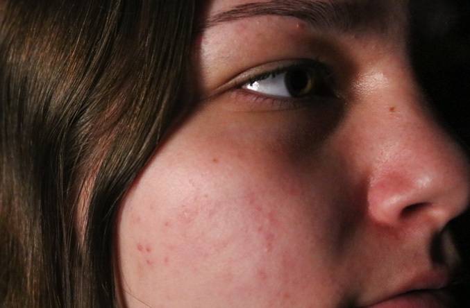
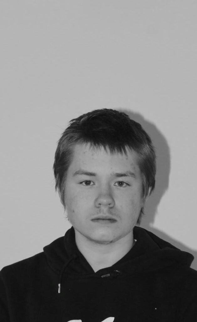
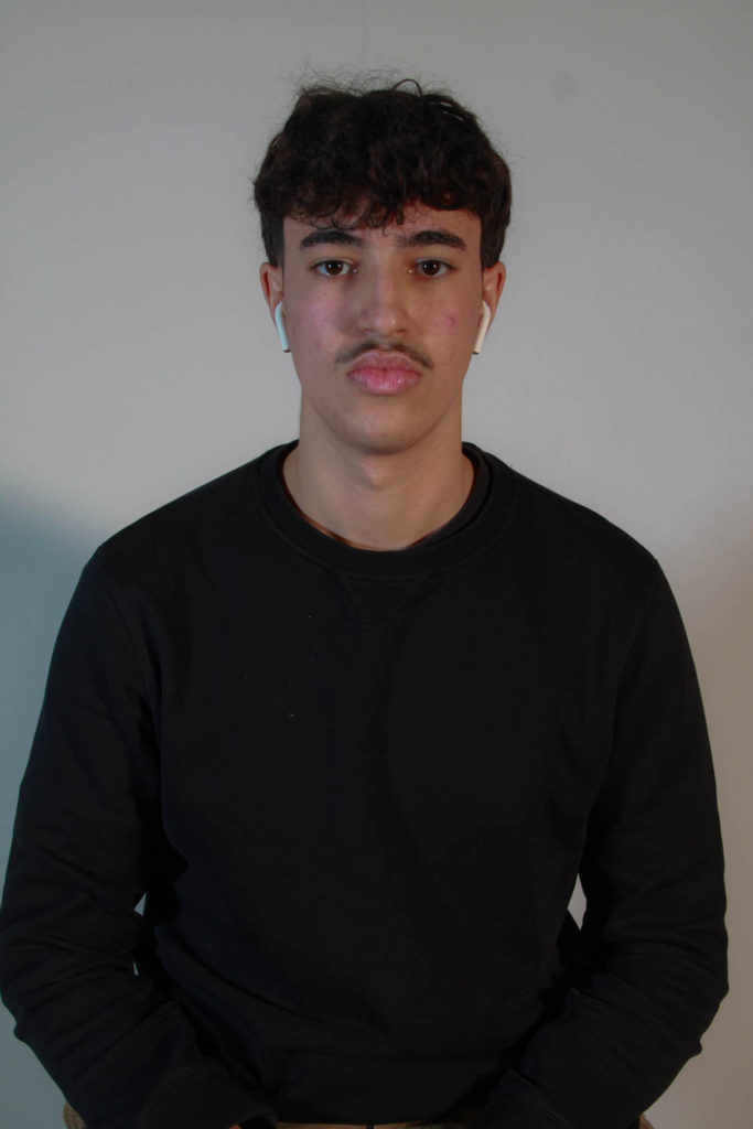
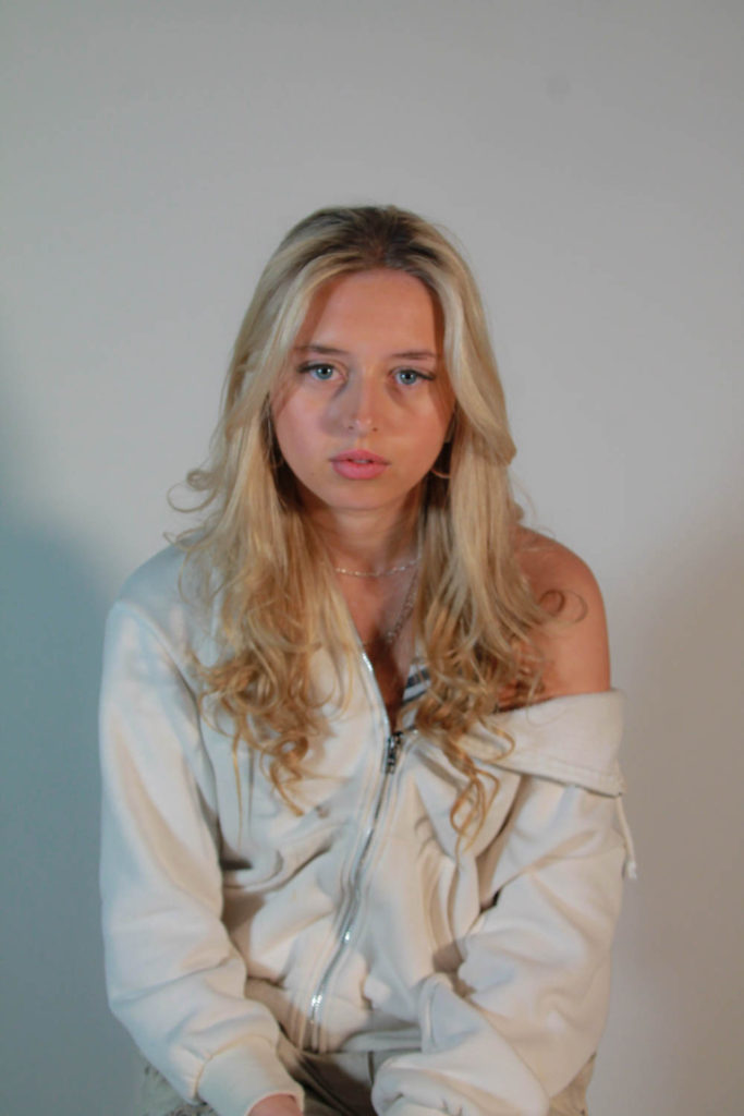
My examples
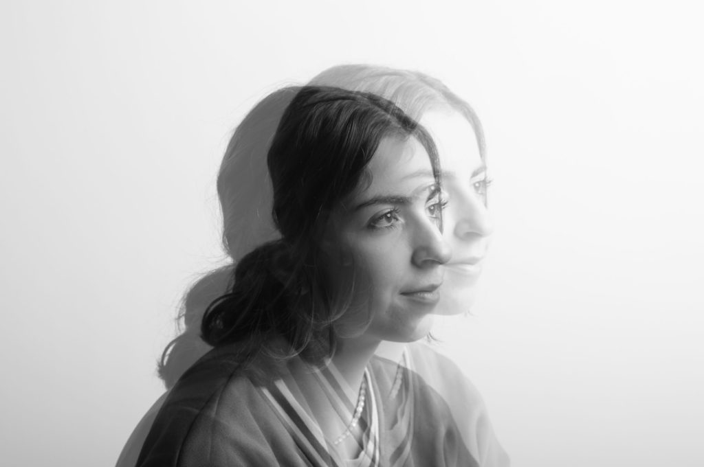
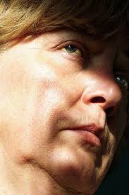
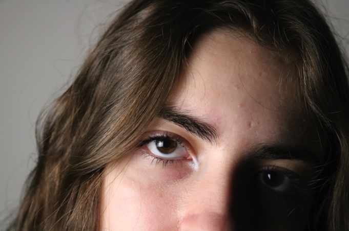
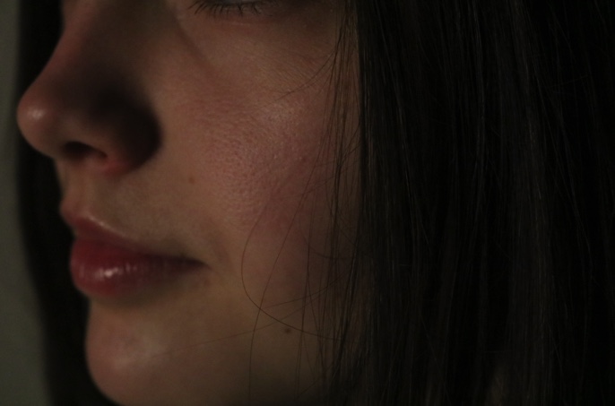
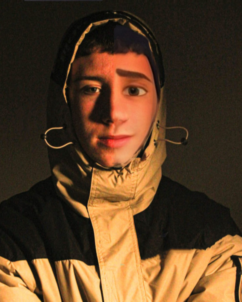
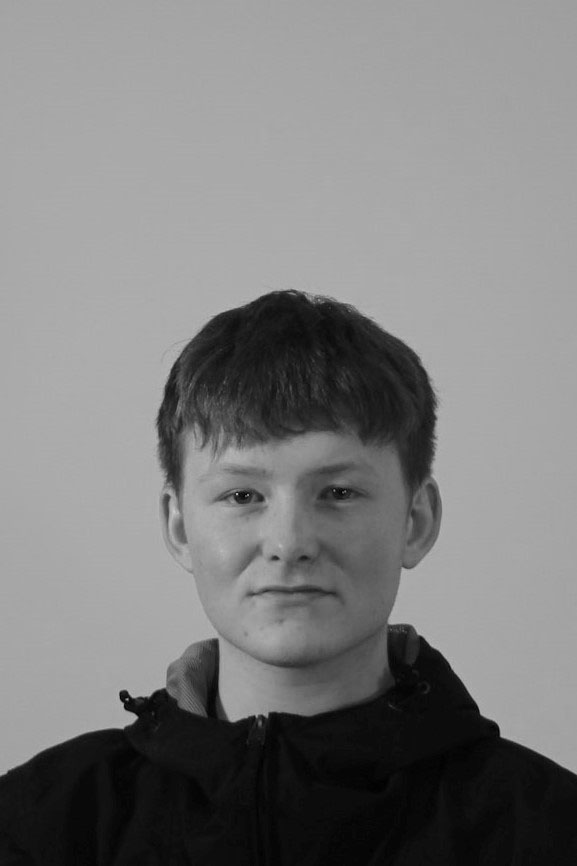
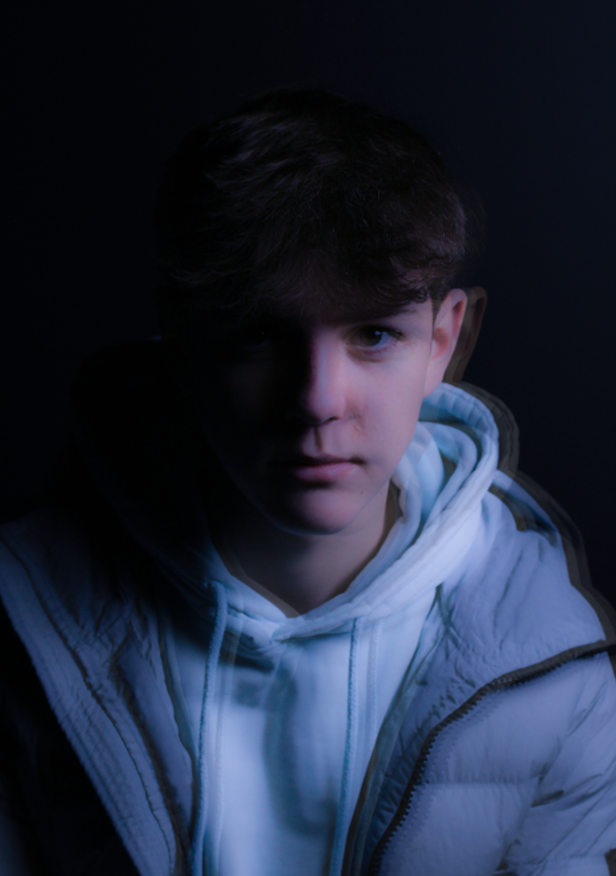
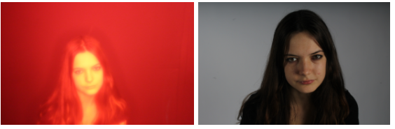
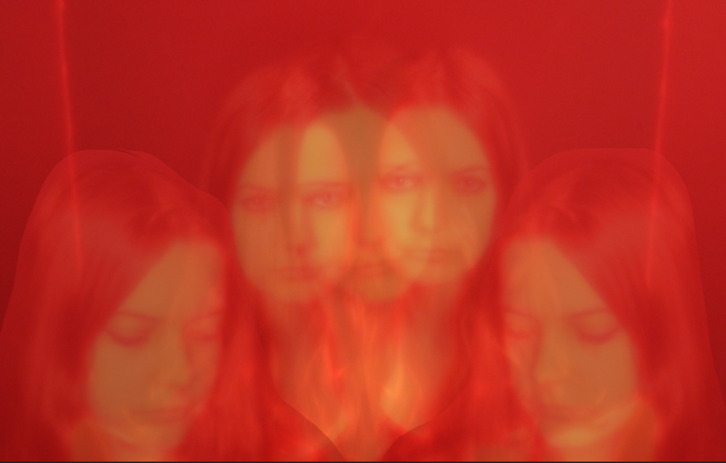
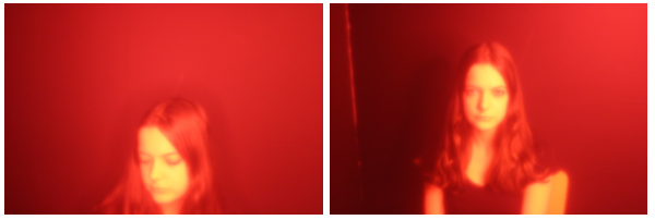
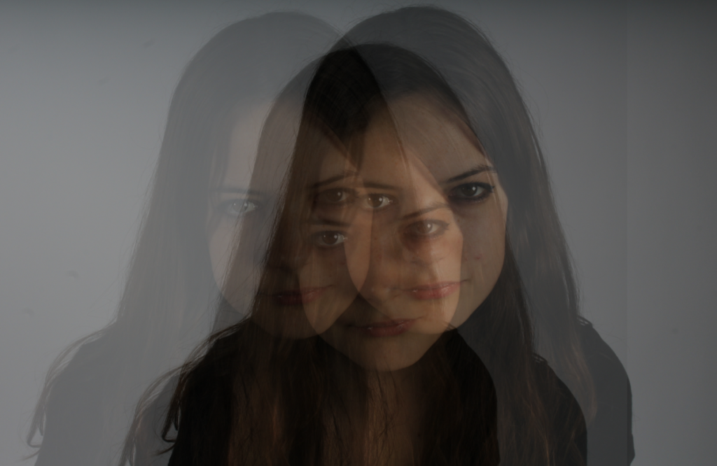
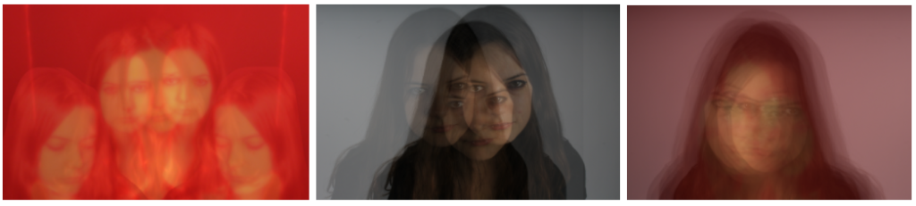
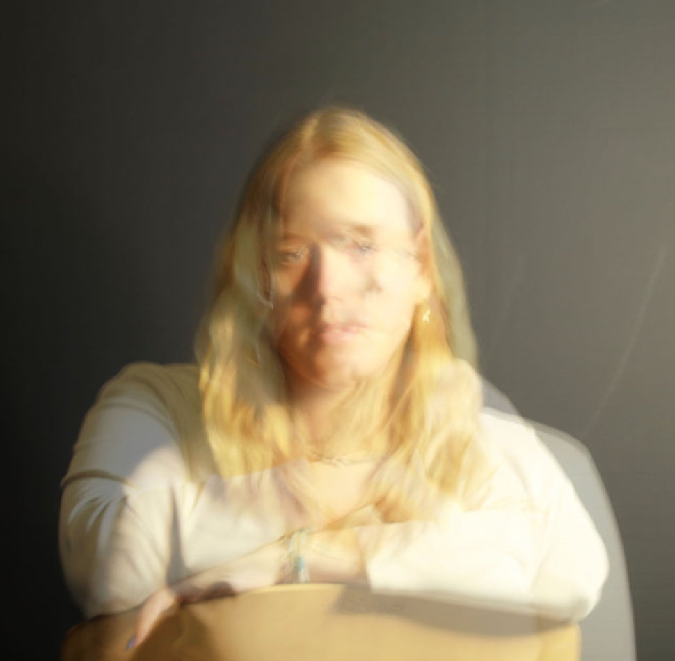
To create my own multiple exposure pieces, we went into the studio to take portraits at different angles, we created a plan to use a variety of coloured sheets over the lights, meaning that if we kept the original images in colour, the multi-exposures would be a blend of colours, hoping to create more aesthetic work. In addition, initially I thought the idea of blending two image, one with someone looking to the left, and one image with the individual looking to the right, would create a cohesive piece.
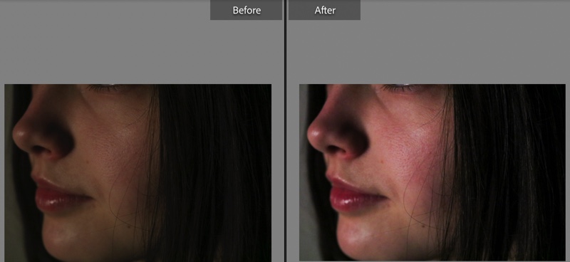
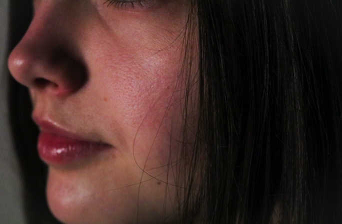
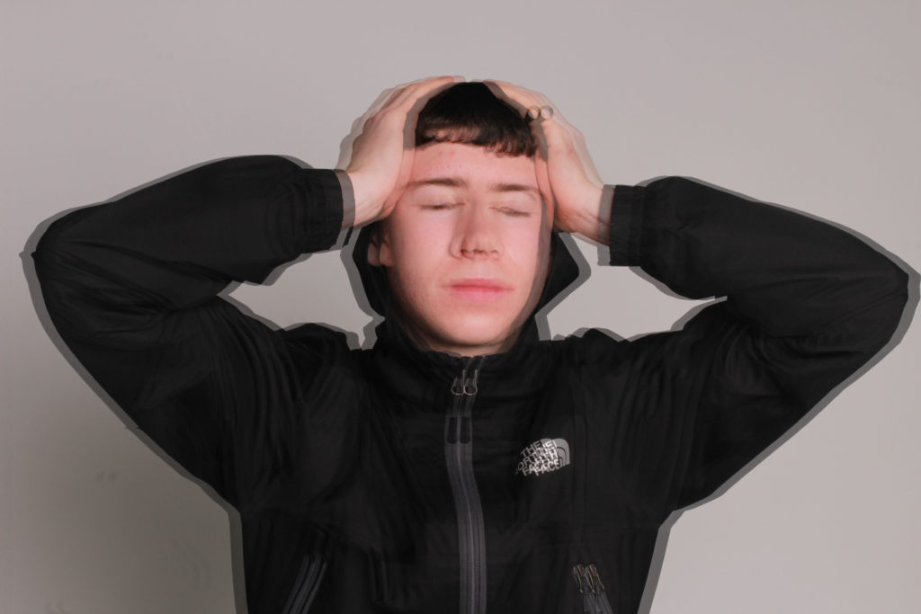
Process– Below, I have created a gallery with my first attempts at some multiple exposure, using Photoshop and my images from the media drive, I overlapped my two selected images and turned down the opacity. The reveals the image underneath whilst dulling down the image on top, this creates a blended effect and therefore the multiple exposure edit. Additionally, cropping of the images after editing puts more focus onto the model and not the background.
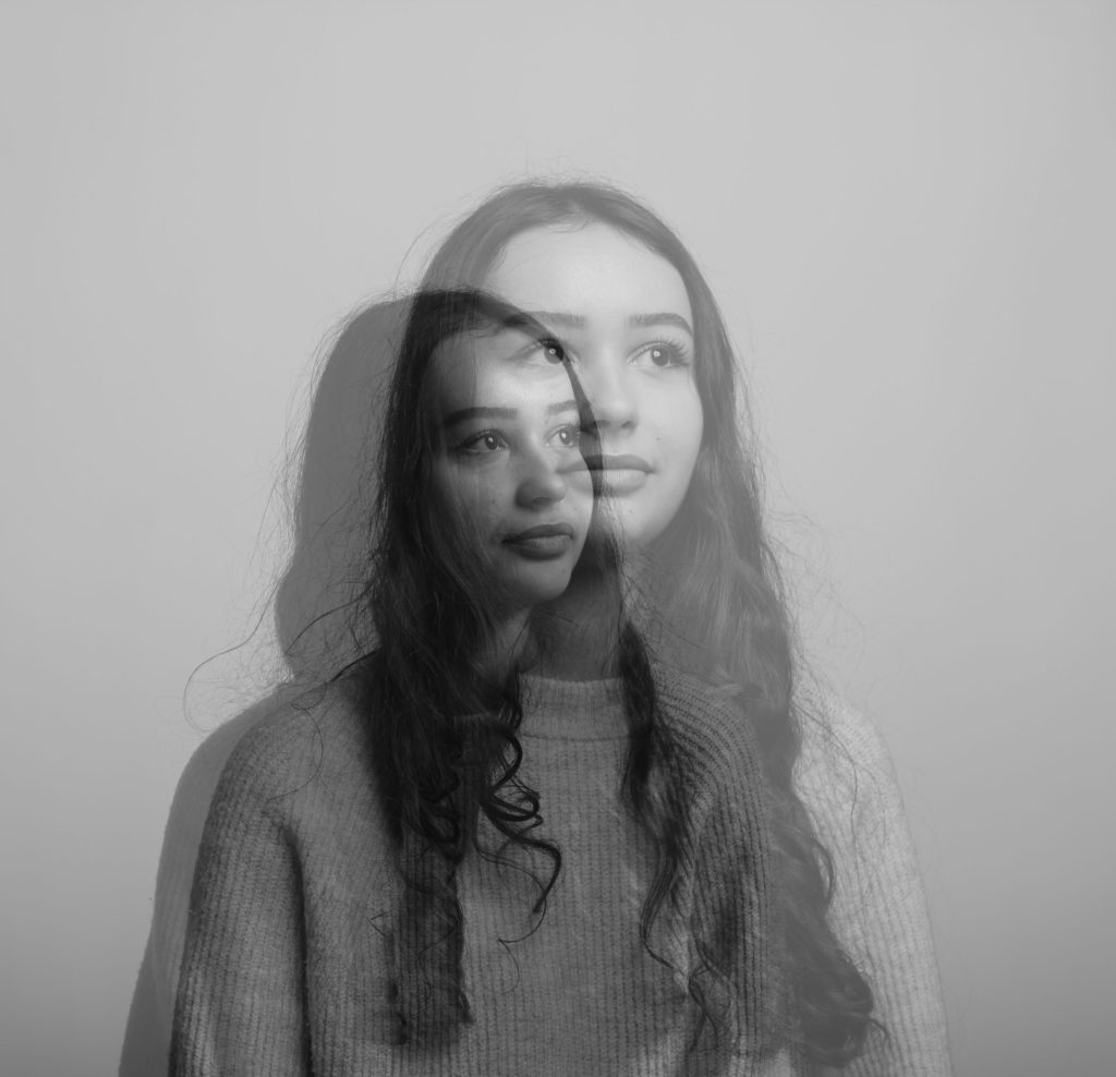
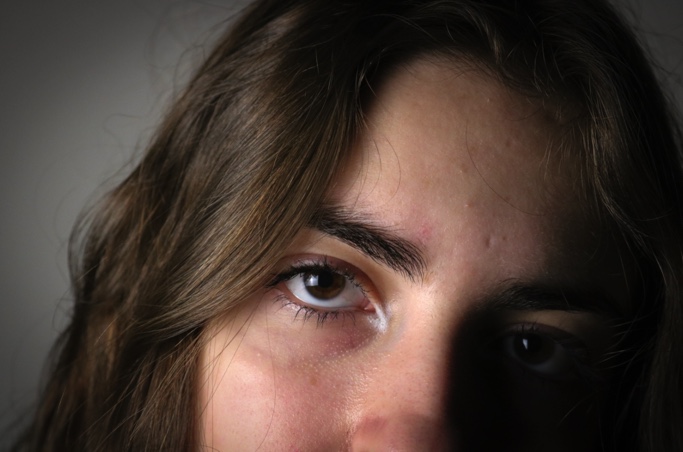
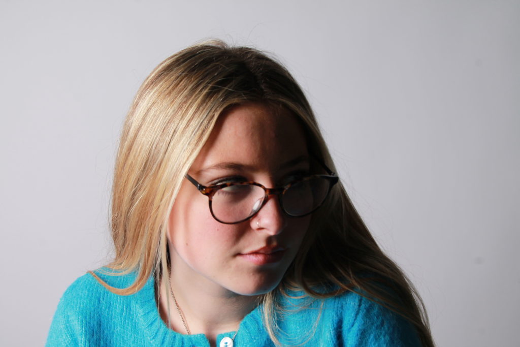
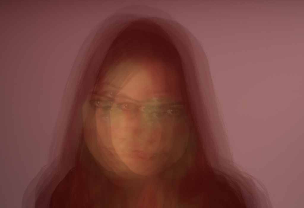
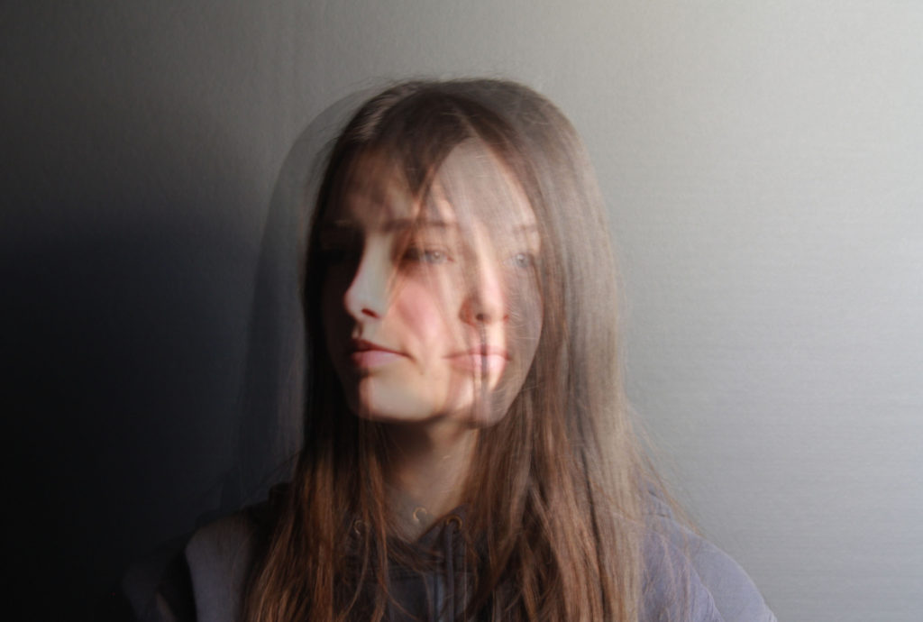
I particularly like this image of Lottie, as the warm yellow tones that we created by using transparent coloured sheets with blue, orange, purple and green tones. This made for more exciting images to select from, as images with different coloured tones can be mixed together. Furthermore, the use of two images, from from the front and one from her left side means that her eyes get lost in the image and the whole thing is almost too blurry, meaning it could be interpreted as not a success.
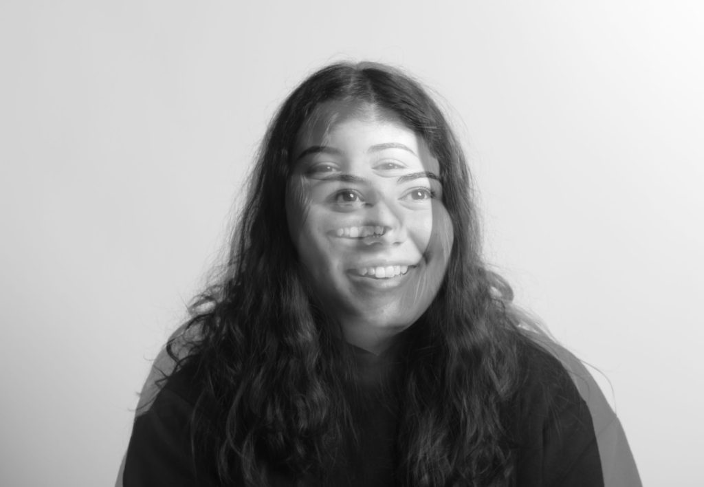
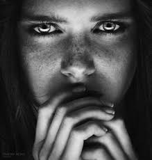
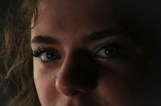
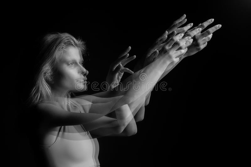
In my opinion the most successful aspects of these images is the shadows that are created and juxtaposed with the use of the monochromatic setting that was put into place when we were originally taking the photos. Furthermore, I prefer the idea of only creating these edits with two images of the same person, as the facial featured are similar, and it can create the effect of two versions of the same individual.
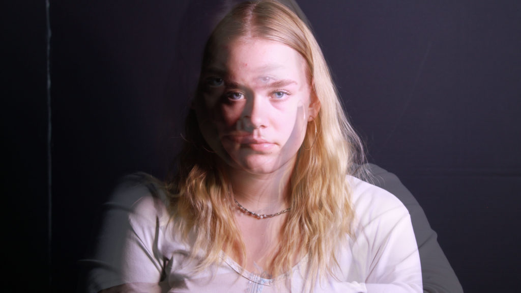
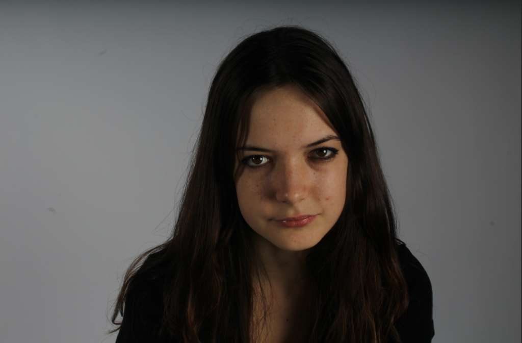
I really like the multiple exposure effect, especially when working with models and portraits as it allows us to cover up certain “imperfections”. For example, if the lighting under the chin was the weak point of the image, this could be covered and blended with anther image to create the multi exposure effect. This also applies if models don’t like certain angles/ elements of the image or how they may look in our photos, these factors can be eliminated thought this type of editing.
Final Images