
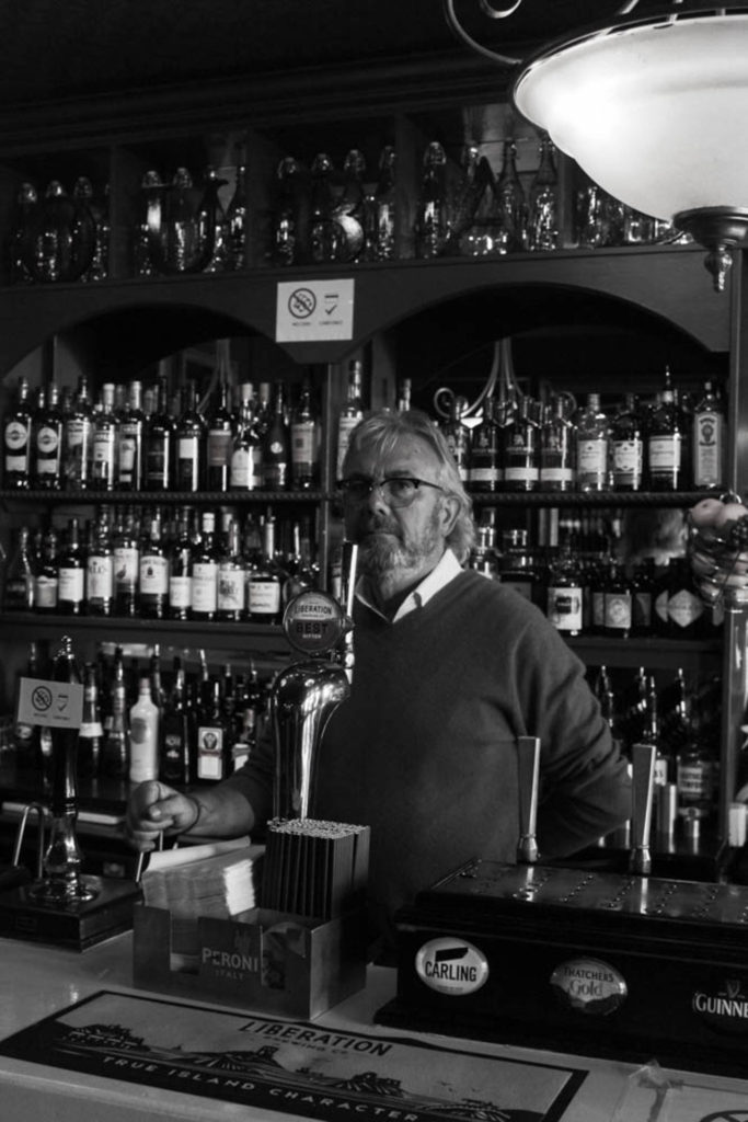
I have picked this photo of Noel Flood from my environmental portraits to be one of my final images because I think it shows what he does and what type of place he worked in. I have turned this photo to black and white because I wanted Noel to be the main focus and I thought that the powerful colours of the bottles behind him would take that away. I like the harsher and darker blacks in it and how the brighter whites contrast with them, I also like how you can see all the bottles in the background with noel still being in the centre of the photo.
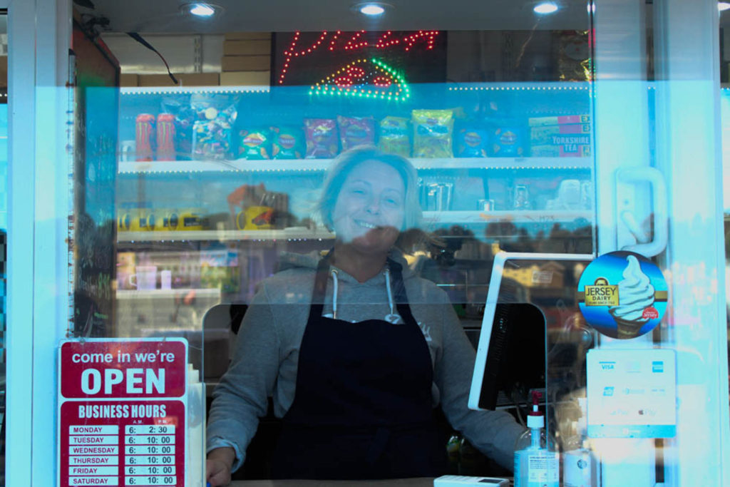
This is one of my environmental portraits of the owner of the Quayside cafe down by the harbour. I like how the background has a yellow tint which contrasts nicely with the blue in the foreground from the reflection on the screen. I also like how you can see many of the products that they sell on the shelves behind her. The lady is also in the middle of the image so it makes her the main focal point even though there are many other elements to the photo.
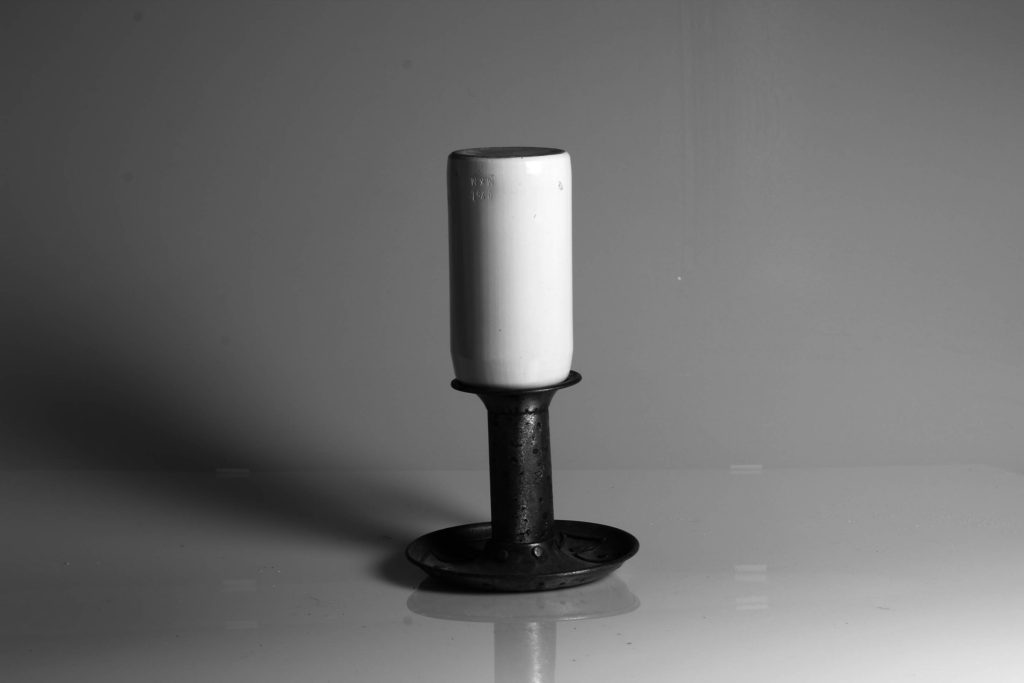
This is one of my still life images and I have chosen it to be one of my final images because I think that it is eyecatching and has nice shadowing behind the objects. I also think the bright white sits nicely on top of the darker metal of the candle holder. I wanted the shadows and the reflection to be prominent without taking away from the main object, so I haven’t made the shadows too dark, as well as cut off most of the reflection beneath the objects.
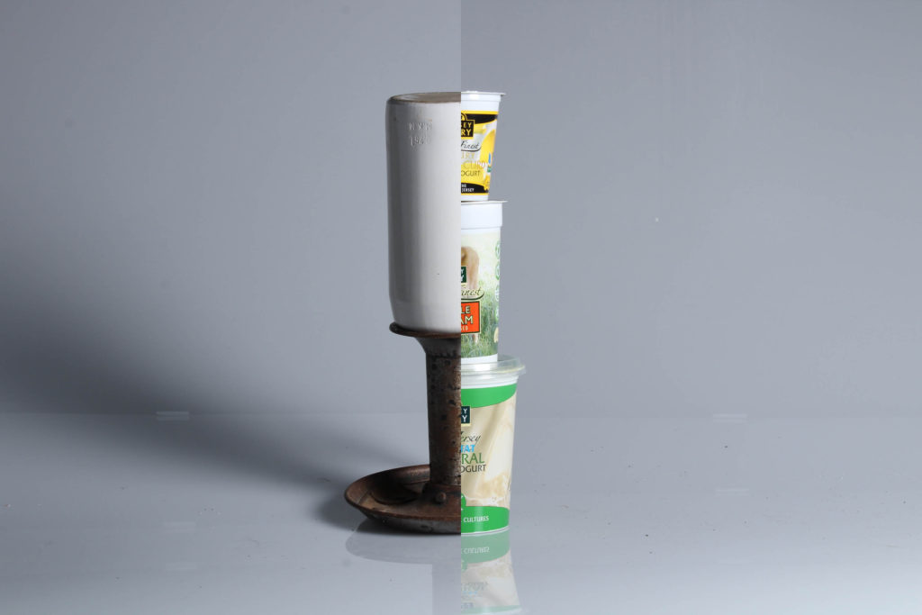
This is one of my experimentations, I have put together my coloured image of the white bottle and the candle holder and the three yoghurt pots stacked on top of each other. I did this photoshop and like how they look together, I also like how they lined up together to make it look like one object altogether.
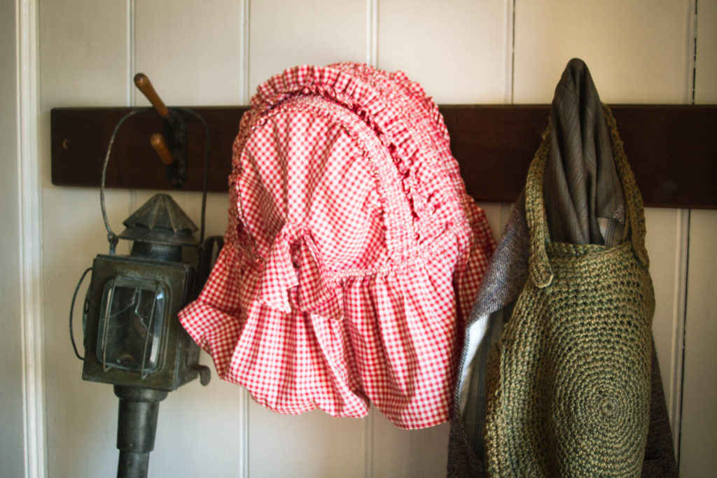
I have picked this from my Hamptonne objects because I like how it shows how people use to live and what they used or wore. I also like how the hat has vibrant reds next to two darker objects because it allows the hat to be the focus of the image but it still doesn’t take all of the attention away from the lantern or the knitted bag. The darker brown in the wooden hangers also contrasts nicely with the bolder reds as well as the greys and greens in the other objects.
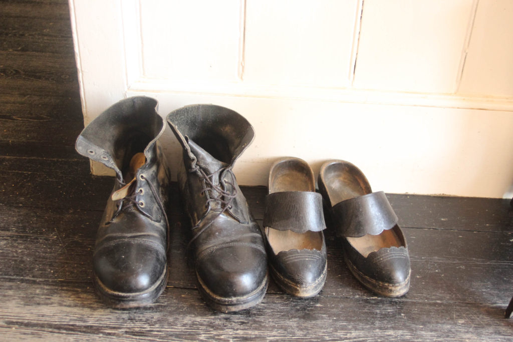
This is another one of my Hamptonne objects and I have chosen this to be one of my final images because I like how it is a bright photo with no dark tones, I also really like how both the brown in the shoes and the wood complement the creamy white of the wall. In the is the image you can also see the ageing of the floorboards which tells the story of those who used to live there.
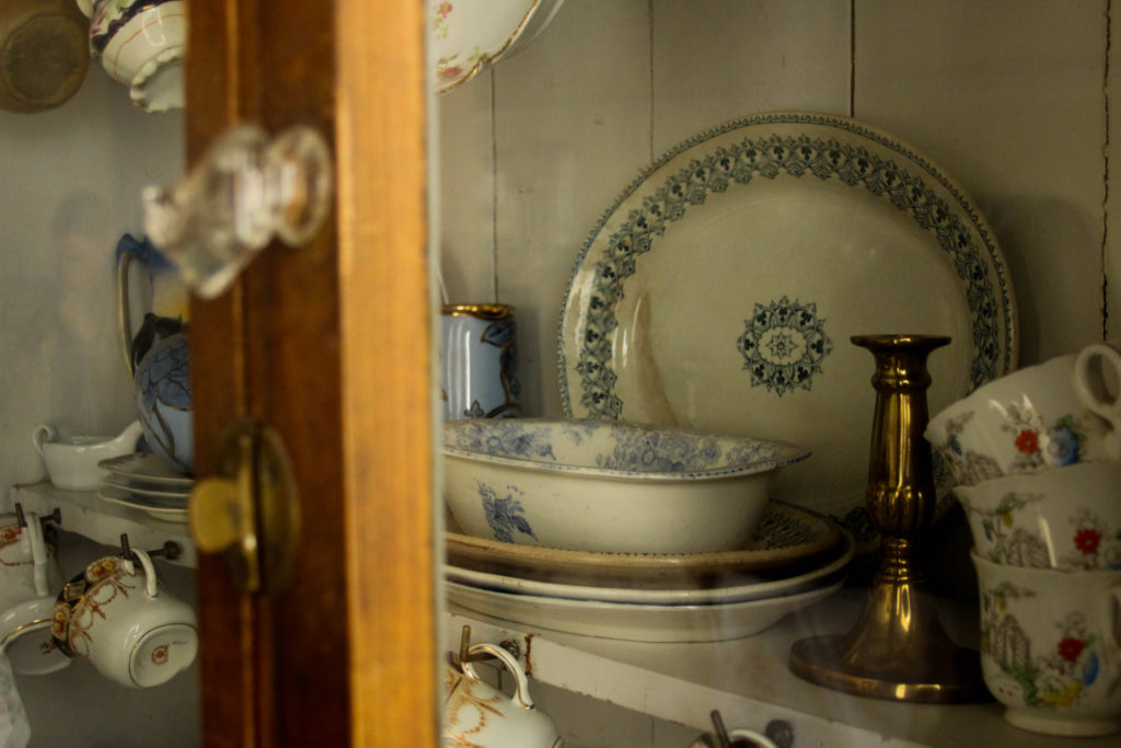
I have chosen this to be a part of my final images because I like how the foreground is blurry and highlights the different antique plates and tea sets. While editing I wanted to give it a more vintage feel to the photo so the blues and red on the plates and teacups are less bright but are still the main focus of the photo. Also, I like how the gold of the cadel holder is shiny and highlighted which is a big difference from the dull and worn out lock on the cabinet.
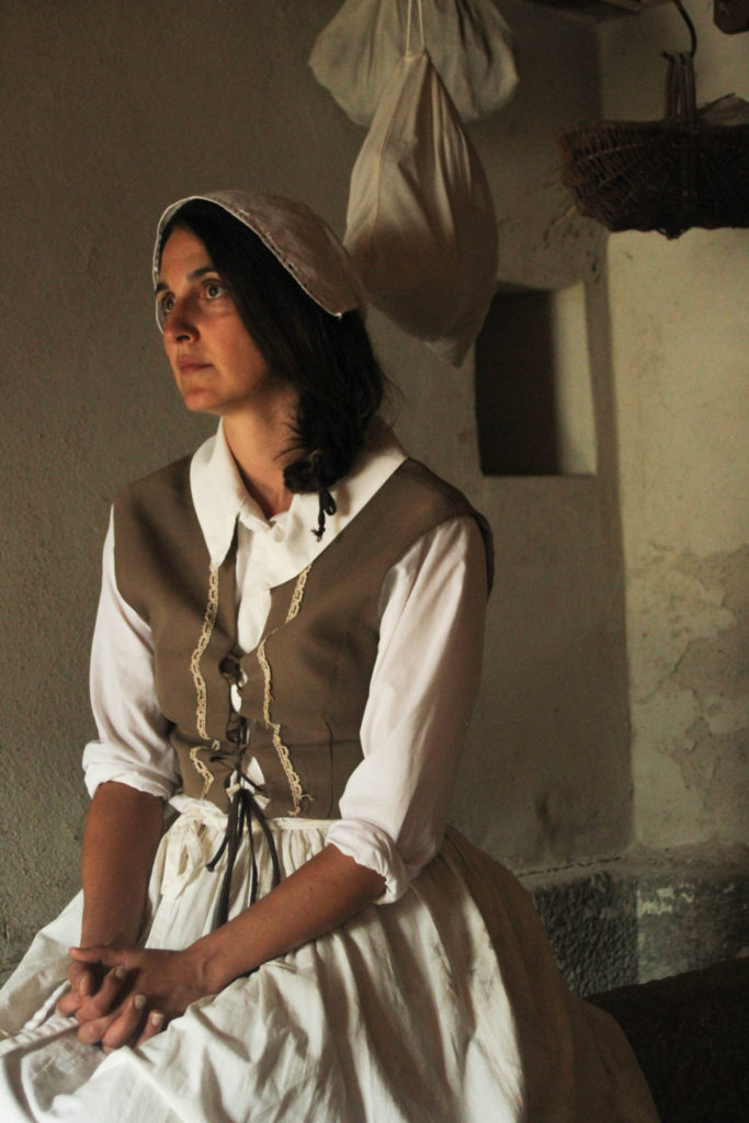
This is one of my portraits from Hamptonne and I have chosen it to be one of my final images because I think that it has good lighting which shows the Goodwyfs features and what she would have worn during that time. I like how that she isn’t looked into the camera because it draws our attention to her surroundings and the shadows that are created from the window in front of her.