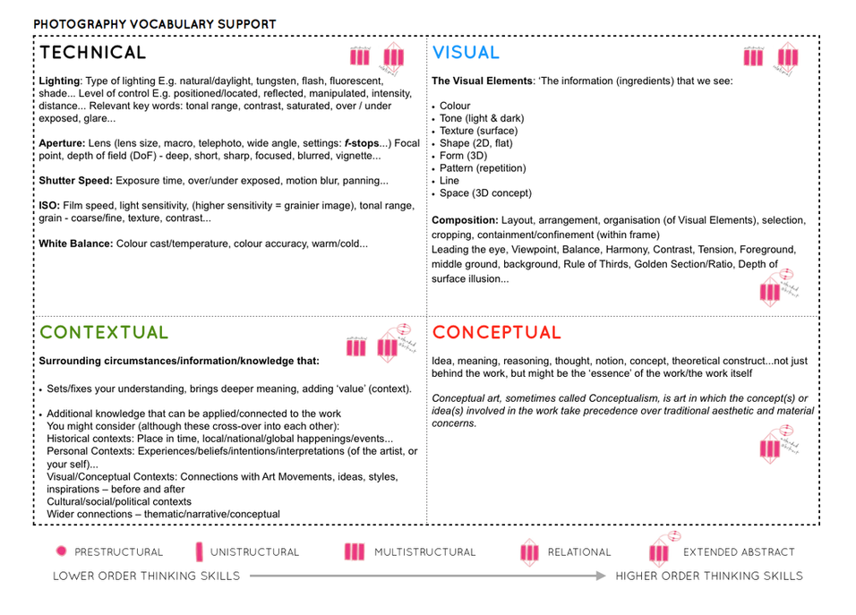
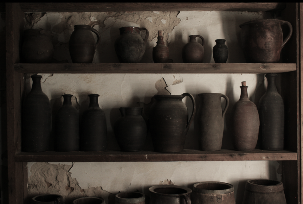
Here is a selection of before and after photos taken of Hamptonne farms exterior on our trip there
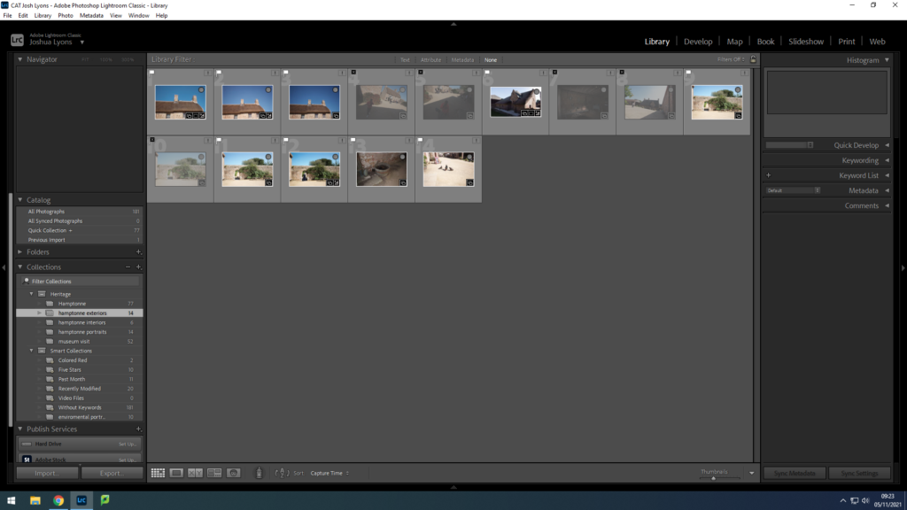
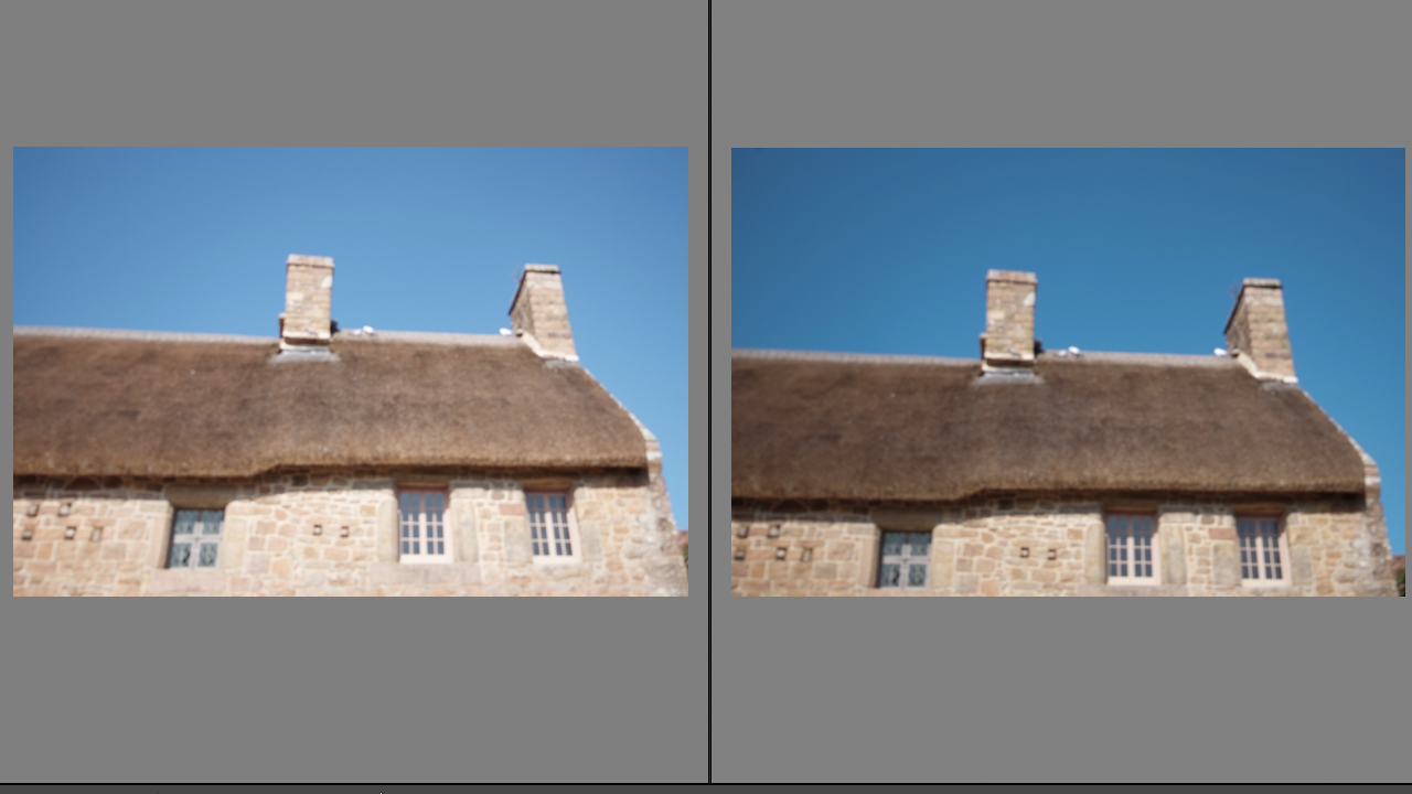
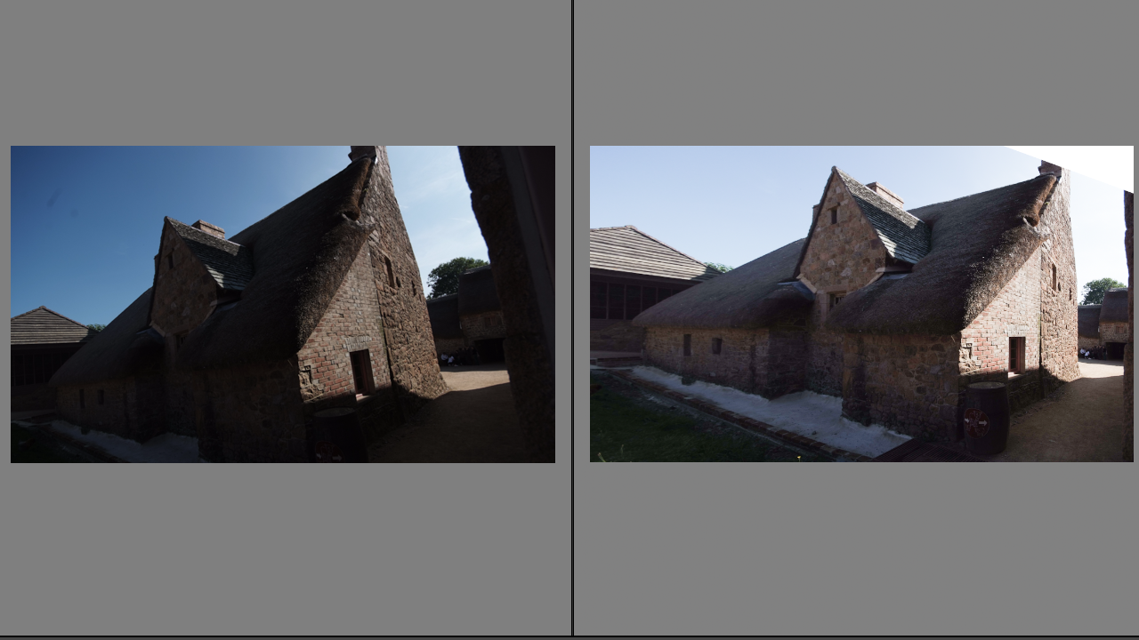
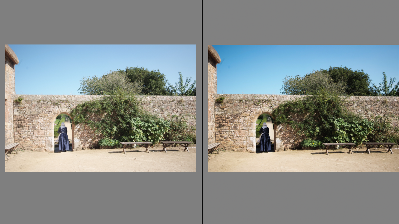
Here is a selection of before and after photos taken of Hamptonne farms exterior on our trip there


TOM KENNEDY
Tom Kennedy is a local photographer, who is influenced by the Dutch Masters paintings of the 17th century, including Rembrandt and Vermeer. His photos with living history characters focuses on using natural lighting to stay within the time periods of the characters.
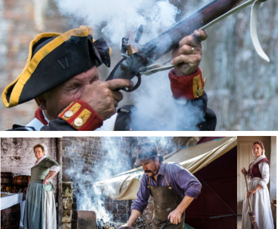
I believe my images below really make use of the natural lighting and are clearly influenced by Tom Kennedy’s work.
MY HAMPTONNE PORTRAITS
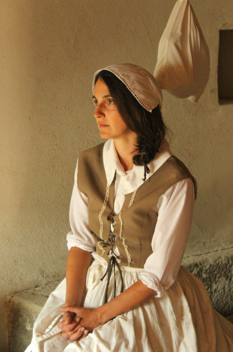
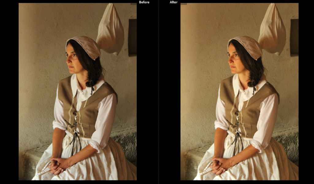

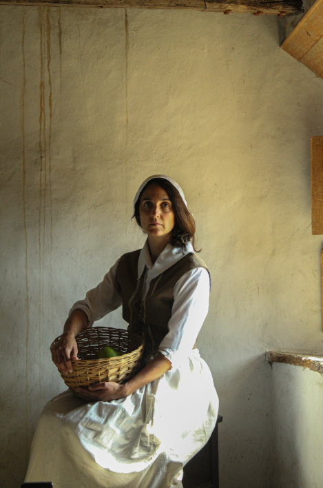
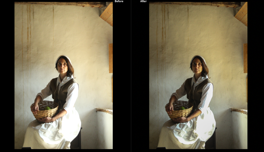
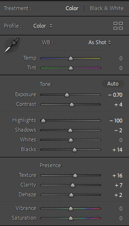
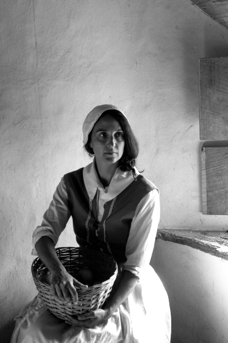
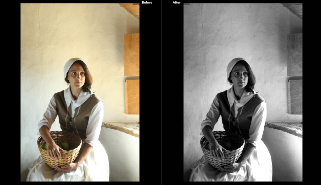
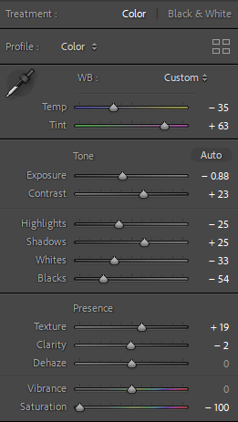
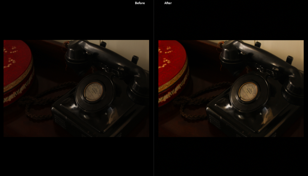
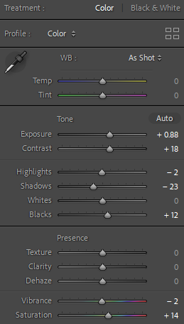
The original image appeared too dark so I turned up the exposure and saturation so the colours would really come out and look more vibrant.
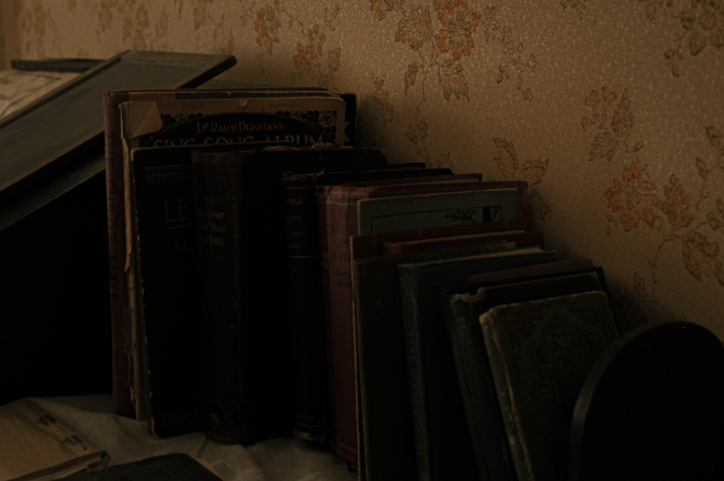
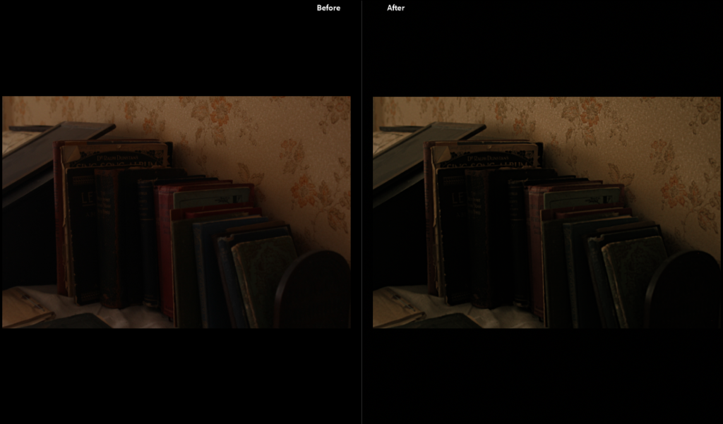
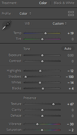
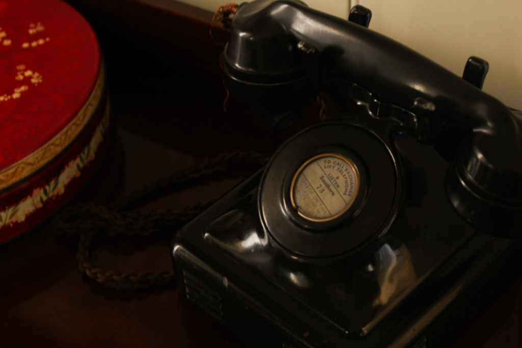
I wanted to make this image look more dulled and aged so it fits in with the theme of heritage, I turned up the temperature of the image so there would be more yellow tones as yellowing is typically associated with age.
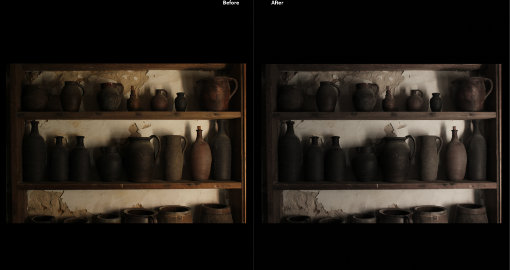
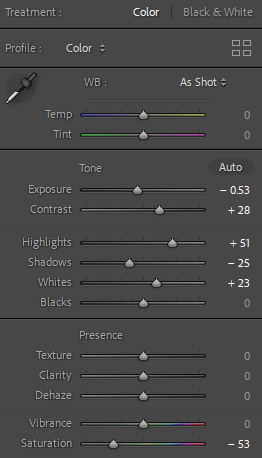
I turned down the saturation so the image would appear more monotone because I really like the shadow composition behind the pots and i wanted to bring more attention to the darkness in the image.
PLAN/FINAL OUTCOMES
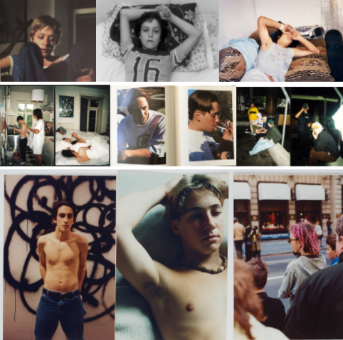
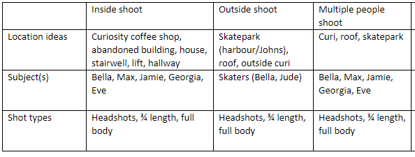
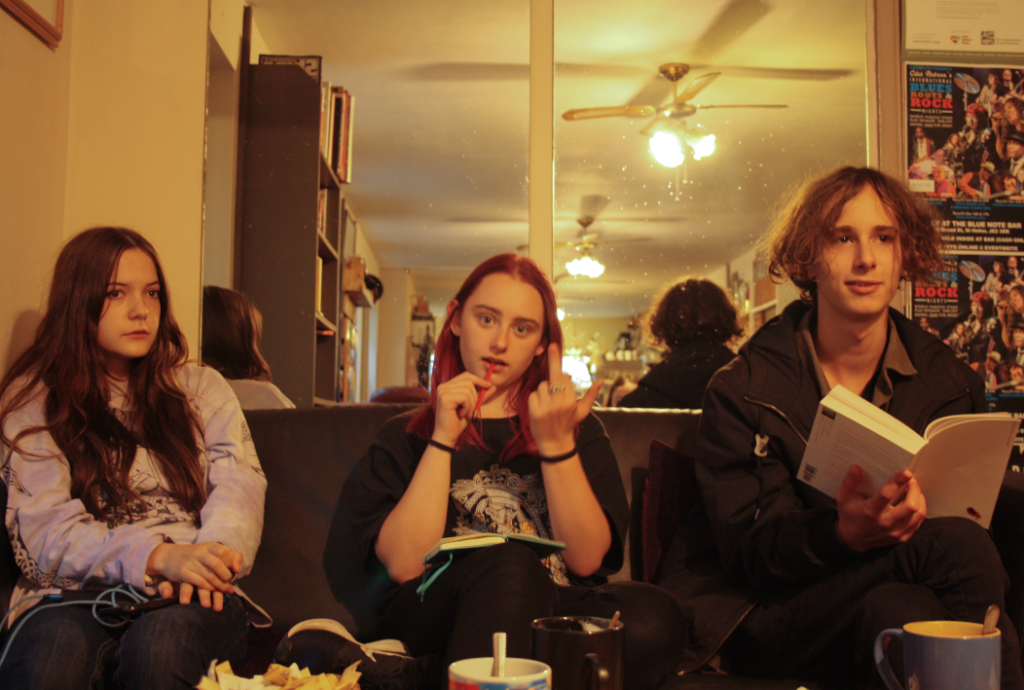
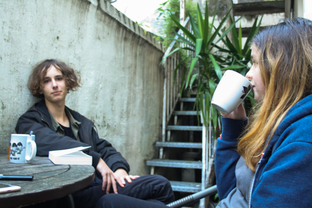
I wanted my environmental portrait images to portray youth culture in Jersey so I decided to take photos of my friends where we usually hang out- specifically being Curiosity Coffee Shop, my house/roof and St Johns skatepark.
FIRST SHOOT
MULTIPLE PEOPLE- ON ROOF/IN CURI
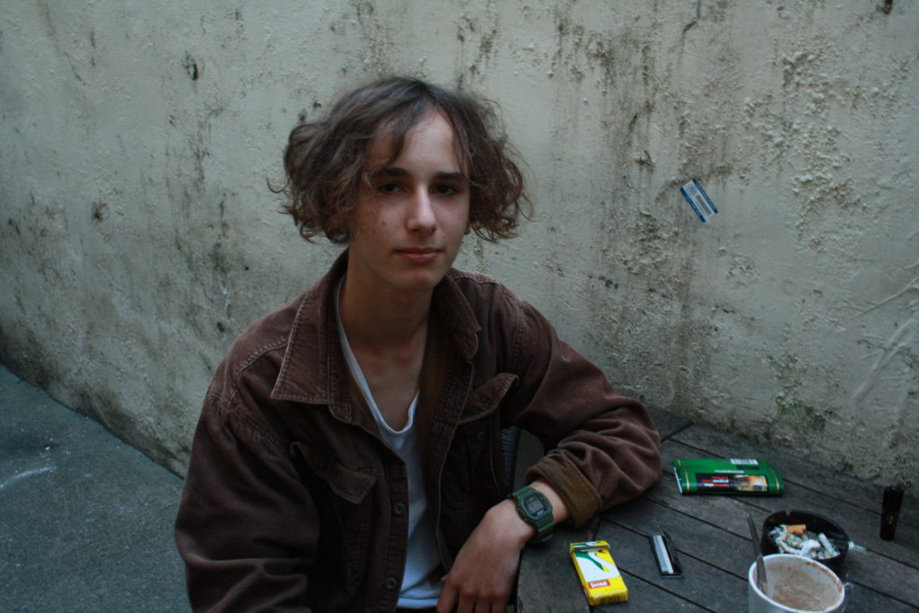
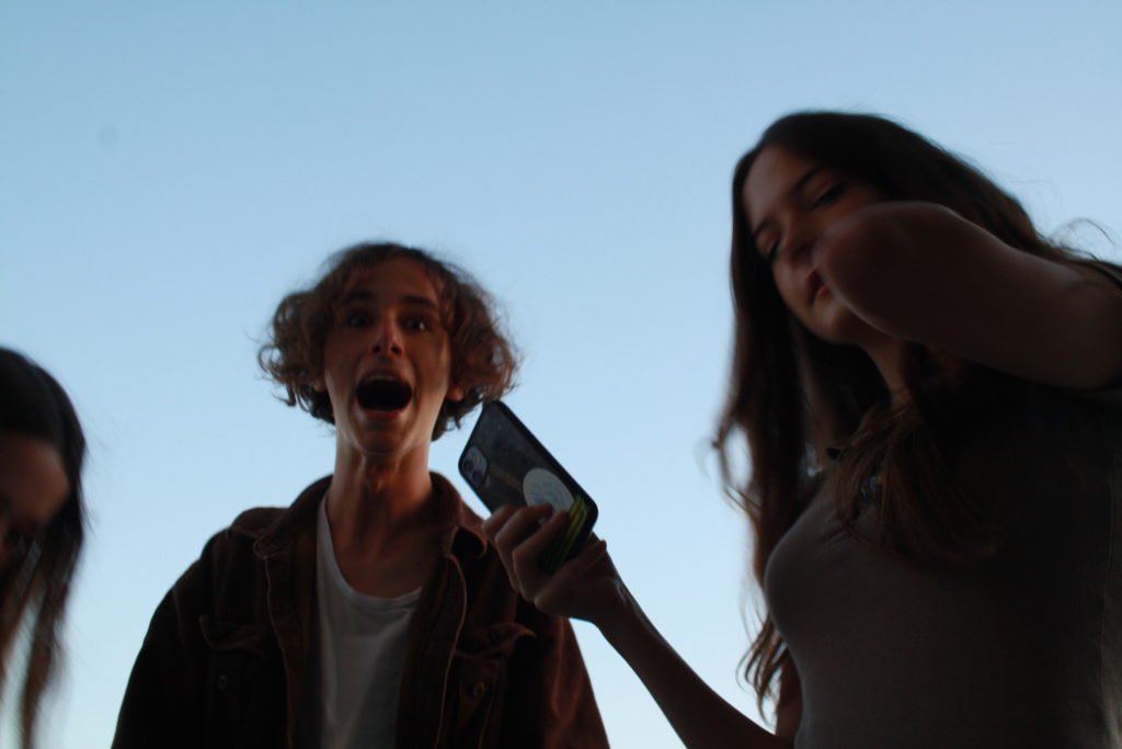
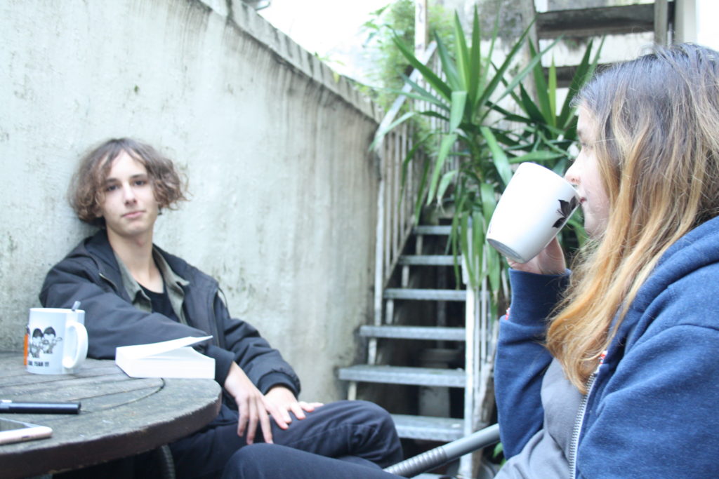
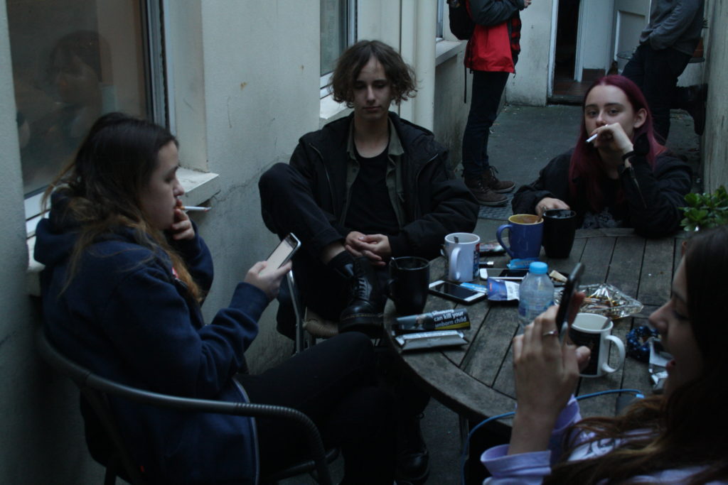
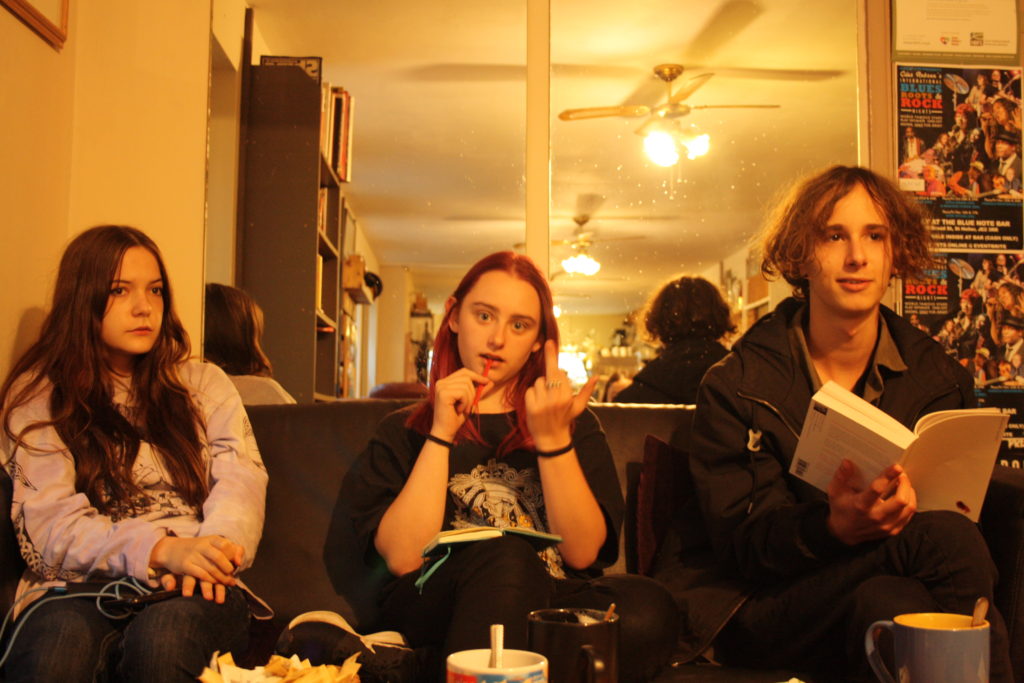
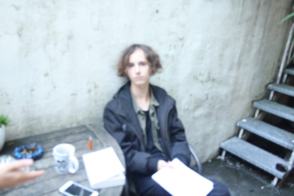
For my first photoshoot, I have selected to photograph my friends in a coffee shop/on my roof. Above I have selected some of my best photographs to create a mini gallery to illustrate my images. Furthermore, I photographed them during the mid afternoon to attempt to get the best lighting despite it being an overcast day. I believe the bottom middle and the top right images have the potential to be the best after being edited in Lightroom Classic.
FINAL EDITED IMAGES
SECOND SHOOT
OUTSIDE-IN THE SKATEPARK
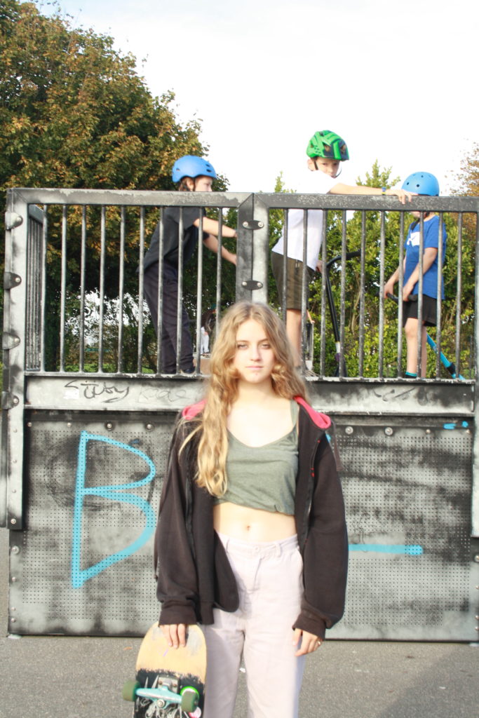
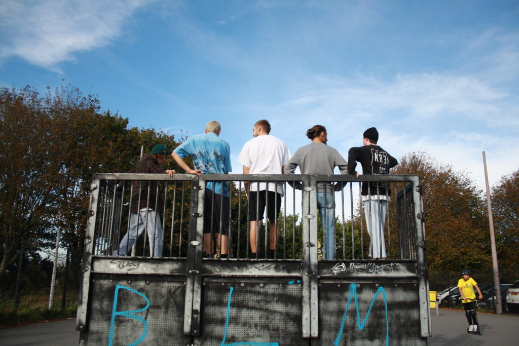
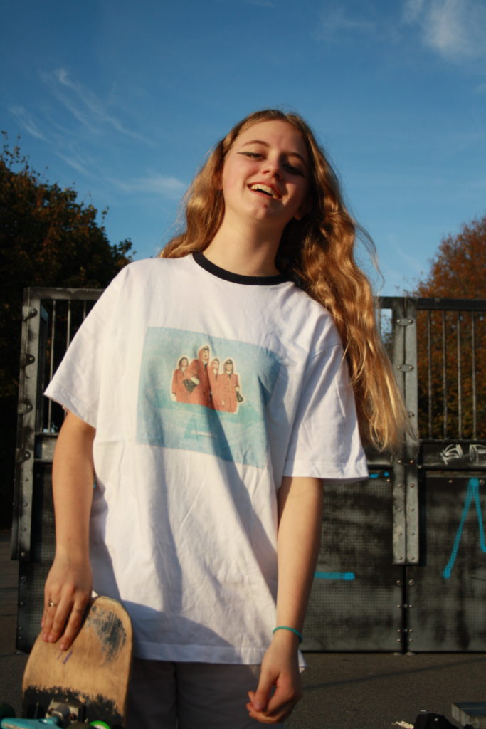
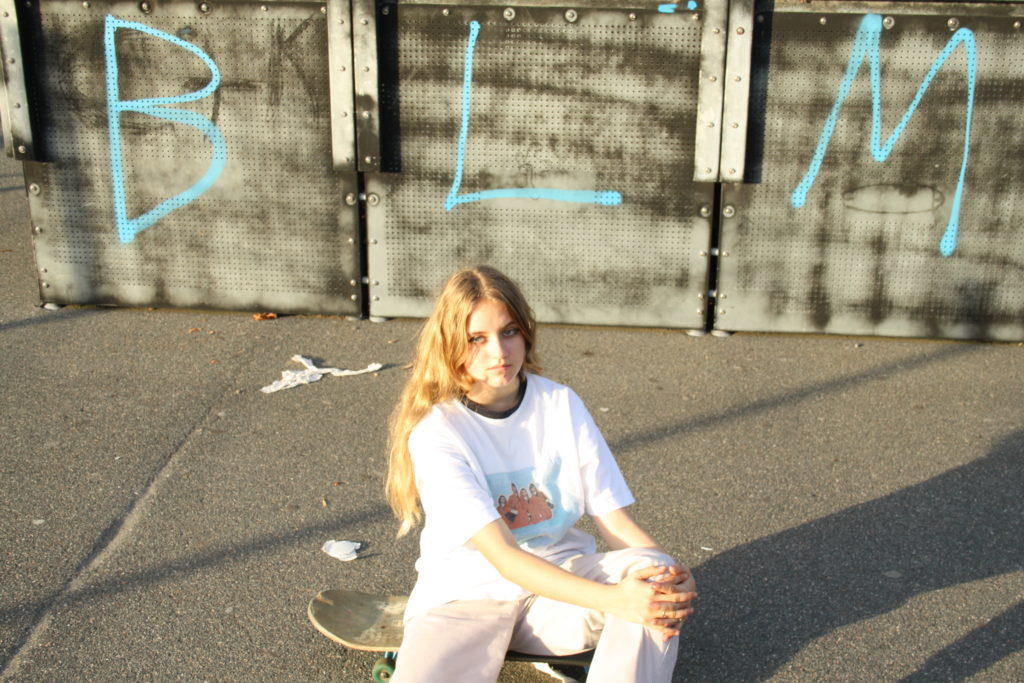
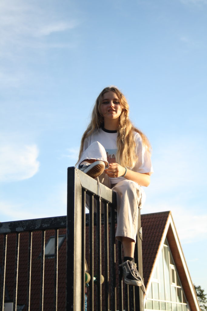
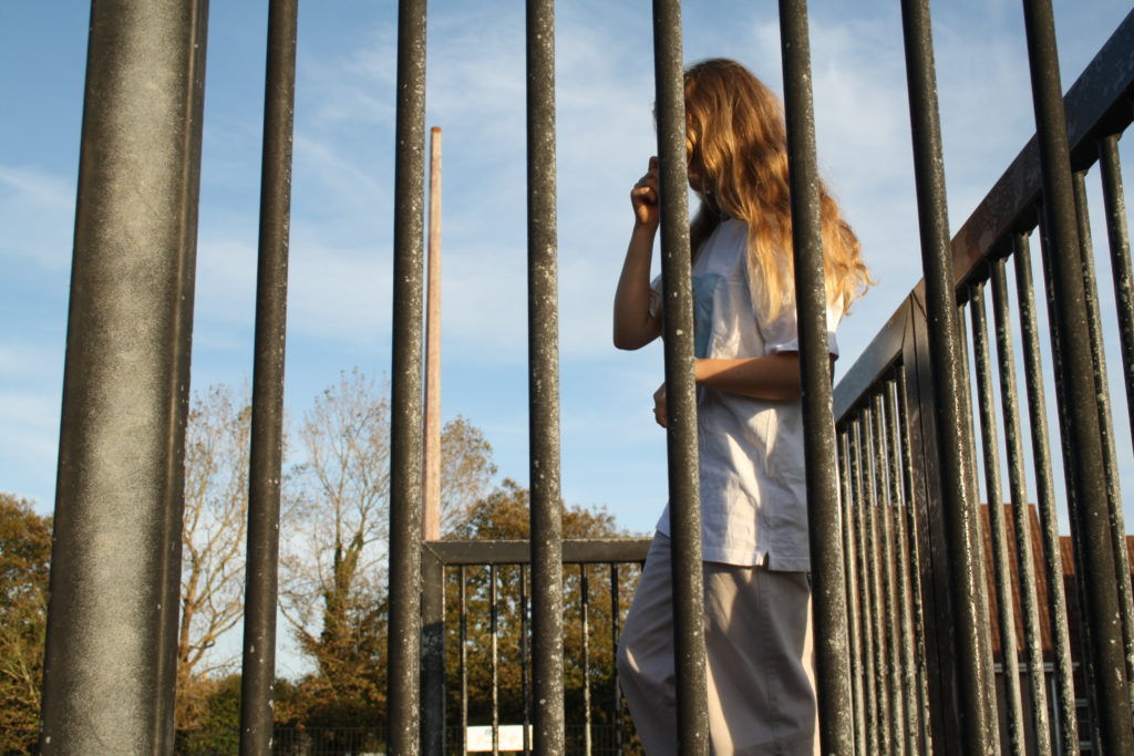
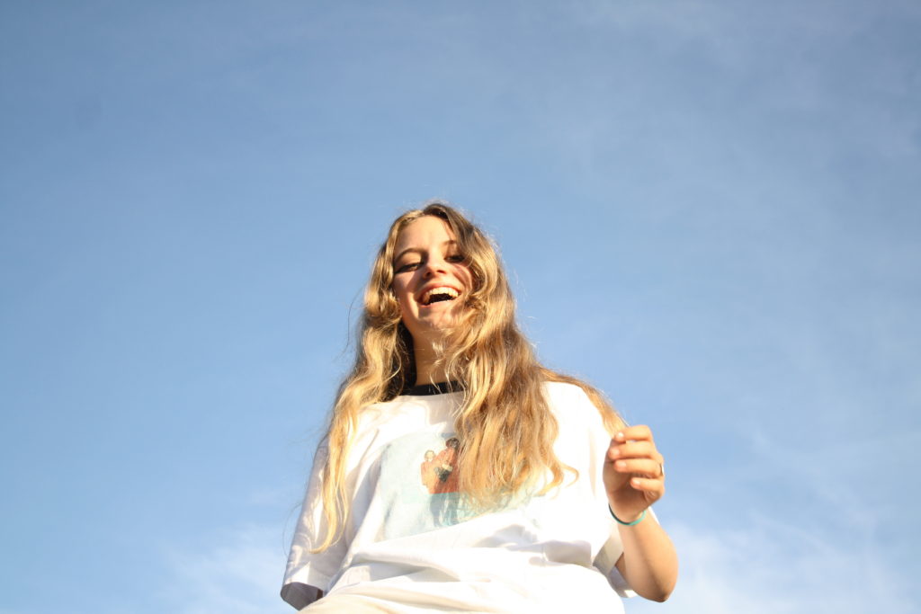
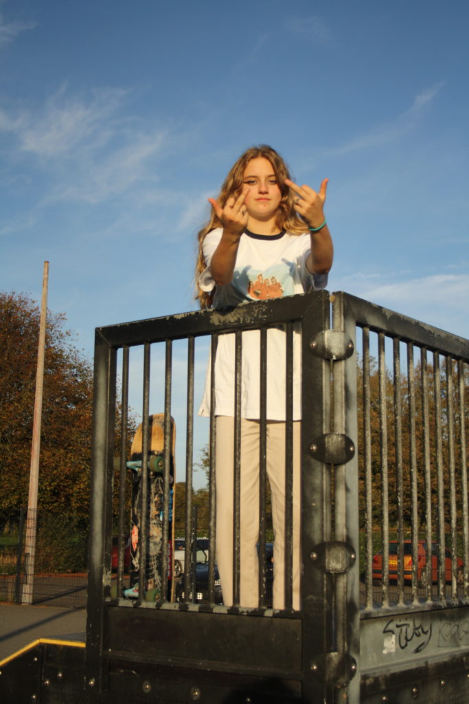
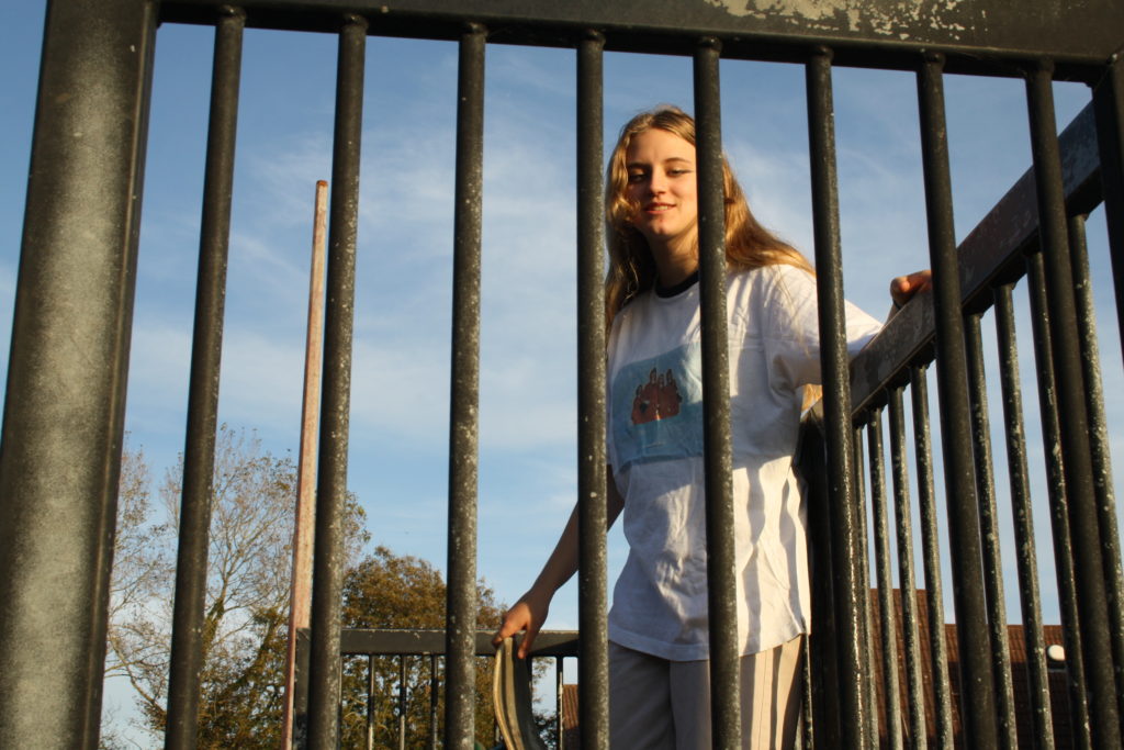
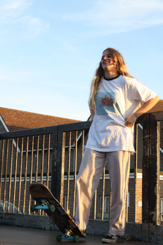
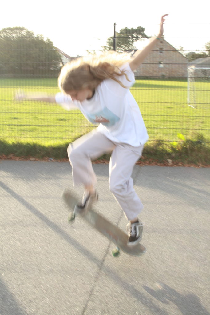
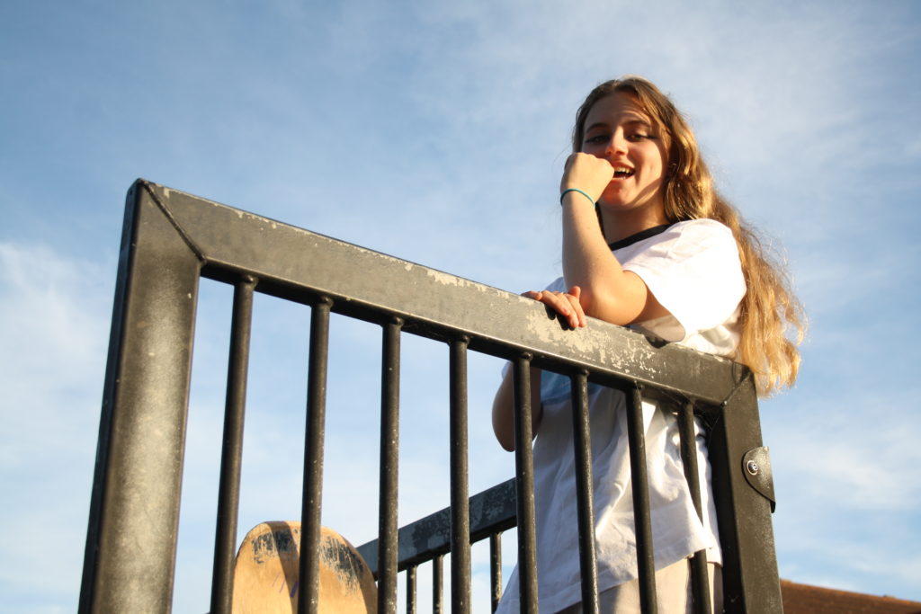
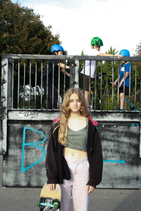
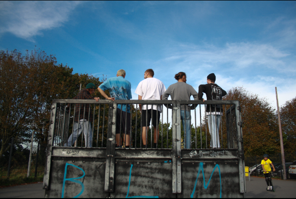
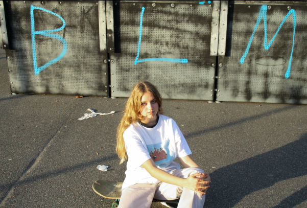
For my second photoshoot, I have photographed my friend Bella skating. I photographed Bella just before sunset to get the best lighting. Some images are overexposed as my shutter speed and IOS was too high but I hope to fix these flaws in Lightroom.
FINAL EDITED IMAGES
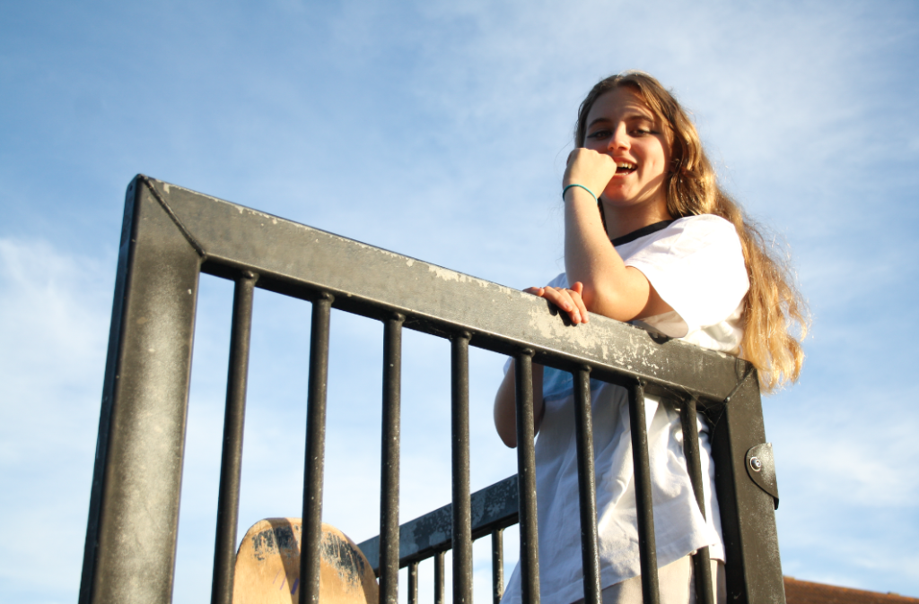
THIRD SHOOT
INSIDE- IN HOUSE/ROOF/STAIRWELL/LIFT
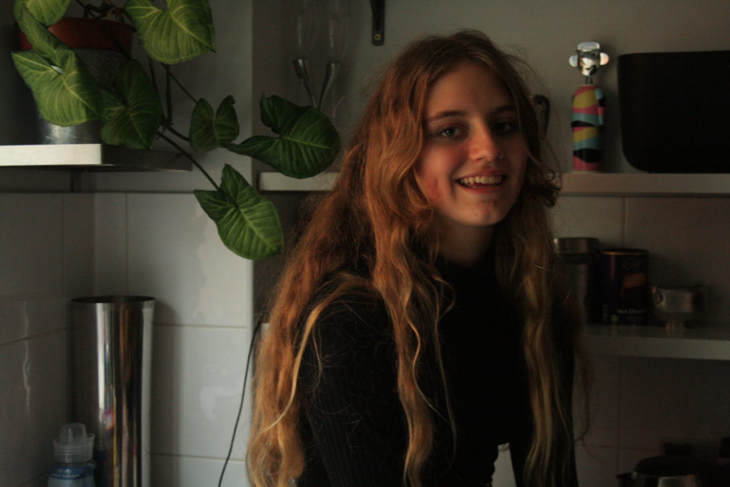
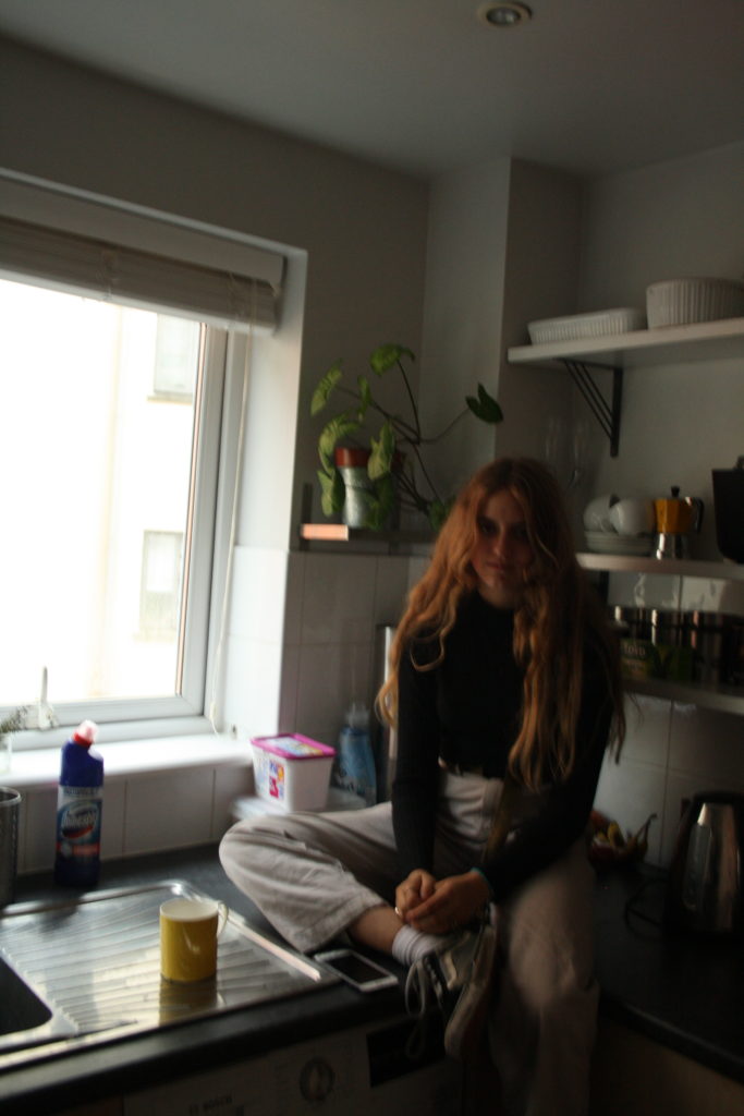
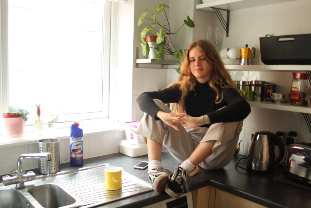
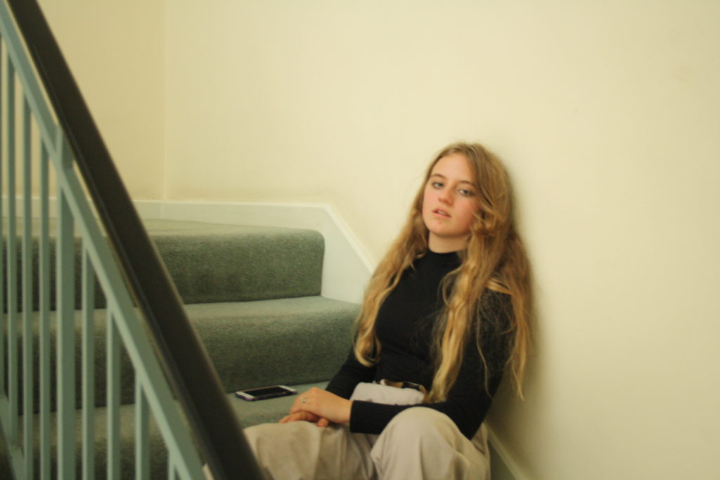
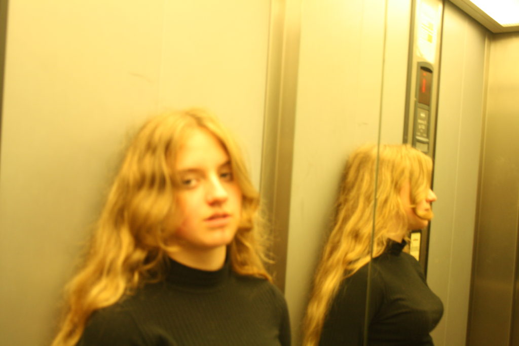
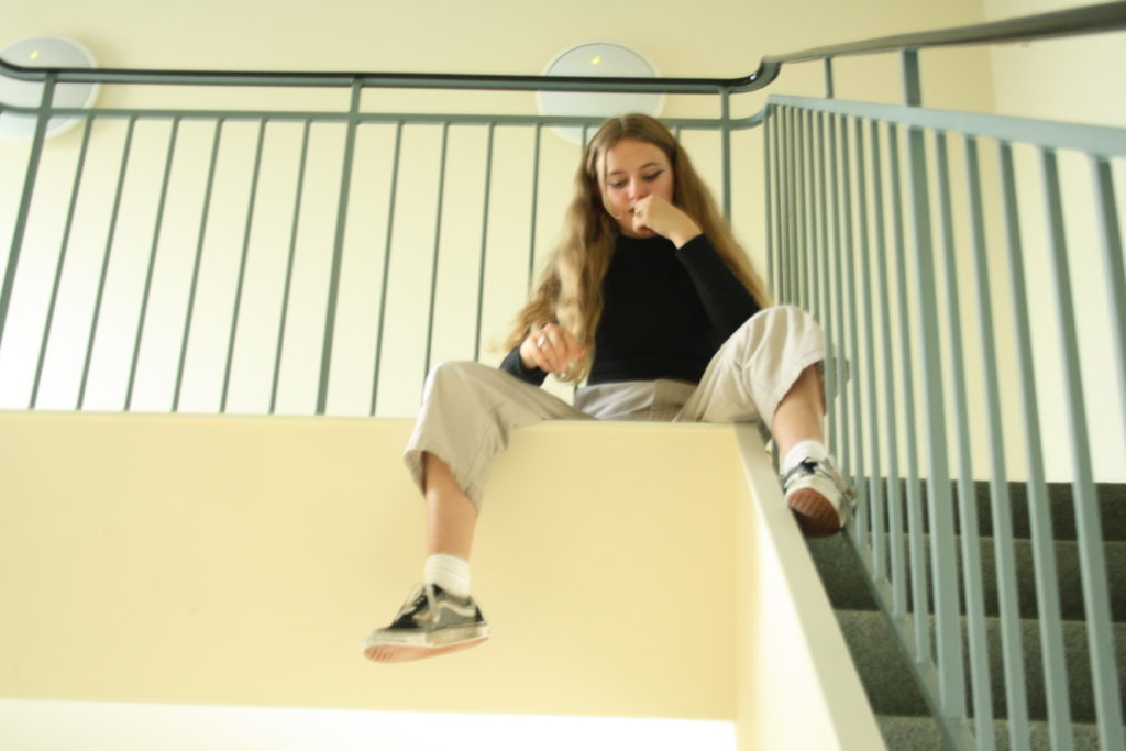
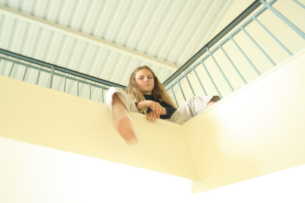
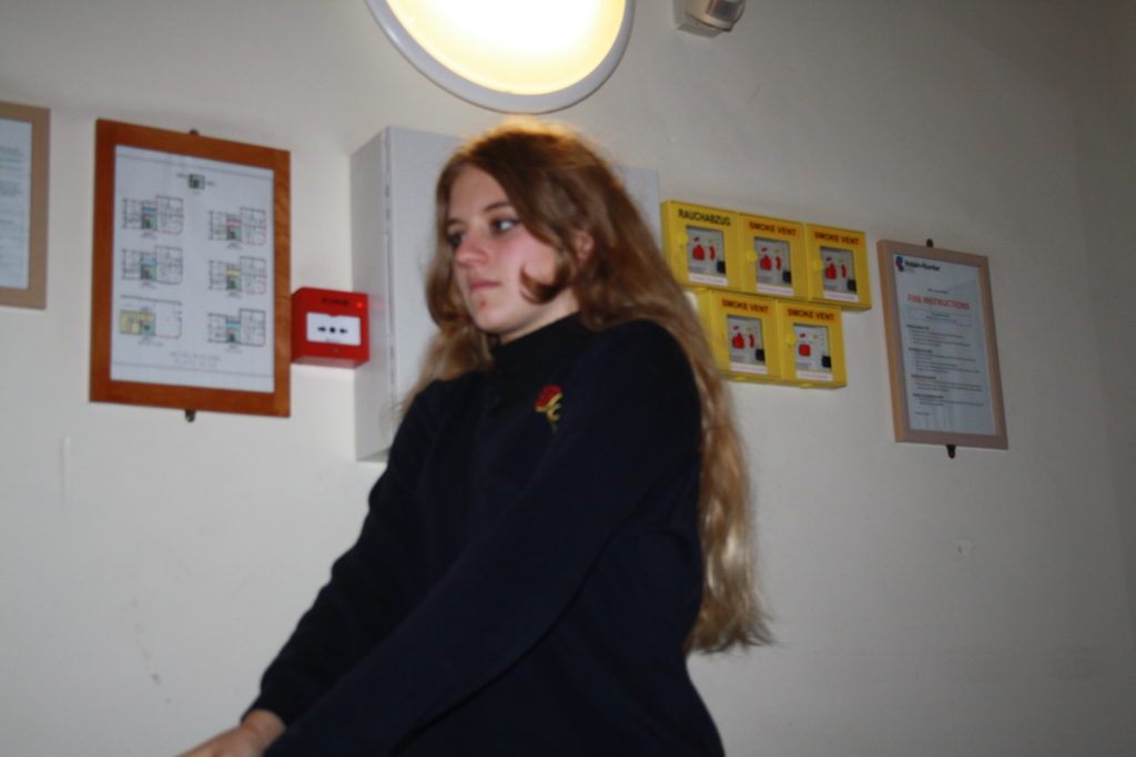
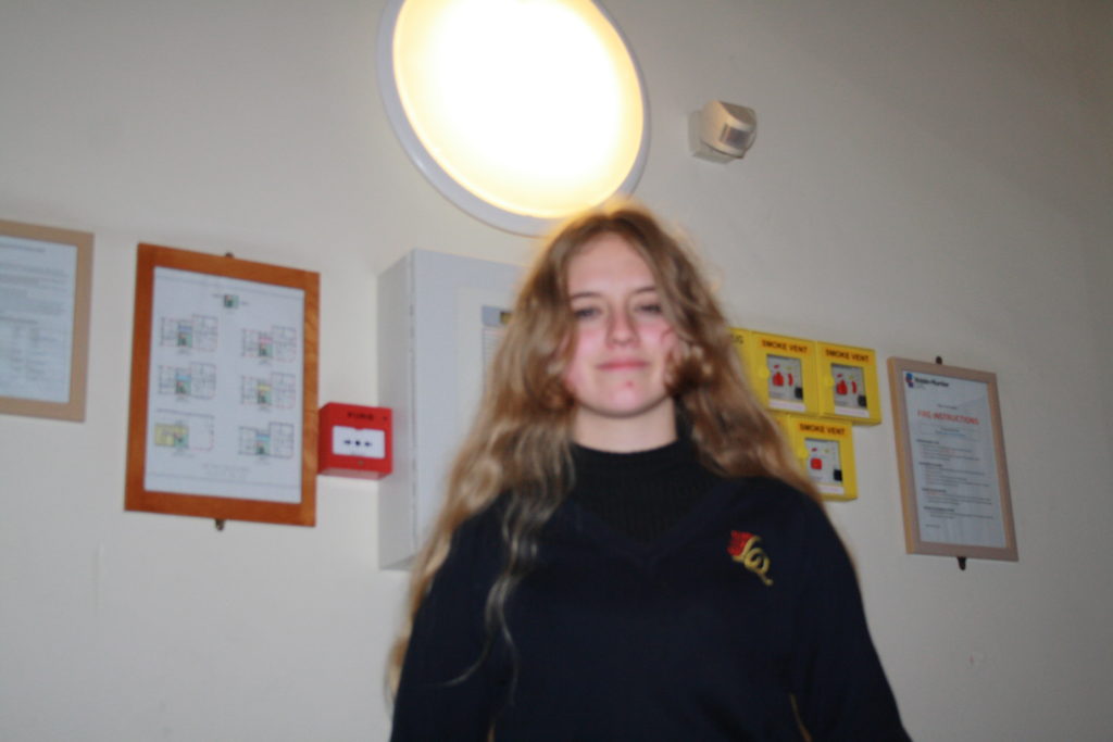
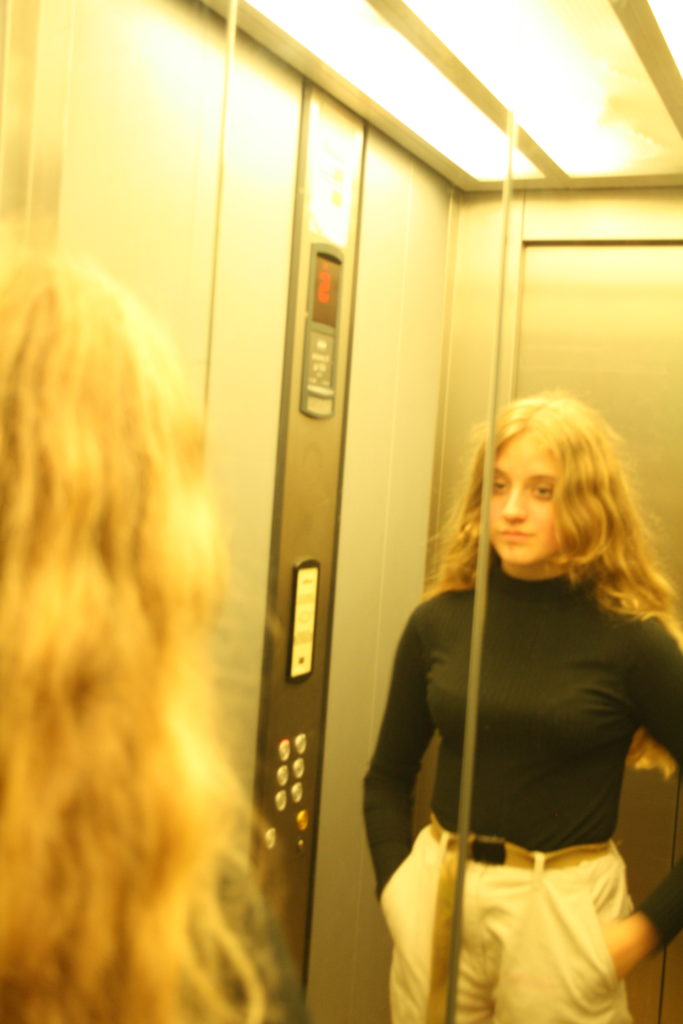
My third and final photoshoot includes images of Bella in my kitchen, sitting in my stairwell and in the lift. In my kitchen and the stairwell the lighting was mostly natural but in the lift the lighting was artificial, leading to a yellow ambient glow. My favourite images include the first two on the second row as I believe they look most inspired by Larry Clark (click here for blog post describing inspirations).
FINAL EDITED PICTURES

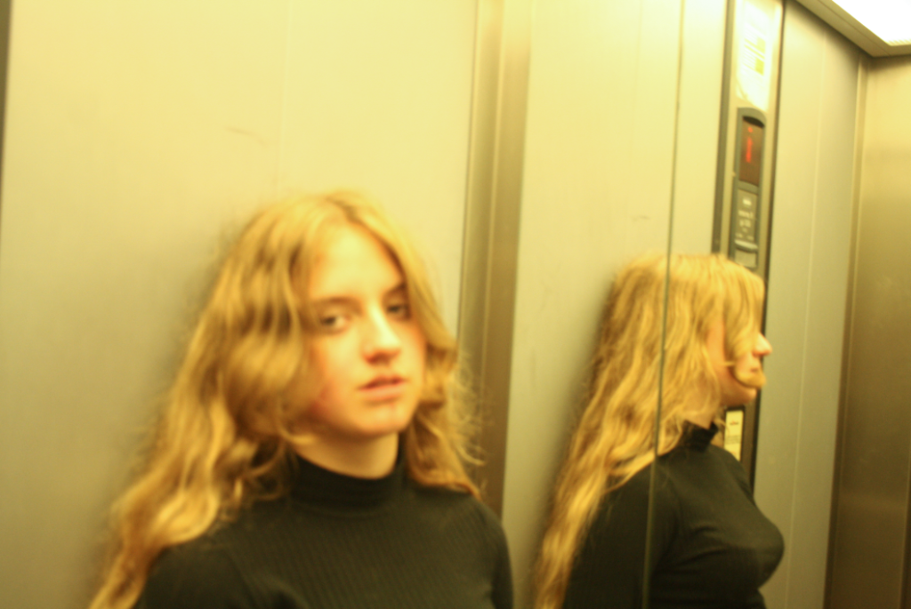
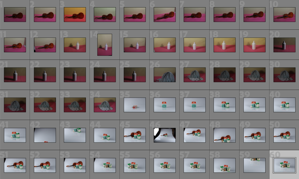
Throughout these photoshoots, the main goal was to keep the objects in centre frame and decently well lit with little to no shadows which ended up being quite a struggle when using the soft box lights as we were using 2 lights that created 2 different shadows, leading us to move them around in order to try minimize/redirect the shadows. I didn’t want many shadows so I wouldn’t have to edit them out later which would’ve made it more difficult to combine the photos together later on.
Editing My Photos: Harvey-Regan
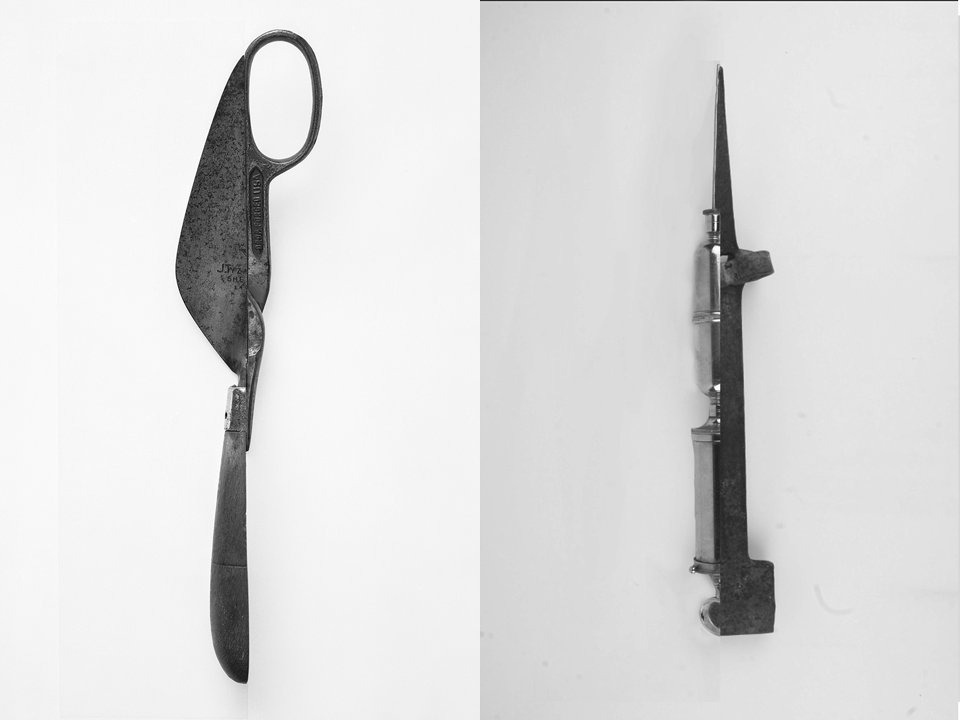
These edits were inspired by Darren Harvey-Regan’s splicing project. I tried to use my photos in order to recreate Harvey-Regan’s work by choosing photos that I thought would work well together and used photoshop in order to edit them together.
——– Edit 1: ———————————–
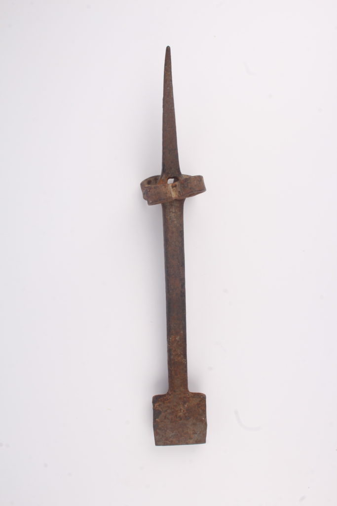
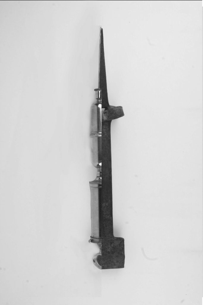
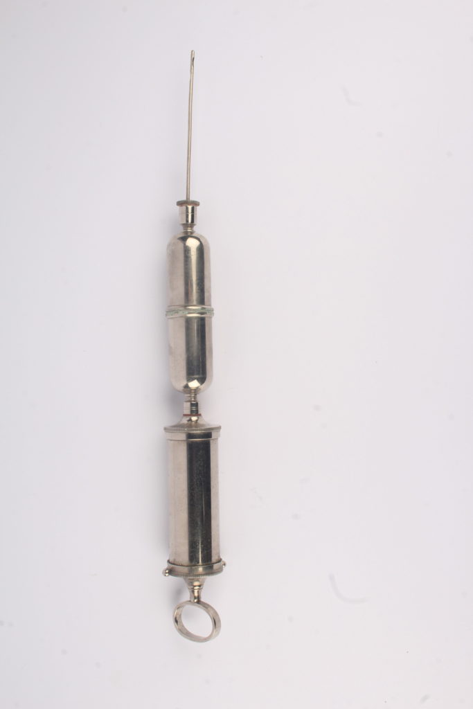
In this edit, I tried to Harvey-Regan’s splices by including many elements of his work such as the sharp edges between the two different images, the white background and making the black and white image in order to get a deeper understanding of his work style.
——– Edit 2: ———————————–
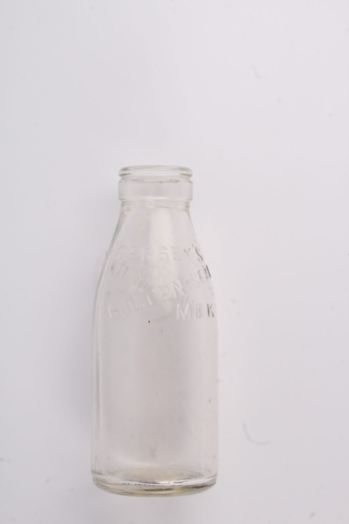
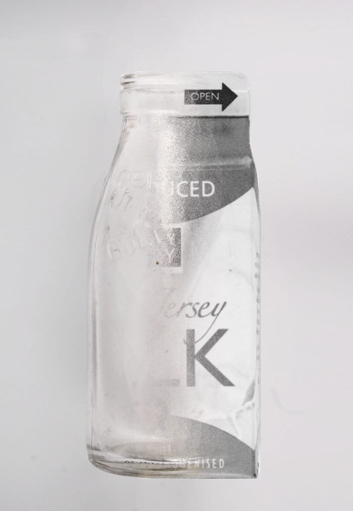
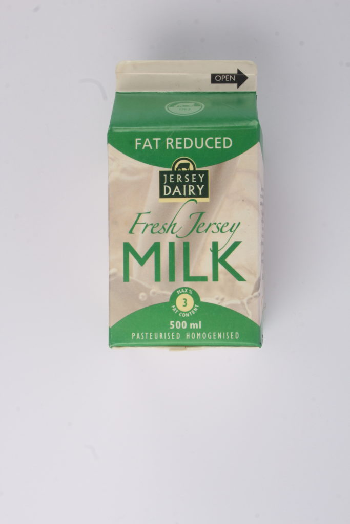
In this edit, I decided that I wanted to try blend the two images together instead of keeping Harvey-Regan’s sharp edge as I wanted to experiment with what I could do in order to merge his editing style with my own. I like this edit more than the first as I think both images work well with each other and I’ve managed to get them to merge together without recreating Harvey-Regan’s style completely.
Editing My Photos:
After experimenting with Harvey-Regan’s style, I decided to use some elements of his work with my own style in order to create edits that loosely resembled his work.
——– Edit 3: ———————————–
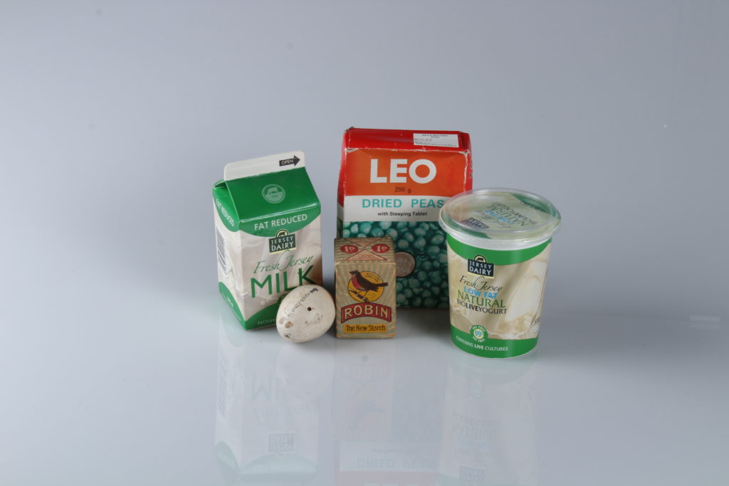
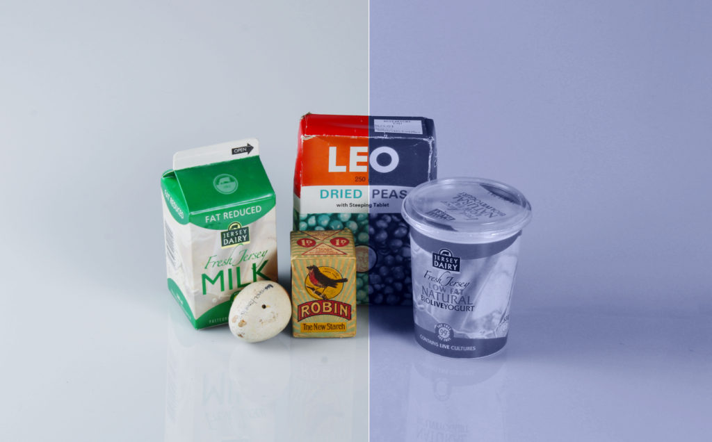
I decided that I was going to start by experimenting with colour in order to see what I could do in order to manipulate the photo as there was a lot of objects in this photo, making it difficult to splice with another. Although it’s not my best edit, I think it still looks interesting as the blue tone from the right side of the image contrasts with the colours from the left side, creating two different moods in a single image.
——– Edit 4: ———————————–
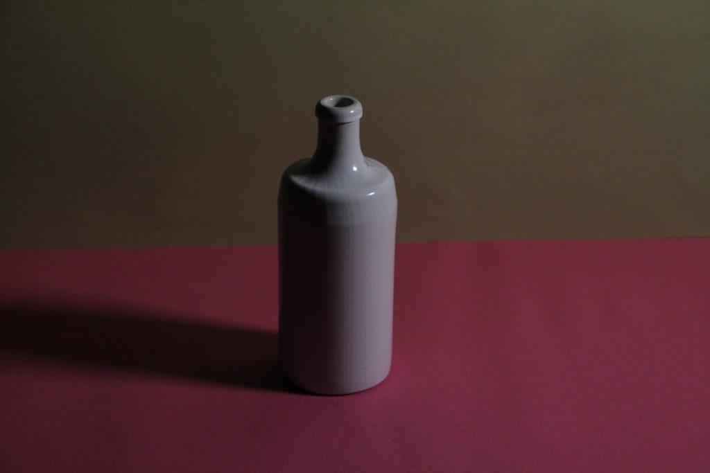
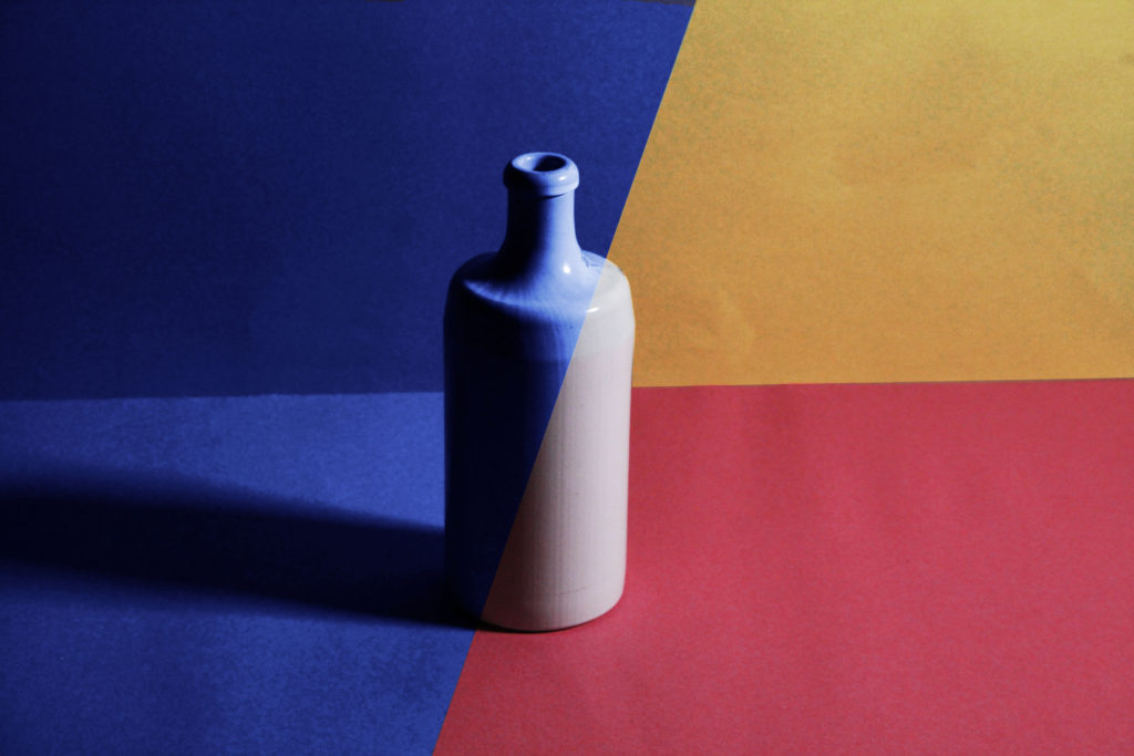
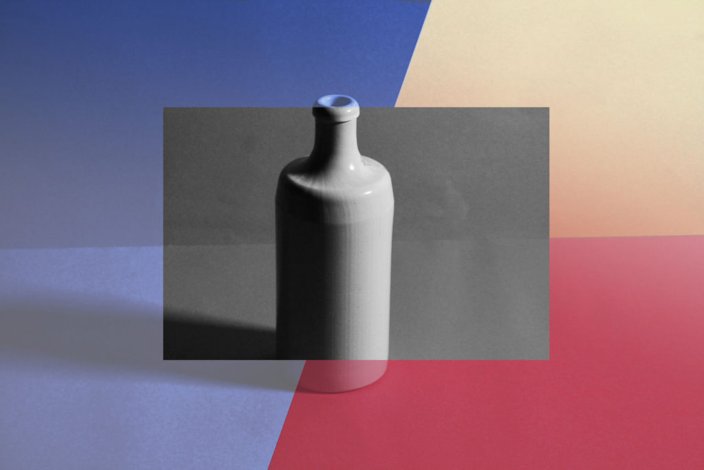
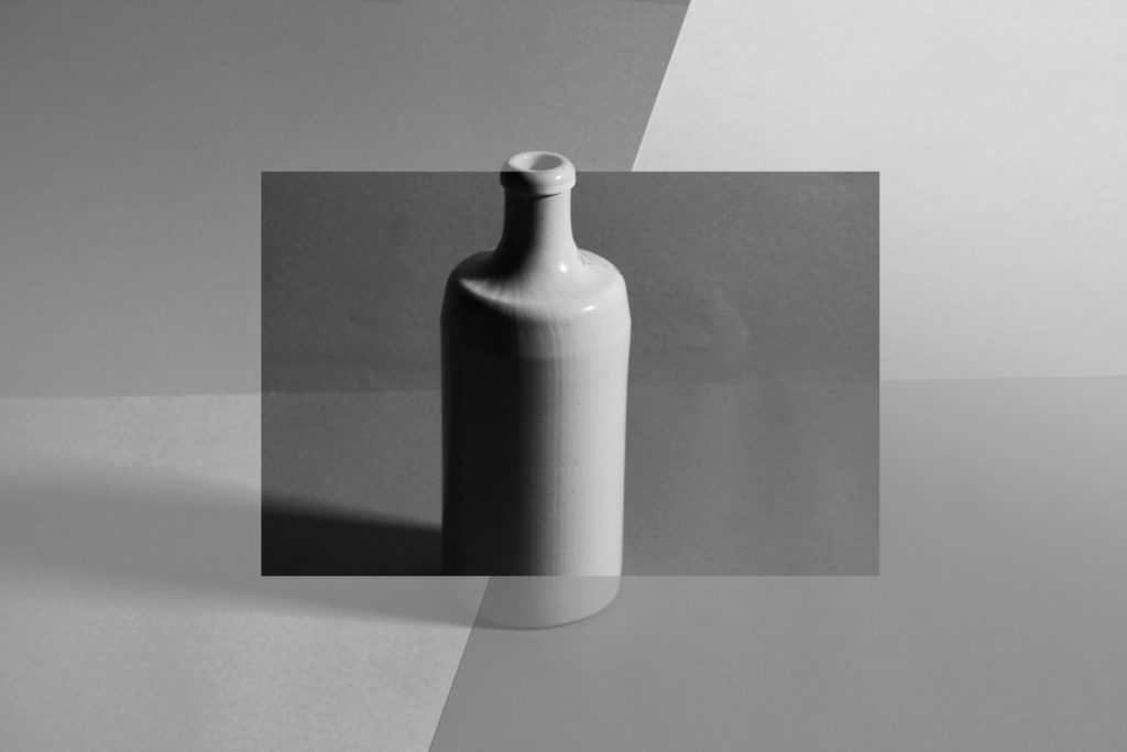
For this image, I created 3 edits as I couldn’t decide which one I liked the most as I liked different aspects of each: the simplicity of the first, the business of the second and the blandness of the third. Overall, I liked having multiple colours in one photo rather than taking 2 different images and montaging them together into a single image.
——– Edit 5: ———————————–
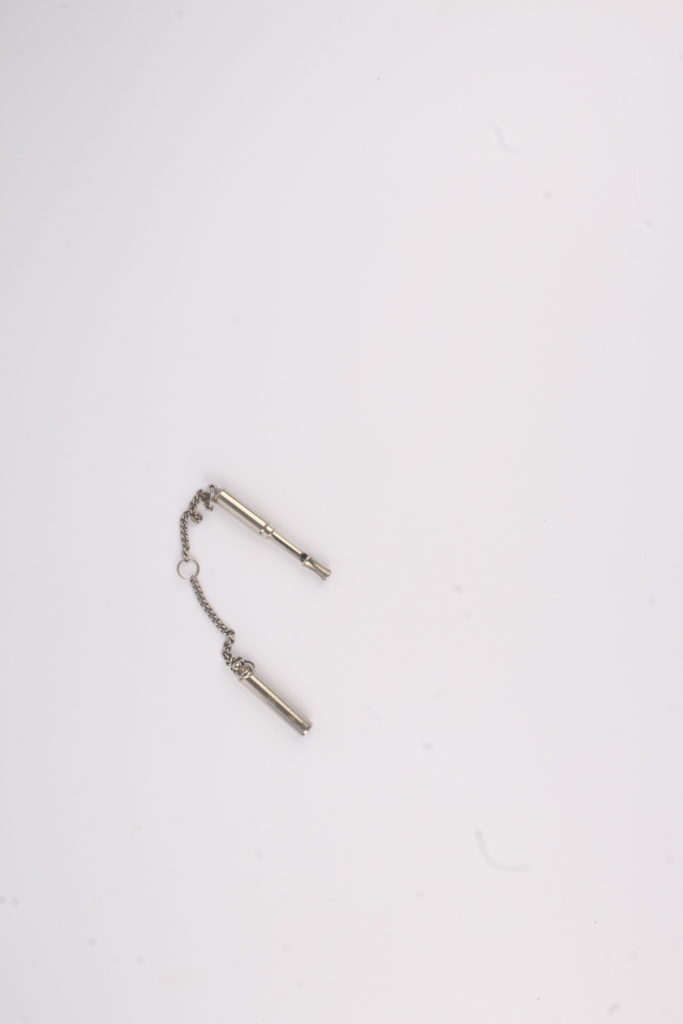
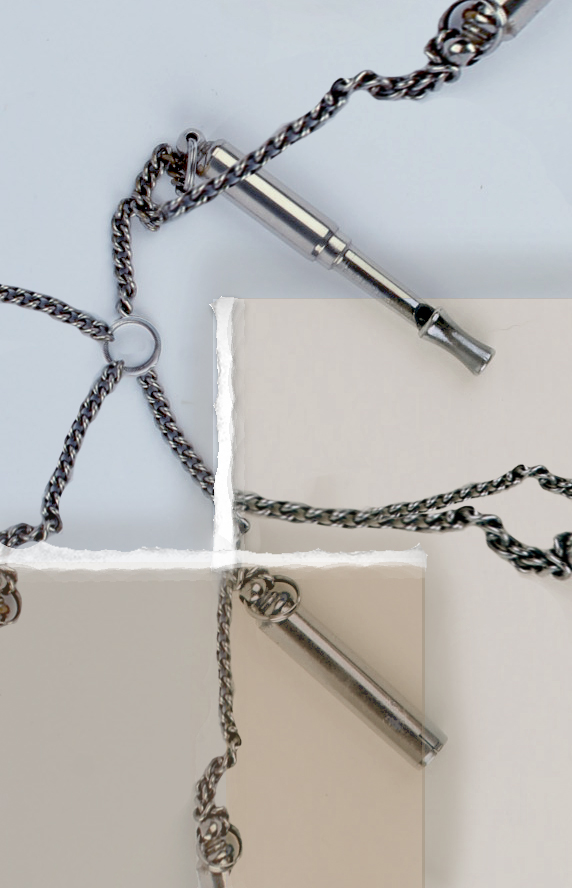
Whilst editing this image, I knew I needed to make it busier as the whistle was quite small compared to the background so I started by cropping the image, making it easier to see the whistle then copy and pasted part of the whistle’s chain around the image in order to make the image look more interesting. I then added 2 squares as I wanted to add more colour and depth into the image, later adding some white to the edges to add texture to the edge of each box, making them look like torn paper. Finally, I added some subtle shadows by the squares edges to make the image look slightly more realistic and add depth.
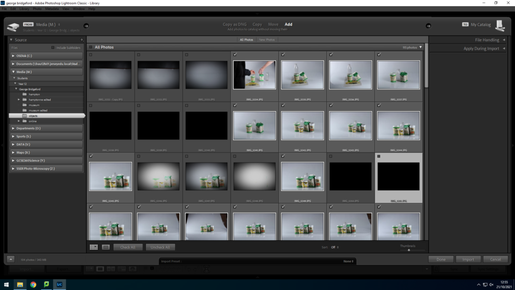
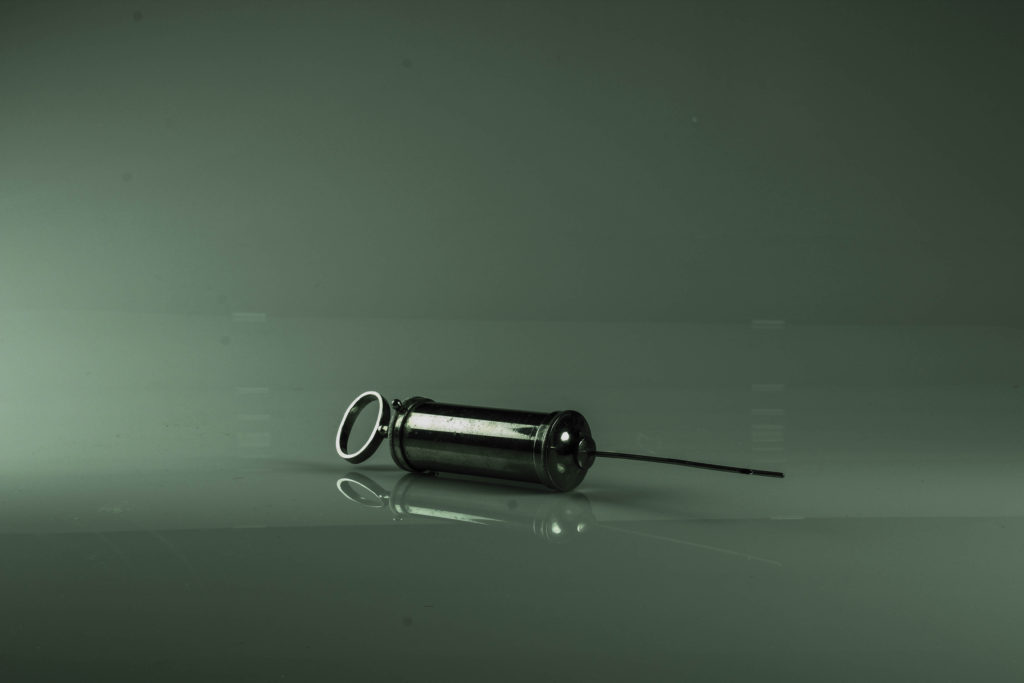
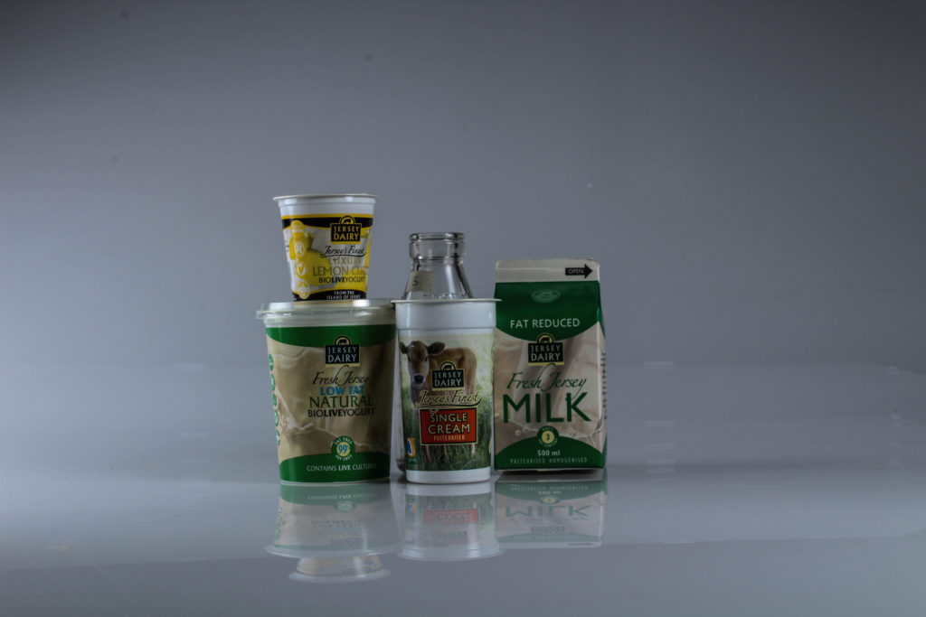
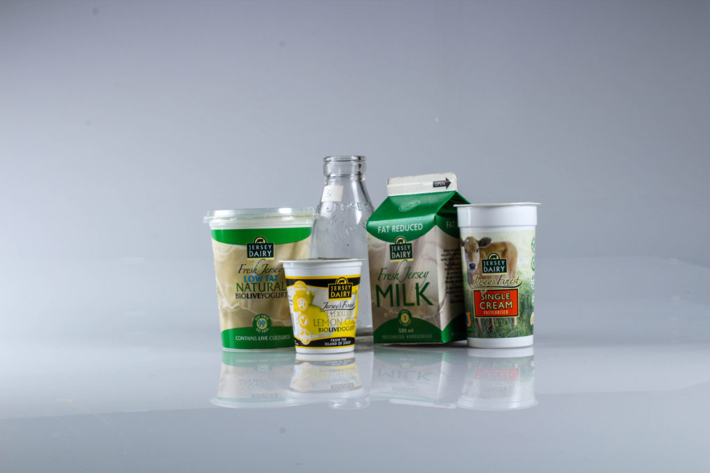
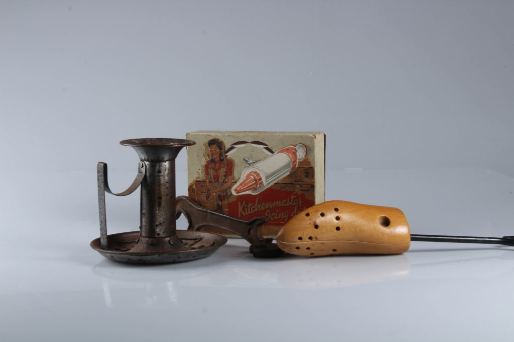
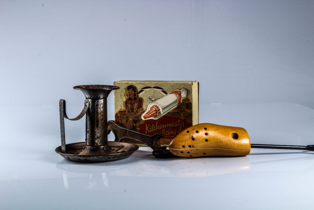
We used products given to us by Hamptonne which represented Jersey’s heritage in some way
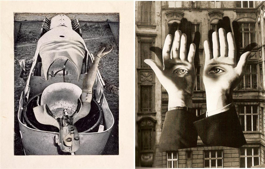

Dada photomontage
Photomontage is often used as a means of expressing political dissent. It was first used as a technique by the Dadaists in 1915 in their protests against the First World War.
Photomontage first emerged in the mid-1850s as experimental photographers aspired to create images that could rank alongside fine art. The idea of the composite image was thought to have been first proposed by the French photographer Hippolyte Bayard who wanted to produce a balanced image in which the subject was superimposed on a background that brought the two together in an idealized setting. Since a photograph was regarded as the record of truth, however, his approach attracted controversy amongst the photographic community who did not warm to the blatant misrepresentation of reality.
The first commercial photomontages were produced during the mid-Victorian era when the practice was given the name “combination printing” by Oscar Gustave Rejlander, a self-appointed artist in this new field. Rejlander started working in portraiture, but he also created notorious “erotic” artworks featuring circus models and child prostitutes. His famous Two Ways of Life (1857) combined over thirty images in a single photograph to create a moralistic allegory contrasting a life of sin with one of virtue. Showing two boys being offered guidance by the patriarch, the print initially caused controversy for its partial nudity. That objection notwithstanding, the print was a success and helped secure Rejlander’s admission into the Royal Photographic Society of London.
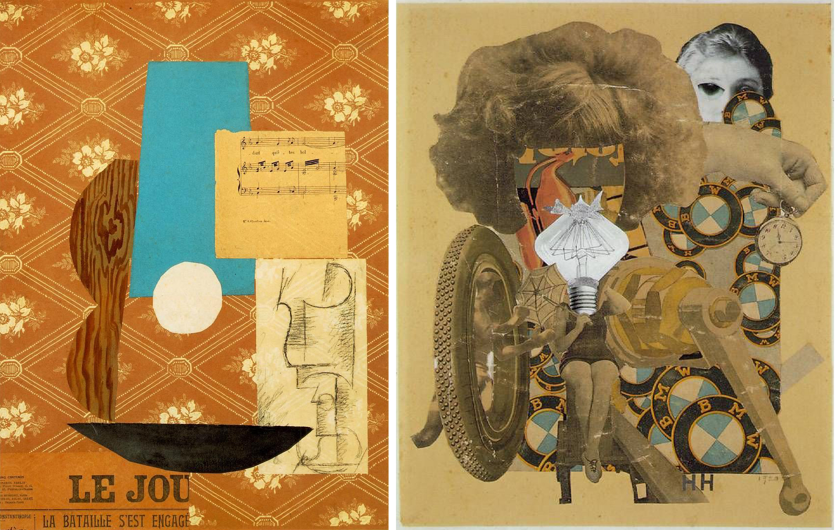
Dada artists are usually credited with pioneering the use of “non-narrative” photomontage. (Not without a little conceit) George Grosz reflected that “When John Heartfield and I invented photomontage in my South End studio at five o’clock on a May morning in 1916, neither of us had any inkling of its great possibilities, nor of the thorny yet successful road it was to take”. Hannah Höch, meanwhile, explained how she and her partner Raoul Hausmann came to adopt the idea, not from Heartfield or Grosz, but “from a trick of the official photographers of the Prussian army regiments [who] used to have elaborate oleo-lithographed mounts, representing a group of uniformed men with a barracks or a landscape in the background then inserted photographic portraits of the faces of their customers, generally coloring them later by hand”. Though these commercial efforts were intended to create a seamless illusion, Höch used the technique rather to draw attention to the absurdities and inequalities of modern German society.
Photomontage would become a dominant technique within the Berlin Dada movement, redefining the very role of the modern artist (as the Dadaists saw it at least). As Raoul Hausmann said, “We called [the] process ‘photomontage,’ because it embodied our refusal to play the part of the artist. We regarded ourselves as engineers, and our work as construction: we assembled our work, like a fitter”. The art critic Brian Dillon added that the technique established “the aesthetic of liberation, revolution, protest And in the hands of these artists it became intensely ideological, a defence in times of tyranny and a weapon against injustice”.
Constructivism
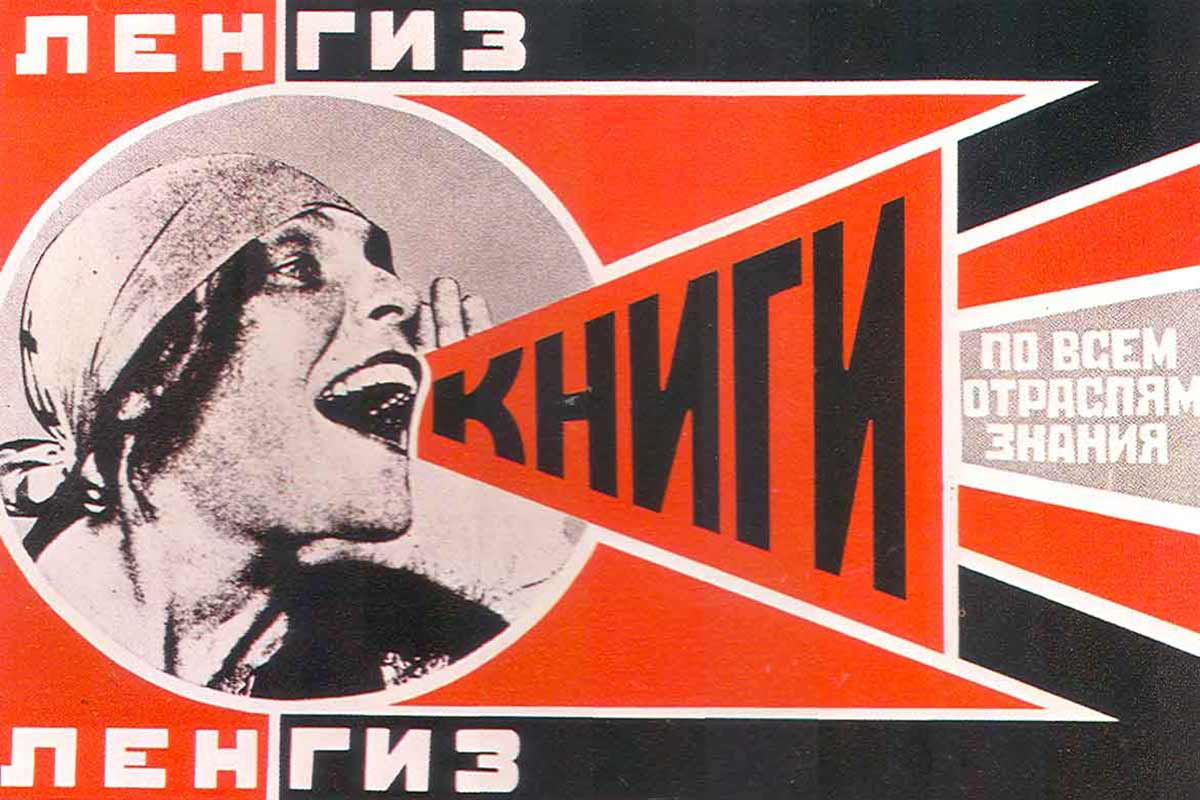


The idea of photographic formalism was the central tenet of Constructivism, and as art historian Craig Buckley remarked, while the “beginnings of avant-garde photomontage are commonly traced back to the context of Berlin Dada after World War I the technique was adopted almost simultaneously by constructivist artists and filmmakers in the Soviet Union”.
El Lissitzky, Alexander Rodchenko, Gustav Klutis, Valentina Kulagina, and Varvara Stepanova (who defined photomontage in 1928 as “the assemblage of the expressive elements from individual photographs”) created photomontages that synthesized images with graphic design to support the Russian Revolution and the new Soviet Government. Constructivist works were inherently propagandist, as exemplified in Rodchenko’s posters which, with their bold colours and dynamic geometric design, transformed the art of graphic design into something revolutionary. El Lissitzky’s photomontages, which combined his photographs in multi-layered compositions, exemplified a more aesthetic Constructivist approach, while also influencing the New Vision movement, Bauhaus photography, and prominent artists such as László Moholy-Nagy.
Surrealism montage
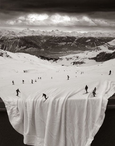

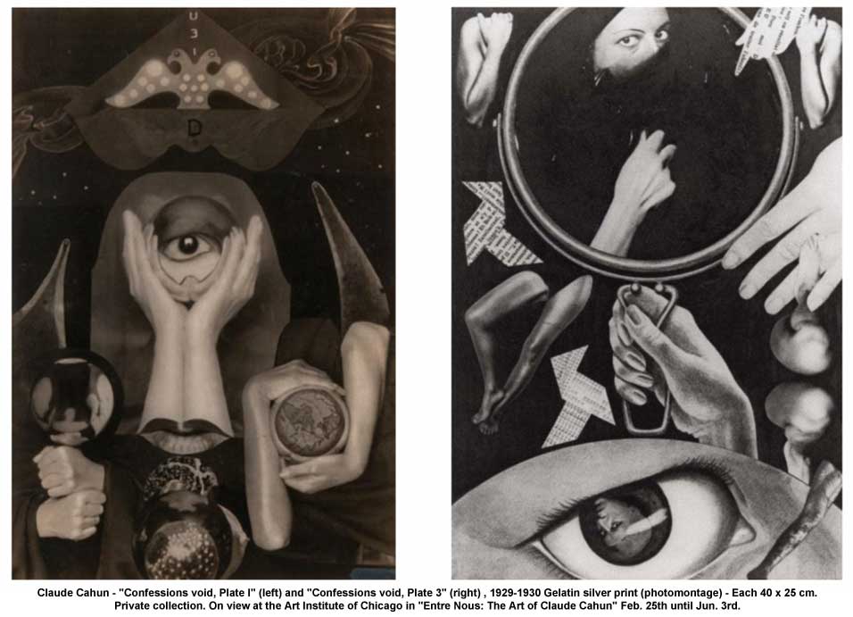
Surrealism montage
Photomontage was valued amongst Surrealists for its ability to create uncanny scenarios that disturbed and provoked by probing the human subconscious. Former Dada artists, such as Max Ernst, carried the technique over into the new movement. Ernst described photomontage as “the systematic exploitation of the accidentally or artificially provoked encounter of two or more foreign realities on a seemingly incongruous level – and the spark of poetry that leaps across the gap as these two realities are brought together”. Surrealism also pioneered collaborative photomontage through the cadaver exquis (exquisite corpse) technique whereby the various participants contributed to the piece while remaining unaware of the origins of the previous contribution. Some Surrealists, such as Dora Maar, were known primarily for their photomontage, though many leading Surrealists, including René Magritte, Man Ray, and Salvador Dalí included the technique in their repertoire. Their works also exercised an important international influence, as seen, for instance, in Harue Koga’s Sea (1929) which helped pioneer Surrealism in Japan. He too used the collage technique to create what have been called “photomontage paintings”.
Between 1899 and 1909 the grammars of cinema entered a chaotic period of experimentation in which filmmakers hurried to test the possibilities of editing individual shots of film together into something more meaningful. Between 1909 and 1919 one D. W. Griffiths almost singlehandedly developed the method of montage that gave rise to the Classical Realist Narrative; known otherwise as the Classical Hollywood Film. A profoundly problematic figure for historians given his supremacist and pious worldview, through films like The Birth of a Nation (1915) he devised a system of montage that was so sophisticated he placed the spectator in the world of a feature length film.
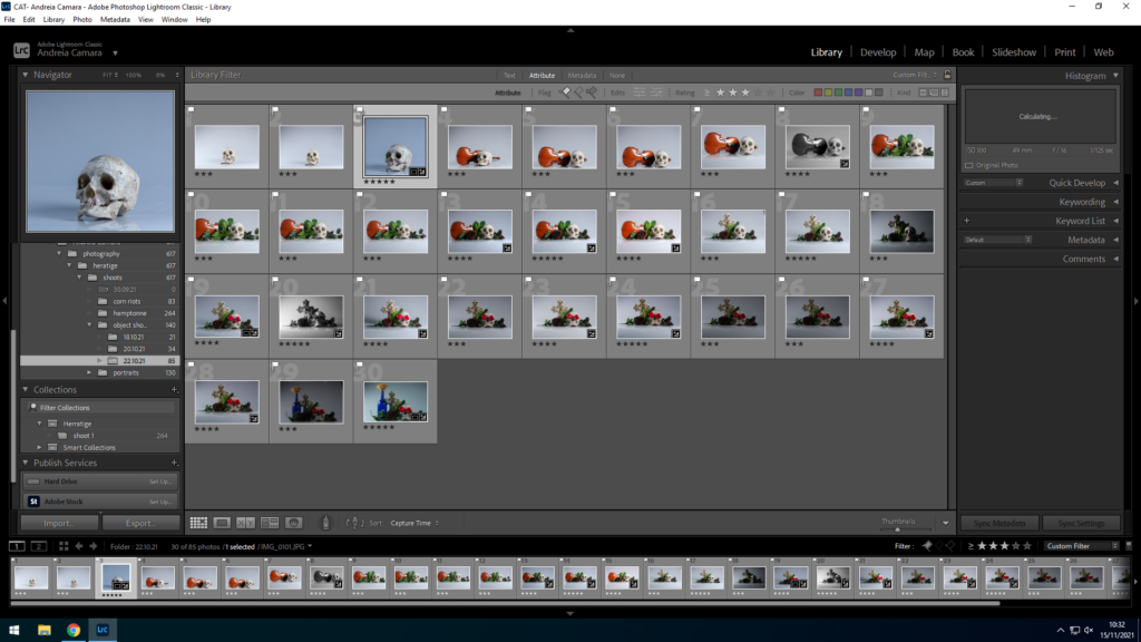
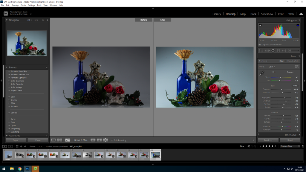
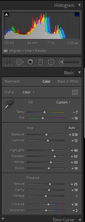
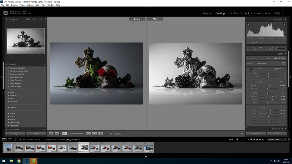

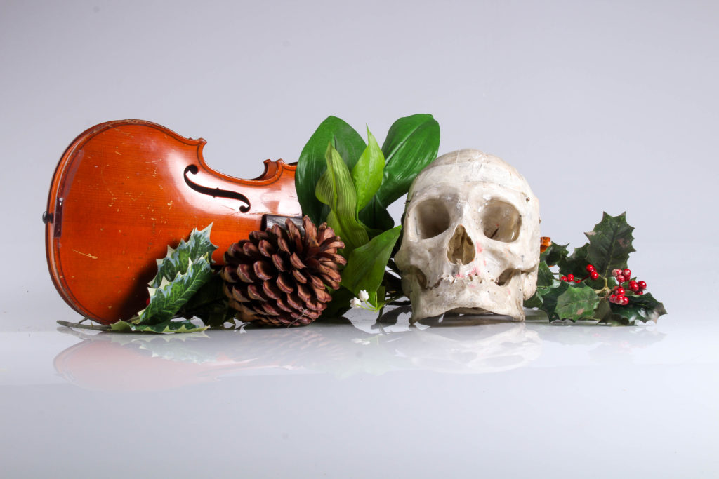
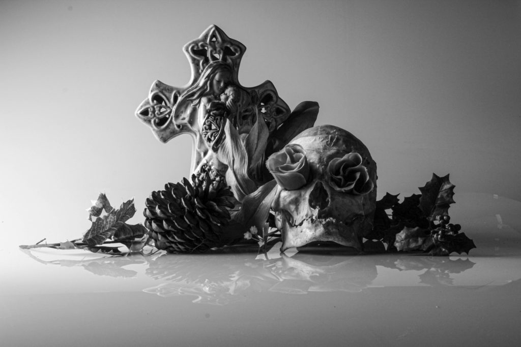
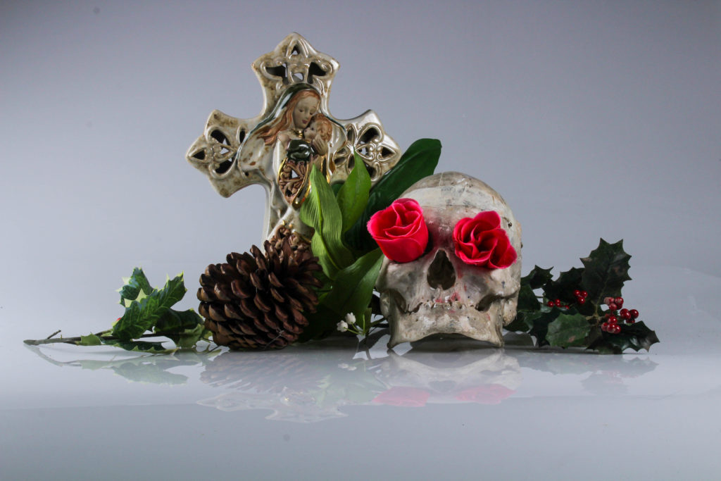
I selected these images because I liked the depth and story that they created as each image has a subtle change to lighting and tone.
first I uploaded a portrait and one of my final object shoot images to photoshop in order to create a collage.
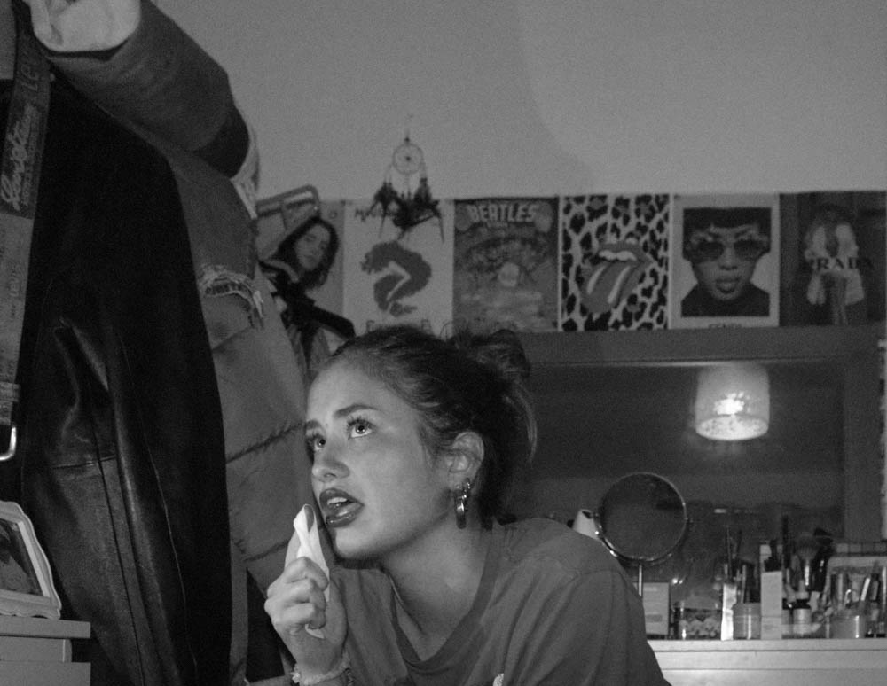
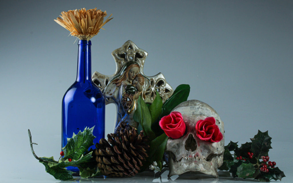
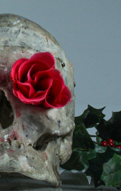
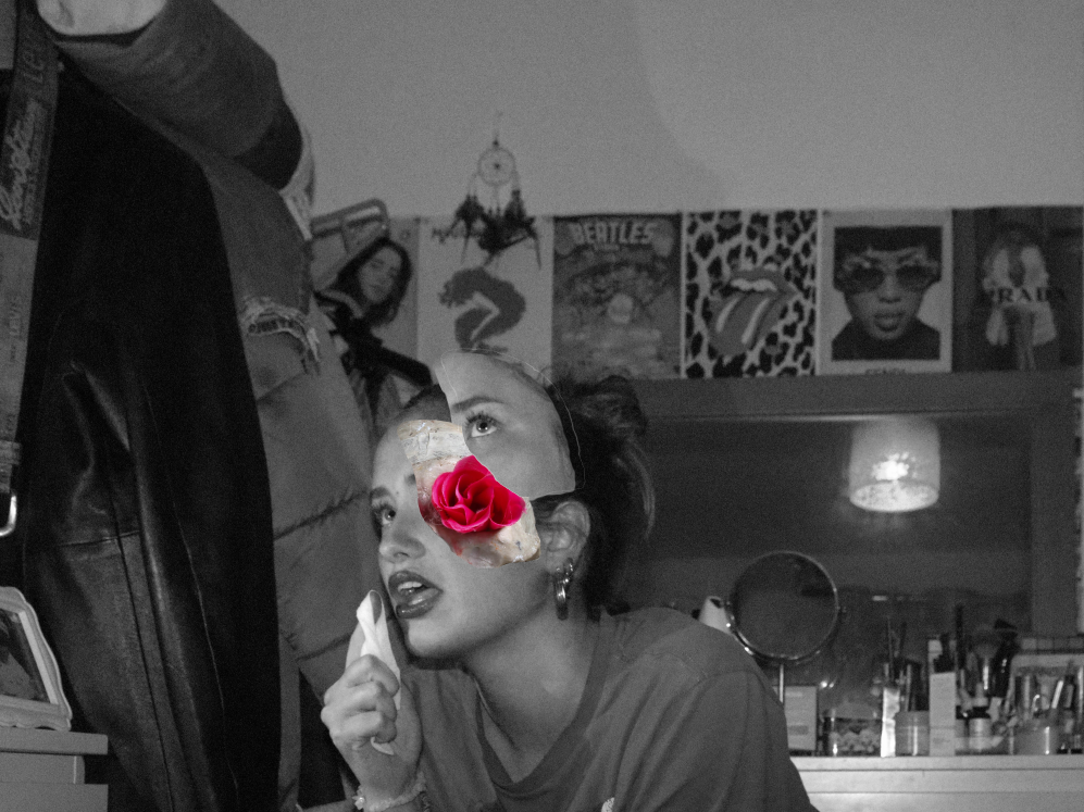
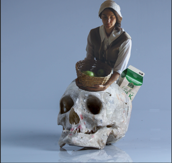
A photomontage is the result of combining two or more pictures together in order to make a new image. This can be done through cutting, pasting, ripping, rearranging and overlapping. Photomontage are usually used to convey a message, whether that be a commentary on political, social, or other issues. The credit for photomontages is given to Dada artists in 1916 but it emerged in the mid 1850s due to artist trying to make photography fit into fine art.
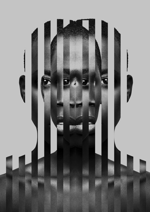
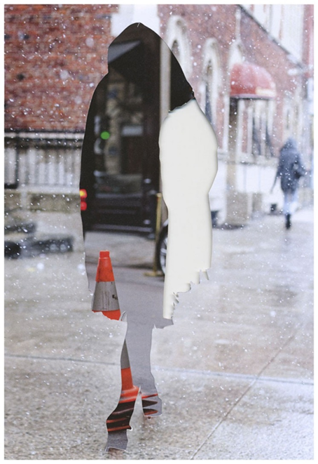
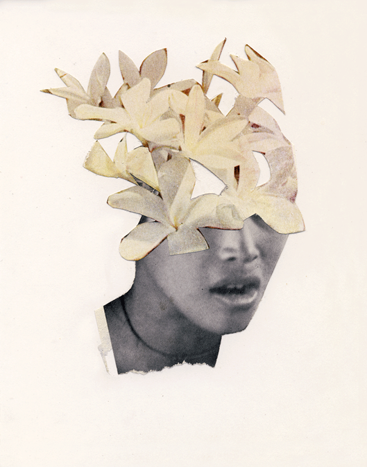
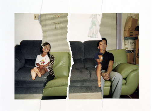
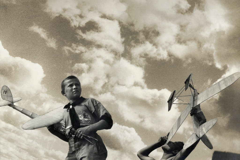
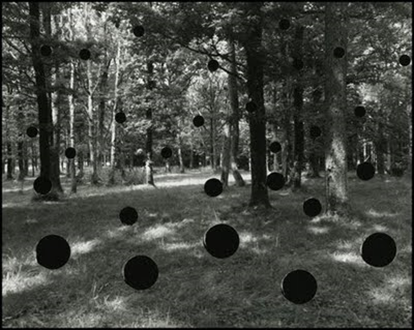
John Stezaker
John Stezaker is a British conceptual artist know for his collages using images found in books, magazines, and postcards. His work re-examines the various relationships to the photographic image: as documentation of truth, purveyor of memory, and symbol of modern culture. Through his elegant juxtapositions, Stezaker adopts the content and contexts of the original images to convey his own witty and poignant meanings.
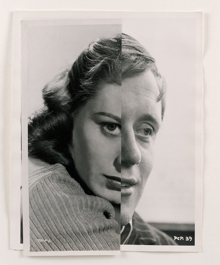
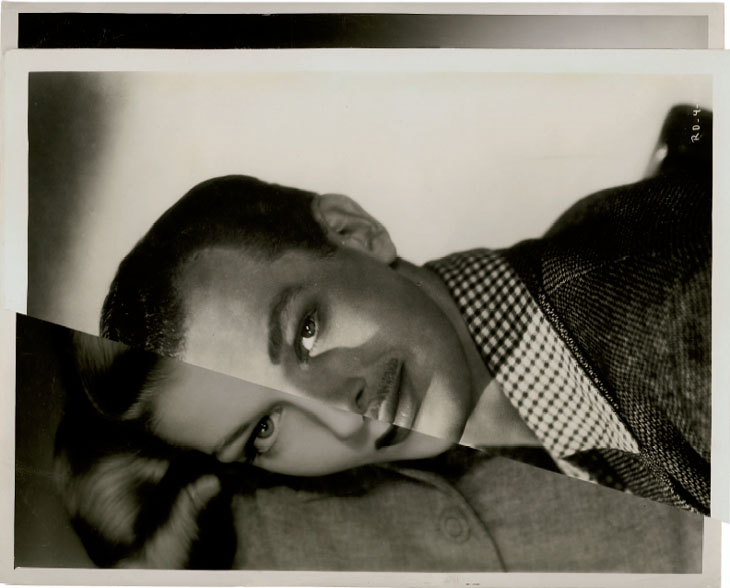
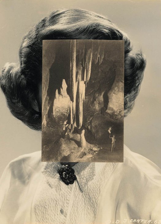
I hate this one I don’t even know what I was trying to do and its just looks bad. the line in the middle is like too clean? and the chicken instead of the apple looks out of place. And I know that’s the point but I hate it
Ultimately , you are aiming to produce a range of high quality images that will be printed professionally. These are your final outcomes (Assessment Objective 4) You must add your high resolution files to the print folder…found here
M:\Departments\Photography\Students\Image Transfer\PRINTING Yr 12 Heritage Nov 2021
What you should be printing…
You can choose A3 , A4 and A5 size prints…and may want to combine some into a set, or group…

This will ensure you have the correct ASPECT RATIO
Ensure you label and save your file in you M :Drive and then coip across to the PRINT FOLDER / IMAGE TRANSFER
For a combination of images, or square format images you use the NEW DOCUMENT + PRINT PRESETS on ADOBE PHOTOSHOP to help arrange images on the correct size page (A3, A4, A5)
The process for your project so far should include blog posts like this…
