final prints

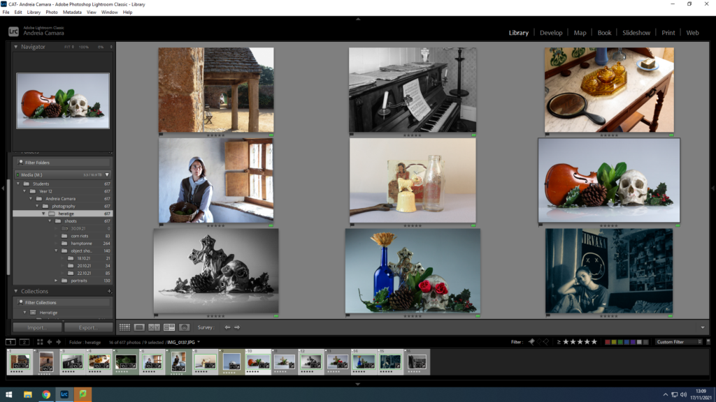
I selected my 9 best images from my heritage project after careful consideration and selecting through all my images to ensure the best work was selected.
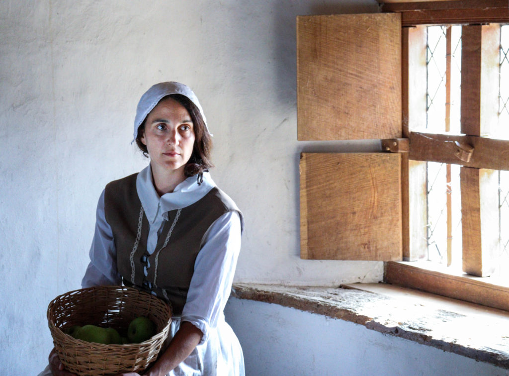
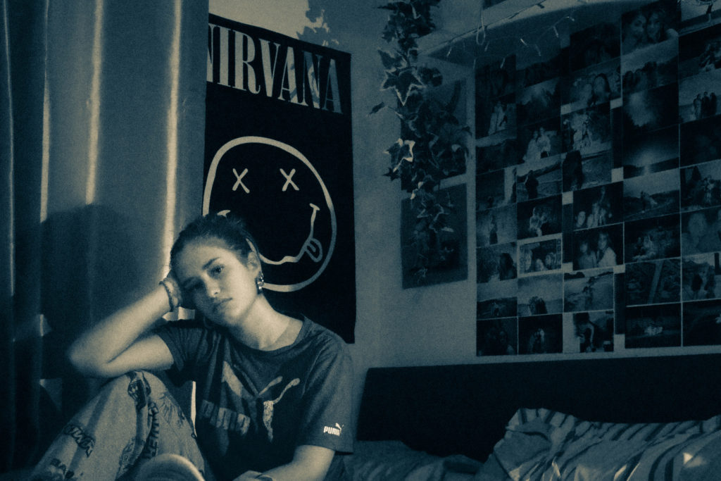
environmental portrait

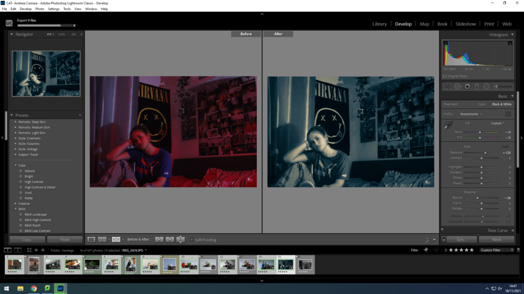
I selected this portrait as I think the posing and the angle really helps to display the models environment and it conveys emotion through her facial expression which gives an insight into how she was feeling that day. I adjusted the WB to improve clarity of the image and used the cropping tool to frame the image. I also played around with the pre-sets and selected the B&W split tone as I liked the tones it created and the blue tint it adds to the image.
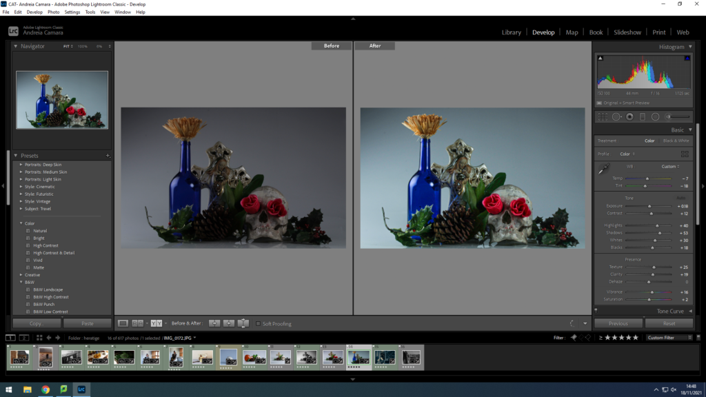
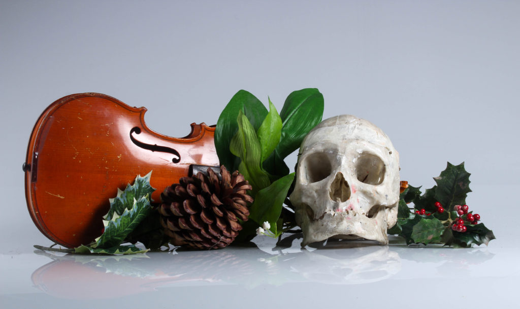
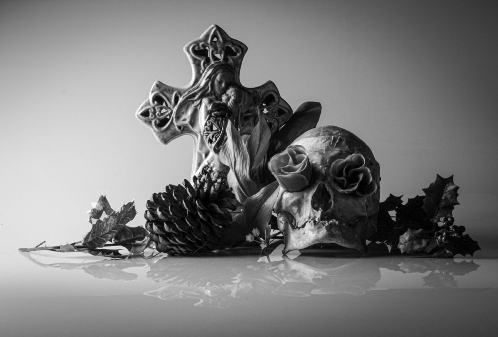
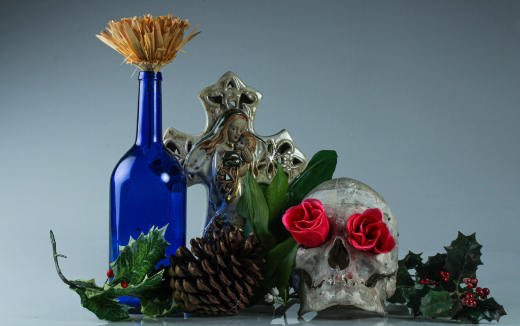
object shoot vanitas

I selected this image as I like the composition of the objects and how the blue bottle and the roses have such opposing contrast this pulls focus to the centre of the image as the shadows around the edges allow for a brighter central focal point.
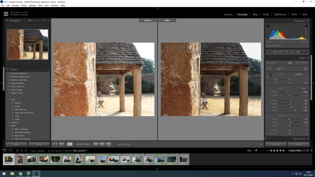
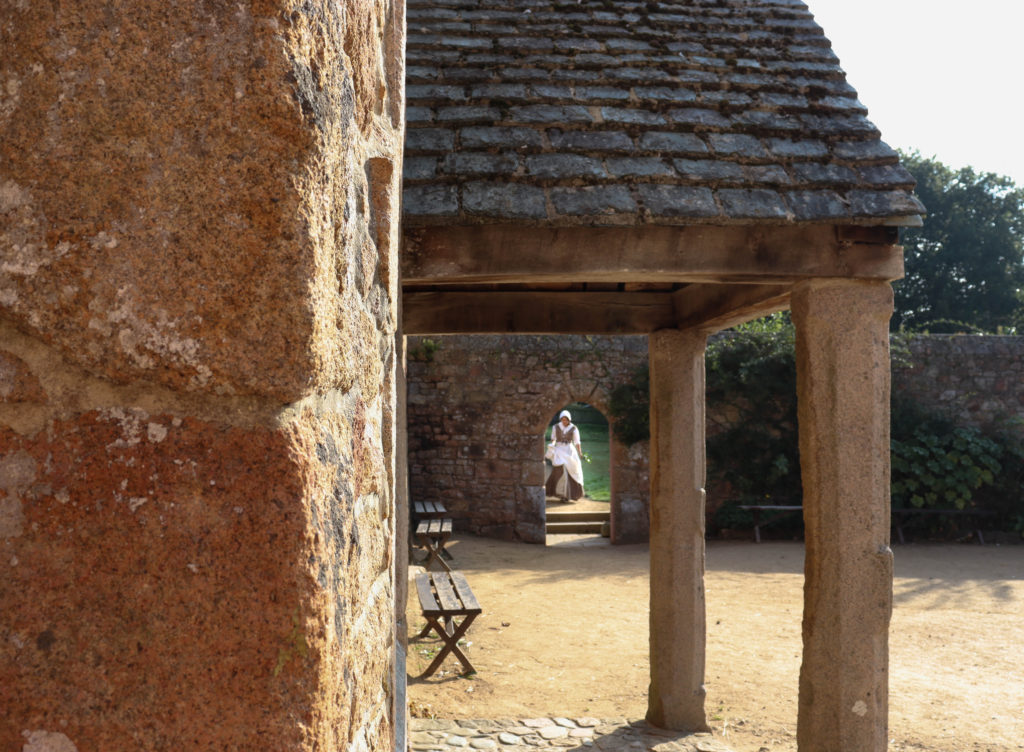
hamptonne building

The third image was taken at the Hamptonne country life museum it shows a classic 17th century building entrance through a cantered angle. The lady in the background pulls focus as she is dressed in white and I captured her running out of the gardens. Overall I like this image as the tones of the ladies surroundings have a true rustic feel and she is perfectly positioned in the horizon of the image.
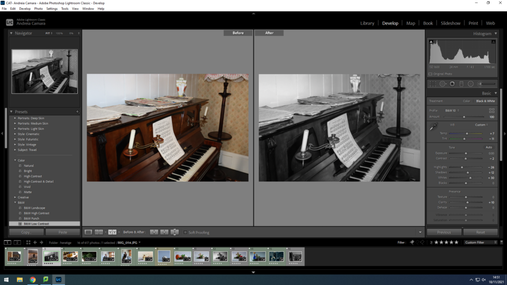
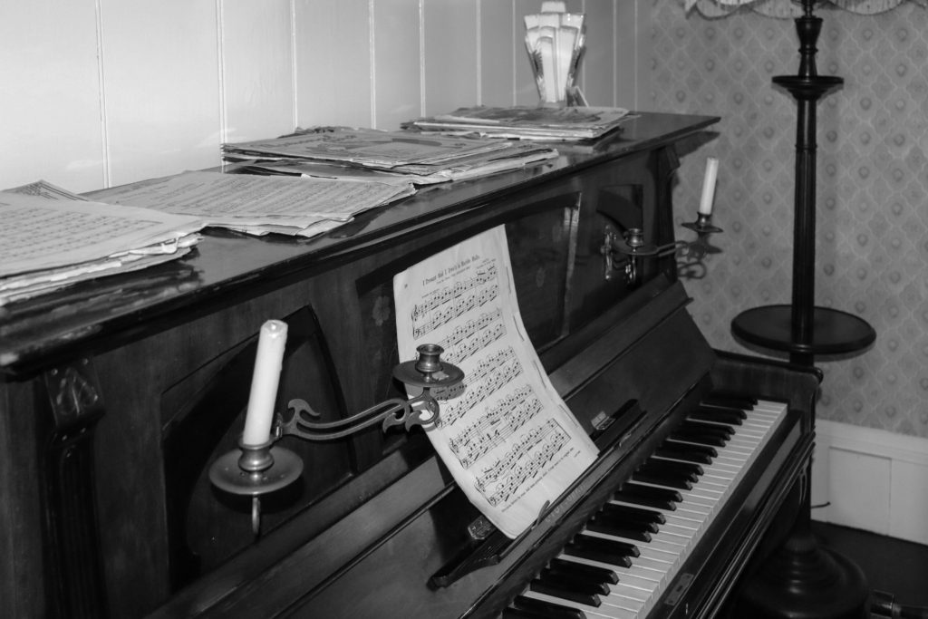
hamptonne object

This is one of my best images because it portrays emotion through the tones of black and white and how the depth of detail on the grand piano is highlighted I also think the angle almost acts as if you are watching someone play and the set up of the cord sheets gives the image the feel that someone had been playing recently. However this image also has a more earie feel to it as vintage pianos hold connotations of the supernatural.
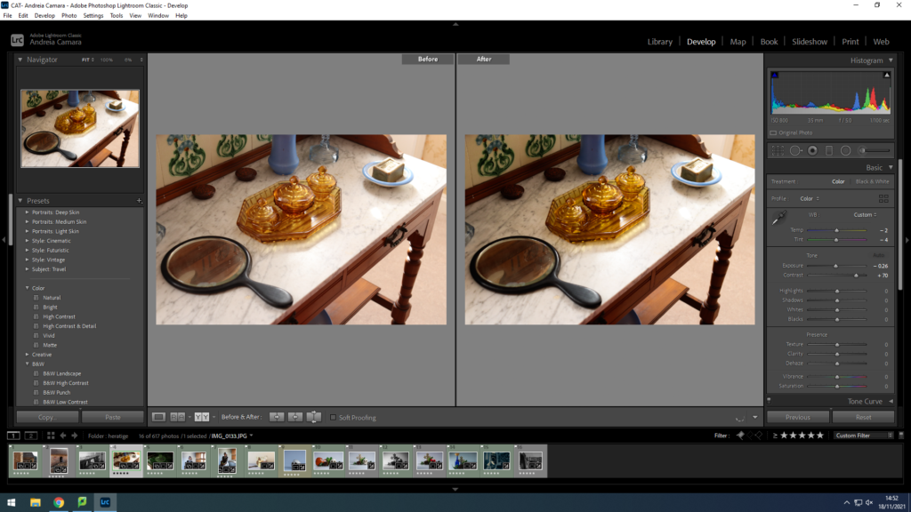
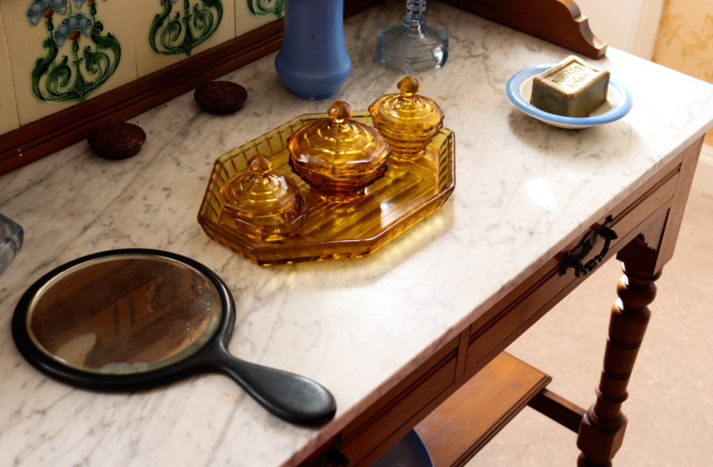
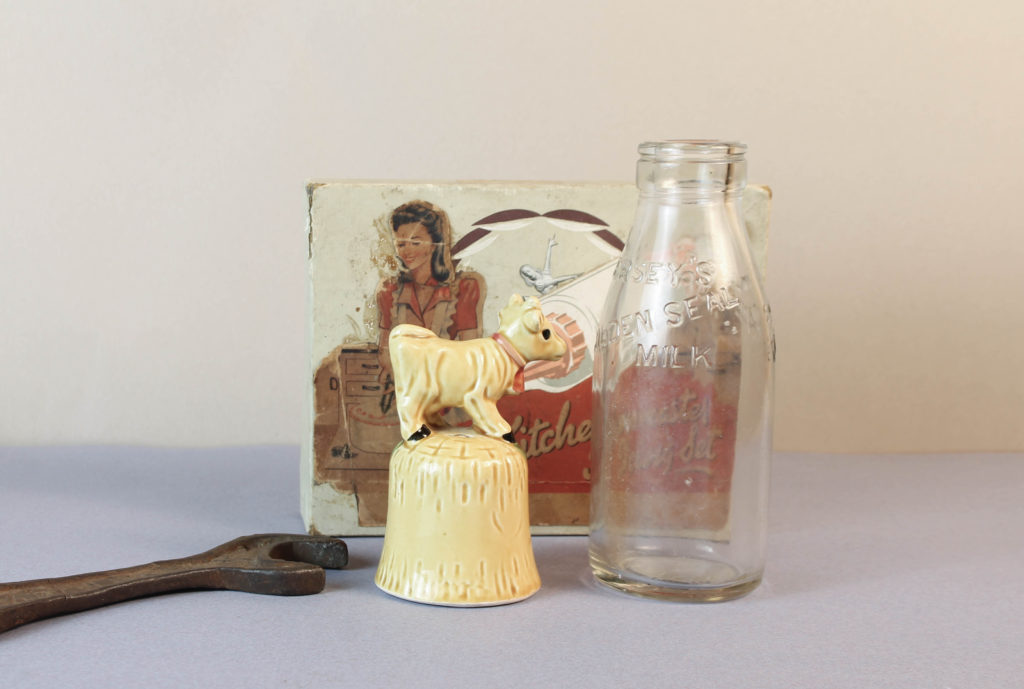
hamptonne objects

I picked this image as one of my final pictures as I really like the detail captured in the glass centre piece i also like that the image has an almost vintage feel to it due to the composition of the objects.

final images after edit
Studio Portraiture

Studio Photography

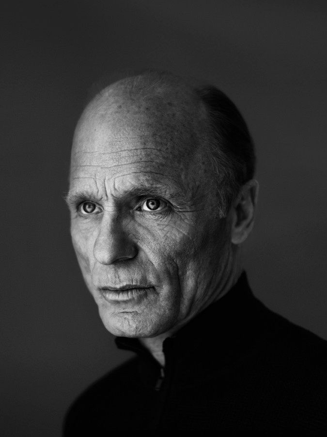
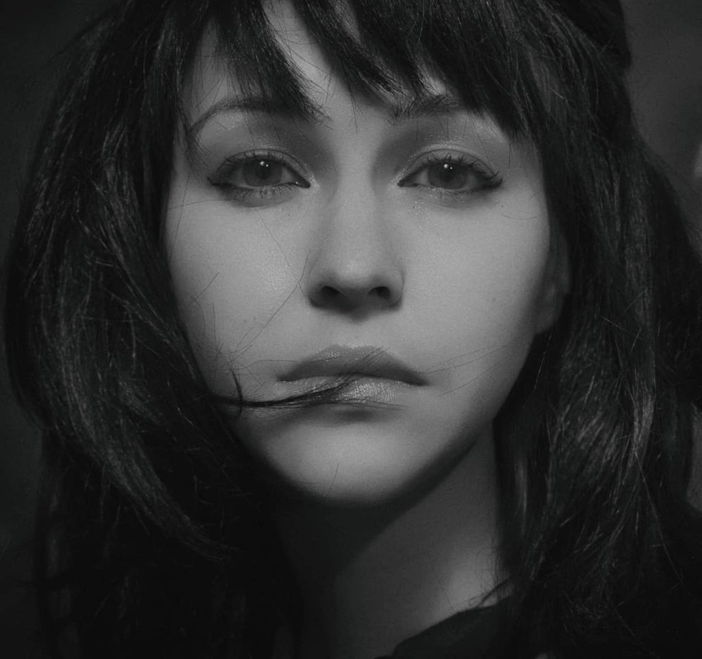
Rembrandt

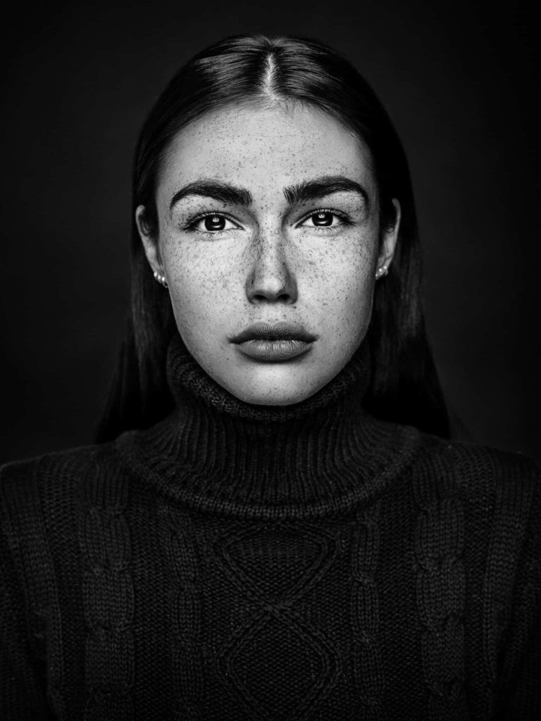
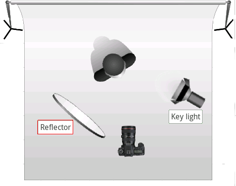
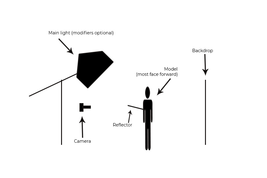
This technique is inspired by Rembrandt who was a Dutch Golden Age painter, printmaker and draughtsman. He used to paint shadows in his paintings in order to add more depth and make them more realistic. This technique created a triangle on the side of the face and makes the model look more attractive. It is used in studio portrait photography and cinematography. It can be achieved using one light and a reflector, or two lights, and is popular because it is capable of producing images which appear both natural and compelling with a minimum of equipment.

set up for rembrandt

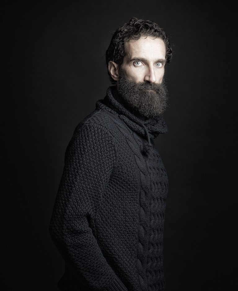
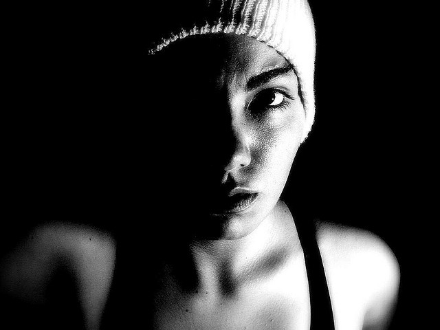
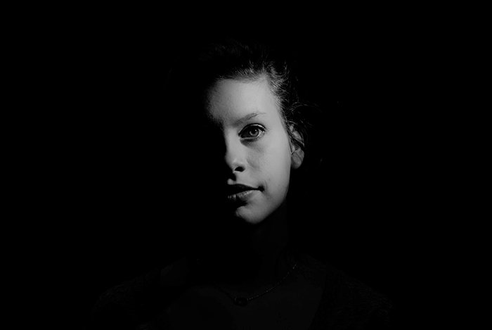
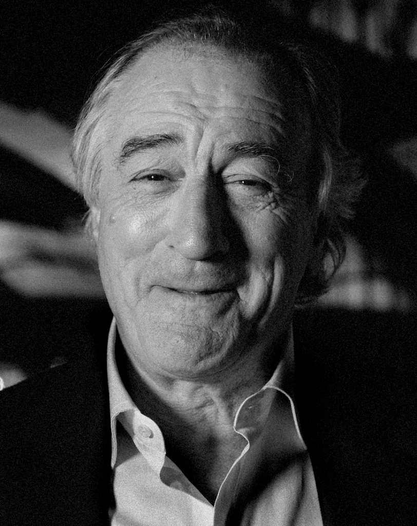
Chiaroscuro/side light

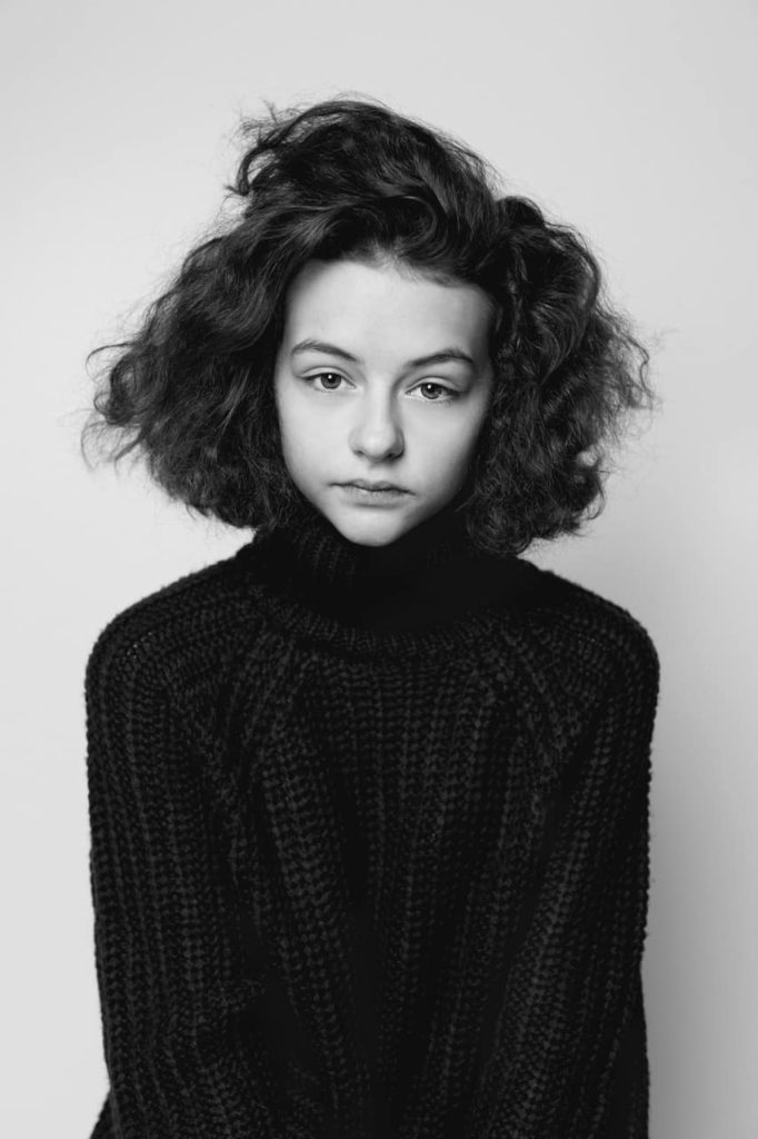
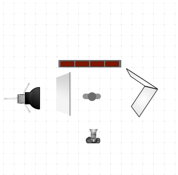
Chiaroscuro (from Italian chiaro, “light,” and scuro, “dark”) is a film lighting style that emphasizes shadow and light. Chiaroscuro first emerged during the Renaissance as a painting technique used to create tension between the light and dark elements in portraits and other still life. To achieve this you just need to put your light on the side of the model and use a flash.

set up for chiaroscuro

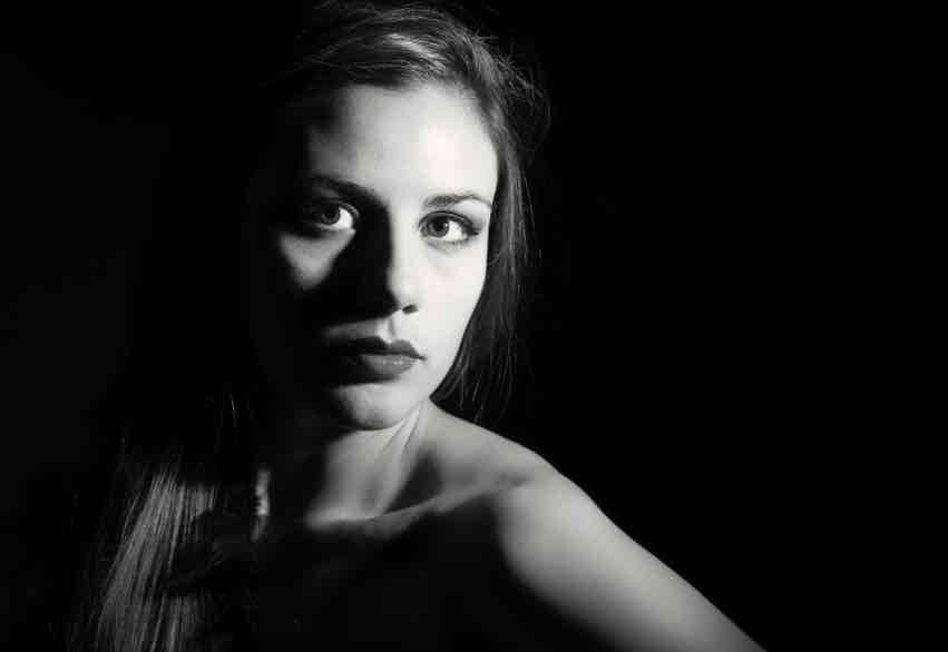
Butterfly

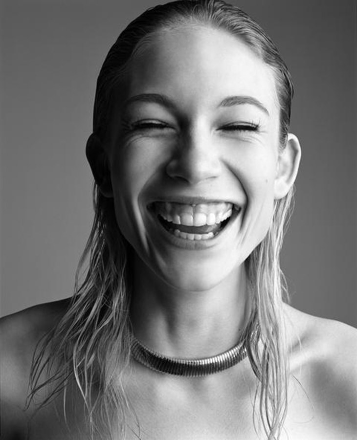
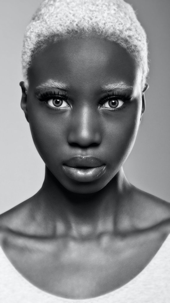
Butterfly lighting is a portrait lighting pattern where the key light is placed above and directly centred with the model’s face. This creates a shadow under the nose that resembles a butterfly. It’s also known as ‘Paramount lighting,’ named for classic Hollywood glamour photography.

set up for butterfly lighting

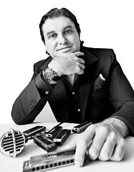
Oliver Doran

Oliver Doran is a commercial, editorial and portrait photographer from Jersey, Channel Islands. He has over 15 years of experience and he photographs some of the most recognisable faces on the planet. He is known for his skilful use of light and mood to create striking visual breakthroughs that also strike the right chords and achieve diverse briefs and business goals.

His passion for travel, meeting new people and appreciating cultures different from his own lights the fire beneath everything he does. His roster of experiences includes working for the royal families in Bahrain and Dubai, an honour that he cherishes. Some find working with famous people intimidating, but for Oliver, the experience has made him empathetic to the innate human spirit.

Oliver creates vibrant, cinematic images using both flash, natural light and a mixture of both. He is comfortable in and out of the studio with complex lighting setups as well as working with ambient light in any location; day or night.

FINAL IMAGES NOV 2021

ENVIRONMENTAL PORTRAITS

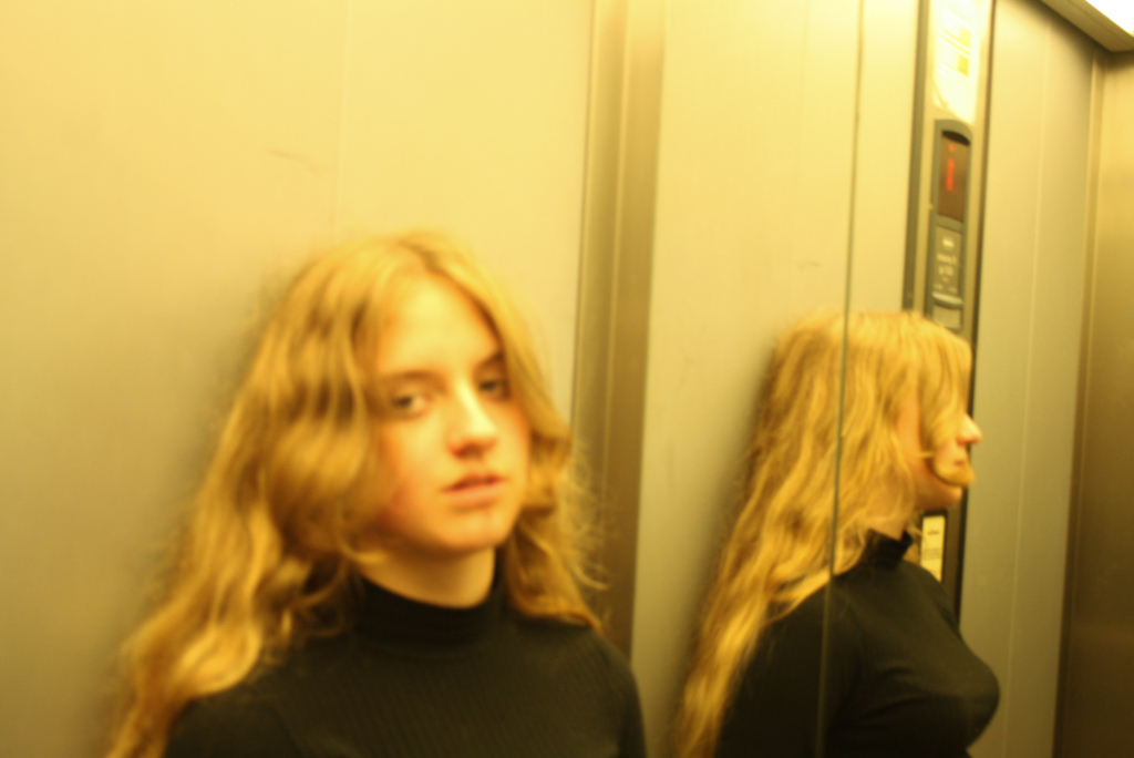
I chose this image because I really like the yellow tones in the image and how the majority of the image is blurry with the exception of the reflection of the subject, I think this creates a really unusual contrast as -in the portrait- attention to drawn to the side where you cannot actually see the main subjects face which is unusual for portrait photography, it also really reminded me of Larry Clark‘s photographic style.

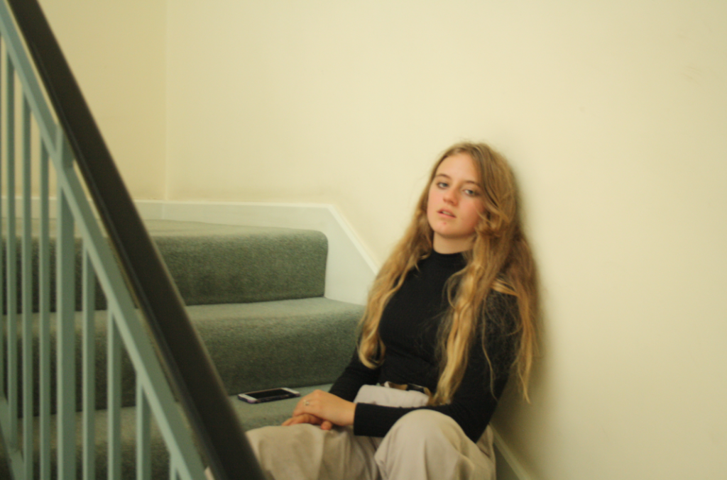
I chose this image because it really reminds me of Michelle Sank‘s photography, although the composition of the image is plain I really like how attention is drawn to the subject as they are the only interesting thing in the image- making the viewer “judge” the subject.

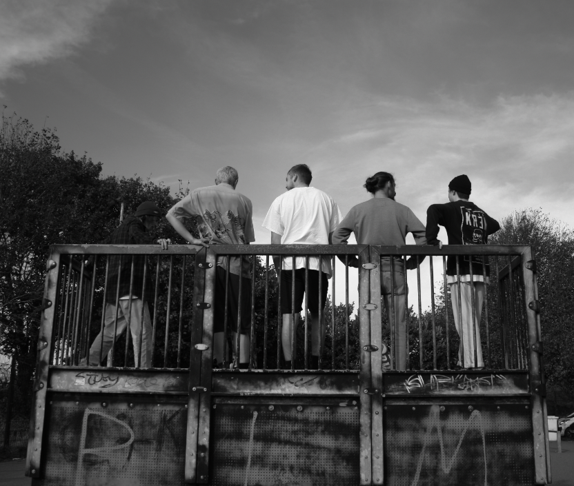
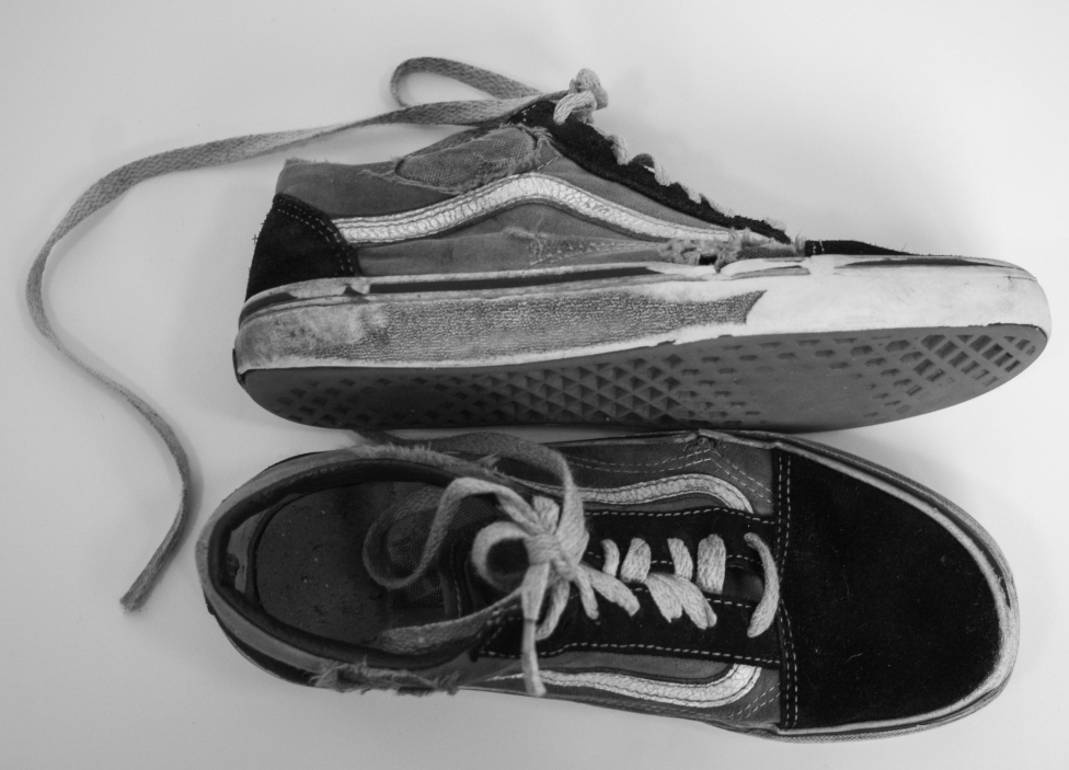
I have decided to print the two images above as a set as I really like the contrast between the skaters actually in the skatepark versus the almost commercial image of the torn skate shoes which implies the reality of skating: clothes getting torn, injuries and wrecked shoes.

HAMPTONNE EXTERIORS/INTERIORS


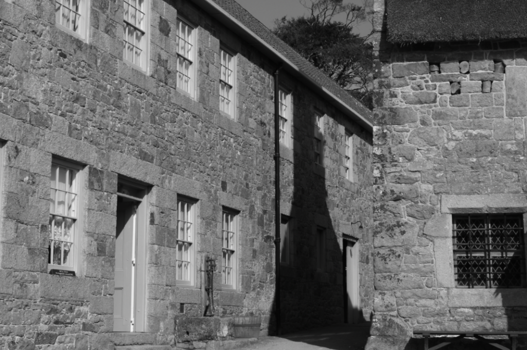
I chose this image because I really like the contrast of the shadow between the two buildings and how the two building almost look attached due to the perspective the photo was taken from. I also really like the wide variety of tones in the image and the texture of the Jersey granite (an important part of Jersey’s heritage) on the buildings as it creates interesting textures.

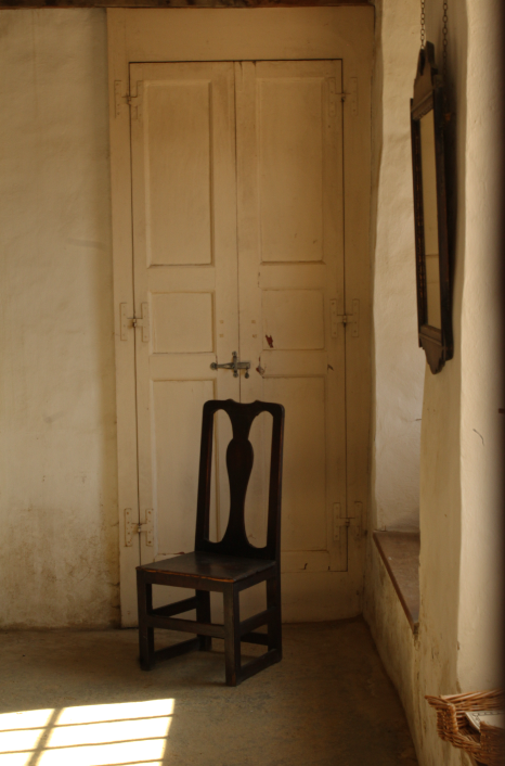
This is one of my favourite images so I tried to do the most minimal editing for this image because I really like how the walls and light almost frame the chair in the middle. I also really like how simple the composition is, with the empty chair in the middle- almost looking lonely.

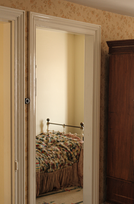
In this image I really liked how the doorframe framed the bed and made it the centre subject. I also really like the shadows and light in the image so I tried to make the shadows more visible.

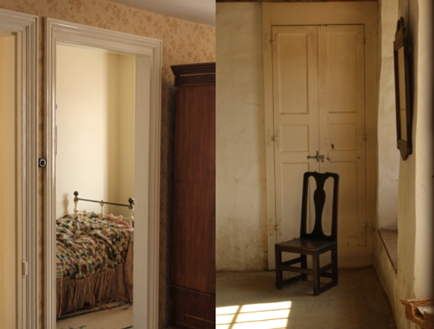
I decided to make the two images above a set as the similar compositions create a set of images that look almost abandoned and empty- possibly bringing in the theme of heritage as Hamptonne is no longer a used farm yet these rooms did once have people living in them.

HAMPTONNE PORTRAITS

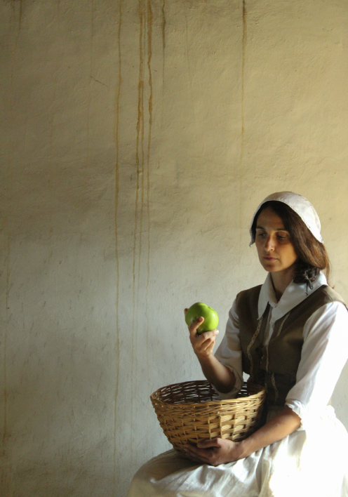
I have decided to print this image because I really like the natural lighting on the model’s face and how the light hits the apple. I also believe the composition of the image is unusual, with the subject in the bottom right corner surrounded by empty space- displaying a sense of isolation.

PRODUCT TABLE

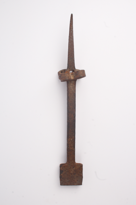
I included this image of a tool taken on a product table because it is obvious of -my inspiration- Walker Evans’ photographic style in ‘Beauties of the Common Tool’. I also really like how you can see every detail on the tool, especially the rusty colour.