Walker Evans
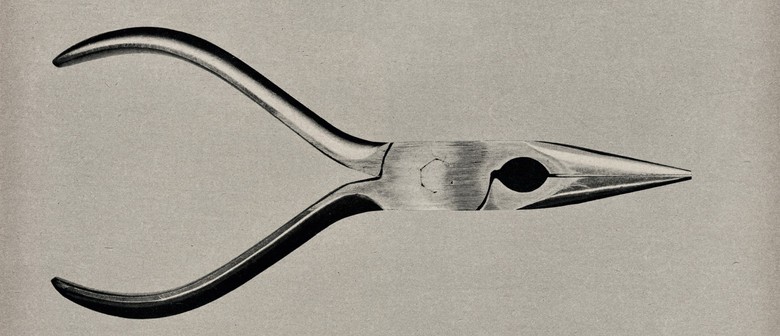
This image taken by Walker Evans is very simplistic, and it is easy to recognise what the picture is of. This image has no shadows due to the way Evans laid out the object, with sort of stilts holding the object up to give it a ‘hovering’ look, and positioned the light source, which looks to be about 12 o’clock and slightly above the object. The light itself is not too harsh nor too dim, giving the image a very formal and straight-forward look. The object does not have many angles, it is mainly curved with a few straight lines on the inside of the head. The contrast of this image mainly comes from the bold shadows on the handles, the hole in the centre and the edges of the head. The background in this image is very plain, it is pretty much the same colour as some parts of the object, this allows the darker segments to stand out more.
Darren Harvey-Regan
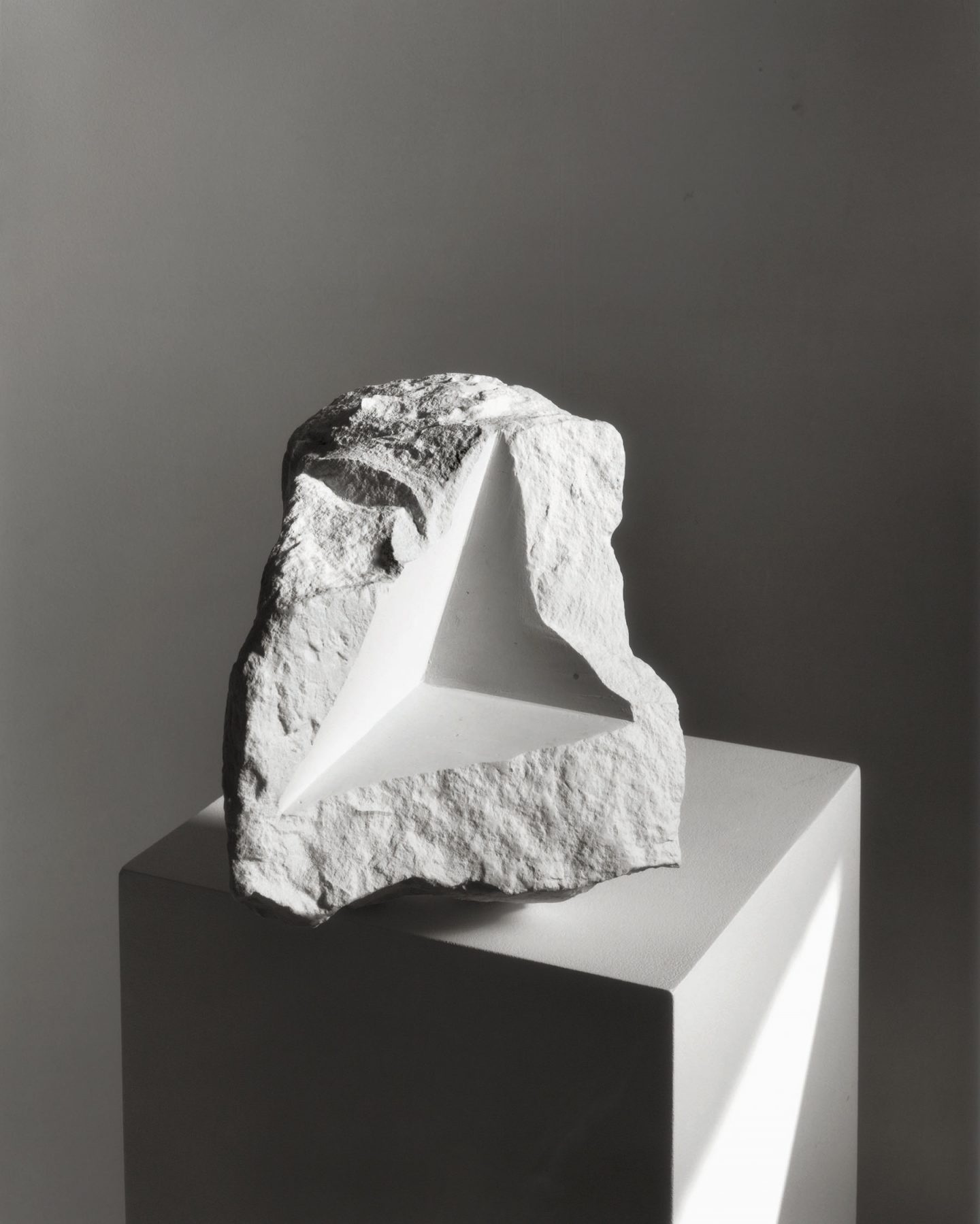
This image by Darren Harvey-Regan looks fairly unnatural, it uses a lot of straight lines and formal shapes to give the object an interesting appearance. The straight lines allow for lighting to give the image clear highlights and shadows, giving the rough texture of the image, as well as some of the shapes created by the lines, a greater emphasis. The light source is likely from around 1-2 o’clock of the object which allows for shadows behind the object and some faces of the pedestal to appear. This image uses contrast as a way of making the object more interesting, cutting out a straight shape in the rough/natural object, as well as placing the object on a regular shape, creates a contrast of shapes and lines. The background in this image is fairly dark, which also contrasts with the object that has been well lit and makes it easier to see the rugged shape of the object.
Comparing the Two Artists:
Similarities
- Both artists used black and white, I think this is effective as it allows the shadows and highlights to be differentiated more clearly, it also makes light the main focus of the images, rather than colour.
- Both artists used a plain background as a way to give the object a greater importance in the image
Differences
- Evans’ image is very simple, with the objects having a simple and well-known shape (being common tools), whereas Harvey-Regan’s image uses an object which has a complex natural shape, but has also been modified to have another simple shape within it.
- Harvey-Regan made use of a pedestal in his image which helps the object by giving it something simple to compare it to. Evans did not.
- Evans does not use shadow at all in his image, this makes the object look both simple yet confusing at the same time. Harvey-Regan’s image uses shadow as a way to embolden texture and shape, making the image clearer and more complex.
My own Images
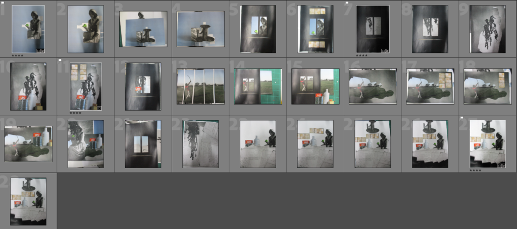

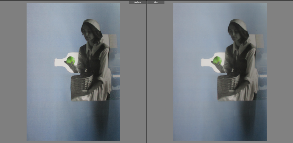
I chose this as a Final Image because I like the way the two pieces of paper subtlety blend with each other, allowing the focal point, the apple, to stand out behind a peculiarly-shaped white backdrop. I think that colour is interesting, as the image is made up of an image with colour and one with black and white (with a part of it in colour), which gives the image a unique look to me, I also think that the soft tone of the blue background gives the image a more gentle and calming look.
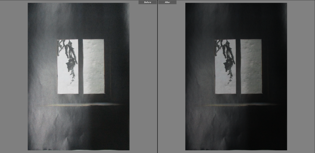
I chose this as a Final Image as it stood out compared to the other images, because of how dark it was overall. I decided to make this image black and white because I thought it would allow the grey colour behind the window to stand out more. I think that the shine on the black paper gives the image more pattern and a greater variety in tones. The plant seen behind the left window frame is mainly made up of straight lines, however in an irregular order, this compared to the regular shape of the window frames, creates a nice contrast.
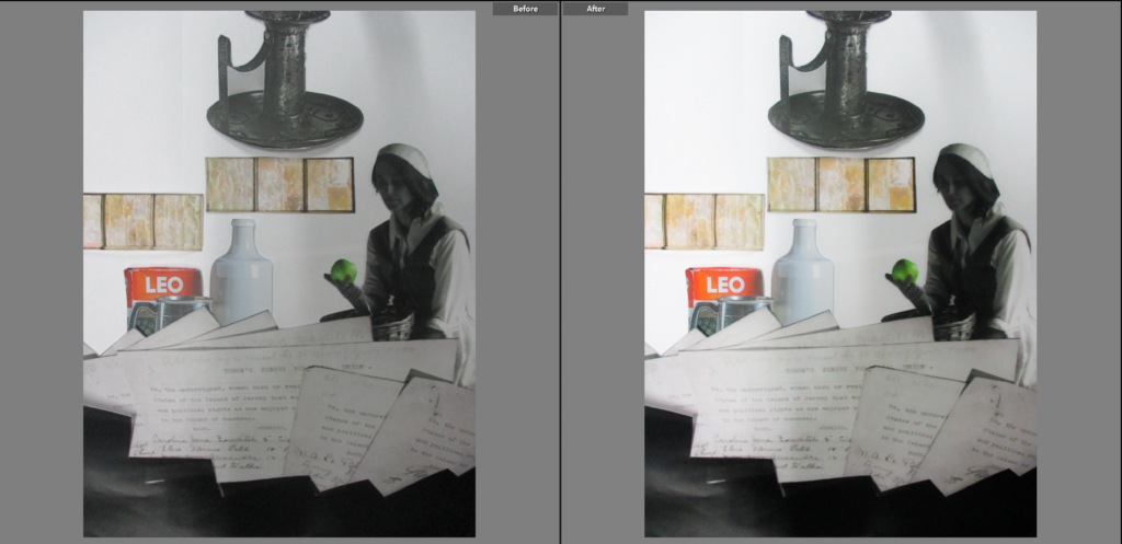
I chose this as a Final Image because I like how it is arranged, it looks as if the pieces have been placed in a planned way, while also looking like they were just thrown on. I think the model is the main focus of this image as she not only contrasts with the objects in the image as a human model, but also as a darker part of the image (contrasting with her white backdrop). I also like how the colour was arranged, with the colour being only seen in the centre of the image, and becomes black and white as the image goes towards the vertical edges of the page. I think the white backdrop gives the individual pieces room to breathe and helps them stand out more.
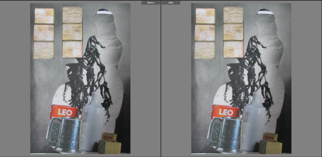
I chose this as a Final Image because I think that the outline of the woman, while it is not exactly the focal point (though it does enclose it), has an interesting look. Unlike the last image shown, the pieces are arranged quite erratically, which helps it look unique, but also rushed and unordered. I also think that the limited colour in the image is almost like a complete opposite to the last image, with the colour being mainly seen on the outer parts of the image.
