Editing One Image
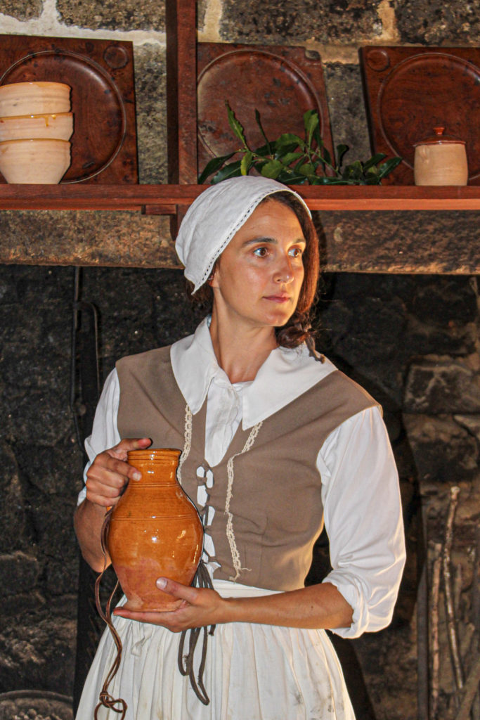
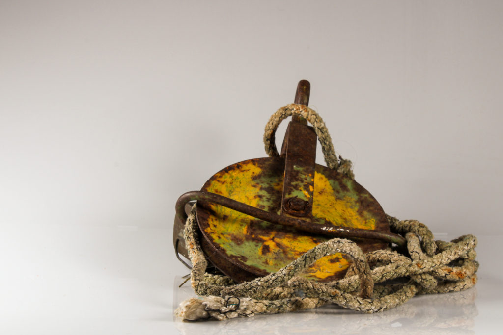
For my hand made photomontages I used the pictures I took in the studio and the images I took on my trip to Hamptonne of the the good wife. I edited them by hand using scissors and glue.

original image 
original image 
original image 
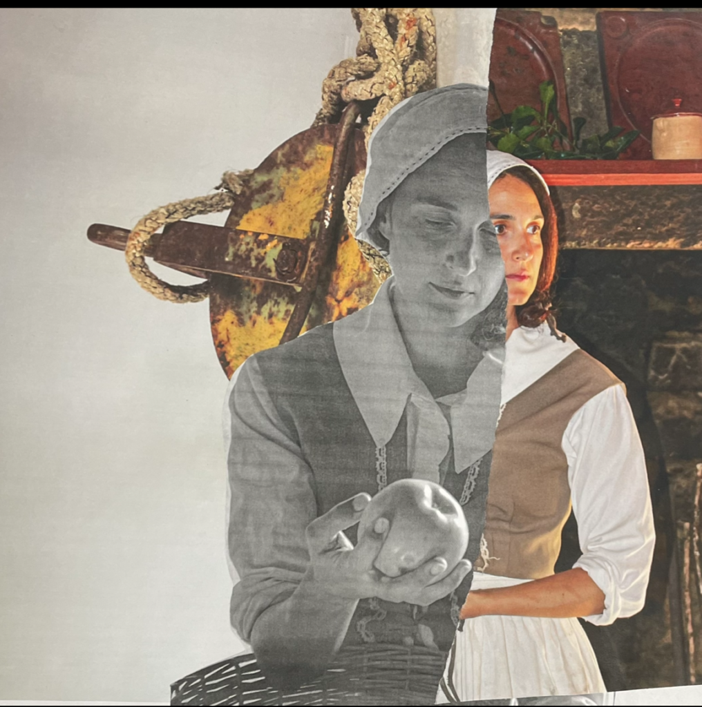
final edit
For this edit, I placed the object picture upside down to make it look more interesting and visible. I then cut out the model from the black and white picture, using a craft knife and a mat, and placed it on top. I took the other portrait and cut it through the middle using a pair of scissors to give it a sharper look. I carefully positioned it so that the face lines up with the face from the black and white image.
My Final Edits

I like the contrast of the black and white picture and the colourful one with the model. I think it looks interesting how she’s looking down (and she looks quite sad because there is no colour) 
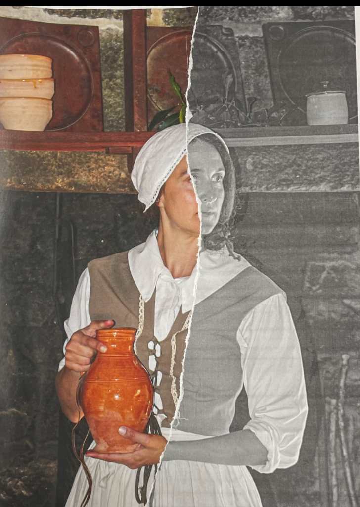
I printed the same picture twice (colour and black and white) and ripped the black and white and then placed it on top of the colourful image. I like how it turned out because it’s simple. 
For this edit I printed out the same image twice (one in colour and one in black and white) and then I cut them strips. I used a weaving technique to get that effect. I don’t like the way tit looks and it was very time consuming.
I hate this one I don’t even know what I was trying to do and its just looks bad. the line in the middle is like too clean? and the chicken instead of the apple looks out of place. And I know that’s the point but I hate it
