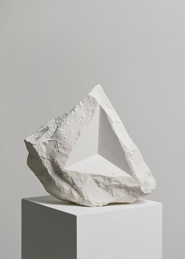
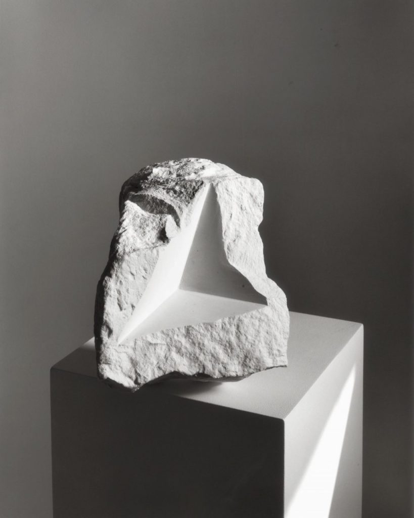
Throughout its long history, still life has taken many forms, from the decorative frescoes of antiquity to the high art of the Renaissance. Traditionally, a still life is a collection of inanimate objects arranged as the subject of a composition. Nowadays, a still life can be anything from your latest Instagram latte art to a vase of tulips styled like a Dutch Golden Age painting.
Walker Evans
Walker Evans was an American photographer best known for his work for the Farm Security Administration (FSA) documenting workers and architecture in the South-eastern states. In 1936 he travelled with the writer James Agee to illustrate an article on tenant farm families for Fortune magazine; the book Let Us Now Praise Famous Men came out of this collaboration.
Walker Evans took up photography in 1928 around the time he was living in Ossining, New York. He was mainly influenced by Eugene Atget and August Sander. Atget was French photography who was known for being a pioneer of documentary photography, even though most of his work was published after his death he was still an inspiration to many photographers. Sander was a German portrait and documentary photographer
Darren Harvey-Regan
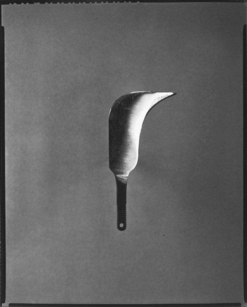
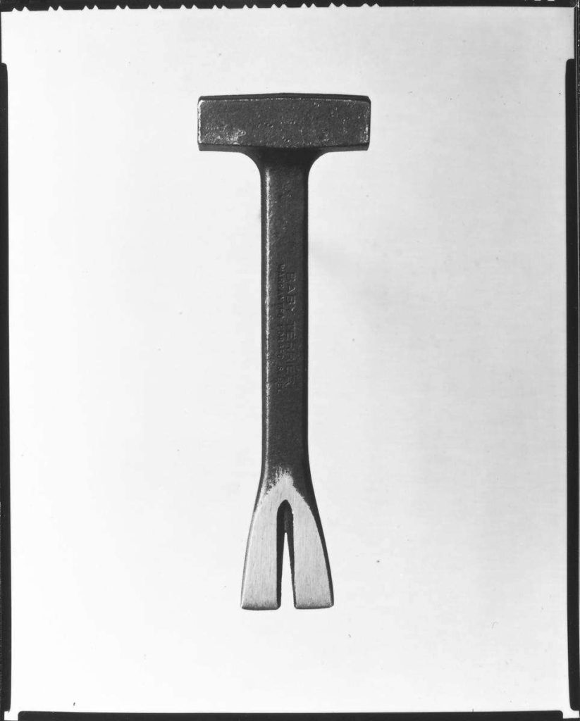
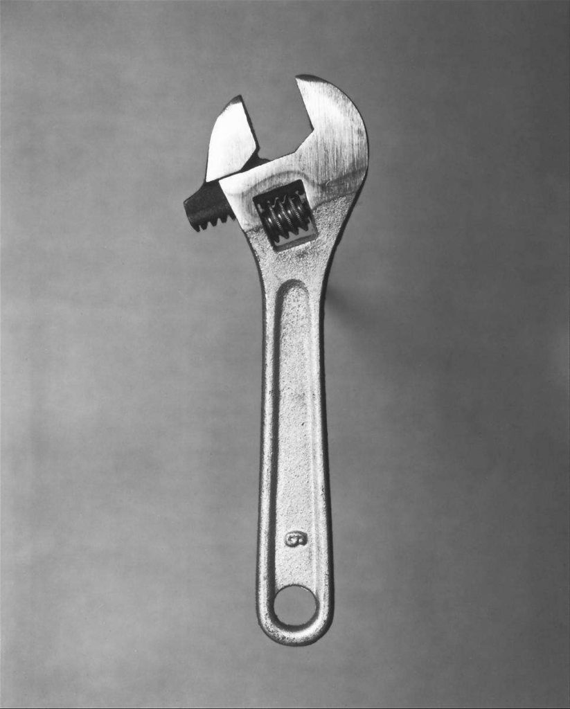
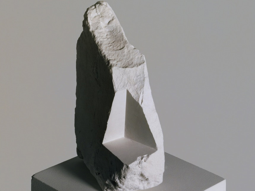
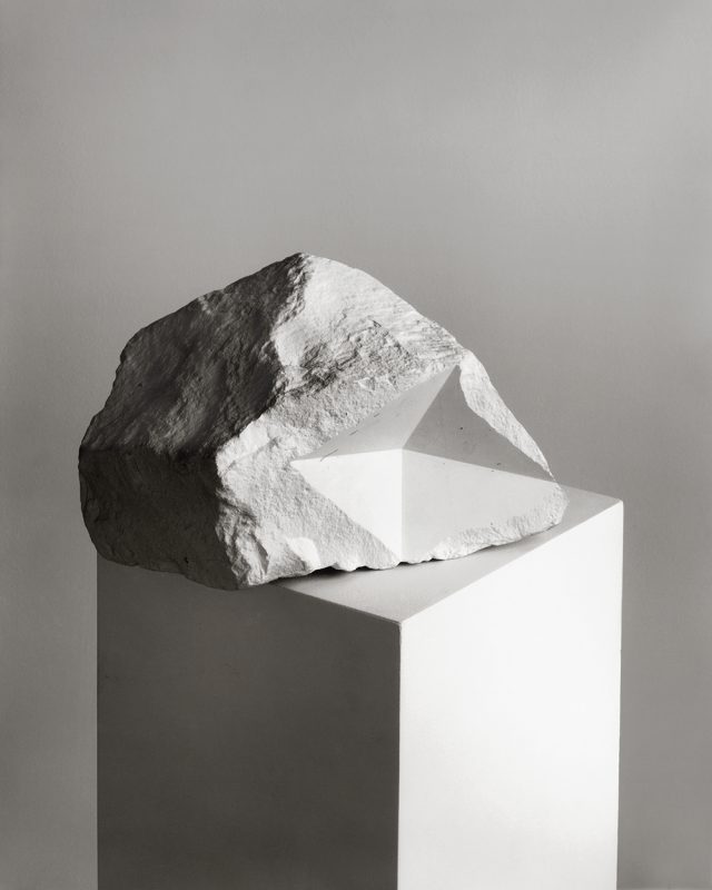
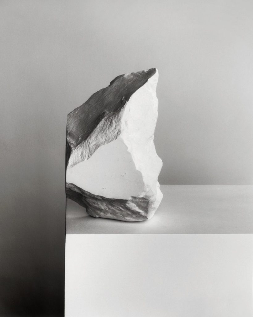
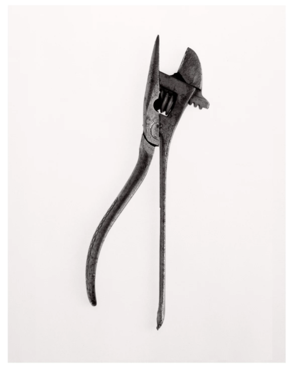
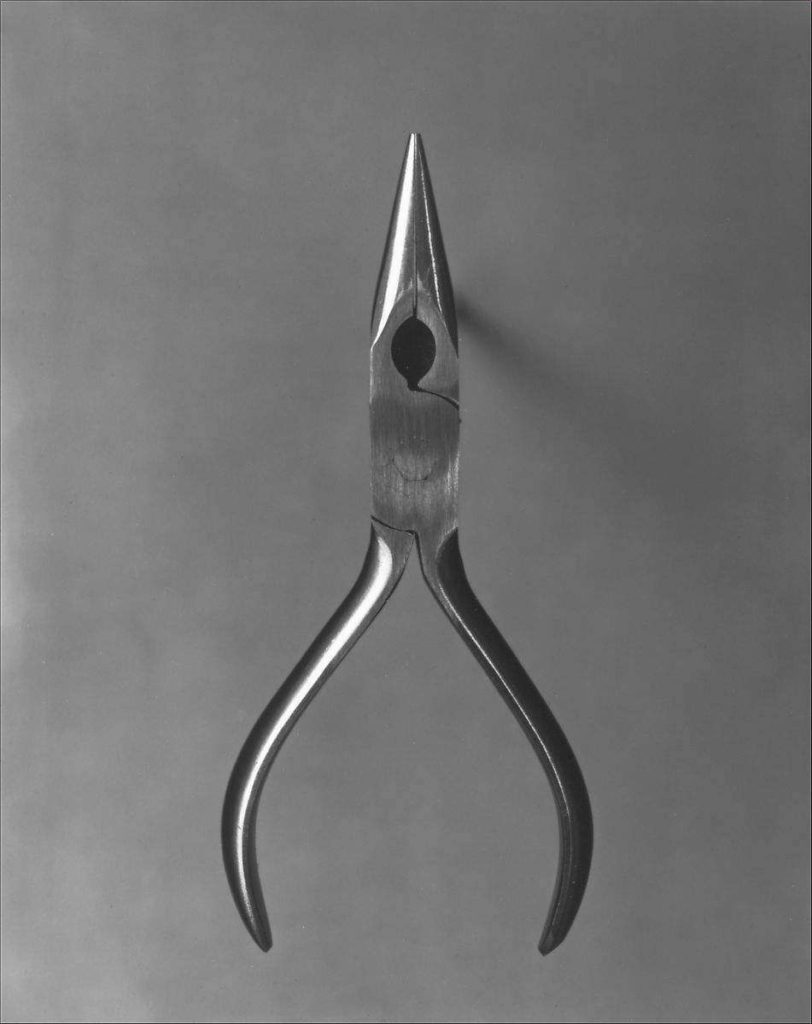
In 1955, Fortune magazine published, ‘Beauties of the Common Tool’, a portfolio by Walker Evans featuring pictures of ordinary hand-made tools, such as a ratchet wrench and a pair of scissors. After seeing this Harvey-Regan constructed a montage of Evans’s images to make new forms. He sourced matching tools, cut them in half and re-joined various halves together, with the resulting physical objects being photographed to create his final work. The montaged tools become both beautiful and bizarre objects, in which a ratchet wrench is combined with a pair of pliers and Mason’s trowel joined with a pair of scissors.
“It’s a means of transposing material into other material, adding new meaning or thoughts in the process. I think photographing materials is a way to consider the means of creating meaning, and it’s a tactile process with which I feel involved. Touching and moving and making is my engagement with the world and my art”.
“The Beauty of the Common Tool”
Walker Evans influenced Darren Harvey-Regan after he saw Evans portfolio in Fortune magazine. Harvey-Regan took inspiration from Evans and made mortgages of his simple tools. Most of Darren’s photos had white or light grey backgrounds which contrasted with the rusted dark greys of the tools, whereas Walker had a range of dark and light backgrounds in his work, the darker backgrounds could have been used in some of the tools had more of a shine to them that others so that a harsh white background didn’t clash.
Both Walker Evans and Darren Harvey-Regan photographed their tools with little to no shadows, this allows views to have all their focus on the tools and nothing distracting in the background.
Studio Work
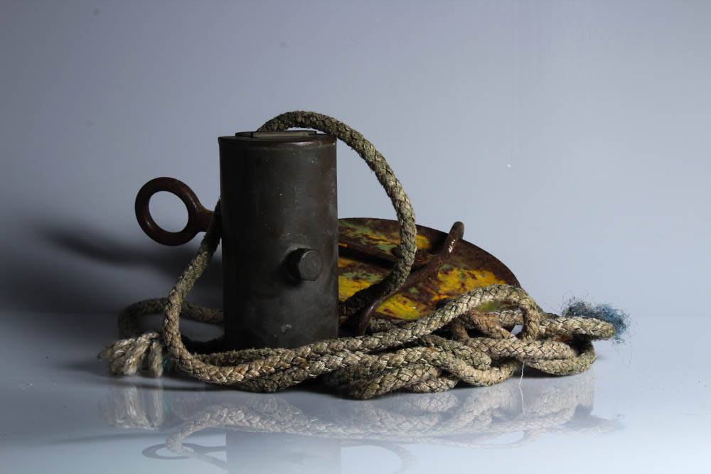
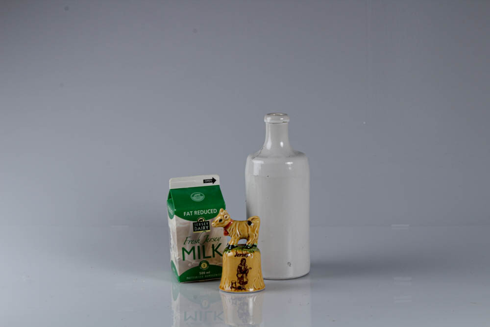
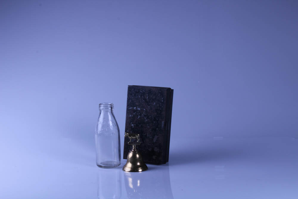
We had gone into the studio to take photos of different Jersey heritage items and some from Hamptonne. We had one station that had a camera that was positioned at the birds-eye view, another with a plain white background and one with a pink a yellow background. While at each station we adjusted the ISO and shutter speed so that we could get different lighting, we also would change if the main light was on or off while in the studio. We would also change our spotlights, we would turn one of them off so that we could get a more proponent shadow.
Editing
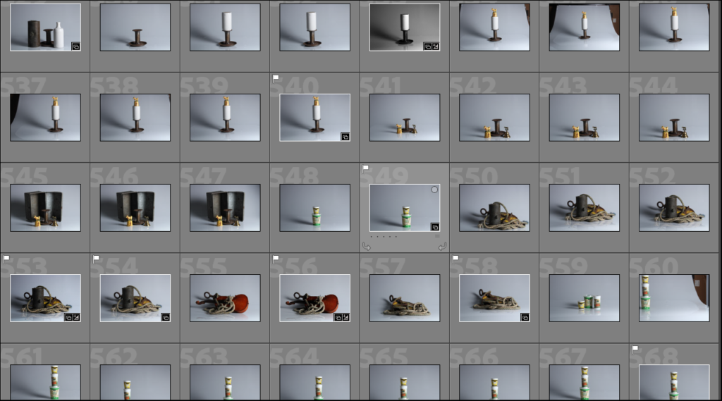
These are some of the photos from the studio in contact sheets, we took photos of different items with different lighting so that we could figure out what would look best on each of the stations. The photos with the plain white background with blue/greyish tint whereas the one with the birds-eye view had a more yellow tint to them. The photos with the yellow and pink background came out more dull than the other two and with no bright colours. The white background photos came out looking more sophisticated and aesthetic than the others because the lighting was better and the background didn’t distract or take away from the objects. If the camera angle was right you could see the reflection of the objects which made it more interesting and it seemed like it was on the water.

The photo below had a blue tint before editing due to ISO, we changed it so we could see the different effects it had on the photos. Some came out more blue and purple while others came out with a yellow tint. In the photo underneath I have decreased the exposure and contrast as well as increased the highlights and shadows. I wanted the chipped paint and rusted metal on the box to be bolder so I also increased the texture.

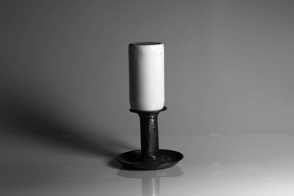
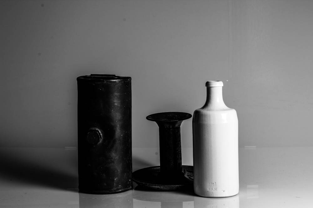
In this second photo, I have changed it to black and white as I thought the objects would look better than if they were in colour, I think the really bright white sits nicely on top of the darker metal. I wanted the shadows to be prominent so I increased the shadows and increased the contest so that the hey would be darker against the light grey background.

Final Photos
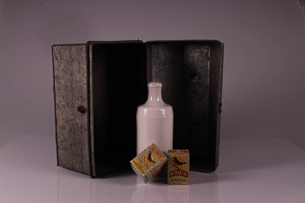
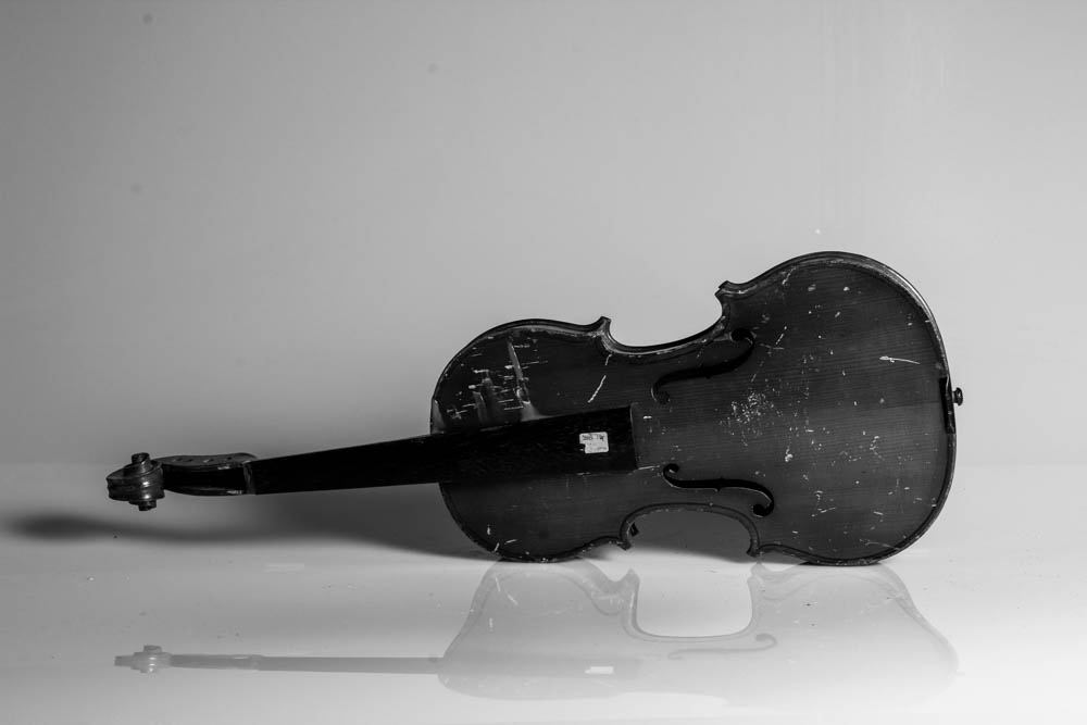
Below I have put six of my final images as I think that they all are aesthetic and is cohesive, the editing also compliments the objects in each photo. In the top right photo, I like the dark pink tint that the photo has, I also really like how the white bottle and the two boxes are framed with the metal box behind it. I also really like how you can see the different textures of the metal box and the different shadings from the positioning of the box. In the bottom left photo, I like how the darker violin contrasts with the lighter background which makes it pop and stand out. Another thing that stands out is the marks on the violin, due to the different shading in the wood gives the photo a more rustic look.

