Still Life

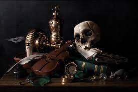
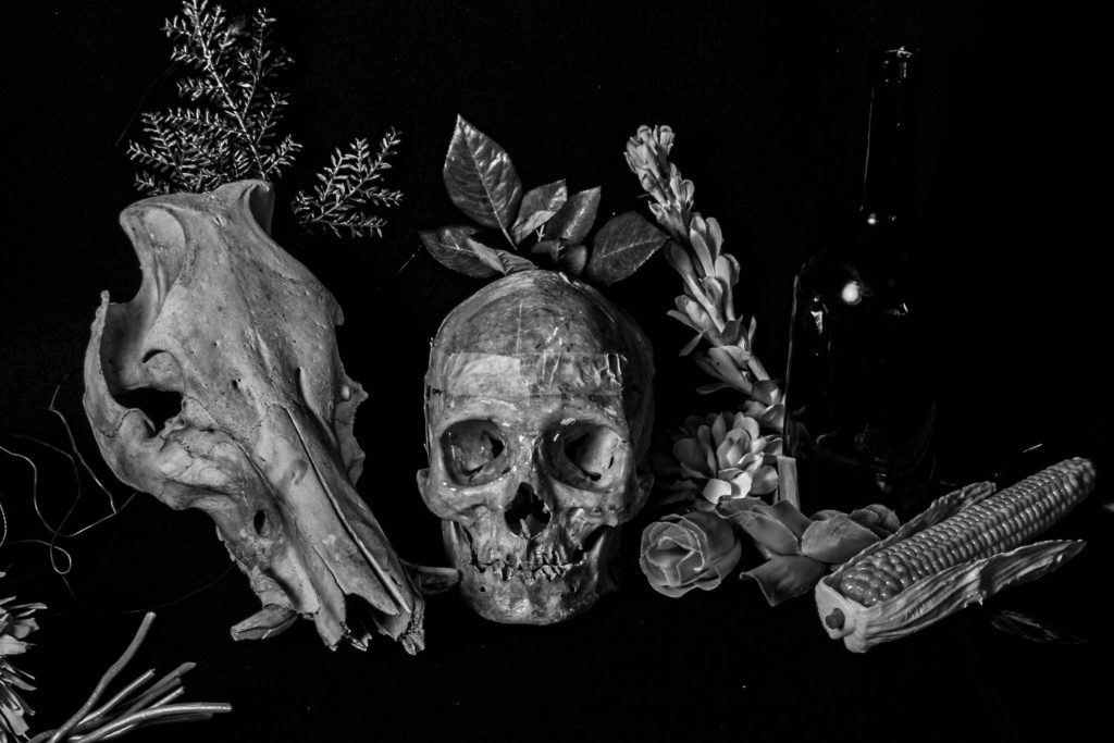
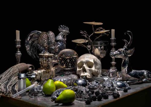
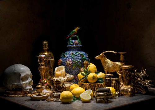
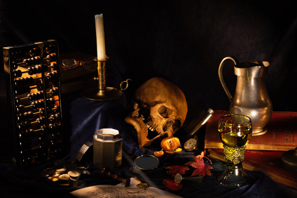
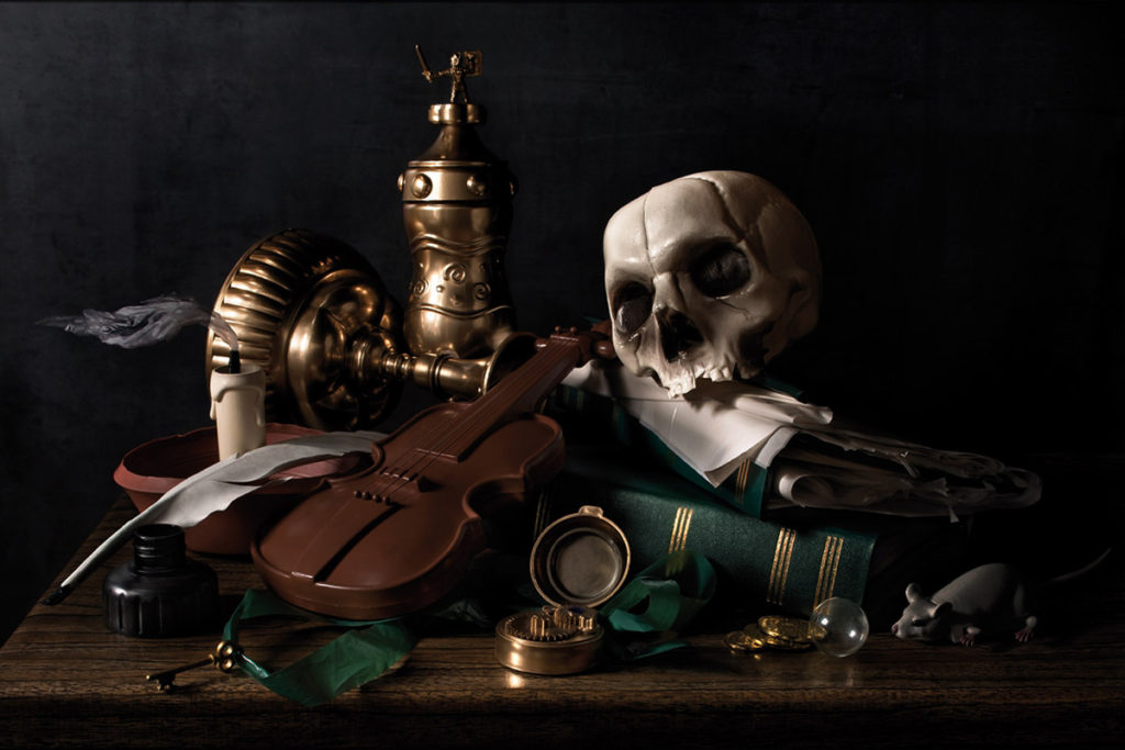
Throughout its long history, still life has taken many forms, from the decorative frescoes of antiquity to the high art of the Renaissance. Traditionally, a still life is a collection of inanimate objects arranged as the subject of a composition. Nowadays, a still life can be anything from your latest Instagram latte art to a vase of tulips styled like a Dutch Golden Age painting.

Walker Evans

Walker Evans was an American photographer best known for his work for the Farm Security Administration (FSA) documenting workers and architecture in the South-eastern states. In 1936 he travelled with the writer James Agee to illustrate an article on tenant farm families for Fortune magazine; the book Let Us Now Praise Famous Men came out of this collaboration.

Walker Evans took up photography in 1928 around the time he was living in Ossining, New York. He was mainly influenced by Eugene Atget and August Sander. Atget was French photography who was known for being a pioneer of documentary photography, even though most of his work was published after his death he was still an inspiration to many photographers. Sander was a German portrait and documentary photographer
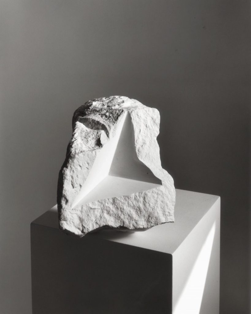
Darren Harvey-Regan

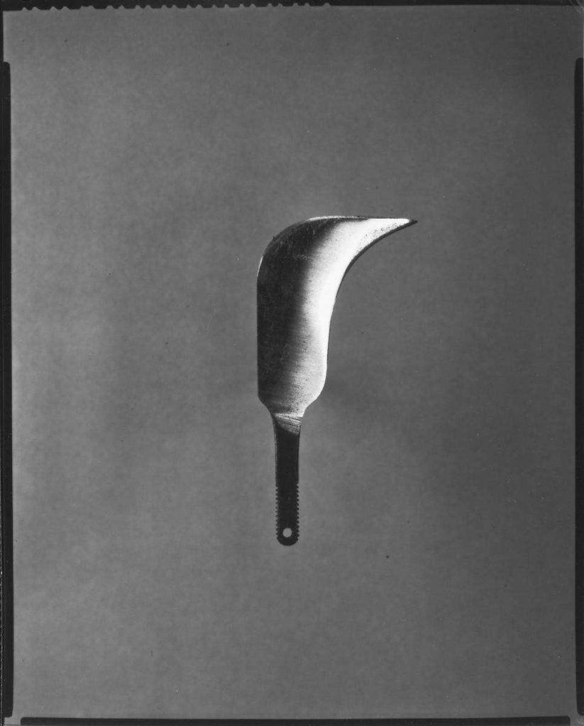
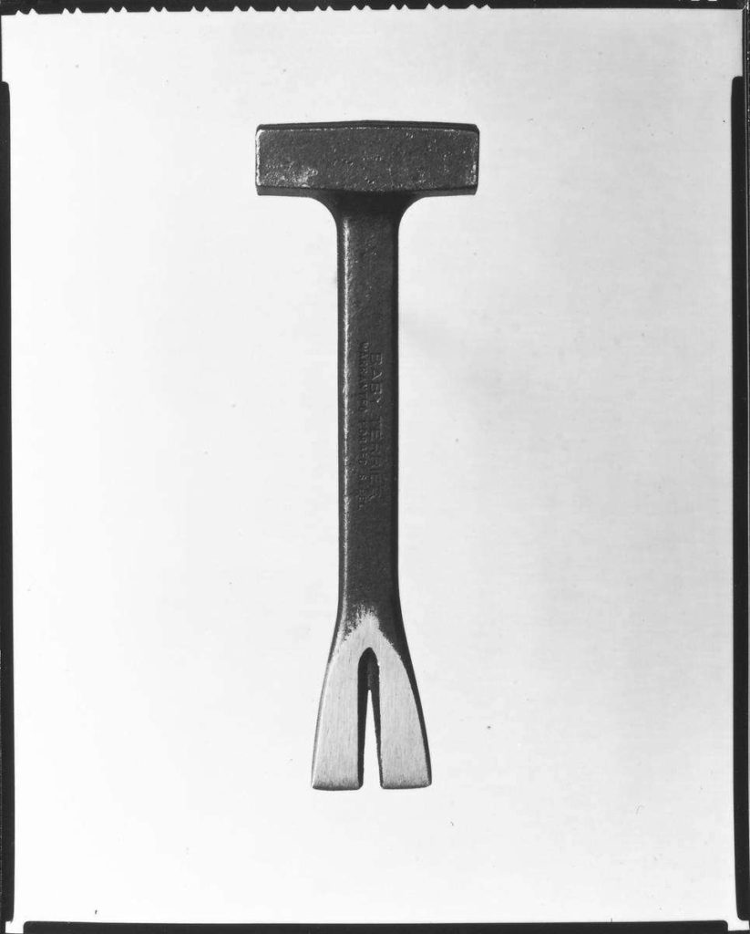
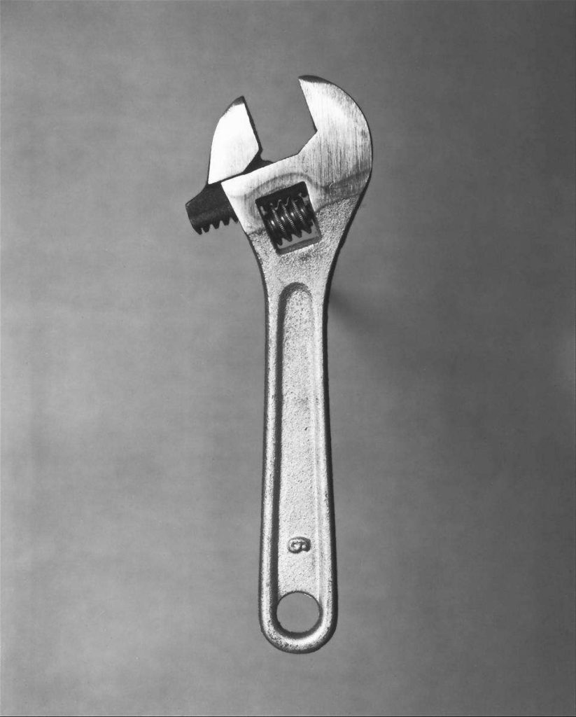
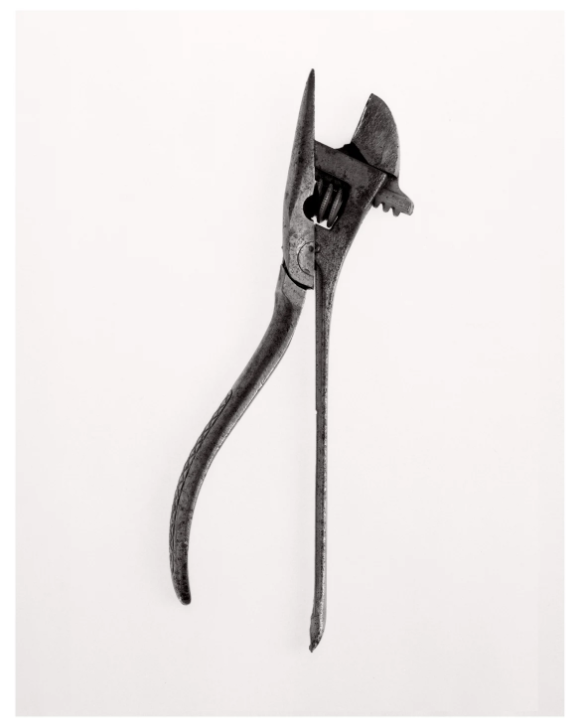
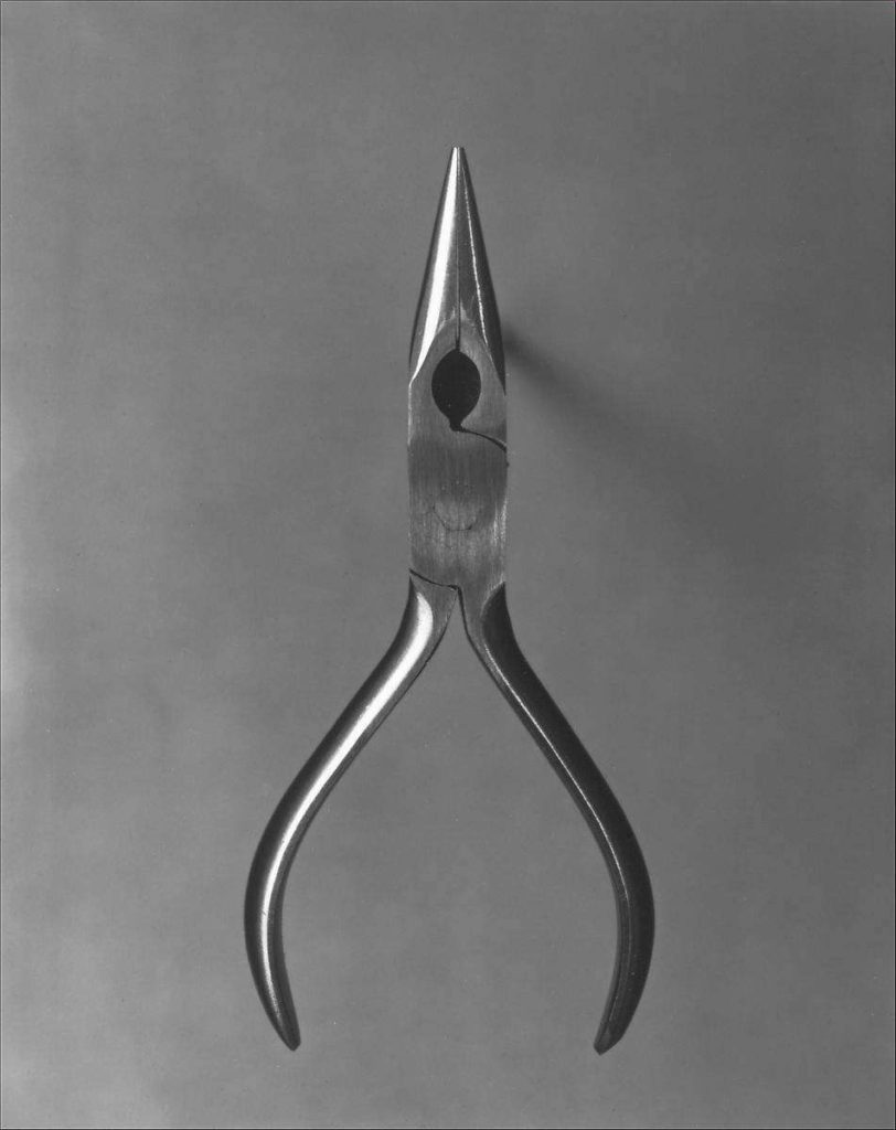
In 1955, Fortune magazine published, ‘Beauties of the Common Tool’, a portfolio by Walker Evans featuring pictures of ordinary hand-made tools, such as a ratchet wrench and a pair of scissors. After seeing this Harvey-Regan constructed a montage of Evans’s images to make new forms. He sourced matching tools, cut them in half and re-joined various halves together, with the resulting physical objects being photographed to create his final work. The montaged tools become both beautiful and bizarre objects, in which a ratchet wrench is combined with a pair of pliers and Mason’s trowel joined with a pair of scissors.

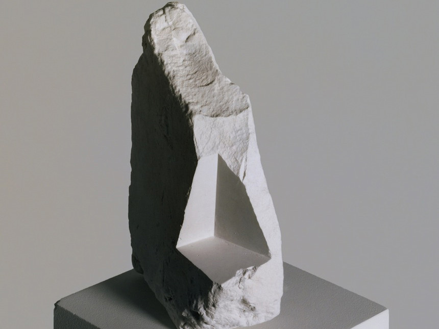
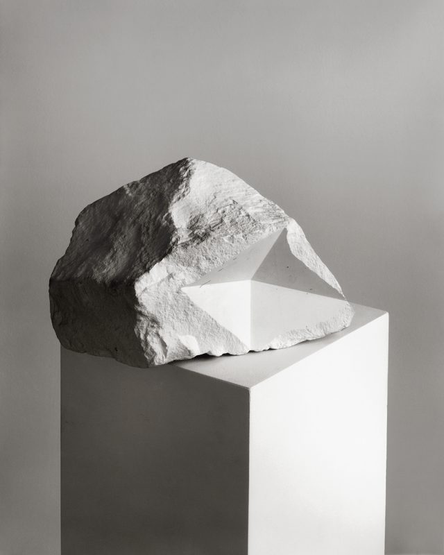
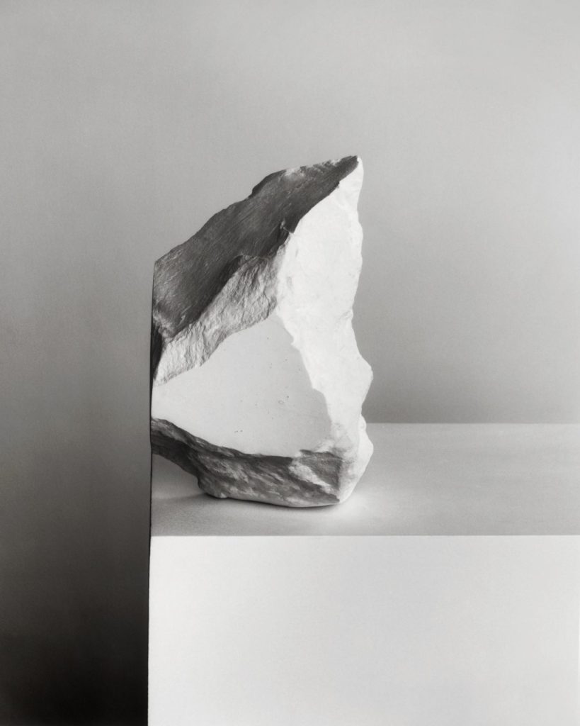
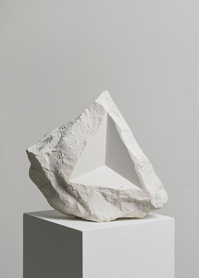
“It’s a means of transposing material into other material, adding new meaning or thoughts in the process. I think photographing materials is a way to consider the means of creating meaning, and it’s a tactile process with which I feel involved. Touching and moving and making is my engagement with the world and my art”.

“The Beauty of the Common Tool”

Walker Evans influenced Darren Harvey-Regan after he saw Evans portfolio in Fortune magazine. Harvey-Regan took inspiration from Evans and made mortgages of his simple tools. Most of Darren’s photos had white or light grey backgrounds which contrasted with the rusted dark greys of the tools, whereas Walker had a range of dark and light backgrounds in his work, the darker backgrounds could have been used in some of the tools had more of a shine to them that others so that a harsh white background didn’t clash.

Both Walker Evans and Darren Harvey-Regan photographed their tools with little to no shadows, this allows views to have all their focus on the tools and nothing distracting in the background.

Studio Work

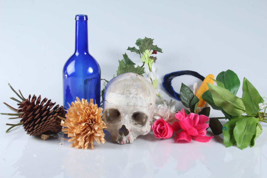
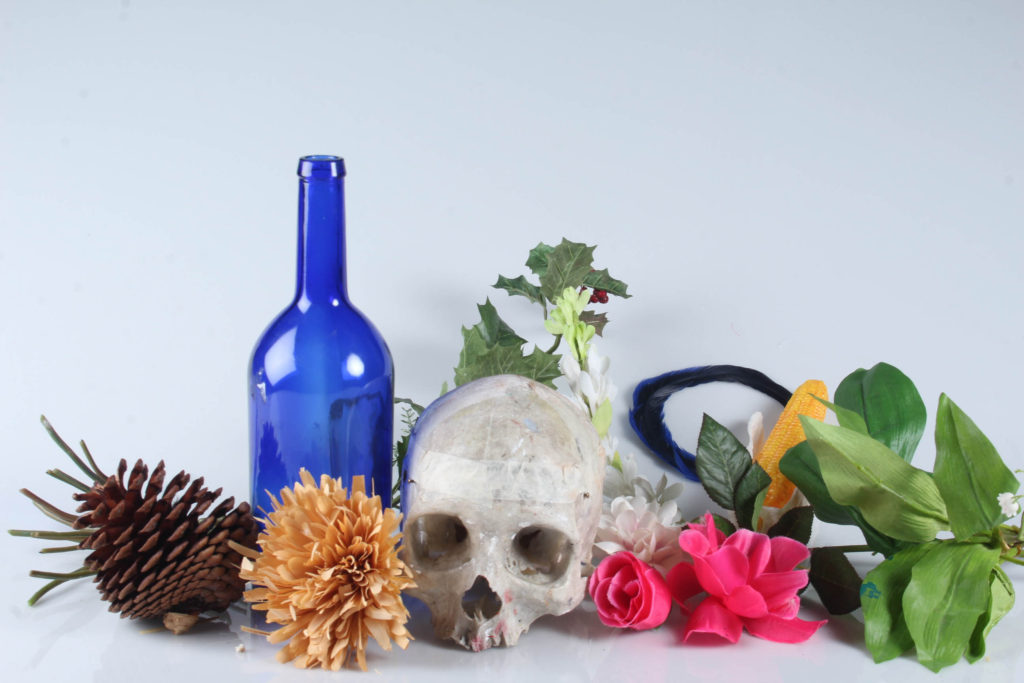
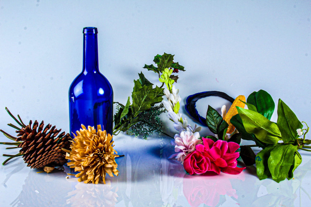
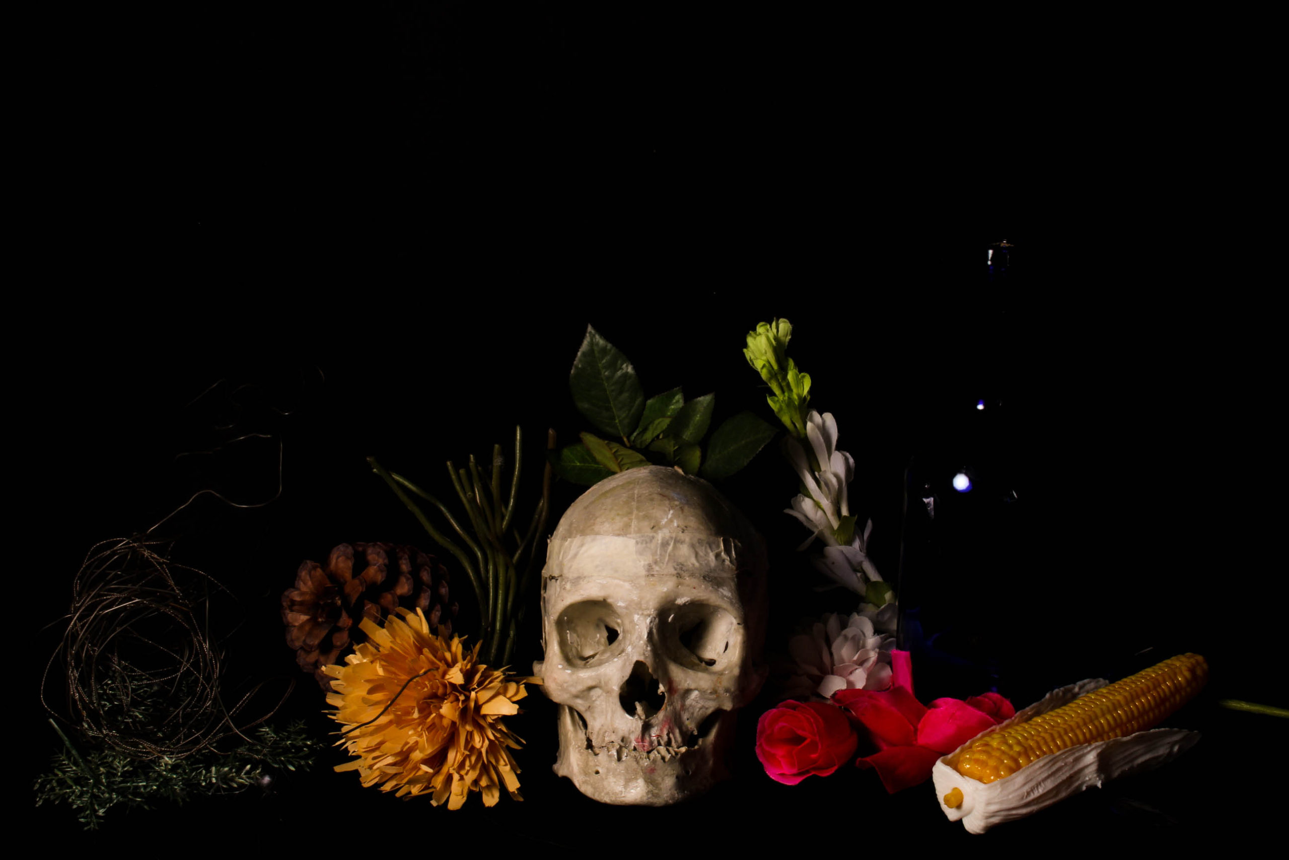
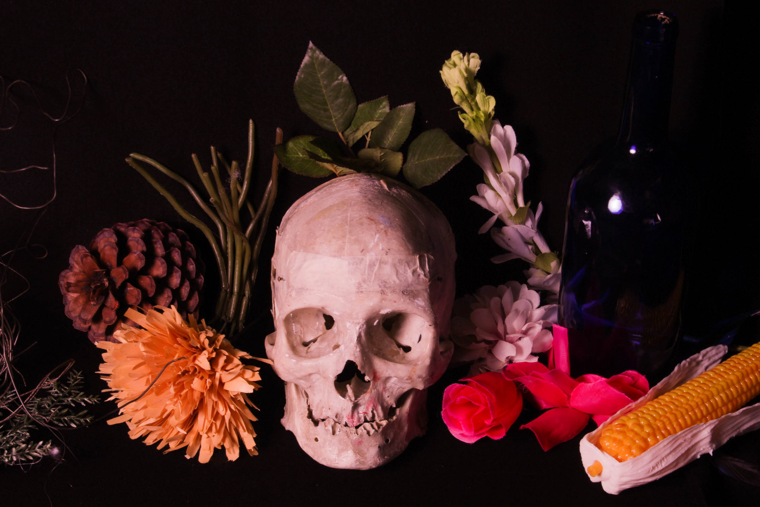
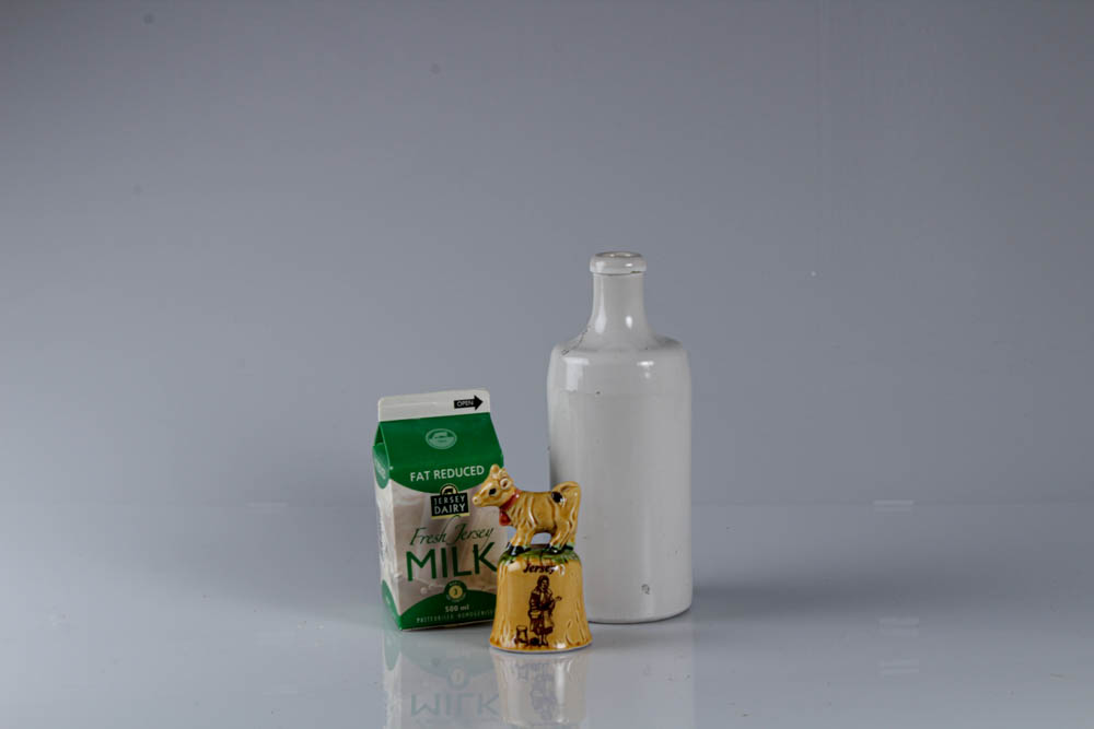
We had gone into the studio to take photos of different Jersey heritage items and some from Hamptonne. We had one station that had a camera that was positioned at the birds-eye view, another with a plain white background and one with a pink a yellow background. While at each station we adjusted the ISO and shutter speed so that we could get different lighting, we also would change if the main light was on or off while in the studio. We would also change our spotlights, we would turn one of them off so that we could get a more proponent shadow.

Editing

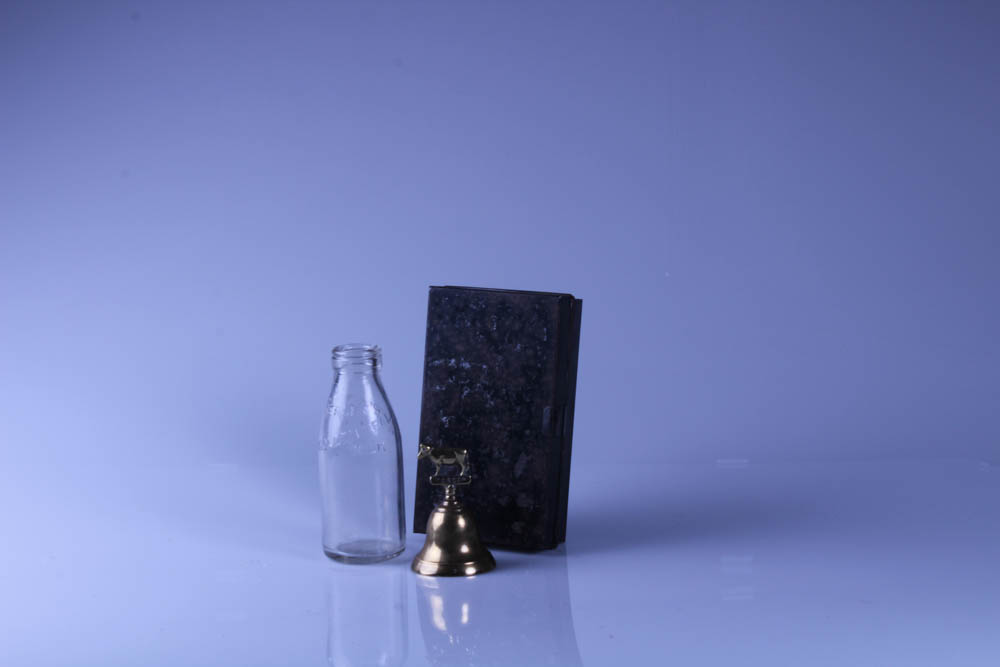
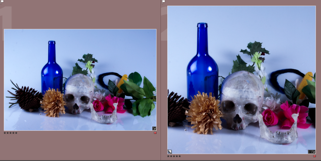
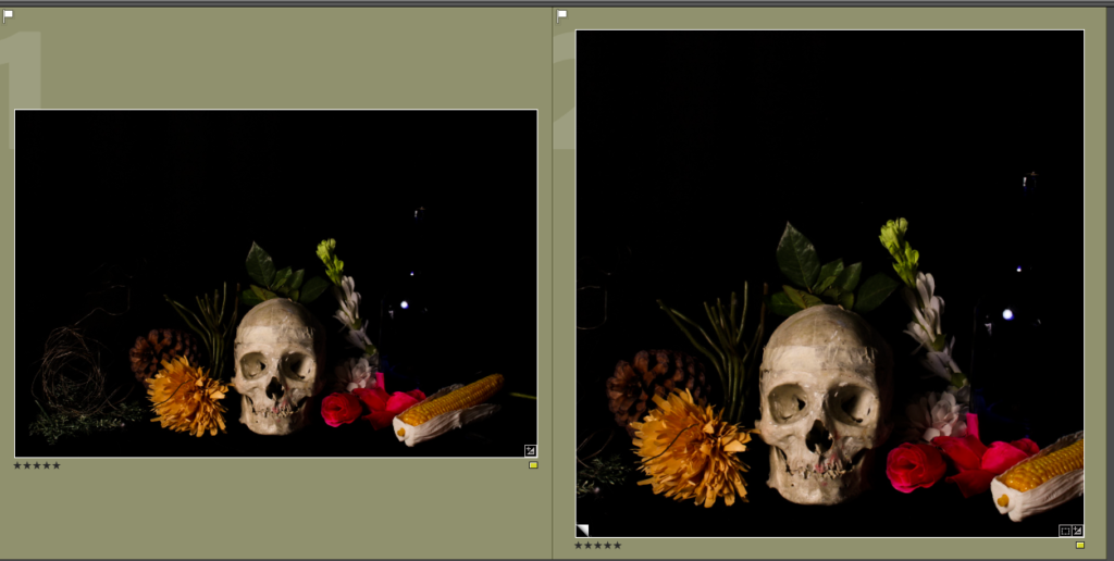
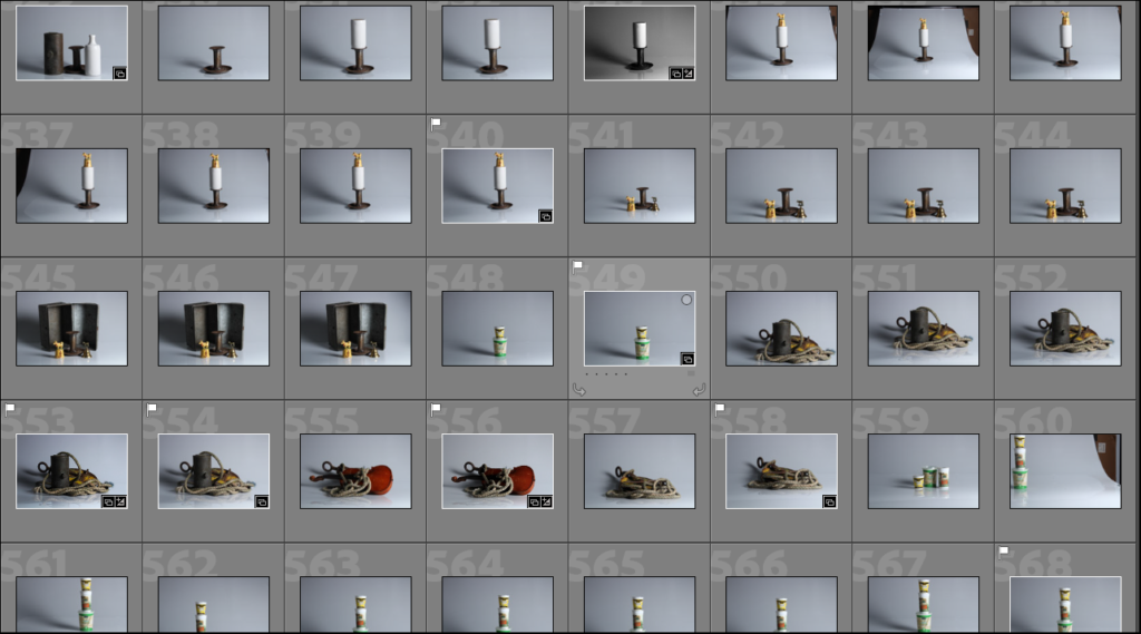
These are some of the photos from the studio in contact sheets, we took photos of different items with different lighting so that we could figure out what would look best on each of the stations. The photos with the plain white background with blue/greyish tint whereas the one with the birds-eye view had a more yellow tint to them. The photos with the yellow and pink background came out more dull than the other two and with no bright colours. The white background photos came out looking more sophisticated and aesthetic than the others because the lighting was better and the background didn’t distract or take away from the objects. If the camera angle was right you could see the reflection of the objects which made it more interesting and it seemed like it was on the water.

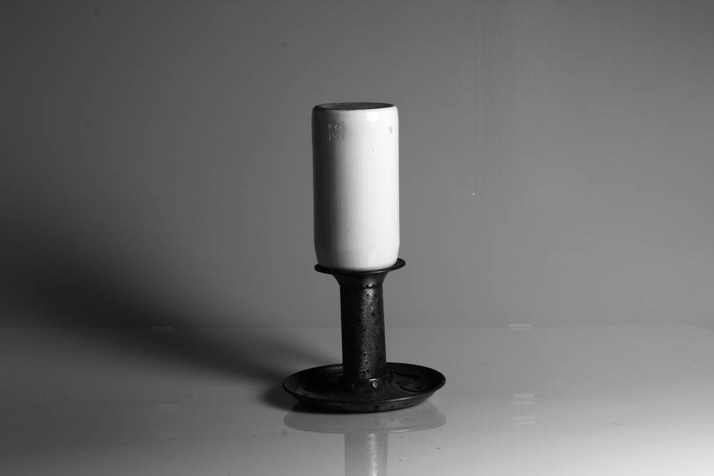
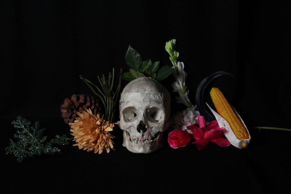
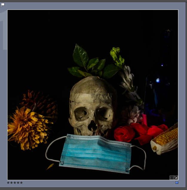
The photo below had a blue tint before editing due to ISO, we changed it so we could see the different effects it had on the photos. Some came out more blue and purple while others came out with a yellow tint. In the photo underneath I have decreased the exposure and contrast as well as increased the highlights and shadows. I wanted the chipped paint and rusted metal on the box to be bolder so I also increased the texture.

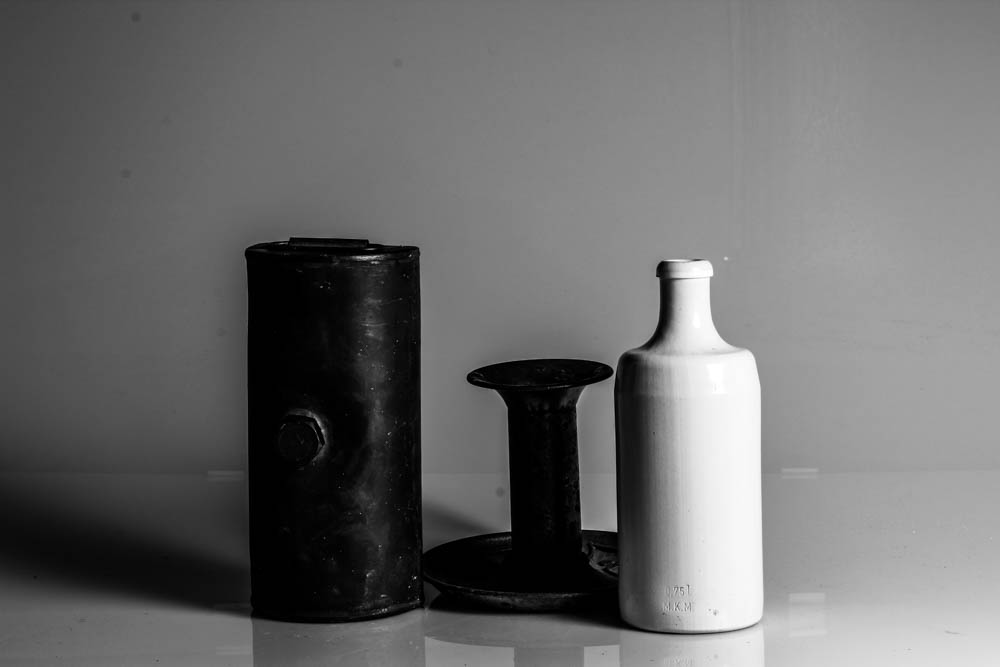
In this second photo, I have changed it to black and white as I thought the objects would look better than if they were in colour, I think the really bright white sits nicely on top of the darker metal. I wanted the shadows to be prominent so I increased the shadows and increased the contest so that the hey would be darker against the light grey background.

Final Photos

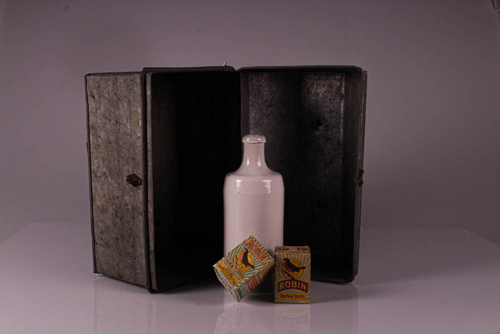
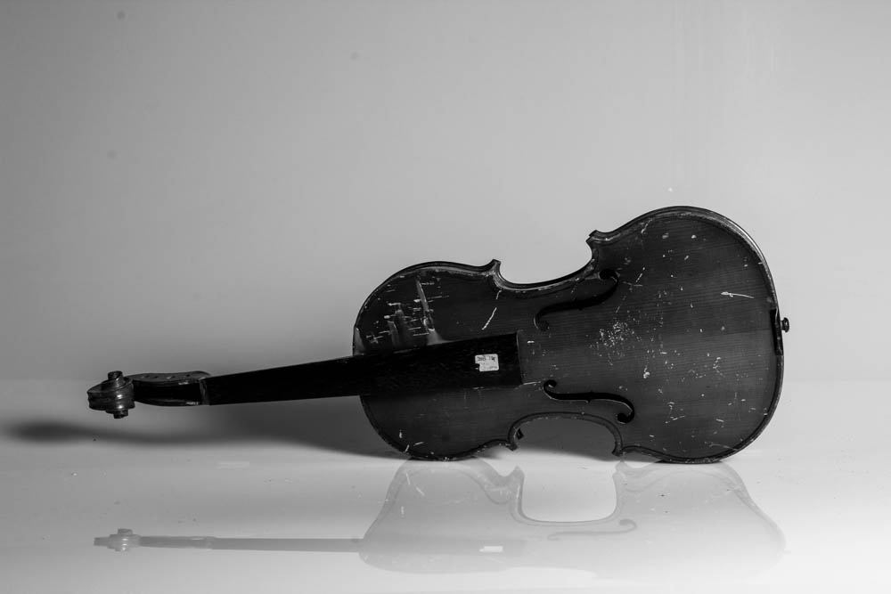
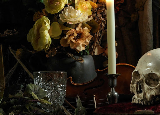
Below I have put six of my final images as I think that they all are aesthetic and is cohesive, the editing also compliments the objects in each photo. In the top right photo, I like the dark pink tint that the photo has, I also really like how the white bottle and the two boxes are framed with the metal box behind it. I also really like how you can see the different textures of the metal box and the different shadings from the positioning of the box. In the bottom left photo, I like how the darker violin contrasts with the lighter background which makes it pop and stand out. Another thing that stands out is the marks on the violin, due to the different shading in the wood gives the photo a more rustic look.

Vanitas

Contact Sheet

Paulette Tavormina

Photographer Paulette Tavormina on the Art of the Table | 19th Century  Furniture & Sculpture | Sotheby's

Paulette Tavormina lives and works in New York City. Amidst the bustle that defines the city, she can often be found at one of the city’s many farmers markets searching for the perfectly imperfect flora that characterize her photographs. Her arrangements often recall the sumptuous detail of seventeenth century Old Master still life painters and serve as intensely personal interpretations of timeless, universal stories. With a painterly perspective reminiscent of Francisco de Zurbarán, Adriaen Coorte and Giovanna Garzoni, Tavormina creates worldly still lives.

Paulette Tavormina image analysis

Paulette Tavormina

My Final Vanitas Images

My Best Images

Vanitas Photography

A Vanitas photograph is symbolic of the idea of the mortality of people and how time in life is short. Props used for this kind of photography (or art style as a whole) usually involve skulls and hourglasses to represent those ideas in a way in which any viewer can get an idea for the symbolism of the image.

Mood Board

Paulette Tavormina

Photographer Paulette Tavormina on the Art of the Table | 19th Century  Furniture & Sculpture | Sotheby's

Tavormina is a New-York based photographer who is inspired by the works of 17th Century Old Masters’ artwork, and creates a modern and almost playful twist (typically using bright flowers) on the Vanitas style. Photography had piqued her interest in the 1980’s, which motivated her to attend classes involving dark-room photography. She took several opportunities to use her skills during her career, starting as a commercial photographer, to even creating cookery books in a Vanitas-esque style. Since, she has continued to develop her ideas and style and has hosted several exhibitions of her work.

Image Analysis

Paulette Tavormina

Lighting in this image is the most important part of this image, it is harsh enough to not only light up the objects effectively, but also show great detail on the objects themselves, while also not being too harsh as to create dense shadows. I like the way colour is used in this image (specifically between the left and right of it): Colour on the left side of the image is fairly limited, being mainly grey with a touch of orange and green, giving it a more formal and serious look. On the right side, colour is very much diverse and bright, with the bright pink of the flower appearing in front of a dark, yet noticeable, green. The composition of the image also looks to be divided by the left and right sides of the image, with the left side once again appearing serious, with nothing appearing above the skull and candlestick, however, space is filled not only with the leaves and flower, but also the bubbles above them, which gives the left side a more playful and energetic look. The focal point of the image is the skull, likely because it looks as if it is looking at the viewer, attracting their attention, or because it is, of course, white. It is possible that the image could have been laid out this way to show that the person that was the skull (or at least the character created by Tavormina) had both a serious side and playful side to them, and were likely praised for this, with the wreath on their head.

Vanitas Photoshoot

Contact Sheet

A contact sheet of my Vanitas photoshoot, I have already selected my best images from the photoshoot. I chose the images with the most effective composition, lighting and colour.
These are my best images (unedited).

This most of the images in this contact sheet have a cropped and un-cropped version. (I did this because Tavormina’s work is usually square).

These are the edited versions. I edited these images by making the ones with the white background cooler and the ones with a black background warmer (I am particularly fond of the warmer images because they resemble paintings in this style)

Final Images

(*Notes* Colours behind the images do not represent a ranking or the like…
The uncropped versions of the images are on the left and cropped on the right)

I chose this as a final image because I liked how the colour palette is diverse, and the colours themselves are bright and contrast nicely with the brownish objects on the left of the skull. The focal point of this image is either the blue bottle or the pink flower, this is because they are bright and stand out in the white background, inversely, the skull’s eyes/nose could also be seen as a focal point as they are dark, which contrasts with the white background, and central. I think the way the objects are arranged in a line is also effective, as it allows a bit of space above and below them to let the image breathe. The leaves and flowers could represent nature and how death is something natural.

This image, to me, is the closest I got to a classic Vanitas painting/photograph (with the colours being dimmed yet noticeable and the skull being the main focal point), because of this I am very much fond of it and chose it as a final image. I also like how the bottle on the right reflects the light from the left, which reminds me of the image I have analyzed previously on this blog post, I think it gives the image an interesting look and gets the viewer to look a little closer. I think the composition of this image is very effective, the way it is laid out in a line, with a large open space above the objects that gives the image more space to breathe, but also make the objects seem small, which adds to the mysterious look vanitas art usually uses to great effect.

I chose this image because I liked it’s warm, pinkish tone, which gives all of the objects, even the brownish ones, an interesting and vibrant colour, which gives this image an energy the others lack. I also like how the skull is clearly the most noticeable part of the whole image, this is likely because not only does it look as if it is looking at the viewer, but also because it is the brightest part of the image, which contrasts especially with the pure black background. I angled the camera to look down on the objects to give this image a slight, yet noticeable change. Unlike the other final images I have chosen, this one doesn’t have much open space, which also helps to give it a unique and energetic look to it.

I chose this image because I liked how the mask has been positioned around the mouth of the skull and how it adds colour to the image. I decided to make this aperture of this image slightly darker because I wanted the mask and the skull to be the most noticeable part of the image and to give the shadows and darker parts of the image a greater emphasis, which I did not do as much in the other images because I felt brighter colours and highlights would better resemble Tavormina’s work, however the darker tones do remind me of the more grim tones of classic Vanitas work . I think that the way the mask is a formal shape and the other objects are rather irregular could not only create a contrast, but also be a way of clearly differentiating what is natural and what it man made.

Evaluation

Overall, I am very pleased with the way this photoshoot turned out. I think I have followed the style of the artist I studied, as well as the theme of Vanitas, effectively. I think my favorite image from this photoshoot is the 3rd Final Image shown (the pink-toned one) as it has a nice amount of colour, while still resembling the classic Vanitas style. To improve this photoshoot I could have maybe changed the colours of the background slightly (perhaps to a dark red or blue for example) and changed the objects around a bit more, but I think those would be little improvements, rather than game-changers.