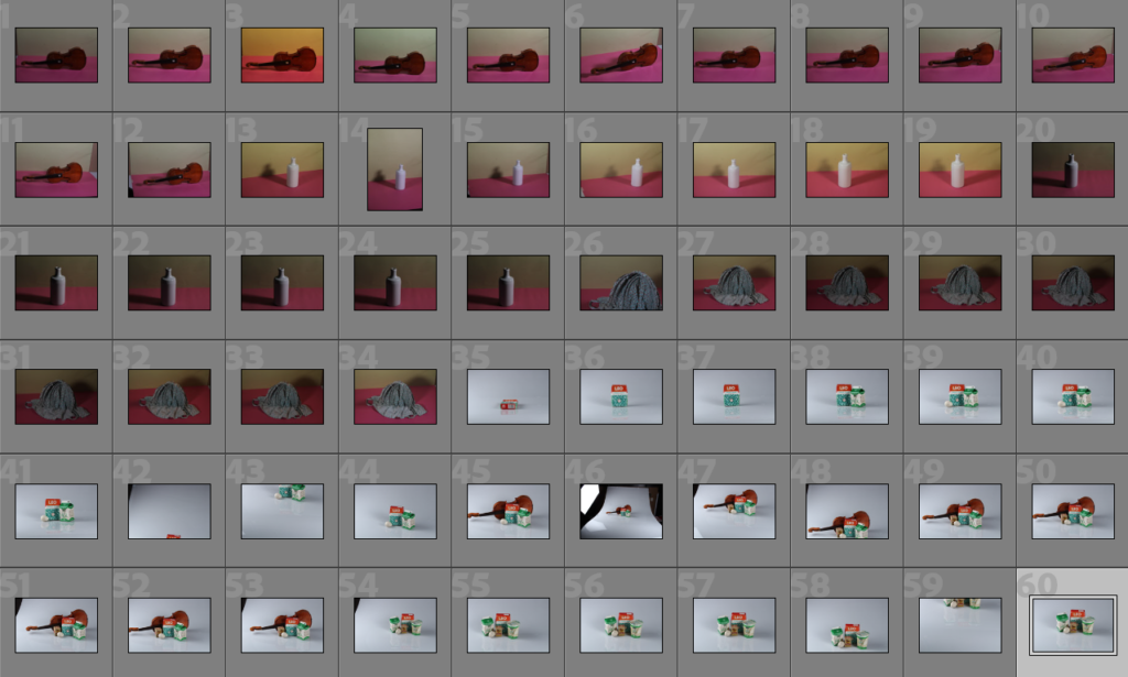
Throughout these photoshoots, the main goal was to keep the objects in centre frame and decently well lit with little to no shadows which ended up being quite a struggle when using the soft box lights as we were using 2 lights that created 2 different shadows, leading us to move them around in order to try minimize/redirect the shadows. I didn’t want many shadows so I wouldn’t have to edit them out later which would’ve made it more difficult to combine the photos together later on.
Editing My Photos: Harvey-Regan
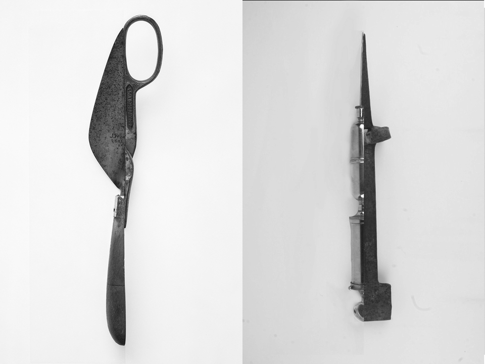
These edits were inspired by Darren Harvey-Regan’s splicing project. I tried to use my photos in order to recreate Harvey-Regan’s work by choosing photos that I thought would work well together and used photoshop in order to edit them together.
——– Edit 1: ———————————–
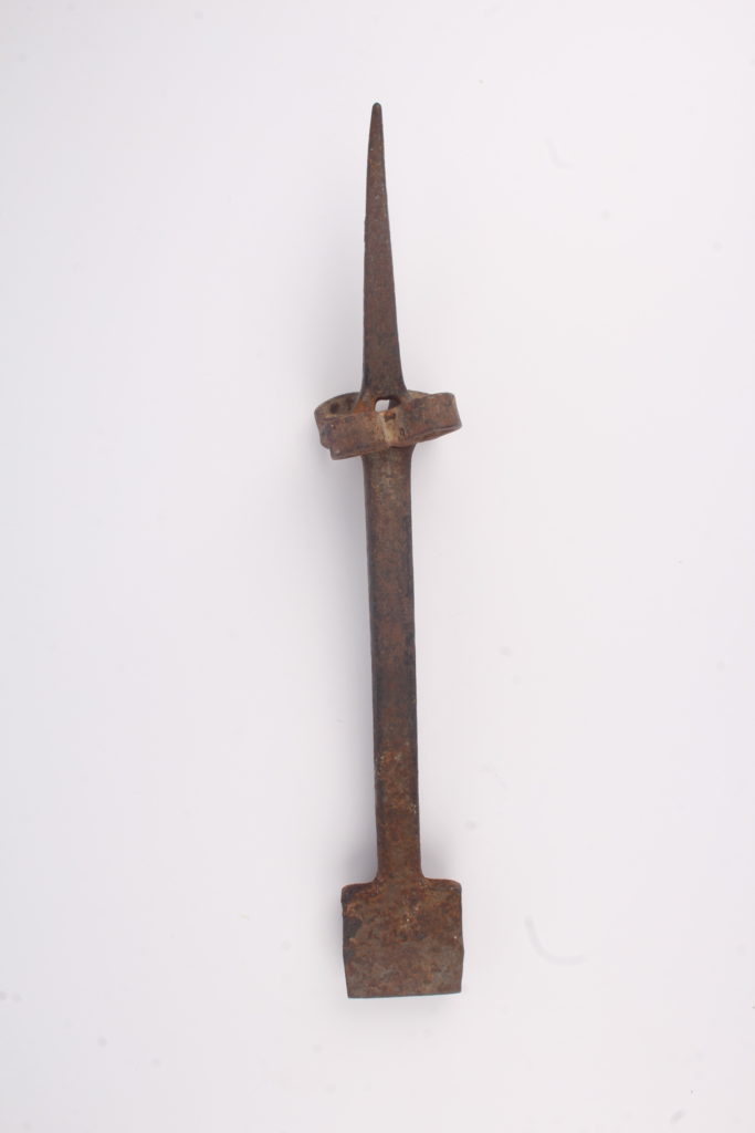
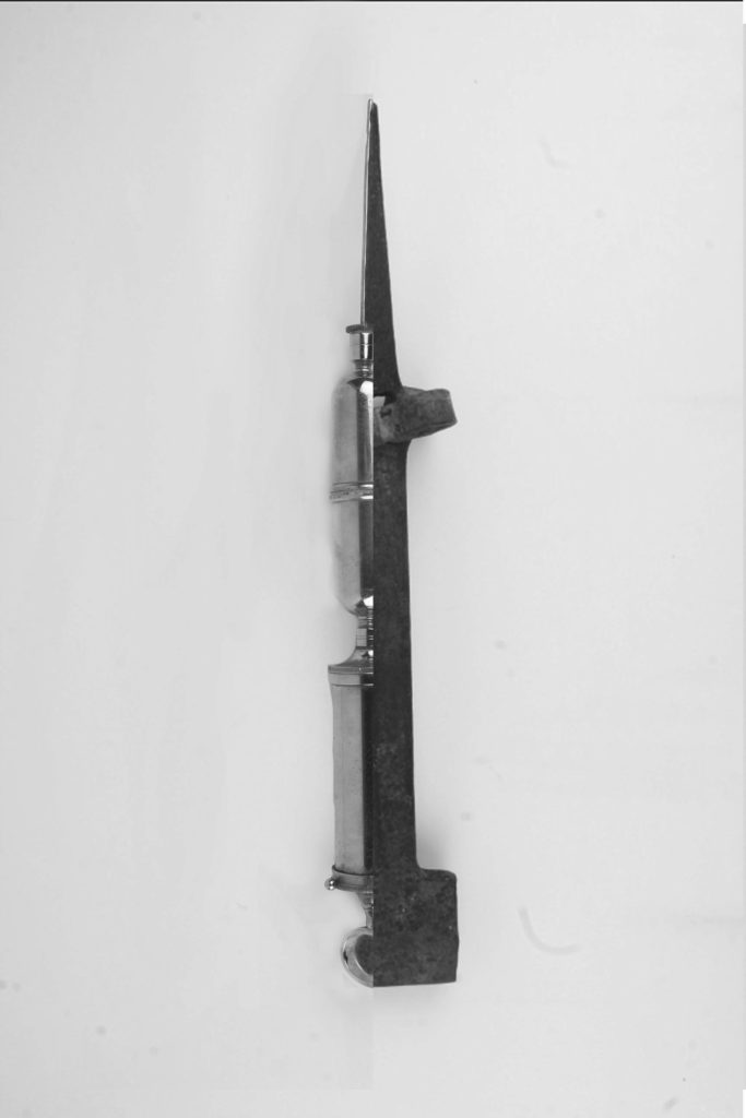
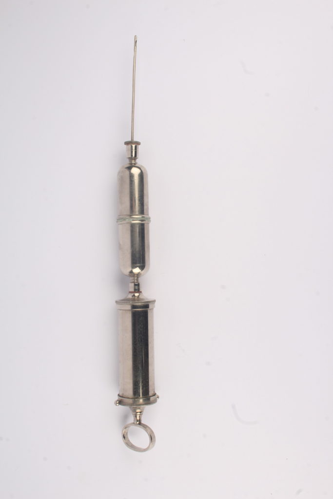
In this edit, I tried to Harvey-Regan’s splices by including many elements of his work such as the sharp edges between the two different images, the white background and making the black and white image in order to get a deeper understanding of his work style.
——– Edit 2: ———————————–
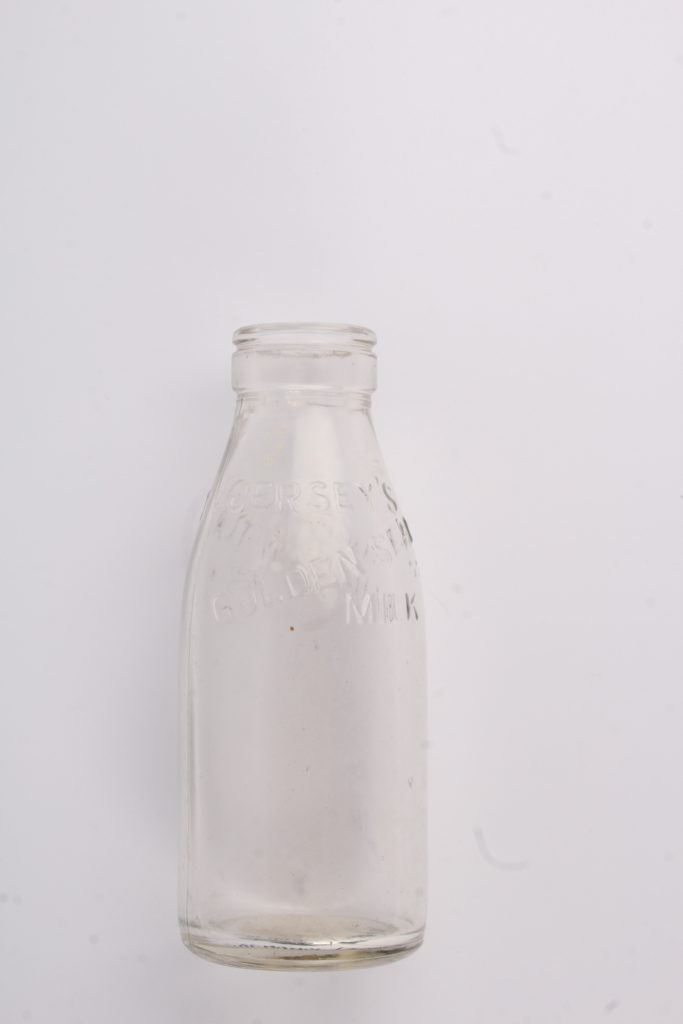
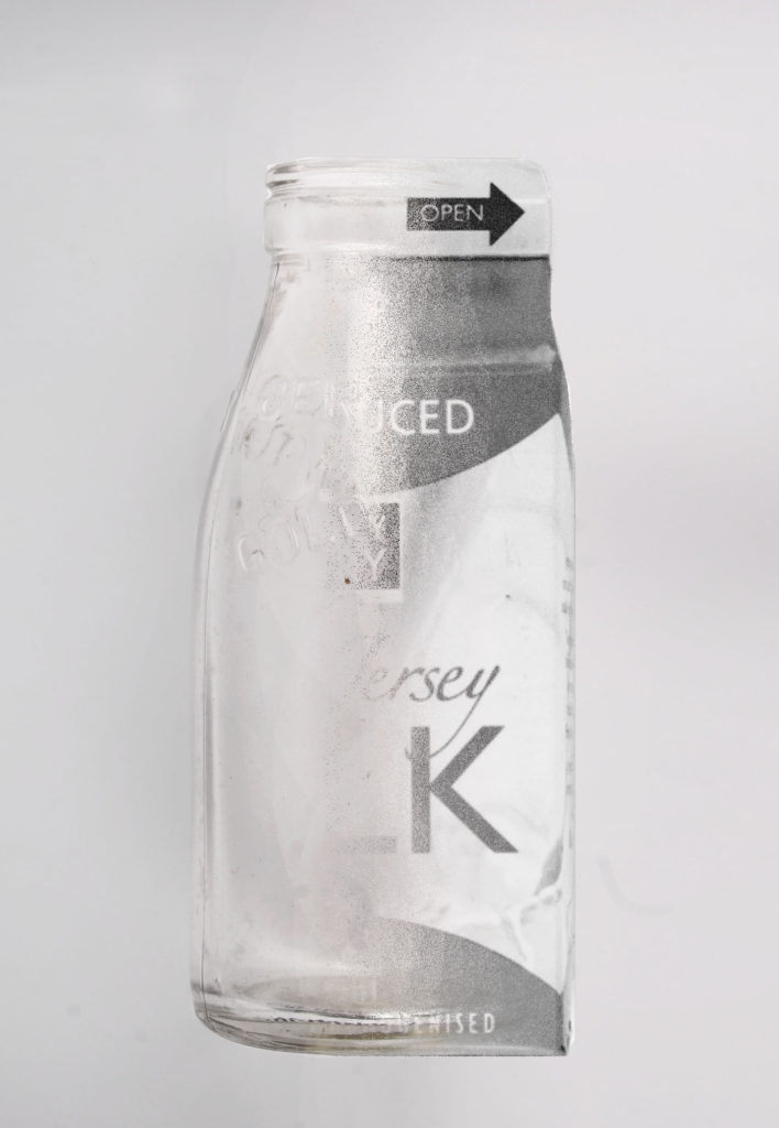
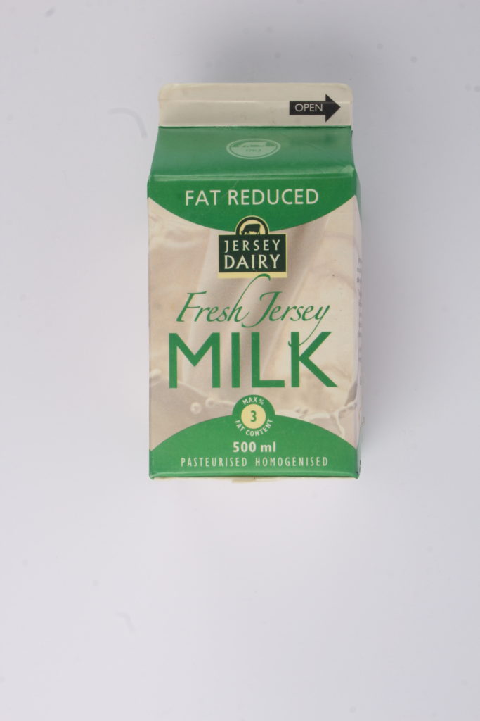
In this edit, I decided that I wanted to try blend the two images together instead of keeping Harvey-Regan’s sharp edge as I wanted to experiment with what I could do in order to merge his editing style with my own. I like this edit more than the first as I think both images work well with each other and I’ve managed to get them to merge together without recreating Harvey-Regan’s style completely.
Editing My Photos:
After experimenting with Harvey-Regan’s style, I decided to use some elements of his work with my own style in order to create edits that loosely resembled his work.
——– Edit 3: ———————————–
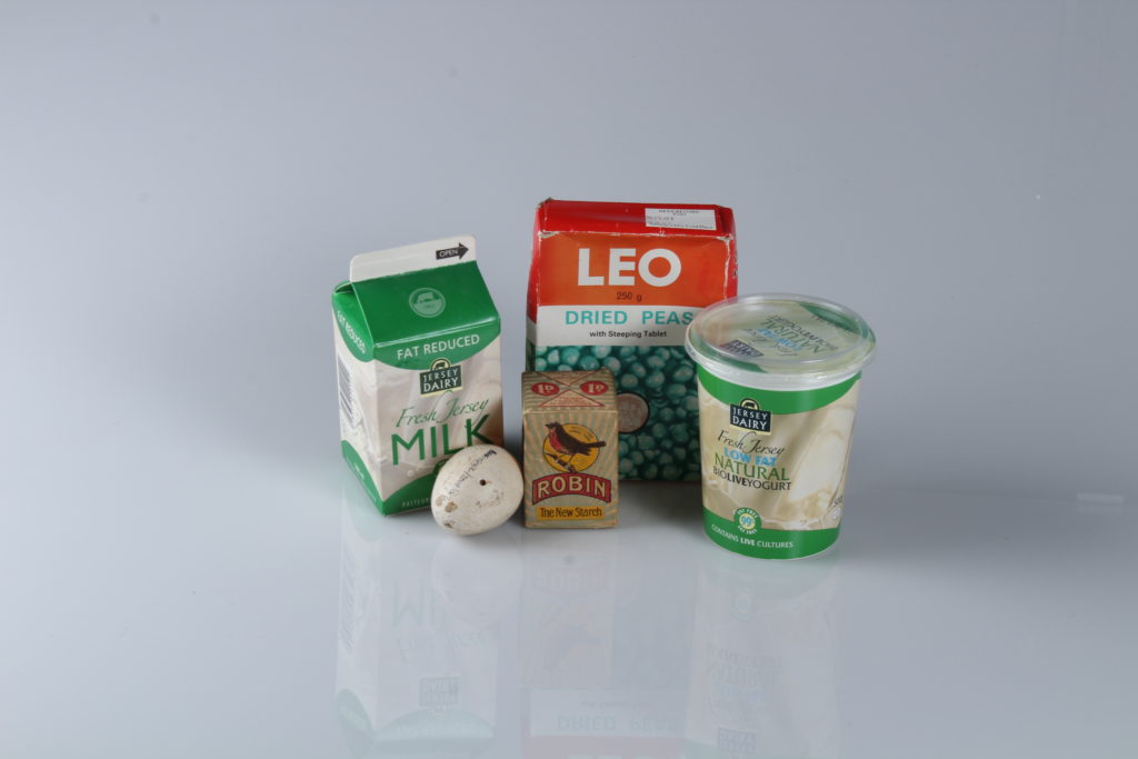
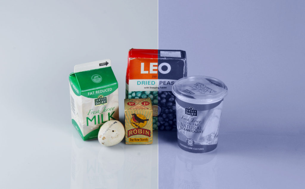
I decided that I was going to start by experimenting with colour in order to see what I could do in order to manipulate the photo as there was a lot of objects in this photo, making it difficult to splice with another. Although it’s not my best edit, I think it still looks interesting as the blue tone from the right side of the image contrasts with the colours from the left side, creating two different moods in a single image.
——– Edit 4: ———————————–
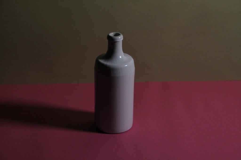
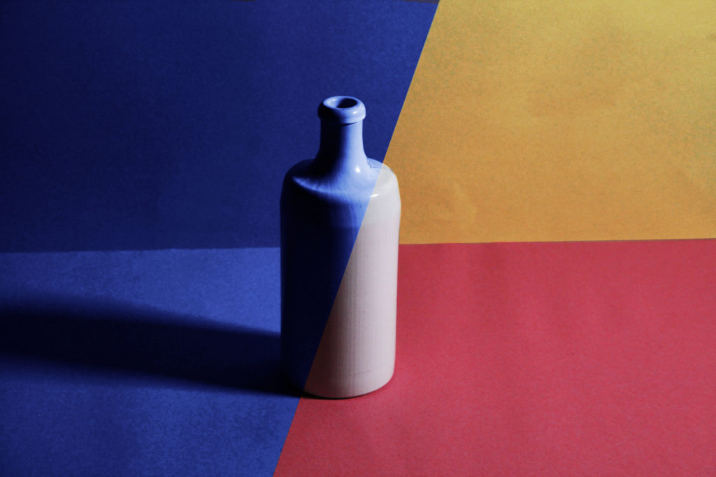
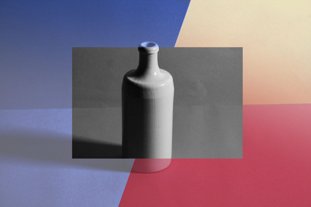
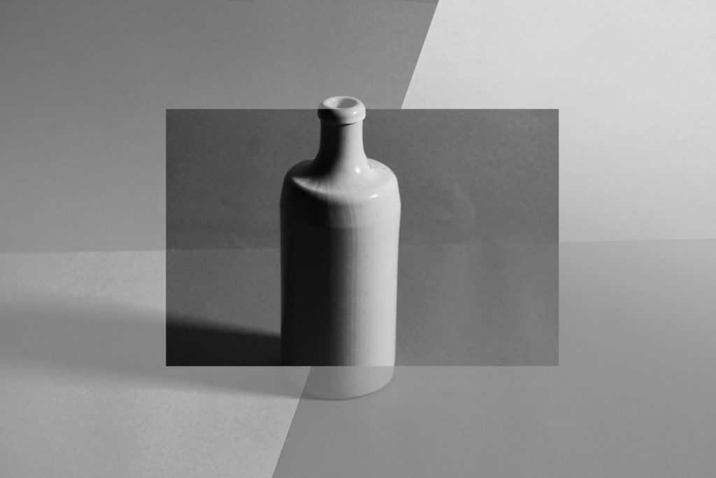
For this image, I created 3 edits as I couldn’t decide which one I liked the most as I liked different aspects of each: the simplicity of the first, the business of the second and the blandness of the third. Overall, I liked having multiple colours in one photo rather than taking 2 different images and montaging them together into a single image.
——– Edit 5: ———————————–
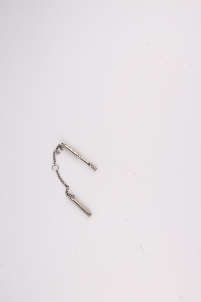
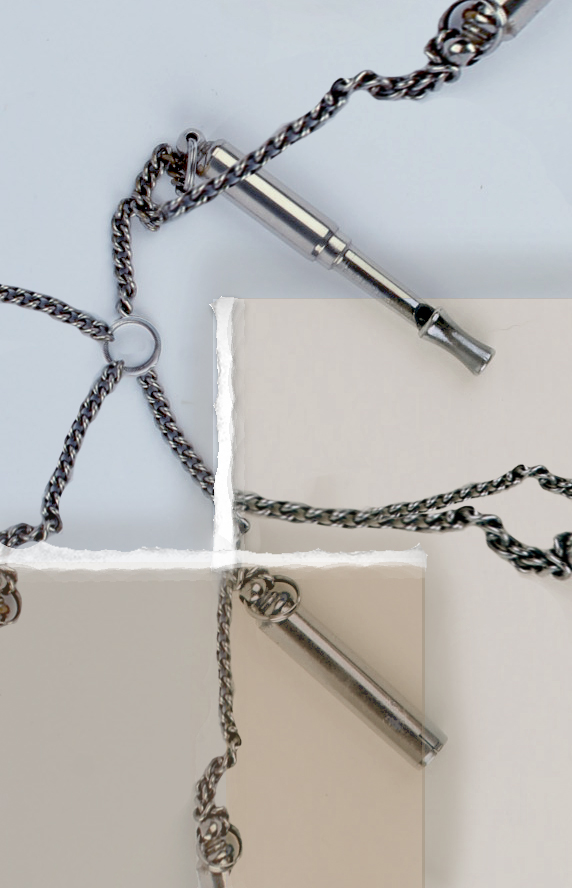
Whilst editing this image, I knew I needed to make it busier as the whistle was quite small compared to the background so I started by cropping the image, making it easier to see the whistle then copy and pasted part of the whistle’s chain around the image in order to make the image look more interesting. I then added 2 squares as I wanted to add more colour and depth into the image, later adding some white to the edges to add texture to the edge of each box, making them look like torn paper. Finally, I added some subtle shadows by the squares edges to make the image look slightly more realistic and add depth.

The GIF is excellent…nicely done Matilde!