

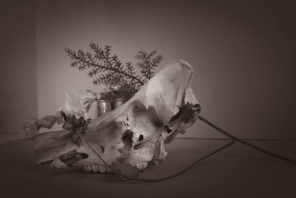
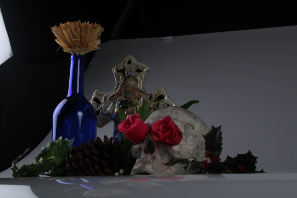
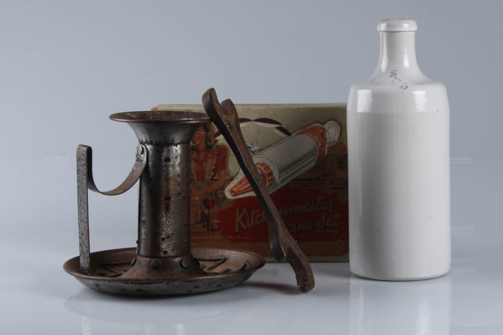
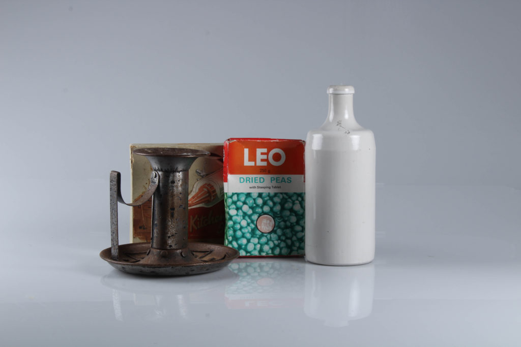
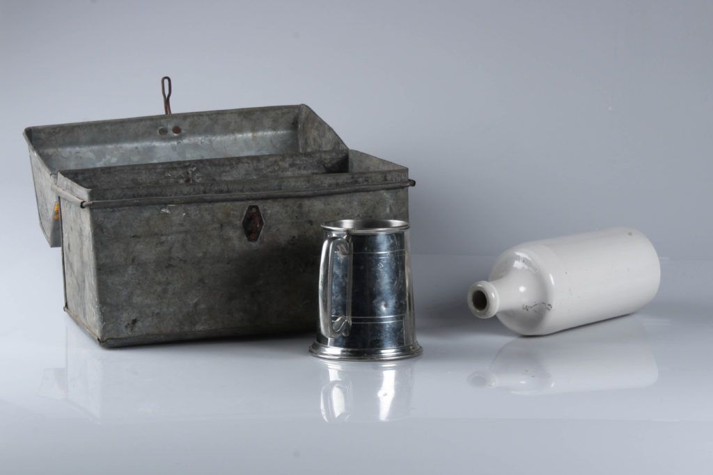
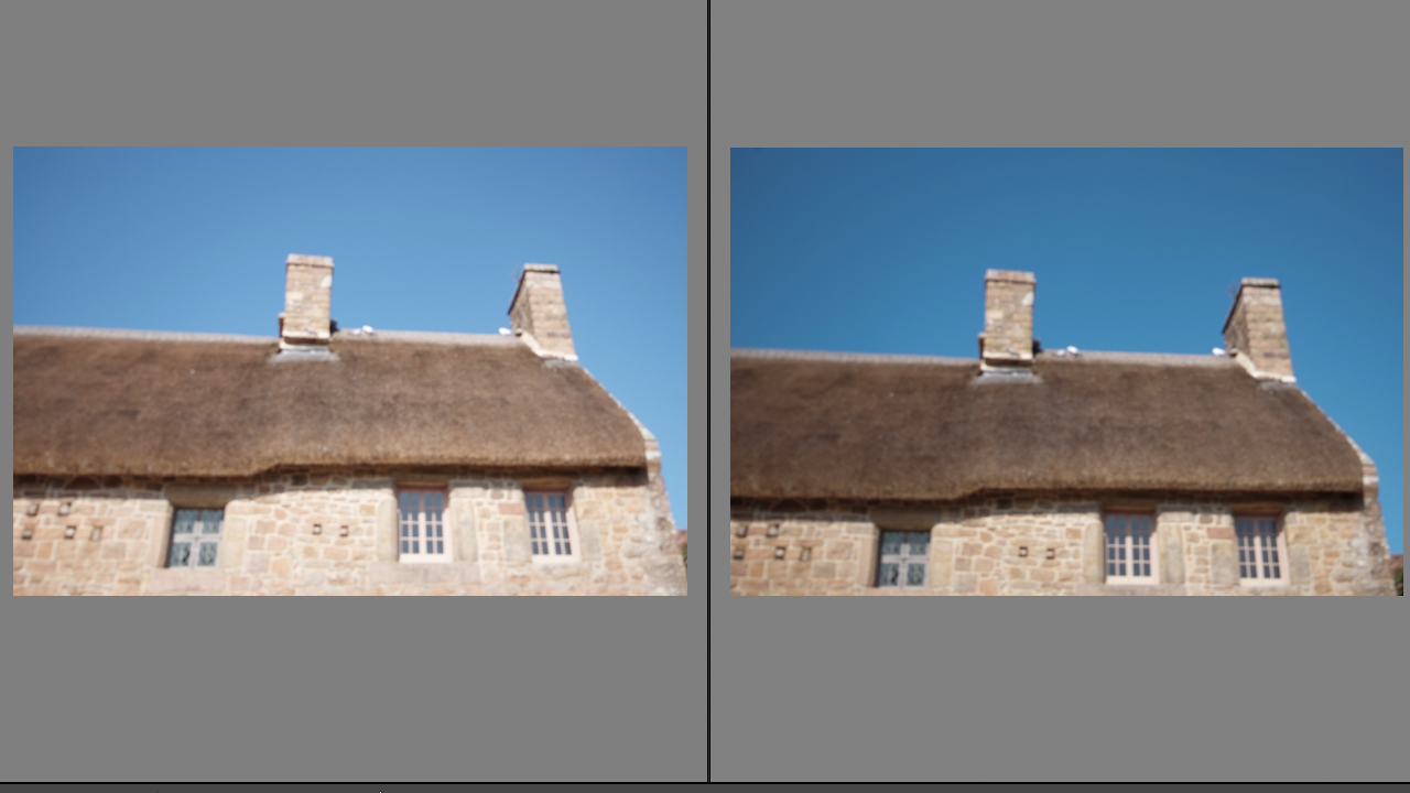
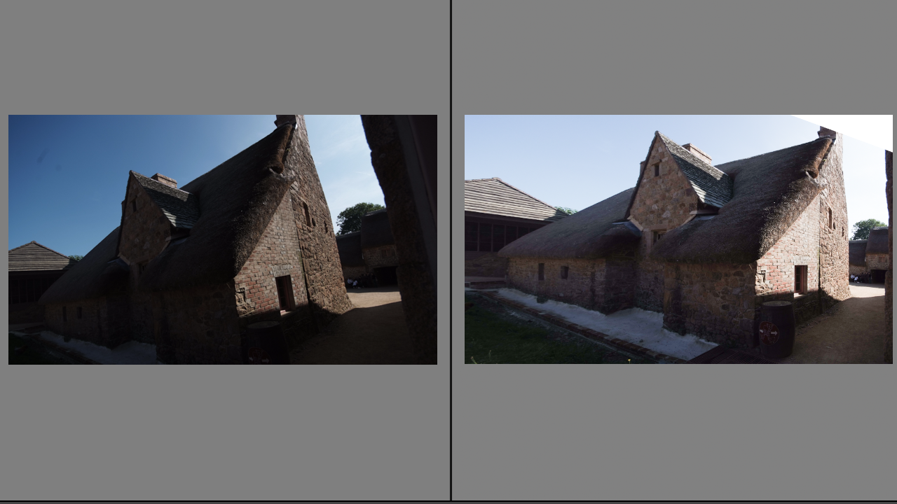
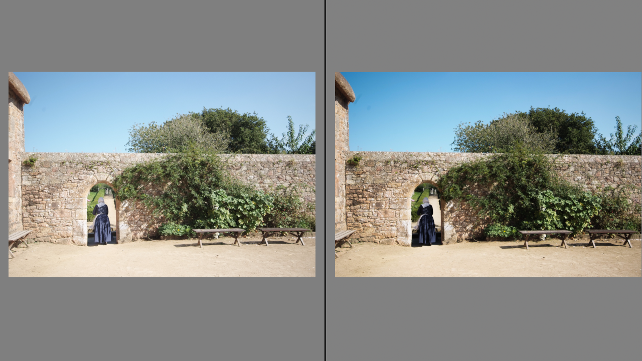
Here is a selection of before and after photos taken of Hamptonne farms exterior on our trip there
TOM KENNEDY
Tom Kennedy is a local photographer, who is influenced by the Dutch Masters paintings of the 17th century, including Rembrandt and Vermeer. His photos with living history characters focuses on using natural lighting to stay within the time periods of the characters.
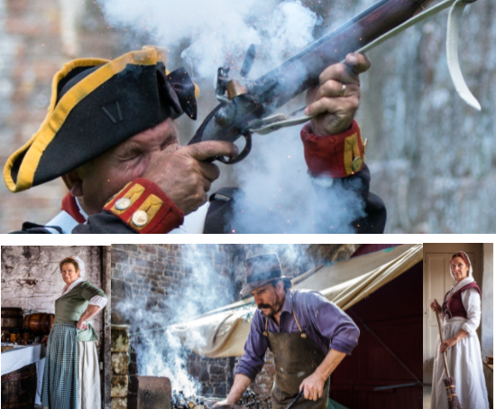
I believe my images below really make use of the natural lighting and are clearly influenced by Tom Kennedy’s work.
MY HAMPTONNE PORTRAITS
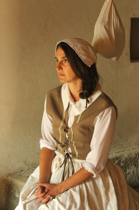
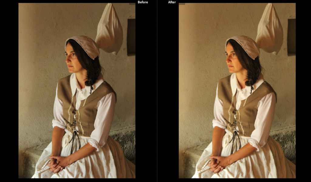

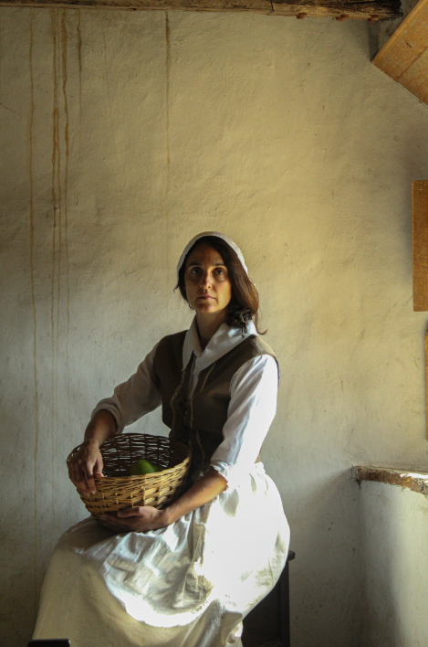
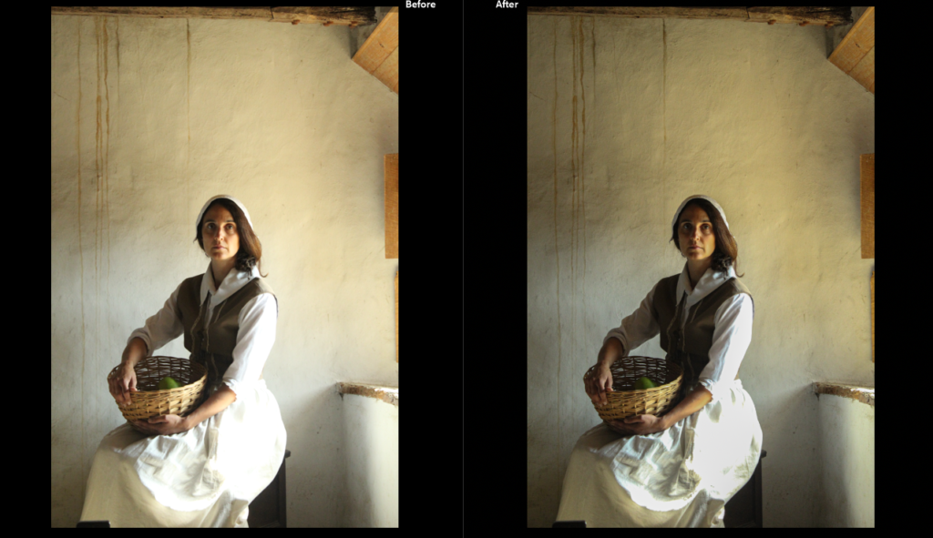
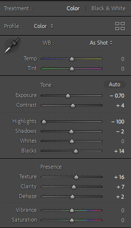
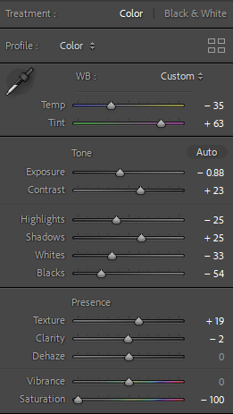
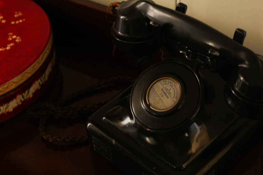
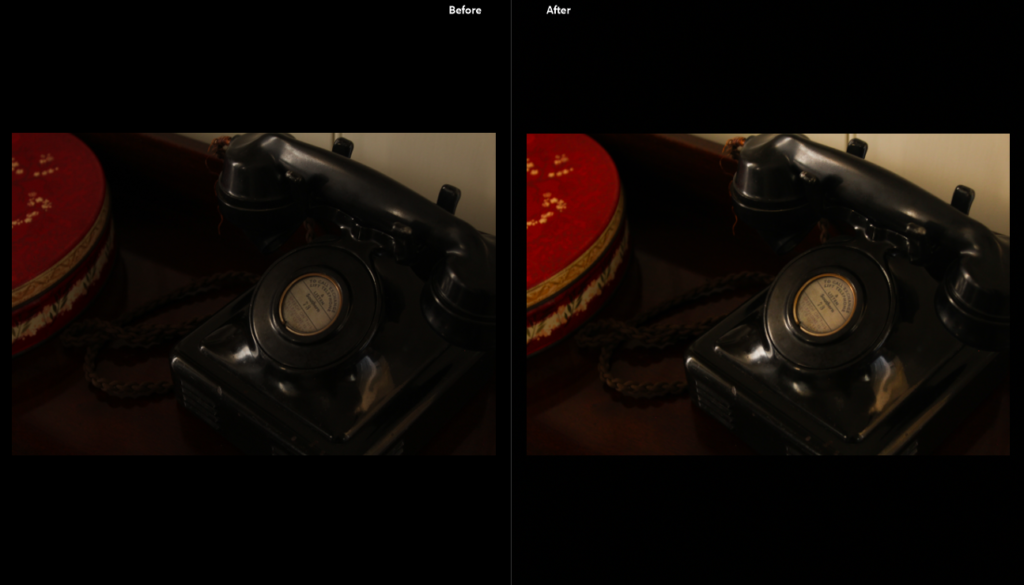
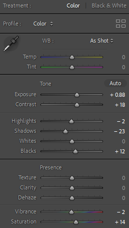
The original image appeared too dark so I turned up the exposure and saturation so the colours would really come out and look more vibrant.
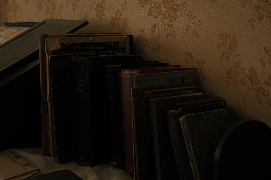
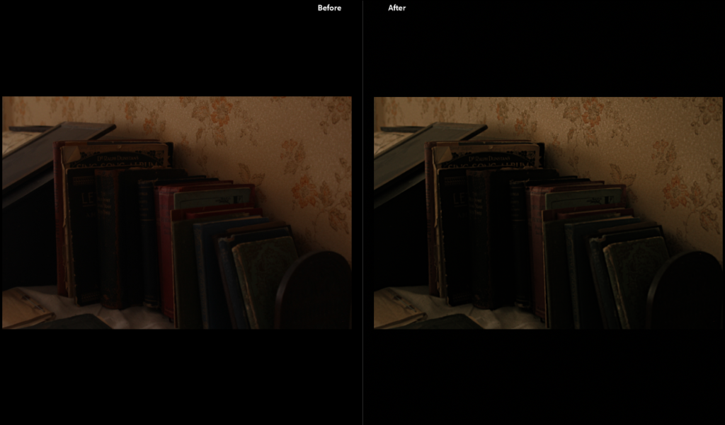
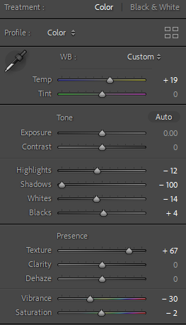
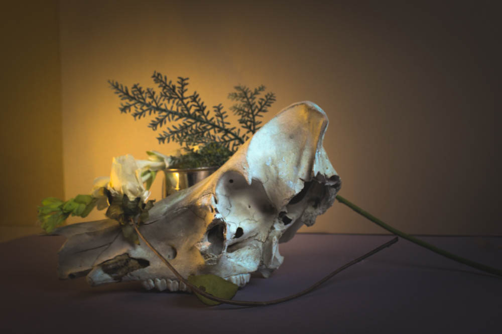
I wanted to make this image look more dulled and aged so it fits in with the theme of heritage, I turned up the temperature of the image so there would be more yellow tones as yellowing is typically associated with age.
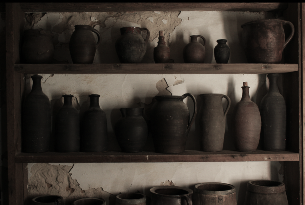
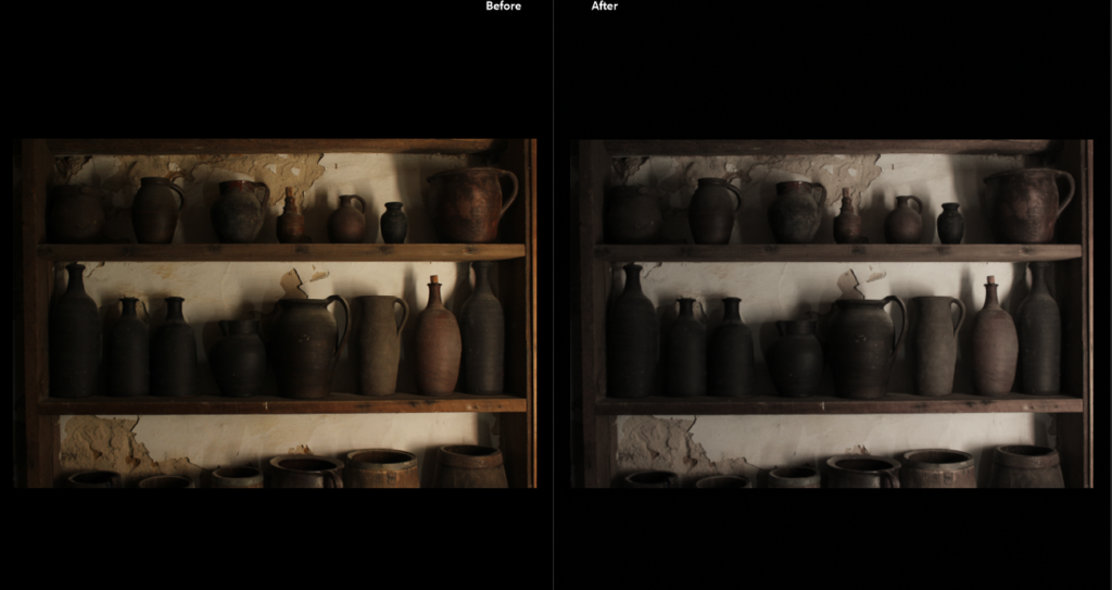
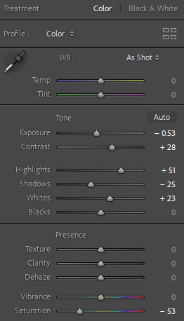
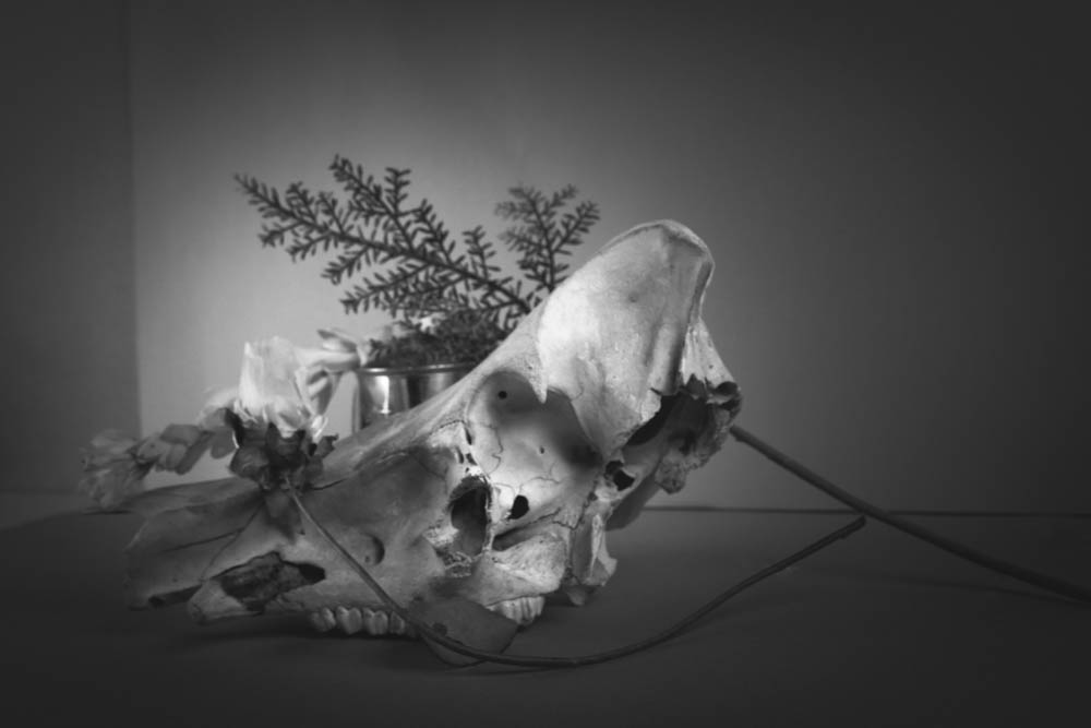
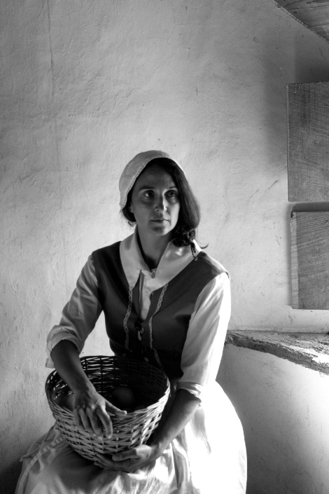
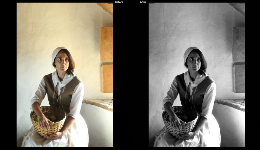
I turned down the saturation so the image would appear more monotone because I really like the shadow composition behind the pots and i wanted to bring more attention to the darkness in the image.
PLAN/FINAL OUTCOMES
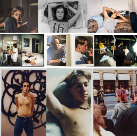
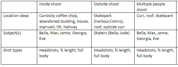
I wanted my environmental portrait images to portray youth culture in Jersey so I decided to take photos of my friends where we usually hang out- specifically being Curiosity Coffee Shop, my house/roof and St Johns skatepark.
FIRST SHOOT
MULTIPLE PEOPLE- ON ROOF/IN CURI
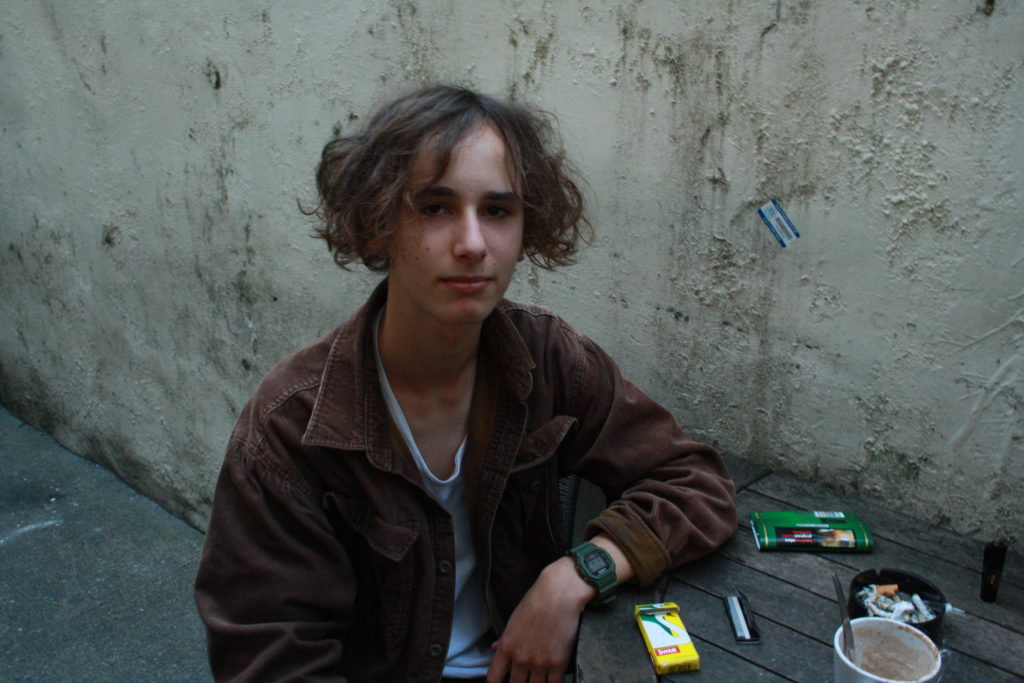
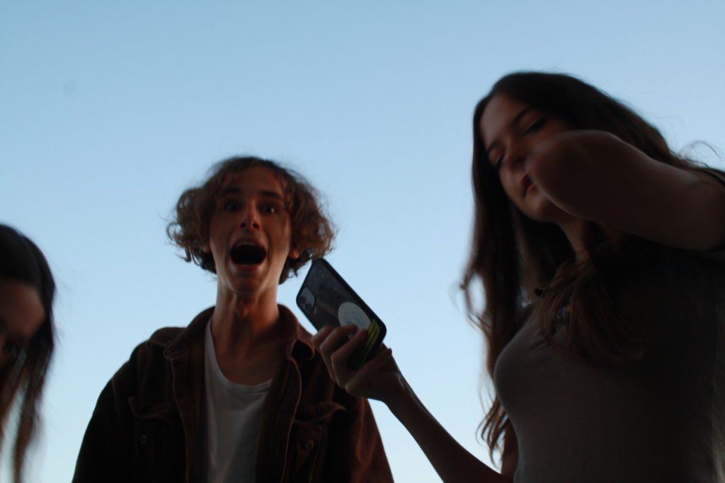
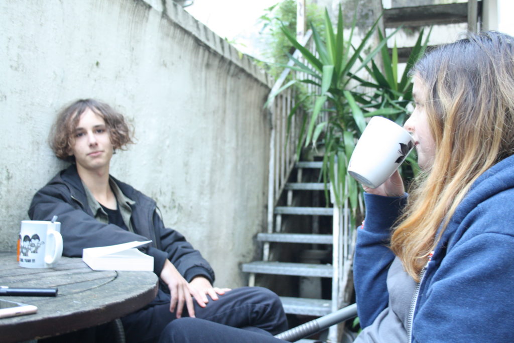
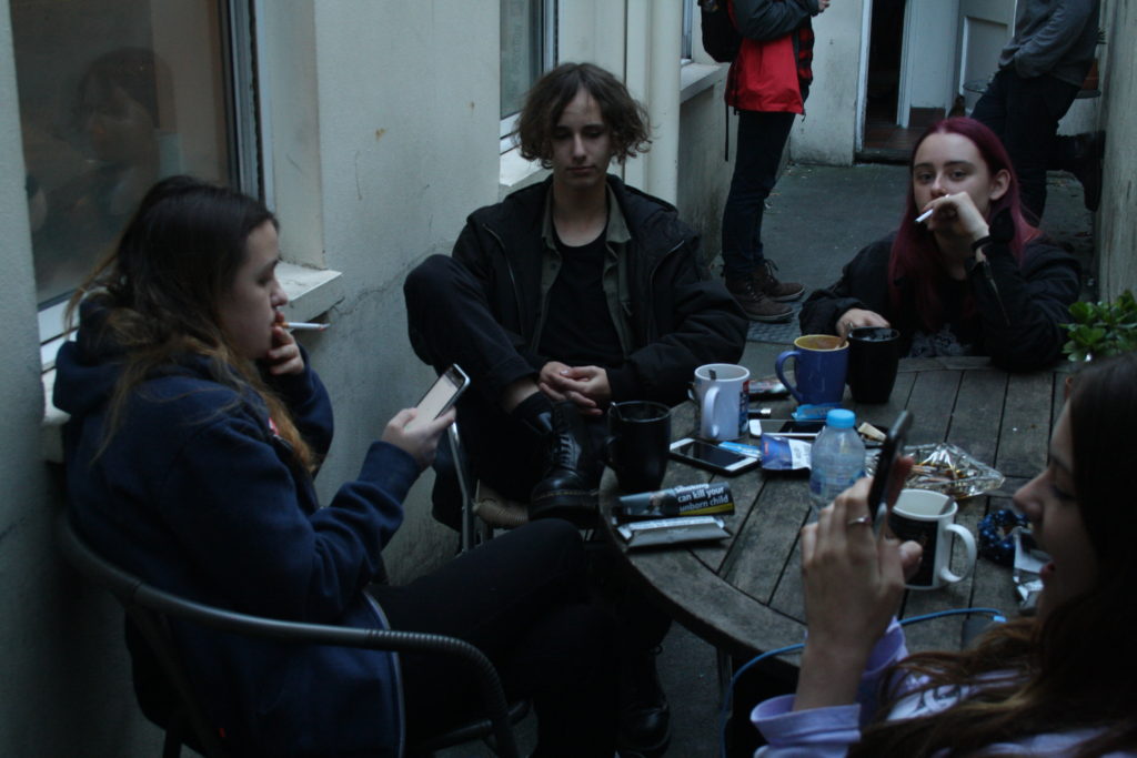
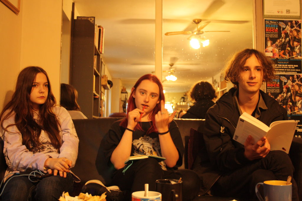
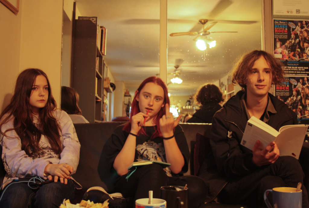
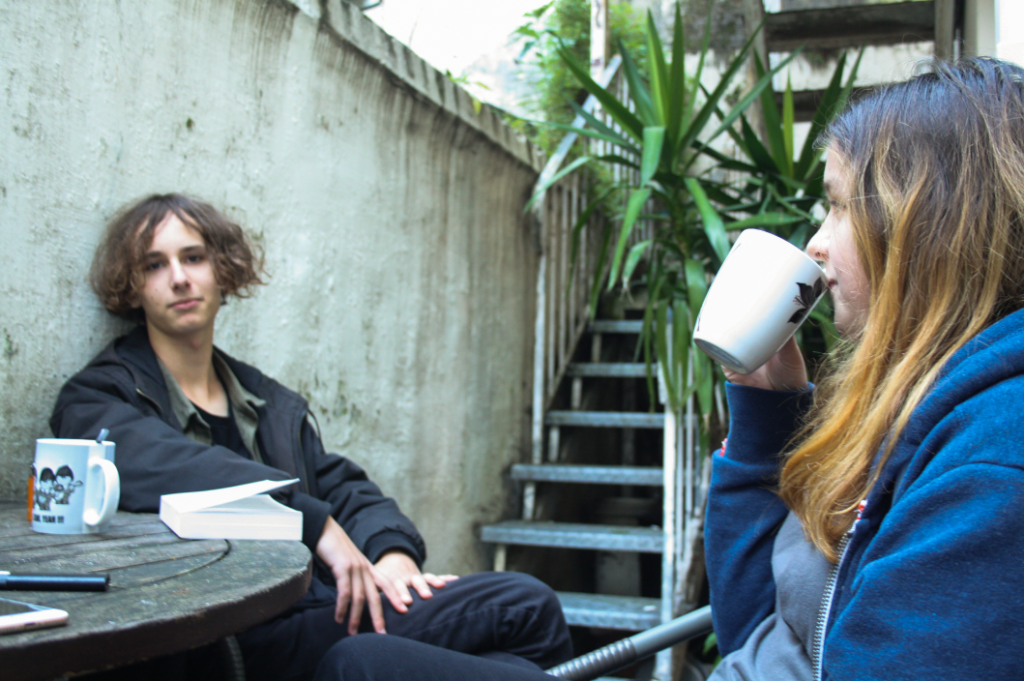
For my first photoshoot, I have selected to photograph my friends in a coffee shop/on my roof. Above I have selected some of my best photographs to create a mini gallery to illustrate my images. Furthermore, I photographed them during the mid afternoon to attempt to get the best lighting despite it being an overcast day. I believe the bottom middle and the top right images have the potential to be the best after being edited in Lightroom Classic.
FINAL EDITED IMAGES
SECOND SHOOT
OUTSIDE-IN THE SKATEPARK
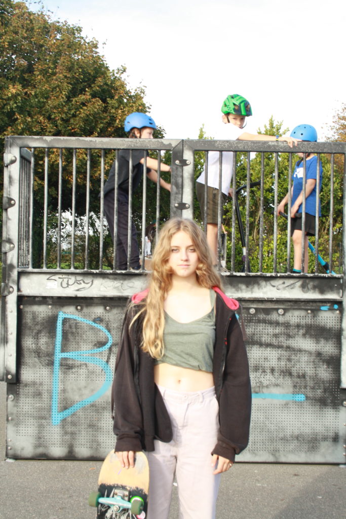
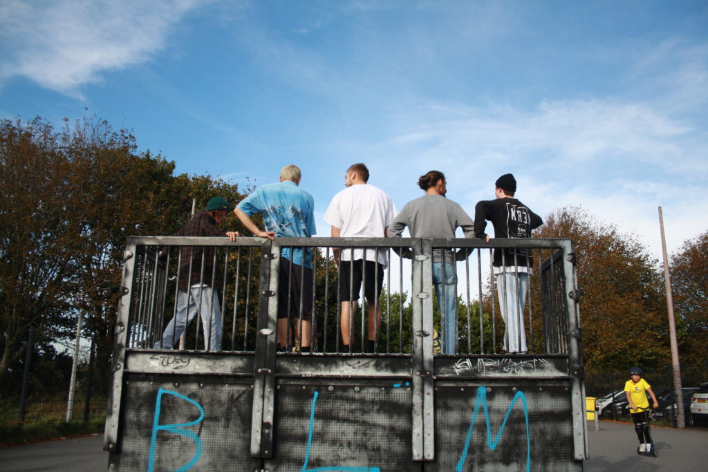
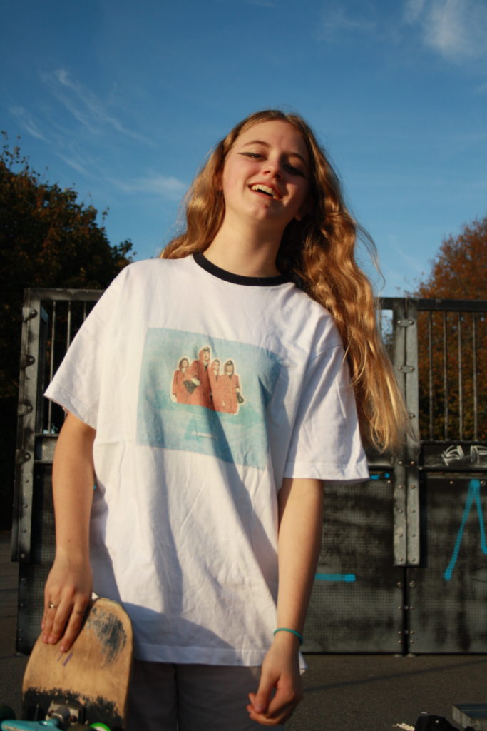
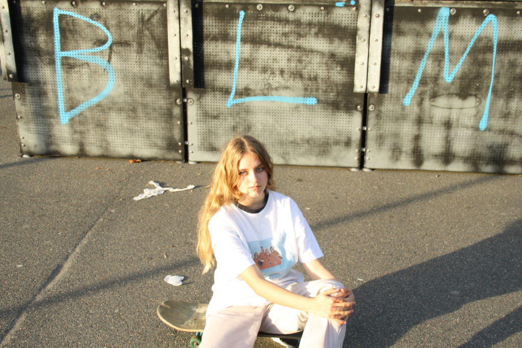
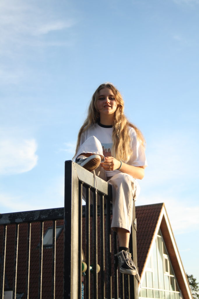
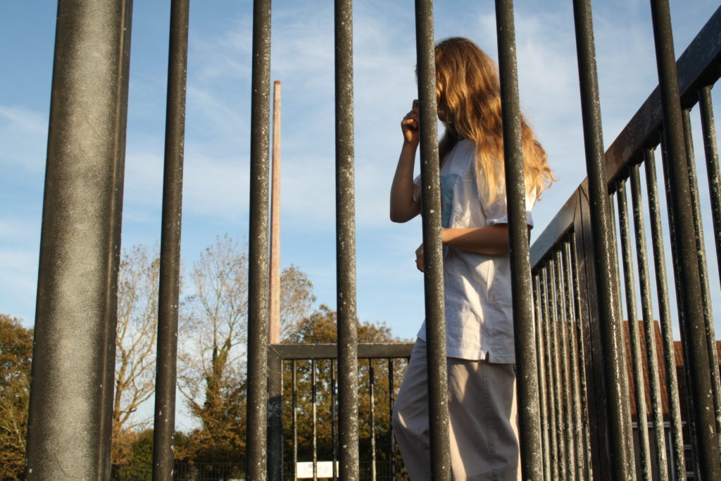
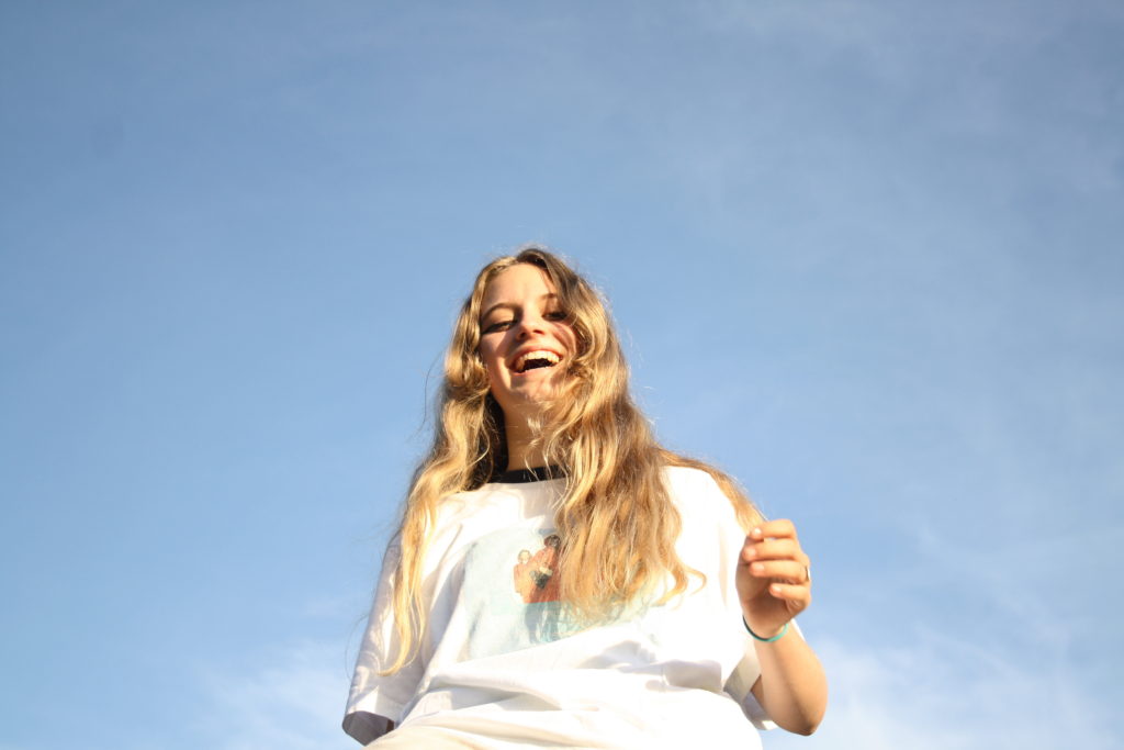
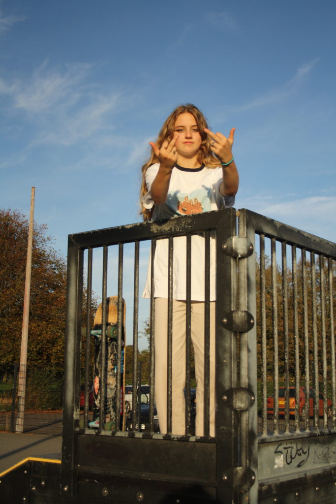
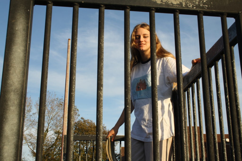
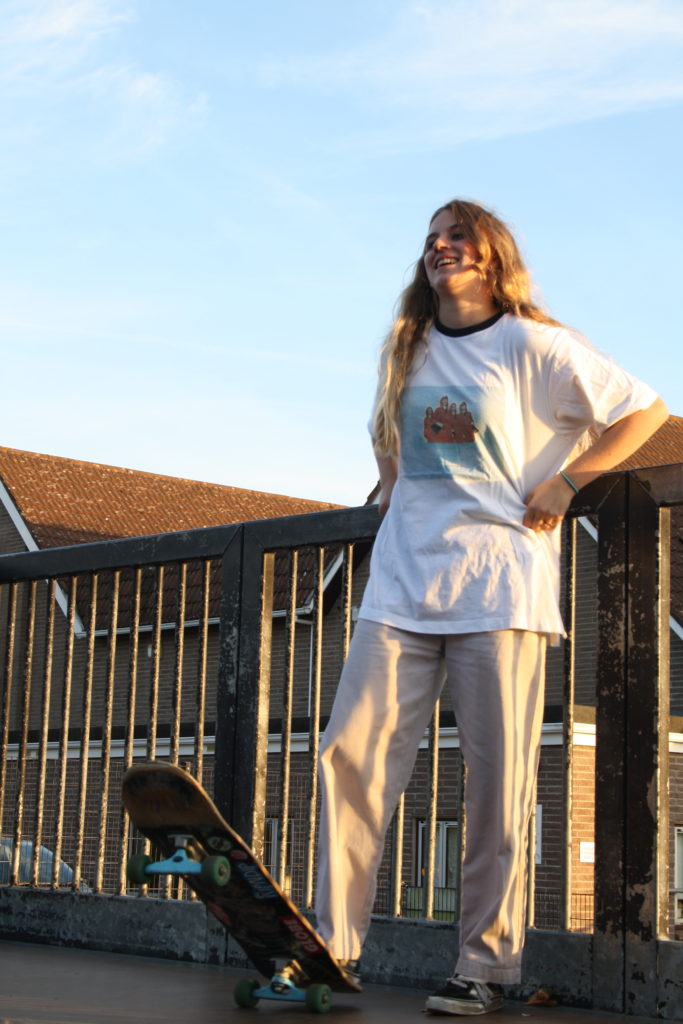
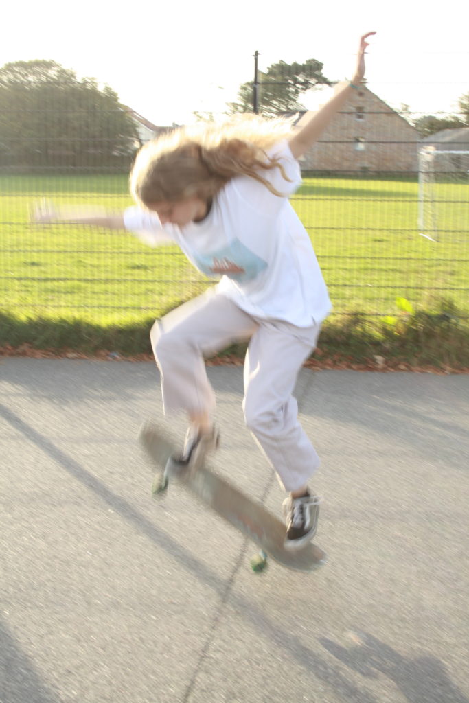
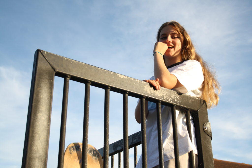
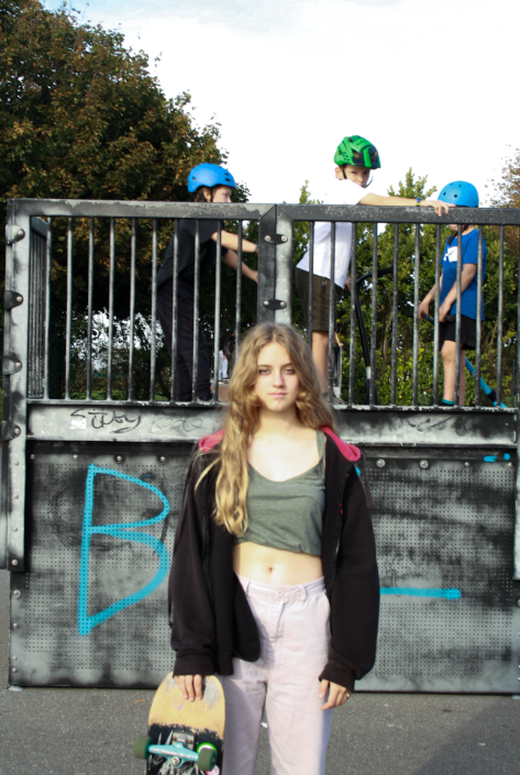
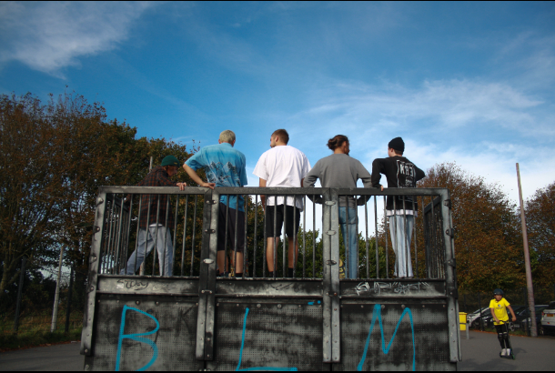
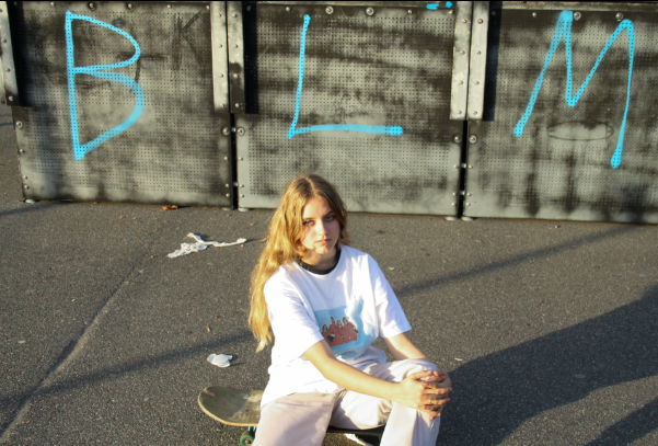
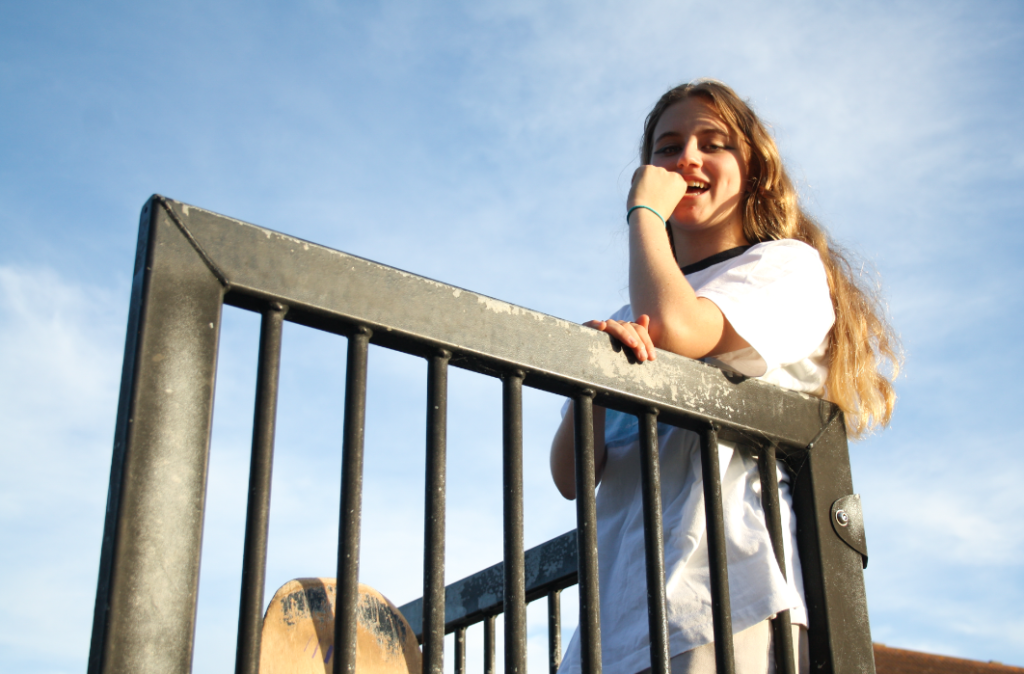
For my second photoshoot, I have photographed my friend Bella skating. I photographed Bella just before sunset to get the best lighting. Some images are overexposed as my shutter speed and IOS was too high but I hope to fix these flaws in Lightroom.
FINAL EDITED IMAGES
THIRD SHOOT
INSIDE- IN HOUSE/ROOF/STAIRWELL/LIFT
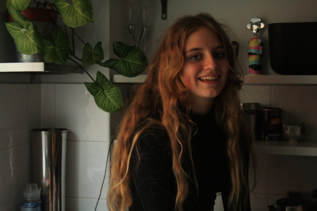
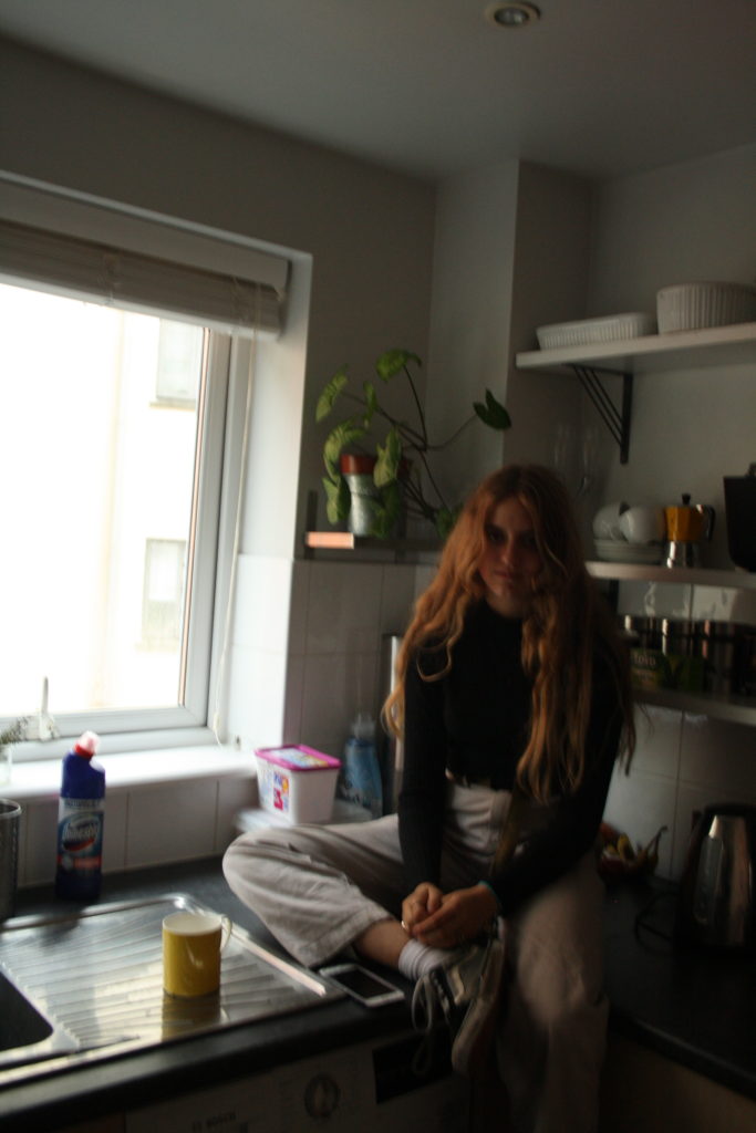
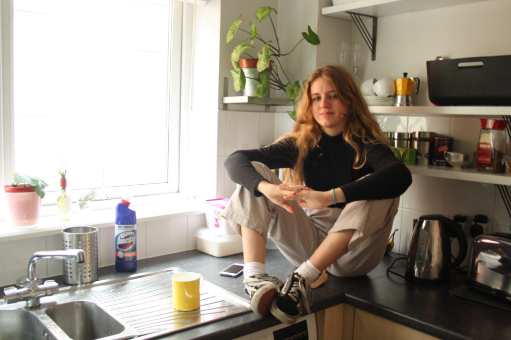
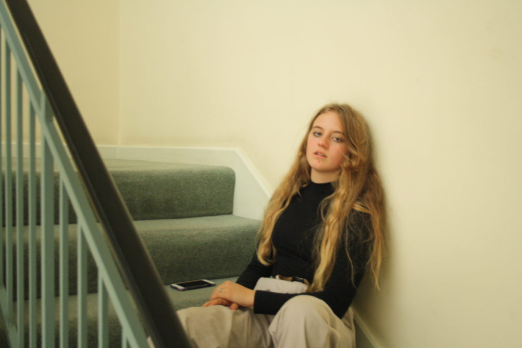
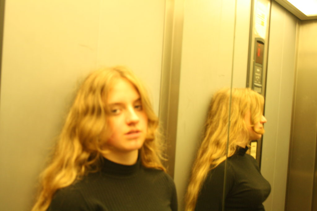
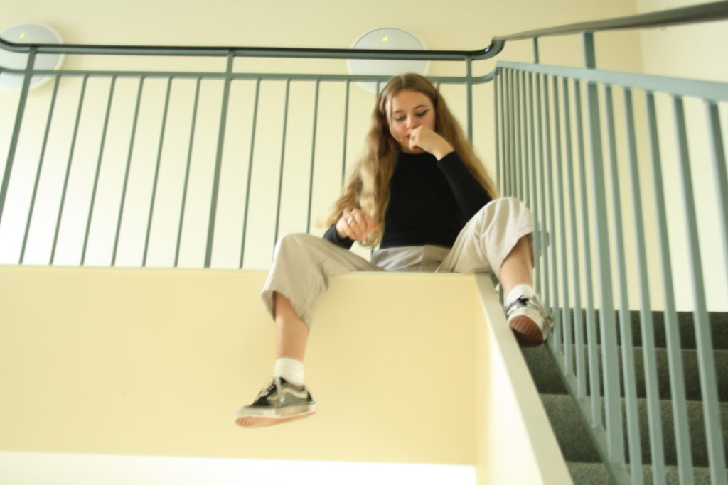
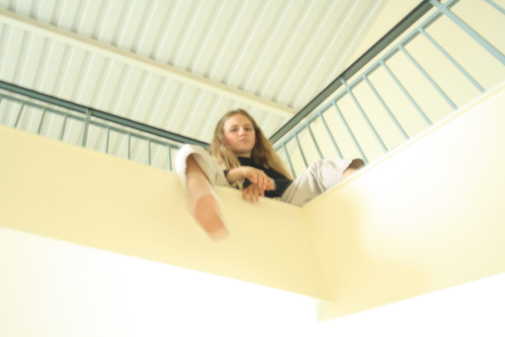
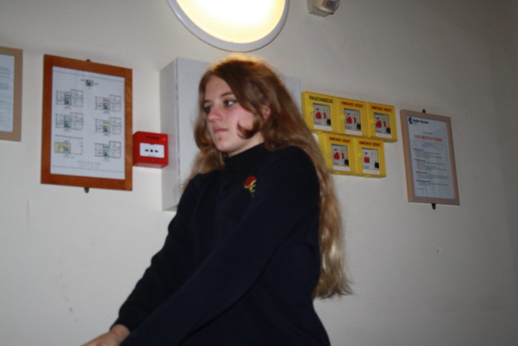
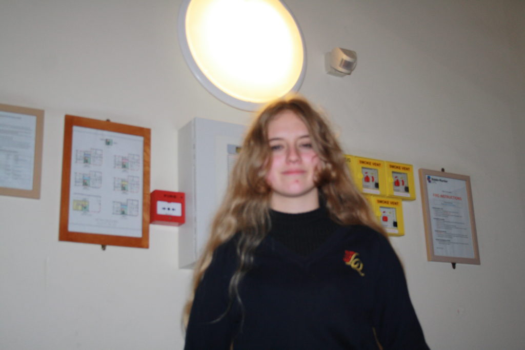
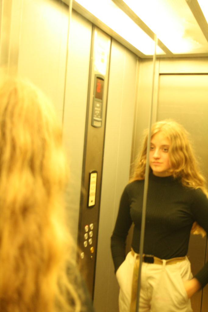
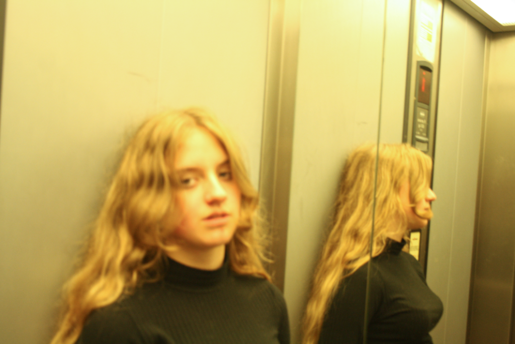
My third and final photoshoot includes images of Bella in my kitchen, sitting in my stairwell and in the lift. In my kitchen and the stairwell the lighting was mostly natural but in the lift the lighting was artificial, leading to a yellow ambient glow. My favourite images include the first two on the second row as I believe they look most inspired by Larry Clark (click here for blog post describing inspirations).
FINAL EDITED PICTURES

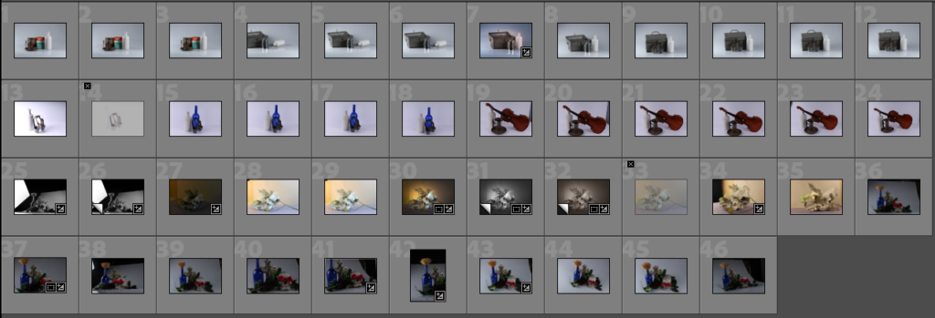
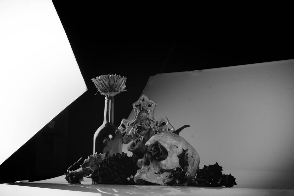
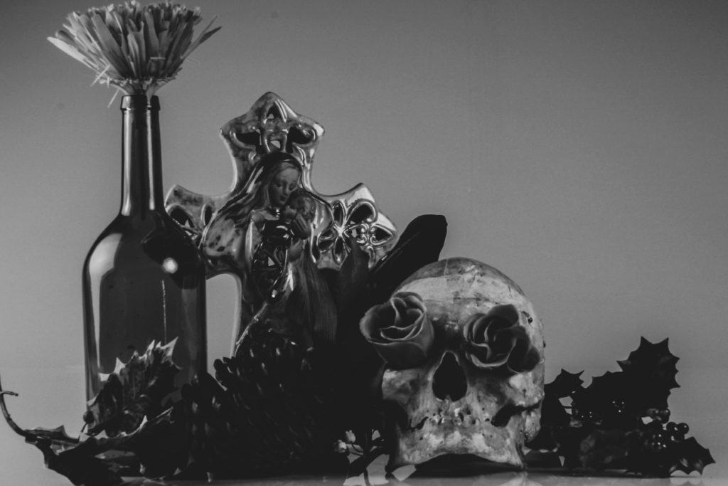
Throughout these photoshoots, the main goal was to keep the objects in centre frame and decently well lit with little to no shadows which ended up being quite a struggle when using the soft box lights as we were using 2 lights that created 2 different shadows, leading us to move them around in order to try minimize/redirect the shadows. I didn’t want many shadows so I wouldn’t have to edit them out later which would’ve made it more difficult to combine the photos together later on.
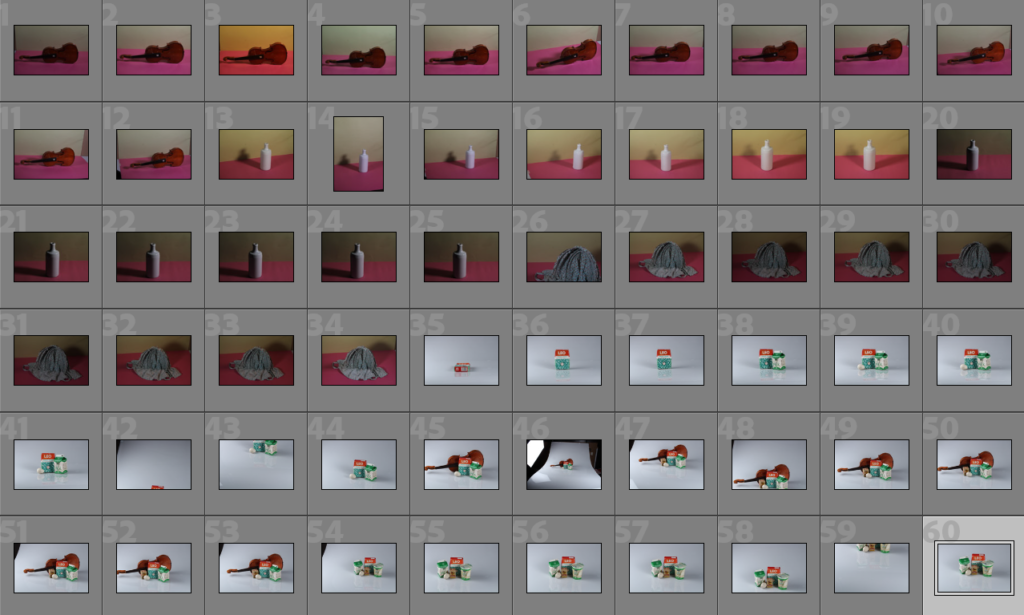
Editing My Photos: Harvey-Regan
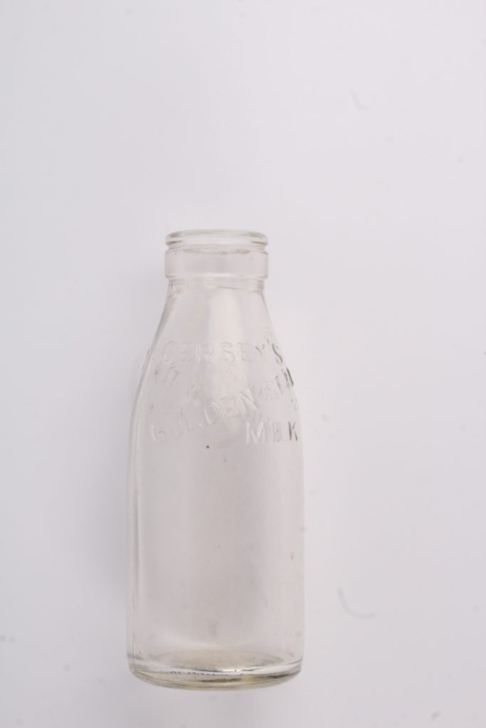
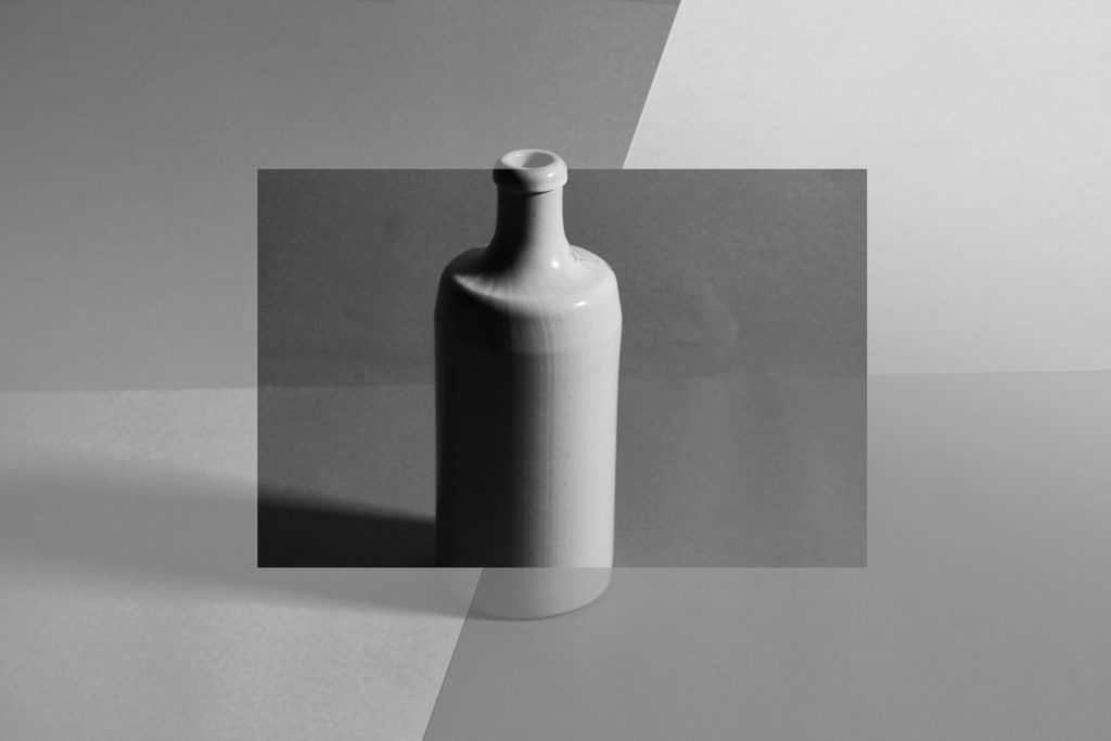
These edits were inspired by Darren Harvey-Regan’s splicing project. I tried to use my photos in order to recreate Harvey-Regan’s work by choosing photos that I thought would work well together and used photoshop in order to edit them together.
——– Edit 1: ———————————–
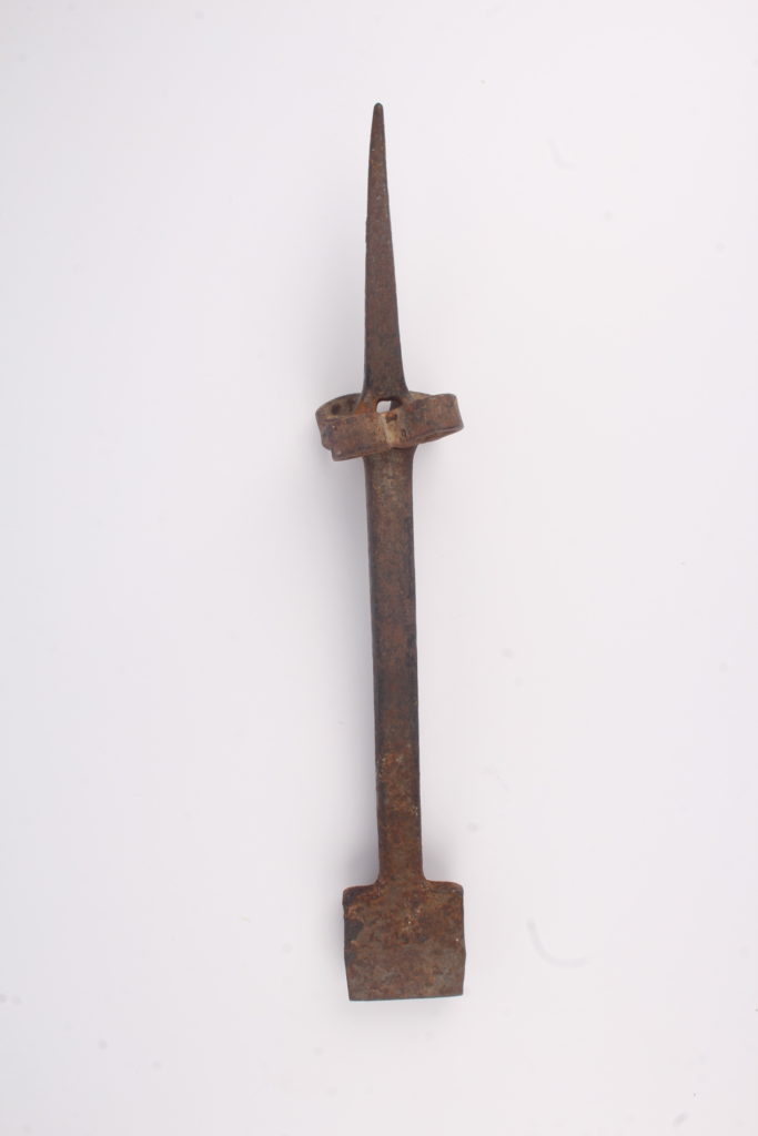
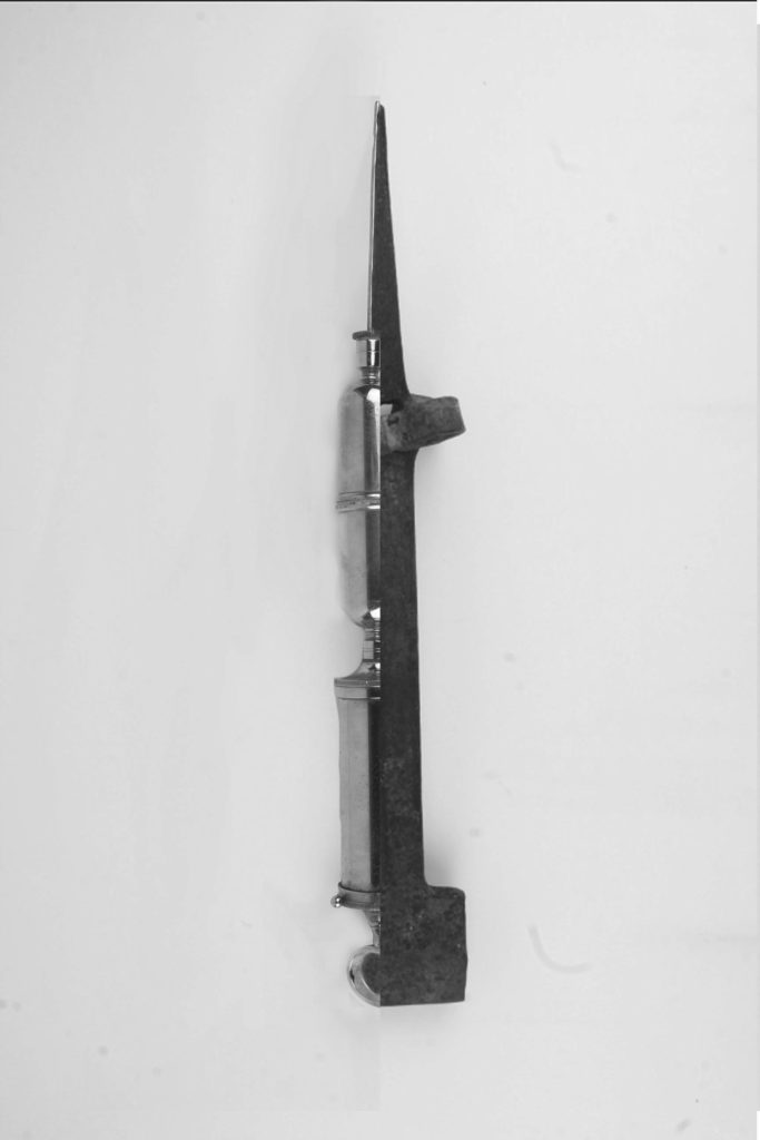
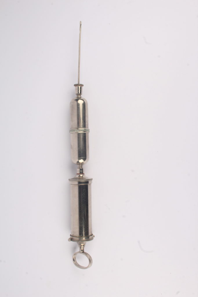
In this edit, I tried to Harvey-Regan’s splices by including many elements of his work such as the sharp edges between the two different images, the white background and making the black and white image in order to get a deeper understanding of his work style.
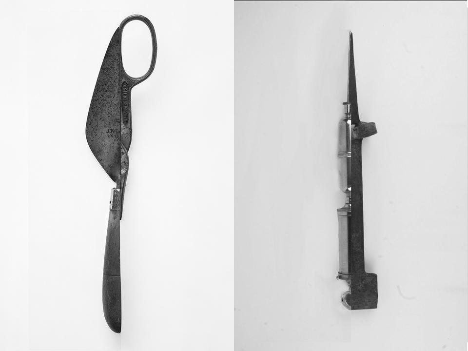
——– Edit 2: ———————————–
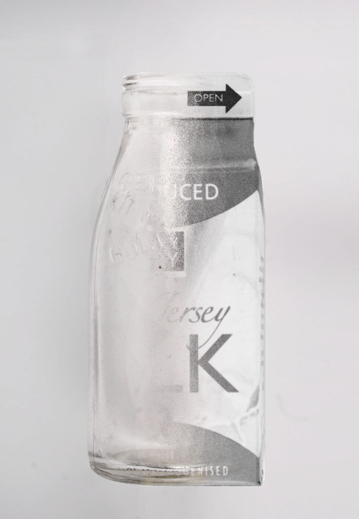
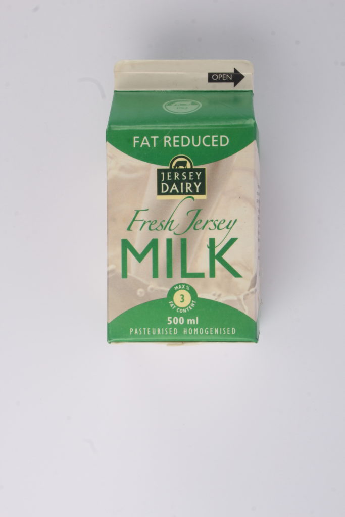
In this edit, I decided that I wanted to try blend the two images together instead of keeping Harvey-Regan’s sharp edge as I wanted to experiment with what I could do in order to merge his editing style with my own. I like this edit more than the first as I think both images work well with each other and I’ve managed to get them to merge together without recreating Harvey-Regan’s style completely.
Editing My Photos:
After experimenting with Harvey-Regan’s style, I decided to use some elements of his work with my own style in order to create edits that loosely resembled his work.
——– Edit 3: ———————————–
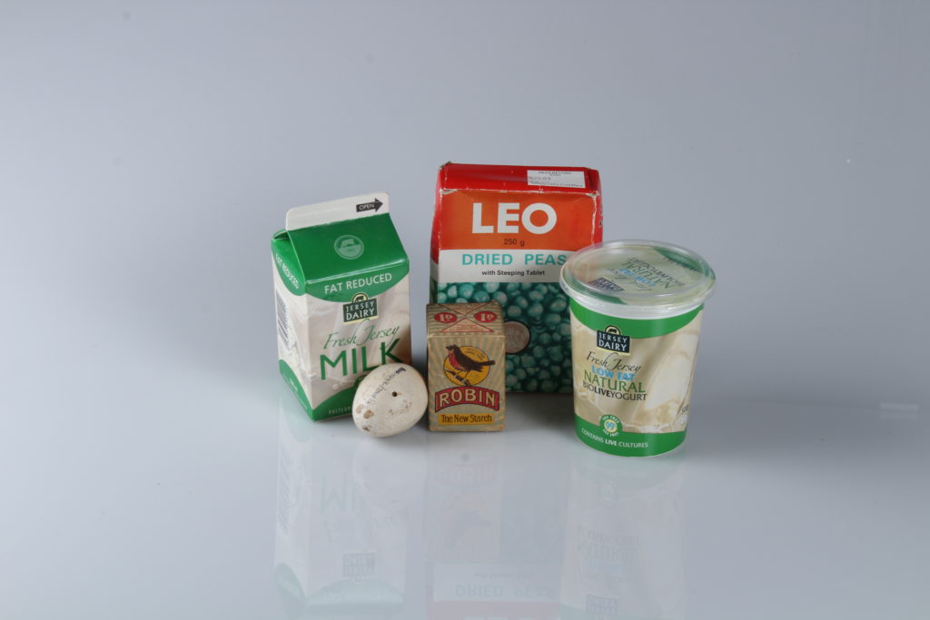
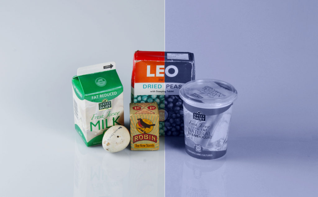
I decided that I was going to start by experimenting with colour in order to see what I could do in order to manipulate the photo as there was a lot of objects in this photo, making it difficult to splice with another. Although it’s not my best edit, I think it still looks interesting as the blue tone from the right side of the image contrasts with the colours from the left side, creating two different moods in a single image.
——– Edit 4: ———————————–
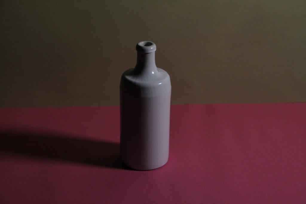
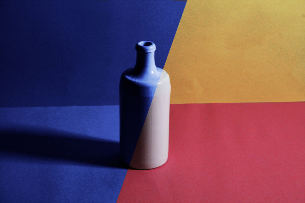
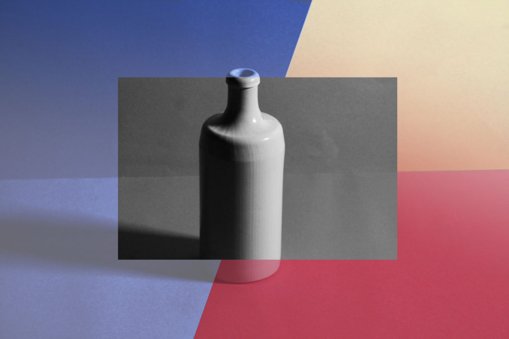
For this image, I created 3 edits as I couldn’t decide which one I liked the most as I liked different aspects of each: the simplicity of the first, the business of the second and the blandness of the third. Overall, I liked having multiple colours in one photo rather than taking 2 different images and montaging them together into a single image.
——– Edit 5: ———————————–
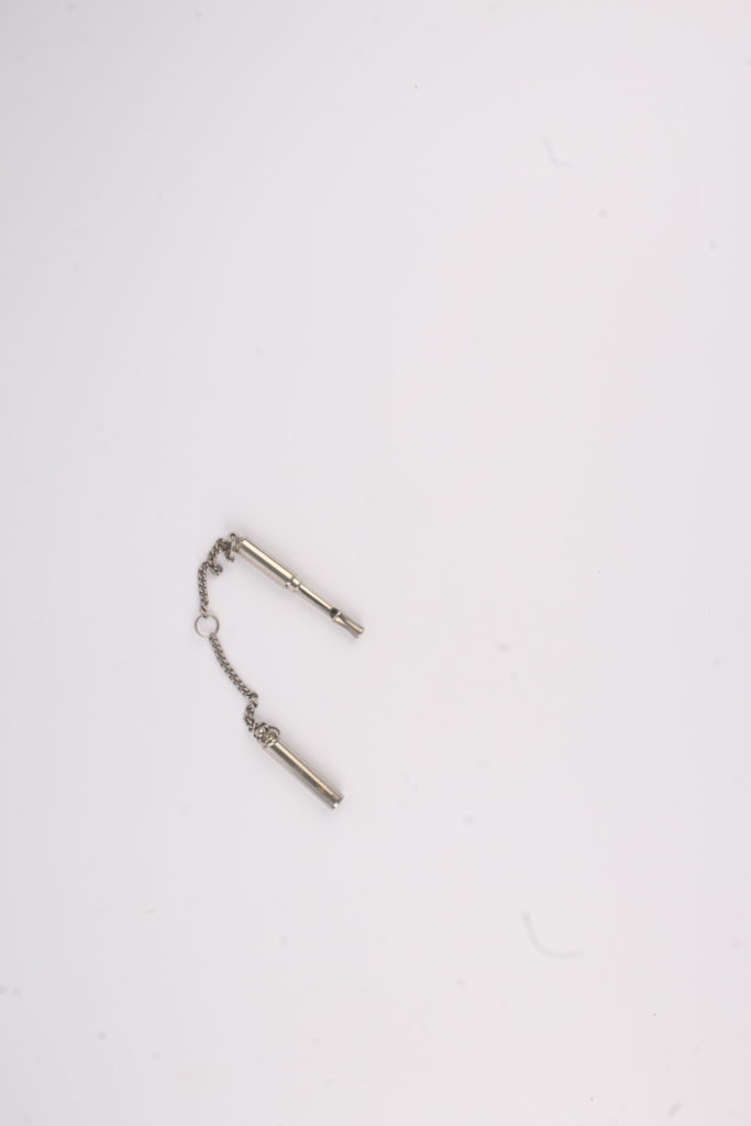
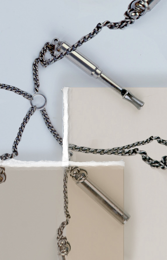
Whilst editing this image, I knew I needed to make it busier as the whistle was quite small compared to the background so I started by cropping the image, making it easier to see the whistle then copy and pasted part of the whistle’s chain around the image in order to make the image look more interesting. I then added 2 squares as I wanted to add more colour and depth into the image, later adding some white to the edges to add texture to the edge of each box, making them look like torn paper. Finally, I added some subtle shadows by the squares edges to make the image look slightly more realistic and add depth.
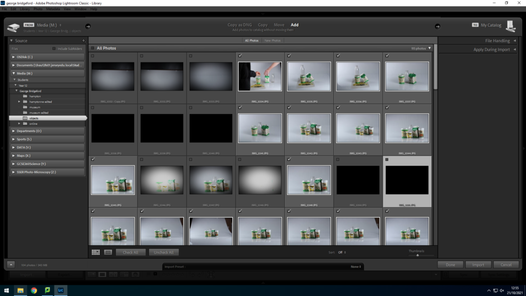
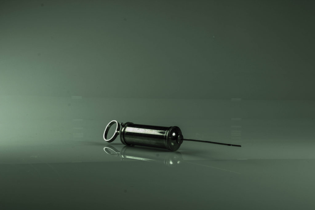
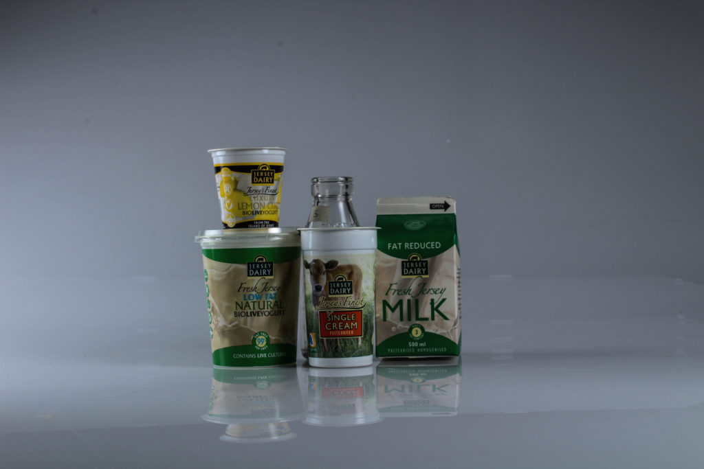
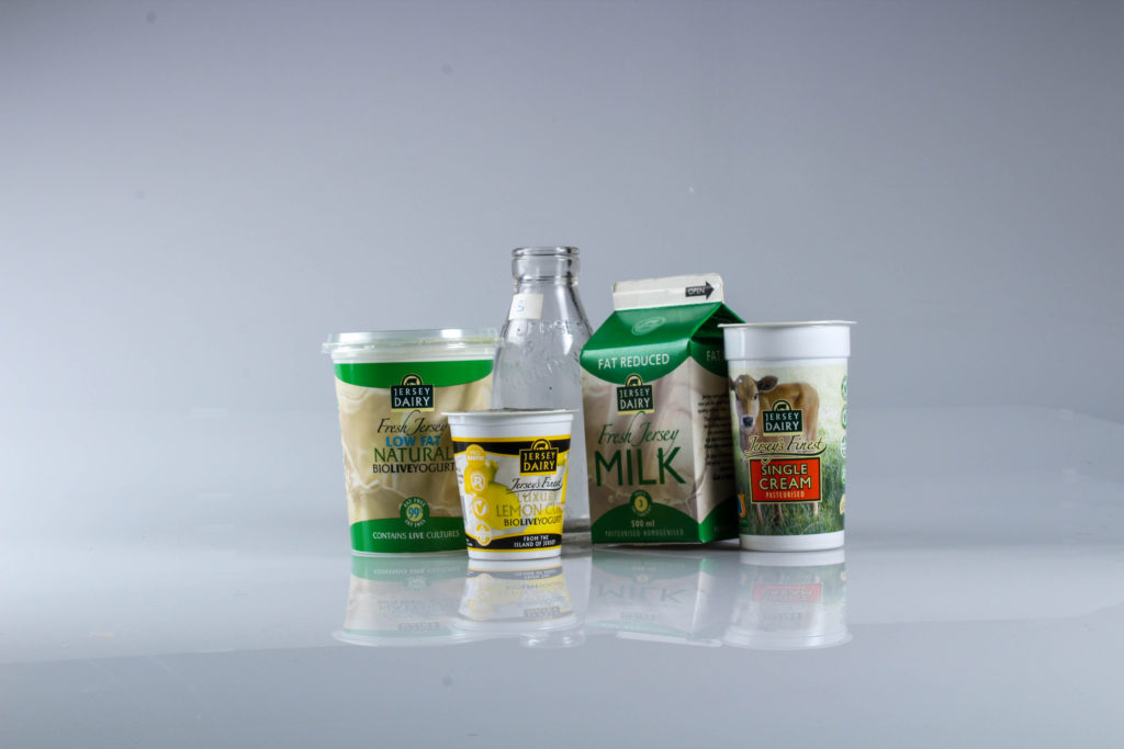
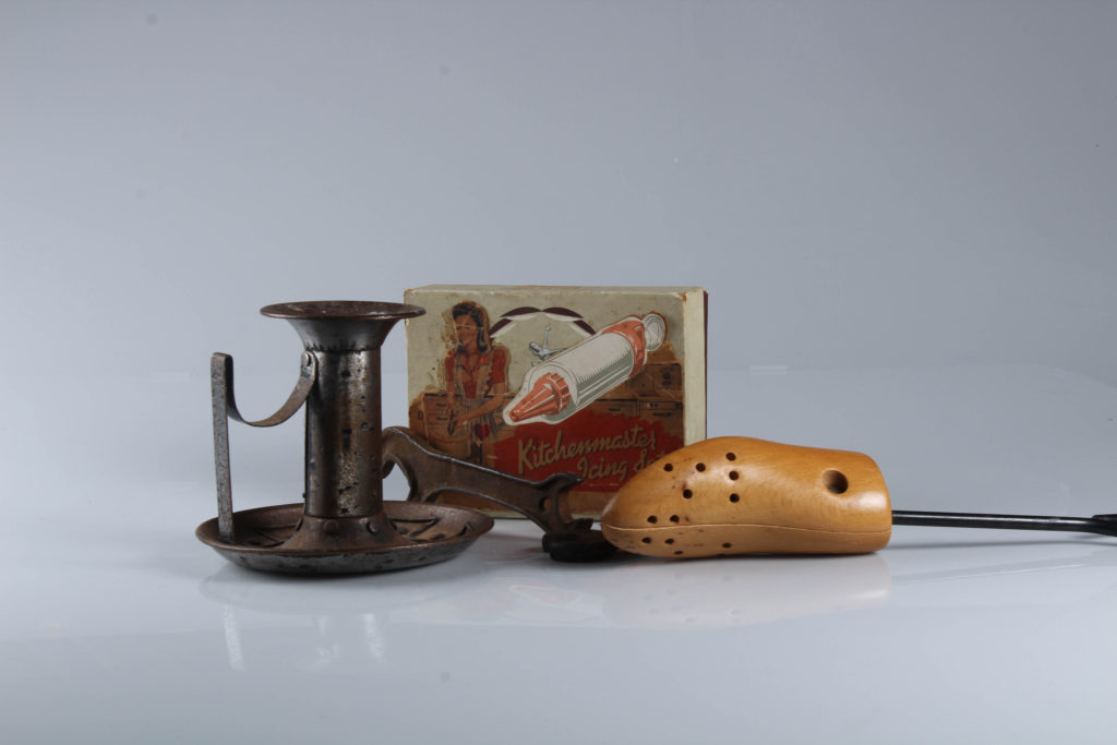
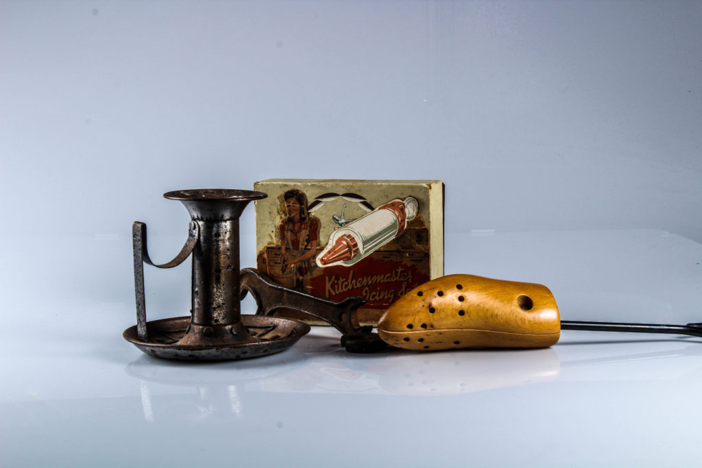
We used products given to us by Hamptonne which represented Jersey’s heritage in some way