
While at Hamptonne, I saw several interesting perspectives from inside the historical buildings on the site and wanted to capture those perspectives.
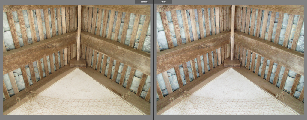
I chose this image as a final image because I like the way shape and line is used in it: with the several rectangles that look as if they were stacked on top of each other, which creates a triangular shape. Because there are many (leading) lines in this picture, the focal point could be either the beam in the centre (with the horizontal beams acting as the leading lines) or the white triangle at the bottom of the image (with the cage bars pointing downwards). Colour in this image is fairly limited, being made up of mainly browns, however, I think this makes the image look more rural and thus effective. I like how the slate has been positioned behind the bars of wood as it gives them a nice pattern that you do not see at first glance.

I think this image is effective because of how the light creates a silhouette from the frame and cage on the window, as well as how that light creates a shadow off to the right and how the objects at the bottom are lit in a way which creates a clear shadow. I wanted to slightly enhance the intensity of the light so that the outside cannot be seen, I think this makes the image look more interesting as it makes the objects and reflection on the wall brighter. The focal point in this image is the window because of the light seeping through it. This image mainly makes use of yellows and browns, giving the image a warm tone. However, if I had the opportunity to re-take this image, I would stand back slightly to make it less cluttered.
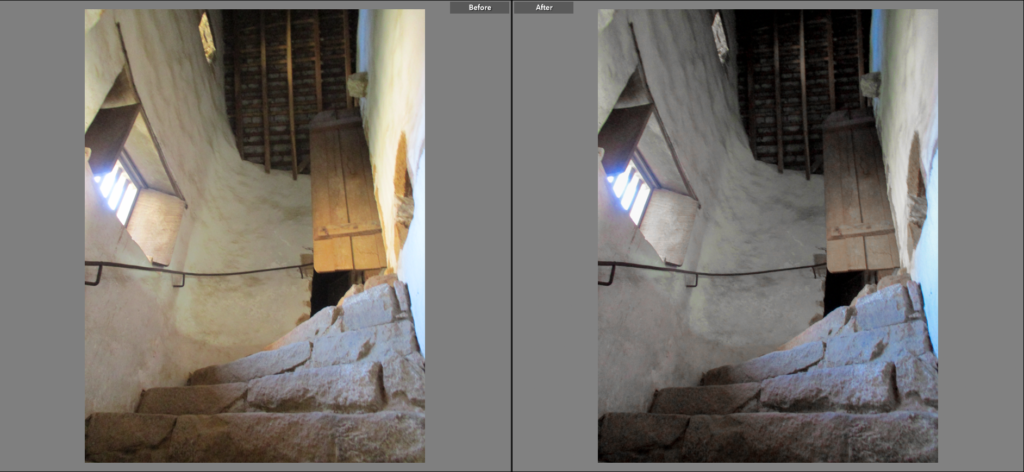
I think this image is interesting because of the different shapes of the stairs, door, window and roof, as well as the low point of view which makes the room seem taller and manages to capture the stairs and roof in the same shot, which, to me, gives it a Hockney-esque look. The focal point is the window because it is the direct source of the lighting and is the brightest part of the image. The colour in this image mainly consists of blues from the window light and yellow/brown on the wooden parts like the door and roof. I like the image has both smooth (the wall) and rigid (the stairs and roof) sections, this in itself creates a contrast.

This image is similar to the second image on this post, however this image I think is laid out better because there is more space for the window to breathe. I like the warmth of the lighting coming through the window. The light shining on the window-sill creates a nice effect with the black surroundings, I think it is interesting how it suddenly stops when the sill ends. I think the shape of the window is interesting as it creates squares of light which emerge from the dark background, creating a harsh difference in tones.

I chose this as a final image because I like the way it is laid out and how there is a sense of space within it. When editing, I wanted to make the image slightly colder in tone and reduce the warmer colours’ saturation because I thought it would not only make the image stand out from the rest of the interior images, but also enhance the white of the pottery and grey of the beams. The focal point in this image is the closest beam because it has a bright colour and has leading lines from the meeting of the planks above it. I like the way colour turned out in the image, by making the image colder, the blue patterns on the pottery are more noticeable.