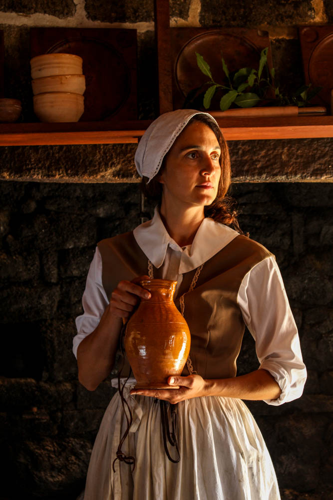
This is a photo of one of the live history actors at the Hamptonne Museum. It shows the lifestyle of people in Jersey a couple centuries ago, how they dressed and what they did. This photo was shoot with natural light coming in form a window to the right and so its very yellow, warm light, creating a golden hue. The light only hits half of the subjects face mean while the other half is shadow. This creates a nice contrast. The white dress also contrasts the dark background. The line in the photo would be the subjects hand positioned horizontally as well as the shelf in the background. Whilst the hand leads the eye to the vase held by the subject, the shelve brings the attention to the background and the rest of the historical objects. There is quite a few textures in the photograph. The wrinkles on the subjects clothes are sharp because of the light and shadow contrasting together, this is eye catching and helps to bring the attention to the subjects. The rough and bumpy stone wall behind the subject brings the focus to the background. Overall, the photo feels cluttered since there’s so many lines and textures and shapes that make it hard to concentrate on one object, there isn’t much space, this is supposed to represent the living conditions of people back in the day when the houses were tiny and families huge.


