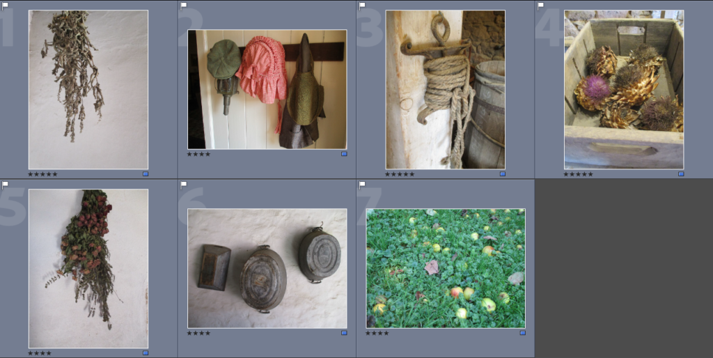
When I went on the Hamptonne trip, I noticed several interesting objects which stood out to me, so, naturally, I took pictures of them.

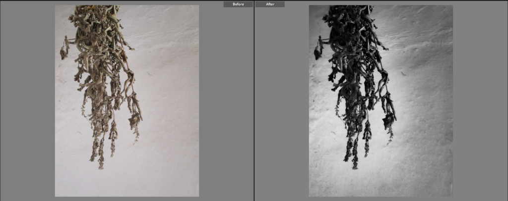
I chose this image because I like the way it is laid out, with the plant hanging from the top left of the image. I chose to make this image black and white because I wanted the shadows on the plant to be even more vivid, giving it more depth. The black and white also creates a contrast between the dark hanging plant and the light-grey background. I also decreased the images exposure slightly, which gave the background a grey-ish colour, which gets lighter the closer it is to the object, I like this effect as it makes the object stand out more. The background is fairly plain as it gives the object more of an emphasis.
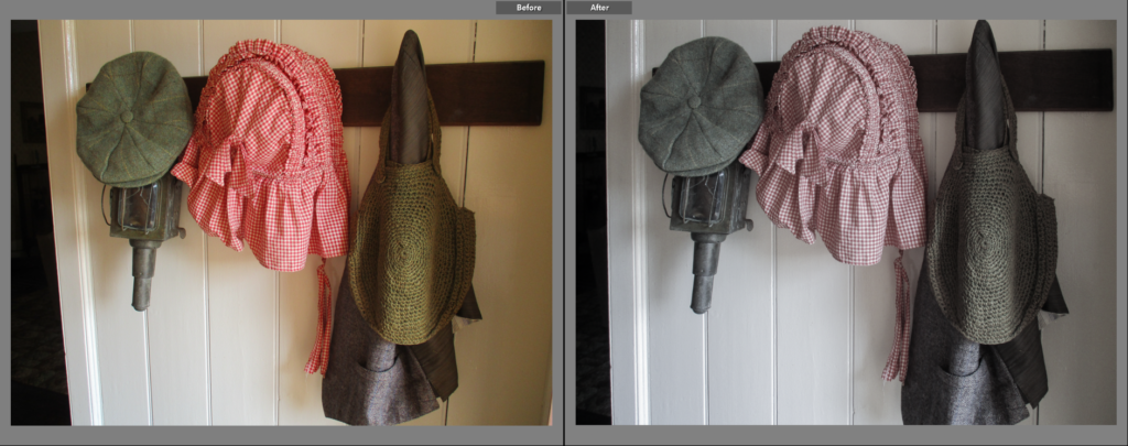
I chose this image because I thought the objects and the patterns on them were interesting. I decided to give the image a low saturation because it allows the colours to stay in the image, while also giving it a older look. I like the way the colours ended up, it looks close to a black and white image, but the faint colours gives it an interesting look to me. The lighting in this image is very soft, which doesn’t allow much shadow to come through, this makes the objects slightly clearer, while the shadow that is seen gives them an interesting pattern.
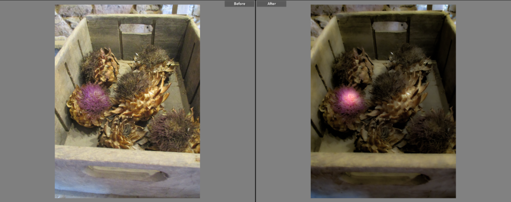
I chose this as a Final Image because the objects inside the crate intrigued me. I wanted to make the pink on the artichoke stand out from the rest of the image by making it more vibrant and appear glowing, I wanted to make the rest of the image have less colour and vibrancy in order to make a more noticeable contrast. I think the shape of the artichokes gives the image an interesting look by not only giving it a lot of sharp lines and patterns, but also giving it more shadow. I lowered the exposure a fair amount in this image because I thought it was slightly too bright, I think this makes the image look more mysterious, maybe alien-like.
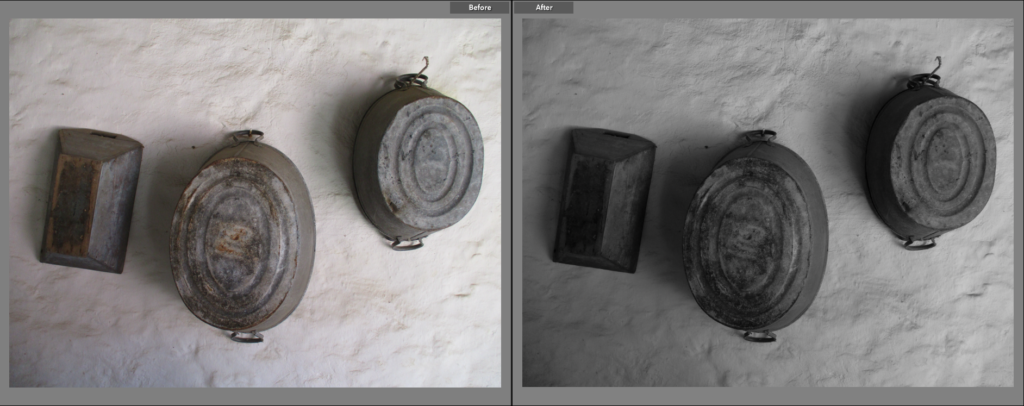
I chose this image because of its simplicity. I like how light is shown in this image: being at its brightest on the right and darkest to the left, the position of the light also gives the objects an interesting shadow. I think black and white goes nicely with the image as it makes the objects more vivid. I think the way the objects are almost in a line gives the image a nice composition. I decreased the exposure in this image slightly because I think it complements the black and white filter nicely, and also makes the difference in tone made by the shadow more noticeable.
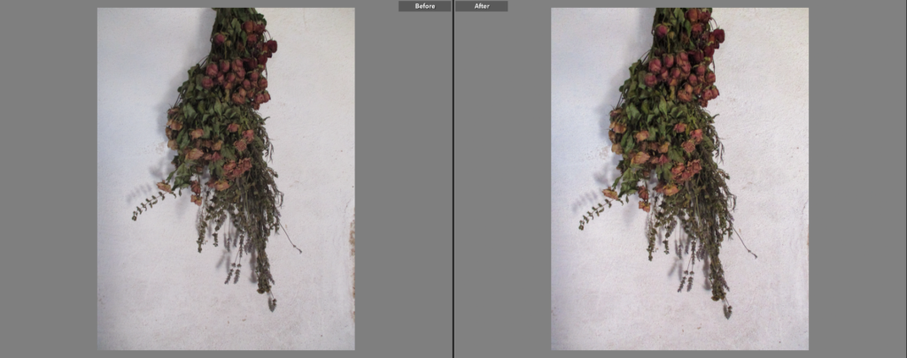
I chose this as a Final Image for similar reasons as the first picture on this post: how the object is left dangling from the top of the image and how the background behind the object is plain, this allows the object to ‘breathe’ by giving it space in the photograph. Because the colour on this image is more varied and stands out more than the other similar image, I decided to emphasise that colour by increasing the contrast and exposure slightly, making the reds and greens far more noticeable. I also made the lighting ever-so-slightly warmer to make the colours appear brighter and more healthy.
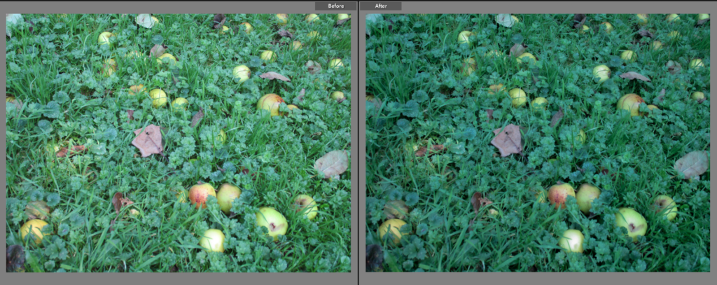
I chose this as a Final Image because I like how it has a lot of colour, probably one of the most colourful images in the photoshoot. When editing, I made the colour of the grass slightly darker, I did this because I not only prefer the darker, slightly blue-ish colour, but also because it makes the apples and leaves on the floor stand out, this makes the apples in particular look almost gem-like and creates a very noticeable or sudden difference in colour.
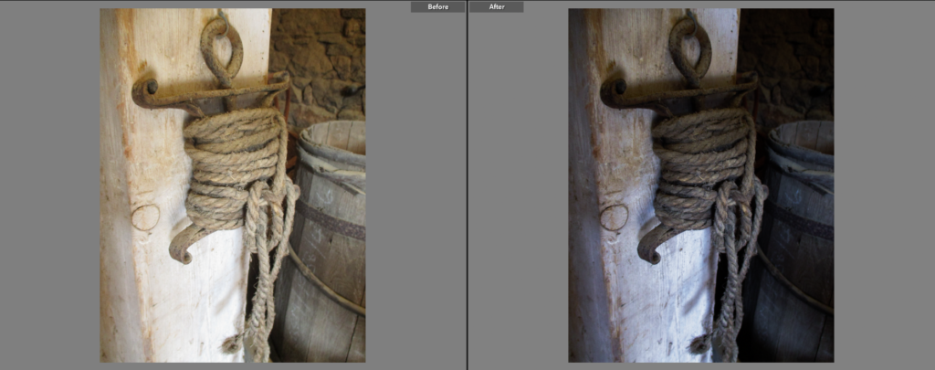
I chose this as a Final Image because I liked the angle that it was taken, as well as how the image is split between the beam the object is hung on, and the further away parts of the image like the barrels and the wall. I decided to make the image darker because I thought that the shadows were not as clear as they could be, it also creates a bigger difference in tone between the left/centre side (the beam and the object) and the right side. I made the lighting in the image slightly colder to give the image a wintery look.
