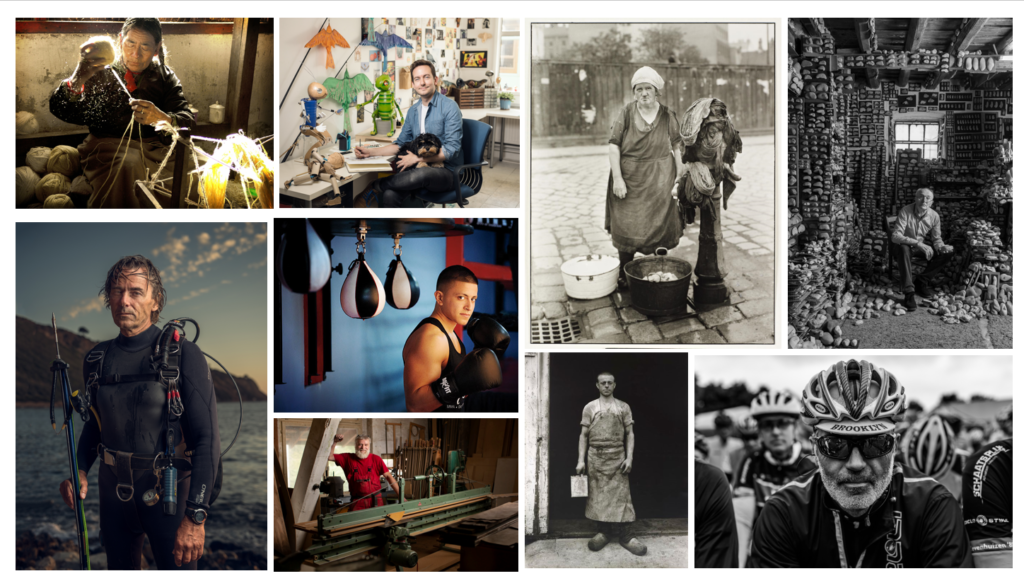
An Image is an Environmental Portrait when the Model and their Environment, the foreground, mid-ground and background, are linked through the actions or appearance of the Model, as if they are a part of that Environment.
Mood Board of Environmental Portraits
Ideas
- 3/4 of Model Visible?
- Colour?
- Portrait?
- Holding Something?
- Could use colour to make the model stand out from the background (Contrasting colour of clothing or prop)
- Full Body?
- Black and White?
- Landscape?
- How much of the Environment will be visible?
- How large will the Model be compared to the environment?
Plan
Outside Photoshoot
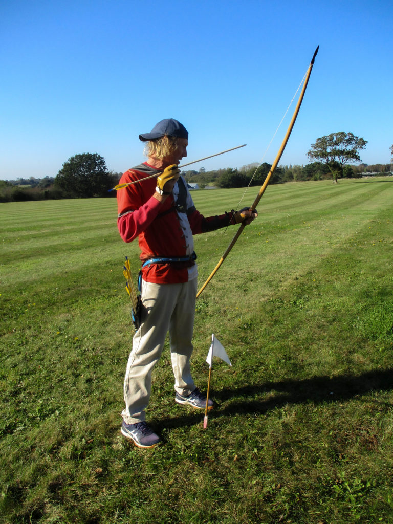
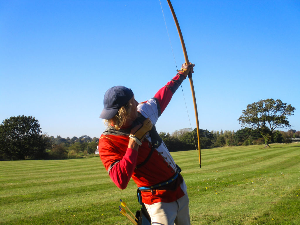
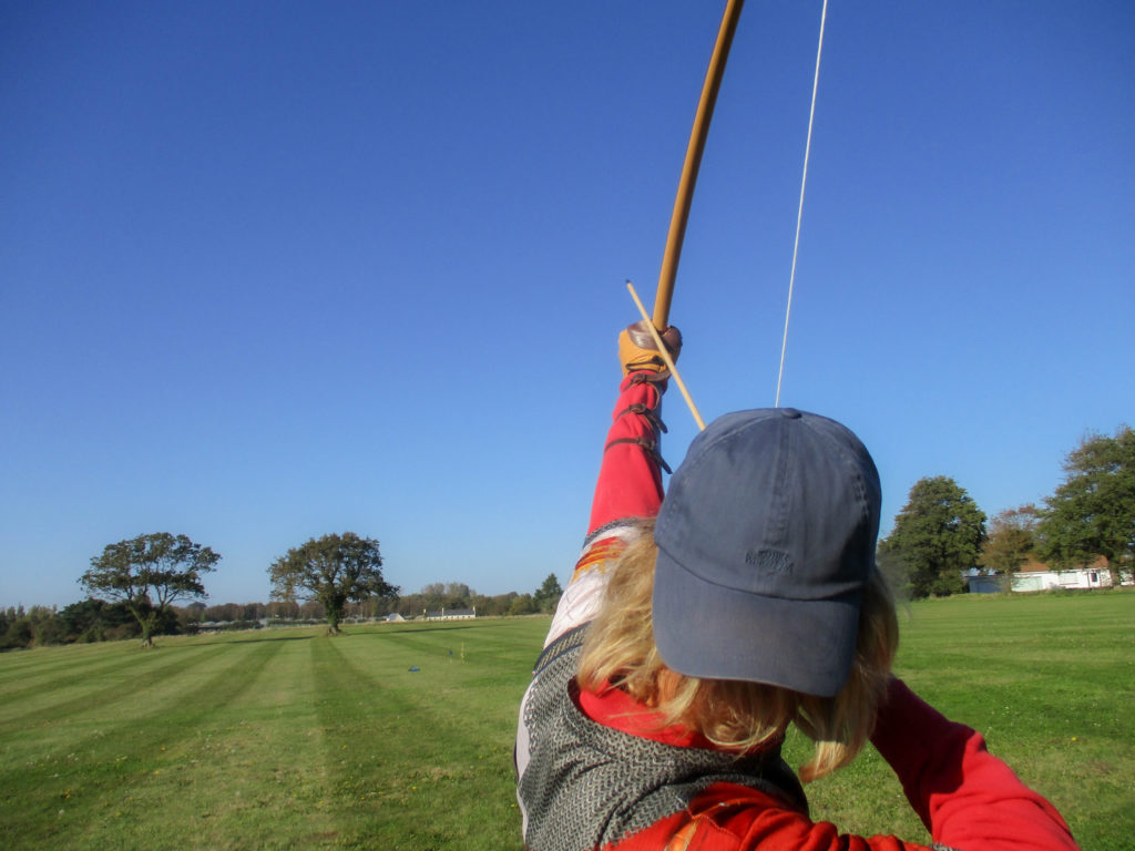
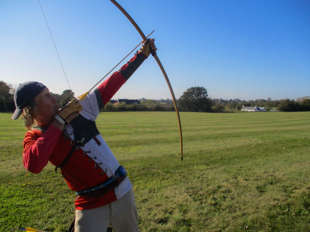
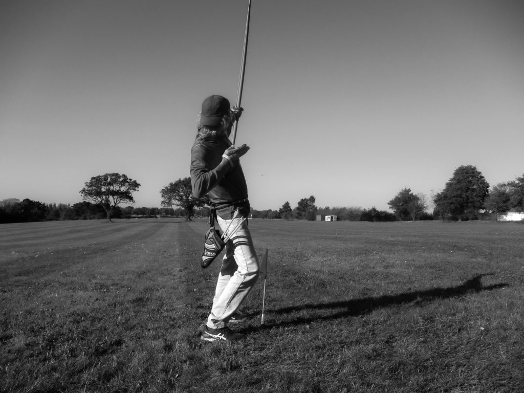
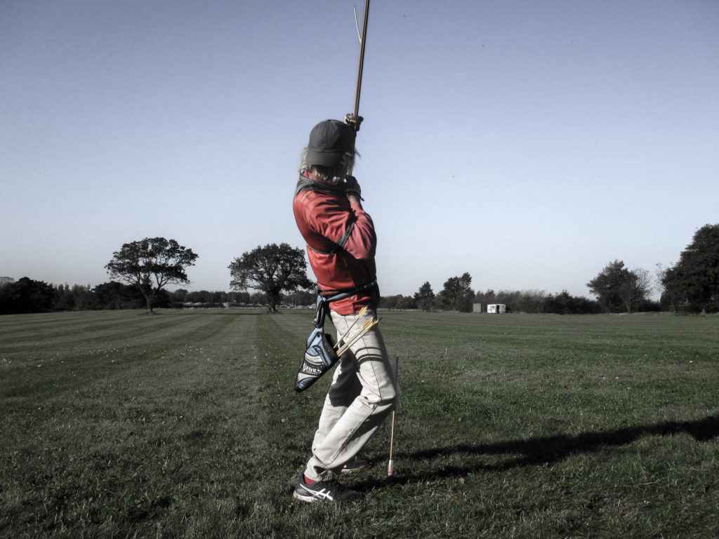
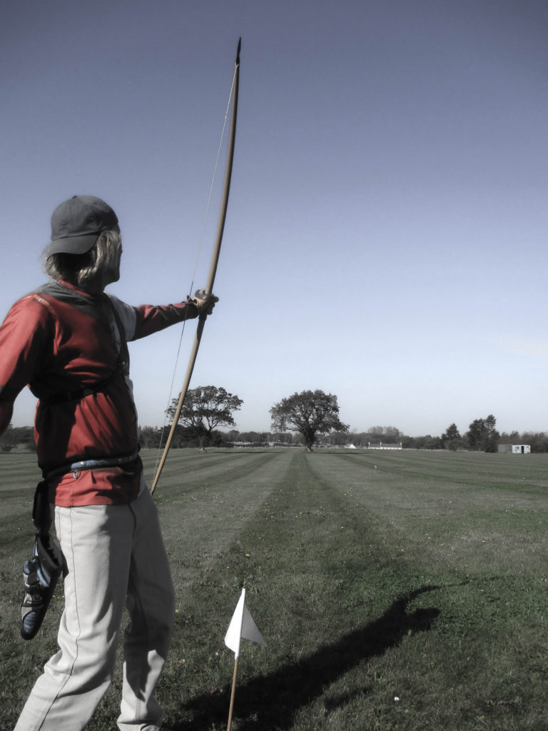
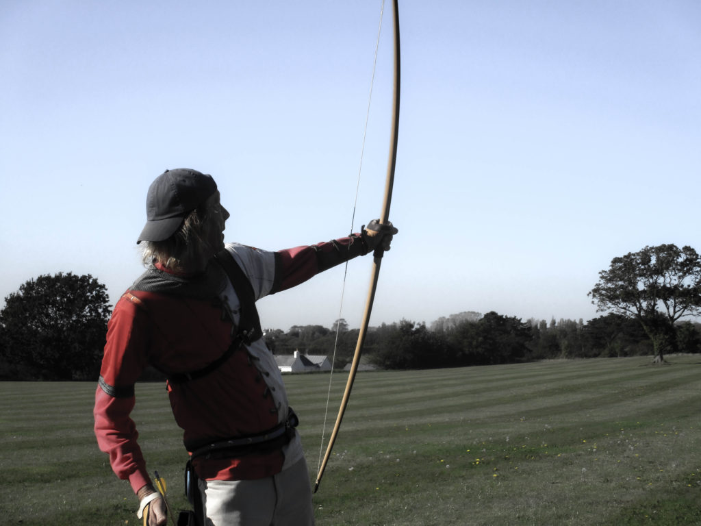
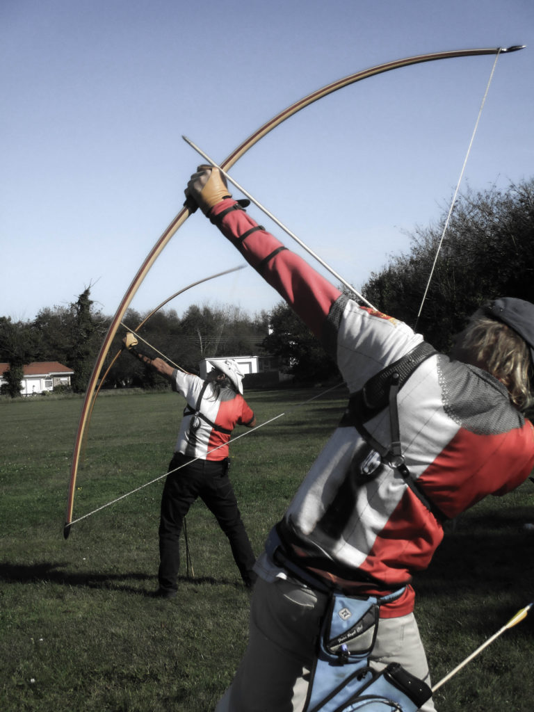
For my outside photoshoot I will be taking pictures of my uncle doing archery. I will go to the archery range on the 17th October because it is sunny on that day, which will allow my images to have natural lighting. I also want to do the shoot on Sunday because we will be doing a Clout Shoot and because it is a less modern style of archery, we will be using an older type of bow and will wear a medieval-themed shirt, which will loosely link to Heritage. I wanted to take pictures of him doing archery because we have both done it for years and we both enjoy a lot.
Inside Photoshoot
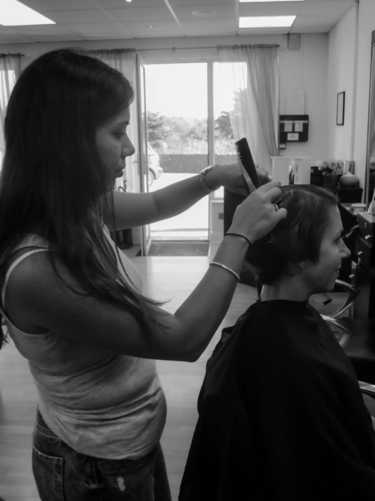
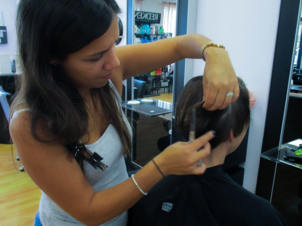
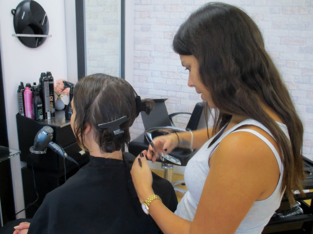
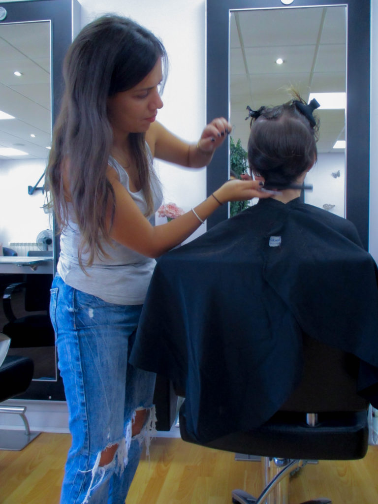
For the Inside photoshoot I will take pictures of a hairdresser cutting someone’s hair at the salon they work at, which will allow me to make the images more recognisable. I will go on the 16th October, when it is not too busy, and I will be using artificial lighting, with fairly bright natural light coming through the door. I decided to take pictures of a hairdresser because I thought it would be a good way for the model to get into poses that are easy to notice and correlate to her profession.
Two or more people
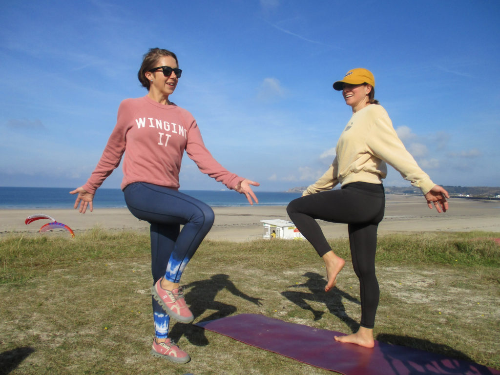
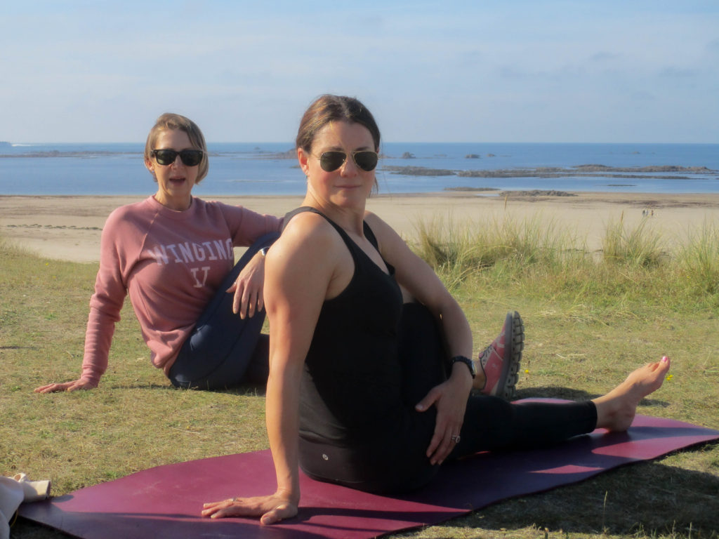
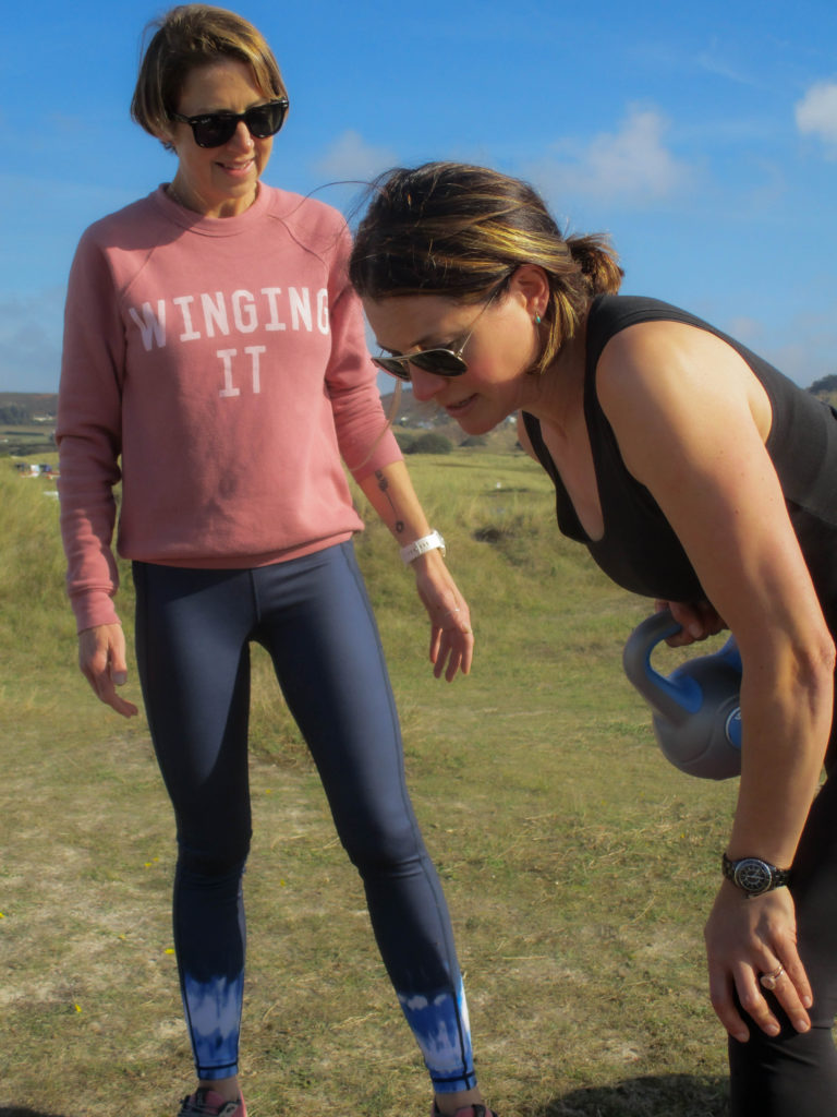
I will be photographing my mother and one of her friends while they are doing a fitness routine. I will be taking this photoshoot at Le Braye (on the dunes) because it has a flat surface and a fairly plain background, which allows the models to be the main focus, on the 16th October because it was also sunny on that day, which allows for good natural lighting to be present in the photograph. My mother used to work as a fitness instructor, so I thought it would be a good idea to capture her skills within a photoshoot.
Bert Teunissen
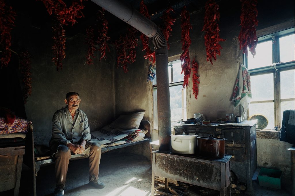
In this image, the exposure is fairly low, which allows for the shadows to be clearly seen and made darker, giving the image a dismal, run-down look. The composition of this image is created primarily through the pipe in the centre of the image, with leading lines from the chili’s, windows and other furniture. It is arguable that the focal point is either the pipe in the centre or the man on the left. Lighting in this image overall is not too harsh, although light shines through the windows creating brightness. The artist likely uses colour as a way to show the situation of this person, with his house looking fairly run-down, which directly contrasts with the chili-peppers which would, supposedly, act as his livelihood. The model’s whole body can be seen and he has not been posed which could have been done by Teunissen to show that life for this person is mundane or glum. The image was taken level with the model, with the camera being positioned fairly far away, allowing more of the room to be seen. The model is fairly small compared to the rest of the image, which could possibly show how this man’s livelihood is of utmost importance to him in order to survive. The model is looking directly at the camera, which could have been done by the artist to make the model appear saddened or stressed about his situation.
Outside Photoshoot Contact Sheet

For these images I wanted to edit them in a simple way, by slightly changing the exposure, contrast, highlights/shadows and whites/blacks, which would allow for the colours and lighting to stand out more.
I think this is the best image from this set because I like how there is a difference in tone from the top and bottom halves of the image, as well as how the model inverts that difference in tone with their clothing (the darker parts of his clothing is positioned at the top half of the image which contrasts with the lighter sky, and his white trousers are in the bottom half creating another contrast). I decided to make the image black and white to make this correlation between the model and the background clearer
I decided to edit these next images in a similar way, I made the vibrancy low to create a dark red on the clothing of my model which contrasts nicely with the rest of the image which is left fairly dark and colourless.
I think this is my best image for the Outside Photoshoot because of how the image is laid out, with the other model’s upper body being positioned inside the bow of the closer model, which creates another frame within the image, as well as how both models have a similar pose like they are synchronised with one another. I also like how the colours in the image are shown, with red and white shirts contrasting heavily with the darker green.
Inside Photoshoot Contact Sheet

I edited these images in a similar way to the last ones, with only subtle adjustments, because I thought the colours of the models’ clothing worked nicely with the mainly black and white colours of the salon.
I chose this as the best image from the indoor photoshoot as I like how both models have their own frame or background around their head (with the model on the left having a white background surrounded by the black frames of the mirrors, and the model on the right having a mirror around their head, which is almost the complete opposite of what is shown around the model-on-the-left’s head). I also like how the image is primarily made of black and whites, yet some colour such as blue and green manage to make their way into the image and contrast with the black and whites.
Two or More Models Photoshoot Contact Sheet

For this set of images, I edited them in a simple way as well, this was so that the different colours, the warmth and tones of the images are kept close to the originals. I did this because I liked how the images turned out without editing them.
I thought this was the best image from the Two or more Models photoshoot because I like how there is a large variety of colours in the image, with blue and green being the majority of the colour in the image’s background and pink and black being the colours of the models’ clothing, creating a contrast. I also like how the models use the blue of the sky as a background for their head, which makes their faces stand out more as the sky has very little in it, while their lower bodies use the green on the ground as their background.
Final Images
Evaluation:
Overall, I am pleased with the outcomes of the photoshoots, I think the images correctly show what the atmosphere is like in those professions/doing those hobbies. I would say that my favourite photoshoot out of the three would be the outside one, as I think the images have a lot of energy and an ‘In-the-moment’ feel to them. However, I think I could have incorporated the style of the artist I researched (Bert Teunissen) more successfully, I could also work on my skills with communicating with my models in order to get the exact image that I wanted.


